On the 14 October 2010 this image by German photographer Thomas Struth sold for £169,250 at an auction in London (the pre sale estimate was £90,000).
Thomas Struth - El Capitan (Yosemite National Park)
Now many of the readers of this magazine might think this a vastly over-inflated price for a rather dull snapshot! I want to look at why a loose affiliation of people that I shall call ‘landscape photographers’ might read it in that way and why critics and another loose affiliation I call ‘artists as photographers’ might see it as something more admirable.
The Photographers’ Gallery reopened to the public on Saturday 19 May after being closed for nearly two years while refurbishments on its new building were completed. The Gallery in its new location on Ramillies Street is much larger than its previous incarnation at Great Newport Street and now has substantially larger exhibition spaces. The beloved bookshop, a popular feature of the Gallery, is now located in the basement with the adjacent print sales room. Alongside the books for sale there is a range of ‘toy’ Holga cameras and accessories as well as a cabinet featuring, amongst others, a selection of refurbished Olympus Trips; all doing their bit to keep film sales alive.
Coinciding with ‘Oil’, Flowers Gallery, on Cork street is previewing Burtynsky’s new work ‘Dryland Farming’; which depicts the agricultural region of Monegros in Spain. These images will form part of his next extensive project ‘Water’ to be completed in 2013.
BURTYNSKY:OIL
19 May – 1 July 2012
The Photographers’ Gallery
16-18 Ramillies Street
London W1F 7LW.
T: +44 (0)20 087 9300
Open: Monday – Saturday 10am – 6pm, Thursdays 10am – 8pm, Sunday 11:30am – 6pm. Admission free.
email: info@tpg.org.uk www.thephotographersgallery.org.uk
MONEGROS - DRYLAND FARMING
23 May – 23 June 2012
Flowers Gallery
21 Cork Street
London W1S 3LZ
T: +44 (0)20 7439 7766
Open: Monday to Friday 10am – 6pm, Saturday 10am – 2pm
email: info@flowersgalleries.com www.flowersgallery.com
Quite a few readers have asked us about sharpening over the last few months. It’s such a big subject that it’s probably best to split up into a series of posts which means that this issue we have an introduction to blur and sharpening.
The first step is to understand what blur is, where it comes from and what it looks like. Let’s take a look at two types of blur.
Types of Blur
The first type of blur is probably familiar if you have ever used the blur function in photoshop - this is technically known as gaussian blur because it follows a ‘gaussian’ distribution.
Guassian Blur
maths stuff - just forget you read it if your head hurts already
There are only a few types of real world causes of gaussian type blurring, spherical aberration is one - a blur caused by a lens with spherical surfaces - and ink spread on your printer is another.
Interestingly your typical out of focus blur of a good quality lens is not a guassian type blurring. This is why photoshop has an extra type of blur called ‘Lens Blur’. If you look at the image below you can see an example of lens blur on the same image used previously. This time the point source has become a circle whose brightness is greatly reduced.
We showed you a diagram in the article on depth of field recently that demonstrated why lens blur looks like it does and we’ll repeat it here.
As you can see, when your point source is slightly out of focus it is spread over a circle related to our previous ‘circle of confusion’ distance.
The alarm goes off at 4.40am. Outside my tent it’s minus 3 degrees with a cold northerly wind that’s been trying to blow the tent off the mountain throughout the night and even the dog is cold! It's just started to hail again and as the first signs of daylight are beginning to show in the sky, it's clear that this isn't going to be a classic sunrise! Believe it or not, this is Scotland in May and not the middle of winter. Sometimes it's hard to tell the seasons apart here!
The stereotypical view of the serious landscape photographer is one burdened with a large bag and a tripod. But for some notable exceptions (Galen Rowell immediately springs to mind) this view has not much changed from the beginnings of landscape photography to the modern day. While almost all things have progressively miniaturised the landscape photographers baggage seems to have defied that trend. Quality comes at a price in terms of the amount of equipment needed to cover the bases. Although the old contention that it is not about equipment is true I suggest that most readers of this site have a threshold of quality for their serious work (target 30x20in print) which rules out the camera phone/miniature compact (e.g. LX5, G12) as an option but for a small percentage of their work. Personally, if I go out on a 5mile+ walk or am engaged in a main non photographic activity (like walking the dog) then schlepping even a DSLR outfit becomes impractical and a tripod a non starter - ever tried throwing a ball with a backpack & tripod ? A secondary factor is that the increased popularity of landscape photography and the accessibility of 'honey pot' locations there is a desire to get off the beaten track to find and produce original work - this normally means walking.
Figure 1: Kinlochleven to Fort William. Nex 5n
In the last few years walking has become more and more important to me and, in addition to between 7 & 10miles per day with our dog, I have walked the Isle of Wight, Wainwright's Coast to Coast, the West Highland Way, parts of Offas Dyke and the Cleveland Way and will be undertaking the Tour De Mont Blanc later this year. Typical days are between 12 and 18 miles exceptionally up to 25miles. On all of the walking I have done I have frequently encountered wonderful scenery or exceptional lighting conditions that just must be captured . Most importantly, I would not have gone to these places as a photographic trip so the 5x4 or DSLR outfit would be at home and as we know the worst camera is the one left at home.... There are some well known exceptional photographers who do carry heavy weight kit on remote locations but it is not something you can casually do, no more so than fell running or the equivalent and it is not for me. As a consequence I have watched (and sampled) the development of high end miniature compacts and Compact System Cameras (CSCs) with great interest in search of a camera that can deliver 'serious' quality and be practical to carry.
Figure 2: Langstrath Dale Olympus E-P1
How big is small ? Some learning points
1. A typical daypack for day or multi day (non camping) walk is 30-40litres in which there needs to be space for essential safety items, waterproofs, additional clothing, navigational aids (maps etc), food, a flask and water. This does not leave much physical space or headroom on weight before you need to increase the pack size (a big step) to maintain comfort.
2. From a mixture of observation and experience the camera needs to be packed but accessible without taking the pack off, if it is in the pack it stays in the pack and it is much too easy to walk on by a promising opportunity. I see quite a few walkers carrying a DSLR ' in hand' which is limiting over rough ground and also means both hands are full if you are using a pole, it always looks uncomfortable for any distance and cannot be safe.
3. A separate strapped bag, whether waist or shoulder, has not worked well for me. Another over the shoulder strap either digs in to your neck or is on the edge of the shoulder and is forever slipping off. A separate belt strap suffers a similar problem in contention with the waist strap of the day bag.
Nett of this is that a pouch (or pouches) on the belt of the rucksack is the best carrying option and really defines the size limits that the camera needs to meet. The pouch needs to be padded, weatherproof and not so heavy as to interfere with balance and integrity of the load distribution function of the belt system. I have found the Lowepro D-RES 10AW to be perfect for a basic kit.
Figure 3: Castle Crag Panasonic GF-1
Based on this, the limit is a small CSC and lenses, essentially ruling out any DSLR as a backpacking option. The good news is that CSCs are now at the point where quality is not compromised over a high end DSLR provided the principle that a CSC will not do everything but a DSLR could is accepted. If you only had one camera you would need to be pretty sure that this wasnt a problem.
What do I carry ?
My 'perfect' kit that enables me to do anything sensible while on the trail would be:
Camera Body with spare battery and card.
3 high quality primes covering (in 35mm terms) 24mm, 35mm and 80mm.
Graduated filter kit with 2 stop ND grad only & polariser.
The camera must be usable in bright light as some models have viewing systems that are next to useless in bright sunshine.
Figure 4: Needles IOW Nex 5n
Over the last 5 years my fulfilment of this requirement has changed and not always perfectly met. My own journey has led me to the following observations:
High End Miniature format Compacts
Typically these cameras have fixed zoom lens , a miniature sensor and importantly cost sub £500ukp. Examples are the Canon G12 and Panasonic LX5
This is where it all started for me with the Canon G10. I carried one everywhere for about a year and but for better options being available I would probably still be using it. The G concept hits the requirement for 'travel lite' exceptionally well with a good zoom range, Image Stabilisation that really works and a brick like robust construction. The LX-5 is similar in its capability but in a smaller package (IXUS sized) and almost shirt pocketable. These 2 models are the most popular amongst my Large Format friends notwithstanding other options being available which share the characteristics. Quality for on screen viewing and limited printing is excellent providing conditions are good. These high end compacts take an adapter that allows filter systems to be added and I found that the camera with filter kit installed could be stored comfortably in the DRes 10 and always be ready for action. I did find the quality of the files limiting in the end as a single portable solution, great for the screen but... .
Figure 5: Nr Inverarnan Nex 5n
Compact System Cameras
This area has seen the most development and a huge proliferation in models over the last 2 years. I wrote a short piece on the Panasonic GF-1 and Olympus EP-1 for this magazine in the first issue and how things have changed since then. The range of pricing is equally large with a small system costing anything from a few hundred pounds to several thousand. For the purposes of this debate I will exclude the Leica M9/10 and Fuji X-PRO. The XPRO is hugely expensive, undoubtedly capable of excellent results but no more than I would consider an M10 as a backpacking camera do I consider this to be in scope for now. Nikon and Pentax have now joined the field but with smaller sensors and as such sit somewhat uncomfortably for me in between High End Miniature Compacts and this group, a discussion for another day but for now I will also exclude them from this assessment ! YMMV.
From the mainstream players any model will likely meet the basic needs. From my own experience these are factors that were significant differentiators:
Model Range
Olympus
Panasonic
Sony
Pros
Great colour
Nice size sensor especially for portrait landscapes
In camera Image stabilisation
Some very nice lenses (12mm F2, 45mm F1.8)
Modern sensor in GX1 ( & G3)
Nice size sensor especially for portrait landscapes
Good lenses (14mm, 20mm F1.7, 45mm F2.8)
Kit lens good enough
Good all rounder
Superb Nex 5n sensor (has micro lenses) DR, sharpness, colour all outstanding. Pictures have a glow about them.
24mm F1.8 Zeiss and 50mm F1.8 superb lenses
Nex 7 amazing detail & good build quality
Nex 7 OLED display good back up in bright light
Metal kit lens good enough but sensor much better
Cons
Apart from OMD sensor is last generation esp. compared to latest Sony 16mp offering
Poor LCD in E-Px range in sunlight
Poorest std kit zoom lens
Colour (especially blues) a bit tricky to get right
No Image Stabilisation in body or key prime lenses
No good wide-angle lens. 16mm unusable on Nex 7 because of magenta shading
No Image Stabilisation in body or key prime lenses
Nex 7 is not a small camera
The lens release is awkward and clearly designed by a left handed person or someone that holds the camera upside down.
Oddballs
The new Canon G1-X conceptually could fall into the miniature category being of 'G' pedigree and ethos and may work well. It has a larger than m 4/3rds sensor but comes with a fixed zoom lens similar to the G12 in coverage. Similarly the Fuji X10 at significantly less money (but with well documented quality issues in its first iteration) should be considered but I have no experience of this or seen people using one to offer comment.
Miscellany
Batteries and battery life is worth a mention. I have never had an 'in day' problem with any digital camera providing I prepared properly the night before. That said I observe that cameras seem to be getting progressively worse on battery life. The G10 would go on forever and I never used the spare, the E-P1 was pretty good with no worries over a week of shooting and still having juice left. The Nex5n chews through batteries by comparison, I used 2 of the 3 batteries I took on the WHW changing the first at 30% and the second had 45% left after the eighth day. The Nex 7 seems hungrier still but I am still in the battery conditioning phase.
I have used the Lee RF75 filter system with all my compact cameras and still find it the best and most compact. Must get a polariser soon....
Figure 6: Raindale Leica X1
Two high end fixed focal length compacts are potential 'travel lite' cameras in the Fuji X100 and the Leica X1 (soon to be X2). The fact that better sensors are available in the CSC camp along with flexibility to change lenses is significant to get to an ideal kit. I did use a Leica X1 for a few months until the Summer and found it unusable in bright light (worse than the Olympus E-P1), sadly the X2 carries over the same screen but with the improved Sony sensor. Results should be outstanding as the X1 delivered the finest quality files of any 12mp camera I observed from that time period but at a significant financial cost.
Final Thoughts
I walked the Coast To Coast with a Panasonic Gf-1 and 20mm lens only. I was happy with the results but really missed the IS and lost a few shots to camera shake at surprisingly high shutter speeds. As a consequence I moved to the Olympus E-P1 with the 'in camera' IS and the Panasonic lenses. Hit rate improved significantly and I really fell in love with the colour from this camera. I was lucky enough to try a Sony Nex 5n at Christmas 2011 and was so completely bowled over by the results from this little camera that it has become my mainstay, it is in a different league from anything else digital I have played with over the years. The files have a very easy to get at 'light box' quality to them. I walked the West Highland Way in May with just the 24mm F1.8 Zeiss and the Nex 5n and came away feeling that I could not have got better with any other camera / lens combination. The lack of IS does not seem to be an issue as it was with the Panasonic, I suspect because the ergonomics are different and the lens balances perfectly in the palm of your hand. I have since added the newly available 50mm F1.8 and a Nex 7. Initial views on the Nex 7 is that there is a lot more detail but it does not zing like the 5n, the pixels feel a little constipated when trying to post process them !
Figure 7:Calshot Olympus E-P1
So, to come back to the question posed at the beginning, I believe that the products now exist for uncompromised quality results from the latest batch of truly field portable cameras . Not 5x4 and not IQ180 as maybe but I find the prospect of walking the Alps for e.g as exciting photographically as for the walking and that is a good thing.
Burtynsky's Quarries project was the work that initially drew me to him. The sublime beauty of these photographs and their compositional poise made it accessible without knowing anything about issues involved or the artistic reputation of the photographer. This is Burtynsky's goal as far as I can tell though - to engage through beauty and then let the visual facts do the hard moving. This isn't original, but it is effective. In the Quarries book the message isn't overtly political - the quarries sometimes are quite brutal scars but in the grand scheme of things, most are quite benign apart from the third world quarries included where the issues are around bonded labour - slavery in any other name. Unlike the Oil book, the introduction includes essays about the history of the quarries and Burtynsky's work around them - including commentary on the issues such as bonded labour mentioned earlier.
It's the photographs that engage here though - and they are stunning. Burtynsky has an eye for the subtle connection between the abstraction of these massive structures and the sense of scale introduced by the subtle inclusion of man made structures. The compositions often recall Klimt and Braque and echo the shapes of babylonian ziggurats in reverse. For me the images had a strong connection with Paul Wakefield with strong, form compositions and great use of texture.
Just as Burtynsky does, I'm going to let the images speak for themselves. All I can do is recommend this as Burtynsky's most aesthetically pleasing book.
You can support a dedicated photography bookstore by buying from Beyond Words for £54 by clicking here.
Originally published in 2003 and now on it's sixth reprint, Manufactured Landscapes is the ideal introduction to Edward Burtynsky's work. Lori Pauli's short biography and review of Burtynsky's work to date provide some excellent historical and contextual background. Tracing the artistic family tree from JW Turner and Caspar Friedrich to Edward Muybridge, Walker Evans, Carleton Watkins, August Sander and more not only places the work in a historic timeline, it also (at least for me) gave me more artists to find out more about such as Margaret Bourke-White and Emmet Gowin.
The second essay by Mark Howarth-Booth traces Burtynsky's participation in the creation of a new version of the Sublime that Burke discussed in his '...the Sublime and the Beautiful [sic]'. This is really interesting as it was my initial reaction to his work that made me think that the ideas of romanticism and when I did a little research I discovered that the German 'Sturm und Drang' (great name!) movement portrayed 'terror and destruction' although at that time mostly of a natural made source such as storms and ship wrecks although Philip James de Loutherbourg's 'Coalbrookdale by Night', included in the book, has many parallels.
Kenneth Baker's final essay looks at the instrinsic stress between Burtynsky's formal and beautiful compositions and the industrial installations and environmental damage they are often made of. Burtynsky's offers very little narrative to support his work, letting the viewer make their own conclusions. The art worlds reaction to beauty makes this approach a dangerous one commercially but the quality and depth of his work cannot be ignored.
One of the great parts of this book is an interview with Burtynsky (in actual fact multiple interviews collated over time). He reveals himself as photography with an interest in craft and art and even more importantly for his work, a deep interest in the world.
The photographs included are from a range of his projects, I'll summarise them here..
Railcuts - Side views of railcuts in the sides of steep sided hills and mountains. Mines and Tailings - Overviews of various mines, abandoned shafts and the well known intensely coloured tailings Quarries - 'Inverted Skyscrapers' in Burtynsky's excellent words. More in the Quarries book review Urban Mines - Mostly monoculture waste, including the remarkable tyre piles Oil Fields and Refineries - Derricks and industrial machinery/piping Shipbreaking - The architectural and most sublime work based in Bangladesh
Overall a very highly recommended book which is available from Amazon for £33.20
'Oil' is Burtynsky's masterpiece - it's the project that has brought him to the attention of the world and has captured the flavour of 'peak oil'. The work takes the aesthetics from his previous projects and applies them to a topic close to his heart, a topic discovered during an epiphany where he took a detour on a trip out to discover classic wild landscape photographs and instead discovered the altered landscape - and the biggest alterations of our planet have come about through the use of oil.
Burtynsky uses his formal compositions and ability to find the beauty in almost anything to draw our eye in to an image, drawing us in until we start to really see his chosen subject. Many argue that aestheticising destruction is wrong in some way, I'm not sure how this is argument works though - desecration isn't inherently ugly, it's the thing itself that is 'ugly' and the representation of something is just a way of seeing.
Although Burtynsky doesn't like to talk about the politics of his subject matter, the essays included in the book manage to make the politics fairly obvious. The discussion of the rise and decline of the oil industry is erudite and ultimately quite depressing. It's this tension between beautiful representations and difficult topics that makes the book successful on many different levels.
For me, the most successful pictures are the where this dichotomy is at it's strongest. Oil pipes through pristine woodland; Arrayed derricks on remote desert; The landscape and topology of a tyre wasteland; and finally, the awesome Bangladeshi ship breakers. If you just want the aesthetic landscape, start with Quarries, if you want an overview of Burtynsky's work, start with Manufactured Landscapes and if you want to see what one of the most successful photography projects in history looks like, get Oil. An epic undertaking, Burtyksky's Oil covers the whole process from extraction, through processing and use to the disposal of it's raw materials. You can buy the book from Beyond Words by clicking here.
"The landscape, the whole landscape and nothing but the landscape."
But what is landscape?
We know that everyone in the On Landscape community (the authors, the subscribers and general readership) is passionate about landscape photography. But when four of us got together to discuss the subject recently, (comprising Onlandscape founder Tim Parkin, photographic guru David Ward, photographer and designer Andrew Nadolski and me, Joe Cornish), we struggled to find agreement about what landscape photography actually was!
Whilst discussing plans for the magazine and other ideas, David Ward, Joe Cornish, Tim Parkin and Andrew Nadolski took the opportunity to record a round table discussion covering a question that has been asked more than once in the past (usually around mid October in the last few years) what exactly is landscape photography (or more usually put "That's not bloody landscape photography!").
The session was recorded for your offline delectation as long as you don't end up angrily disagreeing and causing pile up due to landscape photography inspired road rage.
Please chip in with your own thoughts via the comments, email, twitter or facebook (preferably once you've stopped driving or get released on bail).
“On Landscape”, is a veritable, virtual on-line temple of landscape photography. So the question posed by the title of this piece might seem almost sacrilegious to some of its readership. Whilst I obviously feel an affinity for the ethos of the magazine and the work presented I seriously wonder if a photographer should be (or even can be) predominantly defined by their subject matter. Schools or genres are of course commonplace in art but photography is amongst the most segregated of all the visual media. There are countless indefinite, and often almost arbitrary, divisions; we are nature photographers, fashion, sport, landscape or portrait photographers before we are just plain photographers. We also divide ourselves into tribes according to usage; we are amateur or professionals (surely the most spurious classification, since the quality of the work is much more important than whether it’s paid for or not) editorial, advertising, stock or industrial photographers (to name but a few). Within each of these divisions there are countless subdivisions and overlaps between specialisms.
This issues featured photographer hails from Birmingham and works as an architectural, environmental and studio photographer but transforms like a celluloid batman into a landscape photographer when the urge becomes too strong to resist (oops - flowery language filter failure!). Take it away Paul Arthur!
In most photographers’ lives there are 'epiphanic’ moments where things become clear, or new directions are formed. What were your two main moments and how did they change your photography?
That's a difficult one. Hindsight is actually a hindrance in answering that question, especially as I seem to have four or five epiphanies a year when I discover some new method for doing something, a little trick to make my life easier, or some new style that I think looks great and that I'd like to add to my repertoire. There are two moments that do stand out though: the moment I purchased my first digital SLR, and the moment I discovered film.
My photographic journey started a good 20 years before I bought my first DSLR, with a cheap, plastic, point and shoot 35mm camera. If you saw the pictures I took back then, you might hope that they were an artistic statement, that I was rebelling against the norms and the oppressive establishment that demands images to be in focus, correctly exposed and where people's heads are in view. Sadly, that wasn't the case. I was just rubbish. My honeymoon was the start of the run of changes that lead me to where I am today. I had by this time graduated from a cheap, plastic 35mm camera to a cheap, plastic digital camera and I couldn't wait to see the beautiful masterpieces I was going to create to remind me of this fabulous island paradise. Once again, I demonstrated my incredible ability to produce disappointing, out of focus, poorly exposed images. Enough was enough, and since I'd always been aware that my parents’ photographs that they took on SLRs were much better than mine, I went out and bought a DSLR. Surely that was all I needed to make great pictures, right?
Of course you all know the answer to that one, but the change to the DSLR gave me a level of control that hadn't been possible up to that time, gave me a way of seeing the results of my tinkering instantly, and since I'd spent a good few hundred quid on it, I was going to make the best I could of it. In putting my money where my mouth was, I had finally committed to making good images, rather than just clicking away and hoping that the camera could come up with something decent.
I was hooked from that moment on, and it was only three years from then that I packed in my job in finance and started working full time as a photographer.
The second big epiphany was the discovery of film, and the eventual progression to Large Format. Like my purchase of a DSLR, using film made such a big difference to my photography because it required a proper commitment. Up to that point my landscape photography had been derivative, virtual copies of what we might now call "the classics". I can often be found in pubs complaining about people who spend all their time producing images identical to a hundred others from the same locations, and I think what really annoys me about it is that I spent such a long time doing exactly the same thing. Moving to film meant that suddenly making an image cost money, and so I shouldn't just waste it on just anything, I should make it count. The move to large format further cemented that feeling, as now it would cost me at least £5 for every picture. I think that's what made me move away from the weather-dependent glory shots and look around at my surroundings more to see what else there was to photograph, other than the obvious.
Tell me about why you love landscape photography? A little background on what your first passions were, what you studied and what job you ended up doing
My childhood was one of travel and music, and to some extent, it's the same to this day. I remember as a child being very bored of travelling to cities with beautiful buildings, and couldn't stand the long drives through the mountains in the south of France that seemed to make up most of the holidays. Never one to hold back any complaints, I grumbled to my parents that it was all boring and rubbish. They replied: "You'll understand when you're older". Of course, they were right, and these days I make my living making images of the very things I initially found so uninspiring.
Music has always been a big part of my life: I spent years training as a brass player, eventually settling for the Tuba, and alongside that I found that I had an aptitude for singing. With a bit of cocky swagger I auditioned for the National Youth Choir, and much to their later regret, they let me in. I was of course very grateful as it allowed me properly to dedicate myself to my other passion - girls. It turned out ok in the end, as I met Helen, who I eventually married.
After school I studied economics at university and end up sleepwalking towards my thirties working in finance, never really getting anywhere and never really enjoying myself. It was landscape photography and eventually other disciplines that slowly dragged me away from the dreary office job, and gave me a career that I love. Even though I spend a lot of times photographing things I wouldn't want to photograph if someone wasn't paying me, it doesn't really feel like work. Cool eh?
I love the act of making landscape images fundamentally as it is a way of getting away from the day job (if you can call it that in my case) and being in some of the most beautiful places on earth. I simply love an excuse to go to these places, and spend some quality time there. Having said that, I think making an image in a place makes me appreciate it even more, and coming home with a good image is far more rewarding and visceral than my memories alone. The very act of trying to distill a three dimensional 360 degree experience into a small rectangle means that I have to look that much harder at my surroundings, I can't just simply walk around thinking "Ooh, that's nice". Something I hear very often from non-photographers is "Ah, well, a camera can never do it justice, can it?" I'd actually argue the opposite. I can't think of a single picture I've taken in the last couple of years that I felt didn't do the actual scene justice, and in fact I think that a carefully crafted image is an enhancement of reality. I find visiting beautiful places and making them look better than they do in real life a tough hobby to beat.
You’re another musical landscape photographer, tell us a little more about your music and whether you think it helps as inspiration for your photography.
I wonder whether photography and music cross over so much because they are both great ways for the creative mind to express itself. I haven't ever had any skill at musical composition, preferring performance and the interpretation of the notes given to me on the page, and I feel that this is exactly what I do with photography. A good musical performer will take a set of notes and turn them into music, drawing the listener's attention to the important bits, and allowing the less important notes to be more impressionistic, if that makes sense. Isn't that exactly what we try to do with photography? As photographers, we will generally find an engaging subject and interpret its relationship with its surroundings in such a way that we show what the important bit is, but more than that, we try to impress a mood or a feeling on the image as a whole.
I wouldn't say that music itself influences my photography, but perhaps the work ethic is the same.
That said, I do find music helps me find inspiration in photography. My best images are taken when I'm not thinking about creating an image too much, but relying on instinct or on my subconscious to find something special. Listening to music is pretty much the only way I can turn my brain off just enough for the creative part of my brain to take over. Thankfully, my music taste isn't reflected in the type of images I make - I don't think anyone would want to look at my pictures for long if they knew what I was listening to when I made them!
You run a professional photography business - what sort of work do you normally undertake and how do you keep your passion for landscape alive?
I know very few professional photographers who work exclusively in one discipline. Those who do are real masters of their craft, and are in sufficient demand to choose to do no other work. For the rest of us, the key is diversity, almost mastering a variety of work in order to keep ourselves busy and the bills paid. I'm lucky though that my work falls almost exclusively into two categories: architectural photography and portrait photography. Living in a big city clearly has a lot to do with the genre in which I work. If I lived in the Highlands, I couldn't do what I do as there is no local demand for it, and there is a similar lack of demand for landscape photography in the big cities. I am able to keep a passion for landscape photography going precisely because nobody will pay me to do it.
It's not that I don't really enjoy photographing people and buildings, but I don't wake up in the morning thinking "Ooh, I'd really like to photograph a warehouse today" unless I'm late on the mortgage. I do however wake up wanting to drive to the peak district and wander around for a couple of hours, or get away for a few days to Northumberland or Scotland. The grass is always greener, as they say, but I'm lucky enough to enjoy what I do so much that I'm very happy to keep landscape photography just for me, and have no desire to make a living from it at the moment.
Could you tell us a little about the cameras and lenses you typically take on a trip and how they affect your photography.
The important thing to note initially is that I do 99% of all my commercial work on digital cameras, and that 99% of my personal work is done on film cameras. Keeping landscape photography as hobby means that I'm far more interested in the crafting of an image and producing something tactile. It's not about getting the finished image as quickly and cheaply as possible, as it is in my commercial work, but it is instead about making an image I can fall in love with. For me, only film can do that.
I have an Ebony 45SU, a pretty rare large format camera except amongst us landscape photographers, where it seems almost to be the camera of choice. The asymmetric movements on the back make focusing almost instant, and I now seldom spend more than a minute on focusing an image. It's also pretty light and is a good all rounder in that it will cope with most types of image from a super wide landscape to quite a close detail. Also, as it is made of wood and titanium, making an image is a very tactile process that I find more rewarding than using my SLRs. I have six large format lenses, ranging from a 45mm up to a 360mm. I will usually carry the longer five of those with me everywhere I go, leaving the 45mm at home most of the time, because it's far too wide to be useful except in the city. There's a lot to get to grips with when you start out in Large Format photography, and as result it inevitably slows you down. Add in the lack of zoom lenses, and you can end up in a bit of a muddle. These days, I've pretty much got the process of making an image sorted so that I can be quick when I need to be. And who needs zoom lenses? Once I've gotten myself in the right place, I carry enough lenses to cover most situations anyway. The only drawback in the weight - but I'm hardcore, so that's part of the fun.
I also carry with me a Panasonic LX5 as a sketch tool, and this might be replaced with a Panasonic GX1 in the near future. It's very useful to see what you're likely to end up with without getting the "bad boy" out, and occasionally I've ended up getting images with it that just weren't possible on the Ebony. It's a very useful tool, but the images just don't have the wow factor that I'm looking for.
What sort of post processing do you undertake on your pictures? Give me an idea of your workflow.
This is going to be a very short section. I think I struggle with inspiration a little when it comes to post production. If I like a transparency once I have processed it, then I'll scan it on to the computer so I can send it to print or put it up on the website. The only post production I really do is to correct scanning mistakes and make the digital file look as close to the transparency as I can manage. I've often watched the videos on this website of Joe Cornish processing his images and those of others, and am very jealous of his ability to judge what changes will improve an image. It's something I'm working on and will continue to work on, but perhaps as my photography matures, so will my vision in the digital darkroom. Perhaps unsurprisingly, I have exactly the same problem in the wet darkroom. I have recently converted my attic into a darkroom, and I can't tell you how cool it is for me, but to some extent if I don't have the goods in the raw negative, I'm a bit stuffed. If anyone wants to write a book on interpreting images out of the camera, put my name down for a copy.
Do you get many of your pictures printed and, if at all, where/how do you get them printed?
Virtually all of my commercial work is for print, but it is printed commercially, so I don't have a part in the process. As a result my printing knowledge is non-existent. It's an unfortunate casualty of my area of the industry. As there isn't a good business case for me buying a large format printer, I don't have any way of printing over A4. It's a real shame as I'd love to print my own colour work, but I just don't need to print enough. When I do need prints I'll send them off to a lab, and my choice depends on the medium I need. The only change to this has been the attic darkroom, where I can make black and white prints up to 20"x16". I haven't made anything that big yet, and it'll be a long while until I do as I've still got so much to learn about wet printing. The ability to make an image in camera, process my own film, and them create my own prints, albeit small ones, is so rewarding that it's what is driving my personal photography forward at the moment.
Tell me about the photographers that inspire you most. What books stimulated your interest in photography and who drove you forward, directly or indirectly, as you developed?
Joe Cornish has clearly inspired a whole generation of landscape photographers in this country, and I of course would count myself among them. David Ward has also been instrumental in me developing a different way of looking at the world. I wish that I could talk about photography as eloquently as they do, but photography is quite simple for me - it's all about a distilling the wider world down to something that I find beautiful. I have a shelf of books that are full of beautiful pictures and very insightful words, but I'm afraid that so far, what has really inspired me are the pictures, and the way they make me want to be there with the photographer. For that reason, I'd have to say that the books of Michael Kenna are the landscape books that have inspired me most. I haven't explored that genre at all, because I don't think I'd be able to do it, and I feel perhaps a bit intimidated by the level that he has achieved, and don't want him to make me look bad! For me though, photography isn't simply about landscape, and there's so much to be learnt from photographers of different disciplines. My photographic heroes are Julius Shulman and more recently Iwan Baan, both architectural photographers who define their era in architectural photography as well as Annie Leibovitz. I have grown up in the age of the celebrity, and Annie's celebrity images have captivated me throughout my life like no other.
Tell me what your favourite two or three photographs are and a little bit about them.
This image was taken in my first week with my Large Format camera, and it's one of the few of my own images that I have up on the wall at home. It was a special time for me as I met some good friends that week, got to work with large format film for the first time and also expanded my repertoire away from the static vistas that I had taken before to more intimate views. I just wish I'd been a bit better at focusing the thing back then!
Screaming cliche, I know. When a photograph speaks to me, it draws me in and makes me imagine what it was like to be there. I know it's easier if you actually were there at the time, but this image just grabs me around the face, splashes me with sea water and forces me to remember. It's not a special image in any sense other than I can't look at it without being there in my mind.
I once joked to Tim Parkin that lots of his images had zig zags in them, and he would have been quite right if he had said that lots of my images have single swirls or 'S' shapes. I find my eye drawn to them, and since they appear in all sorts of places, whether in snow, water or sand, they're not all that hard to find. I love this image because of how weird it is and how peaceful it makes me feel until I remember how I had to kneel down and protect the camera from the howling wind during the exposure!
If you were told you couldn’t do anything photography or music related for a week, what would you end up doing (i.e. Do you have a hobby other than photography..)
I'm a PADI Divemaster, so I would probably choose to go somewhere hot and spend the week scuba diving. I tried underwater photography at one stage, and found it too fussy, complicated and not to mention, expensive. Now I just dive to relax and to explore. I want to go back to the Maldives (the island paradise I failed to photograph before), but you wouldn't let me take any pictures, so perhaps I'd got out to Truk Lagoon in the Pacific, where 60 Japanese World War II ships lie at the bottom. Are you paying, Tim?
What sorts of things do you think might challenge you in the future or do you have any photographs or styles that you want to investigate? Where do you see your photography going in terms of subject and style?
Well, I need to keep the darkroom ticking over for a while, I think, so I'm really keen to explore pinhole in particular, but black & white photography in general. I had tried a couple of times with pinhole, but never had much luck with it. I think the darkroom has given me the motivation to try some Kenna-esque images - it's not going to push any boundaries, but as I've said all along, I do landscape photography for me, so as long as I find the images interesting and engaging, I'm happy. One thing I am very keen on exploring is black and white architectural photography. There are a number of photographers around these days who use very long exposures and create quite striking monochrome images. I managed to break my Big Stopper in half on my first day of using it, so I won't be doing that, but I'm keen to explore what can be done without it.
Who do you think we should feature as our next photographer?
You've already covered Paul Mitchell, who I admire very much, but one person who has been missing from the featured photographer slot is you, Tim. I think it’s about time that you tell us some more about your photography and how you came to do what you do.
I had not visited Sutton Bank before despite (or possibly because) it being such a well photographed landscape location, most famously by Joe Cornish who has visited here many times. In 2011 I received a phone call asking me if I were interested in meeting up to discuss a project to provide photographs for the visitor centre refurbishment, something I was more than happy to do (as you can imagine!).
Craig Aitchison's panoramas of Scotland mine a well used vein of place and form probably most well known from photographer Colin Prior. Craig undoubetdly knows this inspiration and should be very pleased to get a testimonial from Colin himself. This isn't to suggest that the book is a clone of Colin's well known output but there is a sense of initial familiarity when browsing the book. The images are nearly all panoramas and come with another feature enjoyed in Colin's books, the annotated map - definitely a useful addition for use landscape photographers who was to visit some of the stunning locations depicted herein.
Although each image is associated with a caption showing the camera and lens used and a short caption, there is a chapter in the back called "Chasing the Light" where Craig talks about the making of a few of his pictures including a dramatic bicycle plummet over the edge of an icy bridge (fortunately riderless!). Almost all are taken on an XPan with 30, 45 or 90mm lenses with the occasional Konica Minolta 5D image from earlier in his travel. It's a testament to the quality of the XPan camera that it is only on close inspection of the full double page spreads (25" x 10") that image quality isn't perfect - not quite Colin's 617 output but perfectly adequate to the task of an oversize panoramic book!
Overall the reproduction is of good quality with only the occasional magenta mountain and would make a great supplement alongside's Colin's mountainous books. You can see more of Craig Aitchison's work at his website Land and Light where you can purchase the book or prints.
Carr Clifton is a photographer that I have talked about before in On Landscape (in "The Rightful Heir to Eliot Porter?") and who is probably one of the hardest working landscape photographers covering environmental issues. The Sacred Headwaters book is one I have been trying to get hold of for some time and I have to thank Paul Marsch for loaning me his copy to peruse and review. The book isn't actually a Carr Clifton production - it's written by Wade Davis with the majority of photographs by Carr. However, the photographs are wonderful - many of them aerial shots of the Sacred Headwaters - an area of British Columbia bordering the Yukon and North West Territories.
The book's narrative which makes up nearly the first half of the book (with photographs on nearly every page) documents the history of the native people and their recent interactions with Big Industry who have manipulated their way into large scale development on these lands. Carr's photography complements this text well and really comes into it's own in the back half of the book which is 100% images. As you can see from the extracts below, the complement of large scale overview with details of nature and indigenous population.
This is a wonderful example of an environmental collaboration between the photographic and the written in the aid of an important cause, one that Robert F Kennedy compares with the damming of Glen Canyon, documented by Eliot Porter in 1963 . You can find out more about the cause itself by visiting the Sacred Headwaters website. The book is available direct through the website or more conveniently via Amazon.
When it comes to improving their photography many photographers fall into the trap of placing the equipment at the top of the list. They presume that the latest upgrade or the next model up the range will be just what they need to take better photographs. Now don't get me wrong, if you have great photographic craft then better equipment can capture better images but if you're starting out in photography, struggling to achieve what you consider to be successful images or just simply feel you are not happy with your photography then buying a new body or lens(s) is not, I would suggest, the best solution.
The purpose of this article is not to be an in depth tutorial on how to improve the situation described in the previous paragraph but to give you a roadmap to point you in the right directions. From this I hope you can go off in these various directions and work at being a better, happier photographer. The stuff I am going to discuss is not all free, some of it could be as much or more than that new lens or body but I strongly believe that the benefits to your photography and your contentment as a photographer will outstrip by a long way the benefits you might obtain from that equipment purchase. This roadmap is aimed at landscape or outdoor photography but the principles apply to all types of photography.
So we will ignore camera’s and lens’s for the rest of this article and I will try and lay out this roadmap that I hope will help you achieve these improvements.
In that first paragraph I used the word ‘Craft’, I feel that consistent good photography comes in three main parts which I put under this umbrella of 'Craft'. These are Knowledge, Practice and Patience. There is also another subject I wish to discuss which lies outside of this umbrella of craft and that is ‘other equipment’.
The first of those is Knowledge. When I use the term knowledge I don't just mean the nuts and bolts of photography - the understanding of all the many technical things that are required in the taking, processing and outputting the photograph - I also mean things such as empathy with the subject, understanding the light and imparting emotion into the final image.
You can improve your knowledge in many ways but possibly the most effective is going on a course of some sort, either a short one or two day course or a longer holiday. If courses and holidays are out of reach financially then other ways of improving your knowledge are with tutorial DVD's or reading books or searching the internet for articles and tutorials (and there are many good sites online such as that have very good information available). Some bits of this knowledge are perhaps easier to get to grips with than others, the easier bits are often the technical things such as the effect the aperture and shutter have on the image, the harder bits are usually things like getting emotion into the final image, these subtle and usually harder areas are often only mastered with the next part which is practice.
Practice makes perfect? Well that may not be entirely true but practice will improve your photography and nothing can really substitute for the good old graft of getting out and taking photographs. This is absolutely vital in improving your photography, not only will it enable you to put into action things you learn from the 'Knowledge' part, it will also feed information back into your knowledge. As you continue to learn how your equipment works, how light works its magic, how to read the weather, how to deal with tricky conditions, how to 'see' you will be constantly feeding information back into your knowledge. Never underestimate what you will gain from just getting out and being a photographer, you may not even realise you're learning but you are, and this learning while working process is something that never really stops no matter how good you get.
Don't forget that you can also stay at home and practice the 'processing' side of your photography, this is also a fundamental part of your photographic skills and while most photographers would much rather be outside taking photographs than sitting at home on the computer, putting into practice the knowledge you learn on the processing side is just as vital.
With practice, all the skills of photography will become second nature, the camera for instance will become an almost invisible part of you which will allow you to put all your thoughts and energy into your creative vision of the world, which is absolutely vital if you want to become a consistently better photographer. Practice will also help make you a calm photographer, and a calm photographer is more likely to bring home the goods than a stressed one.
Now we get to patience. Photographers generally need patience in bucket loads. We need it when we are standing by the tripod waiting for the light to change at the same location for the umpteenth morning in a row. We need it to put in the hours finding locations. We need it when the computer decides to throw a wobbly. And we need it at many other times along the road of photographic life. You need to develop a patient attitude towards photography, patience like practice will help you be a calmer photographer.
All of these three parts feed into each other, for instance if you are well practiced with your equipment and are patiently waiting for the light to change you will more than likely be in a calm state of mind. If you're calm you are more likely to see something you would not have seen had you been stressed and this new something may well add to your knowledge.
Finally we come to ‘other equipment’. One of the most important pieces of other equipment is a good solid tripod and head, and for this item to be of any value at all you must actually carry it with you and use it. Most landscape photographers use one all the time and for good reason. A tripod does many things other than the obvious one of making sure there is no camera movement. A tripod will slow you down and help you think more about the shot, and if you're thinking more then you have a better chance of creating something good. A tripod will help you adjust the viewpoint so it’s just right and then hold the camera in the same place while you wait for the light to reach perfection, which is important as often that little burst of perfect light will only last a few seconds and you don’t want to spend any of them framing up the shot again. A tripod is a very important bit of equipment, but as I said you have to carry it with you all the time to get the value of it so make sure you get one that is sturdy but light enough to carry wherever you go, as a tripod left in the boot of the car is no good to anyone.
Another piece of additional equipment are filters, these are important tools that allow the photographer to adjust, in some way or another, the light that hits the sensor (or film). Again there are many sources of information on the types and uses of filters but they should become an essential part of your gear as should a spare battery. How depressing would it be if you failed to get a great photograph because your camera battery died at just the wrong time.
A cable or remote release is also well worth having, this should help alleviate any vibration you might get as your excited finger stabs at the shutter release.
The next items of additional equipment relate more personally to you the photographer rather than your photography, but they can - and I believe do - have an effect on the quality of your images.
Most important of these is clothing. You should have appropriate clothing for the time of year and conditions that you are going out in. Apart from the potential dangers of not being adequately dressed it is also important for the quality of your photography. If you are cold and wet you naturally won't be giving photography your full attention, and that means you are more than likely not achieving the best photography that you're capable of, which is not the ideal situation to be in. So make sure that you have suitable clothing and footwear to keep you comfortable, as you can then put all your attention into your photography.
Food is also important, have a few rations with you as hunger can often be distraction but worse it can make you leave a location earlier than you perhaps should which may well cause you to miss the appearance of the perfect light.
Next it's good to have a comfortable way of carrying all your equipment (especially the tripod!), you are more likely to explore further and be more relaxed when you get there if you have a good comfortable bag or rucksack that also keeps your equipment dry.
Finally good preparation should become part of your routine, if you are getting up early then get everything you need ready the night before, plan where you are going and allow plenty of time to get there and get set up. Things happen with light very quickly first thing in the morning so you do not want to be rushing about in the morning and getting stressed, as I have emphasised before its all about staying as calm and relaxed as possible. And don't forget to set the alarm!
So I hope you can see that what I am trying to advocate with this article is that simply replacing a lens or body with a newer or higher spec version will not necessarily yield better results. If you fall into the categories I mentioned in the first paragraph then I feel your photography would be much better served spending time and money on improving your craft with the equipment you have - and perhaps some of the additional equipment mentioned - than it would be by spending that money on a new body, lens or camera. Once you have worked at improving your craft to a higher level you can review your position and see if you still think that new body, lens or camera is needed. I think you will be a better and happier photographer for making the effort.
I first went to Brittany in March 2010 for a short visit specifically to explore the Pink Granite Coast. The endless variety of wonderfully sculpted shapes was simply overwhelming and I was constantly torn between taking shots to show the folks back home, and taking a more measured approach with an artistic intent. I resolved that I had to come again. The opportunity arose in March of this year when I accompanied Nigel Halliwell and Paul Franklin in the guise of their recent venture, Taking Time (www.taking-time.co.uk). The workshop was almost twice as long as my solo visit and took in the southern coast of Brittany with Quiberon and the Côte Sauvage, Penmarc’h and La Pointe de la Torche, as well as my old stamping ground at Trégastel and Ploumanac’h in the north. A varied programme with lots of time to explore, think and talk photography and for culinary delights too: when the light was too harsh we visited crêperies – a good way of nurturing the creative spirit!!
Nigel (whom I already knew from two other tours) and Paul are both highly experienced and accomplished photographers, using digital compacts and smart phones for exploring subjects before turning them into final compositions on large format cameras.
Our two dawns at Quiberon were rather too clear for the rocky shore but we had more workable soft light on the pristine sandy beaches at dusk. On the second day, while waiting for the harsh light in middle of the day to subside, we of course lunched on crêpes and then visited the gallery of Philip Plisson (http://www.plisson.com/) at nearby La Trinité sur Mer: it is often worth seeing local artists’ work to gain inspiration from their vision of the area. It was here that we uncovered photos of the “cimetière de bateaux” (boat graveyards) at Magouër, and decided to stop-off there on our way to Penmarc’h the next day to attempt our own images.
I found a rich variety of detail subjects some of which proved to be really challenging technically and I took some time to decide on my preferred viewpoint, depth of field etc. Careful lens choice and tripod position were paramount. Another surprising find was a dreadfully smelly fish landing station, again with plenty of detail subjects among the ropes and other fishing paraphernalia.
What I found very difficult during those first two sunny days was visiting rocky coastal locations in strong light and visualising how they might appear in the late evening or at dawn. Somehow the structures and shapes just would not fall into place and when we returned to photograph at either end of the day, the earlier scoping hadn’t really helped me. I found that I still had to take time to settle in and find my subject.
A rather rainy Wednesday evening at Penmarc’h gave me the opportunity to play in black-and-white with my Rollei. Thursday dawned with thick mist and dismal light and again I felt that black-and-white would suit the conditions best – though Paul and Nigel both opted for colour. The shoot over, we had breakfast, packed and moved on to the northern Pink Granite Coast at Ploumanac’h. It was a long drive through attractive countryside and we stopped off at another cimetière with a different set of abandoned fishing boats and trawlers, some of which were well over 100 years old. The images we all created here were very different from the first such location, reflecting the different character of the boats, the light and the surroundings.
At Ploumanac’h the totally different coastal structures afforded yet more new subject matter, this time helped by softer dawn and evening light and subtle colours. Daytime light was again rather too contrasty so we whiled the time away watching the world go by while talking photography and watching the local café society enjoying their time off.
Workshops like these help to bring new learning but also refresh what many of us know but sometimes forget to apply. So it was with me and as the week progressed I stopped hurrying: I selected and observed my subjects more carefully and thought far longer before clicking the shutter. I began to take far more time over each composition, something which I did not do sufficiently well two years previously. Paul and Nigel were always on hand to check my viewfinder and make helpful comments. The main lesson I re-learnt was that photography is not a race (unless the light is going to disappear!) and there is no absolute need to take a photo: better to take time over one good composition than rush into several poor ones. Some say that it is best to leave our pictures for some months and come back to them once we’ve forgotten our emotions at the time of taking. Others say that if the photo doesn’t hit the spot straight away, then it has missed the mark. It remains to be seen which of my photographs will become my favourites from this trip, but there is no doubt that I enjoyed taking them all.
Adjusted Layers: The first morning I lined up a shot with some difficulty as it necessitated standing on a small sloping ledge while carefully setting the tripod on steep rock. Nigel had been watching me and on the way back to breakfast grilled me in detail about my composition. As we talked I realised that I had included too much of the background and needed to re-shoot the next morning. The resulting shot, from an even more precarious perch, is shown here.
Rocky End: I like the juxtaposition of soft sand and hard rock with the colour contrast. This was one of just three compositions in the whole week where I used the landscape format.
Blue rinse: the rising sun had just reached this sloping patch of wet rock creating wonderful shapes and colour contrasts
Got knotted: I had to work quickly as the hazy afternoon sun was about to disappear behind a hill. The colours help to add character, almost personality, to the worn old hemp. I like it, yet I still ask myself: a photo taken or an image made?
A-peeling angle. Brittany has several locations with old beached boats; this one is at Magouër. The shot was particularly difficult to set-up, showing the ribs of one boat that was almost buried in the sand, with the other newer boat at a crazy angle in the background.
Stormy weather: On the Wednesday evening it rained. Not hard, but enough to dampen the spirits. With my ageing Rolleicord and 400 ASA B&W film, I found three compositions in the gloomy fading light, one of this particularly enthusiastic wave that had me running for higher ground!
Play Misty: Thursday dawned dark with a brooding mist. Despite the gloom and an over-friendly dog (horrific visions of prominent paw marks all over pristine sand) we each found our own subjects and separated to get to work. I used the Rollei again to set-up a minimalist composition which included some gulls on the wet sand in the middle distance.
Golden hour. These rocks looked good in gentle light at sunrise: I was attracted to the reflected light and colours on the shady side but never saw that the water drops caught the rising sun - an added bonus!
In the shade: with a bright blue sky above, the wet rock was full of contrasting colour and I was fortunate to find these geometric patterns. Delicate footwork (mine and the tripod) was required on the slippery rock to get the composition as I wanted it.
See: weed. I had to use a sunshade here against the strong hazy sun. Velvia emphasised the blue from the sky above and the green fronds have turned a dark cyan. But here again, is this a photo taken? Perhaps because I chose this angle to show the “flow” in the fronds (with Paul’s help) and decided on my own framing, I think this really is an image made.
In the groove. The full-on sunset never materialised as the sun dissolved into a cloud bank, a problem that plagued me two years ago. Nevertheless, what I though was subtle lighting came out very colourful and brought out the pinks and oranges in the granite.
In the pink: The dawn light was just right for this wonderful rock formation right at the edge of the water. Meter the subject, point the camera and shoot: it was an easy one to take. So is this just a snapshot or have I shown why this eroded mass took my fancy?
Boulders: not so easy to compose requiring careful choice of lens, depth of field and viewpoint. I preferred monochrome here as the light was too strong to do justice to the colours.
Shell shocked: I spotted this early after sunrise, but ignored it. Maybe the light was too flat, or I thought I saw something better close by. But when later the light was just glancing off the top I decided to have a go. It was difficult to compose, I was at the limits of depth of field, and almost gave up. But with Nigel’s help this image came about. I was uncertain about it at first, but it’s grown on me over the weeks.
Quite often, the serious landscape photographer, particularly the large format variety, is thought of as a typically male profession - however, when we do see many women picking up a camera they quite often show just what the men should have been doing all along. Mel Foster is very good example of someone who stepped into her photography with an almost perfectly formed style from day one (especially with her large format output). She is also another example of the musical photographer, I'll let her tell you more about that.
In most photographers lives there are 'epiphanic’ moments where things become clear, or new directions are formed. What were your two main moments and how did they change your photography?
For many years I pursued photography as a hobby, which gathered momentum quietly over the years. A major turning point for me was a 5 week photographic trip with my husband around several National Parks and Wilderness Areas in America. We witnessed many amazing places, and for the first time I was up for dawn and out for sunset pretty much every day in a row, with good ol’ Jeremy by my side! A lot of slide film later, and a big overdraft to boot, I had the most incredible memories and some images that I was really pleased with. I was definitely hooked. But what next?
On our travels we also spent time visiting book shops and galleries when the sun was too bright to make images. We saw work by Michael Fatali, Tom Till and David Muench but to name a few. I bought books by Dykinga, Linde Waidehofer and anything else of interest that came to hand. There were a few images that really took my breath away, and as I’d found previously, more often than not they seemed to be taken with large format cameras. Was there anything in this? I had wondered for some time about whether I was just hankering after the wooden box, or whether there was something in the nature of the way it worked that made these images so appealing to me.
A while later I came across an advert for Light & Land and a particular course they offered exclusively for large format cameras lead by Joe Cornish and David Ward. It seemed I could go and try out a camera on a 4 day course and see if the niggling idea that was burning a hole in my brain was actually worth pursuing. Needless to say it confirmed my suspicions, and my passion for photography hit a new high. It felt like the ideas and images I’d been wanting and trying to make for a while could come to fruition at last. Now the corner had been turned there was no looking back... (More about LF impact on my photography in later camera question.)
Tell me about why you love landscape photography? A little background on what your first passions were, what you studied and what job you ended up doing
I had an amazing childhood - I remember lots of playing outside, building camps (igloos in the years with lots of snow) and watching the garden birds from my bedroom window. (My brother and I even had a little Pentax compact each for Christmas one year.) My parents were always making things with us, whether it was a way to entertain us or as part of a school project, they both took lots of time to be creative with us. I never really thought much about how this might have sown some artistic seeds, as I didn’t even do art gcse - didn’t really think I was much good at drawing or painting. Besides, I got into music from an early age - and the clarinet lessons took over from messing around with a recorder at about the age of 9. It didn’t really start to get serious until my early teens when I went on my first NYWO (National Youth Wind Orchestra) course. I had already been enjoying the local music centre groups, but the level of playing on the course was so much better, and some of the older students were already at music college. It was inspiring to have a peek into a world where you rehearsed for few days and then did several concerts at this level, and I began to imagine myself as a musician...So obviously I ended up studying Spanish!?
When faced with a year abroad as part of my Spanish Degree my parents bought me an SLR. I enjoyed photography, but still really from a documentary stance - I wanted to be able to show friends and family back home what I’d seen on my travels. As the initial pictures came back, I was quite pleased with the results, and slowly the photography became the reason for making the images rather than the other way around. I travelled every month to Madrid for clarinet lessons, and visited the art galleries and exhibitions as I also had done back in London with my friends at music college. As the end of the course drew near I started (!) to think carefully about how I might actually make a living after University, and realised that if at all possible, I really wanted to be a musician. With the backing of my already bankrupt parents I auditioned for music college and got a place. Whilst studying music I met my now husband, who is also largely responsible for reawakening my love of the outdoors with trips to the Lake District and later on for agreeing to a 5 week photographic trip to the USA traveling around lots of National Parks and Wilderness Areas when my photography ‘hobby’ started to reach new obsession levels the year before I finally made the move up to large format...
I’m working now as a freelance musician, peripatetic music teacher and photographer - although the photography only forms a small part of my earnings. Being self-employed I don’t really see any boundaries between my musical and photographic endeavours, as they are all a fully integrated part of what I do (and who I am). So much that I ‘do’ (music practice, investigate new music/art, photograph the landscape) isn’t paid by the hour (or even paid at all!). Maybe that makes it easier to combine both my passions. I’m sure anyone who’s self-employed finds themselves in a similar state of evolution and development of ideas and skills.
I love landscape photography because it’s a way I can express my love of nature and the world around us. I find myself absorbed with a child-like fascination taking in the scene around me, exploring the possibilities and enjoying the discovery of details or elements from which an image might evolve. I find this voyage of discovery and the exploratory nature of making images stimulating and very addictive. I love the way that being a photographer encourages me to really see, and appreciate the detail in even the most common place or everyday situations - sometimes to the point where through the process of making an image I can transform it into something of beauty.
Does your music inform your photography in any way?
Even if they don’t directly inform one another, there is a lot that goes hand in hand. As with most things you usually start by learning a set of skills. I think working as a musician will have given me an important grounding in a type of unspoken coordination between technical skills and self expression that could be quite advantageous. Both music and photography are crafts which concentrate on a type of expression that is non-verbal, and when they are at their best are full of nuance, variation and character. Although they can both be broken down into simple underlying structures and shapes, these are not the essence of their art. In the same way that music and photography have fundamentals of technique and composition, neither amount to much without individual expression, interpretation and vision. I am often reminded of certain pieces of music, or indeed listening to music whilst out in the landscape making images, but more from a perspective of enjoying both my passions rather than one informing the other.
You’ve just started a family too (congratulations!) do you have plans for sherpa training in the near future? More seriously, will the whole family be coming out on photography trips?
An extra sherpa would be very useful, although in reality the current sherpa will be more heavily laden! I'd hope that the family would join me on most photography excursions - highly likely as Jeremy is just as keen on being outdoors and we both want our daughter to grow up with the same appreciation of the world around her that we have. I've read with interest some articles by Niall Benvie on not only combining family life and photography, but also our duty as parents to ensure our children connect with nature. 'Rewilding Childhood' is also a topic of concern for the National Trust, as besides the health reasons for being active and enjoying some fresh air, a proper connection with nature is of paramount importance - why would future generations want to work hard to safeguard something they don't relate to?
Having a young (10 weeks old!) family will also push me to make more of my immediate surroundings from a practical point of view - rather than always looking to go further afield. The image Ice & Oak Leaves is a good example of how you can make an image on your doorstep!
There seems to be a surfeit of men ‘into’ landscape photography; Why do you think that is?
Hard to say. I don't think it's due to a lack of interest or artistic ability. I guess photography might initially be more appealing to gadget fans - there does seem to be more importance placed on what you use over the results sometimes. I can only speak for myself, but I'm certainly not as bothered with lots of things unless I can see how they effect the image. I do like to know how things work, but I'm maybe too focused on making the image over everything else. I love my new iPad - but that's because it's beautifully designed and the 'workings' aren't so relevant to the user - unless it's to submit a file to be viewed on one, I don't feel the need to find out how many pixels the screen has! Maybe the women that are into landscape are happy purely doing it for themselves, and combined with a generalised lack of interest in computers, how would we ever know about them? It has occurred to me trying to think of an answer to this question how sometimes a website is the only means of viewing someone's work (and that's a big wake up call to update mine, after the best part of 2 years without an update - pretty disgraceful). I do also think that unless you've had the time and space to pursue a passion like landscape photography beforehand, it would be very difficult to start to do so whilst bringing up a family, especially if the partner is in a 'normal' full time job and not around to help with family life.
Could you tell us a little about the cameras and lenses you typically take on a trip and how they affect your photography.
All the images on my website and shown here were taken on an Ebony large format camera with either a 90mm, 120mm, or 150mm lens. (I'd love a Nikkor 270T if any turn up secondhand - the bellows on the camera don't extend enough for longer lenses.) I also use a Lumix LX3 which I really enjoy, as both a digital notebook for the 'High Impact' camera (as my friends have nicknamed it) and to experiment with in its own right. Using large format has definitely changed the way I work. Firstly you have to slow down and go through the visual process of searching for the image without the camera stuck to your face! I love how this makes me interact more with my surroundings. Once the camera is out and I'm under the dark cloth the isolation it provides from the surroundings help to me focus solely on the image, and the further abstraction of it being upside down on the ground glass screen helps balance composition and colour. Having used this exclusively for several years, the Lumix has added more flexibility and freedom which I'm also enjoying.
What sort of post processing do you undertake on your pictures? Give me an idea of your workflow..
As they're mostly transparencies, it's mostly a case of scanning and doing a small amount of remedial work in photoshop so that the scan resemble the transparency again, or what I'd envisaged the image should look like when printed. I often rely on David Whistance's expertise in this area.
Do you get many of your pictures printed and, if at all, where/how do you get them printed?
I think it's really important to take images beyond the transparency or digital file. So much is virtual today, and I'm one of those old fashioned people who needs tangible things to hold. I still love looking at transparencies on a light box, but do also enjoy the further transformation to a print. I employ the expertise of David Whistance (who I very highly recommend) to print my images - especially if they are for my portfolio, exhibitions or for clients.
Tell me about the photographers that inspire you most. What books stimulated your interest in photography and who drove you forward, directly or indirectly, as you developed?
I'll try and be brief! Early on I loved Adams, Muench, Weston, Fatali, Dykinga - all the usual suspects. I came across the work of Burkett in the gallery in Yosemite, Waidhofer in Arches, and enjoyed reading the writings of Galen Rowell - the first insight into some of the thought processes of the 'The Inner Game of Landscape Photography'. Since then books or exhibitions by Kertesz, Kenna, Porter, Wakefield, Dombrovski (Simply), Bell (Primal Places), Norfolk, Töve (Speglingar is my current reading material), Cornish (First Light, Scotlands Coast, Scotlands Mountains and A Photographer at Work) and Ward (Landscape Within, Landscape Beyond) have all had an impact. I can't really thank Joe Cornish and David Ward enough for the incredible inspiration and guidance they've been generous enough to give to me both on the fateful first large format course in Whitby and over the subsequent years. There's no doubt in my mind that I wouldn't have got to this point without them and I'm very grateful for the catalytic effect they had on my development and new levels of photography addiction! I've also learnt a tremendous amount from Eddie Ephraums and loved exploring new ways to think of making images and presenting them.
Tell me what your favourite two or three photographs are and a little bit about them.
Whitby Pier Railings has to be in this selection, even if just from a sentimental point of view as my first experience of large format. I still enjoy the composition and mood of this image even now.
Nanven Curves - Often "Keep it simple, stupid!" rings in my head (thanks David!), although jesting aside, it's a serious and valuable point. I think it's the simplicity of this image that I love, and I'm still surprised that despite how little is in it, I don't seem to tire of it.
Northumberland Reflections - I like how the reflected sky in the water resembles a spilt ink pot. This was one of those times where the composition was instinctively seen and seemed to just make sense.
If you were told you couldn’t do anything art, photography or music related for a week, what would you end up doing? (i.e. Do you have a hobby other than photography..)
If art includes book binding, box making and rubber stamps, then I guess if at home I could get stuck into some fine food and wine, or go on holiday with Jeremy and Daisy without a camera (what not even for family photos!?).
What sorts of things do you think might challenge you in the future or do you have any photographs or styles that you want to investigate? Where do you see your photography going in terms of subject and style?
I've been revisiting some photographers work that I haven't looked a for a while, as I've noticed over the years that as my own style develops my reaction or appreciation of others work has also changed. Here are few images that spring to mind that especially intrigue me. I love 'Martinique' by André Kertesz - its mystery, beauty, simplicity and balance produce a dreamlike quality. 'Untitled (from the series 'The Loft From Inside In' by W Eugene Smith has lovely echoes of shape between the guitarist and the double bass because the photographer has chosen to only include part of them on opposite sides of the frame. There are images by Paul Wakefield that I know I wouldn't previously have 'understood' and now I find they're my favourites. They've been partly responsible for me making more sculptural images and with the others I mentioned previously, also thinking more about negative space and selective inclusion or exclusion. I'm also trying to make slightly more experimental images and push myself out of my comfort zone. These last couple of years I've also been working more on others ways of presenting my images, including handmade books and clamshell boxes. Watch this space!
Who do you think we should feature as our next photographer?
Nigel Halliwell and Anna Booth in no particular order!
Many thanks to Melanie Foster for her comments - you can find out more about her at http://www.melaniefoster.co.uk/ but we have have to privilege of showing many images here that have not been seen before or at a larger size for your greater appreciation.
If, like me, you spend time on photo-sharing websites, both sharing your own work and viewing what others are getting up to, you will doubtless be aware of the dangers of getting too comfortable - complacent, even. Once you get to a level of ability where you can reliably produce images which receive lots of positive comments from your peer group, there is a strong temptation to simply carry on feeding your audience what it is you think they want. We all like a bit of praise, of course, but too much can actually be a hindrance to developing as a photographer since it's usually criticism, not praise, that spurs us on to greater heights. Unmitigated praise, as enjoyable to soak in as a hot bath, can often act as a brake on creativity, offering us a warm and welcoming comfort-zone that can become increasingly difficult to leave. And leave it we must, if we are to improve - especially if personal expression is the goal.
This issue we ventured out to an exhibition in the 1066 gallery in Baldock nr Hitchin where Julian Calverley has been exhibiting his photographs of Scotland under the title Northwest Beginnings. We had a chance to record a conversation with Julian and to ask him about his work and he also talked us through the images on show.
Our last article on depth of field took an overview of all of the ‘techniques’. This article is the first one to look into depth of field in depth but don’t worry, we’ll also break out now and again to give you some simple ideas for use in the field.
The first thing to cover is “What is depth of field?”. A lot of people have the assumption that everything in the “depth of field” is sharp and everything outside it is blurry. Nothing could be further from the truth. In reality we only have less blurry and more blurry, only occasionally do we reach truly sharp. Depth of field is all about working out what ‘acceptably blurry’ is.
Circle of Confusion (or 'Amount of Blur')
To understand this we need to take a look at what blur is. If you look at the following diagram, which is based on taking a photograph of a star in the night sky, you can see that light rays converge on a point, either side of that point.
In a previous article about books and photography David Ward challenged us to come up with some helpful titles. One such could be Georgia O’Keeffe and Ansel Adams: Natural Affinities, published in 2008 to coincide with an exhibition in the USA of the same name.
Whilst there is an undoubted link between painting and photography, there are very few books combining landscape photography with landscape painting. Ansel Adams was enthused and inspired by photographers like Timothy O’Sullivan who had gone out into the American Wilderness to record their feelings for the landscape. Where Georgia O’Keeffe got her inspiration from is difficult to say. But she was married to Alfred Stieglitz who was primarily responsible for photography being accepted as an art form between the two world wars. Stieglitz helped launch both Adams and O’Keeffe in their respective careers, and his relationship with the two of them was complex, not to say crowded.
Most landscape photographers will be familiar with the work of Ansel Adams and probably own not just some of his monographs, but also biographies about him, such as those by Jonathan Spaulding or Anne Hammond. Photographers may not be so familiar with the work of Georgia O’Keeffe, except in the context of her life with Alfred Stieglitz. Whilst O’Keeffe is well known for her floral abstract paintings, she is less well known for her paintings of the wild and unforgiving landscape around Taos and Ghost Ranch in New Mexico. An area she visited every year, and then settled after Stieglitz’s death. So like Ansel, landscape was in her blood. Both had a deep affinity for the natural world and travelled together through the South West of America and into Yosemite in 1937 and 1938.
It was the harsh landscape of New Mexico which produced reactions in both painter and photographer. Red hot mountains, sunburnt forests and trees, deserts, weather patterns and adobe architecture were the subject matter. These are reflected well in the section of O’Keeffe’s work along with the sense of blistering heat. But not so well in Ansel’s section of photographs as many of the photographs come from the cooler and easier California. Some of the snow detail photographs look out of place. It would be fair to say that O’Keeffe’s strong colour paintings dominate Ansel’s black and white photographs. He admits that the South West belonged to O’Keeffe saying that “noone else has extracted such style and color, or has revealed the essential forms so beautifully…..” Of course Yosemite was Adams’ territory commenting that “there is no human element in the High Sierra – nothing like New Mexico”.
The essays by Richard Woodward and Barbara Lynes explain their character traits, and there are excellent descriptions of their different motivations for being in the South West. In the case of O’Keeffe it was to get away from the ‘arty’ scene in New York and experience an isolation in which she could devote herself to her art. For Adams, it was an opportunity to meet some of the avant-garde New Yorkers, such as Paul Strand who stayed with O’Keeffe on occasion. Indeed it was seeing Strand’s negatives that did it for Ansel – their impact on him made him become a photographer rather than a concert pianist. Sharp focus and minimum manipulation in the dark room were qualities that stood out in Strand’s negatives.
The best essay though is by Sandra Phillips as she actually makes a good comparison of the artwork of Adams and O’Keeffe, or at least says what the influence was on their work. We hear how Adams admits to being ‘stirred up’ by O’Keeffe in Yosemite ‘to see things for himself’.
Whilst many photographers have identified a painterly influence, O’Keeffe said that photography was an influence on her painting. This may not be surprising given her relationship with Alfred Stieglitz. One of her paintings, entitled In the Patio VIII consists of a stream of clouds which certainly suggest the idea of equivalents, as espoused by Stieglitz. Ansel’s High clouds at Golden Canyon in Death Valley also reveal the ‘equivalent’ influence.
The feeling I get from the book is that it is more about O’Keeffe and her elusive personality than Adams. More assessment of their approach to art and photography would be of greater interest, rather than how they dealt with their fame. Both had a deep awareness and sensitivity to the natural world. The book would have greater value if this aspect of their lives was explored in greater depth.
However we do learn of Ansel’s other interests such as membership of the Sierra Club and the wilderness Society which tells us something about the man and how those aspects of his life drove his photography. We hear that he made over 13,000 prints from about 2,000 negatives of the 40,000 or so he made. He made 1300 prints in various sizes of Moonrise, Hernadez, New Mexico 1941. He was instrumental in establishing the Photography Department at the Museum of Modern Art in New York and at the California School of Fine Arts, latterly the San Francisco Museum of Modern Art.
Adams as a personality comes across as more generous of his time with great importance attached to people he knows and loves. O’Keeffe on the other hand does not seem to rely on anyone – not even Stieglitz. She could devote her entire life to her art without distraction, unlike Adams who revelled in social interaction and his open house attitude.
The difference in characters is summed up by O’Keeffe writing that “ When I got to New Mexico that was mine. As soon as I saw it that was my country.” Contrast that with Ansel’s arrival in New Mexico which is non possessive or proprietorial. He writes to Stieglitz: “ It is all very magical and beautiful here – a quality which cannot be described……the detail so precise and exquisite….”
Comparing the photographs and paintings takes some work on the part of the reader. Examples are Saint Francis Church, Ranchos de Taos, New Mexico, painted and photographed in the same year, 1929. Ansel’s Dead Oak Tree above Snelling is similar to Gerald’s Tree painted by O’Keeffe. The quality of light and luminosity is there in both depictions, but they are pages apart.
The book itself is high quality – good paper and print and, well laid out with about 50 plates dedicated each to Georgia O’Keeffe and Ansel Adams. There are useful chronologies of events and detailed bibliographies for those who wish to research further. For anyone interested in the history and development of landscape photography as it relates to the work of one of the great painters in America, who was herself heavily influenced by photography, then this is a book to acquire.
The recent sale of Instagram for $1 billion to Facebook has got me thinking about how many people use cameras today and how we - as “photographers” - might learn something from the playful approach of ‘casual users’.
First, a little history: the rise of Instagram has been truly meteoric; the service was launched in March 2010 and by March this year had over 30 million subscribers and a billion images stored on its servers. Another aspect of the business was quite extraordinary; there was never any charge for the app or for sharing the files. Set up and run on just $7 million of venture capital and with no way of generating cash, sceptics might speculate that Instagram’s strategy was always to be bought by one of the big players. (No doubt the investors and the thirteen engineers who work at Instagram will be pleased with the pay out resulting from this strategy!) The creators of the Hipstamatic app have been hugely successful too, with more than 10 million downloads in less than two years. Numerous other camera apps, including Tadaa and Lo-Mob, are doing almost as well. The question is why?
I have a confession to make, before you read further, you should know the following article isn’t really about photography at all. It is about a place, a place I love and my personal history in that place and how and why I have come to love it. But if place isn’t important to landscape photography then I don’t really see the point; surely there is a reason we go out to capture what we do? Okay I’ll admit it is something to do with landscape photography really, but first I’m going to have to explain why I feel so close to this area and that’s quite a long story.
If you are sitting comfortably, then I shall begin.
I sit on a late winter patch of russet bracken about three quarters of the way up the north-facing slope of the Skirrid. The first warm rays of sun hint at the coming spring, there is a gentle breeze carrying the cries of lambs exploring their new world, birdsong in that joyous way that birds sing when the end of the cold, the meager rations of winter are at last in sight.
Looking north I can see the rounded hills of mid Wales; to the east, across rolling fields lie the Malvern Hills; southeast is the escarpment of the Cotswolds. But west, hard up, close by is the familiar ridge of the Abergavenny Hills (properly the Black Mountains). Hatterall Ridge, the border, below it the long winding remote Vale of Ewyas. It leads past the stony ruins of Llantony Priory and to Capel Y Finn which housed a more modern monastery, founded after local people reputed saw a vision in nearby fields, the farm is still called Vision Farm. A deep remote retreat from the world which was also home to artists from the 30s such as Eric Gill and his followers including David Jones artist and author of the First World War poetry book In Parenthesis.
Further to my left hand is the Hill Fort of Y Gaer, high on a promontory, hummocks of yellow gorse gracing its ditches and proudly topped with a rocky cairn – one I had to rebuild before I last photographed it. A little way further left lies the volcano like summit of the Sugar Loaf, just short of 2000feet, but it more than makes up for this apparent failing by being a proud point amongst the rounded ridges, purple when in summer heather.
So this is my country, I don’t live here, although I’ve come to love it over many years, it is special in so many ways, ways that can’t all be explained by the way it looks. The Sugar Loaf for example is the hill that on most Sunday mornings in my childhood I would climb with my mother and brother, my mother pointing out and naming the wild flowers. Whilst my grandparents (who lived near the foot of the hill) would go to the dour, dusty, dark Methodist chapel to listen to thunderous sermons denouncing ‘the young people of today’. But we would have the freedom of the hills, the sunshine on our limbs, the fresh air and the grassy paths to the summit. Our return, miraculously timed to coincide with Sunday lunch, maybe there was something to this religion after all!
This was also my childhood escape from the claustrophobic industrial valley we called home – an escape from “real” life. Although only thirty miles away, Abergavenny was the first proper country town after the coalmines and steel works that scarred the valleys back then. And the first proper, untainted, countryside separated from the industrial wastes by the vast bulk of the Blorenge Hill, big enough to blot out the view and polluted air.
In the school holidays we would be packed off to our grandparents, and spent a lot of time walking in the lower hills with my granddad – his dickey heart precluded the heights. Or driving the lanes in his Reliant Robin three-wheeler, wheezing and whining up hills, my brother and I would lean into bends like a yacht so unstable was it. Like many men of his class and generation a car seemed an impossibly distant dream, so he only had a motorbike license, which by some quirk of law allowed him to drive two wheels or three, but not four. Nonetheless motoring equaled a new found freedom and we would crisscross the countryside by the most obscure lanes avoiding the highways where we would slow up faster traffic. Colours flashing through the windows, flashes of bluey purple in the bluebell season, the almost shimmering fresh greens of spring, that spoke of renewal and the yellow, reds and browns of a kaleidoscopic autumn.
These trips gave me a thorough appreciation of how everything fitted together over a wide swath of countryside for the first time and like none I’ve experienced since. This was more than thirty years ago and at times I struggle to put it together in my mind. A stranger would soon be hopelessly lost, mainly as the local tradition of turning the road signs to face in the wrong direction still persists into the twenty-first century. But keeping to the main roads would mean missing out on the real delights, as every landscape photographer should know.
Had I been a poet this would have been like Ted Hughes’ Devon, Dylan Thomas’ Laugharne with it’s “heron priested shore” or of course Owen Sheers’ Skirrid Hill, the place of safety of contemplation and refuge, a reason to exist amongst the daily mundane. I was just a child back then, however, but it has come to mean all that and more in my deepening adult life.
Stopping to think about the places I love the images that come to mind are predominantly this rolling landscape hemmed in to the west by sheltering hills. It has become so familiar that I feel I couldn’t get lost, even on a moonless night I could safely navigate back to civilization. It’s that intimacy which has become important for self-expression. Even when I don’t have a particular image in mind I know where to look. Be it in the dark, untidy wood of the Skirrid or the bright valleys that cut into the Sugar Loaf or the airy tops that speak with an open heart. I need that depth of knowledge, but more so I need that interconnectedness.
In a way I suppose it has become a muse, a paint box on which I express my feelings. It is still an escape – I live in Cardiff - and for the past three years this land has become the way I express who I am, how I feel and how I interact with the landscape. More than that it actually feeds into who I am, it has in some ways reflected back into my self-definition. Sometimes I feel like a hefted sheep, so accustomed to my part of the hill that I can’t begin to imagine wandering to somewhere new. On those rare occasions when I do venture to photographic pastures new I feel I am struggling to find an engagement, the fires of creativity too weak to crack the spark needed. Not that I’m worried by this, the days of wanting to rush from one grand vista to another are well behind me. I have learned here what I love about landscape photography, and it is more to do with finding the magical amongst the mundane than it is about adding some extra magic to the already impressive.
It took me a long time to realize that what I wanted to express with the landscape was the inner vision. Well the outer vision of landscape is quite compelling! I take a certain delight in the fact that this landscape doesn’t conform all that well to the norms of landscape photography, it’s lacking in well formed mountains, there just aren’t those clichés to tempt me, no jetties, no piers, no slow waves, no limestone pavements with lone trees, no waterfalls, only one lake. It is landscape in the common, everyday sense, tree topped hills, hedge lined rolling fields and mostly featureless moor. I have to work hard here to find ways to express myself, I can’t rest on my laurels and copy all those ideas I’ve seen others use in the past. I might stoop to the odd pointy hill for which I apologise most humbly, but for the most part big vistas don’t work here. It’s the intimate expression of connection that fascinates me in any case. I’m not really interested in showing you how it looks to my eyes, you have eyes of your own, I’m looking for a narrative, which represents the experience. And when you get into representing – denoting, signifying - rather than illustrating, then it opens up a whole new world of expressive potentials. Pablo Picasso once said, “A painter paints to unload himself of feelings and visions.” it’s why I photograph too and I believe we can do that with a camera as well as a painter can with paint if we only but try.
Some charge me with of having an agenda or a dislike of Romantic landscape photography (capital “R” Romantic in the artistic tradition rather than the pink fluffy stuff). But I am a Romantic, I feel the world me inside, I just have a need to find new ways to express it, in order that I might discover new revelatory expressions, ways that don’t replicate the ideas of others, but are as much as possible my own, that come from within. I’m not claiming to be Byronic, but the Romantic tradition originated as a reaction to the industrial revolution, the age of enlightenment, the scientific codification of the natural world and the right to express our emotions. Of course this brought it’s own codification - of emotion, that is what I fight against, not emotion itself, but a cosy, repetitive realization of those emotions. There are new ways to say it, that is all I want to explore. If my experience and photography doesn’t represent that, then everything above is mere falsehood.
So do you fellow landscape photographers have a special place, a place that has both taught you how to love and taught you how to photograph? I would love to hear more!
In most photographers lives there are 'epiphany’ moments where things become clear, or new directions are formed. What were your two main moments and how did they change your photography?
I think perhaps the first instance would have to be around the time I was first introduced to photography by my father when I was still quite young. He encouraged me to experiment and explore what the camera could do and the processes involved. One of my earliest memories – possibly the event that started it all – was standing over a developing tray in the converted downstairs loo, the strong odour of chemicals mixing in the darkened room, as an image began to emerge like magic on paper. I can’t remember what the image itself was but that experience clearly had a lasting effect, I knew that what ever I ended up doing I wanted to include photography somehow.
Another moment of particular clarity was when I decided to change my career as a research scientist to photographer. I recognised the opportunity to satisfy my creativity and inquisitive nature and am glad I made the transition.
Tell me about why you love landscape photography. A little background on what your first passions were, what you studied and what job you ended up doing.
I have always been fascinated by science and the natural world. I grew up with David Attenborough videos virtually on constant replay and a monthly feed of National Geographic so pursuing my interests in science, studying physiology at university up to MSc level seemed natural. Sadly my photography took a bit of a back-seat making way for academia, the camera was never far away but I didn’t devote enough time developing any skills or any hint of a style. I started working as a research scientist shortly after completing my second degree and reacquainted myself with photography but with much more intent to actually be creative rather than merely ‘take a picture’.
I allowed my inquisitive nature to investigate photography more thoroughly and realised it is a wonderful combination of being both incredibly technical, requiring a level of proficiency with the cameras and equipment, and an outlet for my creative side.
The pursuit of landscape photography is not a static one, you have to put yourself out there and experience the environment the subject exists in to create the image. I enjoy the physical challenge of getting to a location be it travel to another country, climb up a mountain or merely a stroll along the beach. You have to get away from the car park to see what’s out there, it’s an adventure to head off and discover for myself what secrets a location is able to reveal.
Countering all the activity and effort with the quiet contemplative moments of formulating and distilling everything in front of me to successfully work up a composition is a curious mix I find captivating. Once at a location I can spend hours poking around and investigating to see if I can craft something that I feel works. I have been known to get myself in precarious positions to make an image as a result of this blend of physical and investigative nature…occasionally.
There’s also the side of things that we cannot control that have more of an effect in landscape photography than perhaps any other form of photography, there’s only so much we can do, after that we’re just observers. There’s nothing new in saying light transforms the character of a subject from one moment to the next, the skill becomes how to balance what you can control with what you cannot. It’s a curious contrast but being immersed in this process is what I really love. There are many avenues of photography I enjoy, certainly as a professional photographer I end up shooting a huge variety of subjects for clients but it’s landscape photography that seems to combine my interests and passions, bringing the most satisfaction and sense of accomplishment when I end up with an image I’m really pleased with as a result of everything coming together just right. Even if I don’t get anything I’m still spending time enjoying the outdoors!
You’re working as a professional photographer, can you give me an idea of what your typical day is like (and what recent exceptions to that have been). Challenges over come?
The transition from research scientist to full time photographer did present a few challenges, not least overcoming the gnawing self-doubt of ‘is this really a good idea?’ but once I’d made a start there really was no question in my mind. I suppose the first rule is there are no rules and you really have to maintain a level of discipline to follow through on things in order to make any sort of return on the time and effort spent. No two days are the same which can be both rewarding and frustrating in varying measures, for example within a 7 day stretch recently I went from standing on a frozen lake in Norway watching the Northern Lights to shooting rowers on the Thames to shooting kids running around in some woods to a day of chasing up clients and contacts to plan the next few weeks. Some ideas turn out to be successful and others less so but the important thing is to keep pressing on.
If I’m on a trip, for either commercial or personal work, the day usually starts the night before with furious weather and sunrise-time checking, this could all amount to nothing when you open the curtains the next day to see ‘not as advertised’ rain lashing the window. This happened on my first major commission last September (2011) working in Norway for a global oil company putting together a book tie-in for a newly built off-shore oil platform. The brief required landscape images from the area surrounding the on-shore base and some of the base itself. For the first four days (of seven) it rained. A lot. But I was able to fulfil the more commercial aspects and do some location scouting in the meantime (I got very good at imagining huge peaks behind the low clouds). Good weather eventually arrived but as we all know ‘good weather’ isn’t for landscape photography and I had three very long days trying to get a cloudless sky fit with my compositions. Thankfully the client was very happy with what they got and a few more trips are being planned. I think that experience taught me that you just have to do all you can and go with it, not to stress if things don’t go according to plan but be ready to get going as soon as things improve.
Could you tell us a little about the cameras and lenses you typically take on a trip and how they affect your photography
I currently use Canon digital SLRs, the 1Ds mkII and the 5D mkII are my two main cameras, along with a selection of lenses covering 17 to 200mm. I think my approach verges on experimental, upon reaching a location I would dump the bag and just wander around for a short while, one camera and one lens just making small grab shots and working out what to settle on depending on what the situation calls for and the composition I want to work up. My most used lens is my 24-70mm which gives me a great range to start with when exploring a subject. If I need to get in a bit closer I use a 70-200mm but rarely do I go much wider than 24mm. I do have a 17-40mm but tend to leave that at home (unless required for a commercial reason) – although a great lens I find it just too wide for my tastes.
I also have a couple of tilt-shift lenses, the 24mm and 90mm, each of which have their purposes. The 24mm tilt-shift lens is perhaps my favourite for landscape ‘views’ as it combines both a reasonable field of view without being excessive and the tilt-control allows me to focus from inches away from the lens to infinity. The 90mm is a great ‘detail’ lens and comes into it’s own when shooting the close-up/intimate images, allowing me to get in close and has that control of focus plain that other lenses just don’t. A positive side effect of having lenses with such movements is they make you slow down. With careful use, get it right and the results are stunning but get it just a bit wrong and you kick yourself. I only got the 5dmkII with live view 10 months ago so doing it all by eye prior to that advantage really made me slow down!
What sort of post processing do you undertake on your pictures? Give me an idea of your workflow.
Although the intention is to get it right 'in camera' by the nature of digital capture at least some editing is required to get the best out of the files. I use Lightroom for 99% of my processing, as much as an image processor with all the raw processing controls of it's bigger brother photoshop, it's a fantastic tool for organising files and keeping track of things. My standard edit involves the usual temperature and colour corrections, contrast curves and general cleaning up. Adjustments I make tend to be fairly minimal beyond that, with an emphasis on ensuring the result is more of an optimisation rather than harsh editing and remains faithful to how I saw the scene at the time of capture. The advantage to having so much technology available is that I can easily go to photoshop for a much more precise edit if I need to, such as using the lasso tool to highlight specific areas needing attention or running it through the stitching processor in photoshop (beyond a crude edit brush on of lightroom’s limitations is that it lacks the ability for precise editing).
Tell me about the photographers that inspire you most. What books stimulated your interest in photography and who drove you forward, directly or indirectly, as you developed?
As a child I spent a lot of time drawing and was encouraged to appreciate and enjoy art which no doubt nurtured my passion for photography. As I became more aware of landscape photography as a discipline I picked up a copy of David Ward’s Landscape Within which certainly had an effect in the way I approach making an image (I read it during a 2 week holiday to Scotland. It rained a lot!). Not in the least thinking more about what I was doing but also the way photography differs from other artistic practices being subtractive as opposed to additive.
Certainly one side of things that I do need to improve on is my landscape photography library not just on photographers but artists in general. I do enjoy slowly wandering through museums, – particularly
Increasingly more photographers are turning to the web in the form of sites such as facebook and flickr to share their work. Unfortunately for the most part constructive criticism tends to be absent, more a back-patting exercise but through them I’ve met some talented photographers and made good friends who I do stay in touch with. The opinions of people you know and trust mean a lot and having someone dissect an image, whether good or bad - and give reasons - is worth more than any number of one line compliments. When I meet up with other photographers I thrive on the discussions thrown around, be it out shooting on location or later ‘back at base’ (red wine tends to be a contributing factor!), the sharing of experiences and ideas on such occasions I find truly inspiring.
Photography as Art... ?
The definition of ‘art’ is essentially as follows:
“The expression or application of creative skill and imagination, typically in a visual form such as painting or sculpture, producing works to be appreciated primarily for their beauty or emotional power”
Clearly a great deal of photography falls within this definition and why wouldn’t it? A lot of work I see is both pleasing and, whilst may not be ‘emotionally powerful’, does elicit a response of some kind but to my mind there are limits. Inevitably there comes a point where people end up making either what’s expected of them, or bland clichés, with little or no thought behind the creation of the work itself. Ultimately it’s an interesting question that no doubt rages in the minds of photographers. Certainly for me the intent when creating an image is that the result will be of an artistic nature and appreciated for what it is, and hopefully connect on some level with the viewer. Photography in this country is gaining momentum as an ‘art form’, we are somewhat behind the US in this respect but it’s getting better. It is a question though that warrants further discussion beyond this Q and A
Tell me what your favourite two or three photographs are and a little bit about them.
The Lightening Tree. I made this image at the end of a walk along the river Dart in Devon, a few years ago at the end of January. I hadn’t made anything I was especially happy with during the walk until half way across a bridge beside the car park I saw a branch out over the water, it’s angular skeletal form contrasting with the rushing water below. I used my 70-200 lens and zoomed in to exclude all but some of the branch and water in the frame. The light levels by this stage were very low and even at f/5.6 I had to use over 10 seconds, I think my final frame ended up around 30 seconds. Thankfully the air was quite still and the branches came out sharp whilst the movement in the water below blurred all shape and form within it. The resulting image, to me at least, has a quirky oriental feel. The relationship between the two subjects is not an unnatural one but you still have to take a moment and look a bit closer to work out what’s happening.
The Misty Bridge. This was one of my earliest digital images and I remember the day I made it quite clearly. I used to live in Bristol not far from Clifton Suspension Bridge that spans the Avon Gorge, occasionally heavy mist would settle in the gorge creating a strangely quietening atmosphere on a typically busy part of town. This particular misty morning I crossed the bridge to take the dog for a walk before work in the nearby woods. The mist was so thick the bridge just disappeared into the cloud halfway along and I was compelled to make something of it. The view was quite monochromatic but I converted it to black and white to emphasise the structure of the bridge and the way it vanishes into nothingness.
My final image is from Norway made on my first trip to the Lofoten Islands in the north west of the country, famous for their dramatic landscape of towering peaks and deep fjords. It’s an environment that has precisely what I love in abundance: mountains and water. On arriving at one small fishing village – complete with fish-drying racks, red huts on stilts and boats slowly bobbing in the harbour – I climbed over a rocky outcrop beside the road and dropped down to the shore. I remember standing looking at the view quietly taking it in, the gentle waves across the rocks in front of me, the warmth of the autumn sun (even at 5oC) and the clarity of the air with the chain of mountains disappearing off into the distance. Perching on a rock I set up with the 24mm shift lens with half an eye on the waves and waited for one to wash over the ledge (without giving me a soaking!). Blurring the water with a moderate shutter speed gave me what I was after.
If you were told you couldn’t do anything art/photography related for a week, what would you end up doing?
I think my penchant for being active would drive me towards something physical. For many years I trained to quite a high level as a rower and although the sense of accomplishment is an entirely different dimension to that of photography, I loved the way at it’s most basic level exercise is a fantastic form of escapism. I think it’s important to have something with which you can completely detach from every day life in some way and makes you feel good about yourself at the end of it. If I didn’t jump in a boat I’d either go mountain biking, climbing or simply get out for long walks in an environment I just love spending time in.
What sorts of things do you think might challenge you in the future or do you have any photographs or styles that you want to investigate? Where do you see your photography going in terms of subject and style?
As a photographer I think I am always learning and evolving and I would like to be able to combine my interest and past research experience in extreme environments with my photography. I’ve already travelled a fair bit in cold countries, such as Norway and Iceland, maybe I should try somewhere warm next? In a slightly different direction I’m now making short films which is quite exciting and I’ve also recently returned from Iceland and begun planning trips leading small groups there – watch this space! I enjoy learning new things and developing ideas around them so, who knows what the future holds.
We've covered printing in a video with Joe before but with it being such a minefield it doesn't hurt to go over another example to perhaps pick up on a few more details. In this example, Joe is printing an image captured whilst on a scouting trip in Wester Ross whilst he was also testing out the Mamiya 645 camera with the Phase digital back.
The new iPad. Resolutionary, supposedly. But is it a big improvement for photographers? Well, hopefully this article will go a short way to informing you even if we can't tell you what the next iPad will be called (New new iPad? New iPad mk 2?). Firstly, it doesn't look much different to iPad 2 - it's slightly thicker, about half a mm, but it still fits in cases meant for the older iPad 2. It's slightly heavier - although I can only just tell when holding them in each hand; and the new one gets a bit hotter - but not beyond body heat in mine so far. Overall then, from the outside at least, there isn't much to tell them apart.
When you start the new iPad up though, it just looks crisp. Looking closer it's what you don't see that makes such a difference. Pixels.. You can't see any of them. In fact you can't really see any evidence of them at all. near horizontal lines that usually have anti-aliasing - jaggy edges - just look like smooth, crisp lines. Text looks sharp, easy one the eye and the icons have a 'depth' to them. But it's what happens when you upload some photographs that makes this a revolutionary device for photographers. The old iPad made photographs a pleasure to view and it was on a trip to Cornwall where I met up with a few other photographers that I saw my first iPad. Images looked vibrant - almost like a lightbox - and it made it a great device to share images with friends. The new iPad is almost indistinguishable from a lightbox though - images now looks amazing. Putting the new iPad along side the old iPad and it becomes clear just how large that difference is. Here's an idea of just how much the detail improves from the old to new. Bear in mind this is probably four times life size (otherwise you wouldn't see the gaos between pixels) and the new iPad image on the left is suffering from a bit of moire (I couldn't focus close enough with my lens to clearly make out individual pixels on the new iPad)
The best way to get an impression of sharpness is to load up an image onto your main computer screen (which I'm presuming is probably 1600px to 2000px wide and is about a 24" diagonal) and then step back until you are about three times arms length away from the screen. That's what the ipad looks like when you are holding it in your hand! Even then, the new iPad screen is 2048 by 1536 pixels - a higher resolution than most large monitors but in a 9.7" diagonal! But there are more things than resolution, how is the colour. Well, it's a mixed bag. If I was comparing it with commercial monitors I would say it's probably good but the big problem with the iPad is that you can't profile it. The good news though is that it's a substantial improvement over the old iPad in most ways. The 'gamut' is a lot better, saturated colours look great and subtle gradations look good. However, there are some colour shifts in the iPad's we own. I tried to photograph these and only a couple could be seen properly. The following are a couple of shots that did match what I could see visually. Old iPad on the bottom left, new iPad on the bottom right and my calibrated monitor at the top.
This first image is typical. The iPad shows an increased contrast due to the high gamma but the colours are fairly accurate and the saturation is in line with that increased contrast. The old iPad in comparison shows a generally warmer result with muted greens. Here's another comparison.
Here is another example showing how the new iPad has increased contrast but generally accurate colour. The old iPad 2 looks muted in comparison. I spent a little time matching a couple of pictures to show the exact hue shift on the new iPad. In general it has a warmer appearance but with a slight magenta tint, especially in the highlights. This is quite a strong colour cast but it mostly shows when you have neutral or lightly cyan subject matter (although this is by far the worst example of my library of large format images). If you want to use a portfolio on your iPad, it is fairly easy to create a curve setting in Lightroom or Photoshop to 'pre-fix' this to give true colour. Alternatively you could use the Spyder Gallery which is a Gallery which includes a colour calibration from the Spyder colour tool. It's annoying to have to use a single gallery for all your images however - hopefully Apple may include some form of ICC correction in a future iOS. So - in terms of a gallery tool, I would say that it's absolutely stunning. If only Apple could fix the colour calibration issue it would be just about perfect. I'll be testing out using the iPad as a 'live view' tool in the next iPad installment.
Would I recommend this as a photographic accessory? If you like to share you photographs with other people, I think this will probably end up more useful than a printer for many people. Oh, and it supposedly does more things than just being an amazing picture frame too!
I am a firm believer that limitation can feed creativity. Imagine if you were going out to make a photograph without any defining boundaries, the chances are the image could be vague and unfocused in relation to communicating the subject. Now imagine going out with a series of self-imposed constraints; automatically you will have to look harder at a subject to satisfy the criteria, and hopefully, photograph something previously unseen.
Being able to get your picture sharp where you want it to be is one of the key aspects of a landscape photographers craft. It is also one where there is a lot of misinformation and confusion. We hope to provide a brief overview of the different techniques accomplish this goal and to make this the start of a series of articles where we will dive into each technique in greater detail.
F16 3sec ISO 100. Raw file processed in Lightroom and Photoshop. Nikon 24-70 f2.8 focussed manually. No filters
It wouldn’t be an understatement to say that the Nikon D800 has been hotly anticipated. Since the rumours of a 36mp Nikon DSLR started to appear on the internet last year interest in this class-leading camera has been steadily building. Landscape photographers, probably more than most, have been eager to get their hands on it and find out if cramming 36mp into a 35mm format body can live up to expectations.
If you are like me you are always searching for the ‘goldilocks’ camera - the one that isn’t too large or too small, the one that can deliver the resolution to make exhibition size prints yet be small enough and light enough to be truly portable. I want a camera that I am comfortable working with on a tripod and one that I can use handheld for my urban landscape/documentary work. And to add more to the list of desirous features; can it deliver good results in low light and if needed can it work as an ‘action’ camera for sports etc. All this would seem to be an impossible ask but on paper it looks like the D800 could deliver the goods. The length of the waiting lists seems to point to the fact that a number of photographers feel it might be ‘the one’.
Luckily for readers of On Landscape, and even luckier for me is the fact that I have had one for over a week now. I have managed to get out and about with it and to use it in situations that are relevant to landscape shooters. Rather than a ‘button-by-button’ review this is aimed at seeing just how useable this camera is in the field.
It's been a few months since we sent the prize to David Langan, although with the task of having his first pictures put on show and the dubious honour of being forced to write about it, it may not have been quite the 'prize' he was thinking of. Here's David's report from his first roll of film.
It was with a certain amount of trepidation that I received the Olympus OM-10 from Tim through the post. Save for putting a roll of film through an old EOS Elan I have been exclusively a digital shooter so far. I knew I would be able to make pictures with the camera but never having used a film camera seriously coupled with having my efforts broadcast to the landscape photography community had me feeling decidedly nervous!
What if I couldn’t expose properly? What if they were all out of focus? What if I mucked it up completely? With all these questions running through my head I took the tiny little camera along with me on one of my regular visits to Grandhome Moss for my ongoing project. The camera was dwarfed by my EOS 5D2 and looked positively silly sat atop a tripod but I quickly got to know the camera (or so I thought!!) and began making pictures.
I had taken the camera with me on numerous outings to Grandhome Moss and on a trip to autumnal Perthshire. It had been a good few months since I had taken delivery of the camera and thought I must be getting close to using up the 36 exposures. A quick check of the counter dial had me sweating ever so slightly. It was on “E”. Hhhhmmm, that doesn’t seem right at all.
When I got back home I went into a cupboard and opened up the back of the camera in the dark. I wound the film on making sure it was feeding right. All seemed fine. Relief! Although I had no idea how many photographs were exposed? It then occurred to me that I should have been taking notes on each photo as I at least would have an idea. D’oh!
I am a reluctant photographer. Reluctant in that I do not commit many photographs to pixels/emulsion. In fact on a trip out with LF photographer Dav Thomas last year he joked that our roles were reversed as he was the one who was making many photos with his view camera whilst my 5D2 stayed mostly in the bag. How long was it going to be until I came to the end of this roll of film? Now into February it had been 5 or so months since I received the camera and began to feel the pressure to get the article written.
I got right into the swing of things getting the OM-10 out on nearly every outing. But I had no idea if any of the result were useable, no idea if the camera under or over exposed as there was not that safety net of instant playback and histograms etc.
Now the end of February I still had not got to the end of the roll and decided just to get the film out and get it developed to see what was happening. When I got the negatives back I was relieved to see that I had made useable photographs.
However, the last half the roll was not exposed. GGGRRRRR. It looks like I did not start the film off properly and only corrected what ever error had occurred when I opened the back up in the cupboard. A lot of pretty decent photos gone forever! At least mishap gave me something to write about rather than exposing the 36 frames correctly first time! (Keep telling yourself that!).
The camera itself is fun to use and the operation simple and intuitive. I will definitely keep the camera loaded with film and take it out with me and use it in the same way I use the Hipstamatic app on the Iphone; provide a bit of light relief from serious picture making. But taking so long to expose 36 photos sits uneasy with me. I like instant results. Or at least not having to wait months to see the results!
As I still very much want to make photographs on film perhaps it all lends itself to the inevitability of going large format one day (have been thinking about it ever since I saw some David Ward transparencies in Glencoe in January 2009 and then interest further piqued seeing Richard Childs develop his own stuff in Harris a few years back). At least then I will see the results a bit faster!
Response to the scans
I have now had a chance to peruse the scans (courtesy of Tim) and I am pleased with the results. Considering the cost of the camera and a lens is cheaper than the cheapest of DSLR lenses it is all the more impressive. And the 12 MB jpeg file from the scan is more than large enough for any printing I would ever consider doing.
I used a roll of Portra 400 for this article so you would expect the results to be grainy, and they are but still very useable images.
Now I can see what is capable from such a cheap set up it puts into context this tech race which inevitably means buying more equipment that you probably don’t need at steep prices. And for what? Are these cameras, laden with options like Active D-Lighting, in camera HDR, Auto Lighting Optimizer etc), actually helping make better pictures? Probably not. Are users of these cameras using the equipment to its maximum potential? Probably not. Are users of these cameras utilizing all those pixels printing huge pieces of work? Probably not.
So before you go and spend perhaps thousands of pounds upgrading your camera you might consider keeping what you have and invest in a cheap film system. You can get a quality camera with quality glass and have more than enough money to buy all the film you would ever need and still have £££s left over. You will be surprised with how good the results are and your images will have something that, currently, your DSLR can’t offer, that lovely filmic quality.
We landscape photographers aren't well known as an overly social bunch and adding to that a hidden undercurrent of competitiveness (or possibly a gushing waterfall in some people's cases). However, there is a lot to be gained from cooperating for mutual gain. A few photographers from Galloway have done just that - combining their forces to create "The Galloway Photographic Collective" with a mission statement to..
increase our presence as professionals in the field of photography
highlight the attraction of Galloway as a place worthy of a visit
join forces to increase our strength as a marketing force
introduce the concept of a trail through the region to our galleries and studio spaces
advertise our work
improve the standing of photography as a valid and worthy art form in its own right.
I asked Phil McMenemy, one of the groups members, a few questions..
The idea of a collective of landscape photographers almost sounds like a herd of cats, how did you get to know each other in the first place and how did the idea come about? I presume things like this need some patience and hard work to kick off.
"I think we always had an awareness of each other and an awareness of the types of work each of us were trying to create. I think, historically professional photographers have tended to operate in splendid isolation – working terribly hard and carving a niche for themselves on their own. This sometimes works but sometimes leads to frustration and almost burnout. Some of us were closer to each other as natural friendships would occur but I think we all had a healthy respect for one another previously.
The journey, to date, has had its ups and downs I think this was inevitable as we all, in some ways, have had to sacrifice our complete/total independence for the mutual benefits of the group – this has been hard as previously we only had ourselves to answer to!!
However, having said that, we remain independent practitioners with total control over our own spaces and creative practices. The fun and games making apparent ‘easy‘ decisions like naming the group were, I feel, an understandable outcome of the group process and dynamic "
Galloway is the part of Scotland that everybody drives past on the way to Glencoe, discuss...
"Galloway has riches, undeniable riches. It has always historically been ignored, it was the last part of the UK to be completely controlled – it has a bloody and surprising history of feudal control and isolation. This won’t change overnight but along with other interested parties we are trying to bring the beauty of this special region to the attention of others. Try it, I think you’ll be surprised – the light has attracted artists for hundreds of years. I think we are just continuing this tradition."
You state that one of the goals is to improve the standing of photography as a valid and worth art form. How do you plan on making this happen?
"Good question – I think it’s about attitudes, prevailing attitudes. For some photography is seen as a somehow secondary art form and seems to fall in the shadow of other more ‘worthy’ art forms. This is not an attempt to decry other artists who work in different media but to be proud of the work and energy we expend in the hours, days, weeks, months and sometimes, in my experience, years, we spend creating those moments of almost magic. Other countries absolutely hold photography in the highest esteem....I think we need to be proud of our achievements and continue the fight to elevate photography to the same level in our country. Photography is our attempt at portraying our world in our terms."
I notice you have support from some local public bodies - how did that arise and what does it mean?
"When setting up the group we were aware of the possibility of support and mentoring from the Creative Clusters programme being rolled out in our region run by Dumfries and Galloway Council and funded by the European Union. So, we invited representation to our earliest meetings to ensure we were on track to meet their targets and philosophy of assisting the programme of creativity and collaboration. This help has been without parallel and without it I don’t think we would have go to where we are at this juncture. We are all extremely grateful for the guidance and support."
You mention promoting Galloway as a place to visit - can you tell me a little bit about a favourite part of it for you (or all of you)
"A favourite part of Galloway, hmmmmm? Too difficult – I think all of it. If one restricts oneself to a specific location it can limit possibilities – I think one needs to be as open as possible to all opportunities and all settings, the only restriction is one’s own imagination!"
Is this a sort of "do it yourself" camera club? and do you recommend it for other people - what would your advice be for someone trying to get one together?
"I think it’s up to other people to feel if its ‘right’ for them, it felt right for us but we’ve still a long, long way to go. I think the comparison to ‘Camera Clubs’ isn’t a fair one, Camera Clubs are an absolutely vital part in nurturing, encouraging and promoting photography for all enthusiasts – I respect them tremendously. We have to trust each other and trust each other’s creative practices – we don’t offer critiques of one and others work, for example. We have joined forces to promote our work, our Galleries and the region in these difficult financial times. We see our efforts as fighting back!
I think us giving advice would perhaps sound a bit arrogant – there is no quick-fix solution, it will be hard work and there will be bumps along the way – that’s the way it has to be, I guess. Its more about the journey than the arrival. However, having said all that these are early days and perhaps you could ask again in a year’s time!"
The group are having a launch party which opens on the 31st of March starting at 6pm with guest speaker Colin Prior, well worth seeing talk, talking at 7:30pm which includes around 45 images from the members. The exhibition will run until the end of May.
Photography competitions, there are literally thousands of them. Most of them are thinly veiled attempts to accrete free images for commercial use (we recommend you read more about this here before entering any competitions). But all photographic competitions have a couple of major issues
The first is the fact that people must want to enter in order to 'win' - this sounds obvious but no competition can hope to declare the 'best' of anything you have to enter, usually through 'fee', in order to be included.
The second is that photography as an art can have no 'winner'. A photograph or photographs can be selected as 'best' by a group of people but in most competitions, one bunch of people judge the first round and then a completely different set of people come and judge the second round bringing with them different perspectives on photography - where's the consistency in that?
Now there is nothing intrinsically 'wrong' about either of these things - a competition is what it says on the tin and you enter at your own risk.
However, I've been thinking about a better way of dealing with the issue of recognising great landscape photography for some time and after consulting quite a few other photographers we've decided to go public with our ideas and have a 'launch'.
The 'Award'
Well, it's probably obvious from the title that we're talking about an award here rather than a competition. What does this mean then? Well, the first thing it means is that you don't have to enter - our judging team can give the award to someone who doesn't even know about our magazine. The idea of the award is that is doesn't exclude anyone and hence has the scope to recognise any photographer.
The next thing we wanted to address is the cult of the single image. Just as you wouldn't judge a chef by a single dish, we don't think judging a photographer by a single photograph makes any sense and so we wanted to look at a group of images. The number of images is difficult but we came to the conclusion that four would probably be a good balance between enough to recognise consistency in a photographers output and restricting the amount of images our judges would have to look at.
The question you might be asking is, if you don't have to enter, how do we find out about you? Well, you can enter - it's just not necessary. And you can also recommend another photographer - you don't have to pick four of their photographs, we'll happily pick a set, but if you want to you can show us what you think works well.
Another question. Won't the first year be the fairly predictable 'best' photographers who publish books etc? Well, our 'brief' for our judges will be fairly loose. We'll be asking for originality, composition, narrative, etc and each judge will have their own quite strong opinion on what makes for great work. On top of this, we will have a section for 'contributions' to landscape photography. We would expect this to include some of the famous names along the way.
Who'll be judging it? Well, the first judges will be people connected with the magazine in some way, myself (Tim Parkin), Andrew Nadolski, David Ward, Rob Hudson, Joe Cornish and a couple more to be confirmed. Next year we'll feature some different judges to keep the variety of results moving.
How are you judging? We'll be looking at various things but originality, creativity and technical excellence will be factors. As will the consistency across the images chosen. Each judge will get to select his or her favourite and then there will be two or three group selections. We'll be keeping things as open as possible in order to ensure that the final set of awards makes sense and shows a great cross section of landscape photography.
Who can enter? For the first year we're going to limit this to pictures of Great Britain from British photographers - it would be unfair with the cross section of judges to do this differently. If all goes well however, we fully intend to open this up and try to extend it internationally as long as we have the resources to do so.
And what does being selected entail? We hope to be able to have a small exhibition of the selected awardees and a permanent section of the website dedicated to the awards which will do the photographs and photographers justice. There isn't any money involved but we're hoping that being recognised by your peers is reward enough.
If you want to make us aware of your own work or to recommend others, you can send your nominations to 'awards@onlandscape.co.uk' and include the name of the photographer as the subject of the email and a link to the four images you have chosen in the body of the text. Feel free to add some text to explain why you nominated them if you like. We'll publish nominations on the website in the coming months.
We'd love your feedback on this as our goal is to build an award that the landscape photography community can be proud to take part in and that represents the qualities we all strive for.
One of your favourite features of the magazine, and one you've been asking us to feature as often as possible, is the Hindsight series where we talk to Joe Cornish (and other photographers) about a few of their photographs. This issue we're back with Joe and talking about a set of pictures taken in difficult light and that also happen to reflect the change in photographic medium that Joe has made over the previous decade. Firstly we have what would have been the front cover of Scotland's Mountains, a shot taken on Fuji Provia with Joe's Ebony large format camera. Second up is a panoramic stitch of the Hole of Horcum in winter taken on the Phase P45 back and featured in tableau, ultra large size at the joint exhibition "Landscape Revisited" with Kane Cunningham at the Scarborough Art Gallery. Finally we have a photograph taken last month during a scouting expedition that Joe and I made in Wester Ross and using the IQ180 digital back. We hope you enjoy the range of pictures and discussion and please ask any questions or add your own comments at the bottom.
If you want to take a look around the image from Wester Ross, Joe has kindly allowed us to include a 'zoomify' version which you can access by clicking 'this link'.
In a previous issue we introduced the idea of Photoshop masks - many of you will have already had some experience of masks but if not, recapping the previous article might not be a bad idea.
In that intrduction, we only really talked about masks in terms of a graduated filter effect; making changes to a large area of an image - in the sky or foreground for instance. Sometimes we want to make changes that target only the darkest areas of the image though, perhaps our shadows need to be warmed slightly or we need to remove a cast from our highlights. Luminosity masks allow us to make these changes. They also help us to mask hard contrast edges more accurately - we'll come back to that later though.
If you remember our introduction to masks, you will recollect that a mask is just a black and white layer where whites. The diagram below shows how the mask is just like a cardboard mask that is used in a real darkroom.
The difference between a real cardboard mask and a photoshop mask is that the photoshop mask can have shaded areas that limit the amount of the effect rather than just switching it on and off. In this way the mask is like a sheet of black and white film that limits the light (or effect) being passed through. The following diagram shows the idea
As you can see in the first picture, a default luminosity mask ends up applying the brightness (or whatever effect) to the bright areas and stops the effect for the dark areas. We can invert the mask to apply the brightness just to the darker areas. This just ends up reducing the contrast of the picture though, which is achievable without luminosity masks.
The real magic of these masks come when you realise you can edit the mask just as you can edit any other picture. This means you can blur them, darken them, lighten them, use levels to move much of the picture to black to limit the effect. Here is an example of blurring the mask.
We can see here that the blurred mask is now raising the brightness of the darker areas of the picture - however, it is also brightening the brighter parts of the picture too, reducing overall contrast. In the second example, we have used the levels tool to clip the blacks and to increase the contrast of the mask. This has now limited the brightness to just those dark areas of the image so it lifts the shadows in the same way that the shadow/highlight tool does.
The following video should give you more of an idea of how we are achieving this.
Last issue I talked about the first half of my epic photography 'vacation' where I finished a commission for the National Parks authority and a week giving a large format workshop. As soon as I got back it was off to Glencoe in the camper van with my ever loving (and occasionally despairing) wife.
Now having visited Glencoe a few times and having done the ‘icons’ in the past, I was interested in looking for some different locations and/or different viewpoints in familiar locations. Our first goal was to take a walk up into the Lost Valley, a hanging valley that sits in between the three sisters. After parking up we saw some an incredible sight of mist overflowing from Rannoch Moor into the Glencoe Valley, after a short run up the valley and a fight with the cold air dropping down the slope - sadly, as is often the case, the view didn’t translate well into a photograph as seen.
The walk into the valley is fairly easy, although there is a sneaky bit where you have to climb over a tree that has fallen across the path with a 50ft drop just to the left of you but it's not dangerous. Once you have reached the place where you cross the brook, you are basically there bar a 100 yard scramble. I took at small detail shot of a water drop in the brook reflected in the very cool light from the pure blue sky above. I reduced a lot of the colour saturation in this image.
Once you get over the talus (a massive skree slope/rockfall that blocks the exit of the valley) you get to see an overall view of the valley. Even thought the subject wasn’t the most photogenic, it was still impressive and sometimes it’s good to get a record shot of a location for future reference, so I captured a side by side panorama using the shift feature of my camera (basically the equivalent of holding the lens in one position but moving the sensor from side to side to capture a wider image). I’ve added a zoomify image to show you the location below.
One of the downsides of walking in November is the short days so we didn’t have long to spend in the valley before it was time to return - we really should have started walking in before daybreak.
On the way back from the valley, we took a quick trip to the hospital Lochan below the Pap of Glencoe, catching the last light. I wanted to work around the reflections of the last sun on the Pap and walked around the edge of the Lochan. Fortunately I found an opportunity and turned it into a composition fairly quickly and I’m happy to say it turned out to be one of my favourites of the trip.
The following morning we drove over Rannoch Moor to take a look at the area of clear fell that I had been looking at for many years - originally I thought the area was a blight on such a beautiful, wild environment; then, later, I understood it's necessity to transform an area of commercial monoculture back into something that was complementary to the moor but that was still ugly; now I'm more sanguine - the area is what it is, the landscape is constant flux and any part is transitory and is interesting possibly for just this reason. Because of this change in viewpoint, I wanted to spend some time in the area just to see what was happening - how the transformation looked from close up. I was quite surprised to find that the area was brimming with new growth. Admittedly this new growth was small plants, mosses and the occasional sapling but it was incredibly luscious. I would be guessing but it seems that where the clear-fell has been burned, the ash has fertilised the soil and boosted growth.
I spent a while looking for a view that would allow me to include this effect and to put it in context. In order to do so, I had to work very close to the ground and using tilt to show a glimpse of the moor and Lochans in the background under a rolling morning cloud. Unfortunately, the location wasn't particularly inspiring to my other half and a retreat to the camper van for a well deserved cuppa and shelter from the wind was soon required.
Later that day we took a walk from our cabin up the Glencoe valley with the aim of exploring areas we had not seen before. Most of this wasn't photographically productive, either my eye wasn't "in" or the light wasn't inspiring me. We reached the end of the valley early and decided to walk down to the river opposite the late Jimmy Saville's house (which had flowers on the gate and scottish flag at half mast - a bit too much reverence in my eyes) and once we reached the river we realised it would be easy to cross and so we decided to have a wander around on the land opposite. After climbing around for a while, I reached a viewpoint where I could see down the valley and also overlook "The Study" and the road through the head of the valley. This view had a wonderful symmetry and showed the meeting of the waters to great effect. Even though the weather wasn't particularly complementary, the effect was worth an image and so I decided to try a first for me, a three shot rotational panorama on my large format camera. The result is shown below and is one I'm quite happy with. It shows the a pair of the Glencoe sisters (the pretty ones, of course) but it also shows the meeting of the waters in full symmetry.
While I was up there, I also took a quick shot in the other direction to show how the glaciers scraped away the head of the valley in all it’s geological glory (not particularly well colour balanced this one ..).
I’m hoping to return sometime to capture this view under more inclement weather and possibly more dramatic light :-)
We could have been a little disappointed with the fact that all of the trees in the Glencoe area were nearly leafless, despite having had some glorious colour in our previous week in the lakes (see the photograph below taken on the edge of Ullswater one morning). The Autumn was quite ‘varied’ to say the least.
Fortunately, our next trip was to meet up with Richard Childs who was to take us to an ‘alternative’ location that showed a little more chromatic vigour. So after a circuitous drive down to Barcaldine and then back up past Invercreran, we ended up not a few miles from where we started but on the other side of Meal Mòr. Incredibly, just the back of this valley had luscious Autumnal colour and full bodied heads of hair .. err.. leaves.. I can only presume that the cold air I had experienced sweeping down the Glencoe valley from Rannoch Moor had hastened the leaf loss.
Although it was only 2pm, the glancing light skimmed across the glacial moraines (lumps of rocky crap left over when glaciers melted... moraine sounds quite posh though so I’ll carry on using that) as shown below. The head of the valley definitely needed further investigation which I was to do later in the week.
I was joined by Mr Dav Thomas and his better half in the middle of our trip and we spent a day pottering about the foot of Robbers Falls at the end of Glen Etive, a wonderful, boggy location with some wonderul grasses and trees. Once particular tree was quite surprised to see myself and Dav with such big cameras.
I don’t know whether I’d been influenced by the Friedlander book I had read recently but I’ve had an urge to shoot through trees and branches recently, hiding the background and ‘scenery’, tantalising a little perhaps. I took the idea a little further when we walked into a small fenced area (to allow saplings and bushes to grow without deer grazing them) and I shot through the fresh birch growth and abstracted the background even further. Quite pleased by the results.
Further toward Robber’s Falls itself, we could see massive landslips that have blocked the ‘scoop’, a feature that Richard Childs has introduced to various people producing beautiful photographs such as David Ward’s and Roger Longdin's. Here is a view looking up from the scoop itself.
Dav Thomas took a fine shot looking down in the opposite direction from here producing something almost looking like a vista, an uncommon occurrence I've been told.
by Dav Thomas
The next day both myself, Dav and Richard Childs returned to Glen Creran. Within the first few minutes of arriving, Richard had shown us an area of grassland scattered with birches and the first light was skimming into the valley and pin pointing areas of the hillside. Within the first ten minutes I had taken three photographs (unheard of for those of a large format persuasion - so I’ve been told).
All of these were taken with a long lens (at least long for large format, in 35mm terms it was about a 150mm). These moments when you arrive in a location and there seem to be an infinite amount of possibilities are few and far between but can be a combination of not just the location but your state of mind. Dav and Richard weren't having the same experience and so we moved on.
Dav had his moments of inspiration later on however, producing this trio of shots from within a hundred yards of each other.
by Dav Thomas
by Dav Thomas
by Dav Thomas
The end of Glen Creran was wonderful; a mix of old growth birch, fir, marsh, brooks, dams, etc. etc.. There was once particular picture that I was desperate to get but despite developing all of my sheet film it appeared to have disappeared. However, last week we found a random darkslide behind the collapsible bed in the camper van so I'm hoping that is the one. The picture below is an iphone shot of what I'm hoping it might look like. This was taken with the iPhone 4S and the ProHDR app, which is evidenced by the ghosting in the trees on the right where my ageing hands had problems keeping things steady.
Our last walk of the holiday was to follow the feeder pipes flowing from the Blackwater reservoir behind Kinlochleven. A recommendation from Richard Childs was very well received and although we were supposed to walk up into the woods, I got attracted to the pipes themselves - starting to understand the attraction that Richard has for the location (see here and here) in the end I made three images, using the graphic shapes of the pipes and the way that the local flora had managed to get a foothold back again.
There is something slightly odd about making a living out of something you absolutely love to do. It sounds as if it should be idyllic of course; getting paid to travel the world and make photographs? How much better can it get? Yet somehow pro photographers often seen as grumpy, dissatisfied, cynical and frustrated (sometimes even more so) as everyone else. Regrettably I would have to include myself in that number. I now realise that satisfaction in life is 90% dependent on expectation. If pro photographers think their lives will be spent on glamorous shoots every day, they will be disappointed. And arguably an enthusiast photographer in a 9-5 job will get more satisfaction from their photography because when they are out with their camera it is always a highlight.
Jason Theaker was one of the first photographers I saw on flickr some time ago now and his regular photo uploads with their associated essays, discussing his thinking on photography, gathered him many followers. He lives and works within the Leeds/Bradford area and most of his photographs are created either around the Yorkshire area, quite often a short distance from home, or down in Cornwall where he spends regular family holidays and has lead a couple of workshops with various photographers. Take it away Jason..
In most photographers’ lives there are 'epiphanic’ moments where things become clear, or new directions are formed. What were your two main moments and how did they change your photography?
When my son was born 12 years ago, we bought a digital camera to record the memories. Up until that point I had used film, so the freedom of instant feedback coupled with next to no cost in the production, gave me the freedom to explore a greater range of subjects. It stimulated a kind of experimentation development cycle that enabled me to critically evaluate, ‘literally in the field’ and pushed me forward. I found the type of subjects I began to explore opened up and I was like a kid in a sweet shop, eyes wide open with possibilities!
At about the same time and whilst our kids were still very little (and would tolerate being in backpacks), we use to head out to the Yorkshire Dales for long country walks. Yes we had the obligatory memory shots of us all in front of waterfalls, vistas and humorous shots of the children, but I found my camera lens irresistibly drawn towards streams, walls, forests, mosses, fungi, than to shots of the family. This wasn’t unusual behaviour, (well….) because as an art student many years earlier I use to spend hours in nature with my old Pentax ME Super and then print them up in our makeshift attic darkroom at home.
This antisocial behaviour coincided with my first encounter with the internet, more specifically blogging, which truly stimulated my desire to progress and gave me a purpose to explore, experiment and develop. I had found a new audience, one that offered immediate feedback and I found the social elements it offered motivating. I could now not only speak to kindred sprits, but learn from them, be inspired, and find justification for spoiling my wife’s walks!
Tell me about why you love landscape photography? A little background on what your first passions were, what you studied and what job you ended up doing
I love landscape photography because it combines everything I feel so passionate about. I could go on and write an entire article about just this question, but if I try and summarise; the profound love of nature is up there at the top. I feel totally at one with myself when I’m immersed in nature, time drifts and there is no other place I would wish to be, it's truly a meditative experience. I cite my childhood as the catalyst to this feeling. I use to spend many happy hours in forests, swimming in rivers, damming streams, making dens and adventuring. The freedom I was lucky enough to have as a child and the subsequent desire to escape into it remains with me still.
The other side to this question comes from my desire to be creative. Again an essay in itself, but I have this profound need to engage with what I see and find ways to create. I’m sure it’s an evolutionary trait, but for me it was, (and is) profound. I use to make my own cameras from bits of broken ones that the college was throwing out and I even made my own pinhole movie camera out of 12 toilet roll cardboard tubes and made a time-lapse from them in Otley town centre! College for me was a passionate and truly inspirational time and I embraced everything that I was exposed to with open arms. I was lucky that the people I met helped fuel this excitement and my interest widened to encapsulate set construction, characters, lighting, drawing, painting, music and editing. Animation brought everything I was interested in together and the sky was the limit to what my imagination could dream up.
After graduating with an animation degree I pursued a career in stop motion and worked on projects such as Mars Attacks, Chicken Run, and dare I say it Bob the Builder…I was following my eagerness to create, but my photography fell slightly by the wayside in this period. I was fuelling my creativity with other things…
I went even further away from photography when I decided to move into computer graphics and took a job in a games company as a modeller and animator. I loved the work, but I was now in an office for 9 hours a day. Then as I’ve already mentioned it was revitalised again when I had children…
After a few years working as a computer artist we decided to move back to Yorkshire. I took this opportunity to change direction again and decided to give teaching a go. I loved the crit sessions I had with colleges in the CG studio and had always wanted to spend more time with people discussing interesting ideas. I’d also found my time studying inspirational and wanted to see if I could facilitate this in others. After a decade working in education I would like to think that I have helped in part to catalyse that motivation in others, that I found so very beneficial.
You work around film animation in its various forms, do the skills you have learnt transfer into your photography at all?
In a word yes. Animation as a moving image uses all the same principles of stills photography, after all animation is 25 still images a second. When I first got into animation, I used a 16mm film camera (Bolex) and began by experimenting with pixilation, (natural light animation). I can remember taking it up into the Dales and making time lapses of natural vistas. It was an extension of the stills photography I was already doing at the time. I remember loving how I could see different versions of reality by introducing photographic experimentation. It was kind of like a new toy that gave me new ways to visualise nature.
Moving this question to today, much of my work is inside the computer. But those key skills of composition, subject choices, movement, appeal, colour (I could go on), are still very relevant. Then there are the technical elements which are replicated in full with CG virtual cameras, (sharpness, noise, f stop, and shutter speed and lens choices) which make them both very relevant to each other and you don’t even have to worry about a massive backpack!
What animated films would you recommend our readership would enjoy or learn from?
Early on I loved the visual splendour of directors such as Peter Greenaway, David Anderson and the Brothers Quay, but now I just love the work of studios such as Pixar / DreamWorks, for their story and characterisation, Studio Ghibli for its amazing stories of innocence, tree sprits, and superbly crafted characters. I also feel inspired by the power of programs such as Maya After Effects and Photoshop to generate whatever your imagination can dream up. I see these software advances a mere tools that enable you to explore the recesses of your imagination. Not unlike a camera, it’s a tool that enables you to work with it to produce something of value.
Your role is also an educator and you lead your own photographic workshops - do you find you learn as much as you teach in both your business and hobby?
I love to see people develop. It’s the fundamental reason I’m in education, as both a lecturer in animation and as you point out delivering landscape photographic workshops. I feel honoured to be part of the development process in others. To be able to catalyse inspiration and passion in others, is a symbiotic experience that energises rewards, and it’s truly a privilege to be a part of.
There is a significant difference between my two roles as a lecturer at Bradford University and the workshops I take out. The first is bound up with academic objectives, grading criteria, lectures, and an entirely different learning philosophy directed towards research and industry. The second not only has an entirely different type of person, but is centred around their individual objectives. I borrowed a coaching tool from my wife who is a life coach and counsellor and ask participants to not only set objectives for the day, but to categorise how committed they are to those objectives. Let me stress, this is optional, as I respect that not everybody wants to go to this level of enquiry, but I find that many do.
The groups that I take out are small and tend to be people who share a deep passion for landscape photography, so as you can imagine the conversations are fascinating and socially rewarding to be part of and to answer your question, I do feel very energised at the end of each workshop, as I’m sure do the participants because thankfully they keep returning.
Could you tell us a little about the cameras and lenses you typically take on a trip and how they affect your photography
I use a Canon 5D2 and the standard 3 L lenses. I tend to favour my mid-range lens, (Canon 24 - 105mm) just because it covers a nice focal range. I also have a Canon 17-40 and 70 - 200 which come out of the bag when I need them, or more accurately when the subject requires.
Sometimes I do limit myself to one lens and I find that when I do this, (mainly with the telephoto), I have interesting creative experiences. It’s almost that if you put hurdles in your way, you find ways to work around them, or see things differently…I have also used a tilt shift (TS-E45mm f/2.8) and macro extension tubes recently. Again this limitation of the prime tilt shift and the macro forces a different reality and you see an entire new way…
As you have probably worked out by now, I tend not to place the technical before the creative, but having borrowed the TS-E45mm f/2.8 from work recently, I was astounded by the quality of colour rendition and crispness of the optics, you certainly do get what you pay for when it comes to glass!
What sort of post processing do you undertake on your pictures? Give me an idea of your workflow...
I tend to use adobe camera raw to get most of my post processing done. The general curves, levels, white balancing, colour correction, noise removal, dust removal and sharpening. I then take it into Photoshop to blend a couple of versions of the same raw file. I occasionally use bracketed shots when the dynamic range is big, but often spend a long time making sure the blend is as seamless as I can make it, without looking unnatural. The key here is not to let the technology take over and attempt to keep objective. Contrary to many other photographers, I love this process. I often feel like I’m on location again and I see much more detail than when I first made the photograph.
Do you have any particularly techniques you could share with us in your photographic post processing?
I think I’m pretty normal when it comes to post processing. I suppose I’m an advocate of blending exposures over using graduated filters, mainly because I feel you have more control. But I respect that many photographers don’t enjoy the post processing stages and want to reduce the time in front of the computer. Maybe my time as a CG artist has lasting influence towards my enjoyment of this part of the process.
Tell me about the photographers that inspire you most. What books stimulated your interest in photography and who drove you forward, directly or indirectly, as you developed?
I couldn’t really pick out particular photographers as being a big influence, I tend to try and synthesise different influences in preference to trying to replicate a particular style, but I respect and enjoy the work of many. Obviously Joe Cornish springs to mind for his use of colour and majestic compositions; also David Ward’s work and philosophy. His books and blog connect with my wish to think more about image making and encourage me to continue to question. Then people like Liam Frankland, Adam Cluterbuck for their utter mastery of composition and the use of colour and subject that Tony Spencer and Sandra Bartocha illuminate. I also enjoy the work of Federico Bebber, but for very different reasons. I have always loved the work of Francis Bacon and Federico visualises this type of work photographically, I would love to have a go, (when I can manage to make some time to do so).
Tell me what your favourite two or three photographs are and a little bit about them.
Choosing my favourite images is very difficult, mainly because it changes dependent on the mood I’m in, that said, I keep coming back to some images and have chosen to hang these three in my house, so I must like them…
This image has very fond memories for me. Ironically it was pouring down with rain, which coupled with a long exposure has given the distance a kind of misty dreamy feel. I love the colour and mood. For me it has positive natural overtones and feels fresh bright and optimistic. It’s the very kind of place I would love to spend a few hours exploring, wandering up the stream seeking out compositions and escaping into the moment. The composition for me has depth and draws me into it. I feel a need to see what is up the stream, what is around the corner, it makes me want to be there every time I look at it.
In addition the story around it never fails to make me chuckle. The image was made one Sunday whilst I was giving my wife a break from our young energy packed overcharged kids. Whilst she peacefully had tea and cakes in the pavilion tearooms at Bolton Abbey, I spent a couple of hours trying to stop my kids from arguing! To put you in the picture, I was leaning over a rusty barbwire fence in horrendous rain, with one eye on the composition and one on the kids, who were now deep in argument on a little bridge about 10 metres to the left of this shot. Yes I know it sounds challenging and you’re probably wondering why I have fond memories of it. Well the scene is so tranquil and I know it wasn’t! Yes it probably says something strange about my dysfunctional psychological state, but the popular idea that landscape photography is a peaceful transcendental pastime, isn’t one that I’m that familiar with, well not here anyway and definitely not with my kids in tow!
This image was made on one of my favourite beaches in Yorkshire. Its midway between Sands End and Whitby. One winter’s evening I had the pleasure of wandering along this stretch of coastline when the evening light began to materialise on the storm clouds in the distance.
For me this shot has depth, I just love foreboding clouds, especially storm clouds packed full of energy. I’ve always loved the power of storms and never tire of being out in them. But the peaceful natural evening light, coupled with the soft subtle leading lines of the receding surf, juxtaposed against the energy, in both the storm and turbulent sea, for me at least work well together. Then there is this groin that forms an anchor point in the composition. I like to think of it being simply there in conceptual defiance, holding on, defending, working to hold back the forces of nature, but naively failing. Again for me it highlights the arrogant human futility of working against nature and the desperate need to work with, embrace and put our trust in it.
Finally a recent image that I made relatively close to home. This is the stream that meanders between Thruscross and Fewston reservoirs not far from Otley. For me the location has an enclosed protected feel, almost sheltered and encapsulating. The colour of the of late summer and the impending change of seasons are evident and the dappled reflections help to simplify the relatively chaotic woodland vista.
The image is working for me on different levels. Compositionally I like the contrast and texture difference between the soft mirror-like long exposure on the stream, the distorted mixed up reflections that the moving water has created and against the chaotic tangled environment. The stream naturally draws you in and is a convenient leading line into the image, but again it’s the kind of place I could spend hours slipping about in. I think I’m naturally inquisitive, (ok ok…nosey) and often find myself wanting to see what is around the next corner and this type of image stimulates the desire to seek out.
The image also helps me feel calm. I’m sure the subject is a large part in this and the colours complement each other pleasingly.
If you were told you couldn’t do anything art/photography related for a week, what would you end up doing (i.e. Do you have a hobby other than photography..)
Well if I were at home I would either, put some time in on the drums, (I have played for years, but recently signed up to some lessons to learn how to read music), or head out for lots of ‘long’ walks. If I could head further afield, I would be hill walking or body boarding…
What sorts of things do you think might challenge you in the future or do you have any photographs or styles that you want to investigate? Where do you see your photography going in terms of subject and style?
I have a couple of open-ended projects that as yet haven’t yet materialised into what I would like them to be. The first is centred around a patch of woodland that I use to play in as a child. I’m attempting to visualise this area with no concrete objective, other than to use my adventurous childhood memories as a starting point to connect the past with the present. I have many happy memories of the area, (making dens, climbing rocks / trees, camping, even finding some Victorian coins with a metal detector) and I want to in some way translate them into a study of the location with a sense of sentimental awe.
The second project is exploring how light reflects and refracts through moving water. Now this theme traverses many of my water subjects, but this project is specifically based on rivers and streams, mainly because of the dappled diffuse light and varying degrees of colour offered up by changing conditions. I’m fascinated by how complex this can be and find stimulation in the murky depths and unusual forms that can be uncovered. It is not my wish to attempt to represent any given location, but to simplify and abstract. Oh yes, I’m also irresistibly drawn to the subject and find hours pass by whilst meandering their water courses.
Who do you think we should feature as our next photographer?
Adam Clutterbuck. You might be surprised with that choice because Adam is fundamentally a black and white photographer, but I find his compositions magical! For me at least there are always elements of subtle tension in his work and I would love to know what he thinks about his work…
Thanks to Jason for spending the time answering our questions - I'm sure he'd be happy to field any more from readers if the have any as well. More of Jason's photographs can be seen below or at jasontheaker.com or at Flickr.
It was in October 2006 that I first set out to North Sands to take my first ‘proper’ landscape photographs. Armed with a tripod, some Cokin filters, and, oh yeah, a camera, I drove in the darkness along Cemetery Road, past skeletal remains of disused factory buildings and parked at the gates of the Victorian cemetery. Walking past gravestones is perhaps not the most inviting of ways to begin an adventure into landscape photography, but that’s how it started for me.
Once I skidded down the dunes and onto the beach at North Sands I was in another world. I set up my new tripod, fumbled around with numb fingers, trying to remember to set plenty of depth of field, and I let the camera set the shutter speed.
Branch and Jetty was the result of this debut outing. How lucky I was for that branch to be washed up there in such a perfect position. And the light! It would be a while before I made an image that satisfied me as much, but I was hooked. I was amazed that I could take images like this here at home in Hartlepool. It was a revelation. This light was everywhere, and anywhere is transformed in such light. I only had to travel a couple of miles to practice landscape photography, to study the light and to find new subjects on this small stretch of beach near my home. It was a place where I could experiment, learn and develop. Seeing as I had recently started a family, getting away on indulgent photographic trips leaving my wife, then girlfriend, holding the baby, were out of the question, so North Sands was my basic training ground.
This beach is no idyllic golden stretch of Northumberland sand though. A vast dilapidated coastal factory sits behind the dunes here. It’s a bloody mess, and its detritus finds its way onto the sand. Stuff gets washed up from ships. Sanitary waste appears when there’s a high tide and when there has been heavy rain. Fine particles of sea coal get deposited leaving a 1cm thick blanket of blackness across the beach. It’s this kind of thing that suggests why this coastline gets bypassed by photographers on their way north to Northumberland or south to the North Yorkshire coast.
I’ve enjoyed the challenge of dealing with the above, and I’ve no doubt it has contributed to my development as a photographer. Finding the frame can be a challenge here, but as time went on I found I could not turn my back on the ugly and unpleasant. I have ended up recording it as well as the beautiful scenes and have discovered a strange beauty in items washed ashore, or dumped on the sand.
So why go to the same location time and time again? Well, convenience certainly plays a role. If I’m pushed for time, I can be here in minutes. Joe Cornish has Roseberry Topping and I get a slightly soiled beach! Also, no two days are ever the same; the light is always different, the tide changes and the state of the sea changes. The prevailing weather conditions change everything again. Also, you never know when something interesting is going to get washed up. There is always something new to learn, practice or discover. I’ve grown to love this place, warts and all.
This month we're featuring a photographer that previously offered some work as an image critique which we featured in issue 12. Chris Goddard is a ranger who works in South Wales but travels the country capturing some stunning imagery along the way.
In most photographers lives there are 'epiphanic’ moments where things become clear, or new directions are formed. What were your two main moments and how did they change your photography?
Where do I start? it seems like in the last four years of taking images there has been one epiphany after another (many small ones in succession you could say). I guess one of the main ones for me once I got over the usual technical problems like focusing, exposure and depth of field was an appreciation for the quality of light, that essential photographic ingredient. Epiphanies regarding light have also been many and since I had no formal training as a photographer I had to learn through trial and error, reading and looking. It seems strange now but for some time after I started taking images, I failed to see why certain images made with complimentary light really worked (composition aside). Of course, once I caught wind of this I started experimenting and using similar conditions for my own images. I started seeking shade and overcast conditions for close up studies and more direct, stronger forms of lighting for wider views. I generally avoid clear, sunny days and prefer to use this time looking for subject matter that will work in more favourable conditions. Having said this I like to remain open minded and I fully understand that it is important to be flexible at all times when out with a camera with the intention of making meaningful images. Other significant moments of clarity have happened whilst developing my skills later, at the computer with software like Adobe's Photoshop. For a long time I didn't want to go anywhere near Photoshop, as soon as I saw the program load I was baffled by all the menus and icons so, I used my camera's proprietry software for as long as I could. However, I needed more control and I decided to take the plunge and learn how to use Photoshop. Although I still have a long way to go I no longer find myself having a panic attack when I click to open it. I can use a layer or two to balance the light in an image or make a localised adjustment to the colour, affect the brightness and darkness and generally have a reasonable level of understanding of what the right tools are for most common problems. These skills are important to me, they influence my decisions about what is possible whilst in the field with my camera and help me to produce an image that is close to how I felt at the time of making it (a process that gets better with time).
Tell me about why you love landscape photography? A little background on what your first passions were, what you studied and what job you ended up doing.
I grew up on a farm in south east Wales, I studied Environmental Science at university and did lots of voluntary work for the Wildlife Trust after university. My reasons for picking up a camera in the first place was so I could record and identify all the plants, insects and fungi I came across whilst out in the countryside. I became a little obsessed with insects and flowers so I bought a macro lens and lots of i.d. books and charts. Spending time outdoors is something I have always loved doing and the realisation soon came that I can use much of this time to photograph the landscape itself, not just the wildlife within it. With lots of help, encouragement and inspiration from a good friend in Oxfordshire, I started travelling the country, visiting remote areas of natural beauty and discovering wilderness Britain (if there is such a thing left in this country?). I have been a ranger for the last three years for my local council and my working hours are such that every five weeks I get four days off in succession so, I usually dedicate this to photography.
Could you tell us a little about the cameras and lenses you typically take on a trip and how they affect your photography
I've been using a Nikon D700 for just over 2 years and before that I used a D200. I almost always carry three lenses, a Nikkor 17-35, a Sigma 24-70 and a Sigma 100-300. I also have a custom made panoramic head set up which uses Archa Swiss style rails and clamps which I use for all my stitching. The panoramic head has had the biggest influence on the way I work. With this I realised that I no longer need to make a single frame and crop it, it became possible for me to make any sized image by stitching them together. I found this process beneficial in a couple of ways. 1 - It takes a while to set up so it slows me down making me more considerate when it comes to composition and 2 - the files are larger so I have a few more pixels when it comes to printing. I'm really looking forward to the prospect of using the same methods with the next generation of dSLR's. I know I will be able to create images closer in size to that of larger formats (something until relatively recently was just a dream).
What sort of post processing do you undertake on your pictures? Give me an idea of your workflow..
As mentioned above I now do most, if not all of my editing with Photoshop. I often flick through my images for review using Bridge and select images that I like and are without flaws for editing (deleting ones that are flawed). Before any serious time is spent on an image I usually do a quick edit using Adobe Camera Raw (ACR), being quit aggressive with the sliders to get a feel for what is possible and with the knowledge that all these settings will be cancelled. If I feel there is something worth pursuing I will reset ACR back to its default so the image at this stage looks very flat. The only things I like to get right at this point are the white balance and exposure, the rest of the sliders I usually leave as they are. If I have a focus stack I will be sure to apply the exact same settings to all files in the set and the same goes for a pano stitch. I then open the file in Photoshop, with some idea what I want achieve with the image (from my quick edit mentioned earlier). I use tools like levels, curves, layers and masks to accomplish this. I also make use of selections for images that need to be blended if it was not possible to capture all the necessary information using a single file (i.e. one exposure for the highlight information and another for the shadows). For focus stacking I use auto-align and auto-blend in Photoshop and for panoramics I use PTGui.
Tell me about the photographers that inspire you most. What books stimulated your interest in photography and who drove you forward, directly or indirectly, as you developed?
There are lots of photographers that inspire me on many levels and for many different reasons - Bruce Barnbaum for his skill and knowledge and who has produced the most striking images of America's southwest that I know of, Eliot Porter for his passion for nature and his simple studies of flowers and trees to his wider, almost abstract views of some of the most beautiful places on earth. Joe Cornish with his flawless use of colour and composition and David Ward who's abstract work never ceases to amaze me. I should also say many in my friends and contact list on the website Flickr have been a constant source of inspiration. I've found they are always willing to help with honest feedback and advice, such a great community.
Tell me what your favourite two or three photographs are and a little bit about them.
I find my feelings often change about an image over time. If I put a lot of effort into an image I might find, initially that i'm quite excited by it however, given enough time to allow it to sink in I find it can sometimes lose its appeal. Other images can be very quiet and it may take a while for those subtleties to sink in, these on the other hand often have lasting appeal and become favourites, this is an example of one such image.
GLEN ORCHY FERN
This image for me is a favourite and made in one of those fortuitous moments after sometime of wondering and not being able to find an image worth taking. This ended up being the one image that I feel most summed up my experience in the wonderful Glen Orchy in Scotland, and it's just some moss, rock and a solitary fern.
PEN Y FAN
This is an example of an image I made after some serious planning and many failed attempts. Ideas started coming together with repeat visits to the area, building a familiarity with the local landscape and how the light played across it and then, about two years after my first visit the conditions and light finally came together and I made this pano, one of my favourite images of Pen Y Fan.
If you were told you couldn’t do anything art/photography related for a week, what would you end up doing (i.e. Do you have a hobby other than photography..)
I would be spending this week with my wife and son, almost certainly outdoors visiting a beach or nature reserve. Apart from that it's not uncommon for me to be found sieving through the records and cd's of independent music stores or looking through the dusty shelves of used book shop.
What sorts of things do you think might challenge you in the future or do you have any photographs or styles that you want to investigate? Where do you see your photography going in terms of subject and style?
One of the biggest challenges for me is the business and marketing side of photography. I'm realising that this is at least half the battle and something I must get to grips with if my main ambition of making my photography pay for itself is going to be accomplished. I wouldn't like to restrict myself by pursuing any specific style, I hope to continue to be inspired by nature and the photographers I mentioned earlier and build my own portfolio. I find the skills I use whilst photographing the landscape are transferrable to other types of photography and architecture is certainly something I would like to do more of in the future.
Who do you think we should feature as our next photographer?
I would be interested to see Anna Booth featured here sometime. Thanks Tim.
Many thanks for Chris - if you want to see more of his photography you can look on flickr or 500px.
Now with all of these high megapixel cameras coming out, one of the clarion calls of the naysayers is that "we'll need more powerful computers and more storage" - well the more storage is a red-herring unless you really are heavy on the shutter release. However, it's true that 40+ megapixel images can be a pain, especially if you have many layers in your files. And once you do have quite a few layers, you can get close to the 2Gb Photoshop file limit quite quickly.
Now it's bad enough that it slows you down but this also gets in the way of your creativity and so anything that can give you a performance boost without spending a lot of money can help you produce better images. Now I'm probably a special case but when I scan my best 4x5 images in, I do so at 4000dpi and end up with a 1.8Gb file. These files were becoming a pain to edit - making a cup of coffee whilst you wait for a Gaussian Blur to finish gets tiring very quickly.
A couple of months ago I decided to do something about this and purchased 16Gb of RAM for my Mac Pro and I also bought two 80Gb SSD hard drives with a RAID card that combined the two into a single very fast scratch drive for Photoshop. Although this did improve the performance quite a lot, things were still slow enough to be a pain.
So I ended up looking at a technique I had used a couple of years ago when I was doing most of my work on a laptop. Most of the changes I was applying to my images were quite broad in terms of dodging and burning with large radius brushes or applying global corrections. I tried an experiment and reduced my master scan by 25% and then worked on it as I normally would. Obviously the performance helped massively. The trick now that I had finished doing my edits was to resize the image by 4x, open the original scan and replace the bottom layer in my Photoshop file with the original 4000dpi scan.
Hey Presto! hi-res file ready for printing! I could flatten this now and sharpen or apply noise reduction and print as needed.
Obviously this does have a few restrictions though. You can't make any changes that affect things on the pixel level, so no noise reduction, sharpening, high pass etc. and, of course, the changes you make have to be kept in layers.
Keeping your edits in layers is a very good habit to get into anyway as this means you can always back track and make changes if a layer is causing issues - non-destructive editing at it's best. However, there are a couple of tools that rely on a flat layer in order to work and that, obviously, cannot be used in this way. The most useful of these is the Shadow/Highlight tool and I spent a few hours trying to find a way to similar this tool just using curves and masks.
How Much Space do Layers Take Up?
Well this is a little tricky to answer because it depends on what is in the layer but there are some general guidelines for you. Firstly, a layered tiff file will almost always take up more space than the equivalent layered Photoshop psd file. When you add an adjustment layer to a Photoshop psd file, the size of the file saved to disk will not go up more than a few kilobytes - this is because Photoshop psd files have extra information in them that can identity a layer mask as being empty. However a tif file does not have this ability and so stores the empty mask layer as a full size, mono file. This means that an adjustment layer can take up an extra 30% of the image size even if it has no mask (the mask is stored as an extra image at the same bit depth but as a mono/b&w file).
If you use a lot of non-masked adjustment layer, this can add up to quite a bit. So, in short I would recommend that you always save your images as psd files rather than tiff files and you don't need to worry about removing those empty masks that end up associated with each layer.
As a side point, if you have a very big file without adjustment layers and you want to save as much space as possible, make sure you have fully flattened it to a background layer as a photoshop file that contains just a single layer with no background takes up significantly more disk space than a photoshop file with just a background layer. Oh - and one more side point. An LZW compressed tiff (one of the options when you save a tiff) will be smaller than the equivalent psd file. However, if you want to be really anal about saving disk space (and it probably isn't worth the bother with disk prices dropping as they do) then a zipped psd file is smaller still than an LZW compressed tiff file.
Non-Destructive Shadow/Highlight
NB: As pointed out by a reader - there is a non-destructive shadow highlight already but it relies on converting the image into a smart object. The problem with this is that you then cannot replace the bottom layer (as far as I know). If you want a similar effect that the shadow highlight produces, the following is a brief explanation of how this works. In a following article about luminosity masks, I go into more detail including a video.
Now most of the adjustments I make using shadow/highlight are to lift the shadows and even if I have to reduce the highlights, I tend to do this with a global curves brightness reduction and then use shadow/highlight to lift the remainder of the picture.
The central part of this technique relies on creating a rough mask that only allows the shadows to be accessed. In order to do this, we need to use luminosity masks - a subject we will cover in our next issue.
However, to summarise, you create a luminosity mask (go to Channels panel, click on 'make selection from channel' or press the dotted circle button at the bottom of the panel. This makes a selection based on the brightness of the image - 100% selection where the image is white and 0% selected where the image is black.
If you now add an adjustment layer, the adjustment will be masked by the selection. Once this is done, the clever bit is to blur this selection by a very large value. For most DSLRs blurring by 250px does the job quite well. How do you blur the mask? Well as long as the mask is selected - i.e. it has lines around it - then when you apply a blur, it only applies it to the mask.
Finally, you want to tweak the contrast of this mask because it will be looking mostly grey - to do this you should 'alt-click' or 'option-click' the mask which will show you the mask itself as a black and white image. You can now use curves or levels to make sure this mask has values from black to white to ensure that the masking effect works well. Now alt/option click to get back to your normal picture.
Finally, just add a brightness boost using the adjustment layer and it should only brighten the overall darkest areas. A video will be added here on Monday to show the process.
Next issue will go into detail about the luminosity masks, a very powerful feature that is especially useful when you want to use a non-destructive process.
"I was extravagant in the matter of cameras – anything photographic – I had to have the best. But that was to further my work. In most things I have gone along with the plainest – or without."
Edward Weston said many things that have resonated with me over the years and this quote is one of them. I include it here because it would be all too easy to assume that any owner of a Phase One IQ180 might simply be a wealthy dilettante. My decision to invest in this enormously expensive item was based on having a reasonably successful medium format digital workflow, a camera system with which it was already fully compatible (Linhof Techno), and an opportunity to buy a used, demo version of the IQ. Even given the latter, and my existing Phase OneP45+ back, and a Horseman camera to trade in, this was still a huge investment. Fortunately, Mrs C became resigned to my curious priorities many years ago!
I certainly don't want to appear defensive, but I do think it is important to set the context. Yes I do make my living from photography, mainly as a working photographer. Yet many of my photographic contemporaries and colleagues are artist or enthusiast photographers who cannot necessarily always depend on their photography to 'bring home the bacon'. You may be one of them. In which case you may feel this article is completely irrelevant. On the other hand, I remember as a teenager being addicted to Car magazine. I would always turn to the latest Lamborghini/Ferrari/Aston Martin test on my first dip into the mag, which sadly (for a nascent environmentalist) was my excitement 'fix' in those youthful days. Was I ever likely to buy one? Of course not, but my curiosity as to how these ultimate driving machines actually drove was intense. The cost of an IQ180 is somewhat less eye watering, but for anyone whose disposable photographic income has to be considered carefully, this may seem a fair analogy.
I digress. The IQ180 replaced my Phase One P45+ (39mp) and is intended to play the role of workhorse landscape camera. Although I do still shoot 5x4 (and have ideas to shoot on 10x8 in the waiting room of my imagination) I admit that my film shooting days are recreational now, although no less important for being so. My daily work is done digitally. I should emphasise that I had no particular need of more pixels. It was other considerations that prompted me to change.
When we did the Great Camera Test back in December(?) I had the chance to see the IQ at work properly for the first time. Undoubtedly its performance then persuaded me to take the plunge, so to an extent I knew what to expect. As well as having stellar resolution it exhibited immense dynamic range, excellent colour and a simple intuitive touch screen interface.
Since having it I have mostly used it mounted on the adapter plate that fits it to my Linhof Techno. One of the first things I did was to run an exhaustive (if not especially scientific) series of diffraction tests, outside, using my longer and mostly older film lenses. This was in part to test their absolute resolution, but also to see how they compared to one another. The first thing I discovered was that focusing the Techno is even more critical with the IQ, as there really is no hiding place once the image is at 100% on screen. Saying that, I was able to discover that several of my venerable 5x4 optics performed stoutly with this sensor. The testing procedure even gave me the confidence that, used with care, a solid tripod and an absence of wind, even my Schneider 210mm f/6.3 Xenar (single-coated, four elements) would perform well. At the right aperture (f/11, no more, no less!)
Diffraction is one of the mysteries of practical optics. It is not a mystery theoretically, as my 18 year old son Sam explained the reasons for it to me from his A-level physics. But in practical terms what does it really mean? I am sure that most readers are aware that images viewed on screen at 100% will exhibit loss of fine detail at smaller apertures due to the effects of diffraction. What diffraction creates in essence, is a fine detail vs depth of field trade-off. Which of these two is more important, when, where and how will need addressing another time. It is my hope to do a more in-depth look at this, what it means in a practical final print-making context in a future issue of OnLandscape. But for now we should remember, "Use the wider or mid-range apertures unless depth of field is critical" is a wise tactic, and in terms of most medium format lenses that means f/11 or wider.
Second digression over. What is the IQ like to use? For anyone with a 5D Mk2 and an iPhone 4S, nothing that the IQ does at the user coalface will seem especially amazing. But coming from the P45+ it is a giant leap forward. The P series backs, robust and practical as they are, have a good histogram and a bomb-proof feel. That is really the nicest thing that can be said about their user interface. Which is fine if, like me, previously you have been shooting film. But the IQ is great to use, encourages careful scrutiny of the playback image, and inspires huge confidence. The resolution of the screen is amazing, like the retina display of an iPhone 4, and the touch screen is accurate, progressive and predictable. There are various playback and display modes, and they are very simple and easy to understand. I am from the 'click buttons until it works' school of thought rather than the 'read the instruction manual' academy. The IQ explains everything very quickly and easily through its short menu system, and all the essentials are in the main browsing playback mode.
For landscape photographers it has a stunning 'fore and aft' live spirit level (so does the Techno itself, but experience has shown me that the IQ's is more accurate!). This can be used full screen, or viewed smaller in the browsing side bar. There is an excellent exposure warning system, and a focus mask, straight from Capture One (Phase One's raw processing software). This is also an enormously helpful quick fix for focus checking when time doesn't allow for an extensive scrutiny of the picture at 100%. The back has an auto feature which formats the image to the orientation of the back, but it can also be customised to play back at 90 or 180º, the latter being especially desirable for ex large format photographers wishing to inspect their images inverted. As far as I know Phase One are the only camera maker to have followed this suggestion (mine). Now, in live view that would be even better…
Live View is a 'feature' which is symbolised by a small movie camera icon in the modal display. I have tried it, and was hopeful that this feature would be one I could use, as in the future I imagine myself using a much lighter outfit. (My working pack remains solidly stuck at around 18kg!) That might well mean using a camera that relied on an accessory viewfinder and guesstimated focusing (no sliding back).
Of course I wouldn't be happy with guesstimated focusing and this is where live view, and its potential for magnification, would come in. In practice, so far with the IQ I have found the rendering of live view rather grainy, oddly-coloured and slow (1 second plus refresh rate). For now I have abandoned it as I am getting such great results with the Techno and the sliding back (and my Silvestri 10x loupe). So for anyone expecting anything as smooth and impressive as the live view in a Canon 5D Mk2, disappointment awaits. I am sure this is a CCD vs CMOS issue. Chris Ireland of Phase One/Direct Digital Imaging assures me that improvements are in the pipeline and that he already has some workarounds. We will see.
What of the much-discussed 'inferior viewing experience' going from 5x4 to the 6x4.5cm viewing size, when using a view camera? I make no bones about, 5x4 wins by a mile for viewing. But, once accepted and persevered with I have found my ability to compose upside down on a ground glass screen at this size is perfectly possible. I often use a Hasselblad 'top' viewer, which has a 3x magnifier and shows the whole screen. I finish the process with a Silvestri 10x loupe, and this gives me reasonable security that I have done any tilt adjustments correctly. In practice, setting up a Techno and a medium format back actually takes me a little bit more time and trouble than a 5x4inch Ebony. Of course all the preceding comments would apply to any technical view camera used with this format and not just the Techno.
Within the menu of the IQ itself, most of the features are self explanatory and the power saving management features are highly configureable, and needed, as I will discuss later.
The huge capture files take their toll in memory. To avoid the irritation of running out of card space and to keep the waiting time on the raw writing to a minimum I load a 32GB/60mbs CF card, and carry a spare; small beer investment these days when everything else is taken into account.
The final operational point to consider is battery consumption. There has been some discussion of this on the internet, and there is no doubt that, compared to the P45+ the IQ is a hungry beast. When I first started using it on the Techno I took advantage of a setting in the menu called 'Zero latency'. This allows the IQ to be used with a technical camera and without a wake-up cable. The absence of wake-up cable makes timing of exposures far easier, especially in relation to sea waves and anything where timing is fractions of a second critical. But, it does mean that the sensor is live all the time that the back is on. With normal latency the sensor powers up nanoseconds before each exposure is made (or for an up to five second delay when using the half pressure of a wake-up cable).
Now, while all this might seem obscure, the effect is significant. In my first month I was getting just about 20 exposures per battery before the back complained of insufficient power! As I discovered, this was partly down to the batteries I had being a few years old and starting to lose power as their charge declined.The IQ needs a hefty shot to keep it alive and a failing battery causes problems when the P45+ would plug along a good while longer. I was also over-using the editing potential of the back while waiting for the light etc, as it is such a pleasure to use. But the main issue was the zero latency. I could either go back to normal latency and use a wake-up cable, or continue using zero and keep turning the back off during downtimes. The latter tactic has been used and the effect has been to prolong battery life a lot. Nevertheless, I still carry at least three batteries (now new ones) fully charged with me for a full days shoot. In terms of fuel consumption the IQ is rather more Range Rover V8 than Polo Blue Motion.
So much for minor irritations. The great thing is that while I found my previous Phase an excellent tool that did the job, the IQ makes the capture process a great deal more fun and enjoyable. That is not a matter of image quality, but quality of life! Such accurate feedback also inspires confidence.
However, all of these considerations will seem minor compared to the matter that Phase One have put at the forefront of our collective minds with the name of the back. IQ. Intelligence Quotient? Perhaps, but to photographers it is all about Image Quality. To an extent we have already covered this in the previously mentioned Great Camera Test. But that was one day, and as Tim would I am sure acknowledge, not a very inspiring one when it came to the images we were able to make, whether inside or outside of the studio.
* * *
Back in the Brecon Beacons in December I was impressed by the breadth of the landscape, and the rhythmic flow of the hills and ridges in the middle and far distance. A wide and moderately panoramic format would emphasise these qualities. The 40mm Digaron-W is my widest technical camera lens, and now it is wider than on the P45+, since the IQ has a larger sensor. Even so, stitching two horizontal exposures together was required to achieve the effect I was after, and this was done easily using the sliding back offset positions. However, even using a centre filter ND on that lens, which I now always do with offset captures, the colour cast was intimidatingly extreme.
Colour casts are not an occasional irritant of using the back on a technical camera, they are a fundamental consideration that cannot be ignored or glossed over. The nub of the issue is this. Every view camera lens capture has, to some extent a degree of colour cast (Phase One's DSLR lenses have their cast, and any other aberrations, mapped out automatically in Capture One). With standard and long lenses these can often be overlooked as the native colours in the scene overwhelm the cast. But with wide angle lenses, and with any lens in a very low contrast or desaturated colour setting (imagine a misty, snowy scene for example) the colour cast is noticeable. Fortunately, all Phase One digital backs come with Capture One, and this software has a pretty well bullet-proof solution in the form of lens cast calibration (LCC) analysis. But you do need to shoot a lens cast capture image to analyse, and ideally as part of each image sequence in the session.
In the case of "northern slopes of Cribyn" the colour cast was enormous, especially at the edges, yet the LCC analysis sorted it out and I was able to make the stitch pretty well perfectly. Incidentally, while most people will never really notice much difference, the system can perfectly well be used with other cameras, and especially with wide angle lenses and with the afore-mentioned low saturation low contrast subjects, will very likely yield superior results. The fact that they can also be used to perfectly map and eliminate all dust spots, and, if desired, remove the effect of lens fall-off (not usually desirable in landscape, but nice to have occasionally) only serves to make this a worthwhile skill for the craft-orientated digital photographer.
The wider perspective that my lenses now give means that the 40mm works like a 90mm on 5x4in, and the 50mm like a 110mm. This was my preferred combination of perspectives on 5x4in, so the extra coverage of the IQ is welcome.
Having done a lot of stitching, and quite a bit of tinkering in Capture One and Photoshop over the last few years, one of my New Years' Resolutions has been to do less in post-production. The absolute minimum necessary in fact. Is it possible that we see a lot of over-processed work these days because the fundamental characteristics of the output from many digital cameras is pretty bland? What I am finding with the IQ is that the base characteristics (once the LCC analysis is in place) is much more like film and much more like my memory of the colour. I am aware this is a hopelessly unscientific thing to say, and pure anecdote. But this is genuinely how it feels. Consequently, it is becoming much easier to fulfill my New Year's resolution (and I am not sure I ever said that before!)
My next examples come from a week spent in Wester Ross, with Tim and Eddie. Apart from being a fantastic week in excellent company it gave me a chance to be out in the landscape every day with my camera. Sometimes I used the Techno, and sometimes a Phase One 645AFD camera which I had on loan. These very different cameras brought into sharp relief a major difference in the way photographs are made. The vast majority of the public make pictures in a casual and opportunistic way. Snap, walk away. The Phase camera, while bulky, makes snapping possible due to its ergonomic grip and easy to use operation (it even has autofocus for goodness sake!). It can be used as a point and shoot, which is saying something for a camera which, with the IQ180,
is the price of a nearly new S class Mercedes. Of course image quality is good, but as they say in Scotland, "ye cannae change the laws of Physics". Depth of field is the Achilles heel, for the landscape photographer, of any rigid bodied camera. Sure, focus stacking offers a software-based solution of sorts, but I personally still far prefer a one-exposure photograph where possible. Which is why I love the tilt mechanism of a view camera, and I'm also happier using filters instead of exposure blending.
So, my favourite Wester Ross images were made with the Techno, although I did have one especially memorable sunrise with the 645AFD, the results of which certainly do more than pass muster.
I have long believed in a photography which is essentially 'subject driven'. In other words the photographer works to place his subjects at the heart of the viewer's consciousness, rather than emphasising the photography-ness of his or her pictures, and by implication how clever he or she is. In other words, the more 'transparent' or invisible the medium is, the better. That to a large extent drove my adoption of 5x4in many years ago. I was interested in the qualities of 'the thing itself' to quote Edward Weston again. And while there are numerous ways in which one could say that is an impossible aspiration, the work of one of my favourite photographers, Peter Dombrovskis, goes a long way to achieving that aim and convincing me to keep trying. In order to do so it is necessary to master the medium so that the artefacts and by-products of the photographic process can be eliminated, and the landscape essentially recreated in the imagination of the viewer of the print, a window onto a moment in time and a point in space. For me, this desire underlies my obsessive pursuit of perfecting the craft.
Essentially the IQ180, used in its low ISO mode creates the equivalent of large format transparency film, because we can see the positive colours, but with the flexibility and dynamic range of colour negative film. In practice the resolution may be equivalent of 5x4 or perhaps rather better, depending on the subject surfaces, but at this level that seems to have become slightly immaterial. The image on screen, enlarged to 100%, is so physically present, so three dimensional, that it does not look like digital at all. But as there is no grain, arguably it doesn't really look like film either (a little noise could be applied if that was the goal). To my eyes it represents the most organic photography I have ever seen, and that makes me confident that, if I keep working to improve, I will be able to create the images that have the physical presence, atmosphere, feeling and significance that I seek in the landscape, to help the viewer connect with air, the light, the place, so long as I do my bit. I could ask no more of my main working tool.
The IQ180 may be my only Ferrari/Lambo/Aston Martin moment in life, but if I use it for ten years I suspect it should pay for itself OK. It should also continue to give me pleasure, satisfaction and confidence in use. Rather as I felt when I finally figured out how to shoot with 5x4 on location, it feels a lot like coming home. I will be hoping that Phase One can continue to provide the occasional aftercare that any piece of working hardware like this is bound to require. Meanwhile, digital will no doubt have moved on several leaps and bounds by then. Although in image quality terms I am already wondering how it could possibly be better than this. And if, like the cars, it has depreciated meanwhile I'll just have to hope I can afford whatever has followed in its wake.
Like many photographers, my family holidays and my photography trips blend into one, limited only by the patience and tolerance of my wife. Ever since I began to have an interest in photography, we have been spending time in Glencoe with the occasional day trip further afield. In 2008 we changed this and spent a fortnight in Kintyre and last year we had a short break in the Lake District as we were launching this very magazine. So it was with great pleasure that we returned to Glencoe again in October 2011, booking into the Clachaig Inn; one of the log cabins around the back with a view over Stob Coire Nam Beith.
Sutton Bank
Let’s backtrack a bit though - for the last year I’ve been doing very little photography, running the magazine and supporting its income with my ‘other jobs’ (scanning film, large group photography and web development) has been very demanding. The two trips I had made were to the Lake District with a group of excellent photographers in January (group photo pool on flickr here and also the Castle Crag location guide here) and a trip to Ardnamurchan with Dav Thomas (documented here). I did manage a day trip out with Paul Moon and also a couple of shoots in the Peak District and Bamburgh but it was really quite a poor year for photography up until October.
October did get a bit silly though. It started when I was commissioned to produce a set of photographs for the new Sutton Bank visitor centre in September which preceded a workshop in October where myself and Dav Thomas teaching large format to a group in the Lake District. From here I would have to head straight off to Glencoe after a few hours to pack. As it turned out, I ended up with nearly three, back-to-back weeks of photography (if we are allowed to include the family holiday in this count). This trip guide will hopefully summarise the whole of this.
To begin with, the first day of this trip report had had me trying to get a set a final of photographs for the Sutton Bank visitor centre - I had been putting this off later and later as the autumn colour was so slow this year. I couldn’t delay any further though as the following three weeks were workshops and holiday.
The brief for the job was fairly loose but they had wanted something a little less ‘picture postcard’ and had expressed an interest in a few of the images that I had taken with negative film (they had found me whilst browsing websites of Yorkshire based photographers). They also didn’t necessarily want images taken in beautiful weather conditions; the goal was to create images that a typical visitor to the park could relate to and would be expected to see.
So, for the last trip of this commission, I packed a full large format kit - Ebony 45SU and five lenses - and also packed medium format camera - Mamiya 7 and three lenses - plus 2 liters of water and a Panasonic LX5. Suffice it to say that everything was a little heavy. I also packed my 8x10 camera, a Toyo 810MII fondly referred to as ‘Black Betty’ due to the sense of awe she instills all who look upon her (well, OK, it might be a sense of “what the hell are you doing with that thing” or, as a colleague was once asked when he was deploying his similar camera “Is that a barbeque?”!). Black Betty wasn't going for the walk with me (although with two tripods underneath her she doesn't look like she's ready for it), she was only deployed for a couple of morning shots of the wider view with the potential of a very large print for the walls of the centre - possibly 8m x 3m.
Fighting with the 8x10 camera can be a little frustrating at times, using two tripods and a dark cloth big enough to sail the Fastnet can be unwieldy to say the least - however, there is something magical about seeing the scene projected onto such a large surface. The picture is the goal with any camera though and so I was hoping that the slight frost would add some tonal highlights to the winter greens and the early morning sun would gently colour the sky..
8x10 Early Morning, Sutton Bank Outlook
The second shot was taken a couple of days after returning from the Scotland trip, a stitch of two 4x5 shots side by side. I loved the way the larches glowed and the light was breaking through the passing rain clouds. I have always thought that panoramas are one of the hardest of formats to create pleasing compositions in. Very often they seem to solicit a technique that shouts ‘Never mind the quality, feel the width!’ but when they are created with care they can suggest more than just a side to side sweep of the eye. I’m far from an acolyte in this medium, never mind a master, but I really enjoy them when done well - a recent purchase of a 617 camera from Joe Cornish may be the push I need to try something more creative in this format.
Late Autumn Panorama, Sutton Bank Outlook
The square aspect ratio on the other hand offers the photography more flexibility in terms of composition. Despite the potential need to produce panoramic images for the commission, I also took the opportunity to take a couple more personal images and so I waited for the rain clouds to close the top of the composition I was looking for and even though I was using Portra 160 negative film, I still used a 2 stop soft graduated filter to bring the weight of the sky down a little (the film can cope with the highlights but can get grainy if you try to darken a sky that was taken without a grad too much).
Square Larches under Storm Light, Sutton Bank
The big mistake I had made in planning the remainder of the day after taking the initial picture was that my ‘goals’ just happened to be scattered across the full length of the park - realising this, I started the day with quite a ‘pace’ and as I made my way down into Garbutt Wood, stopping on the way to take a picture of Roulston Scar as listed in the brief (well OK - a little bit of artistic license here).
Through the Trees to Roulston
One of my goals was to get photographs of Whitestone cliff but with so many other pictures of this location, I knew I would have to do something a little different to give the park some original imagery. Taking a photograph from below the cliff was a possibility but trying to find somewhere to do this without trees getting in the way was difficult. In the end, after much thrashing through bracken, I found a rock perched on a small prominence that allowed to me see the whole of the cliff edge. The only issue was trying to see the ground glass on my camera once it was all mounted on the tripod. After a good fifteen minutes of tiptoeing and stretching I managed to get a position to take a shot. My first shot was taken as the sun was being diffused by the edge of a cloud - a technique I often use to soften the contrast in a picture without losing direction light.
Whitestone Cliff in Sun
However, as I was about to pack up I glimpsed a dark cloud through the trees behind me, where the wind was coming from. I thought I’d wait a few minutes to see what it would bring. 15 minutes later and a dark cloud had crossed over where I was and then sat behind the cliff just as sunlight came out to pick out the trees in the foreground and the edge of the cliff.
Whitestone Cliff, Stormlight
The next six hours passed in a bit of a blur, up and down the cliff to capture images of the grassy fields at the top of the cliff and back down again to try, unsuccessfully to make something of the cleared forest areas. I was quite happy with a shot of a lonely fence who'd lost all his fency friends though - made a little more interesting by removing the magenta/green saturation (trying to give it an 'aged' look - sort of - OK, I got the developing wrong and it was the only way I could fix things - However nice it would be to have people think I was being creative, I'm useless at lying).
Sutton Fence
Finally it was one last thing on my checklist - High Barn. This must be an important barn though as it was featured high on my list of goals. Checking the map at this point was a bit disheartening.. I had another two miles to walk, back up the cliff and then three miles to get back to the van again and I was already feeling a little whacked. Sometime later, cursing the decision to carry so much gear, I saw my first sight of the fabled barn in the distance.
Nearly There
Sadly, there was still someway to go and about half an hour later I was approaching the barn and my imagination had been working it up into being some sort of gothic splendour - a barn that bales of hay dream about. Sadly it was not to be so - to the stupefied sounds of a photographer shouting "is this it!?" bags hit the ground and I though "what am I going to do with this". Well, at this point in time the answer was probably 'not much' as I had 30 minutes until sunset. To add insult to injury, the barn was fenced off with barbed wire so I couldn't get any other angle apart from by the path. So be it..
barn
And now the walk back which, after checking the map, worked out at about an hour and a half hours - for a fit man with no rucksack. For a beleaguered photographer with a bad back and half his camera collection in his rucksack, who knows how long. Even more annoying was the fact that the evening light was wonderful. At one point I found myself persistently swearing at it, accusing it of "taking the michael" I seem to remember - passers by were giving me the odd look - perhaps I was slightly delusional at this point. It got so bad as I was walking past a stand of fir trees that I swear the yellow tree below was shouting "ME! ME! TAKE A PICTURE!!". Of course I couldn't ignore a talking, jumping tree so here's the result.
Me! Me! Me!
As the sun finally set, I pulled out my head torch - or would have had I got one with me - doh! Ah well - how dark could it get in an hour? ... one hour later ... Ouch! Bloody tree ... hmm, is that the cliff?
Well, OK, it wasn't quite that bad but when you got inside the woods it went dark enough to not see where your feet were. It never ceases to amaze me how our eyes adapt to the light once the sun goes down. The first surprise is always that it seems to get lighter once the sun drops - I've been told by a couple of people that they've actually measured this but I still think it's just that your eyes adjust to the brightest thing in the sky, which is normally the sun as it's above the horizon. Once the sun has dropped, your eyes start to acclimatise to the sky brightness. This is normally enough to see to walk by for a good half an hour and even after that, you can usually just about make out the outlines of objects for another half hour maybe (assuming no moonlight).
Even after half an hour I was still able to take a final twilight shot although we were getting into 60+ second exposures now. Fortunately all was still and so clouds kept their definition.
Late Twilight, Whitestone Cliff
So - back home at 8pm, pack the equipment again and Dav Thomas and I are off to the Lakes to put on a large format workshop.
Lake District
Dav and I have been putting on the occasional workshop for the last couple and have wanted to run a longer workshop for some time. We were fortunate to find a beautiful location just near Ullswater to hold our workshop and had six great participants that we knew or who had come on previous workshops. The goal of the workshop was a combination of enabling people to work with large format cameras and film and also to give people guidance on composition and finding the picture. We met up with our clients on a rainy day at Aira Force and spent a few hours looking around the site. Aira Force's main attraction is the waterfall but as photographers, the shape of the land arranged around the gorge and the trees make an autumnal visit a beautiful occasion. I was talking to our guests and at one point was working with Joe Wright on a composition which I've included below.
Arch of Colours, Aira Force
I used the trees as a pseudo frame for the picture, an arch over the whole image. The colours in the tree in the centre were wonderful but the light was too low for a short exposure and so there was more movement than I would have liked in the picture.
We spent the remainder of the travelling to a few locations within the lakes, firstly to White Moss about Rydal where I had taken this shot on a previous scouting session that myself and Dav Thomas had made. White Moss is a beautiful location that I can heartily recomend with a view over both Rydal and Grasmere and a wonderful selection of white birch, bracken backed by the coffin run.
White Moss Cottage
Later in the day, Dav Thomas took a great picture looking in the other direction here ..
White Moss View, Dav Thomas
.. and then onto a location that our colleague David Unsworth had introduced us to called 'Black Hole' as shown below.
Black Hole
The light had fallen when I took this shot and so I ended up exposing the film for seven minutes - during this time Dav and David wandered around the other side of the cavern, in the photograph throughout my exposure. However, no trace of them can be seen in this image, even though they were standing still quite often. The sad thing about this location is that to my left is a large, deeper hole and at the top of the cliff to the left is the end of a road - the result is an impromptu local tipping point. It's sad to see somewhere so dramatic and beautiful ruined by rusting washing machines, old nappies and car parts. It's often difficult to understand that people local to the area don't see the beauty all around them. About 50 yards outside of the cave entrance I took a second shot that had an even longer exposure. This picture was used as an example of extreme tilts, complex bellows factor calculation (the bellows factor is affected by the length from the lens to the sensor - when you tilt you get a longer length for close subjects than for subjects further away - hence the close area needs more exposure. This is equally true of 35mm tilt shift lenses). By the end of this, we could hardly see to get back to the van.
Slate Boxed Tree
The following day and we managed to talk our clients into a morning shoot, with the possibility of a mist over Ullswater. Somehow I had the feeling that our clients weren't natural morning people, the conversation was pretty one sided although the occasional grunts were heard from the back of the van. We decided to keep it local and so stopped at Mossdale Bay, just North of Glenridding. Typically the light wasn't spectacular but the autumnal colours were beautiful. We had been trying to get pictures of the sunrise across the lake but most of the good photographs produced made the most of the autumnal colour such as this by Dav Thomas
By the short, Dav Thomas
After helping a few of the clients, I sat down on the beach for a moment and as I looked around I saw the 'bowing' tree that seemed a little cliched earlier become mirrored by branches hanging down from above. Whilst I was waiting for clients to regroup, I thought a photograph was worth taking. It was a little windy though and I realised I would have to wait for this to die down in order to get the photograph. This took some time and I was about to give up when I realised the wind was coming in waves and if I could time things right I could get movement in the background trees but could keep the foreground branches still. The result? below...
Still, Ullswater
Later that day we drove over to Stonethwaite in Borrowdale where we met up with David Unsworth who had offered to help our clients if they wanted it. The area, just below Eagle Crag, is beautiful but I was a little tired at this point and potentially coming down with a cold - which probably explains why, when Dav asked a client where I was, he said "Oh Tim's just fallen asleep in a field over there!" Customer service - always our primary consideration! I was actually in the middle of taking a picture when I fell asleep - which just goes to show how exciting large format photography really is!
Eagle Crag, After Dozing
We spent the following day photographing in the garden of our accommodation. Or rather our clients did whilst we developed film from our days out and then talked to our clients through the scanning process. Joe Wright even managed to take a picture in the garden, have it developed and scanned an hour later and then retook the shot a few minutes later. This is the shot.
After a splendid evening chatting with David & Angie Unsworth we started the final day below Hallin Fell in Hallinhag Wood (cool name!) where we helped our clients for the first couple of hours but were then told to go and take some photographs. One of the things I like to do when I'm working at a location is to try to work out just what it is about where I am that I find unique - it isn't that I will be blinkered about that subject but it helps guide me to areas that might give me something that evokes that location. My first impression was the beautiful oak trees hanging over the water. My first shot was a drawn directly from this and although I like it, it doesn't say anything beyond this.
Golden Locks
As soon as I walked to the edge of the lake, I noticed that the oak leaves had fallen into the water and were forming a layer just below the surface. I looked around for something to cast shadows or to shade the light from the sky to allow me to create shapes across the water, areas where shadow would allow you to see through the surface of the water and where the reflection of the sky would block these. This was inspired by a couple of photographs I had taken in Ardnamurchan earlier in the year (the two green feet). I played around with using a polariser at first but was surprised to find that I could only block an 'area' of reflection using the polariser, this made sense when you think how a wide angle lens and a polariser cause unevenness in the darkening of a blue sky; in this case the unevenness was in the reflection from the surface. I did try a shot using the polariser but it was the last picture shown that worked the best. This was shot on negative film and I loved the way that the oak leaves don't look like they are underwater and the reflection looks like a double exposure of some sort.
Bed of Oak Leaves
Mirrored Leaves
All in all things had worked out quite well so far and the following day I was driving to Scotland for a ten day holiday with my wife - more on that next week..
I recently spent a few happy hours searching for photography books in Hay-on-Wye, the second-hand book capital of Britain. On previous visits very little of interest has turned up, despite searching for hours through the racks – it’s strange how searching when we can’t find anything that fits our criteria seems interminable but browsing takes on the aspect of an exciting hunt when we catch sight of even a small amount of ‘game’. This time, however, I definitely struck it lucky. Virtually every bookshop that I went into had a few interesting titles. My haul - an appropriate word as my arms were brushing the ground by the time I finished - included a number of books that I’d never even heard of before (of course this might just be a measure of my ignorance): “Ansel Adams, New Light”, “William Henry Jackson, Framing the Frontier” and “Timothy O’Sullivan, America’s Forgotten Photographer”.
Timothy O'Sullivan - From the U.S. Library of Congress
The early American landscape photographers fascinate me as one aspect of their work – recording ‘wilderness’ - has largely set the tone for the majority of landscape imagery produced today. Of course the full range of their work was much more varied than the ‘greatest hits’ that are typically reproduced. O’Sullivan, for instance, photographed mine workings as well as images of ‘wilderness’.
O'Sullivan - Gould and Curry Mill
The mining images weren’t meant as criticisms of the despoiling of nature. He saw no irony in photographing both scenics and industry without ascribing precedence to either, perhaps because he didn’t feel our modern separation between nature and man. Even the great Ansel wasn’t above a bit of commercialism, one of his snowy images of Yosemite graced a tin of Hills Brothers Coffee. (However, Rockwell International’s posthumous and unauthorised use of “Clearing Winter Storm, Yosemite”, in an advert supporting tactical nuclear weapons, was considered a move too far by the Adams’ Publishing Rights Trust!)
Yet, the view that we have of these photographers’ work, edited by successive publishers and writers, would suggest an almost saintly relationship to the land. A passing knowledge may well lead to misapprehensions so it seems blindingly obvious to me that anyone who takes their craft seriously should try and understand its history, and ideally in the broadest sense possible by looking at many different kinds of photography. How else might we come to a fuller understanding of our own position?
Unfortunately, some recent conversations with photographers have led me to despair of what seems like a growing insularity. To be fair, I’m not sure that photographic insularity is anything new, or, more accurately, perhaps it’s always been a characteristic of those who are relatively new to the medium. However, I find one thing very worrying; the explosion of published photographs via the web hasn’t been accompanied by an explosion of articles on the history of our medium in the printed press. The photographic horizons of these nouveau photographers are bounded by Flickr, ePhotozine and the popular photographic press. It seems that for these individuals, very little happened in photography prior to the digital age. They might have heard of Henri Cartier-Bresson and Ansel Adams but it’s unlikely that they would know of Bill Brandt, Man Ray, László Moholy-Nagy or André Kertész.
One up-and-coming photographic leader even asked who John Blakemore was and, depressingly for John, posed the additional question“…is he still alive?” Rather than art, these photographers are only looking to make ‘good’ photographs. And how is a ‘good’ photograph assessed? Why, just by looking at other recent photographers’ work - hence the endless repetition of ‘classic’ views and aesthetic points of view. Anything outside this milieu of ‘the recent’ is, seemingly, felt irrelevant. As they used to say in the 1960’s, if it ain’t ‘happening’ it’s nowhere. (That’s post-modernist irony, for any of you in doubt…) The photographic style that these innocents aspire to is, therefore, self-referential, with little regard for the wider landscape of ideas that is propagated throughout art. But we should always recognise that our current aesthetic sensibility didn’t arrive fully formed with digital technology. It’s the product of thousands of years of human development and tens of thousands if not hundreds of thousands of artists’ work and that history shouldn’t just be ignored. An attitude that only ‘now’ is relevant leads to people pointlessly reinventing the wheel - and mistakenly believing that what they’ve done is really neat and novel. Knowing the history, on the other hand, can lead to ‘knowing’ photographs such as this collection of self portraits.
Leni, Ansel, Moholy, Anon
Lest you misunderstand, I should make it clear that I’m not blaming the newbies for their paucity of understanding. In my mind, the blame lies squarely on the shoulders of commentators in the monthly photographic press – I know, I know, all the photographic information you ever need is out there on the web! But you have to realise what you’re missing before you can find it. What we need is some positive education. I feel that educating photographers about the history of the medium (and not just telling them about the latest whizzo gadgets) should be part of the magazines’ remit. However, in their frantic scramble to keep things current, they never seem to think to set today’s photography within a wider historical context. Whilst I can understand that there’s no financial imperative (understandably, the major imperative they’re interested in is keeping the advertisers happy) I don’t see any reason not to explore the history of the medium in the magazines. I’m not asking them to do it out of the goodness of their hearts either. Such an article strand could, if written and presented well, help to keep readers on board, something they’re all desperate to do in these difficult financial times. I’ve heard that many readers cancel their subscriptions at the end of the typical 24-month cycle of technical articles when they start to see topics repeated. But there’s no reason why the magazines should ever run out of material on the history of the medium. And, for all the reasons given above, there would be numerous benefits to photographers from looking back. Surely a win, win situation?
Might not camera clubs and societies also take a more active role in educating their members? Perhaps I’m doing them a disservice but it seems to me that they do very little to introduce their members to wider influences, beyond inviting a few guest speakers. In “Ansel Adams, New Light”, John Pultz writes about a visit by Ansel to a Detroit camera club in 1941 and the influence his workshop had on Harry Callahan, then just starting out in photography. During the camera club visit, Adams was fierce in his criticism of people’s work and technique - so much so that it apparently set some people’s confidence back years - but this was exactly the shock tactic that Callahan needed to realise his dream of becoming a photographer. Describing the prevailing cosy camera club ethos that had failed to galvanise Callahan, Pultz wrote,
‘Camera clubs called for personal expression in their rhetoric, but in practice they discouraged it. Their members won guaranteed pleasure and satisfaction by forswearing spontaneous personal expression for strict adherence to conventions and formulas, which would ensure success in print competitions and juried salons. Camera clubs and photography magazines encouraged amateurs to abandon simple snapshot photography for more carefully structured “pictures”’
Plus ça change… It seems to me that there’s still today a formulaic approach to making images for judging in competitions. Whilst it’s hard to pin down exactly what might characterise this approach I think that those are the pictures that surprise us and may make us exclaim, “How did he see that?!” eloquently proclaim the absence of a formula.
* * *
Perhaps there’s no appetite amongst club and society members for this kind of education but I can imagine something akin to a book reading circle where great photographic works are discussed and critiqued. At the very least the governing body for photographic societies should provide a list of books for background material. (I’d be really pleased to find out that they already do, so please tell me if I’m wrong in my assumption that they don’t!)
And we shouldn’t just limit our horizons to the history of photography. If we are serious about thinking of photography as an art – and we should be! – then we need to look at the wider worlds of painting, sculpture and music. For me, the most exciting find, by far, from my visit to Hay was a pristine copy of “Memory & Magic”, a retrospective look at the works of Andrew Wyeth. I’m a long time fan of Wyeth’s austere and emotive style of realist painting. His work is a million miles away from the abstracted landscape photographs that I love to make but this doesn’t stop me learning something from his work. No matter how spare his paintings, each leaves room for the viewer to weave a story from the slenderest of clues and cues. On one level they are simply descriptive, in the manner of a photograph, yet each is packed with emotion. Studying them to try and feel how he achieved this emotional charge is surely a lesson worth learning and applying to photography.
Painters seem to see art in a wider sense, but too often photographers see photography as a special category and one that need only refer to itself. Of course, it’s not the only medium that has this tendency, movies and television are also famous for their navel gazing. But that doesn’t make it right. The only way out of this solipsistic trap is to try and broaden our horizons. (I’m very aware that I’m probably preaching to the converted here, but please bear with me as I believe that we can never know too much.) Tim has already done a sterling job of bringing photographic books to your attention and introducing some of the great figures such as Stieglitz. But I think it would be great if we could start a library list of photographic and art titles to expand our horizons. I’d like you all to suggest books (send ideas to books@onlandscape.co.uk) and I think we could build up a really broad and interesting selection of recommended books that could become a useful resource for photographers of any ability. To start the ball rolling I’ve written down the books that I have found most important and interesting for me and my photography. We're splitting these into groups of four so next issue we'll have another four to suggest to you next issue, until then.
OK - we've been keeping a place open for this one.. Nokia have just out specced nearly all of the camera companies in one fell swoop. The new Nokia 808 will have 41MP!! This looks like a typo when you first see it. FORTY ONE MEGAPIXELS! Well, my first reaction was - must be a fake - but no, lo and behold they've actually created a camera with more megapixies than Nikon's new D800.
The second thought is "Must be a marketing gimmick - there is no way they can make a camera that resolves 41Mp of data" - well, it turns out that they can. The first sample images have been release and I have to say they're pretty damned good.. no scratch that, they're stunning! Here's is a sample with some enlarged details following it.
Having done a bit of analysis of this picture, I'm pretty sure I can see near pixel level detail in those cables or at least 2px level detail. This is amazing for a lens never mind a sensor! The lens, out of interest, is supposedly built to a tolerance surpassing that of DSLR lenses, 10x so according to the PR surrounding this camera. I think this must be to do with the lens system, not the lens itself. I can imagine this to be true because just the construction of larger lenses - plastics involved, machining etc, may be a source of innaccuracies.
However they've managed this, it's damned impressive. Let's take a look at some of the specifications for the camera system.
Xenon flash with operating range up to 3.5 m depending on conditions. Automatic fill-flash
Focal length: 8.02 mm f/2.4 (35 mm equivalent focal length -26 mm, 16:9 / 28 mm, 4:3)
Lens: 5 aspherical elements, 1 group.All lens surfaces are aspherical, one high-index, low-dispersion glass mould lens
Shutter: Mechanical shutter with neutral density filter
Focus: Hyperfocal, Macro, Infinity and Auto; range - 15 cm ~ infinity
Automatic location tagging (Geotagging) of images and videos
16 GB internal user memory and support for up to 48 GB with an external microSD memory card
Weight: 169g
The standout information here are the Carl Zeiss lens... five aspheric elements and one full glass mould coated element. That's a pretty damned complicated lens! On top of this we have a 35mm equivalent focal length of around 28mm (3.5x crop factor) - nicely wide enough for landscape. The only sad news is no RAW but, hey, this is a phone camera!!
The specs also say that it can process 1 billion pixels per second, that means it should turn around a single image in about a 60th of a second (all else being equal).
The logic behind all of these pixels is to oversample the image. This has a logic in audio as well as photography. In audio, the highest frequencies we can hear are about 16kHz with some people managing 18 or maybe 20kHz. In order to get great quality audio though, we need to sample at 44 or 48kHz. Nokia are doing something similar to this and they are 'clustering' groups of pixels together, seven at a time, to create a single, very high quality pixel. Because the 7 sub-pixels should have all colours available then we should get good, moire free colour and because of the averaging effect, the noise should be very low. This means the camera will produce astonishing five megapixel pictures.
Here's a diagram and a a promo video showing the aspect ratio's vs megapixies..
According to Nokia ...
The starting point is a super-high-resolution sensor. This has an active area of 7728 x 5368 pixels, totalling over 41Mpix. Depending on the aspect ratio you choose, it will use 7728 x 4354 pixels for 16:9 images/videos, or 7152 x 5368 pixels for 4:3 images/videos as is shown in Figure 1:"
"Pixel oversampling combines many pixels to create a single (super) pixel. When this happens, you keep virtually all the detail, but filter away visual noise from the image. The speckled, grainy look you tend to get in low-lighting conditions is greatly reduced. And in good light, visual noise is virtually non-existent. Which means the images you can take are more natural and beautiful than ever. They are purer, perhaps a more accurate representation of the original subject than has ever been achieved before."
"With the Nokia 808 PureView, you get effective maximum aperture throughout the zoom range. Whereas with optical zoom, less light tends to reach the sensor as the zoom increases. At maximum zoom, 5.4x more light reaches the Nokia PureView Pro sensor than a broadly equivalent optical-zoom digital camera (f/5.6 as opposed to f/2.4). And this means you get the benefit of faster shutter speeds."
So there seem to be quite a few benefits involved here. What does this say about camera sensors though? Well there are obviously quite a few compromises involved here but, looking at the pictures it certainly seems like Nokia have produced a sensor that could provide the basis for movement beyond the current sensor designs. This 'oversampling' allows different colour sensor distributions and also introduces the possibility of have more than three colours (a hexacolor sensor filter perhaps with a clear pixel - perhaps that's why there are 7 sub-pixels?).
I expect this technology to make it's way into compact cameras quite soon which will make some interesting possibilities. For a start, at this pixel density a micro four-thirds camera could have an image size of 12,500px by 9,300px for a sum total of 116 megapixels.
A lot of people may say "What about diffraction?" - well, at the f/2.4 aperture that the lens has, the diffraction 'spot size' is 3 microns - this just happens to be twice the size of the pixel sensor. Handily, this means that diffraction is acting as a built in anti-aliasing filter, averaging the light over the (probable) different coloured pixels in a sub-pixel set!
What I expect to see is a 40-60 megapixel micro four thirds (or similar size sensor) camera built on this technology using down sampling to produce critically sharp 10-15 megapixel images.
Anyway - enough of the waffle..
Let's take a look at another picture. Take a look at the bottom right and corner - following this picture is a crop showing the car parked on the track.
You can download some more full size images here and here.
Here's one more for luck...
I'm sure we'll see more about this new phone in the up and coming days and I'll try to add links to those resources here.
There has been a lot of talk on the interwebs recently about the new Nikon D800 and the fact that it has been split into two product lines, the D800 and the D800e. For those of you who don’t know, Nikon’s new DSLR is a 36 megapixel blockbuster and for the ‘e’ options, you get to pay an extra £300 and have the anti-alias filter disabled. The fact that you have to pay to have something removed is not the subject of the article, merely a sad reflection of consumer pricing policy somewhat like the extra money you can pay to have the model number removed from your high-end BMW (“if you need the number to recognise the car”, so the logic goes “then you aren’t the person I’m trying to impress”).
Anyway, this article discusses what exactly an anti-alias filter is, why we’ve needed one for so long and why we now want it removed so much that we’re willing to pay enough for a high-end compact to have it.
Firstly, what exactly is an anti-alias filter - well let's backtrack a little - what exactly is aliasing and why are we anti about it? Well in order to understand this, we could do with some signal processing skills but we can get away with talking about fonts instead.
When you used to work on your computer doing some word processing or browsing the web, the letters are formed from an array of pixels. Letters can be quite clear when we have a large number of pixels but as we get smaller and smaller, letters become harder to read - this is especially true on older Windows computers. Here is an example..
What you can see here is a 400% enlargement of some text. On the left is the actual text, in the middle is what a computer would represent the text as if it only had black and white pixels and on the right is the text that has been anti-aliased. In short, this form of anti-aliasing uses shades of grey to represent areas that are part black and part white.
The aliasing problem can become more obvious when you take a look at lines, especially lines in close proximity. A well known test for aliasing problems uses a radial set of ‘spokes’. The diagram below shows what happens when we try to ‘downsize’ a set of these spokes.
The set of lines were 5 pixels wide on my display and I added them at two degree intervals which is shown in the first picture.
My first ‘reduction’ took the image and reduced it to 20% of it’s original size (to give 1px width lines). You can see that where the lines get closer together, we are getting almost concentric circles. These are caused by the areas of grey that are used to make the lines less jaggy occuring next to areas of gray in the next line. These patterns are called moire (pronounced like soiree).
Now this is typical of the sorts of patterns that digital cameras are susceptible to. The last image in the diagram shows an image that has undergone the same amount of reduction but was slightly blurred before being reduced (by 2px using gaussian blur).
This is what the anti-alias filter in a camera is typically doing. It is adding a small degree of blurring to the image coming from the lens in order to prevent the types of moire pattern shown above. These patterns typically occur in clothing but also occur in tiles on rooves, brickwork, fences, etc.
But digital sensors are a little bit more complicated than just black and white pixels. The typical colour sensor also red green and blue pixels but not for every pixel. So for red colours the camera only has a quarter of the resolution or half the number of red pixels in the horizontal and vertical direction. This means the camera is twice as susceptible to colour moire for red colours. The same is true for blue colours and green is about 1.5 times as susceptible.
What this means is that we need to have a bigger blur radius to solve colour moire than to solve black and white moire effects.
The problem with cameras is we can only have one or the other - we either have a big blur that helps with colour moire or a smaller blur that helps with black and white moire only.
Whilst cameras have been used to print at almost their maximum resolution, moire has been a reasonably visible problems. Colour moire is typically in patterns that are 2px wide and hence even small patches are fairly visible. However, as cameras increase in resolution, some of these effects become less and less obvious. This increase in camera resolution is like the increase in monitor resolution we have seen over the last few years. Text on monitors has looked better and better as monitor resolution has increased.
This increase in resolution has led camera developers to think more about removing or minimising the effect of the anti-alias filters - the only problem is that some anti-alias effects are visible no matter what the resolution of the camera. The worst of these are usually clothing materials for fashion photographers where the moire not only adds strange patterns but also adds colour shifts and patterns. For example, the image below (copyright “Nadine Ohara” photo.net).
This probably one of the worst examples of moire I have seen (taken with a Canon 5D) which goes to show that having an anti-alias filter cannot solve the problem completely.
Post processing can help with some of the effects of colour moire, typically by just blurring the colour channel though (with possibly some clever identification of typical moire colours and intensities).
How Does an Anti-Alias Filter Work
I admit to not knowing this completely before reading around the subject. An anti alias filter is typically called a ‘blur’ filter and, whilst some cameras may do this, most cameras use a birefringement (http://en.wikipedia.org/wiki/Birefringent) material that splits light into two separate paths. For example, the image below (from wikipedia) shows some text being split by a ‘birefringent’ material.
If you use two peice of this material with one peice rotated 90 degrees, you can split the image into four separate sections. Tuning the distance between the four images can give you the effect of a ‘blur’ without throwing away lots of extra information.
The following diagram shows that the nikon D800E has two ‘birefringent’ layers but that one of them cancels the other one out. This probably makes manufacturing simpler as Nikon only have to alter one component rather than having to recalibrate the sensor layer for the D800E (the different optical parts affect focus slightly so removing them would mean positioning the sensor differently).
It will yet to be seen but I have my suspicions that there will still be a small anti-alias or blurring effect introduced by the two low pass filters and the optical elements (whatever they are). Without them, there would be luminosity moire introduced which would be a lot harder to correct using software.
One of the interesting things we noted during our Big Camera Comparison was the difference between the 5Dmk2 and the D3X - most notably that the 5Dmk2 had a lot weaker anti alias filter. If you look at the two results, it’s fairly clear that the 5Dmk2 has colour effects around areas of high contrast detail whereas the D3X has very little. It’s also clear that the D3X is showing some luminosity moire - see the area marked ‘L’ on the picture. This shows some of the trade offs the manufacturers have to make.
The other interesting result was that the effects of moire diminished at smaller apertures (see the picture below). This comes as no surprise when you think about diffraction as a blurring effect in itself - hence for photographers having problems with moire, stopping down may well help considerably. (Since writing this I’ve been told that this technique is discussed in the D800 technical manual)
This leads us to presume that other ‘blurring’ techniques can help with moire effects, for example - blurring because of bad technique, defocusing slightly, adding a couple of extra UV filters, breathing on the lens; all of these will diminish moire effects to one degree or another.
In fact, one of the clarion calls of high megapixel critiques is that lenses are not good enough for the sensors anyway may actually be an advantage to these high resolution sensors. Using a poor lens may just introduce enough blurring or abberation to eliminate moire completely (so having that stock zoom lens to hand may be a good thing!).
Conclusions..
In summary - an anti-alias or blurring filter of some sort is a good thing under some conditions. The effects of moire are difficult to remove consistently and hence people shooting a large range of subjects are recommended to go for a camera with an anti-alias filter (or a camera with a high enough resolution to out resolve moire causing patterns, e.g. material patterns in clothing at typical distances).
Moire removal tools are quite blunt instruments and typically remove it by blurring the colour channel. Quite often moire shows itself as colour fringing in areas that already have fine colour detail and hence is impossible to remove without damaging colour texture.
Aliasing issues exist in just the brightess channel and no amount of moire reduction can remove these.
There are ways to minimise moire when you have no anti-alias filter though, stopping down being a prime example and one compatible with most landscape photographers work.
I hope this short guide has helped you understand the issues with the removal of the anti-alias filter and ways to overcome them. Feel free to ask any questions below...
We’ve reviewed Olaf’s ‘Above Zero’ in a previous issue and we were equally enamoured of it’s aesthetic sensibilities with its depth of seeing and the story it carried. We contacted Neil McIlwraith at Beyond Words to ask about other books and he recommended we take a look at ‘Broken Line’. From first opening, we knew we were unlikely to be disappointed. The tipped in picture on the front cover and the embossing of the Greenland coastline on the pale blue cloth cover all pointed to an attention to detail that is carried on throughout.
This book documents a journey (or, possibly more appropriately, a broken journey) that Olaf took between 2003 and 2006. He decided to take his 8x10 camera from one end of the Greenland coastline to the other, a task made slightly more difficult because it has no roads at all and travelling by boat is extremely dangerous. The photographs were mostly taken in the summer months, when it is always light, and shot in the middle of the night when twilight lends the landscape an otherworldly look.
But more than these aesthetic considerations, it is the documentary nature of each photograph that suggests the transient that is particularly interesting. Each image has a GPS location and time associated with it - each picture pinpointed in both time and space. This message is that of impermanence. Even the photographs of the occasional habitation look transitory, houses perched on a bare rock, possessions scattered on surfaces. The overall feel of the book is of a document of change, transient beauty with the occasional human punctuation.
These aren’t all political statements though, Olaf allows the viewer and the essays to make these statements. The pictures can stand on their own as beautiful, formal compositions using exquisite light and each taken with an obvious attachment to the subject matter. From the mist wreathed icebergs of the introduction, through the bare, ice ground rocks and rugged cliffs to the occasional settlement - all the more shocking for the mess surrounding them and the detachment from the beauty of their surroundings (even the the point of hanging pictures of Nordic kitsch on the only interior wall shown).
The whole work is a study in how romantic photography can integrate with a fine art approach to create a work of beauty that can also act as both a documentary and philosophical work. A book that can work on multiple levels and one that I enjoyed immensely.
You can buy ‘Broken Line’ from the Beyond Words website.
Takeshi Shikama - The Silent Respiration of Forests
I had seen Takeshi Shikama’s ‘Silent Respiration..’ series before on a couple of websites and was very impressed with the beauty of his platinum-palladium prints of exquisite forest and flora subject matter. I was hoping that this book would be more of this work but was disappointed to find that it the subject matter was more homogenous and consisted of a set of silver prints, not the platinum prints I had seen. This is not to say the photographs were poor but they did not excite me in the same was as the material I had seen originally. The book is also difficult to browse with a tight binding that doesn’t lay flat without a lot of pressure. Overall a little disappointed. If you want to see the work I would like to see made into a book - take a look here (http://www.klotzgallery.com/?page_id=2576).
Sean Scully - Walls of Aran / Mariana Cook - Stone Walls
I’ve had in the back of my mind for some time the idea of creating a body of work based around stone walls but always had in the back of my head that somebody must have done this before. Whilst browsing around Amazon recently I saw two books about the subject matter that reminded me of these thoughts. The first, “Walls of Arran” by Sean Scully looks more my cup of tea - working with a limited subject matter and location, the opportunity for self expression was there and with a publisher such as Thomas and Hudson. Sadly this book turned out to be more of a poor typology of walls - seemingly poorly reproduced at varying levels of (sometimes inappropriate) enlargement. I tried to spend time with the book to discover something beyond straight reproductions, something that would reveal itself in the patterns and rhythm of the pictures. Alas, no.
However, the book I purchased that I was unsure about, Marianne Cook’s “Stone Walls” turned out to be the book I was looking for. Its cover had what looked like another Aran stone wall (albeit well produced) but I shouldn’t have worried. Mariana has travelled around the world from her home in Massachusets to places as far afield as Ireland, Mediterranean, Peru, Britain and the US.
The book is divided into three main chapters, Personal Boundaries, Containment and Back to Earth plus a series of essays on each location by Wendell Berry. Personal Boundaries shows the walls from a distance, Containment from close up, details and fine structure and Back to Earth shows the decay of stone walls.
The images are uniformly good but many are beautiful. All simple, square black and white images with very little obvious treatment. I later found out that Mariana Cook was one of Ansel Adam’s last protege and this shows in the balance and poise of the compositions. The photographs of the White Peak in the Peak District recall Paul Hill’s work and at times an echo of Goldsworthy appears (a well known natural landscape artist but lesser known photographer).
The book is the antithesis to Sean Scully's, this is about photography in its role as narrative and art. The pictures show the similarities and differences between human constructs, from ramshackle make, do walls as purely functional barriers to the perfection of the South American constructs and the beauty of the British enclosures (interestingly, Mariana chose to photograph a Goldsworthy wall
Gus Wylie - Hebridean Light
Gus Wylie is a photographer I knew very little about. The name rang a few bells from snippets in the popular photography press and I had seen his book on the shelves of a tourist centre in Lewis on my own trip to the Hebrides in 2005 so this book was an introduction for me. The book itself isn’t what you would really call a landscape photography book, it is more in the genre of the photo essay and it is its narrative that attracts. We aren’t looking at a photographer who has spent his time perspiring over the minutiae of formal composition or that works producing perfect prints, Gus seems to use the camera as a tool in the vein of Lartigue's ‘eye-trap’, an extension of his vision, recording moments of his experiences to create a very personal record of the Hebrides. Much of the content is documentary in nature, sheep shearing, tweed production, pictures of families outside their homes, seaweed gathering, etc. but it’s the occasional gem such as the play of the fish scales and wet sand ripples or abandoned church window, thistle and shaft of light opposite a carved gravestone. If you are just after landscape photography, this book probably won’t interest you too much but if you want a slice of what the Hebrides is about and an example of a great photo essay it’s well worth a look.
In this issue we’re talking to Hampshire/Cornwall based photographer Baxter Bradford whose prints from around the granite coastline and Kimmeridge I first saw whilst staying in the Mount Haven Hotel near St Michael’s Mount.
In most photographers lives there are 'epiphanic’ moments where things become clear, or new directions are formed. What were your two main moments and how did they change your photography?
The first ‘moment’ is more of a protracted phase. I learned to slow down, somewhat by necessity as I tried to operate a second hand Bronica SQA on a tripod. This was just as the books and magazines say would happen, despite me thinking I was perfectly capable of hand-holding the camera. With this combination and a book I’d found in Waterstone’s of wonderful square landscape photographs by someone I’d then never heard of, called Charlie Waite the blue touchpaper was lit. I found an amazing internal motivation to do significantly better than I had with my Nikon SLR, this had been sold to help fund the SQA. I soon found that I was taking better family pictures on the Contax T2 too. About six months afterwards, my late father-in-law showed me his Gandolfi traditional 5x4 camera and tripod which the brothers had made in their Peckham workshop. We had a very funny weekend trying to take a few pictures with it near York. One of us read from a procedural checklist, whilst the other fumbled with the camera controls and keeping a darkcloth over their head. He suggested I borrow the camera for a few months. Initially my aim was not to be defeated by a wood and leather contraption. Having managed to get a place on a Joe Cornish L&L workshop at Bedruthan steps, he encouraged me to take it along. Things started to fall into place as I found how to make things work for me. That summer I bought an Ebony RSW off spec as it was the first batch and none had been seen.
The second moment came as I was sitting in the audience of a camera club, with a judge talking about what was to me, the stand-out print of the evening. He said, ‘it’s a lovely image, but it just isn’t competitive photography’. The penny dropped. I didn’t want to be a competitive photographer, I knew what I liked and didn’t need to make images to please a camera club judge. Shortly afterwards I was lucky to arrange a deal whereby I sold my pictures at Habitat in Bournemouth and it seemed their customers were happy buying my non-competitive prints.
Tell me about why you love landscape photography?
It is an opportunity for me to get out to a location in our wonderful countryside, to observe the latent beauty and solve problems working with light, form and the technical issues that using a camera entails producing something original that looks elegant and coherent, yet with hidden, subtle content. I’m constantly seeking to find new ideas, interpretations and ways of seeing; even if I’m not often successful!
Could you tell us a little about the cameras and lenses you typically take on a trip and how they affect your photography
I have a Kata Bumblebee 220 bag which houses my Phase One 645DF, P45+ back and four lenses (28, 45, 80 and 150mm). There is also a set of Lee filters, holders and adaptor rings. These cover all my needs, though I would dearly love Phase One to release a tilt/shift lens or a windfall of cash for a Linhof Techno and 3 prime lenses…. Otherwise, I have a Lumix LX5 and a Nikon D7000 with 16-85 and 35mm f1.4 lenses. The latter I bought when I went to Hawaii last summer with my children. I couldn’t justify the risk and hassle of taking the expensive gear. The Phase One system is so easy to use that the other cameras are only used if I’m out with the children, on my bike or at a gig.
Investing in a high end digital system was quite a step - how has the experience been?
I started looking at the prospect of switching to MF digital 2 years ago taking delivery in the summer of 2010 following the sale of my LF film equipment. There have been many things to learn, but then that’s an integral part of my enjoyment of photography. I still laugh at my early errors with a 5x4 camera. Without camera movements, there are times when I need to focus stitch, usually, this is with the 80 or 150mm lenses. Occasionally, I realise that I’ll need to blend exposures, but find this process tedious, so have only done a few.
In terms of quality, I am extremely happy with the quality of the P45+ back and viewers haven’t been able to distinguish between P45+ prints and my LF film images which were scanned using my Imacon Flextight (soon to be for sale!). As such, I find it hard to believe claims that the P45 was at the bottom of the print pecking order in the recent test conducted for this website.
Tell me what your favourite two or three photographs are and a little bit about them.
One of them has to be this
First light – St Michael’s Mount
I was starting to love the Far West of Cornwall and a very early start on a tranquil summer morning saw me shoot a lot of film as twilight developed I moved up and down the beach. Soon the Mount was sunlit and I was the only one on the Causeway. It was taken on my Ebony 45SU with RVP50 and a 0.6 hard ND grad with possibly a 0.45 soft down over the water. The halo around the mount is entirely natural and this is a straight scan of the transparency. After taking this, I switched to landscape format and had sunlight on the causeway, but this made it too dominant and overpowered the Mount itself.
Two minutes at Dancing Ledge
This was my First visit to Dancing Ledge in Dorset. Paul Franklin had been previously and made a great image with light reflecting off the wet cliff. Having walked down in the dark, conditions were rather different. There was a strong F7-8 South-Westerly blowing and really loud crashing waves. Having set up my shot in near dark, the light meter pretty much read Zero. So I guessed I’d need an ND grad and placed it diagonally. The title comes from the exposure on RVP50 allowing for the one stop of reciprocity. This was my first long exposure image. I like the way the clouds have blurred, but most of all how serene it looks, a far cry of the reality of spray reaching 10m up.
Wavelight
This is from last year and marks a new direction for me. Made with the Phase One 645DF and P45+ with 150mm lens. It’s quite a crop from the full frame and I’d like to think of it as more than a happy accident. I could see this lovely light shining through breaking waves and wanted to see if I could photograph it. I’ve made many subsequent visits and not achieved anything quite as pleasing, but I’m getting better! The conditions needed are exacting, right tide, swell direction, with strong sun and little wind. This viewpoint is pretty precarious and I got a wet camera trying somewhere else.
What sort of post processing do you undertake on your pictures? Give me an idea of your workflow..
I like easy, in all walks of life, though sometimes this proves elusive. Where possible I still try to get things right when pressing the shutter, so use Lee Filters etc. I use Capture One for the RAW processing and have some basic adjustments which I make on import such as a slight contrast ‘S’ curve, metadata etc. Horizon gets levelled and I crop to 5x4 the vast majority of the time. Typically all I touch is White balance, default lens corrections and sharpness. Sometimes I alter saturation slightly (up & down) and use the advanced colour editor to tweak colours. Adjustment Layers are used to balance exposure that couldn’t be achieved at time of exposure with ND grads. For B&W I convert using Silver Efex Pro 2 and focus stitching is performed with Helicon Focus.
You have your prints exhibited in a few different locations in Cornwall, can you tell us a little about how you produce your prints and how you went about finding places to distribute them
I print all my pictures myself using the workflow which I explained in Issue 7 on an Epson 7800 printer using predominantly Photo Rag 308gsm paper. I have been fortunate to make some good friends in Cornwall. I’ve gained their trust and so they see what I am doing and try to sell my pictures to help me pursue my quest to show aspects of their County at its best.
Tell me about the photographers that inspire you most. What books stimulated your interest in photography and who drove you forward, directly or indirectly, as you developed?
In the last few years, I’ve spent little time looking at photographic books, but have a reasonable collection. I tend to like quietness in pictures, Werner Bischoff, Josef Sudek, Alfred Eisenstadt, Michael Kenna and Yousef Khanfar. The humour of Elliott Erwitt appeals too. Andrew Nadolski’s End of the Land has been instrumental in developing my way of seeing. I feel privileged to have bought an Eve Arnold print of a Cuban woman in a bar with my LPOTY prize money. In terms of personal photographic development, I have been helped enormously by Joe Cornish and David Ward during their workshops and through their books. They have my utmost respect for their vision, skill level and motivation. I’ve thoroughly enjoyed the time spent in their company.
If you were told you couldn’t do anything art/photography related for a week, what would you end up doing (i.e. Do you have a hobby other than photography..)
This is frequently the norm! As a single parent working full time teaching Maths, there are many weeks where I don’t touch the camera or feel the need to go out and make pictures.
I love doing a myriad of different things and am master of precisely none of them. When at my house at Sennen in Cornwall, I surf and walk on the beaches or cliffs. There’s always something to do. Here in Lymington, I am frequently out on my mountain or road bike, I also paddleboard and windsurf. When I’m feeling brave, the Tenor Sax comes out for a short blast. I’m currently trying to learn Pro Tools 10 software so I can help my children record their music in a spare bedroom. Photoshop was easy in comparison. The poor state of my garden is evidence of the neglect it experiences…
What sorts of things do you think might challenge you in the future or do you have any photographs or styles that you want to investigate? Where do you see your photography going in terms of subject and style?
I am increasingly being motivated to make images with waves. 'Wavelight' has inspired me to try to do a series. Despite the difficulties, or perhaps because of them, I feel that I must see if I can realise the potential that is inherent in this type of picture. It may mean that I need a waterproof housing and to use a tripod and wetsuit.
Who do you think we should feature as our next photographer?
Paul Whiting is always coming up with wonderful new interpretations. If we go shooting together we end up with very different images. Matt Sampson also has a fantastic way of seeing images and creating superb artistic prints.
Thanks to Baxter for a great interview and if you want to see more pictures, take a look at his website, Flickr stream or Facebook page.
I don’t know if you are like me but sometimes our best pictures are those we have in our heads; the shot we would have taken if only we had a camera with us, or if only we could have got the camera out of the bag and on the tripod in time before the light changed. You probably know what I mean.
One of my ‘best’ pictures was ‘taken’ in 2005 standing at the face of Franz Josef Glacier on New Zealand’s South Island. The sheer scale of that monumental wall of ice, the subtle shades of blue in the ice... I could go on. It should exist, I knew where I was going to place the tripod, I knew what light I would need. I knew because I had been there before.
In 1999 I was heading to Australia for a holiday to visit family. As the plane was going via New Zealand, my cousin Tony suggested he fly up from Melbourne and we spend a week driving round the South Island. He was thinking white water rafting, bungy jumping and beer. I was thinking white water rafting, bungy jumping and beer... and photography. That was until he, in that delightfully succinct way of explaining things that Australians have, said “And I am not standing round while you photograph bloody rocks”.
We did have a great time, the weather was exceptional and I must admit I did forget about taking ‘proper’ pictures. It was only by chance then, that I carried my Bronica with me when we set off to walk to Franz Josef Glacier. We followed the easy path along the valley floor to the glacier. Even from miles away it was one of the most amazing sights I have ever seen. It was slightly surreal that the sky was blue and it was baking hot (I was even in shorts and a t-shirt). The sun was reflecting up from the silvery rocks on the ground and it was the only time that I have managed to get sun burned on the underside of my chin. I couldn’t believe that we were able to walk right up to the glacier face. We found some steps carved into the ice for ice climbers so we climbed up - even making our way across a crevice via part of a broken ladder conveniently left there. Realising that training shoes probably didn’t class as ‘appropriate footwear’ we descended. At the base, and by hand holding my Bronica, I managed to get a photograph of the melt water pouring out from underneath the glacier.
On my return to the UK that ‘snap’ began to haunt me. What would it look like taken in subdued light; shot on 5x4; 10x8; a dyptch; no wait, a giant dyptch? I just needed to go back and actually shoot it.
Fast forward to 2005. I was on my way to Australia with my wife-to-be Maria. We had planned on combining a holiday with getting married and I suggested a quick detour via New Zealand (you can probably see where this is going).
Maria was slightly suspicious when she saw me packing my Hasselblad and tripod (my 5x4 would probably have given the game away). I faithfully promised her that it wasn’t going to be a photography trip but “I might want to take a few snaps of the odd glacier if we happen to find one“.
We left Christchurch in beautiful sunshine but as we drove over the Alps in our camper van the weather started to change. Maria was disappointed but I was thinking “perfect for glacier photography”. As we neared the glacier it started to rain. I don’t mean English rain, I mean big wet monsoon type rain. We set off on the walk to the glacier “Its got to ease up at some point” I naively thought, “it has to, my photographic destiny awaits”.
However as we got nearer I realised there was a major problem; the river of melt water, now a raging torrent, had changed direction blocking the path and we couldn’t get to the glacier face. We watched some people on an escorted ice-walking trip wade waist deep through the icy water to get across, only just avoiding being swept away because they were roped together. Meanwhile the rain started to seep into everything. My trousers were so wet that the water was now running down my legs and filling my walking boots.
Evoking the British Bulldog spirit I announced that I was going to wait here until it stopped raining. Maria stood with me for half an hour before eventually deciding to head back to the camper van to try and dry off. I stood in the same spot for over an hour before eventually, it started to dawn on me that it wasn’t going to stop and that it wasn’t a passing shower.
I set the tripod up and got out the camera. I just about managed to focus the lens, looking through a pool of water that was starting to fill the waist level finder. I took a couple of frames before having to tip the camera upside down to empty out the water.
On the long walk back to the camper van I started to wonder whether I could suggest we “wait around awhile” in case the raging river of meltwater subsided a bit. We were getting married in less than a week and I realised that my suggestion, however subtle, might not be met with tremendous enthusiasm.
Maria was then subjected for the next few days with my grumpy moaning “it wasn’t like that last time I was here”.
My masterpiece is still there in my head, I can see it clearly. One day....
_____________________ Andrew Nadolski has realised that sometimes it is best not to combine photography with non-enthusiastic friends and/or, wives to be. He is currently planning his return trip and is looking for a pair of fisherman’s waders.
I’ve written quite a bit about using curves to adjust tonality and brightness but curves can be a lot more flexible tools than this. The fact that curves are split into red, green and blue components allows us to adjust the tone of a picture and to do so at various brightness points. So, for instance, we can change the colour of the shadows in one direction whilst changing the highlights in another direction (e.g. cool shadows, warm highlights but leave midtones alone). This is particularly apt as Lightroom now includes curves adjustments of the red, green and blue channels in a similar way to Photoshop.
General Colour Balance
The first thing that most people will do with the colour components of curves is to play with the white balance of a picture. The ‘noddy’ way is to use the grey color picker as shown below (click on the central ‘grey’ eye dropper icon and then find a neutral subject in the picture).
When you 'pick' using the grey eye dropper, Photoshop adds a middle point to each of the red, green and blue curves and then adjusts each of them until the point you selected has no 'tint'.
"Rolling Back White Balance"
It's worth noting that very often you don't want to eradicate all of a 'tint' or 'cast' in a picture - the subtle natural colour may be positive in small amounts and so it's sometimes useful to use the opacity of a layer to 'roll back' some of the correction; keeping a little bit of a cool cast in a twilight shot for instance.
By default, Photoshop uses an eyedropper which is a single pixel in size. This can cause all sorts of problems if you have a textured surface or a noisy image. Even an area of uniform grey will probably be made up of lots of different pixels that just happen to average out to grey when seen from a distance.
In order to prevent this from happening, you can set the eyedropper to pick up a circle around the area you click of a certain size and it will then average all of the pixels in this circle to calculate an average colour. To get this to happen, you choose the eyedropper tool from the tool menu and then in the options bar there will be a drop down allowing you to pick a 'sample size' from 'point sample' up to a 101px by 101px area. I normally choose 5 by 5 (or 11 by 11 if I'm working on a very high resolution scan). NB Make sure 'sample all layers' is selected too!
The image above shows the 'eyedropper' tool selected and the drop down to select the different sample sizes. It also shows a 'colour sampler' surround that shows a larger representation of the colour being picked (very useful to see just what the colour looks like in a large colour field - very often it's difficult to work out what a colour looks like when sitting in the context of a picture).
However, in most pictures you are unlikely to find anything that is quite neutral so the typical use will be manually adding points. This isn’t as difficult as it sounds but does involve knowing a little bit about colour opposites and the ability to recognise casts.The fundamental things to know are that cyan is the opposite of red, magenta is the opposite of green and yellow is the opposite of blue.
For some other colours, like the classic cool/warm balance, you need to use ‘in between’ colours, for instance to warm a photograph you need to increase the red level and decrease the blue level (because orange is a mix of +red and +yellow and +yellow is -blue) and the opposite for cooling (-red & +blue).
Adjusting colour like this does not require more than a single point adding to the middle of the curve.
Making targeted adjustments
Sometimes colour casts don’t affect the image across its whole range or alternatively we want to apply a colour adjustment just to the shadows or highlights. For instance, quite often in landscape work, adjusting the shadows to make them slightly cooler can improve the look of an image. The following video goes through using the basic ‘eyedropper’ tool to set the white balance of a picture and then discusses using the curves manually and finally looks at setting different colour corrections for highlights and shadows.
When not to use curves
I find that nearly all of the corrections I need to do can be performed using curves either as discussed above or by adding masks (as discussed in a previous ‘curves’ tutorial). However, there are a few different situations where I use different colour corrections
1) Problem colour balances - quite often it’s difficult to see exactly what is happening with a colour cast. This is especially so when you’ve been working on an image for a while and you brain starts to auto correct things for you (how nice of it! google ‘colour constancy’ for more info). In this situation, it’s quite useful to ‘break’ the connection with your eye and the original picture.
The colour balance tool is good for this because you can easily add too much colour correct to a highlight, midtone or shadow and then gradually bring the colour back to normal. In this way, you tend to ‘forget’ what the original image looked like and hence are approaching the correct result as if for the first time. So, open colour balance, pick the midtone selector and then take the red/cyan controller and swing it to either end of it’s range so that you end up with a heavy colour cast. Once you’ve done this a couple of times (to con your brain into giving up trying to balance things) you can then start to bring the controller back toward a more sensible setting. Don’t look at the settings though! You want to use this technique blind if possible. Once you’ve finished with red/cyan, move onto green/magenta and then blue/yellow - you can play with the shadow and highlight if you want after this.
2) For ‘selective’ colour. Sometimes you don’t want to correct a colour cast over the whole picture but the subject matter, your camera or a light source has caused a problem with a particular colour. As discussed in previous issues, green is a particular problem with many cameras or films. I use ‘selective colour’ to target an individual colour (foliage is better addressed as yellow in this case - odd I know).
3) Adjusting the hue of a colour. The only real tool that does this well is the hue saturation tool - this is pretty hairy stuff though and I have rarely used it and only then to fix a problem when printing a particularly out of gamut colour or to tweak colours to make them look more like Fuji Velvia film. It’s probably best to come back to this one in a future article
We'll look at some of these examples in a future issue. In the meantime, please feel free to ask any questions below and we'll add to the article if we can explain things further or add more examples.
It was only a matter of time before I ended up loitering in the countryside at night.
This series is my attempt at challenging my own relationship with and understanding of the landscape around me. When I was contemplating my next project, night time seemed an obvious choice for a few reasons. It would be technically and physically difficult and would certainly initially be fairly unpredictable in terms of what I would achieve photographically. Starting with no plan was as good a plan as any. I didn't really have any idea what was going to happen and there was a lot of trial and error. In fact there still is. I'm fully aware night photography isn't a new thing and I'm hardly cutting edges or blazing trails but I wanted to explore the heavily photographed landscape of the Peak District in a new way. I wanted to find a balance between the application of fine art photography, satisfying my own creative needs and making something that can be appreciated by a wider audience.
All the images to date were made in the Peak District, which can have a sense of foreboding that I wanted to accentuate by photographing it at night. The initial photographic results were encouraging and I started to formulate the basis of a long term project. I also received very positive feedback from a broad range of people.
In terms of making the images the whole point of the project was to use artificial light to create a sense of unreality and get viewers to question the photographs, making a series of well known landscapes into something different, possibly an uncomfortable difference. The idea was that I closed off all non essential aspects of light (that I could) as a way of purifying the subject matter. I could then choose to illuminate certain parts of the landscape or allow others to do the hard work for me, as in the Winnats Pass light trails image.
I used various lighting sources. I started with a 1,000,000 candle power torch. This proved effective yet very time consuming due to the long exposures and as usual was never guaranteed to get anything that resonated. I managed maybe four or five shots per shoot. I also used my car headlights to light some of the tree shots but most recently have resorted to using off camera flash. This allows a modicum of control the torch doesn’t offer and I have found planning shots easier and the results I envisaged more achievable.
Other difficulties are getting to and from your location safely and the dreaded composition. Generally I have an idea of what I want to achieve and set out in daylight to compose the photograph. Then it's a case of hanging about till darkness falls.
The biggest problem was overcoming the nervous reaction to sometimes being a long way from anywhere on my own at night. I haven’t always found making the images to be an enjoyable process. It is a strange side effect of the project. When you're working you don't notice but it's always there. All those bad dreams and childhood imaginings reappear. At first I didn't think that this would come across in the photographs but looking back over the series so far I feel they encapsulate some of these emotions. I probably need to man up a bit.
I will keep going with the project for another year or so. It's always running in the background and I intend for it to be the basis for an exhibition and finally a book. In terms of this series of photographs I will be heading further afield to locations around the country to let the project evolve. The next trip is to the Norfolk coast for some late night work by the sea. Should be a mission but the harder the photographs are to make the more I seem to love them.
You can see more work by Al Brydon at his website or Etsy.. Here are a few more photographs from this series
As landscape photographers we are fundamentally solitary predators. Away before the dawn and skulking home long after sundown. Shying the pack culture. Lost in "the zone" of image capture meditation. It is a personal space of peace and calm I love to frequent. A place I feel I am at my best, away from intrusions and thoughts that invade much of the reality of the every day.
And indeed, when seeking to express through the lens ones thoughts and emotions of the scene before us I for one find myself horribly distracted when I feel constrained by the presence of external undesired intrusions. When out with other photographers whose style I know I have in the past found it difficult not to be influenced by their presence and have even found myself creating images that reflect their work more than my own. Time to retreat to the comfort of being alone with my thoughts and ideas. A much safer place to reside.
And there is definitively something to be said for this approach. Some of my favourite personal work has come out of these solitary excursions. To the point where I rarely consider taking my camera out if I am walking with a friend. This lesson I learned many years ago when travelling in Ireland with my brother and a camera. The "third party" on the trip did little for bon accord and at one point I was nearly left at the side of the road having apparently taken more than an hour setting up and wait for the light. My brother is a very patient man but this was the end of the line as it was my umpteenth stop to get a snap.
A decade and a half later I purchased and lived for a year in a campervan as I pursued the solitary dream concept of being alone with my camera in the wilderness. But as the weeks and months passed I realised that solitude, whilst having is place, is a lonely existence. At least it was for me. After about ten days out in the field I would rush to visit a friend or town for a modicum of civilisation. It was a very interesting time and I learnt a great deal about myself. I am sure some would survive and excel in such an environment and part of me wishes that I could but it simply wasn't the case. I love the solitude but not, obviously, over significantly extended periods.
So when I met my wife Morag a new approach to my photography materialised. As a fellow photographer we could go out into the field as individuals and yet at the same time learn from each others experiences, emotions and reactions to the moment. With digital technology we could even learn in the field, reviewing each others ideas and developing concepts as we went along. Sharing the joy of being in "the zone
" whilst out the field.
Our first "project" developing this very new way of working for me, was our Impressions series of portfolios, which we worked pretty much consistently and exclusively on for a period of some two to three years, barely taking any traditional images over that period. This Intentional Camera Movement (I avidly dislike this terminology as I think it reflects only the science of a capture method and not the emotion of the resulting image) at the time was a relatively new concept to single frame, in camera digital capture. The LCD screen allowed us to review and learn as each shoot progressed, enabling us to make step changes in our approach as we went along and examine the styles and techniques of the other which in turn we could use to influence our own images. We could instantly explore new themes and emerge from blind alleys. At some point one or other of us would take the image that reflected our combined vision at the time and that would become the statement shot for the shoot. It didn't really matter which one of us had taken the final photo as we had both played an equal role in arriving at the final shot. As such we adopted the joint signature approach for our collaborative work, which had the additional advantage of reducing marital competitiveness!
As we designed, built and subsequently moved into our new Eco-home in south west Scotland this approach continued with the commencement of the Zero Footprint portfolio. Having spent 5 years of our lives working to minimise our carbon footprint at home we felt it would be interesting to see if this could also be adopted in our work lives. With respect to any commission works we began to charge the client for "carbon dioxide free" petrol and planting native species of trees to offset the fuel use. More recently we have installed a domestic wind turbine to produce our electricity, and the digital darkroom for us is a more pleasant and environmentally friendly place to be (although there will always be a part of me that would love to dive back into that cocktail of pungent chemicals and muted lighting).
We then looked at our fine art work and decided that we could shoot a portfolio of work from the same location, allowing ourselves the luxury of any lens and shooting in any direction. Either one of us could take a photo at any time, as long as it was from the same location, the patio of our house (we are extremely fortunate that despite be a very remote location our house is blessed with a fantastic view). No travel meant no carbon emissions from the shoot.
At times we would work together and at others alone, it just depended on who was where at the time when the light shines gold (or grey or dark or bright). The project has remained collaborative and as such maintains the joint signature. With our current exhibition at the Joe Cornish Gallery we present the end of the first phase of this project, which depicts the amazing mists and fogs that permeate our valley throughout the year. These moments are rare and it has taken many hours waiting for the occasional few seconds when the tides of fog roll up and down the valley to reveal the mysteries beneath. In future phases of this ongoing lifetimes work we will explore a variety of techniques and approaches as we attempt to capture our glen in its many guises.
I still absolutely love and crave the solitude of being out there on my own and fully appreciate and admire those who adopt nothing but this approach to their work. But in collaborations with Morag, learning form every person that comes on our workshops and the odd shoot with fellow photographers in the field, I now feel as though I have a new string to my bow as I head to the hills and glens with my sole mates.
While we were working on the Big Camera comparison, one of the things that became quite clear was that the different sensor devices we looked at were producing images whose colour was quite different. More importantly, when we tried to fix the colour from one to look like another, it proved impossible.
This rung a few bells with me from a couple of years ago when I was looking at whether it was possible to simulate Fuji Velvia 50 by creating some form of Photoshop action or icc profile. It quickly became obvious that although we can approach some of the colour changes that Velvia introduces (for instance blue shadows, tendency to move colours toward their primaries), there were certain colour changes that were impossible to fix. Trying to change one part of the colour range would inevitably affect another part. Eventually I gave up with this, concluding there was either something magic going on or my Photoshop skills weren’t up to it.
I’ve also been looking at the colours produced by certain sensors, for instance comparing the colour out of Dav Thomas’ Sony A900 with my Canon 5Dmk2, and saw similar differences in colour that looks ‘uncorrectable’ (I’ve never been completely happy with some of the colour from the 5DMkII - preferring my old 5D by a bit and Dav’s A900 by a lot),
Obviously being a complete geek I had to work out what was happening and so started looking into colour. The very first thing that came to mind was some of my reading around inkjet printers where certain colours appeared different under different light. This effect is called ‘metamerism’ and for the interested amongst you, I’ll try to explain what it means. If you want to skip this section - head down to the ‘comparing sensors’ sections.
Metamerism
The first thing to understand about colour is that our perception of it is a compromise. The physical property of ‘colour’ is the subject of quite a bit of controversy. The actual physics of colour starts with a ‘spectral power distribution’ which tells you the proportions of the light emitted, absorbed or transmitted by an object.
For instance, here is the spectrum of the sun compared with a D65 light bulb. Along the bottom is the frequency of the light and the ‘outline’ is the amplitude of each frequency. You’ll notice that they are completely different. However they are both the same ‘colour’ (a cool white). The spiky output in the saturated colours shows that it has a spike in the blue colour range, another in green and a final one in orangey/red.
How can these be the same colour? Well it turns out that our eyes don’t detect the ‘spectrum’ of light, they have rods and cones that detect an intensity of a section of that light spectrum. The following diagram shows the sections.
This shows the L, M and S cones which combined together give you a colour response (in a similar way to the way R, G and B can create any colour).
Here is how the D65 lamp manages to match the colour of sunlight. The blue spike ‘excites’ one part of the eye, the green spike ‘excites the M and L parts of the eye and the red/orange spike provides a bit of separation between the M and L parts. (in our eye we have blue cones, green cones and red cones)
Hopefully this introduces how the eye works without getting too geeky. Lets take a look at how a digital sensor sees light spectra.
Digital Sensors
Digital sensors work in a similar way to the eye in that they have three colours. However the colour ‘spectra’ are different than the cones/rods in the eye. Here is a sensor sensitivity spectrum for the Nikon D700 (this image is from the Max Max website - a company that customises digital camera by removing anti alias filters or even the whole bayer array in order to create a true black and white digital camera).
The different coloured curves show the colour response of the red green and blue filters in the bayer array.
Different cameras can have very different colour sensitivity though, for instance here is a comparison between the D700 shown above and the Canon 40D (again - sourced from Max Max -
We can see from this comparison that the two cameras are producing different colours. The Canon is producing greens that are more yellowy than the Nikon and reds that are more magentary too.
Now this shows that two sensors can have different colour responses. However the argument put forward by many people is that we can just calibrate our sensors, using ICC profiles perhaps, and correct these colour issues. This *may* be correct but is not necessarily so - the following section tries to explain why.
Metameric Failure
Some of you may have seen the magenta stickers called, RHEM indicators, that look a solid colour under daylight but look striped with different tones under ‘unbalanced’ light.
And here I propose a little experiment; imagine that we take a picture of one of these stickers and it shows two different tones of magenta (I have done this with my Canon 5DMkII in daylight and shown this happens), what colour correction can we make to adjust them both back to the same colour? correct one strip and you affect the other stripe. There is no way to fix because it is impossible to know which magenta stripe was the right colour in the first place.
This form of ‘metameric failure’ is why you may sometimes try come clothes on in a shop and then find out that they look different at home. However, in that case it’s light source that changes but for our digital cameras and film cameras, it’s the sensor that changes. We can imagine that instead of the Canon 5DMkII, we use a different camera and photograph the RHEM sticker in daylight and get a solid magenta colour.
Fortunately for us, the ISO organisation (who create various standards and specification for pretty much everything) have a way of measuring metameric failure in sensors and fortunately for us, it’s used by DxO Mark in their measurements of camera sensors so lets take a look at some of the figures. The number give is an abstract percentage value where 100% is perfect and probably unattainable and where 50% is the metameric error introduced by a difference between daylight and fluorescent lighting. Essentially a score of 90% is very very good and scores close to 50% are getting on for mobile phone quality.We've compiled a small sample of the DxO Mark metamerism results here (I would link to these but they aren't compiled in a single place)
Sony A900
87
Sony NEX7
85
Canon 5D
84
Nikon D5000
83
Nikon D700
83
Samsung GX20
82
Nikon D90
82
Panasonic G3
81
Panasonic GX1
81
Nikon V1
81
Phase IQ180
80
Phase P40
80
Canon 5dMkII
80
Olympus E5
80
Panasonic GH1
79
Nikon D3S
79
Nikon D3X
79
Hassleblad H50
78
Canon 7D
78
Panasonic GH2
77
Fuji X100
77
Phase P65+
76
Fuji X10
76
Leica M9
76
Canon G11
76
Panasonic LX5
75
Hassleblad H39
75
Aptus Leaf
75
Samsung EX1
74
Phase P45
72
The table reflects some of the experiences I have had with colour, starting with the difference between my 5Dmk2 and Dav Thomas’s Sony A900. I’ve noticed that the Canon 5Dmk2 has less accurate colour than the 5D and in the recent tests we noticed that the Nikon D3X had better colour than the 5DMkII. The final item that really showed up the difference was between the Sony A900 and the Phase P45+. To find out that these two cameras were the best and the worst in this list reinforced my belief that it is a metamerism problem that I’ve been seeing.
It also highlights that it isn’t necessarily the sensor that is causing the problem as the Nikon D3X and Sony A900 both have the same sensor and yet score differently. I am presuming this is to do with the dyes used in the bayer colour filters. The Nikon D3X has a lot better low light capability so I’m guessing it uses more transparenct filters (think about how much a dense red filter needs in exposure compensation - making the filter less strong would let in more light but possibly make the colour less accurate?). NB after reading around on the web it turns out that Iliah Borg has checked the filters on the Sony and confirms my suspicions and in many tests, the Sony has outperformed nearly all other cameras (including the Sony A850) for colour accuracy.
I should add here that a low score on this table does not mean that the photographs produced will look bad, the distortion could be pleasing - for example Velvia would probably come out scoring quite low but some would say the distortion looks better than reality. However, it is most likely that the score does reflect a problem rather than an advantage.
Conclusion
I hope that the above discussion has not been too geeky as I think the conclusions drawn from it are very important for landscape photography. These are simply that it may not be possible to take the raw file from a digital camera and, using icc profiles or Photoshop curves, adjust it to look just like reality. There are many materials and conditions where the results from a digital camera (or film camera for that matter) do not match up with real life and unfortunately landscape photography is one of those areas where colour changes are probably more prominent than other genres due to the colours of nature, such as chlorophyll, being quite sensitive to metameric failure i.e. the interaction with chlorophyll spectra and sensor sensitivity might not generate the right green even though all other colours look correct.
This leads into one of our future tests where we take a look at a set of cameras to assess just how good there colour response is, how far you can 'fix' the colour using profiling, and how aesthetically pleasing the results are. We hope to test a range of top end DSLRs, high end compacts and perhaps a couple of low end medium format backs.
We're talking to a fell runner turned photographer this issue (I wish I was as fit!) and someone with a fascinating take on the classic mountain photography genre.
What photographic moments have most transformed your thinking about photography (or have just had you jumping up and down for joy!?)
This is the hardest question Tim and I actually left it last to answer; I do know though that I am not an excitable type to be jumping up and down, far too old for that anyway!
There have been a few transition periods in my relatively short photographic time, for the first year I was in the distinct phase of learning how the camera and lens worked and what I or it needed to do to make reasonable photos. I quickly understood the mechanics and basic physics though and this was made easier I think with me being an Engineer and having a good grasp of technical concepts and devices.
The next phase was concentrating more on the artistic elements needed to make better images such as understanding which exposure to choose for my creative intent, focusing and DOF, motion etc. Although I must qualify by stating that I’m not a creative type by nature.
Then about have way through I became far more concise on the type of images I really wanted to take and became much less random, around about this time I also stopped chasing the light. By this I mean that I became much more subject driven, I stopped taking images of random things that happened to be illuminated in great light and concentrated far more on photogenic subjects that I wanted to capture that were enhanced by complimentary light. A good example of this would be me haring off down to the beach at the sniff of a decent sunset without much consideration for subject but hell bent on light and colours. Actually I don’t think there is anything wrong with this approach and I should do a bit more of it as it can be very relaxing enjoying a spectacular sunset but more on this later why it is on-hold at present.
How long have you been a ‘photographer’ and what connection with the landscape have you had before you started?
I’ve been taking photos seriously for the last five years once I bought my first digital camera, I’m uncomfortable calling myself a ‘photographer’ as I have no formal training and I don’t make a living from photography. I’m a ‘camera user’ though and know how to use it enough to produce results that please me. Prior to buying my first DSLR I only had various automatic pocket cameras that I would very sporadically take a few rolls of film for snapshots only. These would be sent off to Boots for processing then invariably be left in their packets and boxed away in the attic once I had taken an initial look at them, I wasn’t really interested in photography or producing images other than the aforementioned snaps. I’m still not that interested in the ‘art’ of photography preferring just to use it as a tool to create the results I want whether that be a print for home, sharing on my website or progressing my long term project.
I have though been an avid outdoor person for the last 35 odd years of my now maturing 45 years of age. I was born and brought up on the coastal edge of the Lake District underneath Black Combe for anyone who knows the west coast of Cumbria and I still live close by and am fortunate to view ‘The Combe’ from my home. I was introduced to the fells around age 11 when my older brother thought it would be entertaining to take me up Blencathra via Sharp Edge on a windy and icy winter’s day, a life defining moment and I’ve never looked back since. During my teens I walked most things the Lake District could offer soon progressing to donning shorts and vest and quickly took up fell running both for pleasure and competition. Learnt to drive then the hills of Yorkshire, Wales and Scotland beckoned. So, here I am, still walking and running over the hills but perhaps a bit more sedately and a lot less recklessly than my younger days, although I still think I can run races at similar youthful times!!
How did you actually get into photography in the first place?
A relative gave me a £20 birthday gift to go towards buying a picture of Black Combe, I searched and scouted for a decent picture I could buy to frame and hang on my wall but after a few months of unsuccessful looking I came to the conclusion that I could try and photograph it myself. This coincided with my consciousness becoming aware that digital SLR technology was advancing to a point where they were of good quality and obtainable by non-photographers, me basically. I did a wee bit of research and bought a Nikon D40 as a Christmas present for myself then spent the next 6 months working out all these strange and peculiar new concepts of ISO, f-stops, White Balance and apertures etc.
I probably had an unconscious desire as well to start photographing the hills and landscapes that I was walking and running over, perhaps turning forty was another trigger that made me part with cash for a camera. Not that it had anything to do with a mid-life crisis or anything!!
You grew up in the Lake District but much of your photography is of Scotland. Where does your love of or connection with Scotland come from?
One of my first trips to Scotland was shortly after I bought my first car, my friend and I drove to Fort William for a week of walking and climbing the hills of Glen Coe, I distinctly remember my first sight of Buachaille Etive Mor rearing up like a huge pyramidal monolith from the blanket of Rannoch Moor, pretty inspirational stuff and perhaps another life defining moment. Over the years we’d make fairly regular visits to the Highlands for the fix of getting big hills under our boots, the Scottish hills offer a rugged and remoteness that the Lakes or even Wales can’t match. I’m drawn to the harshness and solitary nature these hills are capable of providing, there are many places where you can stand on a summit and not see any signs of civilisation in any direction, a fulfilling and enhancing experience that is quite hard to come by.
More recently, four years ago, I had the chance to work in Aberdeen with a fortnightly commute home; this coincided with me getting more proficient with my then Nikon D200, filters and tripod. I found it convenient on occasion to get a spare day or two on my commute to detour via Skye or Torridon and spend a bit more time walking; this is really where my passion for photographing took off as I could combine the two pastimes together.
Could you tell us a little about the cameras and lenses you typically take on a trip and how you came to choose them?
My current camera is a trusty Nikon D300, a little hard worn but still performing brilliantly. I find it a great compromise between weight, mechanical construction and sealing, performance and operability. I use three Sigma lenses from 10mm to 200mm, the 17-70mm being my default lens and producing probably 80% of my images. I only use the 10-20mm in limited and last resort situations as I find it has a few odd effects but has been essential for a few mountain scenes that dictated its use. I hardly ever use my 70-200mm as it is too heavy to carry in the hills, has a scratch and the focus motor is broken, I should get shot really and repair or replace it. I use a Heliopan polariser, Lee and Hitech filters much preferring to use ND grads rather than HDR which for me doesn’t produce the results I desire for various reasons.
I’m bought into the Nikon system and way of things stemming from the D40 Christmas present. I have to say that Nikon had a better marketing program at the time of my purchase, they were actively advertising in the magazines I was reading at the time so it was them that I plumbed for and I have to say am very content with my present gear with no desire to change or even upgrade.
I believe you are working on a photographic project, can you tell us about this?
It’s a bit of a labour of love I have to say. A couple of years ago whilst my passion for photographing the mountains of Scotland was increasing, I became inquisitive as to what actually are the finest mountains in the Highlands. I started a lot of research gathering many different opinions and information from a fairly wide range of people who either use or admire the hills but mainly from other walkers and drawing on my own experience. I then developed a list, a list in flux I have to say as opinions are so subjective that I keep adding or subtracting depending on who I listen to or how I feel. I then embarked on trying to photograph the mountains on my list, it has taken me a couple of years to photograph 70 odd of them so far and I have around a dozen left to do which as usual are the hardest and most frustrating to accomplish.
This process though has given me great reason to explore parts of Scotland that I probably wouldn’t have thought to go to before and it is a constant source of enthusiasm and has given me plenty of focus and direction in my photography, sometimes detrimental to taking an other type of photograph though occasionally. I’m absolutely committed to finishing it, to the point where I hardly take the camera out of the bag to photograph anything else, I can even drive past Buachaille Etive Mor these days on a frosty winter morning at sunrise and not even have a pang to stop and photograph the waterfall, I already have my image and am solely focused on the ones I require. I may allow myself to go back there and photograph it again though once I’m finished..!!
The ultimate goal though for my collection of photographs is to produce a book describing the most appealing, iconic and photogenic mountains that are in Scotland. I’m in the process of proposing my idea to various publishers and keeping my fingers crossed I may be given the opportunity to see my project to publication.
Actually, I have to say that I have probably had as much enjoyment doing the research and planning of the images that I have wanted to capture for each subject as much as actually climbing the hills and taking the images. The learning process has been exciting, discovering that there are more to the obvious mountains that most of us know. Discovering hidden gems such as Ben Aden in the heart of Knoydart, understanding what its like to walk and photograph a whole range such as the Mamores in a day and the lone overnight camps high on the hills. It’s also given me more reason to pore over maps and guide books with the ability to switch off from the latest soap opera that the family are watching.
Tell me what your favourite three photographs are and a little bit about them.
My current three favourite images are ones that I have taken specifically for my book.
North Glen Shiel Ridge.
This image has some simple aesthetic appeal for me, the Glen Shiel Ridge leading off to the right as the main subject, backed by the opposite mountains in a typical winter scene but this isn’t the main reason why I like this image so much.
This was my third attempt at this image as previous tries hadn’t materialised in favourable weather conditions but this one met my expectations so it does have some appeal purely from a satisfaction point of view that I captured an image that I had pre-visualised.
However, it’s mainly an image that provides me with some distinct memories of a fabulous and quite rare experience. There had been heavy snow overnight and a harsh frost which provided a crust on the fresh snow surface which made a fabulous crunching sound that shot the otherwise eerie silence. The light half an hour before sunrise was soft and subtle which gently accentuated each slight contour. As I stood there in the -10 C temperature I could have stopped time and just savoured this moment for ages. I may not have actually portrayed this atmosphere or how I felt very well with this image and there might not be any particular solid compositional or interesting features in it but it is simply one of them images that transports me back to a wonderful 15 minutes or so where I was literally on a mountain high.
Solace in Silence.
I like this image for two main reasons; firstly it fulfils my desire I had to simply capture the Corrag Bhuidhe ridge of An Teallach in favourable light. I hadn’t seen this image from the summit of Sgurr Fiona before even after all my research but I knew from my study and reading accounts of the scramble over it that it must be worth photographing, again my expectation was satisfactorily met. Perhaps this image demonstrates a bit of my hunter/collector side where I want to show viewers where I have been and what the view is like from this particular location, it was certainly an effort to gain it but more overriding is my desire to show quite a spectacular scene, well for me anyway.
The second reason is perhaps hinted at in the title. I had orchestrated this trip to be at this location for sunset; I had pitched my tent in the afternoon and now had time alone on the summit waiting to take this picture. I had chance of a few minutes to just sit and absorb my circumstance and environment; I was alone close to darkness on the summit of a remote mountain surrounded by inspiring scenery in every direction. This was another life enhancing moment and a wonderful experience all round, it invigorates me when I place myself in these situations and there are many similarities with my personality in this image.
However, once again, I don’t know if viewers will get this message and it’s not really my intention to try and portray these nuances but if you do get more than just the details of the scene then it is a bonus I guess.
Buachaille Etive Beag.
I think this image just simply pleases me greatly for its aesthetics, mountains in winter with a quite fabulous sunrise. It was another location that was planned and pre-visualised for many months before I got the opportunity to attempt it. I’m essentially a recorder of scenes, I like to describe and inform the viewer with straightforward information of a subject. There isn’t much room for abstraction or mystery in my images, I usually cram in as much visual data as possible and there isn’t much left for the imagination in them, Tim will go and choose other images that may contradict me now probably!
It’s a bit of an unusual view of Buachaille Etive Beag and I think makes a reasonable attempt at something alternative of it, the usual view of it is from Glen Etive or from the entrance to Glen Coe but it usually gets overlooked in favour of its big brother. It wasn’t the sole reason why I climbed to this point though as Bidean nam Bain was my first priority which is just out of shot and bagged along with this. These are in essence the type of shots that I’m most proud of and if I could produce just a few of these each winter I’d be very happy as I think they sum up my relationship with the mountains.
When you are ‘in the field’, what is your usual workflow? i.e. How do you find a picture? Do you take sketch shots and then go back to a choice spot and wait for light? etc.
I have two very distinct phases for my planned shots, the research and planning stage which can be up to a year or so from conception of an image to capture. Typically I’ll decide on a mountain to photograph based on obvious reasons such as Ben Nevis having a terrific crag and being the highest or more subtle reasons such as Ben Lomond having an association with the loch and its popularity with many folk from Scotland’s central belt, both worthy of photographing. I will then work out how best to photograph them or concentrate on a particular feature that identifies them, this will be the part where I pore over my maps and ignore the family for hours on end. I will write down the season, angle of Sun and time of day etc to maximise my chances of showing the subject of at its best. I have a methodical spreadsheet for all this information; being the Engineer in me I’m afraid.
I then move to the next phase where I make a trip to attempt the shots and where I am at the mercy of the weather but I have become quite adept at predicting what will happen, the weather is usually the deciding factor whether I meet my expectations or not, if I don’t then I make return visits.
I don’t take sketch shots but I have very strong pre-visualised images in my head of what I want the image to turn out like even if I haven’t seen a previous image or been to the location before, I build this up from contours of the map, I know, I should have done something a bit more funky in my youth!
However, I’m not always robotic and do act spontaneously when chances arise, ‘Schiehallion’ and ‘Leave the light on for me’ are good examples of being somewhere for another reason but taking advantage of an opportunity.
Once on location I don’t think too much about composition and shoot more on what instinctively looks right to my eye through the viewfinder, I’m not trained and don’t read much theory relying more on my years in the hills and what feels right or makes a pretty view.
Light is not a driving factor for making an image either, I prioritise the subject first then hope that the light is complimentary for the composition I have chosen, although it has to be said that if the light isn’t obviously right then I will usually return.
Do you have any desire to put your photography on a professional level (i.e. make some or all of your living from it)
No not really, I’m very lucky to be employed in an interesting and satisfying industry that pays well so it would be quite a hard decision to change to a different career.
I obviously want to get my book published which isn’t from a financial desire but certainly more from a recognition and ability to share places perspective. I have though been fortunate to do well in a few competitions and that is very gratifying. I’m a member of an international curated gallery which displays my images of Scotland and the Lakes to a wider audience other than UK based and I have developed an appreciation and following there.
What sorts of things do you think might challenge you in the future or do you have any photographs or styles that you want to investigate? Where do you see your photography going in terms of subject and style?
At present the only challenges are my levels of enthusiasm and desire to get to the locations that I have set myself, some are physically quite hard, time consuming and at a sacrifice being away from my family, they are getting harder as well, should have taught me not to pluck the champagne images first!
I don’t have any real desires to try different styles or approaches, I am quite limited in what I like in my photography and don’t have any real desires to photograph other than mountains at the minute, I have a macro lens collecting dust that should get used more often in the garden but I’ve found it even harder to get a decent macro shot than trekking all weekend for one.
Even though there is a lifetime of subject matter in Scotland I’d probably like to do the Lake District justice with a similar approach to what I am doing now.
To illustrate how dead set I am though, I spent an all paid three week trip to New Zealand for work but didn’t even bother to wiz down to the Alps and have a ganders there, shocking for a landscaper.
Who do you think we should feature as our next photographer?
Ooh, a difficult question as I don’t really know too many and if I am being totally honest don’t draw too much inspiration from other photographers as much as subjects. I’m also a bit limited to photographers that shoot the things that I’m interested in; I am though a big fan of Colin Prior’s panoramic mountain scenes so I’d suggest Colin Prior.
Alan Gordon provided all the images for ‘The Scottish Mountains’ book. Another source of inspiration with images that were taken through the eyes of someone who obviously spent a lot of time in the hills, I know nothing about him though so that would be interesting for me.
I’m sure many of you are aware that the Bradford-born artist David Hockney has recently filled the walls of the Royal Academy with an exhibition of his landscape paintings, iPad drawings and multi-screen HD films most of which were produced in the East Riding of Yorkshire. Whilst it may not be of great significance to landscape photographers it is certainly a significant event in the history of landscape painting. It is also playing an important role in promoting the landscape of East Yorkshire and especially the Yorkshire Wolds. This quiet but beautiful part of Yorkshire has been largely ignored by tourists but due to the Hockney exhibition is now gearing up for an influx of visitors keen to sample the landscape he has been painting for the last eight years. As some may know I too have spent the last eight years on a different journey into the Wolds landscape, mainly searching and photographing the steep sided dry valleys hidden below the chalk upland. I’ll discuss my reasons for photographing such a quiet and relatively un-dramatic part of the British Isles later in this article but for now I’d like to expand on the landscape work of David Hockney.
Over the past few weeks there have been countless newspaper, television and internet articles about the exhibition which is the first major event in the 2012 Cultural Olympiad. David Hockney had been asked four years ago if he would like to fill the walls of the Royal Academy with new landscape paintings of East Yorkshire. He had previously been successful with the display of ‘Bigger Trees Near Warter’ at the Royal Academy. This huge 50 canvas painting was done on location in stages over a period of a few weeks in winter and spring 2007. It shows towering beech trees at the edge of a junction near to the small Wolds village of Warter. The location is fairly typical of many others around the Wolds but Hockney saw the opportunity to create a huge painting to show the colour and majesty of the trees and tangled branches stripped of foliage. He (and colleagues) used Photoshop to combine photographs of each of the partly painted canvases to re-create the finished jigsaw whilst returning time after time to add new paint strokes and to start on new sections.
After finishing ‘Bigger Trees Near Warter’ he began work on another spinney of beech trees near Warter to show the seasonal changes but the four works were cut short when the trees were felled leaving him aggrieved.
The current fast-selling exhibition has been received favourably by many people and some reviewers but has also been slated by others. His large joined canvas oil paintings range from clever subtle use of colour and keen observation of light to surreal psychedelic studies using an exaggerated palette. His brushwork harks back to the Impressionists, most notably Van Gogh, but he also pays homage to the Fauvist movement’s use of bright colours. Whilst they bare little resemblance to the traditional English landscape work of Constable and Turner there is no denying their presence and impact. As a founding member of the British Pop-Art movement in the early 60s Hockney has now re-invented landscape painting to suit his own radical style and vision. It has certainly sent the art world into a spin and delighted most of the public.
I discovered Hockney’s Wolds paintings shortly after I had begun to explore my local area for photographic subject matter. A friend had shown me a series of Hockney’s early watercolours of views I knew well and they certainly captured the look of the Wolds beautifully. I had no idea that Hockney was continuing his Wolds period only a couple of miles from my home near the village of Warter. I had become far more pre-occupied with my own journeys into the Wolds landscape.
I had become aware of the vast areas of Access Land in the dry valley systems that scatter the Wolds but remain virtually invisible as you drive over the arable chalk upland. The valleys are used for grazing livestock and I’d visit and photograph them with the intention of showing the wonderful geometry and the colour that existed all year round. I would walk miles down quiet and peaceful dales searching for subject matter and the best viewpoints. I’d pour over O/S maps of the Wolds searching for hidden locations then visit and re-visit at all times of the day and throughout the year. I began to know when and where I should visit to catch the best conditions. I learnt all the Tolkein-esque names - Scoar Dale, Frendal Dale, Sylvan Dale, Great Dug Dale, Horse Dale, Thixen Dale (named for its six joining valleys) to name but a few. Each valley has its own individual look and feel - some are barren and beautifully desolate, some are complex and varied where each new twist reveals a completely different eco-system of plants and trees. I began to coincide my visits with the seasonal events I’d witness. Wild garlic, hawthorn blossom, rosebay willow-herb, ox-eye daisies, harebells, ferns and hawthorn berries provided me with scope for variety in my photography. Without mountains, rivers, waterfalls, lakes or rock formations to photograph I had to adapt to what was on offer.
This brings me back to David Hockney and specifically his well-publicised views on photography. According to Hockney photography is all but dead. He has been vocal in criticising the camera’s single viewpoint (hence his series of ‘joiners’ made in the 80s) and the single timeframe of the photograph. Perhaps he should investigate the work of many photographers who take advantage of equipment to drastically lengthen the exposure time, varying it from several seconds to one year in a single image or move their cameras whilst exposing the shot to create blurred effects and impressionistic studies!
This opinion does no justice to Hockney or to the important role photography has had in shaping our lives over the previous and into the current century. It also demeans the already hard work that photography galleries in this country have in convincing the art world of its validity as an art form.
As a landscape photographer I’m fully aware of photography’s limitations. It can never replicate the real sensations of a place but neither can painting nor filmmaking. All three are only capable of creating an impression of being in the landscape. The truth can only come from experiencing the landscape first-hand. All the experiences of being in the landscape can never by gathered from a single image bound by a frame but does that make photography pointless? Whilst it cannot create the feeling of being out in the open air, the one thing it can do is give you the feeling of WANTING to be out in the open air. Wanting to see the subject for ones-self and revel in the experience of being there. This brings me to my own reason for wanting to photograph the places I see on my travels. My photographs do remind me of where I’ve been and the wonderful times I’ve had in the landscape but I also want others to see what the Yorkshire Wolds has to offer.
It’s not about one single image. My photographs around the Wolds were taken over many years in the areas I visit at all times of the year. To show the wonderful variety of subject matter, weather conditions and light you have to produce a large body of work, not a single shot. Only then can people begin to see the dramatic and subtle changes I see on my travels.
A recent article on the Guardian website really caught my eye. Some of the East Yorkshire residents were interviewed after visiting the Hockney exhibition. Whilst they all praised the work they had seen the most telling comment was that it ‘made them wish they were back in East Yorkshire’. That must be the greatest compliment paid to Hockney about his East Yorkshire landscape work. I’d like to hope they, and others, would also feel the same way if they were confronted with wall-filling landscape photographs from their locality (unless it was a Gursky!).
I hope the exhibition will encourage people to begin to experience the landscape and see it with fresh eyes. I know that many landscape photographers already appreciate the wonders of nature, light and the climate as do many non-photographers (ie. artists, naturalists, walkers, climbers) but I hope it convinces others to look a little harder and appreciate and cherish their own immediate landscape.
I’d also like to encourage other photographers to look closer to home. I know of many who do and have been rewarded with some wonderfully creative photography. By putting yourself out of the comfort zone of traditional landscape photography locations you will be forced to look harder and in return begin to see more. That is what Hockney has achieved by putting himself into a landscape that isn’t overtly dramatic.
East Yorkshire residents have always been justifiably proud of this quiet, secret landscape and we are glad that someone of Hockney’s stature has recognised the Wolds undeniable beauty. His motives are purely for pleasure, not for profit, which is an endearing quality. It’s not every day that Britain’s greatest living artist makes his home on your doorstep. It’s also nice to know that the English landscape has found a new spokesman, despite his curmudgeonly views. I’ll forgive him for his views on photography because there’s so much more to admire in him than to dislike. I only hope he continues to produce work around the Wolds as I hope there will be better to come.
I’ve included a selection of some of my favourite views and some of the conditions I’ve had the pleasure to experience on the Wolds. I know one man who’ll hate them!
I’d be interested to hear anyone’s views on Hockney’s work, his views and the exhibition if anyone has been or is planning a visit.
A recent article written by Ian Thompson on his wave photograph at Porth Cawl generated just a little bit more feedback than I or Ian expected. The main gist of the comments were along the lines of ‘this has gone too far’ or ‘this isn’t photography’. I thought it would be a good idea to take a look at the idea of truth and photography in a little more detail.
The Camera Doesn’t Lie
A very famous phrase suggests that what appears in a photograph is a direct reflection of reailty. However, even from the very first photographs we have had varying amounts of metaphorical or literal distortion. For instance, Louis Daguerre’s photograph taken in 1838, supposedly the first photograph of a human being, shows a street scene where a single figure stands on a corner having his shoes shined. Anyone who saw this picture at the time would think that the street was empty, early morning possibly. However it was the extremely long exposure needed that made all the people dissapear (a technique used by many architectural photographers).
And if we are talking about landscape photography, many of the early landscape photographers (Gustav le Gray for instance) used to have a library of sky photographs that they could combine with their landscape images in order to create a convincing whole or would have to take multiple shots with filters to capture the sky and foreground (Frank Meadow Sutcliffe). This could be taken as a necessity to capture skies because of the film used but they regularly picked skies from different locations for instance (skies that probably couldn’t exist in these locations because of atmospheric/geographic conditions). The following image by Camille Silvy is very well blended but for all we know those clouds would never form like that in that location. Although it is thought that they may be taken in the same location, there is no guarantee of this - hence the beginnings of doubt in landscape photography.
Camille Silvy, "River Scene" 1858
Or quite common in the mid 19th century are photo montages, combinations of multiple images into a single scene such as Henry Peach Robinson's "When the day's work is done". A scene as fictitious as the sentiment recorded and the following "Two Ways of Life" by Oscar Rejlander - a blend of many, many pictures.
Most of us probably know about the intentional photographic lies where individuals have been ‘darkroom’d out of photographs such as Trotsky from images where he stood close to Lenin or the Reichstag Flag raising. More recent changes such as OJ Simpson’s ‘darkening’ in Time magazine show a different distortion that is insidious in its subtlety.
However, let us take a look at a photograph taken in 1939.
Dorothea Lange- Mother and baby of family on the road. Tulelake, Siskiyou County, California. 1939.
What we have here is a mother and baby looking like they are enjoying themselves having just gone to pick up the shopping. The more famous version of this picture, taken a few moments earlier is this..
Dorothea Lange- Mother and baby of family on the road. Tulelake, Siskiyou County, California. 1939
So here we have the image chosen by Dorothea Lange for the Farm Security Administration’s representation of the Great Depression. Which one of these photographs is the truth? Obviously the choice of photograph was made influenced by the message the FSA wanted to put forward. (more info here)
Both of these are a lies to some extent - the first is a lie where the subject has decided to show the photographer that they are happy and have a happy, clean baby (the father cleaned the babies face). The second photograph, the one that was taken first, lies in that it only shows a single aspect of the subjects life having just arrived at a food shelter after a long car journey (I look pretty bad after eight hours in the car too).
A more subtle lie that photographers make is through elimination and choice. For instance, a documentary photographer, Supanit Riansrivilai, was criticised recently when they produced a series of photographs depicting the Polish city of Krakow. The criticism was based on the fact that through choosing only to take photographs that depicted her own vision of what communist depression was about. This scenario mirrors the photographs taken by Russian spies of the US where they wanted to depict the human fallout of a capitalist state. By only showing one part of reality they created a new version of it that didn't exist.
Given these particular ‘lies’, lets try to construct a list of ways in which photography can lie without ‘manipulating’ images.
1) Through conscious choice and elimination of parts of a ‘reality’ in a series of images, thereby creating a distorition of the truth. This is particularly true in landscape photography where many people want to create ‘beautiful’ photography in crepuscular light, showing bucolic pastoral scenes. However, the countryside isn’t like this - much of it is agricultural, it spends most of it’s time under high sun with contrasty shadows etc and in many cases it can be quite dull or barren.
2) Through choice of subject or by cropping of the subject to represent a different truth. For example this image from the front pages of most newspapers at the time ...
.. looks very different when you see the whole picture?
. Does this photograph mean the same thing? I would say the story has changed substantually. We do the same when we photograph many of our favourite icons - eliminating the fact that they are next to main roads or popular paths and doing our damndest to make people think we are in the deep wildernerss. Take the tree at Lochan Na h’Achlaise (since blown down)
copyright Christopher Hawkins (cc)
this is literally a few dozen feet from the biggest road on the west coast of Scotland and yet a viewer would think it was in the middle of the wilderness and that the photographer was an intrepid explorer.
3) Through the use of non standard focal length lenses, particularly wide angle lenses. The most recent example of this in my experience was that when I visited the Isle of Eigg, I expected to see Rhum quite small on the distant horizon.
In actual fact Rhum sits quite close to Eigg and encompasses so much of the horizon that it is difficult to take photographs from the north side of the island without including it. Here is a shot showing how close Eigg and Rhum actually are..
In fact when the first very wide angle lenses were used, people struggled to understand what they were seeing in pictures because the distortion of perspective did not make sense - they didn’t recognise the locations in photographs for instance.
4) Through colour balance. Our eyes do a fantastic job of correcting colour casts in the real world, we are so good at doing this that we don’t notice that at midday in blue sky weather, the landscape is quite cold looking. Our eyes adjust for this and keep on adjusting until the sun gets very low in the sky and has become very warm. It is only when the sun gets very low that are eyes cannot compensate for the colour cast any more and everything takes on the hues of the ‘golden hour’ (which is why you can still get great light well before you can see it with your eyes).
With the camera though, we can adjust or fix the colour balance and show images with intense tones that are dramatically different than that which we would have experienced had we been there ourselves.
One of the intriguing things about colour balance is that we can override our subconscious and learn to see it. For instance, most people who have not looked hard at the world will not say that shadows are blue. However, if you get used to this fact, you start to see the blue shadows on clear sky days - so when one person says the shadow is blue and the other one says it isn't, who is correct and who lies?
5) Through saturation. Don’t we all know this one - I think everyone has seen a picture or two that has had their eyes itching and even the subtler levels of saturation boosting depict a strange form of reality. Although this is not necessarily lying, it is certainly deceiving to some extent.
A second aspect of saturation that lies is the total elimination of colour - black and white photography is the original distortion. By removing one of the important cues we have about reality, we are creating a fiction, however aesthetically pleasing that fiction is. Black and white also allows us to us colour filters to change a blue sky to a black one using a red filter or to make foliage 'glow' using a green filter.
6) Through the actions of the photographer whilst taking the photograph. I'll stick to landscape photography here to keep things on topic but there are many examples outside (include Capa's Spanish civil war 're-enactment' and various other staged ware photographs). I suppose the most extreme example of this is Edouard Muybridge's admission of clearing "trees by the score that interfered with the cameras / best point of sight". I suppose you could say he wasn't lying because that is what the landscape looked like, after he had finished with it at least.
Less invasive perhaps, but bringing up the same questions is our fond habit of 'gardening' the scene. Removing or arranging parts of the foreground to better suit our composition. Many photographers talk about this as being more morally correct that using photoshop to remove these items in post processing but I do wonder what the difference is in terms of 'honesty'.
Manipulation
So straight photography isn't purely truthful in the first place, even before you consider manipulation. But once we start to look at manipulation, a whole new set of issues appear. How far can we take digital (or analog) manipulation before we start to lie.
Reading through the hundreds of comments on Ian Thompson's article about the 'wave' picture that was composited from multiple photographs, it really makes it clear that this is an issue that photographers feel very strongly about (whatever their opinion). The points of view range from "the capture is sacrosanct" to "everthing goes" but at first glance there seems to be a few milestones along that path. I'll list a couple here..
1) The first milestone can probably be described thus "Items can be removed but not added and those items removed should be transient with respect to the landscape". So this means that it's OK to remove cars and rubbish but it's not OK to remove stone walls and trees. However, when you look closely at this, things get a little messy. For instance, some rubbish does not degrade at all - many plastics will be around long after we've died. And some things we think of as permanent could be gone, for instance the trees on Rannoch moor that have recently been blown over. Does that means we have to set a time limit on how long things last or do we class 'rubbish' as something that is OK to delete regardless of the amount of time it will be there for (and can we class pylons as rubbish in that case?). And as for transient, clouds are probably the most transient thing in most peoples pictures, is it OK to remove a few of them if they aren't adding to the picture?
2) "It's OK to add and remove things as long as the intrinsic documentary nature of the subject is preserved". This sounds easy to understand, the landscape is the truth and as long as we represent it as truth then we're OK. But what truth? It's probably a little fascetious but if a Llama wandered into your photo of Loch Sunart in Ardnamurchan would you keep it in because there are Llama wandering around the shoreline or remove it because Llama aren't a native species? The problem with a definition like this is that it's subjective - we all have our own interpretation of what the landscape is and this interpretation will dictate what we can or can't do - meaning what is OK for one person won't be for another.
So it seems that even when we have some form of shared vocabulary about our level of tolerance of 'distortion', the finer points mean that we might not be in agreement as much as we think we are. So let's take a look at where this idea of 'pure' photography comes from by looking at some of the 'masters' of photography (hopefully biased towards landscape).
Ansel Adams - One of the supposed bastions of truth in photography but the use of black and white images, strong colour filters and quite extreme darkroom manipulations - for instance in Moonlight over Hernandez was manipulated to remove many of the clouds from the top of the picture (particularly the clouds to the right hand side of the moon)
Bill Brandt - A British master of photography and one know to use the darkroom to quite dramatically change the tonality of his pictures. A good example of which is "The Snicket" which when printed straight shows a lot of detail in the building at the top of the cobbled street. Brandt's darkroom work creates a starker picture where any detail in the building has been completely burned in (darkened to black).
When colour arrived in full swing in the 1950's/1960's, photographers did not manipulate quite as much, mostly because it was too difficult to do so. There were a few colour photographers who did have the skills to manipulate and some of them chose to occasionally 'tweak the truths nose' a little. For example, it seems to me quite obvious that some of Michael Fatali's shots have been manipulated in terms of colour and tone but more importantly for our discussion, he also introduced (or enlarged) celestial and atmospheric conditions. Take the moon in this shot - according to some quick calculations, he would have needed a 1000mm lens to capture the moon at this size in the frame. Even on 8x10 this 1000mm lens is equivalent to a 180mm lens, hardly the wide angle suggested by the perspective of the composition.
Now that we live in a world of digital photography where even film captured images can be piped through the magic of photoshop before creating a final 'darkroom' print, the ability to edit images has been democratised. There is a huge range of free and cheap software out there that you can use to 'photoshop' your images, it should be no surprise that some people do so.
One of the questions that was raised during the discussion in Ian's article was 'Has the bond between photography and the truth been broken'. Having looked at some of the examples above, I would have to say that this bond was fragile to begin with. It may be that in the current era the expectation of truth in photography is weaker than it once was but I would say that it is up to the artist to decide how to answer the question "Did you do anything to that?".
This hasn't stopped people trying to regulate landscape and wildlife photography in some way, even going so far as to propose some form of kite mark to record what level of truth the image includes. Perhaps Ansel Adams' recent exhibition should have contained warnings about 'Moonrise' saying "significant darkroom work applied and elements removed" - would this have helped the viewer enjoy the image? Attempts such as this are always going to be difficult and self regulation seems the only real way to go - especially when the people who are the real villains are those who actively deceive people, suggesting that there pictures are straight out of camera (SOOC) when in fact they have applied all sorts of trickery. Michael Fatali famously set fire to some fire bricks to create some nice smoggy effects whilst leading a course and allegedly added or enlarged moons in many of his desert temple such as Back of Beyond and possibly pasting in mammatus clouds in The Crossing (a meteorologist friends assured me that mammatus such as that don't stretch to the horizon and would be quite small with a wide angle lens). Another photographer alleged to have manipulated his images that insists not is Peter Lik - his latest piece, Bella Luna, is almost certainly a combination of two or more images. The narrative associated with the image "I pressed the shutter, a feeling I'll never forget. The moon, tree, and earth." certainly implied a single moment of capture.
And that is possibly what people want to preserve when they talk about truth in photography - that a single moment of capture created the final image; not multiple captures that have been blended together to create a composite. However, this 'category' of straight photography, however blurred by gardening, subtle cloning etc. is only one aspect. Many photographers wish to evoke the memory or emotion of a place or moment in time and use whatever is in their creative arsenal to achieve this. Ian Thompson's image is perhaps a visualised moment that Ian was unable to capture in a single exposure but he still wants to share what he felt at the time and who is to say that what he did to achieve this is wrong?
Ultimately, photography has been used throughout it's relatively short history as a way of both representing reality and fiction - the viewer is not tied to a single way of understanding the image and it is up to the photographer to suggest ways of viewing just as the cinematographer adds 'based on a true story' to their works of art. No one expects 127 hours to all be the actual recordings of events that happened but they still connect it with reality. Likewise I don't think many people expect fine art to be a pure recording of the truth unless they are specifically told that it is.
As for the limits of what is and isn't photography, like many things in the english language, it is defined by usage and people call images that were primarily recorded by light onto a sensor a photograph. The problem we face if we try to provide definitions is how to cope with edge cases - a colleague runs a roll of 120 through his camera and then sends it to America to get another photographer to expose it again. The constructions don't record the same instant or even the same continent - are they still photographs?
The most sensible course of action is to let each person define their own moral/ethical boundaries and, where possible, help the viewer to understand what they are.
At about the same time that we were testing the cameras for the Big Camera Test, Joe Cornish was pondering the possibility of purchasing the IQ180 and in the last few weeks has been getting to grips with it. Tim Parkin and Andrew Nadolski accompanied him on a walk through Bilsdale which proved too windy to get the photograph we had planned but we stopped on the way back when a group of larches caught our eye in the shadows at the edge of the path. Despite it being almost too dark to see the composition, we decided to record the process and then to print the resultant file to share with our readers. We hope you enjoy the process and would love any feedback.
Photographic description alone will never be inspirational, never make a heart beat faster, never bring a tear to another's face. To achieve these things emotional messages must somehow be woven seamlessly into the photographic representation. But beyond what is baldly described by the light captured in a scene, the exact meaning of photographs is elusive. We read them but it’s not like reading prose, there’s no dictionary that we can refer to for definitions. Every viewer reads them in a subtly different way and their meaning may also alter for different viewings by the same viewer. Photographs’ descriptive power is almost overwhelming, sometimes it’s as if the images shout about the contents of their frame. Yet, almost lost in the cacophony of detail, deeper messages are being whispered. Despite the difficulty of hearing them, we know that the messages are there because we know that photographs can move us.
When a photograph evokes something beyond the mere description of what’s in front of the camera I think of it as transcending its subject matter. A transcendent image is therefore more than just an illustration: the message it imparts is more than the sum of the tones and forms that are amassed in the frame, more than the sum of labels that can be attached to its contents; a transcendent image moves us because of something beyond what is described. The question arises, how are these messages transmitted? Where is the emotional meta data held in a photograph? In this article I will be looking for the sources of this secondary information.
Consider this postcard image of the Austrian Tyrol:
When we ‘read’ a photograph, the first thing we do is to look for things we recognise and mentally attach linguistic or pattern labels to these objects. Our first read of this image might therefore go something like this: ‘tree’, ‘tree’, ‘tree’, ‘tree’, ‘tree’, ‘tree’, ‘tree’, ‘sky’, ‘sky’, ‘sky’, ‘mountain’, ‘mountain’, ‘snow’, ‘mountain’, ‘cow’, ‘cow’, ‘grass’, ‘grass’, ‘grass’, ‘grass’ more ‘grass’ and ‘cloud’. A list of nouns isn’t very exciting is it? (Incidentally, it’s a myth that in the Western world we read a photograph left to right. Our eyes actually move across an image in a complicated pattern, moving up and down, right to left and left to right at seemingly random angles according to what we find interesting in the image. We also frequently return to some points, such as the eyes in a face. It may be a convenient stick for a judge to beat an image with but it makes no difference to how an image is read whether the principle object in a scene is placed on one side of the frame or the other. The ‘preferred’ placement is simply a matter of tradition.)
You’ll notice that all the labels I’ve mentioned are nouns. Yet we rarely get an emotional response simply from a noun – tax-inspector being an obvious exception! To signify emotions we need to look for adjectives or adverbs in the image such as ‘green’, ‘blue’, or, even better, ‘peaceful’, ‘still’ or ‘sunny’. Obviously there is degree of consensus on the definition of some visual adjectives – ‘green’, ‘blue’ etc. – whilst others have more plastic definitions – ‘wild’ for instance. But the central problem with wanting to use photographs to express how we feel about our chosen subject is that whilst every photograph is heavily laden with visual ‘nouns’ (description) there is no single fixed interpretation of their emotional significance. To show how complicated the question of interpretation is let’s consider just the colour adjectives for a moment. Any colour has a wide range of emotional information associated with it, some of it cultural, some personal and, as I shall point out later, some of it hardwired into our brains. Red, for instance, is the colour of blood, said to be the most emotionally intense colour but it is also thought of as optimistic and sexy. In Russian there is a linguistic link between the word for red and the word for beauty. This might be why the Bolsheviks chose red for their flag. But even if it were not it means that red now also has a political connotation. It’s also thought of as aggressive, it stands for danger and stop! It stands out from the background better than any other colour; perhaps this is why some wag once suggested that RPS stands for red patch somewhere? That’s quite a range of possible responses and I’m probably only scratching the surface. There will be other attributes of red that are of personal significance to individuals; perhaps that shade was the colour of your first bike, or the colour of your beloved’s lipstick, or the colour of your favourite football team’s shirts. And it’s not simply a question of any sign being present; how it’s interpreted will depend upon its context. And how the viewer is feeling… Complicated, isn’t it?
So, our reading of the visual nouns would seem straightforward enough but for the fact that we all habitually and unconsciously attach a personal history and significance to objects and places which colours how we interpret them. Our personal experience and the cultural symbols that we have absorbed throughout our lives can lend significance to any part of an image. This level of meaning is classified as residing in signs. Hopefully you can see from my brief look at the colour red that the adjectival labelling is an example a subtle sign system. Signs can exist as text, images, symbols, flags, objects, sounds, colours, smells, facial expressions or physical gestures. Signs can be grouped into languages (body language for instance) in a similar way to words, though the boundaries between these languages are not as distinct as those between spoken languages. Signs are literally anything that communicates a meaning or emotion to us, whether that meaning can be expressed in words or not.
So anything that we see in a photograph might be suggesting something other than just itself. For adherents of the mystical tradition in photography a cloud in a photograph isn’t always just a cloud but, as Tim pointed out in his recent article, in the case of Alfred Stieglitz it was also an expression of how he felt. Beyond this personal perspective, objects or places have often been widely adopted in a culture to stand for things other than just themselves. To grasp this idea one need only think of how living things have been used as symbols to suggest specific attributes; a lion for valour, an oak for strength or an owl for wisdom. Sometimes, as in heraldic symbols, this system of representation is meticulously codified.
A rigorous study of signs began at the beginning of the 20th century when a group of philosophers began looking, as Daniel Chandler noted, “for ‘deep structures’ underlying the ‘surface features’ of phenomena.” These ‘Structuralists’ included the Swiss linguist Ferdinand de Saussure. He proposed a study of signs; anything that signifies something to us and not just the kind that read ‘Keep of the Grass’ or ‘No Waiting’. Perhaps appropriately, philosophers can’t agree a name for the study of signs; it is known variously as semiotics or semiology - it hasn’t even been agreed whether linguistics is part of the study of signs or vice versa! Throughout this article I will refer to the insights Frenchman Roland Barthes who was for many years, until his death in the 1980’s, the leading theoretician using semiotics to analyse photography.
Linguists, like Saussure, realised that words are arbitrary symbols: there can be no innate link between the object and the word attached to it. Such a link would deny the possibility of naming the same thing ‘dog’, ‘hund’ or ‘chien’ - it would preclude the existence of more than one language. This arbitrary nature extends to all other sign systems and therefore any sign may have a multiplicity of meanings. Consider, now, how a photograph of a single crooked tree atop a rocky hill might stand for ‘loneliness’ or ‘deforestation’ or ‘perseverance’ or ‘old age’ or ‘life’ - or maybe even ‘wind’. Semiologists would recognise the tree as a sign and refer to its ‘standing for something else’ as connotation and its ‘standing for itself’ as denotation; so our example tree would, amongst other things, denote crookedness and hawthorn and might connote life and loneliness. As soon as you place two connotations next to each other the complexity of the result is much greater than just double, since it calls to mind yet more signs that evoke the same idea.
The principle difference between words (so called natural language) and other kinds of signs is that words have widely accepted definitions of meaning (otherwise there could not be dictionaries) whereas the latter usually do not – though of course the meaning of some is prescribed, just think how much more chaotic our roads would be if we didn’t all agree on what road signs meant! The lack of definition is because our reading of signs, other than words, is both culturally specific and partly subjective. It is also because, as Emile Benveniste asserted, “We are not able to say ‘the same thing’ in systems based upon different units.” Others, though, have asserted that all other signs can be expressed in written language; Marvin Harris opined that, “human languages are unique among communication systems in possessing semantic universality… [in being able] to convey information about all aspects [of experience] whether actual or possible, real or imaginary.” Lucky chap, he has obviously never been ‘lost for words’! Just think about how inadequate words can be for describing smells or colours and you will see that, whilst it may be true that we can describe anything with them, words are not truly equivalent to the thing described. In a similar vein, the curator, photographer and critic John Szarkowski wrote that, “The meanings of words and those of pictures are at best parallel, describing two lines of thought that do not meet. If our concern is for meanings in pictures, verbal descriptions are finally gratuitous.”
Signs that have a wider cultural meaning are referred to as icons and form a particularly interesting group. Examples from different fields might be Marilyn Monroe, Everest or a Rolex watch. Each of these icons connotes a wide range of subtle but powerful messages. For Monroe for instance we might read movie star/tragedy/beauty/glamour/sex. Icons are potent signs because their range of connotation is widely accepted. The inclusion of any well-known cultural icon in a photograph strongly affects how we read the image. (This has implications for how we caption images since the mere naming of a well-known place will to some degree alter how people think about the image.) Perhaps the best example of a landscape icon in the UK is the Buchaillie Etive Mor, or more correctly the east-facing crag called Stob Dearg. It appears in so many images because its shape mimics the classic pyramidal shape drawn by any child asked to depict a mountain. You might say that it represents mountain-ness in its most concentrated form – especially when covered with a mantle of snow. The problem with including icons in a photograph is that they have a tendency to polarise interpretation because there comes a hard to define point where an icon tips over into a cliché. For some people photographing Stob Dearg is still a dearly held goal whilst for others its mere mention turns them off because they see it as having been done to death.
When Barthes wrote in his last book, ‘Camera Lucida’, that, “A photograph is always invisible, it is not it that we see”, he meant that the meaning we gain from a photograph derives from a whole range of signs and symbols that we understand in a wider context external to the image. The key point is that we read a photograph; viewing one is an active, not a passive process. Some of these signs appear to be universal (e.g. some facial expressions), others are widespread but culturally specific (e.g. religious symbols) and still others are peculiar to the individual viewer arising from their personal experiences (e.g. I hate that shade of green!). The response to some other signs is very deeply seated, perhaps even hardwired. Research has shown that some of the light entering our eyes transmits signals directly to the hypothalamus, one of the oldest parts of the brain and part of the limbic system. Light shifted towards either the red end or the blue end of the spectrum evokes an instinctive emotional response from the limbic system relating to temperature. We even call these colours, respectively, warm light and cold light.
All forms of visual representation, including photography, share one attribute; the image is not only a mirror for the artist's experience but also for those of the viewer. The meanings that we extract from an image are necessarily flavoured by individual responses since every viewer brings his or her own intellectual and emotional baggage to the viewing. The precise source of these personal responses is by rights the domain of psychology and psychoanalysis in the Freudian or Jungian tradition and beyond the scope of this article but we must always be aware that these personal responses are inevitable. This individuality of response means that not only will single signs evoke different connotations for different people but also that any given sign may evoke no response at all in some individuals. There will be common points of contact but also areas where meaning drifts for each individual, in the same way that no two people will get exactly the same meaning from a poem. Just as the conjunction of words produce indefinable and unstable thoughts and feelings which change from one person to another, and sometimes subtly from one reading to the next, so the effect of an image on the viewer changes from one person to another. For some the reflection of the photographer’s viewpoint by the image is smooth and almost perfect, for others it resembles more the grotesque distortions encountered in a fairground Hall of Mirrors.
As I mentioned earlier, the great American photographer Alfred Stieglitz proposed that a series of his photographs of clouds where in a sense equivalent to how he felt about his subject. The problem with the notion of Equivalence is that not only should the object photographed evoke an emotional response in the photographer but that, by dint of his expertise and insight, he is thought able to evoke the exact same response in the viewer. John Szarkowski curated an exhibition entitled ’Mirrors & Windows at the Museum of Modern Art in New York in 1978 that has greatly influenced subsequent ideas about the interpretation of photographs. The premise for the show was that all photographs are either mirrors reflecting the photographer who made them or windows presenting the photographer’s view of the outside world. The former tell us more about the photographer than about reality, and the intent of the latter is to tell us more about reality than about the photographer. In Szarkowski’s terms Stietglitz’s Equivalents are mirroring the photographer’s concerns and presenting them as a perfect reflection to the viewer. This could only possibly be true if there were single fixed meanings for visual signs and, as we have seen, there are none. Another American photographer, Minor White, offered little practical advice on how to achieve ‘equivalence’ beyond his somewhat gnomic comment that, ‘When a photograph is a mirror of the man and the man is a mirror of the world, Spirit might take over.’ However he seemed to realize that something more than a simple intent to express emotional response was needed because he added that, ‘It follows that “self-expression” as the aim of the photographer is not in itself sufficient.’
There can never be a guarantee of Equivalence, only a striving towards it. Individual responses do not mean that interpretations are cut entirely adrift, at the mercy of unstable currents of meaning. The photographer suggests a course by the content of the image but cannot ensure that the viewer will safely reach the intended port. The reading of an image can be directed further by captioning the image, which serves to emphasise certain aspects over others.
Is, then, a common inner meaning really unreachable and if so aren't we then left just with the surface gloss? Photographer and theorist, Victor Burgin insists that a single common meaning beyond a simple description of the contents of the photograph is indeed unreachable because, “There is no language of photography, no single signifying system… upon which all photographs depend.” This contrasts with classical painting. Many works by grand masters from the Renaissance onwards depicted scenes from the Bible or other mythologies. Figures and places depicted in these masterpieces had a range of accepted meanings, so the cognoscenti (i.e. the rich patrons and those involved in the production of such art) could read them. It’s important to note that the paintings were not equivalent to prose but nearer to stanzas of poetry, with all the fuzziness of meaning that suggests. Nevertheless there was an accepted codified system of signs. Such a painting contained a limited range of signs with broadly accepted meanings but in a photograph the signs are not so constrained. To return to my earlier question, we are definitely not left just with the surface gloss in a photograph, but rather with a very complex set of signs to decode.
In any single photograph we will read a lot of different signs, often from totally different sign systems. In a portrait photograph, for instance, we might read signs relating to the style of photography, body language (including facial expression), clothing, age, era, location, social status, race and so on. Some of the processes by which we read these signs are conscious but many are not. The photographer cannot know how the viewer might respond to any one of these signs, let alone the entirety of signs within the image. By careful composition, the photographer might be able to limit the choice but there will always be the possibility that something of personal significance to the viewer subtly changes or even entirely subverts the intended message.
So where does this get us when we’re thinking about making photographs? Landscape photography in the traditional view has essentially been a documentary practice in the sense of recording an image rather than constructing one but, as we have seen in the last issue of On Landscape, this is changing for many practitioners who use montage widely or even exclusively. The possibility exists for these photographers to construct a message from a series of icons. I feel that because the breadth of interpretation is so wide photographers might be tempted to pick icons with the narrowest possible interpretation. The danger arises of the message being clunky. Instead of it being subtle and seamless, like finely crafted prose or (more desirably) poetry, it might look like a group of disparate words. For the traditionalists, the search for symbolic meaning is necessarily constrained by what the landscape has to offer in any particular location. I feel that it is better to react instinctively rather than to try and consciously include signs. Whatever we do at a conscious level there is bound to be a huge amount of signification that we are only subconsciously aware of. Trying to control the signification completely is fruitless task, likely to result in a stilted conversation with our viewers. Where the notion of signs really helps is when we’re trying to understand why an image moves us, whether it be another photographer’s or one of our own. I feel certain that the accumulation of this understanding over a long period will help us to craft our images more skilfully.
Stieglitz may not be the best photographer that the century has ever seen but you would be hard pushed to find a more influential one or one that pushed the bounds of what photography meant. His obsessive hard work pushed photography forward as an art like no other. His own photography stretched these boundaries as well, occasionally creating groundbreaking work such as the equivalents. He spent more time promoting others than on his own work, however, famously helping Ansel Adams, Paul Strand, Edward Weston and Eliot Porter. Stieglitz was a workaholic who had to excel at everything he touched, to the point of mental breakdown occasionally. His influence stretches far beyond photography, however, and he was deeply involved in the modernist movement in the first decades oft he 20th century.
Stieglitz was one of five born to a wealthy family of German immigrants and was a precocious youngster who declated his favourite colour as ‘cardinalian black’, his favourite book ‘a pocketbook full of money’ and his the saddest words ‘too late’. In Germany, he received an education and also gained a mentor in Wilhelm Hasemann, a painter, and was influenced by Adolf von Menzel (who interestingly performed his own cloud studies in 1851). He was also influenced by the rural way of life and also painted work horses, another fascination in later life.
When his family returned to America, Alfred started studying under Professor Hermann Wilhelm Vogel. Prof. Vogel taught metallurgy and chemistry and gave the course in photochemistry that Alfred studied. Vogel challenged Steiglitz to make a photograph of a white stone statue outside with a black velvet cloth draped over it and retain detail throughout. Alfred surprised his professor who thought this was not possible.
At this time, Stieglitz was also taking landscape photographs in the Alps, particularly photographs of Lake Thun with a sky that foreshadows the equivalents series. Stieglitz was finding a place for himself in Europe and was exploring some abstract concepts of water and clouds (if approaching them askance) and he also had a romantic involvement with a prostitute who ‘starred’ in one of his most successful images of that time, “Sun Rays, Paula”.
He was called home at the death of his sister and he was so attached to his European life that he refused until his father threatened to stop his ‘stipend’. Stieglitz found New York ‘difficult’ after the liberal life in Europe; a drab city without the cafe culture and without a network of friends, he found it lonely. He started making contacts quickly though and was quickly writing for it with ‘A Plea for Art Photography’ - a call for simplicity and boldness in composition.
It was at this point that Stieglitz borrowed a hand held 4x5 Kodak plate camera* with which he took a picture that for him became ‘The basis of so-called “American Photography”’ - “Winter, Fifth Avenue”. He subsequently bought a Graflex which he loved so much he contributed testimonials to the company. With this camera he very quickly took another pivotal picture, recalling his earlier images of draft horses in Europe, “The Terminal”.
Over the next year he worked taking pictures around the streets of New York and Central Park. The following year he made a marriage of convenience with a friend of the family, Emmilie Obermeyer - a marriage that was not consummated for another year and one that Stiegletz regretted almost immediately.
They honeymooon'd in Europe where, in Paris, Stieglitz took another significant picture of the wet streets, “A Wet Day on the Boulevard, Paris”, the subject being a sense of luminosity rather than the descriptive city scene. Another image that shows a wonderful sense of composition of line and shape was “One the Seine - Near Paris” where a drover rests with his goats but where the image is a combination of perspective, line and recession.
Whilst he took many distant views of the mountains, one of my personal favourite pictures was of a mountain bridge (called “Mountain Bridges”) which depicted two bridges over a gorge but displayed a sense of shape, texture and weight that is quite admirable.
Whilst travelling in Venice, he also took a striking image of the canals, exercising his control over contrast creating luminosity in the sunlit and shaded parts of the picture. A subsequent crop of this image was also very strong and was a little more suggestive than the more classical un-cropped image.
Stieglitz was still working in a pictorial sense though although his work in this genre could still be revelatory. In particular, a photograph ‘The Net Mender’ is particularly evocative and demonstrated Stieglitz’s empathy with the rural and the honest toil involved in village life, an empathy reflected in his work on the streets on New York.
Two other images were taken in Katwyk (the location of the Net Mender) were also significant. “Scurrying Home” is the better known photograph but “The Gossip” with its daring balance of composition is another of my favourites. Interestingly, Stiegletz was travelling around the ‘iconic’ locations of Europe (Venice, Paris and Katwyk particularly being a subject of many painters including Turner).
On his return, Stieglitz became a whirlwind of activity, helping merge the New York camera clibs into a single entity and becoming president thereof, becoming a member of the Linked Ring brotherhood and becoming editor of Camera Notes (the united clubs periodical).
Stieglitz could be as annoying as he was inspiring though and rubbed many people up the wrong way. When the workload became too much and he invited two non-members of the camera club to become assistant editors which ‘annoyed’ some of the other members who made efforts to expel him from the club. Fighting this, whilst running the magazine, exhibitions, etc. mean that this wasn’t his most productive years photographically. He did meet a long time best friend in Edward Steichen, a photographer who began in painting which, in Steiglitz’s mind, gave him an authority that was complementary to his way of thinking. Stieglitz said, “I think I’ve found my man!”.
Stieglitz had a daughter at this point on whom he swung between dotage and disregard. This was the turn of the century though and Stieglitz had other interests. He began the century by putting together an exhibition by the ‘Photo Secession’ a group of photographers chosen by photographs - an uncommon thing at the time. The secession was a move away from the attempts to make photography like painting and an attempt to allow it to be itself.
The same year he officially resigned from Camera Notes and started Camera Work, a journal of photography and art with the goal of placing photography firmly alongside other artistic media. He also opened a small (very small) gallery that complemented the periodical and was used to promote photography and as a place to show the latest movements in art as well (The Little Galleries of the Photo Secession)
In the first three years of the 20th Century, Stieglitz made up for his lack of work in the previous years by producing some of his best work. These include”Spring Showers” recalling his Paris rain pictures, “Snapshot from my Window, New York City”,“The Hand of Man” and “The Flat Iron”, marking a sea change in photography.
These images were a prologue to the photograph around which his work would pivot. On a trip to Europe, he was drawn to an arrangement of mechanical and human shapes and produced “The Steerage”.
Between 1907 and 1915, Alfred Stieglitz became a colour photographer. Yes, you heard that right. He was playing with the autochrome process. Just like Ansel Adams experiments in colour, this was merely a sideline, an experiment of sorts and although some images were strong - they were merely black and white images in colour and did not use colour in any particularly creative way.
Over the next decade, the gallery changed name to 291 (its location on Fifth street) and featured photographers such as Edward Steichen, Paul Strand, Alvin Langdon Coburn, Robert Demachy, Constant Puyo, René Le Bégue, Gertrude Kasebier and Clarence H. White and other artists such as Henri Matisse, Auguste Rodin, Henri Rousseau, Paul Cézanne, Pablo Picasso, Constantin Brâncuşi, Marsden Hartley, Arthur Dove, John Marin, Charles Demuth, Georgia O'Keeffe, Francis Picabia and Marcel Duchamp.
He also produced work that echoed "The Steerage"s new approach, including some from the back window of the gallery! ("From the Back Window of 291" & "Snow Covered Tree, Back Yard"). He also photographed the dawn of the age of flight with photographs of early aeroplanes and dirigibles.
The photographs that many know Stieglitz for are his 'Equivalents'; abstract photographs of clouds. These images were symbolist in nature (symbolism being an extension of romanticism where a shared iconography is replaced by personal metaphor). Stieglitz took cloud photographs over much of his life, starting in Europe in the late 19th century and continuing well into the 1920s. The particular challenge of shooting clouds at the time was that the orthochromatic film was not sensitive to blue light and hence clouds appeared against a white background. The artistic challenge was to answer some of his critics that suggested his photographs were great because of the subject matter, not his particular skill. His answer was to choose the most democratic subject he could think of. The other success of the series was that no one had taken photographs of 'nothing' before, just to present an abstract form from a representational palette. At the time the pictures were revolutionary and received enormous critical praise.
Stieglitz's marriage finally ended shortly after with many people suggesting that he arranged for his wife to find him photographing Georgia O'Keefe naked in their family home upon her return from holiday. This 'provocative' behaviour was not unlike Stieglitz who had a passive-aggressive personality but was also quite prone to just aggressive on occasion. His relationship with his friends was volatile and he gradually pushed most people away from him, including Paul Strand whom he famously insulted after Strand had arranged to invest in a gallery for him.
Stieglitz obsessively photographed O'Keefe over the next decade but still found time to develop further infatuations with young artists. famously Dorothy Norma when she was 42 years younger than him. At the same time
In later life Stieglitz was to shoot landscapes of various sorts, especially around Lake George - a childhood favourite retreat and a Stieglitz family home. The photographs here include beautiful abstract images of grasses.
During his seventies, Stieglitz put on exhibitions of Ansel Adams' work and also, through successfully exhibiting and critiquing his work, nudged Eliot Porter into becoming a full time photographer. Ansel Adams has always talked of Stieglitz as a major influence on his work, being especially moved by the Equivalents series.
Stieglitz died in 1938 after a series of progressively worsening heart attacks.
Timeline
1864 - Born in Hoboken, New Jersey of German parents
1881, aged 17 - Family moved to Europe for education and Alfred’s father to paint
1884, aged 20 - His family returned to America
1887, aged 23 - Writes for photographic magazines and wins prize with A Good Joke
1890, aged 26 - returns to America for his sisters funeral
1892, aged 28 - Buys his first hand-held 4x5 camera, takes “The Terminal”, “Winter Fifth Avenue”
1893, aged 29 - Marries Emmeline Obermeyer
1894, aged 30 - Honeymoon in Europe
1896, aged 32 - Merged NY camera clubs and became president (Camera Club of New York)
1899, aged 35 - Mental breakdown through overwork and resigned/expelled from Camera Club and editor of Camera Notes
1900, aged 36 - Met Steichen
1902, aged 38 - The Photo Secession is formed
1903, aged 39 - Camera Work issue One
1905, aged 41 - Steichen talks Stieglitz into starting a gallery on Fifth street
1906, aged 42 - First exhibition of Little Galleries of the Photo Secession (291)
1907, aged 43 - Exhibits Pamela Coleman Smith’s paintings, widening his artistic eye beyond photography
1907, aged 43 - ‘The Steerage’, taken on a trip to Europe
1915, aged 51 - Exhibits Paul Strand’s work at 291
1916, aged 52 - Includes Paul Strand’s work in Camera Work / Meets Georgia O’Keefe
1917, aged 53 - 50th and Final issue of Camera Work and last exhibition at 291
1918, aged 54 - wife finds Stieglitz photographing O’Keefe in the nude in the family home - not good..
1922, aged 58 - Reviewed Edward Weston’s work
1923, aged 59 - got a bit naughty with Paul Strand’s wife
1924, aged 60 - Started using a room at the Anderson Galleries (The Intimate Gallery or "The Room")
1924, aged 60 - Marries and exhibits with Georgia O’Keefe
1925, aged 61 - puts on the “Alfred Stieglitz Presents Seven Americans: 159 Paintings, Photographs, and Things, Recent and Never Before Publicly Shown by Arthur G. Dove, Marsden Hartley, John Marin, Charles Demuth, Paul Strand, Georgia O'Keeffe and Alfred Stieglitz” show
1927, aged 64 - Starts affair with Dorothy Norma (aged 22)
1929, aged 66 - The Strand’s invest in a new Gallery space for Alfred (The American Place or "The Place")
1929, aged 66 - Georgia O’Keefe gets her own back by being a bit naughty with Paul Strand’s wife too
1936, aged 73 - Put exhibition of Ansel Adam’s work and afterwards, Eliot Porter’s
1938, aged 75 - Heart attack, the first of many which gradually debilitated him
'Honesty' and 'truth' are two descriptors which are applied very frequently to the subject of landscape photography. Typically, they will be applied by 'scapers who fall into one (or both) of two categories: the chap who searches tirelessly for the perfect scene and the perfect light (hopefully concurrently!) and the other who is not quite so pernickety but has little in the way of aptitude or skill to get the best out of his images in post production. In the latter category, I have met no end of folk who eschew the very idea of altering even a single pixel, as so to do would disturb the twins called Honesty and Truth. Often the principle is propounded in a loud and condescending voice, and built upon foundations of clay. I know that there will be few of our readers in this camp!
This issue we had the opportunity to spend some time with David Ward at his home near Hereford and he chose three pictures for us to talk about (well, mostly avoid talking about to be honest). David has inspired a lot of people in the UK through his photography and his workshops and having the opportunity to talk again was a pleasure.
If you'd like to take a telephoto landscape image of the full moon then hopefully this technical guide will help you to achieve that. An image of Staple Tor on Dartmoor shot at 560mm is being used as an example.
Software
The Photographer’s Ephemeris is the tool you will need to download in order to follow this article. No doubt many of you will be using it already, but if you aren’t this program is used to give use times and bearings for the sun and moon at any time of day.
You could also use Google Earth to find interesting skylines. It’s another invaluable photography tool.
Subjects
At telephoto focal lengths it is likely that you are going to be looking for strong silhouettes. Make sure that you can stand 'a long way' from your subject so that the moon and subject are within the depth of field of the camera (unless you want to try focus bracketing which would complicate an already technically challenging scenario!)
In this case Staple Tor has many interesting silhouettes, but there was one particular view that had the best potential. Taking a snapshot can help you plan your final image.
Equipment
If you want a telephoto image of the moon where it becomes the focus of the image then 400mm (35mm equivalent) is probably a minimum. The image here was shot with 400mm 5.6L and a 1.4x converter to give a total focal length of 560mm.
Using a camera with a high pixel density can help to increase the size of the moon in pixels if you can actually resolve the detail. The example image was taken with a 5DMKII and it didn’t quite reach the achievable resolution of the camera.
A sturdy tripod is essential. A Gitzo G2228 Explorer was used for this image. It’s a little lightweight, but with good technique and favourable winds you can make any sturdy tripod work. You will also need a shutter release, some weights to hang off your tripod and an umbrella, all of which will be used to reduce wind induced vibrations.
Planning
To simplify things a little this article only refers to photographing the moon when it is full. It is also possible to take these images at the crescent moon.
At the time of the full moon, the moonrise occurs at a similar time to sunset and the moonset occurs at a similar time to sunrise. This is significant because it reduces the contrast range of the image, allowing you to expose to retain detail in the moon whilst still maintaining colour in the sky, or even having the landscape lit by the low sun or twilight. In general, the time when this contrast range is best is from sunset until around 20 minutes after.
In the image above the contrast isn’t quite there to produce a silhouette of the tor. Waiting till a little later helped to deepen the sky to a richer blue whilst the fill light on the rocks was also reduced
You can see in this image that the contrast is already becoming unworkable just 15 minutes after sunset. On this particular evening there were just 10 minutes in which the contrast range was good for making images and of those 10 minutes only 5 were ideal.
The moon rises in the NE through SE and sets in the NW through SW depending on the time of year. The moon will travel through south along the way, just like the sun. This means that from your planned viewpoint your subject shouldn't be to the North, the moon will never appear there! Equally, if your subject is to the south then the moon will be relatively high in the sky which may pose a problem compositionally.
Open up The Photographer's Ephemeris and determine which full moons have the potential of allowing you to capture your shot! Start by finding your location on the map, plant the marker where you think you will be standing to shoot your image then cycle through the full moon dates (it might be better to Google ‘Full moon dates’ to get you there quickly) until you have a full moon rising or setting in roughly the direction of your shot. If this never happens then you might have to go back to the drawing board!
A bit more precision is needed to narrow down exactly when will be suitable. For each of your candidate dates you need to click ‘Details’. Place one end of the marker where you think you will be standing and the other marker where your subject is. You will be given a bearing and an altitude. This is where you probably want the moon to be! You can now move through the day to see how the moon's altitude and position changes relative to your shot direction. Having a little bit of flexibility in your position (in all three dimensions) can be helpful to allow you to match the direction of your subject to the moon. Obviously, you want the altitude of the moon to be above the altitude of your subject!
In the case of the Staple Tor image the moon needed to rise before sunset in order that it could get high enough in the sky to be photographed with the tor, whilst still having twilight to keep some colour in the sky and reveal the silhouette.
You should now have a number of candidate times where the moon is in the right place. Unfortunately many of these times may be unsuitable! You might start with 5 potential days, but by the time you’ve accounted for wind, cloud and life getting in the way you might only have 1 opportunity! In fact the image on show here came after nearly 18 months of waiting and 6 months spent looking forward to that specific Friday.
Recon!
Before 'the big day' try to mock-up a Photoshop image of what you are expecting to shoot. If you use the same camera setup then you can see how big the moon will be relative to your composition and make any adjustments as required. The mock-up might increase your determined to capture the real thing.
Capture technique
Now you've planned exactly where and when you need to be and realised that the opportunities to get your shot are few and far between, the last thing you want to do is mess up the shot!
As far as ISO, aperture and shutter speed go, there is no single correct answer. For the example ISO was compromised first, setting it to ISO800 to allow a short shutter speed to combat motion blur due to the wind. Following similar logic, the aperture was set to f8 (the widest possible with the lens and extended). A practice a few days before showed that a shutter speed of 1/200 should be possible.
You will also need to set mirror lockup on your camera to separate the mirror flip from image capture, reducing vibration. Alternatively, you can set your camera to live view so the mirror remains up. Shoot RAW so that you can adjust exposure and white balance later. Save all your settings in a custom mode if you have one on your camera and hopefully you will only have to tweak things on the day.
The last piece of the puzzle is your tripod. It is quite possible that you will find yourself in a breeze (hopefully it’s not too windy!) and if so, you need to set up your camera and tripod in such a way that they minimise the possibility of the wind causing vibration.
Remove your camera strap
Remove your lens hood or collapse it
Lock the camera firmly to the tripod
Set your tripod up without extending the last leg sections and without using the centre column.
Force the tripod legs into the ground if possible
Hang weights from the tripod. 10kg of dumbbells were used for this example to increase the inertia of my setup and hence reduce the winds affect on it. Make sure that whatever weight you use is in contact with the ground to prevent a pendulum effect.
Use an umbrella as a windbreak.
If there is no wind and you are setting up on a hard surface then you probably won't need any of these techniques.
The Big Day
With everything planned it is probably unnecessary to explain in any more detail exactly what to do. It is important however that you don’t let your planning get in the way of any creative opportunities you might have.
The final shot of Staple Tor, was different to the shot that was planned. The below image was captured first but later recomposed to move the moon behind the tor.
Whatever you do, when you get the chance to take your image, make sure you make the most of it.
Myself and Dav Thomas went to report on the Outdoor Show last week and planned on spending a couple of days looking around and chatting with the exhibitors in the Photographic Village. However, the photographic village turned out to be a stall for GMC Publications, Joe Cornish and Andy Rouse, Ocean Capture and .. and .. well that was about it. There was more balsamic vinegar stands than photography stands. We saw Charlie Waite give a talk but instead of a theatre, it was just a bunch of benches in front of a couple of large screen televisions and a small PA system. The music from the slacklining stand provided entertaining background music (not) but Charlie's talk about 'influence', giving examples of classic photographs and possible subliminal links with Charlies ouvre were entertaining and to see some of Charlie's new images from Libya (and to hear about his intriguing experiences for the unknown client) was a refreshing change. However it couldn't make up for the poor show elsewhere.
Even the Outdoor Show itself dissapointed. Very few exhibitors were showing and the majority of the stands were adventure holidays or organic food. The Paramo stand was good and I was happy to see the full range of F-Stop gear (although it might prove expensive).
We eventually gave up, went for a curry and made a change of plans. The following day we visited the 'Wildlife Photographer of the Year' exhibition and the Natural History Museum. Now here was something worth visiting London for. Both myself and Dav are hardly 'wildlife' fans but these images went beyond visual preference. Even though we had to pay £8 each to see the exhibition, the way it was presented and the quality of the peripherals (e.g. computer consoles that allowed you to find out more, vote for you favourites, add comments and get prints) transformed it into an event - I didn't even react that badly to the merchandising (although 'mini chocolates' and 'luggage labels' push the boundaries somewhat). You can see what it looks like by browsing the images below.
The quality of images was very high indeed. What really surprised me was that nearly every single image was powerful and each was presented in a way that maximised its impact. There were some particular favourites, quite a few of which were taken in snowy conditions that created simple, abstract compositions. We spent a good two hours wandering around the exhibition and both agreed that it was one of the best we had visited.
Comparing this to the Landscape Photographer of the Year is not really fair as the Wildlife Photographer of the Year has been running for a lot longer and is truly international but this is definitely an exhibition/competition to aspire to.
For now - take a look at the images below and do yourself a favour and visit the exhibition whilst it is still open until the end of February.
This week sees a feature on Hugh Webster - originally born in Northumberland but having spent most of his life in Scotland, Hugh has his own stock photo library which used to be called the Scottish Highland Photo Library but is now Stock Scotland and previously ran the Highlands Development Photo Library.
In most photographers lives there are 'epiphanic’ moments where things become clear, or new directions are formed. What were your two main moments and how did they change your photography?
I am sorry to say that I haven’t had any moments of epiphany as yet but I keep on hoping. I’ve had moments of apparent clarity in which the future, photographically speaking, seemed to open up before me but they have proved to be untrustworthy. I am a pretty stubborn type so I think the answer for me is just to keep on working. Perhaps the closest I’ve come to a moment of revelation was when, just before my university finals, I realised that I could try to make photography my career. Up until that point I’d had no idea what I wanted to do. My father, who was a keen amateur photographer, must have bought me a camera at an early age because I can’t recall a time when I didn’t take photographs. It’s strange, then, that it never occurred to me before that I could make it my living. It seemed such a normal activity that I think I must have just taken it for granted and not noticed how important it was to me.
If I can turn the question around a little, I’ve often had periods of doubt about my choice of photography as a career. There have been sometimes quite long periods of what I call, borrowing from Winston Churchill, photographic ‘black dog’. Periods when I have just found myself going through the motions of producing pretty pictures for my calendars, postcards and stock agency and occasionally wishing I’d chosen another career. These phases have always passed, though, and it may be that they just reflect my temperament rather than anything more profound.
Discovering the slow practice of large format photography was a great help during a particularly extended period of ‘photographic doubt’. Latterly I’ve made some alterations to the way I run my business so that I can spend more time on more personal projects. This practice of setting projects and developing themes through my photography is something I’ve come to quite recently and it has changed the pictures I take and re-invigorated my love for the medium. It’s early days and I don’t have a great deal to show for it yet but I am looking forward to the future. I’ll still be taking the ‘pretty pictures’ though - I have bills to pay and sadly ‘themed projects’, however interesting, don’t tend to pay them.
Why landscape photography?
That’s simultaneously a simple and a complex question to answer. Like many photographers, my initial love for the landscape grew out of a love of place. I was a lucky child: my parents both loved the West Coast of Scotland and most of our family holidays were spent there. Every year from about the ages of four to twelve we would spend the whole summer, six or seven weeks, renting a cottage in the remote village of Arnisdale by Glenelg. For me, it was like being allowed to visit Eden for a few weeks a year and this experience is almost certainly the reason that landscape photography has become so important in my life.
Notwithstanding my earlier remarks about photographic ‘black dog’, the landscape has only grown in importance to me as I’ve got older. However, over time the relationship has become more complex. The initial innocent, joyous and unmediated response to the landscape has been changed by life experience, ideas, history and politics into something more ambivalent, less comfortable or comforting. I can’t regret this as I think it’s absolutely inevitable and I think that this inexorable process will enable me to take more satisfying photographs. I hope this doesn’t make me sound like a gloomy and depressive old landscape photographer because nothing could be further from the truth. Those wonderful moments of sheer unadulterated pleasure in the light and the land occur almost every time I take my camera out for a walk. Also, I am not all that old!
TS Elliot insisted that a poem should be able to communicate before it is understood and this is the way that I approach my landscape photography. The immediate shared aesthetic pleasure of a picture is the vital element and this comes, principally, from relatively immediate experience. The deeper content of the picture comes from elsewhere and, although very important, is more difficult to read. It often requires a little help from the photographer to be understood. I believe that it’s the desire to share experience that draws people to landscape photography - it’s what really counts. I want to share my experience of the landscape with others. Solipsistically taking pictures for myself would be just a waste of time.
Could you tell us a little about the cameras and lenses you typically take on a trip and how they affect your photography
It depends what I am working on. If I am photographing for my retail calendars, postcards etc. I generally use a Canon 5dII and a 24-105mm lens. If I am photographing for personal projects or for my planned gallery and associated prints then I use an Arca F-metric for short carries or a little Ebony 54 for longer carries. I also have a Ebony 5x7 and a Fuji 617 kit but these get less frequent use. I am starting to look seriously at medium format digital.
Do you have any particular workflow post capture?
When I am using film I try to do as much correction as possible at the scanning stage ( I use a Hasselblad Flextight scanner). Once scanned I tend to set dark and light points using a ‘threshold’ layer which often has the added advantage of removing any unwanted casts. I’ll then use a combination of the ‘shadow/highlight’, ‘selective colour’, ‘curves’ and dodging and burning controls. As a general rule, I try to do as little as possible. I’ll draw a veil over my digital workflow as it’s something I am well aware I haven’t really mastered yet.
Who are your inspirations?
I’d like to mention five books that I’ve kept on coming back to over the years for pleasure and inspiration. The first is, in my opinion, the best photo book ever published. Paul Strand’s ‘Tir A’ Mhurain - The Outer Hebrides of Scotland’ combines open landscape, landscape detail and wonderfully sensitive portraiture to get as close to photo-book perfection as I’ve yet seen. My second, third, fourth and fifth selections in no particular order would be: John Davies book ‘The British Landscape’ where he photographs fells, terraced houses, motorways, mountains, railway sidings and bowling greens all in the same majestic light; Fay Godwin and Ted Hughes collaboration Elemet which is the most successful combination of my two favourite art forms that I know of; Gus Wylie’s book ‘The Hebrideans”, another book about the Hebrides and surely inspired by Paul Strand; finally Joel Meyerowitz ‘Cape Light’ for its calm refreshing beauty.
Also, is it just me or are people unwilling to mention names like Ansel Adams and Edward Weston any more? They seem to have slipped out of fashion.
Tell me what your favourite two or three photographs are and a little bit about them.
a. ‘This is not a sunset. A bomb hits An Garbh-eilean’.
I was photographing at Balnakeil Bay in North West Sutherland when I took this photograph. The jets had been around for most of this rather sombre winter afternoon but hidden from view by a lid of thin grey cloud. There was a sudden huge sound which rolled around the bay and I turned to see a ball of fire rising over An Garbh-eilean, a rocky stack just off the North coast of Sutherland. I hastily collected my kit together and hurried up onto the top of a promontory that juts out into the beach in the hope that if they dropped another bomb I’d be able to record it. The resulting picture is one that I find uncomfortable viewing as it seems to make explicit, in perhaps an extreme way, the hidden ambiguities that are often concealed in landscape photographs. In this case the incongruity of beauty and violence.
My daughter asked me if the picture was a sunset, hence the title. An Garbh-eilean is the only live aerial bombing range in Britain.
b. St. Mirren’s Graveyard and Birches, Strath Brora.
This landscape hasn’t always been so quiet. There used to be a lot more people living here and I suspect that the land was better for it. This is Strath Brora in East Sutherland, an area that suffered significant de-population during the infamous Highland Clearances. The structure at the upper right is St. Mirren’s Graveyard. There are the remains of many cottages and much older habitations visible in the Strath but few people live here now. It’s a subtly beautiful and poignant place.
c. Rock formations by Loch nan Uamh, Morar.
This photograph is of one of the many fascinating rock formations by Loch nan Uamh in Morar on the road to Mallaig. According to my geological map, they are part of the ‘Morar Group’ of Neoproterozoic rocks and are about a billion years old. They weather to form beautiful and sometimes dramatic shapes exhibiting a range of fine and course textured layers almost suggestive of the grain of wood but far older, harder and colder. I particularly like the way the large sea-worn pebbles in the foreground have been washed up to the base of the flattened ‘mushroom’ of projecting rock. For some reason, I get a very particular sense of the dynamic nature of the landscape from this picture. Perhaps it’s because the plane of rock is shaped like an arrested explosion (another explosion!).
Where do you think you are going with your photography?
I will, of course, be continuing to photograph for my retail calendars and cards. But I am happy to say that with regard to personal work I believe my road ahead is reasonably clear (for the first time in a long time). I’ll be sticking with landscape but I want to take more understated pictures that make use of a more subdued colour palette than I’ve been accustomed to using. Pictures which whilst emphasising immediate aesthetic appeal also attend to the importance of deeper content.
I want to work more on themed projects rather than taking so many random individual landscapes. For example, I am starting this year on what I hope will be a large project for me tentatively called ‘The Big Space’. Its subject is the area that I live on the edge of and which is probably the world’s largest blanket bog, the huge ‘empty’ area of central Sutherland and Caithness which includes the famous Flow Country. It’s the least densely populated area in Europe and although it is usually ignored or avoided by tourists it is a remarkable place and a real landscape of the imagination.
I am working on a project called ‘The Fading Landscape’ which is about the dwindling signs of the past peoples of the landscape I live in. This part of the world is crowded with the remains of ancient people, with the crumbling squares of roughly cut stones that once were the cottages of those forced to move to the coast or beyond during the Highland Clearances and with signs of the much more recent departures caused by economic hardship and agricultural change.
I am also planning a smaller and more intimate portrait of rather unusual oak wood in East Sutherland and I have an idea for a more light hearted project which I am keeping under wraps for now.
Which photographer would I like to see interviewed?
How about Gus Wylie. A lot of his work is portraiture but the portraits are always tied to a particular landscape.
Or what about David Robertson for an informed perspective on shooting stock in the ‘download age’ or perhaps I should say the ‘sharing’ (read thieving) age.
What do Michael Kenna, Josef Hoflehner and Hengki Koentjoro have in common? I suspect many of you have guessed the answer already: they all work predominantly in black and white and use the square format.
Its popularity with arty landscapists means that I've come to think of the square format as the 'fine art photographer's format'. Perhaps this is because of the format's roots – before digital, you needed a 6x6cm medium format to work in the square format (print cropping aside). These cameras tended to be owned by keen amateur or professional photographers attracted by the high image quality and large print potential of the medium format negative.
How times have changed. Now, any photographer with a digital camera can crop an image to the square format in post-processing. Some cameras even let you use the square format when you're taking a photo (this tends to be cameras with electronic viewfinders or that can display crop marks on the camera's LCD screen in Live View mode). But just because you can doesn't necessarily mean that you should.
Or does it? I've found myself using the square format more and more over the last 12 months. It has been both fun and instructional to work in a different format other than the 3:2 aspect ratio I'm accustomed to seeing through my camera's viewfinder.
One of the reasons that I like the square format is that the rule of thirds no longer applies. I'm not a big fan of the rule of thirds anyway; I firmly believe that balance, space, energy and flow are far more important elements of composition within the landscape.
There seems to be a strange kind of freedom to composing within the square frame. You can place the subject in the centre, or near the edge of the frame, and it seems to work. The square format lends itself to strong, simple compositions. Shapes become emphasised, negative space more important. Perhaps that's why black and white images work so well – the square helps reduce a scene to shapes, forms, texture and lines; which also happen to be the building blocks of strong black and white images.
My first square images were crops of photos that I never originally intended to be square. It started when I was building a photo gallery for my website that used square thumbnails. I noticed that many of the images seemed to become stronger cropped to a square. But not only that, the dynamic of the image had changed. In a rectangular image, the viewer's eyes scan from side to side (if it's in the landscape orientation) or up and down (in the portrait orientation). But a square is different – all the sides have equal weighting and the eye tends to move around in a circle.
Now, I find myself taking images that I intend to crop to a square in post-processing. I've started to 'see' in the square format, and recognise when a subject has the potential to work as a square. Working in the square has also improved my eye for composition within the 3:2 aspect ratio. It's made me more aware of the need to fill the frame with something that's interesting to look at and to avoid too much empty space at the far ends of the rectangle.
The graphic qualities of the square format means that it suits very simple or minimalistic compositions. Again, these are important elements of good black and white imagery. Converting to black and white is in itself a form of simplification as colour is discarded to reveal the underlying forms, shapes and textures.
That's not to say that the square format doesn't work in colour. I've deliberately selected some colour images to illustrate this article to make that point. You should also take a look at the work of Jessica Hilltout. While only a small amount of her work could be described as landscape, she has a wonderful eye for colour and composition and utilises the square frame beautifully.
I've come across a few slightly 'oddball' uses of the square format. One is Instagram, an iPhone/iPad app which crops images to a square and applies 'creative filters' that imitate vintage film types. I enjoy uploading photos to my iPad, and playing with Instagram to see what happens. It's surprising how pleasing the preset effects can be.
Another is the use of toy cameras such as Holga. These are used to good effect by black and white photographers who use film and make their own prints. Flavia Schaller has some wonderful black and white images created with a Holga camera on her website. Lee Frost also has a beautiful series of photos taken with a Holga.
You can also create an enormous square image by taking two photos with a 35mm camera and blending them together afterwards. These are called 'vertoramas' (a search on Flickr will bring up many examples) and are another way of exploring the square format. They work best if you use a tilt-shift lens, although you can achieve the same effect with regular lenses as long as you are prepared for a little more work in post-processing.
There is something very appealing about looking at a framed square image. They also seem to work well when placed in sets of two or three to make a diptych or triptych. Perhaps these are other reasons that it appeals to fine art photographers; who are creating art that will one day be exhibited in a gallery or hung on someone's wall.
Andrew S Gibson is a freelance writer and photographer. His clients include EOS magazine, Craft & Vision, Peachpit and Focal Press. His eBook Square is available on his website.
I had the pleasure of coming along to Tim’s Big Camera Comparison which featured in Issue 28. As we know, being the ultimate geek, Tim loves to compare pretty much everything photographic – cameras, resolution, film, colour, you name it. And congratulations to Tim for putting together such a thorough and informative test.
I got the chance last week to look at print outs from the test of the landscape view, some differences were noticeable on the larger prints which featured a tiny section of the overall image and from the blind test of which ones I preferred, I think I picked the 4x5 Portra 400 shot and a 4x5 Velvia as my top two – generally the wasn’t an overwhelming difference between them, apart from the P45 back, which looked terrible. On the smaller prints, you really couldn’t choose much between them, other than some better colour in the film images, sharpness, detail and all that was much the same.
Even during the day of testing I was thinking to myself ‘so what?’, resolution, megapixies – it doesn’t matter, it’s an endless and wildly expensive path to follow.
So, I thought I’d put my thoughts down about this whole resolution thing and why, ultimately, it doesn’t matter.
Big, Big Big!
In this rather troubling age, it all seems to be about big – more pixels, bigger prints, more followers, more Flickr comments, but why? Of course in the relatively calm days before digital things were pretty stable, 35mm was the norm for most folks and medium and large format were the the standard formats in the studio. We were happy with what we got out of our chosen mediums and cameras advanced at a sedate pace with ‘improvements’ fast auto focus and better metering. Print sizes were really dictated by darkroom technology, so A1 prints were unusual. Then along came Epson and their bubbles, and as ink jet printers improved, making big prints from home became a normal pastime. Obviously the bigger we choose to print, the bigger the source image needs to be, whether it’s film of digital.
Now I believe this whole ‘print big’ thing is a norm that needs questioning, and can, in some cases, be foolish. The fact is, most people don’t need to print large and in some ways I believe it’s detrimental to the photography and limited selling possibilities.
I went to the Fay Godwin exhibition in Bradford last year, other than a couple of large prints (that didn't really look so good), the prints were small, maybe 12" square or so and mounted with the usual wide gallery mounts and black frames. The beauty of images at that size is that the viewer engages with them – you can’t really look at them too closely from a distance because of their size - so you’re forced to get up to them, you view them from a couple of feet away. At this sort of viewing distance you focus fully on the image, your angle of vision extends little further than the edge of the frame. Now imagine if these images were A1 sized - I have to stand considerably further away to view the image as a whole and as a consequence I have more chance of being distracted by the next image which is only the flick of the eyes away. There’s also a more personal connection with a small print – it’s size dictates that only I am likely to look at it at any one time, we share a moment with the photo and with the photographer, whereas with a large print, you often end up side by side with one or more people, rushed into your enjoyment and pushed into moving on.
At these smaller framed sizes the camera equipment is taken out the equation, sure it will have effected the photographic process, but not the viewing process. Most camera can produce a fine print at sizes up to 10"x8", at that size it’d be pretty hard to tell between a 12 megapixel camera and a large format scan (from a realistic viewing distance at least), this was evident in the print outs from The Big Camera Comparison. A 35mm film camera is certainly capable of producing a fine 10"x8" print and at a push, could probably manage nearly twice that size – as could a lesser pixeled dSLR.
Something else I've found whilst selling my work at shows and exhibitions is that people just haven't got room for mega sized prints in their houses. There may be room above the fireplace for a large framed print but if these are people who are willing to spend a few hundred pounds on a photograph, they’re the sort of people who will have already filled that space up before your photo came along!
I've heard many times people saying ‘I really like that but I'd have nowhere to put it – have you got a smaller version?’. People are also not so keen on spending lots of money without serious consideration. Small prints which allow for a more modest budget are much more likely to sell. Small prints are also much easier frame and are much easier to store.
And then, of course, there are those photographers who buy the latest pixeled up gear and never actually print anything, they look at their images on screen, magnify in and look at all those lovely pixels. Well, I guess if that’s what you want to do...
The tradition of small
Traditional photographers haven't felt the need to print big, if you were to see a Michael Kenna original print, for example, you’d find that they are actually smaller than you’re used to seeing them in the multitude of calendars that are around – a tiny 8"x8" print mounted to 20"x16". You pay for the art with Kenna, not the print acreage! I also recall that Lord Ansel Adams' prints I saw at the exhibition of his work in Edinburgh were generally around the 10"x8" size and smaller.
If you really must
OK, so maybe you want some big prints to go along with your lovely small ones. At an exhibition, I did this year I chose to show four large framed prints with sixteen smaller images It’s a technique that worked well for me and one I'd certainly do again. Obviously, I couldn’t have produced the large prints without something like a large format camera or an IQ180 – well, actually, I could.
Stitching offers a world of possibilities for large prints. With a (fair) bit of work, I'm sure I could produce a file that would match a large format camera or IQ180 with my old Nikon D200
Even without stitching I could get prints that looked perfectly acceptable out of my 10.2 megapixled D200 up to A2 size – they wouldn’t be as bitingly sharp as those produced with the Sony A900 I have today, but I'd rather you didn't wipe your snotty nose on my picture glass – I'd rather you stood a at a more respectable distance away!
Ultimately it’s about the image, it’s not about the technology.
The Joy of Different Cameras
Whilst I never see myself selling everything I own in order to buy an IQ180, or the newer version that’ll come out next year (probably), I have many cameras - from a small army of 35mm SLRs to a couple of large format 4x5s and a full frame digital. Whilst many photographers are happy to stick to just digital, or just large format or whatever, for me, the process of using different cameras makes for different approaches and helps to keep my photography fresh.
This is the crux of it for me – it’s not about if one camera is sharper than the next, or if one produces a file that’s 100mb bigger than that one – it’s about the cameras and how they make you work.
I’m currently working on a self imposed project photographing in an area of woodland. I decided to use 35mm film cameras for this project because, for one reason or another, it suited the way I wanted to work. As a result of the prints I produce form the project will be limited to a certain size, but so what! For this particular project, the majority of final images will probably be printed no bigger than 10"x8" – these aren’t Wow! pictures, I want the viewer to view them up close, as I did when I viewed the Fay Godwin exhibition.
Made with a Yashica TL Electro X - one of my army of 35mm cameras
As my project has developed I have started using other cameras along side the 35mm – my Pentacon Six medium format has come along with me, as has my 4x5s, and even my dSLR once or twice! For me, using different formats makes me interact with the subject in different ways and that’s why I’m unlikely to stick to one type of camera. It frees me up, makes me work differently and hopefully keeps my work fresh.
The same is true of using Holgas or even iPhones – it’s not about resolution, it’s about art! If you’re limited by the size of the final file embrace it, use it as an advantage not a hindrance.
People won’t pay more for resolution
This really only applies if you want to sell your photos, or even just give them away to friends and family.
A framed print is a framed print – the general public really don’t care less if a photo is taken with a £10 SLR or a 40k digital back – all they care about is the image – do they like it, does it move them, and sadly; does it match their colour scheme and will it fit in their house?
Made with £3.99 worth of Fujica 35mm
I occasionally do arts fairs, where, amongst my framed prints, I have a large format camera on display, mainly to draw attention to our large format workshops – I inevitably get asked repeatedly ‘were these taken with that?’ (pointing generally at my work) Generally, people are surprised, (the next question normally follows ‘can you still get film for that?’) You then have to explain about quality, size of transparency etc. Not all of my prints are taken with a large format camera, it must be pretty clear from this article that I use many types of cameras. I normally tell our questioning show visitor that most of them were taken with a large format camera. After that, they look at the prints, and normally... don’t buy anything! If I’m lucky and they do get their wallets out I’ve hardly ever had anyone ask me what the particular photo they have chosen was taken with – they don’t care, they just like the picture.
Last year I bought a Fujica ST605N 35mm camera on Ebay with a 55mm lens for the princely sum of £3.99. It’s an unassuming little camera which works fine. I took it out, along with my Pentacon Six 6x6 medium format camera to my local bluebell woods where I got a photo – nothing amazing, but reasonable enough. I’ve since sold 3 framed prints of the image (which was scanned on a Nikon IS-2000 Film scanner which cost me £33) – if only all camera purchases could pay for themselves so quickly!
If I were to have two 10x8 sized prints, mounted and framed the same way but one taken with a top of the range digital back on a diabolically expensive Alpa camera body, and one made with my Chamonix 4x5 large format and one of the second hand lenses I use (maybe £900 worth of equipment), Tim’s tests prove that there would be very little difference between the two prints. The fact is I would not be able to charge any more for the print made on the super expensive camera – I'd have to get to be a mighty popular photographer to sell enough prints to cover the cost of the digital back and Alpa!
Be creative with your prints
You may well have the latest Canon DSLR and a super lovely inkjet printer, but without care and consideration, it’ll make no difference if they’re mounted and framed badly. I actually think that a well framed print can add value (both visually and economically) to the final piece. I have an established method of framing my work – I like to make a border out of the actual print and mount with a big margin. I always use thick mountboard as it gives a better perceived quality, and I use plain wood or black or white mouldings.
I have two examples here of two framed prints I made today to go along with this article. The first image I made with a very lovely Pentax Spotmatic 35mm camera, I could have printed this at least twice the size I have but I think it works great at this size (the actual image is about 12cm x 28cm and the frame is 32cm x 39cm) by framing it with wide borders, thick mount and signing the actual photo it gives it a greater perceived quality – no one will ever care that it’s made with an old 35mm camera, hopefully they’ll just enjoy the image and it’s presentation.
To push things to extremes I thought I'd have a go at printing something from my iPhone (and it’s not even a new iPhone with a good camera), I managed a print that’s about 24cm x 20cm and mounted and framed it nicely. I showed it to my girlfriend who’s used to seeing my prints and asked her what she thought – could she see anything out of the ordinary about it? She couldn’t (she even said it was nice)!
I’m not suggesting we all go and sell our expensive camera equipment but it goes to show that you can produce perfectly good work with cameras that most people wouldn’t give the time of day too.
Forget about megapixies - it’s about colour
What Tim’s Big Camera Test highlighted was the fact that whilst 4x5, 10x8 and IQ180s can all produce images that are sharp that you could print the size of Norwich, in my opinion film has the edge on digital in terms of colour fidelity. You’d only really know this if you compared the two side by side (and I wouldn’t suggesting taking an IQ180 out alongside your 10x8). The P45+ looked positively hopeless. The film cameras still had a life to them that wasn’t present in the digital images, and some colour that the digital cameras couldn’t replicate. This colour rendering isn’t particular to large format film cameras, it’s there still on the lowliest of film formats.
It shouldn’t be about resolution anymore – we’ve got enough. It will be interesting to see how the new Fuji X-Pro works out with its X-Trans CMOS sensor, will it make for better colour rendition?
Stating what’s been stated many times before
Maybe the most ignored statement in photography goes something like ‘expensive equipment doesn’t make you a better photographer’. The general reaction might be ‘yes quite right.... oooh look, a new Canon 5Dmk3 with more...things!’ I think it may be the case that easier to use equipment makes you a better photographer. I've experienced this with large format cameras – a client on a workshop had a Wista 45DX – an obvious beginner’s large format choice due to their modest price – it has to be one of the worst pieces of camera equipment I've ever used! Focusing it is a thoroughly miserable experience and folding it up after you’ve battled with it is like mastering one of those annoying wooden puzzles I always seem to get at Christmas. Compare that with the experience of using my regular Chamonix camera which costs only a couple of hundred pounds more and you'd see that, even though they both aim to do the same thing, using the Chamonix is a much more desirable and enjoyable experience. If I were made to use the Wista for a week and then the Chamonix for a week I suspect the Chamonix would make me a better photographer just because it’s more pleasurable and easy to use – I’d actually want to make photos with it.
I’m sure the same is true of digital cameras – usability is something that’s overlooked, trumped by megapixel power. Fiddly controls, nested menus, dim viewfinders (or viewfinders that look like a scene from Tron). I chose my digital camera not because it had thousands of modes, flashing lights, video, but because it didn’t – I don’t want a camera’s fancy antics to get in the way of me and the subject.
It’s all very fancy but...
I've harped on about this before, but I'll repeat myself if I may... Photography at its best is an art form. Sure, if you’re having to photograph toilet seats (that was a perhaps a low point in my career) art probably doesn’t come into it too much; but generally with landscape, fashion, architecture, street photography... it’s about art. Putting your own creative slant on your photography is what it’s about, it’s how you get to stand out from the crowd. And art isn’t about megapixies, it’s about the final image.
Other forms of art, painting and sculpture for example contain within their brush strokes or chisel marks, slight flaws, that when combined as a whole make the work unique and brilliant – unintentional yet brilliant gestures that give the work character. This is what makes the process of making the art so compelling and engaging. Compare this with current trends in landscape photography – the IQ180, clever as it is, takes the art out of photography. Press a button and it’ll show you what’s in focus – it’s computerised photography – where’s the art in that!? Of course this is a fantastic way of working if you’re a commercial photographer, it’s not going to wash if I produce out of focus product photography for a client, ‘oh yeah – it’s art’ isn't going to appease the client! But how many of us are working as commercial landscape photographers where computerised perfection is required? Not many.
We need to question what we’ve photographing the landscape for, where’s the connection, what does it mean to us? It’s not a technical exercise, or at least it shouldn’t be, it’s about making images that mean something to us and hopefully, those who view our photographs.
Enjoying landscape photography often requires that we have the right gear for walking and also, if we want to spend some time in the landscape, the gear for camping too. The Outdoor Show, now in it’s 11th year, obviously realise this as they now have a dedicated ‘Photography Village’ where there are a few exhibitors and some great speakers lined up.
For instance, we’ve talked about cold weather shooting but Phil Coates really takes the biscuit working in temperatures down to -48 degrees (Thu/Sat), Jonathan Critchley will be talking about his ocean photography and his travel company ‘Ocean Capture’ (Fri/Sat), Tom Mackie will be talking about his long career in landscape photography (Sat), Andy Rouse about his career and new ideas for photography training (Thu/Fri), Charlie Waite will be talking about his new pictures of Libya and also about where we get our influences from (Thu), Colin Prior about his stunning mountain photography (Fri/Sat), Ben Osbourne about his recent wildlife projects (possibly about shooting for an opera about evolution - Sun) and Joe Cornish talking with Andy Rouse on Saturday - "Inner Visions", a wander through sets of new images and on Sunday his presentation is called "Viewfinder" and is about how we find our images and what it means to be a landscape photographers today. Andy and Joe have prints up at the exhibition so if you want to see some new work, get yourself down there! Alongside these there will be talks by shipwreck explorers, sherpas, professional adventurers, wildlife trackers, travel writers, climbers, outdoor magazine editors and much more. What a line up!
Paramo are exhibiting at the event too and they will be featuring some new products they are distributing, F-Stop camera bags, and I can personally testify to the quality of the product having ordered one well before I heard about this. I have the Tilopa BC, a bag that weighs a fraction of the competition and has various design features that give it some big advantages. Paramo are giving a 20% discount on their own products at the show but just for paying On Landscape subscribers they’ve given us a special discount of 15% on Torres gear (smock, trousers and sleeves) and 10% off F-Stop gear for the whole of January. Drop us a line at info@onlandscape.co.uk in order to get a discount code.
Finally, we’ve got two one day tickets to the first paid subscriber to comment on this post! We’ll be down at the show this Thursday and Friday reporting on as much interesting stuff as we can. We hope to see you there!
We started our series on web design recently and it’s about time we continued. We’re going to take a look at something that a lot of people have been asking recently and that is ‘Wordpress for photographers websites’. I've been developing websites since 1994 (my first was a website to coordinate a collaborative research project I worked on whilst working at Manchester University) and over the last decade have incubated, grown and sold an Internet marketing and development consultancy. Over this time I've seen WordPress emerge and go from a flawed blogging platform to quite a comprehensive content management system. I still do some web development and have previously used a web framework that myself and a colleague developed. However, in the last year I've started to use wordpress for nearly all my web development work and have started to migrate my existing websites to it.
We’ve talked previously about curves of various sorts and how to manipulate contrast and we touched on the relationship between curves and saturation. In short, increasing the slope of a curve also increases the saturation at that point in the image.
Now this doesn’t seem to be a hard and fast rule and is a side effect of the RGB colour system but it’s good enough to allow us to understand a few things that relate to colour and contrast. For instance, the reason why most ‘raw’ HDR images look very unsaturated is because they are very low contrast. Increase the contrast by applying a simple ‘S’ curve. It’s also why things often look less saturated when we print them out because on screen the difference between the brightest white and darkest black is a lot more pronounced, hence it has more contrast.
How can we use this knowledge to help our image processing? Well, image you’ve taken a picture that uses the whole of your cameras dynamic range. For most digital cameras this will be somewhere around 10 stops of light. The picture straight out of camera will look fairly flat and so our first instinct may be to increase the saturation. However, our first step should probably be to try to increase the perceived contrast.
Let’s try this on an image. Here’s a shot I took at Brimham Rocks some time ago which used almost all of the dynamic range of the sensor on my 5Dmk2 and where I couldn’t really use grads effectively. My first step was to output an image that had as much of a spread from shadow to highlight as possible and in order to do this I opened the raw converter and switched off any contrast increases, used ‘camera neutral’ in the profile and reduced the exposure until I got no clipping. At this point the shadows may have been a bit dark so I used a bit of ‘fill light’ to bring these up a bit. The final result wasn’t pretty but it made a good starting point.
You can tell by looking at the histogram that the image is almost split into two halves, the sky and the ground. The sky has a big lump in the histogram to the right and the ground has one to the left. What I propose to do is to increase the contrast in the ground, ignoring what this does to the sky. So here goes.
I’ve click and dragged the white point slider (the white arrow underneath the curve, A) whilst holding ‘alt’ on windows or ‘option’ on mac. This allows me to see if any area in the land is clipping the highlights. I adjust this until it looks contrasty but not too bright. I then add another couple of points to make sure the shadows don’t get too bright. These were B1 which lifted the lighter parts of the ground a little, B2 which pulled the darker bits down to create more contrast and B3 which stopped the darkest bits ending up nearly black.
The next thing I did was to choose a black brush and to brush into the ‘mask’ on the curves layer, stopping the curve from applying to the sky. Start this by ensuring the mask is selected (click in the ‘D’ area of the layers palette if unsure) and then paint onto the picture using the brush tool with black selected. You should see the area of sky that is currently blown out start to reappear. You can preview the effected area by ‘alt’ or ‘option’ clicking on the mask next to the curves layer. (here is a photoshop video tutorial on masks)
You can use a variety of soft edged brushes and you can change the ‘flow’ in the options bar so that you aren’t painting 100% black straight away - allowing you to brush in the effect by stroking over an area multiple times. I like to use a soft brush of about 500-700 pixels for a typical DSLR file. You can tune this mask later on if you have problems with edges showing too much - just remember that softer is probably better. Preview the image small to check whether the transitions look natural.
After you have done this you should have a nice contrasty foreground that has become fairly naturally saturated.
Next job is you can optionally do the same for the sky. Add a curve layer and add a curve that darkens the darkest part of the sky and lightens the brightest part. Don’t forget you can use the ‘hand’ button on the top left of the curves panel to allow you to place a control point on the curve by clicking in the picture.
And then you just have to use the black paint brush to paste out the curve so that it doesn’t affect the ground.
NB If you like, you could just make a selection in the sky, use refine edge to feather it and then add the curves layer - this automatically creates a mask. However, it’s often quite nice to see the areas being brushed in or out so you can interactively see the effect.
Using Shadow/Highlight
There is a quick trick to getting a half decent result which relies on the Shadow/Highlight tool doing the work for you (well - the Shadow tool anyway as the Highlight tool seems like the work of the devil to me).
Firstly you apply a big darkening curve to your image
This provides contrast to the lighter half of the picture so check that the sky and lighter parts look natural. Next, you use the shadow tool to bring the shadows back up again. The shadow tool just happens to increase contrast whilst it’s doing so. I would recommend not using a radius less than about 10% of the picture size and preferably about 5-7% of the picture size. Here I used a 400px radius. You will have to use a tonal width of 60-80% and quite a large amount.
The results can be tweaked by altering the colour correction slider which actually applies a little saturation adjustment to the areas that are being brightened. Midtone contrast can be tweaked too but I rarely use it.
The Shadow tool example doesn’t bring anywhere near as much punch and colour to the image but it can work if you want a more subtle effect. Play around with the midtone contrast and colour correction and you can probably get close though..
NB - One precaution about using curves is probably worth bringing up. The first is that if you make large contrast adjustments to an 8 bit image, you may end up with 'posterisation' in the sky. e.g. If the sky was nearly all a nearly consistent blue colour that only spanned blue values between 200 and 210, increasing the contrast dramatically might mean that the individual transitions between 200/201, 201/202, etc can become visible in the picture as 'bands' of colour/tone. In order to avoid this, try to keep your images in 16bit mode until you have made most of the dramatic tone adjustments. This posterisation doesn't really happen when making normal tone/colour adjustments.
“Why do we make photographs?” It seems such a simple question. But when I started to think about it I realised that actually, it’s quite a big question and one that few of us have a fully conscious understanding of. In this article, I will try to cover what seem to me to be the most obvious motives for capturing views of the world with a camera. Many of these are based upon personal insights gained from my thirty odd years as a photographer; some come from my interactions with workshop participants; and some from conversations with fellow full time photographers. A few of the motives that I will describe are necessarily specific to landscape work whilst others are, I feel, more universal. But I hope that as a whole they will give some understanding of an aspect of our craft that I think interests most of us. Hopefully, they will also provide a jumping off point for studying your own motives.
The reasons for making photographs are probably almost as numerous as photographers. But however disparate our objectives, there are - in my opinion - two dominant, conscious motives for photography.
Firstly, we make photographs to preserve a visual record of a period of time. This is the overarching reason for all photography. How can it be otherwise? It’s what photography does. It is also, not surprisingly, the principal motive for making photographs amongst the ‘non-photographer’ population – though in this digital age when almost everyone in the West carries a camera, perhaps we’re all photographers.
Secondly, we use photography as a way of expressing our love of a subject. This is the most prevalent reason for making photos amongst photography enthusiasts.
I’ll look at this in more detail after considering photography’s ability to fix a moment in time.
We live in a state of permanent temporal flux, perpetually balanced at the point where the future tips into the past. For millennia man has tried to hold on to some remnants of significant moments, tried to stop them descending into the dark and dusty canyons of the past from the sunlit - but ephemeral - upland of the present. Through the centuries we have done many different things to try and hold on to the past and to try to mitigate our sense of loss. On a cultural level, we commemorated events with ceremonies and rites, we erected memorials or we celebrated events through stories and myths. On a personal level, we had our portraits painted (if we were wealthy enough!), we wrote diaries or we kept mementoes - from commonplace holiday souvenirs to a locket of a loved one’s hair. But none of this was incontrovertible proof today of what had once been true. Photography changed this by holding on to myriad slender vestiges of moments and forever preventing their fall into the past. And, because our memories of the past make us who we are, in this way it provided a reassuring proof, both personal and cultural, of our identity.
Mrs C as a child, Mrs C's daughter and child, Mrs C's daughter and husband
Try for a moment to imagine a world without the family photo album and the memories it enshrines (it’s more likely stored on a computer today than bound in a book but it’s nonetheless a depository of memories): the twenty-first birthday party, the graduation ceremony, the holiday, the christening and countless other less significant moments are entrusted to the permanent vault of photographic representation for safekeeping. Our memories of events in our personal lives are now very often defined by accompanying photographs. Elliot Erwit once said, ‘weddings are orchestrated about the photographers taking the picture because if it hasn’t been photographed it doesn’t really exist.’ The mental image may fade but there is an air of irrefutability about the photograph that dominates our personal histories. If you can’t remember what great aunt Dorothy looked like, what colour hat she was wearing – just reach for the photo album. Memories of the faces of our social circle and events in which they participated are as much the memory of the photographic evidence as of reality. The time of our lives is made real by photography.
Fixing a point in time is also a prime motive for professionals (along with money!) but the difference is that they are preserving carefully crafted constructed moments. This is most apparent in the fields of advertising and fashion but it can be argued that it applies, perhaps to a lesser degree, to all professional photography. Since we inhabit the literal and metaphorical viewpoint of the photographer when we look at a photo, these constructed moments gain power because of their inherent link to reality. Of course, they might be heavily manipulated, both during the making of the image and afterwards, and in this sense, they might almost be thought of as false memories.
Fixing a period of time may be the overarching reason for picking up a camera in the wider population but I would argue that for enthusiasts it’s combined with an equally powerful one: love. I’m not talking about romantic attraction but rather a deep, abiding fascination. Most frequently this love is of a subject but sometimes it’s simply a love of the process of making photographs. In the case of the most committed photographers, the initial love of the subject becomes a love of photography as an aesthetic tool for gaining insights into our world – we can see this shift in the work of photographers such as Alfred Stieglitz, Edward Weston, Man Ray, Minor White, Henri Cartier Bresson, Jacques Henri Lartigue, Elliot Erwit and many others. As the photographers strive to make their images transcend their subject so subject becomes of secondary importance to the exploration of seeing.
For landscape photographers, walking across the land and a concomitant desire to capture some sense of how it feels to be in the landscape are often their initial inspiration for photography. I know from conversations with Joe that walking with a camera – or even just walking – is a very important part of the joy of photography for him. I wonder too if the physical effort helps to form a positive reinforcement between climbing hills and making photographs. It’s well known that when we exercise at moderate to strenuous levels for prolonged periods the body produces a range of chemicals which give us a sense of euphoria – sometimes called the ‘runner’s high’. The chemicals produced include endorphins, serotonin, dopamine and endocanabanoids (related to cannabis!). Together, in a way that’s not yet properly understood, this cocktail makes exercise a pleasurable pursuit rather than simply a fatiguing or painful one. Of course, we mustn’t forget the opposing view as stated by Edward Weston: “Anything more than 500 yards from the car just isn't photogenic.”
The love of subject can at times shade into obsessive behaviour. It is often jokingly suggested by fellow photographers that our craft is an addiction. Within any compulsive behaviour, there is always a spectrum of response. Whoever wrote, “If you saw a man drowning and you could either save him or photograph the event... would you shoot in colour or black and white?”, was clearly worse off than me but perhaps ideally suited to the life of a paparazzo.
I don’t mean to belittle sufferers of more serious and destructive addictions, but the compulsion to make photographs that takes over my life on a regular basis does seem like an addiction. We should be clear that we’re not talking about substance abuse but a form of addictive behaviour. (Opinions differ as to whether behaviours can truly be called addictive but for the sake of argument I will leave that definition in place.) Photography isn’t a destructive force in my life in the way that a true addiction would be. On the contrary, you could say that the craving I feel produces a positive creative outcome.
My photographer friends and I share some of the symptoms of addicts including compulsively performing deeds without the promise of material gain, getting a physical and mental high when the ‘drug’ is taken, feeling unhappy when we’re denied access to the ‘drug’, and a diminishing level of satisfaction with each ‘hit’ – we always want something bigger and better and our craving is never truly satisfied. (‘Bigger and better’ is hard to quantify when we cannot definitively say that one image is better than another. The unstable foundations of our craft can, therefore, make it hard to know for sure when we’ve had a good ‘hit’. And the longer we make images the quicker an individual image’s appeal is likely to diminish. And so we crave more… in an endless cycle.)
The behaviours that we don’t share with addicts are more significant. The level of compulsion is mild compared to true addiction. Photographers generally don’t, for instance, make images even when part of their brain is telling them that it’s a bad thing to do. Nor do they pursue their habit at the expense of their long-term health. Though photographic expeditions have caused me a deal of physical pain over the last three decades, I have only rarely endangered my life in an attempt to satisfy my yearning. I may be mad, but I’m not stupid. A life in photography hasn’t been an easy journey in other ways but it hasn’t cost me my job (perhaps that’s why I became a photographer!) or lost me my house. I’m certainly poorer than fellow graduates who chose other professions. And don’t get my wife and daughters started on my long absences and the pressure this can create at home. Yet, if I could live my life again I would not choose a different path.
I’m truly blessed that, although I’ve spent a small fortune on equipment, photography has provided me with a net income. This is a rare thing amongst landscape photographers who normally have to supplement their earnings with other jobs. But it’s worth re-emphasising that, whilst photography has earned me a living, money is definitely not the reason that I do it. Along with countless thousand others, I would continue to make images even if there were no possibility of a financial return. This suggests a deep compulsion based on emotional rewards. A chance conversation with a psychiatrist on a workshop revealed that the reason I’m not motivated by money might be because I’m affirmatively bonded to my art. Affiliative bonding is similar to the force that creates a profound emotional link between father and child.
Often the initial motive for photography may be slight. The reason given for picking up a camera might even be a pretext, a way of avoiding doing something else. In a phone conversation a few weeks ago, Tim suggested to me that some people might take up photography to look busy on holiday. They simply can’t leave the Protestant work ethic behind when they take time out from their occupations. Perhaps making photographs as opposed to lying on the beach makes them feel virtuous? "I'm not just lazing around, I'm making art!" Facetiousness aside, I can see that for some people photography is simply a way to while away the hours. For me, the thought of lying on a beach basting in sun cream and sweat is abhorrent, so much better to be making something. (I’ll return to the appeal of creating in point one below.)
In addition to the two principle conscious motives I mentioned above, I’m going to look at a further eight possible contributing factors or reasons for our mildly addictive behaviour. The list is not meant to be exhaustive; there are no doubt other reasons. Some of the ones I propose reflect a basic human urge – such as the need to create – some are intensely personal, others arise from our social nature and some are probably not consciously expressed by the photographer.
Here goes…
1. To satisfy the creative urge...
The drive to create seems to be an almost universal human trait though where it comes from is less clear. I've been told that Sigmund Freud thought creativity was the perfect expression of the id, our inner animalistic being. If this is true then creativity is driven by base biological impulses rather than being a highfalutin quest to make grand gestures of civilisation. What is clear to me is that most of the participants I meet on workshops and tours crave the opportunity to make something because they have limited outlets for creativity in their everyday lives. An interesting question to which I currently don’t have a complete answer is what is the reward for creativity? Why does making something make us feel happy? (I’ll return to this in point seven.) Freud thought that creativity was a sublimated sex drive. On the face of it this seems a plausible explanation. Making babies and making art could easily be seen as opposite sides of the same coin. If it’s true then there might be a plausible evolutionary explanation for our desire to create. But I’m not sure that the theory doesn’t say more about Freud and the age that he lived in than provide a true explanation for the urge.
2. Self expression…
The great American painter Edward Hopper wrote, “If I could say it in words there would be no reason to paint.” This is no doubt reason enough for many. Self-expression is an oft-used phrase but what does it mean?
Single photographs can have no consistent meaning because each viewer’s interpretation will be different – sometimes wildly so. Photographs are not like words with a range of widely accepted definitions. Therefore, the thought of being able to express how we feel or some more cogent narrative or idea in a single photo would seem doomed. We might, at best, be able to achieve some slightly out of focus image of our aims with a body of work. Appending a textual explanation would also help.
But I don’t think that most people are trying to express an idea. They just want to show their love of subject by making the most powerful image that they are able to. They want viewers to be entranced, to be fascinated or intrigued or in awe by what they re-present. As far as I’m concerned, there’s no doubt that great images spring from a deep love or understanding on the part of the photographer. There seems to be some alchemy at work since insights are gained yet no words pass between viewer and photographer. It’s apparent to me that when a photographer has a deep and abiding passion for his subject he is able to make images that reveal aspects and subtle nuances that would be invisible to others. It’s this insightful quality that makes the images great.
3. A chance to escape…
Many hobbies or pastimes spring from a desire to move beyond the bounds and bonds of our workaday lives. Photography can satisfy this with both practical and spiritual means of escape from everyday existence. In the case of outdoor photography, the practical escape comes in the form of a continual incentive for a literal change of scene. The majority of the working population now spends their lives indoors. Landscape photography gives people a reason to be outside, a reason to enjoy the natural environment.
The spiritual escape depends upon a certain amount of effort from the photographer but the rewards are great. If we are to master any kind of art, including photography, we need to think in a different way. In our everyday lives many of the tasks that we’re faced with call for convergent thinking, where there is only one correct answer to the problem in hand. A representative example of this type of thinking is an arithmetic equation: 2+2=4. But in the arts the problems we face are divergent. In other words, every puzzle has numerous possible and equally valid solutions. (That’s not to say that some solutions aren’t better than others!) Trying to solve this kind of problem calls much more for subconscious rather than conscious mental processing. This means that one is apt to fall into an almost meditative state where neither the physical discomfort of standing in the pouring rain nor the passage of time is of any significance This meditation is, from my own experience, both pleasurable and psychologically invigorating. I also can’t think of a more profound way to escape the mental restrictions of everyday life. (See point 7 for more on the attraction of solving puzzles.)
4. To hunt, to gather…
The phrase “take a photograph” has more depth than first impressions would suggest. I have written elsewhere that I think one of my motives for photography might be to capture beauty; one might say that I'm seeking to take an image of that elusive quality back to my lair so that I may feast my eyes upon it at leisure. But I think that there’s also a baser motive that might be typified as being a collector. When one looks at some online galleries, there’s a sense that the photographer is ticking places off a list, like the photographic equivalent of Munro bagging. This might be seen as akin to stamp collecting or train spotting, something now recognized as a mild personality disorder called Obsessive Compulsive Personality Disorder (OCPD). This is distinguished from the more serious Obsessive Compulsive Disorder (OCD) by the fact that the effects of the latter (e.g. compulsive counting, washing hands until they bleed, extreme orderliness) are recognised by the sufferer as disruptive whereas the effects of the former (e.g. habitual practices, attention to detail, encyclopaedic knowledge) are seen as a boon. I feel that artists of all kinds benefit from a little bit of OCPD, but it’s a question of degree. The Wikipedia entry puts it succinctly: “habits tend to bring efficiency to one's life, while compulsions tend to disrupt it.”
A subtle variation on this collecting approach is the taking of trophies. The intention of these photographers is not to provide new insights but to gain bragging rights. Typically landscape photographs in this category were made after the photographer endured extreme conditions or are of well-known locations in spectacular light. Of course, both spectacular light and extreme conditions might be seen as worthy reasons for making an image but the accompanying text or discussion in the forums is on how hard the photo was to make rather than it’s aesthetic or artistic merits. A good photograph should do much more than proclaim how clever or brave the photographer was.
5. To belong…
Humans are social animals, we evolved and feel most comfortable as members of familial groups. But now we have the choice to join tribes who share our common interest and although photographers are often loners most still want to belong – they also, not incidentally, crave the approval of their peers. Joining a photographic society, club or online forum are all ways of making stimulating and satisfying social interactions with like-minded individuals. The huge success of web galleries like Flickr and ePhotozine are proof positive of our desire to belong to a group of like minded people.
6. A voyage of discovery…
It has become fashionable in recent years to describe various human activities as revelatory journeys though few seem to warrant this grand description. However, I think that this metaphor is quite opposite when applied to photography – perhaps even more so when applied to landscape photography! When Richard Child’s cited the urge to discover as the driving force in his photography (in his piece on “Why…” in Issue 27) it resonated with my own ideas about photography. For me, photography is a voyage of exploration. But unlike the famed explorers of the past, I don’t usually set out with the expectation of reaching a particular destination. When I set out to make images I do so purely in a spirit of enquiry, and this is the point of difference with the hunter-gatherers that I mentioned above. I don’t feel the need to achieve a specific target, to tick a box and say that I have taken an image of a particular place. I am striving to broaden the limits of what I understand and that doesn’t mean that I will always make a photograph. Robert Louis Stevenson wrote that, ‘To travel hopefully is a better thing than to arrive’ and for me the voyage of discovery alone is sometimes enough.
7. Puzzle solving…
Making a photographic composition can be compared to solving a four-dimensional puzzle – with the added twist that (as I noted in point three) there is no single correct answer. In fact, if you stand a group of six photographers in one spot for an hour or two they will probably make dozens if not hundreds of differing compositions. Because there will always be some uncertainty as to how valid your ‘answers’ are, the satisfaction you achieve from making a composition isn’t quite the same as correctly answering all the clues in the Times cryptic crossword. There is still enormous satisfaction, however, to be gained from making the effort.
In Landscape Beyond I wrote about how a part of the brain called the limbic system forms the bridge between emotions and objective thought. It is the limbic system that provides us with the capability of reasoning so that we may solve problems and also provides us with the feeling that good solutions are beautiful. This makes perfect sense in evolutionary terms. Finding something that works beautifully is a rewarding experience and one that is likely to lead to positive outcomes for the individual. This also explains why the mathematician Henri Poincaré wrote, ’the longing for the beautiful leads to the same choice as the longing for the useful’. And it is why Subramanyan Chandrasekhar, a winner of the Nobel Prize for Physics, wrote, ‘What is intelligible is also beautiful’.
As photographers, we can increase our pleasure by finding more novel solutions to the problem of composition. Since the compositional puzzle is a divergent problem there is always the possibility of finding an answer that stands out amongst the mass of images made by our fellow photographers. The longer we practice as photographers (and sometimes the longer we delay pressing the shutter) the higher the chances are that we will find such an unusual solution. Experience, through a thorough understanding of technique and a practised eye, allows us to combine the elements of the puzzle in new and interesting ways – yet another reason to abandon ‘rules’ which will only lead to mundane answers.
8. The pleasure of seeing…
One of my most enduring pleasures comes from the beauty that I find in the world around me, whether it be new or familiar. Photography has opened my eyes to this treasury by teaching me how to truly see. I suspect that this joy is one shared by most artists and hence a widespread motive. We take seeing for granted, it appears to be a transparent, simple process but is actually a very complex one.
As an indication of how we take seeing for granted, no one understood why we have two eyes until the scientist Charles Wheatstone discovered human stereoscopic vision in 1838. It had always been assumed that we had two eyes merely for reasons of bilateral symmetry. The mind does such a good job of combining the separate images from each eye that, apart from Leonardo da Vinci, no one had noted before Wheatstone that each eye had a slightly different viewpoint. Even the genius Leonardo had not realised that binocular vision afforded us the ability to determine the relative depth of objects in our field of view.
Vision only starts with our eyes, our brains do the majority of the work. However, we have evolved to take shortcuts in this ‘processor’ intensive procedure. We habitually use assumptions, patterns and routines to enable us to see more quickly. There’s an evolutionary advantage in understanding just enough of our visual environment so that we don’t get ourselves into trouble. So most of the time we glance rather than see. If we spent too long looking we might get into other kinds of trouble, like not gathering enough food. The mental processing is subject to misleading assumptions – this is why we have optical illusions. These illusions, such as the Necker Cube shown below, can reveal where the assumptions take over.
Visual artists have to turn their full attention to the world. I’ve heard it said that drawing is 99% observation and only 1% doing and I think that the same applies to making photographs. In order to make good photographs we must learn to see things for what they are and not what we imagine them to be. We must also learn to truly see proportion, line, colour and tone. I find this a deeply engrossing and satisfying process so exploring how I see and how a photograph can change how something looks has become perhaps my overriding reason for making images.
When Tim first proposed that I write this article I was instantly reminded of the fine collection of essays on this topic by Robert Adams. His exploration covered themes both grand and subtle – from the common desire to make art to the less apparent desire to tell truths about life through photographs. In nineteen essays, he looked at other photographers whose work inspired and informed his own and he also examined how working practice had changed in the last century and a bit. The book touched on the profane, the mundane and the personal – exploring sex, money and a love of dogs as reasons to make images. I would recommend it to all of you. I haven’t even attempted to emulate the range of his fascinating work in a mere four thousand words but I hope that this list has stimulated some questions and would love to read about your reasons in the comments.
Fascination is a good place to start in my art. It comes from the Latin for a spell and quite appropriately describes the feeling of wonder which beckons me to stop and admire something beautiful or intriguing. It gets around the demand for aesthetics in artwork and legitimises the expression of diverse interests. It also has universality by summarising neatly the feelings of the artist before his subject and the public before the work of art. Of course, it is not art per se but it convinces the artist to transform his subject in to a work of art. Equally, it convinces the public to transform the created object in to a work of art too. I take the stance that art is always created afresh and that it does not exist in the absence of the human mind; some may disagree. Whatever the belief, the need for fascination remains.
Landscape photographers are fascinated by a great diversity of subjects. Some are attracted to the sanctity of wilderness, others to graphic patterns, yet others to the simple pleasures of life such as a beautiful sunset. It is easy to dismiss this latter as a naïve response after having witnessed the depths of thought associated with the former two. But it actually draws me to something profoundly within me, something so basic that it is for many of us one of our first expressions. It may be the beauty of a sunset; it could also be the power of a waterfall, the magic of snow or the excitement of an approaching storm. These chime with our primeval instincts.
For all its edification, education has the disadvantage of silencing this set of reactions. They are ridiculed because they do not talk to the higher mind. As I develop my childish fascination in to an individual art of landscape photography, I build up my critical faculties. After a period, the beautiful sunset becomes yet another sunset, or the wrong kind of sunset. I invent reasons for not capturing the scene. I think it won't captivate my future self, or my peers, or that it won't be worthy of Art.
Intellectual concerns channel my thinking. While my power of thought may remain just as vigorous, it is constricted and guided. This pushes me to explore the ramifications of a narrow concept and build in-depth knowledge. The accretion of information on to such a small area lends gravitas to the work of art, for which the specialist public will commend the artist. The generalist public however will see the greater density of the rendition as a barrier to their understanding. The discussion now encounters a moral question over whether the purpose of the artist is to satisfy specialists, himself included, or make it easy for laymen. The choice of elitism versus demagogy is recurrent but a personal one which we should all answer separately.
Yet there are many good reasons for indulging my simple urges, foremost of which is that the original reasons why I loved the landscape can speak plainly for themselves. Much is made of how true to the scene photographs need to be: lifelike colours, a little gardening but no digital fakery are essential to the traditional, almost purist approach but not to the more progressive artists keen to let their imaginations run. Should we also debate whether the picture represents the artist's feelings rather than his education?
Without the imposition of guidelines, my art's evolution would be chaotic. With a modicum of control, my understanding grows in strength while my art returns regularly to haunting themes in order to re-appraise them. Then I can build in-depth knowledge of concepts and techniques in several areas, which in turn can cross-pollinate. It also allows for the subject of my fascination to alter and feed off the process of exploration.
I recently visited Wales with the camera gear in tow. I stopped off at Marloes Sands which I had never visited before. The tide was in and the wind was howling a gale but on the plus side, the sky was full of fluffy clouds and the evening sun was lighting them up wonderfully. For all my looking around and pondering, I failed to find a composition which could not be ruined by one criticism or another. I came away without a shot. A couple days later, I was now in mid-Wales, at Nant yr Arian. I had swapped seaside for moorland, my large format camera for a hand-held digital SLR, evening for middle of the day, and importantly a critical mind for an open mind, without fear of the results’ interpretations.
The changes brought about the pictures which illustrate this article. On the surface, they're about mother Nature. I am fascinated by Her diversity of forms, by the interplay of species, and generally by the many things which led me to a career in the life sciences. They also play with a concept which has fascinated the child and then the artist in me: colour. In what can seem a throw-back to Delaunay’s use of work on the simultaneous contrast of colours, I like to juxtapose strong colours.
The photographer in me has taken this further to a general love of contrast. As my art grew, I realised that one of the defining features of a successful picture (by my terms) was the ability to distinguish the visual elements within that picture. So I would use a subject’s colour (hue, brightness, saturation), as well as its textures (including sharpness) and forms. I also learnt to contrast meaning while perversely not varying the visual elements. By themselves, the photographs stemming from this investigation are mostly heavy going and not obvious out of the context of my thinking. Some however provided exciting results which have been used again in this series.
This fruitful walk in Wales has spurred me on to look again at what the landscape can deliver and not to get too hung up on the validity of the work within a narrow context. It’s important not to lose sight of what was fascinating initially. As long as I am enjoying myself, I am probably doing just that.
This week we're featuring two books from Beyond Words, Sam Abell's 'Seeing Gardens' and Peter Niedermeyer's 'Appearances'.
Seeing Gardens - Sam Abell
Sam Abell (http://samabell-thephotographiclife.com/) is part artist/part journalist. His work for the National Geographic puts him firmly in the documentary camp and yet his photographs always seem to push to the creative interpretation, that momentary vision of something other than it is. The front cover of this book, Seeing Gardens, is a great example - a simple glance through a japanese window reveals a tree in front of a roof covered in old tiles. And yet through a matching tonality, the tiles and tree become one and the three dimensions become two rendering a graphic scene like something from a Mondrian painting. The book travels to gardens throughout the world and does succeed in capturing some of the essences of the places visited. Garden is sometimes a loose description though - I'm not sure I'd call the outback of Australia a garden but he suggests the Aborigine culture does so and repeats the semantic dodge when working in Alaska - however it's the results that matter and I found myself coming back to the book after my first glance, dipping in and appreciating the relaxed composition of various pictures. It was only after doing this for a while that I started to realise how much I liked the book. Although initially only a smaller group of pictures impressed me, time spent with the others was rewarded well. At first I was planning to return the book but now I'm in two minds - I think I'll keep it a bit longer to find out :-)
Abell's other book credits include Contemplative Gardens, The Inward Garden: Creating a Place of Beauty and Meaning, Australia: Journey Through a Timeless Land, and Stay this Moment (The Photographs of Sam Abell). In 1998 he collaborated with author Stephen Ambrose on Lewis & Clark: Voyage of Discovery and again in 2002 on The Mississippi: River of History. That same year, he worked with author Leah Bendavid-Val to produce a retrospective of his life and work titled Sam Abell: The Photographic Life.
You can buy 'Seeing Gardens' at Beyond Words (http://www.beyondwords.co.uk) for a discounted price of £10 using this link.
Appearances - Walter Niedermayer
I'll just quote from the text of the book for a second
“Which Colour is the green we know? When snow falls, the colour has a name. Then it (the colour) is called white and isn't one at all, and isn't the white in the photographs either: achromatic and black and white that at least awakens the memory of the green of the meadows and woods, the blue of the sky. The sequence in the framework - a horizontal and vertical order. Individual points of view contemplating each other. Where does the image face? The movement within the borders is static. The alienness is integrated. The image appropriates the alien place. The alien place is de-lineated, which is to say the image robs it of it's alienness.”
Hmm... if the text is meant to evoke alienness I think it worked. There seems a disease at work in contemporary photography that has supplanted rational discourse and substituted some sort ballistic mash up between beat poetry and Roget's thesaurus. I came away from reading the two essays at the start of the book wanting to take a scalpel to the whole introduction, ensuring no-one else has to suffer. Now onto the pictures (at last). As you can imagine from the type of introductory text, this isn't your average romantic landscape photography book. Walter Niedermayer's images have a little bit more sense to them than I could extract from the text though. He uses a combination of straight, single photos with diptychs, triptychs and many more tychs in order to create a rhythm throughout the book. The initial images are all taken on ski slopes or glaciers, all high key and of a consistently green-cyan palette that continues past the snow pictures and into his architectural and interiors of hospitals and airports and then onto a series of almost burnt out images of Iran. The connections between these images is about as clear as the introductory text though, my interpretation is of a sense of disconnection with the world, the way the world looks when you walk out of a dark room into a sunny day, almost painfully bright and robbed of colour. Interestingly Walter works a lot with architects who share his vision of simplification - rendering the world has a reduction of colour and form; the typical white buildings and rooms that are part of the book looking like modern art galleries themselves. Later pictures are off the heart of a developing Iran and I can't find the connections here. From his PR comes this though - "Like SANAA [the archtects he works with] Niedermayr is concerned with a distinct kind of light and whiteness that leave it to the perceiver to ascribe meaning to the photo" - I do wonder at statements like this though. Isn't it the photographer's job to communicated something? The book is full of interesting ideas in pictures - the use of panels of images that suggest a narrative flow, almost like photo comics, is definitely interesting - but I can't seem to engage with the whole in any way. Call me a cynic but his topographic style, close association with professional architects, visits to 'controversial' locations like Iran and 'art installations' with video and audio all seems like a planned strategy for success in the contemporary art world, especially one obsessed with New Topographics. A sum of parts that meet a certain expectation. Looking at the work as a simple series of photographs does work though, they are undoubtedly of a unique look and many are quite beautiful. However cynical I get, the photographs do work, if you like that sort of thing, especially those of the snowy mountains where his obvious relationship with the location is reflected in his creative interpretations. The combination of these with the architectural photographs and the topographic photographs of Iran just seems a little forced.
In this issue we talk to Peter Clark - a photographer from Staffordshire who, in my opinion at least, had the best image in this years Take a View competition (The Landscape Photographer of the Year). We asked him the typical questions.
In most photographers lives there are 'epiphanic’ moments where things become clear, or new directions are formed. What were your two main moments and how did they change your photography?
I got into photography almost by accident; my first passions were rock climbing and mountaineering, and it was through these activities that I developed a deep appreciation for nature and the landscape. Climbing immersed me in a world that had previously been unimaginable to me and it captured my imagination in a way that nothing else ever had. When I got home from my climbing trips I desperately wanted to show my friends and family the places that I’d been to, and so I became increasingly interested in photography.
I suppose I’d have to say that my first real epiphany happened five or six years ago when my father bought Colin Prior’s book, ‘Scotland, The Wild Places’ for my mother as a birthday present. I was immediately entranced by Colin’s stunning images of the Highlands and I fell in love with the panoramic format. For a number of years after that I don’t think I took a single image that wasn’t a panorama, and I measured the success of my images based on how similar they were to Colin’s!
So if my first epiphany was discovering the panoramic format, strangely enough my next one was realising that not all photographs had to be panoramic. I came around to the idea that ‘normal’ photographs could be just as visually stunning as their wider counterparts and I enjoyed being able to use my filters without having to worry about how the frames would stitch together in Photoshop. I was also forced to rethink my compositional style which really helped me to develop as a photographer. In other words, my second epiphany was realising that my first epiphany was a load of rubbish! That’s quite depressing.
You studied art in school but went on to study adventure media; kayaking, climbing, writing, etc. What got you interested in art and did you think about studying it at university?
I’ve been interested in art in some way or another for as long as I can remember. I was fascinated by birds and ornithology when I was much younger and I spent countless hours making detailed sketches of various species wherever I could, normally in the back of school exercise books! In my mid-teens the birds turned into cars, and I decided that I wanted to become a car designer when I left college, which would have meant studying art at university. However, climbing eventually took over and I moved away from the idea of studying art.
You mentioned that you got worse results with your first DSLR than the compact that you were already unhappy with - what happened? How did you get to where you were happy?
I think that’s true. I know that certain members of my family were not too keen on the idea of me spending all that money on fancy camera equipment, and so I felt a lot of pressure to try to prove them wrong. I saw using auto mode as cheating, meaning that the results that I was getting were poor in comparison to what I’d been used to with my little Olympus compact. After a while though, and a lot of trial and error, I did start to see an improvement in my pictures. I’m still nowhere near where I want to be though!
Could you tell us a little about the cameras and lenses you typically take on a trip and how they affect your photography
I’m afraid to say that I’ve always been a digital photographer and I wouldn’t know where to begin with a film camera (I realise that this may make me unpopular on here!). My first ‘proper’ camera was a Canon 30D which I used with an EF 24-105 f4L IS USM for a couple of years before taking the plunge and buying a 5D Mk II. At the same time as the camera I bought a 70-200 f2.8L IS USM, which is a fantastic lens but I must admit it doesn’t get all that much use, and more recently I’ve bought a 16-35 f2.8L II USM. I also use a Lee filter system and I’ve just got hold of a Heliopan 105mm circular polariser. My next purchase will hopefully be a 24mm TS-E lens.
Your climbing must be very important to you. Do you still climb and do you combine it with photography much?
It is, but not as much as it was. I find that I’m more interested in photography these days than climbing but I do enjoy it when I get the opportunity to do both at the same time. I’ve always been inspired by mountainous areas and I’d say that the vast majority of my images have been taken in the mountains and have required a certain amount of climbing in order to get the shot. I’ve been involved in a couple of climbing accidents and I’ve known people who have died climbing, and that has really made me reevaluate the risks involved.
Tell me what your favourite two or three photographs are and a little bit about them.
Like a lot of photographers, I find it quite difficult to judge my own work. My favourite images are invariably the ones that I enjoyed capturing the most or the ones that I associate with happy memories or good experiences, and in that respect, my favourite photos are not necessarily the same as my best ones.
I also change my favourites on a regular basis, but here are my current top three:
Derelict Cottage, Lochranza. I took this shot on the final evening of a two-week long holiday in the Scottish Islands. We spent a week working our way down through the Outer Hebrides and then we spent another week on the Isle of Arran. The weather was awful throughout and definitely not conducive to landscape photography. I was feeling really despondent on the final day when, suddenly, the clouds broke up and I was treated to this beautiful evening light. The only problem was the midges which were worse than I’ve ever known them! I think it was worth it in the end though.
Rawhead Woods. I haven’t always loved this shot but it has definitely grown on me recently (probably something to do with it earning me £1,000 in the LPOTY!). It was a fantastic morning when I took this shot and I went home with a number of images that I was pleased with. I took it during the prolonged cold spell that Britain experienced during December 2010.
I couldn’t talk about my favourite photos without mentioning at least one panorama! This shot was taken not long after I bought the 5D Mk II and it shows Loch an Eilean in the Cairngorm National Park. It is a stitch consisting of five photographs and I feel that it’s one of my better compositions. I love the way the mountains in the background get progressively further away and then they almost seem to blend into the clouds. I was also really luck with the direction of the light because it casts shadows over the loch and provides some foreground interest in an area that would be quite blank without.
What sort of post processing do you undertake on your pictures? Give me an idea of your workflow..
My workflow is pretty simple really. I invariably shoot RAW files and then import into Aperture. I have used Adobe Lightroom in the past but I find that Aperture is much more user-friendly and intuitive. If it’s a panorama that I’ve shot I then export the individual files and stitch them in PS CS4. I make all of the normal adjustments in PS including curves, levels, sharpening etc, and I fix any distortion if it needs it – which it normally does if I’ve used my 16-35mm. I then use masks to make any local adjustments. Sorry for being quite vague but each shot is entirely different and I don’t have a set workflow as such.
Your photograph that got into the Take a View competition is very good indeed. I was wondering how many pictures you entered and whether this was your favourite (most people say that the picture that was chosen typically isn’t)
Thank you Tim! I was honoured to be chosen as one of the winners, especially given the quality of the other work in the book. I can’t remember the exact number I entered, I think around seventeen perhaps. I wasn’t all that confident about any of them but I selected the winning image as a bit of a space-filler because I’d paid to enter the maximum number of images. As I mentioned before, I’ve grown to like the shot a lot more now but I think that’s because of the rewards that it’s brought me.
Do you print much of your work? If so how have you approached it and if not, why not?
I do print my own work but I have a very haphazard approach to printing. I bought a Canon Pixma Pro 9500 II about a year ago and I print up to A3+. My monitor is not colour calibrated and so I have to print a series of test-prints before I get anywhere near decent results. I bought a book called Fine Art Printing for Photographers about two years ago but I haven’t got round to reading it yet. I suppose I should really!
Where do you want to take your photography? Have you thought about trying to earn money through it.
That’s a bit of a predicament for me at the moment. On the one hand it’s my hobby and I don’t want to risk losing it and on the other hand, who doesn’t want to earn their living doing the thing they love? At the moment I take photographs because I want to and I don’t want to get to the stage where I take photographs because I have to.
Tell me about the photographers that inspire you most.
First and foremost, I have to mention Colin Prior again. I am a huge fan of his work and I have probably taken more inspiration from him than any other photographer. I also love Joe Cornish’s images and ‘Scotland’s Mountains’ is one of my favourite photography books of all time. I recently bought ‘With Landscape in Mind’ and found it really interesting to be able to see how Joe works in the field and how he approaches landscape photography. Adam Burton is another landscape hero of mine and I recently bought one of his images of the New Forest which is sat just above me as I write this. His work is always technically superb and he has his own unique style that I really like.
Other photographers that inspire me include Don Tiffney, who is always very constructive on Flickr and who posts some top-quality images, Michael Kenna, Doug Chinnery, Chris Friel, Pete Leeming and many more.
If you were told you couldn’t do anything art/photography related for a week, what would you end up doing (i.e. Do you have a hobby other than photography..)
I would probably head to the mountains somewhere and go climbing, cycling, skiing and walking for a week and maybe take a few good books for the evenings.
What sorts of things do you think might challenge you in the future or do you have any photographs or styles that you want to investigate? Where do you see your photography going in terms of subject and style?
The biggest challenge these days is finding enough time to go and take pictures. With working full-time I rarely get the opportunity to head out with the camera.
I would really like to be able to build up a bigger portfolio of Cheshire because I think it’s a beautiful county and it’s rarely explored by photographers. People tend to pass by on their way to North Wales or the Lake District.
I’m also becoming increasingly interested in more abstract landscapes and I want to experiment a bit more with ICM images like Chris Friel’s.
Who do you think we should feature as our next photographer?
Maybe someone like Robert Fulton. It would be interesting to get his perspective on winning LPOTY.
Our first book reviewed here is The International Garden Photographer of the Year, the catalogue to the annual exhibition held at The Royal Botanical Gardens, Kew. The competition which specialises in plant, flower and botanical photography showcases the hugely diverse skills of today's 'garden' photographers and the natural spaces which inspire them. The book, well printed and thoughtfully put together, is a testament to the high standard of this year's entries.
Aside from content, the layout itself is visually very appealing. Adjacent images are nicely juxtaposed and captioned with information about how they were created and the equipment used. I find this a much more reader-friendly solution than similar competition catalogues which seem to list the camera and production details on the final page, as an afterthought.
The double-spread Portfolio pages are also a welcome feature in the book. Interspersed among the individual photographs, they acknowledge extended bodies of work and give context to the photographer's dialogue with his subject. As the competition itself is called 'Garden Photographer' as opposed to 'Garden Photograph of the Year', surely this is how most of the work should be judged. Jason Ingram's Portfolio especially caught my eye, and provides an interesting alternative to the more colour-saturated landscape vistas. The six images, which focus on the hands of vegetable growers clasping their recently picked produce, are rustic in subject and yet delicately captured. Monochrome is used to stunning effect – highlighting the organic textures of both plant and skin.
As a theme, 'Garden' appears to have been widely interpreted. Of course, there is the occasional traditional shot of a well-kept garden 'swathed in evening light', but the majority of photographs are innovative and often unpredictable. The book itself may not be ground-breaking as such, but the talent which the competition showcases make it a worthy purchase. Furthermore it is priced at a reasonable £25 for 150 pages. A welcome addition to any bookshelf.
The second book is from the Czech photographer Josef Sudek. Born in 1896 in Kolin, Bohemia, he initially trained as a book-binder before being drafted into the Hungarian Army. Whilst serving on the Italian Front his right arm was severely wounded and eventually had to be amputated. It was during his convalescence in hospital that he first became acquainted with photography, taking pictures of his fellow inmates. He often had to cradle the camera in one hand, using his teeth to compensate for his right arm. Sudek is probably best-known for his striking black and white still lifes; his compositions of drinking glasses, seashells and eggs have become iconic in the history of twentieth century photography.
This book however, details a body of landscape work, dedicated to the Mionší Forest in his home country of Czech Republic. The project spanned over twenty years of Sudek's life and was his final photographic venture before his death in 1976. The series of images remained unpublished during his life-time, largely because he intended on continuing to re-visit the theme. Sixty four of the set are beautifully printed in this book, which also contains two moving tributes from Antonin Dufex, an historian and expert on Sudek, and Peter Helbich, the photographer's best friend who accompanied him on each of his journeys to the Mionší Forest.
His affiliation with the forest came from a fascination with trees, once they had died and shed their leaves. He rarely photographed them for their picturesque qualities, but instead was interested in their statue-like forms, how they appeared like tombstones or totem-poles rising from a devastated landscape. Sudek's dedication to the subject may have originated from his time at war, his respect for the fallen soldiers. His photography immortalizes it's subjects and the trees in this series are portrayed with a similar stillness and monumentality to his still life compositions. The personifying of inanimate objects has been linked to Surrealism, yet I find more connections with the paintings of Cezanne. Sudek seems to employ what the still-life painter called 'the melancholy of the apple': light picking out wrinkles, dents and flaws in the surface of the object.
The earlier images in this book were taken with a 13x18cm camera and the later with a wooden 18x24cm format and a 10x30cm panoramic. Photographs include the original film rebate and are printed to highlight the exceptional level of detail and soft tones of the original contact prints. Every time I return to this book, I appreciate the photographs more and more. His trees gradually take on different identities; to me they seem as much portraits as they are landscapes. Sudek is a master of light and mood, and this book is testimony to that. A very sombre set of images, yet a fascinating insight into a relatively unknown body of work.
The book costs £42.93 and is available from Beyond Words
When I first considered running this test I figured it would be quite hard work and would take a few days to complete. Little did I know I would end up spending around a hundred man hours completing it. The test started as a reaction to a few articles comparing digital with film over the years, all of which were lacking in some way. Some overestimated the resolution that can be laid onto film by large format lenses, others missed out on critical techniques to make the sharpest pictures on one platform or another. In all though, there was definitely room to make a definitive review of high resolution imaging technologies.
I was in a fortunate position to know the supplier of Phase One cameras in the North of the UK and to have a business partner who had a great deal of experience shooting digital and film cameras and hoped (naively perhaps) that including two ‘experts’ in the digital side of photograph would circumvent some of the criticism from that camp. We also spent some time making sure we had the best gear for the digital cameras, knowing that someone somewhere would say “Ah! You should really have been using a Alfalfa Alpagon on a steel reinforced concrete plinth!”; so we talked to Paula Pell-Johnson from Linhof Studio who loaned us the Alpa SWA with a Digaron 40mm lens which combined with the Phase One 645DF, Cambo Wide and Linhof Techno which we had access to already should be enough to cover a few different bases.
We also talked on various forums about how best to get the sharpest pictures and finally calculated the depth of field based on the pixel size of the IQ180 (turned out to be 10cm either side of the target at the 7m distance for our studio test) to ensure we weren’t asking too much of our focussing abilities!
It was also thought that a good test would be to include some DSLR’s and so we arranged for a colleague, John Robinson, to come with his Nikon D3X and combined with my Canon 5D2 and Dav Thomas’ Sony A900 and a couple of tilt shift lenses from “Lenses for Hire” we covered quite a range (not forgetting the legendary Mamiya 7 in the middle).
The Day of the Test
The day of the test turned into an epic 8am to 5pm marathon with the majority of this taken up in the studio. Each camera was focus checked at least three of the five people present (All four of us, Chris Ireland, Tim Parkin, Dav Thomas, Joe Cornish and John Robinson) and the Alpa was checked by everybody (we all wanted to see how astonishing the Alpa fresnel and ground glass was!).
Focussing wasn’t easy at times either. We were targeting the ‘resolution trumpet’ (we really need a better name for that) and we could only ever manage to see the low resolution version on all cameras apart from the 8x10 (which we hoped had a good ground glass registration - turned out it did). Even the live view on the Alpa was not the easiest thing to use because of the 1s refresh rate. We did spend some time taking multiple pictures with very small shifts of focus whilst checking the maximum resolution we could achieve afterward so became very confident that we were achieving the maximum we could get out of the cameras.
The most difficult focussing was probably the Mamiya 7 though, trying to get critical focus using the Rangefinder wasn’t that easy. However, I did find a ‘cheat’ way of doing it which was using the video camera on 100% zoom and pointing it through the rangefinder window! I shouldn’t have worried in the end because the effective depth of field for the Mamiya was even more than the IQ180.
Around 2pm, after 6 hours of studio shooting, we decamped to the Yorkshire Moors for the ‘landscape’ test. Joe found an excellent spot that he has used a few times in the past and we spent another two and a half hours getting very cold whilst setting up multiple cameras. The IQ180 on the Phase 645DF was as easy to use as the Sony A900 and Mamiya 7, taking very little time to set up beyond working out the best focussing point for hyperfocal operation.
Setting up the 4x5 wasn’t too much of a hassle either, only taking about ten minutes to get set up. The 8x10 was a different matter and even using two of us, it still took a good 15-20 minutes to get set up, stable and focussed (we were using two tripods on the 8x10 - pretty essential for sharp shooting as the camera flex is enough to degrade the image). The windy conditions had us thinking that the 8x10 would probably do worse than the 4x5 in these conditions but the combination of Joe and my skinny frames blocking the wind the results proved better than expected (although one of the Velvia frames was slightly fuzzy).
The Results
Well, I’ve refrained from commenting on the results until everybody else has chipped in so as not to influence people but here goes. What do I think? Well, I have to say I was incredibly impressed that the 8x10 could manage to nearly double the linear resolution of the 4x5. Most sources will tell you that you sacrifice a lot of detail using 8x10 but we definitely proved that if you can avoid stopping down too much then you can get astonishing resolution out of 8x10 photographs. However, at larger taking apertures this can be a different story, more on that later.
Let’s start with the results that started the exercise in the first place, the IQ180 vs 8x10. Well the results put that to bed and pretty authoritatively at that. The studio test shows that the difference in the capabilities of the two systems is enormous. The IQ180 files are 7,660x10,328 pixels whereas the resolving power of the 8x10 system can generate pixel sharp images at 22,400 x 28,000 pixels, nearly three times the linear resolving power and nine times the ‘megabyteage’ at an astonishing (and computer defying) 630 megapixels. Our 4000dpi scans of the 8x10 transparencies generated a 7.6Gb 16bit file, finally pushing me to upgrade my 8 core Mac Pro to 16Gb of RAM and a 64Gb SSD raid 0 scratch drive - and it was still painfully slow.
This isn’t quite the end of the story though, as seen in Hans Strand’s comments where he says he is getting better results from his medium format back than he was getting from 5x4 and 8x10. Digging a little deeper, Hans was using much larger apertures that used in the tests so I did a few calculations. The following table might look really confusing at first but bear with me. What I've done is to provide, for each platform, a list of aperture's used in the test where each row shows an equivalent aperture for each platform. i.e. the first row in each table is the aperture that gives the same depth of field for that platform. What follows this is the theoretical maximum enlargement based on diffraction (based on the table here) - however I've modified these to limit the maximum enlargement based on a couple of different factors. The first limitation is the maximum enlargement of a 35mm digital ~20Mp camera which is 12" x 18" (at 300dpi). The next limitation is placed on the Phase IQ180 system because it has a maximum enlargement of 26" x 32" (based on 300dpi). The next limitation the maximum resolution for lenses for the Mamiya 7 which is about 100 line pairs per mm. The final limitation is the resolution of LF lenses which is about 70 line pairs per mm. Each of these tables now shows the largest enlargement in mm for each platform and each f-stop for equivalent depth of fields. Fortunately you can ignore all of that maths and skip your way down to the very last table which shows the ratio of the different platforms to each other at equivalent focal lengths.
35mm
f/stop
multiplier
height/mm
2⅔
13
312
2.8⅔
13
312
4⅔
13
312
5.6⅔
13
312
8⅔
13
312
IQ180
f/stop
multiplier
height/mm
4
16
646
5.6
16
646
8
16
646
11
16
646
16
13
525
Mamiya 7 - 6x7
f/stop
multiplier
height/mm
5.6
13
728
8
13
728
11
13
728
16
13
728
22
8
448
4x5
f/stop
multiplier
height/mm
8⅔
7.5
720
11⅔
7.5
720
16⅔
7.5
720
22⅔
7.5
720
32⅔
5
480
8x10
f/stop
multiplier
height/mm
11⅔
7.5
1470
22⅔
7
1372
32⅔
5
980
45⅔
3.5
686
64⅔
2.5
490
4x5 vs 8x10
IQ180 vs 8x10
IQ180 vs 4x5
(8⅔/16⅔) 2.0x
(4/16⅔) 2.3x
(4/8⅔) 1.1x
(11⅔/22⅔) 1.9x
(5.6/22⅔) 2.1x
(5.6/11⅔) 1.1x
(16⅔/32⅔) 1.4x
(8/32⅔) 1.5x
(8/16⅔) 1.1x
(22⅔/45⅔) 1.0x
(11/45⅔) 1.1x
(11/22⅔) 1.1x
(32⅔/64⅔) 1.0x
(16/64⅔) 0.9x
(16/32⅔) 0.9x
In summary, this table shows the maximum critical enlargement for each camera type at each aperture taking into account diffraction and 'best lenses'. e.g. 35mm and Mamiya 7 are film limited at 13x but the IQ180 sensor will allow a 19x enlargement before diffraction kicks in. The last table shows the relative enlargement ratios of the camera pairs shown. e.g comparing IQ180 and 8x10 shows that at smaller apertures the advantage to 8x10 is 2.3x but this falls behind at f/90 to 0.9x - diffraction has killed 8x10's advantage
The last section shows the aperture for each platform and the ratio difference in achievable resolution. As you can see, when we are working at the operating apertures we used in the Studio test, the 8x10 is capable of over 200% of the resolution of the IQ180; However, as the need for depth of field increases this advantage starts to disappear. By the time you are using an aperture equivalent to f/5.6 on 35mm cameras, the advantage of the 8x10 over the IQ180 has dropped to 50% and if you should need to stop down to the equivalent of f/11 then the advantage of 8x10 has disappeared. The advantage for 4x5 is is minimal - the theoretical advantage is 10% for smaller apertures but this disappears by the time you get to around f/8 equivalent and for apertures smaller than f/8, the IQ180 has a distinct advantage over 4x5. (don't forget that these are 'equivalent' apertures based on 35mm - the actual aperture is shown in the table above - pick a row from each table to see the equivalents, e.g. the first row in each table is the equivalent in terms of depth of field).
Now this matches up with our studio and field work quite well. The distinct advantage to 10x8 is rapidly degraded by the time you get to the field work where it has maybe 50% advantage in resolution. The same is true of the 5x4 shots where at the taking apertures of f/22⅔ showed a similar resolution to the IQ180.
Just as an aside, the Mamiya 7 did very well in the resolution tests and yet the files looked a lot worse than the absolute resolution would indicate. This is due to the grain of the film starting to obscure tonality and fine detailed textures. Low contrast elements got lost within the grain in most cases. The Mamiya 7 ended up resolving considerably more than the DSLRs but looking only slightly better than them.
Comparing Canon 5Dmk2 with Mamiya 7, Portra 160 Noise Reduction
Choose Which Cameras/Films to Compare
Before side
Nikon D3X
Mamiya 7, Portra 160
Mamiya 7, Portra 160 Noise Reduction
Mamiya 7, T-Max 100
Canon 5Dmk2
After side
Nikon D3X
Mamiya 7, Portra 160
Mamiya 7, Portra 160 Noise Reduction
Mamiya 7, T-Max 100
Canon 5Dmk2
At first it looks like the DSLR's are quite a bit sharper but once you look closer you see that the details are quite mushy. this is something that has been observed in the IQ180/film results also and is symptom of the way digital and film resolve fine detail. With digital, the finer and finer detail in an image are quite contrasty all the way to the resolution of the sensor and then, at that point, there is no more detail. The camera detail hits a resolution brick wall beyond which it cannot go because of the size of the pixel. Film, on the other hand, renders detail quite differently. Finer and finer detail loses more and more contrast so that at the point where digital hits a brick wall, film has lower contrast so the digital looks sharper. However, the film keeps on going finer and finer until either the grain overwhelms it or the scanner runs out of resolution.
What this can mean is that digital can look sharper "at a certain critical resolution". This resolution is dependent on the format but having printed out lots of tests, seems to be at the point of a 300dpi print at native resolution. Once you enlarge beyond this, film carries on looking good but digital starts to look 'plasticky'. Having said that, this critical resolution for the IQ180 is 26" x 32" print - quite good enough for nearly all purposes. In our final print comparison, once you enlarge beyond this to 40" x 50" for example, the 4x5 and definitely the 10x8 start to look better than the IQ180.
Digital Artefacts
One of the inevitable side effects of the digital cameras used is that caused by the Bayer Array. The bayer array means that not every pixel counts for full colour information. In fact, for red and blue, only one in four pixel counts. These effects are not generally seen but as you approach the resolution limit of these cameras, strange things start to happen. The obvious effect is that occasionally colour will appear where there was none in the original picture, or colour will disappear where there was some. For instance, if you look at the close up detail of the nikon lens, the white numbering on the aperture rings have begin to be coloured on the IQ180 files. Also, some of the red berries in the water in one of the transparency tests have almost completely lost there colour. Less obvious is why we appear to have some sort of grid pattern on the resolution chart for the IQ180 and why this grid pattern is overlaid with blue and red colouring (image shown below).
There are a few things going on here - firstly we have the fact that once the resolution of the lines gets higher than the resolution of the sensor, we get lots of aliasing happening. This means that the raw conversion algorithms can't work out what is a line and what is a dot. Why should they be working these things out in the first place? Well the aim of raw conversion is to take the data given and to create something that looks as sharp as possible. In order to do this, the algorithm takes the individual pixel data from each of the colour channels and tries to work out whether there are any contiguous lines or shapes. If there are, then the system can sample the brightness of each of the green, red and blue pixels along this line to work out what colour it should be (adding in the missing data for places where there are no red or blue pixels). When there is no obvious lines, the system hunts around trying to find anything that looks like one and in this case, mistakenly thinks that we have some vertical and horizontal lines and also mistakenly works out the colour as either red or blue depending on exactly which pixels happen to sit over these lines. The means that instead of a blurred effect, we get a mosaic like grid effect; and instead of a lower contrast grey colour we get a textured, coloured effect.
As well as on the nikon 50mm lens, the effect is also very clear on the Nikon logo on the larger lens. Here is an image showing the individual pixels that represent the Nikon text. As the small lines of white text pass over the different coloured bayer filters, the colouring tends to either blue or red. You may wonder why you never see a green effect? Well this is because each row of pixels always contains green, in fact every other pixel. However, each row also contains either red or blue pixels. So one row will be green red green red and another will be green blue green blue. So depending on which row or column the white text hits will result in a different coloured tint. If the white line of the text spans two rows, then the blue and red cancel each other out and we get back to white again.
Scanning Film
All of the film was scanned on a 4000dpi Howtek 4500 drum scanner that can be purchased from between £800 and £1,200. These scans have picked up all of the detail of the 8x10 film but for the f/11⅔ 4x5 file, the microscope results tell us that there is more detail to be scanned. This does suggest that it may be possible to get more detail out but we would have to have access to a 12,000 dpi scanner to do so (the 8,000 dpi scanner we tried did not give a significantly greater amount of data).
The Mamiya 7 results were very surprising though. The scans provided a great deal of detail but when we examined the results through our microscope we were amazed to see a significant amount of extra detail still left. For the Mamiya 7 T-Max image, the resolution detail matched the 4x5 4000dpi scan! This does suggest that it may be possible to get a result from the Mamiya that would compete with the IQ180 in a very, very good darkroom. Achieving this in practise is unlikely though, but that won't stop me trying.
We also had a look at how much detail we could get out of the film if we only had access to an Epson flat bed scanner (V750). It was no great surprise to see that the Mamiya 7 results were degraded to a point where they were only really a match for the Canon 5Dmk2, not quite matching the Nikon D3X. The quality of the 4x5 files was degraded to a point where the detail resolution was a little worse than the IQ180 but the overall result was aesthetically a lot worse for the transparency (you can see this comparison on the Nikon Lens test in the smaller sample of side by side comparisons). However, scanning the Portra 400 on the Epson resulted in a file that was not a huge amount worse than the drum scan in terms of resolution and colour fringing. This would suggest that if you don't have access to a drum scanner, you may be better off shooting negative film? The 8x10 Portra 400 scan was hardly degraded at all however; the results showed a similar level of sharpness of that of the drum scan with very little evidence of the colour fringing and halation that flatbed scanners are renowned for (all Epson V750 scans were made at 4800dpi and down sampled to reduce noise).
Printed Results
The very last task that I undertook was to make prints of all of these images at various sizes from 20"x24" to 64"x80". Obviously I didn't print them at full size but I did make 12"x17" crops. The results of these were quite enlightening. At 64"x80", the 8x10 print was considerably better, it held more detail and the tonality was smooth even though it was slightly grainy. The IQ180 image had that 'plastic wrap' look to it that wasn't particularly pleasing. I did wonder whether adding noise to the IQ180 file would improve that and to a certain extent it did. Although the IQ180 still looked soft in comparison with the 8x10, once noise was added (using Alien Skin's 'Exposure' plugin) the 4x5 and IQ180 prints looked on a par with one another.
At a more realistic gallery hero image of 30x40" print, the images started to look on a par with each other with the edge given to the 8x10 if you really 'nosed' the print (i.e. it has sharp detail in the 20 lines per mm range) and the edge to the IQ180 because of the high acutance at around 5 lines per mm. The 4x5 print holds the same detail as the IQ180 now but looks less sharp because it doesn't have that high level of acutance. However, there is something aesthetically pleasing about the 4x5 and 8x10 images because they don't have this acutance - this is a purely subjective thing though
When you come down to 20x24 prints, the difference between the difference cameras is very difficult to discern a difference between the 4x5, IQ180 and 10x8 images beyond a difference in tonality. The Portra 400 and IQ180 produced very similar images but the Velvia 50 had a definite ability to separate tones, especially in foliage, that both the IQ180 and Portra 400 couldn't manage. This wasn't possibly replicated in Photoshop either. Whether you like that difference or not is a subjective decision - personally I like it in some images and not in others. It's also as impossible to emulate as it is to remove so if you get your Velvia image, you won't be able to wind it back out again - it isn't just saturation by a long shot.
What was a surprise out of all of this was how bad the Phase One P45 managed. The resolution wasn't a great deal better than the Sony A900 - which was evident when we produced prints of both of them side by side - but the colour was terrible. There was no way to compare the files without making quite dramatic selective colour changes (i.e. removing yellow from the greens and yellow/greens, removing magenta/red from everything and also desaturating the greens). I have an idea that this may be something to do with a clash of the frequency spectrum of the bayer filters/sensor and the spiky frequency spectrum of light reflected from chlorophyll. The reason this may be so is that although plants look green, the actual colour spectrum of chloropyll is a combination of almost an almost ultraviolet purple/blue with an almost infra-red red. Because of metamerism, these two colours get detected in our eye and combine together to give us green. However, digital sensors have all sorts of strange behaviour around the ultra-violet and infra-red ends of the spectrum and any slight imbalance between these two ends will end up with chlorophyll looking a weird colour. However a synthetic green patch that looks identical to our eyes may render perfectly correctly. OK - as a colleague of mine would say "back away from the science Tim"...
Back to the Sony A900 for a moment. I was incredibly impressed with the output of this camera on the landscape test - the colour rendering was very natural and looked very similar to the IQ180. During this test the results from both this camera and the Nikon D3X have been very impressive and although I'm a bit tested out, I would love to do a comparison of DSLR colour at some point in the future.
Overall Conclusion
OK - what do I think of all this after spending so long on it. Well, first things first; The IQ180 is the first digital camera that really competes with the best that film can manage. It has the resolution to compete with 4x5 and 8x10 for prints up to 30"x40" and, more importantly for me, it has the colour rendering to compete with negative film. In all respects it is a very highly desirable item. So I would say that if you have the money, either through the volume of work you do or personal reserves, then think about buying one of these. They will produce results that will cope with almost all jobs. I say almost all jobs because there are still three areas where film excels.
Dynamic Range
The IQ180 has one of the highest dynamic ranges of any production digital camera and yet it is still a long way from matching the dynamic range offered by colour negative film, especially the film that has just been released by Kodak, Portra 400 and Portra 160. The truth is that in many situations, especially if you are working at sunrise and sunset, you will still occasionally have to use graduated filters or blend multiple exposures together. It is estimated that the IQ180 has about a theoretical 13.5 stops of dynamic range but in fact has about 10 stops of usable range. Portra 400 has a theoretical 19 stops of dynamic range and a usable 15 stops (see here) and although could arguably benefit from a graduated filter occasionally, most people don't use them and don't need to. I have accidentally left a lens aperture open on a Fuji 6x17 after using the ground glass to focus and only noticed after a minute. That was 10 stops of overexposure on the film that I had just loaded into the camera. I was stunned when there was still an image scannable on the developed film (albeit a little grainy).
Colour
The IQ180 has stunning colour and I would say that this is a more important reason to buy this camera than it's resolution. However, the different colour film stocks available - especially Velvia 50 - give a range of palettes that just are not achievable even through photoshop work. Some artists, such as David Ward, using the idiosyncrasies of these palettes to their advantage in their creative colour work. Until film disappears, this gives a unique rendering of the world.
Composition
Until the IQ180 has a bluetooth tether to an iPad and at least a 15 frames per second live view, a ground glass screen is still one of the most accurate ways of composing images. There is no replacement for working with a reasonably large image in an environment abstracted from the real world. Even the upside down nature of the ground glass is argued by some as an advantage. Obviously many artists can work without this but on the other hand, many artists (just like many art directors in studios) find working on a large scale representation of the image a critical part of their compositional workflow.
Price
Well - I had to say this one didn't I? Myself and Dav Thomas hold large format workshops and we have some recommended kit for clients that would allow them to build a two lens large format system for under £1000. Quite recently I bought an 8x10 camera with reducing back and dark slides for £1000 also. I develop my own film so each frame of 5x4 only costs me about £4 a sheet (or £2.50 if I shop around for short dated stock). I shoot about 300 sheets a year which ends up costing about £1000-1500. In other words the outright purchase of a 5x4 system and two years shooting could cost less than a two lens DSLR system. My 10x8 shooting is a bit more expensive at about £8 a sheet (which would be £15 a sheet if I bought new film and sent it off for developing). I operate an Epson V750 scanner and a drum scanner (got to get a plug in! http://cheapdrumscanning.com/) and hence my scanning outlay was an initial £1200 on top of which consumables cost about £50 per scan.
Disadvantages
Do I need to go into these? Loading dark slides, carrying the equipment (although a minimal 4x5 kit can weight less than an IQ180 set up), developing, scanning, spotting film, inverting negatives, missing transitory light, processing huge files, etc, etc. All of these are true.
My conclusion? Well, If the IQ180 were £10k and lenses for it were about £1k each then I'd be saving up. Would I get rid of my film equipment as well? No.. The process of shooting large format and some of films unique characteristics (i.e. Velvia colour, Portra 160/400 dynamic range) still give me something I want.
Having been involved in the testing process I was a little nervous whether our 'work' in the field and studio would stand up to close scrutiny. Previous internet-published tests often seem to have a hidden agenda, (possibly to prove that the tester is right having invested in a particular digital workflow!). As a reader it would be helpful to understand what that agenda is, if any. Tim, no regular reader of this magazine will doubt that you are a fan of film, and I know you were always intending to 'redress the balance' in this mammoth effort but I am confident that you have been as objective as possible. I think this examination has been incredibly thorough and is something of a revelation.
What it proves unequivocally is that technology and marketing cannot conceal the laws of physics. Film 'engineering' is a great deal more mature than digital, and modern films are simply superb (digital is also superb, but we can all agree that a great deal of additional development lies ahead). Relatively low-tech, inexpensive lenses render huge amounts of detail on film. The vast size of the film capture area means that the images are subject to far less enlargement stress (let us not forget that 8x10inch film is nearly 25 times the image area of the IQ180's CCD sensor). The fantastic detail and colour rendering of the negative films was striking. The remarkably usable detail of the IQ180 was, in its own way, equally impressive.
Overall, the pervasive degrading effect of diffraction is an issue on all devices, but because of the greater degree of enlargement required, far more significant on the MF sensors than on the large format film. Subsequently I have tested most of my film lenses with the IQ180, and that proves beyond doubt that even film lenses are diffraction-affected from F/11 and smaller. None of this is new, but the relative importance of it can be nicely glimpsed in this test. As a committed 'fence-sitter' who uses both digital and film these were fascinating results. It is important to remember that just because diffraction is noticeable at 100% on a high resolution digital back does not make smaller apertures unusable for real world print application. In theory there is a clear trade off: depth of field vs fine detail. But the fine detail 'sacrifice' is in practice insignificant for most print scales.
Resolution is an important part of photographic quality, but only one part of the photographic experience. The opportunities and the ideas created by a workflow inevitably influence our approach. The scale and wonder of a large format ground-glass encourage very 'deep and resolved' approaches to composition (but possibly a risk-averse attitude due to the 'running costs'). The low cost and instant feedback of a digital system encourages a more experimental attitude, and gives us many more opportunities to explore timing relationships with fleeting and elusive subjects, such as clouds, light beams, waves etc (but it can also lead to an undisciplined 'I can fix it later' mentality). These apply equally, whether the work being done is personal or professional.
As a matter of interest, one of the opportunities created by digital (and not covered here) is stitching; once we start putting a few files together (for example in a panorama) then they obviously become much larger files and relatively speaking higher resolution 'devices'. Additionally, I was so impressed by the quality of the IQ180, and with its ease of use that I ended up part-exchanging my nearly 4-year old P45+ with Chris Ireland's demo unit, the very one we used in these tests.
As far as the whys and wherefores of which medium to adopt, the arguments advanced by David and Andrew above cover all the ground I would wish to visit. In reality, most will have already decided, and may simply use the results to prove that they were right. Especially if they shoot 10x8inch colour neg! However, in the end all of this is beside the point. For 99% of photographic applications, all of the devices tested will provide excellent quality. As has been said so many times before, the best camera is the one you have with you.
David Ward
I think it was Niall Benvie who described me as an ‘evolutionary denier’ (that’s someone who denies things, and nothing to do with hosiery) because I’m still emulsionally attached to film. (Enough puns for now…) But reading Tim’s incredibly in-depth and fastidious examination of the differences in quality between digital capture and film gives me, on the one hand, some reason to believe that I have made the ‘right’ choice but, on the other, shows me that in real world situations some of the quality differences aren’t that great.
So if there’s not that much to choose in terms of quality, why don’t I convert? It seems to me that there are two main reasons, one economic and the other based on quality, but not just a narrow definition of quality relating to resolution.
Let’s get the economic argument out of the way first.
It has to be said that looked at dispassionately on purely economic grounds I would have to be mad to want to convert to digital capture when I only make around three hundred images a year on 5x4. I calculate that at around £5 per sheet processed (and that’s Quickload so things will be a lot cheaper when I run out) my film and processing bill is around £4,500 per year. If I wanted to swap to an IQ180 not only would I have to invest in the back but also change the camera body, a number of my lenses and get some new gear, such as the Linhof sliding back. It’s interesting to note that I failed to find a price for the IQ180 during a quick look around the net. My mother always told me to be wary of shops that don’t put prices on their goods… In search of answers, I rang Paula at Linhof and Studio and asked her what I’d need to put on my shopping list and how much this would come to. The basic price for me to convert to digital camera - including Phase 1 back, Techno body and other gubbins - would be £35,283. On top of this I would need to change some of my lenses (a further £3,600) and perhaps upgrade my computer to handle the large file size (let’s say £2,800 for a suitable Mac Pro). So the total bill is in excess of £41,000 – or more than nine year’s worth of film and processing. Even given that I will have scanning costs on top of the film and processing, it’s easy to see that there’s a strong economic disincentive for me to make the move.
But for someone shooting product (who would have spent a far larger annual sum on film than I do) or in an industry that demands digital output such as advertising (where the day rates are also much higher) converting to digital capture is a no-brainer. And we should not overlook the reassurance, that digital brings, the comfort of knowing that the shot is in the bag. When working in a pressured, professional environment this is a huge psychological benefit and one that simply cannot be overestimated.
And so to the issue of quality, my second reason for preferring 5x4.
One look at the maximum print sizes for critical sharpness will confirm that few of us will ever need to approach the limits of resolution that even the Mamiya 7 is capable of. So why would anyone want to shoot on an IQ180 or, as I do, on 5x4 film? Surely in real world situations we simply don’t need the quality that these cameras can achieve? Perhaps a more pertinent question is how relevant a measure of overall quality is this analysis of acuity?
Whilst it’s fairly easy to define the technical results for this aspect of quality there are other indefinite, even ‘unseen’ qualities which using a view camera brings to photographs. For me there are two main reasons for shooting 5x4. The first is that a view camera allows me to manipulate perspective and plane of focus in ways that are simply not achievable on a rigid camera. Though it may not always be readily apparent in the finished photograph, these manipulations are critical to my image making. It’s wonderful to have a large ‘original’ to make a print from but my overriding reason for shooting 5x4 is very definitely not simply one of quality as expressed by the resolution of the picture. But, I hear you say, you can have the view camera experience with a Techno and an IQ180.
It’s true that many of the manipulations that I use are available on other ‘platforms’ (why aren’t they called cameras when a digital back is attached?) but a medium format view camera offers, in my opinion, a diminished experience - especially when one has used a 5x4 for as long as I have. The 6x4.5 ground glass feels cramped and it’s hard to focus accurately in the corners. As the format size diminishes with a view camera so the accuracy with which one needs to use movements such as tilt increases. Yet it’s harder to see if one has applied these ideally. The IQ180 helps out by showing the ‘in focus’ regions on live view. But this only works really well on subjects with reasonable contrast and granularity. In focus, smooth, evenly lit surfaces won’t be identified so well.
The second reason, and perhaps the more compelling one for me, is that I still feel that film gives a better result than digital – both in terms of sharpness and other rendering qualities. It’s interesting looking at the image resolution target images for the Provia 5x4 and the IQ180. There are some very weird artefacts appearing for the latter, presumably because the algorithms for calculating what happens with a curved line are failing to cope very well. This rendering problem is also apparent in the image of the Nikon lens. On the 5x4 Provia it is possible to read the figures on the barrel but these become meaningless blobs on the IQ. Now it can be argued that this doesn’t matter in real world situations as this is an extreme enlargement and having readable text in an image is not of huge importance to landscape photographers. This is a little like the CD versus LP debate in hi-fi circles. The CD manufacturers claim that the audio information that is lacking in comparison to an analogue recording is of no importance, as most people can’t hear the difference. I’m just not sure that this argument really holds up under close scrutiny.
Of more significance to me is the colour rendering of film, the feel for want of a better term. Each film has a particular feel as each responds in a prescribed way to the differing wavelengths of light. I really like working with the fixed palette of a film and treat what might be considered a limitation as a positive advantage. I am convinced that after a while one begins to see like one’s chosen emulsion and that this helps with the creative process. With digital there are no such fixed points. Whilst this might seem to offer boundless opportunities I feel that it can actually limit people’s creativity as they may become paralysed by the choice. Colour is a very personal matter, with each individual seeing things slightly differently – or even, in the case of some well known artists, drastically differently – but I believe that 5x4 transparency’s colour rendition is both more appealing and natural than digital. I know that a film like Velvia can hardly be described as neutral but the superb way that it handles fine colour detail in my opinion far outstrips the digital equivalent.
So to summarise… Perhaps the economic question is a red herring and a more interesting question to ask is would I convert to digital if there were no effective cost barrier? Like many others I wistfully imagine the day when someone from Camelot phones to say, “It’s you!” but, come the day, I can’t quite envisage me spending a large chunk of dosh on a digital back. Having examined my motives for this view quite carefully I can honestly say that I don’t hold it because of any Luddite tendencies I may have, nor because I’m prone to parsimony. The real motives for my wanting to stay in the photographic Iron Age are to do with those qualities that I have mentioned. They may be hard to quantify but, nevertheless, I feel they are essential to my image making.
Andrew Nadolski
There are going to be some people who will see this extensive test as fuelling the fire of a ‘digital vs film’ debate. This is unfortunate as both have different strengths and for me it simply comes down to using the one best suited for a given situation.
I think the test does debunk some of the misinformation that is peddled about the resolving power of digital compared to film. Over the years I have grown tired of reading that each new generation digital medium format back betters 5x4 sheet film; some people have been claiming that since the days of 22mp backs. I can even remember reading many years ago that a 6mp Canon was supposed to be ‘better’ than medium format film.
If the goal is maximum resolution then at last we have the opportunity of an unbiased comparison of the best possible performers from each camp - drum scanned 10x8 film and an 80mp IQ180 digital back costing around £28,000. We can also see how the smaller formats scale up.
To my eyes, and my own experience, the overall ‘winner’ today is 10x8 Portra, both in resolution and dynamic range.
But looking forward, and being realistic, there is unlikely to any significant further development of film emulsions and we won’t be seeing any ‘new’ drum scanners or new film scanners of any quality. The next ‘phase’ (excuse the pun) of medium format digital backs will probably beat the best that film can realistically achieve in resolution but I think it is going to take a few more generations in sensor development before they can better the dynamic range of negative film. And, they are not exactly going to be cheap when they do!
There is an argument that says the best camera is the one that you have with you and the one that allows you to get the shot you want in the circumstances.
The following applies to me and how I work today:
My personal landscape work
For some of my landscape work I struggle to achieve with digital (regardless of price) what I can with film. That is to produce an exhibition print the size I want to be able to make with my style of working.
My commercial work
I cannot match the versatility of digital compared to film in today’s marketplace. To put it simply, I couldn’t work with the limitations of film in a commercial environment.
An explanation
I have been shooting colour negative film for 25 years, moving from hand printing to scanning my negatives when the Nikon LS8000 scanner became available. I found that by scanning my negs I could make exhibition prints which were far superior to anything I could achieve in the darkroom. I wrote an article for the late Chris Dickie’s AG magazine in 2004 about this.
With my personal work the only deadlines I have are the ones I set myself. There is no client demanding pictures the next day so I can wait for films to be processed and the one hour plus it takes me to scan a frame of 6x6 at 4000ppi. This file equates to a file size of around 430mb and can produce a print size of just around 29 inches square at 300ppi. Although I have produced prints around 36 inches square I generally downsize that file and make 20x20 inch exhibition prints. What is sobering is that I can achieve this with cameras that can be bought for a few hundred pounds today.
For a while I had a Hasselblad H4D 50. This was capable of achieving very impressive resolution and would produce a print 27x20 inches at its native file size, which, if shot under optimal conditions would appear to have more detail than film. I found I could obtain stunning results by focus stacking when I was working with non-moving images. However compared to film there was a greater deterioration in image quality as I stopped the lens down to its smallest apertures.
The biggest problem I had was the necessity to use ND grad filters under the conditions I often choose to shoot under, which I found very frustrating. The other aspect which I found affected my picture making was the value of the equipment! On a couple of occasions I found myself reluctant to get the camera out of the bag due to extreme weather conditions, £20k + doesn’t buy you weather sealing!
There are, it must be said, frustrations with working with film. I have had a film ruined this year by a lab and the Nikon film scanner I use has minimal depth of field even with a dedicated glass carrier. If there is any curvature in the film the sharpness can drop significantly and this can be visible in 20x20 inch prints. This is not an issue with drum scanners but I don’t think I would be prepared to go through wet mounting every piece of film I wanted to scan and print.
If I was shooting on transparency I would have abandoned film years ago. The reason I still shoot film is that at the moment there is no medium format digital back currently available that can match the dynamic range of negative stock.
Where I think digital has leapt ahead is in the smaller formats and this is down to the use of CMOS chips with the associated high ISO performance and other benefits such as Live View.
I shot two jobs the other week that I couldn’t have shot successfully with film. The first was some ‘editorial style’ portraits in a hospital. I wasn’t sure what the lighting was going to be like and the location prohibited lugging studio lights around. I ended up balancing daylight, artificial light and two wireless iTTL flashguns with my Nikon D3. I was able to adjust the ISO up and down as required as the light changed.
The other job was, I thought, going to be a three hour shoot. The client wanted me there all day. They ran me ragged shooting a mix of interiors, exteriors and even some floodlit sport. I couldn’t have packed enough film of differing ISOs to cover all that was required, or even enough film. And, at the end of the day the client asked for the best high res edits by the next afternoon!
Shooting film is like a drive in the countryside in a classic two seater sports car (that may break down on occasion) but has ‘soul’. Digital is like the Audi that you can rely on to get you from A to B.
In a ideal world you would want both but the ‘Audi’ would win if I could only pick one.
Hans Strand (from an email conversation)
Interesting results. However I would have liked to see the test being made on a typical shooting aperture. With 8x10" you rarely use f/22, since the depth of field is too shallow at that aperture. At least for landscape photography. A more relevant f stop would have been f/64. The same with 4x5" a more relevant f stop would have been f/32 and for IQ 180 it would have been f/16. You would never get this high resolution at f64 on an 8x10" as you got at f/22. Still I am surprised that the digital medium format was so mediocre. My own experience is that I am getting better results than from 4x5". Not that I have made tests like this one , but I can compare scanned transparencies with the digital files from my Hasselblad H3DII-50. When I compare large prints there is a significant difference in resolution in favour of the Digital medium format.
F-stop also have to do with shooting style. If you use big foregrounds, you need to stop down your 4x5" to even f/45 and the 8x10" certainly to f64 if you want everything to be inside the depth of field. If you have a large object in the foreground which is sticking up from the ideal tilt plane e.g. a rock a plant etc. Also when I shoot in a forest and have a tree close to me. That happens all the time for me:-) Today I solve the problem with focus stacking at f/11 and two or even three focusings. At f64 you will just have a fraction of the resolution you get at f22. This can be discussed in a special thread :-) However I am surprised, since my own experiences, from using both 4x5" for more than 10 years and 8x10" for 5 years, is that I am getting better files from my medium format and I would never go back to film again. I fully respect your test though.
My experience is that at f/16 the diffraction is still at an acceptable level whereas at f/64 there is no fine details left. Still I would sacrifice resolution for depth of field. A landscape image with patchy sharpness does not look good to me. With 8x10" you are extremely limited to what you are able to shoot. Depth of field is a big issue. Look at the images by 8x10" photographers like Christopher Burkett and you will see mostly flat surfaces like ponds of waterlilies or field of flowers or he shoots across a valley from one side to the other. This because he is avoiding depth of field problems. This problem was limiting me in the way I wanted to shoot my images. Now with focus stacking and better depth of field I can shoot more or less without any limitations. You also have the aspect of shutter speed. With 8x10" I was always getting several seconds and even minutes. Shooting in a forest without getting blurred branches was almost impossible. Then of course also the slowness of the operation of the camera which made it very difficult to catch the moment. That is another topic I know, but still it makes sense.
Baxter Bradford
Baxter used to use Ebony 45SU and a combination of Velvia or Acros and bought a P45+ back and Phase One 645DF a couple of years ago - ed
The test has clearly involved a considerable amount of work and commitment to bring it to the stage whereby results can be shown and compared.
It appears to me that the test was very much driven by the phenomenal capabilities of 8x10 with B&W film coupled with the 4000ppi scan. This is really pushing the envelope and whilst academically interesting, think that the practical needs and applications for such resolution are in the tiny minority, if they exist at all.
Because of the extreme magnification, I was surprised to see how Grainy/Noisy the film files were also how badly the Alpa/IQ180 fared. This latter combination has pixel-peepers world-wide in raptures with the incredible detail obtainable, likewise the IQ180 with lesser camera/lens combinations too. Jack Flesher’s B&W Passing Storm, Yosemite image impressed me greatly.
Post 208 shows 100% crop of trees on a ridgeline with the full image below
Image quality is not all about sharpness and noise though, tonality also comes into the appearance and perceived quality of the look of a print. Deciding how this could be measured leads to another quandary!
At my level of resolution and experience, I think that the P45+ back with the Phase One 645DF and lenses produces images which are the equivalent of my Ebony 45SU with Velvia or Acros using lenses such as the Schneider 110XL. Either system is more than good enough for the vast majority of situations. It was only my very best 5x4 film images destined for big prints that I scanned at the 2040ppi maximum resolution of my Imacon scanner. The vast majority were scanned at half resolution and they make 40x50cm prints at 240ppi which are not criticised for poor image quality. The same cannot be guaranteed regarding the picture’s content!
Comments on swapping from Film to Digital.
I’ve been using a Phase One 645DF with P45+ back for the last 18 months and prior to this had predominantly used an Ebony 45SU with a variety of film emulsions. There were a number of drivers which made me spend a considerable amount of money in order to sell up my film equipment and buy an MF digital camera system.
There is no doubt that my approach to photography has changed in these 18 months, some of which is by necessity for the new system, some by flexibility, trying new things and getting immediate/short term feedback and I have made more images than when using my view camera. I am very aware that quantity isn’t everything! Waves have featured strongly in my subject matter and they are tricky customers necessitating shooting many images which would be very wasteful of sheet film.
For some situations, I do miss not having camera movements to control both perspective and plane of focus. Should I wish to make another appreciable investment, then either a Linhof Techno or an Alpa STC, both with Digeron lenses would enable me to increase sharpness and have movements albeit the two cameras implement them slightly differently.
Loading Darkslides, emptying them, film developing, drying and scanning film and subsequent post-processing account for far more time than I expend when adjusting a very demanding image from my P45+ in Capture One.
In summary, I do not regret making the switch to MF digital from 5x4 film, which is what I expected, having undertaken considerable research before the making the large expenditure in order to effect the change. Equally, I am sure that there are many photographers who would weigh up their own needs and decide that a film camera provides their best solution.
David Tolcher
As someone who spends a lot of time considering how to get the best out of the different mediums I was very interested to see the tests that have been done. Myself, I have concluded that my D3X resolves about the same as a 1200 dpi scan of a 5x4 slide on my V700 but the output is very different. I am not surprised that film continues to impress especially in the larger formats. I believe that all the formats discussed are capable of resolving enough detail for commercial or ‘gallery quality’ work up to 30x20inches so we should concentrate on the look and feel of the image and its intended purpose. We are way past the point where any of the cameras tested cannot be said to produce good enough quality.
For me the key difference is that film is a 3 dimensional medium and I believe that this comes through in the lowest resolution scans in the smallest sizes files, the output has a depth. Digital is a 2 dimensional medium and however good the resolving power of the chip the images always look flat to my eye.
There are too many compromises fighting each other in the digital world for it to be an easy solution to get the quality you get easily from film and these are important in the real world. Diffusion on 35mm digital kicks in at F8/F11 with the D3X and lenses have to be the best in Nikon’s draw to get anything like the output the sensor is capable of. Use of T/S or PCE lenses only gets you so far and you still get issues with DOF. With wideangle lenses or movement on medium format digital sensors then you get colour shifts (magenta mainly) and fall-off issues in the corners so have to add extra steps in the workflow or use reference shots to realise the quality available technically. DOF challenges are even worse than 35mm and movements introduce more problems. For a few of the landscape photographers whose work I particularly admire these would be significant issues where extreme movement is used to great effect.
I am with Andrew on this one, for commercial work where the shot has to be nailed on the occasion then digital is king but for ‘slow time’ work in the landscape arena then if you want the best at most reasonable cost it has to be film and preferably on 5x4 for cost/benefit & portability.
Peter Cox
Good to chat with you just now, and thanks for asking me for my involvement.
As I mentioned on the phone, I'm impressed with the testing you've done, and admit surprise at the amount of difference between the IQ180 and the 8x10 results. Here are my comments.
My own background is landscape photography and mainly digital. I have about a year's worth of experience with 4x5 film (using Velvia 50, mainly). I started as a digital photographer and moved into film when my resolution needs were not achievable with the digital equipment I could afford. I will confess that while I enjoy working with medium and large format film cameras, I do not enjoy working with film as a medium. You could say I was spoiled by always being able to review and confirm images in the field, and scanning is a process that I abhor.
For my work, as I don't shoot large volumes in a year, 8x10 would possibly be more cost-effective for me, but due to the point I outline above I much prefer working with the IQ180 on my Arca-Swiss tech camera. There is also the issue of real world practicalities - 8x10 cameras are big and heavy, difficult to transport and are incredibly vulnerable to windy conditions. The IQ180 based system is much more compact, easier to travel with and can be shielded from wind much more effectively. As a result, in real field conditions, it's easier to achieve technical perfection than it would be with the 8x10.
I'll admit to some disappointment to seeing that 8x10 film still trumps digital for resolution at this point, but in honesty for my purposes (and the purposes of any non-scientific photography) the differences (while obvious) are probably minimal in the real world. As you mentioned in the test, we're looking at tiny, tiny areas of these images and pixel peeping to a huge degree.
Did you look at large format prints of these images when testing? I'd be interested to see what sort of subjective results you may have gotten if that had been done? I know from my own work that the IQ180 prints beautifully up to 30x45" - I don't make larger prints than that in general. I'd be very curious to compare an 8x10 image against the 180 in prints of that size.
Sami Nabeel
Thank you for the invite to comment on your very extensive report, very impressive Tim, I really have very little to add, it is very comprehensive and the reasons I went down to Phase One back rout are not technical or due to an extensive study. I had a hotel project in London that ran for 28 months that needed weekly progress reports documented with photographs and the the maths simply added up, it was much cheaper to by a Contax fit back P25 (we had a film based 645 Contax and lens) the immediacy of the output, quality and money saved was enough to upgrade to date to an IQ180. The fact that it easily fitted a view camera, which as you know is my preferred system for personal work clinched it. I still have my 5x4 system which I still use but a lot less since the P45+ came to be, it started to become apparent that the quality was approaching 5X4 and now with the IQ180 I think the images are a bit better that a 5X4 Imacon scan.
This test originally came about as a response to a previous test on Luminous Landscape. Although the test below stands alone, you may wish to read the previous test and our response to it. If you do, please visit the luminous landscape page IQ180 vs 8x10 and the follow up posted in ‘On Landscape’ here.
We followed up the research on the first article by talking to a few different photographers in person in order to get their input on what a thorough test would look like, these subsequently helped with the actual running of the test (so a massive thanks to them!).
Joe Cornish, who owns a Phase One P45 but has spent much of his career shooting transparencies on 4x5 film
Dav Thomas, who started shooting digital DSLR’s but moved onto film and eventually large format
Chris Ireland, Phase One’s representative in the North East of England
We also talked about the project on a few online forums, including the ‘Large Format Photography’ forum, the ‘Luminous Landscape’ forum. These were very helpful in picking the right approach.
Following the test, we talked to other photographers who use large format film, high-end digital or both, including Hans Strand, Andrew Nadolski & David Ward
We started looking at which cameras to test and distilled the potential candidates to the following
Film Cameras
Toyo 810MII
Ebony 45SU
Mamiya 7
Digital Cameras
IQ180 on an Alpa
IQ180 on a Cambo
IQ180 on a Phase One 645DF
Phase One P45 on a Linhof Techno
Nikon D3X
Canon 5Dmk2
We would have liked to have tested the IQ180 on the Linhof Techno as well but the platform used (any of them) didn’t contribute a great deal of difference to the sharpness of the result under ideal conditions so we don’t think this would have produced vastly different results. The Alpa and lenses were loaned to us by Paula of Linhof Studio the tilt shift lenses were loaned by Lenses for Hire and the D3X was contributed and operated by John Robinson.
Our next job was to select a range of lenses that would give us a close enough focal length match. We made a presumption that most people interested in the results would probably be thinking about moving from 4x5 to digital and so we decided to settle on that as the aspect ratio for our conversions. Given this, the ratio of the short sides of the IQ180 (40.4mm) vs the short side of 10x8 (196mm) gives a ratio of 4.6:1 - these calculations were made for all of the cameras and as we wanted to use the Rodenstock Digaron W lenses, we only had 40mm, 50mm and 70mm lenses to choose from. Here is the conversion table we came up with..
Bear in mind that the table below uses the IQ180 as the baseline. Hence the multiplier is 'how much do I need to multiply aperture or focal length to get the equivalent'. The %ge values next to each lens is a representation of how close it is to a perfect match for the IQ180 lens. This is mainly relevant for the landscape photograph shown later as we recomposed the picture by moving backwards and forwards to compensate for these changes (obviously we didn't want the difference to be too much because of perspective effects).
short side / mm
multiplier
f/stop equiv
IQ180
40.4
1.0
5.6
40mm
50mm
70mm
8x10
196.0
4.9
27.2
210
8%
240
-1%
360
6%
4x5
96.0
2.4
13.3
90
-5%
110
-7%
180
8%
6x7
56.0
1.4
7.8
55
-1%
80
15%
80
-18%
35mm
24.0
0.6
3.3
24
1%
24
-19%
50
20%
The table above also shows the f/stop equivalents. We estimated that the sharpest aperture for the IQ180 would be f/5.6 and so bracketed the photographs around this aperture. Obviously this needed converting to keep the same depth of field for each size of film/sensor and so the equivalent f/stop for 8x10 was f/22⅔ : 4x5 was f/11⅓ : 6x7 was f/8 and 35mm was f/4.. In reality, we realised that imperfect lens design would mean the optimum aperture may be larger than these and hence we bracketed with smaller apertures to make sure we found the sharpest point.
Given the available focal lengths in 8x10 and 4x5 we decided to use the 40mm and 70mm Digaron W lenses which gave the following equivalent lenses.
8x10
For the 40mm equivalent we chose the Fujinon 240A, a very popular 4x5 lens which covers 8x10 with some room to spare. The resolution figures suggested it to be a fairly sharp performer. It was a bit longer that we would have liked but for the studio test we were able to move the camera back to compensate and ensure the same framing.
For the 70mm equivalent we shopped around and finally Mr CAD loaned use a huge 360mm Schneider Symmar-S which we knew would perform exceptionally well and only had a 6% difference in focal length* giving a small advantage to the 8x10 for the landscape view.
4x5
For the 40mm equivalent we chose the Rodenstock 90mm f/4.5 Grandagon N, one of the best 90mm lenses available.
For the 70mm equivalent we chose the Fujinon 180A, another classic large format lens and one that matches the 70mm fairly well although gives an 8% advantage to 4x5 over the IQ180*
* i.e. If the cameras were shot from exactly the same position, the %ge difference would be a magnification ration. This translates directly into a %ge difference in resolving power. However, for the studio tests, we repositioned the cameras to compensate for this effect.
6x7
For the 40mm equivalent we chose the 55mm. The Mamiya 7 does not have a great range of lenses for quantity but for quality they are amongst the sharpest lenses ever made and this matched the focal length well.
For the 70mm equivalent we again didn’t have a close match and the resulting shots have a disadvantage of nearly 20%.
35mm
The 40mm equivalent on 35mm cameras was a handy 24mm and we decided to compare using tilt shift lenses on both the Nikon and Canon systems (the latest versions).
The 70mm equivalent wasn’t really a great match again, giving a 20% advantage to 35mm.
Test Targets
Here is a sample picture of the test target used.
The areas that we will show in our tests are marked in red. The sample that is used in the absolute resolution test is marked in green
We were very keen on having some real world targets for the resolution testing but after some debate we also decided to include proper resolution targets and in retrospect it was a wise decision. The tests used were the slanted edge target supplied by Imatest (printed on matt paper using an Epson 4800). The slanted edge target also includes a ‘resolution trumpet’ (I’m sure there is a proper name for this) which is a set of lines which gradually get finer and closer together. We calculated the resolution of these lines so that even in the very best scenario of 8000dpi 8x10 being pin sharp we would still have resolution to spare. We also included a few slanted edge lines in different colours to take a look at possible bayer array issues.
The test on the right was for a 'readability' test. This is to combat the potential for raw converters or sharpening to add data that wasn't in the original image. Again these were included in the three primary colours. Two colour targets were included as well, one a colorchecker and the other a Wolf Faust IT8 target. The light box used for the main resolution tests is a Just Normlicht Colormatch 5000 which has a colour balanced proofing light and lightbox. The lightbox is used to display four transparencies that include typical landscape scenes.
We have also included a five pound note and a twenty pound note which provide very fine detail to check rendering. Finally, we raided Joe Cornish's camera cupboard and laid out a few lenses and cameras. The results show extracts from the Hassleblad, Nikkor Lens, Transparencies and the twenty pound note.
The exposures were made based on the different films used. For instance for the digital cameras we exposed using the histogram and checked this with the light meter. For transparency film we spot metered the paper white and set this at +1⅔; the negative exposure was made by setting the darkest shadow at -2 (we chose the darkest part of the 8x10 camera bellows) and the black and white was set with the paper whites on the lightbox at +3 stops.
The photographs were taken over the space of a three hours and the ambient light in the room changed by about a stop over this period. Obviously the illumination of the lightbox remained constant throughout.
Ensuring Stability and Sharpness
Making sure that the cameras produce the sharpest results possible is an art in of itself. Instead of going through all of the steps taken, here is a summary
Using a five series Gitzo tripod with a BH55 ball head with spikes
Ensuring no one moving when exposures were taken and give time for system to settle (no main roads nearby etc)
Use two tripods for the 8x10 shot (a Velbon Sharpa/Carmagne CF tripod and a five series Gitzo tripod) the smaller tripod supporting the lens end of the camera.
Use double sided tape for the dark slides for 4x5 and 8x10 (more about that later)
Final focus with an 8x Schneider loupe for 4x5 and 8x10
Use live view for digital focussing
For the main aperture chosen, take multiple shots (this includes film e.g. 3 sheets of Provia for both 8x10 and 4x5)
For outdoor shots, ensure that tripod legs are firmly bedded into subsurface of soil
Protect camera from wind (using bodies for larger cameras)
The studio IQ180 photographs were taken using three different camera systems, an Alpa SWA, a Cambo Wide RS and a Phase One 645DF. Although we used the 40mm Rodenstock Digaron W on the Alpa, the lens used on the Cambo was a Schneider 35mm f/5.6 APO Digitar XL and the lens used on the Phase One 645 was the Phase One 45mm Digital AF f/2.8. Remember that the position of all cameras was changed to ensure the same view on the sensor/film.
The film was developed at Peak Imaging, Sheffield (Xtol was used for the black and white processing) and the 8x10 black and whites were developed by Palm Labs, Birmingham. The film was checked using an 80x stereo microscope and photographs were taken through the microscope to record absolute resolution on film. 4000dpi scans were then made using a Howtek 4500 drum scanner with higher resolution scans made by Matt Kaye of Karmaan. on an ICG and Lanovia. It should be noted that the scans were made at an aperture of 6 micron which gets the sharpest pictures but does mean grainy results, scanning with an aperture of 13 micron reduces the noise considerably at a very slight loss of resolution. The following image shows the resolution target results that have been aligned to keep the resolution axis label consistent. Some of the resolution axes were so long that we had to composite the final microscope images from multiple photographs (e.g. the 8x10 black and white result). Digital images were uprezed using Capture One - we tried alternative methods but the results did not change the underlying resolution results. Some of the details are too fine to see on this version - click here for a 1600px wide version.
It is worth noting that we have based our results on the highest resolution camera in our test, in this case it was the 8x10, and enlarged the other results to compare.
We should also mention the sharpest aperture chosen for each platform. The sharpest aperture on the IQ180 was generally f/4 although more contrasty is a better description (see later). The sharpest aperture on 5x4 was f/16⅔ and on 8x10 was also f/16⅔ - this shouldn't completely surprise us as the most large format lenses perform best at the centre of their image circle at between f/16 and f/22. We also shot images at smaller apertures and the reduction in resolution was quite interesting and is reproduced in a separate table below the results here. The 35mm sharpest aperture was f/5.6 but like the medium format, very little extra information was recorded, the contrast was just higher.
You may ask why we are using a microscope to look at the film (and possibly how did we get pictures?). Well many people say that you can get sharper images by enlarging film and the only way to find out the true capability of the film without enlarging is to check through a microscope, the following image shows our 80x stereo microscope. The images were taken using a Canon 5Dmk2 but even this was not able to show the very finest of lines visible through the microscope. e.g. the Mamiya 7 T-Max result shows 7 as the highest value when photographed through the microscope but we can clearly see a value of 9 by eye (the microscope has a higher magnification when used by eye). This suggests that it may be possible for the Mamiya 7 to resolve as much as 4x5 with a very good enlarger. This remains to be tested.
We have used these images to work out what the optimum scan size is by assuming that you need at least one pixel per line to represent the test chart. For example, the 8x10 delta 100 result shows a maximum figure of 14 (i.e. you can see a separation of lines at the number 14 on the chart). At this position on the chart, we can work out what percentage of the frame height is represented by the group of fifteen lines which is 0.134% hence if we need 30 pixels to represent 15 lines, we should have 30/0.00134 approx 22400 pixels for the frame height. We can work out the frame width by dividing by 8 and multiplying by 10 = 28000 pixels and hence we can work out how many megapixels this represents = 28,000 x 22,400 = 627 megapixels. We can also work out how big a print this is by dividing the 22,400 pixels in height by a 300dpi print resolution which makes a 75" wide, 93" high print.
max resolved
height in pixels
Mp
print size (inch) where dpi=300
8x10 Delta 100 (microscope)
14
22400
627Mp
75"
93"
8x10 Delta 100 (4000dpi)
14
22400
627Mp
75"
93"
4x5 Delta 100 (microscope)
12
19200
461Mp
64"
80"
4x5 Delta 100 (8000dpi)
11
17600
387Mp
59"
73"
4x5 Delta 100 (4000dpi)
10
16000
320Mp
53"
67"
4x5 Provia 100 (microscope)
11
17600
387Mp
59"
73"
4x5 Provia 100 (4000dpi)
8
12800
205Mp
43"
53"
IQ180
5
7760
80Mp
26"
32"
Mamiya 7 Portra (microscope)
6
9600
115Mp
32"
43"
Mamiya 7 T-Max (microscope)
7
11200
157Mp
37"
47"
Mamiya 7 T-Max (8000dpi)
5
8000
80Mp
27"
33"
Mamiya 7 T-Max (4000dpi)
4
6400
51Mp
21"
27"
Nikon D3X
2.4
4000
24Mp
13"
20"
Canon 5D2
2
3700
21Mp
12"
19"
These figures should not be taken as bare facts of perceivable differences as different cameras have more or less grain for instance and even though the target resolution was visible, they may have been at less contrast. This does indicate our evaluation of resolving power of these systems though. Items in grey italics are the theoretical results based on microscope analysis. Also it should be mentioned that these figures work out slightly higher than mathematically calculated resolving powers due to diffraction - however these assume a certain level of contrast and we are looking at the 'extinction' value where the detail actually disappears. This has given us an extra 10-15% of resolution compared with theoretical values of maximum enlargement.
Below are the examples showing reduction in resolution at smaller apertures - italics here are used to show the smaller aperture results. I haven't included the results from the IQ180 at different apertures as the camera was sensor limited and resolved the same amount of lines for f/4 f/5.6 f/8 and f/11 - the only difference was that the f/4 and f/5.6 were contrastier and showed more moire. The f/11 result was lower contrast but showed no moire - I've included a photo of the details here which have been scaled up using 'preserve edges' to show actual pixel detail. There was some concern about whether the IQ180 results were in focus; we used live view to focus check but the 1s refresh didn't allow us to do the normal 'sweep' through the focus range to pick the sharpest point. However, it did let us confirm that moving the focus back and forth did not change focus at all and hence we were fairly sure we were at peak focus. We also checked what the depth of field was using the 5 micron pixel size and calculated a value of 20cm front to back. This gave enough room to focus on the chart and still get the cameras within the focus spread. It also confirmed that the camera is sensor limited. i.e. the lens is outresolving the camera,
max resolved
height in pixels
Mp
print size (inch) where dpi=300
4x5 Provia 100 f/16⅔ (4000dpi)
8
12800
205Mp
43"
53"
4x5 Provia 100 f/22⅔
7
11200
157Mp
37"
47"
4x5 Provia 100 f/32⅔
6
9600
115Mp
32"
43"
4x5 Provia 100 f/45⅔ (extrapolated)
4.3
6912
60Mp
23"
28"
8x10 Delta 100 f/16⅔ (4000dpi)
14
22400
627Mp
75"
93"
8x10 Delta 100 f/22⅔
12
19200
461Mp
64"
80"
8x10 Delta 100 f/32⅔
9
14400
259Mp
48"
60"
8x10 Delta 100 f/45⅔ (extrapolated)
6.5
10400
134Mp
34"
43"
8x10 Delta 100 f/64⅔ (extrapolated)
4.7
7500
70Mp
25"
31"
The results for the Mamiya 7 when observed through the microscope directly gave higher figures than the photos through the microscope. At f/5.6=8, f/8=9, f/11=7, f/16=6 - obviously these results will probably all resolve down to 4 or 5 when drum scanned on a 4000dpi scanner. This does suggest that darkroom prints may be able to made to a scale similar to 4x5 if very high end equipment and techniques are used.
We also have comparison samples from some of the areas of the test target.
The right hand side is the IQ180 on the Alpa - by default the left hand side is the 8x10 Provia but you can change this by clicking on the links below (noise reduction has been applied using Imagenomic Noiseware to the second set)
8x10 Provia
4x5 Provia
8x10 Provia (noiseware)
4x5 Provia (noiseware)
8x10 Provia (noiseware/photokit)
4x5 Provia (noiseware/photokit)
Now the IQ180 result doesn't look particularly great here but this has been enlarged considerably to bring it up to the same size as the 8x10 4000dpi scan. You can see in the image below a 100% view of the area including the Nikon lens and if you click on it you can see the whole of the target area at 100%. You can download a sample of the 8x10 black and white file although be aware that it is a 26Mb zip file.
The studio test is the main result of our work but we can't finish here. We need to take some real pictures in real conditions. It's always been suggested that although you can theoretically get high resolution results out of 4x5 and 10x8, there are lots of compromises in real world use that mean it is unlikely that studio based results can be repeated. Well nearby to our studio work is a handy sandstone edge with a great view to the horizon. The view is from Kildale looking over to Roseberry Topping with the city of Middlesborough in the background. The following picture shows the 4x5 Velvia photograph taken without using a grad (showing more dynamic range than many people would credit Velvia with - the sky was reading about 13EV and the foreground about 5-6EV in the darkest areas).
The one issue with taking images of long distance views is that any difference in focal lengths can't be compensated for by 'just getting a little closer' so we can't use these results as a resolution comparison without taking into account the slight differences in focal length. These differences can be summarised as a 7% advantage for 4x5 and 8x10 over the IQ180, a 20% disadvantage for the Mamiya 7 and a 20% advantage for the Sony A900. In real terms, the 7% advantage for the 4x5 and 8x10 is small enough to be difficult to notice (effectively this is smaller than a 1/10 of a pixel advantage in fine detail) and is equivalent to the difference between 18Mp and 21Mp cameras. The 20% disadvantage for the Mamiya is fairly large and would be noticeable and represents the difference between 10Mp and a 16Mp camera - something people pay a lot of money for!
The idea of this test is more about comparing the way the results are rendered, the tonality and colour. The resolution of the IQ180, 4x5 and 8x10 are close enough in focal lengths that comparing them as 'equivalent' is fine for all but absolute resolution purposes.
The image was taken under quite windy conditions, probably about 20-30 mph with the occasional stronger gust. We used a firmly grounded tripod and a second tripod on the 8x10 supporting the front element. We tried to protect the cameras from the wind with our body (bodies for the 8x10) but it was coming toward the front of the camera so was difficult to stop easily.
We have done basic colour and contrast adjustments to match the images where possible (using the Portra as a baseline) but we made sure that we only use a simple central colour picker for the colour balancing and a simple photoshop curve (two control points) for the contrast. We thought that this would be better than comparing images with vastly different colour balances.
It should be noted in all of these tests that whilst some of the cameras look particularly bad (i.e. the Mamiya 7, P45 and DSLR's) this is only because they are being enlarged a great deal more than you would ever do in a real world situation. These shots on screen represent looking at a 12m by 8m print (assuming screen resolution of 100dpi) or a 6m by 4m print in the cases where the tests are marked by "50%".
All of the extra tests are currently available on the following pages. Please note the following
Sharpening was done with a combination of Smart Sharpen (which uses a deconvolution sharpening depending on size of radius) or Photokit Sharpener. Noise reduction was done with Imagenomic's Noiseware plugin. Additional noise was added to one of the IQ180 scans (noted in the tests) using Photoshop's 'add noise'.
We recorded some video but didn't really do a good enough job to make it into anything exciting but thought it may add some background.
We solicited a few opinions on the results from various photographers who use different platforms discussed which you can read here. I have also written my thoughts on the results combined with a few more calculations and conclusions here.
Addendum
A few questions were raised about the accuracy of our resolution figures for the the 8x10 test. We took our best scan of the frame taken on Provia 100 and put the result through Imatest's SFR (Slanted Edge) resolution tests. This gave a maximum resolution at MTF9 of 3360dpi or 66 line pairs per mm. This correlates well with other tests online i.e. Henning Serger tested the peak resolution of Provia 100 recorded in a 35mm camera as 130-140 line pairs per mm. Chris Perez and Kerry Thalmann tested the 240A lens used on the 8x10 as producing 76 line pairs per mm in the central area onto T-Max 100. Henning Serger's test of T-Max 100 produced 140-150 line pairs per mm.
The resolution of 3360dpi on a 10x8 camera is equivalent to 900 megapixels. The difference between this and the 650mp is only approx 15% difference in linear resolution. Here's the Imatest results page.
This article was featured in our bumper christmas issue which you can access here.
The teachers of my youth were seemingly embalmed in cheap tweed jackets with leather elbow patches, lightly coated in chalk dust, and masters of the withering stare – often closely followed by a well aimed chalk duster. Intimidation and coercion were their preferred methods for motivating their students. They singularly failed as role models, giving me little grounds to think that I would one day follow in their footsteps. But to my unending surprise, I find myself teaching for a living: and, worse than that, enjoying it! To be fair, the circumstances are somewhat different. I’ve swapped the dingy classroom for the great outdoors, and learning from dog-eared textbooks for hands-on experience in some of the most beautiful landscapes in the world. There’s no security of tenure and the wages aren’t that great but the job satisfaction is immense.
For me, that satisfaction comes from two things; the broadening of my artistic horizons that teaching has brought and the pleasure of seeing my students grow in photography. The dialogue that I have with students and the need to analyse how I work has immeasurably altered and improved my photography. To teach a subject well you need to be able to dissect it and pass on your findings to your students. Before I was invited to lead workshops I made images more or less completely instinctively – at least at an aesthetic level, technique is something that has to be more consciously studied. I’m pretty sure that this is how most people work. There is usually a right way or a wrong way when it comes to technique – or at least an optimal and a sub-optimal way. Technique needs to be understood in a logical, straightforward way and this make it relatively easy to teach as you can take a step-by-step approach. But trying to pick apart our aesthetic judgements when making images is a much less straightforward matter. Most of us struggle to vocalise how we arrived at a particular composition or why we feel that it works or doesn’t work. In fact we habitually rely on feelings rather than analysis. In a way we can hardly do anything else because, firstly, there is no single ‘right’ answer when we make an image (more on this later) and secondly because we actively want the image to express our feelings about the subject and not to simply illustrate it.
But I feel that in order to become a good teacher of photography you simply have to find a way of explaining that procedure, either through looking at your own work or by critical analysis of another’s. The whole process of examining how I make images in order to be able to teach others has become a virtuous circle for me, leading to new revelations in how to make my own images which feeds back into new insights to pass on to my students. A good workshop leader doesn’t simply deliver facts to be learnt by rote, rather they have to be open to fresh ideas and eager to engage in meaningful conversations with each participant. These conversations, be they technical or aesthetic, should then be enlightening and enriching for both student and teacher.
When I began teaching photographic workshops I had no idea how involved I would become in the photographic journeys of my students. Seeing how students grow in confidence and find their own voices has been both a revelation and a deeply rewarding experience for me. For most students the journey that they undertake is quite modest; they wish to master the equipment so that they might make a faithful “copy” of a landscape that inspires them. For others it is a much longer and harder journey: one in which they move from making illustrations to making images that do much more than describe. It’s equally rewarding for me to see a student progress along either path.
Whatever their ambitions, two things are absolutely clear to me; the student needs to make a serious commitment – they can’t expect to improve without applying themselves – and they also have to believe in themselves. There’s no magic wand that a tutor can wave over the student that will transform them into a great (or even good) photographer overnight. As I noted above, technique is reasonably easy to pass on and I have seen workshop participants move on in leaps and bounds technically in a matter of a few days. But to me enhancing the student’s experience in this way seems the least that we can do. After all, mastery of technique alone won’t make them a good photographer. (Nor will simply plonking them in front of an inspiring landscape, as some photographic tour companies seem to believe.) To develop as a photographer one needs to pay as much, if not more, attention to aesthetics as to technique. It’s the tutor’s job to help the participant achieve the right balance. With such a guiding hand the student can develop their own voice, their own personal style of photography. Sadly there is sometimes an unreasonable expectation of how quickly one might progress. I’ve written elsewhere about how 10,000 hours practice is the minimum time required to become truly proficient at anything. So a one-week workshop isn’t going to transform anyone from a beginner to competent or from competent to masterful. There’s simply no getting around the fact that it’s a much longer journey than this.
You might find it disheartening that you can’t just read a manual in order to achieve mastery of photography but there is no getting around the fact that it requires regular practice combined with a focused way thinking. The key to this is adopting a different way of solving problems to the one we employ in everyday life. Most of the day-to-day problems we encounter in life present themselves as convergent problems with a single correct solution, e.g. 2 plus 2 irrefutably equals 4! In contrast, art presents us with divergent problems with many different but equally valid “correct” answers. This leads us to a question rather than a definite answer: which composition should we pick from the host of alternative possibilities available? This is where the tutor can really help the student by sharing their hard won expertise at the point at which an image is made. Lessons learnt in these circumstances really stick with the student. But there’s little benefit to be gained from the tutor being either prescriptive or proscriptive, taking this approach only leads to the production of artistic clones of the tutor. One man who travelled with Charlie Waite to Andalucia a number of years ago would always utter the same querulous phrase whenever the group reached a location: “So, Charlie, ver is ze picture?!” Charlie could simply have given the man a “Charlie Waite” but ultimately it’s better for the student if they are helped to find their own solution.
The leader, therefore, needs to allow the student room to make their own choices, including making mistakes! Sadly humans learn far more readily from their failures than from their triumphs. That’s not to say that I would ever leave a student entirely to their own devices. And there are even moments when urgent intervention is called for. On a trip to Provence four years ago the group were photographing the beautiful hilltop town of Gordes from a rocky ledge above a deep ravine. I noticed that one of the tripods was in an unstable position and was worried that the camera might blow over in the stiff evening breeze, something that happens surprisingly frequently. So I turned to the lady whose camera it was and proceeded to give a sermon on the dangers of not spreading her legs – always a delicate subject, especially when the client isn’t a native English speaker. At the end of my speech she stared at me blankly for some time and then said in a slightly puzzled voice, “But it’s not my camera…” The real owner was sitting shame faced a couple of feet away and had, perhaps wisely, chosen to remain quiet throughout my lecture.
My aim is to be available to offer advice and guidance whenever needed but most of the direction I offer is necessarily subtle rather than blatant. Some participants are unfortunately unable to appreciate the need for this – at least initially. I vividly remember a client on one of my workshops in the Scottish Highlands complaining that they couldn’t find any images at a particular location. I advised the man to find a spot and just sit still for a few minutes, “Inspiration will come.” I assured him. From the look I got I’m sure that he felt he was getting the brush off. But thirty minutes later he came over to tell me what a great image he’d found and what a profound lesson he had learnt.
So in some ways a tutor’s task is simply to steer the student in the right general direction for their artistic journey, helping them avoid the worst obstacles. A major part of what the tutor provides for the participant on a workshop is confidence. We each need quiet self-belief in order to manage our voyage of artistic discovery. Unfortunately self-criticism is essential to the process so we need to guard against self-doubt. Any photographer needs to believe that what they have to say is worthwhile. Only then will they have the confidence to move beyond making banal and vacuous pastiches. A poor mentor will prevent you from leaving their shadow but a great one will help you find your own place in the light.
I’m always very aware that clients have chosen to spend their valuable leisure time with me so I work hard to try and ensure that everyone is enjoying themselves. Sometimes I feel more like a Butlins Redcoat than a photographer, though you’ll no doubt be relieved to hear that there’s never a knobbly knee contest on any of my workshops. Perhaps I take the humour too far sometimes and people lose sight of my serious intent. A number of years ago a lady on a large format workshop borrowed a copy of my first book, Landscape Within, one evening. The next day she approached me over breakfast with a slightly shocked expression and told me in a very earnest tone, “There’s more to you than meets the eye!” A backhanded compliment perhaps, but one that I was happy to accept.
So what can a student expect on a tour or workshop? Well, it won’t be (as one recent participant was pleasantly surprised to find out) like attending the most boring camera club evening you can imagine but five days long! There will be plenty of laughs as well as amazing opportunities to make images. Many people worry before they go on their first photo trip that other participants will be snooty about a perceived lack of knowledge or high end gear. In my experience nothing could be further from the truth and everyone is very keen to share their knowledge, which further enhances the learning experience for all.
Another great advantage of going on a workshop or photo tour is the chance to completely immerse oneself in photography for a number of days without worrying about one’s significant other! We’ve all been in the situation at one time or another when we want to make an image but worry that our companions will become bored whilst we mess around or wait an hour and half for a cloud to move. Time should never be a concern on a workshop. I aim to go to between 3 and 4 locations in a full day out which gives plenty of time at each to explore and find images beyond the obvious. Much is made of the magical quality of the light at dawn and dusk, and I would certainly take the group out then if the weather is favourable, but it’s equally important to teach the participants how to work with different light and match it to locations. The leader therefore needs to know the area of the tour intimately and be willing to change their plans at a moments notice to make the best of the conditions. I will always have a number of different locations in mind during the day and keep my options open depending on what the weather throws at me.
You can dismiss from your mind – at least on my tours – the notion that everyone will meekly line up at my command, cameras on tripods, and make the same image. Last November, I was in California with a group and watched in disbelief as an American tour leader (I’ll save his blushes by not naming him) told his group to do exactly that. We were at the Patriarch Grove, 11,500ft up in the White Mountains and home to 5,000-year-old bristlecone pines, some of the oldest living trees. I find this one of the most inspiring places I’ve ever visited and somewhere that offers a huge range of possibilities for photography. Yet this other group stayed barely forty minutes and stood in a row to photograph a single fallen tree. My group stayed nearly three hours and spread across a wide area making a diverse range of images. In my experience (and I’ve now led close to 100 tours and workshops) it’s vital to give each participant the time and the room, both physically and artistically, to explore their own potential.
Anyone who regularly reads printed periodicals on photography (shame on you!) can hardly have failed to notice the proliferation of adverts for photography workshops and courses. Not so many years ago there were barely half a dozen providers in this field in the UK but I now estimate that there are over fifty. On the face of it this seems a very positive development. It would appear to show a healthy demand but I wonder if the clientele’s expectations are being met – or, more importantly, exceeded as they should be. There are two main issues that need looking at here: the provider’s level of experience and their motivation.
The question of experience is a tricky one - as one man’s expert is another’s beginner - but I wonder how large a proportion of the many people offering their services are actually equipped to do so in terms of expertise and teaching ability. Certainly the standard of photography on many of the providers’ websites is quite poor. And even when the images look good there’s no guarantee that the photographic leader in question can teach. People skills are every bit as important as photographic skills. My view on this should rightly be balanced with the realisation that not everyone wants to learn from a high profile photographer. Many find the idea of travelling with Joe or Charlie or another big name intimidating. They’re probably not looking to do more than travel with their camera and learn the nuts and bolts. The problem comes when someone advertises himself or herself as being an expert but can’t back up that claim with deeds.
If a tour or workshop seems fantastically cheap then the reason is probably because it’s not being run as a proper business. Some providers give minimal or no support to their clients because they are only taking a group in order to subsidise their own photography. I have heard many stories about photo tour leaders putting their image making before that of the clients – in one case a leader asked a paying client to move out of the way so that they could get a picture, in another an American wildlife photographer scared away a rare bird once he’d got his image. There are a number of reasons why, in my opinion, it’s important for leaders to make photographs:
• Doing so helps participants to understand how a photographer works – learning by example is one of the best ways.
• It can provide participants with fresh insights and inspiration.
• It helps the clients to feel confident that a subject that they wouldn’t normally shoot is worth attempting.
But tour and workshop leaders are, first and foremost, being paid to provide tuition and support. So making their images should never come first. If they aren’t being paid enough to make this the case, as one workshop leader complained to a client of mine, they shouldn’t be in the game.
Clients have paid for a photography trip but I don’t think that it should all be about photography. I want my clients to go home from one of my tours or workshops feeling not only that they’ve learnt something new and exciting about photography but, just as importantly, that they’ve had a great time, been to some fantastic places and met some interesting people. And for me it’s wonderful to pass on my knowledge to people who are eager to learn. Two of my regulars have travelled with me over twenty times without me ever having to threaten them with detention or lines so I hope this means I have the balance about right but one should never get complacent and the students must always come first. How different that is to how I remember my school days.
You can see more of David's work at his website Into The Light where he has recently posted images to his 'latest' and 'sketches' galleries.
Andrew Nadolski's 'End of the Land' represented a watershed for many photographers in its discovery of a unique beauty in a small beach in Cornwall. For me, it showed me my first glimpse of an alternative style of photography, both in terms of composition and palette. Andrew visited in October and we recorded an interview where we discussed the origins and creation of the book in a conversation that often veered onto other topics (what a surprise!).
It is likely that everyone reading this article derives some joy from photographic images of the natural landscape and from the practice of photography. If my decidedly un-scientific observations are any indication, it’s also likely that most of you have found your way to this genre of photography through the appreciation of natural beauty that is inherent in most humans. It’s no wonder that most of us intuitively and emotionally respond to natural scenes and phenomena. After all, we are the product of four billion years of evolution, throughout most of which our ancestors relied on instinct alone to tell good from bad, pleasure from pain and safe from dangerous. In time, imagination and creativity served to provide us with the solutions to progressively more complex problems, allowing humanity to rise to a degree of intelligence, prosperity and dominion unprecedented in Earth’s history. Visuals once found conducive to survival became the foundation for our sense of aesthetics; scenes once associated with awe, challenge and opportunity were incorporated into our perceptions of beauty, adventure and spirituality; and the ability to effectively and visually communicate our thoughts and inspiration to others set the stage for our arts.
Yet, for all our progress and intelligence, our brains often function in primitive ways. When challenged, we tend to fall back on instinct, repeat patterns already established to be successful, seek safety in numbers, conform to popular trends, avoid conflict, and heed the authority of those we accept as superior or more successful. Indeed, the survival and dynamics of a productive and well-functioning society depend on compliance and repetition being the norm rather than the exception. The same, however, cannot be said about progress, which requires the occasional disruption: something novel – an aberration – to introduce new possibilities and the potential to advance toward something better than the prevailing paradigm, albeit often at some risk.
Like the evolution of life, so is the evolution of art dependent on the introduction of new ideas, new methods, new ways of seeing and interpreting, and the courage of creative individuals to step outside the bounds of the common, the accepted and the fashionable, to challenge established concepts and at times to endure personal hardship as well as the ire and ridicule of peers and critics.
I came to photography, as many do, by chance and with little knowledge of, or aspirations for, the creation of art. To me, photography was an extension of my love for the wild; a means of capturing, documenting and sharing the things I’ve seen and the places I’ve been; at least the ones I found worthy and interesting. This was the impetus behind my photography for the nearly two decades over which I became more proficient with tools and techniques. I began earning some income from my images and believed I was content with my work. As long as my images were technically good, aesthetically pleasing and well received, little else mattered. Or, so I tried to convince myself. In truth, my work had become repetitive and formulaic. I visited beautiful places, waited for the ubiquitous “magic” light, captured a few “pretty” images on large film, and waited to post or publish, knowing the accolades from the usual crowd were to follow. It was easy. It required little forethought, emotional engagement or expertise beyond operating the camera. Worst of all, it was utterly and completely meaningless. Short-lived pride in “getting the shot” soon began to feel hollow.
Give anyone a camera and some time to practice, and they’d have made the exact same images that I did. There was nothing in them that was unique to me, that required creativity, that expressed my own sensibilities, state of mind, personal relationship with the subjects or any ulterior message more complex or meaningful than “ooh, pretty.” My images were the equivalent of fast food: simple, momentarily gratifying, requiring little thought, easy to like, and easier to forget and move on.
Ultimately, I realized it was not enough; I had a choice to make. I could continue to trickle repetitive and unremarkable “pretty pictures” into the ever-surging torrent of similar, if not identical work; continue bickering about minutia of gear and visual gimmicks with other photographers; revel in being like everybody else, or I could make my life and my work about something greater, aim for something higher, and strive to create a new aesthetic and purpose for my work.
From a professional viewpoint, this was a daunting proposition. Photography as art relies on complexity of message and ulterior meanings beyond mere aesthetics. As such, it tends to demand more of the viewer. It is also rarely about recognizable subjects and demands to be considered on its own rather than as an illustration for an article or an advertisement. It is, therefore, of little use for editorial purposes. On the other hand, photographic art is still a long way from earning its rightful place in most galleries and museums. I was entering a world that fascinated and challenged me with little idea of how I could earn an income in it. Still, once the seed was sown, I knew deep down that I could never be satisfied being “ordinary” again.
There is nothing wrong with taking pleasure in repeating the successes of the past and in remaining faithful to already-established methods and styles, just like there is nothing wrong with spending an evening watching a movie with loved ones, earning a steady income in an un-exciting job, or eating a favorite dish for the third time this week.
Some people, however, would rather spend the same evening admiring the view from a port-a-ledge hanging 4,000 feet up a cliff, or sitting alone by a small campfire in the middle of nowhere listening to the mournful howls of coyotes, contemplating the universe, or smashing sub-atomic particles hoping to peer into other dimensions.These include people who may not yet know that they would have such preferences and that they are indeed capable of realizing them; people who may never know unless they allow themselves to try. I will tell you this: you will never experience a more profoundly satisfying moment than the instant you realize that you have it in you to be that person – a hero in your own mind, without excuses or wishful thinking.
I went to live in a tiny town of 200 residents, surrounded by millions of acres of wilderness. I began making a different kind of image: more considered, more personal, more creative. I made it my goal to come to know the land around me intimately so that I could listen to its stories and understand what it had to offer. I washed my mind clean of the formulas of the past and forced myself to see deliberately – just me and the subject, with no filters, preconception or concerns about what others might say or think. I became an avid reader of journals and biographies of artists I admired and was amazed to find the same common thread: the art and the life become one and the same. The purpose of one becomes the purpose of the other: to experience first, to feel in the raw and with no cynicism or judgment, then to translate the experience into a work by whatever tools available. For better or worse, the tool available to me and with which I had the most experience was the camera, and it became my brush, my notebook and my chisel.
Where in the past I tried to push myself in the physical sense (to climb higher mountains, to visit more remote locations, to photograph under more difficult conditions), it no longer mattered. Bragging rights seemed so shallow a goal compared with experiencing a moment of profound awe, so joyous as to move me to tears, and then to convey at least a small part of it through a photograph.
I soon learned that I was not alone. Almost every photographer I met expressed a similar desire to produce more personal and original work. The vast majority of them, though, were still beholden to a fear. Yet they were willing to listen, and I began to teach. I was soon able to earn a modest income from the most satisfying of all jobs: inspiring others.
By daring to venture into the unknown and merely being myself in the face of overwhelming pressure to accept photography as practiced and defined by the masses, I was able to not only produce more satisfying work but to live a life that was previously but a dream: the creative life.
There is undoubtedly the risk of failure, but for those bound to be different, the choice of breaking with the pack should be made in consideration of the greater failure of never knowing if your gift and, indeed, your life may be going to waste. You will be far unhappier going through life perpetually wondering “what if” than any ill fate you may suffer for daring to unleash your true self. And, if all comes crashing down, you will at least have the benefit and peace of mind that comes from knowing you tried and you gave it your best.
How do you know? You just know. It nibbles at you from the inside; it makes you daydream and fantasize; the more you feed it the more restless and frustrated you become until you muster the courage to heed your calling.
There is more to it than personal satisfaction, however. The very concept of photography as art hangs in the balance. Some of the most iconic photographers of the past worked tirelessly and against staggering prejudice to promote their work as worthy as any painting, sculpture, novel or symphony. At some point in recent history, the great photographic artists of their day had passed, and few dared continue their struggle for acceptance.
At the core of opposition to photography as art is the assumption that all photographs have but one purpose: to illustrate something already in existence in a way that most closely resembles how a random person would have seen it. Certainly that is one use for photography but it is not the only use. Photography can be a means for creative expression capable of illustrating much deeper concepts than “this is what I saw.” It can be used for the creation of art and ulterior meaning with the same power and nuance as any other means of making and fixing images onto paper (or screen). The purpose of illustration is to say: “Here’s what you would have seen had you been there.” The purpose of art is to say: “Here’s what you would not have seen had I not shown it to you, even if you were standing next to me.” In the former, the photographer is but a passive bystander, a mere operator of machinery; in the latter, the photographer is an integral part of an image and its reason for being.
I no longer consider myself a nature photographer or a landscape photographer. I do not photograph nature or the landscape; I use their visual elements to create images of my own making.
While the proposition of turning your life around on a hunch may understandably be daunting or unrealistic, there is a simple shift you can apply in your work right now, at no practical risk to your livelihood: stop shooting and start creating.
Many thanks to Guy Tal for contributing this article - you can see more of Guy's work at http://www.guytal.com and I can highly recommend his 'Exposures' ebook for a Christmas treat. (all content copyright Guy Tal, all rights reserved)
It’s easy to get hung up on weather forecasts. I admit, I’ve been guilty of putting too much emphasis on predictions of cloud cover, visibility and precipitation that may or may not come true. Making the most of what you are given is part and parcel of landscape photography and it’s something I am only now coming to recognise.
At the end of November I planned my second visit to Assynt in Sutherland with friend and landscape photographer Steven Sellman. Forecasters had warned of a big Atlantic low pressure system for a while. In fact the forecast for the 4 days we had planned to be there was one of the worst I had ever seen. Heavy rain was forecast every day, along with fierce winds and little prospect of sunshine. I was so pessimistic that on the drive up I convinced myself that Snowdonia would be a better bet. We even came off the M6 and drove a junction down the M56 before we said, “Stuff it, let’s go”. It proved to be the right decision.
10 hours of conversation and bad singing after leaving Bristol and we were finally in Assynt. The wind was strong, the rain persistent and the darkness absolute. We set up camp with the car acting as a wind break. I was glad to have my Terra Nova Ultra Quasar, a 4 season mountain tent; the extra sense of security is great in unpredictable conditions even with the car nearby.
The following morning brought grey skies, showers, plenty more wind and brooding clouds. We headed out to a viewpoint over the mountains of Inverpolly and Assynt and set to work. One of the greatest challenges was stabilising my tripod. I use a Gitzo 2228 Explorer, not the biggest of the Gitzo models. Being able to set the leg angles to a wider than standard base proved useful, as did the soft peaty ground, which the legs were unceremoniously forced into. Using my own body as a windbreak seemed to take care of the last of the vibrations, although I doubled up on all my shots just in case.
I made several images and a couple of them worked for me compositionally. The image from the shoot shows an erratic of Torridonian Sandstone surrounded by a pool of water. It was a great start to the trip and the results pleasantly surprised me. I would never have gone out in bad weather on my native Dartmoor.
The main hope for the day hung on the broken cloud and heavy showers forecast at 15.00 by the MetOffice, it was the only spell of sunshine forecast for the whole trip. Sgorr Tuath looked an exciting walk and from my internet research, I couldn’t find any evidence of landscape photographers having visited (although no doubt one or two have). At the start of the walk, we had a break in the weather long enough to get a nice view of Stac Pollaidh but I didn’t hang around for long, determined as I was to reach the summit in plenty of time.
So began the long and boggy climb. Small by Scottish standards at 589m, Sgorr Tuath is completely unpathed though route finding, fortunately, wasn’t a problem. We did have the joy or driving rain and strong wind on the way up, but we were already getting used to the weather and well dressed to deal with it. Fifty meters from the summit and the sun burst through the cloud, I made a dash for the top leaving Steve behind.
The gusts on the summit were powerful and unbalancing. In my hurry, I still had to be very careful not to do anything stupid. A simplistic composition to frame the view was all that was needed and I switched my camera into a custom mode, exposure bracketing to shoot a 3 frame panorama (9 shots). In my hurry, I failed to get the tripod level and as a result, I lost some of my foregrounds when I did my final crop of the panorama, but I am still pleased with the result. The view encompasses from the left the peaks of Cul Beag, Cul Mor, Suilven and Stac Pollaidh.
Relieved to have captured the image I came for I set about exploring the summit, coming across a rather fascinating rock formation. I set up my camera, tweaked my composition and double checked my exposure just as the sun came out again. The resulting image captures the drama of the Scottish Highlands, something that I could never have hoped to do on a sunny day.
If there is anything to take away from the summit shoot it’s that physical fitness can really help, but concentration and preparation are much more helpful. Inclement weather doesn’t mean bad images and you only need one burst of light to see something spectacular.
Day 2 was a complete washout. We drove along the coast exploring future opportunities and stood in the violent wind and rain enjoying the power of the weather. I took a stormy image of Split Rock at Clachtoll but the 60-70mph gusts made it almost impossible to stabilise the camera and I ended up shooting at ISO 1600. The image I came home with won’t be going into the portfolio, but it was an enjoyable challenge getting it!
The third day began with more cloud wind and rain. We headed out to a popular view of Suilven, the region’s most iconic mountain. Although I didn’t really have much success photographically I did come very close. Whilst waiting for the visibility to improve 3 lightning bolts shot across the view. The first struck the peak, the second just to the side and the last arcing horizontally across the mountain. It was absolutely spectacular, a moment I will never forget, but sadly one I didn’t quite manage to capture on camera.
With the promise of more wind, rain and snow showers in the afternoon, we decided to head up to the friendliest peak of the region, Stac Pollaidh. Shortly after getting to the top we were enveloped by cloud and then hit by two flurries of snow. My hope started to sink of seeing the view again, but we stuck it out for two hours.
Shortly before sunset, the sun made a brief appearance lighting the ‘stacs’ of sandstone with the cloud adding some atmosphere. There is no doubt that had I not been more or less ready to go I would have missed it entirely. Being fast enough, or prepared enough to capture fleeting moments of light can pay dividends. ‘Waiting for the light’ is certainly the best approach of the two, but having a fast setup process gives more time to compose when the time is of the essence.
Minutes after the first capture sun had gone but the cloud had lifted giving me the change to shoot a couple of the surrounding mountains, Cul Mor and Cul Beag, desperate to avoid treading on the old ground of my previous trip to this mountain. The best opportunity for a shot came when a snow cloud drifted across the view but my images of it were ruined by an unnoticed water droplet on the lens. I must remember to check in future.
We headed down in the impending darkness as a blizzard hit. The wind sent the snow falling almost horizontal and it was difficult to see but the car wasn’t far away. It was an exciting end to the trip which surprised me in many ways. The images I got from these three days are amongst my favourites in conditions that I originally thought would produce nothing. Although I won’t be completely ignoring the forecast in future, I’ll be paying much less attention!
A few days ago I received a very kind email from a client who attended my recent photographic tour to Torridon. Having thoroughly enjoyed the five day workshop he made a comment that finally helped me answer a question I have been asking myself for some considerable time. Why photography?
For those of you who don't know I trained as an orchestral Timpanist/Percussionist, graduating from The Royal Academy of Music in 1988. For the next sixteen years I taught and played (but mostly taught) Drumkit and Percussion in and around London escaping to the hills whenever I could to walk. Living on the edge of the Chiltern Hills I was introduced to quality landscape photography by the husband of one of my wife's ante-natal class friends and set off on the path to where I am today. Having always been in love with the outdoors I quickly fell in love with photographing it and formulated a plan to escape my life of claustrophobic soundproofed rooms and the repetitious nature of a very full teaching timetable. A plan that finally came together in 2004 when I bought my first large format camera and shortly after moved to Argyll.
Autumn Squall, Port a'Mhuillin
More recently my relationship with photography has become somewhat strained, not particularly because the economic climate has made business and life in general tough but because I have struggled to fathom exactly what I am doing as a photographer and what I personally get out of it. Perhaps to put it differently, why I still love heading out with my camera with a little financial reward for my efforts, huge amounts of frustration when opportunities to travel are suddenly taken away and with the effect, it has had on my relationship with the outdoors (more on that in a minute).
For the vast majority of landscape photographers, the activity is, in reality, a hobby. There are very few photographers actually succeeding to make their entire living shooting landscape. Most professionals (quite sensibly) undertake all sorts of commissions, shoot weddings, portraits, interiors, whatever pays. There are many more who hold down regular jobs to provide stability but still have impressive websites and produce prints, books and calendars etc. For most of these landscape photography is the escape, the chance to get out, clear the mind and be creative.
Fracture Control Liesegang Rings, Widemouth, Cornwall
I have chosen to immerse myself fully in the world of landscape photography as being outdoors is such an important part of my life. The reality, of course, is that for every hour I spend out with my camera I spend another two or three indoors, processing film, managing the library of images, producing a saleable product and then marketing it and myself to the world but I knew that comes with any business you run yourself. What I wasn't expecting, however, was that when I was out photographing I began to feel disconnected from my surroundings and a full outdoor experience (should the one reader of my blog also subscribe to this magazine then you will have read my post on this). You can find the article here.
So why is it that having sounded fairly downbeat about my career choice so far would I not have it any other way? Why do I still feel driven to go out and photograph every day whether I can or not? The answer came in the words of my clients' letter. He was commenting on the strapline on my website, 'Light. Camera. Passion' but suggested that I add a fourth word, 'Discovery' since that had been a defining feature of his experience in Torridon. I realise now that it is a discovery that drives me and my photography. There are always two words in my head while on location, 'What if?'. What if I go round the next corner? What if I follow this river a little further upstream? What if I walk to the top of the next hill on this ridge? What if I stay out in this storm rather than packing down and leaving? This questioning has lead me to many wonderful discoveries over the years and gets me way off the (photographic) beaten track to make images in original locations. Even in well known places, there are many many more undiscovered viewpoints and angles to work.
Winter Reflection, Hospital Lochan
The thrill of finding something new and unique to me and then hopefully being able to make sense of it in camera keeps me plotting and scheming to get out more. The clients with me when we arrived at Hospital Lochan on one of my Glencoe workshops to find the above conditions will remember just how animated I became. In Torridon two weeks ago the burnt forest presented us all with subject matter we had not previously seen. Walking to the far end of Widemouth beach led me to discover geological features I had never seen. Clambering over repeated jagged basalt dykes and slippery sandstone platforms I eventually arrived at a section of Laig Bay I had not seen in any other photograph before. The great thing is that if you look hard enough you really don't have to travel far to find something new and extraordinary, it's often right on your doorstep. I know what you're all thinking, I've got a pretty damn good doorstep where I live with Glencoe only twenty-two miles away but often things conspire to make even that too far. While returning from Torridon last weekend the cam belt on my car broke causing more damage to my engine than I can afford to repair or replace at the moment. So, I find myself facing an on coming Scottish Winter season with no means of getting out and about. So, a massive change of plan then, I live on a small peninsula North of Oban, it has miles of unexplored and very rugged coastline, two or three secret bays, fabulous ancient woodland, ruined cottages and tremendous views to the islands. There's very little of any commercial value here because it's not on the tourist trail but I am so looking forward to spending all my available time out making a series of images within a few miles of my home that no one will have seen before.
Sgeir Liath, Shenavallie
Afterburn, Glen Torridon
Perched Boulder, Okstinbreen, Nordland, Norway
Perched Boulder, Okstindbreen, Nordland
Winter Reflection, Hospital Lochan
Ice, River Nevis.
Mineral Staining, Red Point, Gairloch.
Fracture Control Leisegang Rings, Widemouth, Cornwall
It has come to my attention over the last few years that many landscape photographers have begun to shun a very good friend of mine - the black pixel. I’d like to take the opportunity to spend a little time discussing the steady decline in the use of deep shadow in digital photography and post-processing.
I suppose I should start at the point where I began to enjoy seeing well-taken and wonderfully printed landscape images in magazines and books. Most were taken using film and, more often than not, on Fuji Velvia. As many landscape photographers know this transparency film was, and still is, famed for its narrow dynamic range and high saturation, although drum scanning has shown there is far more detail in the shadows than most flatbed scanners can extract. As a result, scanned images often lost shadow detail when printed. These deep, dark shadows were, in my mind, part of the process of image making and helped give the light a firm foundation from which to glow.
Most negative films, on the other hand, contains a far wider dynamic range than that of transparency film and I do enjoy seeing the proper use of these film stocks for subjects that suit the softer tonality - Andrew Nadolski’s ‘The End of the Land’ being a prime example of how negative film works for the subject matter and soft lighting. Even then, Andrew uses areas of near black quite often, consciously limiting the dynamic range or exposing to allow the shadows to block.
As we know the human vision is far more capable at seeing a wider dynamic range than film and digital sensors but should our photography mimic that dynamism? Many believe it should and hence the proliferation of HDR software and wide dynamic range sensors, but on a personal level, I’ve headed in a completely different direction. I intimated earlier that for me the dark is the foundation for the light to glow from. I’m not implying that every image we take has to include black pixels and deep shadow, just that when there is a shadow in a scene should we not show its true tonality in our final result. Obviously, silhouettes should contain no detail (I hope! ) but where there is shadow and shade should it not look naturally dark? We shouldn’t have to lighten these darker areas into a near mid-tone to show hidden detail.
There is also a tendency for over-grading the sky that often, especially after sunset on coastal images, means that the tonality of the shore and rocks becomes far too light. Surely when the sun goes down the only light is from the darkening sky, and dark surfaces, unless they are wet, will inevitably be dark. I may be on my own here and losing a few readers. As photographers, we often make images that are governed by how the ‘light’ is behaving. Perhaps we should also pay some attention to how the ‘dark’ is misbehaving.
Of course, this argument gives way to a host of philosophical conundrums about image making and digital processing. Does my opinion of how an image is processed matter? Certainly not! It’s only an opinion and should be largely ignored. We rely far too often on the words of others to guide us in our photography when we should work hard to discover our own style. I believe all magazine and online tutorials should always start with the words “In my opinion…”.
Another argument (of mine) is that of creativity versus documentation. Should we produce images that are only governed by our view of the scene as we take the shot or by the exposure value we chose and the post-processing of our raw files? If one only takes photographs to document a subject then surely one has to make an accurate exposure and avoid over-processing. If however, we want our images to evoke something more than ‘this is what I saw’ then use of exposure value, filters and post-processing becomes inevitable. It therefore becomes a creative choice and the final image a tribute to that process. Ansel Adams completely re-worked his ‘Moonrise, Hernandez, New Mexico’ to give a far punchier and contrasty print so there’s certainly no shame in re-interpreting the final image from a raw file.
So what am I trying to say with all this waffling? Put fairly simply – I’d like to see photographers thinking carefully about the tonality and use of the shadows in their final images.
Does your shade look like shade? Does the use of darker shadows allow the lighter areas to shine? Would underexposure create a far more interesting interpretation of the subject matter? Do the areas of shade and shadow create interesting negative spaces?
I hope I’ve made a reasonably good defence for my friend, the black pixel. It’s been dealt a worrying blow from the photographic press, software programmers and camera manufacturers and needs all the love and support I, for one, can give it.
Perhaps my view will change over time but that is entirely up to me and it will not be down to the trends that many photographers seem compelled to follow.
I’ve included a small selection of photographs that show various attempts at the use of shadow and shade creatively. Some are drastically underexposed images, some use shadow to create mystery and drama, some are taken of subjects in shade, and some of just dark subject matter. All these images do contain some highlight elements but they rely on the darkness to bring them alive. Hopefully, each image works in its use of shade and shadow but if you’re not partial to the final results then I won’t mind. It’s purely personal taste and that is something we should all strive hard to hold on to. I’ve only made this case to counteract the slightly worrying trend I see in landscape photography.
Paul Moon’s article about the inclusion of areas of black in an image got me thinking about another pet peeve of mine and I was hoping to share it with you. Paul touched on this in his article when considering the balance of light in a picture and talked about the over bright foreground found in so many coastal sunset shots. This isn’t just a symptom of the coastline however and a more subtle issue arises where parts of a picture that are not in direct sunlight are unbalanced when one area receives the attention of the dodging brush but not the other. This also happens when the shadow/highlight or the fill shadow tool is used. I can’t really continue this without an example and as I was chatting with Neil Mansfield recently about one of his excellent pictures of the Summit of Moel Siabod towards Snowdon, via the SE ridge and although I could see he’d captured some wonderful light with a great composition, I couldn’t help but ask if I could have a little play to rebalance the light in it. Neil, being very tolerant of my presumptuous approach, let me have a play and I’ll describe what I did and why here. First of all, let's take a look at the original file.
Now, again, this is a wonderful picture and my goal was hopefully to show an alternative interpretation. My goal was to try to compensate for the essential graduated filter that I presume was used so the first step was to darken the foreground and lighten the sky using a curve so we don’t clip any highlights or block any shadows.
The result was as follows :
This hopefully creates a baseline to work on for the foreground - I've used some local adjustments to try to make the light on the foreground look as balanced as possible; reducing highlights and opening up shadows.
The next step was to lighten the clouds which were darkened by the graduated filter. This was done applying the following adjustment layer.
Which gives a picture as follows :
Hopefully, this balances the light through the picture from bottom to top, ensuring the clouds are not darker than the foreground (or at least not too much). By doing this we have a picture that is a little 'flat' in the foreground and so our next step was to apply some lightening around the sunlit ridge and applying selective lightening to some of the rocks in the foreground to create 'shape'. Here is the adjustment layer.
Which gives :
My personal logic when applying this lightening is to work out where a light source 'might' be coming from and light objects consistently according to this light source. In this case, the open area of the clouds on the right hand side suggested that there may be more open sky to the right which could give shaping light to the foreground. Obviously, this is subjective but working with the way that objects area already lit and using this sort of logic to help emphasise it often works. These adjustments don't need to be exacting, as you can see from the adjustment layer we have only applied broad adjustments.
A final couple of steps are pretty general but I like to burn the edges in a little using a curves adjustment. I don't apply an overall 'vignette' adjustment as this can often darken areas too much if they are already dark. Here is the adjustment layer.
and here is the result
As you can see we haven't applied the adjustment to the bottom of the image, leaving a lighter area in the foreground to allow a 'route' into the picture. We've also offset the overall vignette toward the focal point of the picture.
Finally, we thought that the light area of the sky at the top right was drawing the eye a little too much so toned it down using the following adjustment.
Giving a final result of ..
So here is a before/after view..
I should probably warn you, switching between the two views quickly will make both look wierd :-) It's what an image looks like after you've been viewing it for a while that matters, the a/b is meant to show the sorts of things that have changed.
Now we haven't worked this image to the Nth degree - there are further amends that could be done. For instance, we might lighten up the path in the foreground and soften up the darkening in the bottom right of the image. However, I'm hoping this has got across some of the ideas. We might even go a lot further and darken the foreground - I've had a little play but I'll leave it at that.
We've probably taken this a bit further than needed in order to demonstrate the point but hopefully, we haven't gone too far. The idea that the light in an image should (may?) conform to the environment where possible is one that I believe helps an image.
What can we take away from this?
Graduated filters are a tool to darken the very brightest parts of the picture, not necessarily to darken all the parts that it covers.
Here is another example using a photograph that I took in 2007 in Cornwall where I used a two stop hard grad to hold back the sky and the bright reflection in the sea. Unfortunately in doing so it made the cliff extremely dark and also darkened the clouds to the point of ominous foreboding. Now if ominous foreboding was my intention (as well as making people squint at that cliff) then I achieved things quite nicely. However, If I apply a fairly vigourous curve adjustment and mask it using a gradient (applied directly to the mask using the photoshop gradient fill tool) I get the following..
And here is the curve and mask I applied..
My second point is..
Look at the natural light in your picture and think about keeping a consistent balance when applying dodging and burning
The biggest culprit in causing unbalanced pictures is probably the shadow/highlight tool. Using this tools blindly can very often result in unbalanced shadows. For instance, imagine we had a picture where we have scattered shadows from the distance to the foreground. The sizes of these shadow areas would differ but the tools described apply a 'boost' only to shadows that are larger than the radius setting. This can mean a shadow in one part of the picture ends up a lot brighter than a shadow in another part of the picture. People may not pick up on what is strange about a picture consciously but the subconscious is very clever at working things like this out. My biggest bugbear is where the shadow/highlight tool has been used with such aggressiveness and with such a small radius that all of the large scale contrast in a picture has been removed. e.g.
I should add that you can get away with areas that should be the same tone being different if they are far enough away from each other in a picture. This has to be true otherwise graduated filters would not work at all! Typically, however, graduated filters have a soft enough transition that the effect isn't 'in your face'. Or when the graduated transition is strong, it is typically placed across a transition in the picture where the difference in tonality is acceptable (i.e. across a horizon or the edge of a hill/wall).
Again, I want to add that all of this is subjective and is also not a hard and fast rule. You can get away with ignoring these 'suggestions' but I would say that being aware of what I have talked about could help your pictures.
Finally, a great big thank you to Neil Mansfield for letting me use his image! You can see more of his work at Neil Mansfield Photography.
or “Arghh!! For St Ansel’s sake, please tell me why!”
I was on holiday in Glencoe when the news of Gursky’s record breaking picture hit the headlines. I must admit to not paying much attention to it, bandwidth being low and my interest being more in the context than the image itself. Once I returned I realised what a visceral reaction it had stirred up in many photographers and, with the help of Alistair Haimes, I set about looking at the picture and the reason for it’s price.
The first thing that I think most pundits got wrong was to judge the picture in terms of beauty. In my admittedly limited understanding, innate beauty is not an essential part of the fine art genre and I find myself agreeing with this more and more as I progress as a photographer. Great art should portray ideas and/or emotions and pleasure/satisfaction/love/etc are only one part of the gamut of human response.
So what emotion/idea is the picture intending to portray? Well it helps a little if you know a bit about the artist and the artistic context in the same way that it helps to know a bit about Van Gogh and his life to appreciate his work or, probably a better example, Mark Rothko. Without understanding his background and reason for producing his abstract expressionist work it would be a lot harder to understand his multiform paintings (example shown below) and the work probably needs to be seen in it’s original (very large) form in order to get the required effect (Rothko even left instructions on how far away the viewer should stand!).
This particular photograph owes more than a passing debt to Rothko and other abstract impressionists and also plays with the central horizon meme that seems to be overwhelming in much contemporary photography. The theme is quintessentially Gursky though, that of globalisation communicated through the taming of the river, synthetic grass and all. Even Gursky’s digital manipulation of the river is done with the goal of creating a proto-urban river that recalls all harnessed waterways.
The other thing that most people are missing is that purchases of art at this level are either because they form a part of a narrative of photography that museums may wish to purchase or that they are simply investments, in this case potentially the money retreating away from the floundering commodity markets. And $4.3m is hardly a great sum of money when compared with other art purchases. Christies and Sotheby’s regularly trade over a billion dollars per season in fine art sales and typical ‘headline’ prices are around the hundred million dollar mark (for Picasso’s for instance and $140 for Klimt) whereas a second rate Monet (one of the art communities unpopular whipping boys) trades hands for $20 million and an unpopular graffiti artist from New York still sold for just under $10m. Put in this perspective, the pinnacle of photography’s financial returns looks pretty sad indeed.
The other sad fact (depending on your point of view) is that the chances are that the piece won’t get to see the light of day, probably ending up in an air conditioned vault of some investment bank. And investment is the key, as seen in the ‘investments’ link above, there are derivatives based on fine art trading and there are various investment funds with industry advisors (seems like insider trading to me) that will take your money and potentially offer double digit year on year returns. This type of investment is notoriously risk averse and hence purchases are nearly always based on the pedigree of the artist and the perceived future influence the artist may have - hence with Gursky’s bloodline coming from the Becher’s Dussledorf school, his referencing of many fine art memes and his sublime brand management he really is a no brainer. But why the Rhine? Well I imagine it shows photographic pedigree with many previous photographers and artists having worked the location and it also fits in with modern art motifs. It also has the potential for big gains - photography is rapidly making gains on paintings and sculpture (although it isn’t even in the same ballpark yet).
What about the picture though? Well, personally I’m ambivalent. I can see the reasons for its popularity but its message seems a little ‘sixth form’ to me. Perhaps I could appreciate it more if I saw it ‘in person’ but if I’m Gursky’ing I’ll stick to his more complex, aesthetically pleasing or intriguing work such as ‘Niagra Falls’, ‘Bundestag Bonn’, ‘Bahrain’ or my personal favourite ‘Cathedral’.
What does this have to say about landscape photography? Bugger all really...
Alistair Haimes
Alistair sent me this opinion of the piece and if you want a good critique of the picture, visit this Tate page (oh and that Telegraph review was embarrassing!)
Out of interest: even looking at the small image on this page, be aware of how long your eye wanders around it; I suspect, regardless of your visceral reaction, a while. Perhaps the eye hunts for detail when the graphic structure is so stark, the tonal balance so even, the textures so rich? A badge of its quality is the extent to which it holds attention: it mesmerises.
There are classic Gursky hallmarks: technically precise, abstract, graphic; flat-lit, depthless, texturally detailed; unremitting, insistent. Cold, meticulous, odd. Gursky is the superstar of the contemporary photography scene, and this is his favourite image: "It says a lot using the most minimal means … for me it is an allegorical picture about how things are...about the emptiness and the fullness".
Many think it achingly pretentious: wiseguys dismiss it as “rich man’s art”. Oddly enough, the people most stridently against this work seem to be other photographers, landscape photographers in particular. Why should this be?
Perhaps because of what it isn’t? Look in the pages of any photography magazine for what is deemed the proper province of our craft. Coasts, heaths, mountains, colourful dawns; arresting arrangements of natural features and details, archetypes of seasons and weather. Surely, the whole point of all this is documentary? At the very least, for heaven’s sake, representation?
Or perhaps people’s knees are jerked because of what the photo didn’t involve? Travel, an early rise, a one-off conjunction of light and weather: effort. Without being dismissive of the incredible art that a conjunction of these elements can produce, at the same time we must admit that you can find good examples of the individual elements by the thousand every day; appropriately, our eyes flickr over them to the next one, and on, and on.
Is it the degree of digital manipulation that grates? Sadly for Gursky, this image would fail the rules of “LPOTY”; he’ll live. But nothing more than Silvy did 150 years before, and more than this, if Gursky is out to make emotive art (rather than a documentary image), and if he felt that the emotional charge would be diminished without changes, isn’t there an obligation to make them?
In many ways, ‘Rhine II’ isn’t a landscape photograph in the same way as Rothko’s dark panels of the Fifties, which also shocked and fascinated, weren’t paintings. Yet their power to arrest and unsettle remains: you are moved as if by a current. Great art often runs counter to contemporary expectations of a craft, and is dangerous stuff. Within the canon of German landscape art, and in particular its portrayal of the sublime, we can say that the strain that reached an early high pitch with Friedrich has been bookended in our times by this image.
Obviously, I think it’s terrific. Compositionally, extraordinary: contempt for the rule never to divide a canvas into equal halves, and terrific play in viewpoint so that the presentation of the bottom half is equal narrow stripes of green and grey sandwiching equal broad strips in the same palette; the grass footer stitches the lower half back to the narrow grass strip above the sand-bar on the horizon.
Any more information in the sky would distract, any less would unbalance. A longer exposure would prevent the texture in the waves referring to the texture of the grass, and in another light, the tones of the tarmac, sky and grass would be thrown out of their precise equilibrium.
Any less information and it might lose the historical reference and sense-of-place that “landscape” implies, and might be dismissed as a Barnett Newman-style “zip” or a Misrach derivative, but it has too much information to be purely abstract. It is in a balanced zone between; it is, in its way, perfect.
That’s the mechanics of how the photo hangs together, but to see this photo within the cluttered scene that Gursky would have been confronted with, in an unremarkable place: that, to me, is approaching genius. The restraint in the presentation and processing is extraordinary.
Rob Hudson
Gursky’s Rhein II sells for a record-breaking amount of dollars and suddenly everyone is talking about it. Sad really! Perhaps it’s an indication of the true value of an image if it’s talked about widely before it sells for an astronomical sum? Maybe we should leave behind the vagaries of a bloated art market and just concentrate on what values it has intrinsically, why it is good, or bad art, or somewhere in between.
Firstly and the most important factor in its favour is what it is not. It is not yet another over romanticised vision of the Rhine, with mist shrouded fairytale castles, sunsets, ad infinitum! It is a far more personal vision than that, it relates to the loss of the natural landscape through the hand of man and that is certainly a preoccupation for many of my German landscape photography friends. It runs deep, the industrialisation of their land, the monocultural landscapes of mechanised agriculture and factory complexes, spreading urbanisation, create a profound sense of loss.
Gursky’s work is of course compared to abstract impressionism and particularly analogies are drawn to Mark Rothko for the similarities of simply dividing the canvas and using bold colour. There are perhaps better examples of this analogy in 99 Cent II Diptychon, and Chicago Board of Trade II, which far more closely mirror the work of other abstract impressionists in their use of overwhelming complexity and detail. I’ve been lucky enough to see a number of actual Rothko paintings in the flesh and the memory of seeing them will stay with me for a long time. It really isn’t possible to appreciate them from a book or a web image, they are large images and I found myself becoming lost in a world of colour, patina, texture and tone. It was one of the most profound artistic experiences of my life. The one thing a Rothko is not (no matter how it looks from a distance) is simple.
Like most of you, I have only seen small versions of Rhein II and I could, of course, be doing it a disservice here (his prints are enormous), but I see little evidence of that detail that entrances, more of a highly simplified and geometric landscape. It is simplified to the extent of blandness, where is the - often referred - to the wonderful use of colour? It looks pretty straight for a grey day in central Germany to my eyes. I am far from a fan of sunsets and all that clichéd literally and metaphorically over saturated imagery us landscape photographers are supposed to do in the popular imagination. Neither am I particularly a fan of the over composed landscape image that fails to allow the eye’s to walk their own path, but Gursky’s image still fails to excite me. It is neither interesting geometrically, in colour or in message. It falls a bit flat to my mind, simplified to the point of tedium, the message isn’t particularly complex, the metaphors are ordinary and the image equals that mundanely. If I’m to be confronted by “challenging art” then I’d rather have something that I have to get my head around, something which generates a little more to and fro between image maker and viewer. I suppose I’m a bit of a Romantic at heart, but that doesn’t stop me appreciating much modern art if it is good art. This is at best suspect art.
It struck me today that I have a strange relationship with my new photos. I suspect that this has to do, in some way, with working with film and its lack of immediacy but mainly because these images are new to me – only ever previously glimpsed. Of course, we've seen the photo before in some form – through a viewfinder, on a ground glass – but we've never actually seen the photo, and this can be quite a different beast.
This is particularly true of negative film, with digital or transparency we have a quick preview of the image, all the colours are more-or-less in the right place. With negative the true sense of the image can only be realised once it's been scanned and inverted in Photoshop (in my case) and the balance and curves carefully adjusted. Then we can step back and take in exactly what the camera has recorded. This image can only be a rendition of the scene as the mind remembered it – or as the mind thinks colours should be. I'm sure there are workflows that can automate the conversion process so that colours are rendered as the film is supposed to see them but I don't know what that workflow is, and to be honest I'm not that bothered for finding out. I like to interpret the negative to give it the colour space that I think it required to get over my feelings about the image.
There's an even greater sense of detachment with images captured digitally. I’ve asked myself serious questions about the worth of an image before I press the shutter when using a large format view camera – it costs a reasonable amount of money to make images this way and I want my hit rate to be pretty high. On a very good day, I might make ten compositions, on a less giving day, maybe just one or two. I know many (but not all - ed) digital photographers come back with an 8gb card chock-a-block with ‘captures’ (although this applies to some 35mm film photographers - ed) – there then comes the process of narrowing those down to ones with promise, ones without operator error (admittedly not a trait only reserved for digital photographers), and then, which one works best – the landscape or portrait version, the one over there a bit, or the one a bit closer in?! I'm sure in some cases the actual best photo is binned before it had any chance of stating its case – shouted down by a more obvious view.
Once we've sorted out the wheat from the chaff we're left with a new set of photos, they are hopefully all compositionally acceptable, good exposure, reasonable focus and with enough about them to hold our attention. Once I've worked on an image for a while, adjusting colours, touching out sheep poo, and dodging and burning I use my "cup of tea" system to establish what I think of the image and the post processing. I leave the image on screen with a black background – no menus and then wonder off downstairs to make a cup of tea (or coffee/beer, doesn't matter which). My lack of office door means I can look at my photo with fresh eyes from a distance on my return – it can often look so much different after a short period away - colour casts become obvious, composition can be quickly re-evaluated and the need for more or less dodging and burning can stand out a mile.
One of the great things about medium and large format photography is that you are forced to spend time with the image. Unlike digital image post processing which can be much more immediate, these film formats demand time and close scrutiny. Whilst I don't particularly like spotting dust off a 450mb scan it does force us into getting up close and personal with the intricate details of a picture. In the same way that they say the best way to examine the bodywork or a car is to get the sponge and Turtle Wax out, there's no better way than taking in the detail of a hi-res image than ridding it of its dust! Who'd have thought there was a benefit to my dusty office! There's a wealth of interest to be found whilst exploring a large format scan, many of my images contain layers of trees - branches and leaves underlined with a base of subtle grasses, detail resides in there that we could never hope to spot when composing the images, it can be quite a delight spotting the homes of spiders - and I'm sure one day I'll discover someone watching me from the edge of a distant forest!
After initial work is done on our new photos after they've made it through the judging stages to the dizzy heights of ‘portfolio worthy’, we still haven't got to know the photographs, they’re still relative strangers.
It's easy to be wooed with the excitement of a new ‘friend’ ready to be added to our collection of photographic successors. We must all have had that feeling of “Oh yes – this is my best photo ever” only to realise 3 days later that it's not even worthy of inclusion in the portfolio. There has to be an incubation period – to get to know the image, to live with your post processing and take it all in.
In its most basic form, the process of loving to indifference involves coming back to the photo repeatedly over a few weeks, months or even years. One of the really useful things I find about putting some of my images on Flickr is not the whole back patting "wow dude great perspective" comments (to be honest I don't get many of those), but the fact I can use it as a place to put my images to assess them myself – I even have a second account that I’m using for an ongoing project, I post everything that’s half decent up there so I can come back to them with fresh eyes to assess how the project is progressing. It’s also a good way of looking back to see how your photography is (hopefully) progressing. On occasion I've looked back through my Flickr stream and found a photo that I might not have been too bothered for at the time, but now fits in with my current way of looking at the world – if I’d have rejected them at the time, I'd have never have had the chance to enjoy them.
Some of you may well remember the dim and distant past when photographs were just that — photographs, not just a collection of entertaining pixels on the screen. This is way our photographs should be viewed, printed out and ideally, mounted up and framed. I made an image earlier on this year that was very un-me, a summer sunrise – and a view, on screen it was quite nice but it was only when someone requested a print of it that it truly came to life – I was surprised myself, printed on lovely Photo Rag it looked great and my appreciation of the image increased considerably, the blue sky looked fresh, the fields lush and warm – it almost made me want to do more sunrise views! I’d urge everyone to print out their new (and old) photos, it really is the best way to get to know your photos and your photography, they’re not meant to be on screen 600 pixels high! Once you've decided you've got to know your favourite images and their every detail, treat yourself to a few big C-Type prints, they deserve it!
I've included a few of my recent images here, I still don't really know them – they're not part of the family yet, I know a few of them will be welcomed in with open arms whilst others may get left out in the cold.
Michael Jackson is best known for his 4-year-old (and continuing) exploration of the beach at Poppit Sands near Cardigan in west Wales. That length of commitment, which startles most photographers, is all the more remarkable because his chosen patch is little more than the size of a football pitch. He always uses the same camera, an ancient Hasselblad 500 CM and a 50mm lens that always stays on the same settings.
That particular camera has paid dividends in his photographic career. Three years running he has been shortlisted for the Hasselblad Masters Competition for some quite beautiful images; they immediately struck me for their wide range of tones from deep, rich blacks to startling, silvery highlights. There is an otherworldly, almost alien, quality to his work. What you’re looking at is ambiguous, with a tendency to carry you to a different place. Relying primarily on sweeping lines, intriguing shapes and contrasting textures formed by the interaction of sand and water, you could almost think of it like music, a beautiful melody or a song. And that’s not just your author spiralling off into some metaphorical epiphany. Ansel Adams said, “I can look at a fine art photograph and sometimes I can hear music.”
I went to Poppit to meet Michael early in November 2011. I wanted to try to get an understanding of what motivates such a long-term commitment and gain some insight into how he produces such startling and varied images. Pretty soon I was to discover I had found yet another photographer to interview who doesn’t consider himself to be working in the landscape genre in the strictest sense, in that he is producing photographs which almost always exclude the sky. But when asked he also denies (jokingly) being a purely abstract photographer.
“I don’t think of it as abstract. Some of it is, some of it isn’t. There – is that a wide enough answer for you? The Poppit stuff is just pictures of sand and water and the two reacting together. Um, I would say some of it is and some of it isn’t! My deeper answer to the question is ‘yes and no’! (laughs) But I wouldn’t actually think of it as landscape photography.”
He is of course completely right to be hesitant about that particular attempt at pigeonholing. The question has to be asked: whether photography can ever achieve abstraction? Remembering what Ansel Adams said, “In a strict sense photography can never be abstract, for the camera is incapable of synthetic integration.”
He is undeniably passionate about his photography.
“It’s obsessive, I’d say. It’s something that, apart from my family, it’s the main thing that I think about. I’m sure lots of photographers are the same. It’s something that registers really high on the levels of need, that they’ve got to come out and take photographs. It feels like a drug to me, you get a real physical high when you see the images.” Yet despite that fervour, he considers his work as something of a “scientific experiment”, like “looking down a microscope or telescope”, but his technique he describes as non-technical “I don’t think of myself as a technical photographer, I don’t fiddle around with the settings on my camera at all, they are always on the same settings.” Not once did I get the feeling these were in anyway contradictory to Mike – more that he is both unpretentious about his work, and he has that essential mixture of artist and scientist that produces some of the best photographers.
Before coming to Wales Mike had worked in IT, becoming increasing obsessed with the world of art; even studying to be a painter.
“It got to the stage where I would get to work and spend all day thinking about painting. I started studying under a painting teacher called Chris Baker, he was so inspiring, it was fantastic. I’d just listen to every single word he’d say and take it all in. In the end, I asked to be his apprentice. I’d do anything to help, just to see what the day-to-day existence of an artist really is, because that fascinates me.” He migrated to charcoal portrait work, but he soon discovered photography, buying a Holga and a developing tank. “One of my first shots was of my dog and I just couldn’t believe it, it made him look like an angel! It was amazing – it was all blurry, beautiful light. I didn’t really know what I was doing taking photographs, but it kind of sparked something in me and I stopped doing all my charcoal and just kept on with the Holga.”
“Coming to Wales was a big choice for me and my now wife. We wanted to have a lifestyle we could build around my photography. I’d had enough of IT, I wasn’t getting out of life what I wanted, but I was [getting it] out of photography. It’s probably very naïve. I probably didn’t know all the facts, but because I didn’t know the facts it probably didn’t scare me off as much as it would have done had I known how hard it is to make a living as a photographer. I didn’t know anything about Poppit Sands then. I spent a couple of months going around the whole area taking quite standard landscape photos and taking them to galleries and asking, ‘what do you think of this, then?’ Luckily one of them was in Cardigan, he looked through them and really liked them and he suggested taking shots at Poppit Sands. I came down and the first time I took some photos I really fell in love with the place. It was the first time I got a certain type of light and image that I wanted. It was something about the blacks and the silvery tones at that time of day at low tide that made me think, ‘This is it! This is the type of photograph I want to keep on taking.’”
Eventually migrating via a Mamiya to the Hasselblad, he became increasingly fascinated by the darkroom process and ‘flying the flag for film’. “I develop it at home. I scan it into Lightroom, at the moment. I’m working more and more in a darkroom, but it’s such a steep learning curve. I find the darkroom printing exciting, for me it’s strange to go through all this process of working with film and developing it by hand, having it all tactile, touching it and smelling it, scanning it in and pressing a button to print it out, it seems like a funny ending to me, a bit of an anti-climax.”
One of the things about landscape photographers that intrigues me is their connection to a location, be it through a sort of personal history or an abiding affection built over time. I wondered if Poppit was special, important? “We come here with the family, but not really, no, I don’t get shivers down my spine when I walk on it. I’ve been coming here so often, that when I trudge onto the beach it almost feels like going to the office. I get quite possessive about it because you get people walking their dogs and horses. But it definitely feels like a workplace rather than a place to go for pleasure. You go there for a reason because you want to record what’s going on. You want to capture these moments. It’s when you’re walking from – that you see the geese flying over – that’s when I take it in. But once you’re concentrating, that’s when you’re looking all over the place to try and see where you are going to shoot, I think it’s interesting how your mind can channel. You get tunnel vision in a way and you can just ignore everything else.”
Maybe the creative process itself provides his inspiration, while he’s out on the beach? “Um, I find it a bit, um, hard, ha! I don’t find it relaxing, I don’t find it fantastically enjoyable. I do find it exciting when I think that I’ve found a new shape or a new texture, but I’ve nearly always found those times when I am excited about it, when I’m patting myself on the back, when I get it home it nearly always turns out to be a disappointment. It’s the ones that I just thought, ‘yeah, that looks all right,’ those ones are the ones that surprise you when you get home. “
“I like variables, like making mistakes. Quite often when I’ve made a mistake developing, or when I’ve left my footprints in some of my photos I thought that would completely ruin it, but now I’ve come to really like having mine and dogs’ footprints in there. I find it adds extra focal points. I think your eye goes straight to the footprint – well, mine do. It makes you look at it first and then leads you into the rest of the picture. I’ve come up with a theory about focal points and I think if there’s more than one focal point, then it makes it more interesting. For some reason in my mind, when you look at it makes it makes a more interesting picture than if the footprint wasn’t there.”
So does he have influences, people, ideas, inspirations, anything behind it? “Not Poppit Sands, I can’t think of any influences at all. It’s just from me really. I didn’t see someone take a picture of a beach and say that’s how I want to take pictures of the beach. It just seems to have progressed over the years. It surprises me that I don’t see more people doing it, it surprises me I don’t see other people on the beach taking photos. I just don’t understand why some photographers don’t want to try something new, or maybe why can’t they just do photography in a similar style to other peoples work if that’s what makes them happy? Who am I to criticise and say you don’t want to be doing that?”
“I sometimes feel there’s a lot of self-promotion involved with that type of stuff and sometimes people do over self promote themselves. It’s not in my nature to tell anyone how they should do anything, but it’s a shame some people don’t seem to get past a hurdle. They see photographs taken by Joe Cornish and Charlie Waite and they think ‘brilliant, that’s what I’m going to do, but they never seem to be able to produce photography that’s as good as those two, because they have crafted a style that is theirs and comes naturally to them and they’ve got the eye that allows them to carry on producing such a high grade of work. People like Joe Cornish and Charlie Waite have spent a long time building it up and they’ve made lots of mistakes. They know the way to think about producing an image – the thought processes and technical processes are just tuned in. It’s no wonder they take the Joe Cornish image and think how fantastic it looks, try and replicate it up to a certain point, but because they haven’t taken the process to get to that point, they don’t continue the journey. They stick with taking that style of photo for the next 20 or 30 years because they haven’t artistically grown to get to that point. It’s about being honest to yourself. I went through a Charlie Waite thing right at the beginning, which is the reason I got the Hasselblad, I saw him take some fantastic photos and I got some of his books. There was something special about the light in them, there’s something uniquely special about what he does.”
I’m fascinated by why photographers choose to work in projects, committing in this case many years to one subject. I ask Mike why does he work in projects? What does it add to your work?
“I like the idea of repetition. I always have liked the idea of repeating something over and over again – be it Poppit or be it taking photos in Cardiff in a certain way, going to the same place again. “
Is there a developmental aspect, be it only incidental? Poppit has surely changed over time? “It has. It’s easier to package up I suppose, it’s easier to monitor, and it’s easier to think about when you’ve got certain boundaries. Like Skirrid Hill, it’s probably easier for you to work on a book of poems from the same person, rather than work on a different poem from half a dozen different poets. Especially with Poppit – the more you go, the more you see. The landscape of the sands changes all the time, every time you go there you see something different. You can keep on going back there, and back there, and back there, and it builds up and becomes more meaningful to you. You begin to do things in your subconscious rather than having to think about them. You can only get that from repetition, I think. If I was to go from beach to beach to beach to beach, I would start to get a little bit confused, I wouldn’t be able to channel everything and condense my thoughts about the way I want it to look.”
“I find so many ideas lead to dead ends. You can waste an awful lot of time trying this new great idea, when you finally realise that what you are doing is copying someone else. That sparks off an idea in the back of your head. Compartmentalising all these different projects and managing to control them, rather than scattering lots of different things. It probably comes down to your personal nature, the type of person you are, the way your personality shines through your photography by the way you structure going about doing it. Not necessarily the style of the photo, but what’s built around it. I think I might be a bit obsessive about projects, I don’t think you have to be obsessive, but I think you have to have a passion about a single subject enough to keep on wanting to do it. I think you have to be the type of person that can have that kind of a passion without being distracted. Keeping it with strict boundaries, instead of scattering everywhere, means that you are condensing the way you think and making the message that you are sending stronger. If someone can come along and do landscape photography in a way that when you saw their photo that you would know it was them, then I think that would be a wonderful thing. Surely that must be an expression of how much personality that person has put into creating that photo?”
“I was trying to water down into just a few words what photography is. You can say it’s simply a way of communicating an experience or an emotion, you are sharing a memory, something that you’ve seen with other people. You can apply that with landscape photography, because they’ve seen this fantastic sunset or landscape and what they are doing is capturing it either for themselves or to share with other people. Really you’re doing it for yourself. I’m doing Poppit for me, rather than everybody, so maybe it is a personal project. Goodness me! I’m finding myself!” (laughs)
I reflect on how such a creative and distinct photographer fits in with current landscape photography, and what state he finds it in? “That’s a good question! I don’t see very much of it to be honest, I don’t buy magazines or anything like that. It seems to me in this country there’s a certain type of landscape photography, in America, it seems to be a little bit different. Maybe it’s Ansel Adams? I find it very difficult to have a strong opinion about that. I find that if you try and tell someone how they should take a photograph and say, ‘Look, that’s a cliché’ – it’s got a purple sky and there’s some rocks in the foreground – you’re kind of telling them what food they should like. It’s totally down to them and totally their opinion. I try not to look at other photographers too much. I’m a bit like a sponge, and it pushes me off in different directions that I don’t really want to go. I find they were doing it better in the first place, and why on earth copy someone else? The amount of time and effort that I’ve invested in going in that direction, it’s like a dead end.”
Many photographers tell me how they like to “tune in” to a location before undertaking creative work, that’s when they say they produce their best work. Does Mike have a “strategy” for finding creativity? “No, no, nothing at all. I used to when I started, I always used to listen to the same piece of music – Philip Glass's Koyaanisqatsi. I always used to play it driving to Poppit and driving home, and when I was developing the film. I find a lot of people find when they are commuting that they use driving as a relaxation, a way of separating home from work, and Poppit is kind of a workplace for me. Then I used to think, ‘this piece of music is becoming essential to my way of photography, I bet if I don’t listen to this piece of music I won’t be as creative on the beach.’ And then one day I forgot the CD and went down there and got a couple of good ones – and hallelujah! I still love listening to it, but now I find it’s not something that I need to listen to get into that state of mind.
“I usually find that when I get onto the beach I’m in a state of strange panic. I’m looking around, I’m not relaxed in any way at all, because I’m really worried that I’ve missed the light, or I’m really worried that I’m not going to get anything. I’m really worried that that dog is going to knock my tripod over. It takes me about 10 or 15 minutes before I start to relax. I’ve lost count of the number of shots that I’ve cocked up, the number of times that my lens has jammed – I’ve got through three lens services since being in Poppit – because I use the same lens all the time. I’m on my second tripod and second camera bag now, because they just get gunged up. I find that, because I only take three rolls of film with me, that if I get there too early, I’m so keen to start taking photos, I start snapping away at things that aren’t really worthy of taking photos of and I find – hang on a minute – I’ve got no film left. “
Many well-known photographers cite a past as a painter or an art practitioner as an influence on their work. Many photographers made the switch from painting to photography, from Eugene Atget, Cartier-Bresson, Lartigue, Mapplethorpe to today’s Chris Friel and David Unsworth. Ansel Adams also cited his past as a musician on his work. Mike trained as a painter; I ask how does that influence his work, and should photographers study art? “What kind of art it comes out from within you without the need to study. Studying art may have helped me with composition, but if anything it gave me a love for the process that an artist takes. Not specifically painting, but the way he lives his life – in a frugal way, not needing expensive things and being able to devote yourself to your art. I draw most of my inspiration from art like Andrew Wyeth, but it doesn’t inspire me to go out and take pictures like an Andrew Wyeth painting. You can be inspired by them, but you can’t copy their style. You can be inspired by how they lived, and what they had to say, and how they dealt with the day-to-day artistic way of getting around things, how bold and noble they were to go out and do what they did. You can admire them without the baggage of thinking, ‘If I incorporated some of his work into how I do my work, maybe what he got will rub off onto me.’ Maybe it’s because I’m a bit older, when I was younger I wanted money, flash cars, but it’s almost like I’ve found satisfaction in something that I can get. I think you can enjoy technology and enjoy being an artist as well, but I have no desire for money – the strange thing, now it doesn’t really matter. It’s to be able to follow a photographer’s lifestyle and to be able to work on it all day, every day.“
Mike switched from charcoal drawing to black and white photography. I wonder what intrigues him about monochromes and why he disavows colour? “I don’t think there’s anything wrong with colour, but to be completely honest I couldn’t process colour film at home. The colour photography that I’ve tried just doesn’t do it for me at the moment, but I’ve got a feeling that I’m going to experiment and try things out. I’m finding at the moment that I’ve got so many things that I’m trying to wrestle with and learn in the darkroom. That’s just taking up all my time at the moment. I’m hoping split toning will get some colour into the Poppit stuff, but not natural. One of my main influences for Poppit was the Apollo shots and that’s all very monochrome-looking. For me, colour doesn’t fit in, but it might come. I’ve found something that I love and that satisfies a need in me like a drug so I’m sticking with it. I’m working with that in a constrained way.”
I’ve heard and read many times about the influence of lunar photography on Mike’s Poppit Sands work. Is that purely a personal motivation, or is it an attempt to increase the appreciation of the viewer? “Certainly not the second! I think it just puts a pointer in my mind as to what I’m trying to achieve. Ever since I was very young I’ve always loved pictures of the craters, the way the angle of the light hits the moon, and I could look at pictures of the moon forever. That childhood passion is coming out with the way that I make the Poppit shots look. But it really does look like the moon out there. It’s not playing around with Lightroom, there’s a certain slot of time when the light is in a certain way and it just comes out like that.”
So why did he choose abstraction as a method of photographic interpretation and (joking) what the hell is wrong with the sky(!)? “There’s nothing wrong with the sky! (laughs) I do take pictures of the sky, but it’s when it’s reflected in the sand and water. When I first started at Poppit I did those classic ‘landscapey’ shots, but I found there’s a limit to how much you can do. For me what was really going on, what was really changing was… pointing downwards. I found gradually that my camera was gradually pointing further and further downwards until the sky was wiped out altogether, apart from the reflections in the water. And then it gives you a free rein. When you are finally pointing downwards you’re not stuck with the structure of the headland behind you and a certain amount of sky or whatever. You can just go completely crazy and shoot in any direction you want, and not have to worry about it being perfectly level, or the sun hitting the clouds in a certain way. If you are pointing downwards the sand gets wiped clean every day and new formations come. It’s just limitless the amount you can get out of it.”
You’ve split the Poppit Sands work into galleries by period on your website. Why is that? Is it editing? Allowing bite-size morsels? Or has something changed over time? How does time influence the development of a project this long? “I think it’s changing over time, but that’s not the reason why. I put it into different galleries so that anyone who wants to see the newer stuff can go to that gallery. I look at in terms of 10 years, 20 years – it’s not a short-term thing. It’s that fact that makes me take a slow and methodical approach to it. Things change very slowly, they feed off each other, one change feeds off another change, feeds off another. Poppit Sands is changing. It changed from being standard landscapes back in 2007 to abstracts. It seems to be getting darker and footprints are becoming more prominent in them. “
Has the framing become more “active” recently, closer; more likely to hint at what’s outside the frame? Is that a conscious decision? “What I’ve started doing is using full frame cropping, I’ve made a conscious decision not to close crop things. It’s no snobbery saying I don’t have to crop my photos, it’s almost like some kind of discipline. Partly because I like the aesthetic look of the black around and also because I’m now using the enlarger in the darkroom rather than the scanner. You can get those lovely rough edges.”
The more recent work strikes me as both being somehow more defined in its shapes, and hinting at shapes which are more open to interpretation – more alien, more sci–fi, if you like. Have I just been looking too long? “Really? That’s good, that’s a compliment, I like the fact that it’s, err, strange. I like it when people say they are strange images to look at. You could say it’s a pretty image, that’s all right, but if you say it’s an unusual image or I’ve never seen anything like that before, then that’s brilliant!”
A certain well-known photographer (who shall remain nameless) described Mike’s work to me as “beautiful, but meaningless”? Which I suspect is something of a key point in my appreciation of his work. I need to understand how and why my intellectual side can appreciate something which is essentially empty of meaning. How come I find it so satisfying? “He’s probably dead right! I dunno when you say ‘meaningless’ – what does he mean, what does it mean to ‘mean’ something? I don’t understand. Photography is totally subjective and what I’m trying to do is show something that I like the look of. It’s as simple as that, I’m not trying to have any other kind of meaning really. If someone can say it’s beautiful then that’s good enough for me. Photography should be like standing next to the photographer. It should be like them talking to you, it should be like them saying to you, ‘Look at what I’ve seen, isn’t this lovely?’ To me, if I look at a photograph I want to feel like the photographer is there, pointing out these particular aspects with the camera that they fell in love with and it’s wonderful enough to share. For me it’s the mixture of tones, it’s satisfying and is something that I love to look at. Maybe it’s because I purposely don’t try to put any meaning in it at all. Throughout all the photography I do I’ve tried to keep it as simple as possible. I remember going back to the painting and thinking about how I got myself tied in knots, mentally, reading about what artists think of this and artists think this way and it completely sent my head into turmoil. So that’s why I try to keep it pretty simple. I have a theory that you should be able to tell if you like a photo or not from looking at it through a shop or gallery window. You should be able to tell straight away whether you thought it was a nice structure or whatever.”
Maybe the answer is in that ambiguity? It is the vagueness of that “abstract” nature that gives us licence to engage, to open our minds to the simple beauties of shapes, tones and textures. The art lies in the question, not the answer. An “answer” in photographic terms is all too easily digestible. As landscape photographers we all have a natural habit of telling the viewer what they are seeing – sky, rocks, grass, composition, etc. The questions raised by Michael Jackson’s work are too intriguing to be easily discarded. They demand attention, and art requires first of all a personal engagement, an investment on the part of the viewer, an exchange of ideas, a cross- pollination of emotions. It’s what John Blakemore (when discussing a sequence) described as “the construction of a meaning that transcends subject” and that “meaning is formed in the space between the viewer and the image”.
Within that ambiguous world, we can appreciate the art in a work. I can’t say I can actually hear music when I look at Mike’s work, but the emotions they evoke are the same as listening to a treasured classical composition. Patterns from sweeping harmonies, the circularity of melody, the patter of a timpani and the boom of a big base drum, all are to be found there. And it’s the sort of music I don’t want to finish, I ask will the Poppit Sands project ever end? “I fully intend to do it for the rest of my life.
You can see more of Michael Jackson’s work on his website http://www.mgjackson.co.uk/
After producing First Light at the start of his career, possibly Britain’s most loved landscape photography book, Joe Cornish had to overcome the ‘difficult second and third album’ issues. These were put to bed with consummate ease with Scotland’s Coast and Scotland’s Mountains which were more personal in nature, less directed at the photographer but still very popular.
The fourth and fifth books were possibly the bigger challenge with Northumberland having mostly strong photography but disappointing printing and A Photographer at Work proving a challenging meal for many photographers. The latter had not quite enough of Joe’s photography to satisfy the purely visual browser and not quite enough craft oriented narrative to satisfy the photography geeks despite the package working very well when taken as a whole.
Joe’s sixth published book had a bit to prove in some people’s eyes but they shouldn't be too disappointed. The quality of the book is wonderful with exceptionally good paper and printing (done on a 300dpi press - a rarity for all but the top photography books) and a selection of images covering the last ten years of his commercial work.
The choice of photography is predominantly regional, a reflection of the footprint of the gallery’s commercial success, and is most definitely accessible with classic images from the dales and moors interspersed with one or two pictures from beyond such as the sublime Millenium Bridge in Newcastle upon Tyne.
Along with the photography is the occasional commentary from Joe about the images and his work. This isn’t intended to please the photographic community but communicates Joe’s thoughts on the subject matter; changing seasons, climate change, historical crudites and the occasional notes on his experiences taking the pictures.
The whole makes up for a classic coffee table feast that should please any romantic landscape photographer, especially ones with a penchant for the Yorkshire Dales and Moors.
The only negative I can think of is that I still want to see a First Light 2 covering some of Joe’s personal work rather than the more commercial material curated by the Gallery; but this is a request for more material, not a comment on the current. This book would make a fantastic present for a non-photographer, showing them an accessible version of what your passion is about and will be equally at home on most landscape photographer’s bookshelves.
The book is only available via the Joe Cornish Gallery either by visiting or by clicking here priced at £37.50 plus £7.50 p&p.
When I started my photographic journey about five or six years ago, the first photographers to make an impact on me were mostly the usual suspects, Joe Cornish, Charlie Waite, Colin Prior and a couple of others, all because of their book publications. Then there were the websites that I found as I browsed around and one of these had a particularly magnetic attraction. Bruce's Scotland work stood out as having a particularly unique character. The combination of high contrast, peal light on the hills and his wonderful Glen Orchy details led to a series of holidays in the Scotland area and my subsequent love for Scotland convinced my family to buy me a photography course in Harris where I met Richard Childs, Gerry Gavigan and David Ward and succumbed to the Dark Slide.
Bruce has kept that unique visual style but instead of using it as a crutch he has worked the edges of it, creating new work in new locations and subsequently inspiring more followers through his workshops and writing (not many people were writing content about photography at the time and definitely not many writing about the art of photography).
So when I heard that Bruce was creating a portfolio book I was very keen to get my hands on one to see how he was going to distill the last twenty years into a hundred or so page, a task of curation that must have been very difficult - to reject so many great photographs.
The result is quite surprising. Despite the majority of Bruce's work being definitely of the romantic landscape genre, a lot of the images in the book are environmental portraits taken in various third world countries (India, Nepal, Cambodia, Ethiopia and South America). The combination sounds like it shouldn't work, particularly as the locations for portraits and landscapes are mostly unconnected. However, taken as an aesthetic combination rather than a documentary commentary the portraits with their rich and contrasty feel do connect and the result doesn't jar like it sounds it should. The portraits provide a great juxtaposition of warmth in a book that could have ended up just a little too blue if it would have only included landscape photographs which have a predominantly blue/magenta look of the pre-sunrise or post-sunset light that reflects Bruces favourite conditions and use of the incredible Fuji Velvia film.
Although I'm not a big fan of the portrait genre, I can still recognise a great photograph when I see it and some of these are stunning, particularly the Lalibela priest, Baktapur Girl and Praying Buddhist monk. I must admit to having a little discomfort at the poverty tourism that seems to be very popular in travel photography at the moment, the thought of rich westerners capturing the ravaged faces of the poor doesn't seem right somehow. I'm sure Bruce's approach is a lot more empathic than most visitors however and the results are definitely beautiful.
Each of the 40 photographs is accompanied by a short essay and occasionally a supporting picture (with echos of "First Light" in places - in a good way!). The writing is typically eloquent and with enough interest to keep the page flipping to a minimum. Bruce typically writes about his experiences with the locations, his thoughts about how his photography has developed and the occasional technical details. My only real regret is that I would love to have seen more new work but this probably says more about how well I know his current portfolio than anything else.
Bruce should be justifiably proud of this creation and it comes with a preface written by landscape photography luminary Michael Kenna, a photographer with a similar taste in simplicity. You can buy Bruce's book direct from his website.
We live in era of amazing advances in camera technology. High resolution DSLR cameras are available to photographers at very affordable prices. 80 Megapixel camera backs are available for medium and large-format photographers and of course, there is still a dedicated band of 35mm, medium and large format film photographers all creating amazing work.
Yet, over the last few years there has been a resurgence of interest in cameras for whom the highest quality is not the only aesthetic; camera such as Holgas, Dianas, and Lomos, where the arty feel and unpredictable nature of the result is all part of the charm.
In the last 3 years a combination of the low-fi camera aesthetic mixed with digital capture has taken off to such an extent that a new style of capture is seen all over the place; iPhoneography.
The premier Apps in use for iPhoneography are Hipstamatic and Instagram. I will concentrate on Hipstamatic as it is a capture only tool; whereas with Instagram you can also post-process images you've shot to your camera roll and share them with your followers.
Hipstamatic was the most downloaded App from the Apple App Store in 2010 and it has probably done a large amount to drive the iPhone to become the most used camera on Flickr. It has been used in art projects and exhibitions, for rock band promotion and even war photography.
It aims to emulate old/toy and plastic cameras with a combination of 'Lenses', 'Films' and 'Flashes' some of which are free, and others which can be bought through In-App purchase. These are supplied in 'Paks' which are released on a regular basis. A 'HipstaPak' normally contains a lens, a film and either a Flash or a case. Other types of Paks are 'GoodPaks' which are released for a limited period, normally to support an event or cause. 'FreePaks' are as you'd expect free!
Descriptions of these Paks are written in cool, 'hipster' style and often obfuscate the actual effect of the item; sometimes the only way to see what a combination of film and lens can do is to try it. And that is where the fun starts.
And essentially Hipstamatic is a way to have fun with photography. If you are a photographer who tends to shoot in the early morning and late evening and you don't tend to shoot in bad weather then messing around with Hipstamatic can be a great way to extend your shooting time. If you are suffering from a creative block, then walking around the scene and trying something more casual can be very freeing.
On opening the app you are presented with a beautifully rendered interface of a cheap plastic camera, a small square viewfinder, a 'film' window, a Flash switch, some navigational buttons and a yellow shutter button. Tap the bottom right button to flip the camera to the front view and you see the lens you are using, the flash window and the 'rangefinder' window. There is a further set of navigation buttons which allow you to choose 'films', 'flashes', 'cases' and buy further items.
Left: The front view of the camera. The icons on the bottom show let you access, Films, Flashes, Cases, The Hipstamart and the rear of the camera. The lever next to the lens lets you change quality. Right: The rear view of the camera. The film window, the normal viewfinder and shutter button, the Flash selector, the print window and the front of camera selector.
You can select a different lens by swiping on the selected lens. A lever next to the lens allows you to raise or lower the quality. Standard Quality is 600x600px , Medium Quality is 1200x1200px, and High Quality is 1936x1936px, so with the highest resolution you can comfortably make a large print. Indeed, you can order high quality prints up to 30" directly through the software. I have also printed them at home on an Epson Printer as a comparison with the first Hipstaprints I received, and a 300ppi print will print at 16cm and a 10cm print (the size of the ones I ordered) you end up with a 482ppi print. They looked really good too.
With the newly announced iPhone 4S, which now has an 8Mpx camera (3264x2448px), version 226 of the app has a High Quality setting of 2448x2448px.
There is much discussion online about how the iPhone 4S is being considered as a more than useful compact camera alternative for scouting. It is, for many, the camera you have with you most of the time. It probably still has some way to go quality-wise, but what you can get is very impressive (and every shot can be geo-located).
Left: Selecting a film. Edit allows you to choose to have your favourites at the top of the list. Right: showing a lens being swapped by swiping on the current lens
Each 'film' has a look, which can equate to old film styles or processes,. They may be bordered in black, white, buff colour or display rough edges. Some of the films are colour, some black and white or nearly black and white. Some of the films contain information in the 'rebate' area
Lenses also have looks; some are clean and bright, others suffer from light leaks, or operate in small ranges of tones or apply special effects. Flashes too impart further colour casts to images. With the large number of combinations possible there are a myriad of effects you can get and at times the choices are overwhelming. On average it takes 10-20 seconds to select the various combinations you might want, unless you stick to a tried and trusted few. I tend to stick to a couple of films and lenses meaning that I spend less time fiddling to get the right result. With practice, you learn how your chosen combos react to different scenes and if you are creating a project you end up with a more coherent result by limiting the experimentation.
So when you finally come to shoot what can you expect? The answer is a square image that looks as though it could have come from a Holga with expired film, which may have been cross-processed and the film might even have been scratched.
If you have got this far you might well be horrified that this exists and wonder what the future of photography is coming to. Bear in mind that Hipstamatic is one of thousands of photography apps on the Apple App Store, and there are countless others on the Android App Store too, many of which distort and distress an image; some during shooting, some in post-production. This style of photography is very popular. But does it offer anything for a landscape photographer?
As I mentioned, it is a fun tool and one that can be used more casually when you are not shooting on your main camera, but it also imposes some discipline on the photographer. When you shoot a Hipstamatic it will take a minute or so to 'develop" the image. In the digital age of instant viewing this can seem an absolute age. If you shoot too rapidly then you can fill up the available memory (9 images) and you will be forced to wait for the 'film to wind'. The developers Synthetic Corp are working on their next app, which makes you shoot a whole roll of 24 shots before you can see your images. Imagine having to wait that long!
Above: 9 images have been shot, so the film has to be 'wound'
This does mean that you have to slow down a bit and think more about what you are shooting, which can only be a good thing! If you add a tripod mount (I use the Glif) and an adaptor for your tripod head, you have the slightly comical sight of your massive tripod and a small iPhone ready to take pictures, but with added stability. The app lacks a self-timer which would be useful for tripod work; it is a highly requested feature. With iOS 5 there is the option in the built-in camera to use your headphone remote as a shutter release. If this is opened up to all camera apps, then a remote release does exist.
Visualising how an image will look is as important, if not more important, in Hipstamatic than with a normal camera. Not only do you have the constraints of capturing the image you have seen, but you must also work out how that image will be translated by your Film and Lens combo in the app.
Above: From a Train Window. Lens: John S; Film: Kodot XGrizzled. On a train trip back from Edinburgh, I had been experimenting with shooting Hipstamatics out of the window. I had pre-visualised an open field with a solitary tree, and knew that my lens/film combo would work. The timing was essential, any telegraph poles or signs in the view at that speed would end up being distorted (as shown on the right)
Above: Evercreech Church. On the left is a shot taken with the standard iPhone 4 lens, on the right using the Photojojo telephoto lens. There is a lot of blur and vignetting with this image as the case and lens mount didn't fit with other accessories I was using, but it shows the potential reach of the lens.
While a Hipstamatic works well for a conventional landscape view, the possibilities for more intimate landscapes are a strength of the app. Isolating subjects can produce rich and vivid imagery.
Above: Two more intimate landscapes
Left: The (in)famous tree at Loch Nah-Achlaise. At the end of April 2011, there were large numbers of peat fires on the Scottish moors, this one framed the tree, which has, of course, now disappeared.
Right: A fiery sunset. Evercreech.
Above: Whitstable, taken with a Photojojo wide-angle lens.
While on a photographic road trip to Scotland in April, my companions and I took a lot of Hipstamatics, so much so that we coined the phrase "Everything looks better with Hipstamatic". We were all rewarded with some lovely 'arty' images that could be created when moving between locations and in the middle of the day when we were taking a breather.
The photographer Kevin Cummins said in the Guardian, a few weeks ago, "It doesn't matter what camera you use. The connection with your subject is what's important." Practicing and developing your style can only increase your connection with the landscape. In the end shooting Hipstamatic landscapes is still about the same essential things as with any landscape photography 1) seeing the image 2) composition 3) choosing the right tool for the job (in this case your Film and Lens combination) 4) waiting for the light and if it is not quite right, persevere! But the very nature of the effects which get added can add texture to flatter images and give a landscape a unique personality.
Using Hipstamatic since it first appeared, has certainly made me appreciate square format photography again after many years of using a DSLR. When I was younger I had a Lubitel TLR, but never quite got on with it. Exploring the square format with the app; a visit to the National Media Museum for the Fay Godwin exhibition and a healthy injection of 'Mr Parkin's patented film tonic' in LandscapeGB has now led me to try the delights of a Mamiya C330.
Accessories
Lenses. The iPhone 4 lens and quality is pretty good, the iPhone 4S lens is even better, but sometimes you might want to change your field of view. A number of enterprising manufacturers have produced lens adaptors for the iPhone.
Olloclip produce a similar set of Wide, Macro and Fisheye lenses, which clip over the phone (which has proven to be a better solution than the Photojojo lenses).
You can also get Schneider Optics lenses for the iPhone, which should alleviate any concerns about quality!
Finally there is even an adaptor to use your Nikon or Canon DSLR Lenses on the iPhone. Even to me this is slightly mind boggling, so I had to order one!! However, I wouldn't recommend it having used it as there are too many flaws (as perhaps was predictable!)
There are many tripods and tripod adaptors for iPhones, I have mentioned The Glif, which you can place on your normal tripod with an adaptor. There are other variations of that and then there are custom camera phone tripods.
Other Apps.
If you still don't like the idea of looks being added to images with little control then there are a multitude of other camera apps on the App Store. Camera+ has a good reputation, with many extra features over the built-in camera, such as Image Stabilisation, Timer, Burst Mode (it also has Looks which can be added post shoot).
For more of a purist approach there is 6x6 by Michael Hardaker, which presents the user with a 2 1/4 square view with very few bells and whistles - colour or black and white; flash on or off. You can touch for focus and exposure and lock those on screen, you can even reverse the view so you can imagine it is a TLR view. He has more recently released 6x7, which offers another classic image format in an app.
Just over a week ago Joe Cornish and I spent a wonderful couple of hours with Jack Dykinga whilst he was preparing for his keynote speech at Wild Photos, a wildlife and nature conference held at the Royal Geographic Society.
While waiting for Jack to get ready, we had the opportunity to see his presentation, albeit at some speed, and got a great appreciation of how varied his photographic output is. We'll be featuring Jack in a 'Masters of Photography' in the next issue but this issue you can see or hear a range of questions we threw at Jack in our one hour interview.
I prepared this video just before a trip to the Lake District and immediately after, Scotland where I'm currently posting this. Unfortunately, the video appears to have rendered as a small screen inside a large black box. I hope this does not reduce the pleasure of viewing too much and I will rectify when back in the office in a couple of weeks time.
In 2010 I left my job as an accountant in London and embarked on a European photography adventure. My plan was to travel from Provence through the Swiss and French Alps down into the heart of Italy and then make my way up to Slovenia via the Dolomites, part of the Italian Alps in the North-East corner of the country. Throughout the early part of my trip, I kept hearing alluring accounts of the magnificence of the Dolomites. I would outline my itinerary to fellow hikers and travellers, and on the mention of “Dolomiti” (as they are called in Italian) a gleam would come into their eyes, “Ah, you know about the Dolomiti”.
And the reverence this range of mountains inspires is well deserved. They are certainly unlike any mountain range I have ever seen, and for me, by far the most spectacular in the world. The fine early autumn day my fiancée and I arrived we spent that first afternoon driving the mountain roads drinking in the scenery in a state of high excitement. The striking originality of this landscape lies in the contrast between the upper and lower parts of the mountains. Raise your hand to block out anything above 2,000 metres lying in your view you will find yourself gazing upon gentle rolling mountains covered with verdant forests and lush green meadowland scattered with old wooden barns. Enchanting villages complete with picturesque churches either nestle in the nooks and crannies, or perch precariously on the steep hillsides. But take your hand away, and you reveal soaring rocky spires, pinnacles and towers of limestone rising like skeletons of mountains up to 3,000 metres above the fairytale landscape below.
Well, we fell in love, and became determined to make this place home!
There are 18 major peaks in the region, some in isolated splendour, others forming great sweeping panoramas. The area is surprisingly easy to explore by car at any time of year, as many of the mountain roads go up to and beyond 2,000 metres and are kept open all winter (unlike those in the French or Swiss Alps). There is also a large ski lift network, with over 1200 kilometres of piste covered by the Dolomiti Superski pass alone. Also in contrast to much of the Alps, although the ski lift network is a visible modern development in the landscape, it is not so overwhelming as to be ugly and many mountains have been left entirely untouched. Venture down one of the many marked trails on foot and a little effort is quickly rewarded with tranquil solitude in which to enjoy special and magical vistas. A fantastic network of “Rifugi” (mountain huts) populate the upper reaches of the mountains where a hiker or climber can sleep in comfort. Some are simple shelters while others are luxurious; one such establishment even serves Cristal Champagne! It is also possible and permitted to camp overnight in the mountains for dawn and sunset shots, and this is my preferred style of accommodation.
Autumn is an especially beautiful time to be in the Dolomites, the many alpine Larch trees turn a beautiful rich gold before dropping their leaves. For a few magical but all too brief days the first snowfall of winter added a dusting of icing sugar to the golden trees and contours of the rocky peaks. These two images of Croda Di Santa, taken from the Armentara meadows were captured just days apart. I returned one day later and all the needles had fallen to the ground. I look forward to returning in spring when I have heard the pastures are ablaze with wild flowers.
Croda Da Lago is a magnificent jagged ridge not far from the town of Cortina, the winter playground of Italy’s uber rich. In preparation for this shot, I hiked up into the Cinque Torri region and scouted for a suitable location. I knew I wanted a line of golden larch with the ridge in the background. I also knew that for the trees to be out of the mountain shadow I needed to be set up and ready a full hour before sunset.
Lago Di Carezza was one of the first spots we discovered in the Dolomites, a classic alpine lake with the Latemar mountain range as a backdrop.
There is a wonderful detail to be photographed; I waited by these dew covered trees for several hours in anticipation of the early morning light illuminating them.
From a photography perspective, the interaction of man with the landscape has provided many interesting opportunities such as this shot of Val Di Funes was taken moments before sunset with the magnificent Odle range nestled behind the village St. Magdalena.
This image of the Wengen church in Alta Badia was captured in the pre-dawn twilight.
By late November the alpine landscape is in the grips of winter, and suddenly everything becomes much less accessible on foot. Following a failed hike to a location which had to be aborted after three hours trudging through thigh deep powder, I began to use the ski lifts to reach handy vantage points. Usually, I would catch the last lift of the day and wait for sunset. The theory was simple, but in practice, I soon discovered that the ski police (yes, such a thing exists!) do not take kindly to photographers hanging about on the piste once the piste bashers get to work. After one run-in with them, I took to hiding behind trees which added a comic aspect to loitering in the cold. At least my return journeys were quicker than my usual boring trudge down in the dark from mountain top sunset shots, and exhilarating too, as I whizzed over virgin piste dodging the piste bashers!
This image of Pale Di San Martino was taken from the stunning Passo Rolle ski area.
Enjoyable though my lift up/ski down shoots were, I still hankered to reach those less accessible spots in winter. I purchased a set of touring skis to which you can attach synthetic “skins”. The skins stick to the bottom of the ski and have a nap, which allows the ski to slide forward but not back on a gradient – hence enabling uphill travel. It’s certainly good exercise and means you can get to remote locations in heavy snow.
Perhaps my most successful ski touring trip gave rise to this image of Mount Civetta. One late winter afternoon the cloudy stormy skies looked very promising. I threw on my ski touring gear and set off in search of locations in the Cinque Torri area. First up was a mid-afternoon shot of Croda da Lago. Caked in snow, surrounded in a moody cloud and dappled with rays of sunlight I took my first keeper shot of the day.
I began to wait for sunset and dug a snow hole to keep warm, but presently I spied an even better vantage point higher up the mountain. To the alarm of my fiancée who was watching from lower down the mountain getting there necessitated traversing a two metre wide ridge of snow with drops on either side. As I set off I received a phone call on my mobile phone. “Do you know there’s a big cliff just next to you?” my dearly beloved wanted to know. I assured her I did and was being careful and it was true – I was terrified. I set my sights on Rifugio Nuvolo, a summer only hut near the summit. At over 2500m the hut has incredible 360 degree views from the tiny summit with vertical cliffs in all directions. Heaven knows how it was built. Every way I looked there was a composition to be had and the sky filled me with hope and anticipation. As the sun got lower in the sky I photographed the last rays of light on Civetta and also shot towards the sun with incredible rays of sun bursting through the clouds. I gingerly skied back down across the terrifying ridge and lived to see another day.
Another method of getting into the mountains in winter is to make use of snow shoes. Having scoured the map I felt spectacular views of Mount Pelmo could be found if I could get up high enough so we ventured out on our snow shoes into the Mondeval region. After spending an enjoyable afternoon hiking up in glorious sunshine I found a spot looking over Pelmo near a small unmanned emergency hut. We put on every item of clothing we had as the sun disappeared behind a mountain and the temperature plummeted. I waited with my camera for an hour and a half in the now howling wind on a snow-blown slope. The light was beautiful and the view was perfect, just as I had hoped.
It is repeated so often as to be a cliché, but patience really is a virtue in landscape photography. On a flat, overcast day there is so often the temptation to pack up and head home early, especially if the temperature is ten Celsius below freezing. These days I wait, no matter what the conditions, as there is nothing more demoralising than missing the perfect light. On my last winter excursion, I took the last cable car to Lagazuoi from Passo Falzarego. I had close to a four hour wait for sunset and during that time the cloud cover did not fill me with hope. Boredom and cold soon got to me but somehow I fought the urge to head down the mountain. I walked in circles and made frantic “star jumps” to stave off the shivers. Then, the joy of joys, a few minutes of magical light came without warning, lit up the surrounding mountains and made it all worthwhile.
I am still to photograph the most iconic mountain of the Dolomites; Tre Cime. It really requires high summer for dawn or dusk light to illuminate the North facing peaks and I must return in June 2012 to capture it. This is what makes the Dolomites such an exciting prospect for me. In such a small area there are so many beautiful mountains and the four vastly varying seasons ensure endless photographic opportunities. Hopefully, over the coming years, I can share my passion for these mountains through my images and workshops.
For more of my images of the Dolomites, Italy, England, Scotland and more please visit my website: www.jonbakerphotography.co.uk
Great British Landscapes has published a number of articles on tilt-shift lenses so most readers will be familiar with the basics. The tilt facility (see Issue 12) is probably of most interest to landscape photographers. With a little practice and a planar (flat – or flattish) subject, this simple movement borrowed from large format cameras can provide front to back sharpness with almost any focal length. The only real problem is price. Proprietary tilt-shift lenses cost in excess of £1000. You can double that if you fancy one of the new Schneider PC-TS lenses. Not an easy purchasing decision to justify to your wife or significant other. So what to do?
One possible solution is to buy a second hand film-based view camera system. If you shop around you can buy a decent two or three lens kit for the price of a single DSLR tilt-shift lens. This need not be a full-blown large format outfit. For example, earlier this year I acquired a 6x9cm medium format view camera, which combines many of the benefits of large format (including all of the same movements) with the economy and convenience of rollfilm. This works very well. But I confess there are times when I just want to work with a DSLR. And what about all those people who don’t use film at all?
Once again, film photography has the answer, this time in the shape of second hand medium format lenses and adaptors. After a brief search on Ebay, I bought a Zeiss 80mm Planar and Hartblei tilt adaptor for my Canon 5D2 for just £450. I could have paid less, but I wanted a nice clean lens. Even so, that’s less than half the price of proprietary tilt-shift lenses. The new Schneider PC-TS 90mm Makro-Symmar costs a staggering five times as much. Notice that I bought only a tilt adaptor, as I am not really interested in using shift with this focal length. But if you want tilt and shift you can have it for another £100 or so.
So how good is it and what, if any, are the compromises? Let’s deal with the question of quality first. The Zeiss lenses, made for the Hasselblad V series cameras, are top-flight optics of the highest quality. They are designed to cover the 6x6cm format, so have the necessary coverage to offer reasonable movements on full-frame or APS-C format DSLRs. I bought a Planar 80mm F as it is reasonably compact and has no built-in leaf shutter (which you won’t be using anyway). But any of the V series lenses will do the job. And what a job they do. Captures are tack sharp right across the frame with a beguiling combination of warmth, depth and dimensionality, which is the hallmark of Zeiss glass.
The tilt adaptor provides up to eight degrees of tilt by means of a ball and socket arrangement. It is small, light and easy to operate by means of a large and nicely dampened collar. Live View is essential for critical focusing and allows very precise adjustments to be made. The tilt mechanism can be rotated allowing for tilt, swing or compound tilt-swing movements. Although various manufacturers offer tilt and tilt-shift adaptors, it is worth noting that Hartblei has considerable expertise in the manufacture of tilt-shift lenses. In fact, they offer their own range of (very expensive) modified Zeiss lenses. I was therefore confident that the Hartblei adaptor would be up to the task, and so it proved to be.
And what of the compromises? To my mind, these are few and easily outweighed by the outstanding optical quality. The main consideration is the need to manually stop down the aperture, just as you do with real view camera lenses. Stop down metering is possible, but requires a degree of manual compensation, particularly with movements. You can avoid this problem by using a handheld light meter. Incidentally, if all this sounds a bit basic, you might like to know that the Schneider (or Scheißteuer for those who know their German) PC-TS lenses work in exactly the same way.
A further limitation is the lack of suitable wide-angle options. The widest commonly available Hasselblad lens is the 40mm Distagon. This is a highly sophisticated and expensive ultra-wide on its native 6x6cm format but only a moderate wide-standard on a full-frame DSLR. However, tilt – so essential on the large format – is often not necessary with wide-angle DSLR lenses, because of their inherent depth of field. With longer focal lengths, on the other hand, tilt can provide a degree of front to back sharpness that no amount of stopping down would achieve. Therefore, if I were to buy just one tilt-shift lens, I would skip the wide-angle option in favour of a standard or short telephoto lens.
The 80mm Planar is a long-standard focal length on a full-frame DSLR. This is an excellent choice for isolating the subject when making detailed studies of the intimate landscape. Add in the tilt capability and you have the perfect lens for extracting the kind of fine detail that this approach demands. Combine it with a wide-angle zoom and you have an excellent lightweight two-lens kit that won’t break the bank. Want something longer? No problem. How about a 100mm Planar or 120mm Makro-Planar? Longer telephoto designs are not recommended, however, as the nodal point is positioned out in front of the lens, causing the image to shift alarmingly when tilted.
Tilt-shift lenses are not for everyone. Some will no doubt feel that nothing less than a large format view camera is good enough. Others will prefer the speed and spontaneity of normal DSLR lenses. However, if you are interested in exploring the unique possibilities of tilt/shift on a DSLR, the Zeiss/Hartblei offers a great combination of reasonable cost, moderate size/weight (about 600g with adaptor) and superb image quality. Some of you may already have some old Hasselblad lenses just waiting to be pressed into service, in which case the Hartblei adaptor begins to look like quite a bargain. Even your wife will approve (maybe).
Amidst all the talk that film is now dead and Kodak is going away, a few people have reacted to the announcement of the new Kodak negative films and have gone out taking pictures. It's true that for the 4x5 photographers amongst us, the death of quickload meant that we had to use double dark slides and in doing so, they realised that Kodak actually made some decent films. And so a few people really started experimenting with these new films and found them a revelation; high dynamic range, relatively low grain and great colour accuracy. However, anybody who has tried to scan their own negative film will have come across the issues with inverting the scans and getting a good result.
The usual experience is when someone uses the in built profiles on their scanning software and inevitably gets something that looks substantially worse than the transparency film they had used previously. The negative film quickly gets abandoned, even though the dynamic range really impresses. The really persistent photographers will try some external software, like ColorNeg for instance. Sometimes this will give good results but it's hit and miss and sometimes the noise becomes intolerable, among other issues. The really, really persistent end up developing their own procedures for inverting based on workarounds in scanning software, canned Photoshop curves or for the really geeky, ICC profiles. Well I ended up being really, really, really persistent as I was sure there must be a simple way that should work with most negative material.
Now I haven't managed to perfect this so far but I think it’s worth sharing my general process and asking people what they think. First of all, here is my general thinking around why some the 'usual' Photoshop technique doesn't quite work. In order to explain that, we need to know what the usual Photoshop technique is.
Well, the idea is that the black and white points in a scene should be neutral and then as long as we colour balance the midpoint, the result should be a fairly good approximation. The process goes something like this.
1) Open your raw scan
2) Add a curves adjustment layer
3) Open the red channel and either turn on clipping
4) bring up the black point until you start to see clipping; bring down the white point until you start to see clipping
5) repeat for the green and blue channels
6) adjust the contrast curve and grey point
Now, this seems to get pretty close but typically produces a pretty flat looking picture and sometimes has some very difficult to remove colour casts. I should add that it is very important to turn off all colour management in your scanner when doing this - if your scanner converts its results into a working space ICC profile then the inversion process will be a lot more difficult and less consistent.
Anyway, I was wondering why this process didn't quite work properly and after scanning an Ektar negative recently I realised that its colour cast was dominantly in the shadows and, when I was tested Portra 400 recently, I noticed that the very brightest highlights also had a colour cast. This simple realisation led me to think that we shouldn't be setting the black point at the darkest part of the image but at the darkest value that doesn't have a colour cast (and the same for the highlights). Now if we do this we obviously we end up with a lot of clipping in the shadows and highlights. To do this easily and with a nice preview of the effect, we can use a tool available in the curves adjustment dialog. If you 'alt' click on the 'auto' button on the curves adjustment layer you get a prompt that allows you to set the percentage amount to clip the percentage amount to clip both ends of the curve (see Adobe help page).
By using various values (depending on how dark/bright your content is) you can see that the colour changes. I find great success from 1-4% clipping but obviously, this is photographic content dependent and I have used many pictures where 0.03% has been fine and others where I've added 8-9% clipping.
Once you have something you like, you need to fix the highlight and shadow clipping. You can do this by adding some extra points to the red, green and blue curves to roll off the highlights and shadows - checking to make sure you remove the clipping by using the 'View Clipping' options mentioned previously.
This typically gets me pretty close with most of my scans, however there are a few other options I'm playing with that will take this technique a bit further. You will notice that on the curves options dialog, next to the shadows, midtones and highlights you have a colour box (well, OK, black, grey and white box). You can click on this box and set the colour for all three points. This allows you to tell photoshop to set the clipping point to bright yellow/orange instead of white for instance. This could be very useful if you have a picture of a sunset where you want the brightest point is the setting sun which should probably not be white.
These colour pickers can then be used to fix your highlight and shadow colours and your midtone overall colour. If your picture is looking too cyan, click on the midtone colour picker and move it from grey to slightly reddy grey (red being the opposite of cyan - always good to know your colour complements in photoshop tweakery). You can also make your deep shadows a blue colour by making the shadow picker slightly blue.
One other option I've also tried playing with, and haven't quite assessed yet, but it looks promising, is to set the clipping percentage values as you wish, and then set the white point to a grey-white (maybe 10% down from pure white) and set the black point to about 10% above pure black. This shifts the whole curve up by 10% at the bottom and down by 10% at the top and can stop the clipping. This needs some more experimenting with over the next couple of weeks.
I'll post a video of all of the techniques in the next issue with some samples processing some challenging negatives - so if you have anything you think would make a difficult neg inversion, please let me know and we'll try to include it.
UPDATE: It turns out you don't really need to roll off the tops and bottoms of the graphs. And if you set the clipping point
When one reaches a certain age the event needs to be celebrated with some pomp and in the last week of August, I managed to get away on a tour of Iceland with Nature Explorer. With just 6 clients we were very comfortable in two huge modified Nissan Patrol cars and for a whole week, we bounced around southern Iceland on 42” wheels, crossing rivers and remote desolate plains, driving on a glacier and going up and down impossibly steep inclines to some breath-taking locations. What follows is a brief summary of the photographic fun that we had.
The Gullfoss waterfall has a massive flow of 109 cu m of water per second. This is a challenging subject though because the usual viewpoints are rather restricted and most compositions have been done before, leaving little scope for originality. However, we also went to the far side of the Gullfoss gorge, inaccessible to tour buses and so with no risk of tripod rage. The steep sides of the gorge still limit the viewpoints, but I am pleased with my picture of a central portion of the cascade mimicking the shape of the cloud-shrouded volcano in the distance.
Gullfoss Mamiya 645
The next day brought the most miserable weather: cold and dark with almost incessant rain. Driving through the sleet and rain showers along the remote Kjolur road, with only a few snatched photo-stops on the way, we eventually bounced across some moraine to arrive at the Langjokull (long glacier). To my amazement, we drove right onto the glacier and carried on up till we reached a reasonably flat shoulder. A biting cold wind and occasional driving showers worked against serious photography, but my trusty LX5 was a godsend and I am very impressed with what can be achieved with this remarkable little camera.
Langjokull - Panasonic LX5
Our itinerary took us further into the remote highlands and the Highland Hotel was our base for three nights. From here we made excursions into the Fjallabak (behind the mountain) and photographed the breathtaking Veidivotn region with its brilliant blue lakes surrounded by lush green fields.
Veidivotn - Nikon F100 - Elite Chrome
But the highlight of our stay at the Highland was the trip to Hrafntinnusker. The wild off-road journey was an adventure in its own right and we had some wonderful photo stops on the way. A particular favourite of mine was an area of black sand and stones dotted with fresh green plants. It is amazing how vegetation manages to survive in these harsh conditions and I hope that I managed to show its fragility against the black hard rocks.
Green and Black - Nikon F100 - Elite Chrome
Hrafntinnusker is rightly described as a summary of Iceland: ice and snow immediately next to active geothermal steam, scalding water vents, brilliant green mossy banks, black obsidian rock and black volcanic ash, a fumarole or two, views onto glaciers in the distance … and all in the fabulous changing light. Pure magic!
Fumarole - Nikon F100 - Elite Chrome
Hrafntinnusker - Nikon F100 - Elite Chrome
Dawn and dusk shoots were only occasionally possible, but our tour guides explained that their desire to avoid disappointment if sunrise or sunset fails and limitations with the hotel meal times, ruled against the idea. But they accepted that photographers are prepared for the possibility of such failures and hopefully future tours will factor-in more dawn and dusk shooting.
On Day 5 we drove to the Landmannalaugur region and took a short hike through the lava field and the hills behind it. Here again, the photographer is totally spoilt with colours, textures, mountain contours and plenty of opportunity for more intimate studies. On the drive out to the coast road, there was one particularly stunning location which I found quite surreal, definitely not of this world. I was mesmerised by some steep and huge furrows sculpted by water running down thick black ash. I quickly decided that I wanted to get in close rather than have a distant view and set up a composition showing the over-powering furrowed hillside and just a thin line of green grass growing by the stream at the bottom. I think that this helps to bring out the dominance of the dark, almost threatening, furrows.
Furrows - Mamiya 645 - Velvia 50
Just a little further the track suddenly gained height from where another magnificent view greeted us. The high viewpoint emphasised the meandering river at the bottom of the steep hill, while the backlit clouds and silhouetted mountains added a strong sense of drama. Whereas I might have been tempted to try HDR had I been shooting digital, by using ND grads the silhouettes retained their mystery and I believe this helps to add a punch to the image. I suspect that too much detail would have diluted the atmosphere and made it less arresting.
All too soon we were on the south ring road heading to the national park of Vatnajokull, a glacier region three times the size of Luxembourg. The next day, at the Skaftafell hotel, I and one other participant got up before dawn. It’s a short walk uphill to a good viewpoint and from here there were several other possibilities and we went in different directions. The morning broke clear but cloud quickly rolled in creating interesting fast-changing light. Just being in this other-worldly place with no soul in sight is something that I will never forget. This was something that was far removed from the alpine experiences of my younger days: unfamiliar colours and landscape structures, soft northern light, total silence apart from the soft murmur of glacier streams and only bright green lupines for company. I was very aware that I really was out in the wild, effectively on my own. Another magical moment.
Dawn - Mamiya 645 - Ektar 100
Glacier - Mamiya 645 - Ektar 100
After breakfast, we drove to Jokullsarlon, the glacier lagoon made famous in James Bond films as well as Lara Croft and various adverts. The sun broke through and for most of the day, we were in a contrasty light that saturated the blues and greens in the ice. On the black beach, I would have preferred softer light on the icebergs as the bright sunlight was really too harsh.
Icebergs - Mamiya 645 - Velvia 50
We also visited Fjallsarlon, not far from the main lagoon. Set some way off the road it is little known but offers a variety of photographic subjects. A small stream carries black sand which on the day we visited had interesting ripples. This is one of those subjects where I knew that the blue sky above would be reflected in the wet sand and it was a matter of finding the right angle…. and then setting up the camera to obtain an interesting composition. Easier said than done: the Mamiya gave me too little depth of field while the SLR with its 2:3 aspect ratio didn’t suit the subject. But after a bit of perseverance, I had the LX5 correctly set-up on my tripod and composed some pleasing frames.
Black Blue - LX5
The evening brought another surprise: fireworks on the lagoon. I have to admit that photographing fireworks doesn’t excite me at all but the locals are clearly proud of the event and I felt that I should see the show. And what a super show it was! Fireworks set-off from candle-lit icebergs against the glacial backdrop! Quite unique, especially when some icebergs serenely floated off having broken away from the bottom of the stream. The LX5 behaved impeccably even if it did look slightly odd perched on top of my tripod.
Fireworks - Panasonic LX5
Sadly our tour was almost ended and after breakfast, we set off on the long drive back to Reykjavik. In rainy weather, we drove through the huge Laki lava field to our first stop at Vik and its well known basalt sea stacks.
Reynisdrangar - Mamiya 645 - Ektar 100
I tried to avoid the compositions I had seen before and chose this view with white basalt fins in the foreground. The lack of colour adds to a sense of isolation.
On to Dyrholeay and its famous long black beach, then via a couple of iconic waterfalls (again difficult to be original) back to Reykjavik. What an amazing week we had with the rich variety of landscapes and colours, unique desolate plains and mix of snow, ice and geothermal vents. Add to that the truly remote off-road locations and I can honestly say this was one of the best, if not the best tour I have ever done. Haukur Parelius and Finn Frodason, the driver/guides at Nature Explorer are very knowledgeable and entertaining, genuinely welcoming their clients and happy to stop any time and anywhere whenever one of the clients wanted to take photographs. I can thoroughly recommend them. They have published a double book which shows their different styles and complements the photo tours they run.
Our minibus pulled quickly into the small lay-by and the doors flew open, my clients spilling out and gathering up their tripods and bags as they went. Before us lay a small Lochan behind which the pyramidal shape of Ben Stack reared, perfectly framed by a notch in the nearer hills. The whole scene was bathed in glorious late September light but the cloud was approaching fast. One client tore off at a great speed through the gate and into the field. Setting up rapidly he fired off a couple of frames before the sun slid behind the cloud and the rest of us arrived. 'I got it' he proclaimed 'and before the light went' he continued. 'But it didn't go' I said 'it just changed'. Other clients were now scouting around the area to find suitable material for their own images and with flatter light, all the autumn colour and texture of the grasses and shrubby bushes was clear to see.
Why are so many photographers convinced that a good image is flooded with sunlight? All light is good for photography as long as it is married to suitable subject matter so why do I hear and read so often of 'poor light' or 'dead light' driving photographers indoors? Mostly I suspect because many photographers have a pre-conceived idea of what makes a good image or more often what they wish to achieve at a chosen location. My facebook news feed is full of comments (usually posted late morning) along the lines of 'rubbish light this morning, hopefully better luck tomorrow' and I can't help but think 'what did you miss while waiting for that golden light and blood red sunrise'. Sometimes images are posted to illustrate how bad it was and all I see is a wealth of missed opportunity.
The common perception is that overcast days are great for detail photographs only, the uniform light helping to even out the tone and lift information out of the shadows. The latter part of this sentence is absolutely right of course but if like me you choose to set your wider views against a strong foreground then the same overcast conditions are going to help add rich textural detail. As an estimate, I would say that I now shoot ninety percent of my images under a cloudy sky, not as a friend suggested because Scotland is cloudy 90% of the time but as an artistic choice. I would never say that the light on a blue sky day wasn't worth capturing but choose not to use it very often, especially when shooting a wider view simply because it no longer appeals to me.
Cloud does feature heavily on the West Coast of Scotland and has without a doubt played an important part in my development as a photographer in recent years. Besides providing loads of shape and form at the top of my images it also plays a vital roll in lighting my chosen foreground. Winter Herald, Bla Bheinn for example has a near perfect cloudscape that has not only allowed a hint of light to play on the snowy summit but that has also bounced warm light down onto the grasses and reeds of Loch Cille Chriosd from above me. These days I always look to the sky directly overhead just prior to exposing a sheet of film to get a better idea of the colour of the light at my feet. A hole in the cloud above me will cool the foreground enormously no matter how much cloud is visible in the frame and I can choose to filter accordingly should I wish. The reality is that clouds plays an important part throughout my photographs as subject matter, reflectors and diffusers enabling me to fill the frame with detail and rich colour.
When viewing the image of the Autumn Oaks most people are surprised to learn that it was raining when the film was exposed. All the colour coming from the effect of a bright overcast sky and a canopy of leaves turning to yellow. Had the Sun actually been out this image would not have been possible, certainly on transparency film, cloud playing an important part in controlling the light.
Personally, though it's in the wider landscapes that I find cloud so satisfying. Adding drama, atmosphere, colour and detail that is often lacking in similar scenes shot in so called 'better' conditions. I think these images can provide the viewer with an image of lasting value, one that goes beyond the initial impact of strong colour and contrast to reveal something new on each revisit. One of my clients on my annual Winter Workshop on Skye posted a fantastic image of the Cuillin on Flickr. One that depicts the wonderful island and its mountains in their true Hebridean glory. Quite rightly all the comments placed were positive but I wasn't surprised to find one starting thus; "Always a blow when you get to these locations in poor weather....."!!
To adapt a famous quotation " There's no such thing as poor weather, just a mind closed to its infinite possibilities"
So called poor weather can make photography challenging but the end results certainly provide me with far more satisfaction than those for which I fought less hard. Next time you look out on venture out on a cloudy or wet day, resist that temptation to head home or to the nearest cafe, open your mind and work with the light you are given, the results should astound you, rain is after all invisible in an exposure longer than half a second.
We’re travelling back in time a bit to find one of the first true landscape photographers. Gustav Le Gray was originally a painter but moved over to photography very early in its incubation. His mastery of the craft and art of photography make him, for me at least, qualify him for this accolade. I think we can definitely say that between him and Fox Talbot, they made the first forays into representing the wilderness in photographic form.
He is also one of the first proponents of HDR, although I think we can forgive him as he only shot two exposures and manually blended them. Take for example the photograph below. This would have been impossible to capture in one photograph for decades after his death and it was his vision of separating the sky and land components and mastery in combining them to artistic ends that is one part of the whole that makes his work so fascinating.
Biography
Although apparently an incredibly clever inventor and self taught chemist (you had to make your own film in those days) Gustave wasn't the most talented of businessmen. He initially studied painting under Delaroche during which a detour to Rome - a common right of passage in that era - ended up with him meeting a young girl (rumour suggests this could have been a 'honey trap' by the girl’s parents), marrying her and returning to Paris months later. It is thought that he studied da Vinci's texts on the camera obscura when he was in Rome which would have piqued his interest in the burgeoning medium of photography.
He very quickly became a teacher of photography to Parisienne luminaries (so photographers holding workshops for other photographers has a long history) such as Maxime Du Camp - a travelling partner to Flaubert who talked about Gustave in his diaries. He moved to the outskirts of Paris when two of his daughters died of cholera. The new location was to be his home for a decade and his first business card read "Photographic Printing House and Chemistry Laboratory", indicating the importance of craft to these first photographers. Gustave went on to write one of the first treaties on paper based photography (his early work and most other photographers were using the daguerrotype process).
In common with quite a few photographers today, Gustave made a majority of his income from teaching other students, quite different to the majority who were trying to make money from portraiture. This separate income allowed him to pursue his own passions, in particular, that of photographing the forest at Fontainbleau. One of his goals at the time was to use photography as a form of simplification, allowing the Calotype process and the soft focus lenses of the time to blur a large proportion of the picture and hence to guide the eye to the main subject. His landscape/forest photography looks quite contemporary even today. He was still a great portraitist(?) and for a long time one of his photographs was held up as an example of Nadar's (one of his students) best works until attribution was discovered leading to Gustave.
The five years from 1855 to 1860 represent one of photography's golden ages. Stereoscopic photography was becoming popular and the carte de visite (a low cost way of getting multiple copies of portraits) had arrived by this point and all the world wanted portraits. Gustave, with the help of a substantial business loan of 100,000 Francs, set up a sumptuous studio in Paris which attracted a great deal of business. Although eventually a financial distaster, Gustave's working cash allowed him enough free time for his personal work back at Fontainbleua and between 1856 and 1858 he produced the epic seascapes that have made him so famous.
For me, it is his work at Fontainbleau (read our article on The Forest de Fontainebleau) that stands out. He has a passion for that forest full of boulders that shines through in his photography. Working with large collodion glass plates he was able to record scenes in exquisite detail. His studies of individual trees from this period have attracted some of the greatest prices in present day auctions with one breaking records at the time with a final value of nearly half a million dollars.
The end was nigh for this golden period and in 1860 when photography became commoditised and Le Gray's business was wound up. To add insult to injury his detested neighbour's photography business took over some of the space and his student Nadar eventually ran a successful business from it.
As an escape, Gustave left on a tour with Alexander Dumas, http://en.wikipedia.org/wiki/Alexandre_Dumas (the author of The Count of Monte Christo and The Three Musketeers). This journey was an escape from family, debts and probably the friends that had abandoned him so cruelly.
The Dumas trip was to be turned into a book covering the epic adventure "Voyage through Sicily and around the Meditteranean" illustrated by 2,000 Le Gray photographs. Sadly, Dumas became enamoured of Garibaldi and a woman and her pregnancy and Garibaldi's need for guns led to Dumas returning to France and thence back to Sicily. This left Le Gray and two others abandoned in Malta without any plan and without the future fame, the Dumas connection would have given him.
Gustave bounced back and despite a few accidents and pitfalls, he ended up covering the Druze & Turks war/massacre of Maronites (a war influenced by the manipulations of the governments of France, England and Turkey) for Le Monde illustre, becoming effectively one of the first photojournalists. He moved on after a few months to Alexandria.
He wasn't quite as successful nor had quite as romantic a career in Egypt (his final destination) where his first recorded commission was photographing camels with canons mounted to their backs** (recalling sharks with lasers - oops) which were being transported to Sudan to quell further Muslim revolts. Other commissions were occasionally forthcoming but were not enough to stop his decline into debt again. At the age of 62 he tried to remarry a Greek 19 year old with whom he had fathered a child. He was to die shortly after at the age of 64, only just having enough assets to pay his debts.
Gustave's contributions to photography should not be underestimated. He was a photographic artist at a time when photography was considered more engineering or business. He was a chemist who invented, documented and taught cutting edge techniques. He arguably invented a form of the Collodion process (although Frederick Scott Archer has a claim to this and also invented the ambrotype process). It was his devotion to the landscape, particularly that of Fontainbleau, and his incredible seascapes that give him a significant place in the history of landscape photography.
Most of this summary biography was sourced from the Excellent "Gustave Le Gray - 1820-1884" by the John Paul Getty museum (available from Beyond Words for £29.20 plus carriage) - a very enjoyable biography and summary of the photographic environment of the age. I've included photographs from a few pages of the book and can highly recommend it for those wanting to dig deeper into the history of photography.
There is an exhibition at the V&A in London where you can see some of Gustave's work and the following web page is also very informative (thanks to David Baker, milouvision, for the link) ..


 web")
 web")


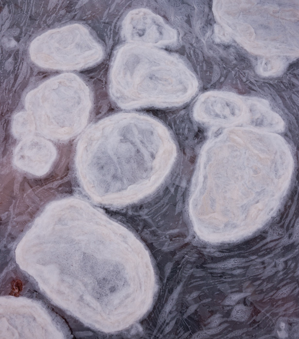
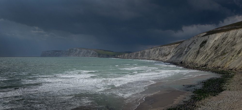
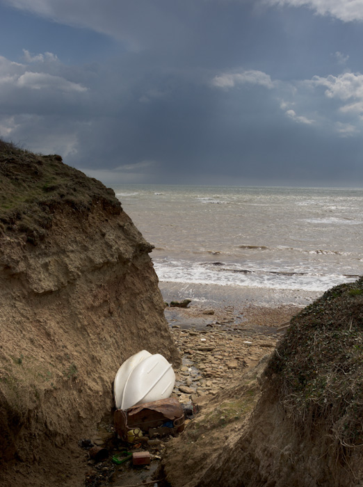
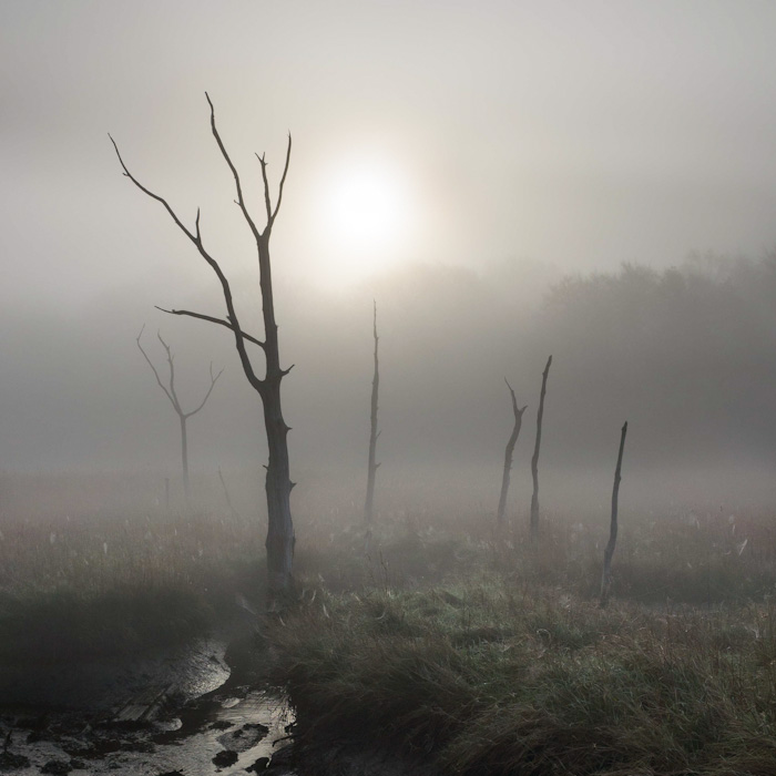
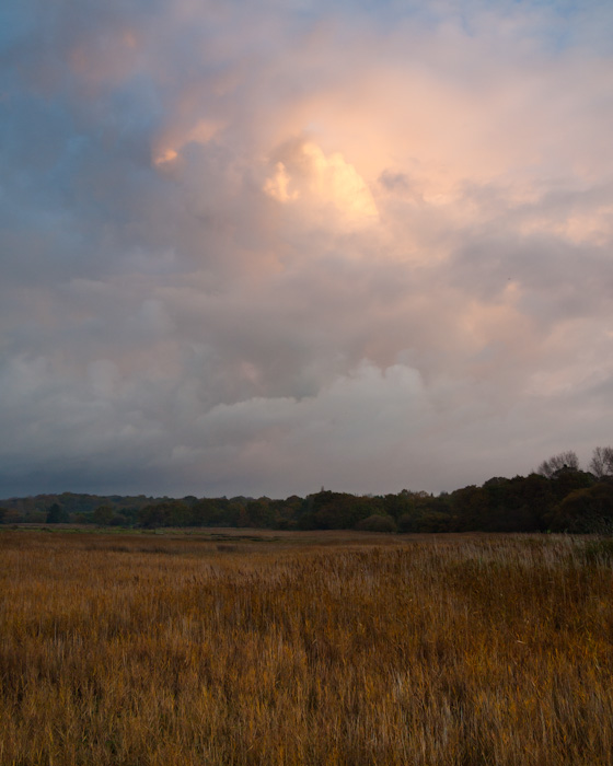
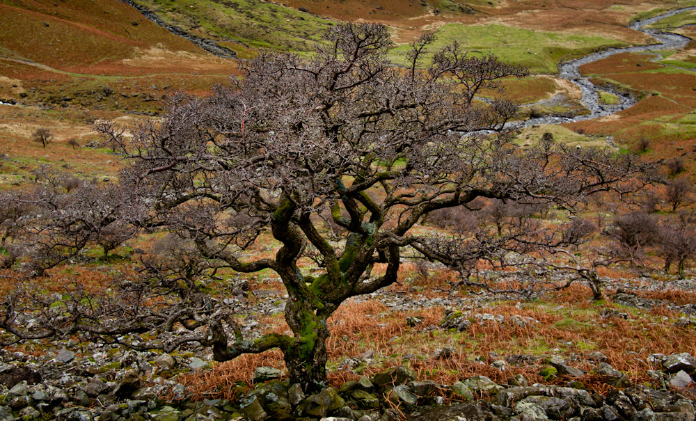
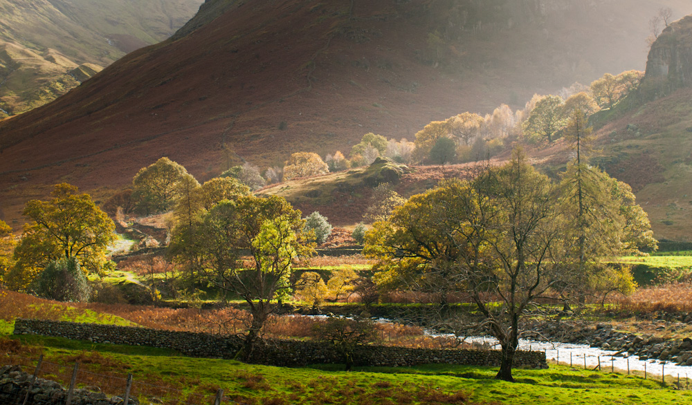
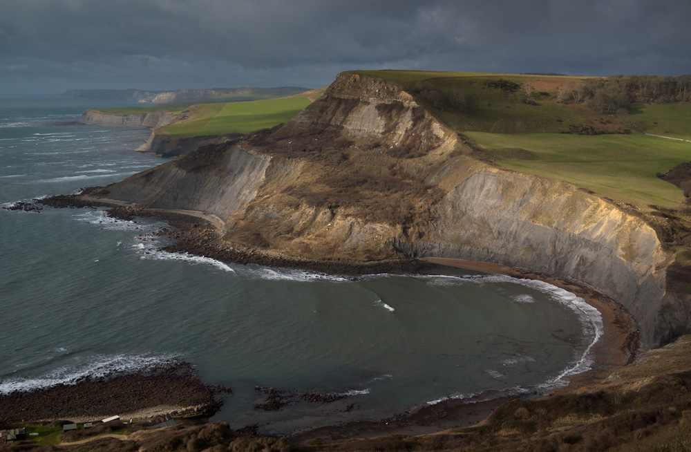
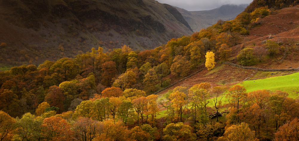
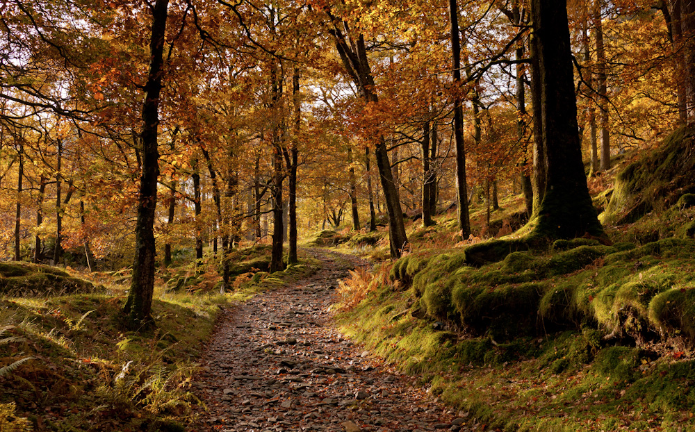
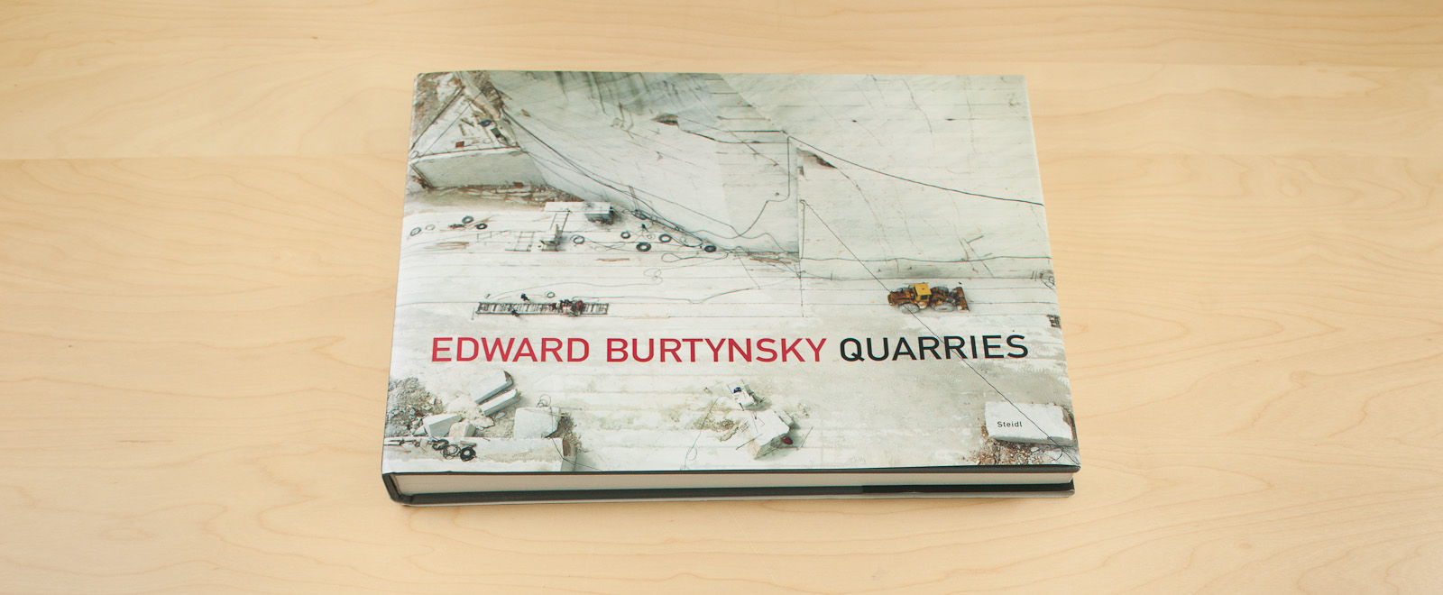
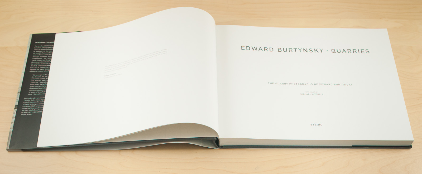
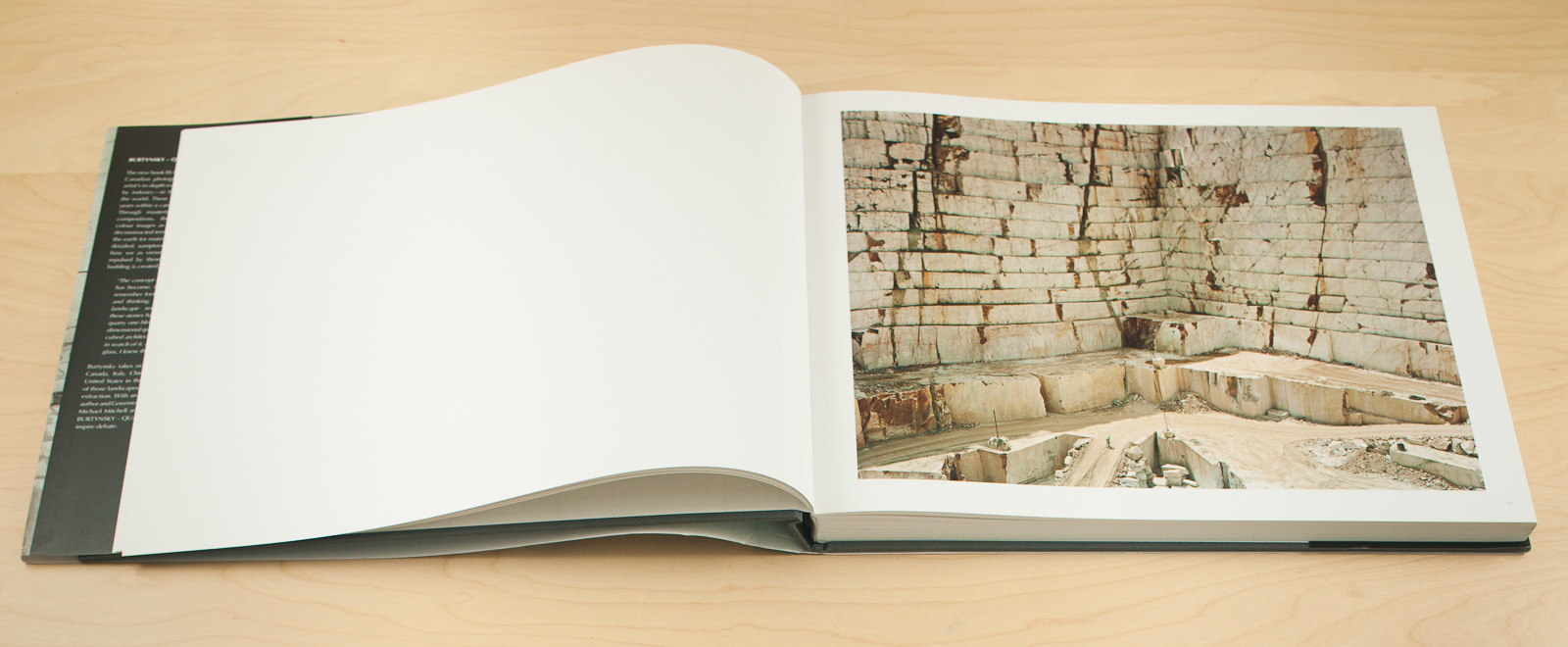
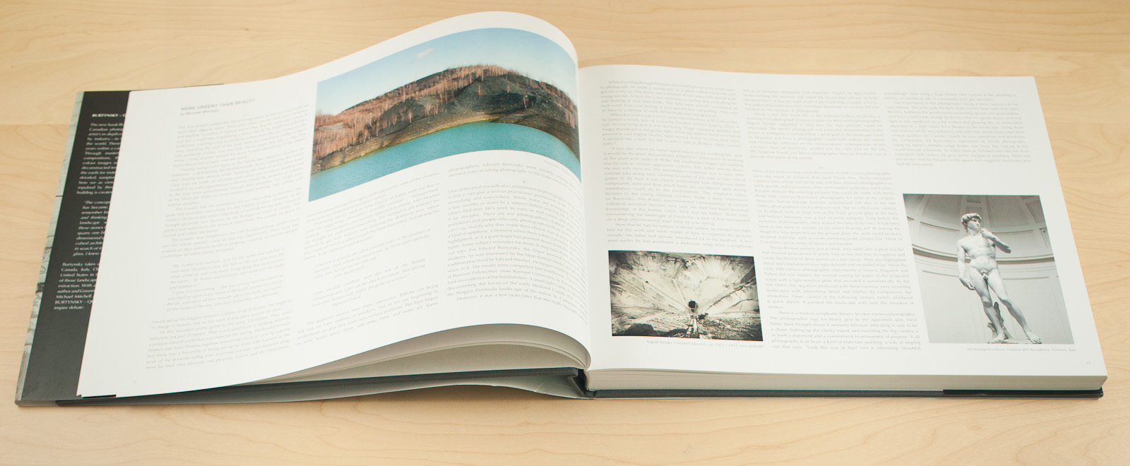
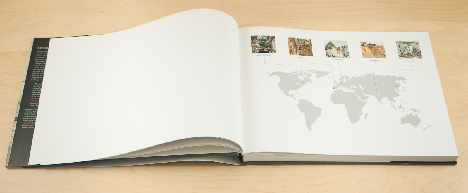
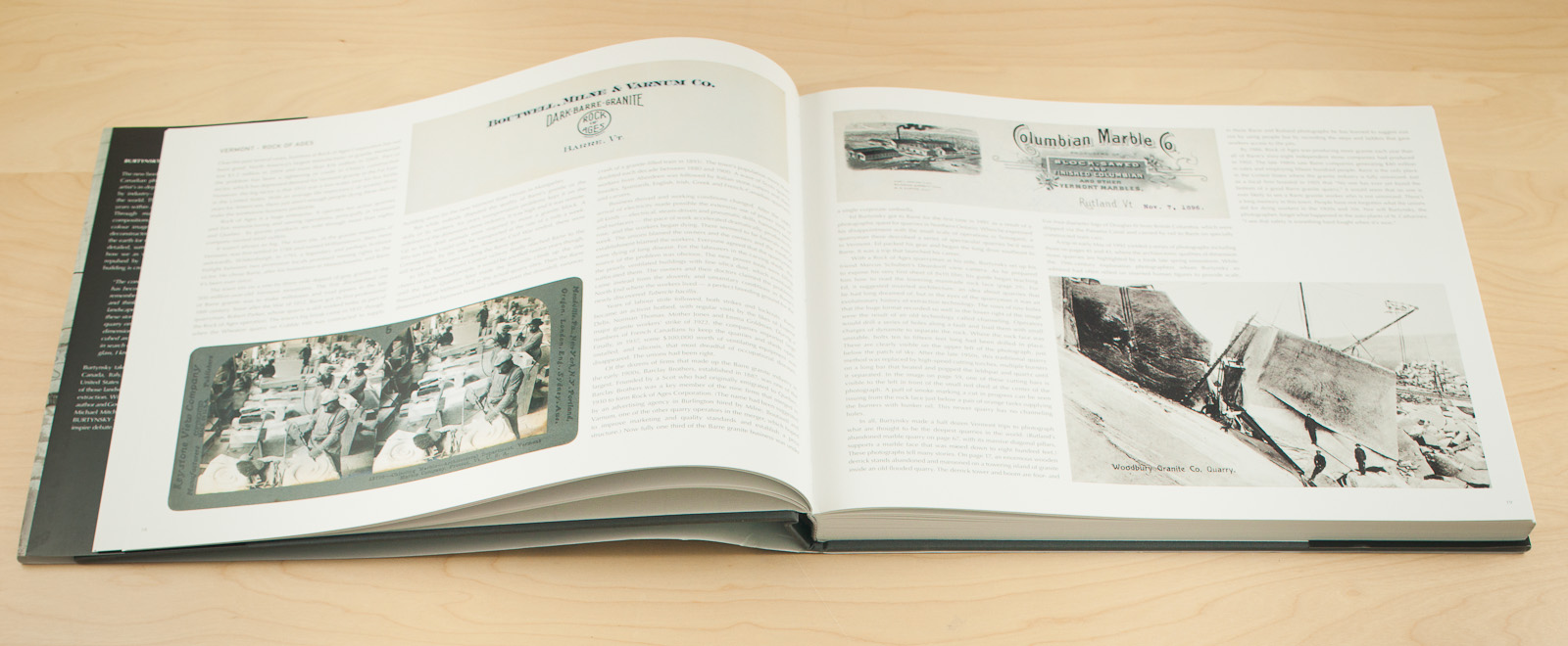
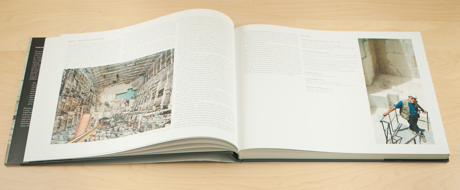
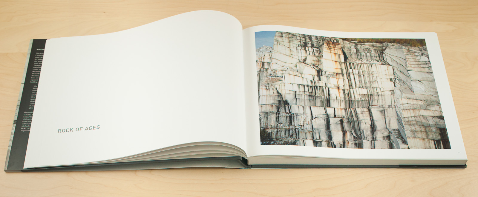
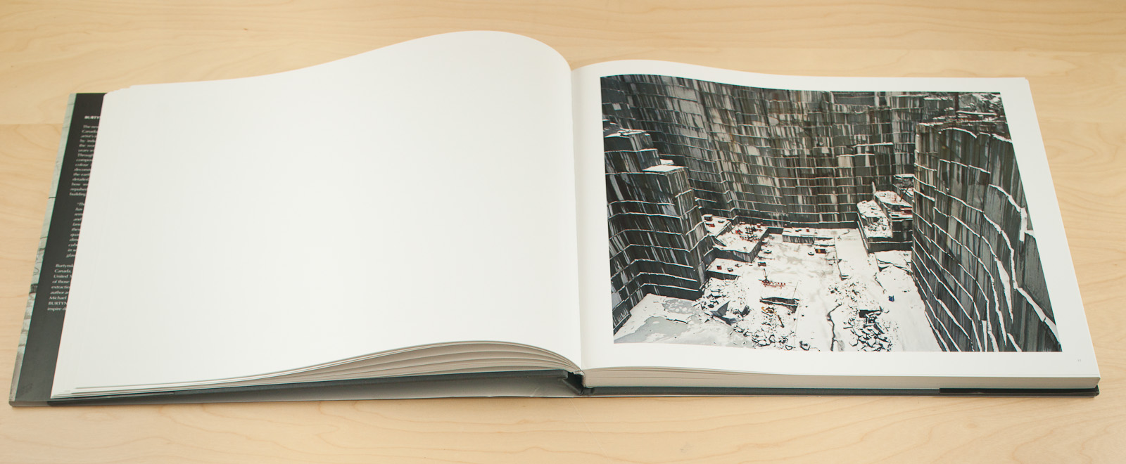
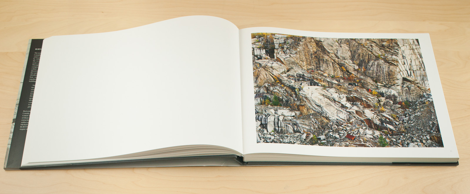
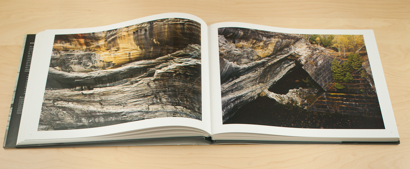
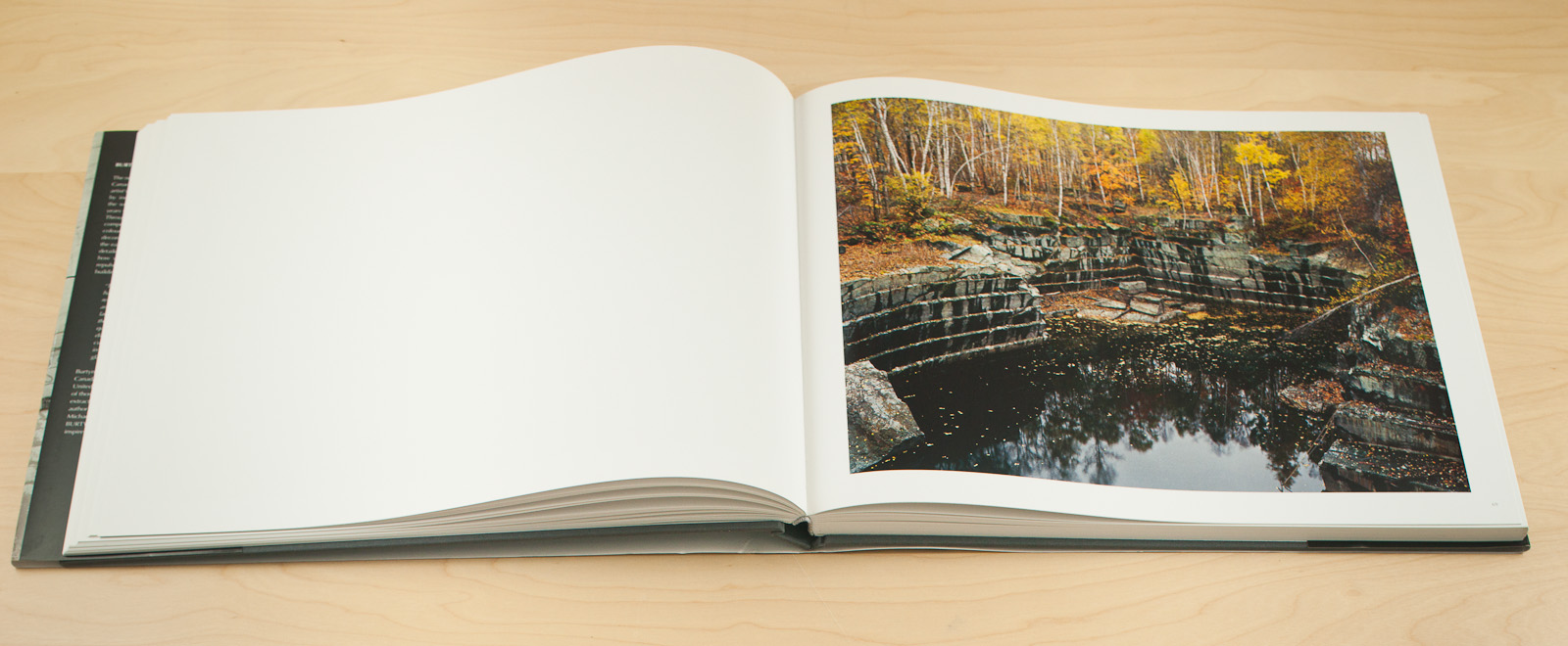
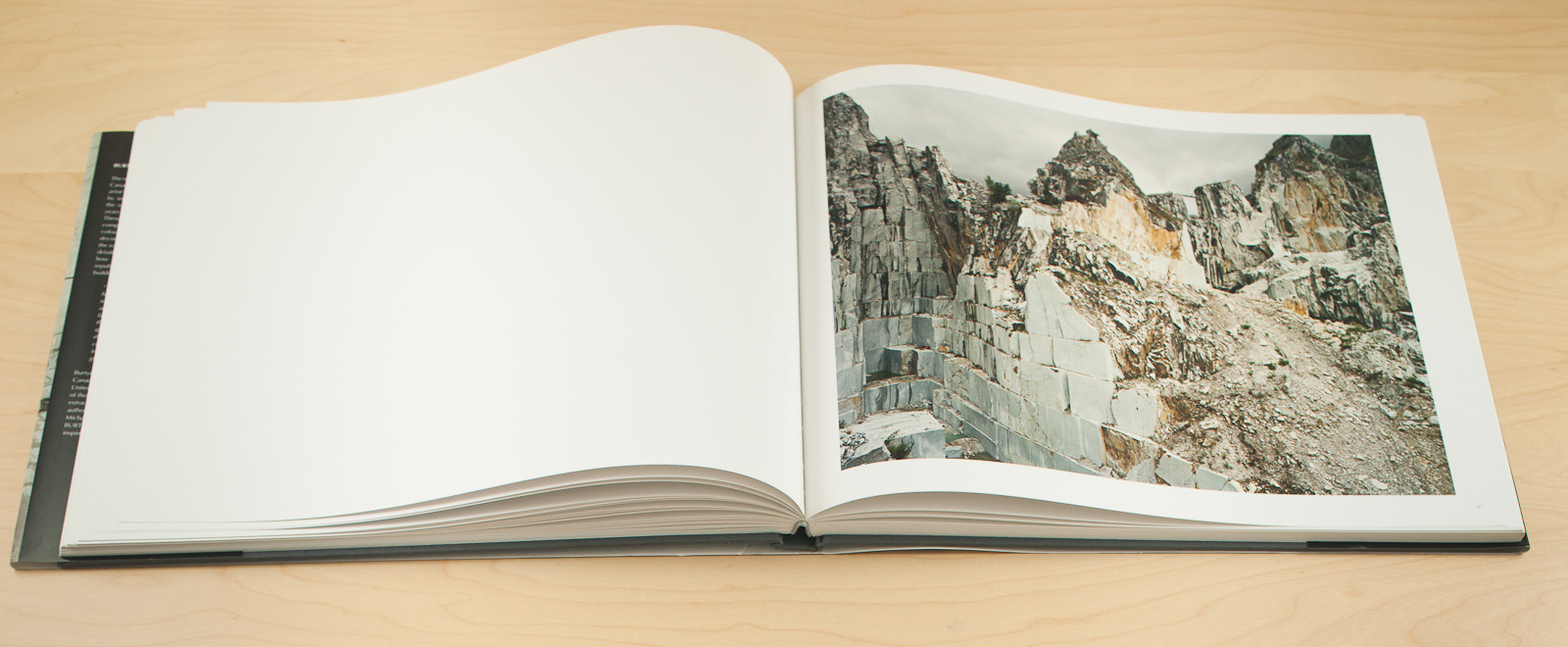
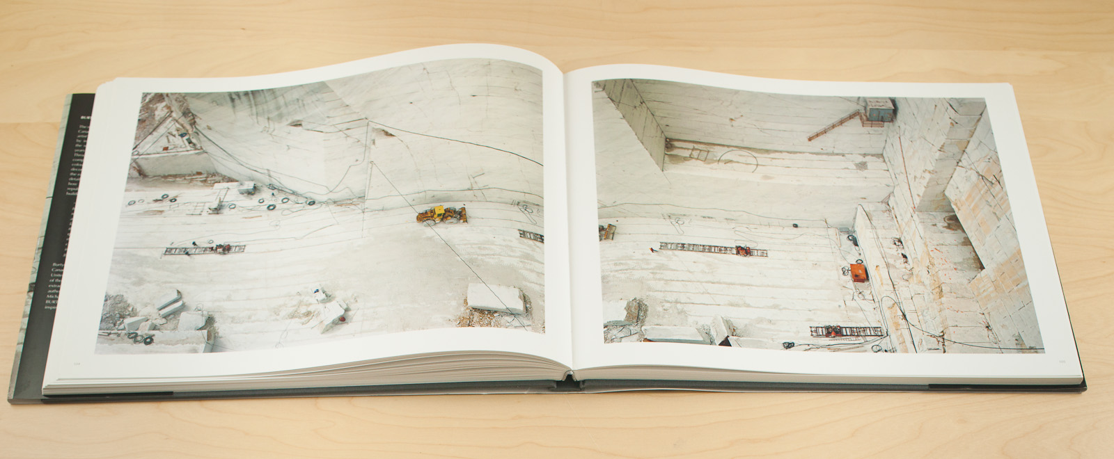
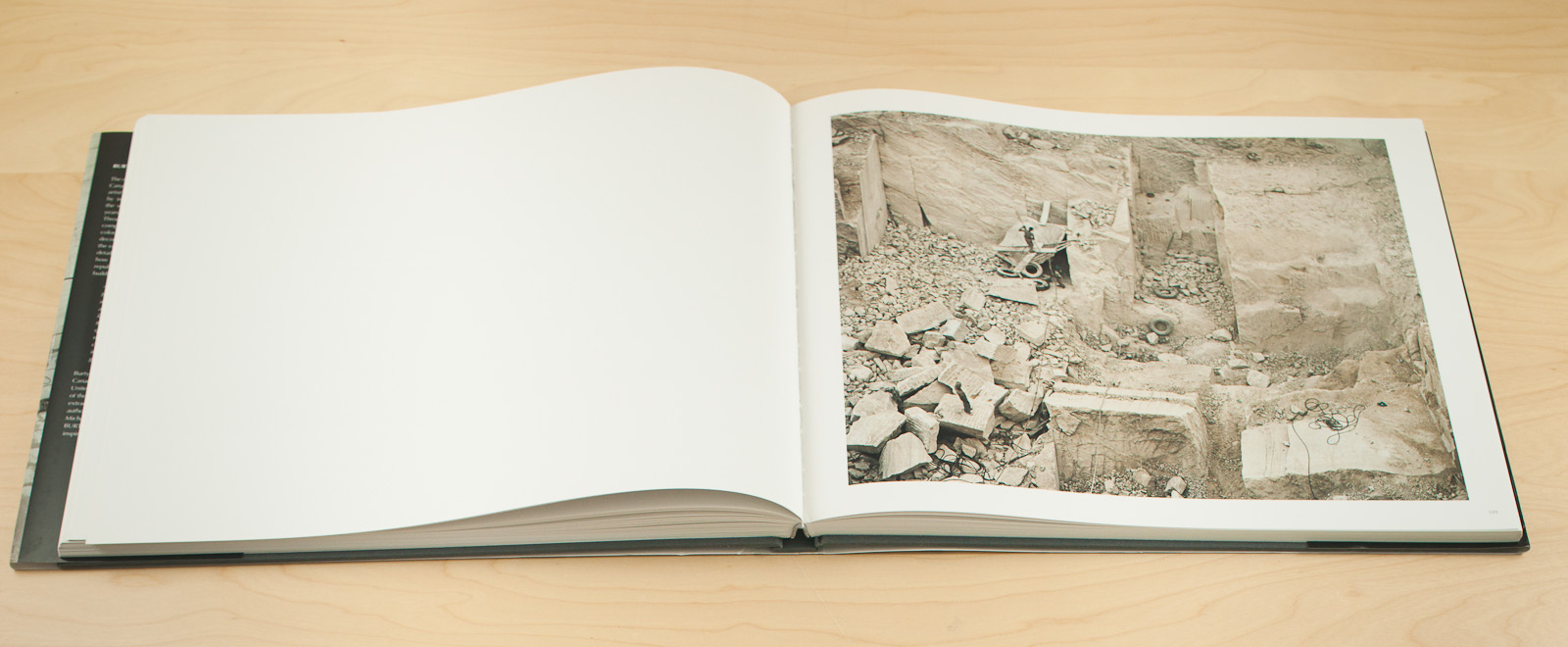
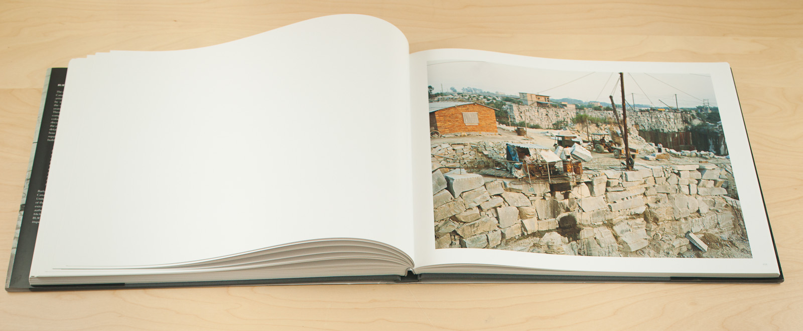
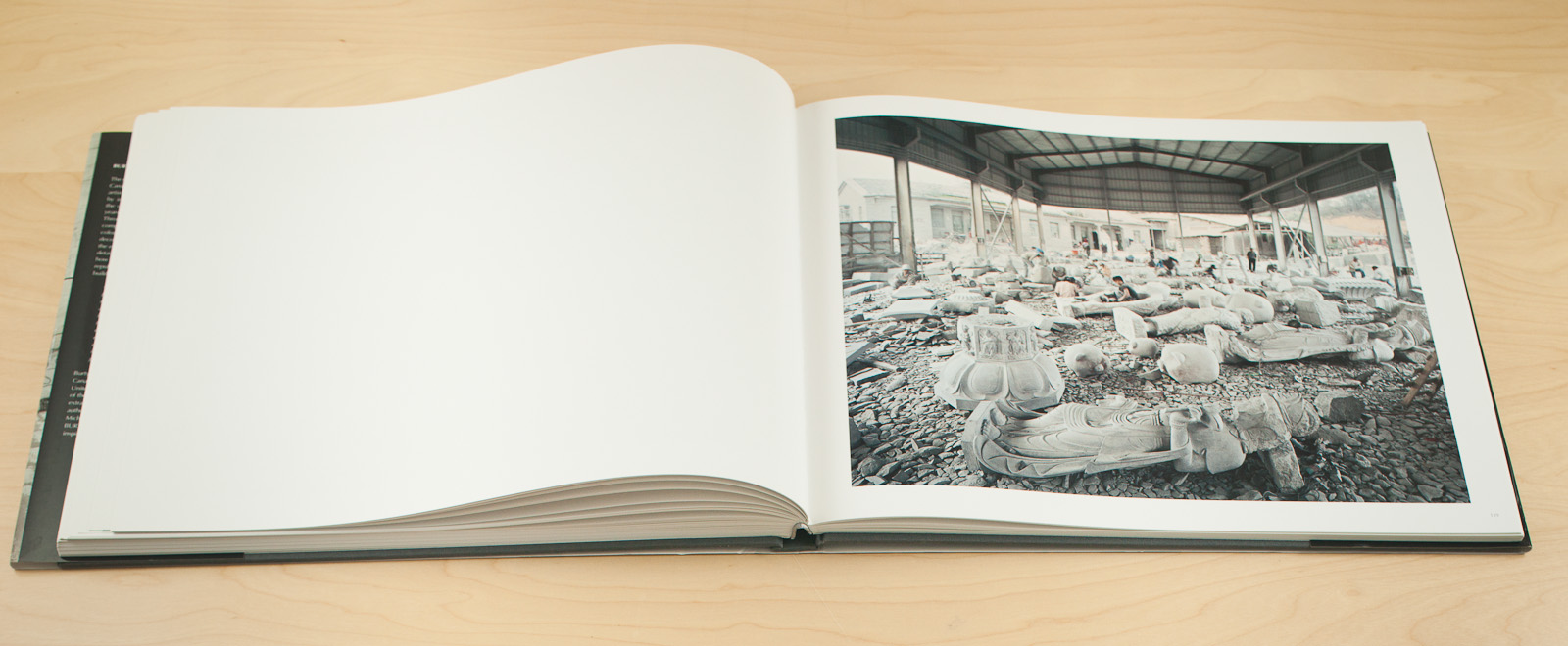
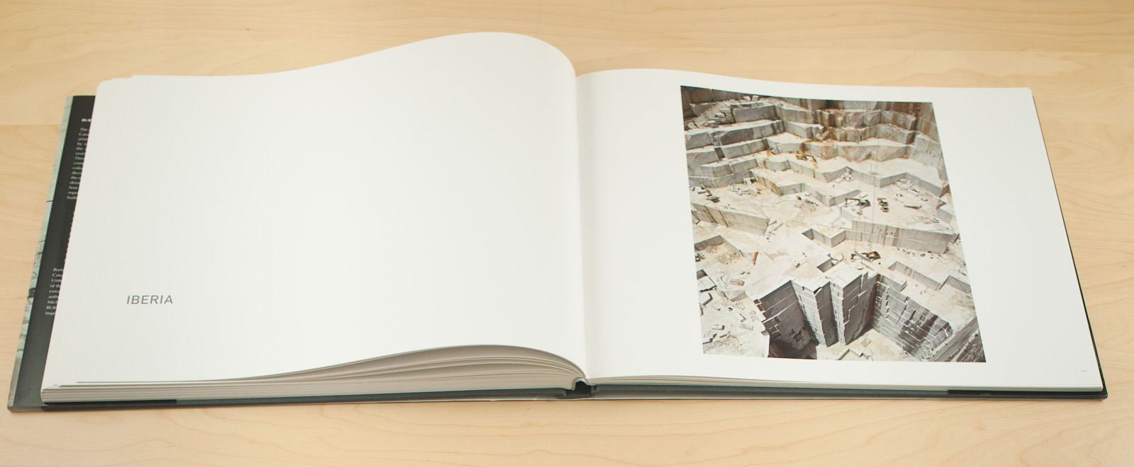
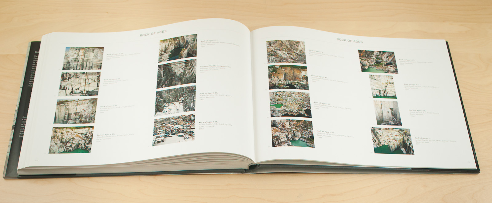
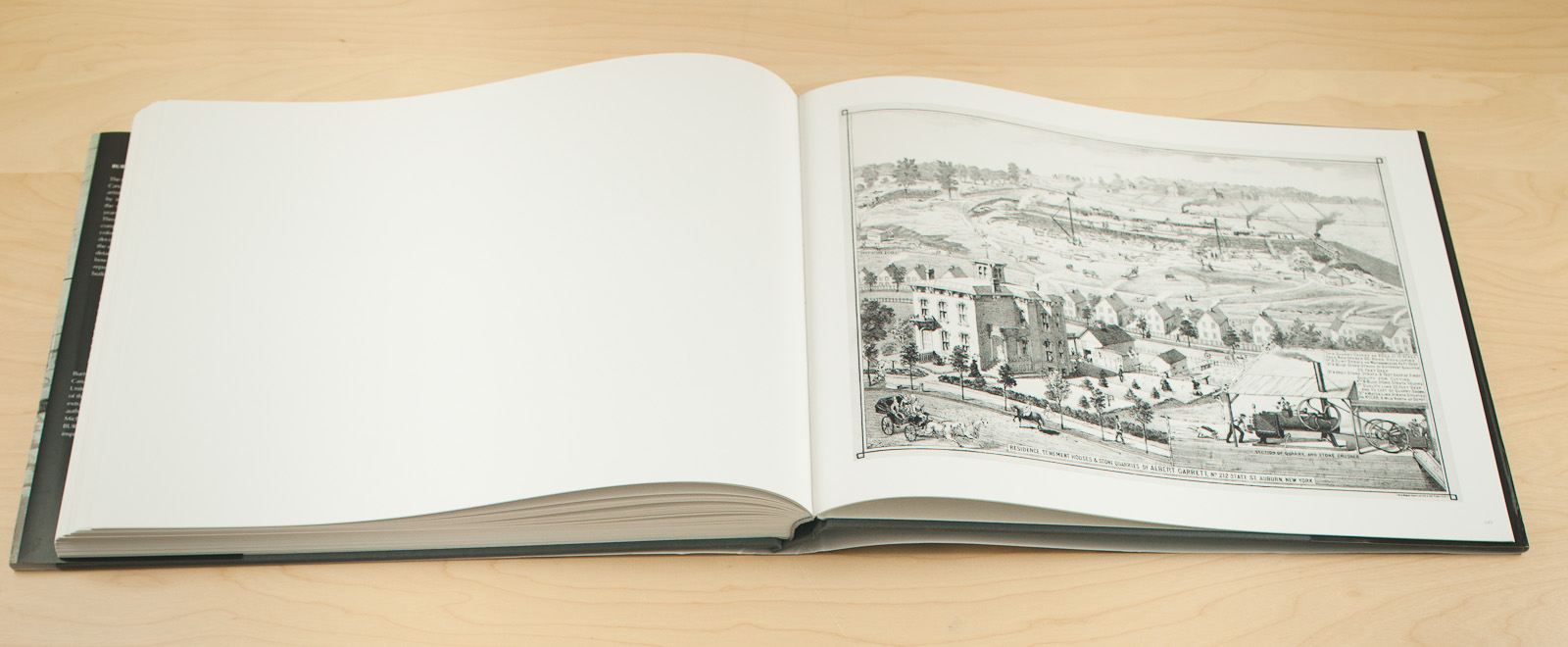
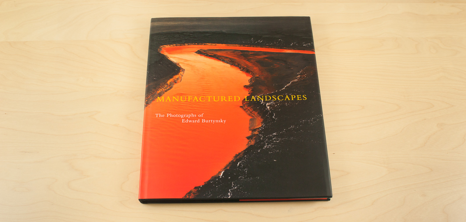
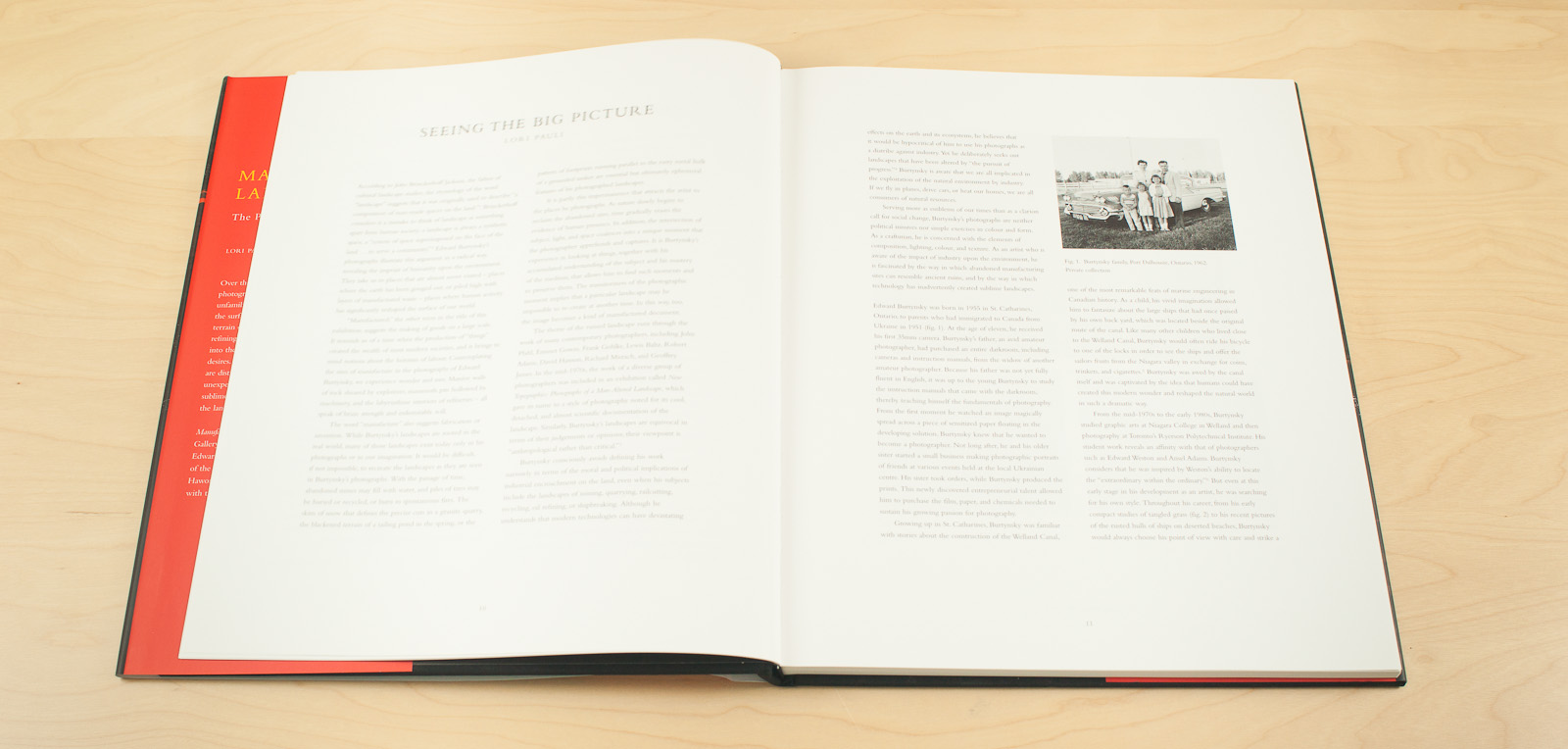
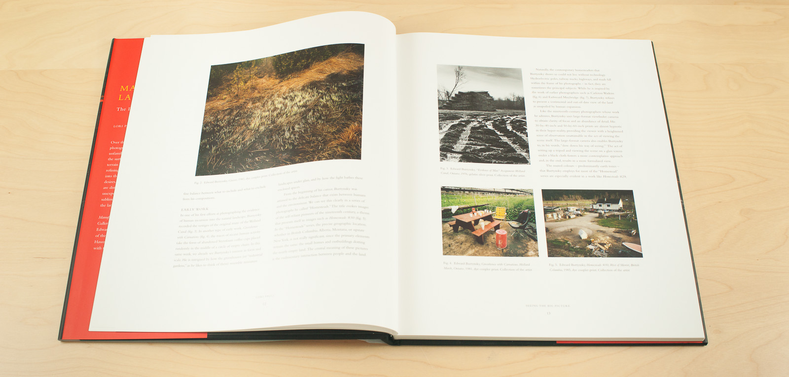
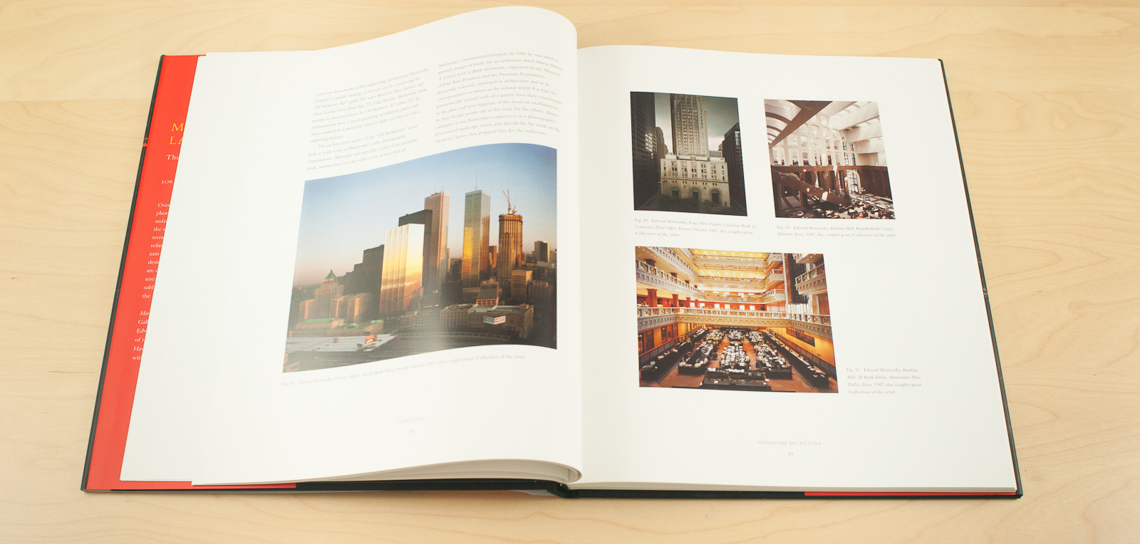
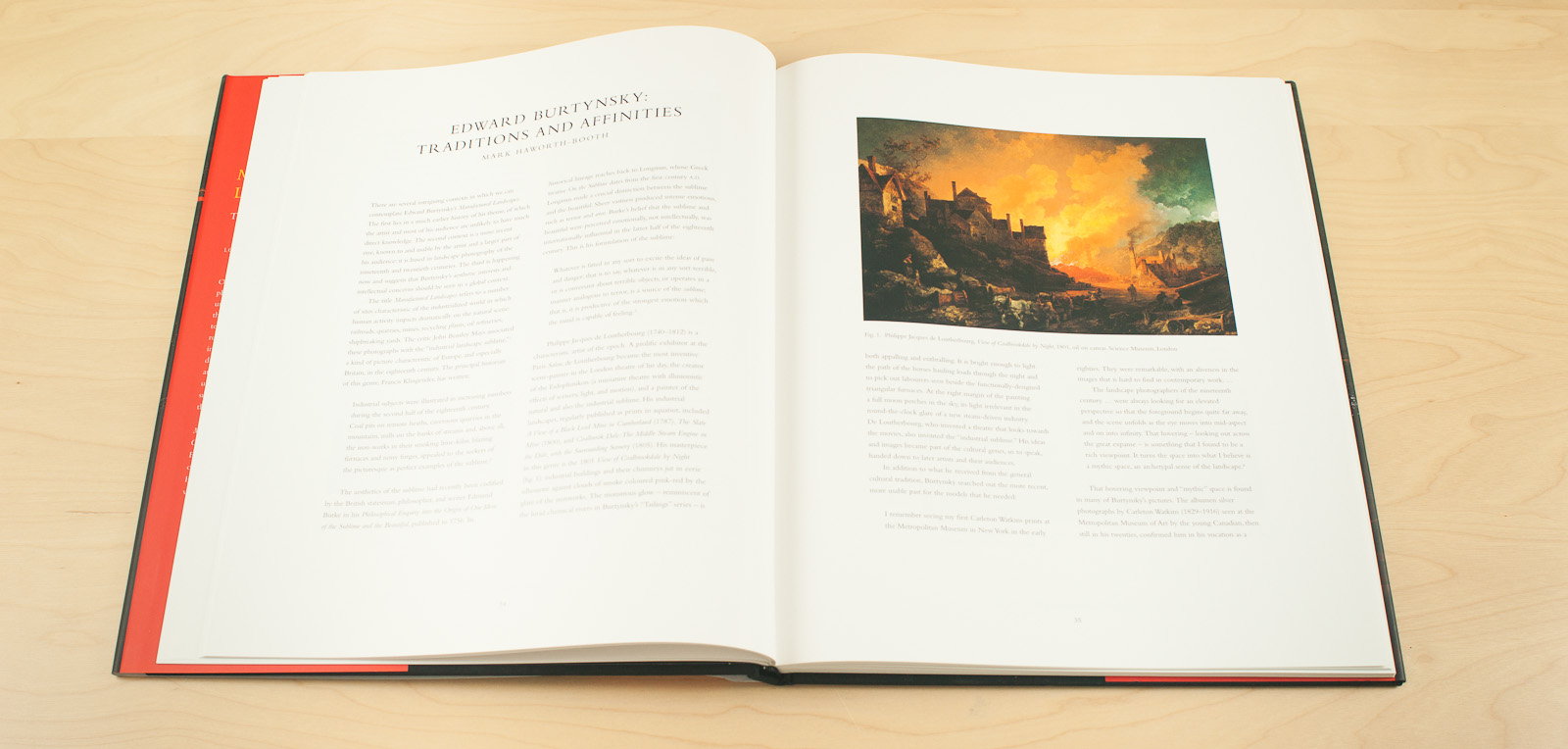
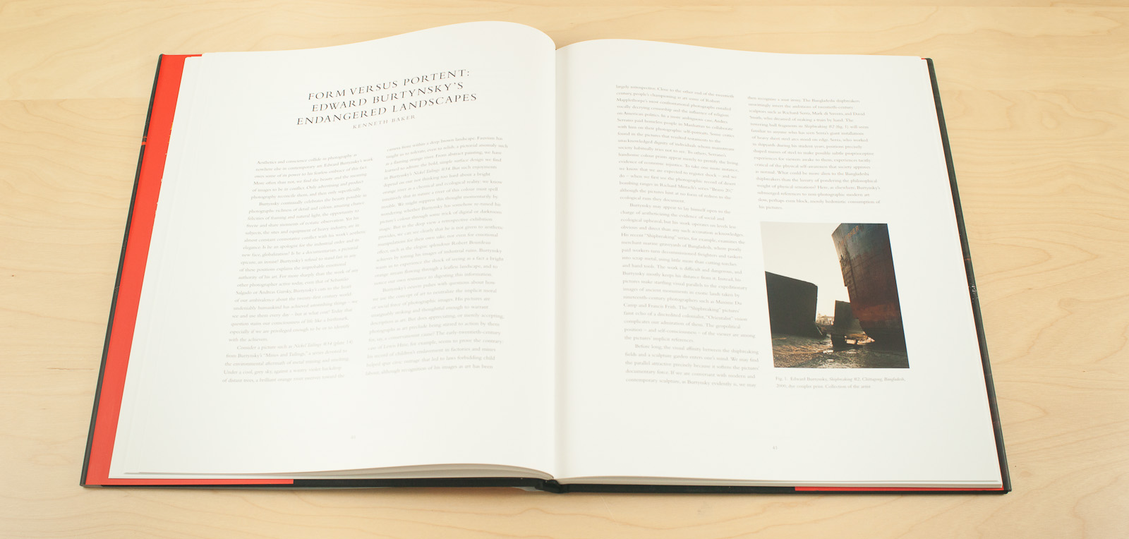
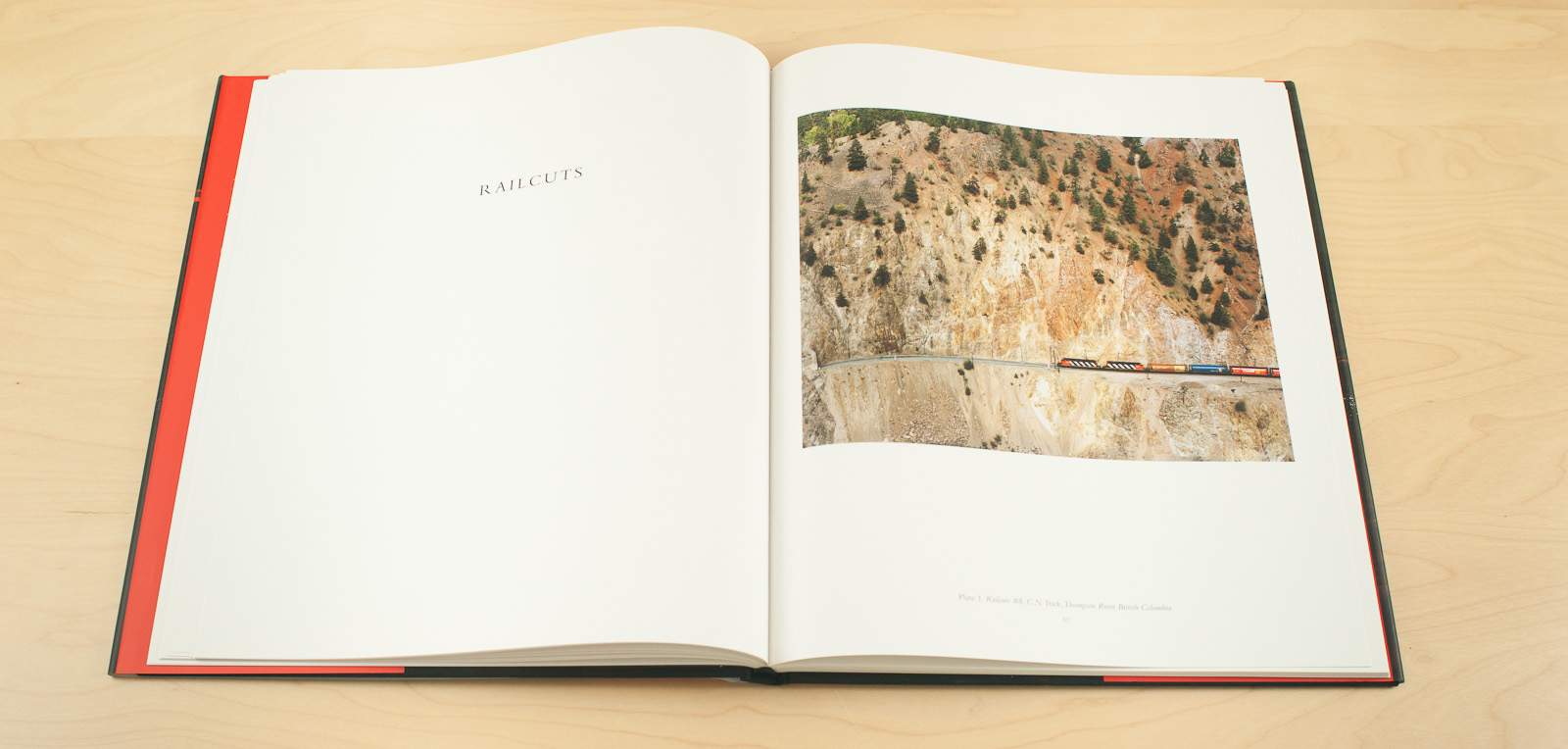
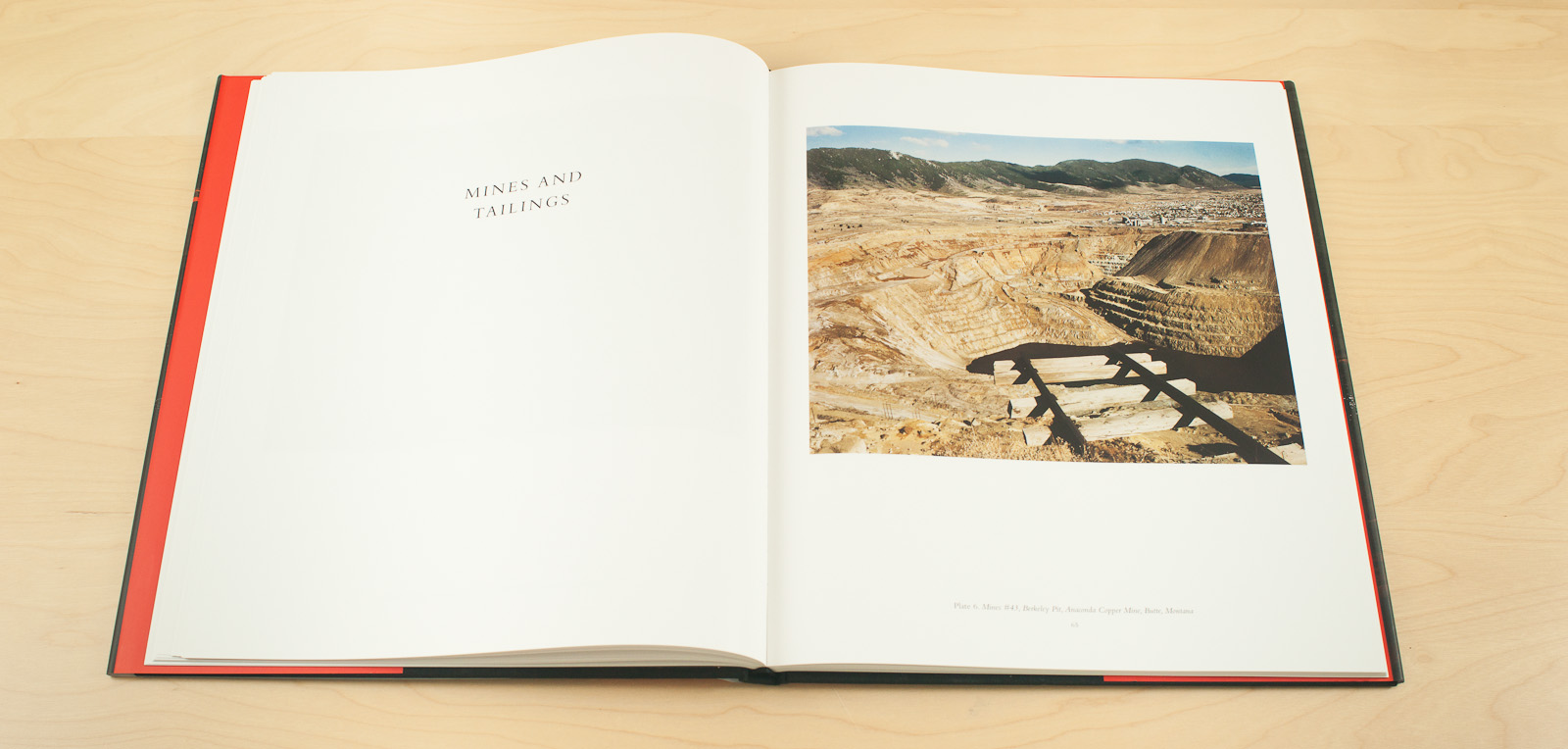
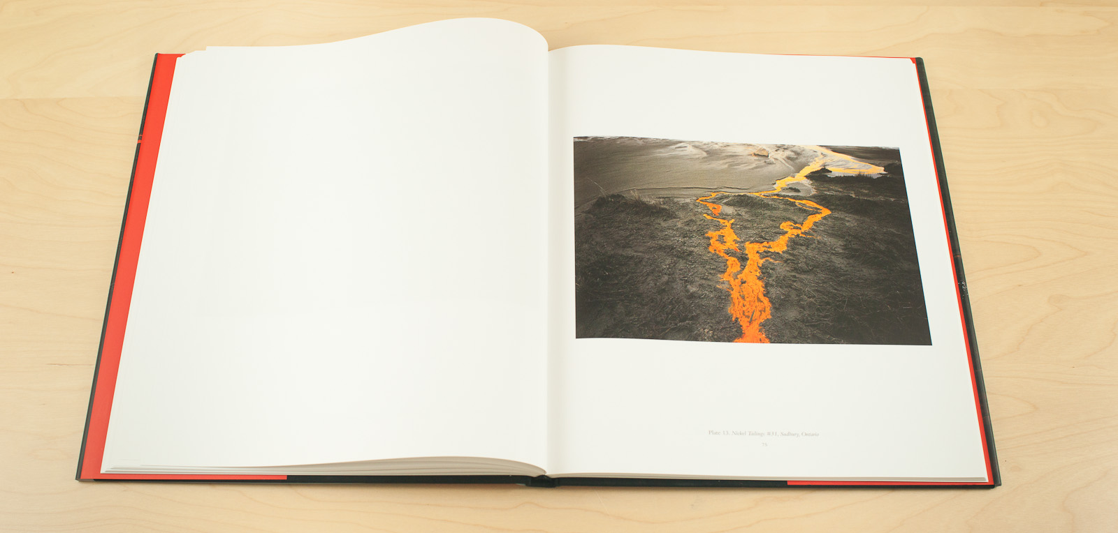
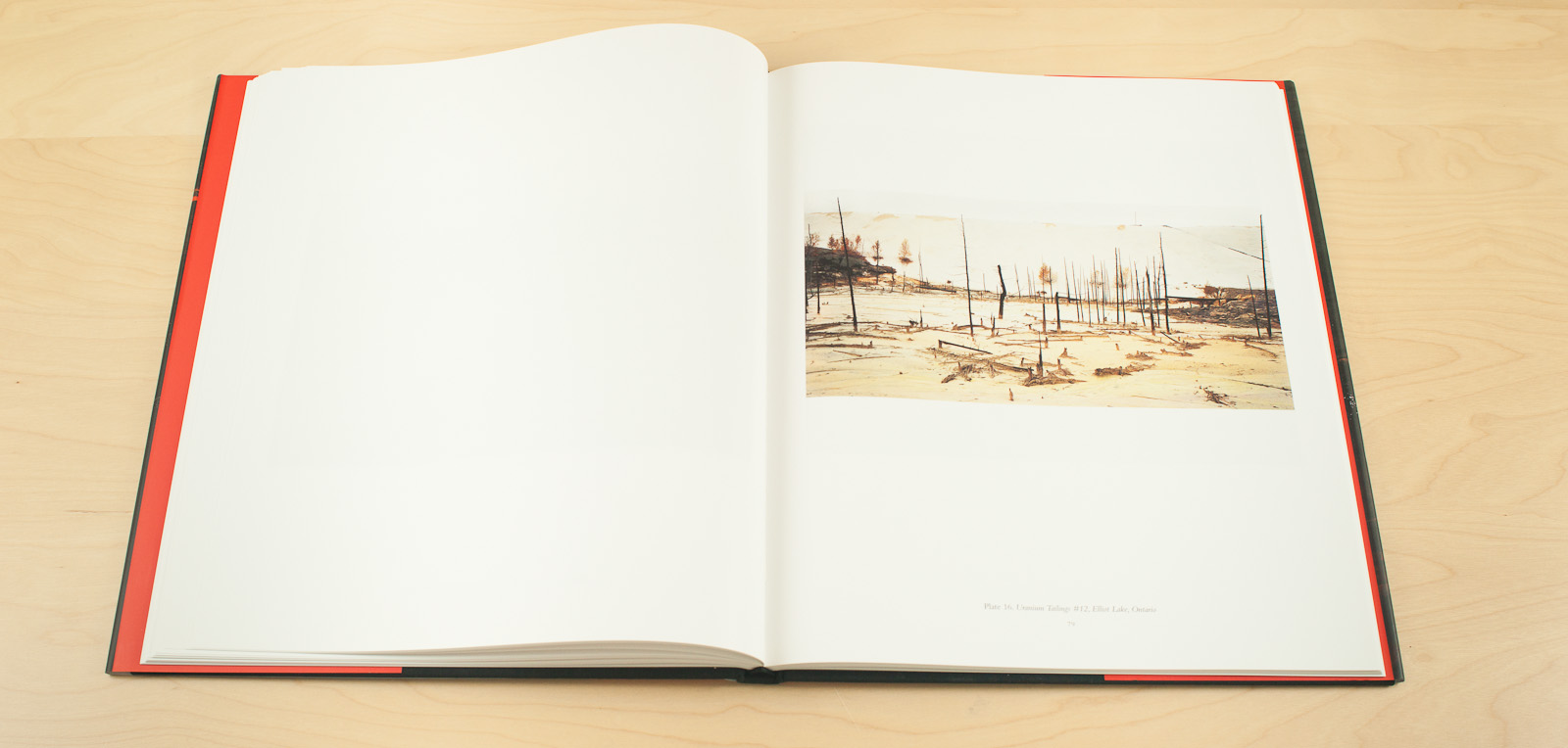
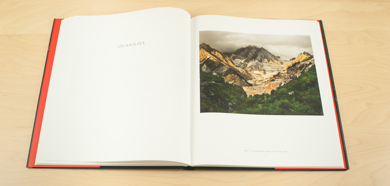
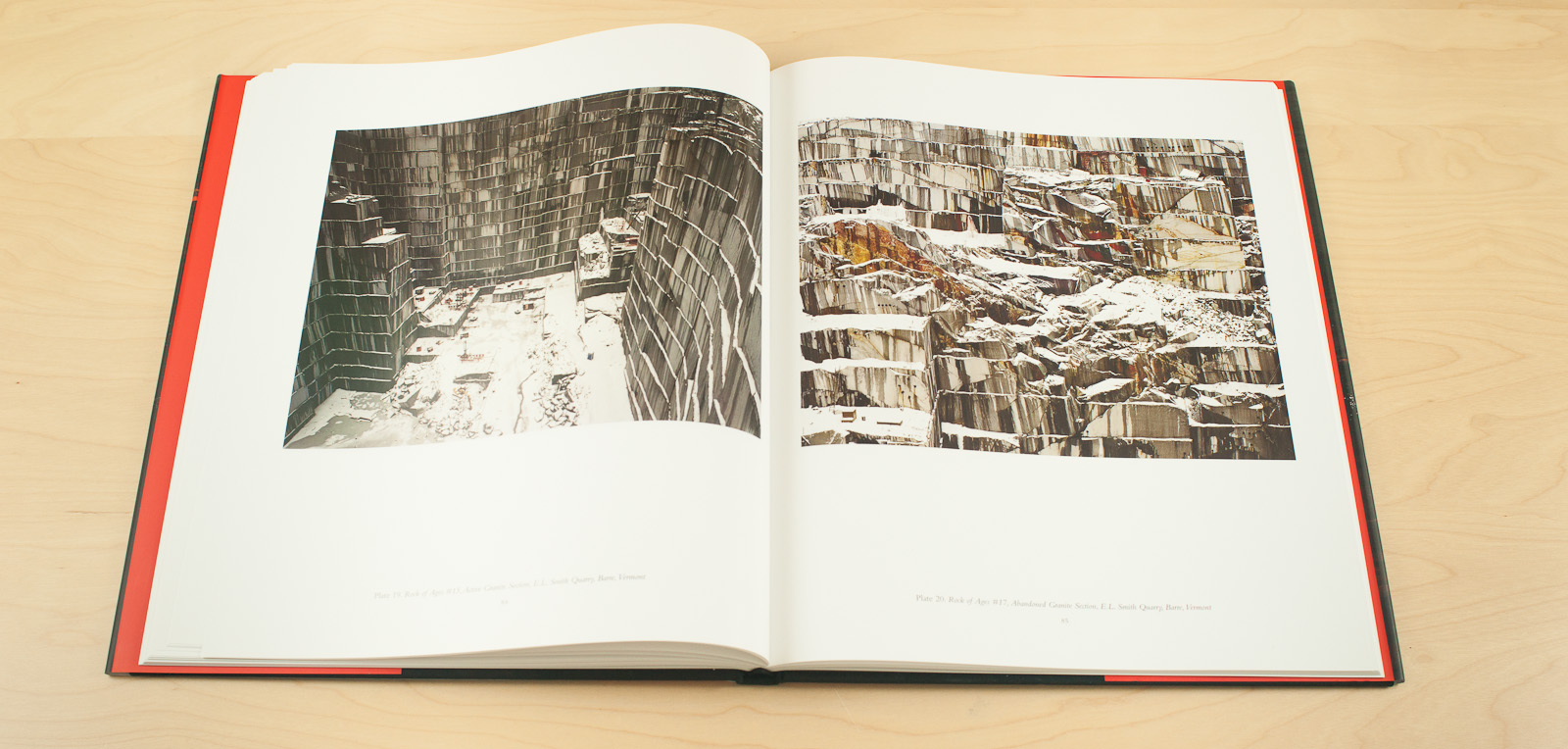
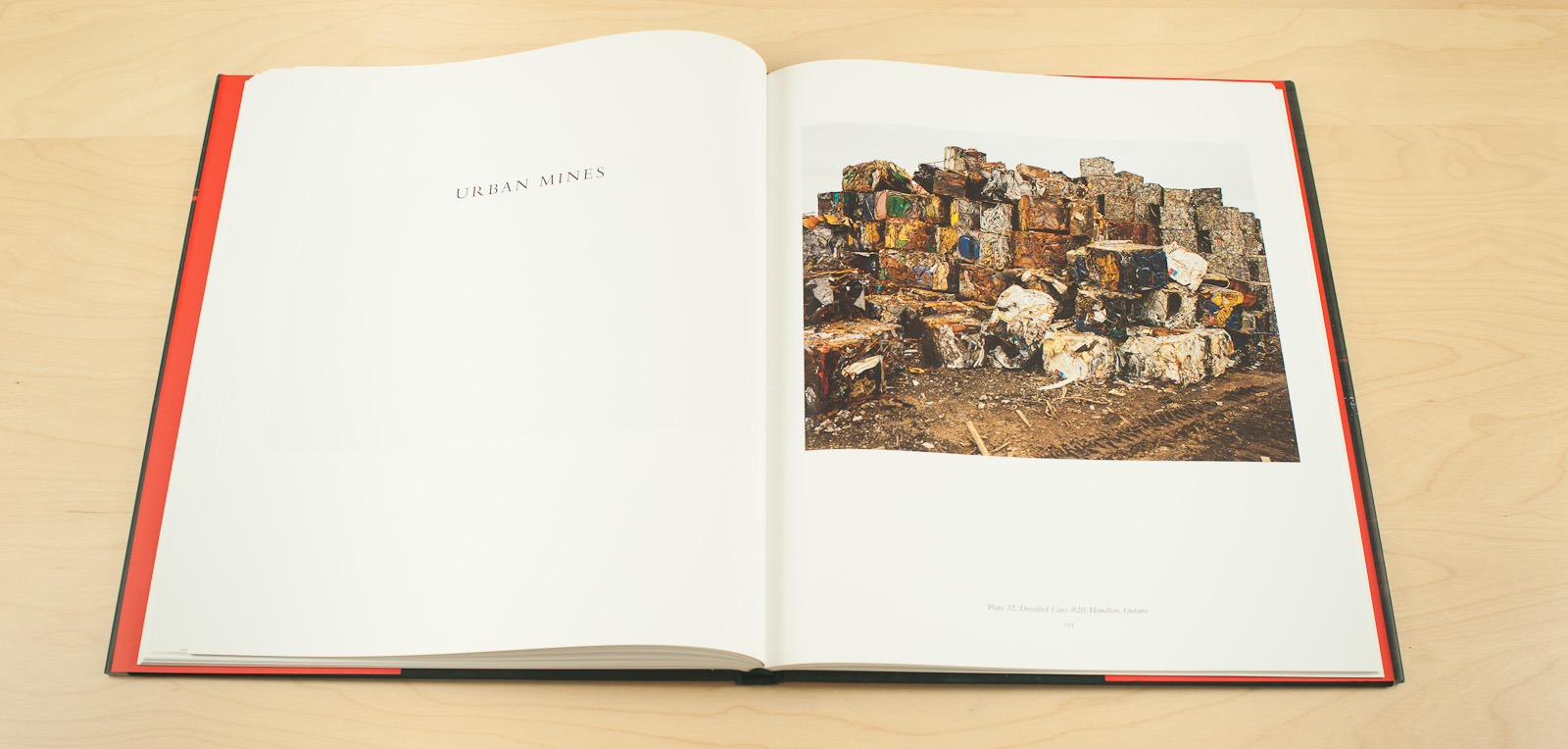
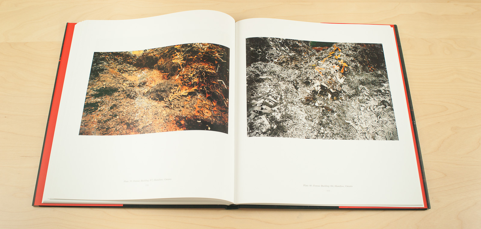
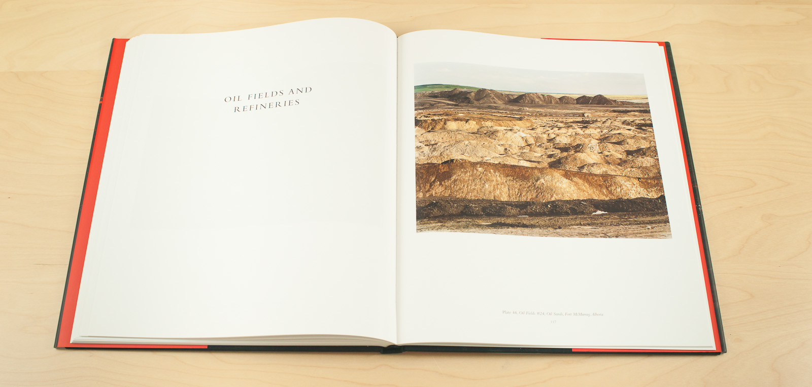
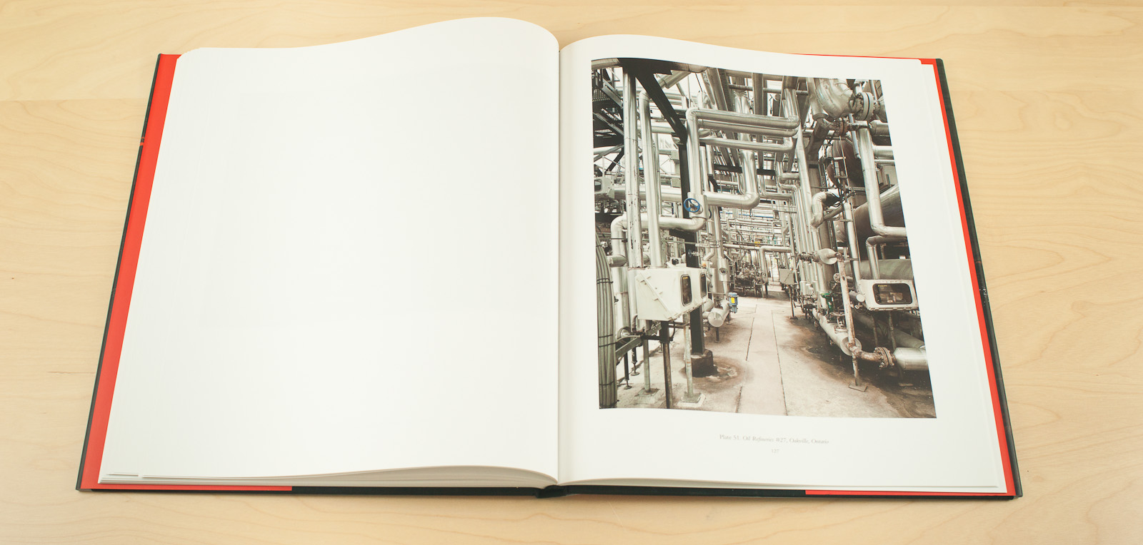
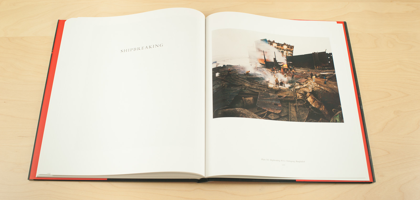
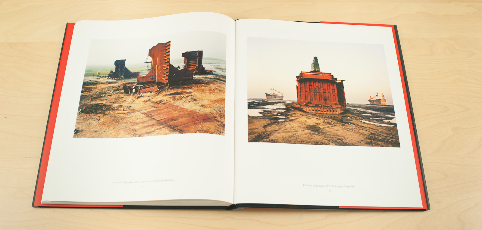
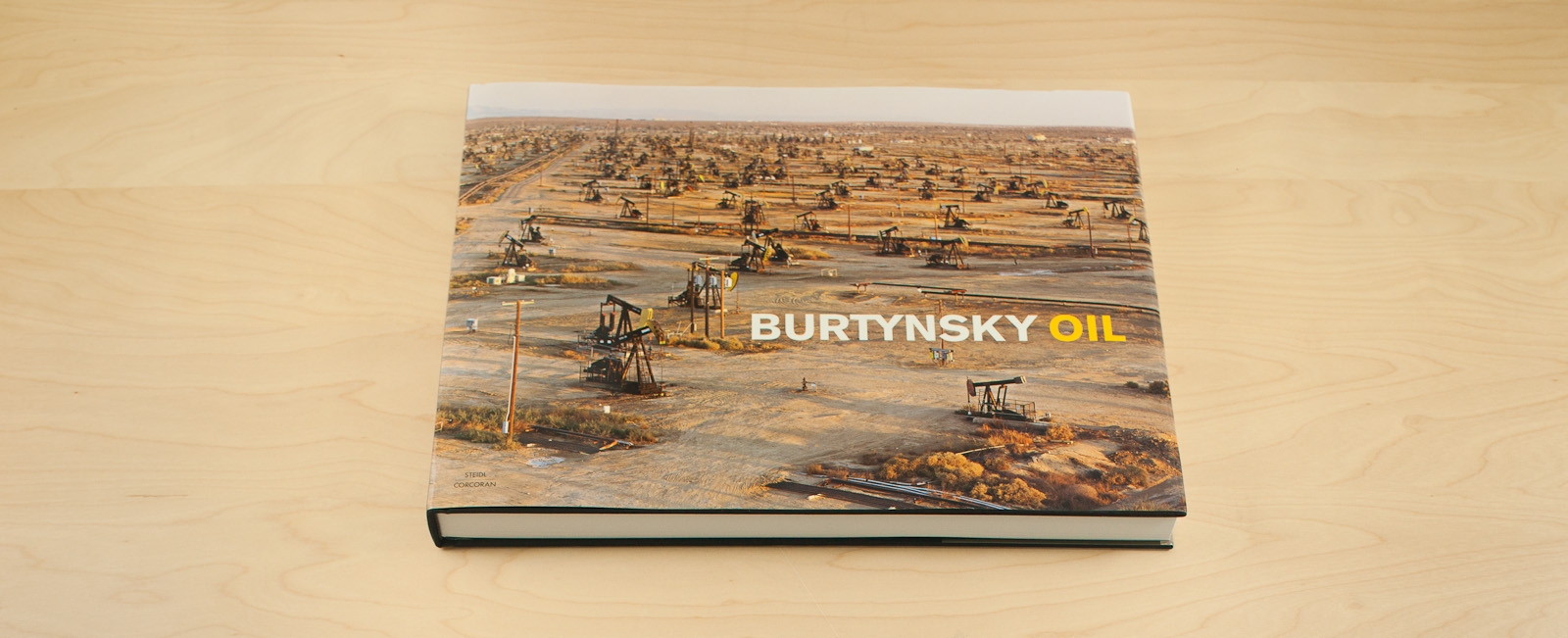
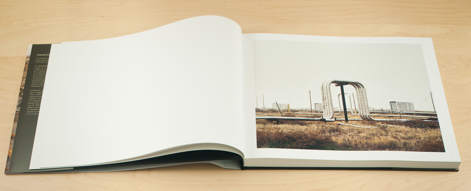
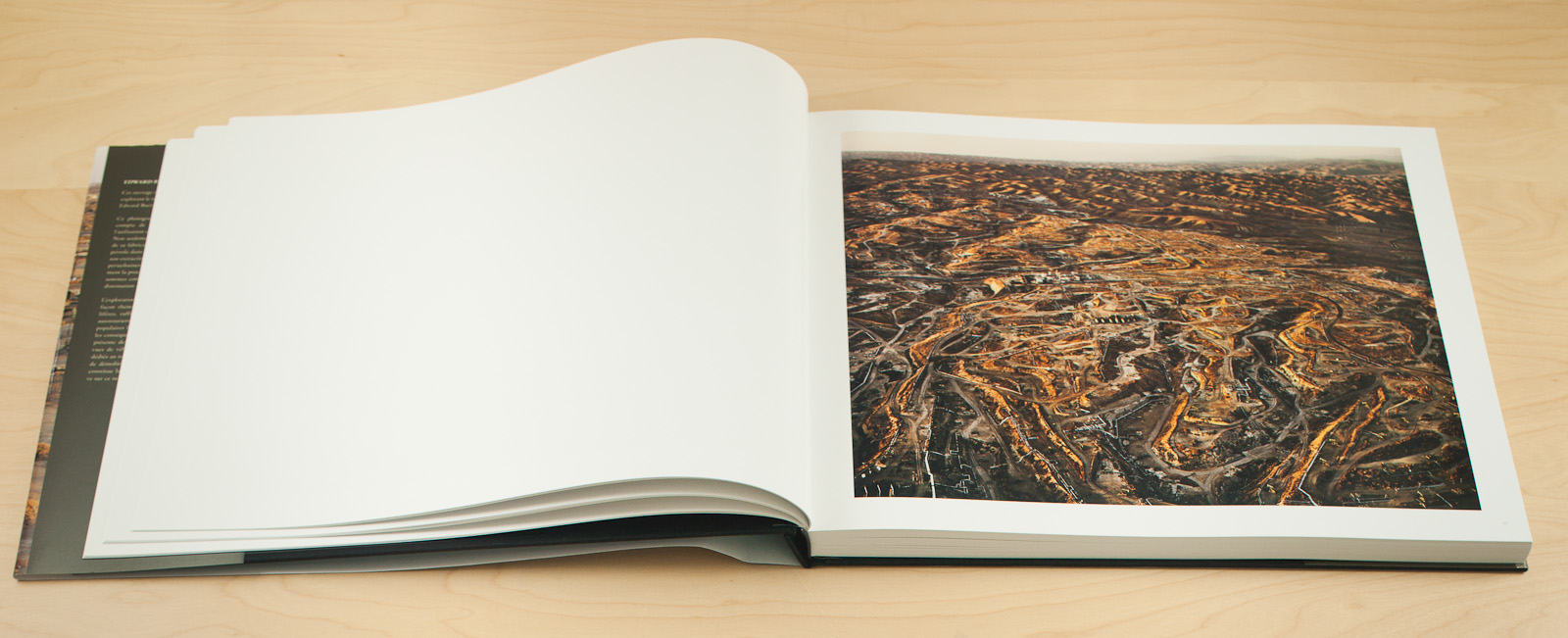
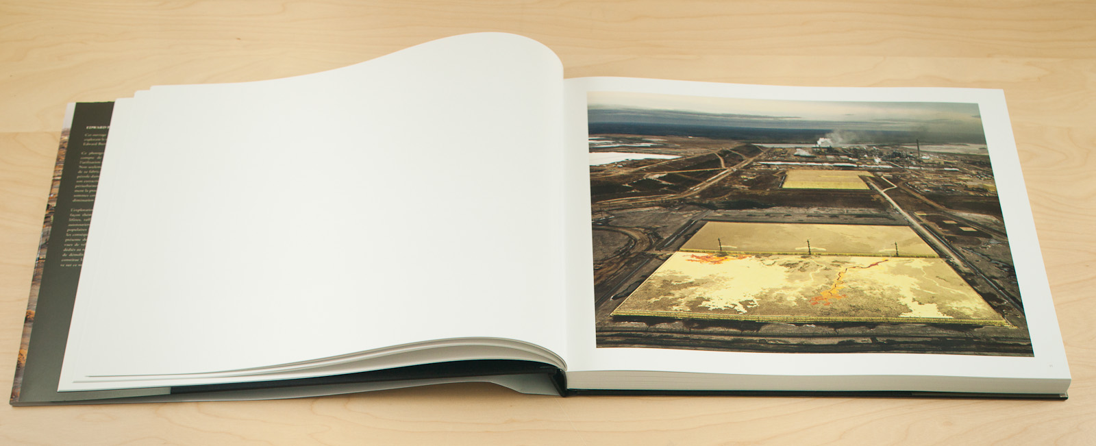
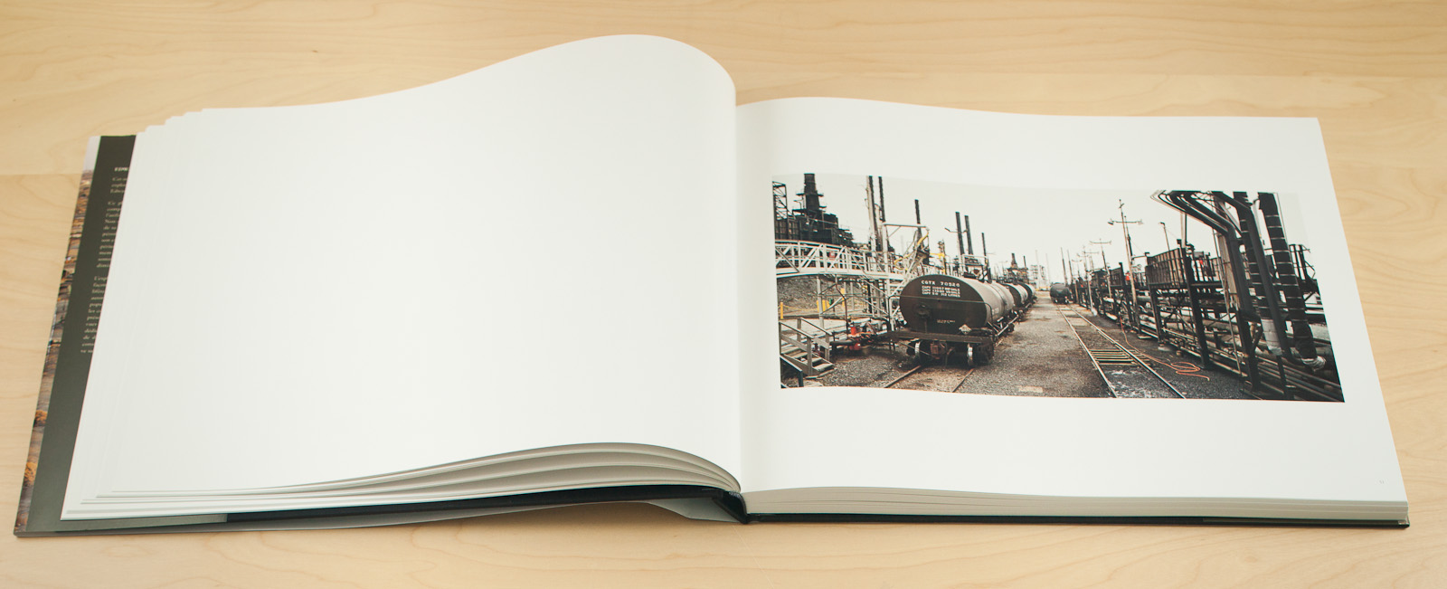
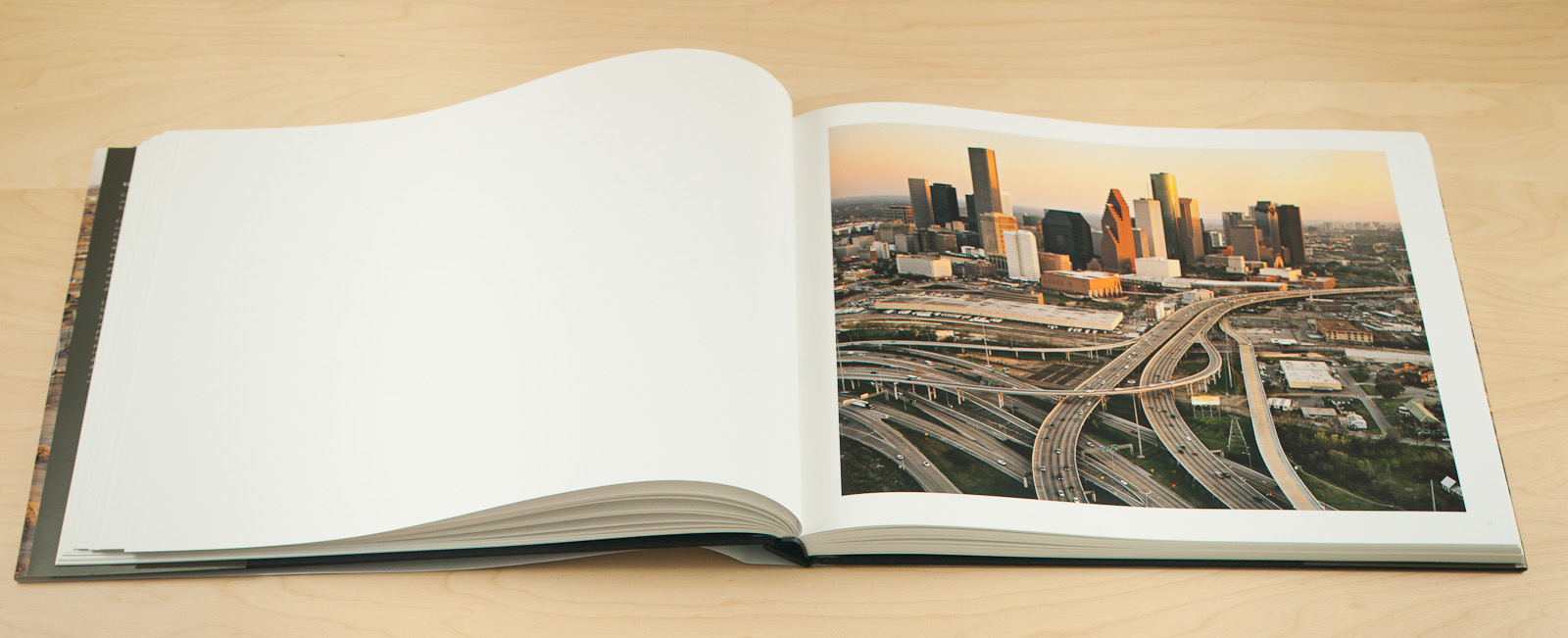
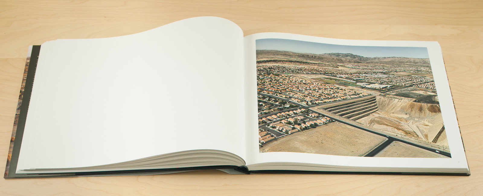
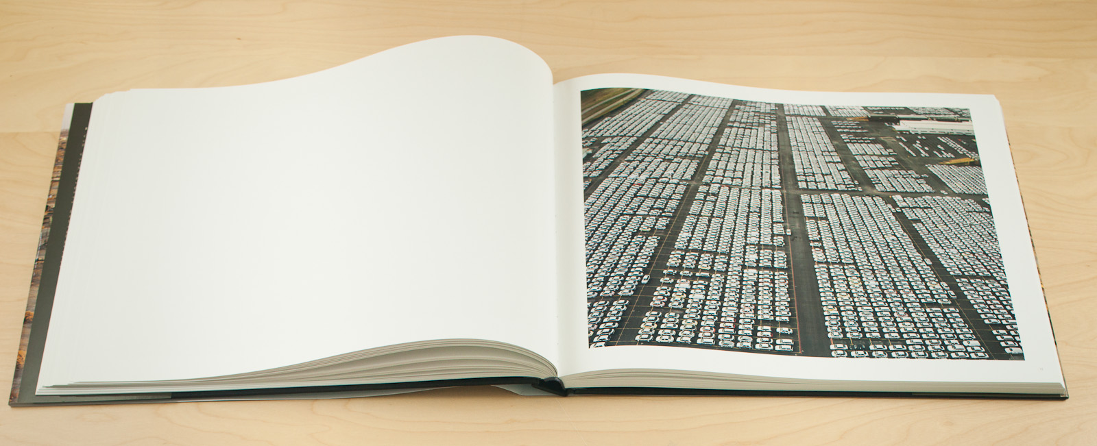
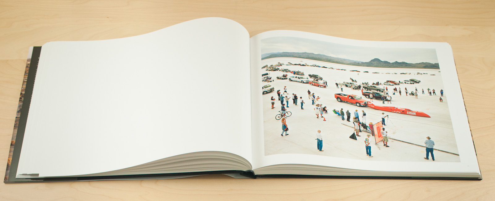
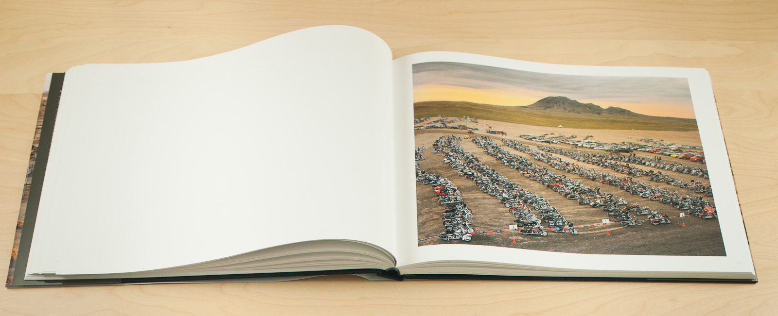
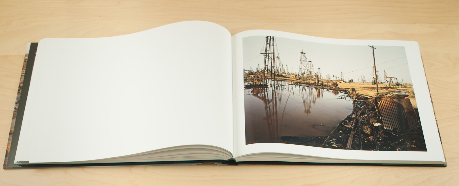
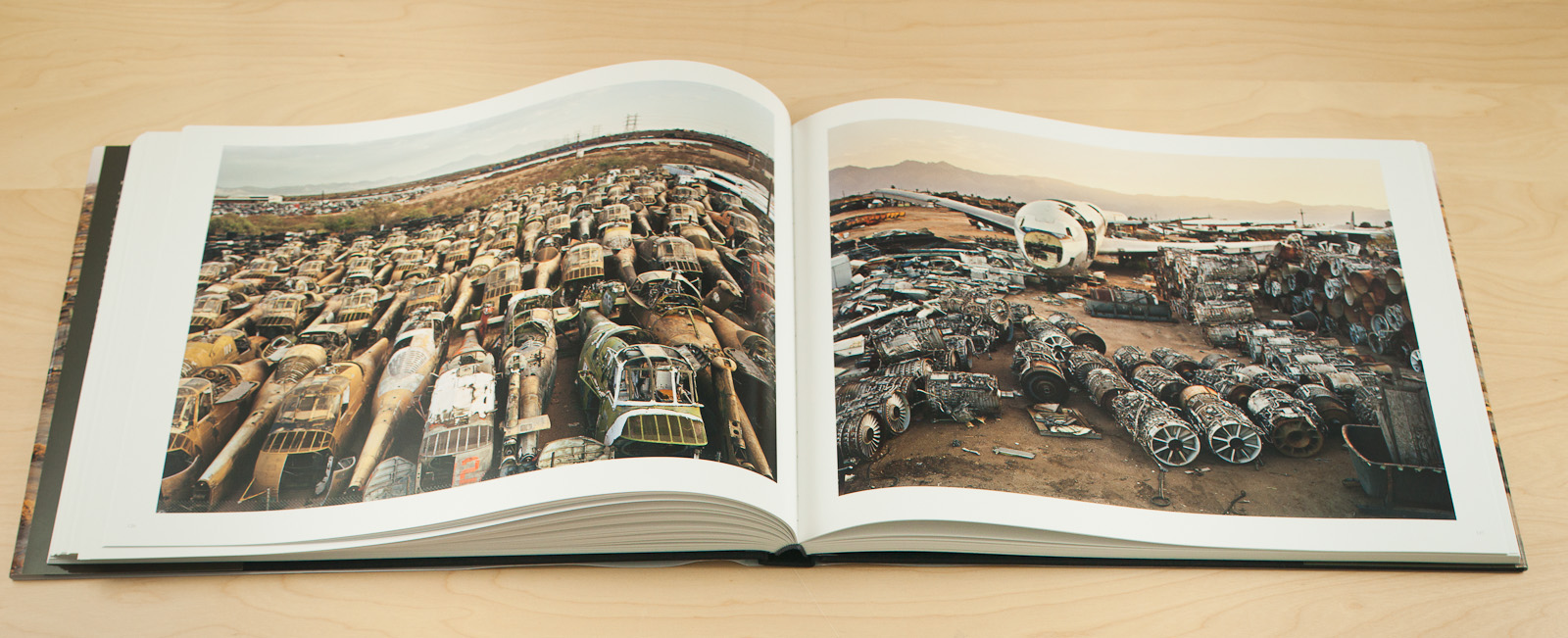
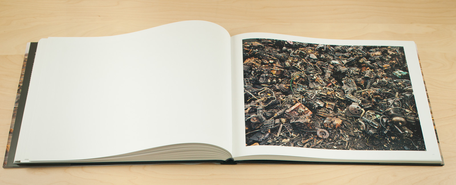
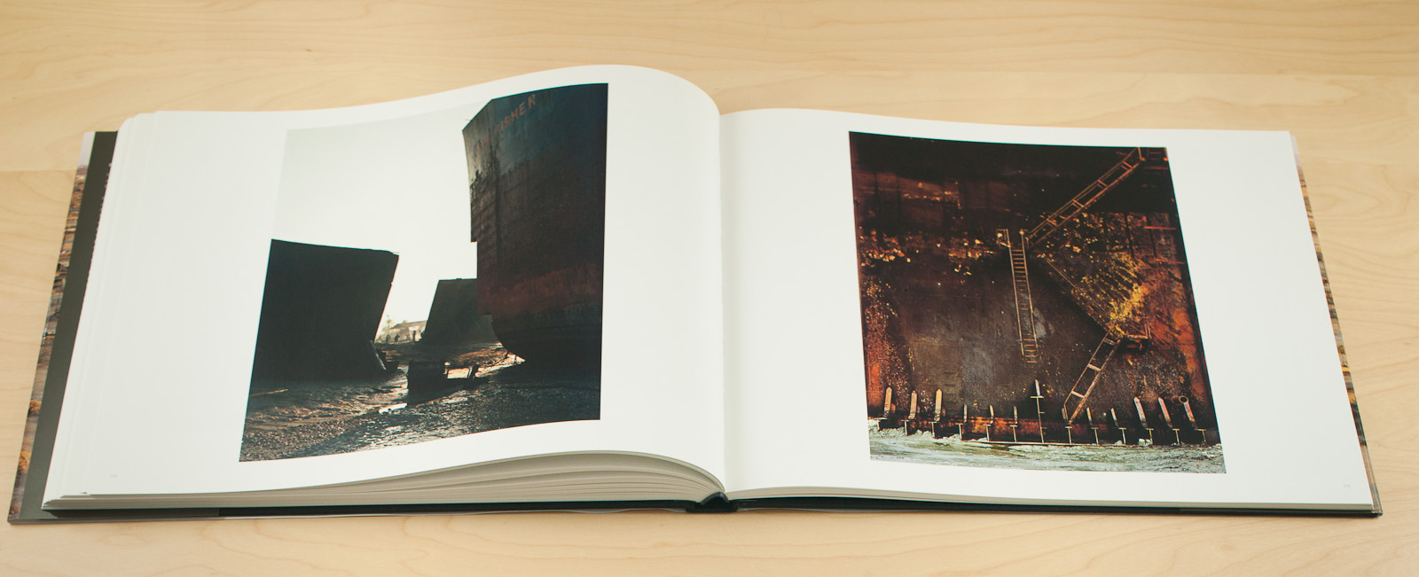
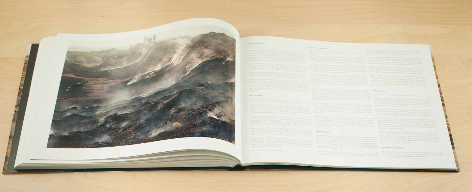
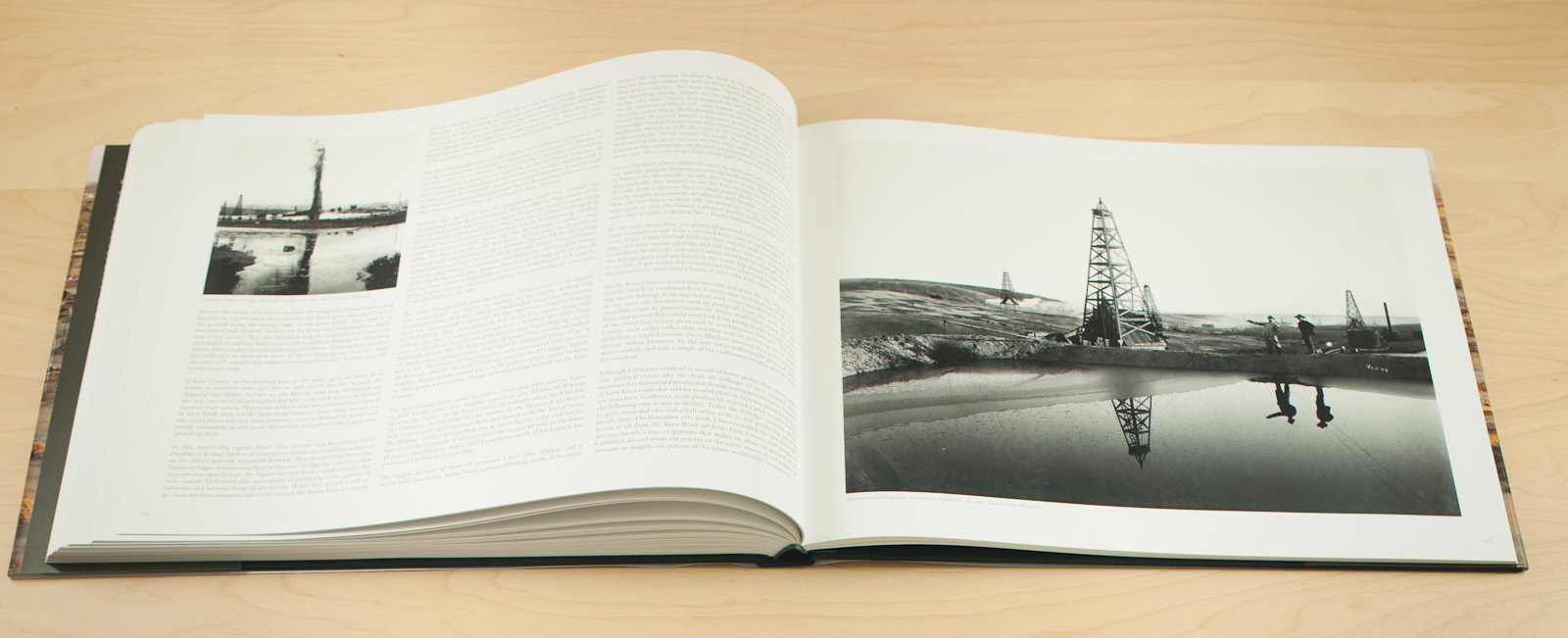
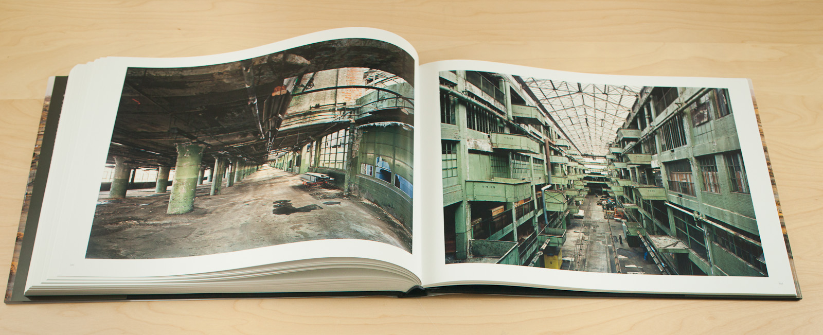
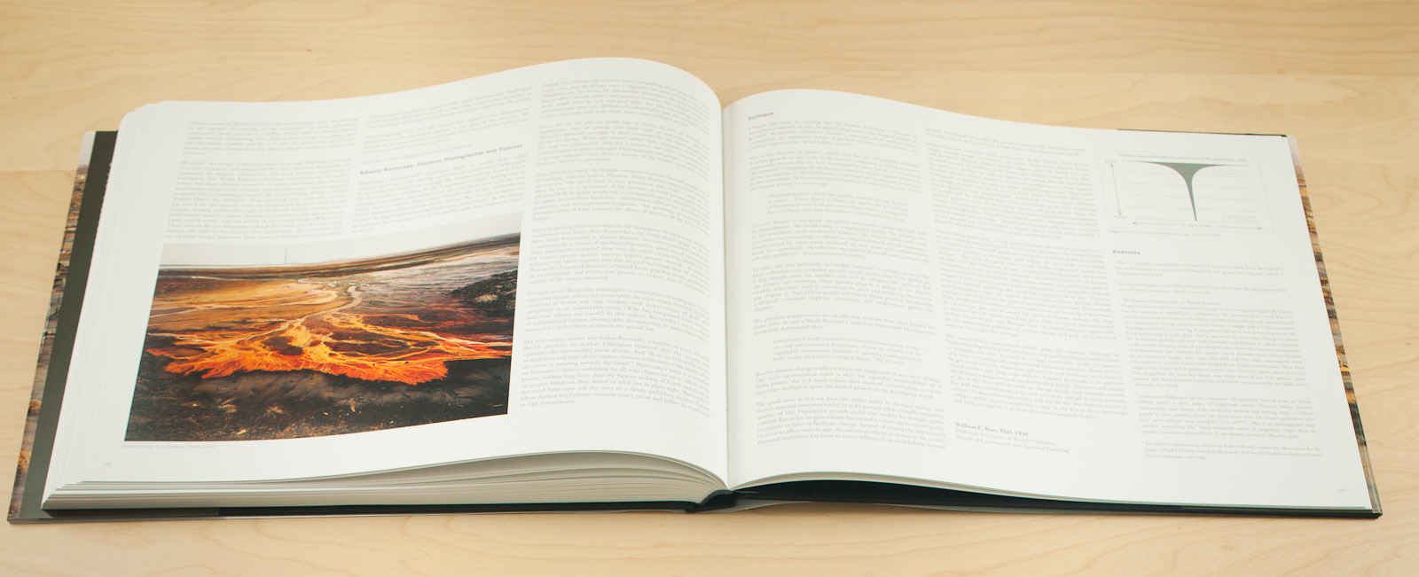
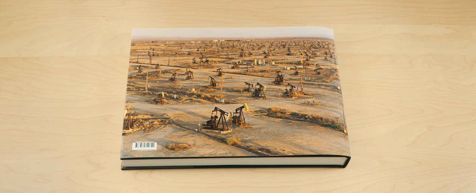


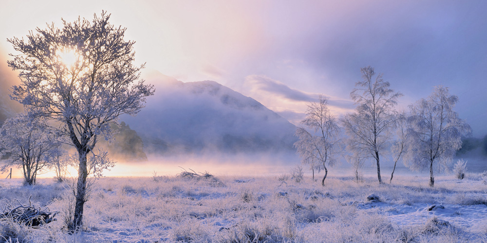
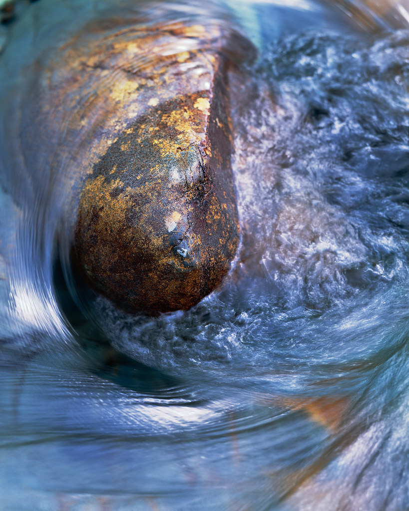


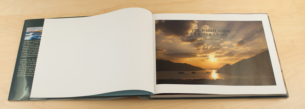
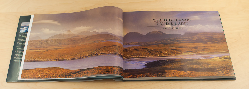
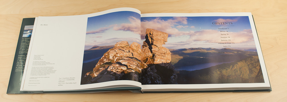
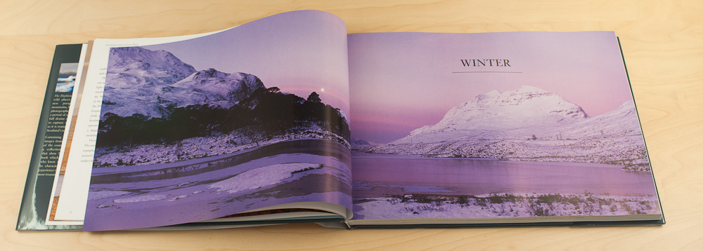
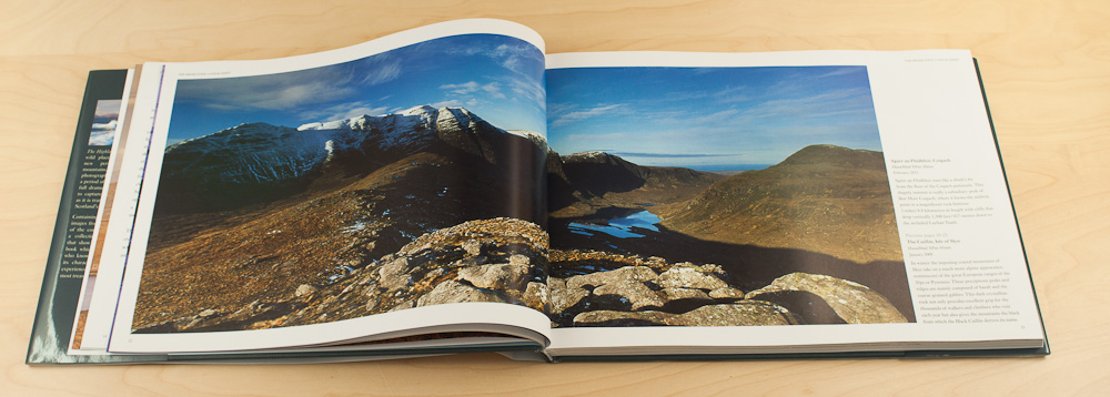
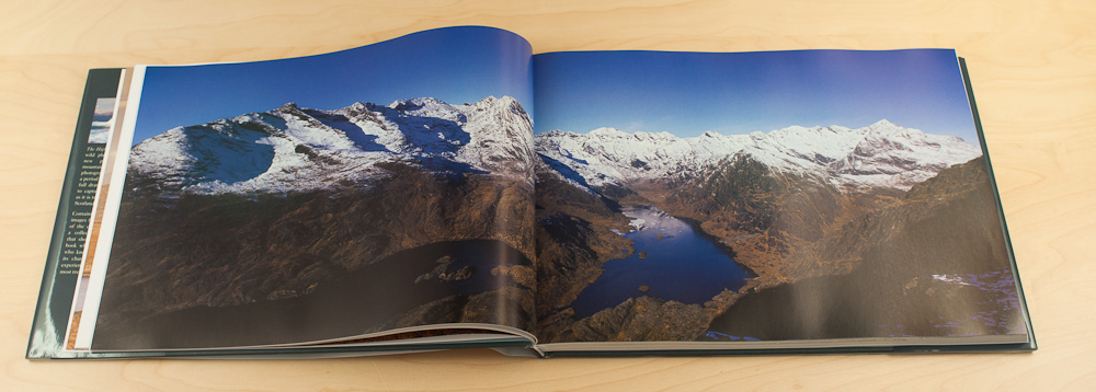
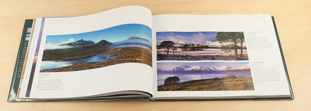
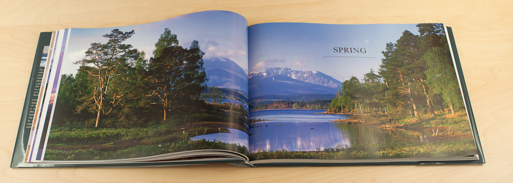
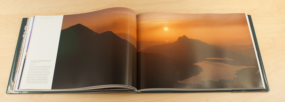
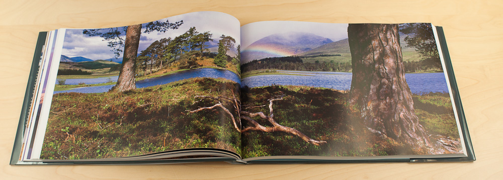
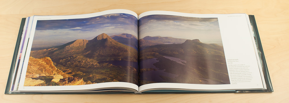
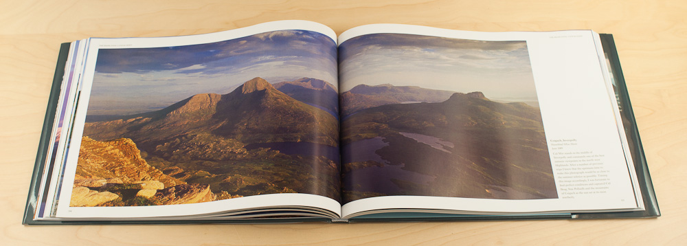
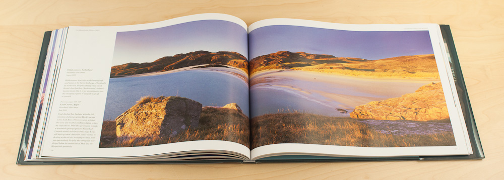
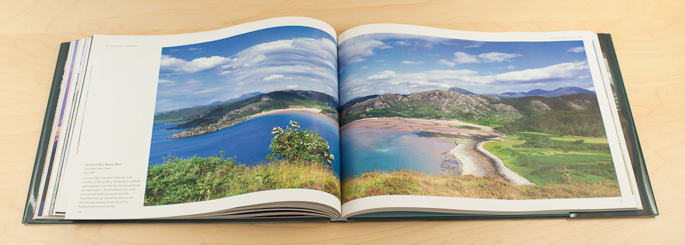
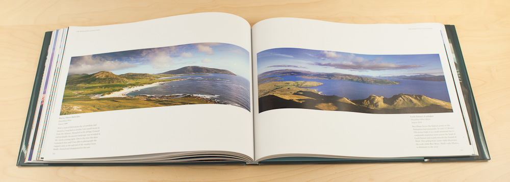
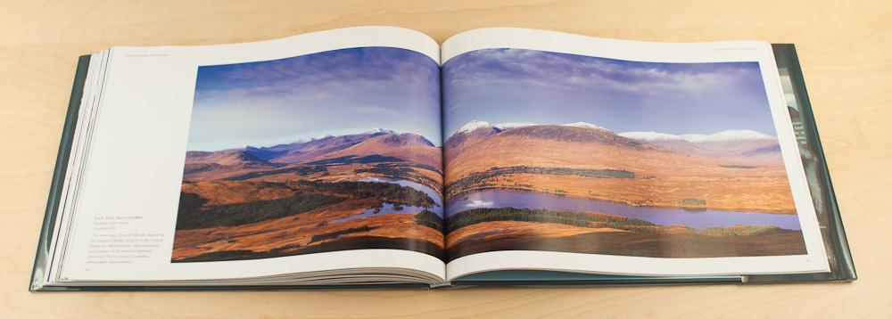
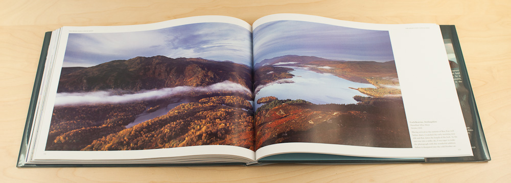
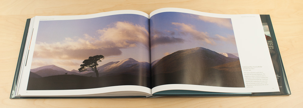
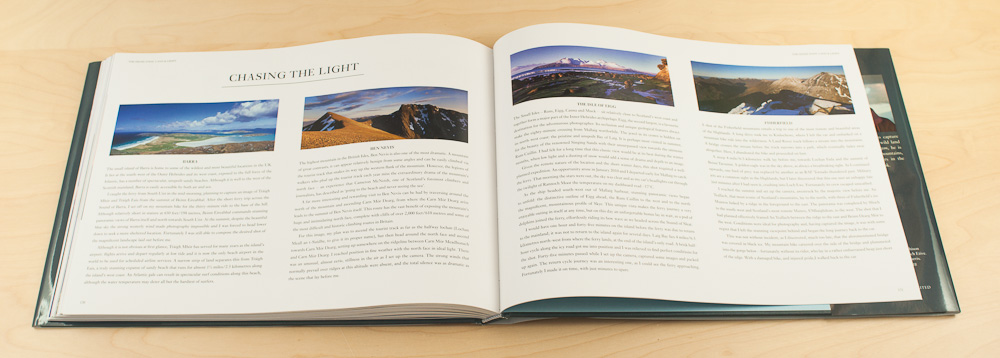

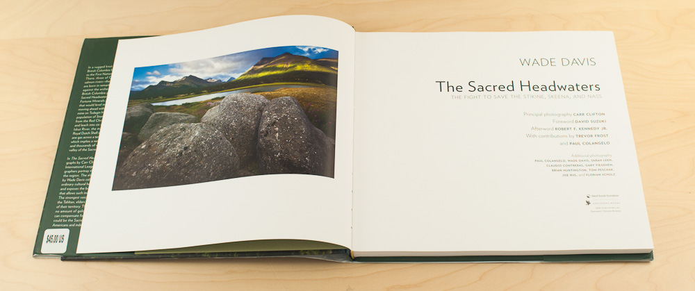
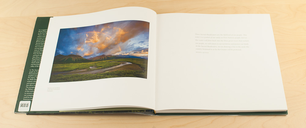
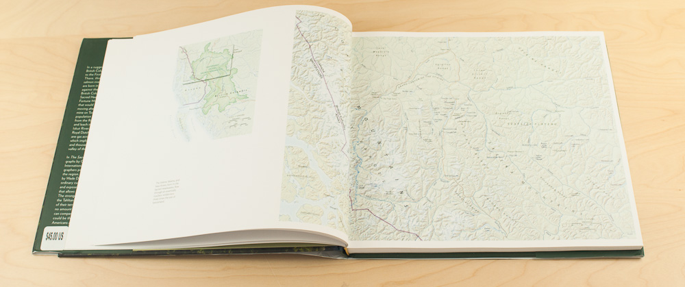
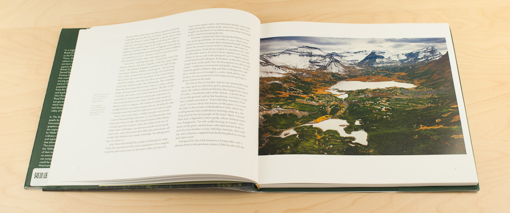
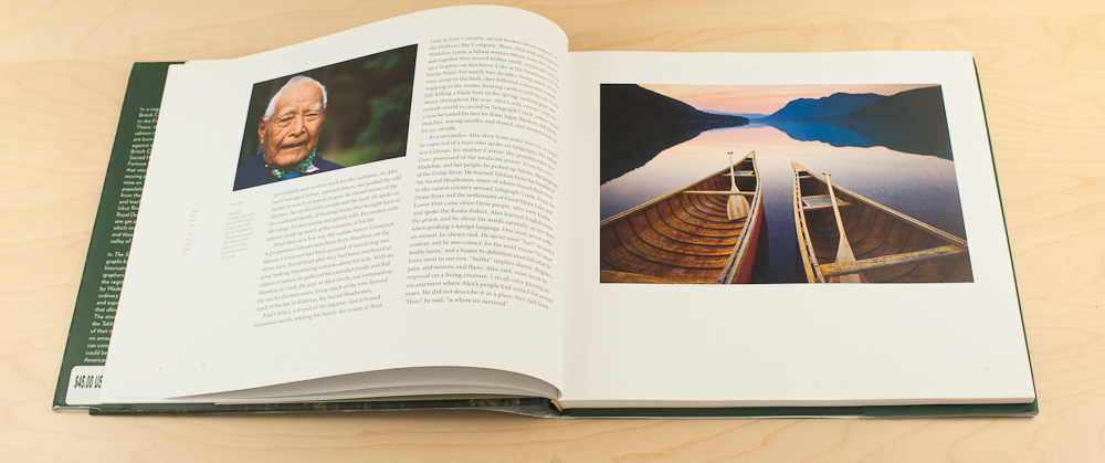
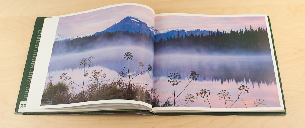
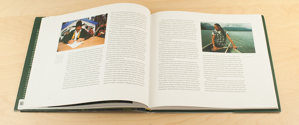
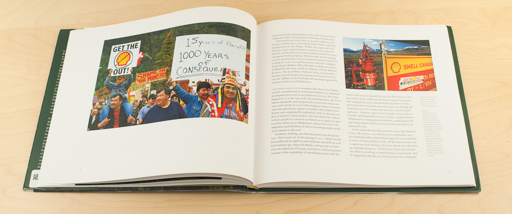
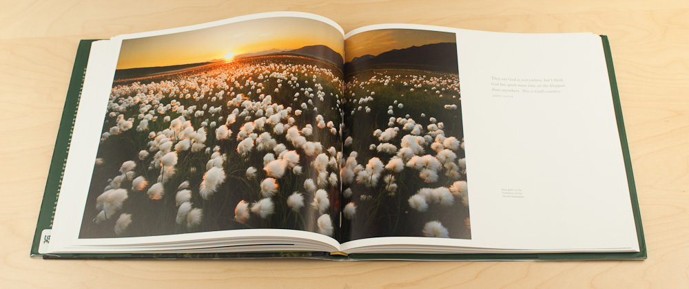
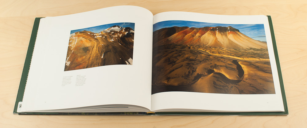
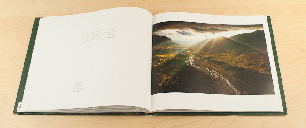
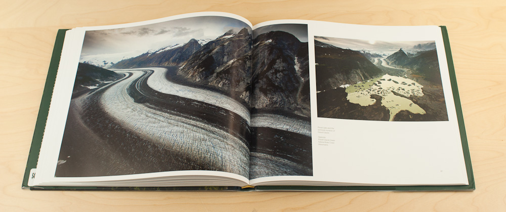
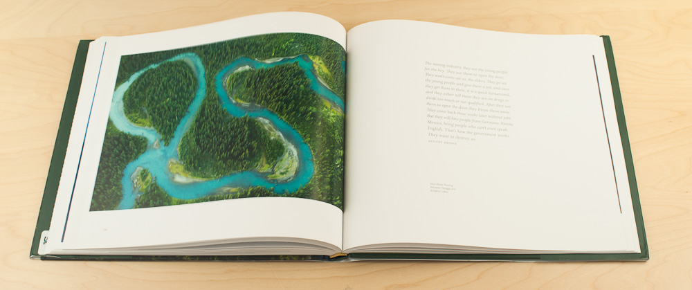
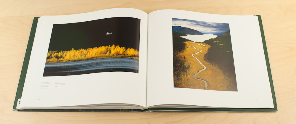
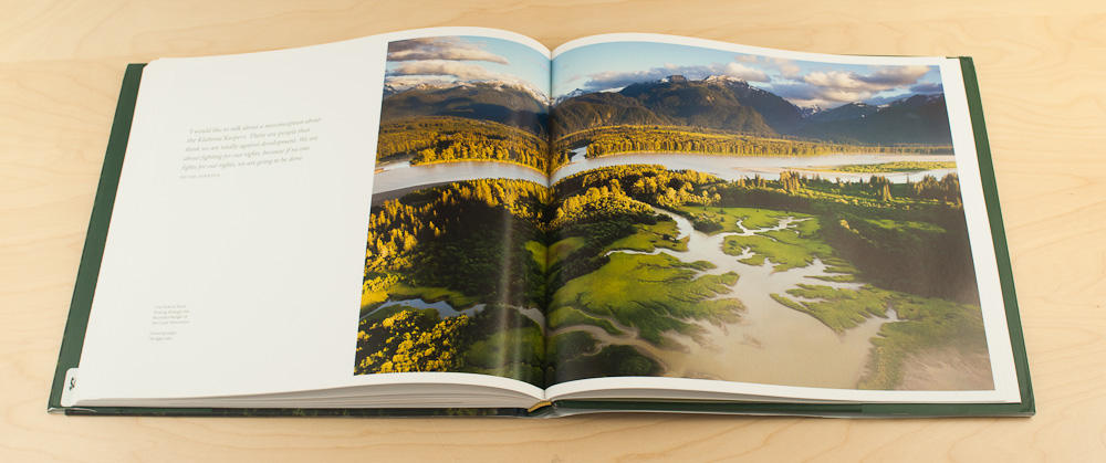
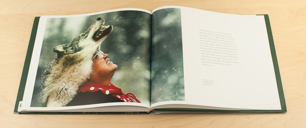
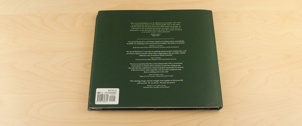


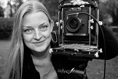
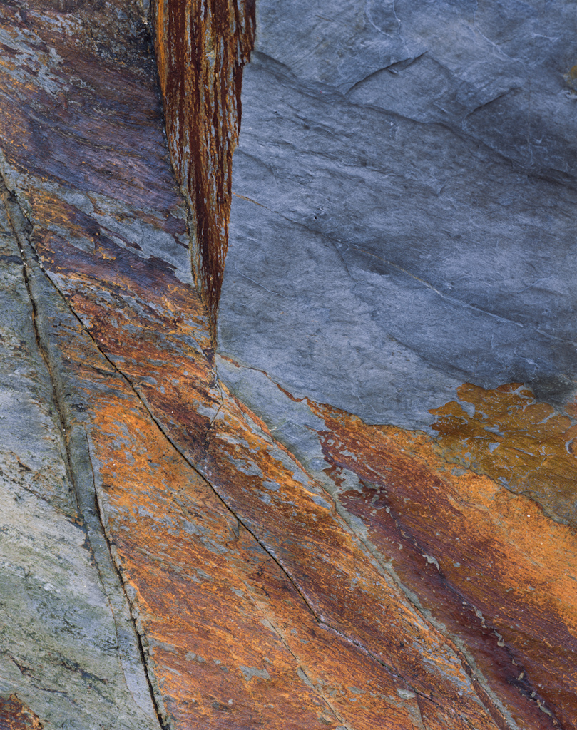
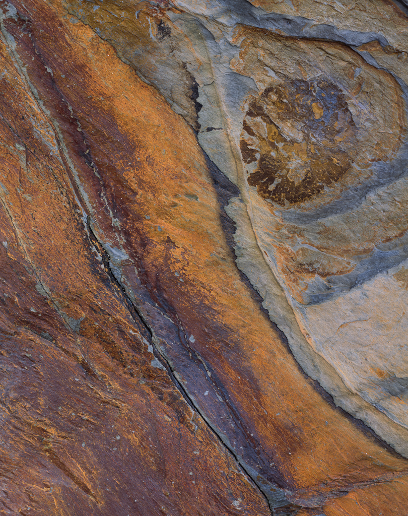
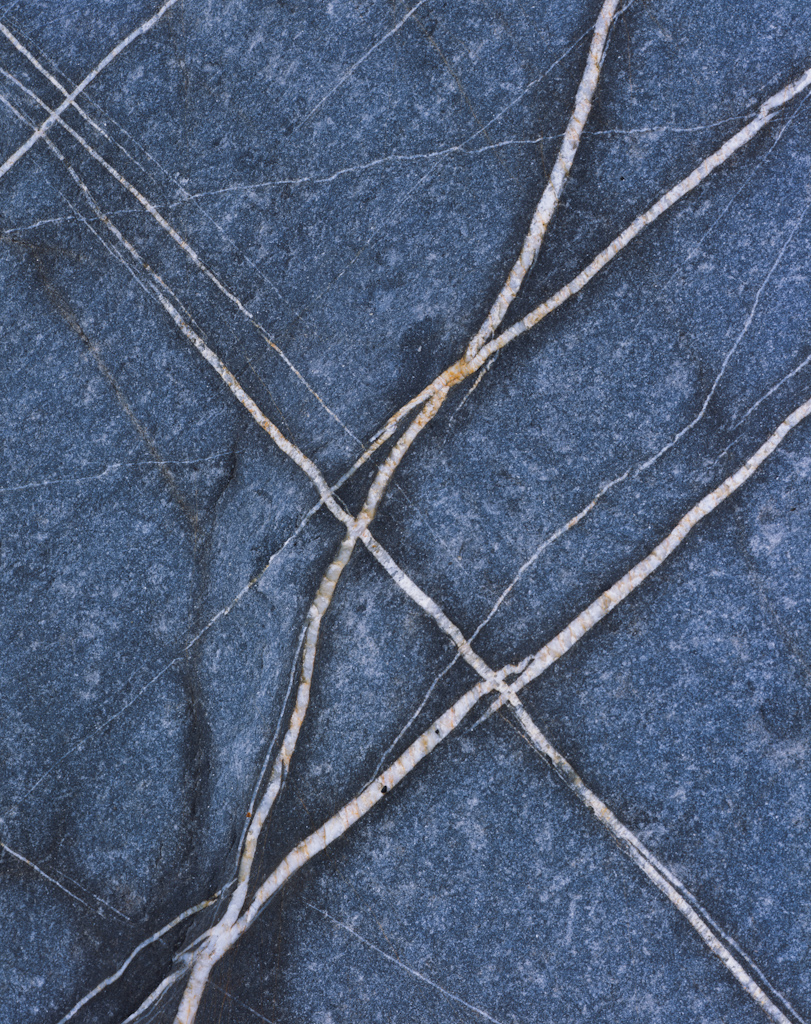
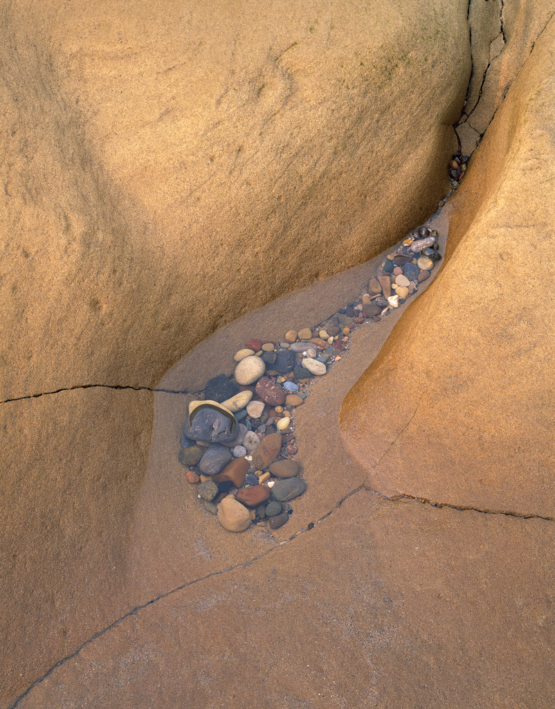
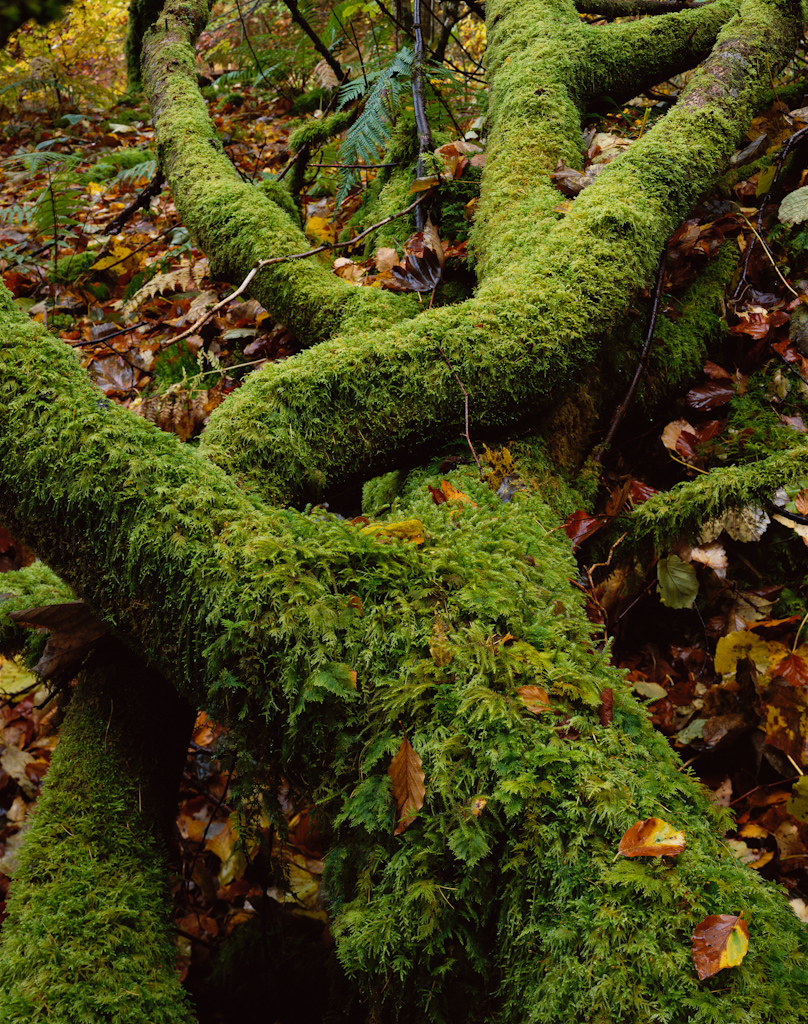
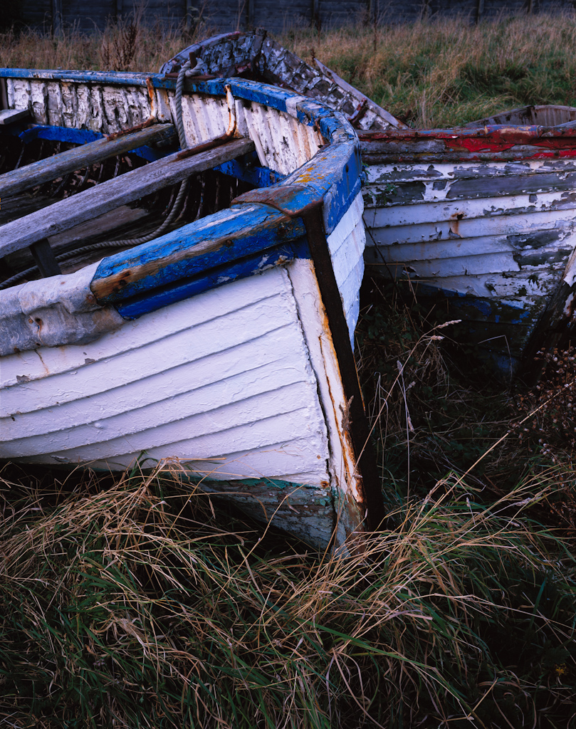
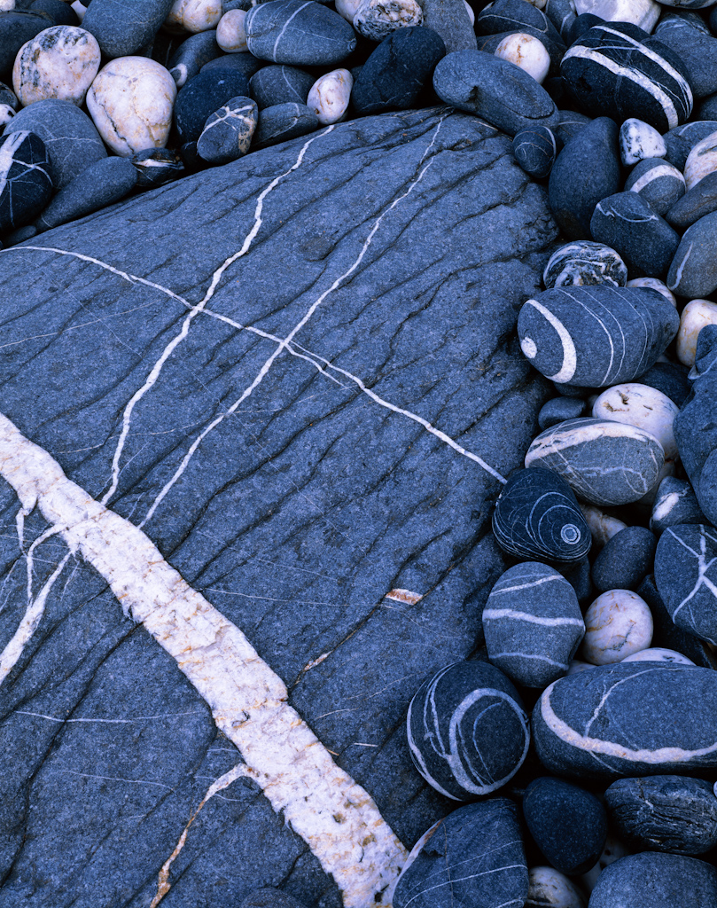
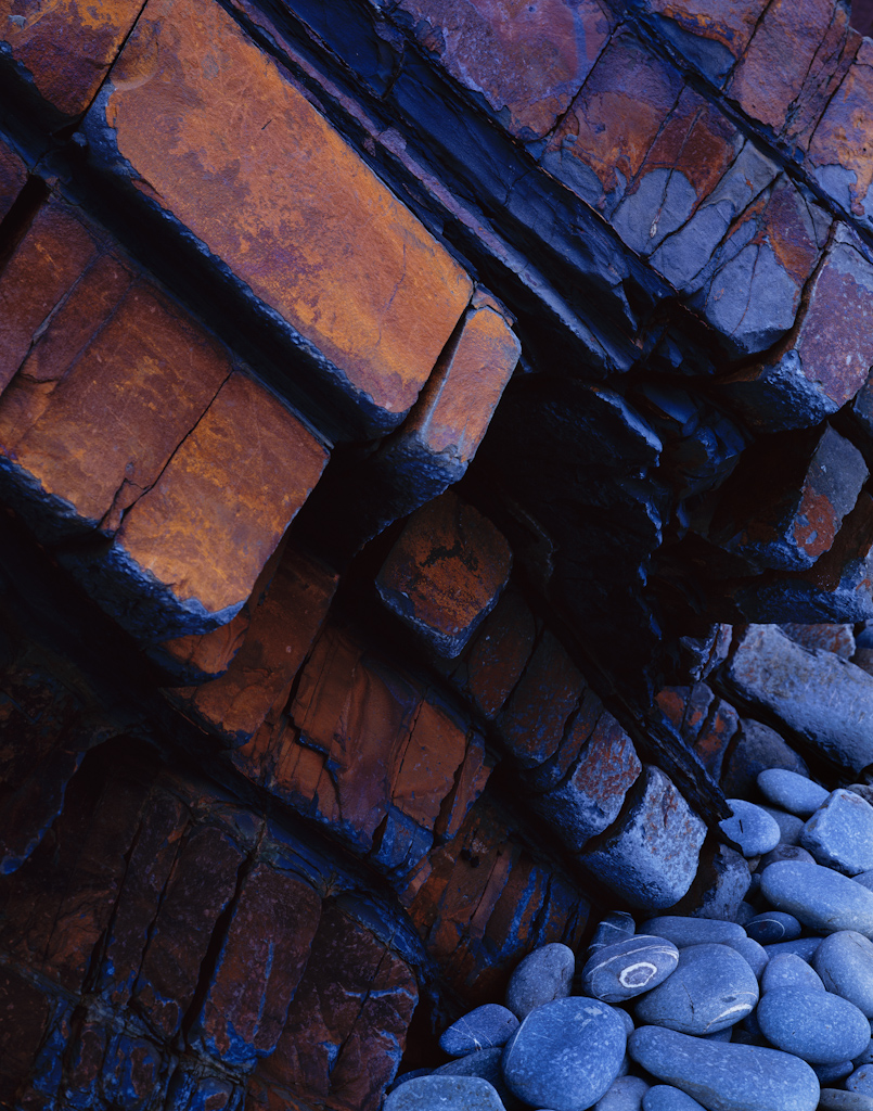
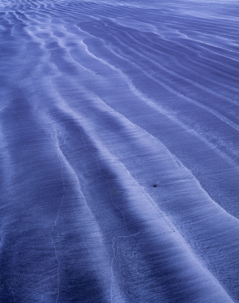
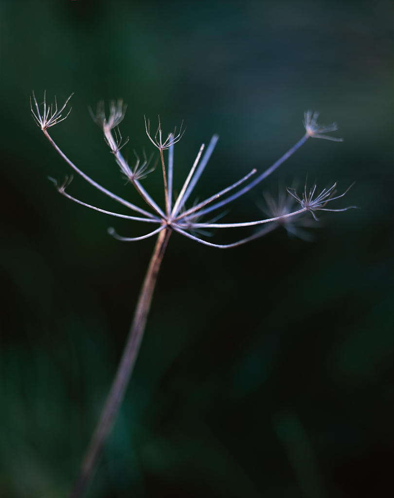
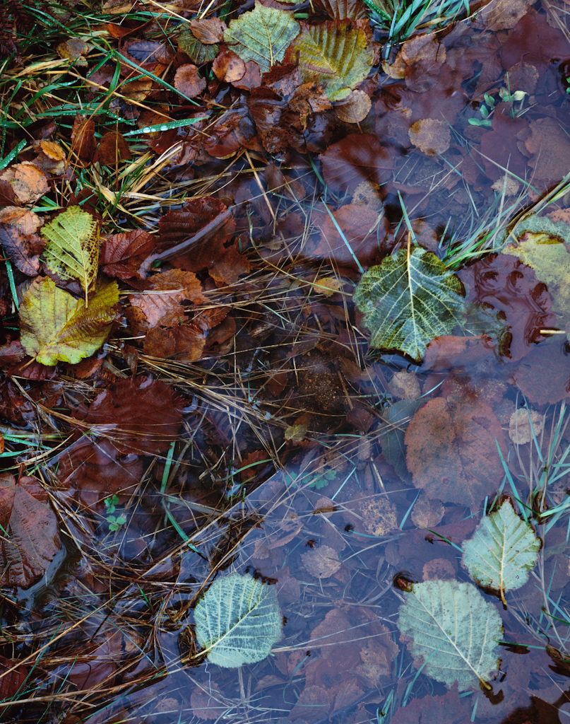
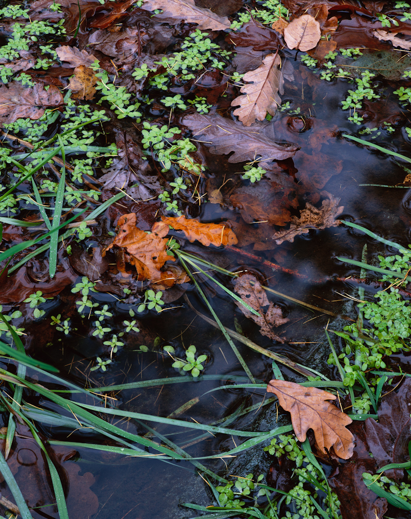
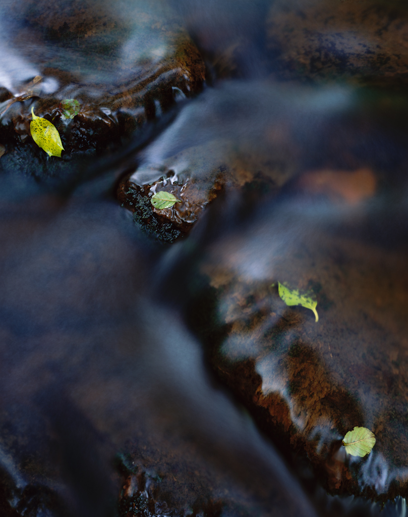
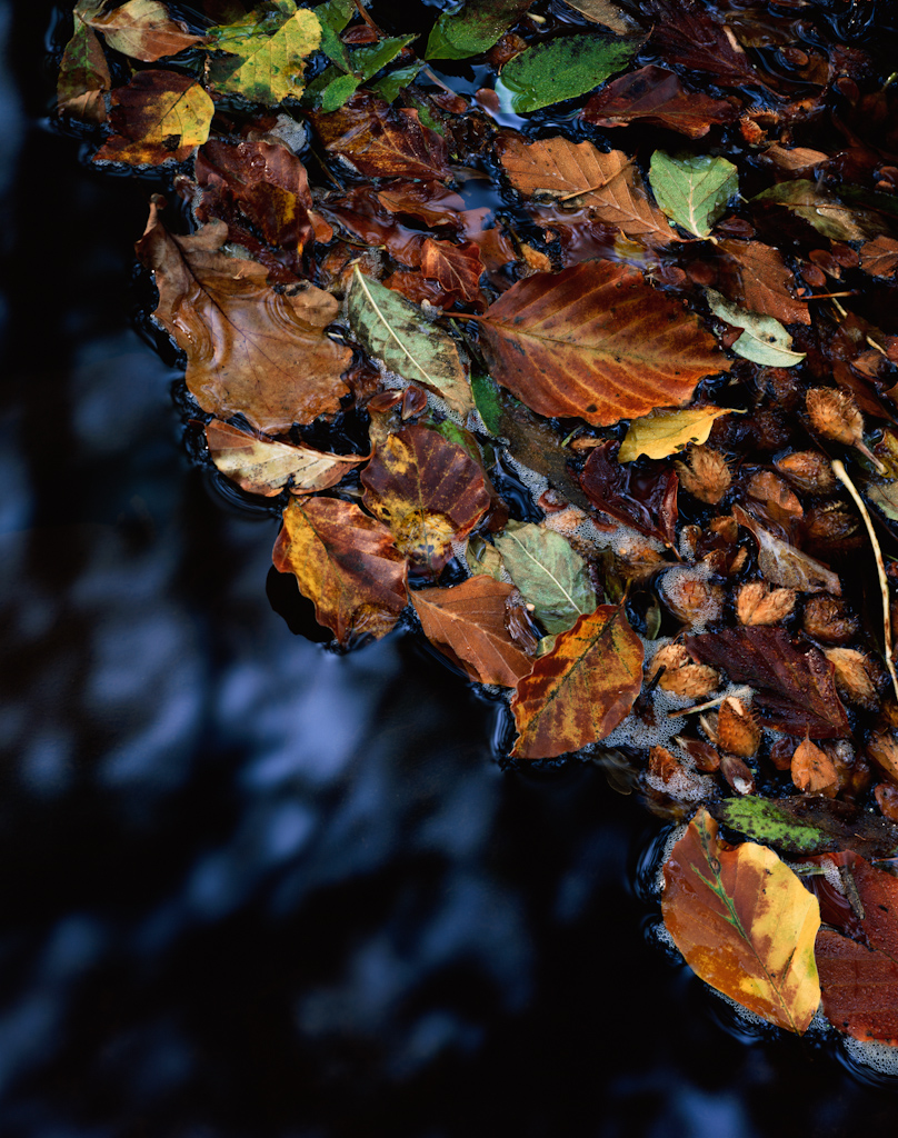
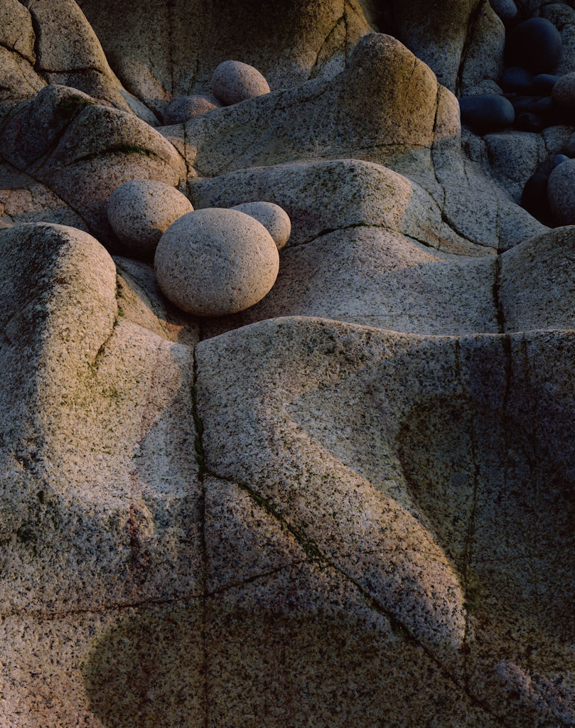
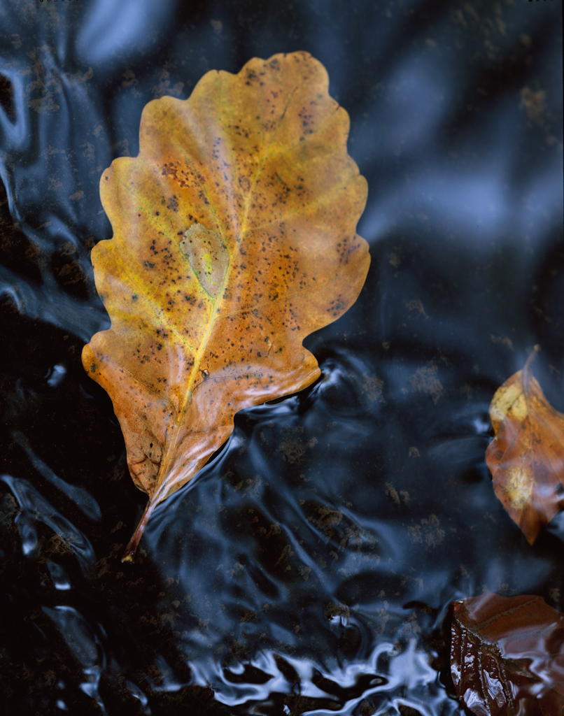
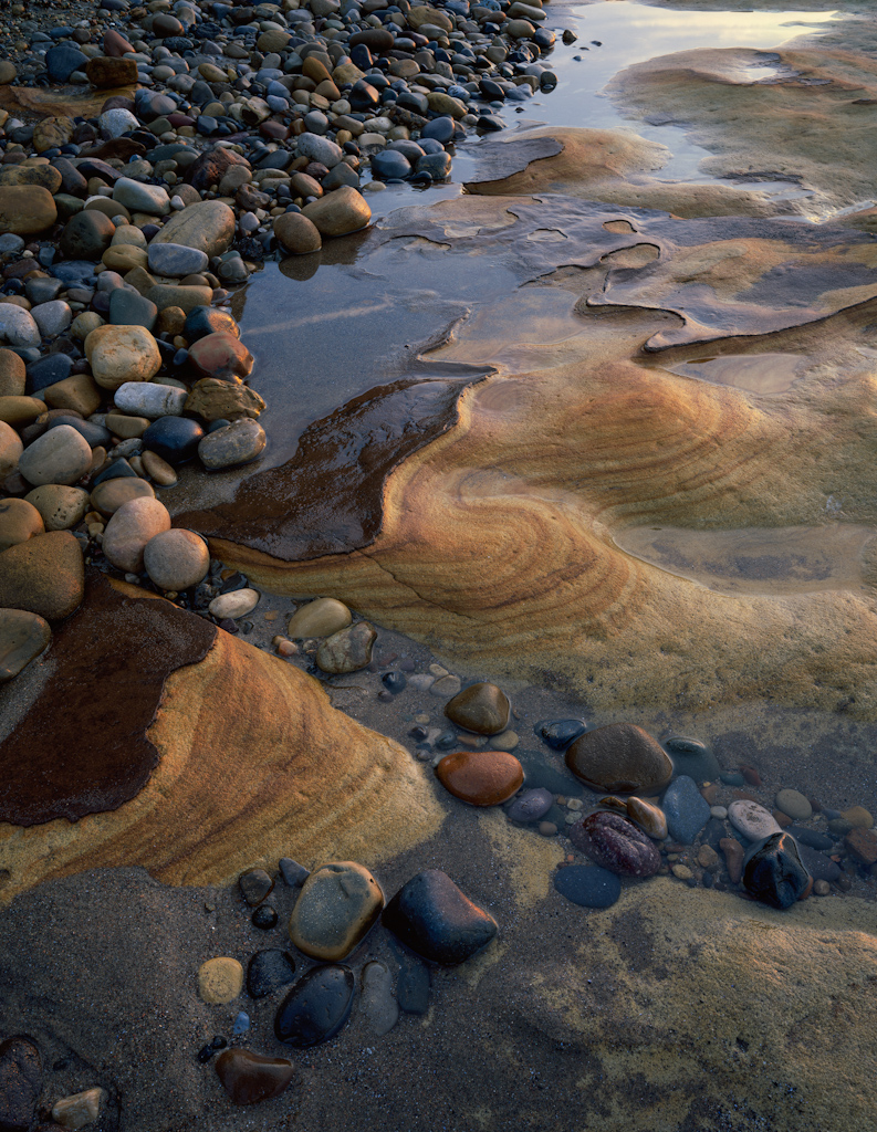

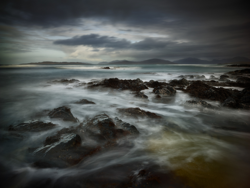
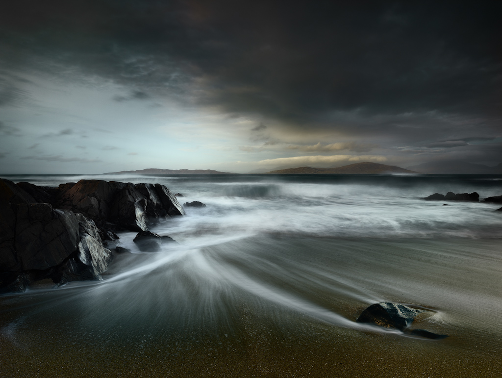
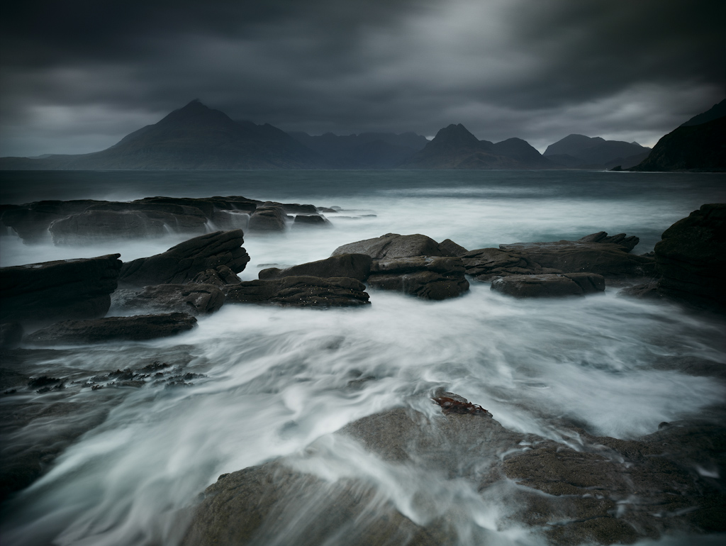
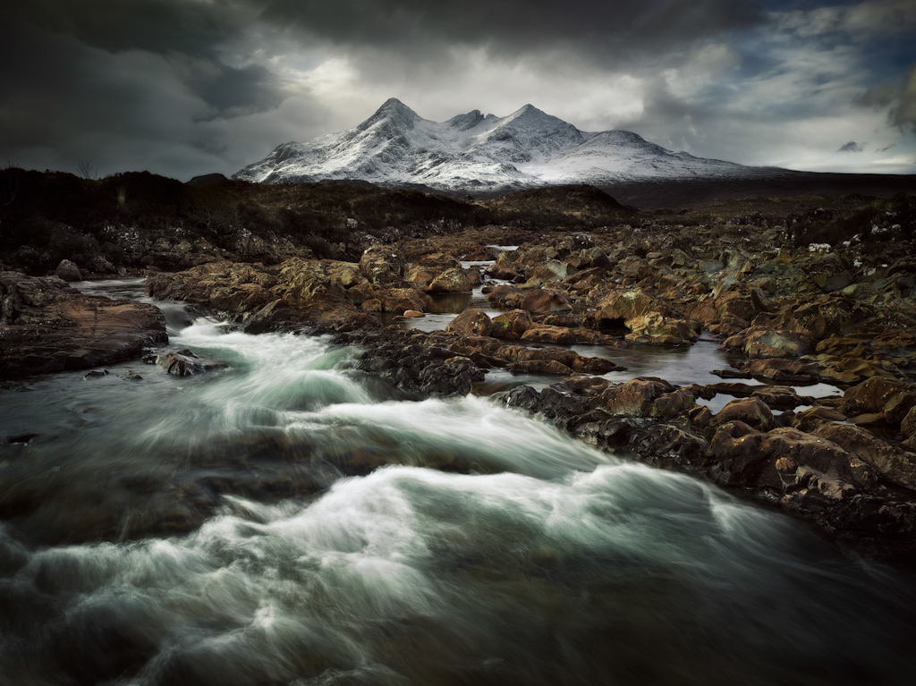
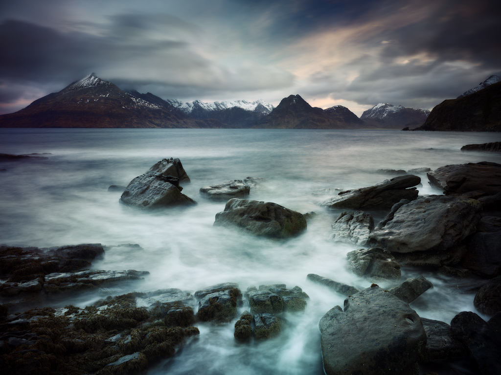
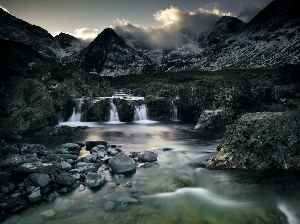
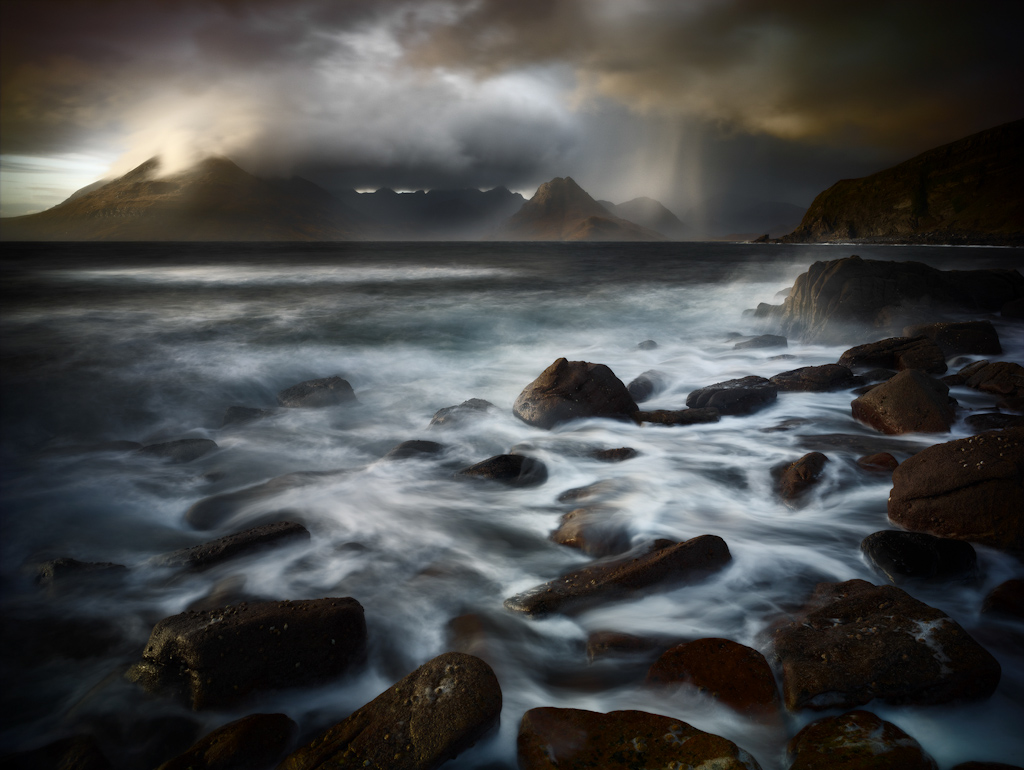
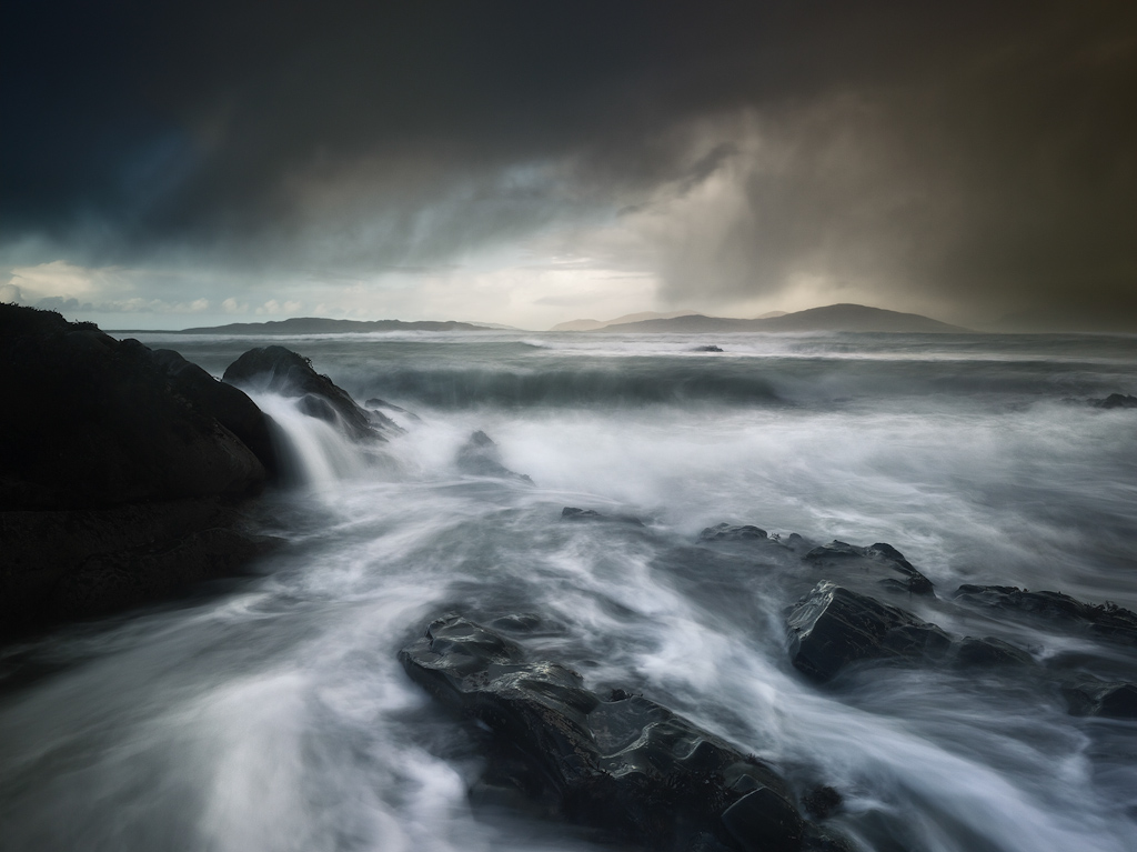
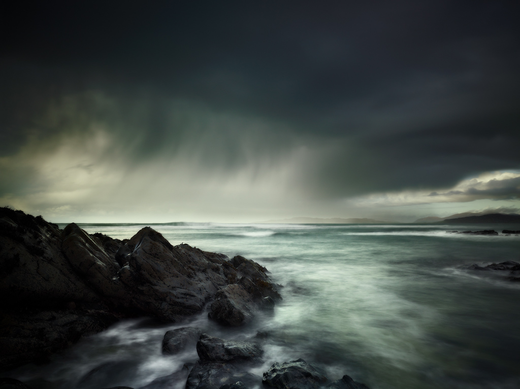


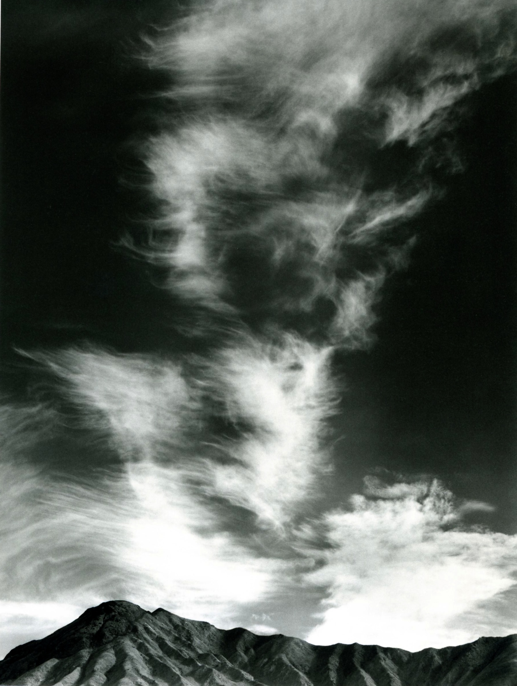
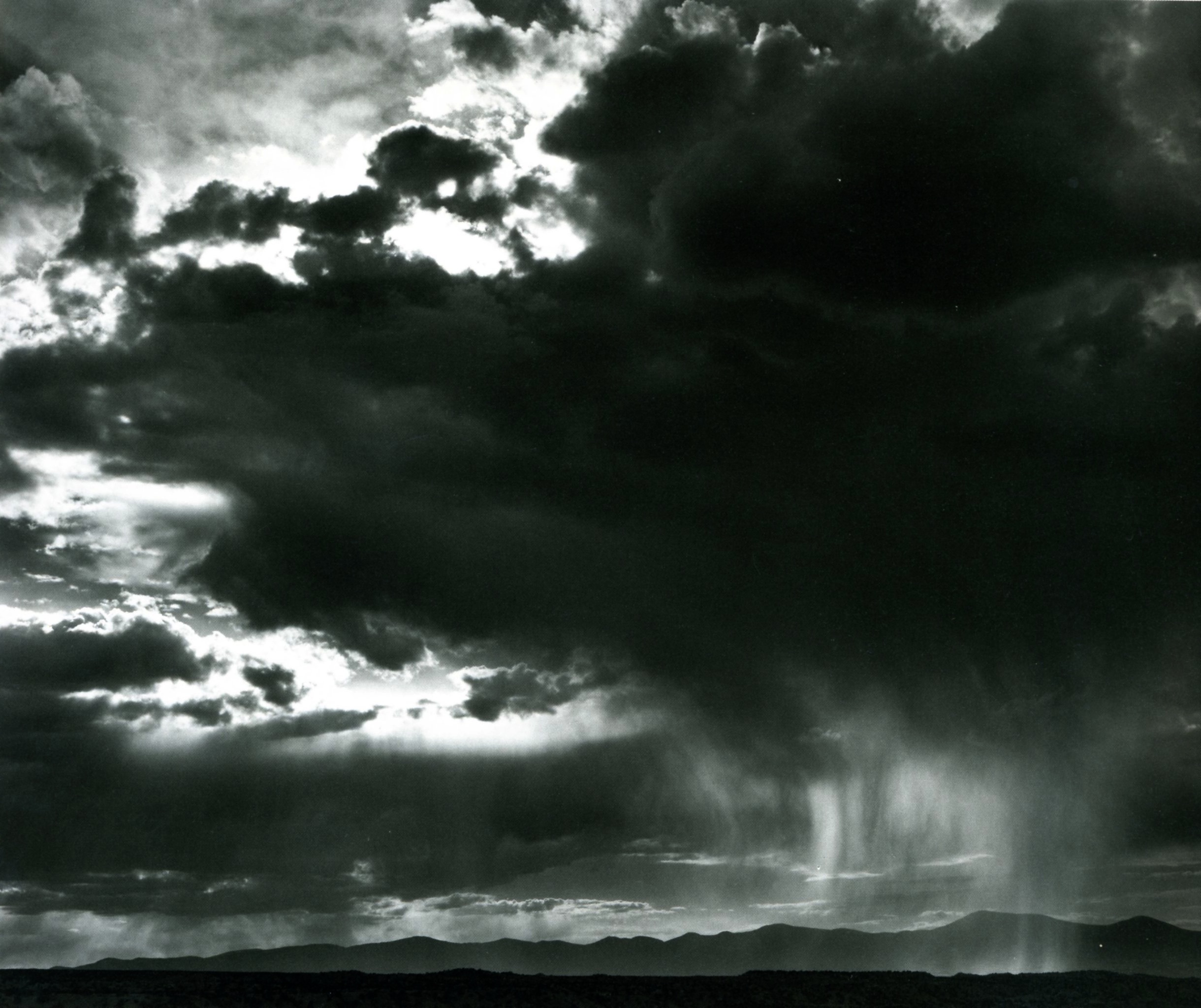


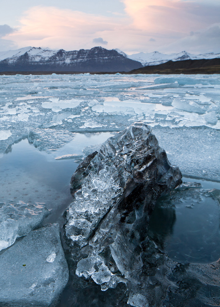
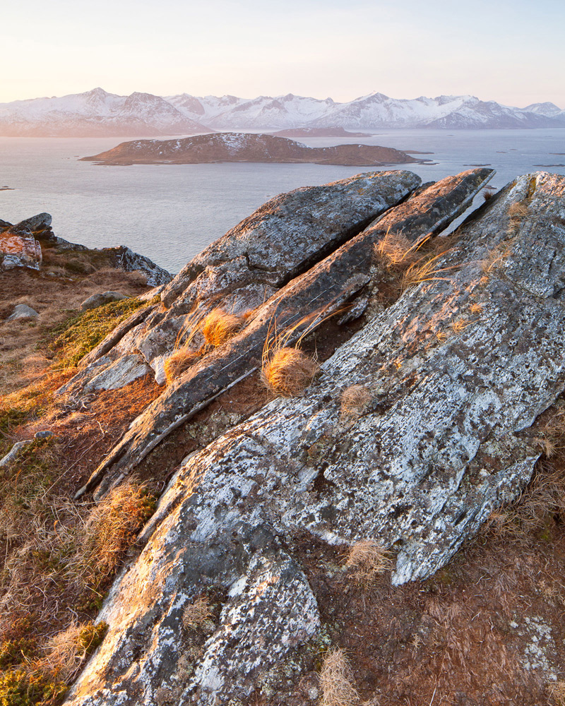
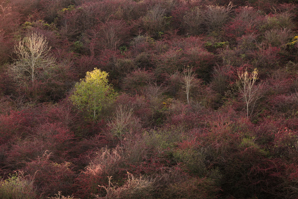
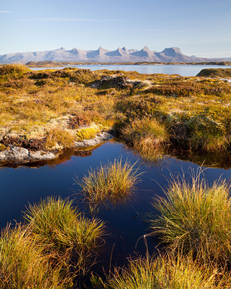
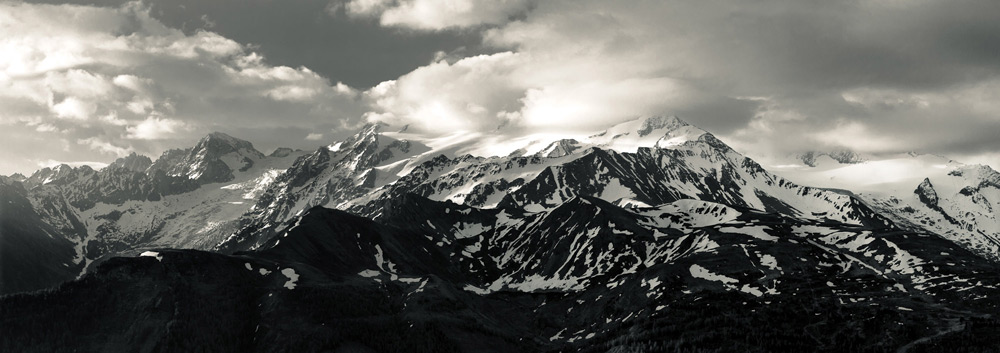
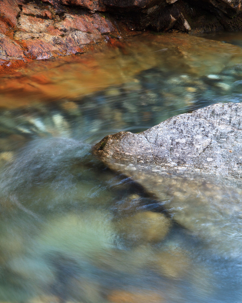
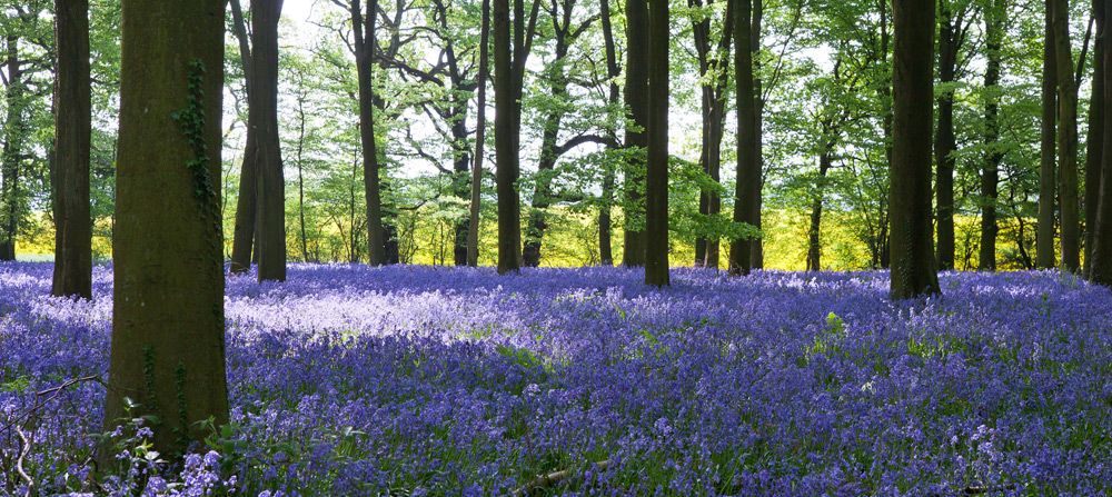
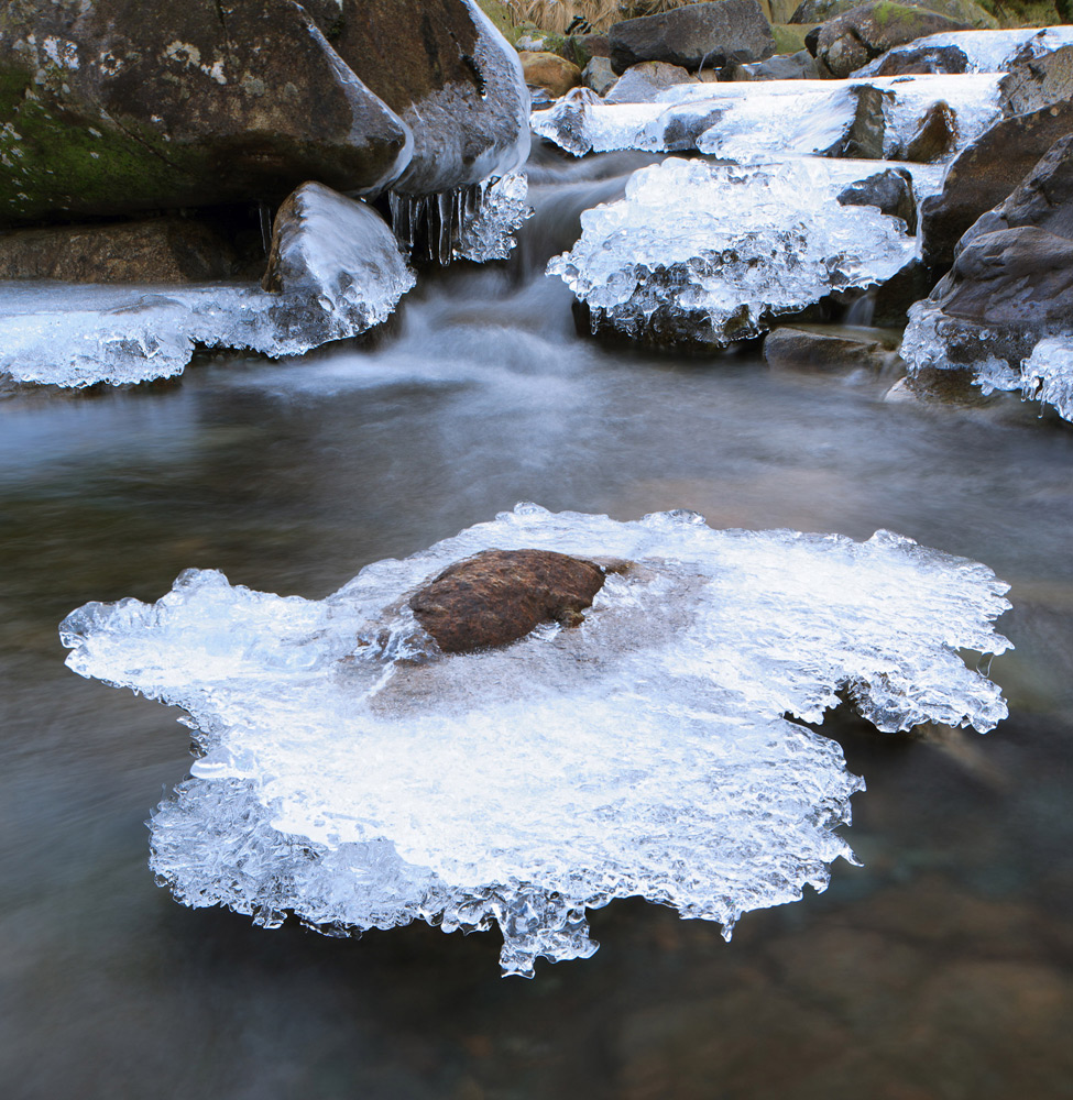
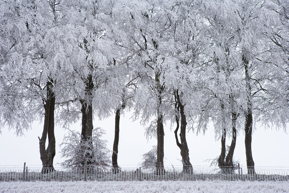
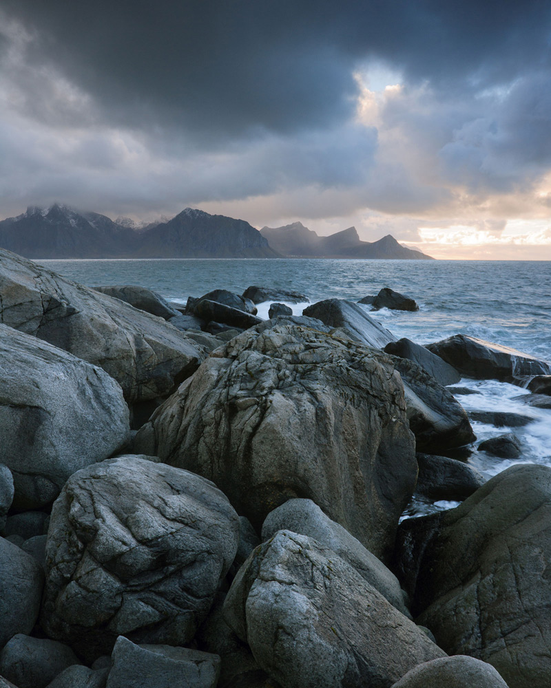
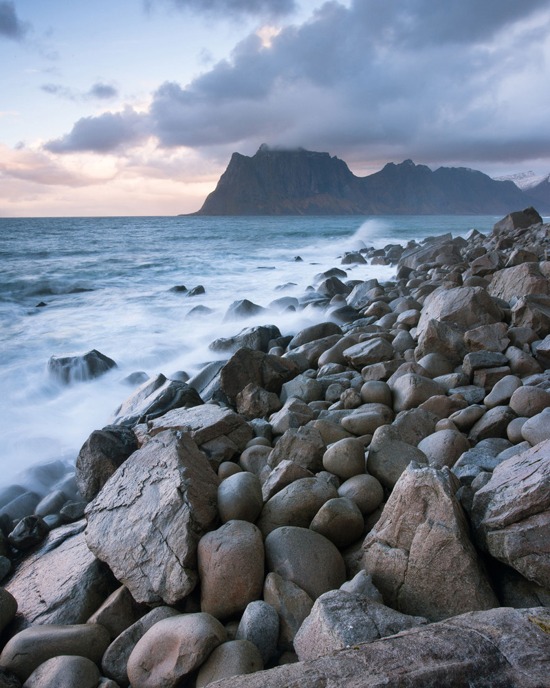


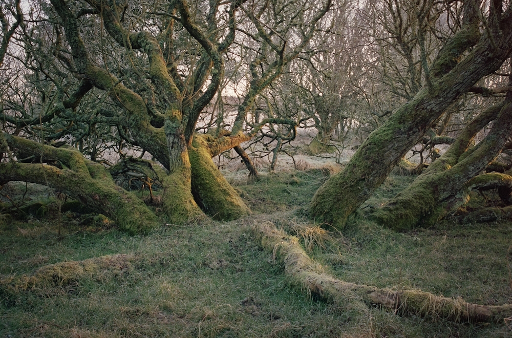
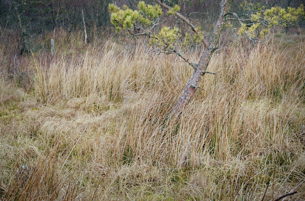
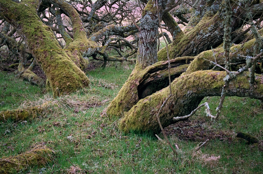

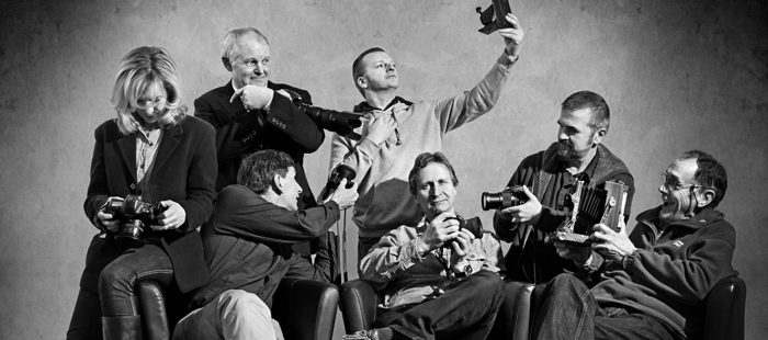
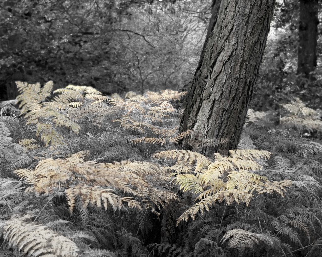
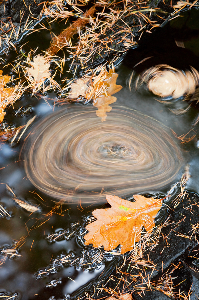
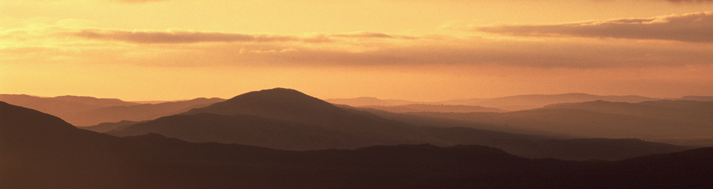
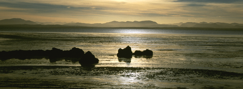
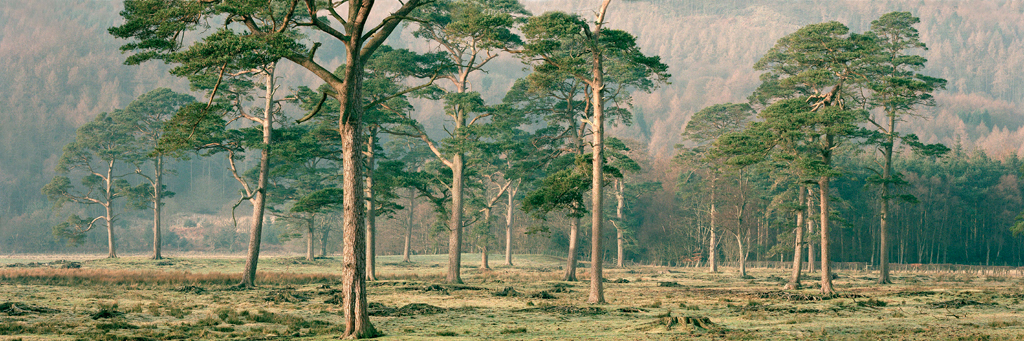
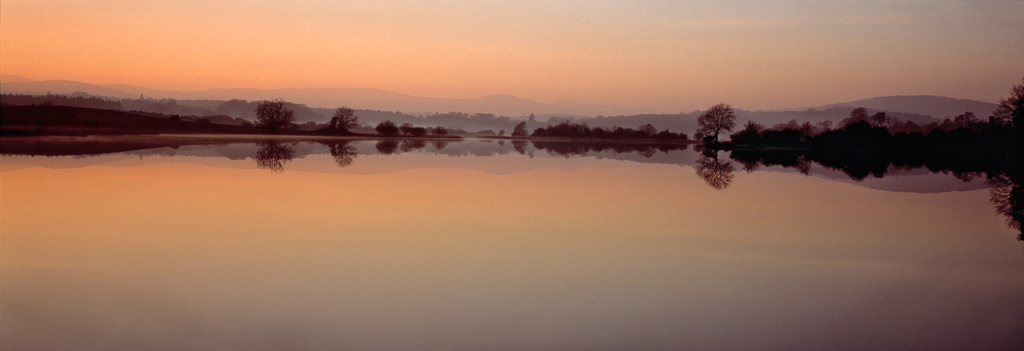
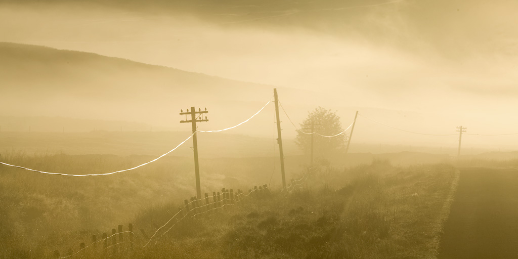
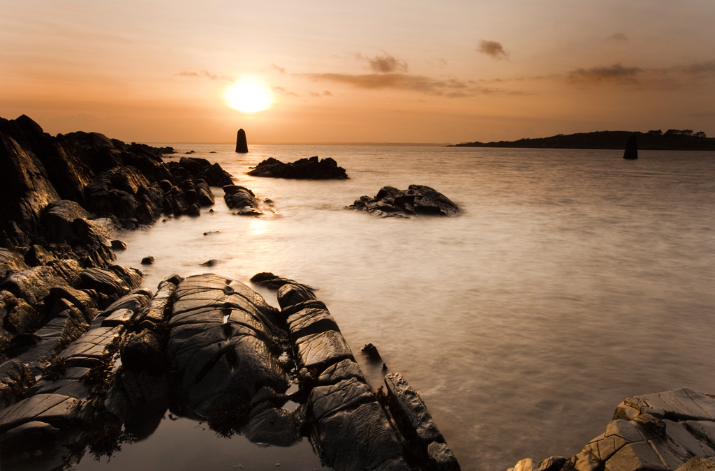
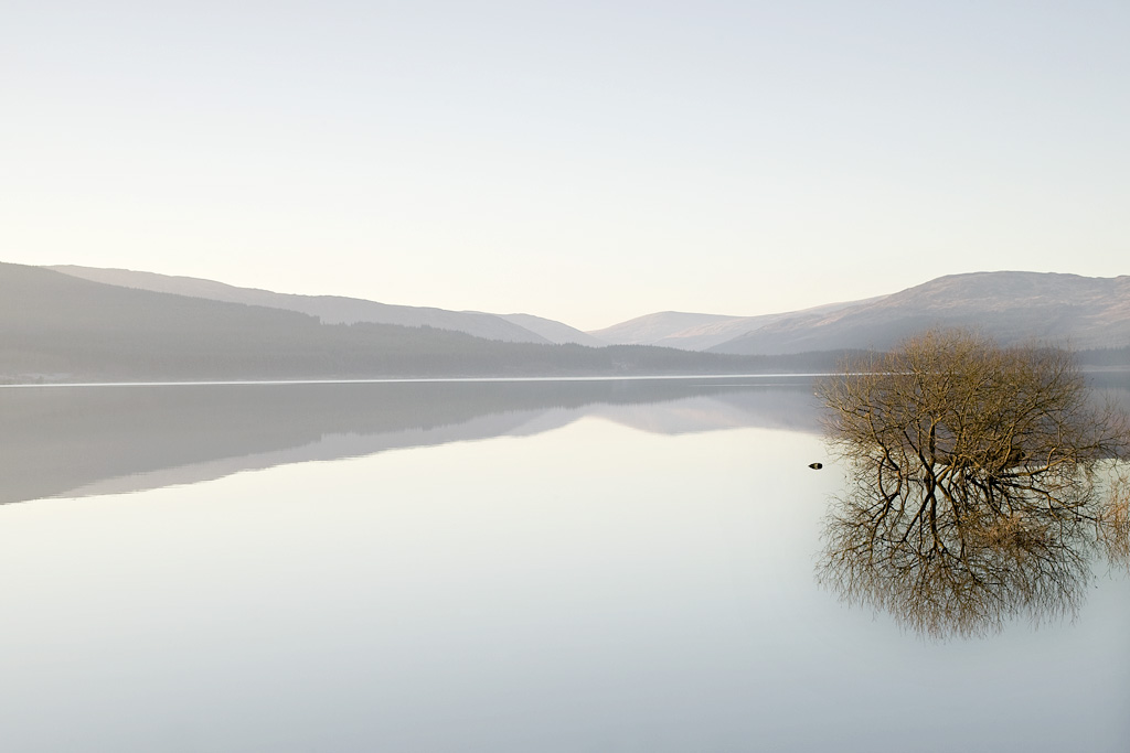
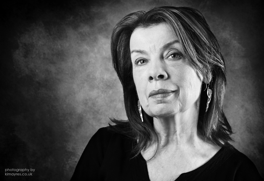
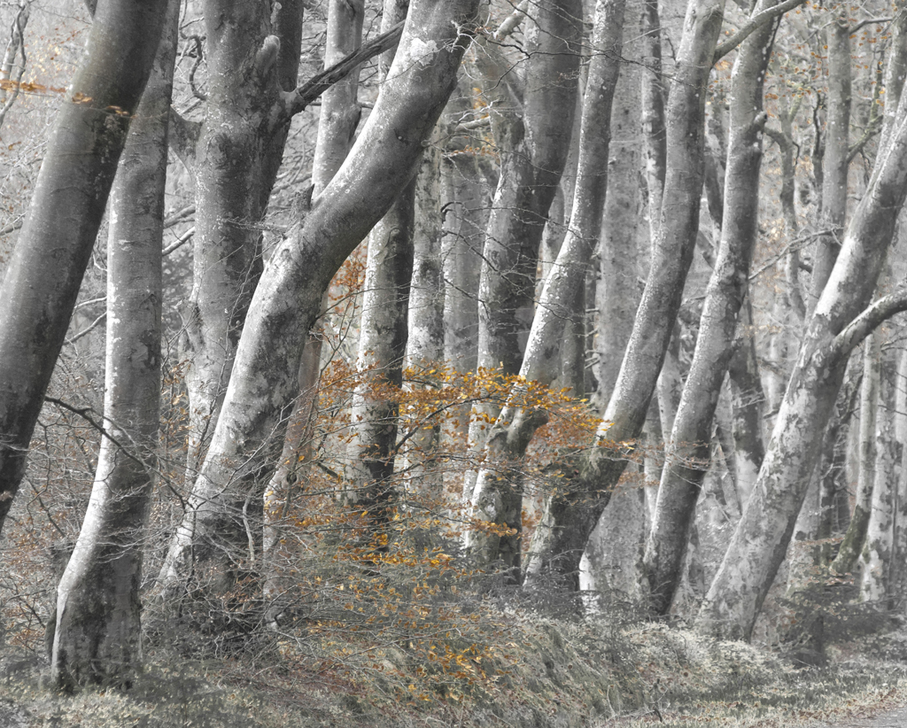
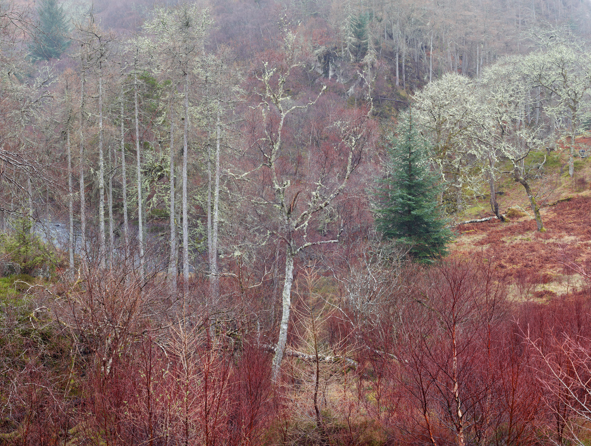
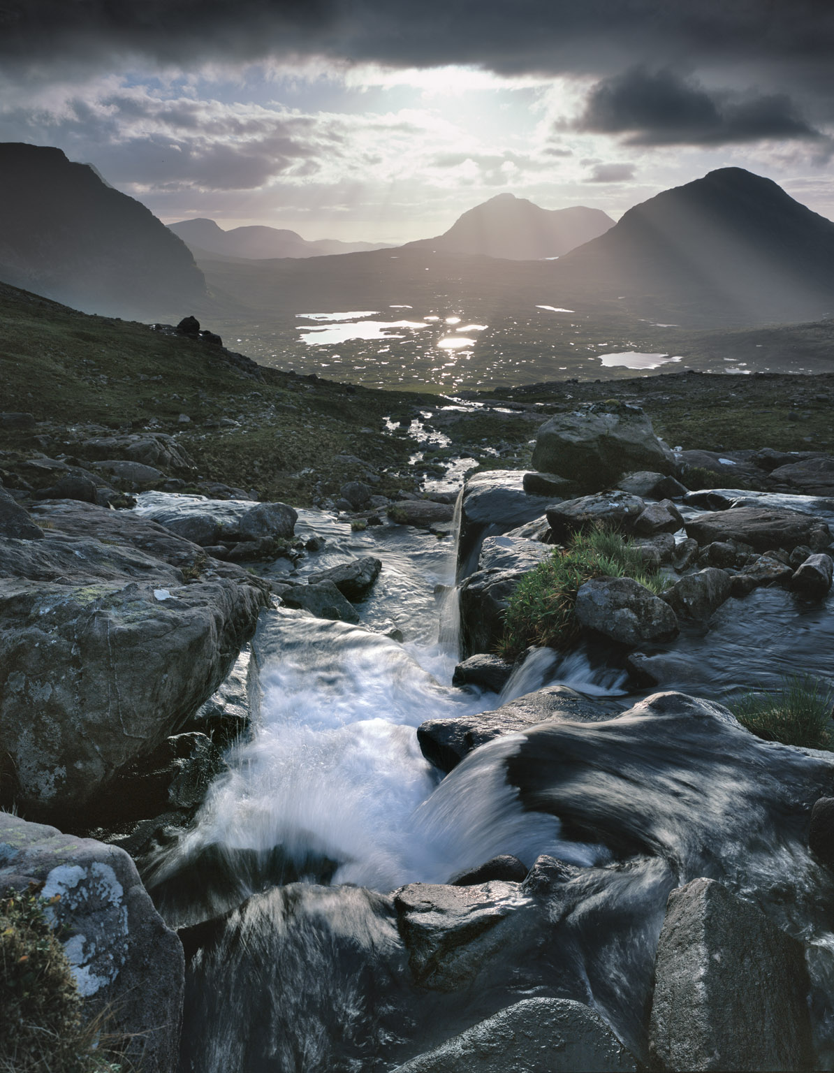
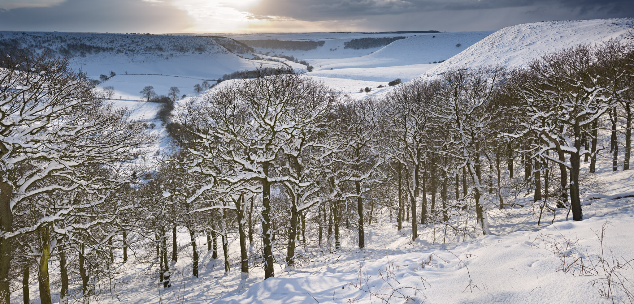


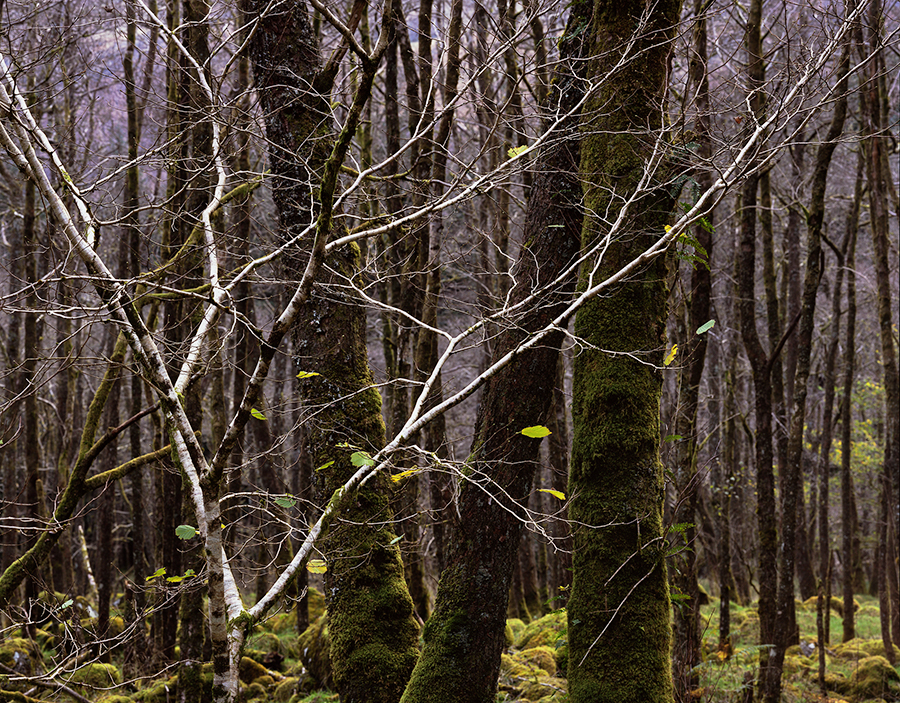
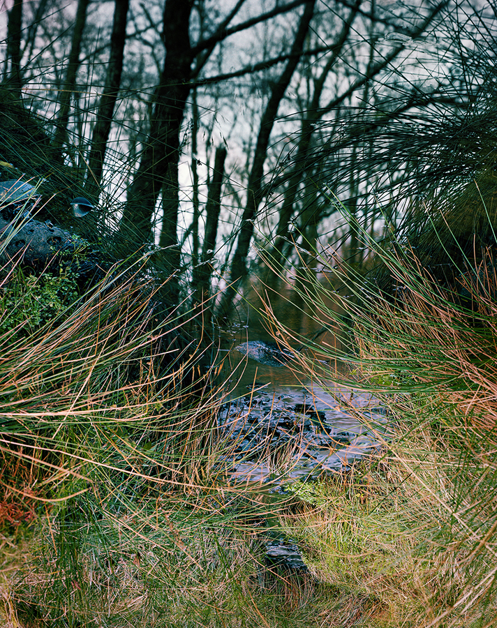
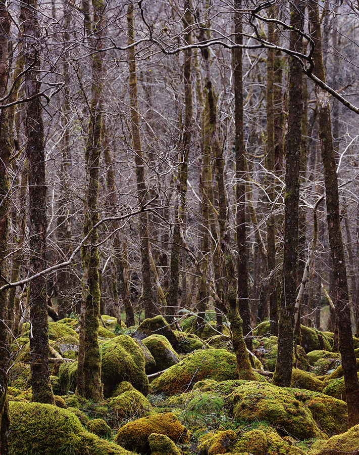
")


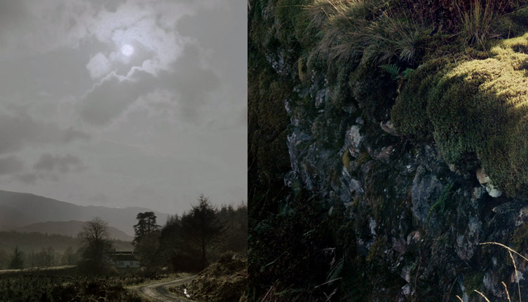
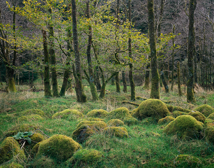
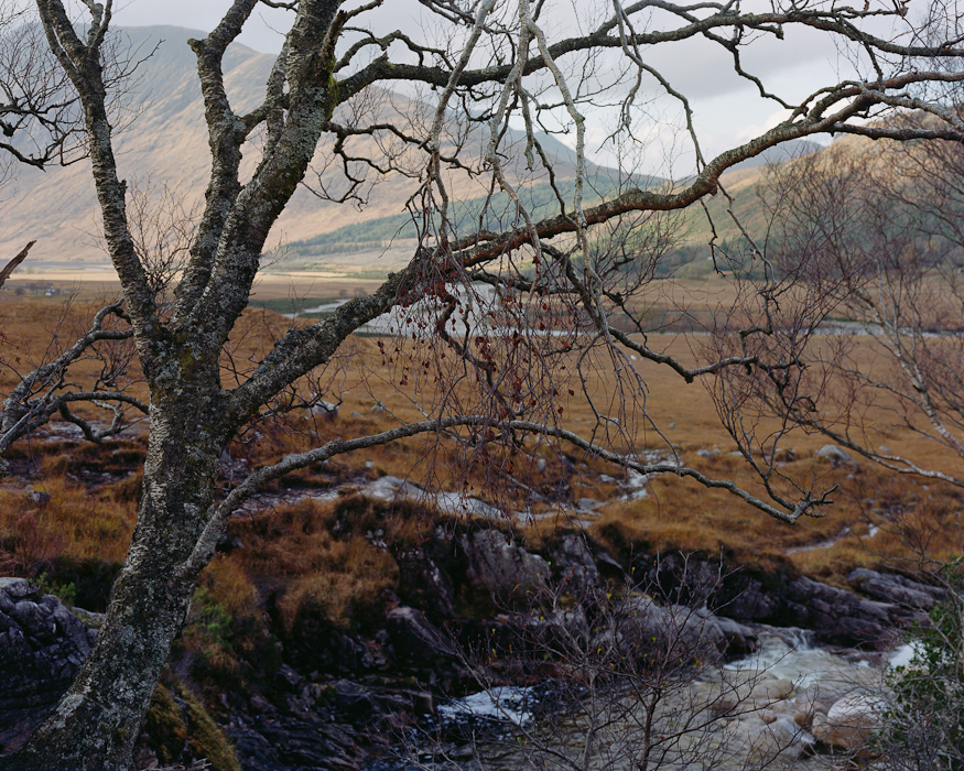

")


")


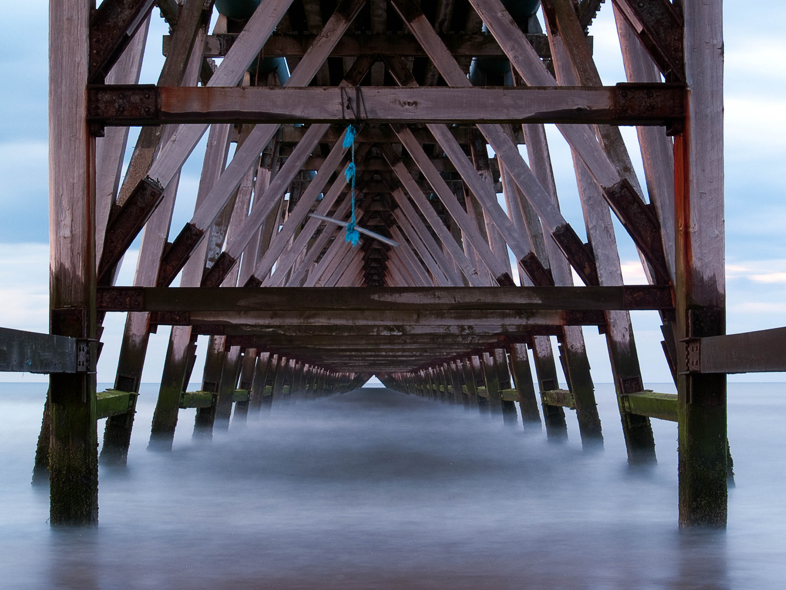
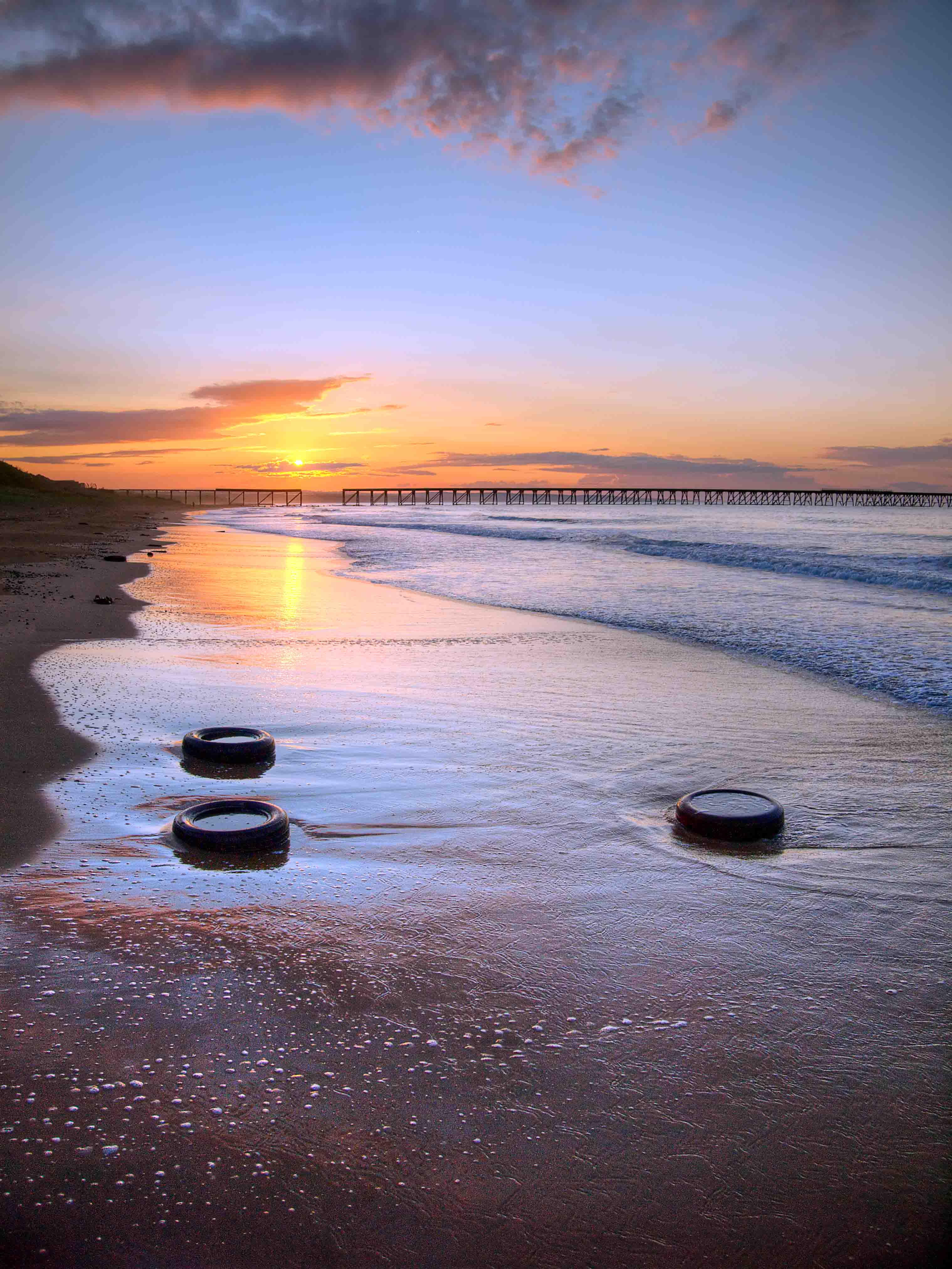
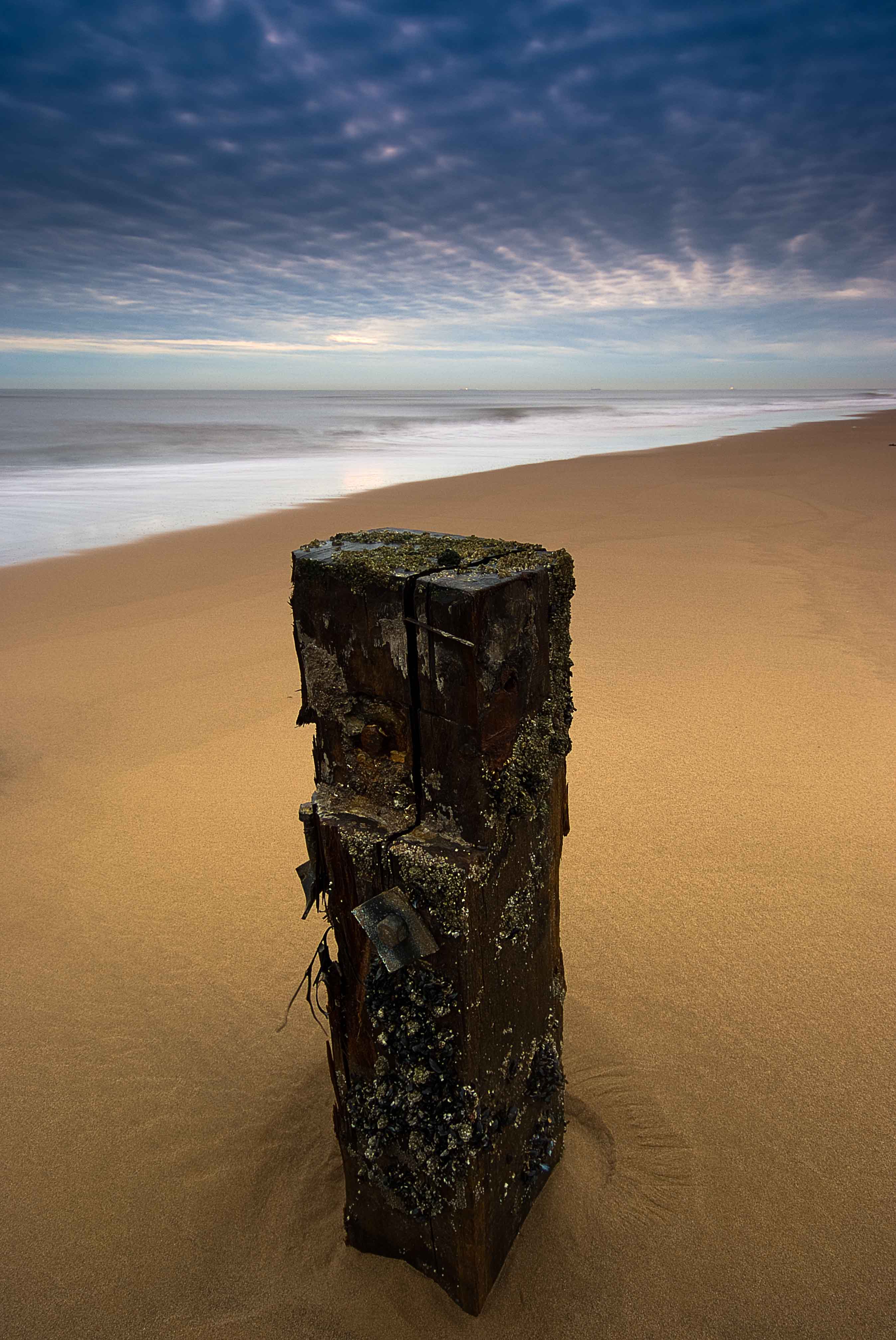
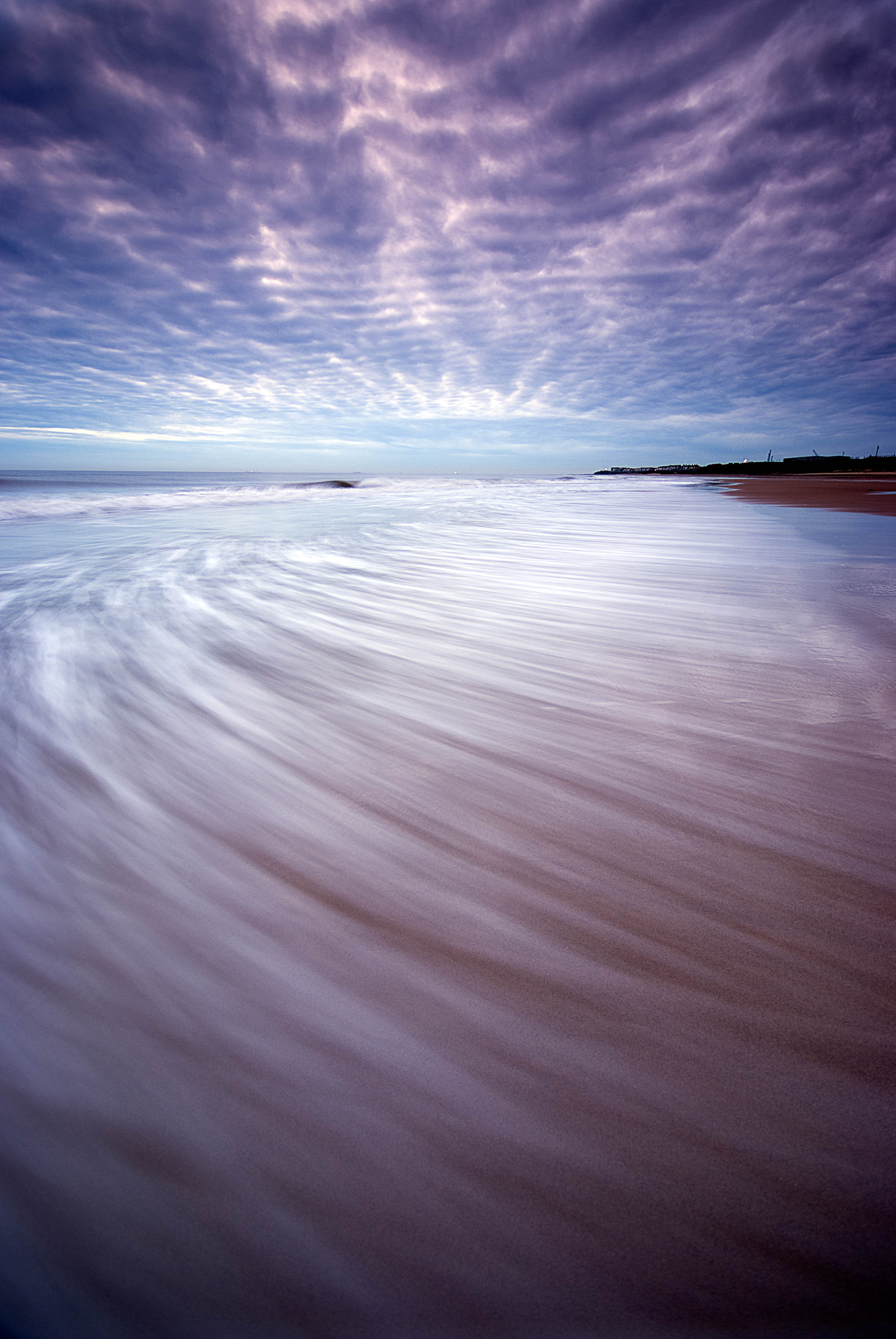
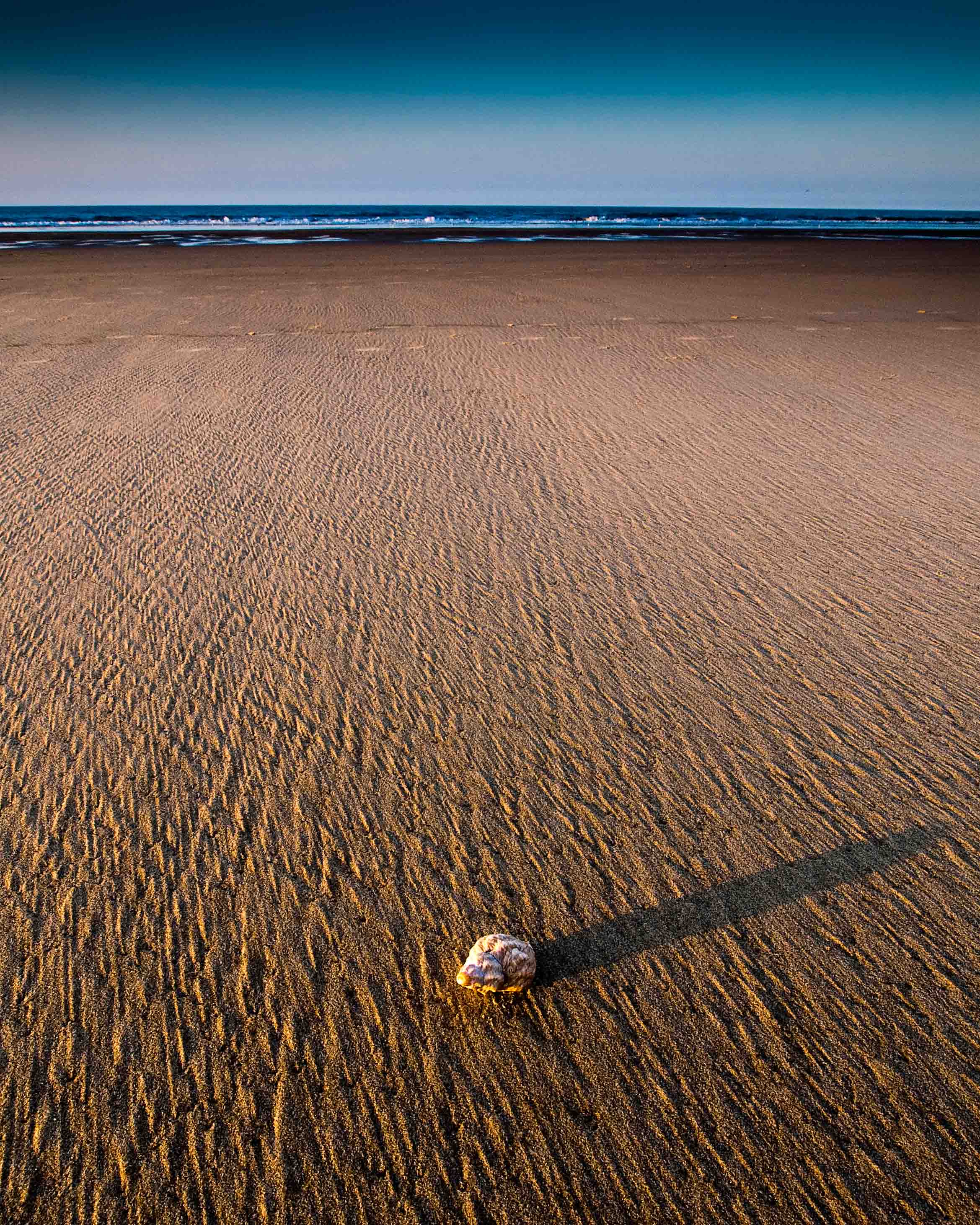
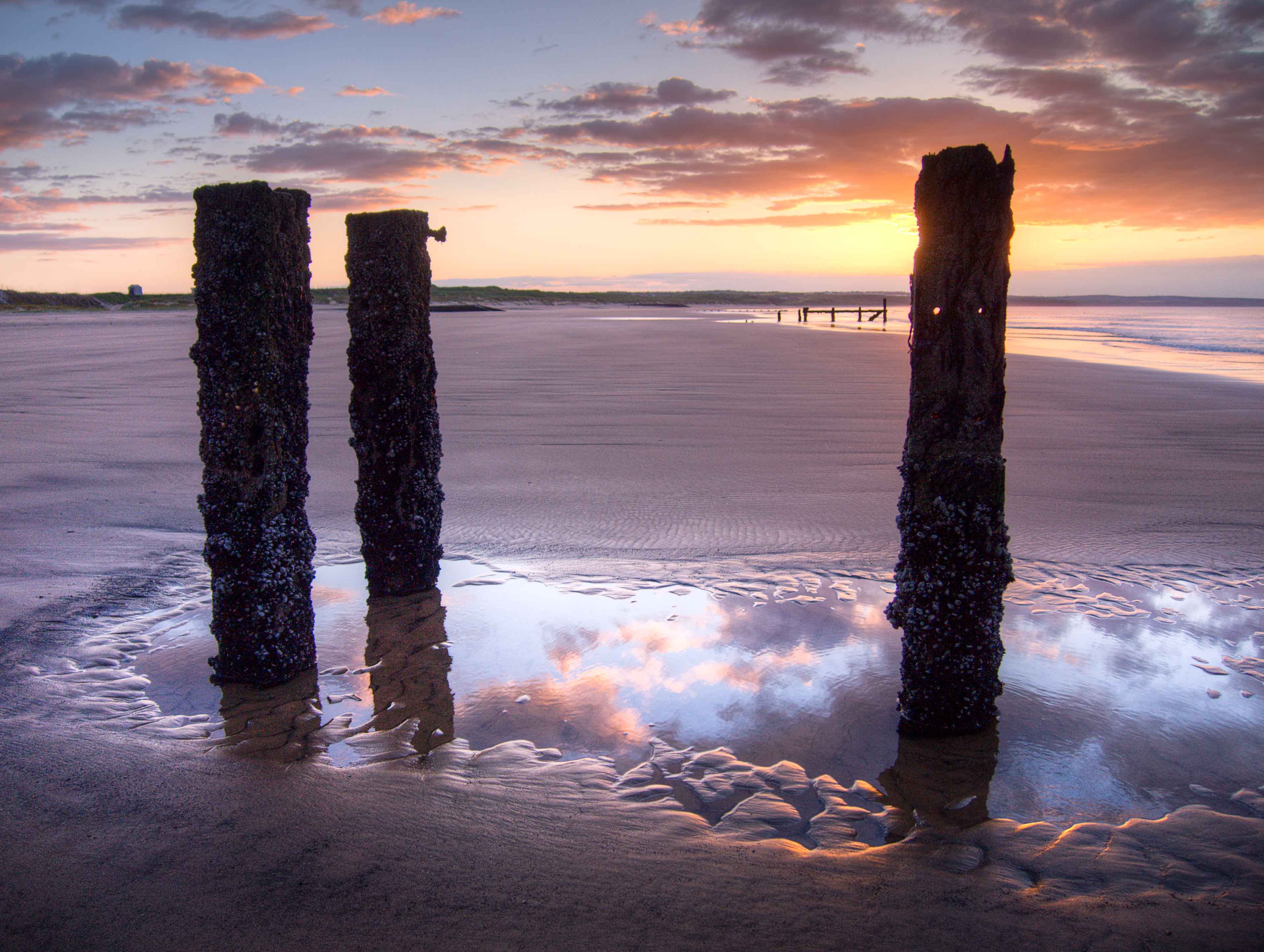
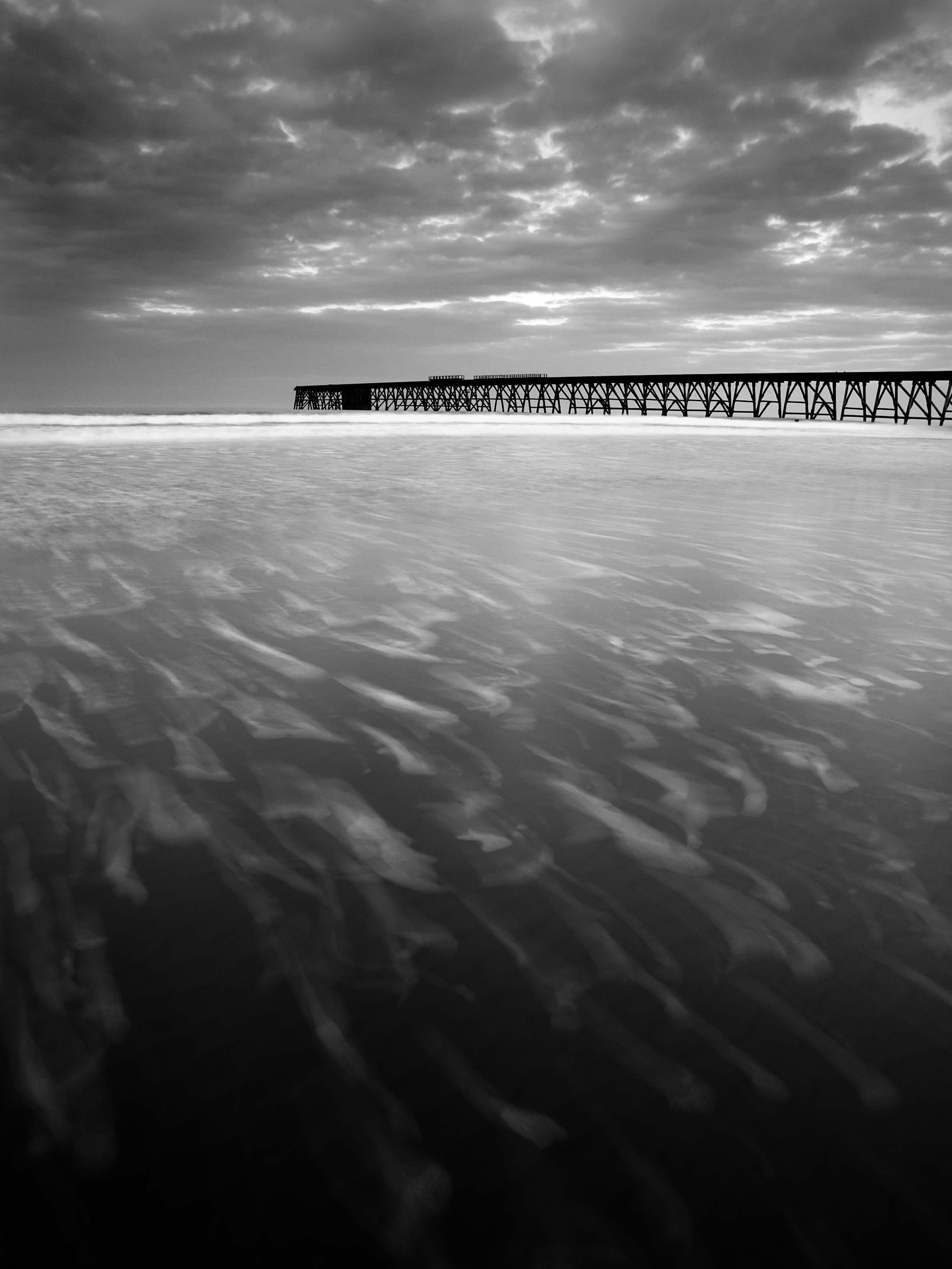
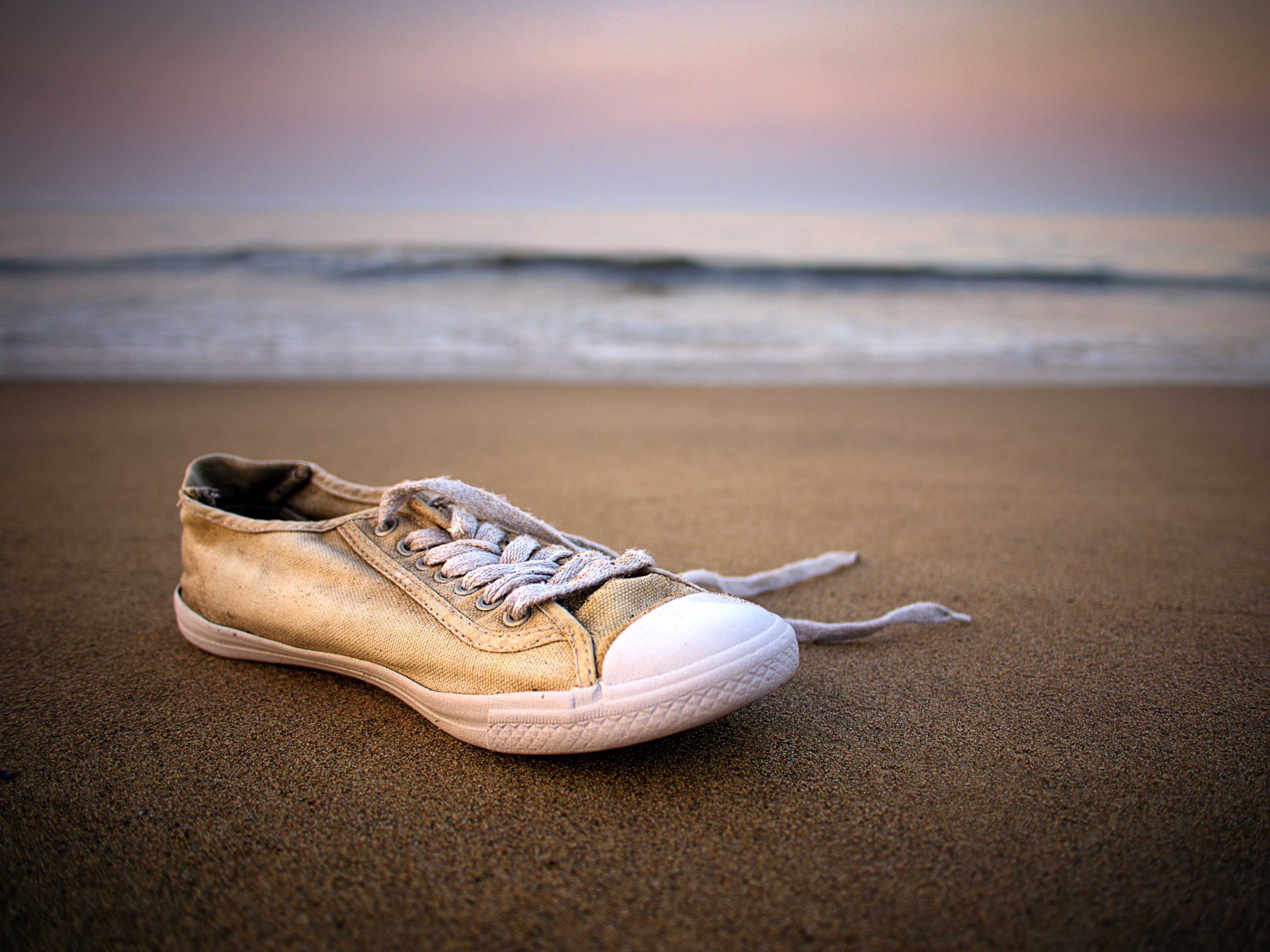
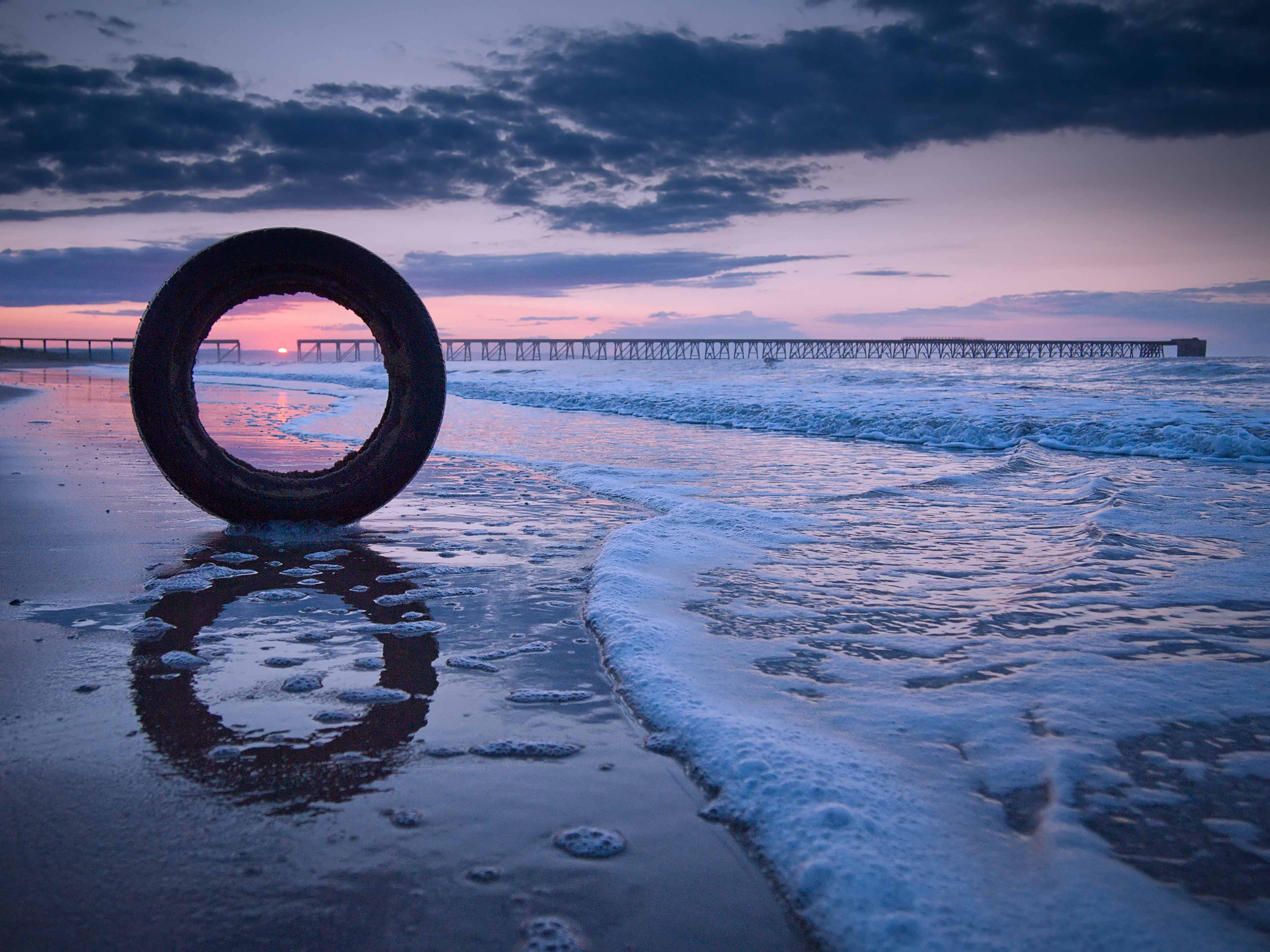
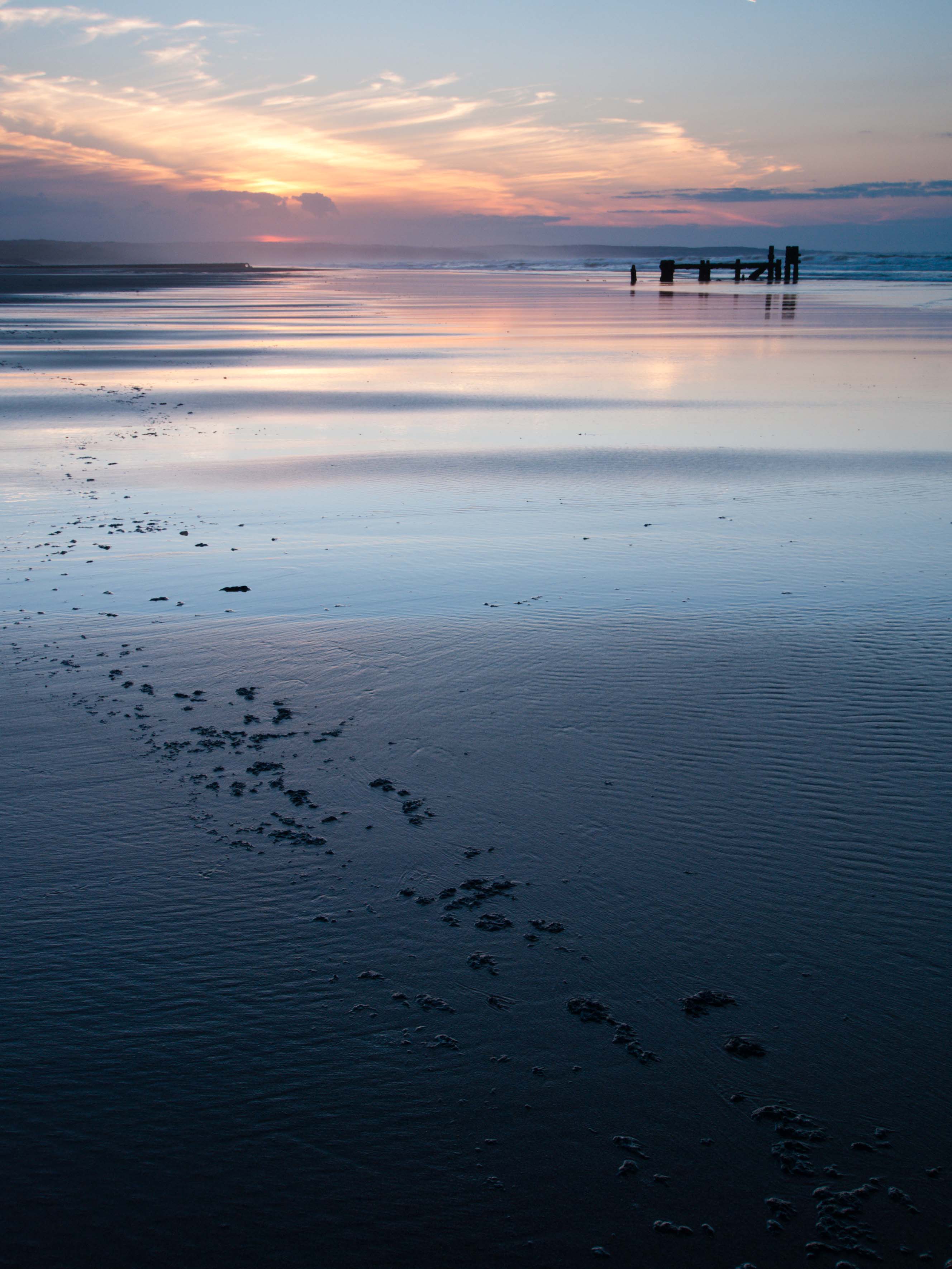
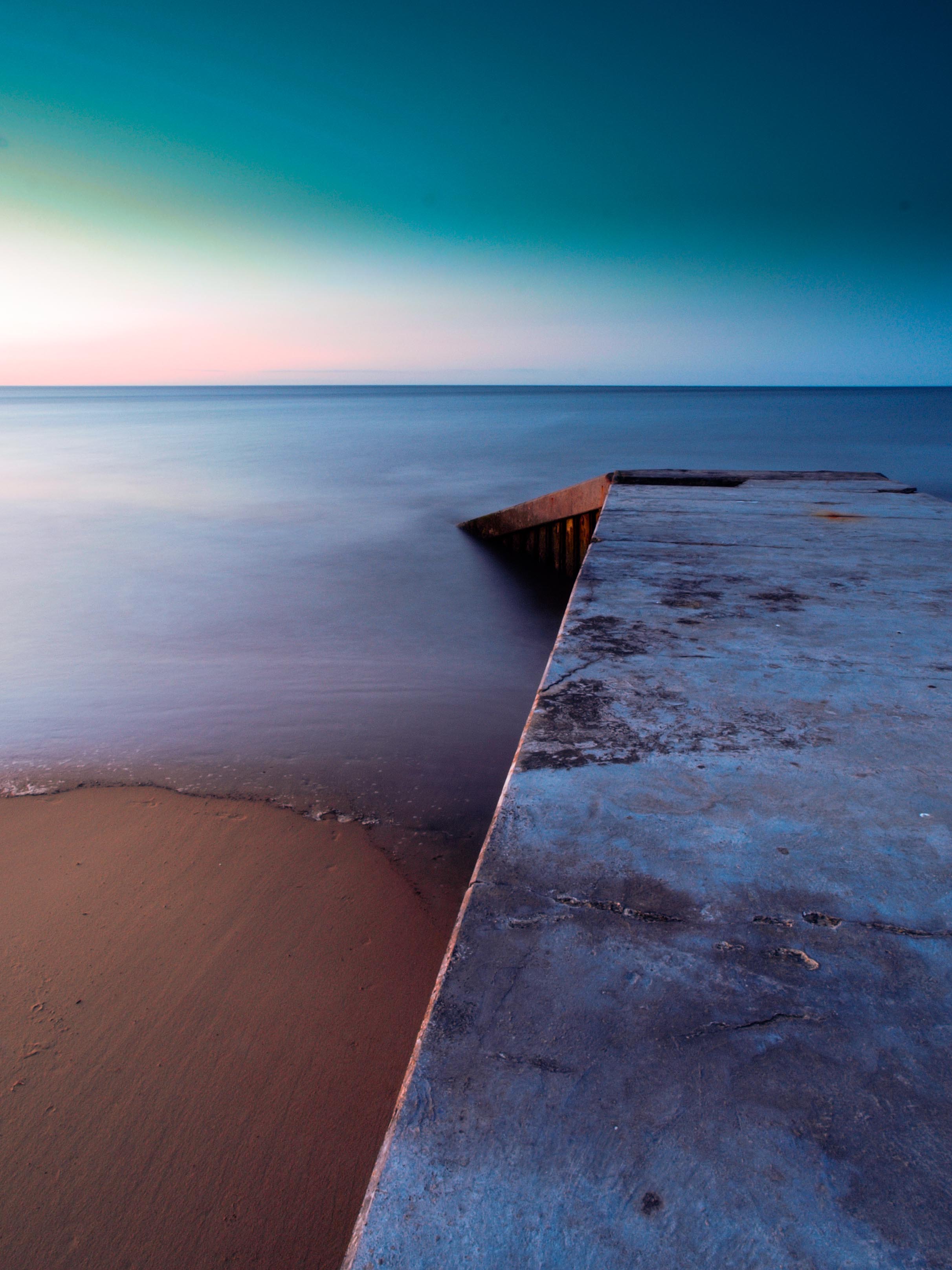
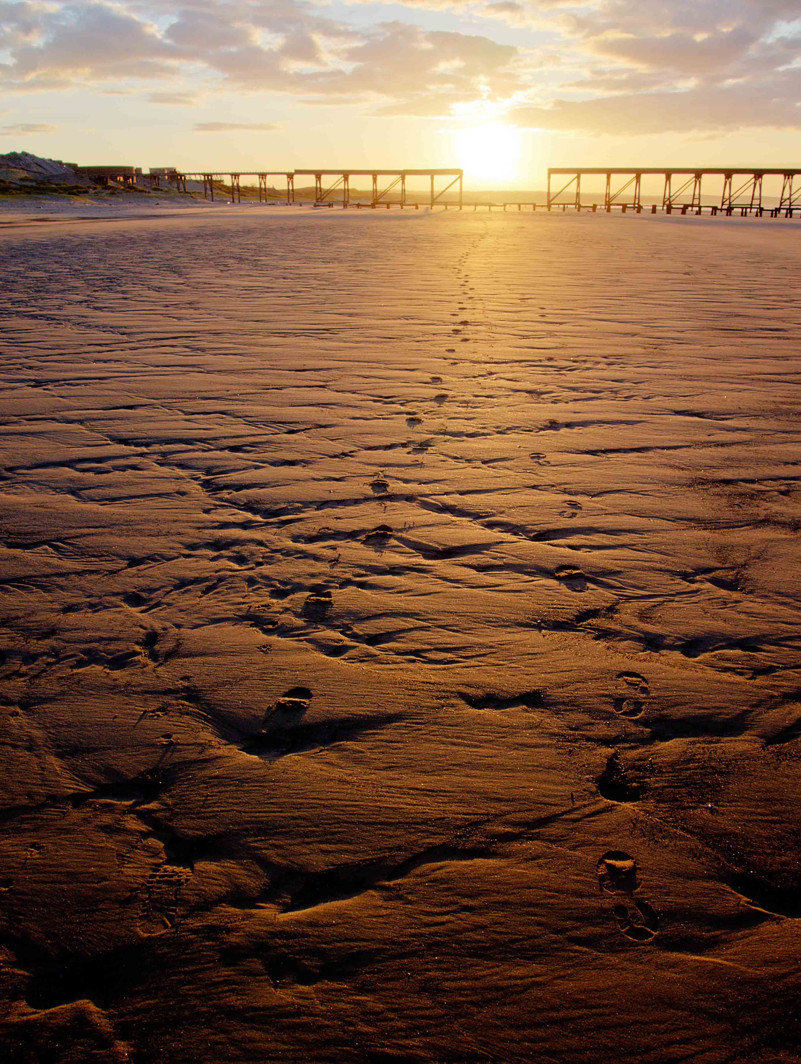
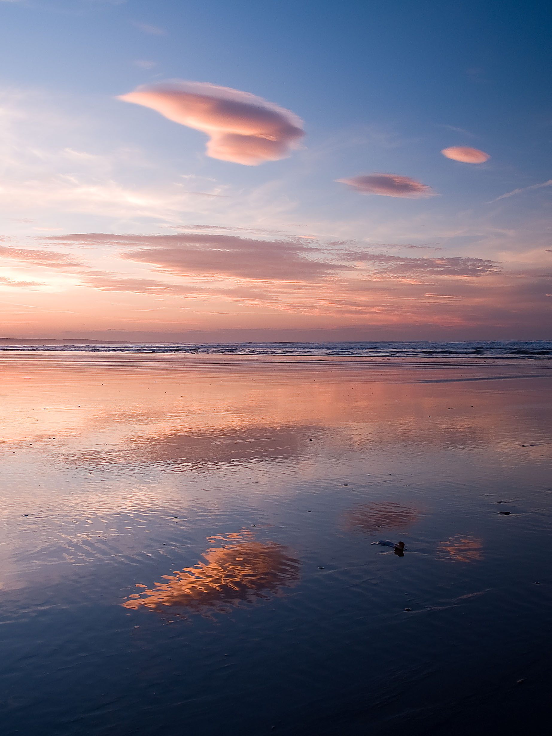
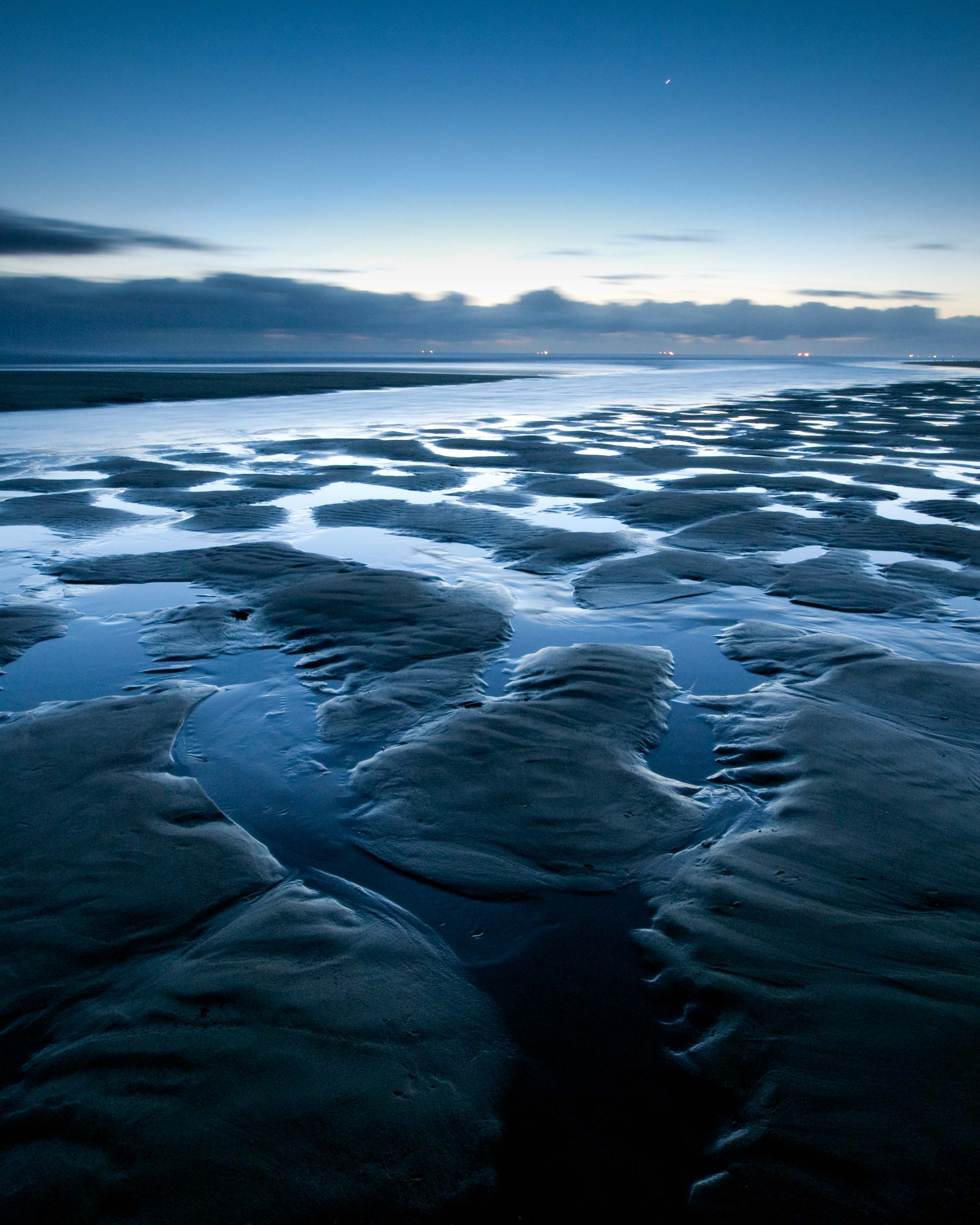
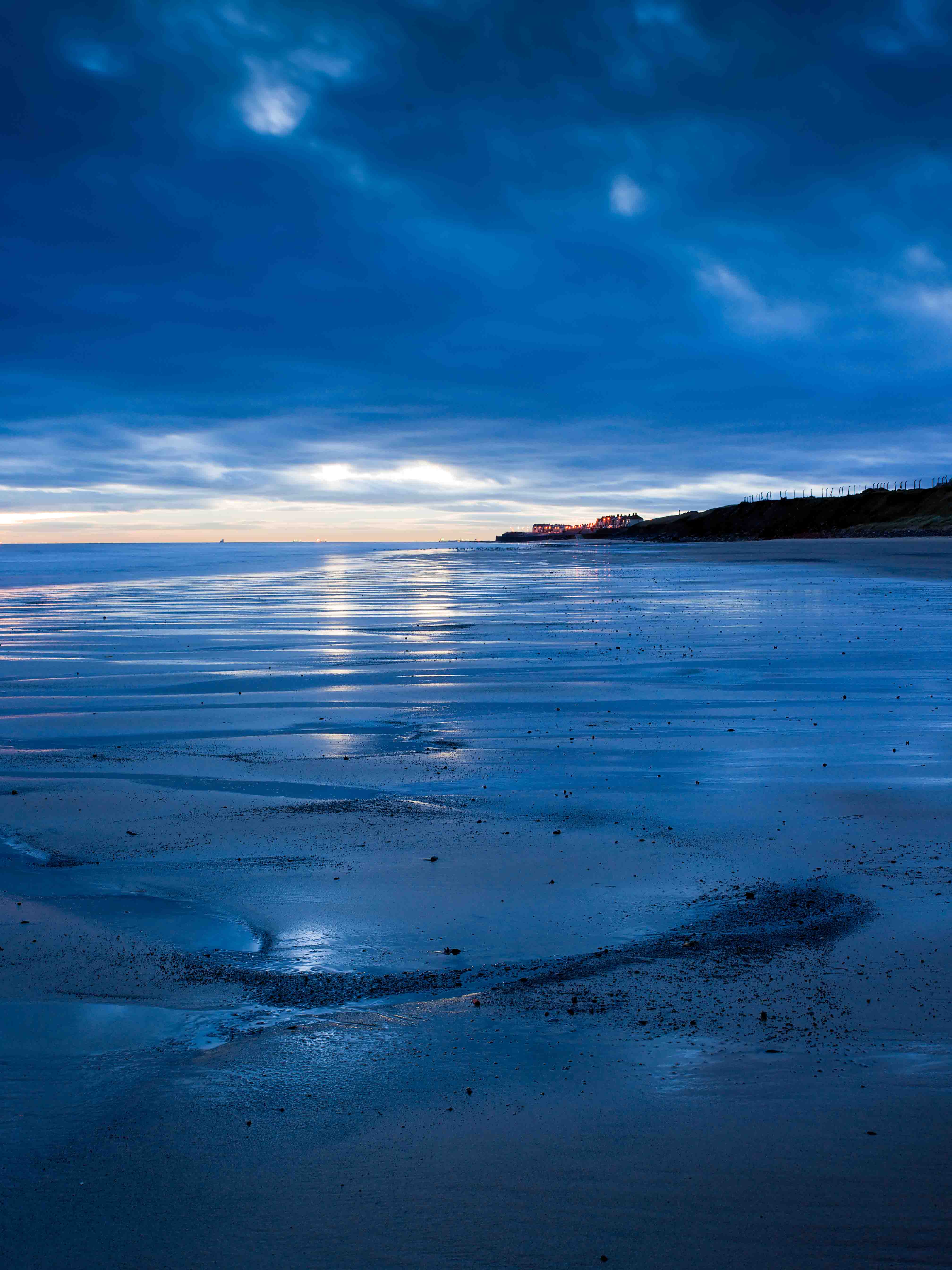
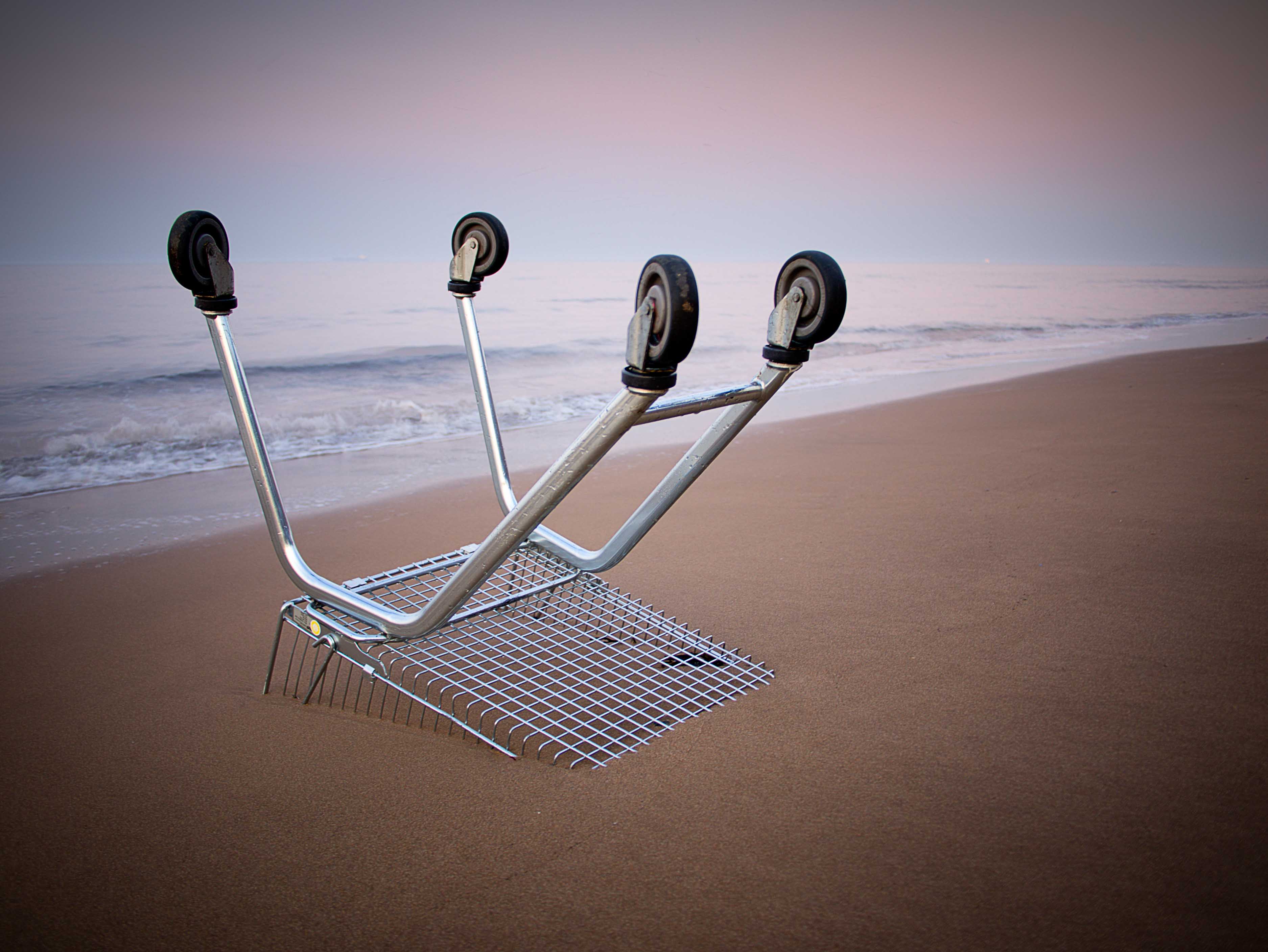


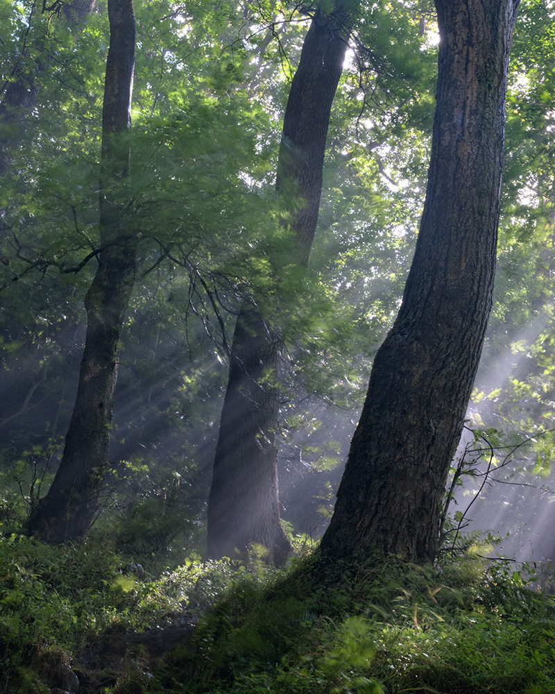
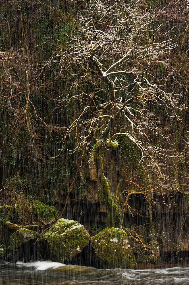
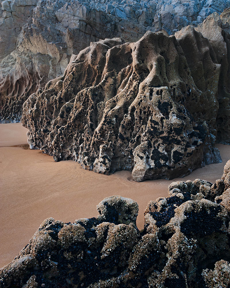
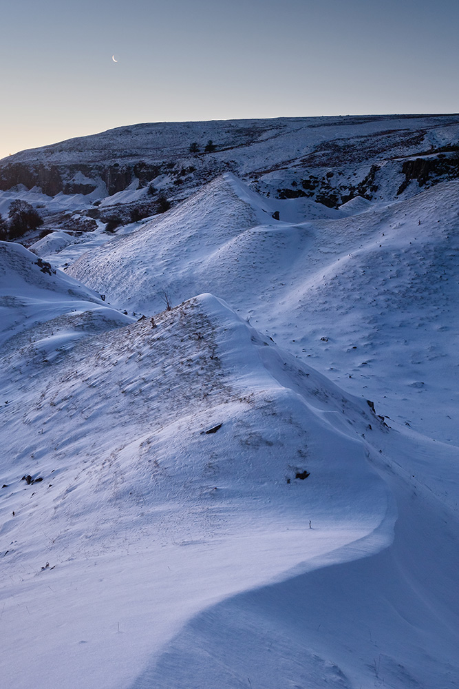
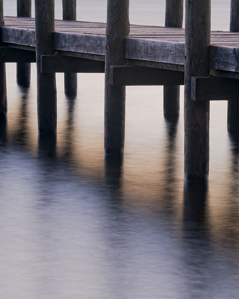
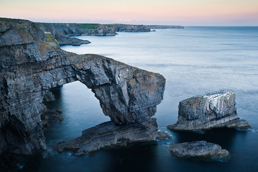
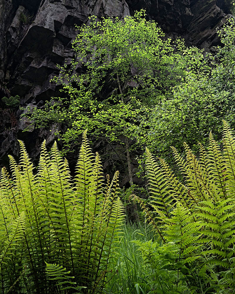
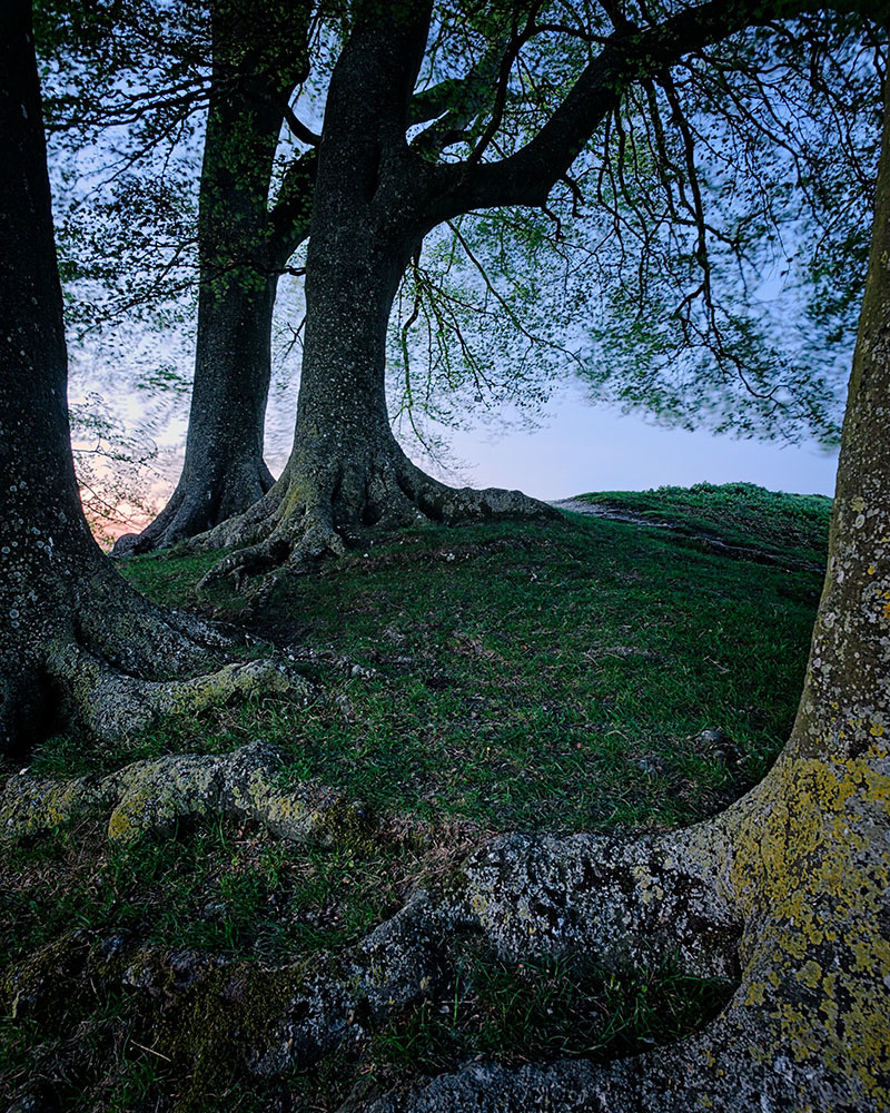
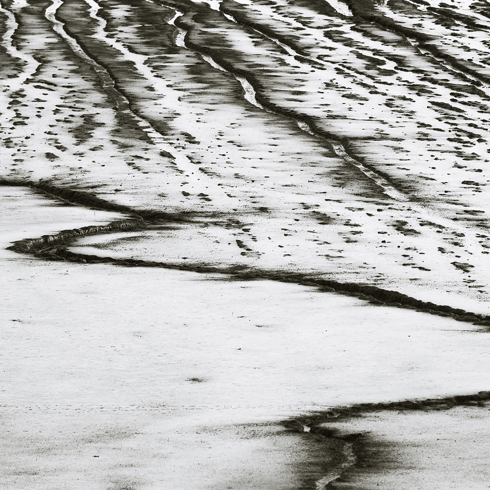


")


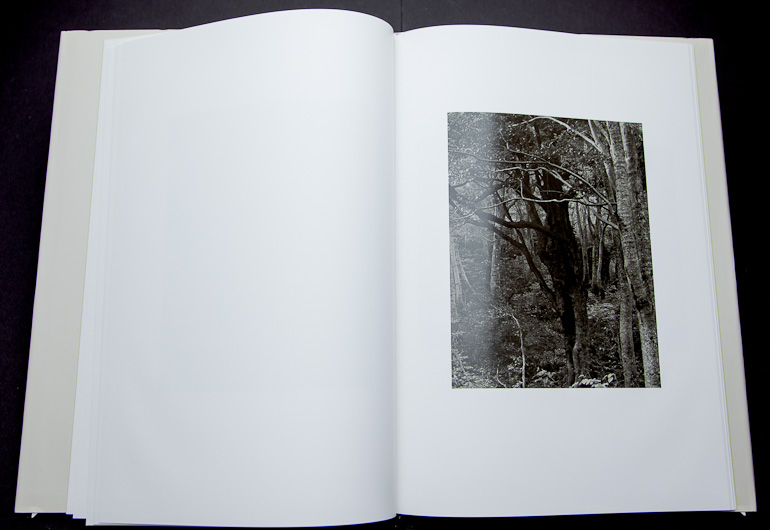
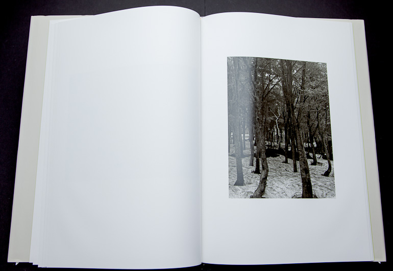
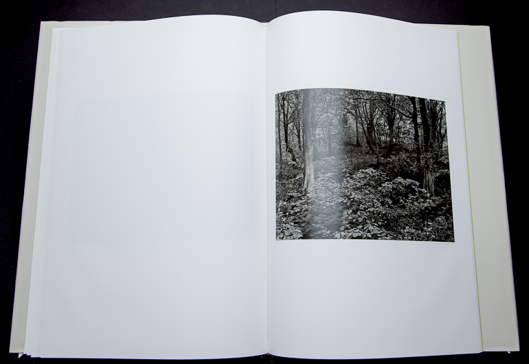
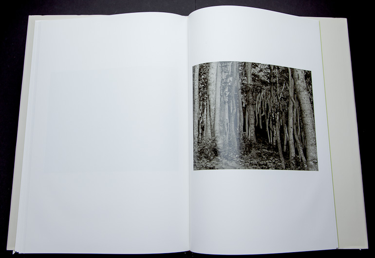


")


")
")
")
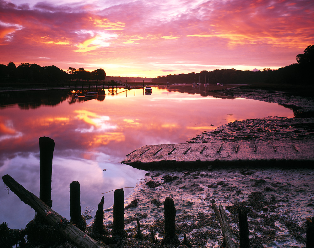
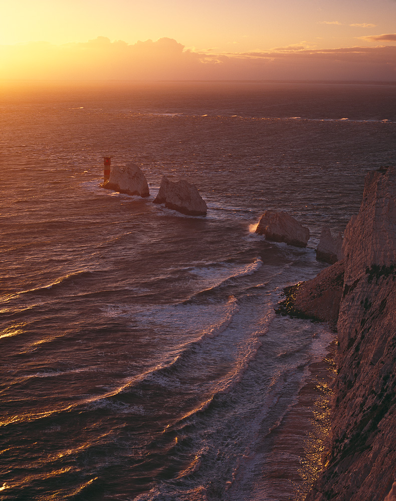
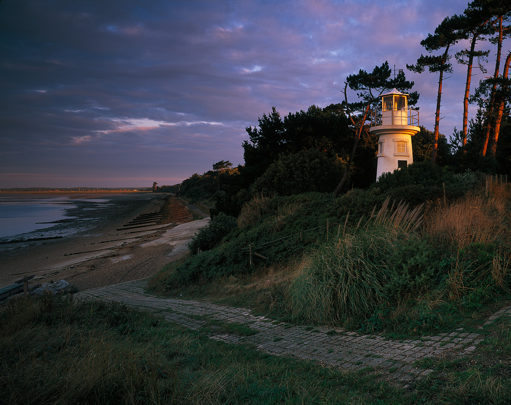
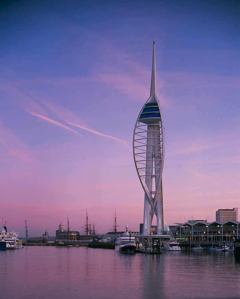
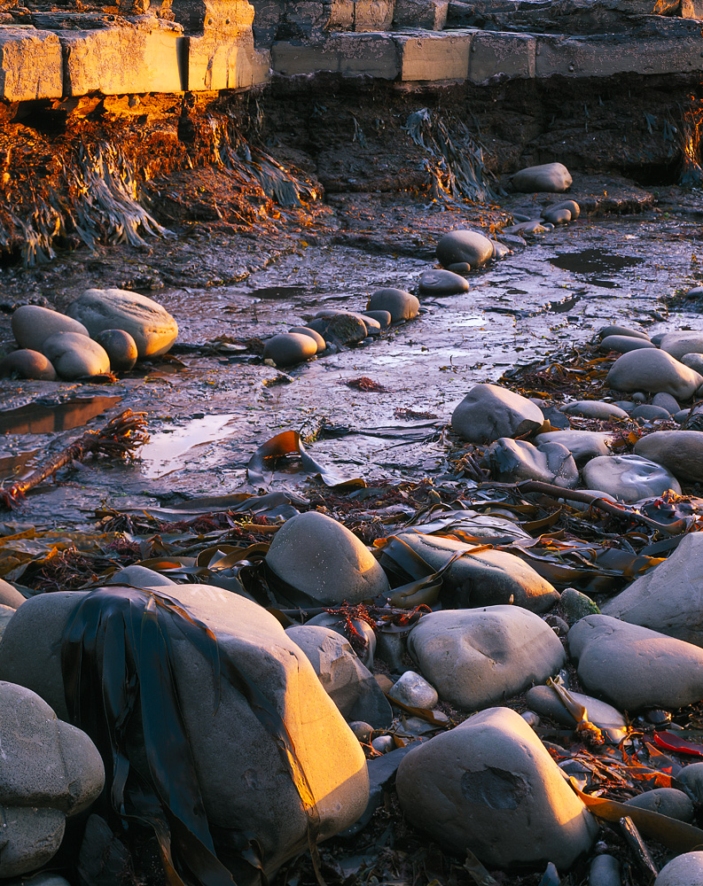
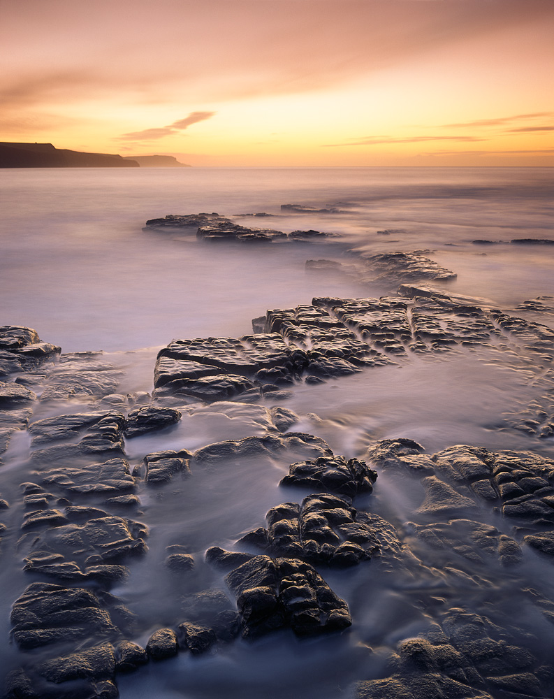
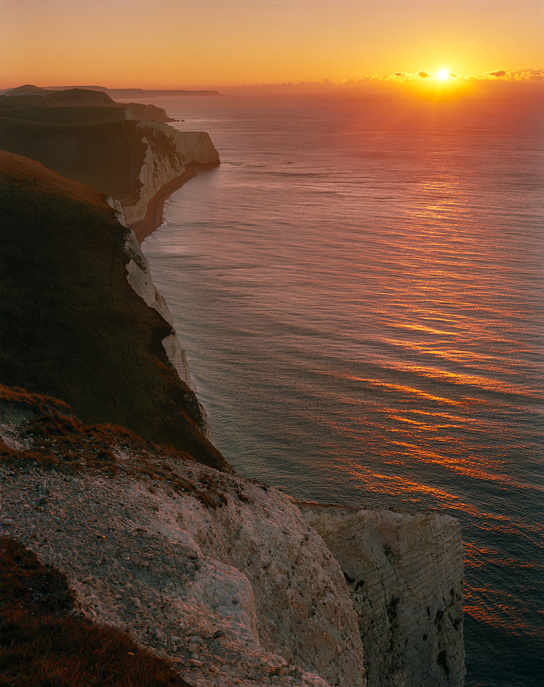
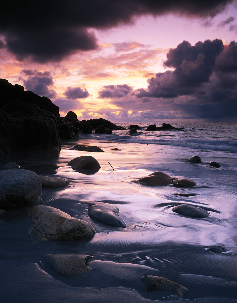
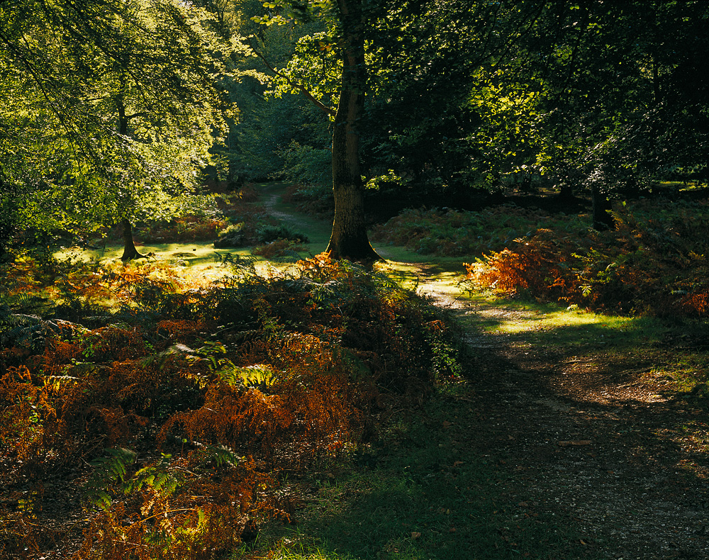
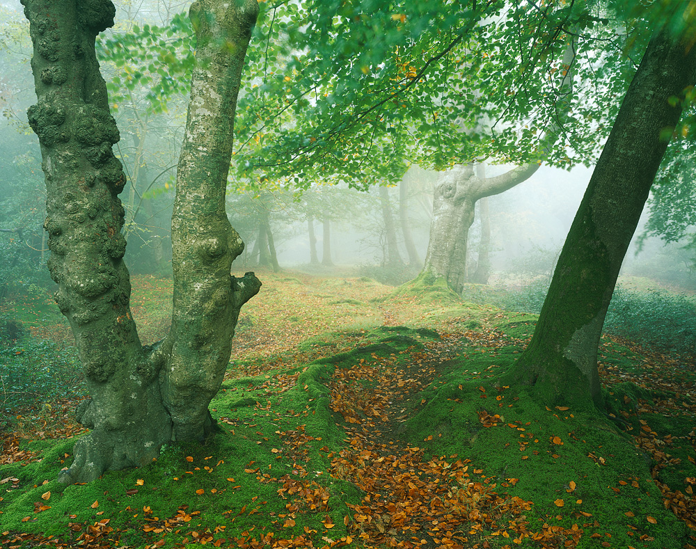
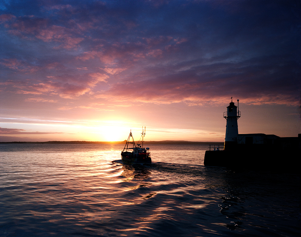
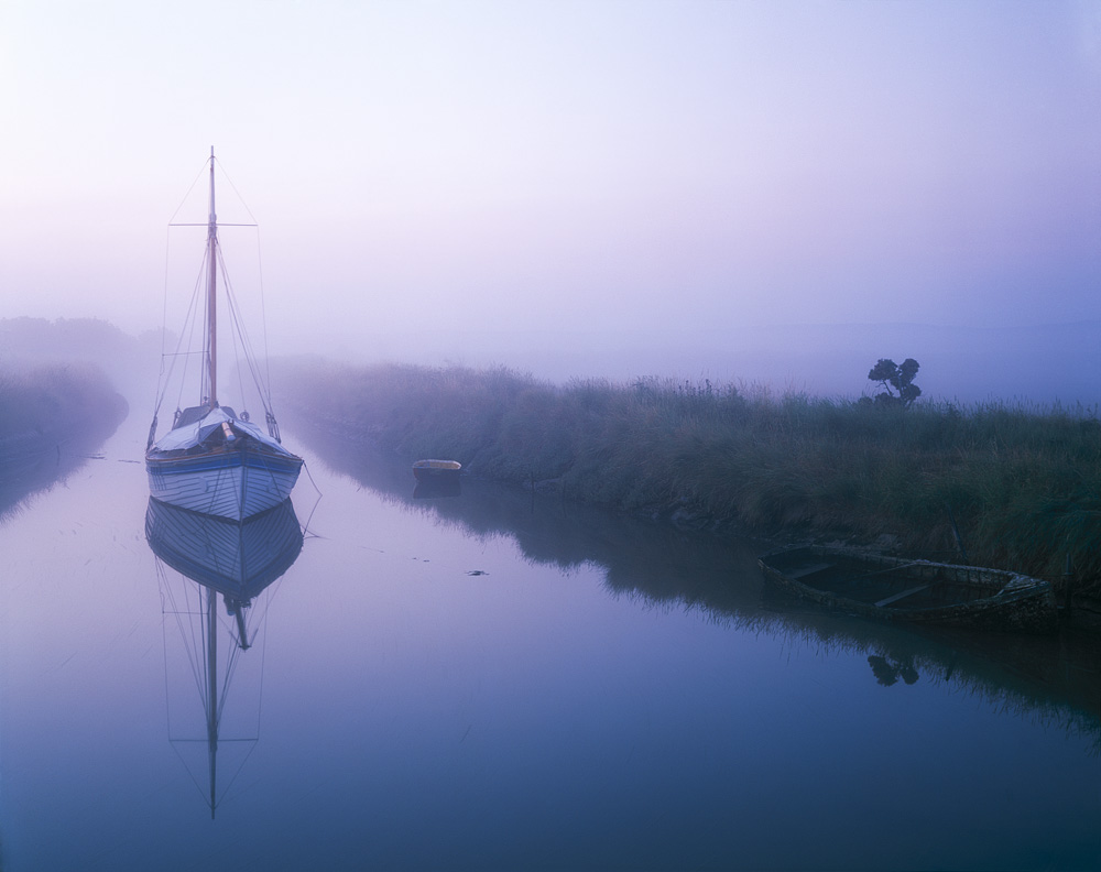
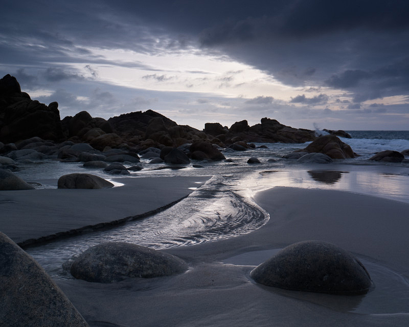
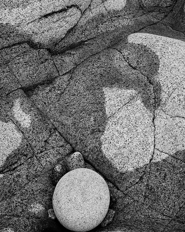
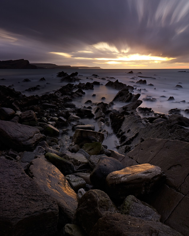


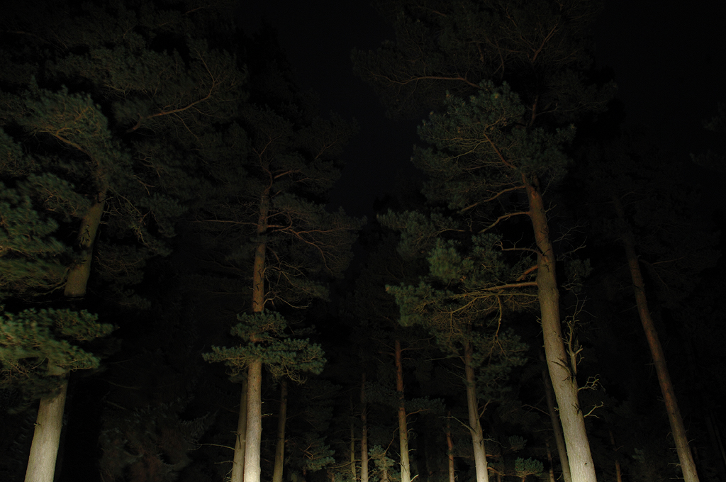


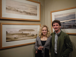
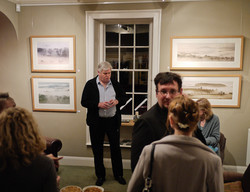
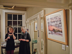
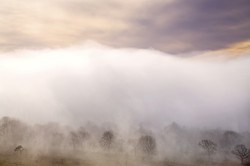
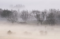
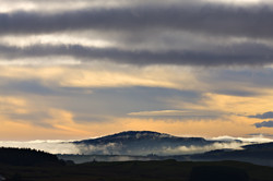
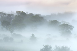
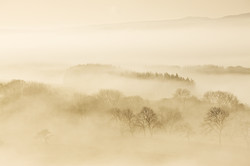


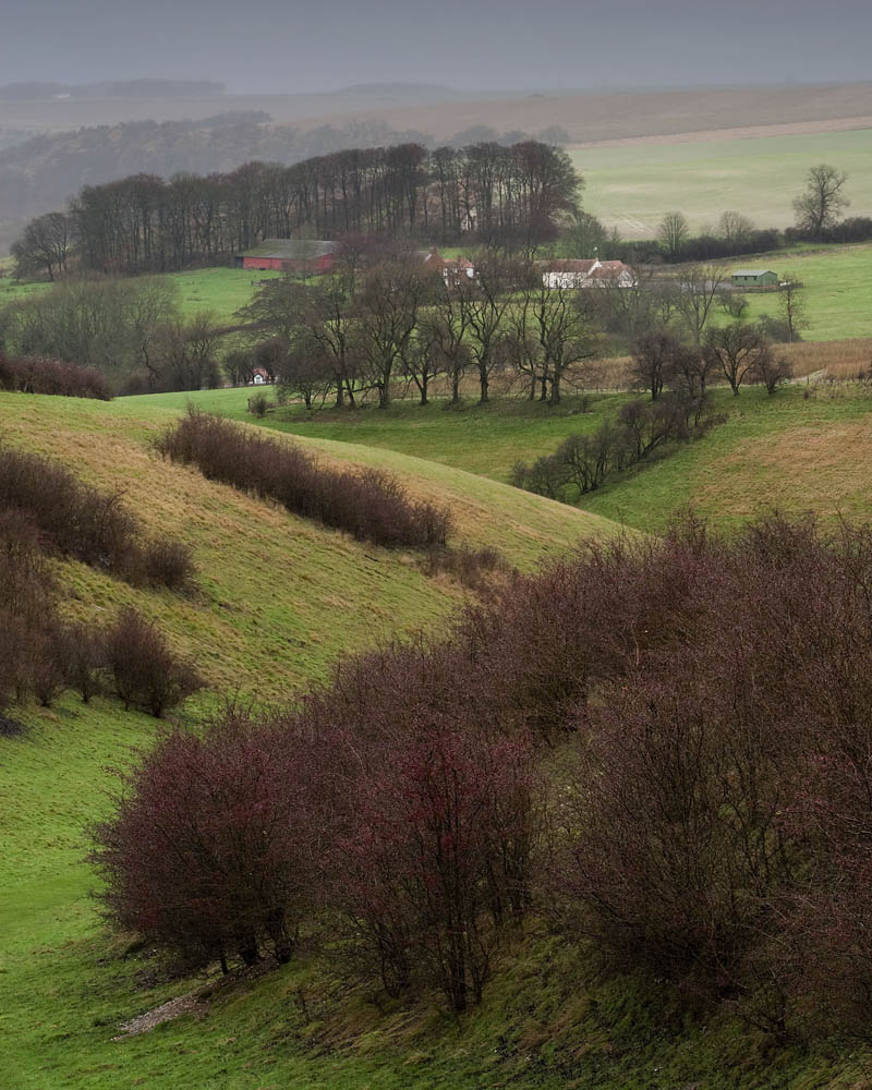
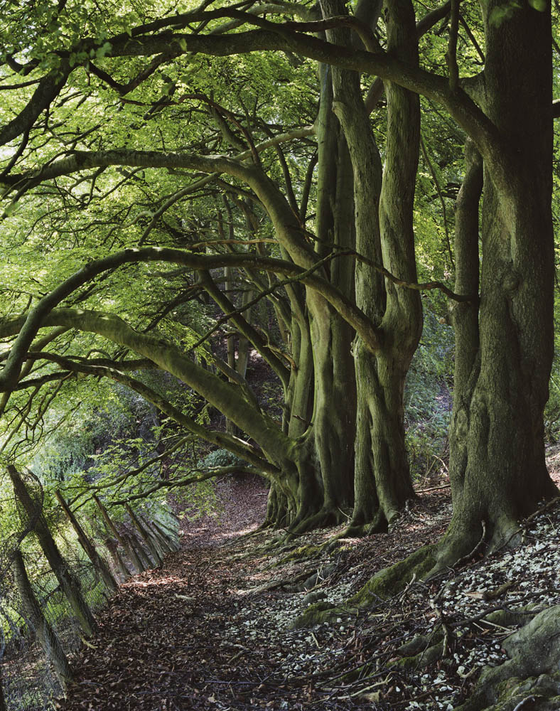
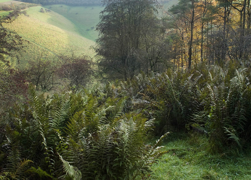
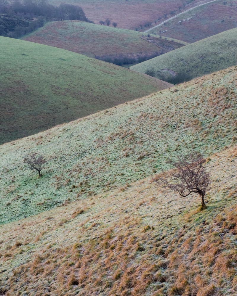
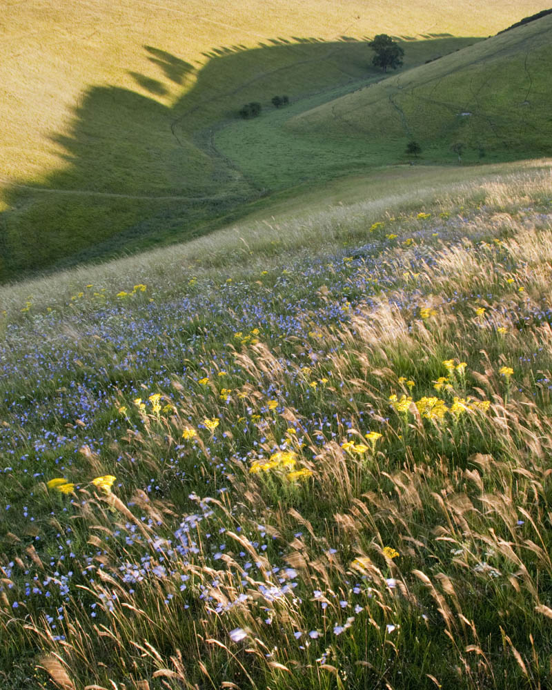
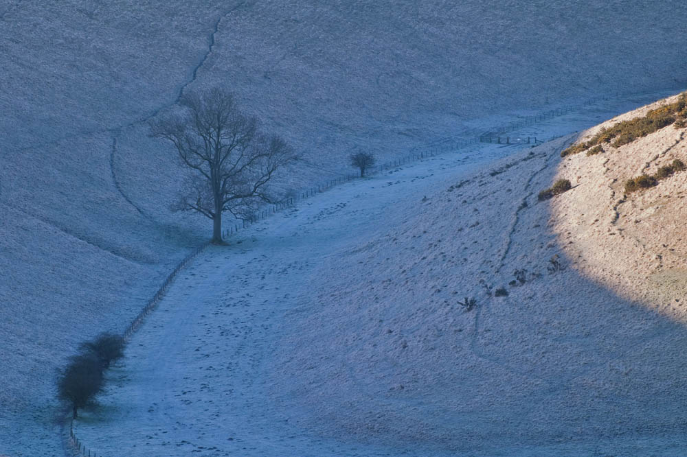
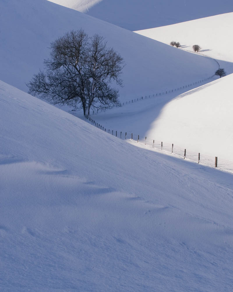
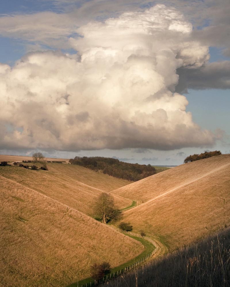
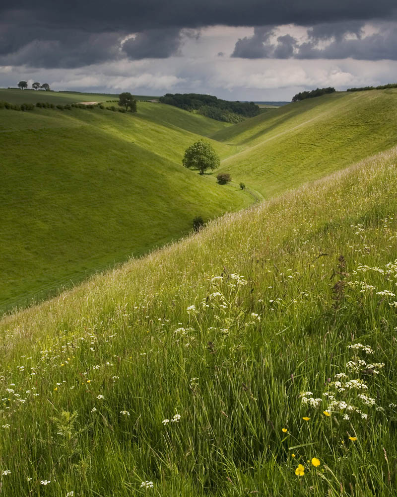
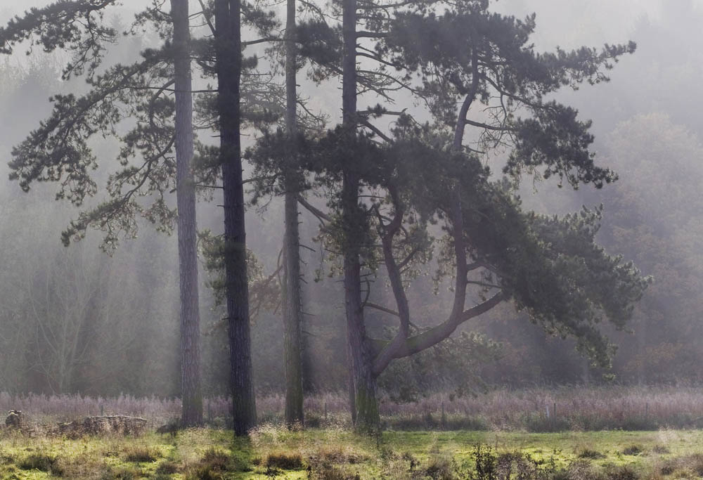
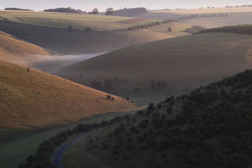
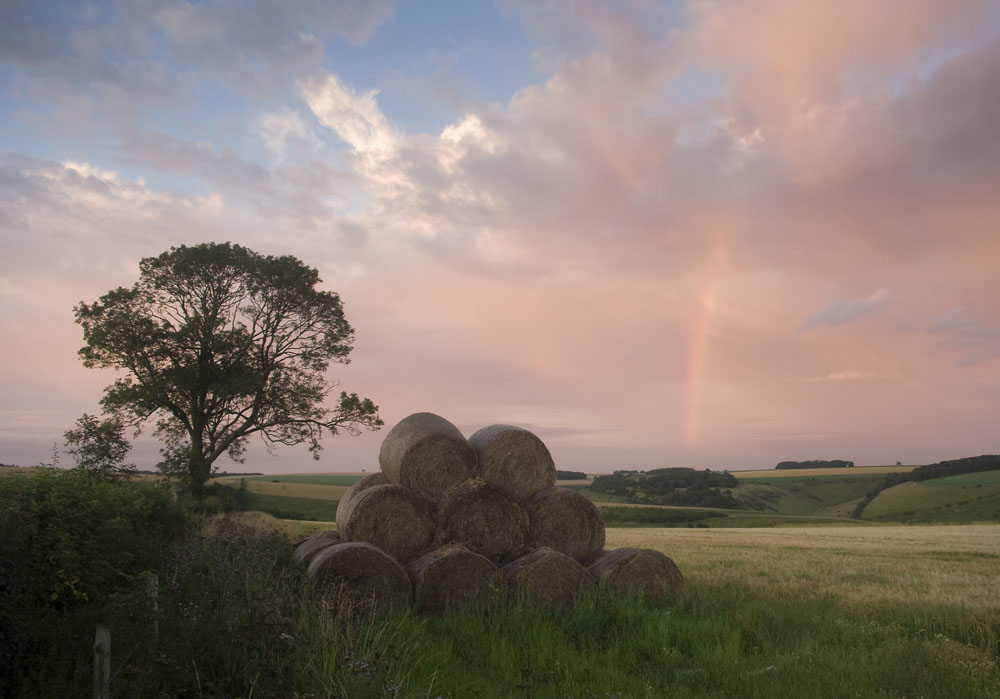
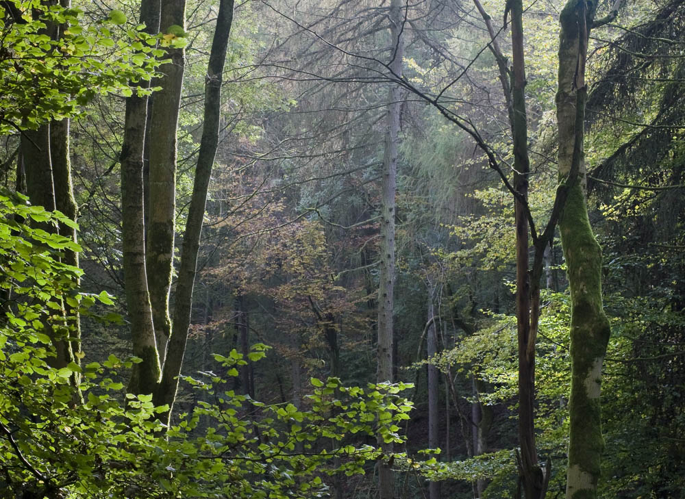
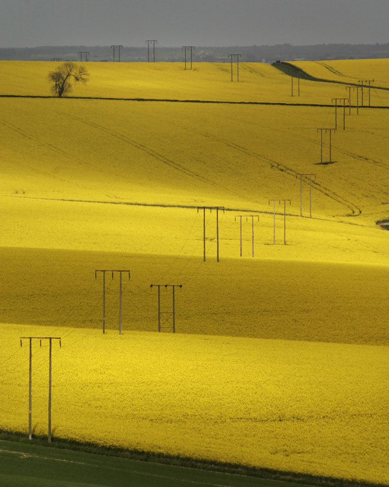
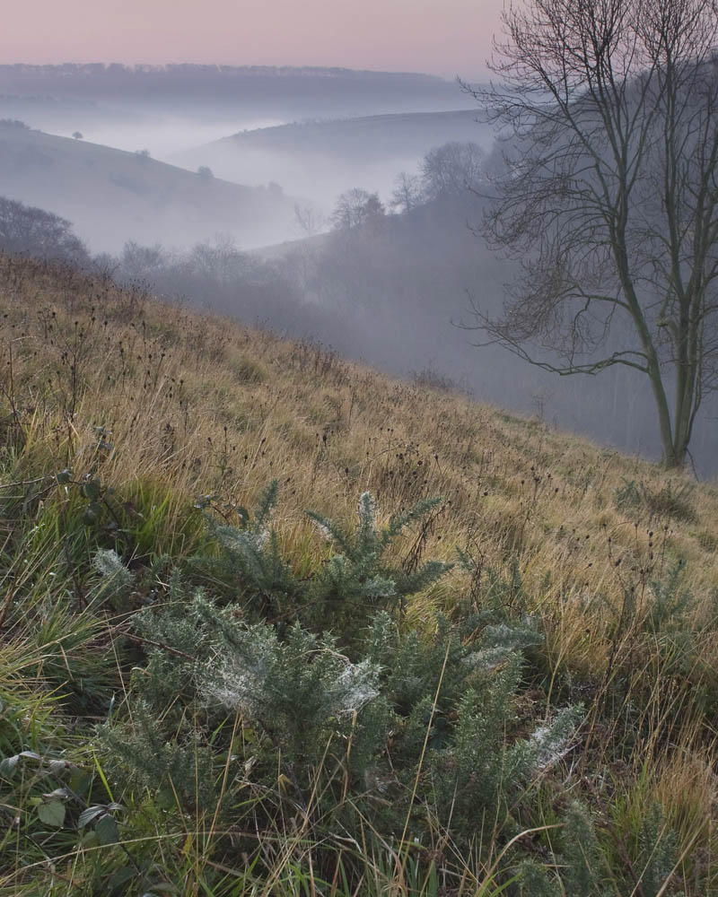
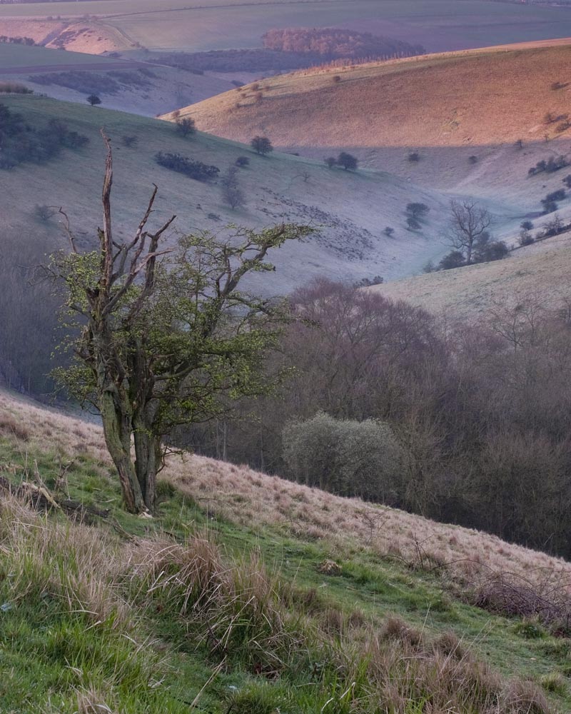
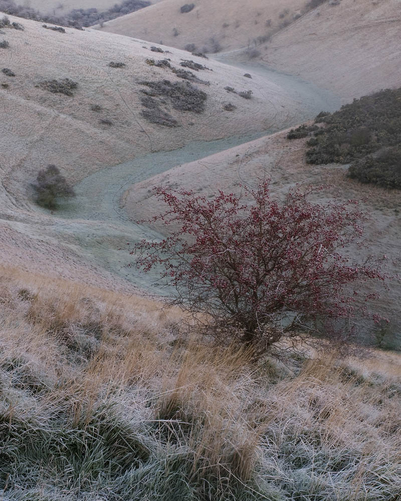
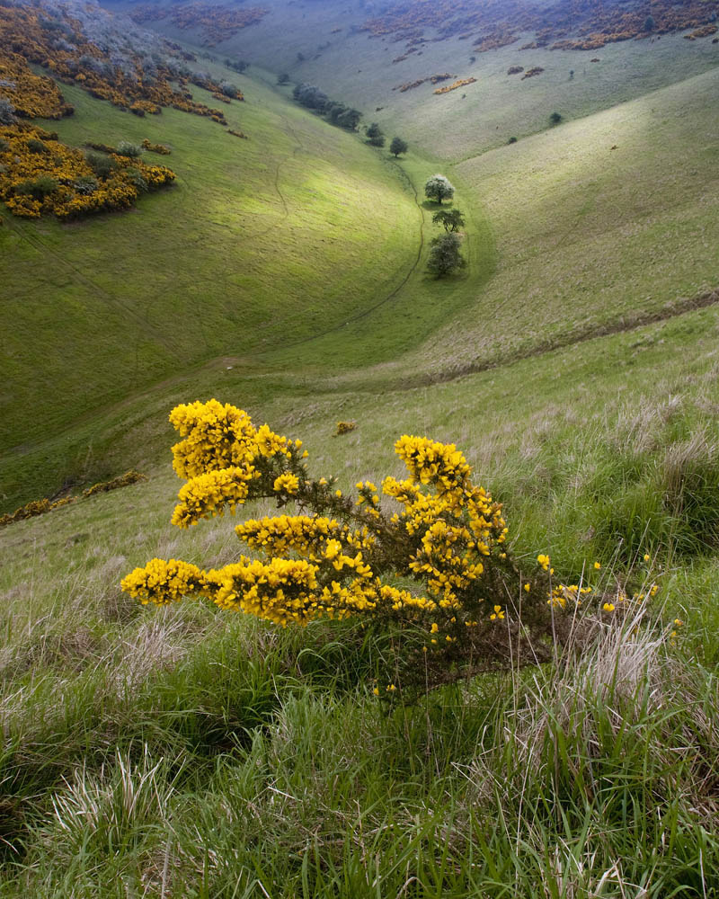
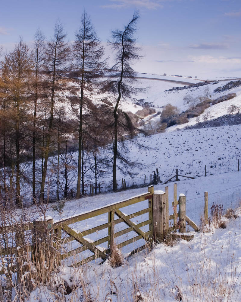
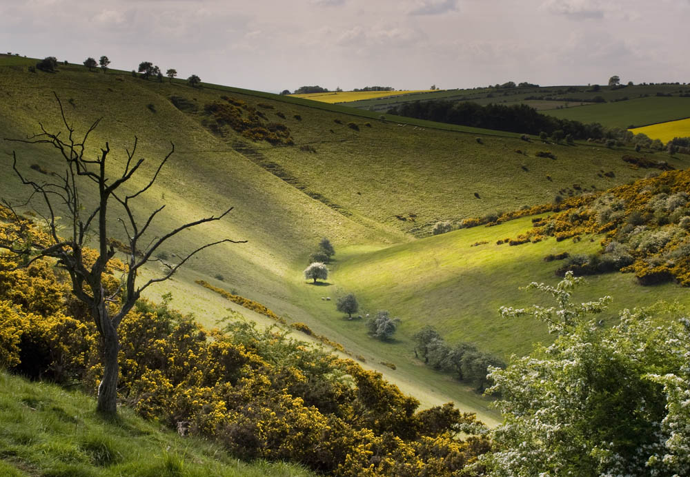
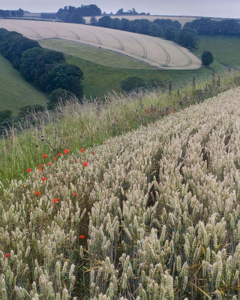
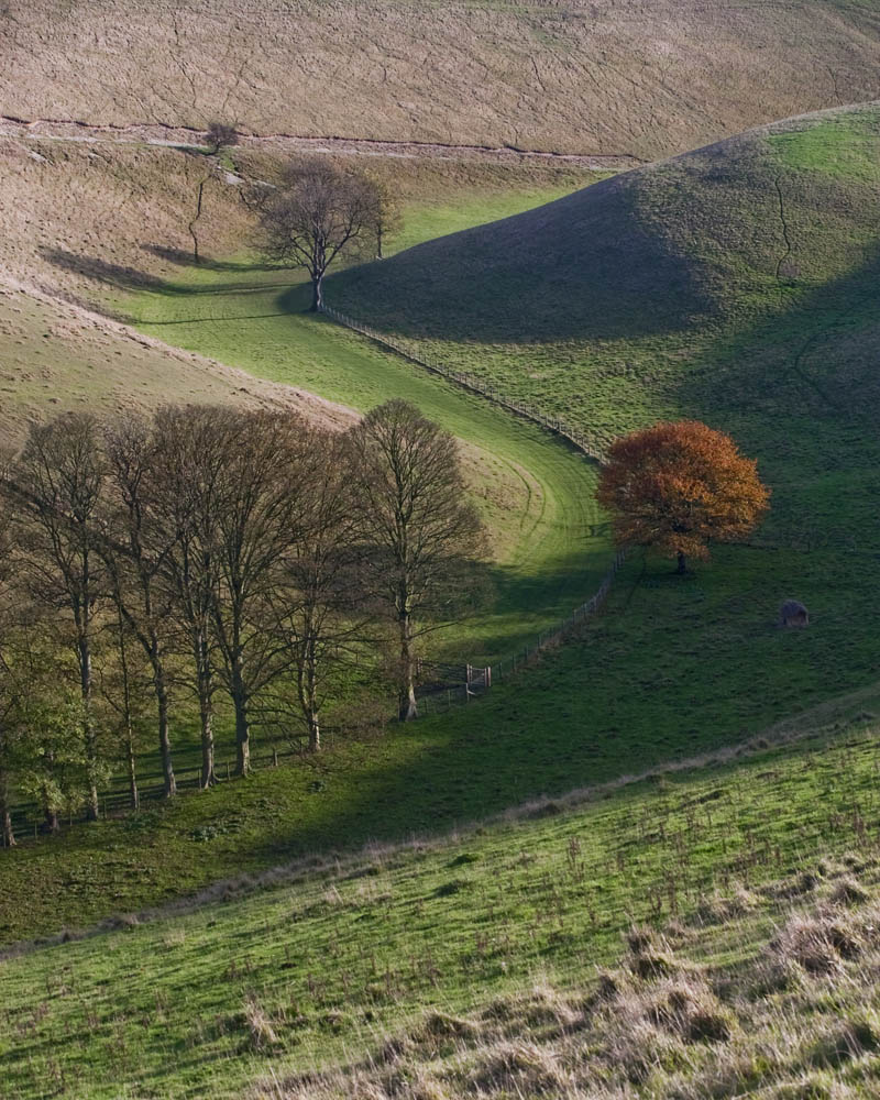
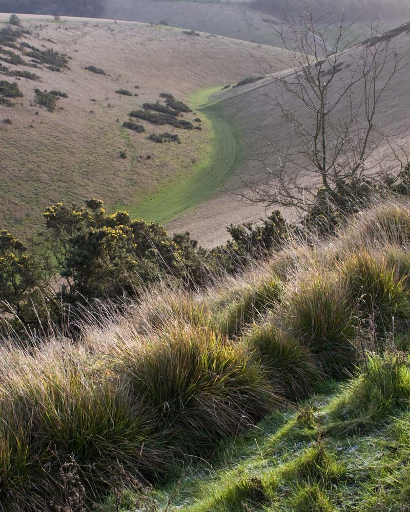


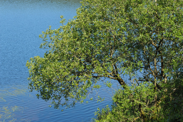
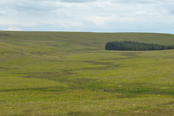
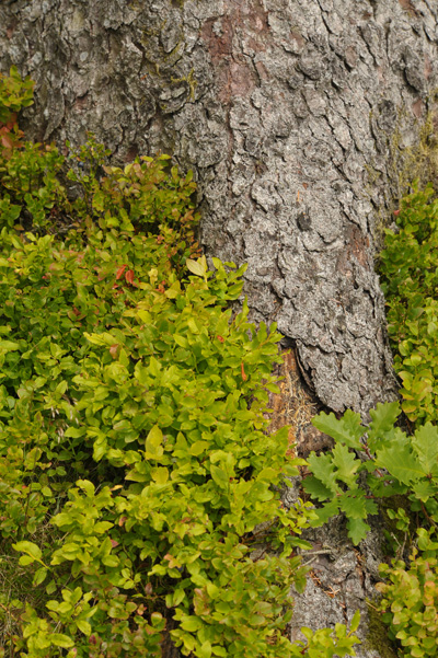
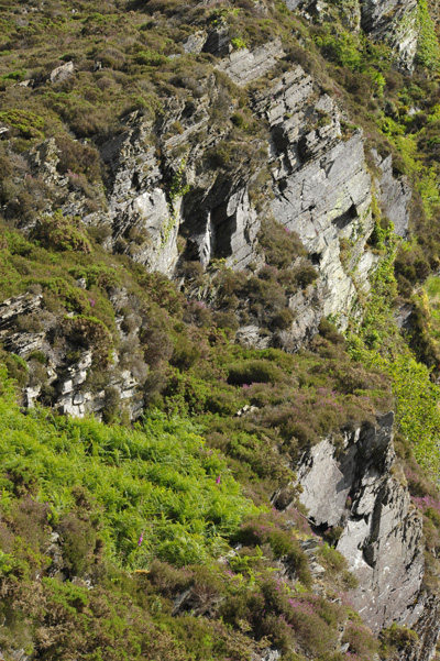
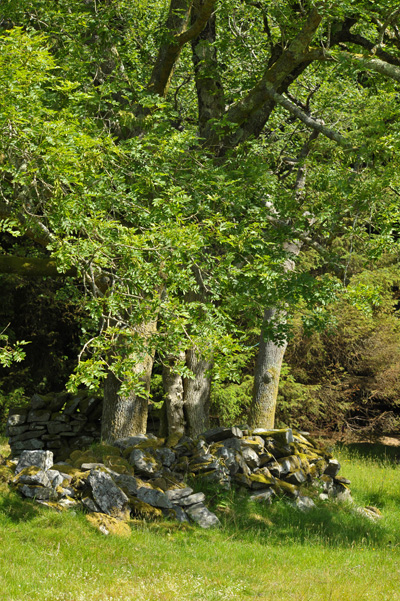
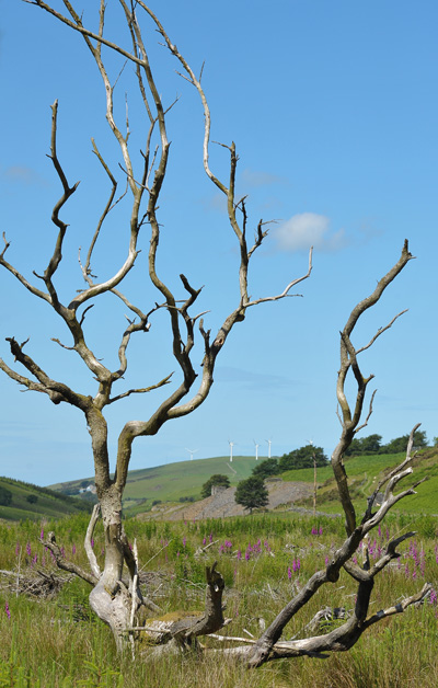
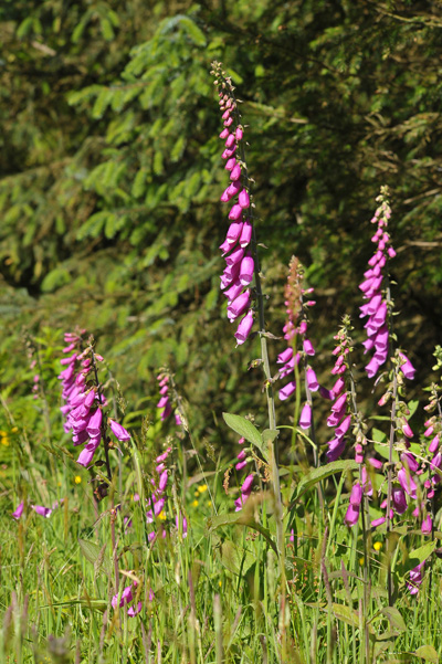
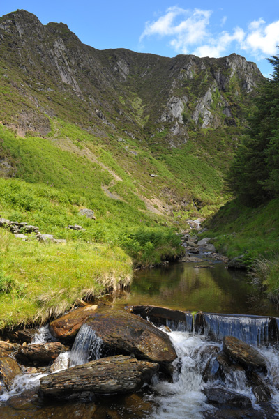


")


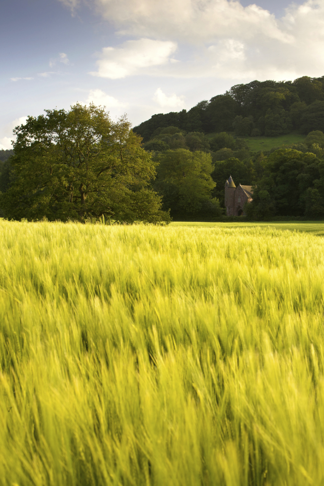
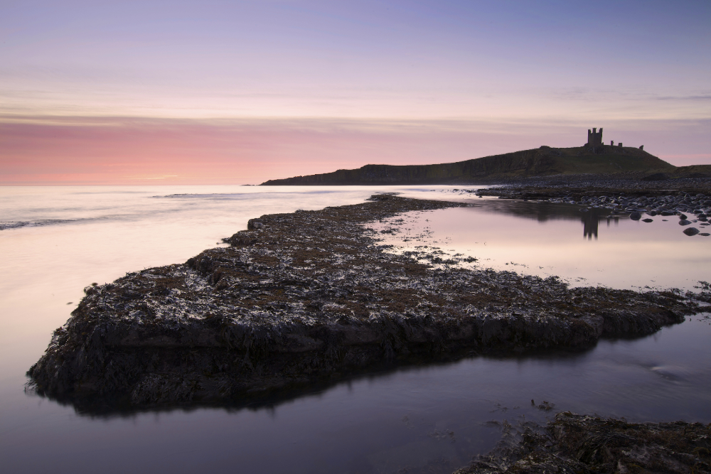
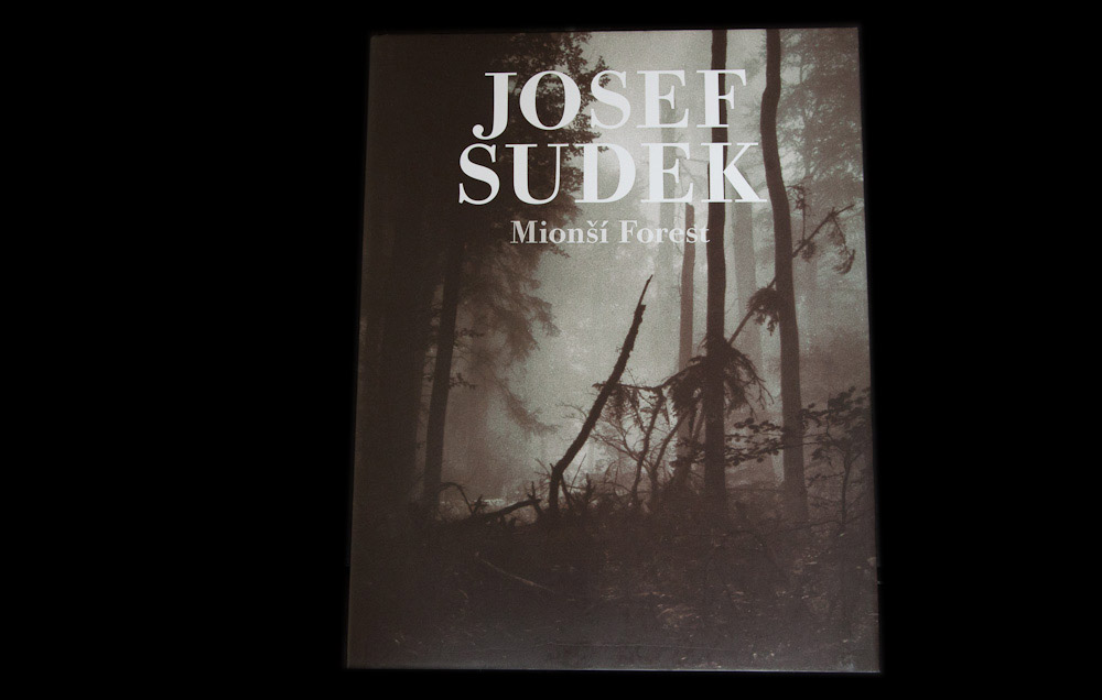
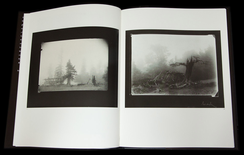
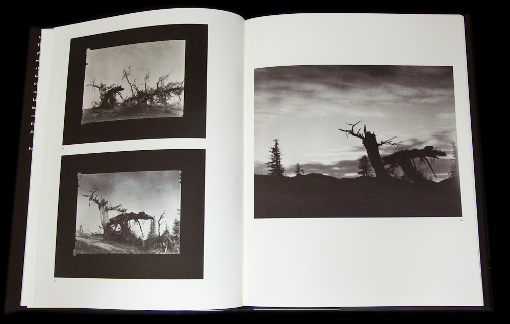
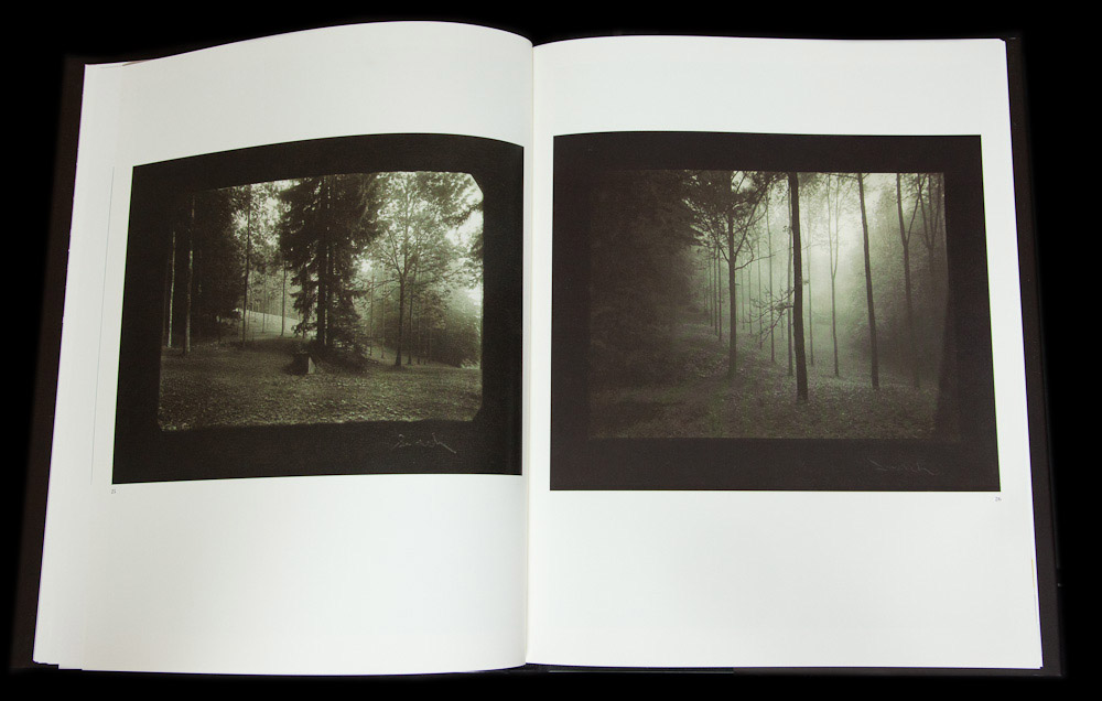
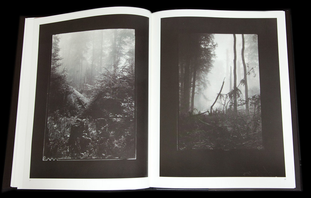
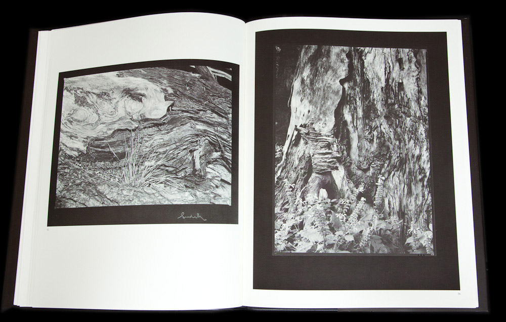
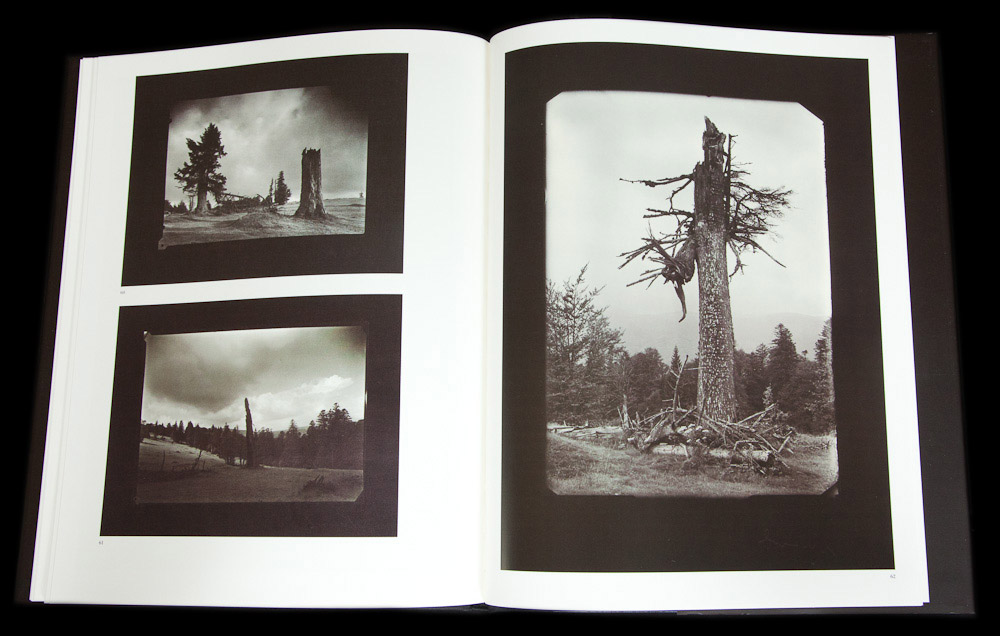
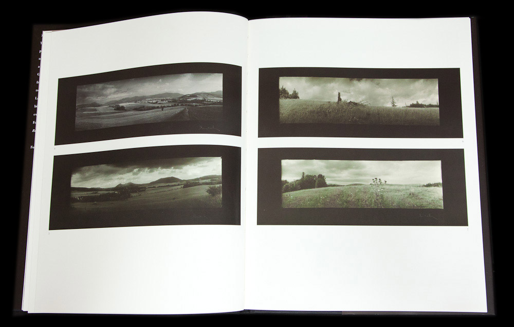
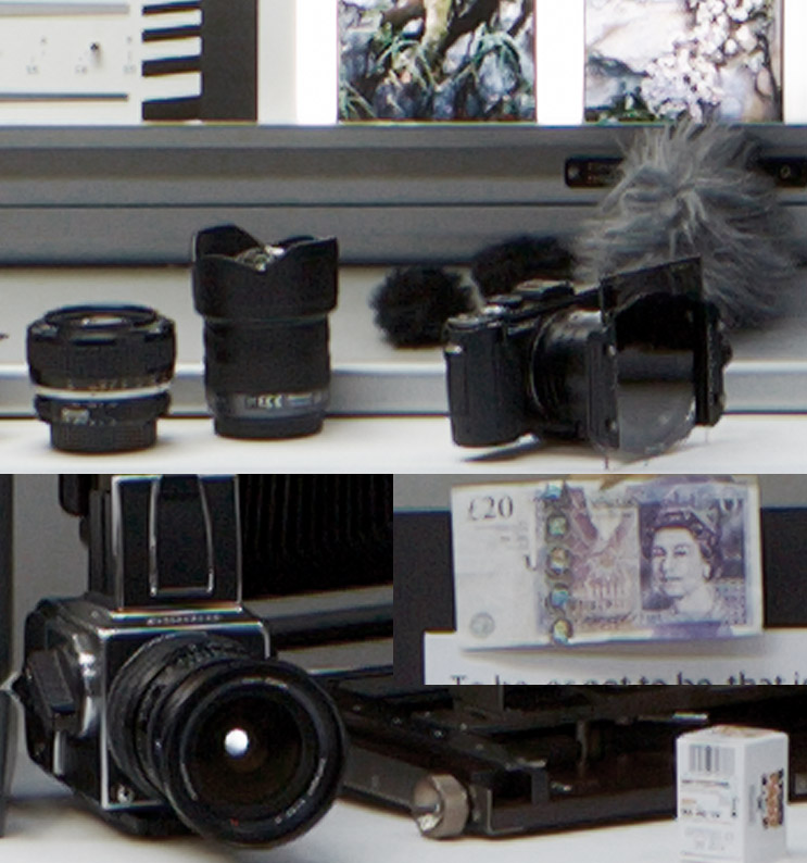
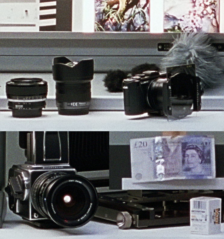


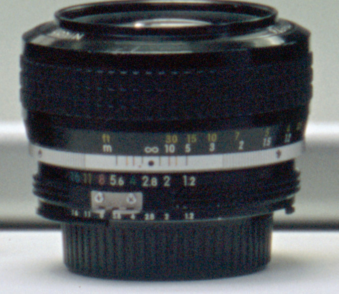
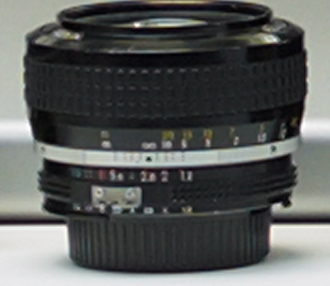


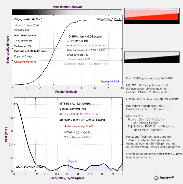


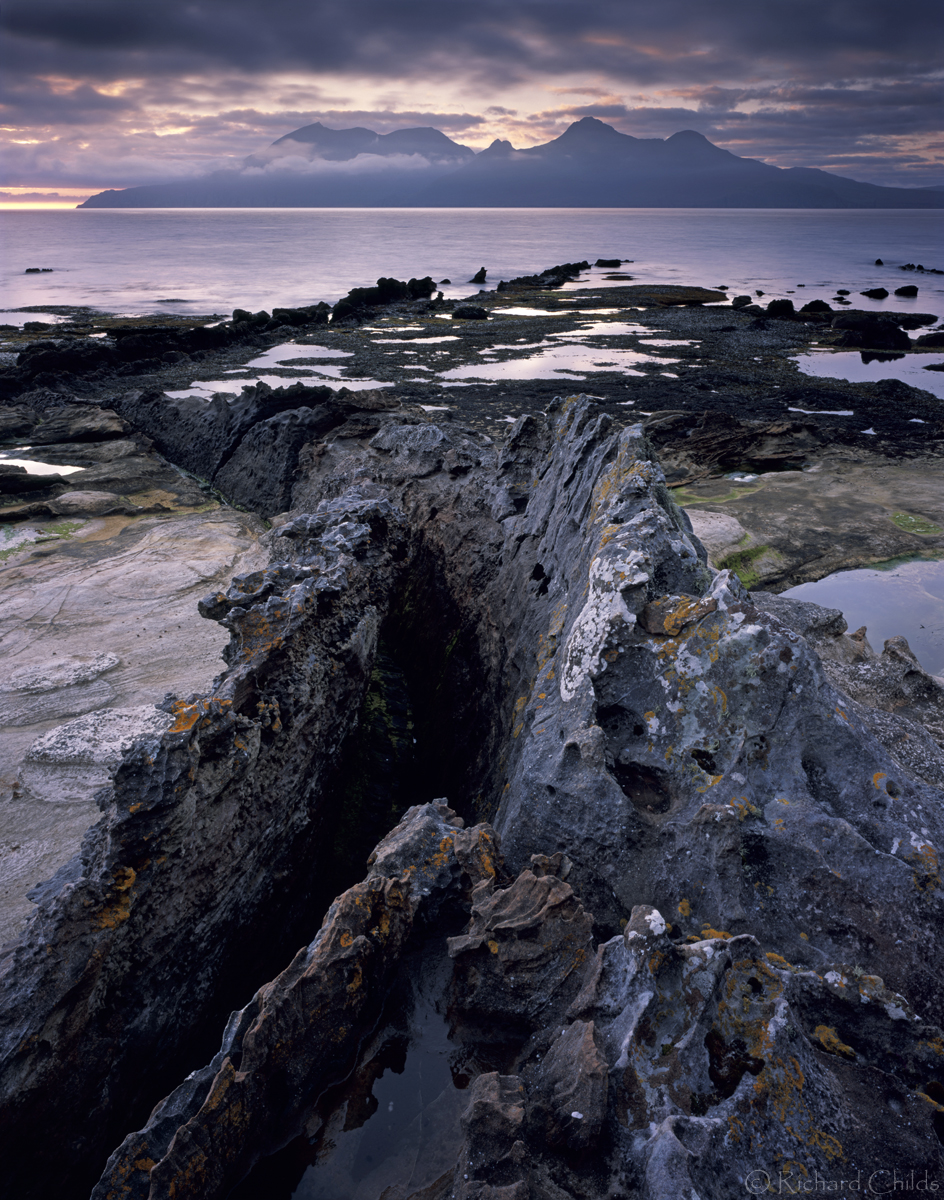
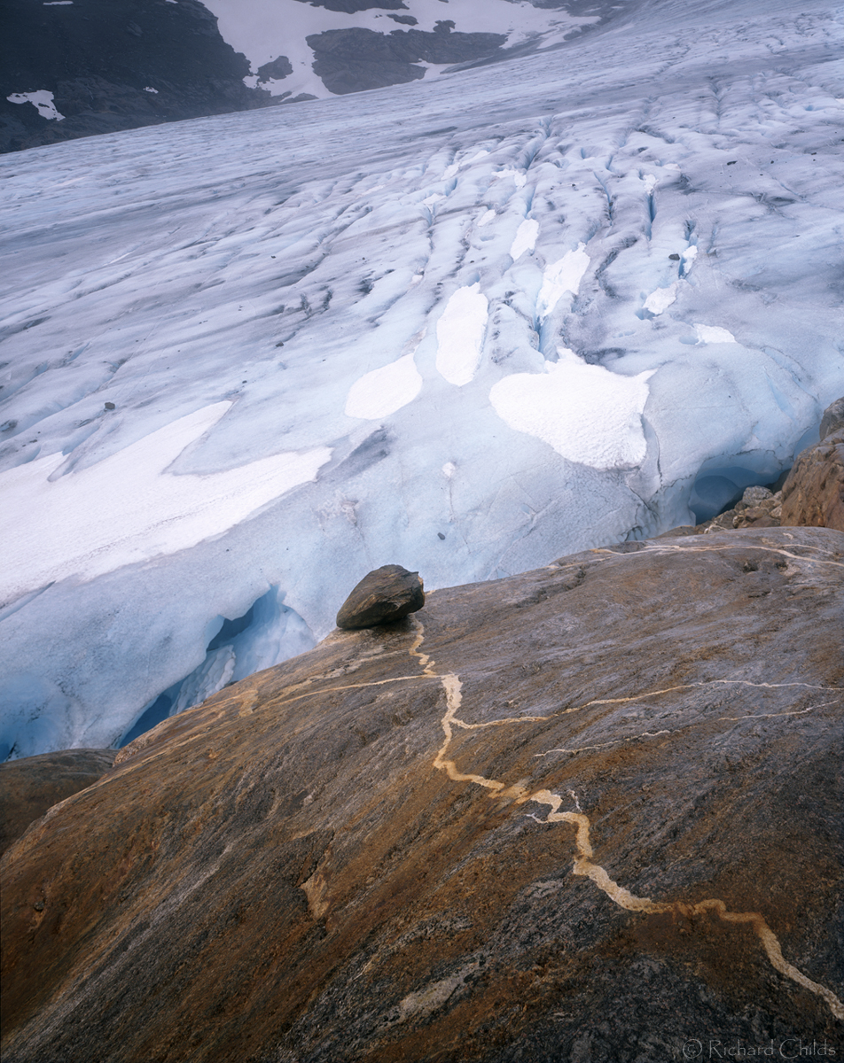

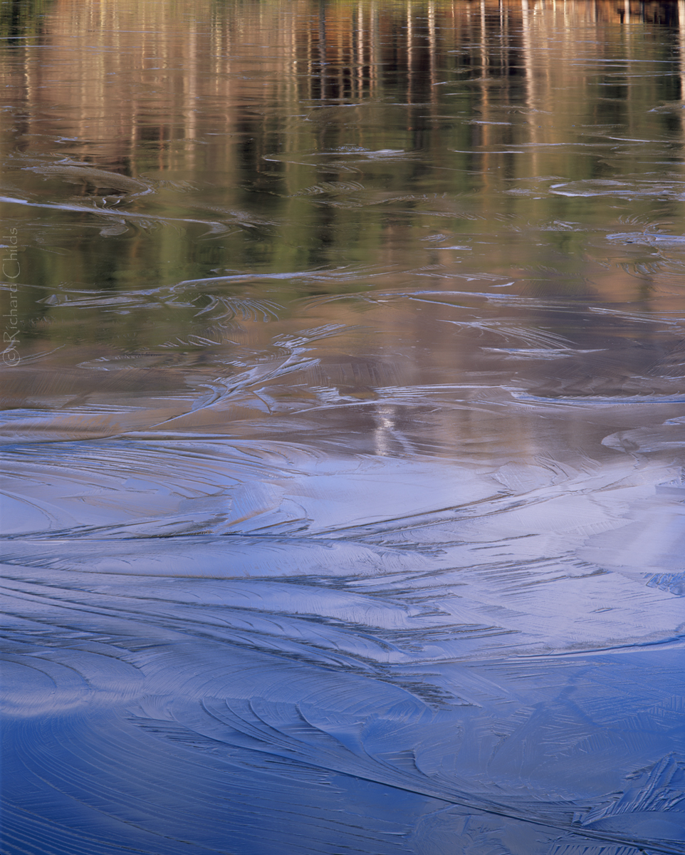
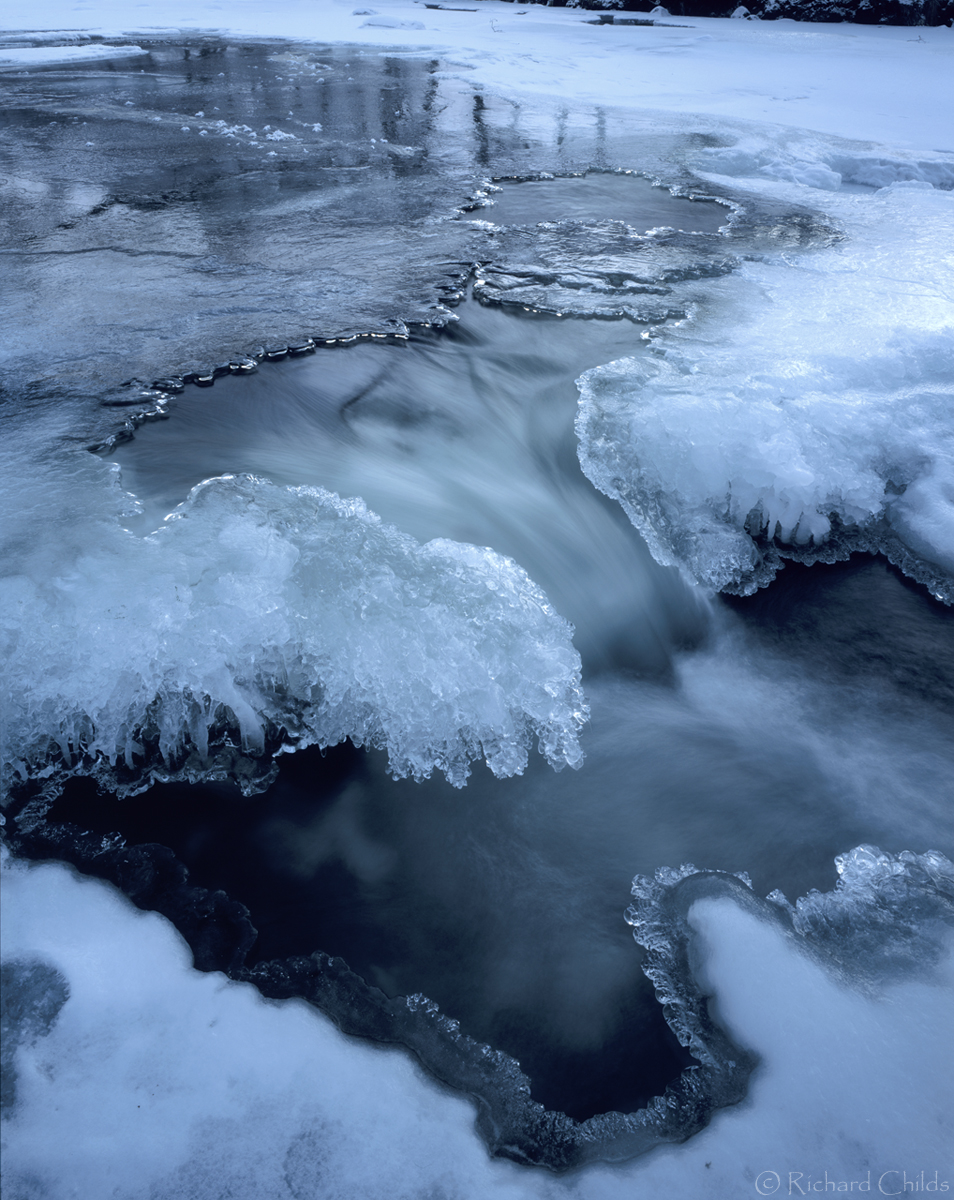
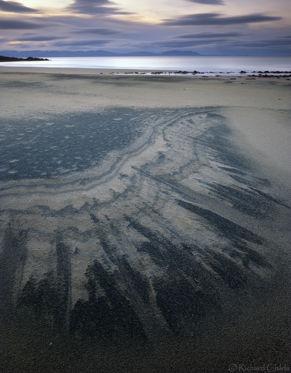
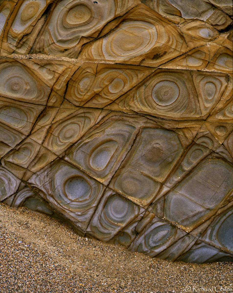
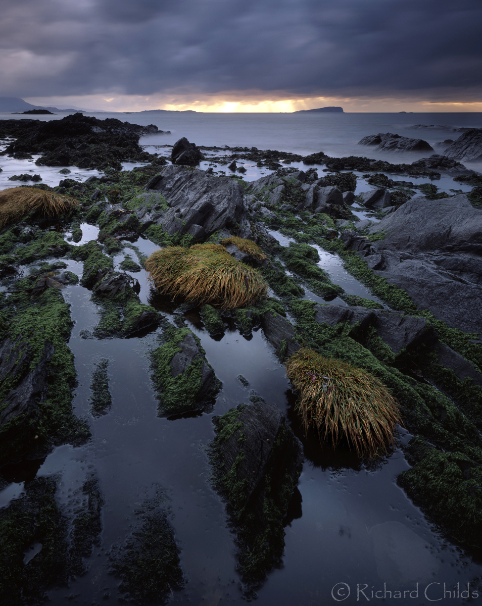
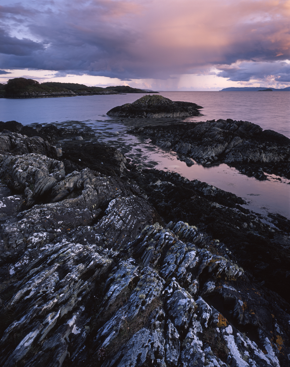


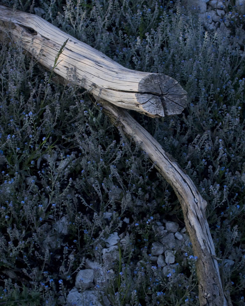
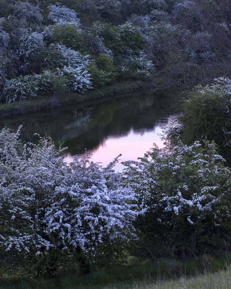
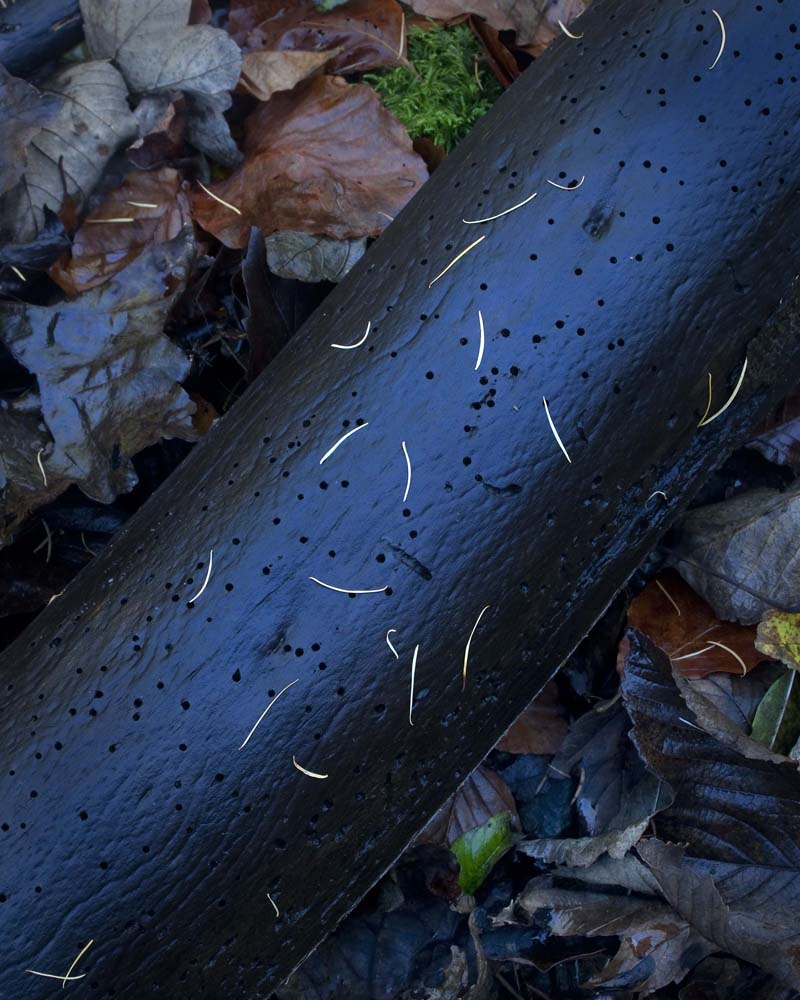
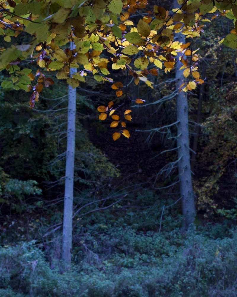
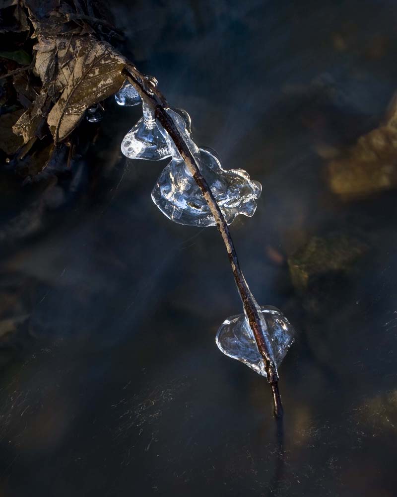
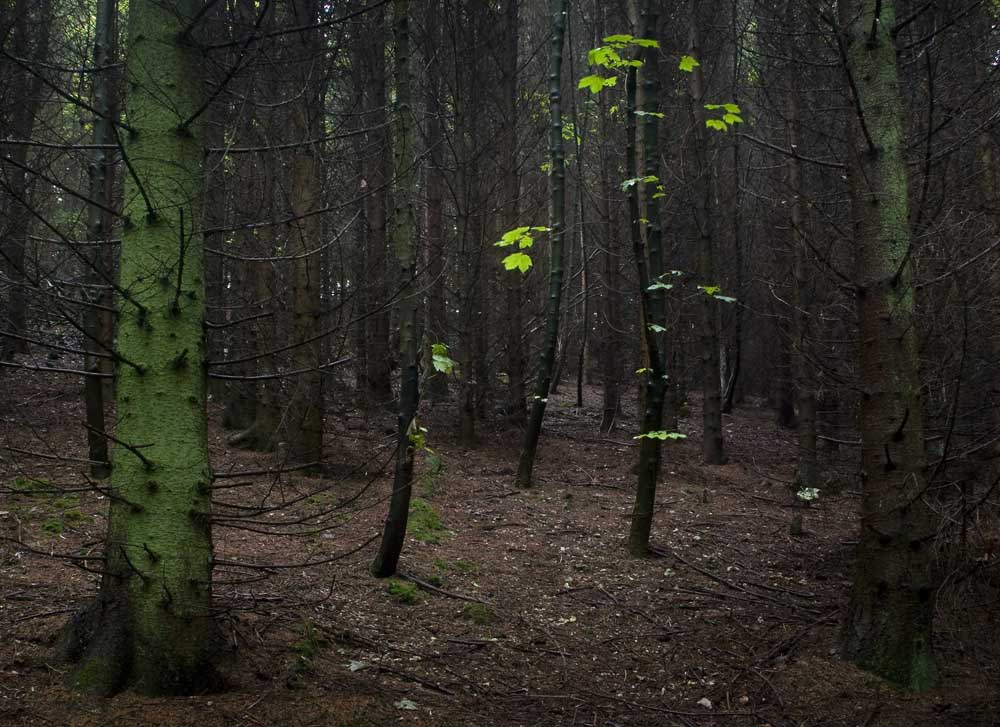
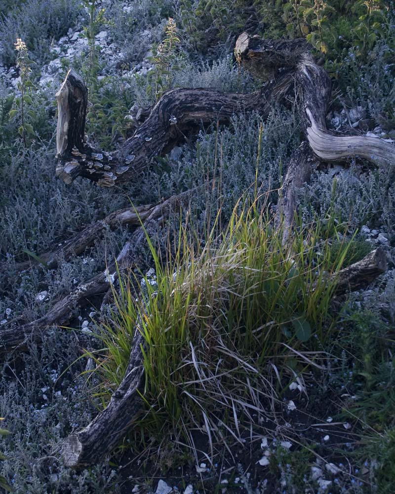
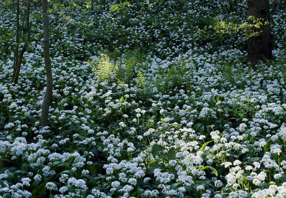
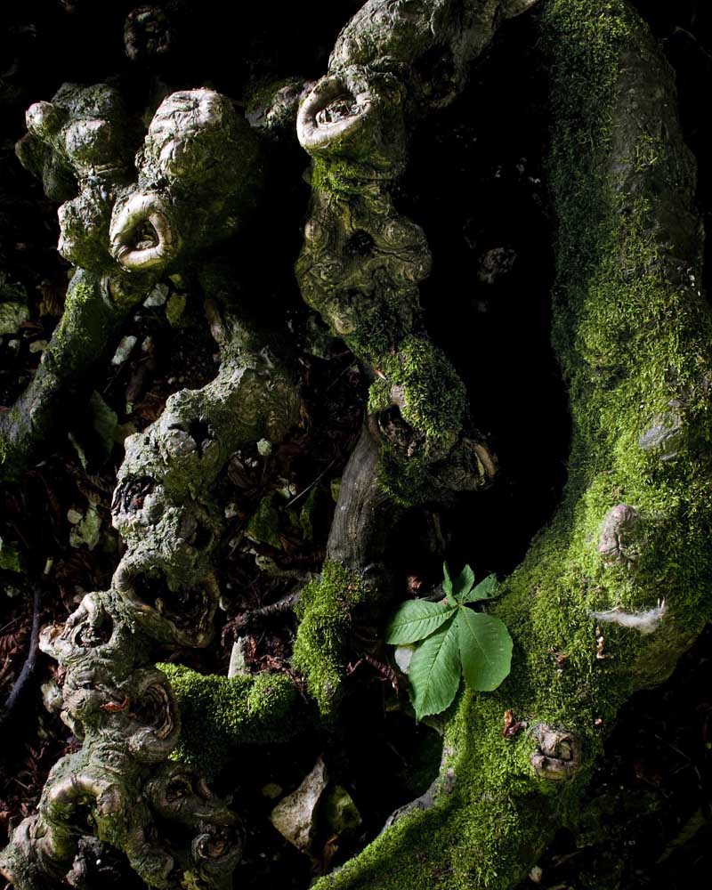
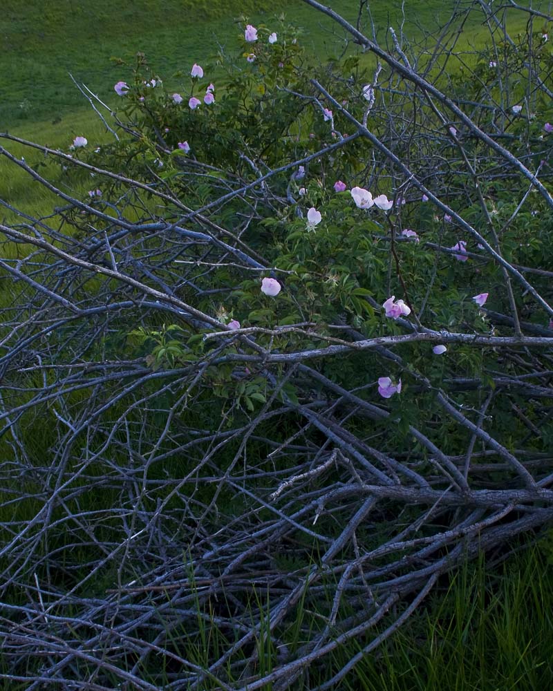
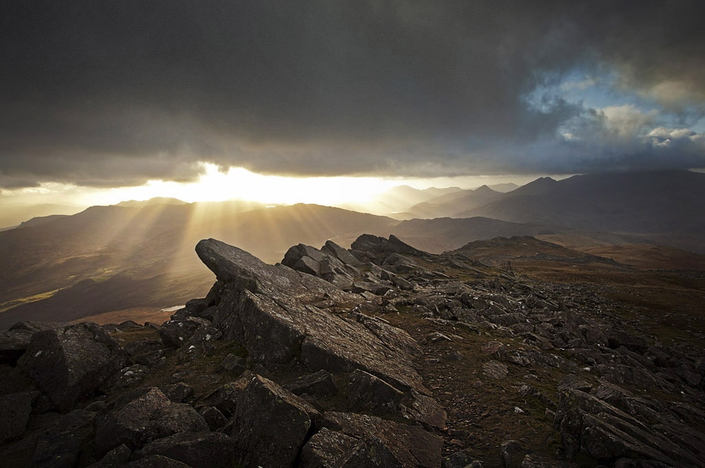


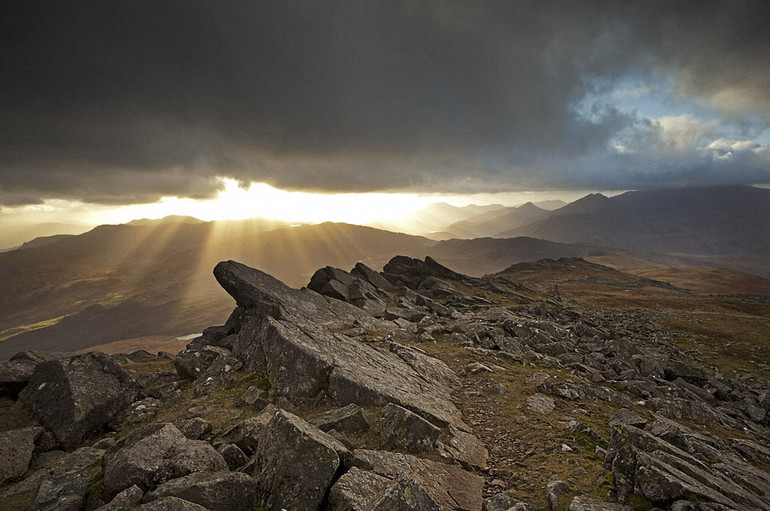
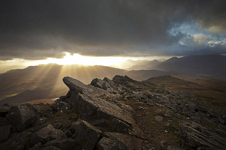
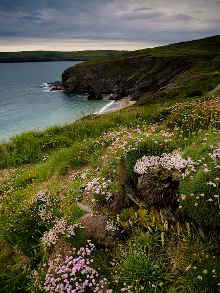
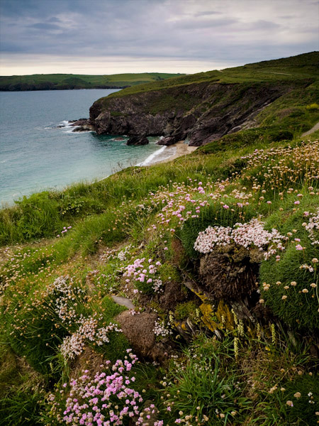


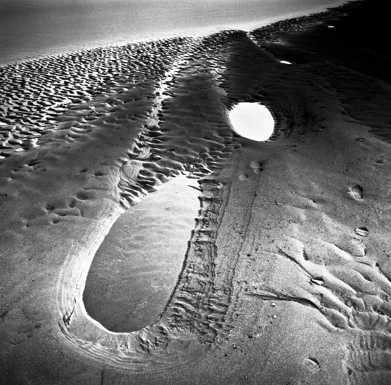
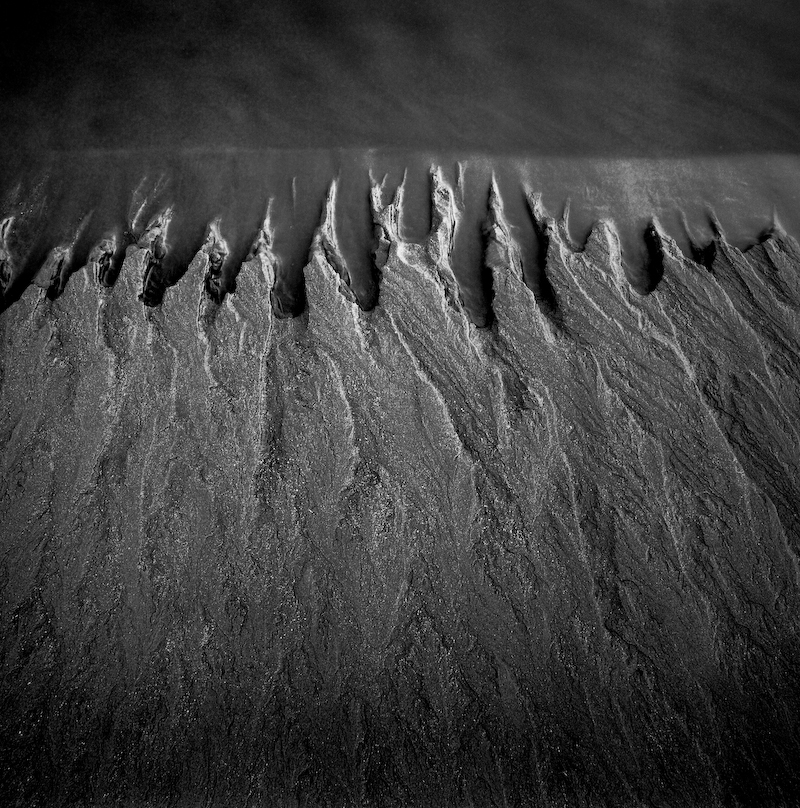
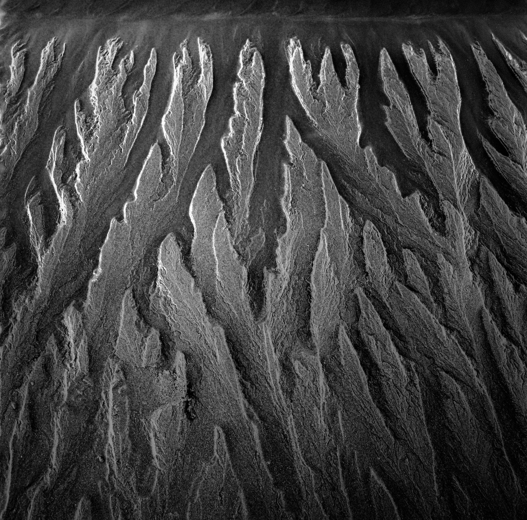
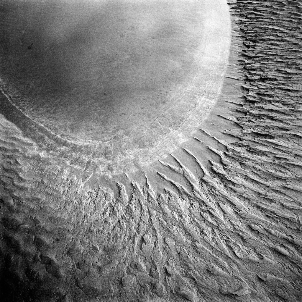
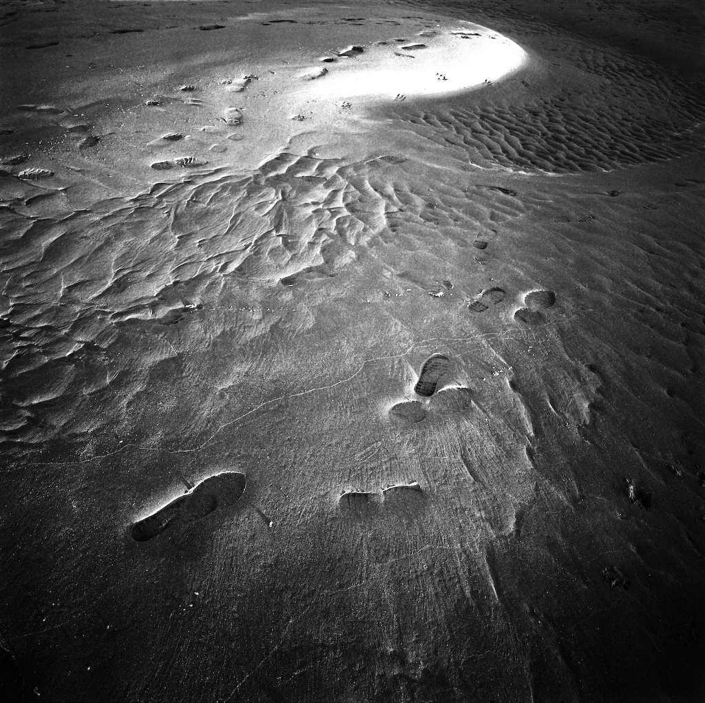
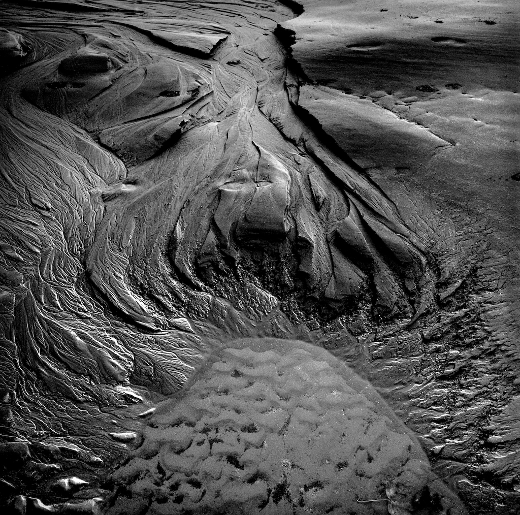
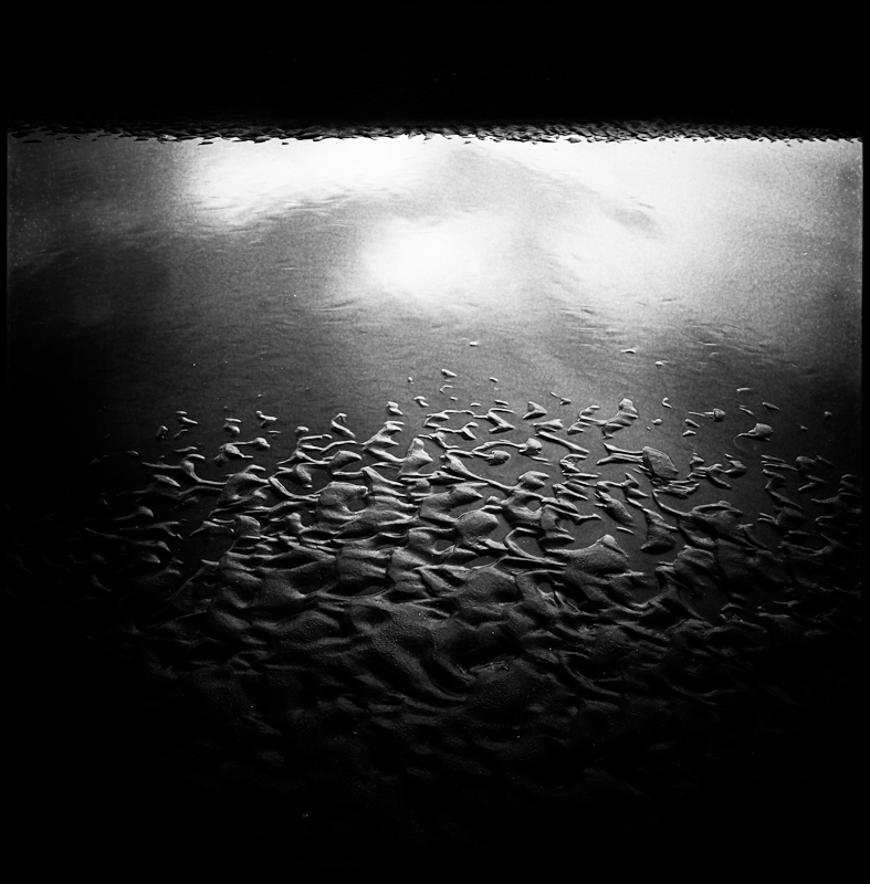
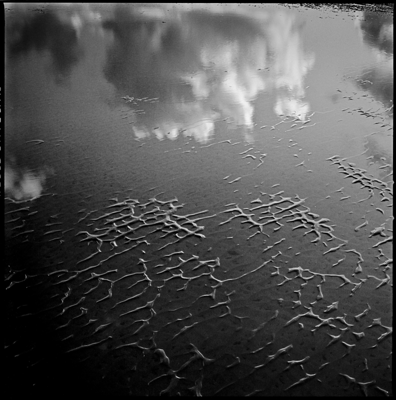
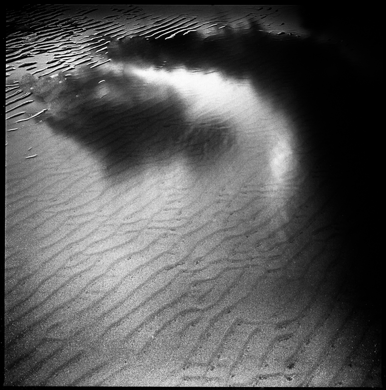
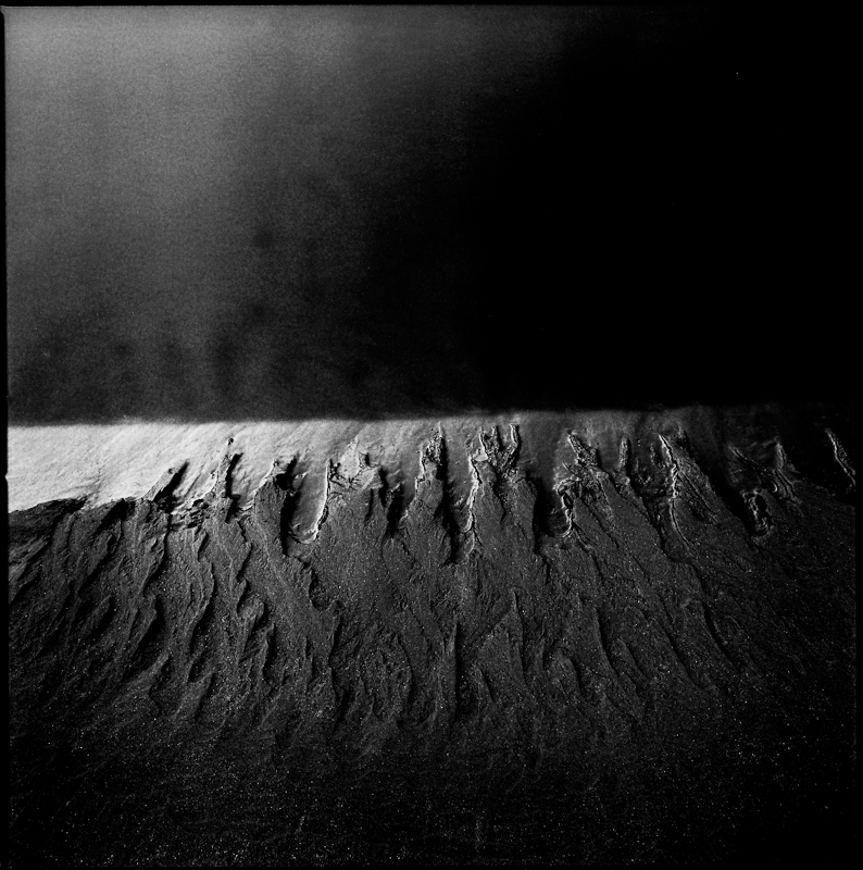
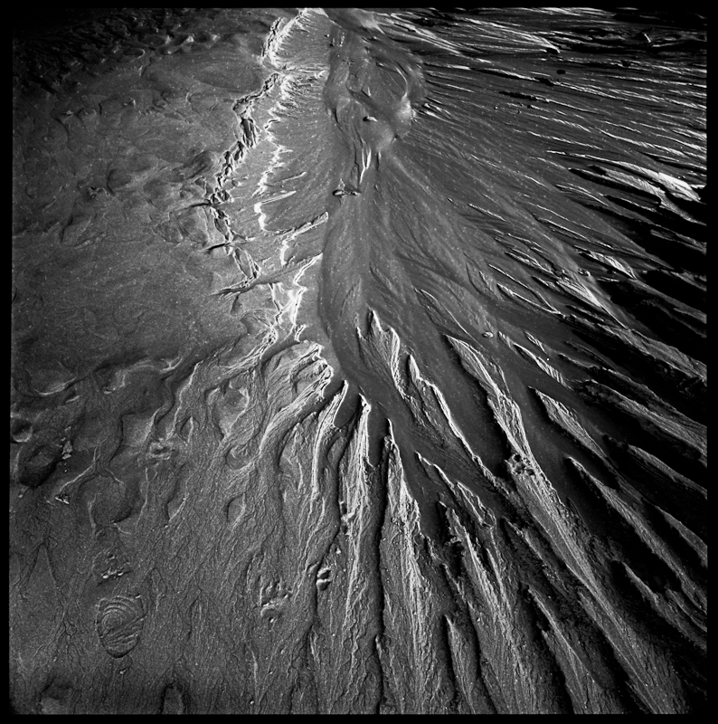
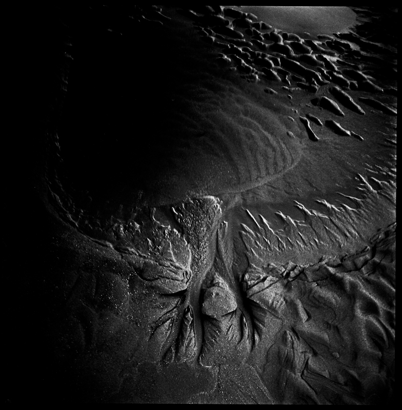
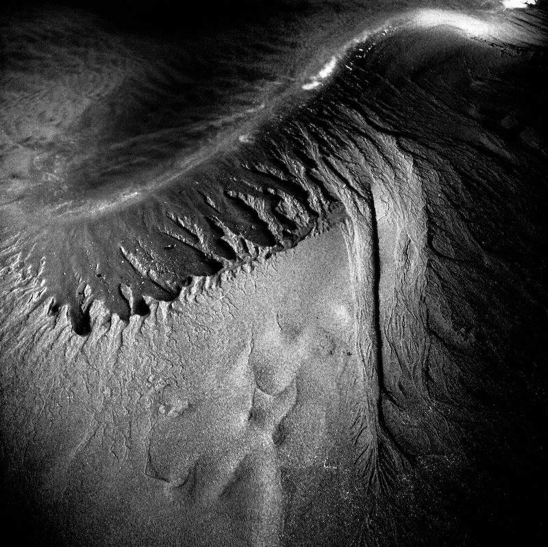
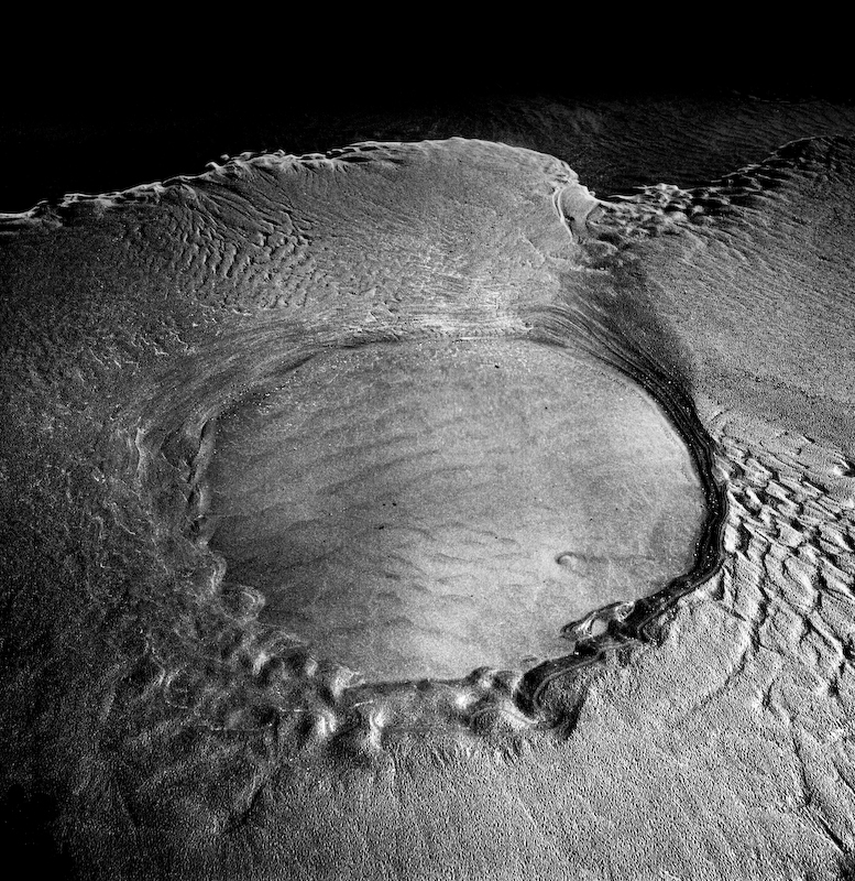
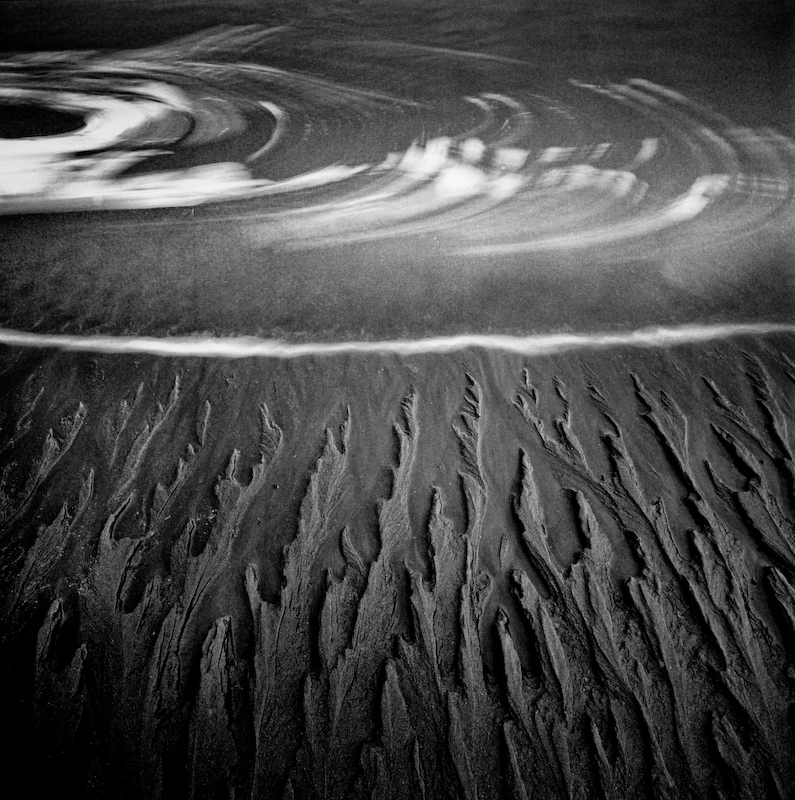
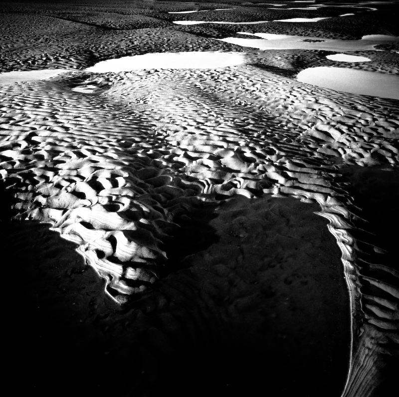
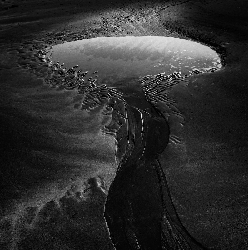


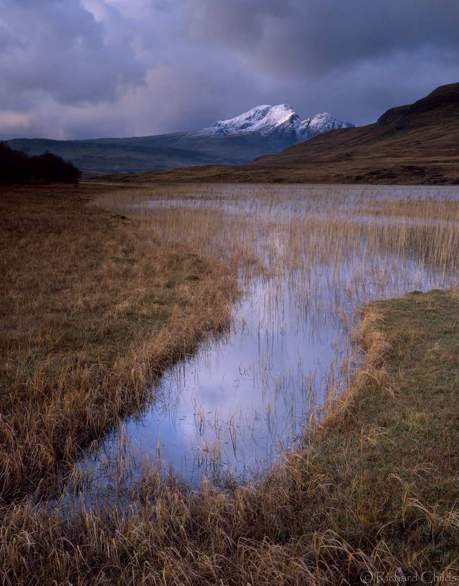
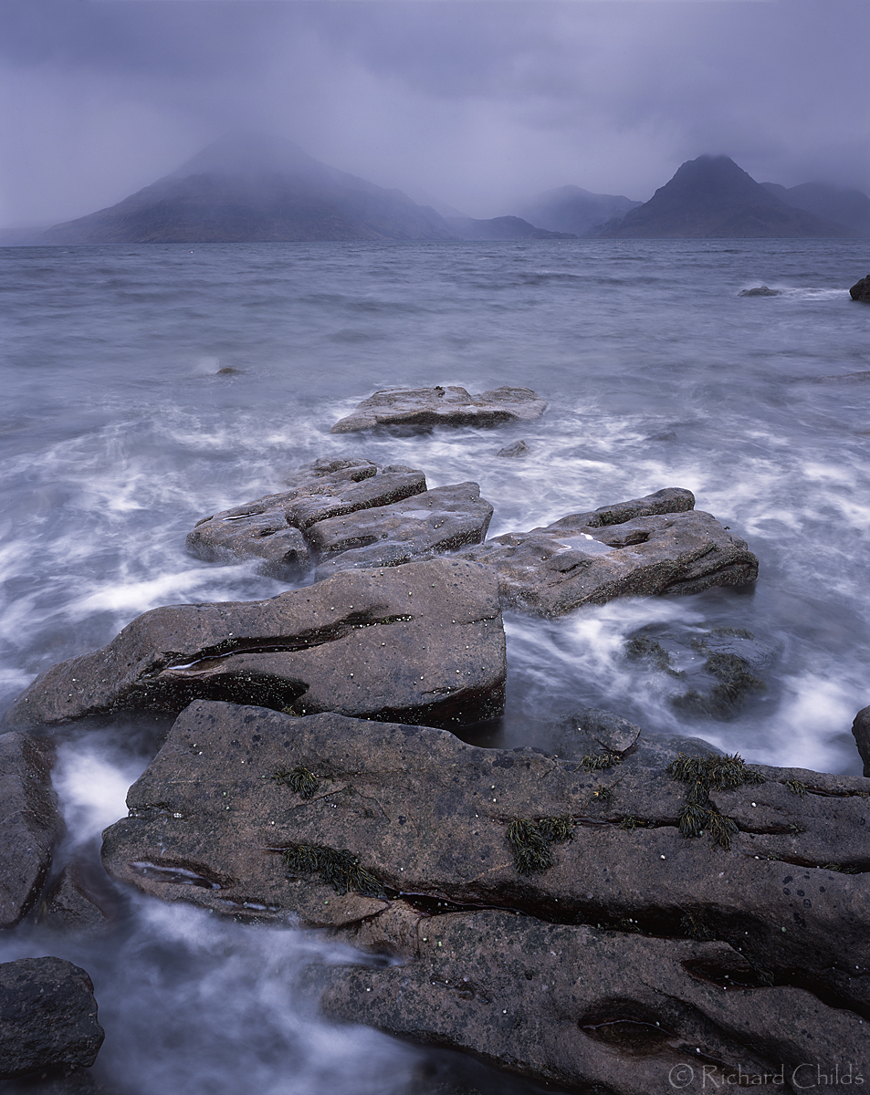
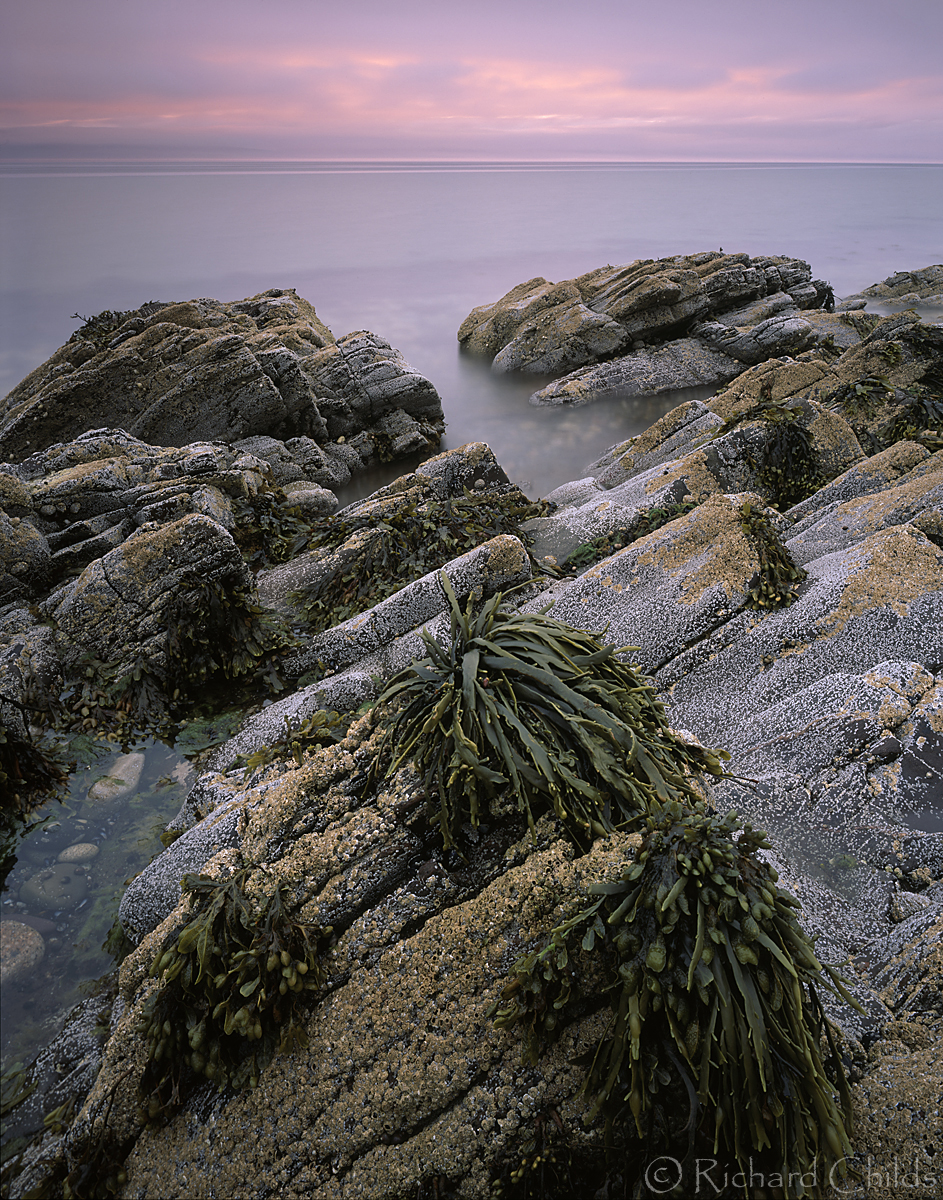
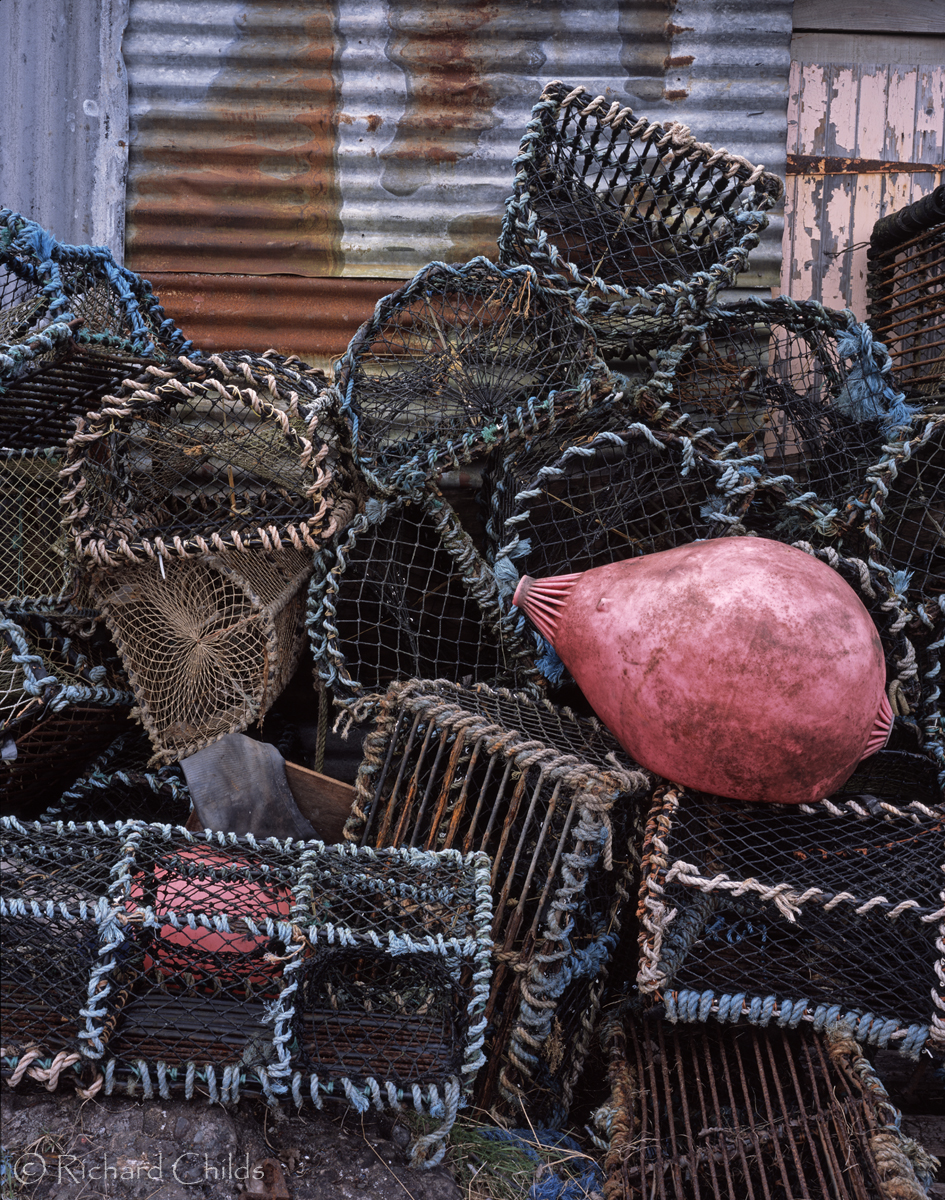
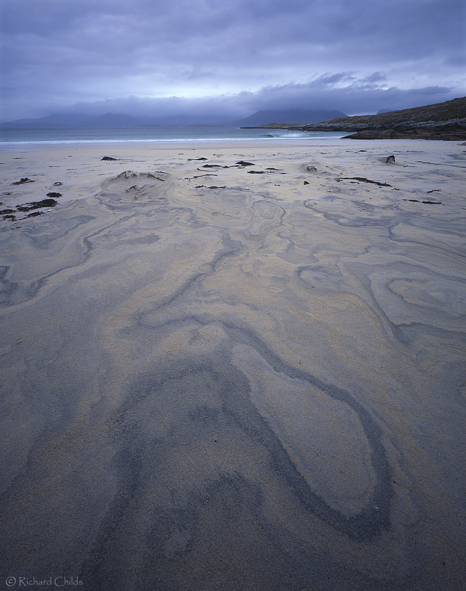
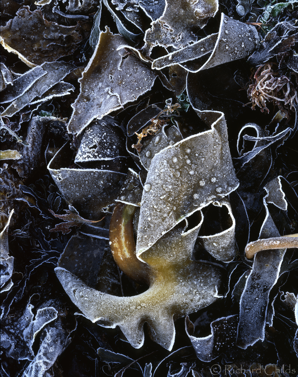
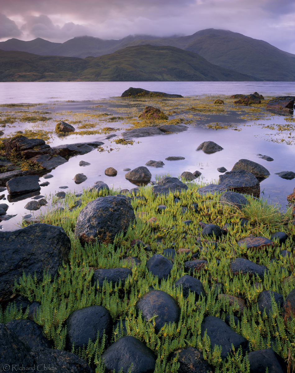


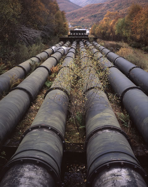
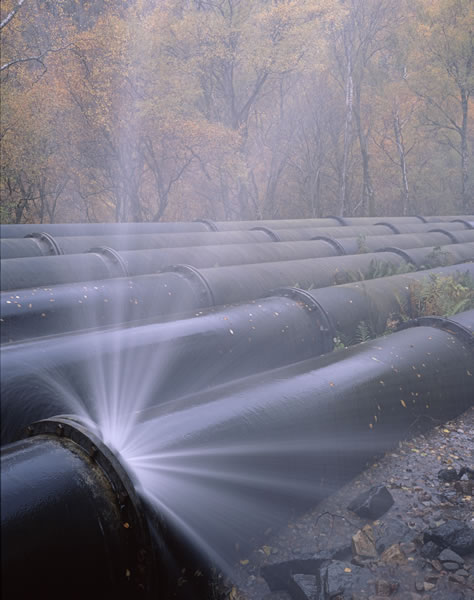