Further discussion on aspect ratios
 In the first part of this discussion on aspect ratios, I genuinely attempted to question the assumptions we all hold about aspect ratio, including the fact that four sides to our working ground is an inevitable paradigm. The responses received (Thanks, Dav, Steve and Adam) helped me to accept that such scrutiny is rhetorical at best, and whistling in the wind at worst! In short, therefore, the rest of my investigation will concentrate on the four-sided figure.
What I would like to do with this second part is look at the main camera types that we all use, and how we respond to the proportions of aspect ratio. I will also speculate on the nature of the cameras with which they were made and how this influences the results. Aspect ratio must ultimately be seen hand in hand with the cameras that were designed to produce them. For in such a technologically-driven field as photography, the camera itself plays a large part in determining the current state of the art.
The dominant digital cameras have an aspect ratio of 2x3 (as has 35mm film), although confusingly for beginners, these come in two sensor sizes; full-frame is the same as 35mm (24x36mm); and we also have the so-called APS-c sensor, which is 23x15mm-ish. In fact, Canon sensors are slightly smaller (22.3x14.9mm), Nikon slightly larger, (23.1x15.4mm). I have absolutely no idea why they are different, so if anyone can enlighten me I would be grateful. To me, these are half frame sensors.
Nevertheless, the aspect ratio remains 2x3.
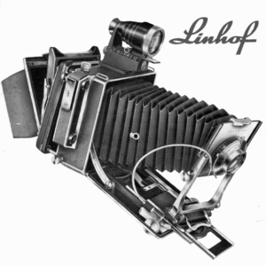
Four thirds and micro four thirds cameras (Panasonic, Olympus) have an aspect ratio, unsurprisingly, of 4x3 (sensor size is 18x13.5mm) This is also the aspect ratio of most (not all) medium format digital backs, with a sensor size of 37x49mm being typical currently. Many readers of these pages use a view camera, usually 5x4inch, whose larger cousin, 10x8inch is the same aspect ratio (and a sort of vague aspiration for most of us to try at some point).
Now, these are all rectangular shapes, and by no means that different. Yet almost everyone I know who has tried them all finds 2x3 the least ‘natural’, and the most difficult with which to compose satisfactorily. I realise that this is not exactly a scientific statement. On the contrary it is anecdotal, and I do accept that it reflects my own personal experience, so I may be listening for comments that support my own opinion.
Nevertheless, landscape photographers looking to shoot vertical format compositions find the proportions 5x4 absolutely ideal. Some photographers appear to only ever shoot vertically in 5x4 with a horizontal composition being strictly a tactic of last resort. While not quite so pleasing as 5x4, 4x3 can be pressed into similar vertical service. But by the time we have narrowed the ratio down to 2x3, the frame seems too skinny somehow. Even the ‘A’ paper series is not that narrow as a portrait, and on most magazine and book formats a 2x3 image will almost always have to be cropped top and/or bottom. Admittedly, that may not be a problem. But personally I cannot help using every last square mm of the frame. I do not like to leave things unresolved, and indeed this was why I could never ‘shoot for stock’. In landscape this typically meant leaving loads of empty sky for the banner title or headline. Most people who pride themselves on good technique and artistic awareness would, I suspect, prefer not to crop.
Can I rationally explain why 2x3 is not a comfortable vertical format? No. Ironically, I prefer the challenge of composing a vertical pan (say 2x1 or narrower) to using 2x3. So could this indicate that the problem with 2x3 is that it is neither one thing nor the other? In landscape I think that is so.
But you might well say, ‘yes, but 2x3 scores when it comes to the landscape format’. But does it? Again, I find that it is neither wide enough to be a real panoramic format, nor boxy enough to be a generous, broadly proportioned ‘canvas’. In short, 4x3 and 5x4 appear to win out in landscape format as well.
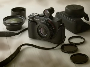
I was lucky enough to have use of a Panasonic LX3 for two years, which has a handy switchable aspect ratio lever on the side of the lens, with 4x3, 2x3 and 16x9 as options. The LX-3 is a wonderful sketchbook camera, with enough quality to allow for fair sized prints. I found I typically used 4x3 for all my verticals (except for the occasional 16x9 vertical pan) and 4x3 and 16x9 for all my landscape format images. After two years I had used the 2x3 shape on perhaps one or two occasions. When I asked all my landscape photographer friends who had this camera about their use of the ratio options, their views universally echoed my own. Nobody I have spoken to has expressed a preference for 2x3. And that included photographers who used Canon and Nikon (2x3 cameras), so it was not simply a large formatter’s view.
All of which leads me to believe that the photographers who have made such good use of 2x3 for decades, the war photographers, the photojournalists, the news, sports, fashion, wildlife and travel photographers must have known something that I don’t.
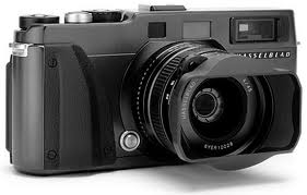
But most probably they simply became accustomed to using what was undoubtedly the best tool for the job back in the day, namely the professional film slr, or possibly the Leica rangefinder. There were no variable aspect ratios back then (The Hasselblad X-Pan being the one short-lived exception), and given the limited repro capabilities of film of that size, cropping was generally avoided for practical reasons. The other reason might have been the insistence that cropping was somehow immoral, unethical, or plain bad photography. Most photographers of a certain age will be aware of Cartier-Bresson’s distaste for cropping, and he was not alone. Such views about the sacrosanct nature of the composition framed in camera were prevalent then and remain so today.
The contemporary successor to these classic 35mm cameras are the dslrs mentioned earlier (and the Leica M-9). While they universally come with a tripod thread, the slr camera is fundamentally designed to be used in the hand. Without doubt this does influence the way they are used, even in landscape photography, as I know all too well from leading workshops. The temptation to rely on auto-iso, or to simply increase the iso to give a hand-holdable speed, then snap and walk away is strong. It takes a special type of discipline to use these cameras tripod-mounted (like a miniature view camera) for landscape photography. This observation by no means rules out 2x3 as ratio for landscape photography, but does imply that the culture surrounding their design and use celebrates the speed and performance of the camera, rather than the contemplative, slow photography ethos that accompanies large format. This culture of speed and modernity is reflected in the majority of 2x3 images we see published and on the web (although not all). How it may be connected to composition in this aspect ratio is harder to define.
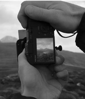
At the same time, some dslrs and a number of top flight compacts give us a choice of aspect ratios. With the greater incentive to determine the final outcome offered by computer-based post processing, we probably should use aspect ratio more flexibly and hopefully, more creatively.
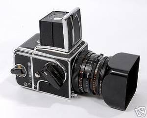
The square is for some people the most pure of all aspect ratios, being ‘neutral’, without bias, or emphasis. Supposedly. In fact, the Hassleblad V series, other 6x6cm slrs, various TLRs and even a few rangefinders utilising the square shape were adopted by many because they offered “a big enough negative to allow for cropping”. Indeed, the foregoing proposition was a marketing ploy that the manufacturers of these cameras almost always used. It did no harm that the cameras never had to be placed on their side, that they could always be used in the same orientation, with the thought, ‘I’ll crop later’ to fit the subject or indeed the use. But you could argue that is a recipe for sloppy technique.
In practice the square represents a favoured final presentation format for many, with some of the most memorable and iconic images in the history of photography shot with this ratio. Perhaps the most famous photograph of all time, the earth rising beyond the surface of the moon shot on one of the Apollo missions, was made with a Hasselblad. Of course, shot on any format it would have been no less memorable. But the fact is that the square works beautifully for many applications. If an aspect ratio could be said to have a timeless quality, it would be the square. I have always loved using it for portraits, probably inspired by the work of Irving Penn. His amazing portrait series, compiled in the book, Worlds in a small room, are mostly square and seem stronger for it. They were mainly shot with the Rolleiflex TLR.
Counter-intuitively, the square has also been hugely effective as a landscape format. Fay Godwin employed it, and Michael Kenna has inspired a legion of followers using the simplicity of the square as a suitable foil for the stark beauty of his long exposure monochrome images. Through the 1980s, Charlie Waite produced an unrivalled body of travel and landscape images, all made with the Hasselblad. Indeed the George Phillip series of books that cemented his reputation was also square, reflecting the photographer’s aesthetic. This was perhaps the first series of travel books published by the British book industry that valued the photographer on a par with the writer.
[Following in Charlie’s footsteps I personally used a Hasselblad for many years, and still occasionally use it (now with a Phase One back). Regarding compositional approaches, I can see that my square landscapes helped me set a framework for the images I now shoot as verticals in 5x4 (or 4x3) today. What does that mean? Essentially, that the emphasis in these images leads the eye from front to back; I am usually seeking to move the eye upward and deeper into the picture space, emphasising depth, and the connection of elements front to back. So for me, the Hasselblad was fore-runner to my vertically-composed 5x4 landscapes. My horizontal landscapes, by contrast, have more space, breadth, sideways movement and rhythm in them.]
Just as influential at the time, at least among working photographers, were Paul Wakefield’s Aurum Press book series of Wales, Ireland and Scotland. These books were all photographed on 5x4, and it was Wakefield who advised David Ward to shoot on 5x4 if he wanted to establish his reputation as a landscape photographer. Between them, the influence these two great photographers have had in inspiring the adoption of large format (and 5x4 in particular) among enthusiasts in the UK and beyond has been huge.
Of course, the view camera’s principle appeal is not its aspect ratio but its acreage of film, giving built-in quality, and the miracle of camera movements, which to the technically-accomplished creative photographer gives amazing control of focus and perspective. But as I have observed above, the rather ‘mild’ proportions of 5x4 prove to be a virtue in their own right, offering emphasis without exaggeration, and minimal requirement to crop when being used (full-bleed) in the majority of published page shapes.
With a few exceptions, such as Weegee and other Speed Graphic-toting post-war photojournalists, most 5x4 photographers have used a tripod for their work. The considered and careful approach this dictates has inevitably influenced the sort of compositions made, as has the expense of the process. Nevertheless, I am always struck that when I look back at my favourite landscape photographers of the last three decades the majority have been large format practitioners. Their compositions seem just right somehow. Much of this is to do with their artistry, skill, commitment and philosophy. So does proportion also play a part, the relatively unobtrusive, yet subtly persuasive emphasis of 5x4 in both portrait and landscape orientations? It is debatable of course, but I believe it does.
Looking back through recent photographic history the ‘middling’ aspect ratios 1x1, 5x4, 4x3 and 2x3 offer a remarkable range of different approaches and opportunities. The reader will no doubt have their own view on the influence of these frame proportions. However, it is up to us all to make the most of the ‘real estate’ (as our American cousins would have it) within the frame boundary. Each aspect ratio has its own charm and effect, and so long as we want to get it right in-camera (which we surely do) then aspect ratio is a fundamental characteristic of the camera we choose.
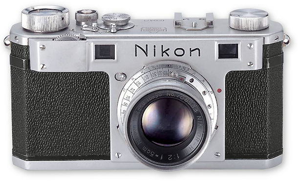
All of which makes me wonder, will Nikon or Canon ever countenance making a 24x30mm sensor? Probably not, but if they ever do you saw it here first. Interestingly, the very first Nikon rangefinders, The Nikon 1, were 32x24mm in format, 4x3 in ratio as it happens. Ironically, the history story in the following link shows how the slide film cutters developed for Leica users were set up for 24x36mm, and that this alone apparently proved the downfall of the new Nikon format.
To think that on the basis of such apparently trivial matters the proportions with which recent history has been recorded were made… Only 1000 or so Nikon 1 cameras were made. I have a feeling that if they updated it with a good digital sensor they might find quite a market share!
My final instalment will look into the extreme aspect ratios, which we collectively describe as panoramic.

