Looking at ICC profiles

Tim Parkin
Tim Parkin is a British landscape photographer, writer, and editor best known as the co-founder of On Landscape magazine, where he explores the art and practice of photographing the natural world. His work is thoughtful and carefully crafted, often focusing on subtle details and quiet moments in the landscape rather than dramatic vistas. Alongside his photography and writing, he co-founded the Natural Landscape Photography Awards, serves as a judge for other international competitions. Through all these projects, Parkin has become a respected and influential voice in contemporary landscape photography.
ICC Profiles and colour management seem to be the bane of many photographer's lives. Understanding why and how to apply them seems a little like magic. Most of this confusion arises because simple descriptions of how they work are few and far between. I hope this article can act as an introduction to the intricacies of colour management, letting you get an overall understanding and acting as a jumping off point if you wish to look further.
The first thing to understand is why we need colour management at all! Well we’ll try and use an anology so bear with me.
In our analogy, we have a designer from France and an engineer from Germany talk to each other about the colour of a lawn mower they are working on and both of them agree that they would like it to be green. However, unknown to many people is the fact that French green is different from German green. The French see green as a yellowy-green whereas the Germans see a richer, summer green. So, the French designer won’t be happy with the German result.
What we need is a universal language of colour that can get around these problems. This is where colour management and icc profiles come in. Colour management experts have defined a set of standard, reference colours and in order to describe the green colour to the German engineer, they need a translation from the French to the standard colour system and then another translation from the standard colour system to the German. In effect, it’s as if the English language is being used as a standard colour system so that when we translate the French vert, we get ‘yellow green’ and then we translate this to the German gelbgrün.
In colour management terms, the icc profile defines the translation dictionary to convert from a particular colour source (a printer, scanner, etc) to the universal colour space.
The difference in our RGB images is that they have values for each component from 0-100%. However, 100% Red coming out of our Epson scanner is different to the 100% we need to send to our printer to get the same colour. Hence the icc profile translates from the 100% scanner red to a universal colour and then translates again to value that can be sent to the printer that gives the same colour.
The other aspects of colour management come in when we don’t have the same language on either side of the equation. For instance, imagine we have a stunning camera that can capture a huge range of colour but we’re working with a printer that can’t cope with some of the extremes. For the sake of argument lets imagine the cherry red that we capture can only be represented by a deep pink on the printer.
Rendering intents (you know, those ‘perceptual’ and ‘colorimetric’ stuff that you’ve skimmed past before now) are ‘rules’ built into the profiles that describe how to ‘remap’ colours that can’t be represented. Let’s look at a few of these.
Relative Colorimetric
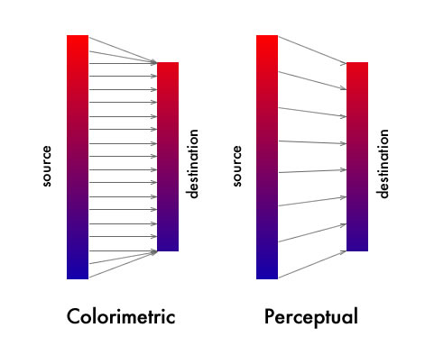
Sounds complicated, however it just means that anything that can’t be handled ends up as close as possible. In this case it means that any colour more intense than deep pink, ends up deep pink.
This can be a problem if you have large areas of colours that can’t be handled and where they should appear as gradients, for instance an intense sunset being rendered to print could cause real issues.
Perceptual
Instead of just pushing all the values that can’t be rendered to a single value (i.e. clipping), perceptual intent scales all of the values down in order to encompass the out of gamut values. This looks better where you have gradients of colours out of gamut but many colours will end up duller as a result.
The following diagram will hopefully make things a little clearer..

Comparing the methods for converting between two colour spaces between perceptual and relative colorimetric rendering intents
The best result is probably to use a combination of manually pulling colour saturation down to bring colours closer to the gamut and then using relative colorimetric. By doing this, you are effectively managing the out of gamut values by hand, effectively generating a custom intent just for your own picture.
Other intents are available but are mostly useful for graphics as they change the colours in pictures (saturation intent keeps the saturation the same but changes the colours to ones that are available).
Black Point Compensation
The icc profile system has a system in place to map the whites from one profile to the whites of another. However, there is no equivalent system to do the same with the blacks. Because of this, without black point compensation you may see areas of an image blocking up when converting from one profile to another.
Black point compensation is a system that compresses or expands the shadow end of an image in order to fit the destination profile. This means that certain areas in the shadows may shift slightly but the result is essential in order to convert photographs from source to destination.
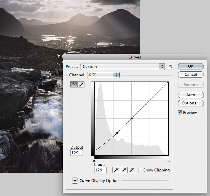
The process still doesn’t help ensure that you don’t block up blacks when printing however, and it is nearly always a good idea to lift up the shadows in your photograph (using a luminosity curve for instance) and experimentation is the best method (although somewhere between 8 and 20 points seems to work well - as in the screenshot below).
This document is meant to change over time and to improve depending on feedback - if you have any suggestions for changes to improve the legibility or understanding of the concepts involved, please let us know.


