Exposing the differences in various colour film stocks

Tim Parkin
Amateur Photographer who plays with big cameras and film when in between digital photographs.
We're back on the film comparison tests again and this time we've got a polarised blue sky and some fir tree greens and pine cone reds and browns. As in the previous tests, the comparisons are between colour films available in large format sheet sizes (comparing roll films is expensive and time consuming).
Digitalab of Newcastle have kindly offered to develop all of these films for us and we will be mentioning them in support of their contribution. See footer for more details.
Methodology
The use of a large format camera makes this sort of comparison a lot easier (if a lot more expensive) as it is very easy to switch between film types from shot to shot. I am also using two graphmatic backs for the film to make things even easier. If you don't know what a graphmatic back is the picture below shows them in comparison with dark slides. They hold six films each and allow you to change to the next sheet by simply lifting the whole body of the magazine out of it's container, allowing the next film to pop to the front. Once you get used to this process (which I hadn't on this first test - see the story at the bottom for more details) then you can change from one film to the next in about five seconds. The main stumbling block in the methodology is keeping track of which shots have been taken, where you are in the series and adjusting the exposure for the different film ISO's. These seem trivial but can get quite stressful out in the field when the light is changing.
Light will inevitably change a little bit between pictures but we will be trying to choose scenes where comparisons are still valid. Additionally, we have bought new film of each type and stored them together. The film has been taken at rated speed for all but the Velvia 50 which was taken a third of a stop down (40 iso or a third of a stop over exposed) as otherwise the comparisons are quite difficult. We've tried to match up mid tones for the transprency work.
We have also placed film that may be used as alternatives as close to each other in the series as possible. For instance, all of the velvias are together, the portras are together, all negatives are together, etc.
The negative film presents the biggest challenge because there are so many different ways of converting them to positive images. To this end, although we have made our own conversions using colorneg at close to standard settings, we have also corrected colour casts where a simple colour curves adjustment allows it. We will be working on the negative inversion process over the coming months and will reassess these as we do. We are also providing the scanned negatives for you to try yourselves (scanned using as colour accurate a process as possible so the scans look like the negatives on a lightbox - possibly with different gammas).
The scans were made on a Howtek 4500 using profile generated with the Hutch Fuji colour target which have proven to have very accurate colour.
Please be aware that the Velvia 100f was overexposed but is included for completion. Also, my technique when taking these shots was probably a little too fast and I haven't given enough time for the camera to settle down in between shots and so there is some movement. Therefore please use these examples as a guide for colour differences between films.
Here is a full list of the films being compared.
Transparency
- Fuji Velvia 50
- Fuji Velvia 100
- Fuji Velvia 100f
- Fuji Provia 100
- Fuji Astia 100
- Kodak E100G
- Kodak E100VS
Negatives
- Kodak Ektar 100
- Kodak Portra 160NC
- Kodak Portra 160VC
- Fuji Pro160S
- Kodak Portra 400NC
The viewers below allow you to pick which two film types to compare. Click on a film type from the list below the image on the left and then do the same on the right and you can then move the comparison slider backward and forward.
Evergreen Tree, Polarised Sky Results
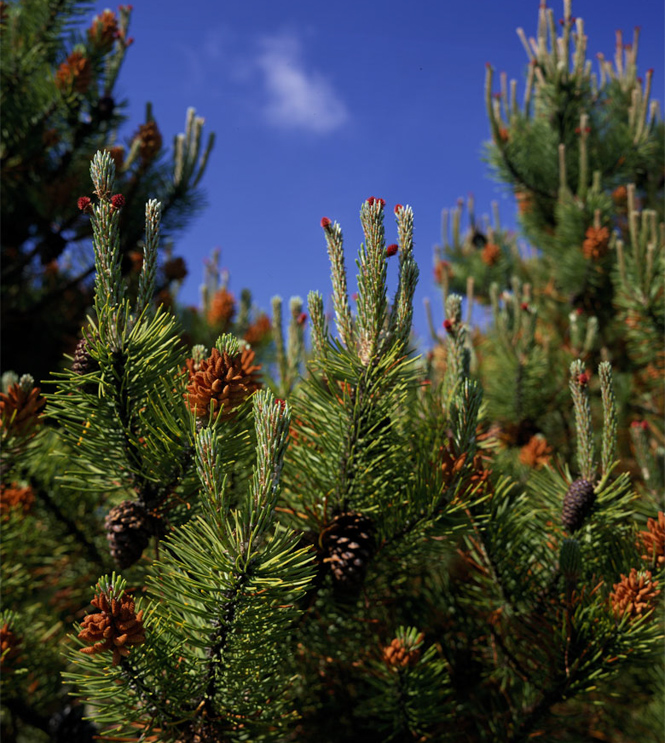
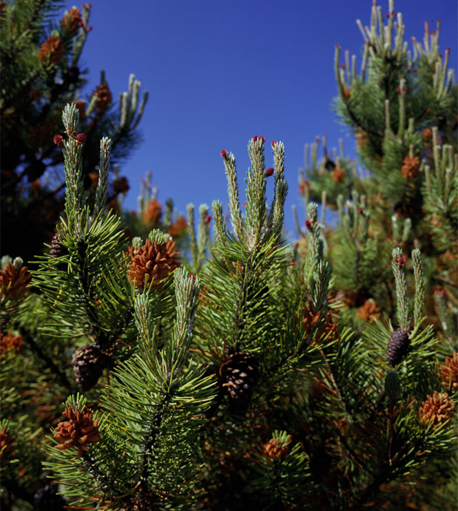
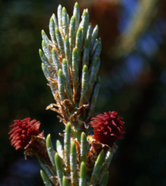
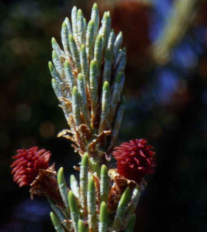
This second set of results were taken whilst on a trip to Northumberland and I wanted to capture a subject that contained some intense colours, including natural greens and blues. The clear blue sky was a great start and adding a touch of polarisation upped the ante a little. The evergreen tree I found had some wonderful rich orange red female cones and some older bluey green male cones.
Complete Picture
Choose Which Films to Compare
Before side
|
After side
|
Female Cone
Choose Which Films to Compare
Before side
|
After side
|
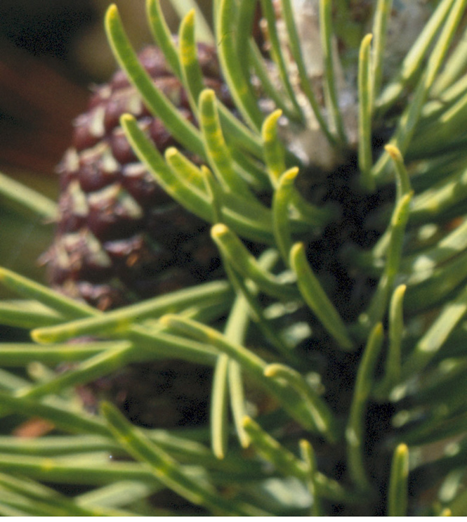
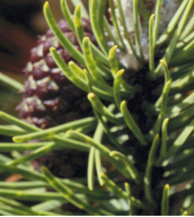
Cone Shadows
Choose Which Films to Compare
Before side
|
After side
|
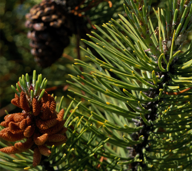
More Cones with Shadows
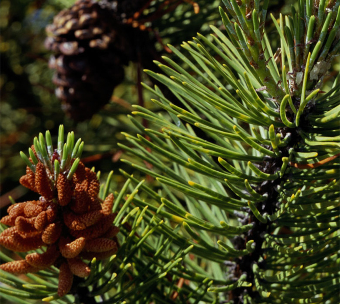
Choose Which Films to Compare
Before side
|
After side
|
More Cones with Shadows - Boosted
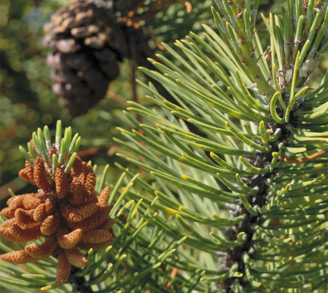
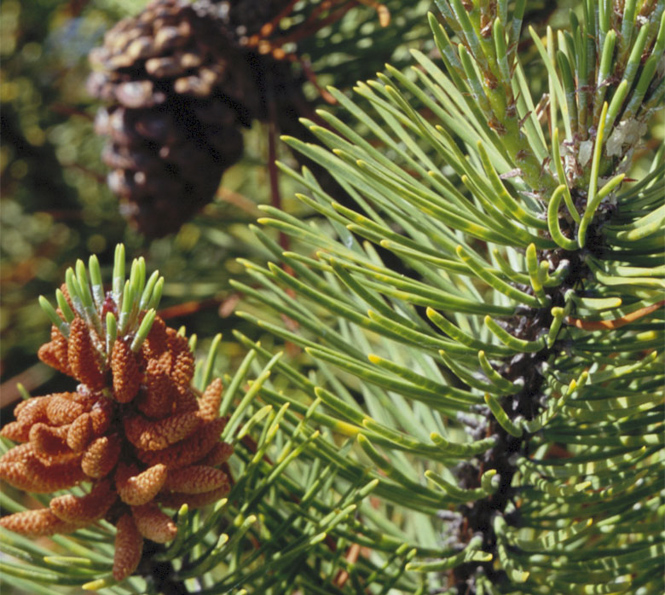
Choose Which Films to Compare
Before side
|
After side
|

