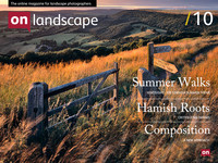
Tim Parkin kicks off a new series on composition

Tim Parkin
Tim Parkin is a British landscape photographer, writer, and editor best known as the co-founder of On Landscape magazine, where he explores the art and practice of photographing the natural world. His work is thoughtful and carefully crafted, often focusing on subtle details and quiet moments in the landscape rather than dramatic vistas. Alongside his photography and writing, he co-founded the Natural Landscape Photography Awards, serves as a judge for other international competitions. Through all these projects, Parkin has become a respected and influential voice in contemporary landscape photography.
We are introducing a new series of articles on On Landscape, trying to cover one of the most difficult aspects of photography to talk about and to actually do well, and that is composition. I’ve spent the last four or five years of my photographic life obsessed with composition. My obsession has probably been detrimental to many other aspects of my photography but in my limited opinion, the most important parameter that defines a great photographer is the way in which they compose pictures. The conscious creation of a composition from the visual material around us demonstrates the difference between letting the camera doing the work and the photographer working the camera. Just as a meals ingredients may taste nice on their own and they can certainly improve a meal - a good cook one is who transforms the ingredients into something new.
The majority of people will have bought books that profess to offer a series of rules of composition and this ‘rule’ based education, a very western way of teaching, dominates nearly all literature of composition. Most people will also know that the rules are almost irrelevant to great landscape photography. I’ve written previously about the rule of thirds and it’s virtual irrelevance and there are a few other rules that have similar ‘issues’.
What is composition taught so badly though? Well, firstly it’s an incredibly complicated subject and the success or failure of most photographs depends on many different criteria. One persons great composition is another persons head scratcher.
However, there is a strong parallel between a few different creative subjects and photography. The first of these, and most commonly mentioned, is probably music. The choices of musical composition can be compared with photographic composition in many ways. Another subject matches very well though, but needs a little more thinking about, and that is graphic design.
A graphic designer typically works with a fixed area (the page) and places subjects within to create a balanced and attractive whole. The sense of balance and energy has great parallels with photography. However, this doesn’t help a lot as graphic design isn’t taught particularly well either. However, there is a great deal of evidence that people learn graphic design through studying other graphic designers and
Both myself and Joe have been thinking about better ways to teach composition and we have a few different ideas, some of which include
- Visual excercises in balance
- Analysis of well pictures to:
- look at how they work
- look at what doesn’t work
- Use examples from the field at how to hone a composition
- Tactics to work the edges of a composition and cropping
- Learning to see colour
- Learning to see 2D shapes not 3D objects
- Layer Alignment
- Cropping
We’ll be using all of the various facilities that the web gives us to enable some of these, such as video, animation, etc. and hopefully we’ll be able to fine tune these techniques with feedback from yourselves.
We’ll start with a little bit of workflow that a lot of professional photographers may use instinctively but that I’ve found is helpful to think consciously. This really covers only one ‘group’ of composition types so it isn’t a general workflow.
This starts with my search for ‘interesting ingredients’, as I like to think of the environment around me. These interesting ingredients may be plants, frost, ice, stone walls, etc. So
1) Find an interesting item that will become the ‘foundation’ of your picture. These items will be placed in the bottom are of the frame.
2) Now, through physically moving and using the zoom, you can move the back or background of the picture by making it bigger or smaller and by moving it left, right, up or down.
In order to get an idea how this ‘zooming’ and ‘moving’ technique works, think of the horror film effect (or the part of ‘Thriller’ by Michael Jackson) where there is a shot of the ‘star’s head and the background suddenly drops away but their head stays the same size. This is done by moving backwards and zooming in at the same time.
The technique allows you to ‘scale’ the background up and down and obviously by moving left right, etc to relocate the background.
This technique allows you to choose a background position and scale that works to complement the foreground, either by making edges and lines align or by providing space between them or positioning key highlight elements in the foreground against dark areas in the background (which is a topic we’ll cover in a future section). This works just as well with a vista as with a detail shot, as long as your picture includes the bottom of the frame nearer to camera than the top.
3) The final step is to just work out the available crops that you can use to simplify your composition. This may be an iterative approach where you go back to step 2 and try again, gradually honing down onto better compositions.
In a future issue we’ll go over this workflow technique in more detail and use it out in the field to show how it can be used in practise (for an example of this sort of technique - take a look at this old blog post - http://www.timparkin.co.uk/blog/finding-your-landscape-photographs)

