Looking at the psychology and history of saturation

Tim Parkin
Tim Parkin is a British landscape photographer, writer, and editor best known as the co-founder of On Landscape magazine, where he explores the art and practice of photographing the natural world. His work is thoughtful and carefully crafted, often focusing on subtle details and quiet moments in the landscape rather than dramatic vistas. Alongside his photography and writing, he co-founded the Natural Landscape Photography Awards, serves as a judge for other international competitions. Through all these projects, Parkin has become a respected and influential voice in contemporary landscape photography.
There has been some interesting discussion on the history of saturation boosting in photography in recent days, notably David Hyde on the excellent Landscape Photography Blogger website talks about "Did Velvia Film Change Landscape Photography". His topic was about how the use of hyperreal film such as Fuji Velvia and whether it fundamentally changed the look of landscape photography.
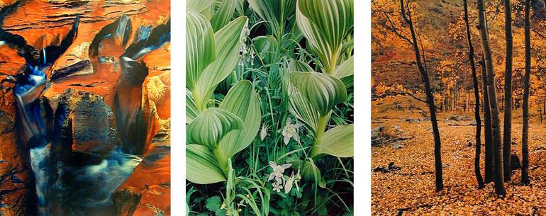
Well the first question I'd ask is 'could you get saturated colour before Velvia came out?' and I think the answer is a reserved 'yes'. For instance, Eliot Porter was a very advanced printer and used dye transfer technology to 'post process' his images. This allowed him to increase colour saturation as much as he wished (within the maximum colour available for each colour). For instance, if he wanted a fully saturated yellow, he would reduce dodge the cyan and magenta separations so that there were no 'polluting' colours. And some of Eliot Porters prints showed a quite 'robust' colour. For instance, here is a sample of photographs from his portfolios - He chose to manipulate the colour palette rather than be restricted by film stock or technology.
Eliot worked with Kodakchrome and later Ektachrome
Dye transfer has been used to create some of the most famous colour photographs, take a look at Ctein's summary of the technique or some comments from Charles Cramer and Philip Hyde on the Landscape Photography Blogger website if you want to learn more about the technique. But just looking at the neon sign at the top of Ctein's shows the capabilities.
Ernst Haas also a pioneer in colour and produced quite intense work. These works from the 60's show that with the right will, saturated works could still be produced.
David Muench also produced what could be called 'saturated' work too. So what was it about Velvia that was so different? Well my suggestion is that rather than producing just more saturation, it was the palette of Velvia that revolutionised things. Velvia moved colours around, shifting yellows to reds, separating yellow greens from blue greens to produce a vivid colour range in foliage. It did boost saturation but other films had done so previously. It's that it purified low level saturation that produced the revelation. It could take a 'mucky' uniform green and purify the colours and separate out the yellow greens from the blue greens, creating strong contrast and interest. As an example, if it was just satuation then a film such as E100VS would have as much impact but it turns out that photographers regularly choose velvia in preference.
But saturation has undoubtedly played a major part in Velvia's success. What is this? Well I put some research into the effects of saturation and how our perceptions work. It turns out that if you show someone a color and then as them to pick that colour out after some time has passed, they almost always pick out a more saturated colour. This is called saturation and has been tested many times.
In another psychological test, people were shown an object such as a brick, apple, tree, etc. and were asked to pick the colour out again. Interestingly, as well as picking out something typically more saturated, they also chose a colour that was closer to what they thought of as a 'typical' colour for the object. Bricks were a particular bricky red, apples an appley green, etc. etc. This is termed 'typicality'.
So it appears that we consistently remember things as more saturated or closer to a 'representative' colour. Is this why we like saturation? It's certainly a potential explanation.
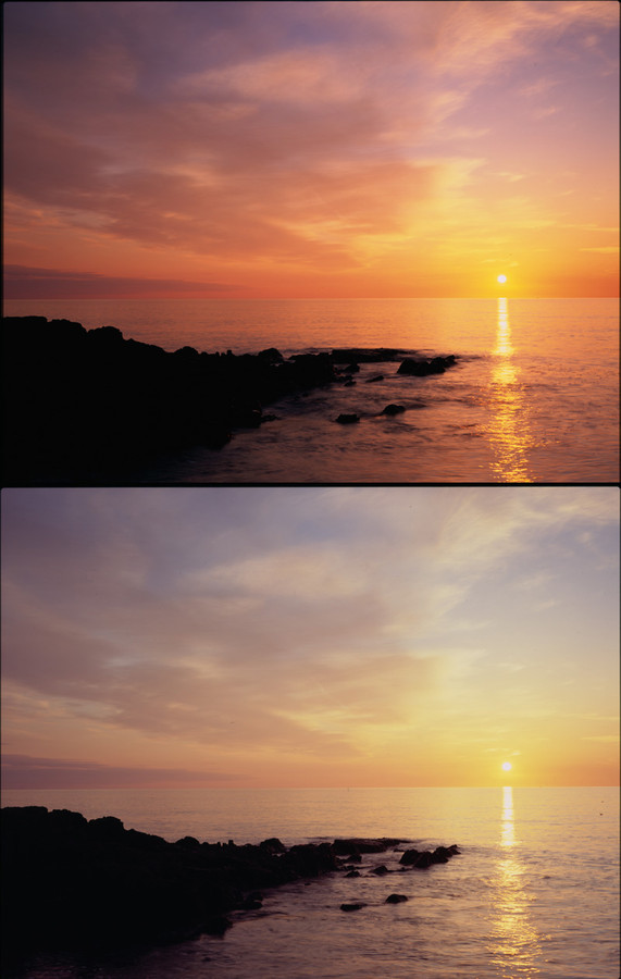
When digital photography and digital post processing became popular there were many calls for 'velvia plugins' that could simulate the colour changes that velvia introduced. In order to create some of the increased saturation in subdued colours, the overal colour saturation very often ended up being oversaturated. My personal opinion is that the easy accessibility of saturation boosting was the big change in colour over the last 15 years. Photographers with a critical eye have always been able to tell when enough is enough, desaturating colour sometimes if necessary (quite a few photographers I know will desaturated velvia in certain conditions). Also, quite a few photographers I know also won't use velvia during moments of 'peak colour' because the results are not only too 'over the top' - mostly because intense colours all tend towards a single orange-red primary wheras a similar shot on astia would separate the colours nicely, see the sunset photo below.
Level of saturation is an artistic choice and more does not equal better and applying saturation globally is far from what the 'bold' films do. Managing saturation on a picture by picture and colour by colour basis, even area by area basis, is important. And don't forget, you can always desaturate as well as saturate ;-)


