A brief comparison two popular film stocks

Adam Pierzchala
Now retired, I have more time to enjoy being out with my camera looking for scenes and subjects that pique my interest, especially coastal, woodland and close-ups. Although I still have several rolls of 35mm and MF film in my freezer, I shoot almost exclusively digital now
I spent a few days on the north Cornish coast in March and chanced upon a really good week. In fact perhaps too good as the weather was mainly of very hazy sunshine and even foggy evenings. This led me to concentrate more on details than the grand vista, but I did have some fun with moody foggy sunsets. Because of the stable light in the shade I thought that I would make a mini comparison of Velvia 100F (my usual MF transparency film) and Ektar 100. I wondered whether the latter would be useful for high contrast scenes and could double up for b&w, even using it with yellow-green and orange filters. Note that I was not trying to reproduce Velvia colours on Ektar. Could Ektar be a universal film for what I like to photograph?
How I did the comparison
I used a Mamiya 645 with two backs, one loaded with the Velvia and the other with Ektar. Switching between the two takes just a few seconds and as the films’ ISO rating is the same I didn’t have to adjust exposures. Given the subject matter, the colour was a little limited; for example I wasn’t able to compare greens, or pure reds and yellows. I do however have a good comparison for blues, oranges, magenta and purple.
I scanned the films on an Epson 750v at 1800 dpi using the standard film holder and processed in SilverFast 6.2.4a. For Ektar there is a standard setting under Kodak/Other/Ektar.
The results
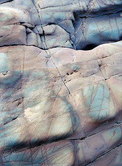
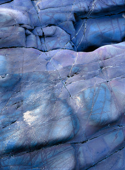
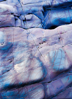
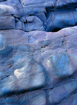
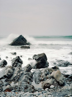
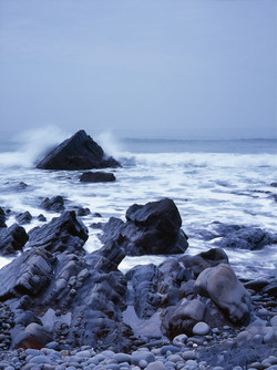
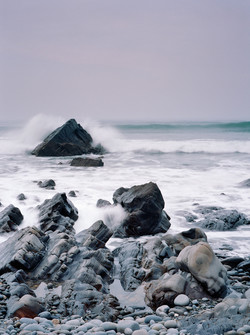
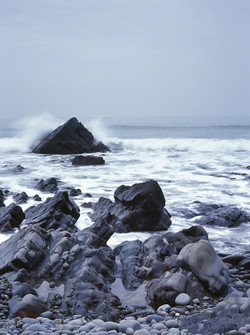
The results are quite surprising. On loading the film in the holder and running the initial pre-scan, the Ektar colours look awful. Totally wrong (so far out that I cannot even describe them) and out of balance. However, as soon as I selected a frame to view zoomed in, the auto-adjust kicked in and the colours looked quite decent. So my “basic” result is the scan straight out of the Epson with just the SilverFast one-click auto-settings applied. I then processed the scan in Lightroom to try and arrive at a satisfying image either close to the jpeg on the back of my Panasonic or close to my memory of the scene. Very subjective I know, but I don’t think that this is so important. After all, I was trying to see if I would be satisfied with Ektar and not trying to conduct a rigorous colorimetric study.
Conclusions
Neither film is exactly faithful to my memory – but how accurate is my memory in any case? Also, given the processing between my eyes and brain who knows what is “reality”. I can certainly live with Ektar though I will probably try to play a little more with the scans to work around that warm cyan-green tinge. The black & white conversions, with conventional b&w filters, work out fine which means that I can probably do away with real b&w film. Incidentally, because of the inability to use Digital ICE with silver b&w film, I have been using chromogenic C41 (Ilford XP2) till now.
So I am definitely going to experiment more with Ektar and see how I get on, perhaps trying some of the other Epson 750v settings for Kodak negative rather than that officially for Ektar. Having said that, where the contrast range is manageable I probably will still use transparency film though I might shift to Provia, an emulsion I used when I first started in MF a few years ago.
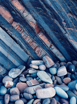
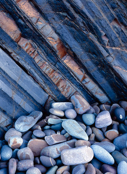
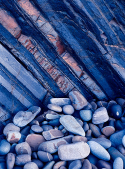
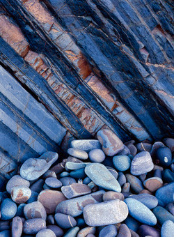
For each pair in the table below, Ektar is on the left and Velvia is on the right
(Ektar is on the left and Velvia is on the right)

