When an image is more than the sum of it's parts

David Ward
T-shirt winning landscape photographer, one time carpenter, full-time workshop leader and occasional author who does all his own decorating.
Photographic description alone will never be inspirational, never make a heart beat faster, never bring a tear to another's face. To achieve these things emotional messages must somehow be woven seamlessly into the photographic representation. But beyond what is baldly described by the light captured in a scene, the exact meaning of photographs is elusive. We read them but it’s not like reading prose, there’s no dictionary that we can refer to for definitions. Every viewer reads them in a subtly different way and their meaning may also alter for different viewings by the same viewer. Photographs’ descriptive power is almost overwhelming, sometimes it’s as if the images shout about the contents of their frame. Yet, almost lost in the cacophony of detail, deeper messages are being whispered. Despite the difficulty of hearing them, we know that the messages are there because we know that photographs can move us.
When a photograph evokes something beyond the mere description of what’s in front of the camera I think of it as transcending its subject matter. A transcendent image is therefore more than just an illustration: the message it imparts is more than the sum of the tones and forms that are amassed in the frame, more than the sum of labels that can be attached to its contents; a transcendent image moves us because of something beyond what is described. The question arises, how are these messages transmitted? Where is the emotional meta data held in a photograph? In this article I will be looking for the sources of this secondary information.
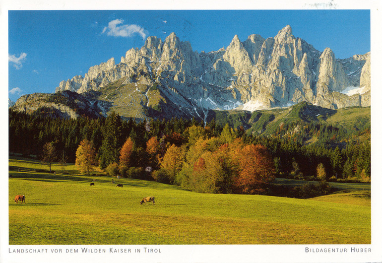
Consider this postcard image of the Austrian Tyrol:
When we ‘read’ a photograph, the first thing we do is to look for things we recognise and mentally attach linguistic or pattern labels to these objects. Our first read of this image might therefore go something like this: ‘tree’, ‘tree’, ‘tree’, ‘tree’, ‘tree’, ‘tree’, ‘tree’, ‘sky’, ‘sky’, ‘sky’, ‘mountain’, ‘mountain’, ‘snow’, ‘mountain’, ‘cow’, ‘cow’, ‘grass’, ‘grass’, ‘grass’, ‘grass’ more ‘grass’ and ‘cloud’. A list of nouns isn’t very exciting is it? (Incidentally, it’s a myth that in the Western world we read a photograph left to right. Our eyes actually move across an image in a complicated pattern, moving up and down, right to left and left to right at seemingly random angles according to what we find interesting in the image. We also frequently return to some points, such as the eyes in a face. It may be a convenient stick for a judge to beat an image with but it makes no difference to how an image is read whether the principle object in a scene is placed on one side of the frame or the other. The ‘preferred’ placement is simply a matter of tradition.)
You’ll notice that all the labels I’ve mentioned are nouns. Yet we rarely get an emotional response simply from a noun – tax-inspector being an obvious exception! To signify emotions we need to look for adjectives or adverbs in the image such as ‘green’, ‘blue’, or, even better, ‘peaceful’, ‘still’ or ‘sunny’. Obviously there is degree of consensus on the definition of some visual adjectives – ‘green’, ‘blue’ etc. – whilst others have more plastic definitions – ‘wild’ for instance. But the central problem with wanting to use photographs to express how we feel about our chosen subject is that whilst every photograph is heavily laden with visual ‘nouns’ (description) there is no single fixed interpretation of their emotional significance. To show how complicated the question of interpretation is let’s consider just the colour adjectives for a moment. Any colour has a wide range of emotional information associated with it, some of it cultural, some personal and, as I shall point out later, some of it hardwired into our brains. Red, for instance, is the colour of blood, said to be the most emotionally intense colour but it is also thought of as optimistic and sexy. In Russian there is a linguistic link between the word for red and the word for beauty. This might be why the Bolsheviks chose red for their flag. But even if it were not it means that red now also has a political connotation. It’s also thought of as aggressive, it stands for danger and stop! It stands out from the background better than any other colour; perhaps this is why some wag once suggested that RPS stands for red patch somewhere? That’s quite a range of possible responses and I’m probably only scratching the surface. There will be other attributes of red that are of personal significance to individuals; perhaps that shade was the colour of your first bike, or the colour of your beloved’s lipstick, or the colour of your favourite football team’s shirts. And it’s not simply a question of any sign being present; how it’s interpreted will depend upon its context. And how the viewer is feeling… Complicated, isn’t it?
So, our reading of the visual nouns would seem straightforward enough but for the fact that we all habitually and unconsciously attach a personal history and significance to objects and places which colours how we interpret them. Our personal experience and the cultural symbols that we have absorbed throughout our lives can lend significance to any part of an image. This level of meaning is classified as residing in signs. Hopefully you can see from my brief look at the colour red that the adjectival labelling is an example a subtle sign system. Signs can exist as text, images, symbols, flags, objects, sounds, colours, smells, facial expressions or physical gestures. Signs can be grouped into languages (body language for instance) in a similar way to words, though the boundaries between these languages are not as distinct as those between spoken languages. Signs are literally anything that communicates a meaning or emotion to us, whether that meaning can be expressed in words or not.
So anything that we see in a photograph might be suggesting something other than just itself. For adherents of the mystical tradition in photography a cloud in a photograph isn’t always just a cloud but, as Tim pointed out in his recent article, in the case of Alfred Stieglitz it was also an expression of how he felt. Beyond this personal perspective, objects or places have often been widely adopted in a culture to stand for things other than just themselves. To grasp this idea one need only think of how living things have been used as symbols to suggest specific attributes; a lion for valour, an oak for strength or an owl for wisdom. Sometimes, as in heraldic symbols, this system of representation is meticulously codified.
A rigorous study of signs began at the beginning of the 20th century when a group of philosophers began looking, as Daniel Chandler noted, “for ‘deep structures’ underlying the ‘surface features’ of phenomena.” These ‘Structuralists’ included the Swiss linguist Ferdinand de Saussure. He proposed a study of signs; anything that signifies something to us and not just the kind that read ‘Keep of the Grass’ or ‘No Waiting’. Perhaps appropriately, philosophers can’t agree a name for the study of signs; it is known variously as semiotics or semiology - it hasn’t even been agreed whether linguistics is part of the study of signs or vice versa! Throughout this article I will refer to the insights Frenchman Roland Barthes who was for many years, until his death in the 1980’s, the leading theoretician using semiotics to analyse photography.
Linguists, like Saussure, realised that words are arbitrary symbols: there can be no innate link between the object and the word attached to it. Such a link would deny the possibility of naming the same thing ‘dog’, ‘hund’ or ‘chien’ - it would preclude the existence of more than one language. This arbitrary nature extends to all other sign systems and therefore any sign may have a multiplicity of meanings. Consider, now, how a photograph of a single crooked tree atop a rocky hill might stand for ‘loneliness’ or ‘deforestation’ or ‘perseverance’ or ‘old age’ or ‘life’ - or maybe even ‘wind’. Semiologists would recognise the tree as a sign and refer to its ‘standing for something else’ as connotation and its ‘standing for itself’ as denotation; so our example tree would, amongst other things, denote crookedness and hawthorn and might connote life and loneliness. As soon as you place two connotations next to each other the complexity of the result is much greater than just double, since it calls to mind yet more signs that evoke the same idea.
The principle difference between words (so called natural language) and other kinds of signs is that words have widely accepted definitions of meaning (otherwise there could not be dictionaries) whereas the latter usually do not – though of course the meaning of some is prescribed, just think how much more chaotic our roads would be if we didn’t all agree on what road signs meant! The lack of definition is because our reading of signs, other than words, is both culturally specific and partly subjective. It is also because, as Emile Benveniste asserted, “We are not able to say ‘the same thing’ in systems based upon different units.” Others, though, have asserted that all other signs can be expressed in written language; Marvin Harris opined that, “human languages are unique among communication systems in possessing semantic universality… [in being able] to convey information about all aspects [of experience] whether actual or possible, real or imaginary.” Lucky chap, he has obviously never been ‘lost for words’! Just think about how inadequate words can be for describing smells or colours and you will see that, whilst it may be true that we can describe anything with them, words are not truly equivalent to the thing described. In a similar vein, the curator, photographer and critic John Szarkowski wrote that, “The meanings of words and those of pictures are at best parallel, describing two lines of thought that do not meet. If our concern is for meanings in pictures, verbal descriptions are finally gratuitous.”
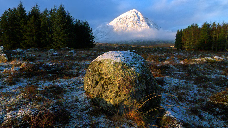
Signs that have a wider cultural meaning are referred to as icons and form a particularly interesting group. Examples from different fields might be Marilyn Monroe, Everest or a Rolex watch. Each of these icons connotes a wide range of subtle but powerful messages. For Monroe for instance we might read movie star/tragedy/beauty/glamour/sex. Icons are potent signs because their range of connotation is widely accepted. The inclusion of any well-known cultural icon in a photograph strongly affects how we read the image. (This has implications for how we caption images since the mere naming of a well-known place will to some degree alter how people think about the image.) Perhaps the best example of a landscape icon in the UK is the Buchaillie Etive Mor, or more correctly the east-facing crag called Stob Dearg. It appears in so many images because its shape mimics the classic pyramidal shape drawn by any child asked to depict a mountain. You might say that it represents mountain-ness in its most concentrated form – especially when covered with a mantle of snow. The problem with including icons in a photograph is that they have a tendency to polarise interpretation because there comes a hard to define point where an icon tips over into a cliché. For some people photographing Stob Dearg is still a dearly held goal whilst for others its mere mention turns them off because they see it as having been done to death.
When Barthes wrote in his last book, ‘Camera Lucida’, that, “A photograph is always invisible, it is not it that we see”, he meant that the meaning we gain from a photograph derives from a whole range of signs and symbols that we understand in a wider context external to the image. The key point is that we read a photograph; viewing one is an active, not a passive process. Some of these signs appear to be universal (e.g. some facial expressions), others are widespread but culturally specific (e.g. religious symbols) and still others are peculiar to the individual viewer arising from their personal experiences (e.g. I hate that shade of green!). The response to some other signs is very deeply seated, perhaps even hardwired. Research has shown that some of the light entering our eyes transmits signals directly to the hypothalamus, one of the oldest parts of the brain and part of the limbic system. Light shifted towards either the red end or the blue end of the spectrum evokes an instinctive emotional response from the limbic system relating to temperature. We even call these colours, respectively, warm light and cold light.
All forms of visual representation, including photography, share one attribute; the image is not only a mirror for the artist's experience but also for those of the viewer. The meanings that we extract from an image are necessarily flavoured by individual responses since every viewer brings his or her own intellectual and emotional baggage to the viewing. The precise source of these personal responses is by rights the domain of psychology and psychoanalysis in the Freudian or Jungian tradition and beyond the scope of this article but we must always be aware that these personal responses are inevitable. This individuality of response means that not only will single signs evoke different connotations for different people but also that any given sign may evoke no response at all in some individuals. There will be common points of contact but also areas where meaning drifts for each individual, in the same way that no two people will get exactly the same meaning from a poem. Just as the conjunction of words produce indefinable and unstable thoughts and feelings which change from one person to another, and sometimes subtly from one reading to the next, so the effect of an image on the viewer changes from one person to another. For some the reflection of the photographer’s viewpoint by the image is smooth and almost perfect, for others it resembles more the grotesque distortions encountered in a fairground Hall of Mirrors.
As I mentioned earlier, the great American photographer Alfred Stieglitz proposed that a series of his photographs of clouds where in a sense equivalent to how he felt about his subject. The problem with the notion of Equivalence is that not only should the object photographed evoke an emotional response in the photographer but that, by dint of his expertise and insight, he is thought able to evoke the exact same response in the viewer. John Szarkowski curated an exhibition entitled ’Mirrors & Windows at the Museum of Modern Art in New York in 1978 that has greatly influenced subsequent ideas about the interpretation of photographs. The premise for the show was that all photographs are either mirrors reflecting the photographer who made them or windows presenting the photographer’s view of the outside world. The former tell us more about the photographer than about reality, and the intent of the latter is to tell us more about reality than about the photographer. In Szarkowski’s terms Stietglitz’s Equivalents are mirroring the photographer’s concerns and presenting them as a perfect reflection to the viewer. This could only possibly be true if there were single fixed meanings for visual signs and, as we have seen, there are none. Another American photographer, Minor White, offered little practical advice on how to achieve ‘equivalence’ beyond his somewhat gnomic comment that, ‘When a photograph is a mirror of the man and the man is a mirror of the world, Spirit might take over.’ However he seemed to realize that something more than a simple intent to express emotional response was needed because he added that, ‘It follows that “self-expression” as the aim of the photographer is not in itself sufficient.’
There can never be a guarantee of Equivalence, only a striving towards it. Individual responses do not mean that interpretations are cut entirely adrift, at the mercy of unstable currents of meaning. The photographer suggests a course by the content of the image but cannot ensure that the viewer will safely reach the intended port. The reading of an image can be directed further by captioning the image, which serves to emphasise certain aspects over others.
Is, then, a common inner meaning really unreachable and if so aren't we then left just with the surface gloss? Photographer and theorist, Victor Burgin insists that a single common meaning beyond a simple description of the contents of the photograph is indeed unreachable because, “There is no language of photography, no single signifying system… upon which all photographs depend.” This contrasts with classical painting. Many works by grand masters from the Renaissance onwards depicted scenes from the Bible or other mythologies. Figures and places depicted in these masterpieces had a range of accepted meanings, so the cognoscenti (i.e. the rich patrons and those involved in the production of such art) could read them. It’s important to note that the paintings were not equivalent to prose but nearer to stanzas of poetry, with all the fuzziness of meaning that suggests. Nevertheless there was an accepted codified system of signs. Such a painting contained a limited range of signs with broadly accepted meanings but in a photograph the signs are not so constrained. To return to my earlier question, we are definitely not left just with the surface gloss in a photograph, but rather with a very complex set of signs to decode.
In any single photograph we will read a lot of different signs, often from totally different sign systems. In a portrait photograph, for instance, we might read signs relating to the style of photography, body language (including facial expression), clothing, age, era, location, social status, race and so on. Some of the processes by which we read these signs are conscious but many are not. The photographer cannot know how the viewer might respond to any one of these signs, let alone the entirety of signs within the image. By careful composition, the photographer might be able to limit the choice but there will always be the possibility that something of personal significance to the viewer subtly changes or even entirely subverts the intended message.
So where does this get us when we’re thinking about making photographs? Landscape photography in the traditional view has essentially been a documentary practice in the sense of recording an image rather than constructing one but, as we have seen in the last issue of On Landscape, this is changing for many practitioners who use montage widely or even exclusively. The possibility exists for these photographers to construct a message from a series of icons. I feel that because the breadth of interpretation is so wide photographers might be tempted to pick icons with the narrowest possible interpretation. The danger arises of the message being clunky. Instead of it being subtle and seamless, like finely crafted prose or (more desirably) poetry, it might look like a group of disparate words. For the traditionalists, the search for symbolic meaning is necessarily constrained by what the landscape has to offer in any particular location. I feel that it is better to react instinctively rather than to try and consciously include signs. Whatever we do at a conscious level there is bound to be a huge amount of signification that we are only subconsciously aware of. Trying to control the signification completely is fruitless task, likely to result in a stilted conversation with our viewers. Where the notion of signs really helps is when we’re trying to understand why an image moves us, whether it be another photographer’s or one of our own. I feel certain that the accumulation of this understanding over a long period will help us to craft our images more skilfully.


