Part One

Tim Parkin
Amateur Photographer who plays with big cameras and film when in between digital photographs.
The world of medium format digital cameras systems is one that is typically associated with either very hard working professionals or well heeled amateurs (or well heeled lazy professionals I suppose). However as the the earlier generations of these cameras and backs circulate through to the second hand market, the prices are starting to look competitive. But just how good are they if you compare them with what you can get from a modern, high-end DSLR?
Well Andrew Nadolski and I went out in Devon to have a look at the differences but with an obvious strong slant toward landscape photography. To this end we tried the cameras on a shingle beach scene and then the following day we wandered into Dartmoor and visited Hexworthy Bridge on a wonderfully challenging rainy day.
First though we had to choose a modern, high-end DSLR to compare it with and the choice was fairly obvious as both me and Andrew had the Nikon D800 (non-E version - although that shouldn’t matter from our previous side by side tests and we’re using f/11 and f/16, typical landscape apertures). It’s widely accepted as the highest quality that DSLR’s have to offer and we could test it with the Nikon 50 f/1.8 G - a stunning little lens.
The planning didn’t take too long and quite soon we were ready.
“Beer first then!” Andrew said.
“Well always” I replied “but I thought we were driving?”.
“No! The village of Beer”
Slightly disappointed we got in car and proceeded
Here’s the view we were shooting taken with the D800 - lots of nice evenly sized pebbles and fine detail from the writing on the boats to the rigging, nets and lots of tough colours including challenging magentas and purples
[aside title=”The Challenge of the Magenta”]
Magenta is one of the more challenging colours for digital cameras as it isn’t a ‘frequency’ of light like the rainbow colours are. Magenta is what you get if you combine blue and red. Hence if balance of blue to red ‘brightness’ of the sensor is off then magentas can shift hue. [/aside]
We’ve taken the images from both the Hasselblad and the Nikon and colour balanced them using global colour colour curves. These brought the images fairly close and the other difference was the inherent longer exposure because of the base ISO of the cameras and the differences in apertures for equivalent depth of field (f/11 on the Nikon, f/16 on the Hasselblad).
NB - The focal lengths have been chosen to match the picture heights and so we’re not really comparing all of the Nikon pixels, only a 4x3 crop of them. We’ll comment on this later though. We’ve also sharpened the Nikon and Hasselblad files ‘optimally’ (i.e. enough not to create artefacts).
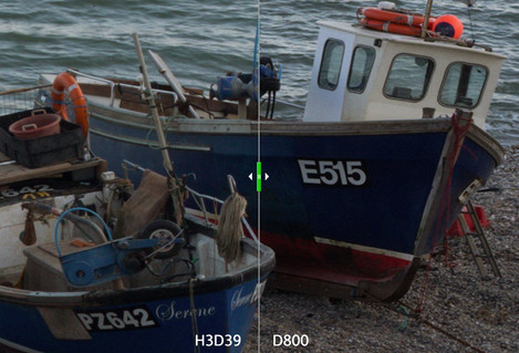
Here’s the full image comparison (Click for interactive)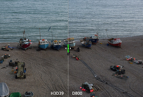
Well the first thing is that we can’t really tell much difference between the Nikon and the Hasselblad at this size, and I wouldn’t expect to.
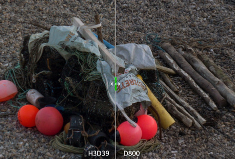
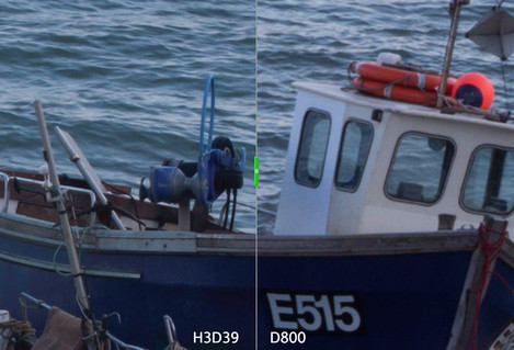
The differences start to appear when we look at the crops. The first crop shows some of the shingle, some writing on a boat and various bits and bobs.
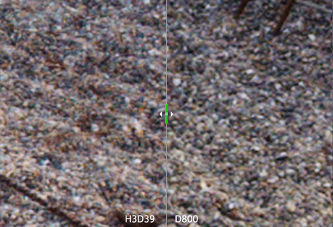
The results are pretty damned close - the Hasselblad has a tiny bit more microdetail and renders thin lines very cleanly but it shows lots of moire on any small detail - bits of colour in the shingle for instance. If you look at the image below you can see an example of this.
If we look at another crop we can see the same result really - a very close match which just goes to show how well the D800 performs.
However, if we look at 200% we can see that the H3D39 is performing incredibly well, the smoothness is very impressive and the fineness of detail finally shows up. This is a remarkable performance from a very old sensor.
This advantage comes from an increased pixel count. For the picture we are looking at we’ve cropped the D800 so it effectively only has 32Mp at this crop size against the Hasselblads 39Mp - This translates into a 10% increase in resolution. But the lack of anti-alias filter also helps when you look extremely closely.
However, looking at the files at this size is the equivalent to a 120” print which is excessive for this resolution (that’s 90dpi). If you were pushed for a wall sized banner then the differences should show up in a side by side but it would be close. In a 300dpi print I wouldn’t expect to notice.
And in fact we made prints at sizes from A4 to A2 and also made a sample crop print at A1. We asked a few people for their opinion on sharpness and the results were inconclusive.
There were colour differences between the two cameras with the biggest differences being the rendering of the plastic fluorescent buoys and life rings. It wasn’t obvious which of the two cameras was rendering correctly but my gut feeling is the Hasselblad looked the more correct.
Finally you may have noticed that we have included a “Portra 160” comparison in each of these tests and from this guessed that we stuck a bit of film in the camera just to see what results we got. We’re under no illusion that the results will be that competitive as we have previously commented that a precisely focussed Mamiya 7 (6x7) frame is about 40 megapixels and hence the Hasselblad 645 frame (which is half the size) should be about 20 megapixels.
And the comparison images hold this ‘estimate’ to be fairly accurate - the detail in the Portra 160 shots is quite a bit less than both the D800 and the H3D39 and also has quite a unique colour. The highlights of the water and shingle tend to a creamy red whereas the shadows are cooler.
We made prints of all the the files and the optimum size of the Portra 160 print was around 10x15 and that of the D800 and H3D39 was around 20x24.
We showed the digital and film prints to a few people and there was a mix with some preferring the film result and some the digital results which were too close to compare according to people. However in terms of sharpness, most people chose the film shot when it was enlarged to between 4 and 5x but then swapped to choosing the digital when you got to 6x and above. This looked to be because the film had a ‘bite’ to it when enlarged this much but the overall resolution fell apart a bit past 6x. The results would have been slightly different with transparency where I’m guessing the smoothness of a transparency scan and it’s increased resolution would possibly bring it closer to the digital results.
Take it to the Bridge
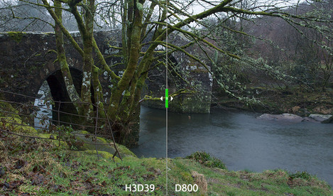
But the scene didn’t test our typical green landscapes and so the next day whilst it was raining buckets we went to Hexworthy Bridge and shot a test of grass, moss and ferns. The two exposures we different shutter speeds and so the water under the bridge looked different and the rain was slightly heavier for the Hasselblad exposure. However the test did show up some colour differences.
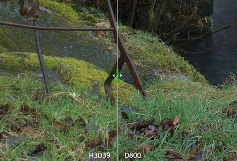
The main difference we noticed was the greens in the grassy foreground. The Hasselblad shows a consistent green of the mosses and grasses whereas the Nikon shows a more blue green grass. Let’s take a closer look at this area.
Here we can see in a lot more detail that the Hasselblad greens have an overall yellowy look to them whereas the Nikon colours are a lot better separated. This isn’t as much of a surprise if you’ve previously seen our ‘Big Camera Test’ where we looked at the colour of the Phase One P45 and you know that the H3D39 and the P45 use the same sensor.
So it’s that luminous chlorophyll issue again. The Nikon, which uses the excellent Sony sensor, renders the scene very close to our reference Sony A900 - a good result if you like green (or don’t like it but want it to look as good as possible).
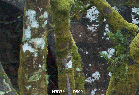
The other area that we looked at a crop of is just where the arch of the bridge is and where we have a couple of small ferns.
The same difference in green handling is visible in the ferns versus the mosses on the tree but we’re more interested in looking at the shadow rendering in this case. It’s an inevitability that the Nikon D800 will perform exceptionally well here - it’s a generation ahead of the Hasselblad. Chalk another to the Nikon.
Purple Rain
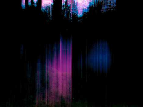
Another surprising issue with the Hasselblad was the way it coped with the rain. Although we were very protective of the camera with one of us holding the umbrella and hence no raindrops hit. However, a couple of times we managed to get some very peculiar results as seen below.
The H3D39 has a fan and vent in the side and we can only assume that the general moisture in the air from the torrential rain (i.e. very fine spray everywhere) had affected the sensor somehow.
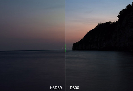
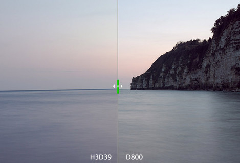
We did have a final test of the camera which was after the beer test where we took a shot of the last light of the day.
We’ve tweaked the shadows of the Hasselblad as the purples were fairly offensive (easily removed). You can see the shadow areas better in this brightened version.
Now the Nikon and the Hasselblad have some problems. Firstly the Nikon has appeared to enhance the blue/turquoise of the sky and the Hasselblad has some very odd colours, strangely yellow almost, in the sky.
The shadows in the Hasselblad shot performed very well - a lot better than we both expected. It just goes to show that if you get the exposure right there is still a lot of scope.
I won’t draw too many further conclusions from this image but leave it for your own analysis.
The next part of our test looked at the possibilities of using the Hasselblad digital back as part of a system. Click here to continue.

