A book review with a twist in the form of an interview with one of the founders of Triplekite

Dav Thomas
Tree loving photographer, mainly using large format film cameras but also flirts with other formats.
Although On Landscape was always intended as a ‘virtual’ magazine for various reasons - cost being an important one but print quality and the possible advantages of video and interactive content being others – the idea of seeing great photography printed well is still one which we think is incredibly important. Seeing photography on a screen is something that is working better and better, especially when people are using tablets such as the Ipad with retina display, but there is something different and uniquely satisfying to seeing images in print, either in a gallery or in a book.
To this end we were very happy when Dav Thomas and David Breen from Triplekite approached us about collaborating on a series of books about landscape photographers. The idea of a compilation book of landscape photographers has been kicking around in both mine and Dav’s heads for a while and we even went as far as to mock up a compilation of large format photographers but real life got in the way as usual and the idea was put to one side. Since then Dav Thomas and David Breen have kickstarted a publishing business with a new model that will hopefully reignite the passion for printed works.
We talked to Dav about where the idea for the Land|Sea book started.
Dav Thomas: I was always a fan of AG Magazine, I enjoyed the fact that it featured photographers who were out there doing stuff a little bit different to the norm and it was varied and interesting every time. So for me there was certainly a gap in the market representing landscape photographers who were not doing the usual stuff, who were doing projects and more personal work and who didn’t really have a voice or channel to show their work in print. There is also a big movement at the moment for publications that are beatiful objects to own – lovely typesetting, beautiful feel publications. There are a couple of these like Another Escape (http://anotherescape.com/) and Kinfolk (http://www.kinfolk.com/) who have this very textural feel - they’re more general subject matter, not necessarily photography.
Tim Parkin: Treating publications like works of art in themselves is done quite a lot in the graphic design industry as well, there’s a very strong craft element with letterpress typesetting etc
Dav Thomas: Well I’m certainly a fan of that as well - the beauty of doing the Triplekite work for me is that as someone with a love and passion for graphic design, it gives me the chance to mess around with type and to produce things that I think are beautiful in their own right – you you don’t generally get to do that with your general graphic design jobs. And also, as I’m a photographer as well, I hopefully know how to treat photographs in a publication and give them the space and the flow they need which I think a lot of non-photographer graphic designers wouldn’t have.
With Land|Sea I didn’t particularly want it to be a magazine but I don’t think it’s really a book either, we can’t actually decide what it is – we haven’t got a word for it – after trying all sorts of stupid descriptions for it, in the end it’s not a book, it’s not a magazine, it’s just “Land|Sea”
TP: So what did David Breen say about this when you raised the idea with him?
DT: He said “How much is this going to cost me!?”
TP: Pragmatic to the last!
DT: He liked the idea of it – he loves quality printed books and the magazines I’ve mentioned. But we needed it to be something that was as close to perfect as we could imagine – it’s definitely not a budget book and with the production costs we’re not going to make millions out of it. If it breaks even we’ll kind of be happy.
TP: And then you came to On Landscape and suggested a collaboration
DT: Yes - We came up with the general concept of what it would be – it would feature 4-6 photographers in each edition and we looked at the sorts of photographers we might like to feature, obviously we were looking at On Landscape which I’ve had an involvement with in the past and it seemed that there was a big crossover between the sorts of photographers On Landscape were featuring and the ones that we wanted to feature. It seemed silly to do something that is sort of like On Landscape but in print but separate from it and so it made sense to see what we could do to work together on it, creating something that crosses over.
TP: And the choice of photographers is very much in the vein of how we work in On Landscape but the obvious difference is we haven’t featured architectural work. Possibly because I don’t feel knowledgeable enough to find appropriate photographers. Giles’ work is very strong and graphic though and works very well in print.
DT: Giles is one of David Breen’s favourite photographers so we really wanted to feature him. Overall though we wanted each issue to be quite varied so it’s unlikely that any one reader will like everything we put in Land|Sea but even if you’re not entirely sure whether you like someones work, hopefully you’ll be able to read about them and get an idea of what they’re about. There are magazines out there that already cater to the mainstream audience - we wanted it to be a bit more cutting edge.
TP: Myself and a few colleagues were chatting about this in Scotland in terms of photography and taste and the photographers featured in On Landscape because we often get emails from people about some photographers that say “I can’t believe you’re including this rubbish” alongside others saying “I’m so glad you’ve included XXX” and they’re both writing about the same article.
But I was arguing that if you had a book or a magazine about music you would be very unlikely to fill every issue with music that satisfied all of your audiences tastes. And most buyers of music magazines accept this but are still interested in buying Q even if they feature an interview with the latest Country and Western artists alongside a Slipknot feature. And people still talk about music with their colleagues even if they disagree about certain artists (which is inevitable if you have a level of passion about things)
The same should go for any subject magazine – it should be something that challenges people and hopefully even if you don’t like the featured artist you have enough trust in the magazine to know that the work is quality and some of the best of that genre.
DT: We certainly want whoever is in the magazine to be someone at the top of their game or someone doing something a little different. Every person we feature is doing work they are passionate about and that is important. Just like there are a lot of bands that I hear and appreciate but might not want to listen to. Hopefully that same sense comes across in Land|Sea. The biggest thing is that these photographers have personally decided that this is the sort of work they want to do and that they love – it isn’t something they have done to be part of a scene or just to get acclaim. They’re either passionate about the landscape they live in like Finn’s work – you can tell from his interview that he absolutely loves that area - and that comes across in the photographs. Giles is the same – he has a strong passion for his subject. That’s what I think it’s all about.
TP: I notice the photographs featured by the artists are definitely not a ‘greatest hits’ which is what we’ve come to accept from many online galleries – it’s definitely a set of photographs related to an area or style or subject.
DT: We wanted to some extent to leave it up to the photographer about what they featured in their section. With some of the people in the next volume which is coming out in the summer, there were particular projects that we wanted to feature and asked them if we could feature those, other people we asked to just provide a set of images and we’ll ask some questions around them - in a similar way that the featured photographer section works in On Landscape – but I didn’t want it to be formulaic, either project or portfolio, it should be different across the magazine .. or book.. or whatever it is … (Land|Sea : ed)
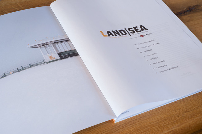
So particularly in this first one we have Joe Wright who is talking about a certain type of photography, Valda Bailey which is more of a portfolio of a style, Al Brydon has a strong visual look but it’s about his philosophy of photography, Finn Hopson is about the place and style he works In the second book we’ve got more project based work along with a couple of portfolio pieces.
TP: When we’re choosing the photographers for the issue, we have a spreadsheet of artists we’d like to feature and out of those the next selection has been published so for those who haven’t seen it yet can you tell us who we have?
DT: I can but it will require me remembering! We’ve got Pete Hyde, great classical landscape photographer, David duChemin who produces the Craft and Vision ebooks and who has submitted some quite surprising work – very different than we expected - but it’s good to feature recognised photographers doing different work; We’ve got Nigel Halliwell who has some stunning newer work from the Peak District which we’re excited about; we’ve got Simon Butterworth who you’ve featured a couple of times in On Landscape – we’re featuring his Scottish Island photography and finally we’ve got Michael Jackson featuring his non-Poppit Sands work. A good second album I think!
TP: And we’ve got a big list of potential photographers to be working with in future volumes too.
DT: Yes - every time we see someone interesting they get added.
TP: And we’re producing three books a year - that’s a hard schedule for book publishing but I think it’s needed in order to cover the huge number of great photographers we keep seeing.
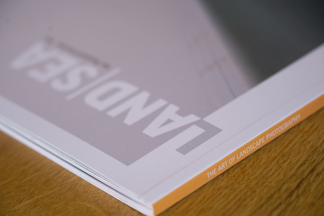
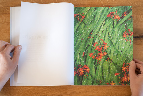
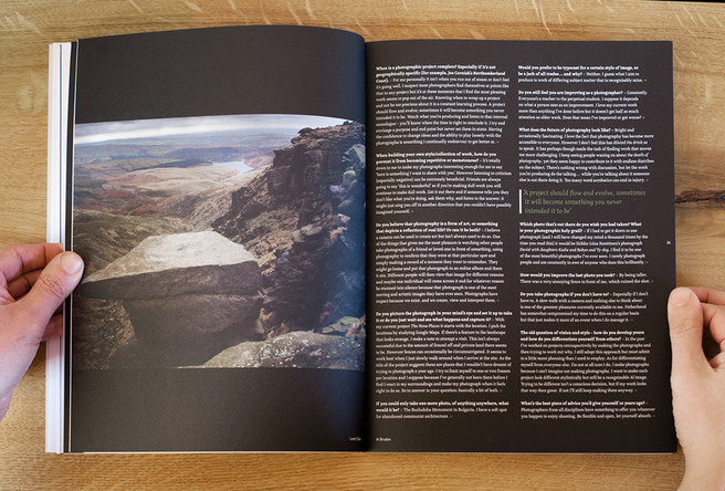
Now in terms of design there are a couple of fairly unique things about it. Firstly it’s printed on a matt, uncoated stock which is uncommon for photography books but which works very well. But also it has proper duotone black and white prints interleaved with CMYK.
DT: Printing black and white images is a little tricking on a litho press, if they are printed with standard CMYK inks like the rest of the book is, you tend to get an unpleasant colour cast – print them with just a black ink and they end up rather flat and washed out. So, because we want the images of those photographers who are working in black and white to be reproduced to the same sort of high quality of the colour contributors, we decided to print that section of images using an extra ink. Although it adds more costs to the production costs, we think it's worth it – we're really pleased with the way Giles's images turned out; the tones and wonderful and the extra spot colour means that the dark areas really are dark!
As for the paper stock, we wanted the whole thing to be a tactile experience really - we’ve a soft laminate on the cover - I’m sitting here now stroking it and it feels really nice. I haven’t sniffed it yet which I normally do!
TP: Steady on!
DT: I specced the stock which is a really good quality uncoated stock and we found a printer that uses a waterless press and that meant we can print beautifully on uncoated without ink splurges, desaturated colours and blocked up blacks. These printers have very little dot gain. Al Brydon’s photographs were a good test for this but his images have a great extension in the blacks.
TP: And you’ve separated these with some very lightweight almost japanese papers
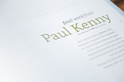
DT: My idea was to have the intro section on this very light stock, it’s 60gsm bible paper, and I wanted it to be a little bit transparent to hint through to the following pages and each artist has a single title page in the same stock. I think it just paces the whole book nicely.
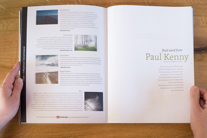
Then at the back we repeat the 60gsm stock with an essay about photography, in this issue a beautifully written essay by Paul Kenny about his influences.
TP: It is definitely going to be a challenge for the next essay writer.
DT: Yes, when we got it through we read it and thought “Wow that’s fantastic”.
TP: The logic behind the essay is just about people’s approach to landscape photography?
DT: Yes, it harks back again to making the book more than just a collection of portfolios. Having the essay is a chance to make people think a little more.
TP: Anybody confirmed for the next one?
DT: Nobody planned yet.. If anybody can write as eloquently as Paul about their landscape photography then feel free to send in your application!
TP: It’s definitely more than your usual magazine or book in terms of feel and that is something it’s difficult to get over in jpegs. It’s definitely something to value and collect hopefully. When this builds up into a collection it should be a good statement of the state of photography at that point
DT: Yes I would hope it’s a good chronicle of the current state of landscape photography. I always look back at ‘The World’s Top Photographers’ book and I think it’s a great milestone of it’s time – it defined what was happening at that point. I’d hope Land|Sea can do that as well.
TP: One of the other nice touches I think is that there is a single page at the end of each photographers’ sections listing a few influences with links to follow to find out more
DT: We left it to people to suggest influences or recommendations and I was really pleased at the wide variety of suggestions that people have come up with. It ended up working extremely well – Valda suggested photographers and painters, we even got Flickr and Pinterest as influences and it ended up so varied it’s become a good stepping off point to looking at other work and you can see in the list that Al Brydon includes and you can see the context in which he’s working. Not sure about Finn Hopson’s recommendation of some bloke called Dav…
TP: The book’s available now at £20 but there are also a few prints you can buy alongside it
DT: Yes we didn’t do a ‘special edition’ but we have got a print from each of the photographers and you can buy them individually at £20 or together at a discount. Photographer’s don’t generally buy prints so we wanted to offer the chance to get an A4 print at a reasonable price and a print that is outside of limited editions for instance.
TP: Getting away from Land|Sea for a moment - You’ve got a few book projects running at the moment including a Paul Kenny book I believe?
DT: Yes, we’re producing Paul’s retrospective of his ‘Seaworks’ images from 1998-2013. It’s looking very nice and we’re hopefully going to have that ready for June too. While we’re plugging we’re also producing s book of Iain Sargeant’s work on his “The Pool” project which will be a smaller, square book. We’ve got two more Land|Sea’s this year too and in total we’ve got about seven books left to produce this year. Hopefully people won’t be sick of us by then!
TP: People should save their pennies up because you’ve be on a stand at the On Landscape Conference at the Rheged in November.
DT: We will yes and by November we’ll have all of the new books out to buy. We’ve looked at this and thought that’s a lot of books to produce in one year, but when we look at each project they are all of a great standard and hopefully will sll be beautiful books.
TP: It is the unique position you have that you can make short run books on direct sale.
DT: We certainly don’t want to be a bulk publisher and we’ll only ever do short runs from a few hundred to a couple of thousand at the very most. We want each one to be great, something that we would buy oursleves – I think that is what differentiates us from the larger publishers
TP: Thank you very much
DT: It’s a pleasure.
Dav and I spent a couple of hours putting together a short promotional video for the book which you can see below or follow the link to You Tube to view it.
We're both very proud of the final product and hope people who start to purchase the series are too and we'd love to hear feedback from you about it. In the meantime you can order the book from http://www.triplekite.co.uk/landsea.
[youtube]https://www.youtube.com/watch?v=Y3vJy0CRTZ0[/youtube]

