Watch What you Dodge...

Tim Parkin
Amateur Photographer who plays with big cameras and film when in between digital photographs.
Over the last year or so I’ve been looking more and more into the properties of light and how it interacts with surfaces, shadows, etc. Some of my first research, prompted by a workshop with our own David Ward when I was first getting into photography, was around how shadows are ‘coloured’. This came about when discussing David’s ‘Poverty Flats’ - a stunning example of how sunny day, blue sky shadows can be intensely blue cast (especially when mixed with a dose of Velvia 50).
At first I had never noticed this because our eyes and brain work together to say that shadows are just dark and we don’t expect, and hence don’t look for, any colour. If we use a nigrometer, just a long tube - or at a pinch both hands shaped into a roughly telescope or cupped over one eye so you can only see a small area, then we can see these colours more easily. The nigrometer darkens all of our peripheral vision and hence our colour adaption gets ‘turned off’ (to some extent).
With the advance in the dynamic range of digital sensors (now starting to approach colour negative levels) we are able to lift shadows almost without limit. This raises a couple of questions though. If we are raising a shadow to match areas that are receiving direct or diffuse light, what about the colour? The answer is that it depends on what we are trying to achieve. If we just want to open up an area to make it more visible but still want it to remain a shadow, then we may not need to do anything. However if we want to ‘relight’ a scene then we most certainly do need to think about how colour is going to be affected.
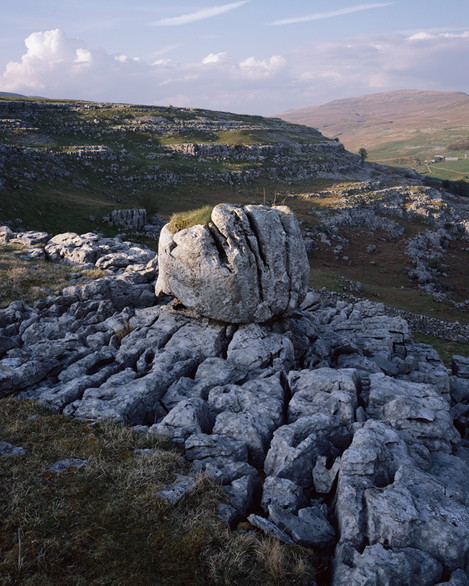
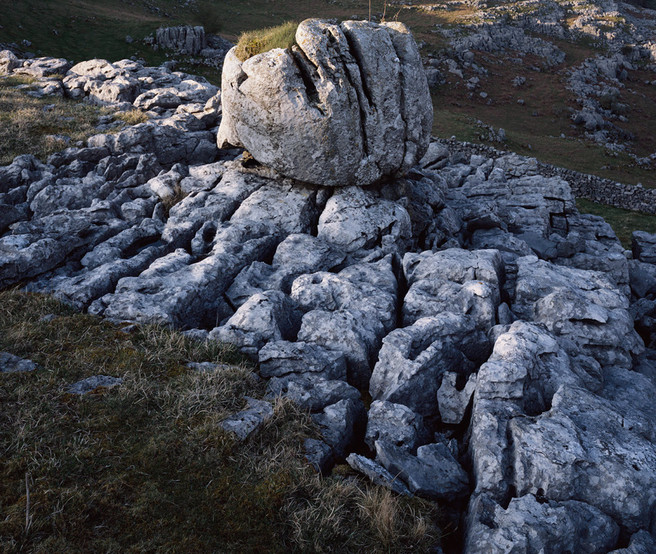
As an example I have gone back to one of my own pictures taken on Fuji Velvia 50 (to emphasise the blue shadow effect) and had a play with how to process it differently. At the time I wanted to catch the light touching the highest points of the limestone pavement in the foreground but by the time it approached this, the whole area become occluded at the same time. It would be great if I could recreate my initial vision for the shot.
Here’s the original
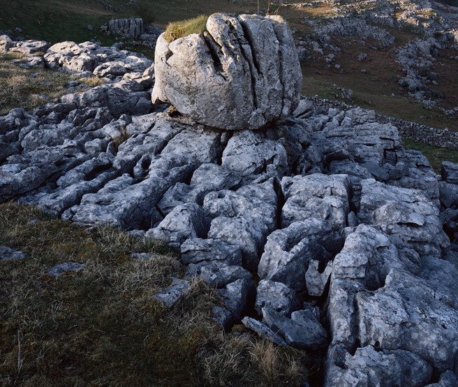
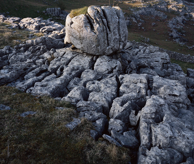
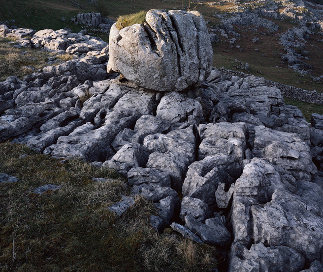
As you can see the foreground is quite blue and dark. The picture fails for me because of this lack of focal point in the bottom right. Let’s go in and just lighten the foreground - we'll show you just the main part to save space.
This looks better but now the balance of colour in the picture is wrong - most people wouldn’t know why it’s wrong but will just feel something odd is going on. We know better - what this picture needs is warming up to signify that this is receiving some direct light (or at least diffuse light).
OK - we're getting there now. This could arguably be receiving some direct light of sorts but what we really want is some of that skimming low light.
This is definitely getting there - the highlights have created pockets of light and acted to continue the area in the top left throughout the rest of the image.
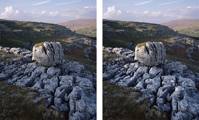
I do think that we might have gone a little too far warming the area up - we could have done with just warming the tips of the pavement where we're now 'simulating' direct light and then graduating down to the original blue in the shadows.
Now we're getting somewhere! All of a sudden the foreground integrates with the rest of the picture and we've also got a wonderful warm/cool complement happening.
This now looks quite convincing. Let's take a look at the whole image side by side with the original
Obviously this technique isn’t going to work in every situation but it’s definitely worth bearing in mind when you’re rebalancing/relighting a picture. Regarding the ethics of making these sorts of changes, I'm neither for not against them - I'd be happier if I had captured the image as I'd envisaged but despite being a large format junkie I'm not puritan when it comes to post processing :-)
If you'd like to see more examples of this sort of post processing or would like to see the photoshop files (or processed in Lightroom) let me know in the comments below.
Featured Comments From:
Scott Rae: Not wanting to get into the ethics of it, but between this and other articles, thanks for helping me become less paranoid about post processing my images! Maybe a naive part of me will always feel I should be getting it “just right” in camera, but I guess post processing has always happened, it’s perhaps just not been this accessible!

