Using a Musical Analogy

Tim Parkin
Amateur Photographer who plays with big cameras and film when in between digital photographs.
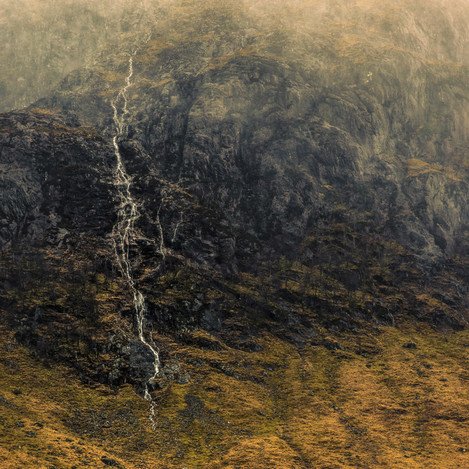
As you may already know from the interviews we have done with him, Mark Littlejohn was voted as the Take a View Landscape Photographer of the Year. The picture chosen was one that gathered quite a lot of praise online from many people who have previously criticised the competition (including me) but to say it was universally acclaimed is a stretch considering some of the quite vociferous abuse it has received on Facebook.
The criticism ranged from people saying it isn’t to their taste, which is fine as art is subjective after all, to … well here’s a sample (of the ones with no rude words).
“You really have to question what the judges were thinking”
“A champion landscape picture should speak to everyone and create a desire to see that place.”
“A viewer shouldn't have to read the caption to figure out what the image represents”
“If it were one of my shots I think I would have binned it at the point of shooting”
“For me the composition is weak, the waterfall would be much better on the right hand side.”
“If it is meant to be a landscape then why is it that I can not see the mountains, the trees, the weather, the sky?”
“If this were an abstract painting it would hold very high marks in my book of likings and preferences. As a photo, I have no idea what I'm looking at here.”
And this skips some of the more extreme comments. To be fair the amount of feedback that was positive in the comments outweighed the negative but I’m interested in why there has been such a visceral reaction (apart from the fact it won and anything that wins attracts haters). Let’s take a look at some of the ‘classes’ of criticism
- If it’s abstract it can’t be landscape
- If it looks like a painting it can’t be photography
- It breaks the rules of composition/photography
- A landscape photograph should make people want to be there
If it’s abstract it can’t be landscape
The first is quite interesting and I’ve never seen a reaction like this before. The general public and hence many beginner photographers have been fed a story that a ‘landscape’ is a wide view of the countryside including a horizon and sky. For some reason people are happy to have this definition stretched to include horizonless images as long as the scene is readily identifiable but as soon as we get close up to something or create a picture that isn’t obvious then the picture moves away from this ‘pure’ landscape definition.
As landscape photographers our definition of what is landscape is a lot more flexible - we have people like Eliot Porter and Minor White to demonstrate that abstract images can still be landscape. Edward Burtynsky creates amazing images that defy recognition but that are still classed as landscape. Perhaps the problem here is that our definition of landscape is formed by the history of art and the photographers that are stretching this definition aren’t particularly well known outside of museums, art galleries and practitioners. My hope is that if pictures like Mark’s make more of an impression on the general public, the definition of landscape might become more accepting.
If it looks like a painting it can’t be photography
This almost doesn’t merit a retort but the continuing idea in the eyes of the general public that photography is a ‘documentary’ medium does it such a disservice I can’t help myself. With this definition, the photographer merely has to be in the right place to record what nature hands us on a plate, and we all known how much rubbish that is. If you’ve ever been on a trip with a bunch of photographers and looked at a colleagues amazing photograph and wondered if you were even in the same location - never mind at the same time - you’ll know what I mean.
It breaks the rules of composition/photography
The rules of photography - I loved these comments.. “The river should be on the right hand side” is my favourite although “If you’re photographing in the rain you should clearly show it” comes a very close second. All rules are merely stabilisers for the beginning photographer - they help the photographer stay in the safe zone. However, the safe zone isn’t where all the fun happens!
A landscape photograph should make people want to be there!
This is quite funny being as some of the most amazing photographs ever come from the tops of 8000m peaks (as seen in the recent On Landscape conference during Alan Hinkes’ presentation). As much as the idea of seeing the view with your own eyes is appealing - I think the experience of actually being there wouldn’t live up to expectations.
And so many of the best landscape photographs are transformative in this way. So often the landscape isn’t a pleasant place to be and quite often the photographer is creating a semi-fictional narrative of what a place is like by excluding all of the other senses (and everything outside the frame). Would those images of Lochan na h’Achlaise be so serene with the soundtrack of the A82?
I don’t like it so it shouldn’t have won…
I have a background in music so I often use this as an analogy and this is no exception. There are many music competitions out there (and I’ve judged a few in my time) and one of the things that is very obvious when looking at the competitions is that just because you like a particular kind of music doesn’t mean that music will win. If you’re a folky and a heavy metal band wins you’re almost guaranteed to dislike it. Does this mean it should not have won or that the judges didn’t know what they were doing? Of course not - the judges have to make a choice across multiple genres and will hopefully have the ability to put aside their personal preferences and make an independent judgement of “best”.
I think that this is a very good lesson for photographers to learn as well. Our chosen main genre, landscape, has many, many sub-genres that, like music, you may find to your taste or not. Some people don’t like abstract landscapes, others find classic picturesque landscapes incredibly boring. The fact is that whatever our personal tastes - a well crafted image in any category is worthy of at least a little attention.
So for instance we may prefer our music more in the jazz genre and don’t like pop music. However when a very talented band produces pop music it can surpass it’s genre - just like the Beatles did. However much you may not like the Beatles you can’t doubt their credentials.
I suppose in many ways this is what Mark Littlejohn has done with his Glencoe picture, he’s dropped a “Paperback Writer” on a world where number ones were expected to be Frank and Nancy Sinatra, Dusty Springfield, Georgie Fame and Jim Reeves! And wasn't the world a better place for that?
Do you think taste in music is a reasonable analogy to taste in photography (and if so are you rockers or folkies)? Let us know your thoughts in the comments below.


