Alpine Landscapes

Dimitri Kouznetsov
After his move to Switzerland since already 15 years, images of Swiss and French Alps have become the main subject, while black-and-white large format sheet film has gradually become the main medium. The author’s statement is a passion for harmony, equilibrium and serenity of images through the perfect composition, which he tries to master studying game of light and shadows, flow of forms and negative volumes, interplay of lines and rhythms, counterpoint of the order to chaos.
Since ancient times, the practical necessity to immortalise images of people and events was the driving force for visual art. Famous artists usually painted landscapes in a mean time between elaborating more important portraits, while landscape-dedicated painters (Claude Lorrain, Jacob van Ruisdael, John Constable, Alexandre Calame, Albert Bierstadt,… ) were not the mainstream in the beaux arts.
The advent of photography in the 19th century not only scaled up portraiture, but also facilitated technique for landscape works. Ansel Adams, being on shoulders of Thomas Moran and Albert Bierstadt, was perhaps the first photographer who seriously considered the romanticism of landscape photography as the main direction for his creativity and life. Since then, both painting and photography in landscape works co-exist, rivalling, influencing and complementing each other. Both offer their unique attributes, unavailable to the other.
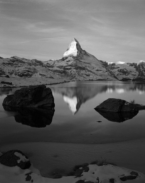
Photo 1: Searching the camera position, choice of a lens, focusing, etc.. was done beforehand the moment when the sun touches Matterhorn
In painting, we have freedom in everything – subject, composition, details at each plane - but difficulty in rendering of the actual image if a reasonably realistic approach is the goal. Photography is inverse – difficulty in composing using only the existing scene elements, being illuminated by the actual light (plus perhaps flash) is compensated by the relative ease of rendering.
A very limited set of tools that a landscape photographer has, are:
- choice of a focal length
- movement of camera position
- attendance of a good moment.
The latter might be either waiting util unwanted elements (a car, an aircraft, a group of tourists, etc..) go out of frame and/or the desired element is in, like a touch of sunlight at the key scene element (Photo 1).
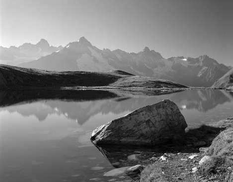
Photo 2. Repetition of the triangular shape on both the fore and far planes creates semantic liaison and helps integrate the image, while tonal perspective accentuates the depth. The stone is located about the low-right golden point
Searching for camera position and lens length is, perhaps, the most “artistic” part in the whole process. I always think that I “paint” over the photo frame using the available nearby objects, like stones, trees, water surface shapes, etc… by moving my camera left, right, up, down, backward or forward and changing my cropping.
A favourable projection of fore-plane elements onto the film can create an arrangement (photo 2) that helps harmonise the entire image. Of course, there are other tricks, like filters, helping photographer to keep resulting image quality under control and/or actively modify it. We use e.g. polarizing, neutral gradient or red filter (or their combination) to avoid too bright sky.
I personally like dark skies, they can ameliorate almost every landscape image, but, sometimes, the dark dramatic sky is the essential element (photo 6). Another example is the usage of a dark neutral density filter to make our exposure much longer and thus reduce the tonal contrast and/or soften unwanted details (photo 10).
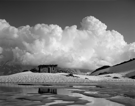
Photo 3. Contraposition of the soft round forms with continuous tonal transitions against the sharp shapes with abrupt tonal grades creates context to place the small refuge in between of the two. Positioning it at the lower left golden point leaves no doubt on where the focal point is.
However, why do we care so much to arrange the scene elements in a right way? Everybody knows that this question was well studied by ancient Greeks and Romans, and polished to perfection during the ages of Renaissance.
Composition
Much ink was spilled in classical text books on studying composition, and nowadays the same principles are reincarnated into a plethora of readily available, often oversimplified practical guides (e.g. this, this, this, and this etc).
The most known golden ratio rule has been discussed as a 'rule' for quite some time. - whether applied or discovered post-hoc by artistic commentators (e.g. John Thomas Smith 1897). The logic behind the rule is that we tend to like a persistent line in our scene, e.g. horizon, if it divides the frame at the golden ratio (sometimes roughly approximated by rule of thirds).
We also like when the key element of a scene finds itself near one of the four golden points, i.e. points of intersection of four golden mean lines (photos 2, 3). Thinking more about all the importance of composition in art, I realized that these rules (e.g. golden ratio) are more an instrument to present the contents of a scene we would like to show. Composition is rather a method, not the goal.
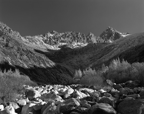
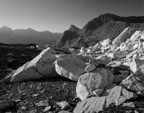
Photo 4. Compensated diagonal lines and accurate balance of tonal masses keep spectator’s eye inside the frame, while entertaining it by exploration of fine details
Given this guideline, the photographer should place the element s/he wants to accentuate near a golden point/line. What object is actually there, is really a choice of the artist. If on an image pretending to convey serenity and sensation of majestic isolation, in the golden point spectator finds an empty plastic bottle, the image undoubtedly fails, all the beauty is ruined – despite the use of the golden ratio. If the same image pended to an ecological contest, the goal is fulfilled – grace to the golden ratio.
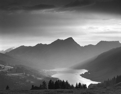
Photo 5. Weak “movement” of the lake shore is readily readable because of otherwise static composition with balanced tonal gradients and lines
The rule we just discussed is far from to be the only compositional principle. Another equally important rule is equilibrium of volumes and tonal masses (photos 2, 3, 4 and 5) on the scene. Such well-balanced, aka static, compositions having no “moving” unstable elements, nor dominant unbalanced leaning lines, being “polished by ages” (Charles Baudelaire) evoke sense of stability, spiritual serenity and tranquility.
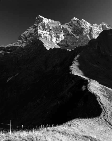
Photo 6. A combination of red and polarizing filters darkened the sky and shadows, thus helping accentuate main element – the diagonal line
However, sometimes we want to impress our spectator with dynamics and flow of energy, hence, we accentuate diagonals and verticals instead of horizontal lines (photo 6). Dynamic compositions are characterised by asymmetrical arrangement of its parts, unstable position of shapes relative to the imaginary horizon and clearly expressed visual movement of elements (photos 7 and 8).
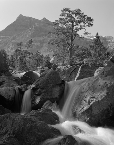
Photo 7. Almost vertical lines and moving water concurs with stable triangular shape of a mountain on the far plane, thus well expressing the usual alpine atmosphere.
Having said all this, I have to confess that, in my opinion, these rational explanations do little for practical work. Yes, some viewfinders even contain golden point marks, ready to be used by eager photographer fellows much influenced by the exact methods.
However, such an analytical approach does not agree with the nature and essence of the art. I like the Chinese proverb saying “it is impossible to comprehend beauty of a rose, peeling its petals one by one”.
Despite this, the analytical approach is still pronounced in western art. However, imaginary lines deduced from landscape scenery in the viewfinder are usually not straight, neither the key scene element is really so small to coincide exactly with the golden point (photo 2).
Hence, when choosing and positioning main elements, we cannot pedantically obey these rules, but rather we have to interpret them using our imagination and taste. Moreover, there are many other details in each scene, and a zillion interactions between them, both tonal and geometrical. This makes quite utopic the idea that we can build the perfect composition using just a ruler.
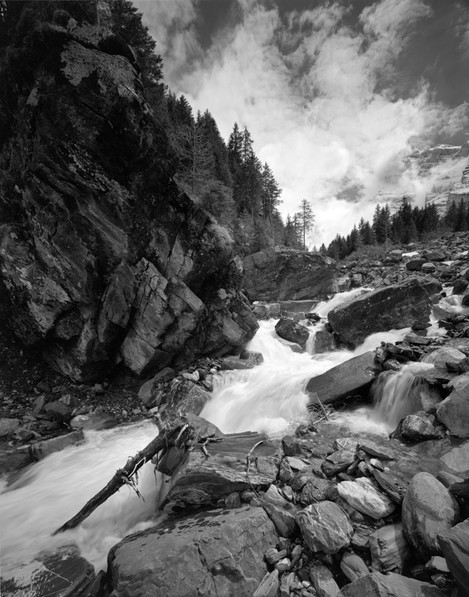
Photo 8. The well-known effect created by the wide-angle lens accentuated diagonals, movement of water, instability of stones, thus building a dynamic image.
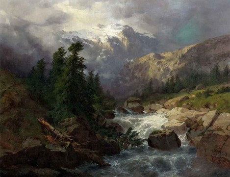
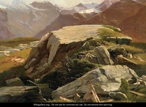
A beautiful image can only be composed using power of our brain, better educated by artistic ideas. Given the classical heritage started by the Renaissance artists, we should not complain about lack of ideas. Let’s just have a look on a great 19th century landscape master, Alexandre Calame, chosen for this article because of his main theme were also Alpine landscapes. Much appreciated in the whole Europe and particularly among British tourists on the middle of nineteen-century, images of “Swiss horror”, full of glaciers, steep rocky slopes, furious torrents and broken pines were his main subject (paintings 1 and 2). The art of Alexandre Calame did influence landscape painters at his time, and nowadays, I believe I am one of his followers as much as it is possible using photography (photos 8 and 9).
How can a photographer could be a “follower” after a painter though? Despite the fact that Calame was a much more realistic painter than his colleagues and he painted the real Swiss mountains in a quite recognisable way, he still was a romantic, easily combining various elements. This makes it almost impossible to directly capture of his subjects when nowadays modern life has left so many traces behind. Hence, instead of trying to stupidly reproduce Calame’s paintings being “at the same place, on the same season”, I keep in my head a “repertoire” of his, as well as my own, artistic ideas and search available scenery to materialise them.
However, a photographer is often is in a situation when only a part of the image observed in the viewfinder complicit with her/his artistic ideas. To what extend should we accept “violation” of the formal criteria? This question actually mounts even higher and addresses the eternal discussion on what is primary in the art: the form or the content. I answered this question for myself: emotions (i.e. the content) conveyed by artwork is the primary goal, while the formal criteria should be satisfied as much as possible.
What does this mean practically? If I see a nice, very interesting element (a stone, a tree, a group of flowers, a lake, a mountain, etc.. ), which is not supported by the overall composition, nor illuminated in a way I want, and there is no way to improve it using techniques discussed at the start of the article (like in photo 10) – I ignore it.
The ability to abstain tripping shutter if the image is not good enough is a fundamental skill for each photographer. It is not difficult to take an image, rather is difficult to abstain taking it. I always say that a thousand mediocre images will never transform into a single masterpiece. How do I assess if my projection on film is close to the perfection I desire?
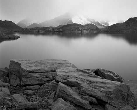
Photo 10. By removing details on the lake surface grace to a long exposure, the neutral density filter turned an ordinary greyish scenery into the emotional image that I sometimes call “Icy silence”
While photographing landscapes, I believe, no objective measures are of help. However, there is one thing to observe – time while composing. If the image is good, it quickly absorbs, leaving no doubts on how to frame the image. Otherwise, if it is difficult to decide which elements should be included, where are the accents, if composing takes longer than a minute or two – I usually just avoid taking such an image.
While deciding about an image, I always try to remember that out of a lot of impressions invading photographer at the moment, only the image will persist and be seen by spectator, but everything around it – being material or not – will disappear. The final image does not smell like flowers around, emits no sound like the torrent in front of you, nor it will tell a story about difficulties the photographer had overcame to arrive to the location. The mental ability to get rid of everything but the image itself is another fundamental skill. To achieve such “isolation”, I even sometimes try seeing the image in viewfinder as already being printed and decorated with pass-partout and frame.
Alpine photography remains one of a few directions in landscape photography where its practitioners may hope to find some inspiratory views, not yet photographed a million times. Himalaya and Andes certainly keep the most of the untouched and even unknown scenery, but even in the well-studied and systematically photographed (from Albert Steiner till Mario Colonel) Alps one can find hidden locations and own points of view.
About Dmitri Kouznetsov
Dimitri started taking photos at the age of 14, being gifted his grand-father‘s Russian camera “Smena”. After he had graduated from the Moscow State University as a chemist, Dimitri continued photography at his free time. Hiking in immense Russia firmed his passion for landscape photography.
After his move to Switzerland since 15 years ago, images of Swiss and French Alps have become the main subject, while black-and-white large format sheet film has gradually become the main medium.
Dimitri spends a lot of time in his secret garden – dark room, set up according to the classical recipes and notes of the best practice by Ansel Adams and many others. Dimitri is a member of Russian Society of photo artists and now lives in St-Maurice, canton Valais, Switzerland and works for Swiss Institute of Bioinformatics as a manager of scientific databases.

