Can the modern photographer profit from these ideas?

Dimitri Kouznetsov
After his move to Switzerland since already 15 years, images of Swiss and French Alps have become the main subject, while black-and-white large format sheet film has gradually become the main medium. The author’s statement is a passion for harmony, equilibrium and serenity of images through the perfect composition, which he tries to master studying game of light and shadows, flow of forms and negative volumes, interplay of lines and rhythms, counterpoint of the order to chaos.
After many years of walking in The Alps with a camera, I start realising that my understanding of photography much evolved from its original form. In the beginning, the way I practised artistic landscape photography was quite within the original goal of the photography, designed and thought as a mean to capture a favourite subject at the desired moment, i.e. make a document. Many tourists, when they come to visit new places, want a document (rather many of those) stating they were there. These documents usually called postcards.
My alpine photography was not much different at its beginning. Of course, I did try to photograph picturesque subjects at interesting moments, but still, too often, I ended up with just a document stating the fact of subject’s existence. Nothing more. Later on, I realised that an image of a picturesque subject, even captured at an interesting moment, but without an overall support of other elements of the scene, has little artistic value. A foreign detail, as a boring, disharmonic but well visible line might detract attention and impeach the spectator to enjoy your subject.
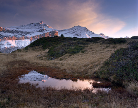
Sunset view over Les Dia-blerets with a small pond in the foreground. Annoying dark horizontal line breaks cross-talk between fore- and far-plans and ruins the image. Pentax 67II, SMC Pentax 55-100mm lens, Fuji Reala.
Being wielded nowadays with very modern (or even not so) cameras, we tend to forget our spectators are still humans and they are unlikely to get an “upgrade” that would enable us (photographers) manage their attention in a way we like and make spectator ignore unwanted details. The principles of human perception, have evolved a lot over the past century of modern art, but still remain close to the origin. Hence, I believe it is worth observing those, that have been well formulated in the flourishing heritage left to us by classical landscape painters.
Albert Bierstadt
In my previous post, I referred to some paintings done by Alexandre Calame, who was regarded at his time as a creator (or one of the creators) of the romantic alpine landscape. Here I would like to introduce the works by Albert Bierstadt, an American painter of German origin. After his 5-year education in the famous Kunstakademie Düsseldorf and professional maturation during his tour with fellow painters over Germany, Switzerland and Italy, he definitively moved to States, where he quickly gained celebrity grace to his monumental and romantic yet realistic works, full of dramatic light effects. The way Bierstadt painted mountains closely corresponds to my understanding of what a perfectly composed alpine landscape should be.
Chiaroscuro
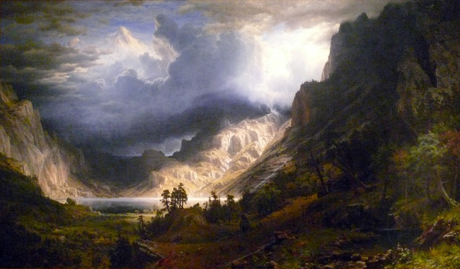
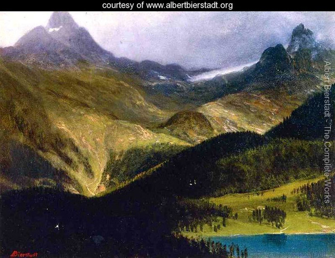
The image below readily demonstrates us the technique to concentrate spectators’ attention in the interior of an image, one of the base principles of the romantic landscape. Well known and appreciated earlier as chiaroscuro, such an effect of emphasising was employed by many Renaissance artists including Caravaggio. In application to landscape painting/photography, it suggests us that the closest foreground would remain in shadow, while the subject, being somewhere at the mid-plane is highlighted. Of course, such a complex scene we see on this monumental multi-stage painting is impossible to observe in reality, and I assume Bierstadt had never seen it entirely but rather composed it in a studio from sketches and plain-air etudes. We cannot benefit from this technique using classical photographic means, but following the principle of keeping illuminated subject somewhere inside the frame outlines the way to go and harvest some reasonably good images.
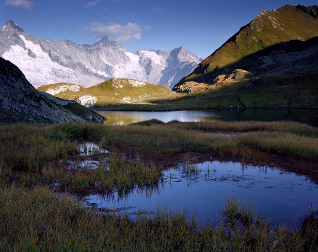
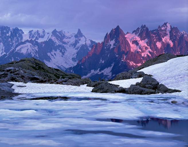
Morning light illuminates a mountain grid near Montblanc, September. Pentax 67II, SMC Pentax 55-100 mm lens, Fuji Reala.
Multi staging
Another basic principle of the romantic landscape is the abundance of stages or coulisses in the image.Technically speaking, these are shapes like stretches of ground, residing somewhere between the closest edge of a scene and the point of infinity. There should be at least two stages: fore and far ground, but more are always welcome.
A sufficient number of intermediate layers helps us to achieve one of the photographer’s vital duties - render depth of the scene with confidence. Landscapes having at most one single plan are usually too simple and quite flat, in my humble opinion. It is indeed difficult to say sometimes how many stages there are and where one finishes and the next one starts, though natural relief and alternating illumination might give us a hint on where the boundaries are. Probably, the spectator does not have to count stages, but rather feel they are enough to entertain her or his eyes.
Alternation of light and shadows
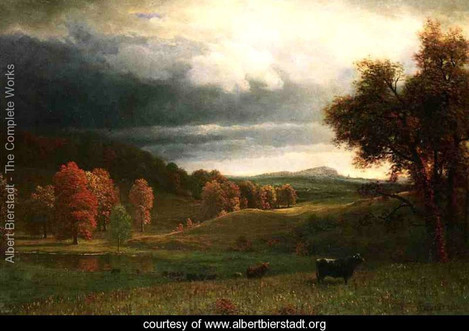
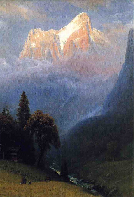
Multi-staging comes closely related to yet another important rule in romantic landscape – alternation of light and shadows at fore- and mid-grounds, which is, in fact, an extension of the principle of chiaroscuro, discussed earlier. A closer look at image 1 would reveal us that the magnificent work by the famous painter does have several light strokes on the foreground, though less evident and important than the main one. As well as practically all romantic landscape painters, Bierstadt did reiterate this approach multiple times [see image below] and was famous as a virtuoso of luminism.
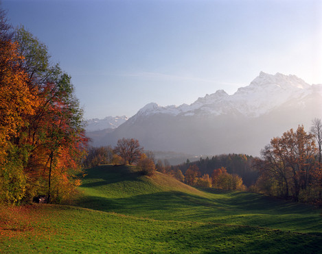
I perhaps should not speak much to fellow photographers to persuade that revealing illumination, as well as light accents, in reality, is a privilege, not the right. No one can be certain that being at a location would benefit having such. However, some prior knowledge might help. Knowing beforehand that direction of incident light on the hour almost coincides with the orientation of slopes, one might expect a revealing illumination. Certain weather conditions like next sunny day after a good rain stimulate the formation of low clouds, which usually provide interesting light accents. Having all these, it is worth to compose and wait until your frame becomes full of nicely highlighted details like e.g. the flow of curves of ground relief [see image 5, View on Les Dents du Midi, October] or stretches of larches revealed by light strokes.
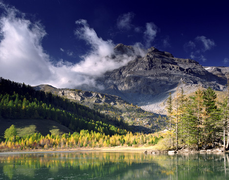
Natural reserve Der-borance, mid-October. Pentax 67II, SMC Pentax 45mm lens, polarising filter, Fuji Reala.
Going further
The ground principles enumerated above are indeed very important and total ignorance of those usually make results unacceptable (at least, for me). However, we cannot always require that all rules be satisfied at 100%. The photography, as we all know, is totally different from the spontaneous rendering of scene elements using pencil and brush, so we cannot have the same freedom. As I wrote in my previous post, we can only wait, search for the perfect viewpoint and select the right lens. The choice of focal length or long exposure are powerful instruments of creativity in photography, unavailable to classical artists, so we can positively use those advantages, while still remaining faithful to the base principles of the romantic landscape.
Foreground with wide-angle lens
Looking on classical landscapes, we readily observe that their creators depict subjects as they see the scene looking just straight, with perhaps some little movements of eyes around (this correspond photographing via a normal lens e.g. 40-50mm lens in 135 format, 80mm in medium format, 150mm in 4x5” and so on). Using modern wide-angle lens, we can render images that naturally cannot be seen without turning the head left and right or up and down. We thus willingly distort the image, giving eminent, sometimes utter importance to foreground elements and reducing mountains on the far-plan to small ridges. This is opposite to the way classical artists treat mountain forms - they always tried to emphasize their grandeur. Though little classical, I find photographing mountains via wide-angle lens is still acceptable if foreground elements compensate lost “value” and entertain spectator with a plethora of unusual shapes and combinations of colour [see images 3 Morning light illuminates a mountain grid near Montblanc & image number 8, Sunrise with a view on Montblanc grid]. Both example images obey the same principle discussed earlier – multi-staging. These multiple coulisses composed of completely different elements (stones, bunches of plants, steady or running water or even clouds) assure spectator’s eye amusements while accompanying its walk to infinity.
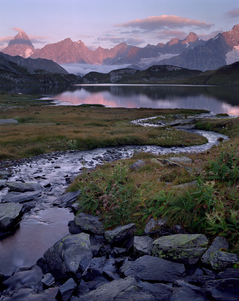
Sunrise with a view on Montblanc grid, late September. Pentax 67II, SMC Pentax 55-100mm lens, gradient filter and filling flash, Fuji Reala.
Ambient light instead of direct light
Though the fore and mid grounds in the latter example clearly does not have any alternation of light and shadows, we still can reasonably well read all its details. Why? Grace to a different reflective capability of its elements, the water surfaces are still less dark than the areas covered by various mountain herbs. On the same note, deranged by a little wind and thus reflecting bright sky a part of the lake is clearly visible in between and separates the darken ridge and still water casting ridge’s reflection. Though not as powerful as incident sunlight spots, all these subtle variations do the job alternating dark and light areas and assure readability of the image.
Colour instead of light
The previous image also shows us how the opposite colours, the herbal green-brown hues alternate with blue-purple tones reflected from water and greyish stone faces. Variation of colours at adjacent planes is another possibility to stay conformed with the rule of alternation when direct sunlight is unavailable. Interchange of opposite colours in addition to (or instead of) classical light and shades was well studied and employed by impressionists. Nothing prevents us from also combining both tonal and coloristic approaches and thus create images rich in various counterpoints.
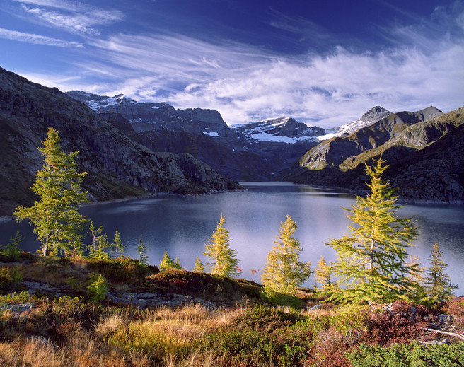
View at Lake Emosson, mid-October. Pentax 67II, SMC Pentax 55-100mm lens, polarising filter, Fuji Reala
On this image, in addition to several obvious light-shadow alternations at both fore and far grounds, we can as well observe how yellowish hues of larches contrapose to blue tones of the lake. While taking this image, I paid special attention and spent quite an amount of time to find a viewpoint where illuminated halves of the larches remain on a darker background, yet their shaded counterparts stay rendered over lighter areas.
Atmospheric effects
Atmospheric effects are another very effective mean helping photographer to unglue planes. I keep saying that fog is the best photographer’s friend. Just a little presence of haze can readily separate planes and help rendering depth with confidence.
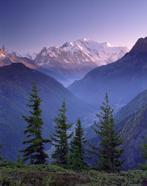
Evening view on Montblanc, mid-July. Pentax 67II, SMC Pen-tax 90-180mm lens, polarising filter, Fuji Reala
Bierstadt certainly had observed this effect many times before immortalised it on one of his paintings. Haze naturally accumulates almost every evening, though during some days more than other. After several warm, windless days it is certainly there. Hence a photographer might benefit if the scene is deep enough. To give you an idea, the distance between the point of view and Montblanc on the last photograph is about 20 km.
Originality
Sceptic reader might say: yes, following these principles is, perhaps, a fruitful idea, but the resulting images are embarrassingly similar to already existing paintings. True, it is clearly a point, though it is only because of choice of the subject. Same as a century or two ago, in the mountains, we tend to immortalise easily accessible locations, i.e. low altitudes, though nowadays we have much more technical means to go a little bit higher. In The Alps trees exist up to about 2 km, thus at already 2.5-3 km we have quite a different scene, rarely depicted during previous centuries just because only a few painters dared to be there.
We can name just several high mountain landscape artists (e.g. Edward Theodore Compton, Gabriel Loppé, Marcel Wibault), who were brave to go high with all their heavy mountain as well as artistic equipment, but without all these modern hi-tech mountain shoes, jackets, pants and skies. Though not always romantic, their works show us they did observe same above discussed principles. I am impressed by these people and do think that those, seeking nowadays for original artistic images of mountains, should follow their efforts.
Plagiarism or follow up?
Did Bierstadt and other influence me? Certainly yes, with their artistic ideas. My works included in this post should illustrate it quite evidently. Though, while looking in my archives, I did find several of them with quite striking similarity to Bierstadt works, this happened “to my surprise”, as I never tried to repeat his Alpine images. I can certify it is impossible, even if he would paint the entire canvas at the location and I knew his exact viewpoint. I cannot make technical replicates of some my own photographs after my move from medium to a large format camera, though I, of course, know exact place, date and time. There are simply much more conditions than just place and time. I believe it is actually very good. Modern technology and means of transportation tempt people to follow other. I guess everyone heard stories on how many try to copy famous “Moon and Half Dome”, so there is even sometimes a queue of photographers at the location on the right day and time. However, looking at these resulting images, one can easily spot out the Ancel Adams’ work just because it is arguably more artistic. I will let the methodical reader find out if his masterpiece conforms to at least some of the principles that we have just spoken about. I hope my post will help fellow photographers to see the beauty of Nature from less technical and more artistic point of view.

