Building a Standard Preset

Tim Parkin
Amateur Photographer who plays with big cameras and film when in between digital photographs.
From the moment I started using digital cameras with my Canon 20D I had difficulty in getting ‘pleasing’ colour. I was regularly told that digital cameras were accurate and yet what I saw on the LCD and computer was rarely as I remembered the scene. My disconnect with colour was furthered when I started buying landscape photography books, such as Colin Prior’s Scotland books, Joe Cornish’s “First Light” and Jack Dykinga’s “Large Format Nature Photography”.
About a year later I bought a large format camera and started photographing the same scene with film and digital (I’d upgraded to a Canon 5D mk2 by then). This really brought home to me how much film was creating a more visceral result and that Velvia wasn’t just about saturation but about how the film manipulated colour in a way that was satisfying to the eye (at least my eye!).
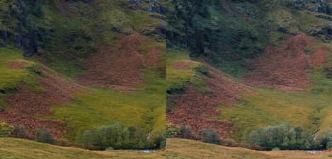
Here’s an early comparison between my film result and my digital result where I used Camera Raw to process the raw files.
As you can see the differences are quite obvious and it’s the ‘muddy’ result from the digital files that I wasn’t happy with. Since then I’ve upgraded from the 5D2 to a Sony A7R and then an A7RII. The camera system got better over time and also the Camera Raw processor got better as well. However, the colours were still not quite as I wanted them.
It was shortly after I bought the A7RII that I tried out a few film emulation plugins for Lightroom. I’ve never been a great fan of these plugins when I’ve just considered them as film emulators but what struck me when I was trying them out is that some of the results ‘twisted’ the colours in ways that reminded me of what I was looking for. In particular, most of them made the shadows cooler and the highlights a little warmer. They also changed the lightness of some colours, in particularly the yellows and greens.
I thought it would be good to go back to basics and try to work out a preset that took my Sony files and produced results that didn’t necessarily look like Velvia 50 but gave a better starting point, adopting some of the common techniques in various film emulation plugins.
Because I’ve been using curves for much of my scanning colour adjustments, I first started by playing with the R, G and B curves in Photoshop to create this warm highlight, cool shadow result. On top of this, I played with the hue, saturation and lightness controls to tweak certain colours, for instance, making yellows slightly warmer and greens slightly cooler and darker. The result of my first tests were quite satisfying and so I moved them over to Lightroom to create a preset I could use when importing images.
Now the results I got with my own tweaks were pretty good but it was only when playing around with the VSCO film emulation plugin that I hit on what for me is the ideal preset. The "Classic Film" pack from VSCO includes a range of Fuji films like Velvia 50 and Provia 100 but it was the Provia 400X preset that did the trick for me. I was basically pulling apart these various film presets to see what different aspects do. For instance, looking how the curves panel on its own works or just the camera calibration for instance. When I tried out the curves and camera calibration from VSCO’s Provia 400X pack I immediately got that rich look I’m familiar with, but it took quite a bit of playing with until it stopped looking like an overblown Instagram filter. I made a range of presets which were based on this settings.
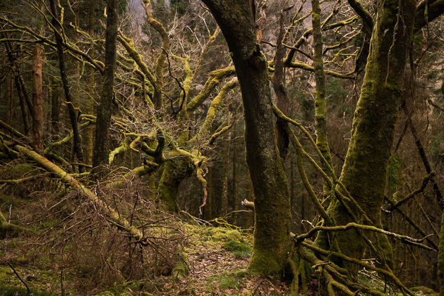
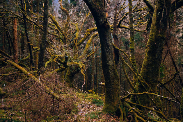
These presets made a world of difference to the appreciation of the results from my digital camera. Here’s a couple of samples of before and after images when using my Sony A7RII on some late winter forest at the back of our house.


