Limitations and Constraints
Autumn. An explosion of colour and a season that many wait patiently for, so that they can try to capture it in all its splendour. For the last few years, I have done the same, but my vision and desires have changed a lot recently. I am drawn more and more towards working in black and white, driven in part by using film and printing in the darkroom, but also through enjoying the challenge of being a landscape photographer, who surrounded by colour, choose to piece together the landscape photography puzzle through a limited pallet of tones.
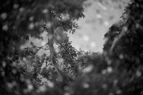
Autumn seemed as good a time as any to try and see whether I could capture the essence of Autumn in the Woodland without the presence of colour. Working almost exclusively in two areas that I have easy access to, I shot consistently over the months of October and November with the aspiration of creating a final gallery of images that captured Autumn in Monochrome.
The project became a good lesson and exercise in using limitations and constraints to produce a final series of images that felt cohesive, and with a unity of vision.
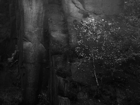
The series was predominantly shot at two locations; Rushmere country park and Aldenham woods, which are near to home and work respectively. Rushmere country park is my home from home, and somewhere I could happily walk around every day, and still feel like there are new images to be made. Aldenham Woods provided me with a place to go on the rare occasions I had time to shoot before work. Shooting locally not only allowed me to get out regularly, and be flexible depending on what the weather was doing, but I could also revisit compositions with ease if I needed to. I did manage a trip to Bolehill Quarry in the Peak District, which allowed me to add a few images that contained a different type of geography, but that was still within the brief of the project.
Black and white work has been a staple part of my photography ever since I picked it up five years ago, and I wanted to complete a project that was solely black and white. I’ve been using medium format film cameras and using Ilford black and white films, for a few years now, but I decided to shoot this project in digital. Predominantly, this came down to wanting to work quite quickly and I hadn’t yet decided on subject matter and style of shooting. Therefore, I decided to shoot the series on a Digital Monochromatic camera, which ended up being the Leica M Monochrome. Using a monochromatic camera helped create a limitation by forcing me to consider my compositions differently to how I would if shooting in colour. The camera doesn’t capture any colour data at all, only luminance values. You can also use colour filters (yellow, orange etc..) to boost the contrast. I have become very familiar with using filters in this way since starting to shoot black and white film again a few years ago.
I only used 3 lenses throughout the project – a Voigtlander 35mm 1.4, Voigtlander 50mm 1.2 and a Zeiss 100mm F2 Makro. The Zeiss was connected via an adaptor and the majority of the close-up images were taken with this superb lens. I like using fast lenses, shooting with a shallow depth of field where possible, and all 3 lenses were ideal for this project.
Where possible, shooting in conditions that were slightly flat in light, was preferred. This gave me more flexibility in post processing because I wasn’t dealing with high contrast files.
I eventually settled on an aesthetic for the final images, which was a result of both post processing and choices made in the field. A yellow filter was used the majority of the time, because of the effect it would have on helping pick out the bright yellows of the changing leaves, as well as give the overall image a boost in contrast.
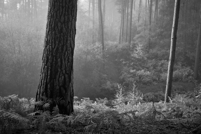
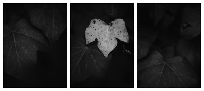
Every session spent on the project was approached with an open mind, starting off with just walking and seeing what the weather was doing, and trying to feel what compositions I was being drawn to. Inevitably there were a number of shots that focussed on the wider landscape, but I also wanted to capture a broad range of images. This resulted in a number of close up and detailed shots, as well as using triptychs, being included in the final project.
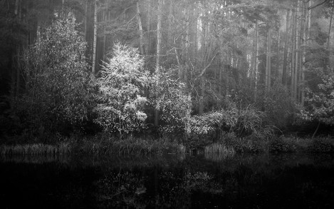
There were a few compositions which I’ve shot in the past that I ended up re-visiting. This did result in one of my favourite images of the project, of the one brightly coloured tree on the other side of the lake, illuminated against the dark of the pine trees behind.
The woodland and forest floor offer a whole world of opportunities for those wishing to explore it. Working with a Macro lens, I would often be found pointing my camera at the ground, trying to capture the details of the leaves which had already fallen, or the textures of the pine needles and lichen.
On a particularly flat morning when I just couldn’t seem to make sense of the wider landscape, I was drawn towards the bark of a tree. Exploring the different patterns and possible compositions consumed me for the next hour or so. My favourite of these was of some bark that resembled a tribal tattoo on top of the stripped wood.
Triptychs run throughout the final set of images and it’s a technique I find myself using frequently, in particular when dealing with smaller details or slightly abstract viewpoints. The triptych allows me to examine a subject from different viewpoints or to show separate, but related elements that complement each other. Displaying images in such a way also asks the viewer to consider the relationship between each ‘panel’.
From the outset of the project, I applied limitations and constraints on myself; Shooting in Black and White, limited lens choice, two locations etc... Many of the limitations were applied right from the beginning, but some were also set when I started to select the images that would make up the final gallery. Over the course of a couple of months, I built up a catalogue of c.200 images that I thought had potential and I printed all individually on 6x4 paper. Seeing all the images laid out really helped with the shot selection process, and I found it much easier working with mini-prints away from the computer screen. Relationships between images and themes started to emerge as I moved the prints around on the desk. I would often think of a theme and work through the images to see if it ‘worked’. More often than not it didn’t, but a new idea would form by completing this process a number of times.
The final limitation presented itself during this stage of image review, when I decided that the images would only be of the woodland interior. Any images that included the sky were excluded, with the only sky that’s visible being in the reflections of puddles or bodies of water.
Working in a project mindset, complete with self-imposed constraints, really helped me focus in a way which I’d been lacking over recent months, and I am now on the lookout for what my next project will be. I have a sneaking suspicion it may be in black and white...

