
Navigating the Minefield of Litho Printing

Tim Parkin
Amateur Photographer who plays with big cameras and film when in between digital photographs.
Given the fact that the first time people most people encounter CMYK conversions is when they’re spending a lot of money, you can understand why people get worried. The process has many confusing aspects, e.g., rendering intents, not using 100% black and white, maximum ink levels, hue shifts for bold colours, getting the right CMYK icc profile, etc., but at heart, it needn’t be overly complicated. In this article, I’ll try to review all the aspects of CMYK that you may encounter when litho-printing books, cards, calendars, etc.
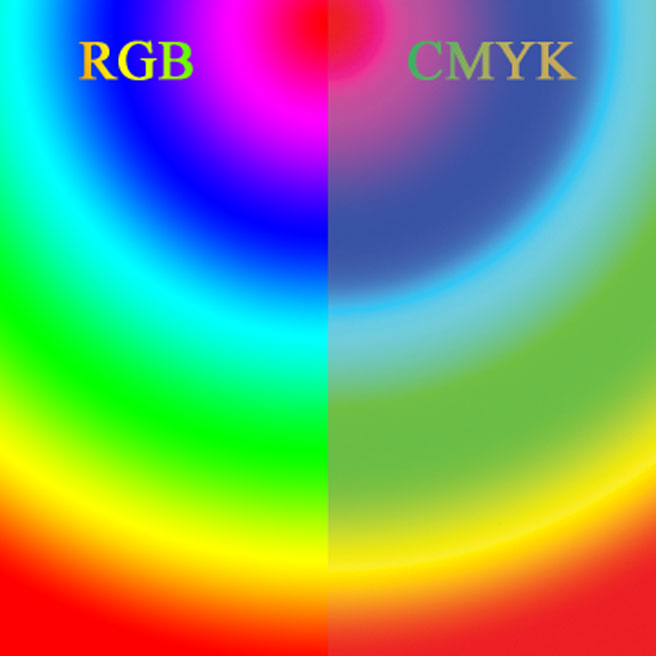
First of all, why do we need to convert at all? Well there is a big difference between the colours that can be represented on a good colour monitor and those that can be represented by applying cyan, magenta, yellow and black inks to a peice of paper. The colours that a monitor can display can be a lot more vibrant. Wikipedia has an image that shows just how different that can be. And this example is sRGB; AdobeRGB and ProPhotoRGB will show even bigger difference1
You can see this difference on a CIE graph. AdobeRGB and ProPhoto are so much bigger than CMYK.
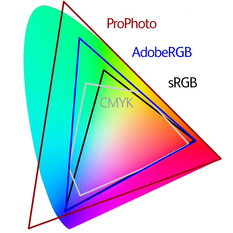
Looking at this you might be wondering “How the hell do any of my photography books look so good?!”. That’s because we don’t really need to see colours that saturated to reproduce a convincing image. It’s the relationships between colours that is a LOT more important.
This leads me to two of the absolutely essential facts to keep in mind when you go about the task of preparing images for CMYK conversion and litho printing.
Fact # 1: The viewer will never notice
People are really bad at judging colour and without a side-by-side comparison with your original prints, your pictures would have to be ridiculously bad before they notice that there is a problem. There are certain aspects that are more noticeable than others but I’ll get into those later. This doesn’t just mean the lack of saturation in colours, it’s also colour casts, clipped black, etc, etc. The viewer is more interested in the photograph, what it contains, how it’s composed, etc. A well taken image in great light can look more saturated than an overblown image on a good colour monitor. You’re magicians and artists, not scientists!
Fact #2: If Anybody is unhappy, it’s probably you
Many photographers go through a disappointed/frustrated stage when first making CMYK conversions and then starting to get litho prints made. There are a few reasons for this. The most prominent reason is that typically, the photographer will only have a screen version to compare with, and because screen is so different from print, setting these two side by side will always make the print look bad.
Even if the photographer has a paper print available so that they’re comparing reflective surfaces, most photographic/inkjet printers reproduce colour so well and have such a deep black that a litho print set side by side will look poo (scientific term) in comparison. This isn’t always true, some photographs don’t rely on strong colour or contrast and these may convert quite well - they are the exception though.
Nearly every photographer I’ve talked to has been disappointed to some extent by the results of litho printing, even though most come to accept the results and become happy with the work (typically when they start getting feedback from people around them). It would be hard for any book to live up to the time and money invested into the process that includes your best photographs. After creating three books for the Natural Landscape Awards, the results have got better and better, and my expectations have adapted along the way. With our current printing process (with Johnson’s of Nantwich), we have got very close to perfect for a litho print. Don’t stick a photo from our book next to the same image on your monitor though, please!!
Converting to CMYK
The Simplest Method
The simplest method is not to convert to CMYK at all. Send sRGB files to your printer and let them automatically do the conversion. Any competent printer should manage this fairly well. This will work with the majority of images and for those where it doesnt, it’s worth bearing in mind the two facts given above - it will almost certainly be good enough.
The Next Simplest Method
OK, we’re taking our first real step on the CMYK ladder. For this step, we’ll be using Photoshop to convert the images to CMYK. In order to do this we’ll have to know which CMYK colour profile we’re going to use. The US and Europe tend to use different profiles, just make sure you’re using the one that the printer tells you to.
The only extra information you need in order to carry out this conversion is knowing what to do with colours that can’t be reproduced properly by CMYK. These are called the “Rendering Intent” - i.e. what does the system ‘intend’ to do. The only two choices you have are (ignoring Saturation and Absolute Colorimetric because they’re not for the likes of us):
Relative Colorimetric Intent
This effectively replaces any colours that are “out-of-gamut” (impossible to reproduce) with the nearest most saturated colour available. This is a form of clipping and so you should be aware that areas might end up losing detail.
Perceptual Intent
The theory for perceptual intent is that it scales all of the colours so that the relationship between colours is preserved. However, in my experience it does all sorts of strange things and I’ve rarely found a situation where I prefer the perceptual result to relative with a couple of manual adjustments. Your mileage might vary.
Even if perceptual worked well, it actually can cause other problems. Imagine we had one pixel which was a really saturated blue (the worst colour in CMYK). In perceptual, the saturation of that colour may need reducing by 40% to get it to print. That means that every colour in the whole picture will also be scaled by 40%! It would be better to clip this one pixel and allow the rest of the picture to be printed correctly.
There are a couple more settings..
Black Point Compensation
Unless you’re doing something special, always have this enabled.
Simulate Blank Ink/Paper Colour
Simulate Black Ink will change the contrast to make your images look more like paper. It’s normally way over the top though and just tends to make them look dull. Simulate paper colour alters the white to some standard paper value. Leave them both alone and your life will be no worse.
Rule #1: Use Relative Colorimetric with Black Point Compensation enabled.
So for a simple conversion, we would always recommend Relative Colorimetric. This is typically what your printer would do if you supplied them with an RGB file (but it might be worth asking!)
It’s worth remembering all those wonderful books you’ve seen and how saturated and beautiful they look before you judge your own conversions.
Dealing With Out of Gamut Colours Manually
If we decide that neither Perceptual nor Relative Colormetric Intents do a great job, what can we do to improve things? The first thing to do is to find out what parts of the picture are out of gamut (not reproducible). We can do that using Photoshop’s Proofing system. Go to “View>Proof Setup>Custom”, choose the correct icc profile (the one your printer gave you), and then you can choose relative or colorimetric. You can use the ‘preview’ button to see what the changes do and once you press OK, you can switch from normal to proof by using ctrl/cmd+Y. You can also enable the “Gamut Warning” to show you the areas that are having rendering issues (shift+ctl/cmd+).
Small Spot Colours
If you have small spots of colour that are out of gamut, it often works just to let the relative colorimetric conversion do it’s thing because they’ll just clip to the most saturated colour of the same hue. Sometimes the ‘spots’ get darker as well as less saturated so it can be useful to selectively brighten those spots after you have converted to CMYK (you can use ‘Select>Color Range>Out of Gamut(dropdown)’ and save this selection for use after conversion). Then use this selection to brighten the image to bring back some of the texture you may have lost during conversion. You probably want to apply this selectively.
Larger Gradients of Colour
This is where things get a bit tricky. If half the gradient is in gamut and half of it is out of gamut, using relative colorimetric will clip the out of gamut colours but leave the in gamut colours alone. I would recommend using a desaturation layer brushed into the areas out of gamut and visually ensure that you still have a good gradient.
Larger Textured Areas of Colour
One of the problems with just automatically converting large areas like this is that they may lose the texture when everything gets clipped to the most saturated colour available. An example from one of my photo is this Acer leaf picture. You can see the larger picture and then I have converted it to Relative Colorimetric and Perceptual.
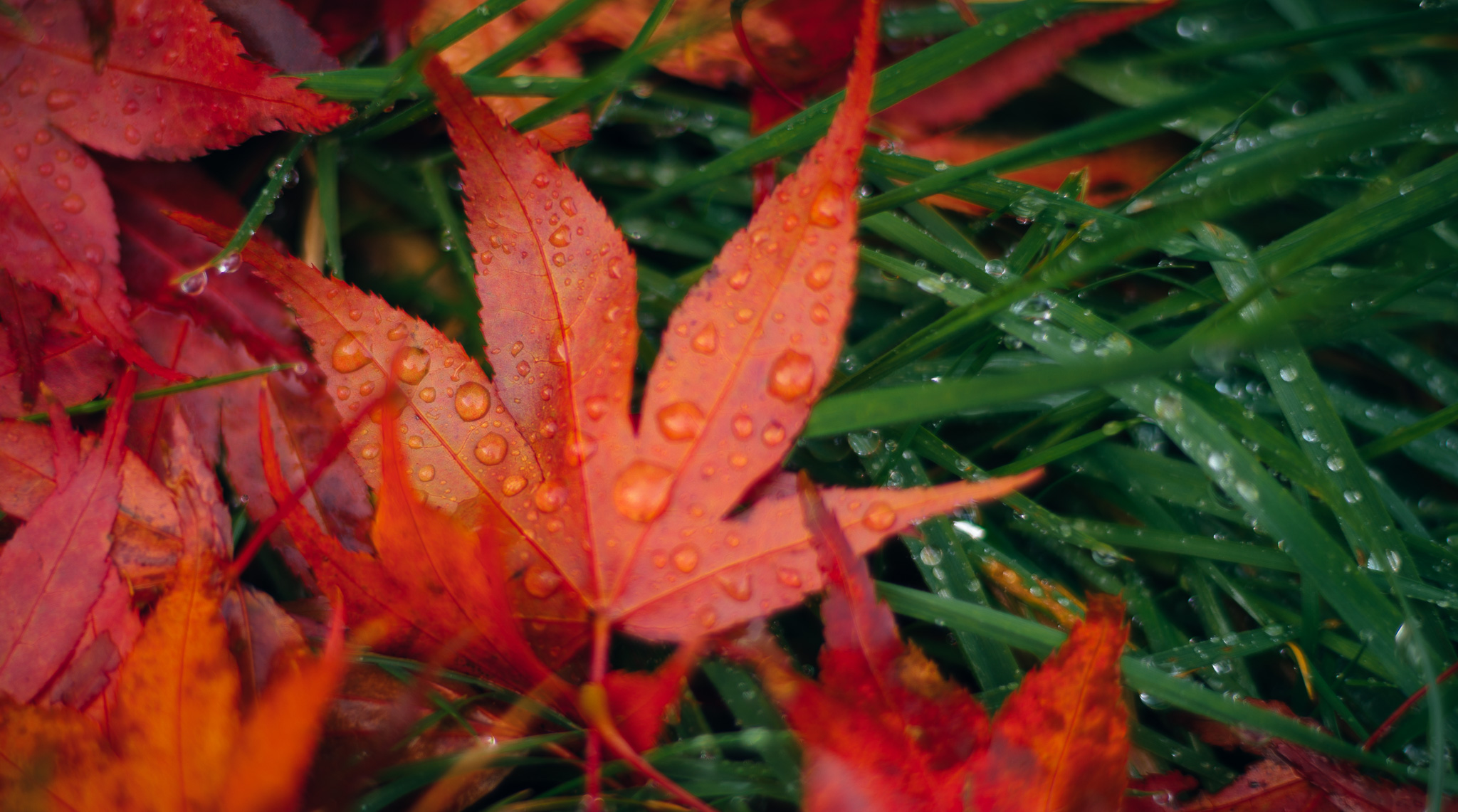
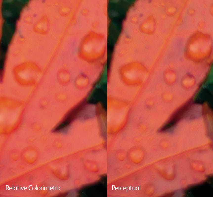
As you can hopefully see, some of the colour texture in the leaf has disappeared in the Relative Colorimetric version. In this case, I might make blend two conversions together or just run with perceptual as it doesn't seem to have negatively affected other parts of the picture too much.
Blocks of Colour
If you have huge areas of your picture out of gamut, I would recommend reducing the saturation across the whole but targeting the colour that is causing the problem (in the saturation tool you can limit it’s affect to a range of colours. Using localised/global saturation on one or more colours is a ‘use to taste’ solution which will be different depending on your photograph.
Difficult Colours in CMYK
Blues - particularly noticeable in mid to light blues. Darker blues can normally be desaturated without appearing abnormal. You can either desaturate or shift toward cyan (or a bit of both). Alex Nail has sent me a classic example of blue sky effects on snow. You can see in the following image how a great deal of the picture is out of Gamut and you need to make a big movement in colour to bring those blues into CMYK. Alex solved this by desaturating and shifting slightly toward cyan.
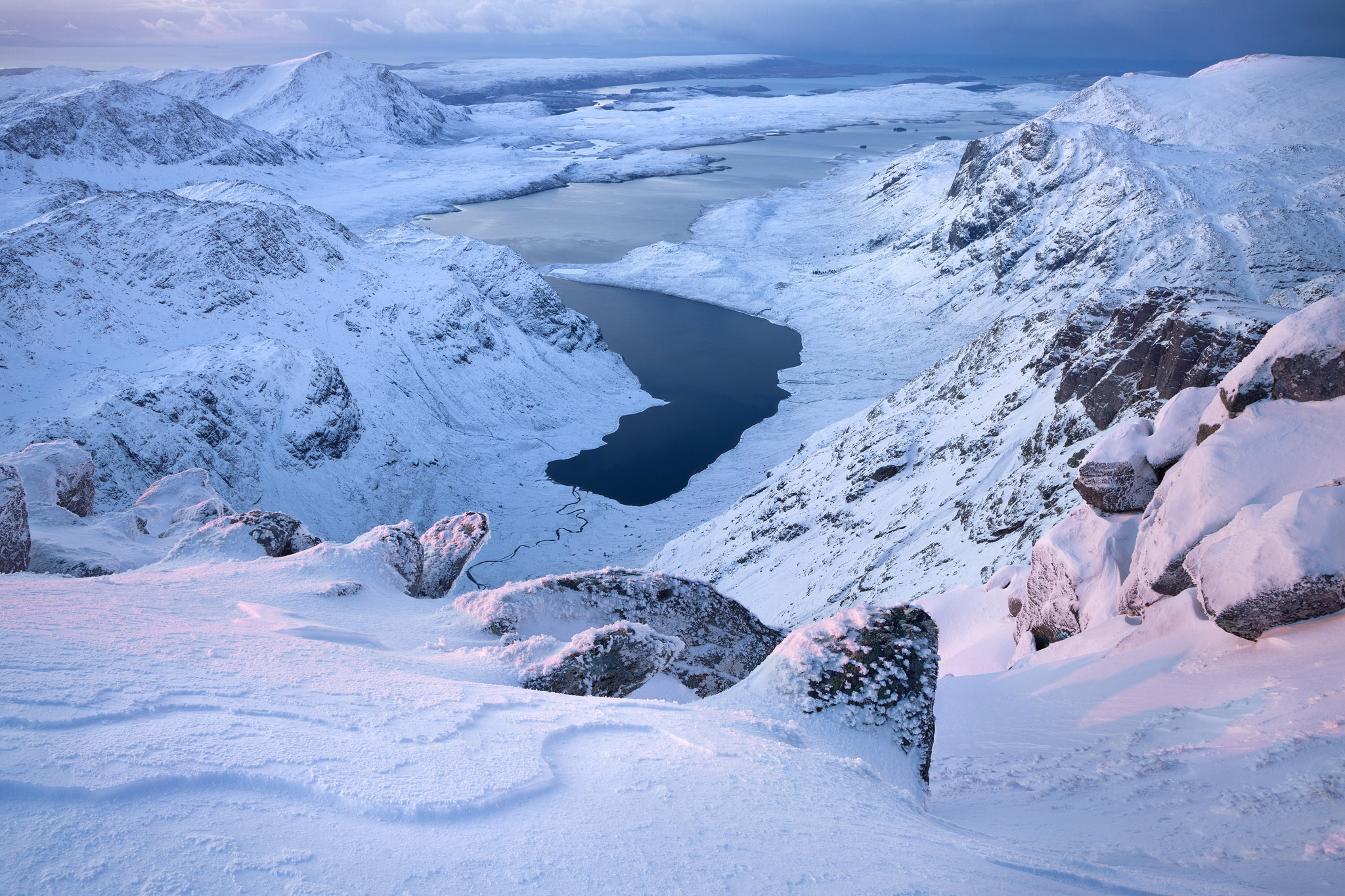
sRGB Original Image - A'Mhaighdean, Alex Nail
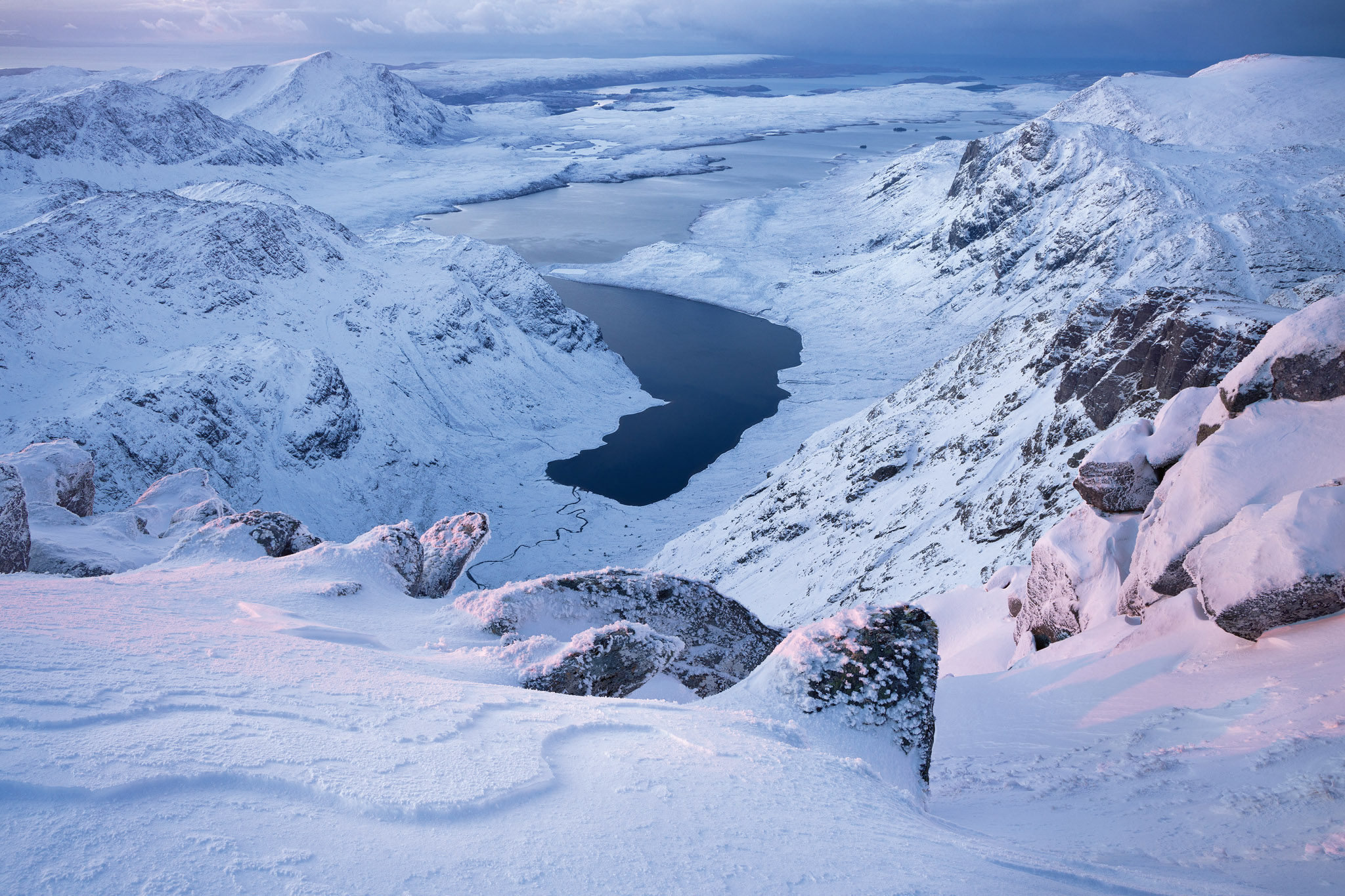
Converted to CMYK using Relative Colorimetric - A'Mhaighdean, Alex Nail
Reds - poppies, roses, autumnal rown leaves, etc. Desaturate and possibly add a bit of texture back in by brightening out of gamut colours (using ‘select color range > out of gamut’)..
Greens are typically OK as it’s rare to have extreme mid-greens in our photos (they’re usually more yellow).
Controversial Solutions, working in sRGB
I know a few professional photographers who just work in sRGB. This means that your final images are always optimised for viewing on screen for all devices plus it’s fairly close to CMYK. You might lose a few really saturated greens (however, I don’t think I’ve ever seen a ‘normal’ photograph of landscape greens that exceeds sRGB) and possibly lose a tiny amount of ultramarine but if you’re happy with all of the book photos you’ve seen, they’re all in a much smaller colour space than sRGB!! What I would strongly avoid is using PhotoPro as your colour space. This has all sorts of colours that not only can’t be printed but also don’t actually exist. Your monitor can’t show them either so you have no idea what is going on. AdobeRGB is probably a good middle ground as many monitors can show it and it reproduces well on most inkjet printers.
Testing the Press (Wet Proofs)
If you’re spending a lot of money on a book, I would highly recommend making a ‘wet proof’ test print. A wet proof is produced on the press and hopefully with the same paper as your project. I would recommend creating the test print from an image embedded in your Indesign document in order to catch any export or process errors (e.g. mistakes with icc profiles, export settings, etc).
As most proofs will be a full sheet (or international equivalent) and will probably have room for four pages. I would recommend using one of your images that contains light saturated blues and if possible one with saturated reds, one black and white (if you’re printing black and white images) and one very dark low key (where getting the black point is really important).
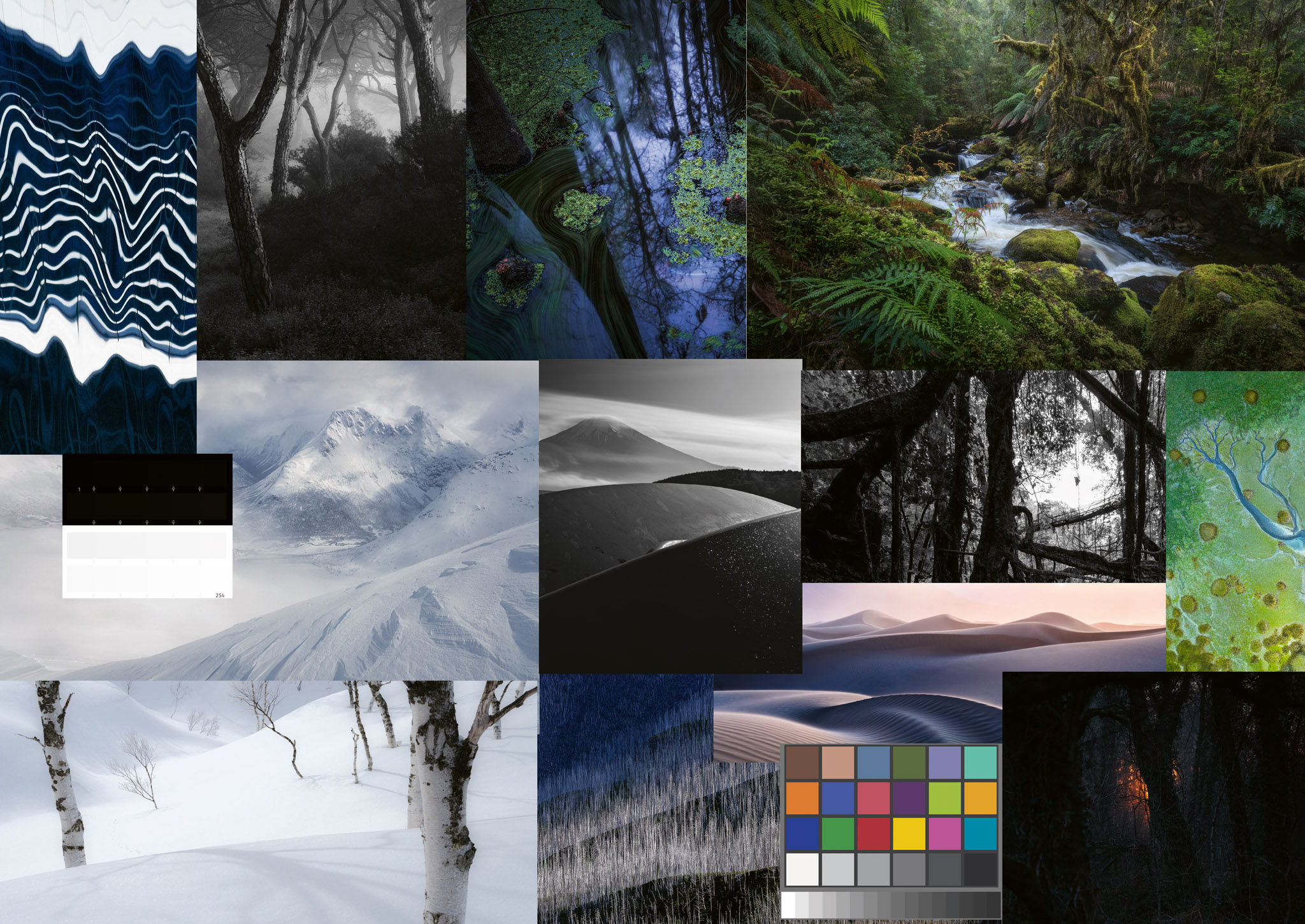
Wet Proof Test Sheet
You could make up your own compilation image for this (or do two wet proofs, one with real pages from your book, one with a compilation sheet).
I created a collage of images that I thought might be challenging and also included a step chart showing the lowest 10 black values and the highest 10 white values to work out if they render correctly. (e.g. if my image is clipping the first 5 values, I could raise the black in all my images by 5 points).

Step Wedge Test Image
There are also companies that will produce very high quality contract proofs (so called because they can be used as a visual contract with a supplier). These are expensive but usually very accurate. Your printer might produce these but it's sometimes nice to have a 'second opinion'.
Quantifying how good (or bad) a print is
Most printers work to an acceptable error using the delatE standard. A unit of one Delta E is the minimum difference between two colours (that aren’t touching) that is discernable by human that is looking for the difference. If you’re print error is below 1 delta E then you can’t see any difference. For most purposes, a value of 2 is indiscernable if you aren’t looking for it.
Most printing companies have a value of deltaE 3 as a target which means you can, and probably will, see some differences between the original and the print, especially so if you place them side by side. Please bear this in mind when working with a printer, the idea is to get your reproduction as close as possible, not perfect.
Proofing On Press
One of the biggest myths of working on press is that you can work to make sure that the sheet coming off press perfectly matches the contract print. Sadly, this isn’t possible because there is BIG shift in colour as the ink dries. Magenta inks are particularly bold when they’re wet and if you try to correct for this, you might end up with a green cast (or desaturated). If you have pictures that show some colour noise, this might show as particularly bad because of this magenta boost as well. Bear this in mind when reviewing fresh off the press.
Differences between Colour Profiles
The quality of litho presses has improved a great deal over time and there are new ICC Profiles that reflect this. Make sure your printer has given you the most up to date profile for their calibrated press.
“US Web Coated (SWOP) V2” is an older profile and will affect more colours than just the blues we’ve talked about. Intense greens tend to go unsaturated and cooler. Fogra 39 was a more modern standard, and common in European countries, and Fogra 57 is the latest.
I’ve noticed that Fogra 57 can cause some banding in colour transitions whereas Fogra 39 doesn’t so for difficult images, trying Fogra 39 may be useful (and then converting to Fogra 57 afterward). Your mileage might vary with this as it’s only an observation while making tests for this article.
Conclusion
There is no reason to fear CMYK if you go into the process with the desire to get results that match up to some of your favourite books. A good printing company will get results that are a very good match for your CMYK proofs and any small variation will not get noticed by your friends, family, peers and customers.
What I’d like to do is to follow up this article with some real world examples so if you’d like to send me any challenging images, I’d be more than happy to show what sorts of changes you might make to convert to CMYK. Just email us at submissions@onlandscape.co.uk.
Glossary
Sheetfed vs Web - Sheetfed is typically for cardboards and other printing stock and processes one sheet at a time. Web is typically for paper and comes off a roll. They tend to use different inks and hence need different profiles (SWOP is web, Fogra can be either, Gracol is typically sheetfed).
Coated vs Uncoated - Paper can be coated with a thin layer of typically clay which changes the surface texture of the paper. Typically this modified surface can take ink better and with higher precision and contrast and changes the look (shiny, satin, etc). The coating can make the paper less environmentally friendly though.