Competing in Photography

Bill Ferngren
I'm Bill Ferngren, a 56-year-old landscape and nature photographer living in Tungelsta, Sweden. Though I make a living as a self-employed carpenter, my heart is often found in nature, where I explore the quieter, smaller landscapes. Photography allows me to escape into the subtle beauty of the world around us, capturing moments that might otherwise go unnoticed. It's a passion that balances my life and keeps my creative spirit alive.
Entering photography competitions brings its own set of unique challenges. While outcomes can sometimes feel swayed by personal taste and the judges' moods, working with physical prints introduces its own complexities. Over the years, I've learned to approach these contests with patience, focusing on personal growth rather than rankings. In this piece, I’ll share my recent experience at the Swedish Photography Championships — from preparing my prints to embracing the process and gaining valuable insights along the way.
Can Photography Really Be Judged?
Is photography truly something that can be measured, or do the results simply reflect the mood of the judges that day? It might sound like I'm questioning the value of competitions, yet I still find myself participating. Why, you ask? It’s the challenge—a chance to present my work without my identity as the photographer influencing the outcome. It also allows me to test my visual language and push my creative limits. And honestly, it's a refreshing alternative to posting on social media, where images often get lost in the endless scroll anyways.
For me, the key is to approach competitions with a light heart. I never judge my work based on its placement. Photography isn’t just a competitive pursuit for me; it’s a form of therapy, a way to connect with nature, hone my compositional skills, and keep my curiosity alive. Sometimes, I return home with stunning shots; other times, the results aren’t quite what I hoped for. But that's the beauty of the process—whether I'm fine-tuning a composition or pushing myself beyond my comfort zone.
A New Kind of Challenge: The Swedish Photography Championships
Recently, I had the opportunity to participate in the Swedish Photography Championships, where I was thrilled to win in the Landscape/Nature category. The competition begins with a digital qualification and transitions to a print final. Competing with physical prints was a new experience that required considerable effort—not to mention the costs for test prints and ink, which often feel more precious than gold!
The Process
Printing the images myself ensured the final results aligned with my vision. While I don’t use a top-of-the-line monitor, my calibrated screen serves me well for most prints. However, knowing the prints would be viewed under controlled lighting, I took extra precautions. I purchased a lamp with a matching 5000K color temperature and relied on natural daylight to ensure color and light accuracy. The controlled lighting revealed a few inconsistencies between what I saw on the screen and what appeared on the print.
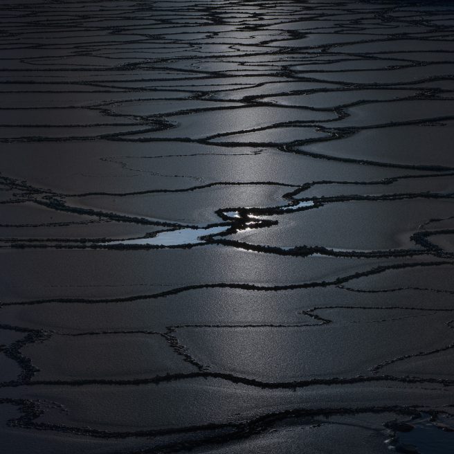
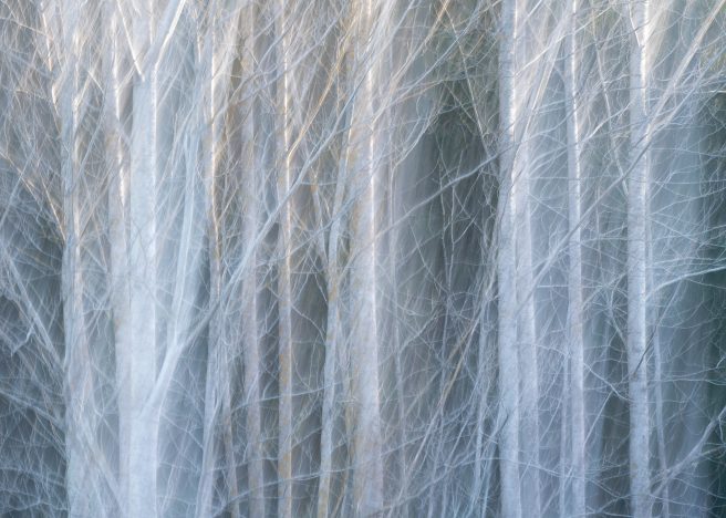
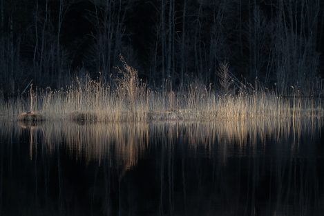
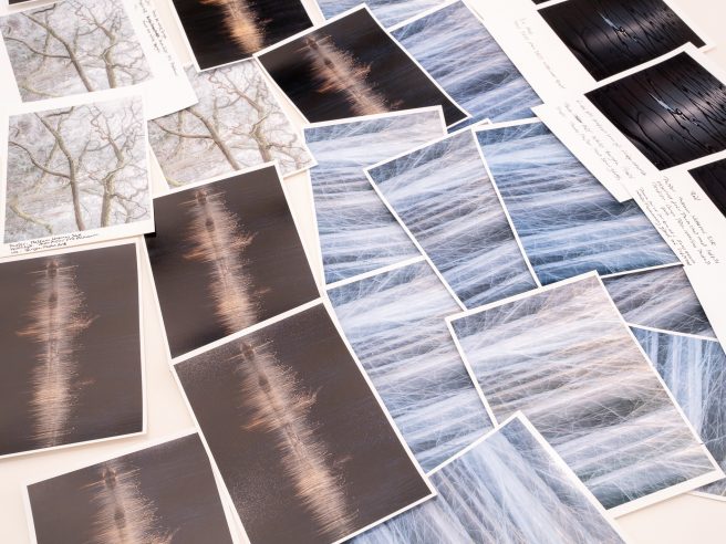
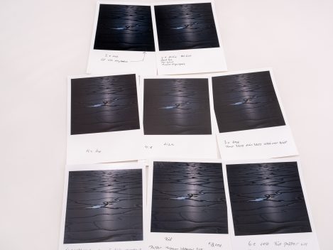
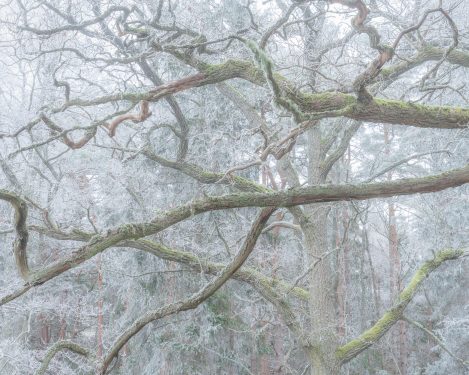
One of the prints, "Reach," had previously been exhibited, and I had developed a master file that looked nearly perfect under controlled lighting. I only needed to slightly lighten the darkest areas. However, the biggest challenge came with the next print, 'Interconnectable,' which required about twelve test prints and two full-size prints to perfect. This image features a wide range between highlights and deep blues, requiring adjustments to accurately capture tones in the dark areas and achieve the right shade in the yellow/golden highlights. While I typically handle post-processing in Lightroom, I found that accessing the subtle nuances of this image surpassed its capabilities. So, I turned to a luminosity masking panel for Photoshop. I followed a similar approach for "Excellence of Light" and the winning print "Blue Embrace," both showcasing a wide dynamic range, though I didn’t need nearly as many test prints for those.
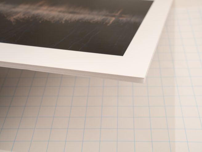
For this competition, I used A5 pieces (148 x 210 mm) of the original paper intended for the final prints. This smaller size made it easy to spot any flaws that needed correction. For the final prints, I left a 3 cm (at the widest part) white frame around the photos to compensate for the requested aspect ratio, which didn’t align with the originals.
Crafting with Care
My experience in the media industry has given me valuable skills in image mounting, which proved essential during this process. I wanted to do as much of the mounting myself as I could. Dust is your enemy, and achieving a dust-free environment can be tricky, but it’s crucial. Thinner paper is particularly sensitive to dust and imperfections, and glossy papers are no exception; even the slightest flaw can impact the surface during mounting.
Over the years, I’ve come to trust certain papers. I use MediaJET papers, which I’m very happy with, thanks to their knowledgeable and customer-focused team. I rely on four of their papers, each selected to suit different images and moods.
Printing Process
For screen calibration, I use the Spyder-X Pro, a hardware color calibration tool for monitors.
For "Blue Embrace" and "Excellence of Light," I selected MediaJET PhotoArt White Baryta, 310 g, renowned for its exceptional color depth that enhances deep blacks—an essential quality for these shots. For the other prints, I opted for MediaJET Museum Natural Silk–300 g, known for its classic pearl finish, giving the images a rich, textured feel.
Tools and Equipment
For trimming the prints, I use a DAHLE rotary trimmer 448, which delivers clean cuts for large formats. I mount the prints on 5 mm Kapafix 600 g boards with adhesive backing. These lightweight boards provide a polished look at an affordable price. Although I ordered four 70x100 cm boards, the first batch arrived poorly packed and damaged. Thankfully, the company replaced them at no extra charge, and I repurposed the damaged boards into a practical box for transporting the finished prints to the event. To cut the boards, I used a sharp, sturdy utility knife along with a cutting mat and a metal guide rail—à la Festool.
Mounting Techniques
Mounting these relatively small images didn’t require special tools for applying them to the adhesive surface. The key is to avoid scratching the paper with materials like plastic or wood; I even used my eyeglass case, made of soft felt! For larger prints, it’s important to use a textile-covered squeegee that spans the entire image to help avoid trapping bubbles when applying the print to the adhesive side.
Reflecting on the Process
I’ve discovered that competing with prints deepens my understanding and respect for the craft. From this experience, I’ve learned that for future print competitions, I will ensure to do test prints before submitting my entries. This allows me to tweak and improve not only the prints but also the overall process.
A paper print has a more limited dynamic range than what we see on screens, meaning details in very bright or dark areas can be lost. This became especially clear when I critically examined the prints under controlled lighting. As part of my routine, I regularly calibrate my monitor to ensure the colors are as accurate as possible. Installing the correct ICC profile for the chosen printer and paper is equally important. The ICC profiles from MediaJET are of high quality, so I’ve never felt the need to create my own color profiles.
Over time, I’ve improved my ability to recognize what will and won’t work as a print, even while capturing the image. However, my approach to photography remains the same: I always aim to create a refined master print file that is exclusively used for printing.
This has also led me to reconsider my previous exhibition choices. I used to customize frames with matting and the most expensive non-reflective art glass. However, for my next exhibition, I’m thinking about mounting the prints on Kapa boards with simple hanging. This approach allows me to showcase the prints as I truly envision them, letting the carefully selected paper take center stage without distraction.
Recently, a non-photography friend said, "When you started out sharing your images, I understood your vision. But now, I feel completely lost; I don’t quite grasp what you’re doing anymore." Rather than seeing this as a disconnect, I took it as a sign of how my work has grown. My creative path has moved away from the familiar toward something perhaps less accessible but much more aligned with what resonates with me now. This shift will undoubtedly shape my prints for the next exhibition, where I’m eager to share this new direction and what truly drives my work.
After completing this article, I was honored to learn that I’ve been chosen to represent Sweden in the World Photographic Cup (WPC), set for March 2025.
- Blue Embrace
- Excellence Of Light
- Interconnectable
- Reach

