Exposing the differences in various colour film stocks

Tim Parkin
Amateur Photographer who plays with big cameras and film when in between digital photographs.
This is the first post in a series of articles comparing all of the colour film available to the large format photographer*.
Background
Some of you may be asking 'Why are you talking about film? Isn't it nearly extinct?' and if you only read the photography magazines, you might well be led to believe so. However, film still has a strong - if niche - market around the world and, surprisingly, one that has started growing again.
I recently spoke to a representative from Fuji who said that film sales of medium and especially large format are experiencing somewhat of a resurgence with large format film sales actually growing. Kodak announced recently announched that "There is a very real resurgence for film" and also released two new films in the last year, Ektar and a new formulation of Portra 400 (which isn't included in the tests yet).
And what of the tests themselves? Well the idea is that over the space of approximately twelve months I will finding suitable subjects that show some of the 'edge behaviour' of film - i.e. Deep blue polarised skies in daylight, bluebell colours (in this example), snow scenes, autumnal colour, sunset/sunrise, overcast woodland, etc. and I will take the same shot with all of the different films.
Digitalab of Newcastle have kindly offered to develop all of these films for us and we will be mentioning them in support of their contribution. See footer for more details.
Methodology
The use of a large format camera makes this sort of comparison a lot easier (if a lot more expensive) as it is very easy to switch between film types from shot to shot. I am also using two graphmatic backs for the film to make things even easier. If you don't know what a graphmatic back is the picture below shows them in comparison with dark slides. They hold six films each and allow you to change to the next sheet by simply lifting the whole body of the magazine out of it's container, allowing the next film to pop to the front. Once you get used to this process (which I hadn't on this first test - see the story at the bottom for more details) then you can change from one film to the next in about five seconds. The main stumbling block in the methodology is keeping track of which shots have been taken, where you are in the series and adjusting the exposure for the different film ISO's. These seem trivial but can get quite stressful out in the field when the light is changing.
Light will inevitably change a little bit between pictures but we will be trying to choose scenes where comparisons are still valid. Additionally, we have bought new film of each type and stored them together. The film has been taken at rated speed for all but the Velvia 50 which was taken a third of a stop down (40 iso or a third of a stop over exposed) as otherwise the comparisons are quite difficult. We've tried to match up mid tones for the transprency work.
We have also placed film that may be used as alternatives as close to each other in the series as possible. For instance, all of the velvias are together, the portras are together, all negatives are together, etc.
The negative film presents the biggest challenge because there are so many different ways of converting them to positive images. To this end, although we have made our own conversions using colorneg at close to standard settings, we have also corrected colour casts where a simple colour curves adjustment allows it. We will be working on the negative inversion process over the coming months and will reassess these as we do. We are also providing the scanned negatives for you to try yourselves (scanned using as colour accurate a process as possible so the scans look like the negatives on a lightbox - possibly with different gammas).
The scans were made on a Howtek 4500 using profile generated with the Hutch Fuji colour target which have proven to have very accurate colour.
Here is a full list of the films being compared.
Transparency
- Fuji Velvia 50
- Fuji Velvia 100
- Fuji Velvia 100f
- Fuji Provia 100
- Fuji Astia 100
- Kodak E100G
- Kodak E100VS
Negatives
- Kodak Ektar 100
- Kodak Portra 160NC
- Kodak Portra 160VC
- Fuji Pro160S
- Kodak Portra 400NC
The viewers below allow you to pick which two film types to compare. Click on a film type from the list below the image on the left and then do the same on the right and you can then move the comparison slider backward and forward.
First Results
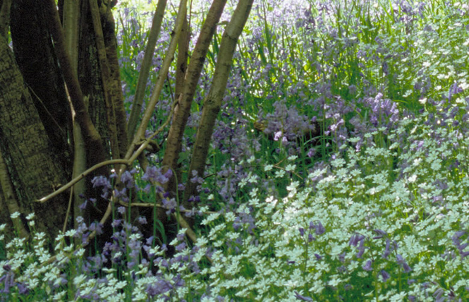
Our first test was taken on an outing to a bluebell wood in the Peak District. Given the issues in getting a good bluebell colour and the challenges of shooting dappled light, we thought this a suitable test. We did have an issue half way through with a jammed graphmatic (I tried to change films too quickly) so there is a time gap between the fuji transparencies and the kodak transparencies and all negatives. The light was still at the same level before and after though (clear skies around midday).
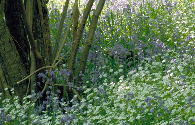
Hopefully this picture will show the differences in how the films handle highlights (top left corner) and shadows (under the ferns near the front).
Complete Picture

Choose Which Films to Compare
Before side
|
After side
|
The following sections show details of crops from a couple of different places and also with the shadows boosted by doubling the gamma. They are available if you have a free subscription.
Complete Picture (Crop Near Trees)
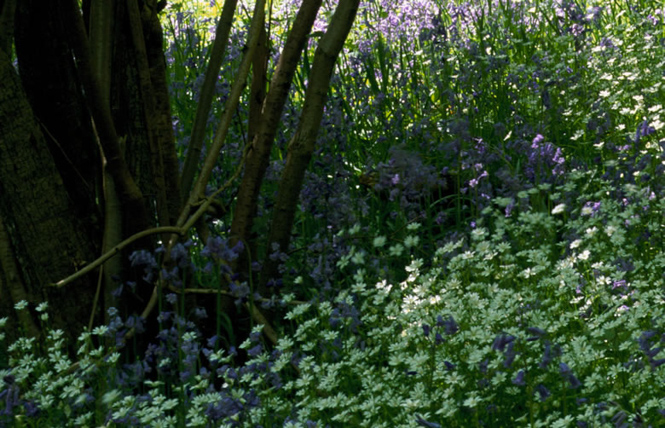
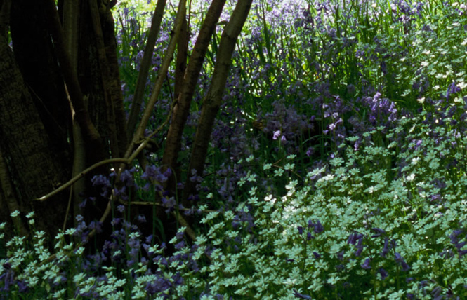
This crop shows an area at the top left of the picture. It includes some of the bright highlights but mostly it includes some of the densest shadows. We have also doubled the gamma in the next example of this crop.
Choose Which Films to Compare
Before side
|
After side
|
Complete Picture (Crop Near Trees - Boost)

Choose Which Films to Compare
Before side
|
After side
|
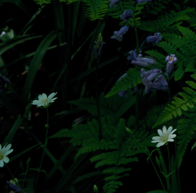
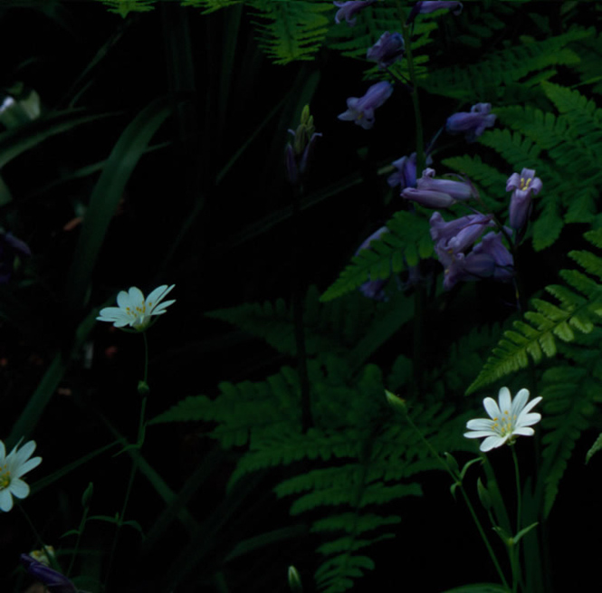
Complete Picture (Crop Near Bottom Corner)
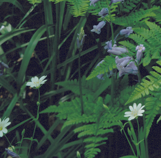
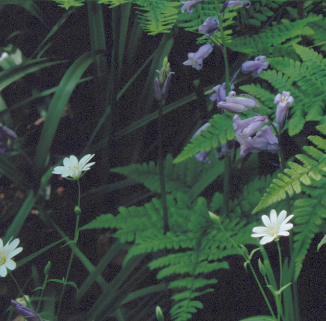
This crop was taken from the bottom left corner and includes some shaded greens and white flowers surrounded by deep shadows. The next example shows a double gamma boost of the same.
Choose Which Films to Compare
Before side
|
After side
|
Complete Picture (Crop Near Bottom Corner) - Boost)
Choose Which Films to Compare
Before side
|
After side
|
Complete Picture (Highlight Area)
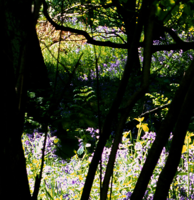
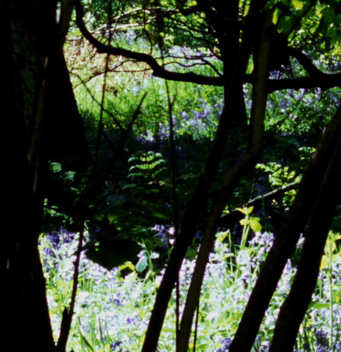
This last shows one of the brightest area of the photo and I've reduced the gamma by 0.5 in order to show how these highlights can be recovered. You'll notice that the negative film really holds the highlights well, which is probably why people say you can rate a lot of negative film at 100.
Choose Which Films to Compare
Before side
|
After side
|
Conclusions
Now i'm not going to make any conclusions out of these tests for now - I'll start to bring my conclusions together as the series continues and as my negative processing gets better. My only comments are that the E100G has surprised me as being a fairly neutral film, well worth playing with despite it's expense. E100VS is also very nice but the colour casts can be a little strange. What is quite clear is that Velvia 50 is a great film with a shadow response almost as deep as Provia (when scanned on a drum scanner anyway). I'm also more and more interested in Portra 400NC and especially as the new Portra is supposedly even more fine grained and with a slightly more colourful nature. We'll see what that brings. What was surprising is that Portra 160NC ends up showing more grain than most films - I'm not sure if this is related to scanning yet. 160VC shows nice grain control though. Pro160S is a difficult one, I find it difficult to convert and so am holding out on whether I like it or not until I've learned more. I'll be trying 160VC and 400NC negative films and playing with Pro160S to see if I can learn more in the future.
A big thank you to Digitalab for doing the E6 and C41 developing for this work. They do a lot of work with Joe Cornish and used to develop his film and now make his custom prints. They are developing the film for this whole series, a not insignificant cost, and so deserve a little push. They're also very good at what they do!
* I was going to try and cover medium format but in order to do so would have had to shoot a whole roll of each and change films between each type and this would have made light changes even worse.
** The graphmatic back locked up because I was trying to change films too fast. This meant getting a dark bag out and fixing the problem so as not to ruin the other transprencies. Also, It appears that I double exposed the Ektar because of a counting problem afterwards (it wasn't clear at what point I was in the cycle of pictures when the holder jammed).
Other Colour Film Comparison Articles
Colour Film Comparison – Pt Two
Colour Film Comparison Pt. 3

