Part One

Tim Parkin
Amateur Photographer who plays with big cameras and film when in between digital photographs.
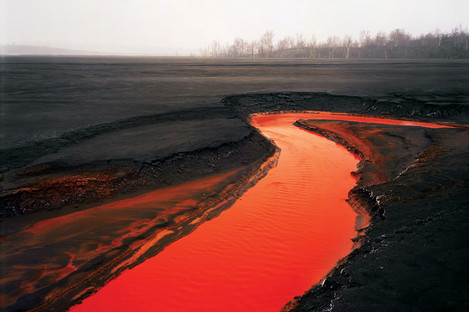
Edward Burtynsky. Nickel Tailings no.34
© Edward Burtynsky, courtesy Nicholas Metivier
Gallery, Toronto/Flowers London
I had a meeting in London last week which ended at 2pm which gave me a few hours to wander off and do my own thing. Having added a news item to On Landscape about the “Landmark - the Fields of Photography” exhibition I thought it would be a good idea to go along and report on it in person (the diligence!). I am so glad I did as this could well be the most important landscape photography exhibition to grace our shores since Bill Brandt’s “The Land”.
Now you have to remember this is fine art landscape photography and just as with classical music and poetry, you might have to spend a little more time getting to know the occasional image than usual. This is far from the default case with the majority of pictures here as most of these are eminently accessible and as such I can only say that this is a must visit for all landscape photographers if you can make it.
The curator, William Ewing, has divided the exhibition into ten seprate sections and I’ll talk through each section in detail below. The rooms draw you in from the pictorial/sublime of the first which segues slowly to the more experimental/political as you travel through the seventeen rooms. Fortunately the size of the exhibition means that even if it is busy, there will always be space to spend some quality time with the images. If you’re really passionate about contemporary landscape photography I would put a whole day aside.
As I’m in the process of looking at printing, framing and presentation of my own images, I was particularly fascinated by the range and quality of work on show. There was a very broad representation of optical and digital wet prints and also of inkjet prints. There were some oddballs where the prints were rippling quite badly (Mr Kander!), and overly noise-reduced, smeary prints; unglazed prints that looked wonderful; photos from 10x8 that ranged from contact printed, jewel like objects to 100”x80” enlargements that sucked you into the picture; screenshots from flickr; cut and paste 3D constructions (the last room got a bit weird). and more.
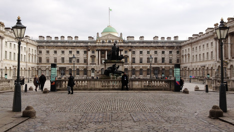
Somerset House, the Positive View foundation and William Ewing should be congratulated for creating such a wonderful, eclectic cross section of contemporary landscape photography and I’ve been told that the space will be used for more and more photographic events (the Sony World Photography Awards arrive just after this exhibition).
For those that are more interested in the works on show I’ve tried to give my take on the exhibition as a whole. Get to see it before April 28th!
You can roll your mouse over any of the links with a small hand next to them to preview the images that we've found on the web. If you click on the image you'll be taken to the page they came from. Please be patient though as often the linked image is quite large so may take some time to fully load.
SUBLIME
- Characterised by nobility, majestic
- Of high spiritual, moral, or intellectual worth
- Not to be excelled; supreme
- Inspiring awe; impressive
- Raised aloft; set high
- Of lofty appearance or bearing; haughty, even terrifying
#1
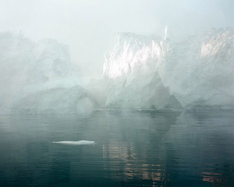
The first room 'sublime' starts the exhibition and in an artistic sense the definition that is most appropriate is "awe inspiring" as we start with two beautiful Olaf Otto Becker's works at opposite☜ ends☜ of the room, both are taken from Broken Line and have the same wonderful aura of mist and icebergs that epitomise the definition above. These are landscapes that awe and wonder in equal measure and despite being taken on 10x8 film, are exuberant about their softness of surface at contrast to the epic nature of the subject matter.
To one side of the Becker's is another classic; Sugimoto's "Baltic Sea, Rugen, 1996☜". This is a silver gelatin print containing almost literally nothing. It starts from subtle sea texture and blends into a monotone neutral gray of horizon and sky. On closer inspection, as I moved my head down, the museum lights introduced a moon into the picture and the surface of the silver gelatin print gave the reflections from the water - entranced!
Alongside the Sugimoto is a Nasa still of Saturn, Cassini and the moon Dione☜. An odd addition to the group until you realise this is part of our generation's sublime as much as Caspar David Friedrich's mountain views were to his. More of this later. On the other side of the Sugimoto is "Free Element XIV, 2001☜" by Dodo Jin Ming, a black and white detail of a breaking wave recalling Hokusai.
Opposite the Sugimoto is "Sunburner GSP#616 (Mojave), 2012☜" by Chris McCaw, a long exposure sunrise where the sun has burned it's way through the 10x8 photographic paper as it rises - a wonderful idea and one we shall see more of in the next room.
Possibly the biggest display in the exhibition Susan Derges' "Shoreline 4.9, 1997☜" - a photogram on C-type of water and sand - her notes say taken by submerging photographic paper in a river under moonlight with flash to fix - is a pink coloured wash of sand, ripples and droplets across four rolls of cibachrome. Interesting but didn’t engage me in any lasting way.
#2
The next room is a continuation of the Sublime theme (I think) and begins with a graphic text panorama "Maine, 2009☜" by Susan Evans where serif text in white and grey on a black background declares "tree, tree, mist, path, cabana, dock" and in big blurred text "MIST" - Really quite pretentious nonsense - Oh well, you can’t expect every image to work :-)
No worries though as the photographic extravaganza continues with some Simon Roberts "Camel Estuary, Padstow, Cornwall☜" from his We English work. Depicting dog walkers on an estuary sand bank with epic blue & cloudy sky fails in some way to do more than document (and the quality makes me think he has too many noise reduction filters engaged - in many ways this looks almost cartoonish in texture on the close inspection this size of print invites).
"Brazil #3☜" by Daniel Beltrá introduces a Dombrovskis like floating island effect but in this case it is a thin, tropical archipelago that sits in still waters reflecting a pendulous, cloudy sky. Further Daniel Beltra work is distributed throughout the exhibition and he impresses more as you progress
On the far wall two more Chris McCaw's show a hung arc of sun, a solarised reflection and fallen tree ("Sunburned GSP#425, Arctic Circle, Alaska, 2010" and "Sunburned GSP#241, North Sierras, 2008") and opposite a sunburned where the sun has almost cut the image in half above a rocky shored coast ("Sunburned GSP#450, SF Bay, 2010"). These images are a great example of the fact that the photograph is an artefact and images become real as they are printed and the way they are printed/presented/created becomes part of the artwork.
In between these last images is an 'extension of an Ansel Adams' print of the Grand Canyon. By extension I mean they (Mark Klett and Byron Wolfe) have literally wondered "what is to the left of this picture” and in doing so have produced a weird 'time/photographer sliced panorama' - I’m not sure they've succeeded in anything in addition though. ("Panorama from Hopi Point on the Grand Canyon, Made over two days extending the view of Ansel Adams 2007" from Ansel Adams' "Grand Canyon National Park, Arizona, 1941☜")
Finally, to the left of these, we have Carlo Valsecchi's "#0691Capri, Napoli, 2009", a blown out view of a Mediterranean landscape through a bare rooms glass french windows. hmmm again.
PASTORAL
- of, or relating to, the country or country life; rural
- Simple, varying from the serene to the idyllic
- An artistic work that portrays or evokes rural life
#1
The next room starts the Pastoral landscape and is begun in grand style with Elger Esser's "Sacramento River, USA, 2007☜", a tour-de-force rennaissance-esque tableau print in shades of yellow recalling a Nile riverbank apart from the station wagons and gin-palaces banking the nearby marina. Great to see
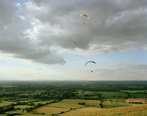
On the left wall Simon Roberts appears again with "Amerta Movement Workshop, Avebury Henge, Wiltshire, 'We English' 2008☜", "Equestrian Jumping Individual, Greenwich Park, London, 'XXX Olympiad' 2012☜" and "South Downs Way, West Sussex, 'We English' 2007☜" of which only the para gliders from the South Downs picture raise this above deadpan observation.
Fortunately on the other wall there is an image by Peter Bialobrzeski "Heimat #31☜" from the series "Heimat", a stunning Breugel-esque snow scene. One of my Favourites of the exhibition, I love the way he’s taken the German identiy a-la Caspar David Friedrich and run with it taking in other art historical waypoints as he travels. And they’re beautiful.
#2
Alongside this room we have a very dark adjunct with photgraphs from Harry Cory Wright "English Channel☜" and "Land's End☜", beautifully printed images but difficult to enjoy with the lights so low. Betweem them is a wonderful cloudscape from Robert Davies, "Tobruk☜".
Another Robert Davies, "Dawn, January, Westminster Palace, London, 2004☜" is unglazed and recalls whistler in its decadent low key tones - quite a fantastic demonstration that you don’t need glass in front of images too.
WITNESS
- Witness to an event or a situation
- Close observation
- A report to varying degrees of objectivity
- A testimony or eyewitness account
#1
The Witness themed room transitions with three☜ John☜ Davies☜ photographs from Easington colliery then and now and a photograph from the Trafford centre. Although I like some of John Davies's work, these don’t do a lot for me. Perhaps more context is needed as I know Andrew Nadolski is a big fan and John is one of the most respected photographers in the UK so...
But here’s a wonderul Ray Metzker print "Feste di Foglie, 1985☜", high key with almost random drop focus but with a acutely sweet flavour. Metzker isn’t as well known for his landscape work as his street photography but I personally think he should be - check out his book “Landscapes” for more.
Exhibited alongside and opposite are two Mitch Dobrowner's, an "Trees-Cloud☜" amazing storm cloud above a few trees and "Big Cloud☜" another one above a city scape. The images are dramatic and beautiful but are enlarged to a point where they display an odd plasticity - a different aesthetic to one I’m used to and one I can ignore if I step back. Nothing detracts from the drama of the scene though.
Two Lee Friedlander's next, a black and white extravaganza with "Nebraska, 1999☜" and "Canada, 2005☜". I’ve not really been a fan of Friedlander before but these two prints engaged me in a way I couldn’t explain. The conceit of the ‘view from car window’ just seems to work.
Robert Bordeau’s print tones and detail blew me away with "West Virginia, USA, 1993☜". Cream highlights and jet blacks pasted into the frame bring the two water railway towers to life. I'll even forgive the diverging verticals. The way a photograph is printed shouldn’t change an opinion of a photograph - a conversation I had recently with Jörg Colberg repeated this - and yet if this quality can get you to engage with the image it does make a difference. Something I need to think more about and perhaps we’ll get Mr Colberg to contribute.
Stephane Couturier’s "Chateau de la Ferte-Vidame, France, Photo No. 6☜", a delapidated brickwork facade in front of cricket pitch confuses me - Another image where some context about the photographers philosophy or concept could possibly have helped.
#2
More Peter Bialobrzeski in a Mitch Epstein like building scape with construction towers "Transition #27☜" sits opposite a nighttime view of the same "Transition #20☜".
Jamey Stilings' hoover dam "Arizona Arch Segment, April 28, 2009☜" with india ink blue night sky and half finished arch look like something from a transformers movie - all spindly metal legs and spun steel webs lit with arc lights.
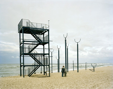
And finally for this section (and as seen as the main picture) Mark Power's "Pobierowo, Poland☜", a delapidated beach slide, gives a post modern sculpture like dose of confusion with a consoling couple in the foreground adding intrigue? The series it is taken from, a Magnum commission to document the new Euro countries doesn’t really enlighten. Can an image be taken out of a series for which it is intended and still mean something?
LANDMARK
- An external point of reference that helps to orient someone in a familiar or unfamiliar environment
- A monument, building, or other easily identifiable strucure
- A notable physical feature that has symbolic, hostorical, or spiritual connotations
#1
Scott Conarroe’s “Loop Biloxi, MS, 2009☜” is strangely entrancing. Two roadways loop into the water and back again paralleled by a rather pointless walkway.
Olivo Barbieri's “Site Specific London☜” of the Gherkin is a lithographic perspective image of archtitecure with features enhanced, removed or overlaid with white. A conceptual work that, again, needs some context.
Mitch Epstein's "BP Carson Refinery, California, 2007☜" is awesome to see in the flesh though - it must have screamed iconic as he was opening the shutter. It’s also nice to see just what a darkroom print from a 10x8 looks like. The power of capitalism as nationalist icon is quite scary.
In Kander's photograph "Ruin (Military Housing) Priozersk (Moscow 10) Kazakhstan, 2011" a man in front of half destroyed building looks like he’s torn down the facade with mind power along. Nadav Kander captures the whirlwind personal and political change in a single picture. I hope the rest of his Russian series is as good.
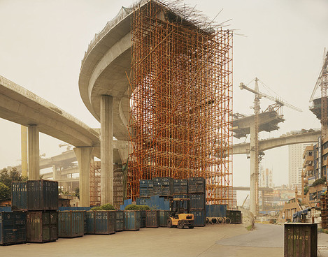
Classic Kander now from his “Yangtze; The Long River” project "Chongqing 1, Chongqing Municipality☜" where a half constructed flyover is epic in composition and form - shame about the rippled print under the framing.
SCAR
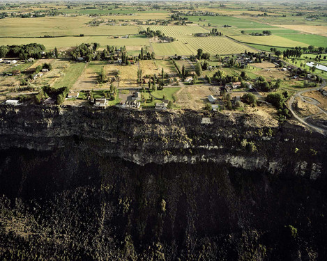
Michael Light. Houses On The Edge of
The Snake River Lava Plain, Looking
North, Jerome, Idaho, 2009
© Michael Light
- A mark or blemish from previous illness or injury, to a body or landscape
- Disfigurement; discoloration
- A hurt, mark, track, or wound
#1
Alex MacLean’s “Desert Landing Pad, 2004” shows an aerial view of a golf putting green dropped into a desert is odd - perhaps another example of a single image taken from a project. I presume this is part of his “Playing” series but it comes across as just a series of ‘topically connected’ aerial photographs. Aesthetically interesting on occasion for example, his windmills photograph (“Windmills at Tehachapi Pass, 1991☜”) is stunning - a wind power farm, towers arrayed and blades burning reflected sunlight back at the viewer, the form flows across the landscape.
And now a picture that stopped me in my tracks and kept me fascinated for far too long. Edward Burtynsky’s “Pivot Irriation #15, High Plains, Texas Panhandle, USA, 1968☜”* instantly grabs attention in that ‘what am I looking at’ way and even when you realise it’s an aerial view you still keep becoming more absorbed. How can a landscape become so abstract? The details make sense but the whole becomes confused. Step back and it becomes an abstract, occult, religious icon in terracotta and steel. I’d expect to find something like this on a Peruvian archaeological dig.
* phew - is that enough title! almost as long as Olaf Otto Becker’s
Michael Light shows the issues of water abuse in a Nevada golf resort. Rich, alien greens against parched desert rills - “Wolf Creek Golf Resort Looking Southwest, Mesquite, Nevada, 2010☜”
And onto Toshio Shibata - a photographer I had not heard of until a few months ago when I found his “Landscapes” in a second hand book store. Born 1949, Shibata is one of Japan's foremost landscape photographers who specialised in photographing engineering works in the Japanese country/wilderness. Looking through his work, it's difficult not to get the idea that some of Michael Kenna's inspiration has originated here (and definitely some of his locations scouts finds). Although the majority of the work that I prefer is black and white,the occasional colour work is quite stunning. Here we have an example, "Otaki Village, Nagano Prefecture, 2005☜", some sort of dam overflow. Not as strong as the later work he has in the exhibition but I was very happy to encounter it none the less.
The scar room large and a chance for a breather/rest on one of the large 'museum' benches is welcome. Take a moment to sit and absorb some of the images in this stunning room. And onward..
Another Michael Light's, and one I instantly recognised, "Houses on the Edge of the Snake River Lava Plain, Idaho, 2009☜". The cliff of the lava field with housing butted up to the edge. An iconic view showing the point where human activity gives up against the natural scars of the landscape.
I was hoping to like Robert Poldiori's Indian slum photograph, "Amrut Nagar #2, Mambai, India, 2011☜", having seen it previously in a book but this feels like a third world "Where's Wally?". I struggled with the distraction of the strangely cropped edges like a panorma stitch that wasn't quite finished properly. Presumably these were meant to add something to the image but I couldn't work out what.
#2
Next to the main 'Scar' room is a stunning selection from David Maisel, Olaf Otto Becker, Edward Burtynsky and Matthieu Gafsou.
The first Maisel, "The Lake Project 15, 2002☜" is beautiful - abstract photographs of industrial and geological features caused by water battles between politicians, locals and big business. This first is a blue toned moonscape that draws you in. I was introduced to the work of Emmet Gowin, David Maisel's tutor, by Andrew Nadolski recently and the work is a natural extension of his (although in many ways I've started to enjoy Gowin's work more). Still this, like much aerial photography, is instantly enjoyable stuff.
The second Maisel, "The Lake Project 3, 2001☜", is so abstract that I can't even tell the scale on close inspection. Areas are blurry which suggest a close up but the features are so fine it suggests aerial. A blood-red, scaled and cracked skin of the world where water recedes in the distance.
And onto more Olaf Otto Becker and this is truly sublime! "River 1, Position 7, Greenland 07/2007☜" is a water channel on a huge ice sheet taken from his "Above Zero" project documenting the accelerated melting of the ice caps. The amount of sheer detail in this image communicates the sense of scale of this river of melting ice water.
Next to this is a truly sublime Daniel Beltrá burning Amazon forest "Amazon #10 2007☜" - like seeing your famiky as roadkill - the dead guts and skeleton of the rainforest on show with a single perpetrator holding the smoking, flaming gun in his hands. This photograph moved me greatly and upon visiting his gallery of images from the Amazon on his website I was doubly shocked as I already knew the scale of destruction but to see it photographed revealed the raw brutality of it.
...
Burtynsky's subject matter and presentation may be seen by some an aestheticism over subject but I disagree - this is where aesthetics are at their best in bringing attention to a subject matter and raising awareness of something at the same time. Simon Norfolk, another exhibitor here, famously said.
"Beauty is thing is just a vehicle.. By making the pictures very beautiful you are almost tricked into coming inside that photograph’s space for a while; engaging with it and being in a conversation with the photograph .. and then, by surprise, you might find that you’ve listened to a whole load of my arguments which you probably wouldn’t have listened to if I hadn’t seduced you into that space, into that dialogue. So beauty has always been a tactical thing for me. If I thought I could get across the points I want to make without beauty then I would dump beauty tomorrow."
And Burtynsky does this so well. He doesn't often abstract away the subject matter and so leaves you to discover what it is you're looking at and hopefully might engage you in the politics of what is being shown. Don't expect socio-political essays from all photography, but it certainly can be a gateway to an important conversation.
And the diptych "Nickel Tailings #34/#35, Sudbury, Ontario, Canada, 1996☜" is a great example of this. The shock and metaphor of the red river over black, despoiled landscape draws you in and flicks your curiosity switch; "What is this? Is this real?" and once you find out you've learned something about the scale of the scars of the industrial West.
Matthieu Gafsou struggles a little in this company to be honest but he really shouldn't as the images are strikingly engaging. The first "Randonneurs sur le Glacier du Rhone, 2010☜" depicts our seemingly futile attempts to cover a glacier with a safety blanket with onlookers contemplating the efficacy (surprisingly the exercise did eventually work, saving over a meter of snow on this particular section of this particular glacier. Sticking plaster?). The second shows a larger glacier covering to the same effect ("Diavolezza, 2010☜").
#3
Luca Campigotto's "Ramlat As-sab'atayn Desert☜" starts the final 'Scar' room with an empty desert view. I couldn't be moved to comment further and reading this review in Photo Eye I think I would have to browse the book and even then I might not understand?
I'm on safer territory with another David Maisel - this one the well known colour abstract "Terminal Mirage 18, 2003☜" which shows the most alien colours imaginable for a landscape - like a colourist abstract it removes any context of the real. You can see more of David Maisel's images in this article - click on the images for extra large views.
Karin Apollonia Muller's "Foundation, 1995☜" is another image that I can't see beyond the 'small figure in big landscape / isolation, etc'. If someone would care to enlighten me? Is this art more about the photographer's story than the photographed?
Pieter Hugo's work "Zakaria Salifu, Agbogbloshie Market Accra, Ghana☜" on the other hand is quite shocking. Despite this being more in the realms of environmental portraiture, the contrast of the protaganists stance and expression against the desolation of the Ghanaian's city and river scape is astonishing and I found it uncomfortable to spend too long gazing at the image. A truly apocalyptic scar.
In between these epic images of destruction and desecration sits a Robert Bourdeau print "Pennysylvania, USA, 1997☜", like a old man in a dilapidated retirement home, its simple toned contact print texture contrasts with the surrounding Technicolor. This doesn't sit comfortably here and doesn't seem to have the same conceptual connection to the land as the other images.
More Daniel Beltrá, this time a not quite as convincing aerial view of the Deepwater Horizon oil spill "Oil Spill #4, 2010☜" is fascinating for it's colour until you see that the oil rig looks far too saturated and has lost all tonal structure. This suddenly removed my visual connection with the colour of the subject which is what drew me in originally. It's a shame as the image didn't need the treatment to be as strong and it looks cartoon like with it. The series of images that this is taken from is still very strong though and is worth a look.
Benoit Aquin's "Genghis Khan. Chine (Le Dust Bowl Chinois), 2006☜" is a peculiar image. A group of people trying to cross a road in a dust storm with a statue of Genghis Khan in the background. Without the context that this is about the desertification of China, the largest destruction of productive land in the history of the world, it loses so much. This is why I think each image needed at least a short description of the series it came from and possibly access to more images to give context.
Although I can't find my way to fully understanding Robert Adams, I can appreciate the work he did. His forest clearings as metaphors for violence, war, nihilism obviously worked for the critics of the day and his yin to Ansel Adams' yang worked to usher in a generation of deadpan photographers, especially after his place in the New Topographics exhibition. Here we see "Clatsop Country, Oregon, 2001☜" a single decapitated tree trunk in a forest clearing, flat printed in harsh light.
"Uranium Tailings #12, Elliot Lake, Ontario, Canada, 1995☜" is one of my favourite Burtynsky images. At first glance this could be a geothermal spring after a forest fire, destroyed trunks of stunted trees around a silt stained floor. There is something about the textures and tonality that I could sit and look at for a very long time. The incongruity of beauty and destruction have left a permanent image on my retina. And that is a good time to take a break!
Continued here...
[/s2If]

