Part Two

Tim Parkin
Amateur Photographer who plays with big cameras and film when in between digital photographs.
In the second part of my review of the Landmark exhibition at Somerset House I'll be looking at the final set of images exhibited.
DATUM
- An assumption or premise from which inferences may be drawn
- A piece of information; fact
#1
The Datum room had me perplexed. I enjoyed the 'new sublime' that is space exploration and NASA images but Dan Holdsworth's work, which this rooms seems to be dedicated to, has not worked its influence over me. The room has four of Dan's works and I can only think that William Ewing struggled to complete this section and fell back on Dan for the remaining images.
The first of Dan's images, "Transmission: New Remote Earth Views: Mount St Helens, 2012☜" shows a shaded contour map of Mount St Helens. Beyond the fact that it's sometimes nice to have big maps I can't really see the point - this smacks of another nice conceptual idea but taken too literally. They do look very cool in the white walled environment of the expensive art gallery though - I wonder..
The next is "XYZ Volume, Yosemite Valley, 2012☜" which isn't even photography - it consists of a pile of XYZ coordinates of Yosemite valley. My mind cannot quite grasp the reason the inclusion of this. The same goes for the other map photograph (image?) "Transmission: New Remote Earth Views: Yosemite, C3, 2012☜"
The final Dan Holdsworth is "Blackout 07, 2010☜" so it's good to see that we've got some real photography here. Holsworth's famous - "Here's a negative of one I did earlier!" shots blown up to tableau sizes appear other wordly and do link conceptually to his work with maps in a way that suggests we can look to our own world for space exploration; but the ideas sort of struggle to appear once you get past surface descriptions. This is odd as I do like some of Dan Holdsworth's eariier photography (Gregorian, The World in Itself and Megalith for instance) but the concepts are taking over from the photography in my personal opinion.
Raphael Delaportra's image "Ruins, Season 1☜" engages me a bit more in that the image holds some connection to the land beyond mathematics. The aerial photography is a tool used by archeologists to survey and document sites of ruins. The result gives a unique view on our social history and with the science that is rediscovering it.
CONTROL
- The power to influence or direct the course of events
- Imposition of order
- Power over other individuals or situations; manipulation
#1
Beginning with Alex MacLean's "Bay Channel, 1984☜", the Control section shows mans efforts to govern the environment. There is a crossover here between other categories here but we'll allow Mr Ewing his way of showing things as no category system can be completely self exclusive. Alex MacLean's image is beautiful here though, a display of the futility of control with flood control systems at breaking points and fields covered in water reflecting a blue sky (or possibly an orange sky if you look around online - not to fine art photographers, avoid any hint of sunset) with a row of pylons walking through frame giving a sense of scale.
Walter Niedermayr's large scale images of the winter tourist industry show a scale of the environment, typically with tiny toy like figures dotted around a landscape with no dimensionality (Niedermayr creates high key pictures that remove the shading on the mountains, leaving on the people and key features). "Graue Wand (Diptych), 1997☜" shows scattered areas of black rock with the ski lift on the left lifting people up and the run on the right where people return which gives a sense of the futility of the leisure activity when seen at this scale.
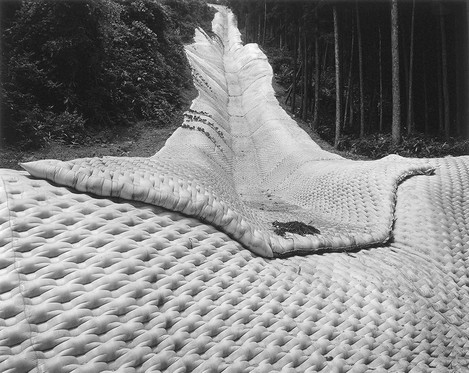
And onto one of my favourite photographers recently. Toshio Shibata's industrial photographs show the places in Japan where civil engineering projects but up against nature. For instance we have a dam overflow in "Otsuki City, Yamanashi Prefecture, 2005☜", a water sluice in "Onokamki Village, Guma Prefecture, 1994☜" and mountainside landslide reinforcement in "Tajima Town, Fukushima Prefecture, 1988☜". Of these images many may see a strong resemblance between some of Michael Kenna's work in Japan. Regardless they have a consummate skill in composition and and eye for detail. Have a look at this interview and this small selection of images to get a taster of his far ranging work in both black and white and colour.
Edward Burtynsky returns with another aerial view, this time of dryland farming "Dryland Farming #8, Monegros County, Aragon, Spain, 2010☜". This doesn't work as well as his other aerial views and is much weaker than his non-aerial photography. The issue here, for me at least, is the disconnect between the abstract and the documentary. There are no real details to give you a sense of the scale beyond the overall shape of the land and beyond this the photograph isn't ‘ beautiful’ in terms of composition and colour. Beauty and the sense of sublime may not be necessary (and is often considered a negative trait in much contemporary photography) but it is a tool that Burtynsky uses well in other works but is absent here.
Olaf Otto Becker's work has the awe inspiring nature of the sublime in bucket loads though. "Concrete Spillway Chute, Karahnjukar Dam, Iceland, 07/2010☜" is a massive print showing the route overflow water takes from a large hydro electric dam project in the North of Iceland and for all intents and purposes looks like a motorway that abruptly ends in a black, basalt cliff with a huge drop. This is taken from 'Under the Nordic Light', a book of images of primeval landscapes that Olaf recorded for no other reason than the their look but the story they tell is about the way the very Northern parts of the world work.
From large prints to small and Ray Metzker's "My Philadelphia, 1996☜" is beautiful and reminds me of Brett Weston's Manhattan ‘Courtyard’ images.
The final image in the Control section is one by Naoya Hatakeyama. "Atmos 2003☜" shows the hot air produced from a steel plant in the Camargue near the Rhone river. You can see more of Hatakeyama's work here with some information surrounding the project and more work from his other projects including the successful limestone quarry images.
DELUSION
- An idiosyncratic belief or impression that is firmly maintained despite being contradicted by what is generally accepted as reality
- The action of deluding someone or the state of being deluded
- An illusion, deception, deceit, or fallacy
#1
This is the part of the exhibition that didn't engage me as much as the other parts. The celebration or ridicule of the commercial, synthetic or vernacular is an ongoing passion for my contemporary fine art photographers but it's something that I find rapidly tiring unless approached in a way that can be read on multiple levels. i.e. In most cases they are just too simple to spend any time ‘reading’.
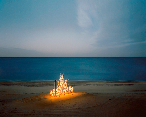
Scott Conarroe's "Swans, Virginia Beach VA, 2009☜" is an image that does engage me though, The contrast of the artificially swans constructed of light bulbs shining their message out into the blue beyond intrigues me and, as I have mentioned I desire, it can be read in many ways and so allows the viewer to bring some of their own narrative to the experience. The clash of natural and artificial is also visually interesting. A win for me then. I should add that the text accompanying some of his pictures does end up pushing the average viewer away such as this "The anonymous earthworks each inscribe a type of formalist aesthetic into quasi-sublime nature" which can easily be translated as "The anonymous earthworks are just pictures meant be sort of awe inspiring". The latter may not be appropriate for major museums but it means a lot more to me.
With Lois Hechenblaikner, "Winter Wonderland, 2006☜", we lose the context of the project which is documentary in nature and reports on the beer and capitalism fueled leisure community in the Tyrol. But the picture shown in the exhibition reveals none of this and becomes just a confusing mess of symbols with no index. Again - context is needed to appreciate.
Nadav Kander's "Monument, Utah USA, 2006☜" is instantly enjoyable on many levels. This is taken from "God's Country", a moment from the classic American road trip that Kander took to document a sense of isolation and loss he saw. These ideas are again partially lost in the individual frame but in this particular image you can still get a sense of it with the isolated figure worshiping at the peculiar monolith. Interesting interview of Mr Colberg's website here.
Robert Voit has a wonderful selection of images of mobile phone attenas disguised as organic objects such as trees or cactus "Scottsdale', Arizona, USA☜", "Industrial Drive', Flagstaff, Arizona, USA☜", "Estoril', S. Pedro, Portugal☜" and "Riseley' Bedford, UK☜" for wonderfully absurdist take on the commercial ideas of nature. The Becher's would be proud.
Mark Power adds to the absurd with his luminous pink Loch Ness monsters in "Lake Miike, Kirishima National Park, Miyazaki Prefecture Japan☜". Another grant based work like his previously mentioned Poland project, this examined a single Japanese region or prefecture, in this case Miyazaki.
Florian Joye's "Bawadi, 2006☜" shows more absurdity, this time a cardboard cutout view of the world iconic locations thrust, spotlit out of the desert dunes. Florian shows the rough scaffolding behind the facade as metaphor for Dubai's own emergence from desert culture.
Side by side Reiner Riedler's, "Wild River, Florida, 2005☜" and "Horizon #01, Tropical Islands, Germany, 2007☜" from his series "Fake Holidays" show theme park emulations of the wilderness with captive trees and backdrop blue skies with fluffy clouds. The is landscape tamed for mass consumption - a haven for paranoid parenting.
And here's a landscape photograpy icon represented in exemplary New Topographic form by Thomas Struth. "El Capitan, Yosemite National Park, 1999☜" sits in a lineage of deadpan, vernacular photography that revels in its amateur take on our landscape. The composition is unbalanced, the light harsh with deep shadows. All of these aren't accidents or due to lack of talent. I'm not sure if the image needs to be enlarged to the extent that it has been as the message is straightforward as far as I can tell. It's a milestone in art history so.. onward to the next.
Ivar Kvaal's "The Upside Down House, 2010☜" is intruiging but, again, without any context it could mean all sorts of things. Visually it's beautiful though and has enough engaging attributes to hold your interest - not least "What the bloody hell has happend here then!!!" You can see a lot more of Ivar's work in this pdf portfolio.
HALLUCINATION
- An Experience involving the perception of something not present
- A frightening or unpleasant dream; a nightmare
#1
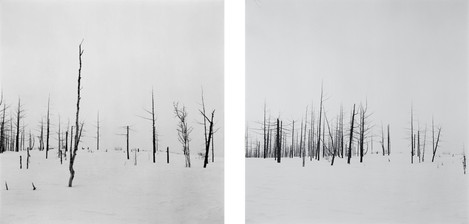
Olaf Breuning is reasonably well known as both a comedian and artist - both at the same time by the way. His videos sometimes feature an "Idiot Abroad" character and his self deprecatory artwork quite often ignore concept for a good old laugh. "Complaining Forest 2010☜" is just that, lots of white bleached sticks going "ooh" "ow!" etc. ha ha!
Yao Lu revisits the Shanshui tradition in Chinese art but using digitally manipulated images of piles of trash using the landfile cover materials as drapery to create the mountains and valleys. With a final step adding in the odd pagoda, cascading river and human figures the result is entrancing and a wonderful commentary on Chinese waste culture. The example included "New Landscape Part 1, Autumn Mist in the Mountain with Winding Streams, 2007☜" shows a demolition site with pagoda, trees and grassy straw for distant forest. Quite exquisite.
Joan Fontcuberta has been mocking reality with fake museum exhibits, space missions, fossils and in this case with "Orogenesis: Derain, 2004☜" a whole fake, computer generated landscape. As an idea, very interesting but not as believable to eye that have seen another decade of imaging technology. However he has a lot of great things to say about art that you can read more about here. An apt quote for this review is as follows.
"I have noticed a perverse phenomenon in contemporary art: artists abdicate their discourse to critics and curators. Their work then just becomes an illustration of someone else’s discourse. Maybe that is the price they have to pay to achieve some form of recognition in the art scene or market." - Fontcuberta
Andre Derain "The Grove, 1912" is shown below the image as it was used as the 'seed' for the landscape - an interesting idea and on inspection you can see how the trunk of the tree has become the bottom of the valley filled with water from a small stream.
An enormous print of Michael Najjar's "Nasdaq 80-09☜" dominates the room here. The peaks of an Argentinian mountain have been manipulated into the boom and bust cycle of the NASDAQ - sounds like a good excuse for a jolly in the snow to me! I'm not really keen on the work and it all seems a bit 'science fiction meets advertising photography' to me - probably why Virgin Galactic are going to make him the first artist in space..
I don't really understand why Robert Bourdeau is in this section but he makes a nice interlude with his "Lorraine, France, 1998☜" anyway.
Peter Knapp's just weird "Il n'y a pas que Mazout sur la plage, 2006☜" bucket and rubber glove perched on stick in sand.. huh!
Mathieu Bernard-Reymond's collection of images echo Najjar's stock prices but in black and white and with concrete, stone and snow charts. "Exxon Mobil 9AM to 11AM☜", "UBS Five Years Backdrop, 2008☜", "Crude Oil Prices, 2003 to 2008☜" I don't understand what they are saying beyond his description on his homepage.
"When I take photographs I try to expose the paradox of the image in its resemblance to the paradox of our existence now: a perpetual back and forth between the imaginary and the real, a vital yet doomed-in-advance striving to know where we are."
I'm struggling with John Stezaker's work too - "Old Mask I, 2006☜", "Old Mask VII, 2006☜" - winner of the Deutsche Borsche prize, Stezaker uses found photographs. This document talks a little more about the work because I don't think I can.
I know the whole ICM thing is very en-vogue but Charles March's images don't seem to distinguish them for other great ICM apart from the fact he happens to be Lord March who owns the trees and grounds that they grow on. He also owns Goodwood. Although he has credentials - he shadowed Stanley Kubrik as a lad and was an advertising photographer for many years. "Gasworks 2, 2009☜" if it's just about aesthetics, as this seems to be, there are better photographers subscribing to On Landscape.
I love Gerco De Ruijter's kite photography of Iceland with "Almost Nature #08, 2012☜" and "Baumschule #22, 2010☜". The remote abstraction of the typical aerial shot are discarded in favour of a more intimate view which engages rather than distances. The two images shown are more formal than his others and I think not as strong for it. They lose the sense of intimacy that the rest of his work has. Highly recommended for a unique view on the land.
REVERIE
- A state of being pleasantly lost in one's thoughts; a daydream
- A work of art inspiring contemplation and reflection
- Characterised by a sense of abandon
To be honest the 'themed' rooms are breaking down at this point. Yes, Leonora Hammil's image does have an element of Reverie but the remaining images are only very, very loosely connected. Let's look at Hammil's image first from the project 'Their Favourite Novels'. "Simone/Metaphysique des Tubes☜" is of a floating man in a tannin stained lake. Leonora asked individuals to name their favourite novels and then helped them create a diorama around them.
Amy Stein's "Howl, 2007☜" is brilliant - an artificial moon for a wolf to howl at. Taxidermically posed (a layer that becomes part of the art) the animals sit in incongruent relationship with the land. Individually ironic but taking a little time to look at the whole series I got a sense of melancholy, I needed to remind myself that I shouldn't anthropomorphise stuffed animals.
Edgar Martin's 'When Light Casts no Shadow☜' - is a series of images taken around airports or ..
"In reflecting on the complexity of the negotiations between estranged lives and de-territorialised worlds, one might wonder if the generic city is synonymous with the contemporary airport." more here..
His other image from the series 'The Accidental Tourist' has the associated text..
"Shot largely on the same set of beaches in Portugal over a period of two years, the imagery of The Accidental Theorist is a series of moments that have become independent of causation or purpose.
This landscape is familiar, ubiquitous, and yet imaginary, unreal. It is full of stillness and silence yet the pervasive tranquility is paradoxically not calming but disturbing, discordant, incongruous, intangible. It is marked by the sense that things are forever unreachable.
All that represents the ambience of a holiday beach is missing. We long for the signs and symptoms of life to reimpose themselves upon the social fabric of this place.
Shot with an analogue, large format camera and making use of long exposures, these images are all about temporal experience.
The beach is rendered as little more than a proscenium awaiting some event.
Found elements underscore an ambiguity in these images between the composed and the contingent."
I might be struggling with these last images but associated narrative like this really isn't helping.
Yang Yongliang comes to the rescue with an aesthetic that once again borrows from Shanshui with his Chinascapes that show the rampant building of skyscrapers and cranes rendered as Li River mountains and trees. "Phantom Landscape III: Lost City☜" is all detail - a tour de force illustration. Hang on! It's an illustration! Is this photography then? I dunno.. next!
Alexandra Catiere "My Town☜" is printed sublimely and so it should be for a student of Irving Penn. Her photography is beautiful and very varied. I'm a fan and I'm looking forward to finding out more.
Wigan born Darren Almond creates multimedia projects with film, installation, photography and sculpture and nearly always has something interesting on offer. His "Night+Fog(Norilsk)(21/22), 2007☜" is one of a few images taken in remote locations under full moon. The results are often intoxicating and this is very much so for the image on show here. Take a look at this website for more - so much better than the 'Moons of the Iapetus Ocean' book I had purchased previously.
Arno Minkkinen takes close up photographs of his body parts, rather like an auto Bill Brandt. The results are original, yes, and incredibly well composed. Despite my initial doubt about the work I'm actually impressed that he's taken a single idea and run with it so successfully. Mostly☜ inspired☜, occasionally absurd☜ and sometimes amusing☜, the work would distil into a beautiful book whereas the volume of images on the website gets tiring after some time. The image included, "Self-Portrait with Swan, Foster's Pond, 1999☜", isn't the strongest in my opinion.
Axel Hütte's "Aonda Camp-2, Venezuala, 2007☜" is a simple view into a reed filled river with reflection and this is what I like so much about much of Hütte's work - the sense that the photograph and the subject are working together to create something beautiful. An extension of the German romantic/sublime aesthetic of Caspar David Friedrich, something that I think confuses critics - torn between lauding another of the Becher's students (alongside Gursky, Struth, etc) and rejecting him because of his use of beautiful/sublime. I'll just continue to enjoy the work. Again, there is much more to find and enjoy in Hütte's work which we'll show in future issues. More here and here.
I didn't have enough time to take a look at the single spread of Simon Norfolk's epic (and probably expensive) art book so I don't feel in a position to comment. When I revisit I'll take another look.
Carlo Valsecchi's full frame 4x5 prints, rebate and all (yes it's nice that you use Kodak 400-NC), show a simple architectural feature in a long exposure night landscape "0692 Capri, Napoli, 2009☜". I can't say much more than that as I can't find any commentary about the work online - anybody able to contribute? Heres a few pages from a book.
Lauren Marsolier's "Buildings and Pines, 2011☜" is an artificial construct, a collage made up of elements taken from different locations and times. She's trying to create a sense of discolation in the viewer as a metaphor for living in a modern, rapidly changing world. The example chosen just looks like a half finished greek holiday villa - perhaps it's supposed to? Her website is here.
"The Man who Fell to Earth☜" by Pierre Radisic is a surreal/absurdist take on Friedlander's "Shadow, New York City☜" but I can't get anything new out of it. By the way - don't Google him unless you want to see extreme porn in the supposed name of art ("Sexscapes"). <sigh>.
I'm finding it more difficult to critique some of this last section with ‘works of art’ like Justin Blau's "The World in a Box, Alps, 2011☜". My art sensibilities don't stretch that far.
The abstract aerial view and digital composite that is Marcus Lyon's "Exodus IV, Hong Kong, China 2010☜" meanwhile is stunning - despite being hung on its side (I don't suppose it matters?) this looks for all the world like a microscopic view of a computer chip with it's data buses and connections. And in many ways that is just what it is if you consider shipping containers as data packets, etc. The overall idea of this type of work has been made famous by Gursky but Lyon has an original take worth looking into. More extra large images to browse here.
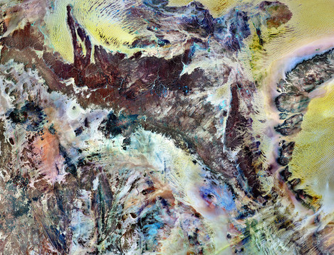
I mentioned earlier in the review that I liked the face that space photography has been included in the exhibition. This is landscape photography and could also be considered the new sublime with the power to shock an awe more than most images of waterfalls and mountains. David Malin's "M104, The Sombrero Galaxy in Virgo, 1993☜" shows one of the most famous galaxies in the sky taken from the Australian Astronomical Observatory. Beautiful.
Jean Baptiste Huynh's photographs of antique Chinese mirrors look for all the world like planets or moons. "Miroir XV, 2007☜" hangs against a night sky, tarnished with meteorites and showing green and orange plains whilst cities light up the surface past the terminator. A beautiful series of observations.
"I Remember -05, 2008☜" by Liu Xiaofang is a dreamscape of a little girl in circles - the series it is taken from is like a modern fairy tale with atomic explosions, rainbows, watefalls, jet fighters and rubbish heaps. It reminds me of a graphic novel but with the narrative left for the viewer.
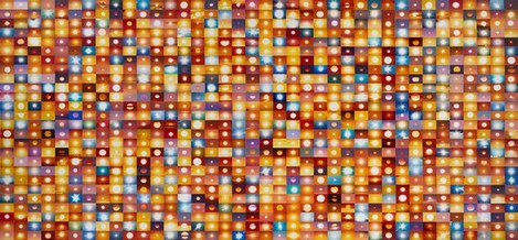
There's not much to say about Penelope Umbrico's "11,936,887 Suns from Sunsets from Flickr (Partial) 2/4/2013☜" apart from 'what a cop out!'. I was expecting at least a million but I only counted a few hundred - I asked for my money back but was told the exhibition was free - "Good point" I replied.
Kent Rogowski "Untitled #9☜" from the 'Love=Love' series. Mutiple jigsaws jumbled up to create new views from flowers and skies. Nice idea - not much more than surface that I got though.
Lois Hechenblaikner's "Behind the Mountains (Diptych), 2002☜", documentary photography from the Tyrol leisure machine then and now replacing cows with cars, Madonnas with strippers, chicken coops with fried chocken stalls and sheep with snowboarders.
And finally the ultimate sublime, earth as seen from Voyager I. "Solar System Portrat: Earth as a Pale Dot, 1990☜".
So with the last image looked at what did I feel about the exhibition overall? The first thing I would say is that it would have helped massively had I been able to have the research I have presented here whilst browsing the pictures. Many images didn't make sense when looked at individually but once you understood a little about the artist and the project they were working on I at least had a foundation on which to build an understanding. I may not have liked the end result but I would have been able to make an informed assessment. My worry is the majority of people won't and will come away saying "I could have done that!" or "What the hell is that all about" when with a little supporting information they could have gone "I understand that and it's made me think". And that is what art is about isn't it?
The exhibition was a literally a revelation in many ways - I've been exposed to many artists that I want to find out more about and have been motivated to look at the presentation of my images more. Many of the photographs may not be the sort of work I or you may wish to make but I would hope that seeing a slice through the state of contemporary landscape photography helps place other work and perhaps your own work in the context of a larger whole.
In short - definitely go and visit. I'll be back to take a look with my new knowledge about the works and hopefully we'll try to get an interview with either the Curator and/or a few of the artists exhibiting here.
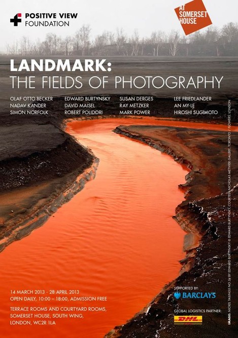
You can find more out about the exhibition at the Somerset House website or at the Positive View foundation's website.

