An idiots guide to photographing trees

Dav Thomas
Tree loving photographer, mainly using large format film cameras but also flirts with other formats.
When I started out in landscape photography I read about "the rules" and tried to practice them like a good boy: something in the foreground, path through the photo etc etc, but it didn't take me long to come to the conclusion that rule following wasn't for me. Why should there be something in the foreground, be on thirds, or be taken at the seaside during magic hour?
I have a love of design - be it print, product, architecture - and as a practising designer I have a very strong view of what I like. I like my design to me minimal yet authoritative, perfectly set typography does it for me and furniture design needs to be minimal, classic and functional. “So what?” you may ask. Well, at first I was too busy following set rules that I missed the fact that my landscape images should just be another part of my creative design process; my images should hold the same values as the other design processors I'm so passionate about. So, after a year or so of sunset chasing, I put away my bucket and spade, stopped visiting the seaside at sun up and start hacking away at my own creative path.
If the seaside was going to be reserved for holidays, what do do? I started exploring my local path, the Peak District. I knew I didn't want to be turning out wide angle views of the 'edges' as is the norm so I started exploring the less noticed elements; the grasses and the trees.
I've had a love of trees for as long as I can remember, as a child I used to play for hours on "Church Field" opposite my house: an overgrown no-mans-land, making dens in the trees and dams in the steam which was shrouded in scatty looking greenery. I spent days exploring my local Wollaton park, home to many a fine tree. The football team I've supported all my life even have a tree as a badge – it was all destined to happen!
I urge anyone who has more than a passing interest in landscape photography to seek out what actually interests them; find something you have a passion for. It shouldn't be about rules, best and worse light, exciting locations – it should be about what you care about. I believe you can only make engaging images if you truly have a passion for your subject, anything else is painting by numbers. I have a passion for trees and woodland and all that goes with it, I hope that passion is imparted in my images; I want to get over just how wonderful these environments are. I conclude that a fair amount of people who say to me "I can't photograph in woodland" don't actually care much about woodland, it's just another 'thing' to photograph!
So, if you've got this far and still want to 'do trees' I'll go through some of my methods and motivations when I shoot trees. This of course, is just my approach, they're not rules!
There are few opportunities to make wow images in woodland, they are quiet places for me, places of contemplation. Very rarely do I find myself scampering about chasing light – it does happen now and again but generally, it's rather a tranquil affair. It may sound a bit New Age but I like to get to know a wood, revisiting the same trees throughout the year is like revisiting old friends. This isn't a one visit experience, you have to get to know the light, where it's going to be at certain times of the year, when is it likely to be misty and what's the all important supporting cast doing; the grasses, mosses and fallen leaves that cover the forest floor? Of course, that's not to say you won't luck out and visit a place for the first time and get great results (as I did last year at Yewtree Tarn in the Lake District), but certainly having a mental list of possible locations for given weather conditions is a good idea.
There's no bad time to photograph in woodland (apart from during lightning storms perhaps). Perhaps one of the best times is during periods of light drizzle (you see, you are lucky to live in the UK!) when the colours are intensified, with light rain woodland comes to life. Any casual observer of my work will have noticed that I like mist – for me this is the most magical time to be amongst trees; forget your cloud
And so, how do I actually go about composing in these complex environments...
Firstly, shake loose the shackles of landscape photography composition rules, forget about foreground interest unless it is going to be a main feature of the photo.
When I'm out hunting down compositions I'm firstly looking for an interesting element to use as a starting point to form the composition around - it might be an interestingly shaped trunk, a colourful element that stands out, or simply some texture that I'd like to portray. I then look at how I can use that element to build a photo. I will look around the chosen potential element and see if I can link it in with other surrounding parts of the woodland or surrounding environment. It's important to look with one eye closed (I'm thinking of doing a line in branded eye patches!), I use a black plastic card with a format proportioned hole cut out of it to look through to find my composition – this to me is very important, I never use a camera at this stage, using the black card viewfinder really helps me determine whether the composition is working, much more so than using a camera's viewfinder.
I want to remove and distracting elements from the composition and really distill the image down to get over the message I want to portray. As I don't carry a bow saw around with me, removing the unwanted elements involves either moving my viewing angle to get it out of shot, or move so that any distracting trees are hidden behind the main subject, or at least blended in with the main elements so that they are not commanding attention.
What is actually composed is very much a matter of personal choice: it depends what floats your boat. I tend to look for connections between elements - links between foreground and background elements - visual paths through a scene, or I may want to remove as much 3d-ness as possible, creating an almost 2d graphic design.
Removing as much clutter and superfluous elements as possible is all well and good but there has to be a balance; there has to be enough left for the image to have some visual depth to it – a picture of just a tree, is, well... just a picture of a tree!
Some examples...
If this is all sounding rather like gibberish I thought it best to explain a few of my photos, to talk about the thought process behind them.
Foreground Ferns
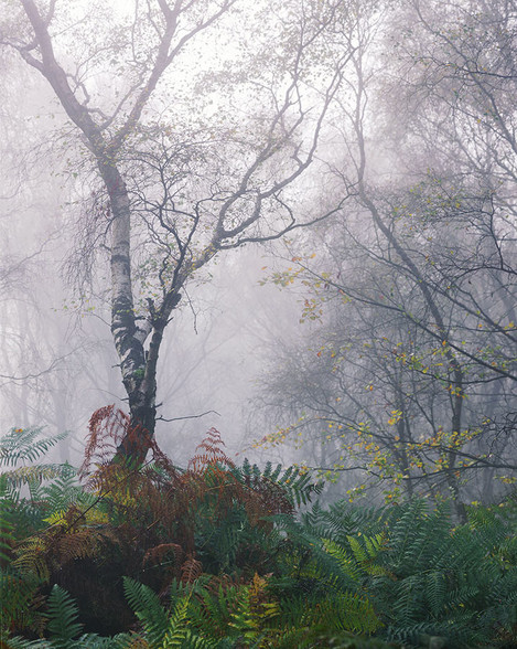
This was one of those magical mornings when the mist managed to get down into Bolehill Quarry, one of my regular haunts that often misses out on mist even when everywhere surrounding it is pea souped. Bolehill is a difficult location to photograph in as it is rather chaotic, but when the mist descends (often a good hour after sunrise), the place is transformed, the mist helping to simplify the background and soften its elements.
When composing the image I look around the edges of the frame to make sure there are no elements that are jarring which can distract and lead the eye out of the photo – I want to keep the viewer engaged with the photo. Here I use the second tree on the right hand side to lead the eye back into the photo thus creating a loop as the eye (hopefully) travels back down the main tree. The branches from the tree that are out of frame also point back into the frame helping with the flow of the image. I'm fastidious about every little element around the edge of the trame, I make sure branches or foreground elements head out to the corners of the frame, as they do in this case.
I can't say I actually go through an actual list of criteria when composing an image, a lot of it is instinctive; I play with the composition until it is just right. Once set up I study the image closely before actually committing to shutter pressing; I ask me self, “is this actually really any good or is it simply a picture of a tree?'?" Obviously this process is more important when using expensive film, but I don't change my mindset when I'm using a digital camera.
When processing the photo I will often darken the edges to help keep the interest in the centre of the image, although one of my (many) pet hates is the over vignetting which is all the rage at the moment (I blame Top Gear). I don't want the post processing to be a feature of the final photo, I want it to be unnoticed. In post processing I will also, on occasion lighten or darken elements that are distracting that it was physically impossible to remove when composing the shot.
It doesn't all need to be sharp
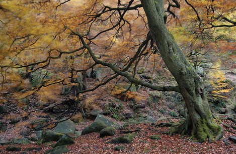
We're living in a world where we all get carried away with analysing which lenses are sharper than the next, and how to get complete foreground/background sharpness. I think it's best to forget this in woodland photography (or maybe that's just my excuse for fuzzy photos!). My hands are somewhat tied by the large format camera I use where large depth of field isn't available – I can't rely on camera movements to create depth of field as that often causes issues with out of focus area at the top or bottom of foreground trees. So I choose to let areas go out of focus, thus emphasising the in focus elements.
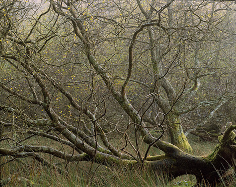
In this photo I loved the texture on the ground and what the grasses intermingle with the fallen tree. This is really quite a simple image that celebrates the rich morning colours and the spattering of rich yellow created by the autumn leaves.
I have moved around the scene here until I can use the branches of the tree behind on the right hand side – rather than shouting for its own attention, I have used its branches to flow in with the main tree and so helping to lead the eye from in a U shape from the top left corner to the right hand edge.
In this instance I didn't want foreground to background sharpness – if the background were sharp it would have flattened the scene into a complicated mess, I only want my front layer of interest in focus allowing the background to offer only colour interest.
Texture
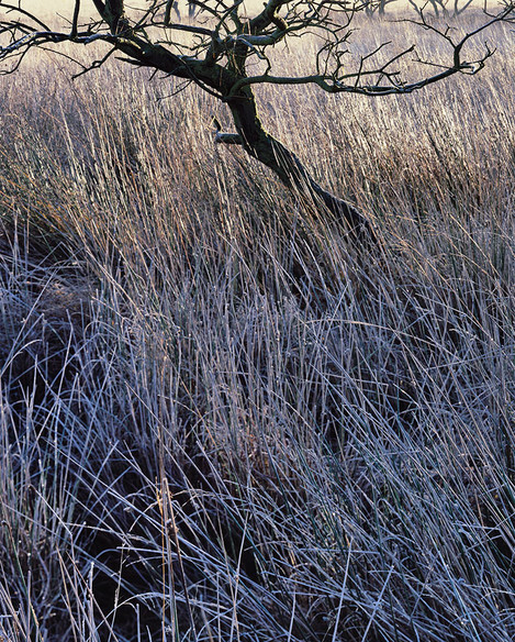
I'm not generally one for showing all of a tree – sometimes suggestions of trees are all that I want, leaving the majority of the image dedicated for the forest floor: those much loved grasses. In this photo I was interested in the lovely light that was falling on these moorland grasses. As the sun was rising, it was lighting up the grass as it went, turning them golden whilst the area which remained in shadow remain cold and blue. This is one of those moments when I had to work quickly, no tranquility here – not only because I had to capture the shot before the effect was gone, but also because I was sinking into the bog I was standing on!
Compositionally I wanted to weight the tree at the top of the frame - the tree, or trees are only supporting the grasses creating visual interest rather than being the main subject. For me the trees in on the top edge are a critical feature providing an element of tension and added visual depth. On a more 'arty' level they also provide a link in the story – this foreground tree is not alone, it's part of a group; it's connected to other trees. Both the main tree and the distant ones help to draw a barrier at the top of the image, stopping the eye wandering out of the photo – my aim is to always keep the eye in the photo and not wandering off to the top of your monitor!
Again, with this photo I have allowed the grasses at the base of the tree to fall out of focus, this helps to emphasis the foreground grasses and the limbs of the tree.
Something Interesting
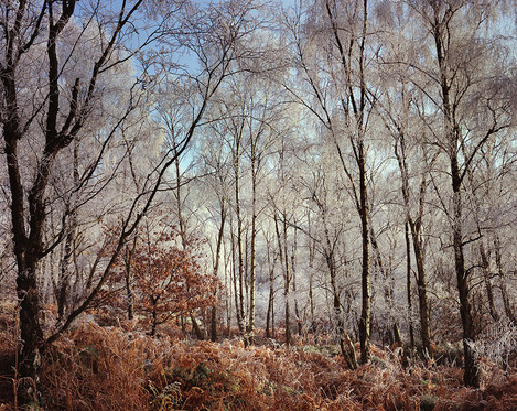
Sometimes even I go a bit wider and very occasionally get the sky in there! Most of my photos are made with a 300mm lens on a 4x5 large format camera, this is somewhere near about 80mm in 35m terms.
This photo is something more like a traditional view than most of my photos, but given these conditions how could I resist?! For me though, even with a wider woodland shot there still has to be a hook – an element that makes it more than a record shot. In this image the thing that makes it for me is the small beech tree which seems to be flying in the face of the hoar frost and ignoring the lead of the other trees.
In a photo like this it's a matter of achieving balance with the weight of the 3 main right hand trees equalling the visual weight of the left hand tree. By positioning these trees I want to create a visual tunnel through the photo leading past the beech tree.
The wider you go the more compromises you're likely to have to make, here I'd prefer not to have the hoar frosted branch in the bottom right corner but sometimes you have to live with these things!
Textured ambiguity
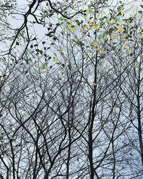
This photo is an example of my scouting an area and finding something minimal that I thought I could make into an image. It's certainly a product of a graphic design mind! I loved the leaves, particularly that some were green and some yellow and the way they contrasted with the stark branches.
In this photo I don't want any depth - I wanted it to be as graphic as possible, I also didn't want to give any visual clues as to where we're looking – up, down, across? In actual fact these trees are below me overhanging Ullswater, the background isn't sky as it may first appear, but water. I'd have moved the camera around once roughly composed to get just the right composition – the top branch falling down into the scene that fills the gap which would have otherwise caused the composition to fail and the weight of the leaves kept mainly to the top of the frame.
For me this image only works because it's been distilled down into its main feature: the leaves and the branches. You can only really notice these things if you give the trees time; they don't give up there beauty at a glance. Many wouldn't have given these saplings a second glance but for me there's often something there in the most mundane of scenes.
Look up!
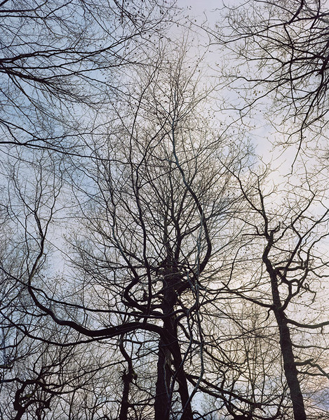
It's easy to ignore what's going on above our heads, viewing where we are from the same level we walk at, but we are so often missing what's going on in the woodland canopy. There's a world of possibilities if we look up, in this photo I wasn't looking completely up in the air but up at trees above me on a steep bank. These kind of photos are very graphic, the branches being all but silhouettes against the sky. I can't remember if it was luck or judgement but I managed to get the cloud to echo the shape of the main tree, filling in virtual foliage; let's say I meant that to happen!
Use the conditions
Most of us don't have the luxury of choosing when we go out to make pictures. I tend to adopt the philosophy that just about any weather is good weather, particularly under the cover of a woodland canopy. The one exception may be a cloudless blue sunny sky when your time might be best spent in a beer garden!
I can't give any definitive guide as to how to photograph in woodland. In fact, I believe you should strive to photograph anything your way - photograph what interests you, not what you are told is interesting. What I can say though is that you can't run through a wood expecting photos to jump out at you - they most certainly won't. You have to spend time there, wander, observe. Sit and have a nap and see how things look with fresh eyes. I often find that I see things afresh if I have to engage with my phone for a minute and then look up; everything looks new again. Who says technology is a bad thing!? One of the benefits of working slowly with a large format camera is that it allows us to look around when we're setting up and there's nothing like coming out from under the dark cloth and observing the forest in a new light. Often I find a composition straight away having just come out of the dark cloth. I can spend hours and only travel a few meters.

