The Role of Memory in Colour Representation

Tim Parkin
Tim Parkin is a British landscape photographer, writer, and editor best known as the co-founder of On Landscape magazine, where he explores the art and practice of photographing the natural world. His work is thoughtful and carefully crafted, often focusing on subtle details and quiet moments in the landscape rather than dramatic vistas. Alongside his photography and writing, he co-founded the Natural Landscape Photography Awards, serves as a judge for other international competitions. Through all these projects, Parkin has become a respected and influential voice in contemporary landscape photography.
Colour - it’s something we sort of take for granted. After all the camera records the correct colour and then we play with it. Right? Well - not actually. Cameras are definitely getting better but they are certainly not perfect yet and if we add in the effects of camera profiles then what we actually see when we load our photos into Lightroom (or whatever) isn’t necessarily what we expect.
Many of us think this probably doesn’t matter, after all we’re not after accurate colour anyway. We want ‘good’ colour - whatever that means.
But I’m going to try to convince you that learning more about the colour of the real world isn’t as trivial as it sounds and developing a stronger colour vision and memory is a useful thing (even if we want to play with that colour to varying extents).
Artists, Photographers and Colour
Painters don’t really have much choice about developing a strong colour vision. If they don’t know the colour of their subject they can’t mix it. The constant working with colour, especially for plein air painters, helps develop a strong memory of colour.
However, everybody has a strong memory for certain colours, particularly things like: green grass, dry grass, skin (tanned, not), brick, evergreen trees, beach sand [1]. When tested people gave colour matches for these materials that correlated very closely. In other words they ‘knew’ what those subjects should look like.
If you talk to video colourists, they usually have a list of things in a shot that need to be checked to ensure they aren’t too far away from the accepted colour ranges. In a study by Clotilde Boust [2] three particular colours came in for close attention - skin, blue sky and green foliage [3]
How we Remember Colour
However it isn’t as easy as getting an accurate match of exactly what we saw, especially after some time. Our memory plays tricks on us; we tend to remember colours as more saturated but also slightly shifted in hue. Here’s what the “Color Correction Handbook” has to say.
- The closest correspondence between a memory colour and the measured colour of the original subject is for human complexion.
Although Caucasian human complexions do vary mostly in luminance, memory colours for skin tone are distinctly more yellow than photometrically measured averages for actual Caucasian skin tone. - There is a preference for more yellow in the complexions of photographic and painted reproductions.
- Sand and soil are remembered as having greater purity, with more yellow.
- Grass and deciduous trees are remembered as being more blue-green than yellow-green.
- Blue sky is remembered as being more cyan and of higher purity than the measured blue of natural skies.
- What’s quite odd is that when people were asked for their preferred colour instead of trying to make a match with their memory - they actually preferred the accurate colour!
As for colours that people preferred in general, they would say that they liked the range from green to cyan/blue but disliked magenta/purple and green/yellow.
Even more interesting for the photographer is that people liked colours more saturated except for green/yellow and magenta/purple which they preferred slightly muted.
Colour Casts
Obviously some colour casts can make matching harder but we’re very good at interpreting these casts. If they are too strong (e.g. late sunset, sodium vapour lighting) then the reference colours can be masked completely but in most situations we compensate for colour casts very well.
However, video colourists do something quite 'odd' in that they often leave a colour cast in for a scene, making it cold or warm for instance, but then 'correct' the colour for skin tones. I have done the same thing when colour correcting cold scenes where I've wanted birch trees to stand out in a more neutral colour but wanted to retain the 'cast'.
Room for Interpretation
Now most of us realise that ‘accurate’ colour isn’t something that is essential in photography (otherwise we wouldn’t still be shooting black and white). Nevertheless, if we want to retain a semblance of reality we need to ensure that we’re not drifting too far away from generally accepted colour. Fortunately we don’t have to get everything right, a study [4] suggests that people check the most significant objects in the scene and if these look natural then they are more lenient with the rest of the scene. This usually means the sky, grass, trees for landscape work.
So although some colours don’t have strong memory associations because they vary quite a lot, for instance, autumnal colour, sunset light, artificial materials, we really need to know some of the basic colour ranges for our main landscape colours, foliage and skies.
Sky
Ask most people and they’ll tell you the sky is blue but in actual fact it can vary dramatically. For instance the sky varies from a very intense, saturated blue towards the zenith (top) down to a desaturated near white at the horizon. It can also pick up colour from the ground (especially in the distance and close to the horizon), for instance inuit can tell what the ground is under the sky at the horizon based on the colour of the clouds (dark for sea, light for snow, green tinged for grasses).
A good basis for a sky colour in the UK would be what is known as cerulean blue in paint terms. This is on the blue end of cyan but if you go to Australia the sky can be a very rich blue, more like a cobalt blue or royal blue than cerulean.
Additionally the sky can appear quite cyan closer to the horizon. Here is an article from a great website called “Atmospheric Optics” which talks about Rayleigh and Mie scattering (reason the sky is blue).
Rayleigh scattering means that blue light is scattered when light travels through air - hence why the sky looks whiter as you look closer to the sun. It is also why the sky is most blue at 90 degrees to the sun (Blue light is scattered most at 90 degrees to the path of the light, hence most scattering is at 90 degrees to the sun).
The sky at the horizon looks more cyan though, this is because the blue light is passing through a long layer of air and ‘particles’ (water vapour, pollution, etc), an effect called Mie scattering which adds red and green frequencies to the blue colour. This both lightens the colour and shifts it toward cyan.
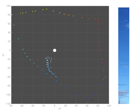
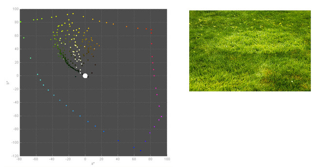
I’ve used a piece of software called “Gamutvision” to analyse a few images of skies. Gamut vision can show the range of colours in an image across the Lab space.
You don’t need to know about the colour space though, all you need to know is that the dots are samples from the picture, the angle a ‘dot’ is at is the hue and the closer it gets to the coloured spots on the boundary, the more saturated it is, the closer to the white spot in the middle, the less saturated.
First of all here's an unfiltered sky
You can see here that the lighter parts of the sky toward the horizon shift toward cyan at the same time. The darker areas are more saturated and bluer.
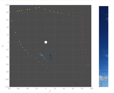
Polarising a sky not only makes the colour more intense (because it is darker) but it can also make it shift hue towards a bluer and possibly mo. This is the opposite effect of the Mie scattering mentioned in the previous paragraph. In this case the polariser is removing some of the scattered light and ‘purifying’ the blue colour i.e. shifting it away from cyan and back to a more.
Here's the polarised version
Here the whole sky is less cyan but the darker areas are also way more blue and less saturated.
We'll talk more about polarisation in a future article but this shows that if you want to cancel the effect of polarisation you have to shift the hue toward cyan as well as lightening and possibly increasing saturation.
It should be noted that the sky in general is also typically not particularly strongly saturated, only 60-75% saturated (in Photoshop’s Hue, Saturation & Brightness info).
Green Grass
One of our reference memory colours is definitely green grass. We have a fairly consistent archetype of what colour grass is. The only problem is, our archetypal memory colour is generally not what the actual colour of grass is. Our memory colour is typically a bluer green (more emerald) than the actual colour of grass (more apple).
Grass can change colour depending on whether light is reflected off it or transmitted through it or just diffusely lit. This can be seen most clearly when when grass is mown to give a stripy effect. The stripes are not only different lightnesses but area also typically slightly different colours. The darker stripe is typically less yellow and more saturated than the bright stripe. This is because the bright stripe is mostly reflected light and the darker stripe is more influenced by light passing through the grass. You can see this very clearly if you look at the colour of grasses whilst looking toward the sun and the colour when looking away from the sun.
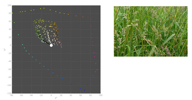
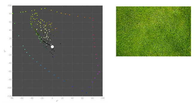
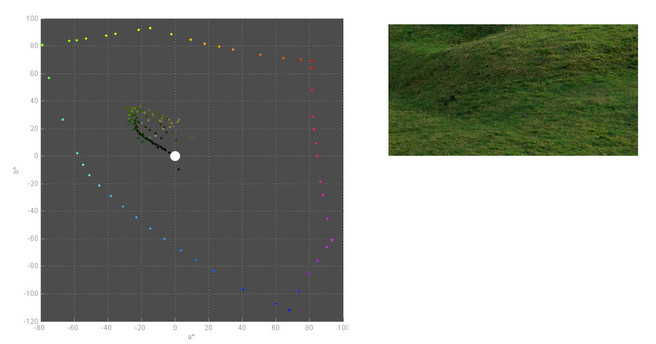
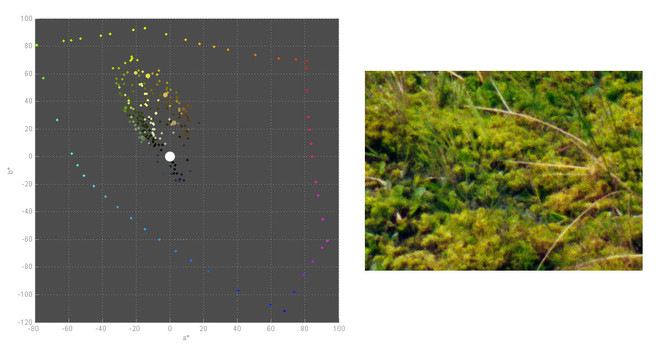
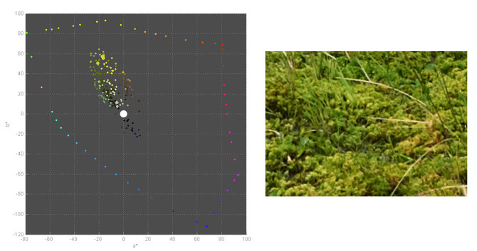
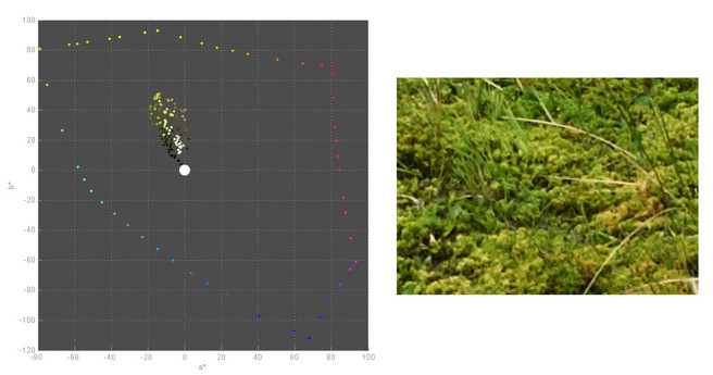
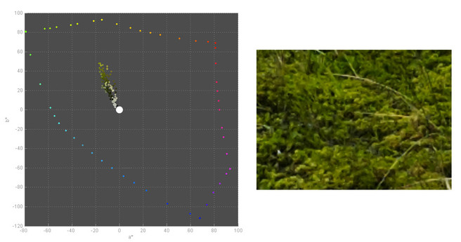
Again, I’ve used “Gamutvision” to analyse a few images of grasses (checking the results correlated with what I was seeing out of the window on our lawn and pasture grasses next door).
Hopefully you can see that the shaded grasses have a definite blue hint to them and also as the grass gets better lit it tends to be more yellow. It's worth bearing in mind that if you want to make grasses darker, it might be a good idea to make them cooler as well.
Different Types of Grass
Secondly, different grasses can have very different coloured greens (and even reds) in them. See this page for examples. There are even companies that sell a device to check your lawn greens against famous parks and even Buckingham Palace lawns.
So whilst we can’t say what colour our grasses should we do have a general guide (as above). We can definitely say what colour grasses shouldn’t be however. Greens will very rarely be strongly saturated and light at the same time, as they get lighter they get less saturated and more yellow. Shaded greens are very rarely yellow and are quite dark. The only time you get very saturated light greens is when they are backlit (and these greens are very yellow - think spring greens).
How do Painters deal with Grass?
Painters deal with the ‘green problem’ and their typical solution is to make the greens less saturated and darker. Here is a great quote from this excellent page on the Handprint website.
“the chroma of all the other colours in a painting describe the light to the eye, and if they all don't harmonize with the green to say ‘cloudy day’ or ‘afternoon light’, then the green will pop and squirm even though the colour match between your green paint and the green plant is accurate, and regardless of whether the green is light or dark, yellow or blue, intense or dull. Green must fit the light, or green becomes obtrusive.”
In other words we should be aware that the colours of grass can also change quite considerably depending on the light source.
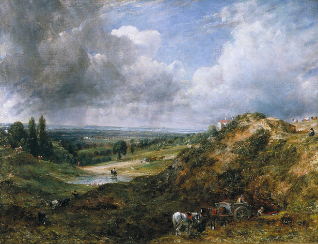
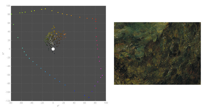
Here's an example of a Constable painting and the analysis of the colours in the grassy areas. Note the lack of very saturated colours - most are darker and less saturated than the photographic equivalent. The area chosen was the grass on the left of the picture and the foreground scrub.
Other Complications
There are quite a few extra things that complicate this picture as well. Firstly grass (or in fact the chlorophyll in it) has a funny ‘spectrum’ of light. It’s hue can be changed by the different levels of blue or red light that it absorbs. Hence the hue of grass can change depending on light source, sensor, etc. A great example of this was shown with our "Big Camera Comparison" where we compared a view of an agricultural landscape taken with different cameras. The Phase One P45+ has problems with grassy greens and if we analyse the colour from that camera compared with the IQ180, Portra 400 and Fuji Velvia we get this difference.
As you can see from the above images, the range of colour in the greens in the Velvia 50 photograph is the greatest and the range gets less as we go from Velvia 50 to Portra 400 to the IQ180 and then finally the P45+. Don't forget that the hue is represented by the angle of the dot relative to the white dot in the middle of the image.
Most DSLRs are quite close to the IQ180 with only one DSLR exceeding that as far as I am aware (the Sony A900) and one camera that was pretty bad (The Canon 5D Mark II). The differences are supposedly mainly to do with the Bayer colour filters, more about this in a previous article called "The Myth of Universal Colour".
Conclusions
In summary, our memory for colour probably isn't as good as we think it is. The good news is we can train it by really observing colour when we're out and about. Paying close attention to the colour of things on a regular basis can really pay off in your creative life.
As for things we can do for our post processing, remember that individual colours in your pictures aren't necessarily correct and even if they are correct, they may not be the most desirable. It's OK to play with hue and saturation changes of individual colours or areas of colour. This is particularly true of sky blues and vegetation greens where it often pays to avoid adding too much saturation to either and in some cases it's useful to desaturate and darken some. If you really want to be a good colourist however, don't take colour for granted.
In a future article I'll take a look at some real world examples of images and how we can use some of our understanding from this article to improve our post processing.
Some other links
Choosing highest saturation for color name
http://www.humboldt1.com/~cr2/colors.htm
Article About Memory Color
http://www.isisimaging.com/MemoryColorPaper.pdf
Accuracy of Hue and Saturation recall
http://www.perceptionweb.com/abstract.cgi?id=v96l1008
[1] Journal of the Optical Society of America, titled “Memory Colors of Familiar Objects.” - C J Bartleson)
[2] "Does an Expert Use Memory Colors to Adjust Images?" - Clotild Boust
[3] “Memoy Colours” - Prolost (http://prolost.com/blog/2010/2/15/memory-colors.html)
[4] "Color Reproduction and the Naturalness Constraint" - Sergej N. Yendrikhovskij
[5] General Vision Papers - http://jov.arvojournals.org/

