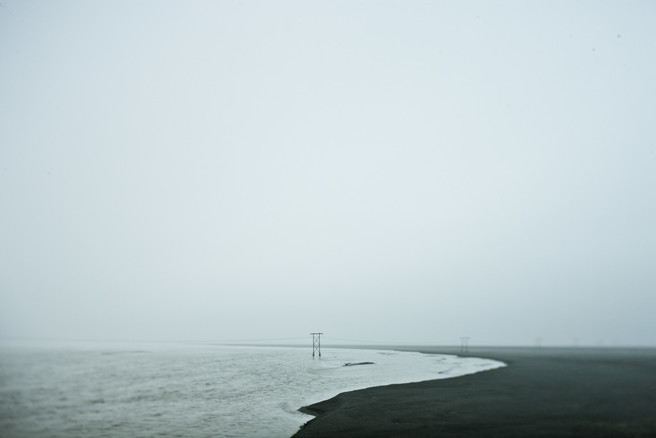
Iceland Image (untitled) By David DuChemin

Thomas Peck
The real pleasure of photography is that it forces me to slow down and really look. That’s never easy in our rushed world, so a chance to stop, look and see is truly valuable.
Photography is always a delicate balance between technique and aesthetics. Think of the debate that swirls around long exposures/Big Stoppers. You either like the effect or hate it. All very Marmite. And a similar discussion is evolving around the manipulation of depth of field (DOF), particularly as tilt and shift lenses seem to become more popular in mainstream DSLR photography, moving out of the niche area of large format/architectural image making.
On Landscape especially has frequently focused on the use of tilt and shift lenses in landscape. The more frequent, more ‘classic’, application of course is to maximize DOF, giving a wonderful sense of front to back sharpness. This can give an amazing plasticity to an image - a sense of hyper-reality, a deep feeling of space and 3D-ness in an image.
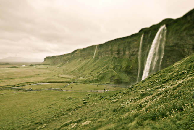
However, in the image above the opposite is the case. The DOF has been minimized. Moreover, DuChemin has then gone much further and has slanted the plane of focus, presumably by keeping the aperture wide open and then rotating the lens roughly at 45 degrees. The DOF and the plane of focus thus merge and run through the image from bottom right to top left. It’s completely the opposite of front to back sharpness, it’s merely a sliver. That plane of focus now runs parallel to the cliff face but the depth of field deliberately does not encompass the cliffs or the waterfall.
The photographer has not chosen to place the focus on the most dramatic part of the image… Compositionally therefore, there is a sleight of hand – the eye is teased by the sweeping line of the cliff and the waterfall but the line of focus drags our intention to the space in front of it.
This particular style of image is becoming more and more popular at the moment. It feels very zeitgeisty. Film-makers are using it in some of our most popular TV programs – watch Sherlock and you’ll see it used every time there’s a shot of London, along with time lapse photography and image/text montage. It’s definitely very ‘in’ right now. But DuChemin isn’t just using this technique for trend-effect. The implications of his image are much more profound as he applies a very deliberate aesthetic to make a point about the insignificant role of humans vs the overwhelming grandeur of nature.
A final comment: How interesting that the same lens can create such diametrically opposed aesthetics – the ultimate in front to back sharpness vs a fluidity of plane of focus and depth of field. And that’s just the tilt function! I suspect that, much like the Big Stopper, the reaction amongst viewers might be very Marmite. What do you think? On a personal level I really like it, especially if, as here, it gives space for the viewer to interpret the image. Blimey, I’m thinking I had better go and get one of these lenses for myself…!
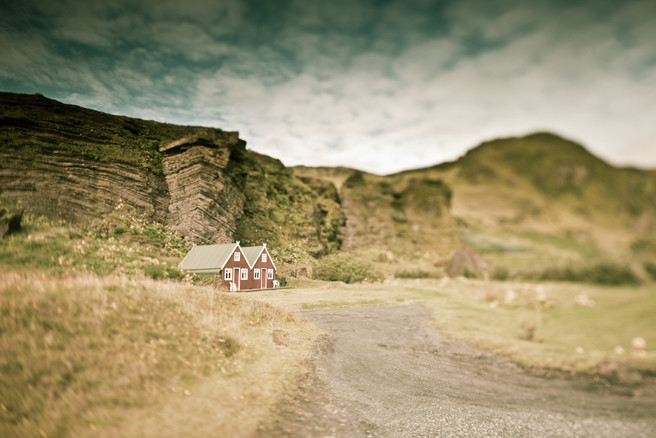
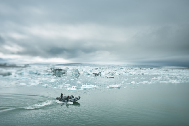
More Tilt Shift Images from Iceland
For more of David DuChemin’s fascinating Iceland pictures – truly Iceland with a difference! – click here.
David’s website: Craft & Vision has an excellent selection of e-books that are well worth checking out

