Tim suggests some guidelines for Black and White Photography

Tim Parkin
Amateur Photographer who plays with big cameras and film when in between digital photographs.
I’ve been asked by a couple of people to write some notes about black and white conversions and although I may not be the expert in this area, I thought it would be a good one to tackle and hopefully get some feedback from some people with more experience than me.
1) What to photograph
2) Preparing the file for conversion
3) Converting the colour file to black and white
4) Post processing
Most articles and books I have read have spent the most amount of time on step two but I feel that one of the most important steps is step three. A simple straight conversion of a colour file to black and white, even with the use of colour filters and grain simulation, etc. will rarely lead to a fully satisfying result. Anyway - back to that in a moment, let’s take a look at step one.
What to photograph
I’m not an expert black and white photographer and don’t publish many of my black and white photographs so anything I say in here will be observations and opinions only.
From what I have seen of successful black and white pictures, the following aspects are important.
1) Broad tonal structure - A picture that has areas of broad and consistent tonal structure offer a good opporunity. This typically means avoiding complex contrasty textures and looking for pictures that have low local contrast but broad global contrast. e.g. mist works well because it smooths out local contrast. The sea, sky and snow are also great elements for providing areas of low local contrast (as is architecture)
2) Overall high or low key - working within a small tonal scale allows you to play with texture and gradation of tone. Look at some of John Blakemore’s work for great examples of this type of work.
3) Bold shapes or structures - Think Michael Kenna and his ability to ‘extract’ the simple from the landscape.
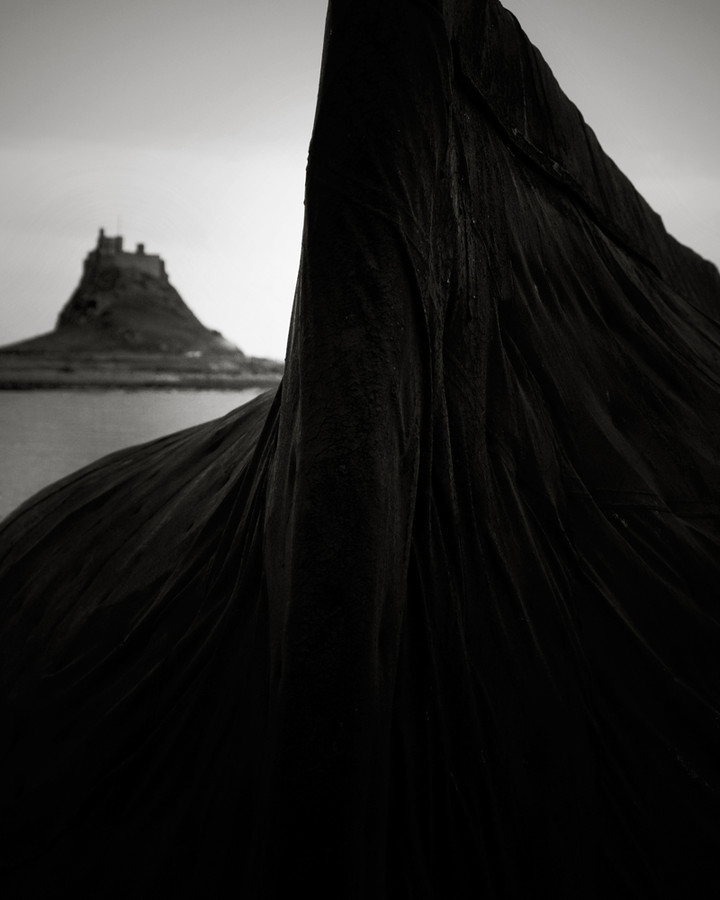
As a colour photographer nearly all of my good colour photographs make pretty bad black and white photographs. I rely on subtle tonal and colour differences to create my compositions and these things tend not to work in a monochrome photograph. In the process of writing this article I’ve tried converting many images from my portfolio and only a few work at all. The only shot that I have published, and taken, as black and white have been a photograph of Holy Island which works because of it’s very broad polarity of shading
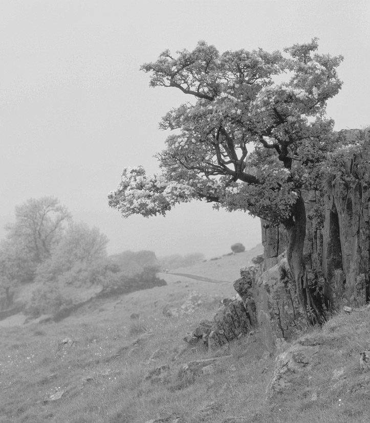
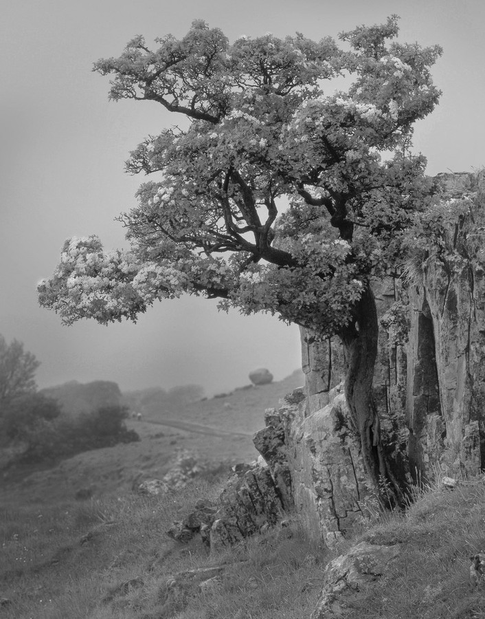
There are a few photographs that may work as conversions and I’ll be looking at these in the next section. One of these is a photograph of a hawthorn (I think) in the mist, which works, well, because of the mist - the great gift to photographers of all sorts. It has enough tonal structure with the bright flowers and mist and with darker rocks and the darker rocks and green leaves form an overall darker structure.
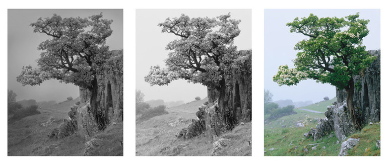 The left hand shot is my final processed image, the middle image is my initial colour conversion and the far right is my original velvia transparency scan.
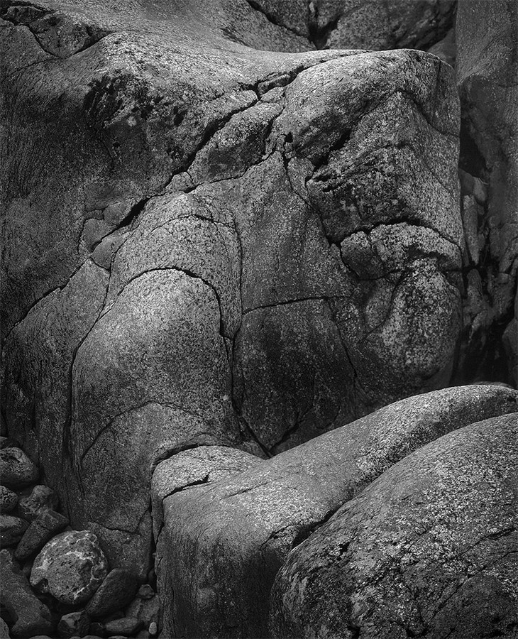
The other is a detail some geology in Glencoe which has enough shape and shading to work besides it’s colour.
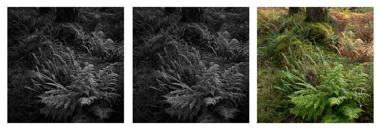
More complex pictures can work but they work best when the colour texture isn’t playing a major part. For instance, this photograph of ferns in the Taynish oakwoods in Kintyre has a consistent colour and it is the shading within this colour that makes the subject work. This shading comes across in a black and white conversion just as well (here using a green filter to enhance green contrast).
The final step here was some simple rebalancing of tones around the edge and the centre.
Preparing the file for conversion to black and white
Here I’m going to suggest that we create a file that is quite flat and natural looking, we don’t need dramatic amounts of saturation.. What we need is a fairly straight looking file with tones from black to white. Now this isn’t a ‘law’, you can start with any looking file you like and I’ll come to low key and high key pictures later but I think this allows you a good flat starting point. This will allow use to derive an initial black and white file which is the equivalent of a good negative - which as we know is only a starting point in itself.
I would also suggest that any noise reduction is applied at this point, as should be any pre-sharpening. This isn’t a tutorial on either of these subjects but I know I have had great success with Imagenomic’s Noiseware and Topaz Denoise for noise reduction and Photokit Sharpener for sharpening. The latter transformed my sharpening approach and will probably be a good topic of discussion in itself.
Anyway - hopefully we’ll have a file not unlike the one below.. (I’m using the Hawthorn tree photograph for this example).
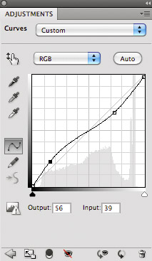
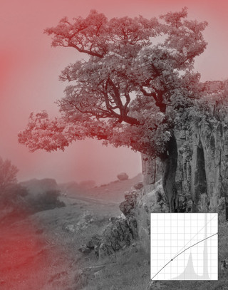
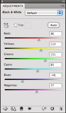 My first task is to create a lower contrast version (after all the original here was velvia, one of the highest contrast films going). I do this by applying a reverse S curve as shown to the left.
This reduces contrast - ensuring we don't have any really dark blacks or really light whites. This also gives us a little headroom to play with when boosting and reducing the brightness of different colours.
I've used the photoshop black and white converter on this image but the approach is the same for most tools - we're lightening or darkening colours in order to create the effect we desire. In this images case, I've lightened the greens to provide some nice separation and we've darkened the blues to create contrast in the background (The background tending towards blue because of the rain. Rain again!! Wonderful stuff!).
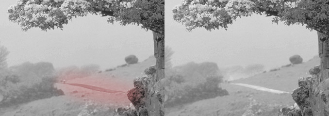
This isn't a particularly exciting file but it gives us some nice material to work with. One thing I noticed with this file is that I didn't like the dark path in the background and so I added a little 'trick' adjustment layer that shifts the hue of that particular area. I could have played with the brightness of just the path but instead I used the hue/saturation tool and selected the blues and shifted the hue towards greens. Since greens are being lightened by my conversion, the path becomes more defined.
Obviously you need to put this adjustment layer below the black and white conversion layer. There is nothing stopping you making two different black and white conversions and blending between them if you like. In fact Joe
Cornish has a graduated yellow to red filter to allow him to place the red filter over a sky and the yellow over the ground - great for emphasising the bold skies without over filtering foregrounds. With photoshop we can blend all sorts of different conversions, red filters for the sky, green for foreground etc..
The geology example was even simpler - I increased the brightness in the reds and yellows a little and decreased the brightness in the cyans and blues - this choice informed by looking at the tones in the initial picture, namely the fact that the blue/cyan fomed the 'canvas' for the colours of the rocks.
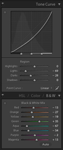
The fern example at the end was prepared in Lightroom and you can see the initial conversion process in the left hand side here. The main influencing parameters are the increase in green brightness and the decrease in aqua/blue brightness. This will typically help with most foliage based pictures as the variation in greens are from a yellowy green to an aqua/cyan green. By brightening one end and darkening the other, we increase the contrast in the foliage areas. I could have increase the yellow a little more but didn't want to create too much contrast and there was quite a bit of yellow in the background which I didn't want to lighten up too much - I could have addressed this with a 'blended conversion', i.e. create two layers in photoshop, one with a green/yellow boost and another with just a green boost and used the 'just green boost' as the background. However, I wanted to convert this in lightroom so...
Post Processing
In my mind, this is where the real magic of black and white comes and and it's something that none of the 'plugins' can help you with (although they may help with burning the edges in a little).
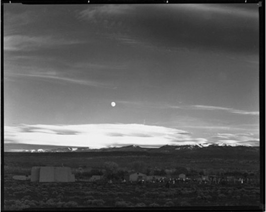
The level of processing that has historically been applied to black and white photographs will probably surprise most people. The most well known example of this process is probably 'Moonlight over Hernandez' by Ansel Adams. Ansel took this as a quick snapshot (as quick as you can with a 10x8 camera) and guessed the exposure. Anyway - here is the original negative.
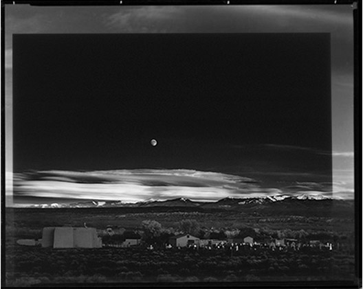
and here is the final product overlayed onto this negative (interesting that he didn't get the crop right although I imagine that would have meant running forward from the car another few hundred yards and he was in a rush so we'll let him off).
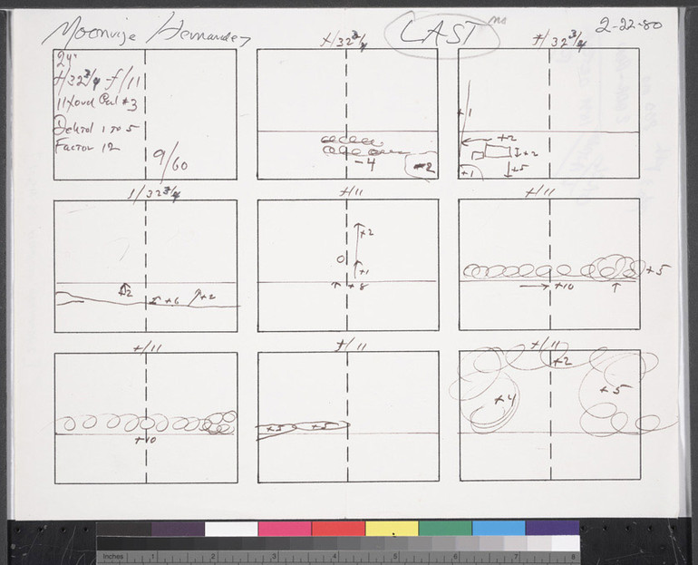
As you can see, quite dramatic changes including the bold move of dodging out the top clouds completely. He also used some intensifier on the actual negative in later years to boost the 'town' area and make it easier to print. Here are his notes..
You can see a translation of these notes (and the original copy of this image) at the excellent Notes on Photographs website.
The notes show where he darkened and lightened areas, where negative numbers are lightening and positive numbers are darkening. Ansel has transformed the image from something that looks pretty good into something quite dramatic.
Your changes don't have to be this dramatic, quite often smaller changes will get you where you want to be (or even no changes at all on occasion!).
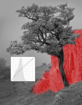
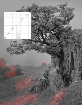
Let's take a look at the Hawthorn tree example from above.
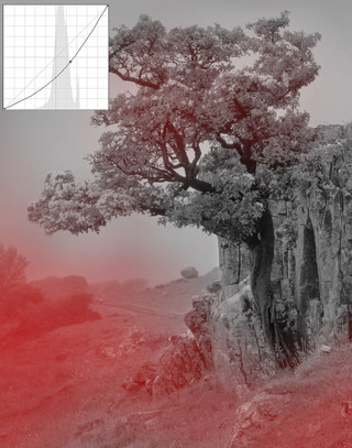
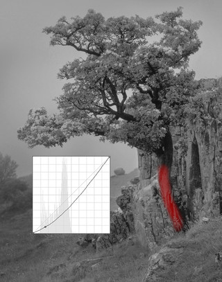
And here is the final image.. I did make one more change and that was to use a fine brush dodging tool to dodge the highlights in the blossoms just to help them stand out a little. I paid attention to a consistent direction of light so I applied most of the dodging to the top and left edges of each cluster of blossom. I hope the final photograph was worth the effort.
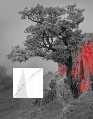
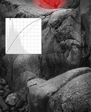
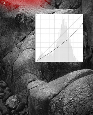
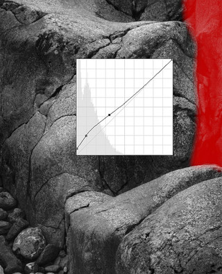
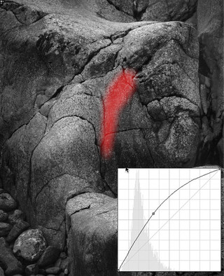
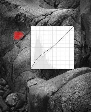
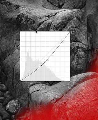
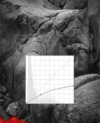
The Geology example from earlier was easier in some ways but I was paying more attention to enhancing the consistent tonal graduations in the print. Here were my steps.
The final result...
If you want to take a look at a few more real world examples from someone I consider to be one of the best black and white photographers, have a look at the technique page of Rolfe Horn's website. Also, take a look around some of his photographs in general as there is a lot of inspiration to be had.
Here are a few other black and white photographers that float my particular boat - Michael Levin, Beth Dow, Rolfe Horn, Michael Kenna, Bill Schwab - not an exhaustive list, please add links to any that you think are exceptional..
I'll hopefully continue talking about Black and White in future posts, addressing some of the conversion plugins such as Exposure or Silver EFX..

