Going Solo

Christopher Pledger
Christopher Pledger is a landscape, fine art and editorial photographer who specialises in seascapes and coastal art. Facebook Instagram
“What’s this then?” said the man who’d poked his head around the gallery door. “We’re just hanging an exhibition, it will be opening tomorrow morning” I replied.
“Is it paintings or photographs?” he asked.
“Landscape and still life photography” I said.
“That’s not proper art then is it” he said before walking off.
I recently held my first solo exhibition since returning to landscape photography at the Colonnade House Gallery in Worthing, Sussex. The gallery is part of a large art deco building regenerated by the local council into a creative hub and gallery spaces. Perhaps naively when I booked my slot six months in advance I had very little idea of the sheer amount of work involved in planning and preparing to fill 348 square feet of blank wall and floor space.
When I began to make plans for the show it seemed that an exhibition could hold two pure functions, commercial or artistic. Dominating the preparations was a constant tension between these considerations. Every decision about the exhibition involved weighing up a fine balance between them.
Unusually the opportunity of exhibiting at this venue came before the idea of holding an exhibition to show a specific body of work. The first decision that had to be made then was on the type of work I would exhibit. Would a portfolio show, displaying my ‘best’ but unrelated pictures, or a themed show displaying a consistent body of work be better? From a purely commercial point of view displaying pictures that had already sold well, alongside popular images of landmarks made more sense. From an artistic point of view, a themed show would hang together better in the gallery space. It would also be more visually appealing through a consistency that would lead the visitor around the gallery space.
While keen to sell work through the exhibition and use it as an opportunity to increase print sales through my website, I felt uncomfortable with the idea of a purely commercial show. While all art is subjective, landscape photography and the vast differences in the treatment of subjects by individual photographers within the genre is particularly so. What one photographer might consider being their best work, or the work they are most proud of, does not necessarily appeal to others. Buying a framed print to hang on the walls of your home or workplace is a deeply personal experience. Alongside an appreciation of the subject and the photographer’s personal vision, home décor such as wall colour and furnishings influence a buyer’s decision. The mantra that your ‘best’ work will sell falls flat when challenged by people’s individual tastes.
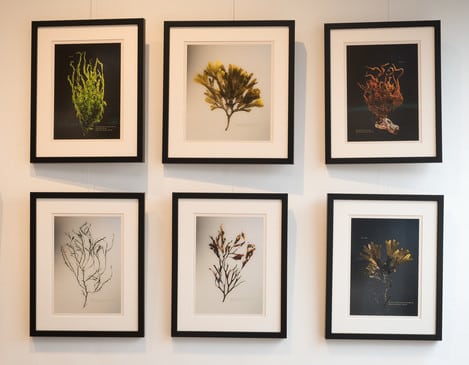
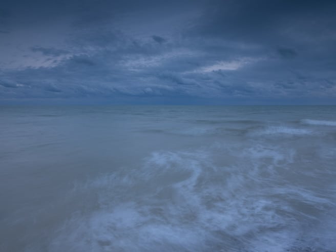
I decided then on a themed show based on a monthly series of nature writing and landscape photography essays that I publish on my website called ‘Echoes from the Landscape’. The inspiration behind the series is to give the viewer a more rounded experience of the physical and emotional experience of spending time in the landscape. This would provide a visual consistency, a narrative for the visitor to follow and a through connection from the gallery to my website. To satisfy the need for a supporting commercial element to the exhibition I could place unrelated work in print racks or as greeting card designs to display my wider portfolio.
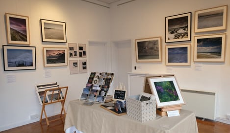
With this decision in place, I was able to move on to plan the layout and select prints for display. This was done via low tech 1:10 scale drawings of the floor space and walls. I then arranged cut out scale sketches of prints, helpfully coloured in crayon by my toddler. This guide proved invaluable both in choosing which prints would hang together in terms of colour, subject and shape, and later on during the time-consuming process of hanging the exhibition. I was then able to make test prints of my selection and check the final layout.
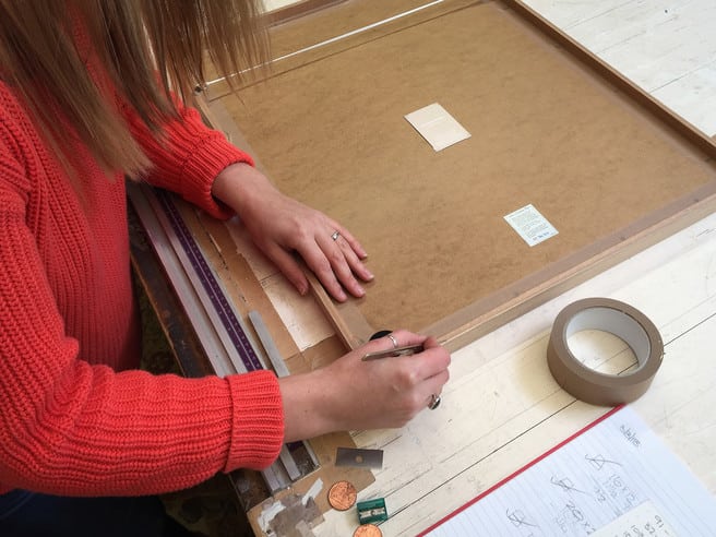
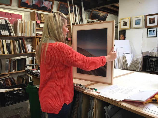
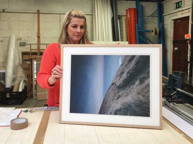
When it came to framing work there seemed to be a clear decision between two options. A traditional approach of framing in a uniform black, or frame as I do in my online print sales in oak or black to suit the individual print. A traditional gallery approach would favour the cleaner visual of a line of matching black frames. Unusually here, however, the commercial and the artistic came together. Rather than sacrificing displaying a print in its best format for uniformity, I reasoned it would be better both artistically and commercially to choose frames on an individual basis.
The opposite was true of the decision to use standard or anti-reflection glass. Commercially, anti-reflection art glasses make no sense. They are very expensive, often doubling the cost of a frame. Most people who buy a print won’t consider the huge difference between a standard and an anti-reflection glass. Artistically though the glass will make the print look at its best. Colours and detail are sharper and clearer. If a viewer can read the picture at its best they are more likely to want to buy it. With this in mind, I accepted the reduced profit margin and chose to frame using the anti-reflection glass.
There were so many logistical considerations that choosing which pictures to display and how to frame them turned out to be only a quarter of the workload of exhibiting. How to take card payments, ordering business and greeting cards, ensuring I had enough stock, ordering bags for prints and cards, promoting the exhibition and dressing the rest of the gallery space were all tasks to complete and decisions that had to be made. Even relatively simple tasks such as ensuring each print were labelled required research, testing and making. In the early hours of the day the gallery opened, I found myself retrieving labels that had been left outside to dry, blown around the garden and spray mounted themselves to several bushes.
Promoting the show through invitations, local magazines, tourist websites and social media was one of the most time consuming parts of the process. Despite feeling at times like efforts to attract visitors this way were in vain it did prove to be worth the time invested in it. Throughout the two weeks, lots of people came in and said they had seen the exhibition advertised and promoted on Instagram, Facebook and in the local press.
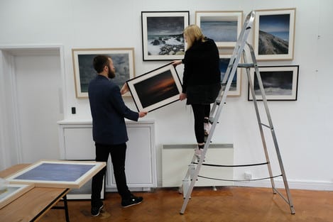
Walking into the gallery on the day set aside to hang the exhibition was a daunting experience. Looking at completely blank walls and an entirely empty gallery space while hoping that your plans were correct and you have enough work to fill it could make even the most confident photographer nervous. Nearing the end of the six-hour hanging process it became clear that the layout meant there would be a large hole left in the display near the end of one wall. Toward the end of the printing process, I had changed the size of some Foamex backed panels that displayed the nature-writing element of the exhibition. Luckily I had prepared a spare framed print that fitted perfectly into the empty space.
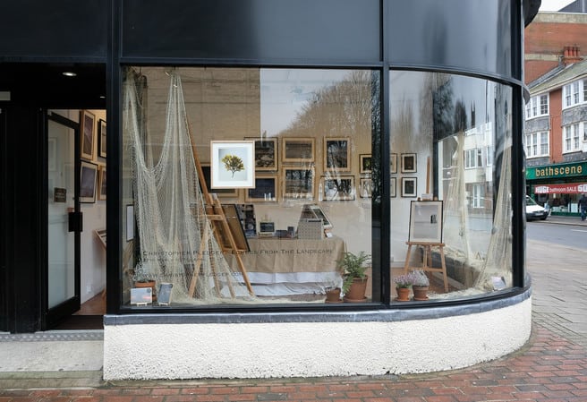
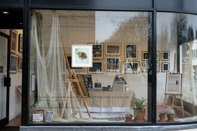
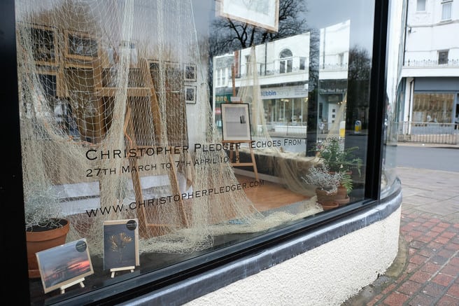
A very large curving art deco window fronts the main gallery at Colonnade House. In a traditional gallery, this window would account for a third of the available wall display space. The gallery advised on creating matching sized framed prints that can be hung back to back in the window to overcome the loss of a third wall. While this can attract people to come into the exhibition, too many pictures would obscure the view through to the rest of the work. A clear space to see exactly what they are entering into can also make it more inviting for people who would find the experience of visiting an art gallery slightly intimidating. To avoid obscuring this view too much and to carry the theme across the gallery space while still creating an inviting display, I decided to dress the windows with coastal plants and a herring net borrowed from a local fisherman. Pulled from a fishing locker on the beach the day before, the net also bought an authentic smell of the sea into the gallery.
“Look at this place” said the man looking through the window on the third day of the exhibition to his wife
“Is it photographs?” she asked.
“What a load of rubbish” he said, “that’ll never make any money, it will be closed down in a week”.
Once opened the exhibition was a hugely rewarding experience. The ethos behind Colonnade House and its staff, to help and support artists to exhibit, made showing my work less of a daunting first step than it otherwise could have been. As encouraged by the gallery I chose to sit in at the exhibition for as many days as possible. Taking the time and opportunity to meet and talk with people about the pictures and nature writing was a real privilege. It was also nice to overhear comments people made when they didn’t realise that the work was mine. The most common question I was asked throughout the fortnight was whether the prints were paintings or photographs. As this is the effect that I try to create when photographing it was hugely reassuring to hear.
In the Instagram age of saturated and over polished sunsets where it can be equally tempting to over edit and frustrating to witness others do so, it was great to hear people praise the pictures for their natural quality. Printing, rather than viewing on a screen, is the true test of an images quality and its ability to engage the viewer. Resisting the urge to overproduce pictures to attract ‘likes’ online was rewarded by prints with real depth that captured people’s imaginations. The exhibition also served as an excellent advertising opportunity to make people aware of my website and how to buy prints online. Despite days of endless rain, the fortnight was a real success. Prints sold and lots of other opportunities to work with people arose through it. It was also lovely to meet other artists working in the community and learn from their experience of exhibiting and selling.
Knowing how much work is involved from conceiving an exhibition to the opening, would I do it again? I’ve already booked my next two.

