The use of deep shadow

Paul Moon
Paul Moon is a landscape photographer from East Yorkshire and has spent 18 years documenting the Yorkshire Wolds - the UK's most northerly mainland chalk upland. It is known for its steep sided dry chalk dales which spread for miles throughout the area.
It has come to my attention over the last few years that many landscape photographers have begun to shun a very good friend of mine - the black pixel. I’d like to take the opportunity to spend a little time discussing the steady decline in the use of deep shadow in digital photography and post-processing.
I suppose I should start at the point where I began to enjoy seeing well-taken and wonderfully printed landscape images in magazines and books. Most were taken using film and, more often than not, on Fuji Velvia. As many landscape photographers know this transparency film was, and still is, famed for its narrow dynamic range and high saturation, although drum scanning has shown there is far more detail in the shadows than most flatbed scanners can extract. As a result, scanned images often lost shadow detail when printed. These deep, dark shadows were, in my mind, part of the process of image making and helped give the light a firm foundation from which to glow.
Most negative films, on the other hand, contains a far wider dynamic range than that of transparency film and I do enjoy seeing the proper use of these film stocks for subjects that suit the softer tonality - Andrew Nadolski’s ‘The End of the Land’ being a prime example of how negative film works for the subject matter and soft lighting. Even then, Andrew uses areas of near black quite often, consciously limiting the dynamic range or exposing to allow the shadows to block.
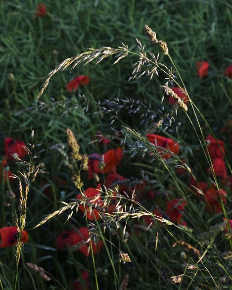 As we know the human vision is far more capable at seeing a wider dynamic range than film and digital sensors but should our photography mimic that dynamism? Many believe it should and hence the proliferation of HDR software and wide dynamic range sensors, but on a personal level, I’ve headed in a completely different direction. I intimated earlier that for me the dark is the foundation for the light to glow from. I’m not implying that every image we take has to include black pixels and deep shadow, just that when there is a shadow in a scene should we not show its true tonality in our final result. Obviously, silhouettes should contain no detail (I hope! ) but where there is shadow and shade should it not look naturally dark? We shouldn’t have to lighten these darker areas into a near mid-tone to show hidden detail.
There is also a tendency for over-grading the sky that often, especially after sunset on coastal images, means that the tonality of the shore and rocks becomes far too light. Surely when the sun goes down the only light is from the darkening sky, and dark surfaces, unless they are wet, will inevitably be dark. I may be on my own here and losing a few readers. As photographers, we often make images that are governed by how the ‘light’ is behaving. Perhaps we should also pay some attention to how the ‘dark’ is misbehaving.
 Of course, this argument gives way to a host of philosophical conundrums about image making and digital processing. Does my opinion of how an image is processed matter? Certainly not! It’s only an opinion and should be largely ignored. We rely far too often on the words of others to guide us in our photography when we should work hard to discover our own style. I believe all magazine and online tutorials should always start with the words “In my opinion…”.
Another argument (of mine) is that of creativity versus documentation. Should we produce images that are only governed by our view of the scene as we take the shot or by the exposure value we chose and the post-processing of our raw files? If one only takes photographs to document a subject then surely one has to make an accurate exposure and avoid over-processing. If however, we want our images to evoke something more than ‘this is what I saw’ then use of exposure value, filters and post-processing becomes inevitable. It therefore becomes a creative choice and the final image a tribute to that process. Ansel Adams completely re-worked his ‘Moonrise, Hernandez, New Mexico’ to give a far punchier and contrasty print so there’s certainly no shame in re-interpreting the final image from a raw file.
So what am I trying to say with all this waffling? Put fairly simply – I’d like to see photographers thinking carefully about the tonality and use of the shadows in their final images.
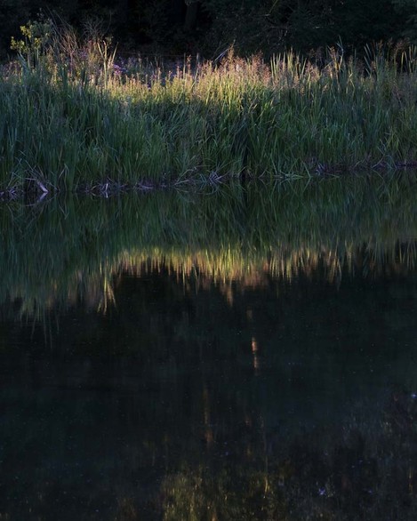 Does your shade look like shade? Does the use of darker shadows allow the lighter areas to shine? Would underexposure create a far more interesting interpretation of the subject matter? Do the areas of shade and shadow create interesting negative spaces?
I hope I’ve made a reasonably good defence for my friend, the black pixel. It’s been dealt a worrying blow from the photographic press, software programmers and camera manufacturers and needs all the love and support I, for one, can give it.
Perhaps my view will change over time but that is entirely up to me and it will not be down to the trends that many photographers seem compelled to follow.
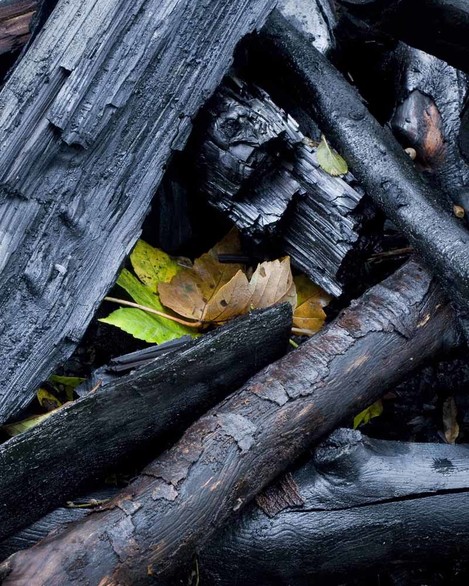
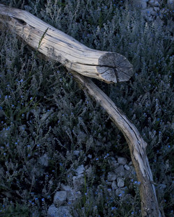
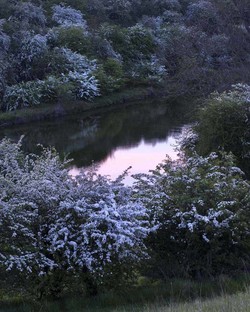
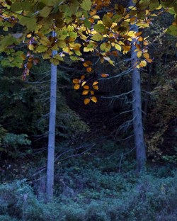
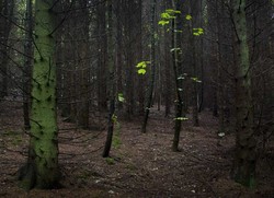
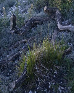
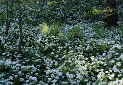
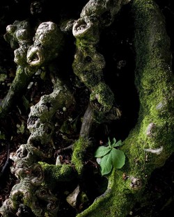
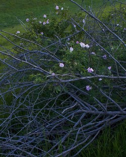
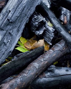
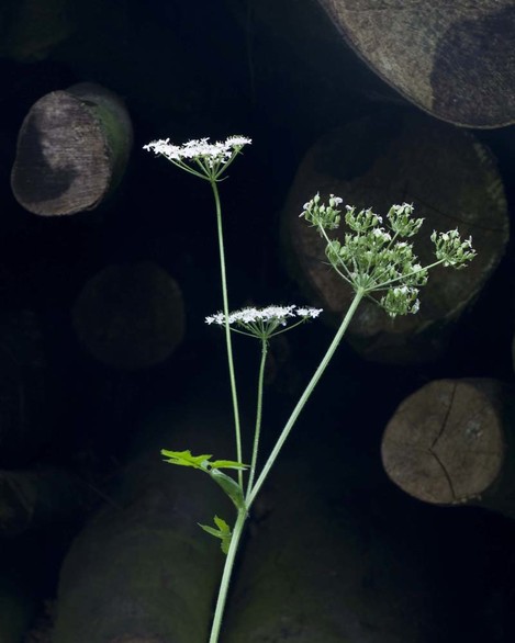
I’ve included a small selection of photographs that show various attempts at the use of shadow and shade creatively. Some are drastically underexposed images, some use shadow to create mystery and drama, some are taken of subjects in shade, and some of just dark subject matter. All these images do contain some highlight elements but they rely on the darkness to bring them alive. Hopefully, each image works in its use of shade and shadow but if you’re not partial to the final results then I won’t mind. It’s purely personal taste and that is something we should all strive hard to hold on to. I’ve only made this case to counteract the slightly worrying trend I see in landscape photography.

