Or how boring must an image be before it becomes interesting

Keith Beven
Keith Beven is Emeritus Professor of Hydrology at Lancaster University where he has worked for over 30 years. He has published many academic papers and books on the study and computer modelling of hydrological processes. Since the 1990s he has used mostly 120 film cameras, from 6x6 to 6x17, and more recently Fuji X cameras when travelling light. He has recently produced a second book of images of water called “Panta Rhei – Everything Flows” in support of the charity WaterAid that can be ordered from his website.
I already had an idea for an article on boring postcards in mind when I was writing the last article on The Collecting of Images, having a vague memory of having seen books of boring postcards for sale. That article on Collecting and Collectors mentions some collections published by Martin Parr – and I was then rather surprised to find that it was indeed Martin Parr himself who had put together the original books of Boring Postcards (though, on reflection, this is not really at all surprising!).
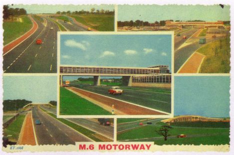
There are, in fact, three books: Boring Postcards (a collection from the UK from the 1950s to the 1970s), Boring Postcards USA, and Langweilige Postkarten collected from Germany. In each case, there are pictures of landscapes containing built features: new motorways, Interstate highways and autobahns; new motorway services and toll booths; new bus stations and civic buildings; new airport terminals and motels. The postcards certainly reflect a pride in the significance of these newly created structures, but the collections also invite a reflection on who might have bought and sent the postcards.
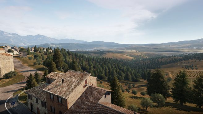
These works have also inspired others. There is a Boring Postcards website maintained by Katherine Burright that is devoted to the collection of Boring Postcards in various categories. There is a collection of Boring Postcards USSR (though those are not original postcards but photos taken on different road trips by the Italian photographer Marco Citron). There is a book of Boring Postcards from Italy (though these are also not real postcards, but were created from stills taken from the video game Forza Horizon 2 by the artists Colleen Flaherty and Matteo Bittani, known as COLL.EO, though, as well as the book, they did also produce some of the images for sale as actual postcards).
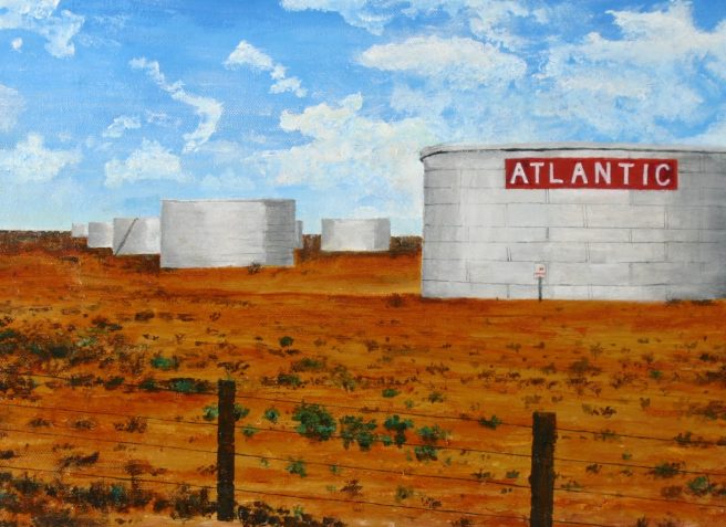
Perhaps more wondrous still, there is an American artist, Jeremy Hara, who was so inspired by the Boring Postcards USA book that he has reproduced some of the postcards as paintings, which of course poses the question as to whether doing so makes the image less boring (no doubt some artists would be able to inject much more interest than others, though that might also depend on the viewer’s tastes). The wonders of the choices that artists make are often amazing (and sometimes difficult to understand2).
So, given these efforts at making boring postcards interesting, can we analyse what might be needed to make an intrinsically boring landscape image into something more interesting or, to put it another way, just how boring does an image have to be to become interesting (even if just to a few viewers)?
Let us first consider what makes a boring image. There can be boring by banality (including some of those new constructions that appear in the books); boring by minimalism (the seascapes and spectral colour images of Hiroshi Sugimoto spring to mind); boring by cliché (including blurry waterfalls, long exposure clouds and waves, and anything with the Isle of Rhum in the background); and boring by repetition (boring being the antithesis of novel even in the case of, for example, photograph competitions of aurorae when repeated every year).
All of these categories will be boring to some, but evidently will have some appeal to others. Some have even become celebrated (at least for those who like minimalism or views of the Isle of Rhum) so perhaps more of interest here is what might render the boring interesting. One of the 5* reviews of Boring Postcards on Amazon for example reads:
5*. It really is gripping, with no accompanying blurb for the cards, one is left to imagine (if you didn't live there then) what these worlds were like and about the people who inhabited them. The sublime wonder of the quotidian is, of course, the wonder of the sheer magic and miracle of our very existence. This set of books (get all of them) is amazing, a constant source of fascination and some of the most interesting publications available. A very important set of documents, something with which one can impress one's guests - they'll think you either in possession of exquisite taste or a bit of a weirdo; or both.
Or from a review on another site:
After going through these vintage postcards, you’d realize how much has changed, or you can just be amazed thinking how some stayed the same through the years. They could leave you feeling nostalgic, happy, furious, sad or just mad bored, but in the end, you’ll find yourself flipping through it again for another time travel moment.4
This suggests that time alone can do the trick, that the recording of an image documenting something (or somebody or, for the landscape, somewhere) will become more interesting with time. There are certainly many photographers whose work was not found to be particularly interesting during their lifetime but who have become celebrated since. There are also collections from anonymous photographers that have later generated interest, such as the in the Vintage Britain or East London books put together by the Hoxton Mini Press5.
Landscape photography is perhaps at a disadvantage here – since it has been around for only 150 years or so and natural change is in general rather slow unless man takes a hand.
Before and after boring photos of natural disasters and man-induced degradation can be of interest as historical records in otherwise unremarkable sites. This was, in part, the reasoning behind the New Topographics photographers (including Robert Adams, Lewis Baltz, Bernd and Hilda Becher, Stephen Shore and others) as a reaction to the classic landscape images of Ansel Adams and others in the 1970s6. Before and after boring photos of landscape renovation are somewhat rarer, but can be inspiring, such as in the case of the work of Sebastião Salgado at the Instituto Terra he founded at Minas Gerais in the Amazon Basin7.
A second reason why the boring might be made interesting is the argument for equivalence or revealing the essence of the every day made by certain transcendental photographers, most famously Minor White. It can be argued that this concept of essence originated with the 350 boring photos of clouds taken by Alfred Stieglitz in the period 1922 (or so) to 1931 (or so – various dates are cited by different authors). This has been explored many times in On Landscape, most recently by Robin Boothby in Issue 2988 who provides an excellent analysis of the context and impacts of the Stieglitz equivalents. This includes a discussion of different types of sensibility originally suggested by John Ruskin in 1856 (and at that time referring to poets not photographers). As viewers of images we might reflect these different types of sensibilities.
The first type might only see the thing photographed as itself (and as such it might well be boring). The second might see the thing photographed purely as metaphor (though there is no reason why as viewers we might see the same metaphor as the photographer intended, indeed we might miss it completely so that it remains boring). The third type will appreciate that the thing photographed might have many meanings while still remaining the thing itself (perhaps therefore the closest to appreciating the essence of the thing in the sense of Minor White). For Ruskin, these classifications would only have applied to first rate poets – 2nd rate poets (or really boring photographs) would still not have been of interest.
I suspect that my sensibilities are closer to the first type, with the result that I might find more images boring than I would if I were more sensitised to a second or third type. But I am not unhappy with that realisation since it does allow for a third way of making the boring interesting and that is in creating a certain sense of mystery. It leads us back to the mystery of just why did the photographer take such a picture? In the case of most of the original images in the Martin Parr books, it was probably because the photographers did it for money, commissioned to do so by some developer, corporation, or public body wanting to record their pride in something new.
But what about photography of the landscape itself? Why those rocks? Why those trees? Why the Isle of Rhum or Roseberry Topping or Kirkjufell or the Torres del Paine or Wild Boar Fell yet again? There is intriguing interest in such a mystery that can draw us in and make us take notice. Certainly there will be differences: in light, time of day and season; the different angles, heights or perspectives; the different clouds and skies; and potentially the identification of change in some of the features. But pondering the mystery can be interesting even if we then realise that some such images are still unequivocally boring (and note that this is quite a different type of mystery to that discussed by Eric Bennett and his non-boring images in Issue 2979
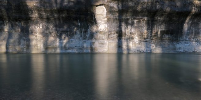
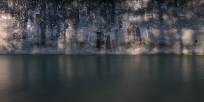
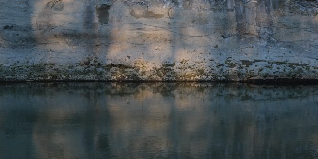
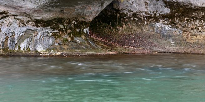
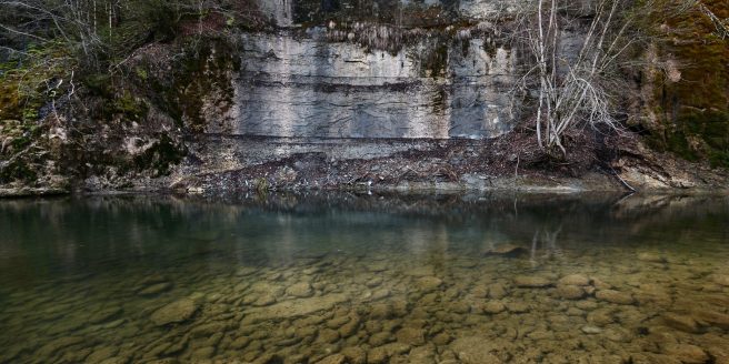
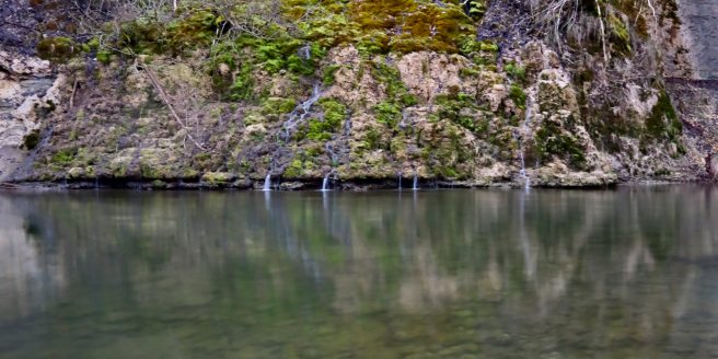
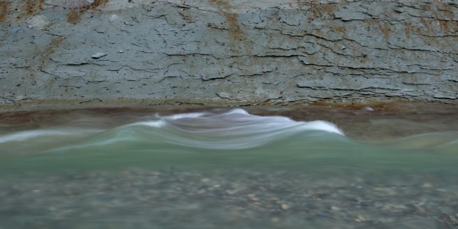
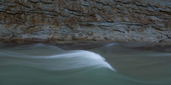
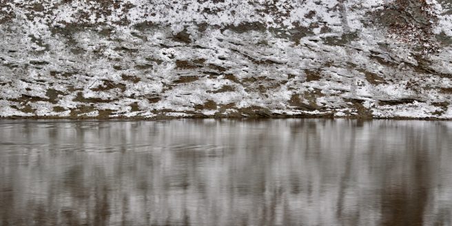
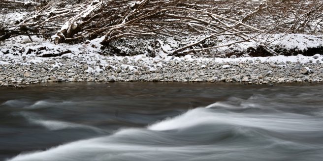
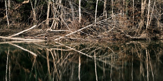
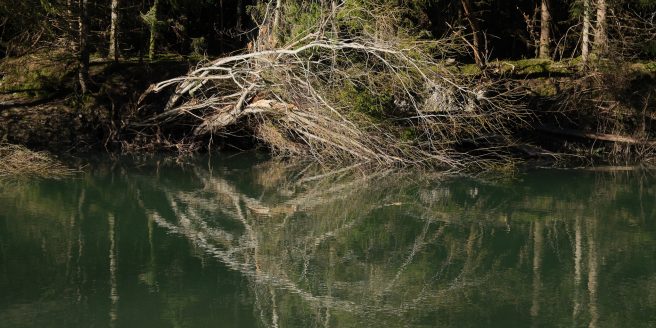
Perhaps a final way of creating interest is by adding to a theme. This can be seen in other series of images of Martin Parr’s own, for example his abandoned Morris Minors in Ireland, his remote Scottish Postboxes, or (in the extreme) his collection of Saddam Hussein watches. This is the approach I have taken for my own boring postcards, with a theme taken from the banks of the Sarine River in Switzerland.
The Sarine rises to the north side of the Col de Sanetsch at the Glacier de Tsanfleuron in the Valais and flows in a generally northerly direction through the region of Gruyère and the town of Fribourg to join the Aar close to Golaten in the Canton of Bern, a distance of some 126km. Just upstream of Fribourg, the first concrete dam in Europe was built in 1870 forming the Lac de Pérolles (now a nature reserve). Since then, two major dams have buried parts of the valley under water, creating the Lac de Gruyere in 1948 and the Lac de Schiffenen in 1963 (as well as other smaller dams in the headwaters).
However, some of the valley remains in a more natural state even if, downstream of the dams, the discharges are largely managed except in the largest flood events. The images that follow have all been taken between the Lac de Gruyère dam at Rossens and a little downstream of the Abbey of Hauterive, a reach where the river is incised into Tertiary Molasse bedrock creating a meandering gorge. All the images were taken in the weeks following a flood during the night of 14th November 2023. This was somewhat controversial in that there was some opinion expressed that the level of the Lac de Gruyères had not been drawn down enough to cope with the flood waters before the event in order to maximise the potential electricity generation while prices were high. The flood resulted in the flooding of some properties in the Basse Ville in Fribourg and the transport of many thousands of trees and associated debris into the dam lakes or left on the floodplains as the waters receded. Many other trees were flattened, even if their roots held. Considerable quantities of gravel were mobilised in the channel, with widespread overbank sand deposition. Trash in the remaining vegetation suggested water levels well above head height over the flood plain.
So here is my own sequence of boring postcards from after the flood. I sincerely hope that in looking carefully you will find them so boring as to be interesting (and should that perchance be the case then there you can find even more here …..)10.
- Amazon.co.uk reviews of Boring Postcard
1 star - I do not understand why anyone would make a book of pictures of stupid post cards when they could have made a book full of real post cards that someone could actually send to other people. I was so excited to have this coming so I could send out some strange cards to people, but it is just shrunken pictures of post cards with another stupid picture on the back so they are 100% useless to me. I will be throwing this into the trash. The author and publisher are idiots.5 star - There is something deeply soothing about this book. My favourite images were the two of Butlin's at Bognor Regis (not all the locations are as exciting as Bognor). My second favourite image was of The Precinct, Coventry. Subject matter is mainly town centres, service stations, roads, hotels, holiday camps, power stations and head offices.There are many images from the nineteen seventies so if you're a fan of this era you'll enjoy this book. You can spot a C&A or Woolworths sign in some images and be gently tugged back in time.
5 star - This book is sublime. It opens up a glorious window to post war Britain. Sit back and marvel at the civic pride that was once attached to what we now consider hideous concrete soulless ghettos.
Good reads reviews of Boring Postcards US
2 star - In reality most such cards are likely to be of interest to someone, particularly as the places and styles disappear over time, but they're likely polarizing: of interest to a small audience, and not at all interesting to anyone else.
1 star - Just as the name implies, it's boring. I thought this collection would be rife with tongue-in-cheek witticisms. Instead I am bombarded with aerial shots of interstate exchanges, the exteriors of motels, blah, blah, all taken by persons with zero artistic sensibilities. The pictures are all rendered in horrible muted colors that look sun-bleached and leave me nauseous. (Apparently, I'm viscerally sensitive to colors beyond that of chartreuse and Pepto-Bismol pink!)
5 star - There is something incomprehensibly mind-boggling about this book. Perhaps it's the graphic designer in me, but the scope of work involved in this book just makes me marvel at the stupid things humanity will do. The book is as its title describes - a collection of very boring postcards from the late 40s-70s.
But here is the bit that gets me. Someone, somewhere had to say "You know Ma, what we should do is create a postcard of the air traffic control tower at Waterloo Iowa/The Skyline Motor Inn in Cody Wyoming/The colorful rug near the entrant of the national office of the American Baptists Churches, Valley Forge Interchange, PA."
But then, NO ONE stopped this boob. Instead, they forged ahead. They hired a photographer, who, in all likelihood, took more than one shot of the chosen scene. They then needed to sift through the shots to find the BEST view of "The beautiful and spacious dining room of the Wesleyan Retirement Home in Georgetown, TX" or "The Virginian Restaurant, Williamsburg, Virginia (with it's large spaghetti pizza sign)".
Now, after the perfect picture is chosen, this postcard must be designed and created by a graphic designer. As these cards were made pre-computer, some poor bastard had to hand lay out the type and image, making sure there are no typos in "Aerial view of the twin bridges spanning the Cuyahoga River Valley and the Ohio Canal."
Finally, this masterpiece must be sent to a printer, who spent time choosing a stock, adjusting colors to get just the right tan for the road of the Pennsylvanian Turnpike near Downingtown PA. Once printed (and this again boggles the mind) people have to take these postcards and post them to someone. And they have! Nothing says "I'm thinking of you" than a postcard from the Pike View Motel in Strongsville Ohio
5 star - The question is, were any of these postcards ever sent and received? No, wait – the question is, why would anyone ever send any of these postcards? Not to say, “Wish you were here,” surely. For the rest of us, this is a fun little book to add some quirk to our shelves or coffee tables.
5 star - Who needs a review when you have all those boring pictures to look at?
- From the description of Boring Postcards from Italy by COLL.EO: “We wanted to highlight the incongruities and inconsistencies of this virtual reality through an unconventional format, that is, an illustrated book. In our previous project POSTCARDS FROM ITALY, we turned a series of screenshots taken into the game into postcards, and we disseminated these artifacts on "real" postcards racks all over Italy. Our goal was to bring "the virtual" into "the real", suggesting some kind of equivalence between the two. We decided to go a step further by documenting our own experience within the game Forza Horizon 2 using our virtual automobile as a camera and using the Photo Mode editor to capture moments and situations that would have otherwise gone unnoticed.”
- From http://jeremyhara.blogspot.com/2011/06/studies-of-boring-postcards.html
- https://whenonearth.net/martin-parr-boring-postcards/
- https://www.hoxtonminipress.com/collections/vintage-britain
- The New Topographics title was taken from the exhibition held at George Eastman House International Museum of Photography in 1975/76: New Topographics: Photographs of a Man-Altered Landscape.
- See the report at https://theboonroom.com/blog/recovering-forest-sebastiao-salgado and the Instituto Terra site at https://institutoterra.org
- At https://www.onlandscape.co.uk/2024/02/cloud-allusions/
- See https://www.onlandscape.co.uk/2024/02/the-art-of-mystery/#comments
- A book of Boring Postcards: Les Rives de la Sarine can be found at https://www.blurb.co.uk/b/11978006-rives-de-la-sarine where all the images can be previewed for free. Also available as a pdf at that site.

