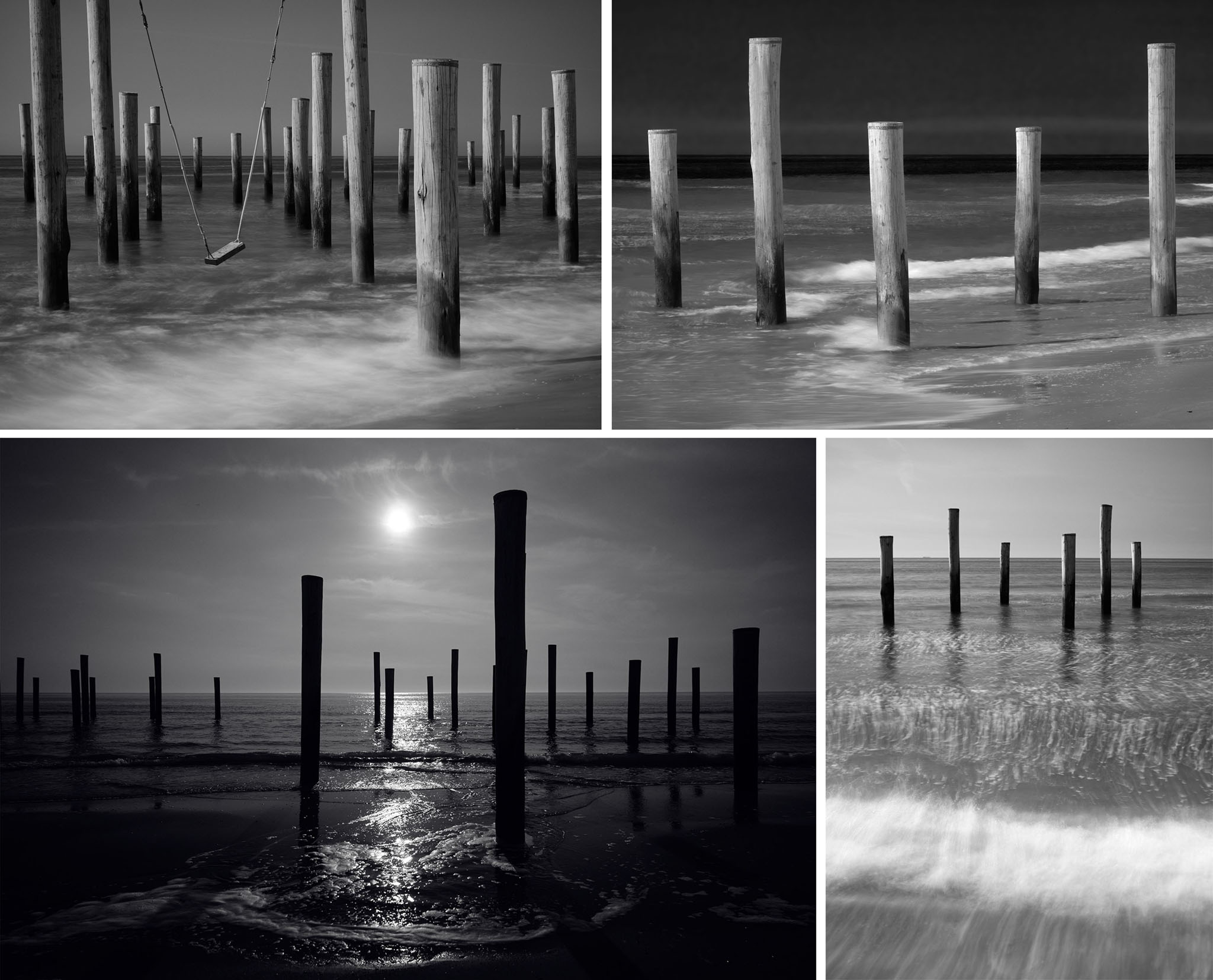
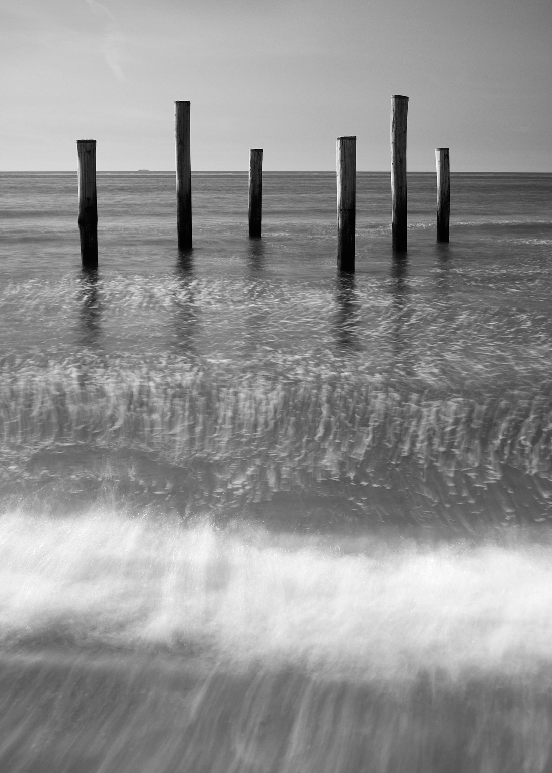
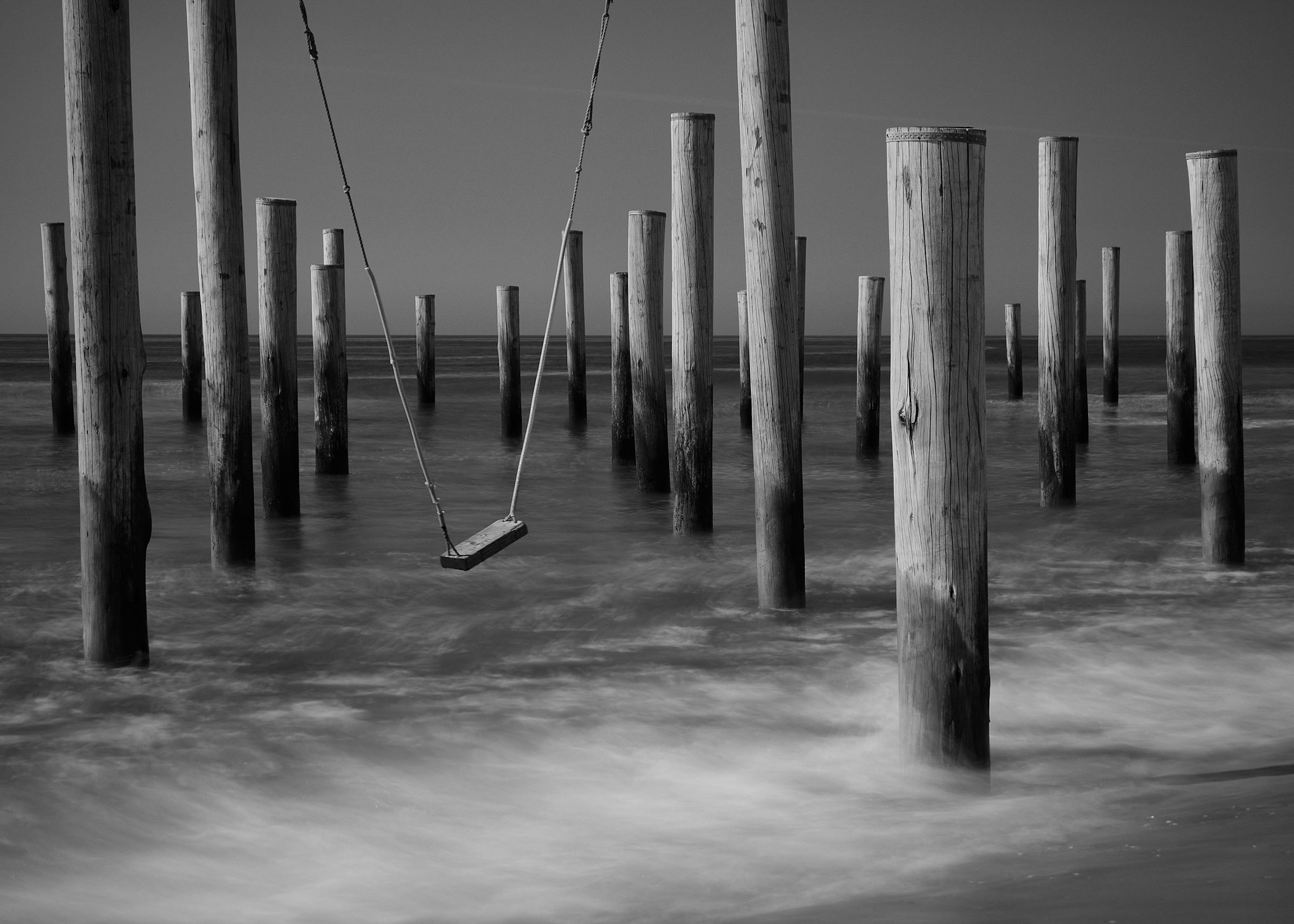
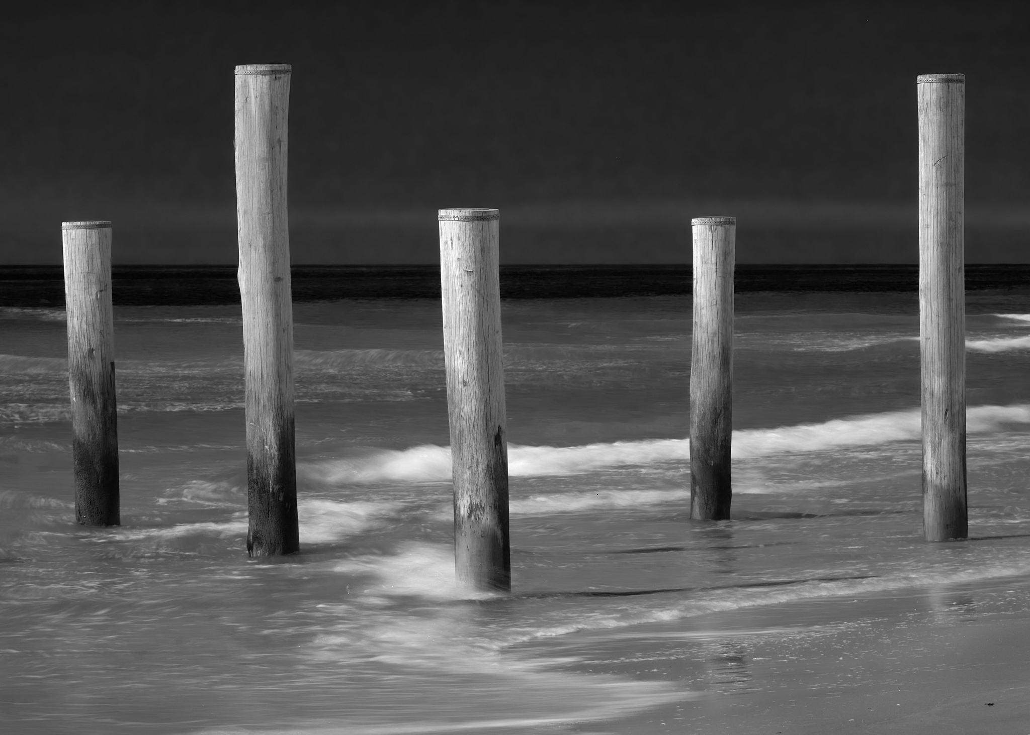
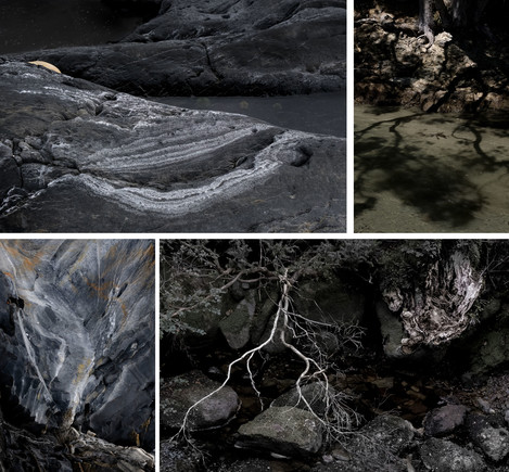
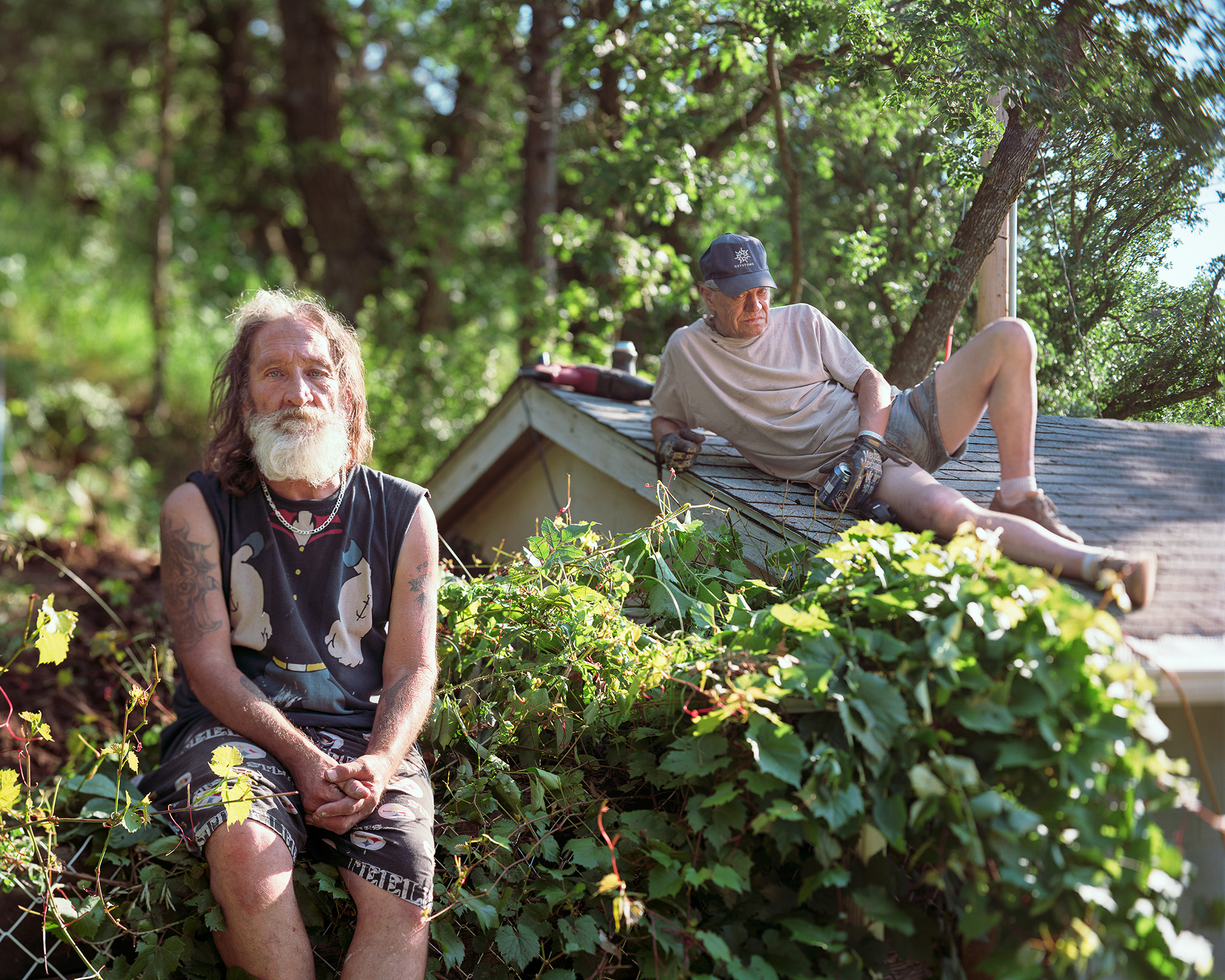
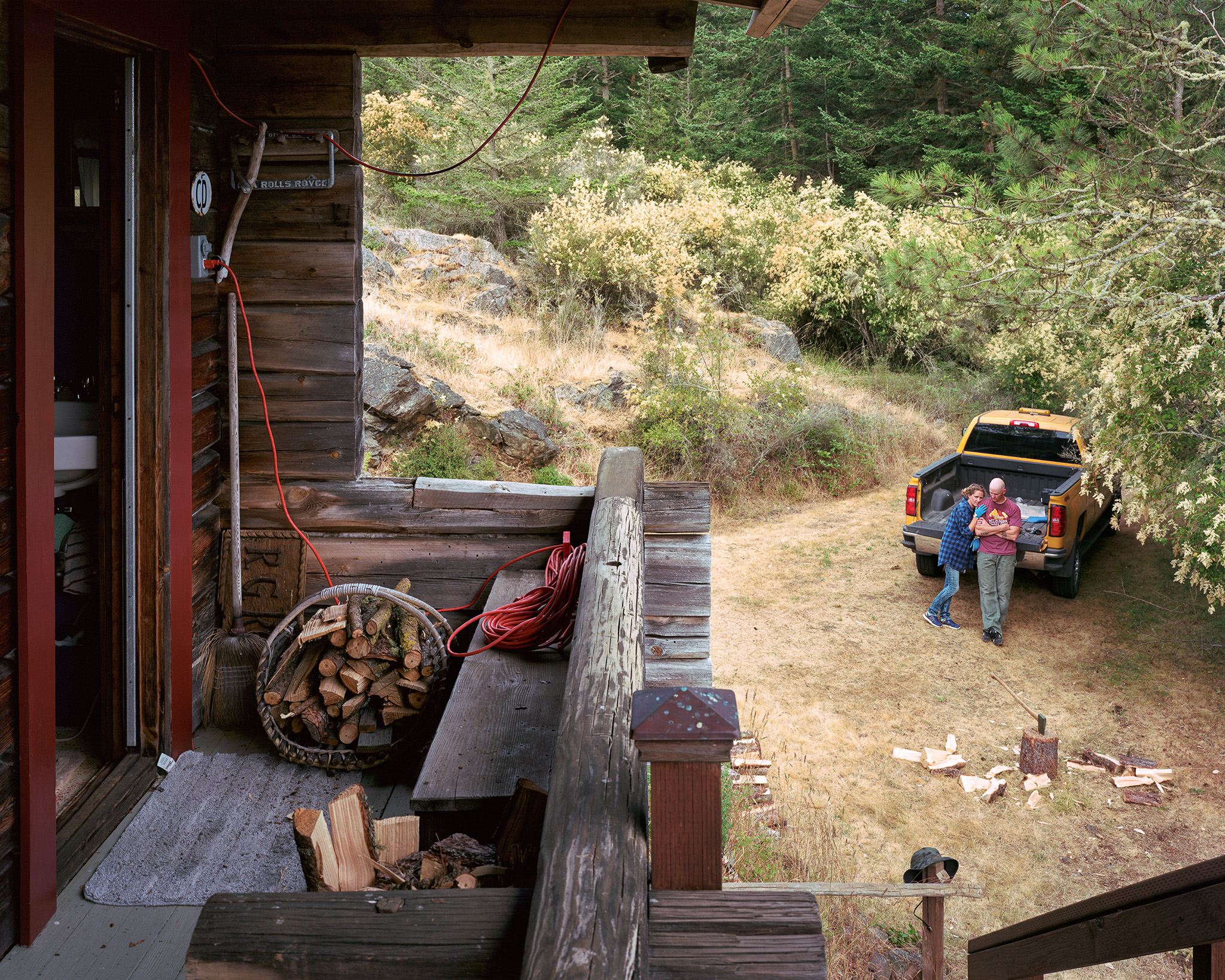
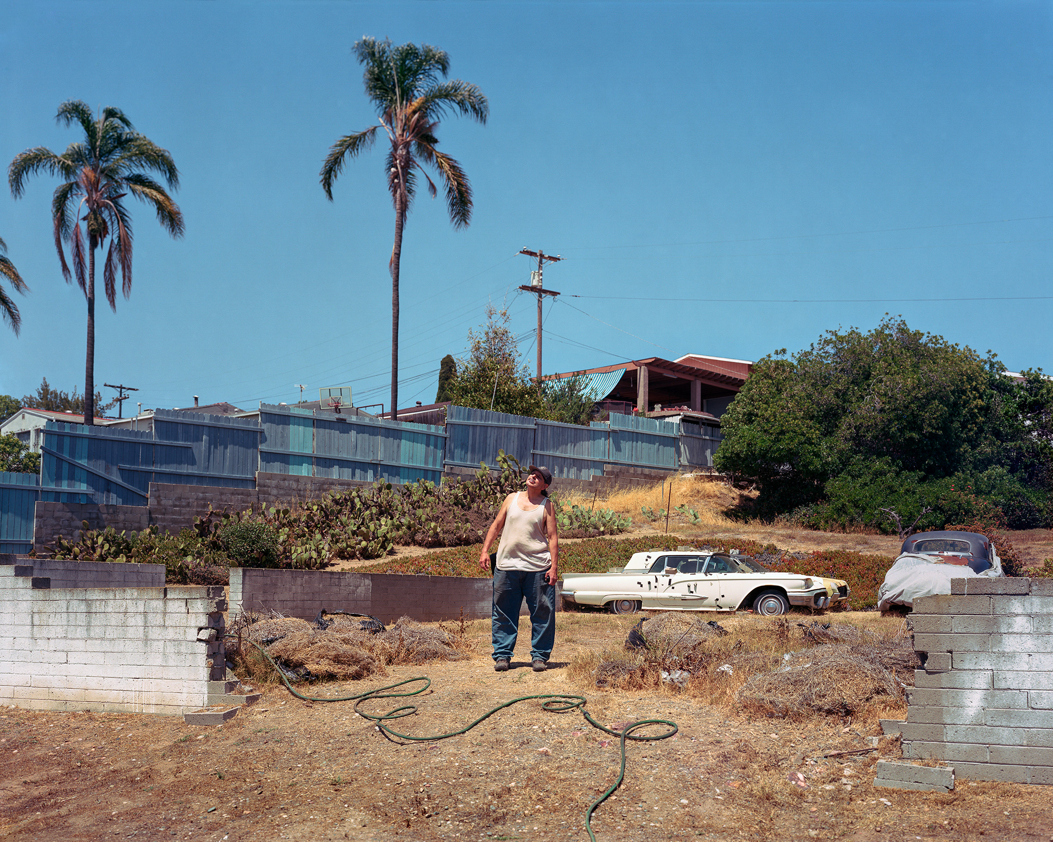
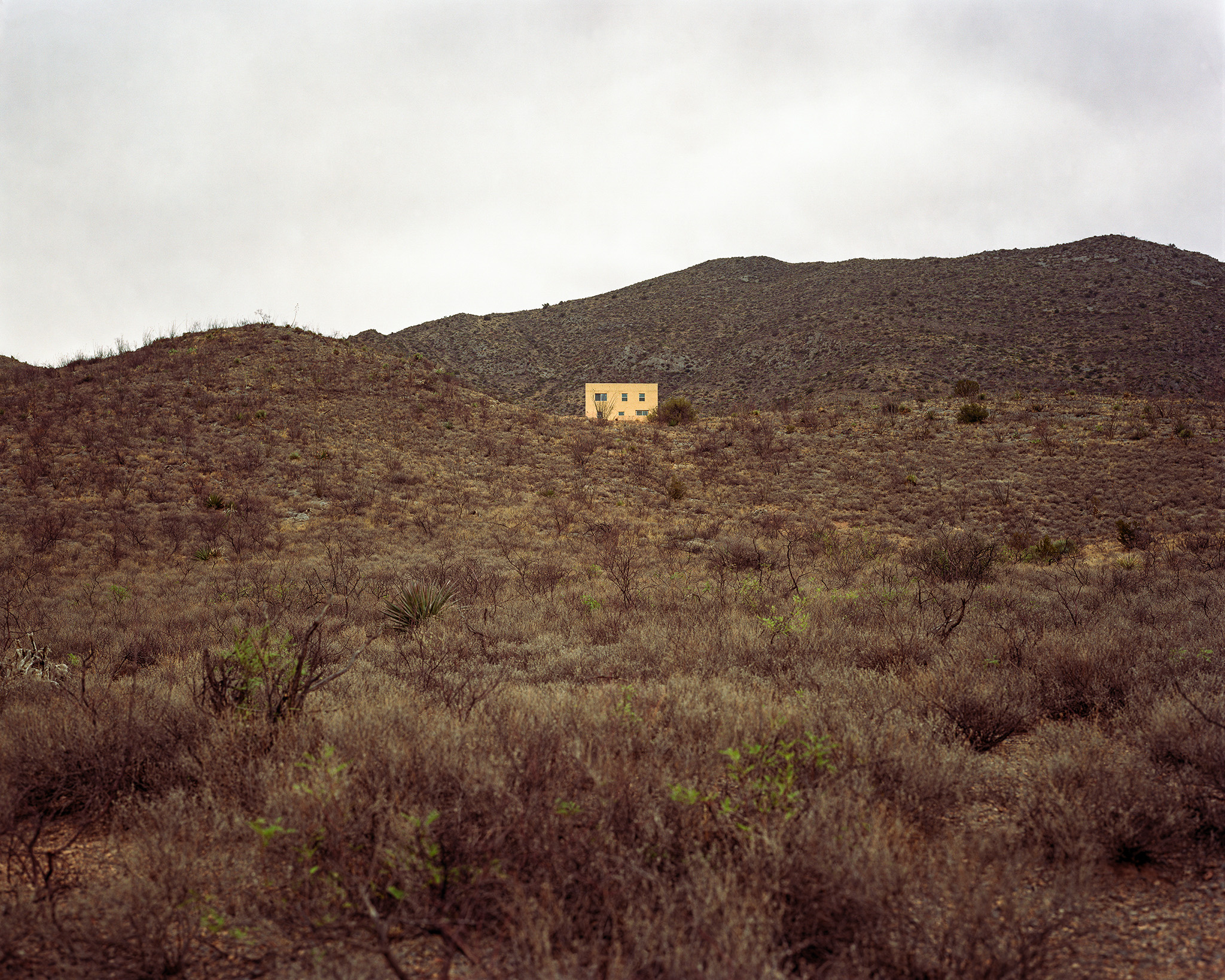
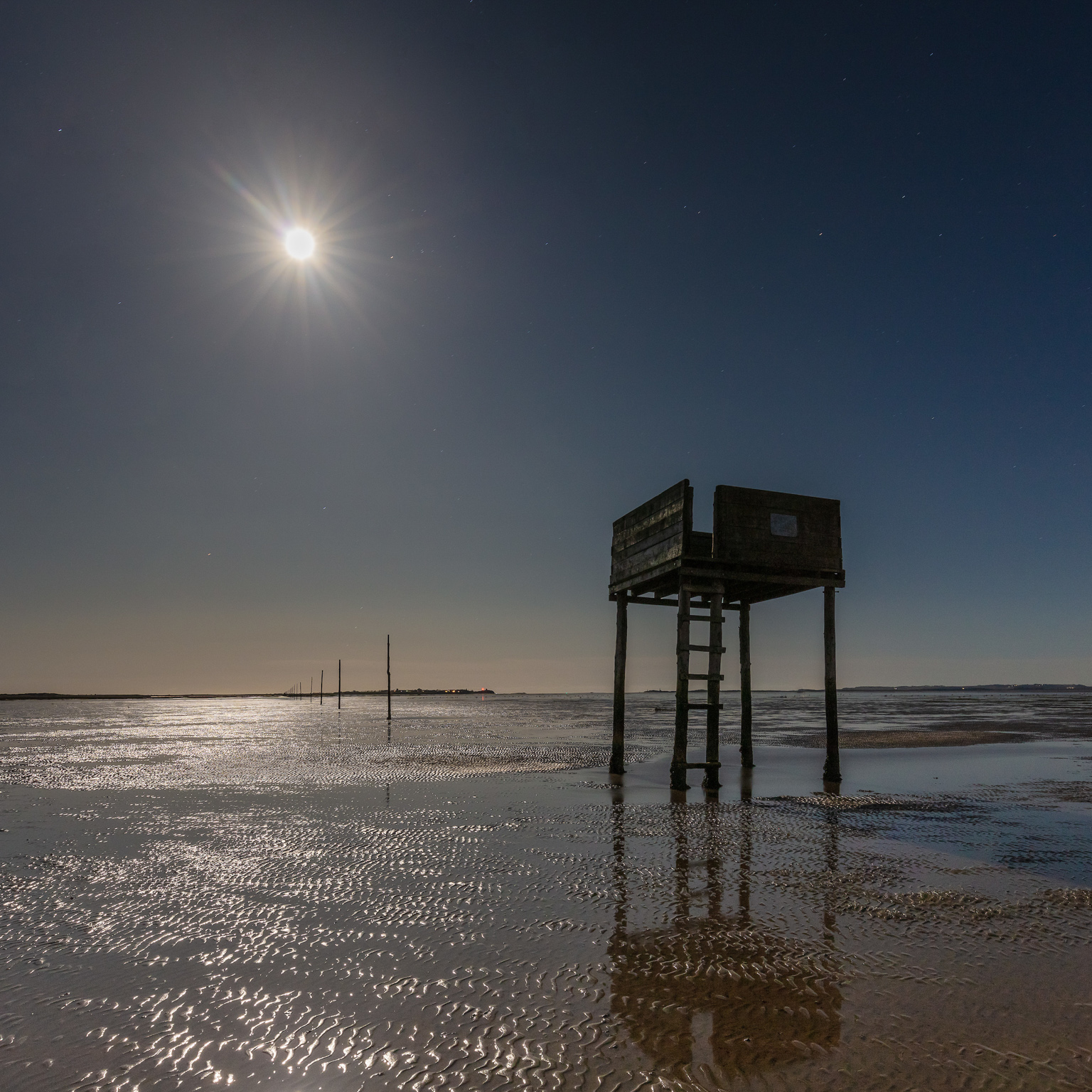
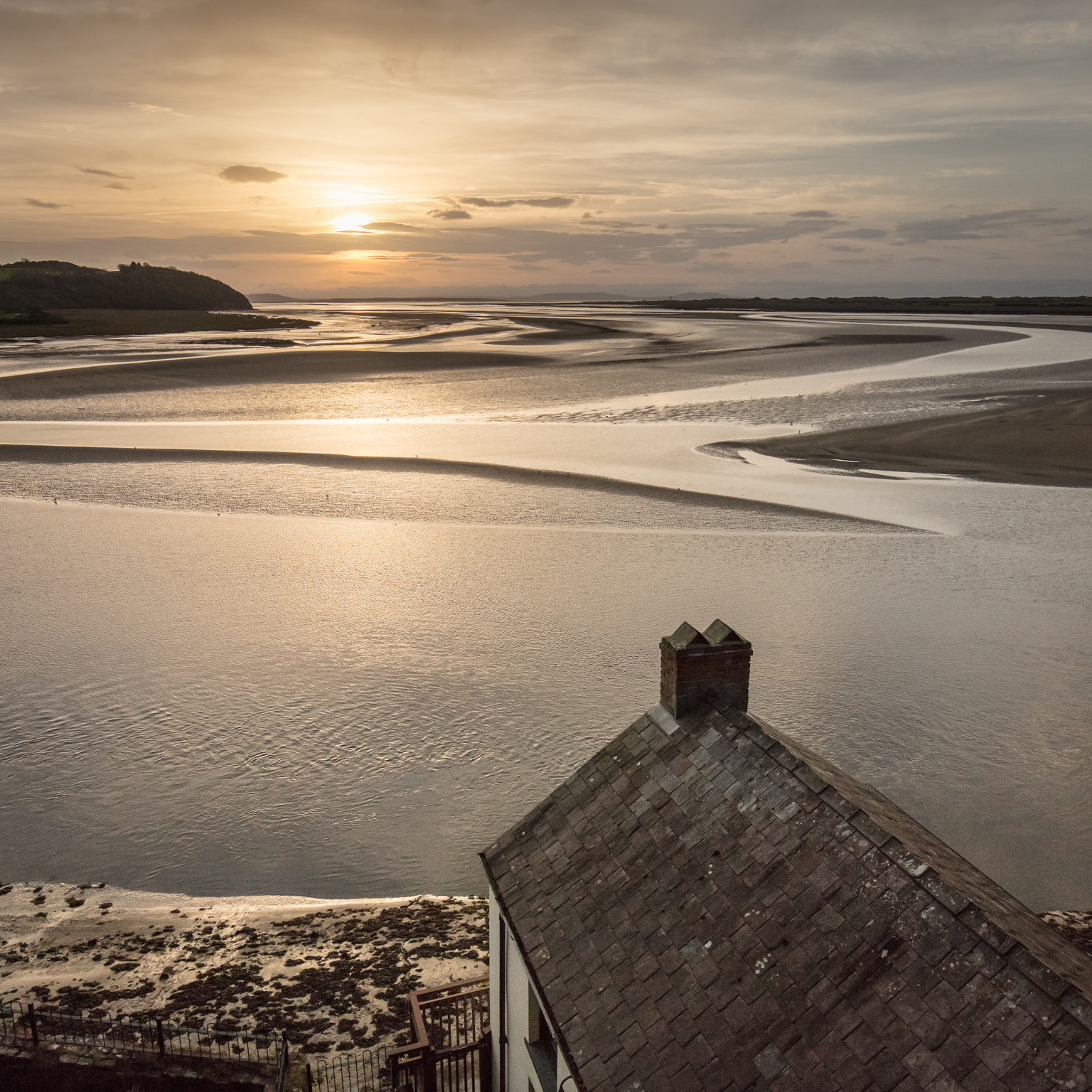
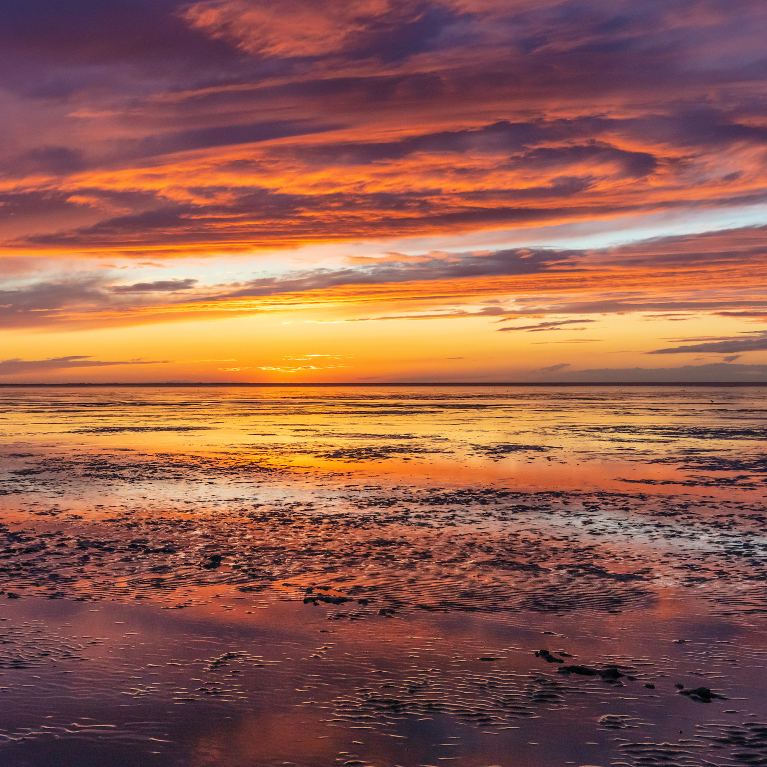
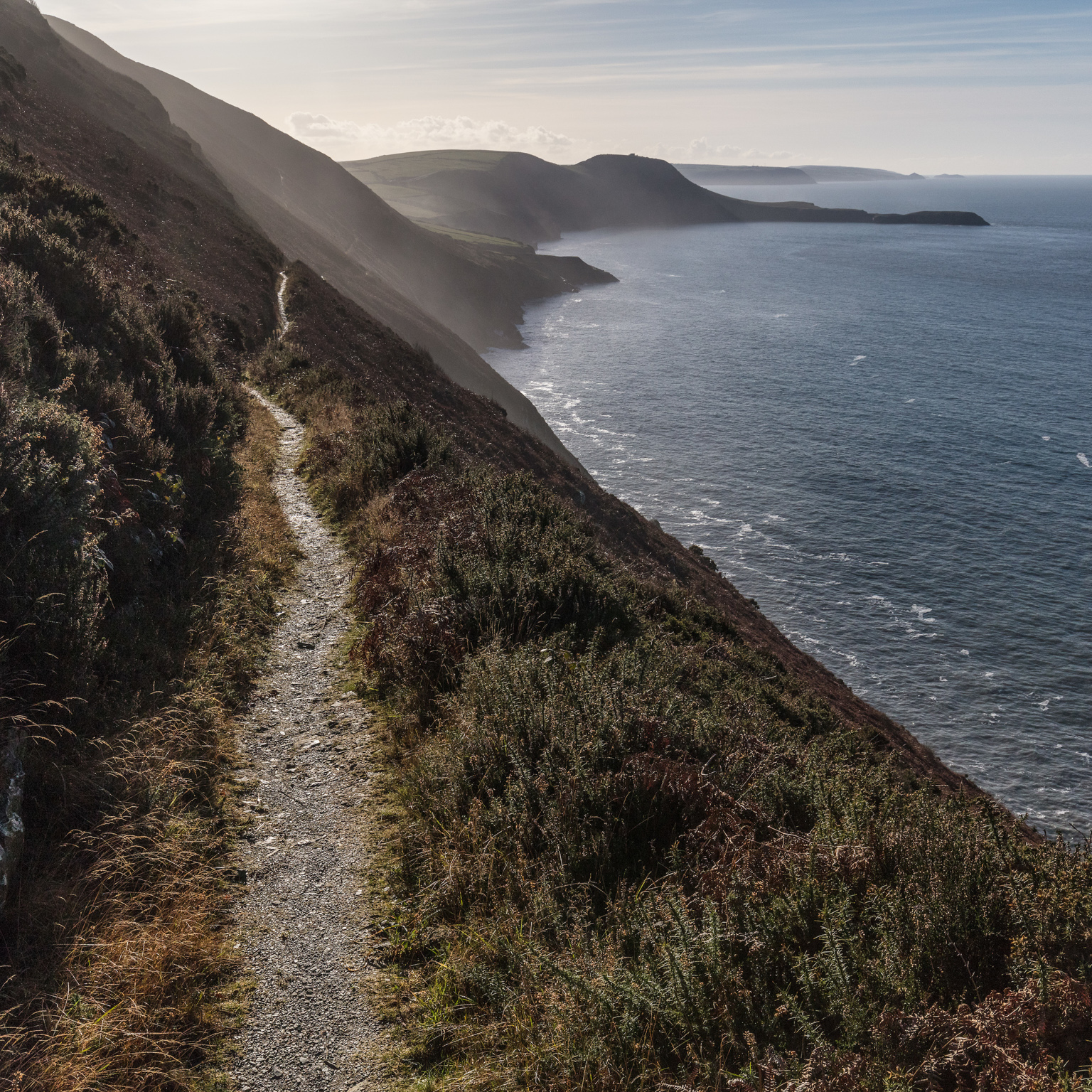
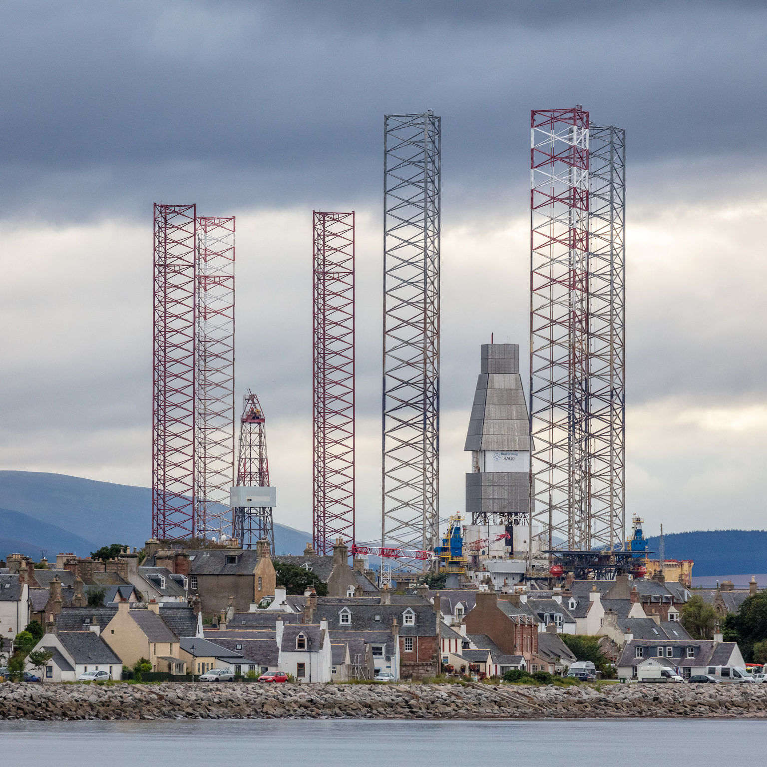
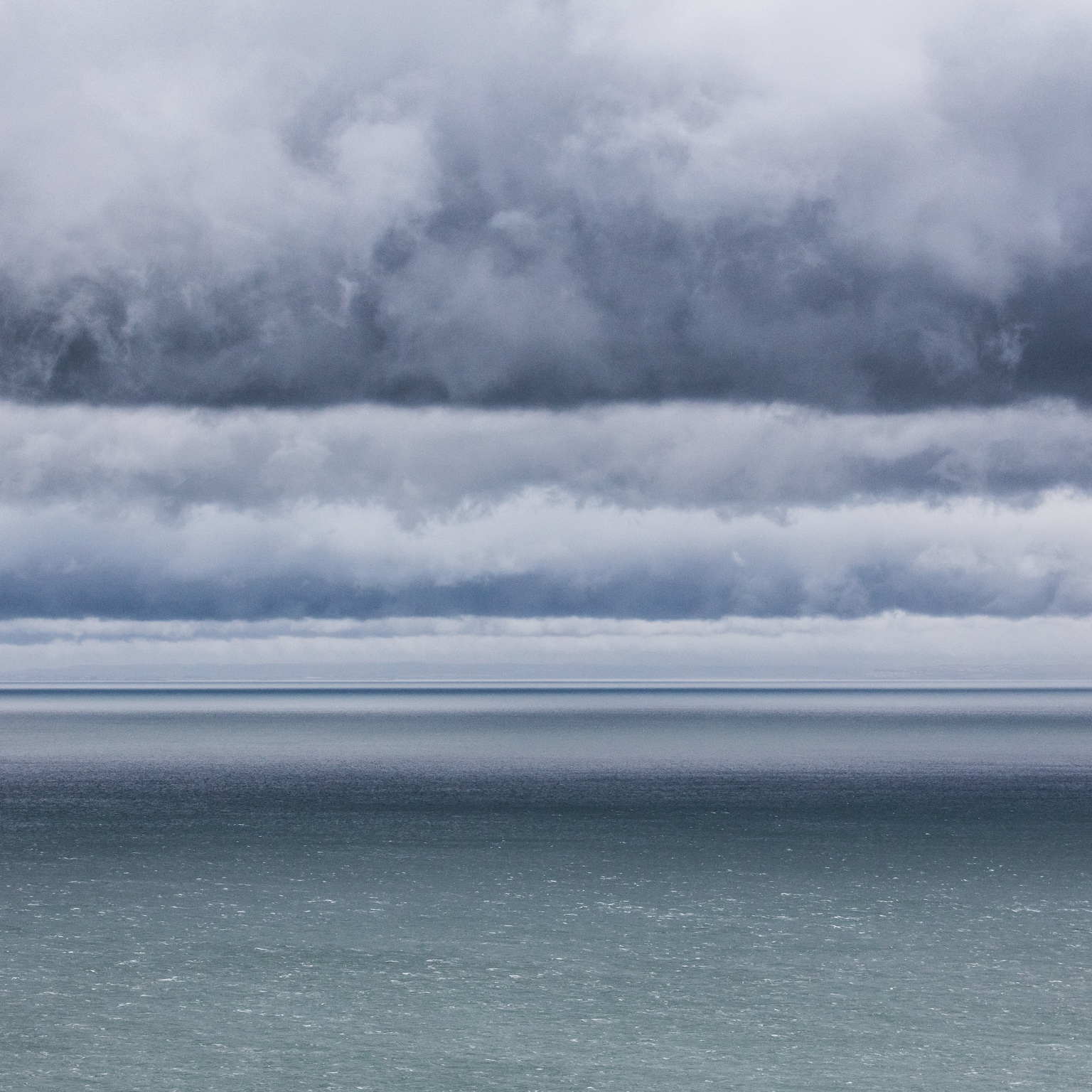
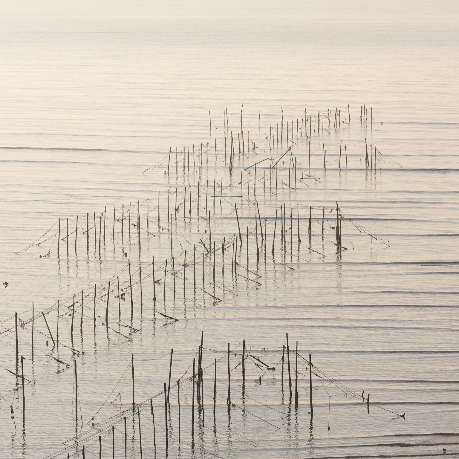
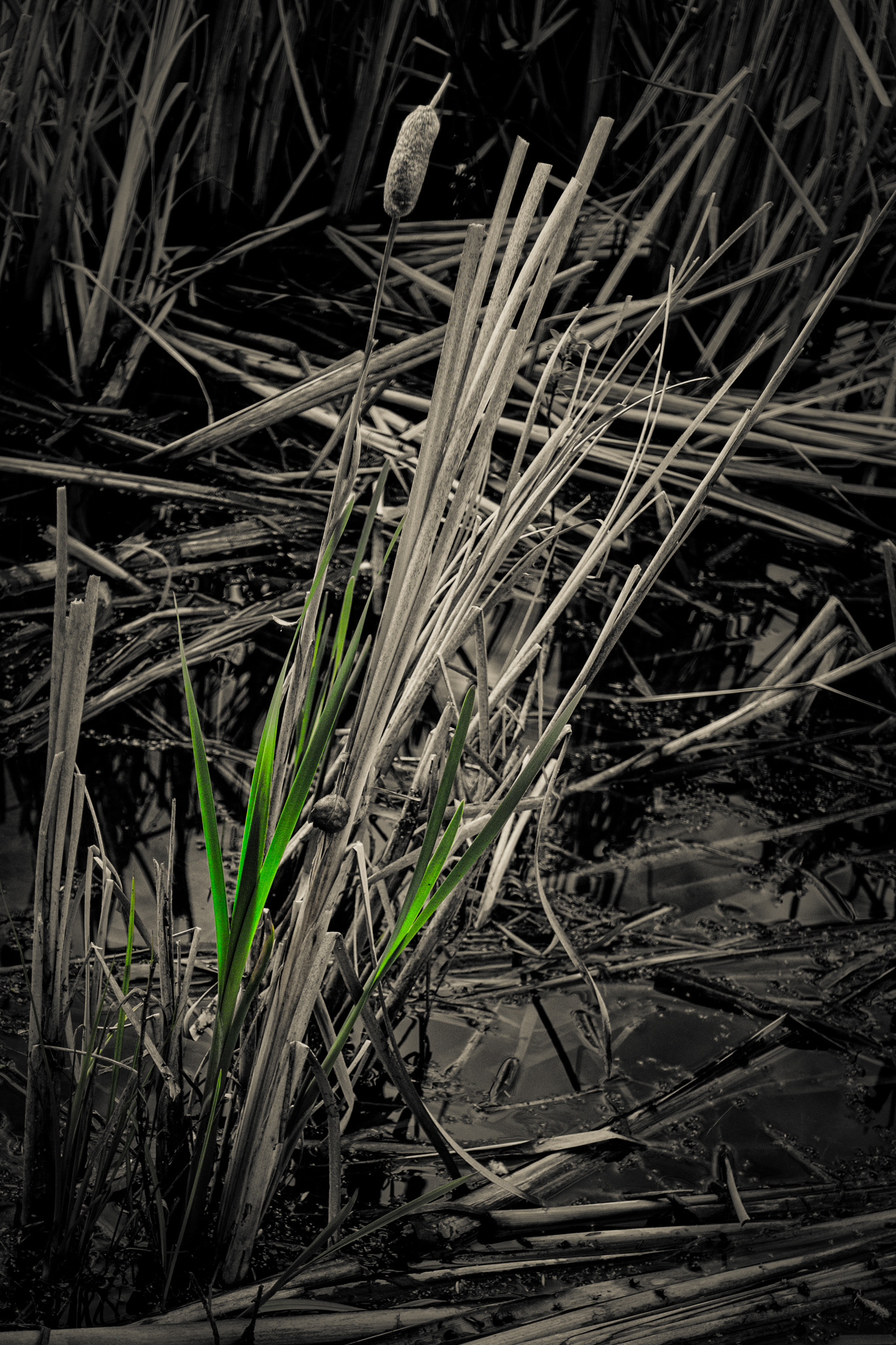
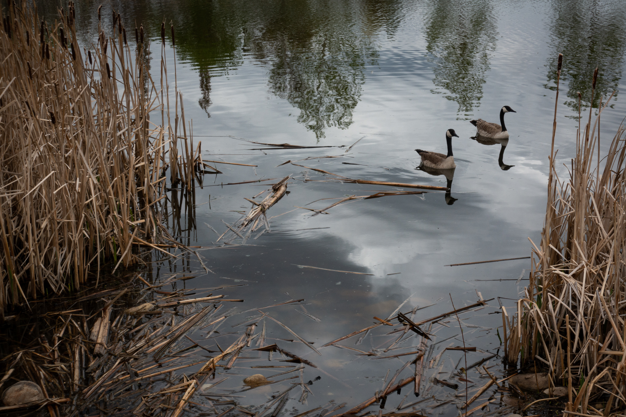
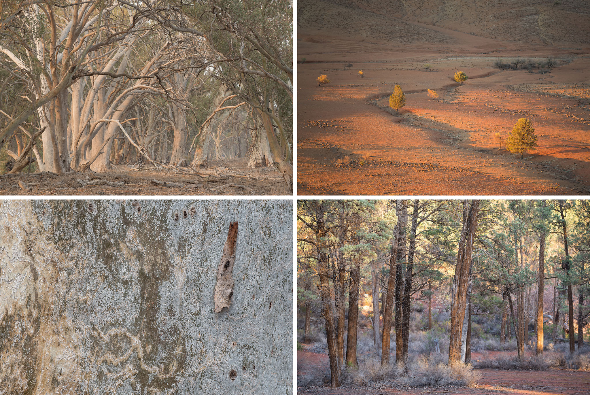
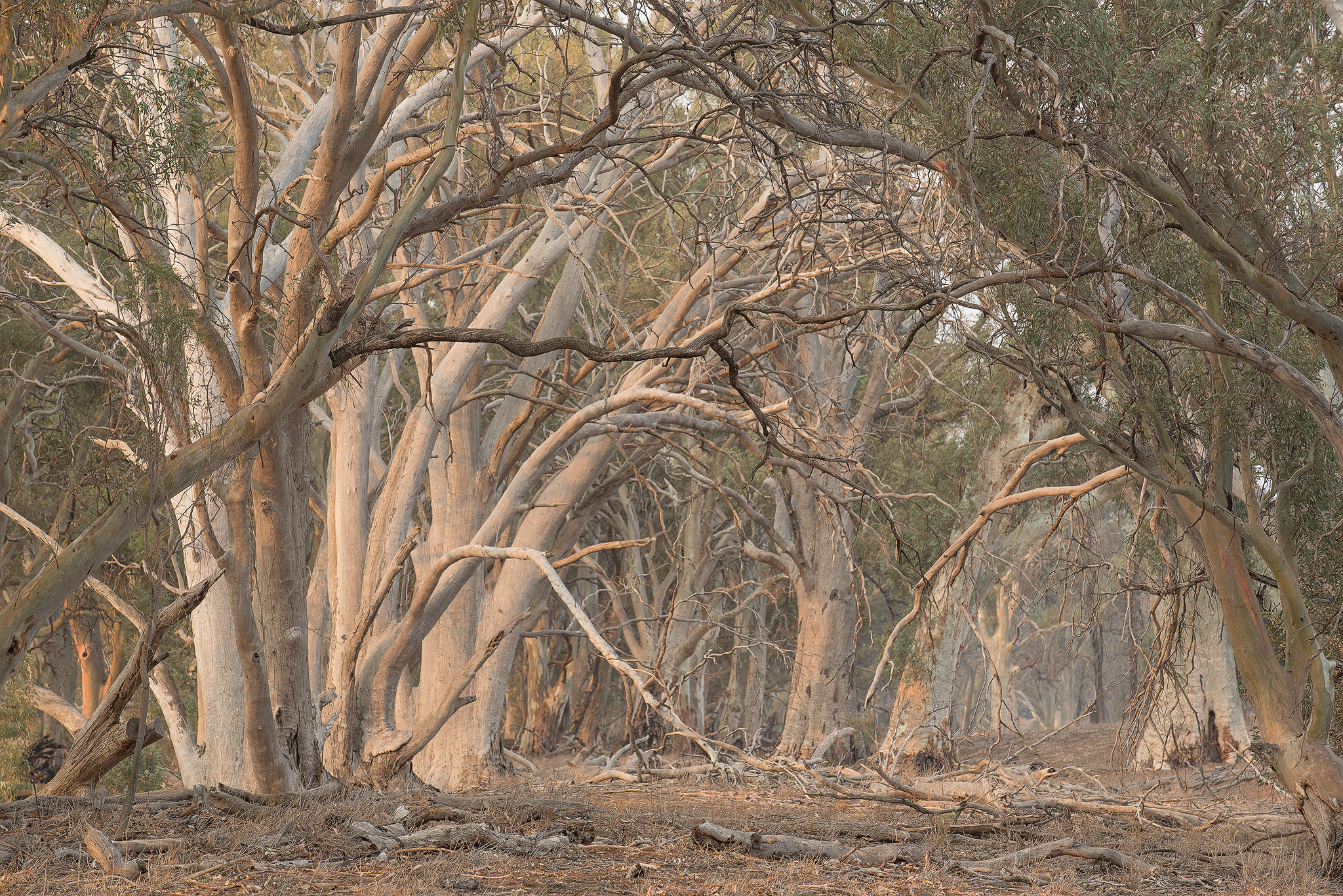
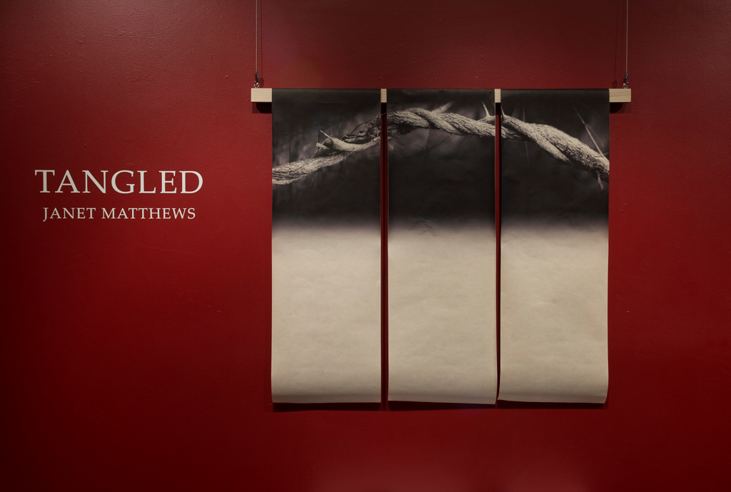
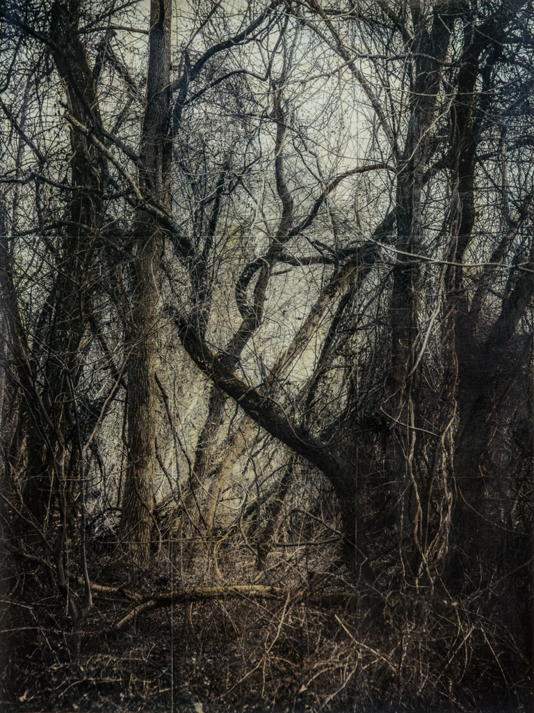
Welcome to our 4x4 feature which is a set of four mini landscape photography portfolios submitted from our subscribers. Each portfolios consisting of four images related in some way.
Submit Your 4x4 Portfolio
Interested in submitting your work? We're on the lookout for new portfolios for the next few issues, so please do get in touch!
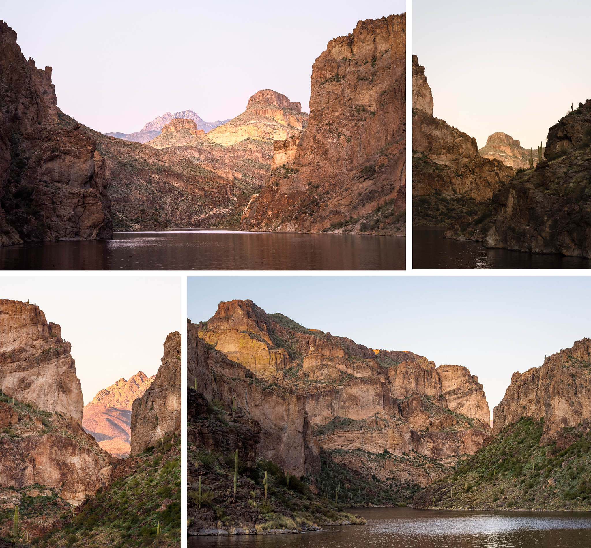
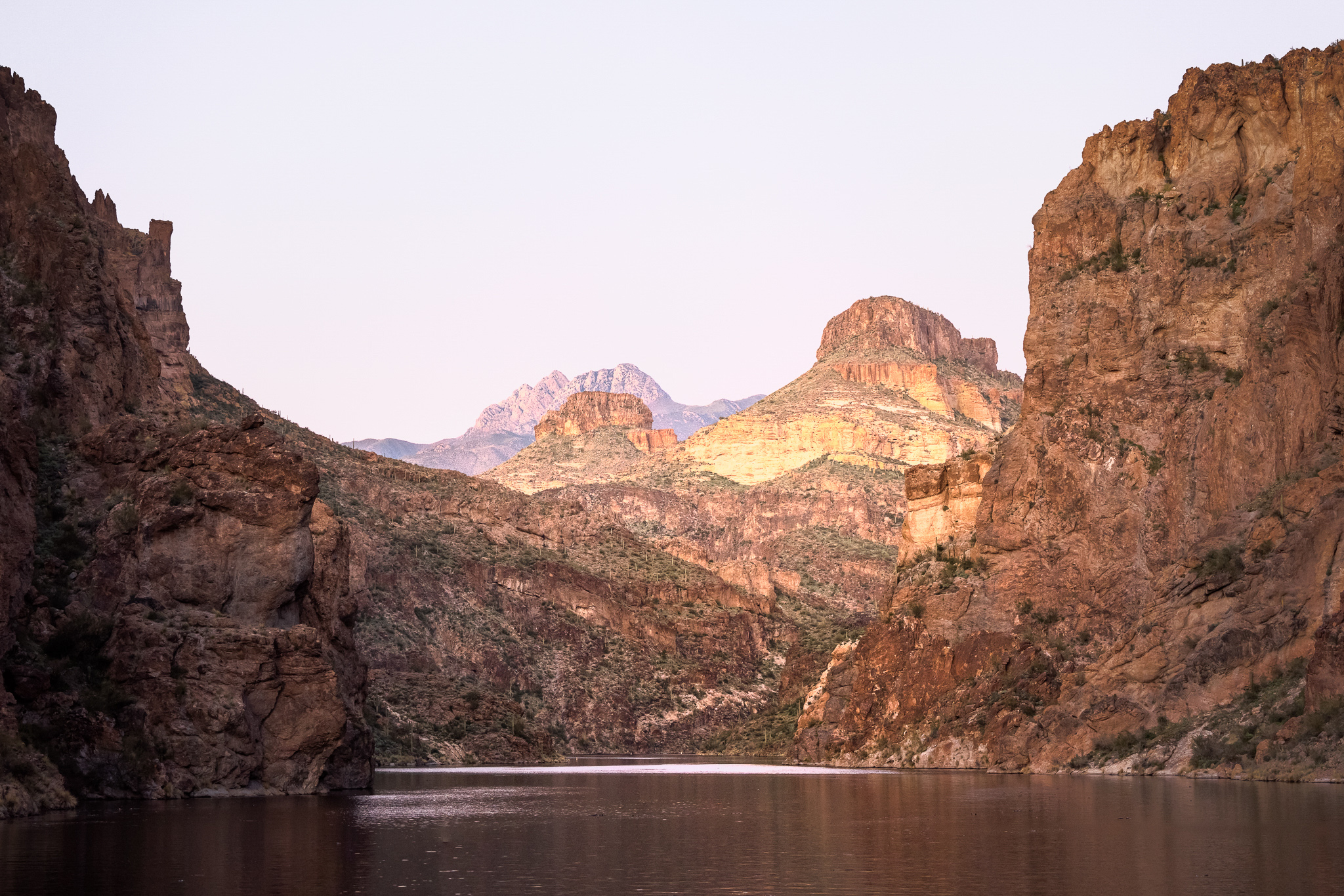
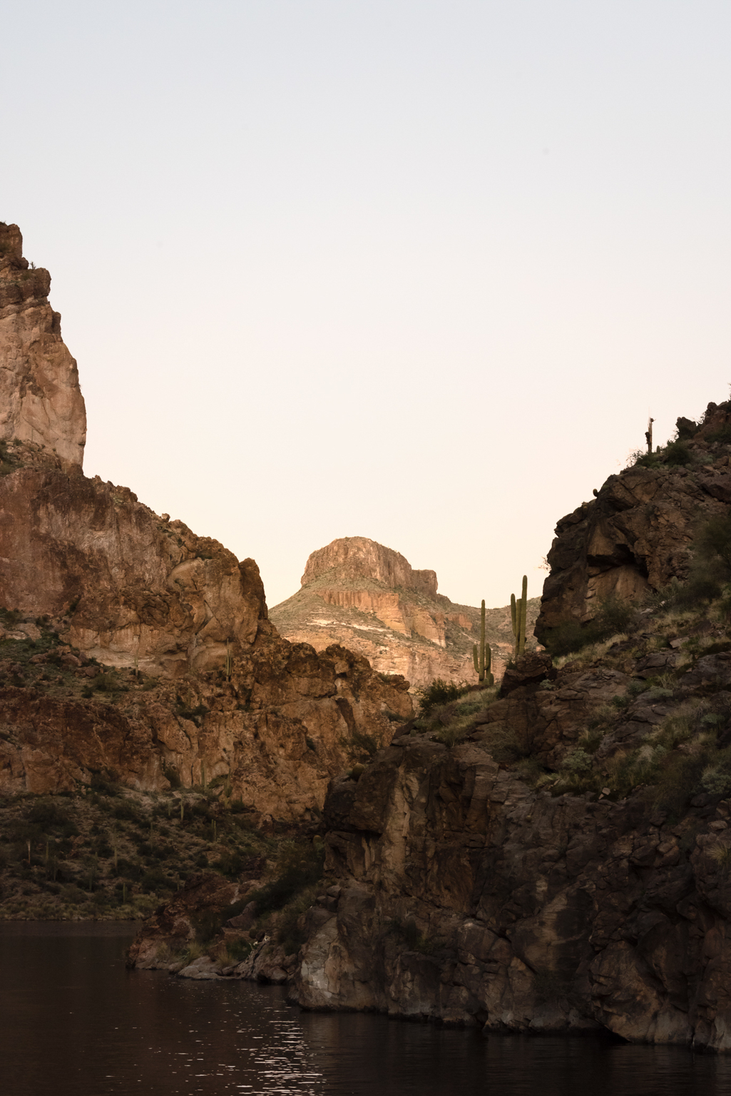
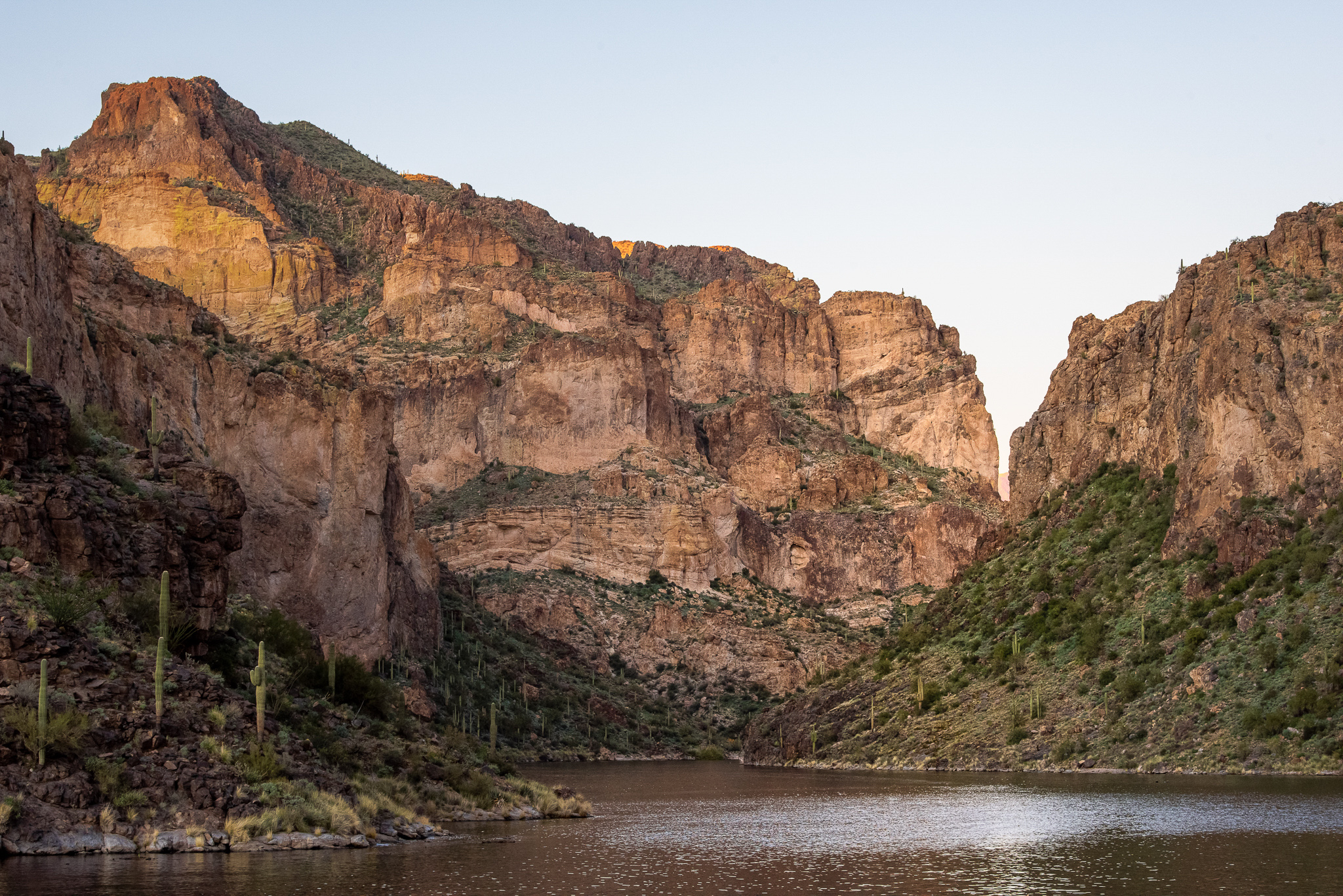
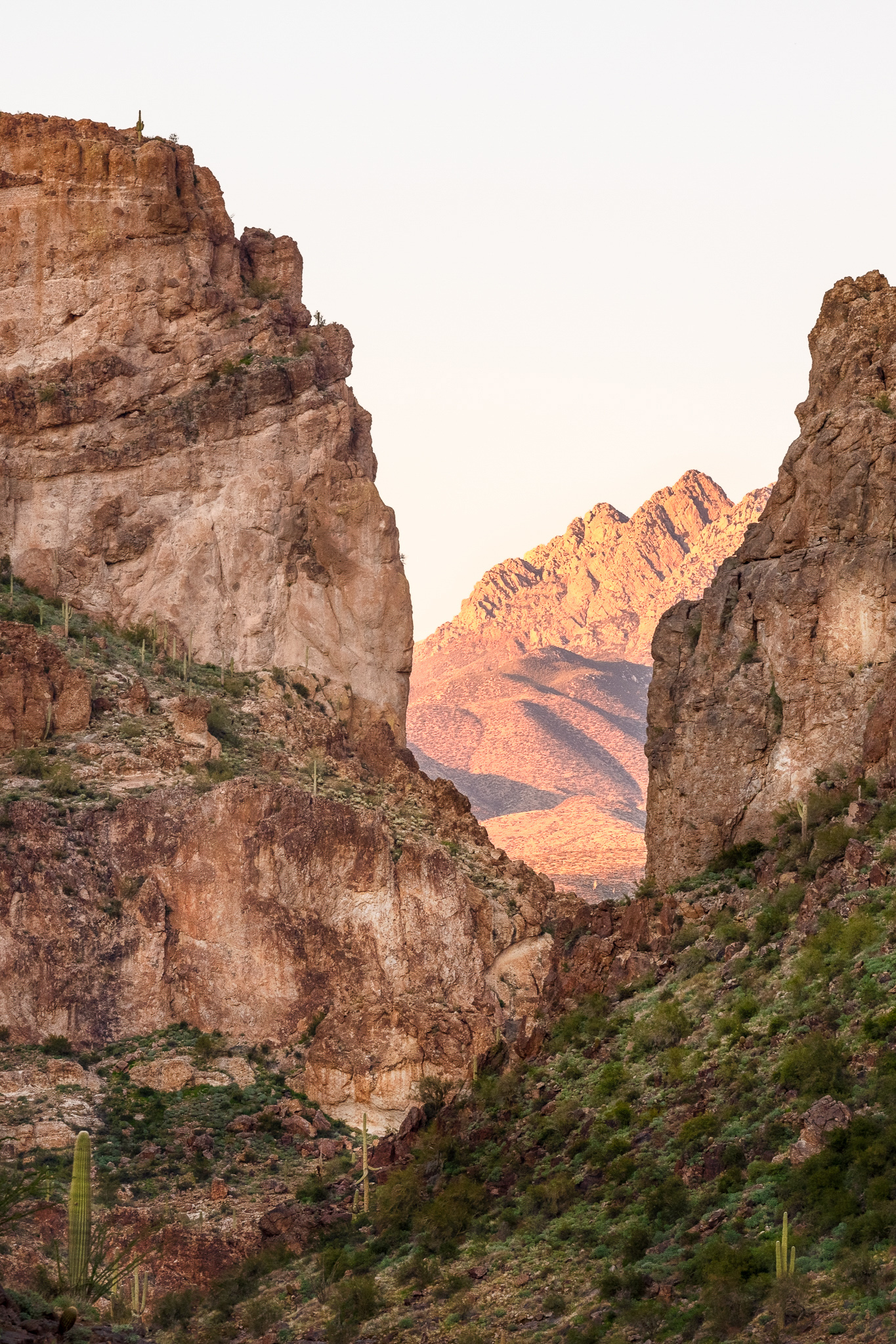
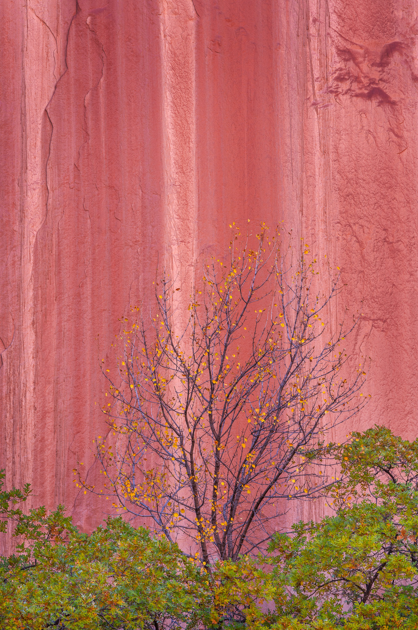
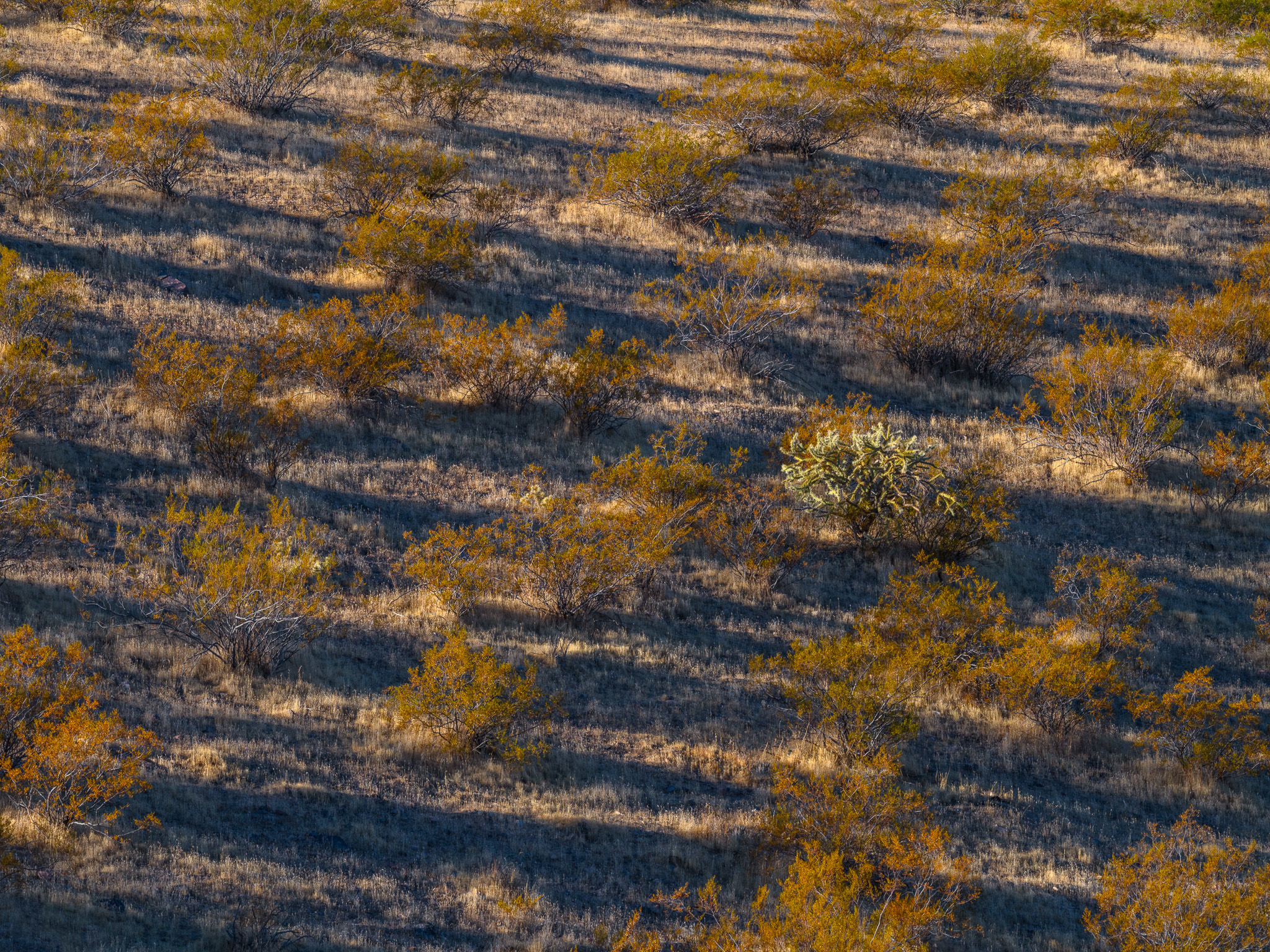
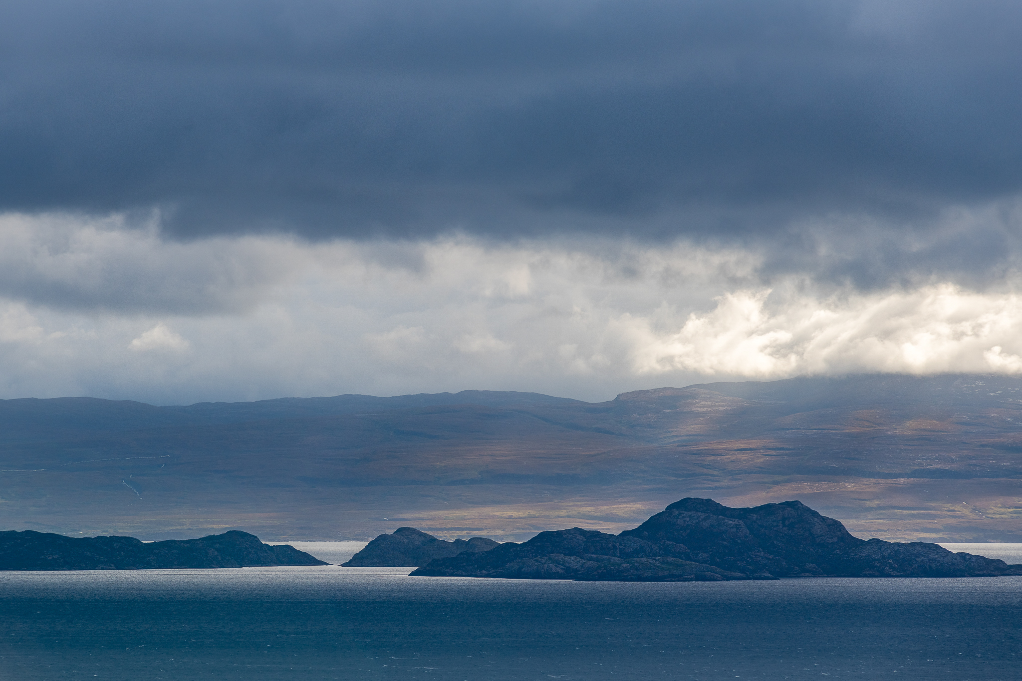
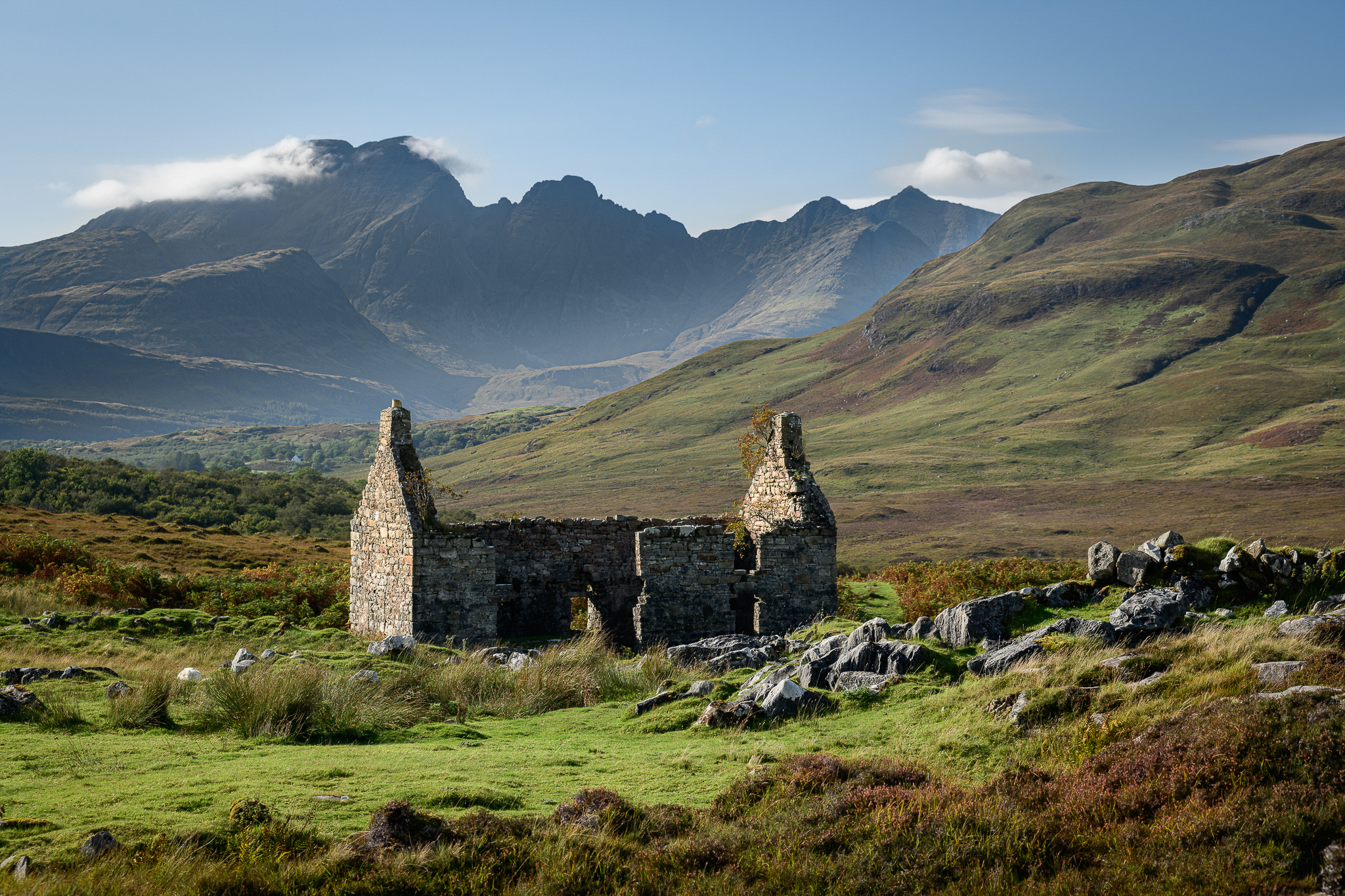
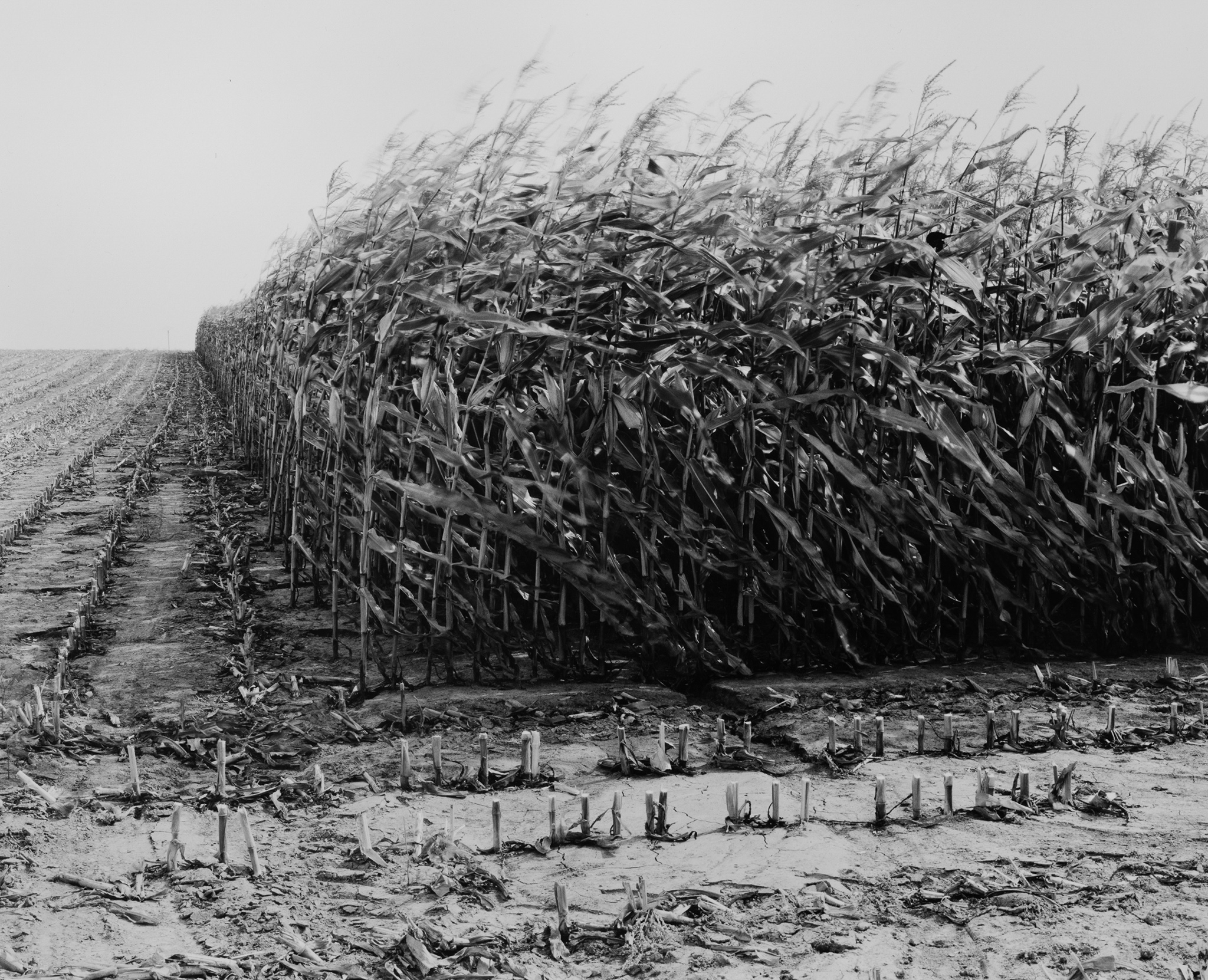
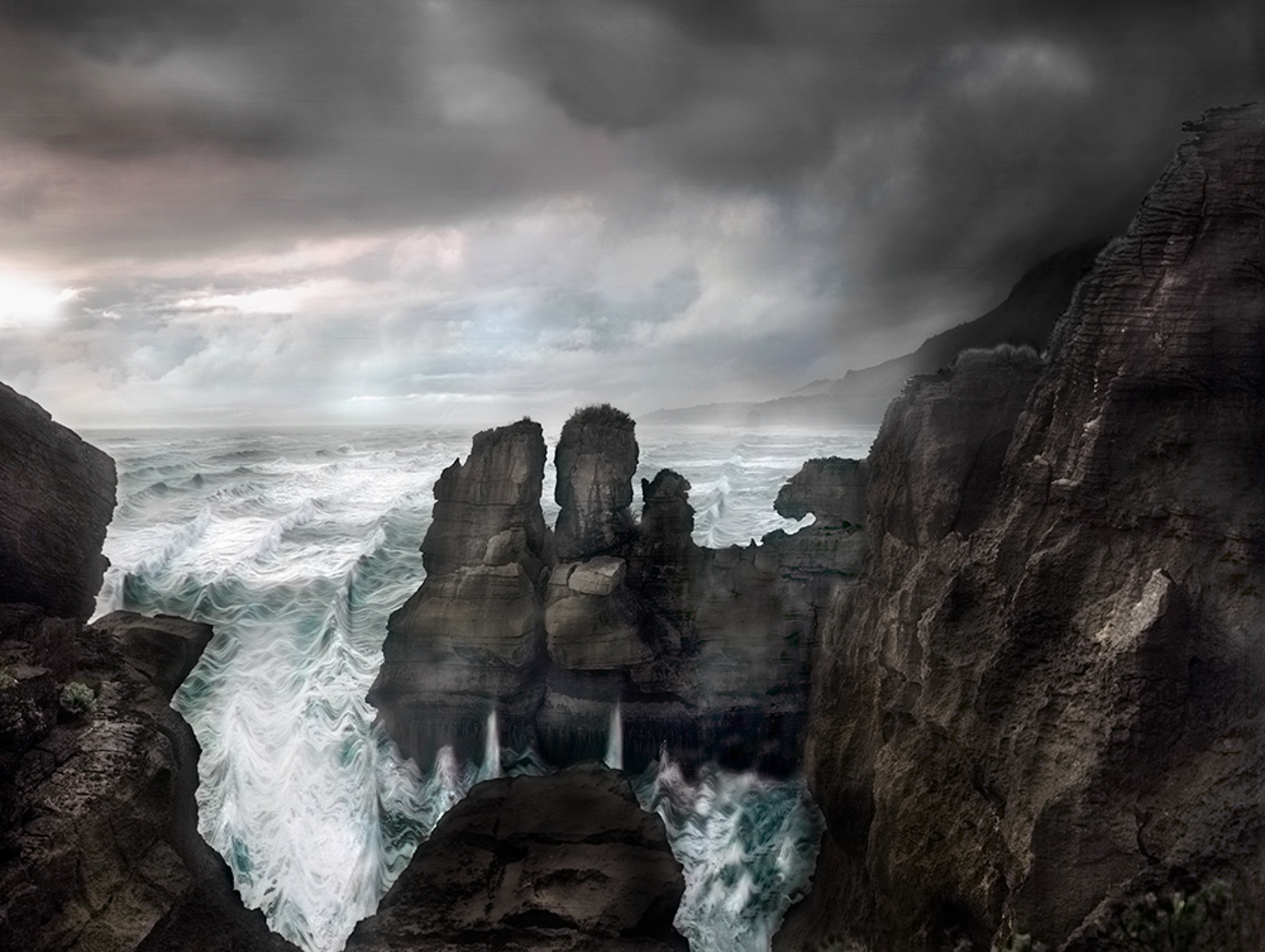
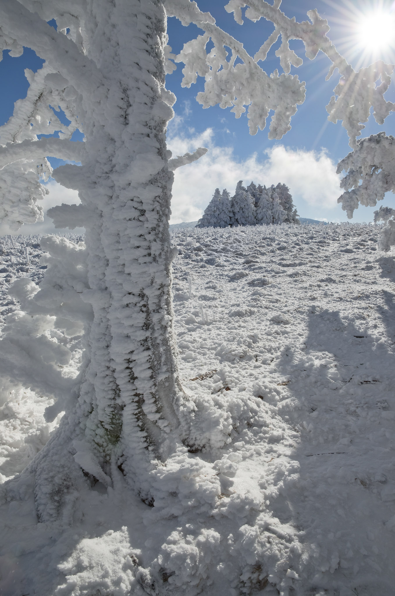
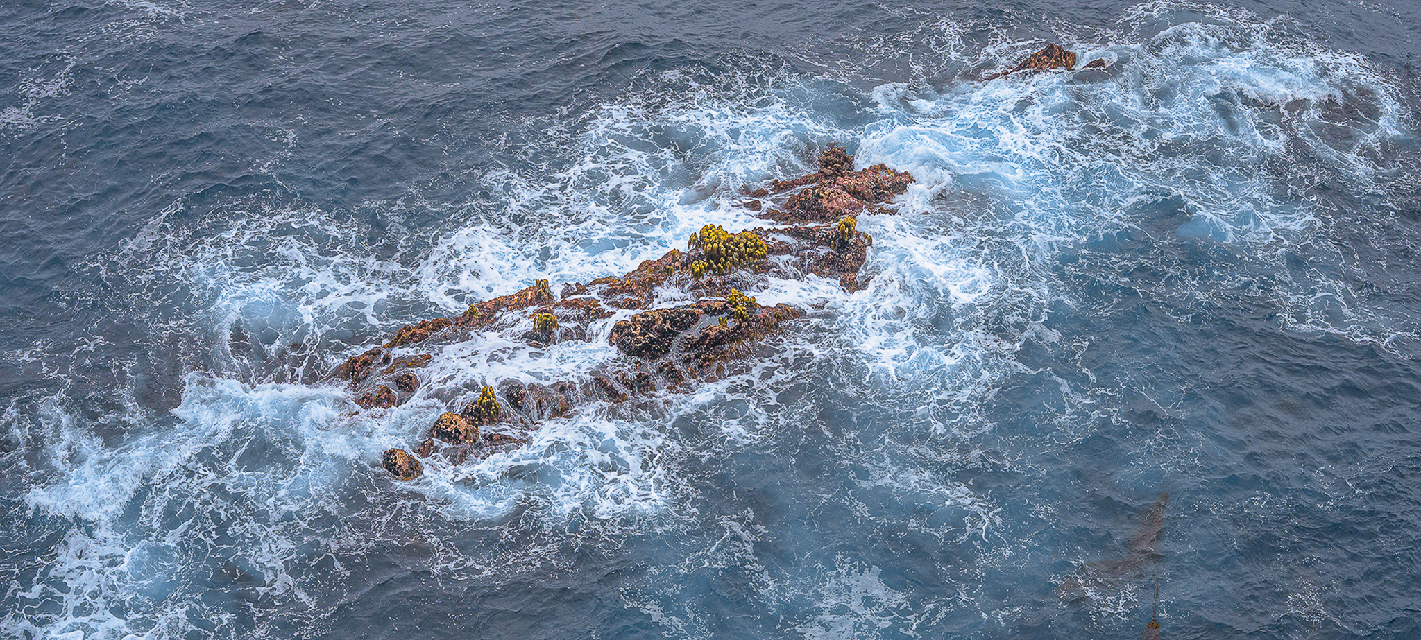
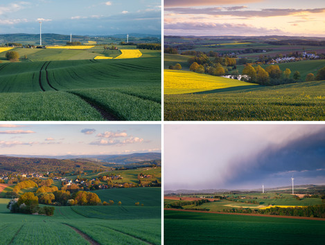
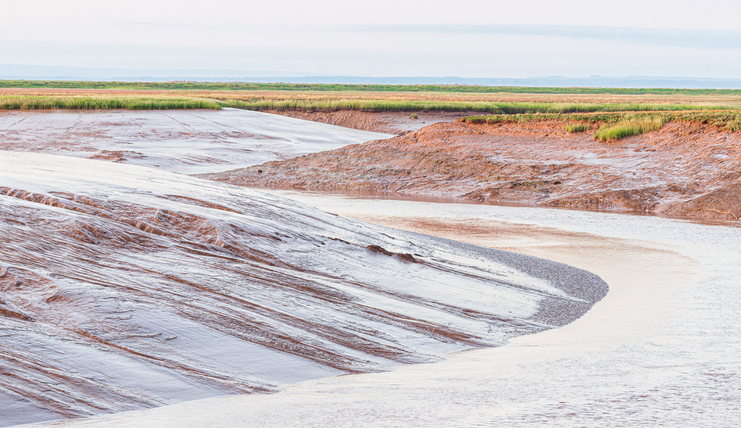
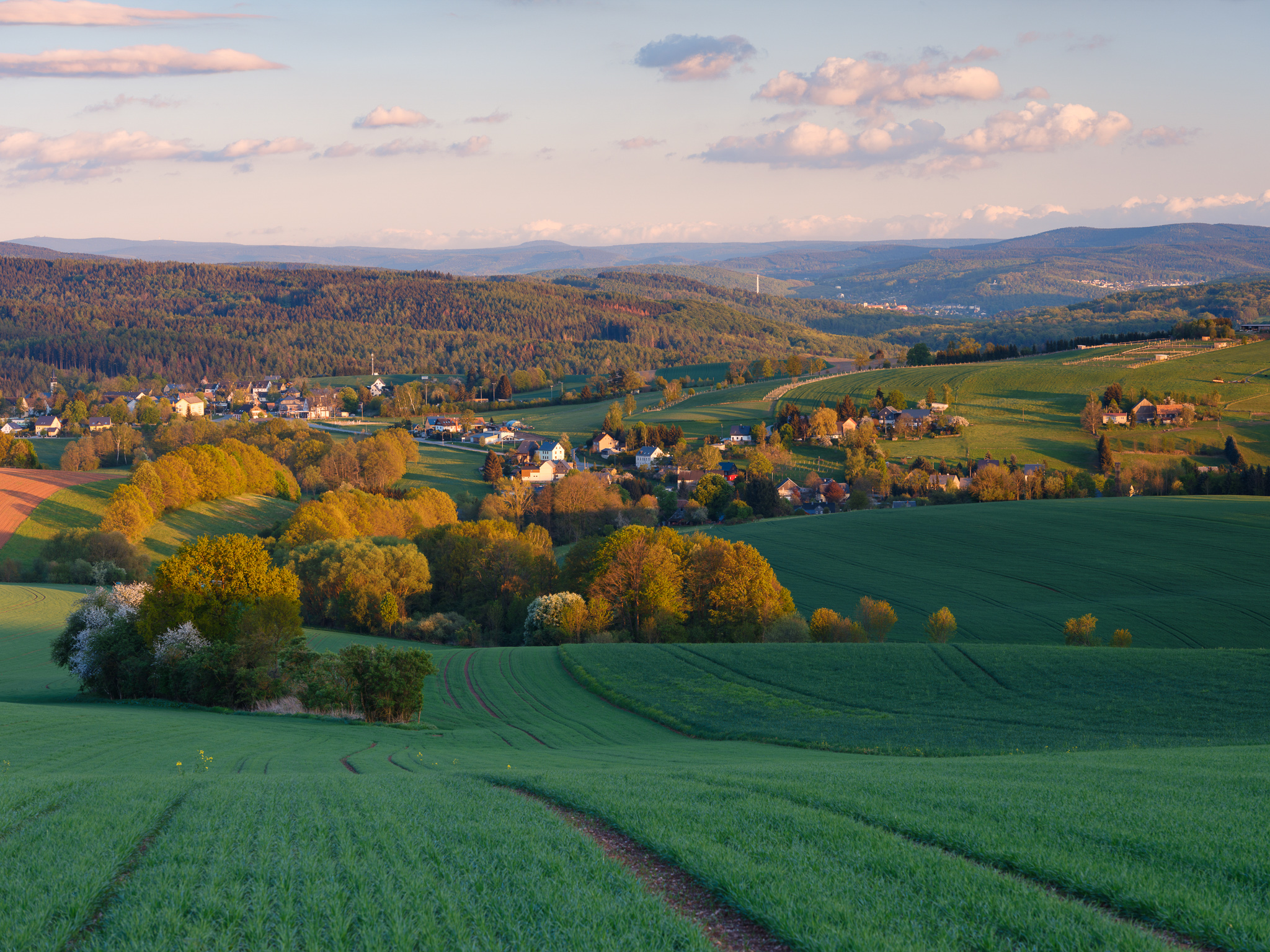
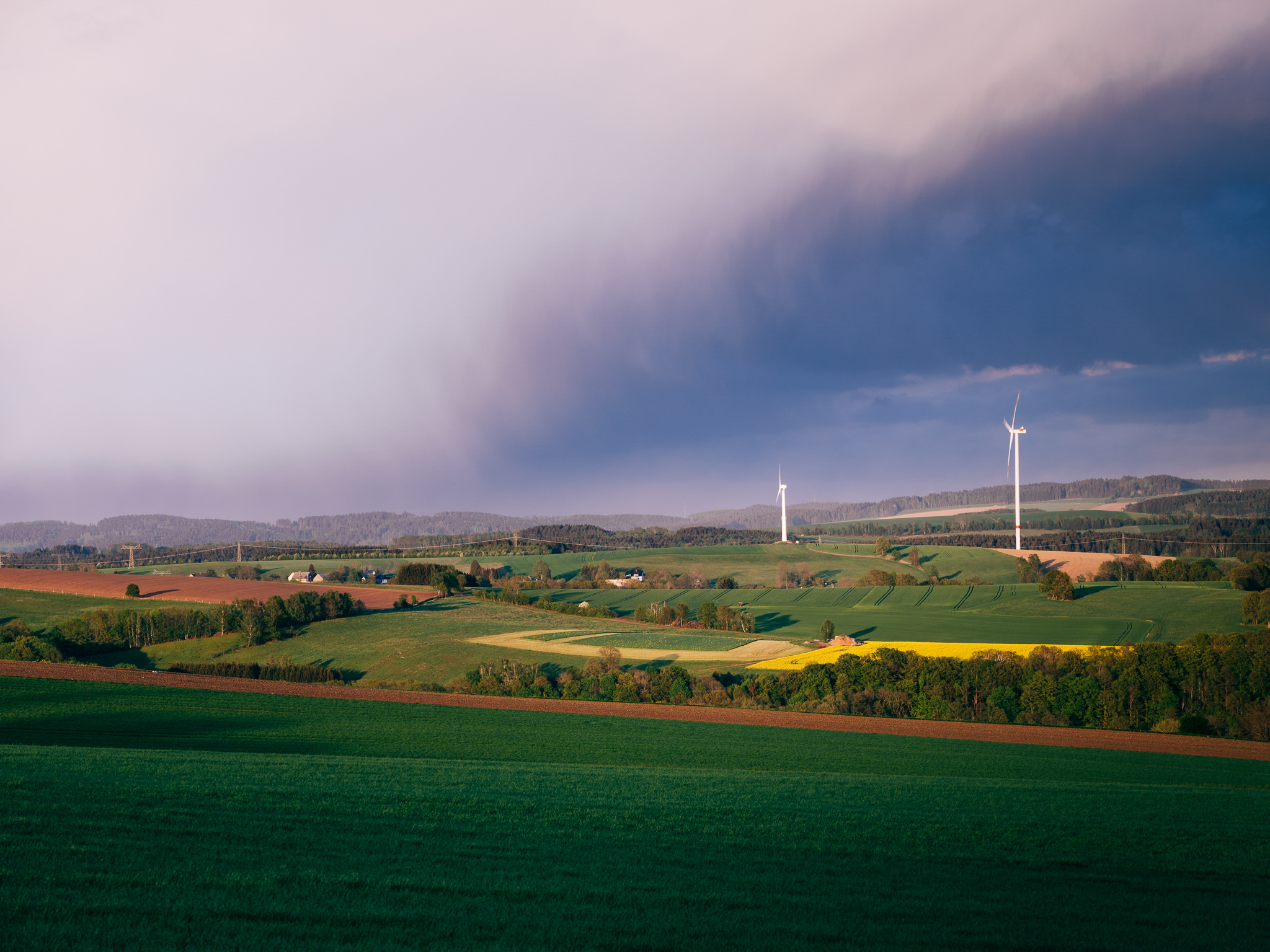
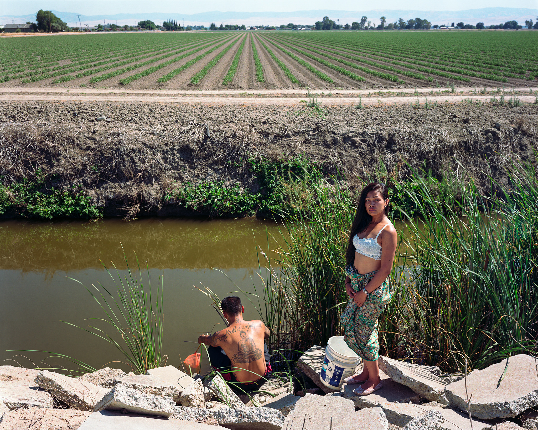
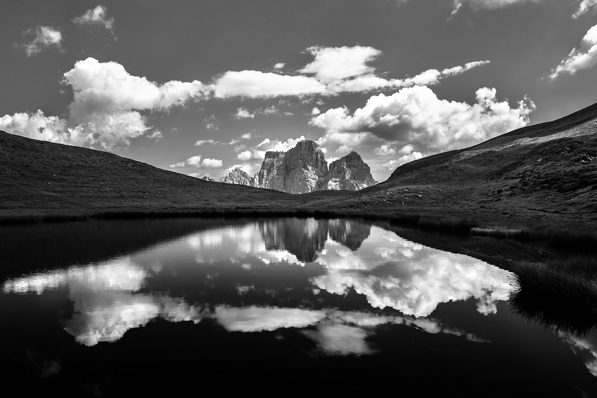
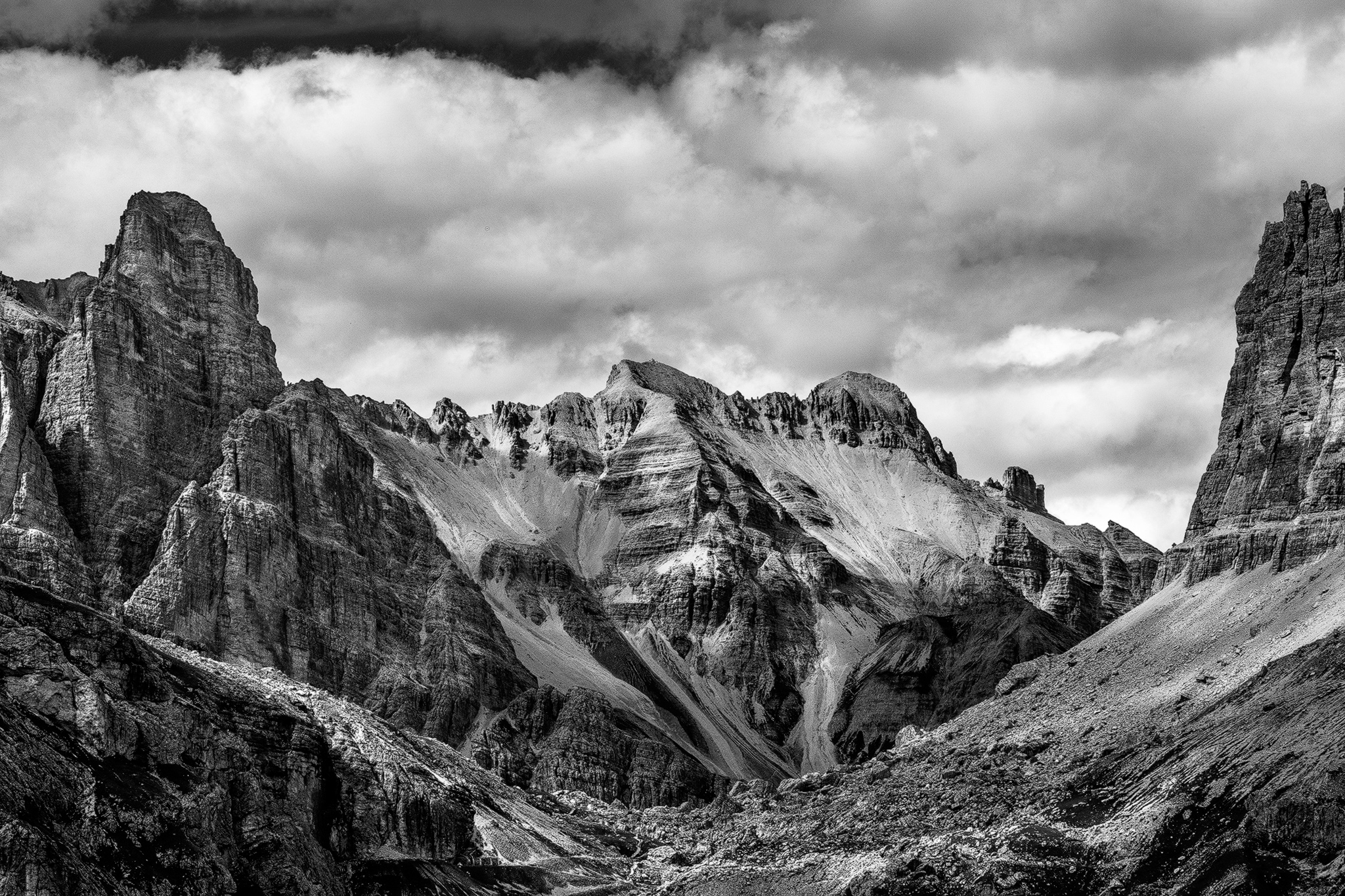
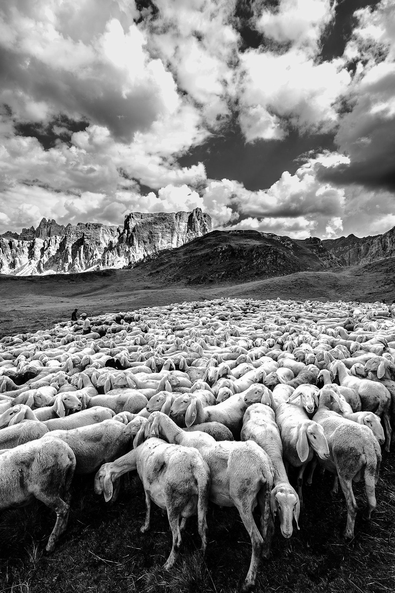
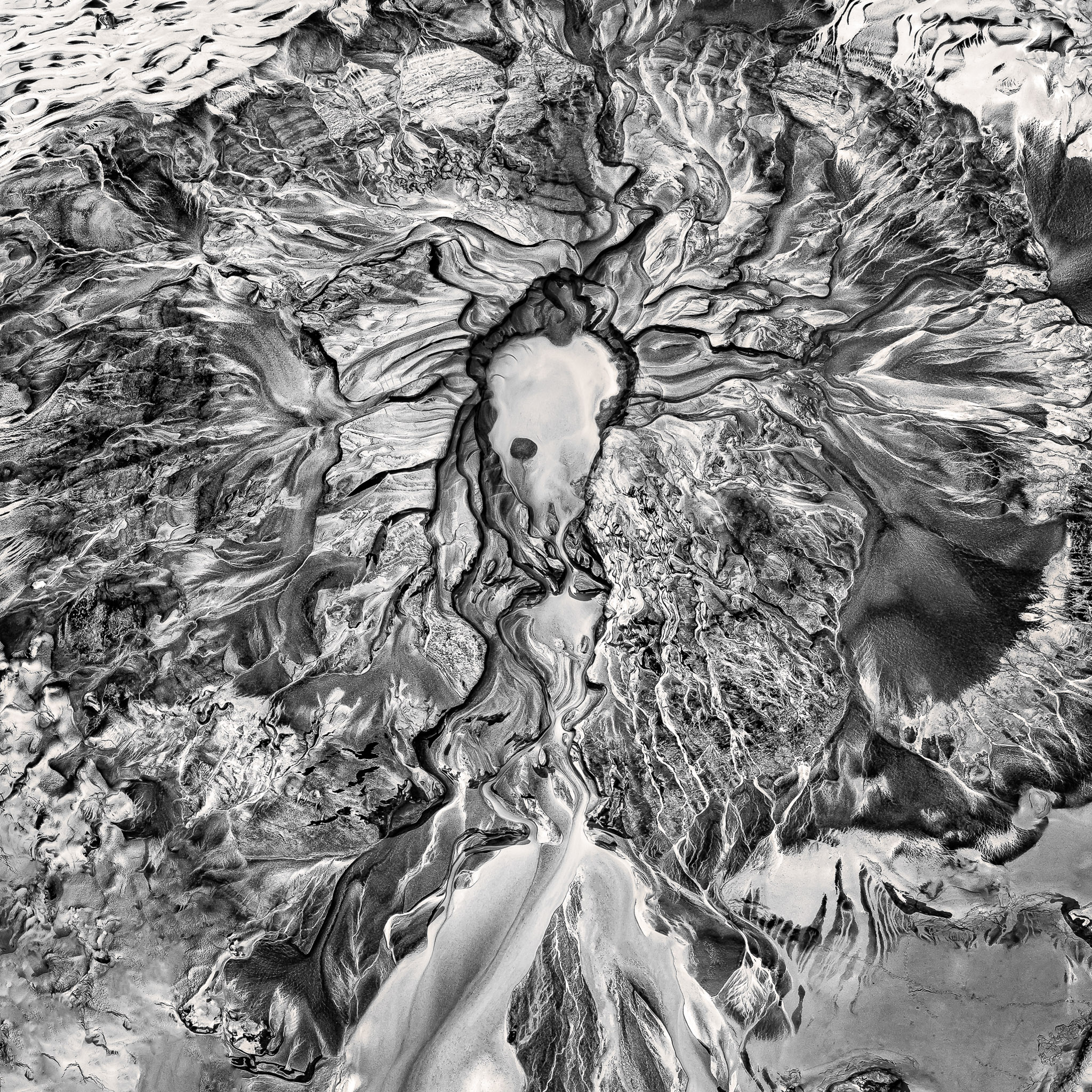
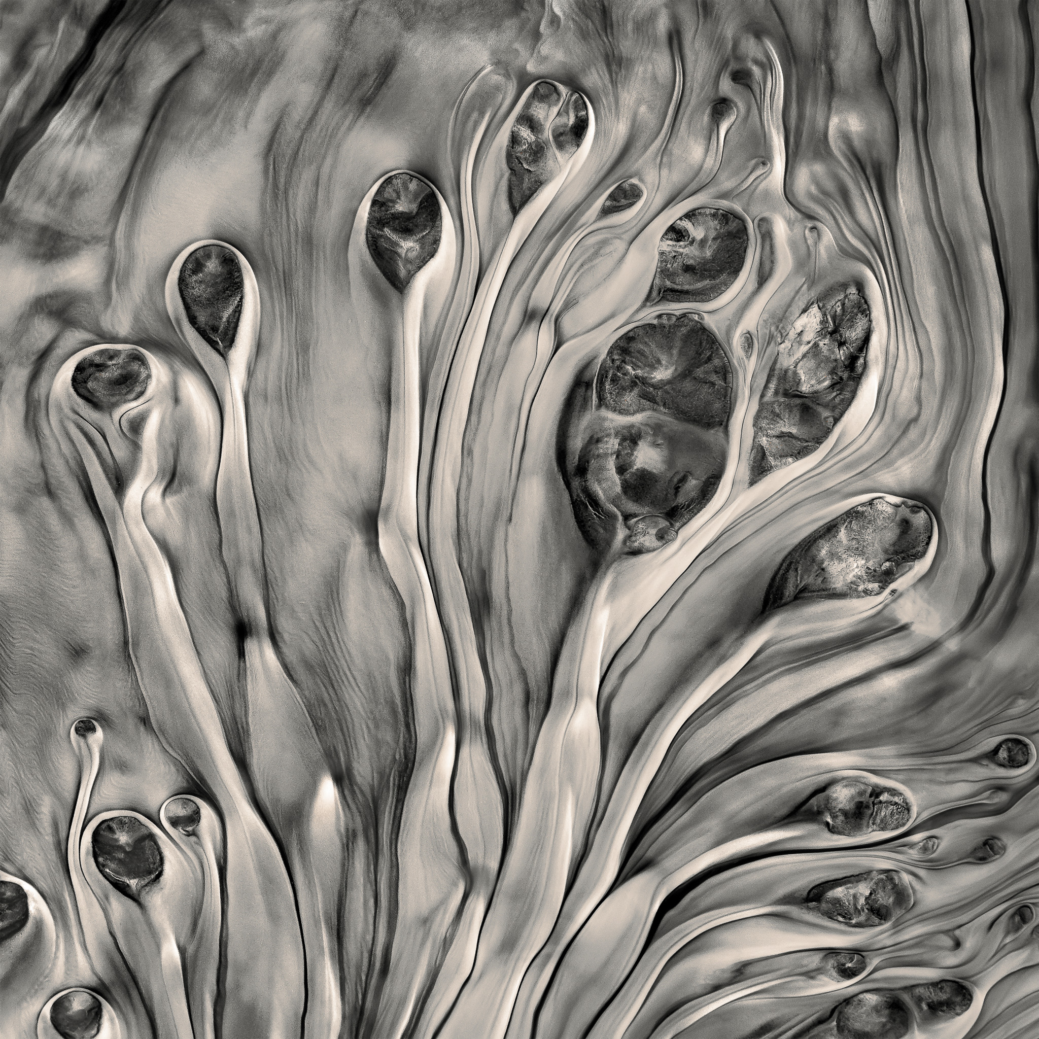
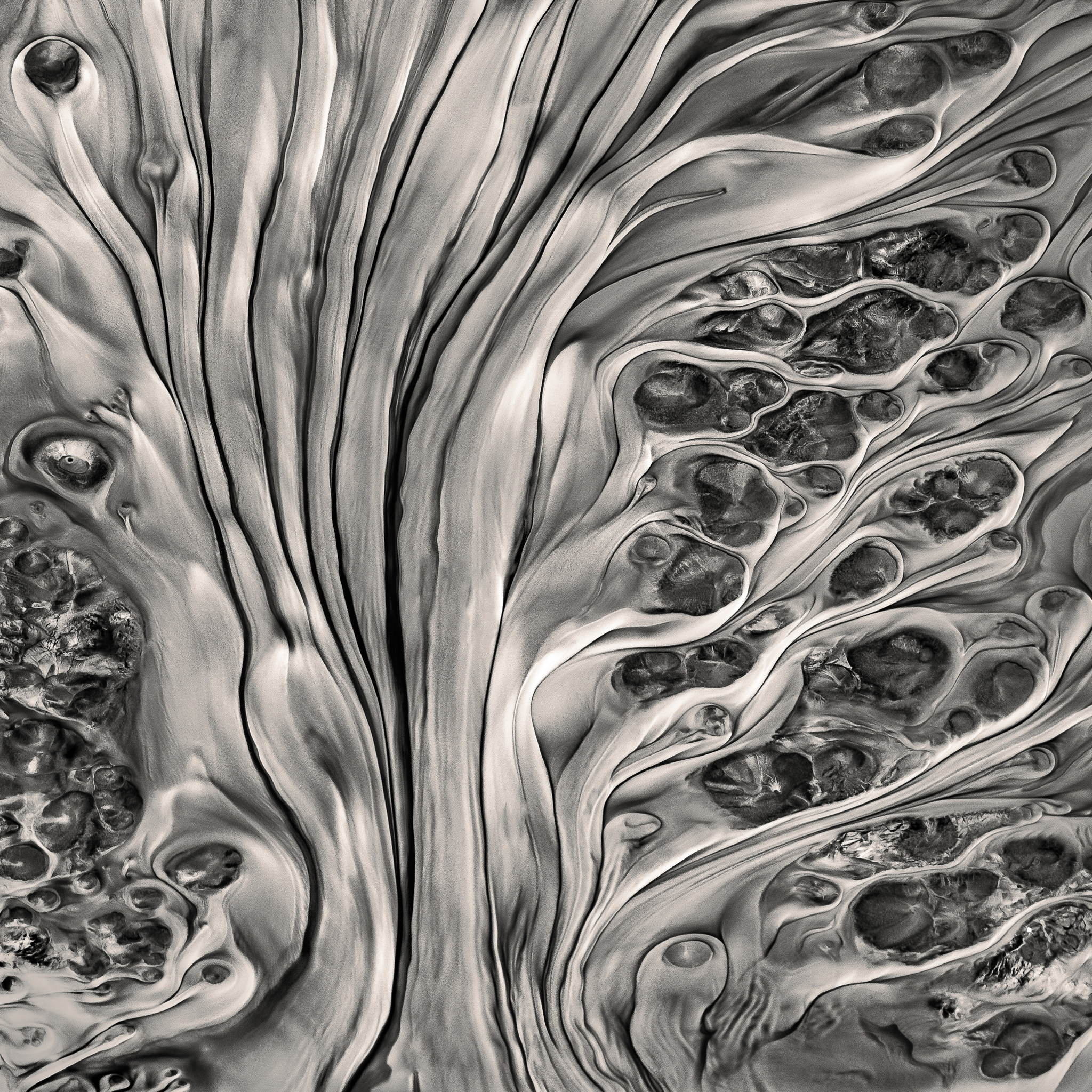
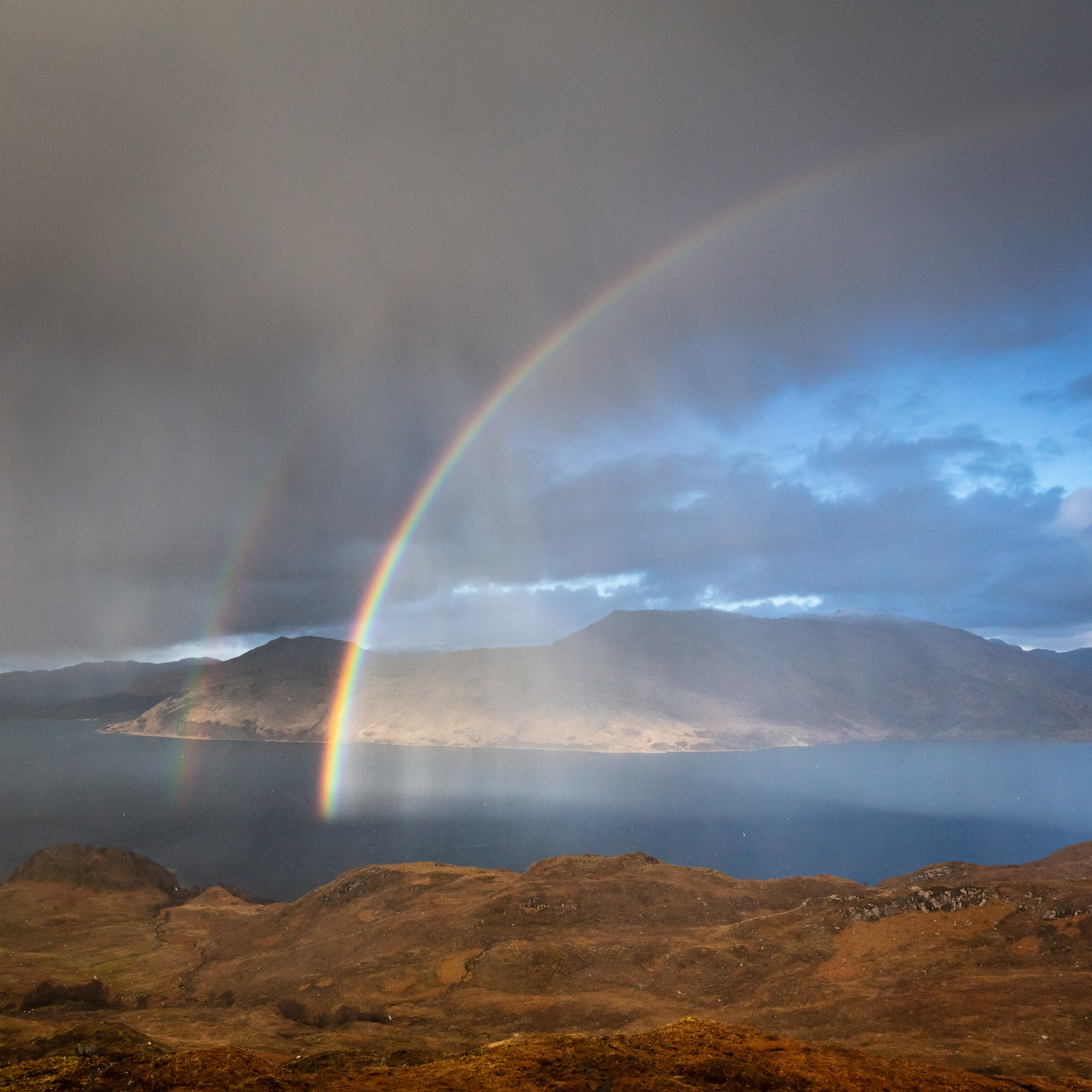
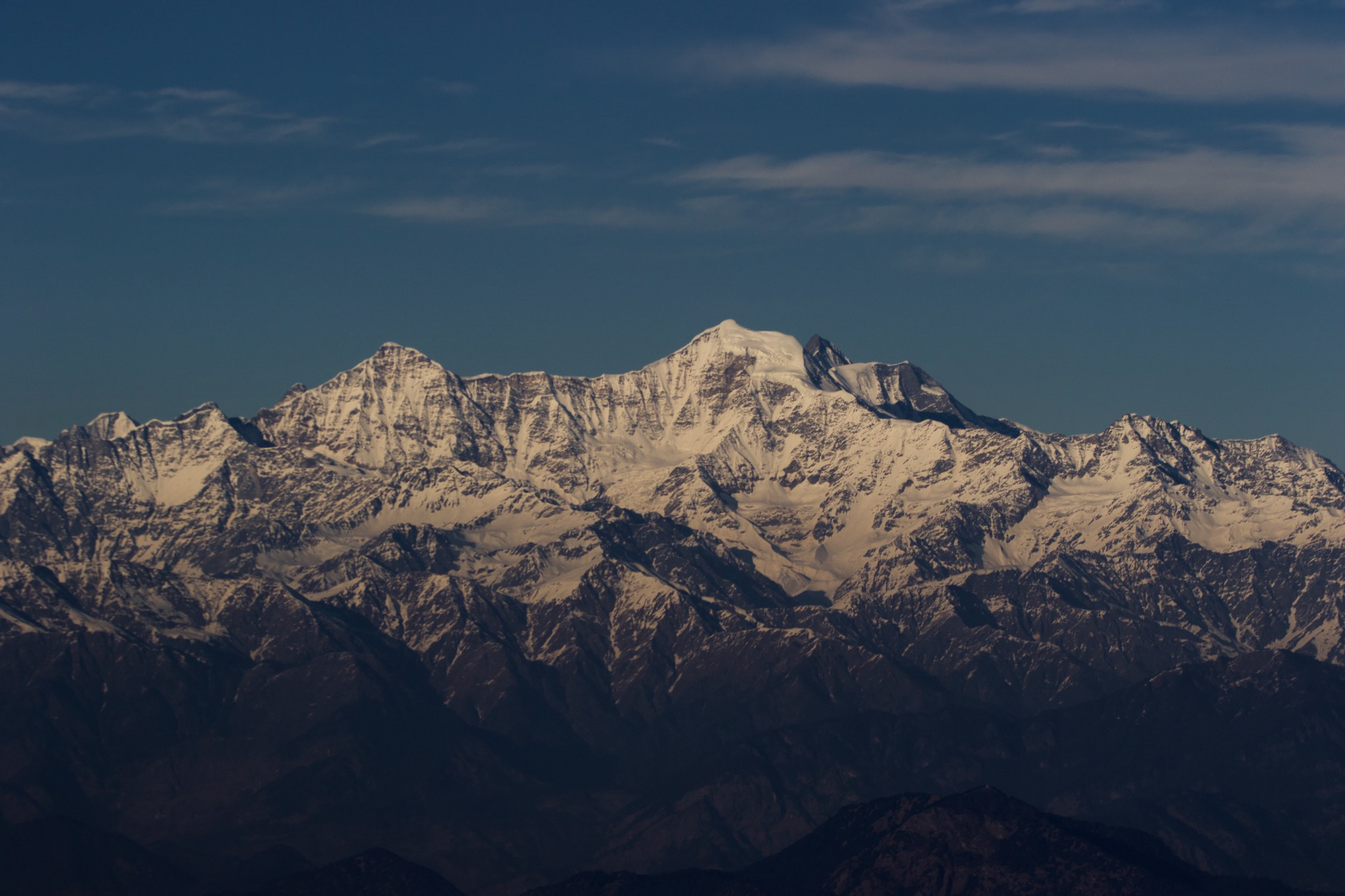
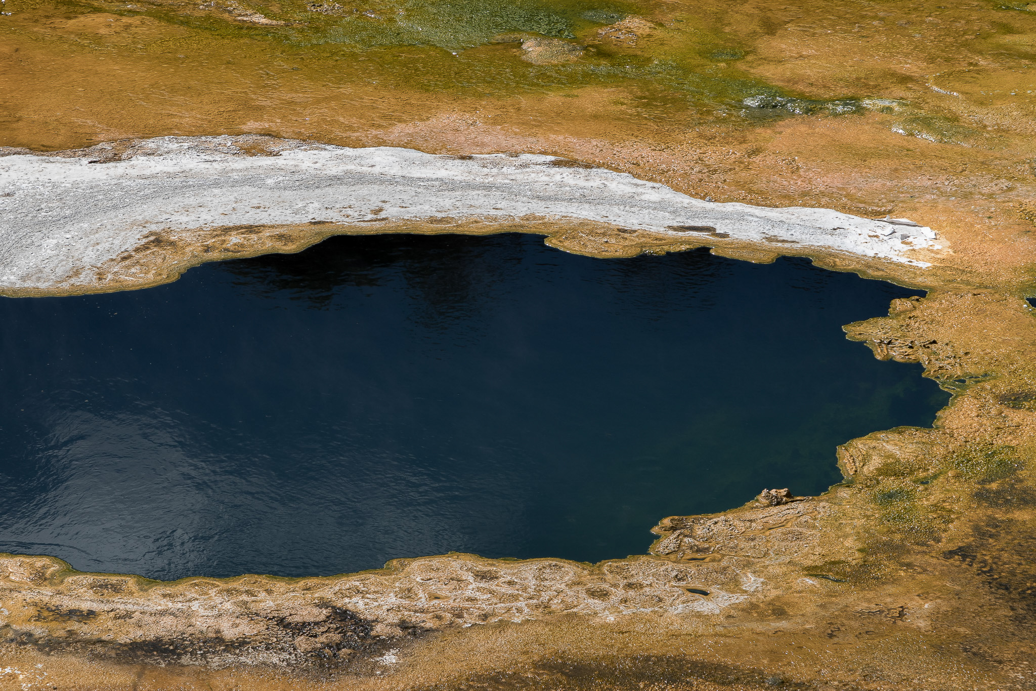
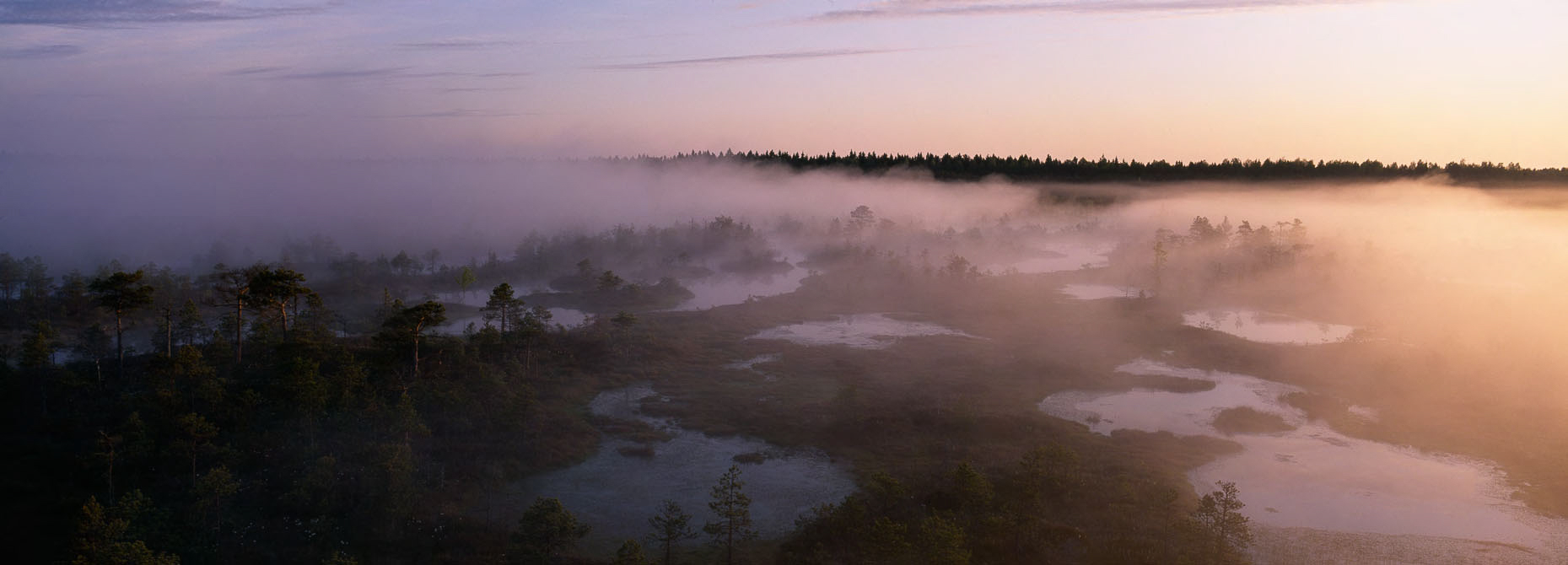
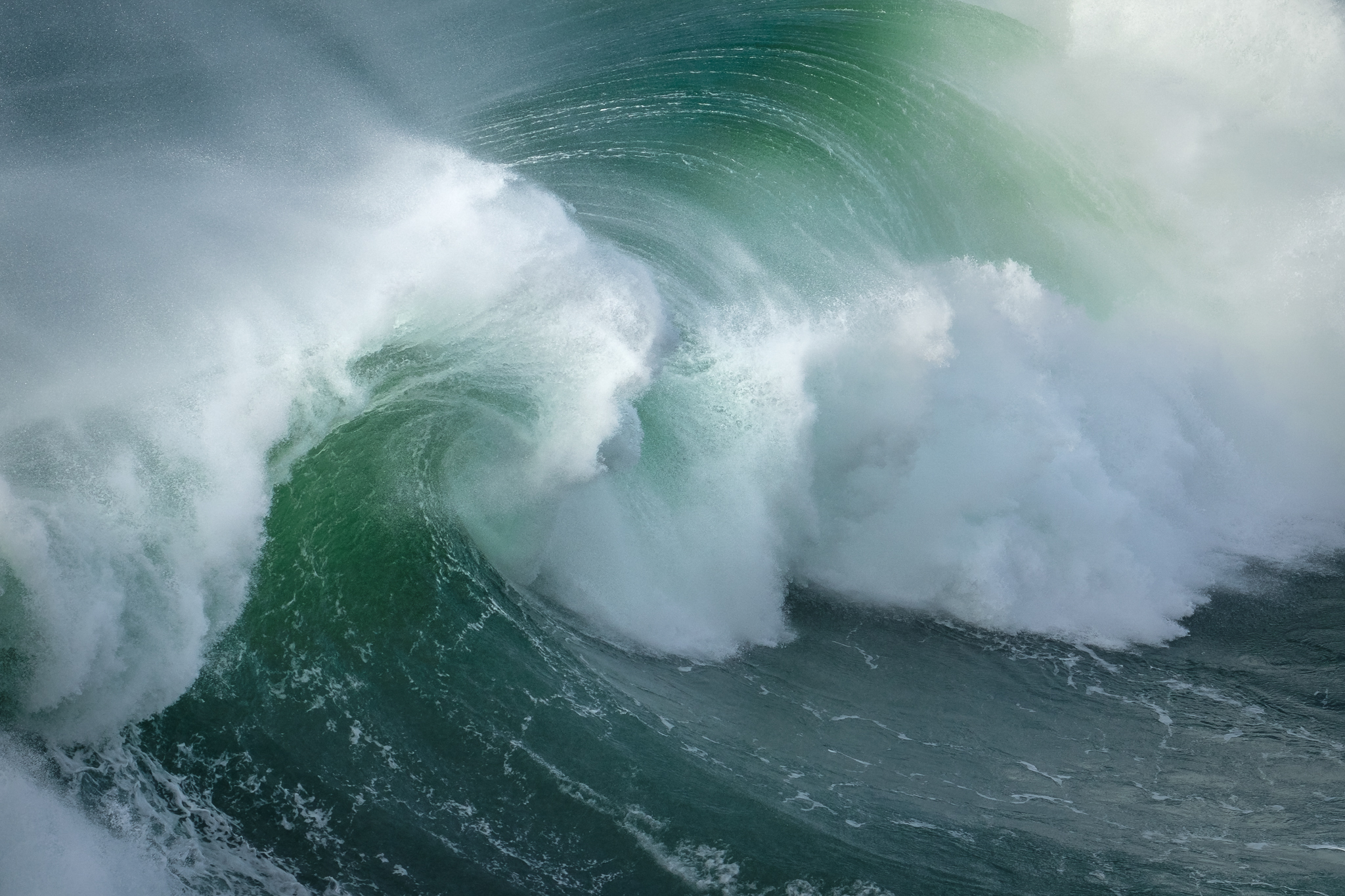
Arizona boasts several picturesque valleys, mountains, and jagged cliffs that are well worth capturing. However, one of the most beautiful vistas I have seen has to be Canyon Lake, just one hour's drive from Phoenix. Although not as well known as some other major landmarks in Arizona, Canyon Lake undoubtedly one of the most beautiful sites in the area.
Besides the clear water and the beams of sunlight that beam through the cracks in the jagged cliffs, there's no shortage of remarkable wildlife on display. From eagles swooping down into the water to grab fish to Big Horn sheep scaling the steep, near-vertical cliffs, my trip to Canyon Lake was filled with plenty of interesting photo opportunities.
Taking an evening barge tour of the lake, I ended up focusing on the Canyon's jagged peaks in the hours leading up to the sunset. As the sunlight beamed on top of the peaks, many of my photos ended up taking on a painting-like quality to them as the light bounced off the red and yellow cliffs.
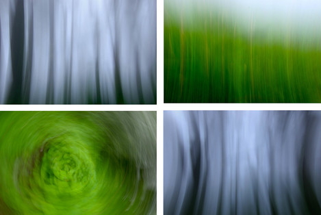
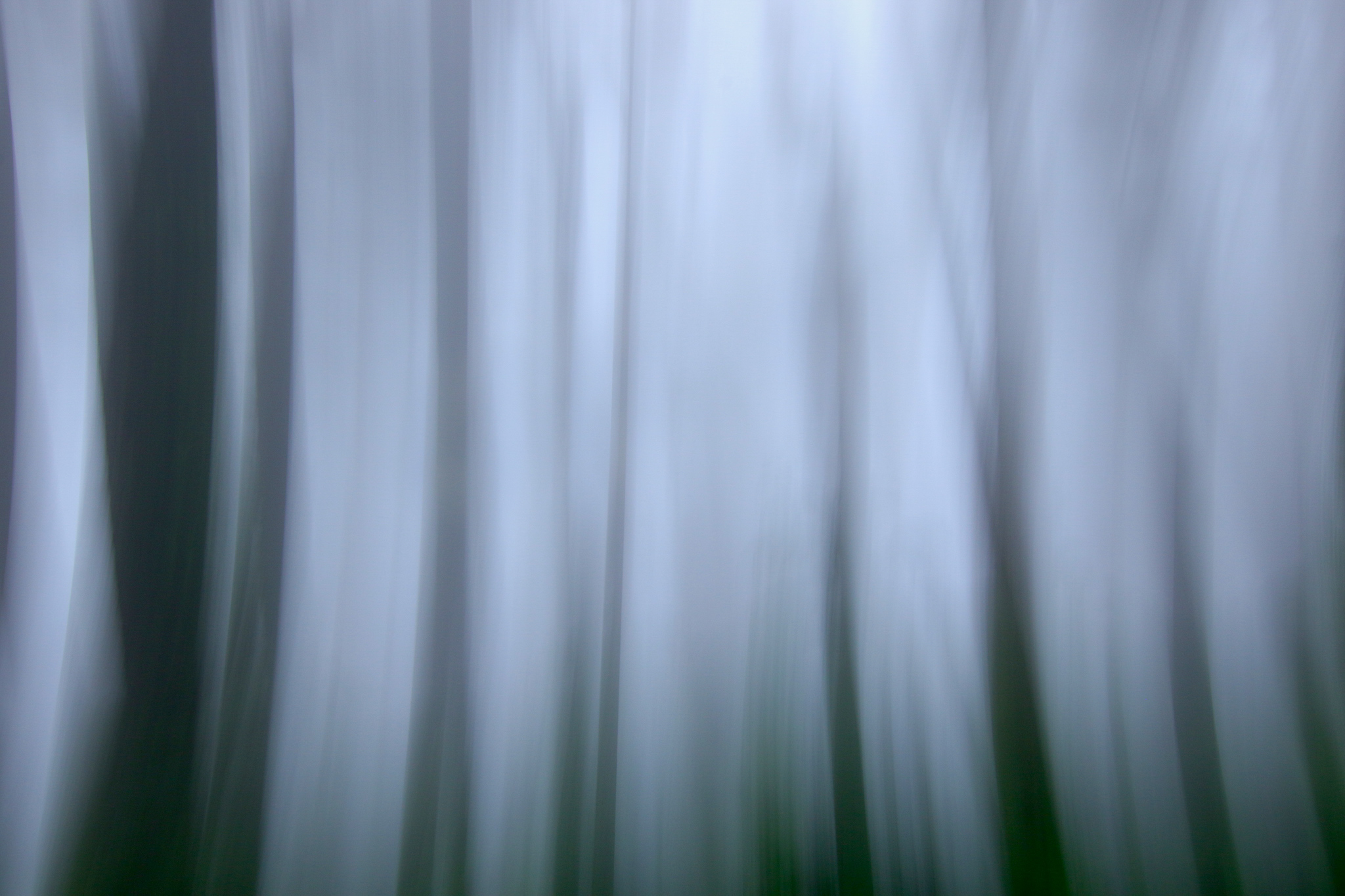
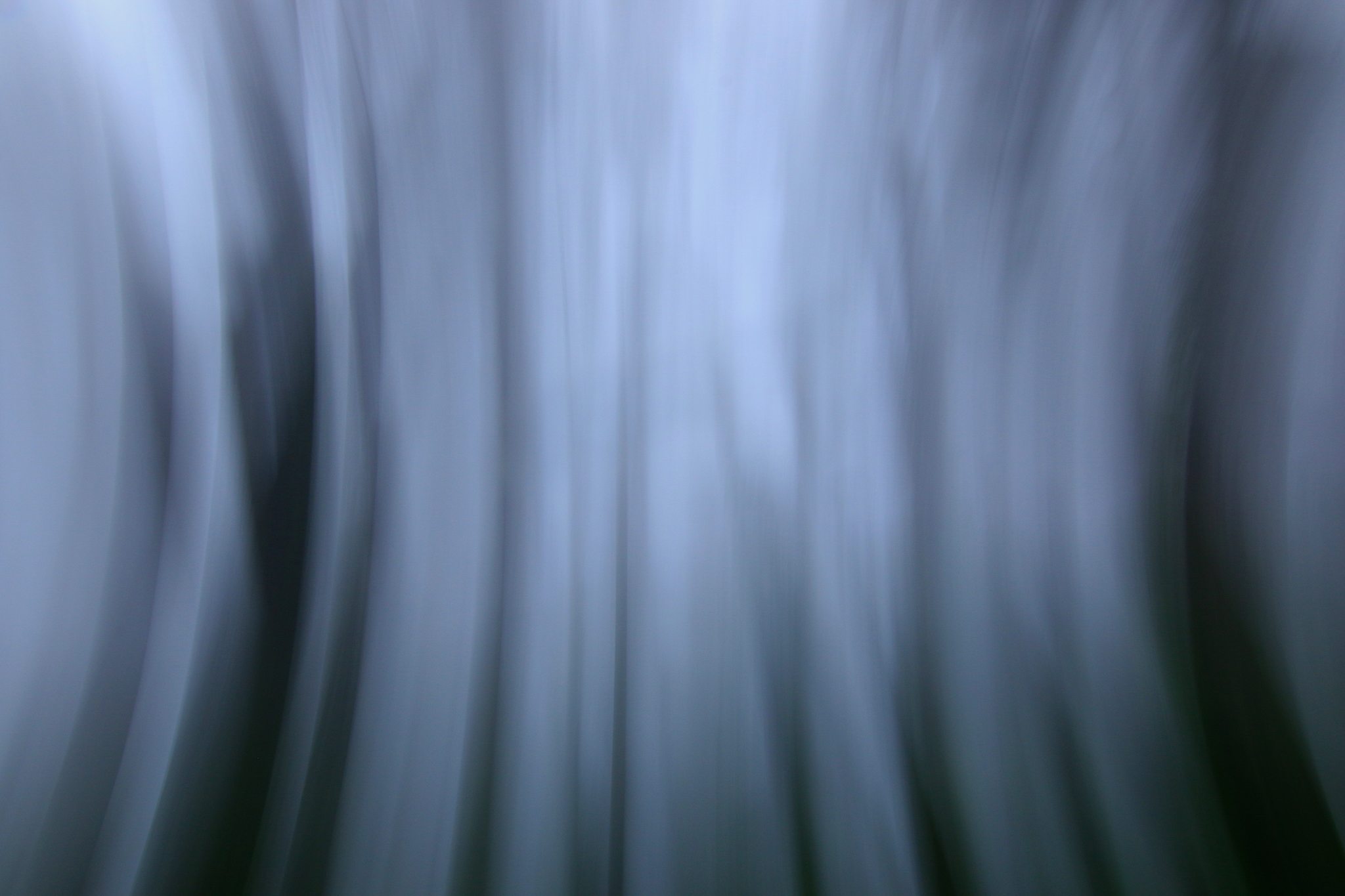
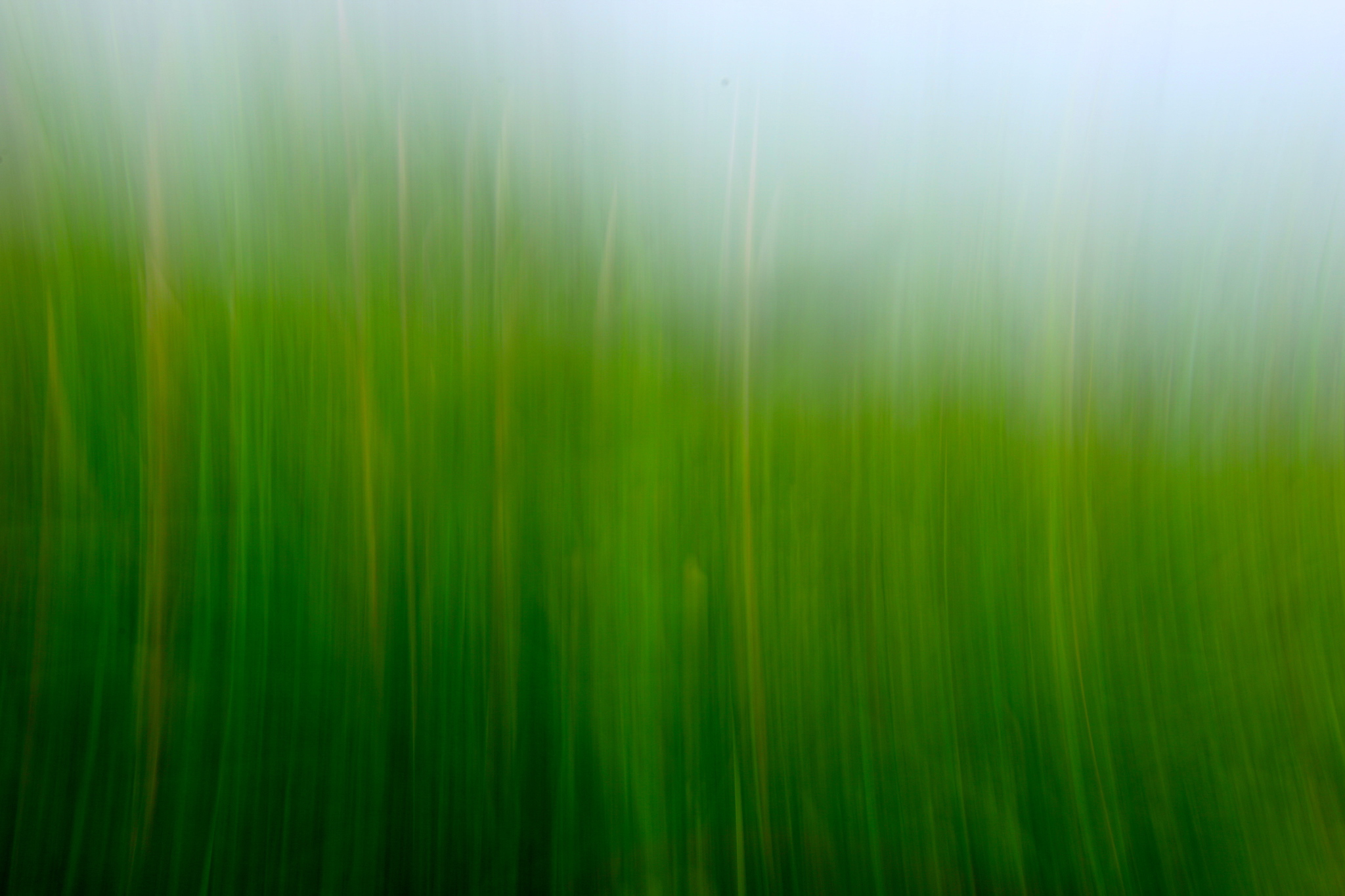
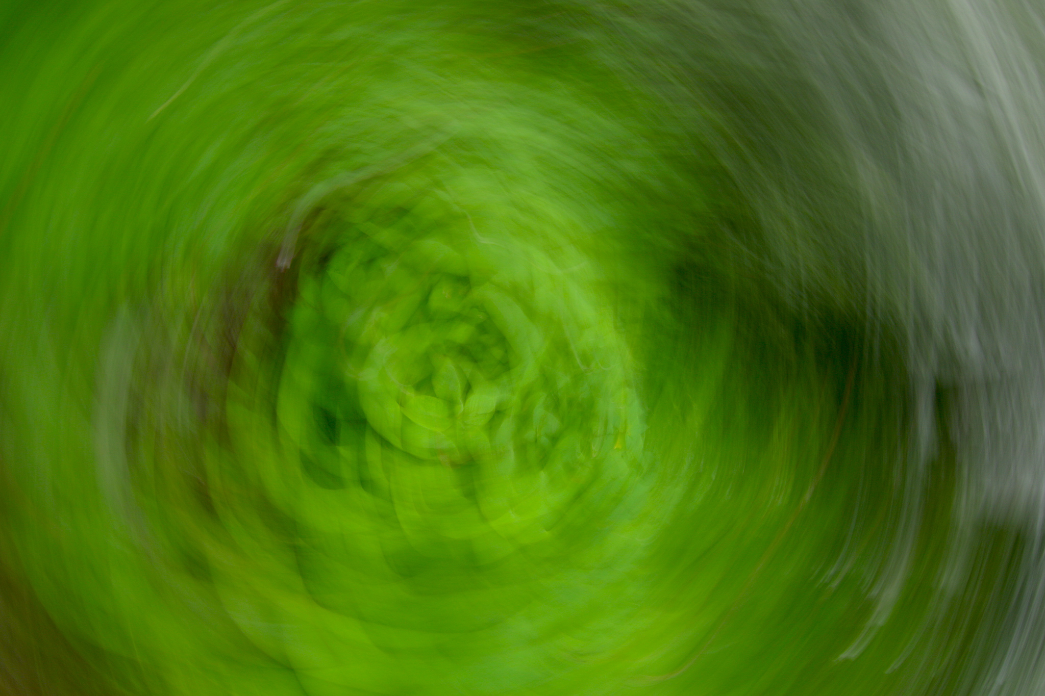
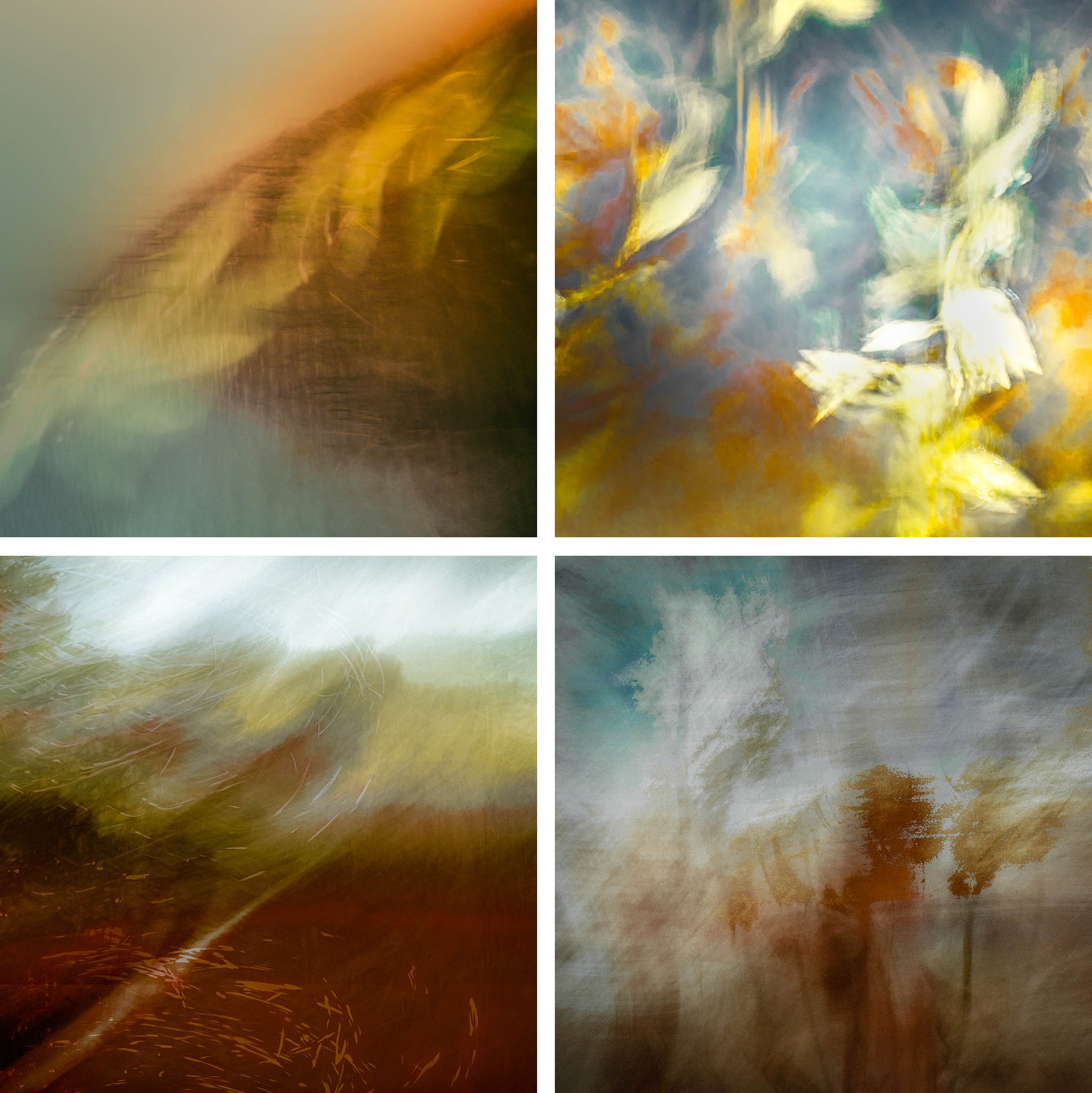
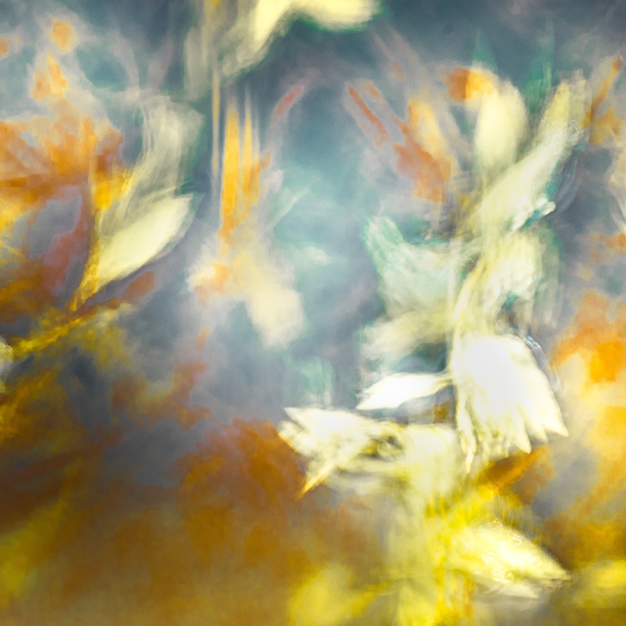
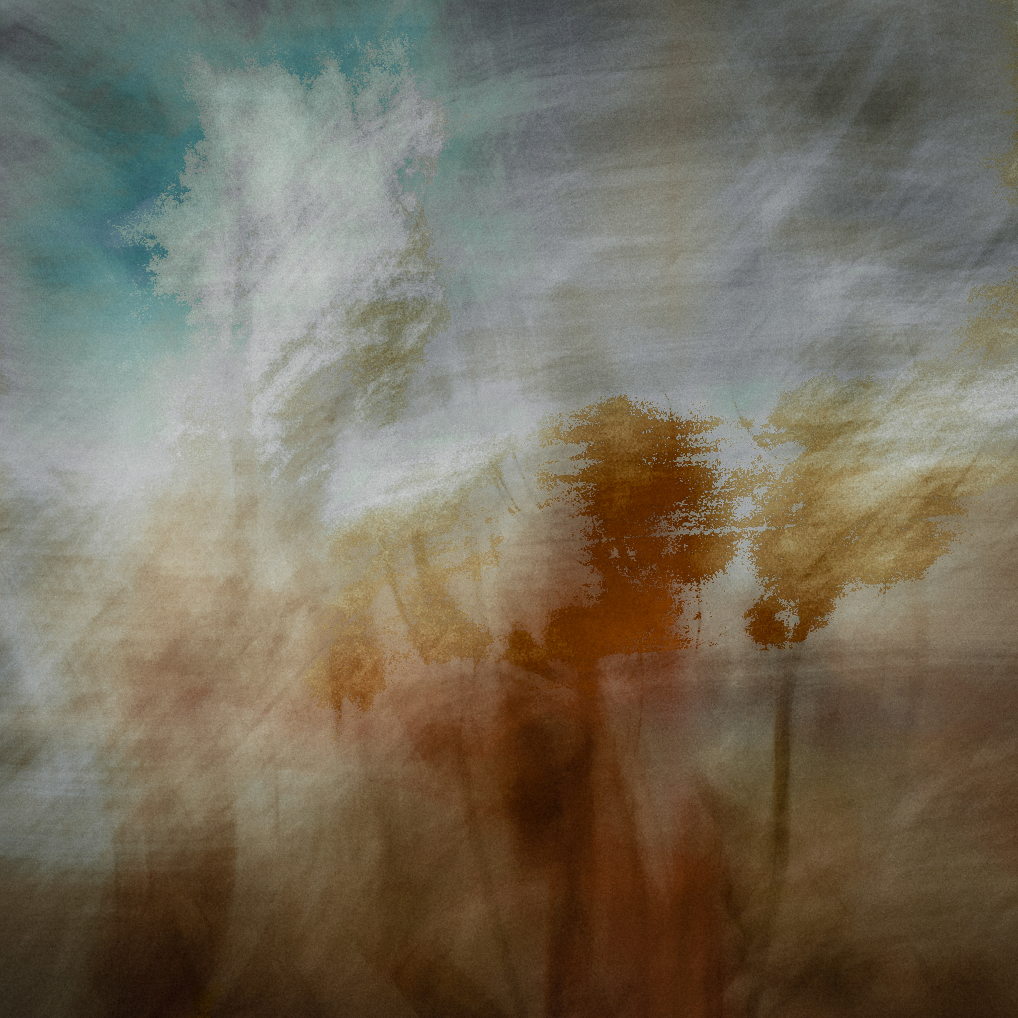
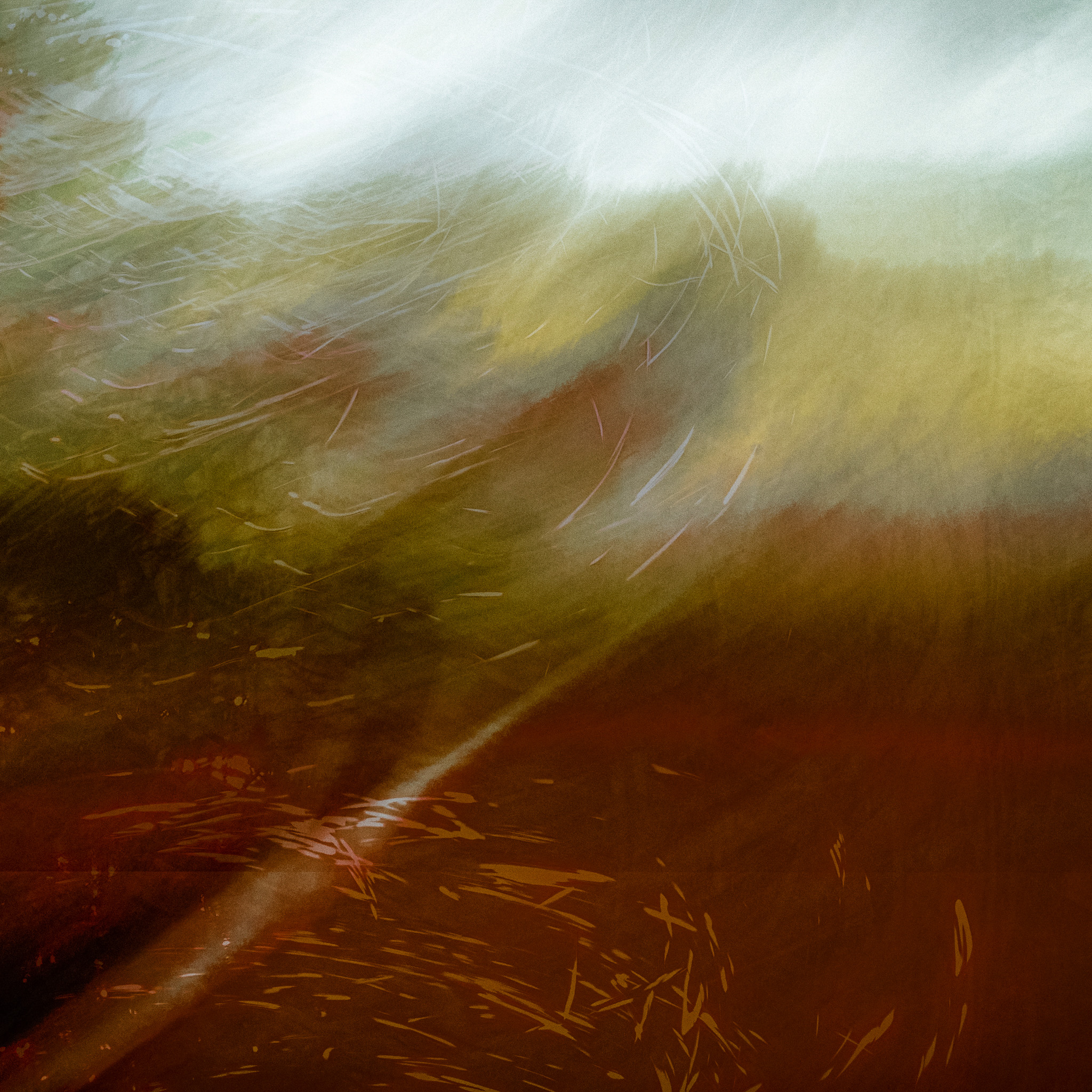
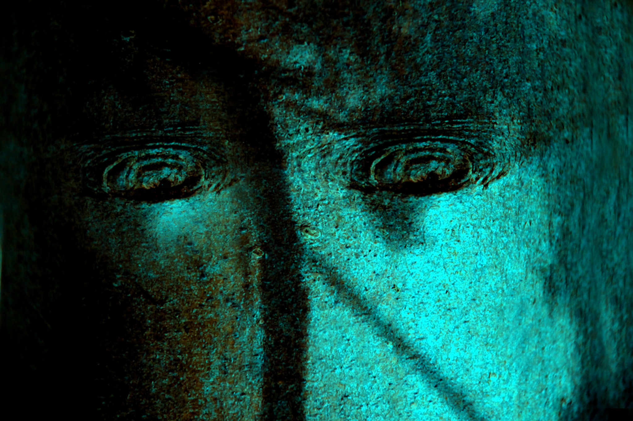
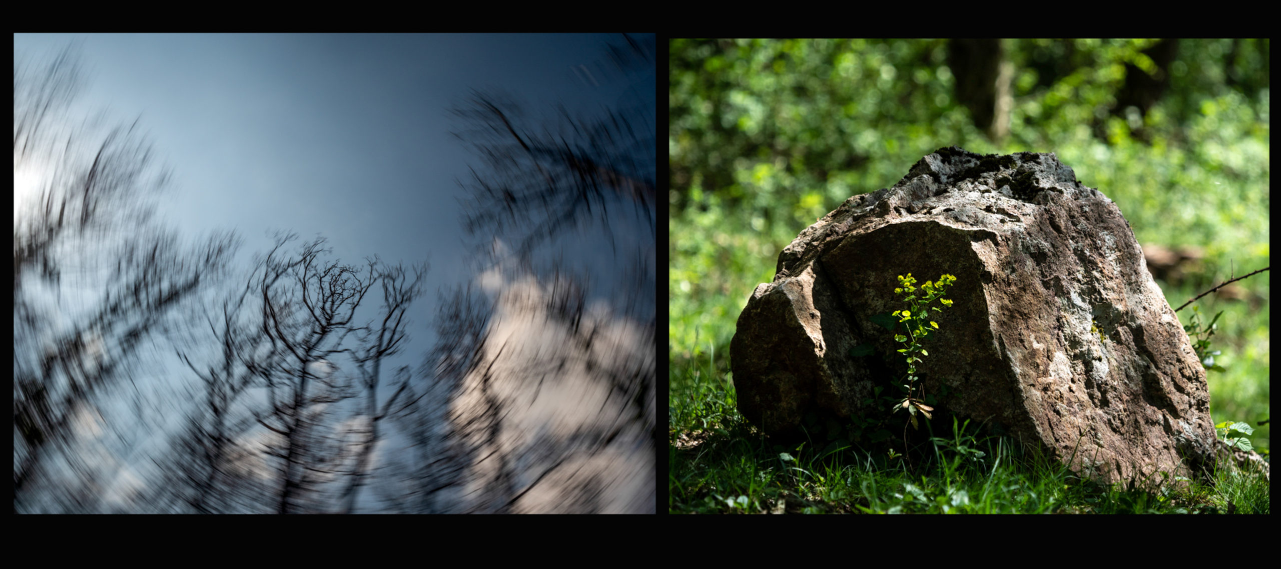
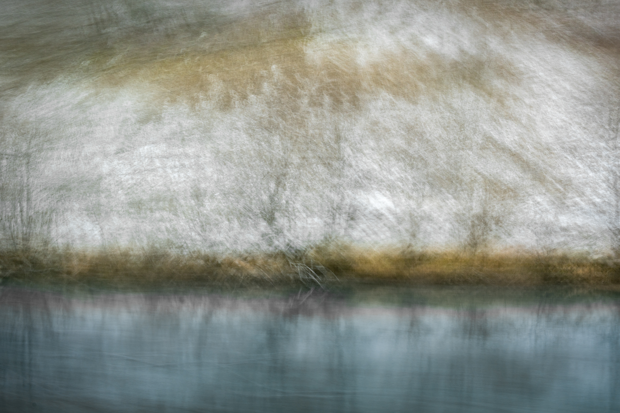
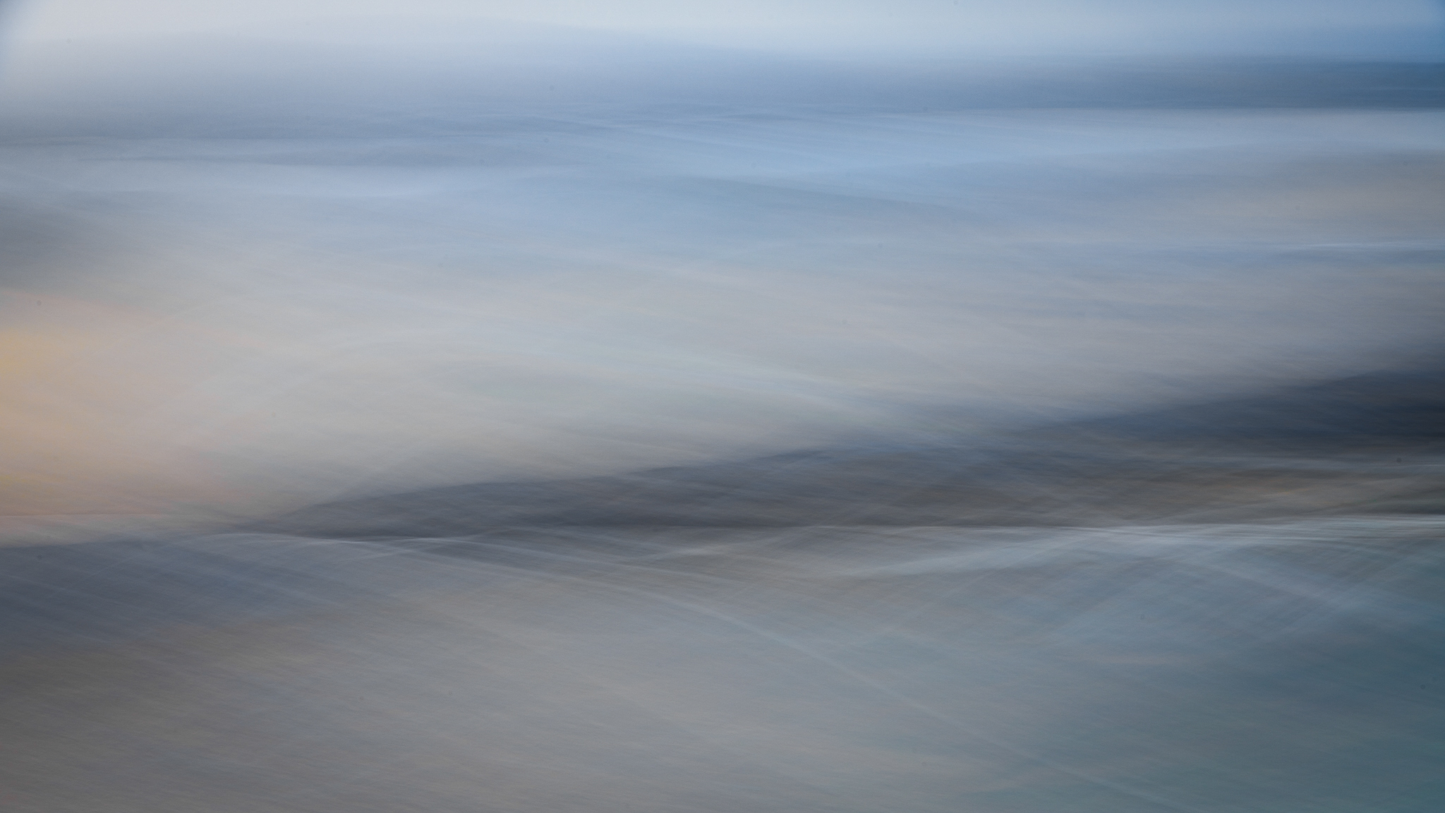
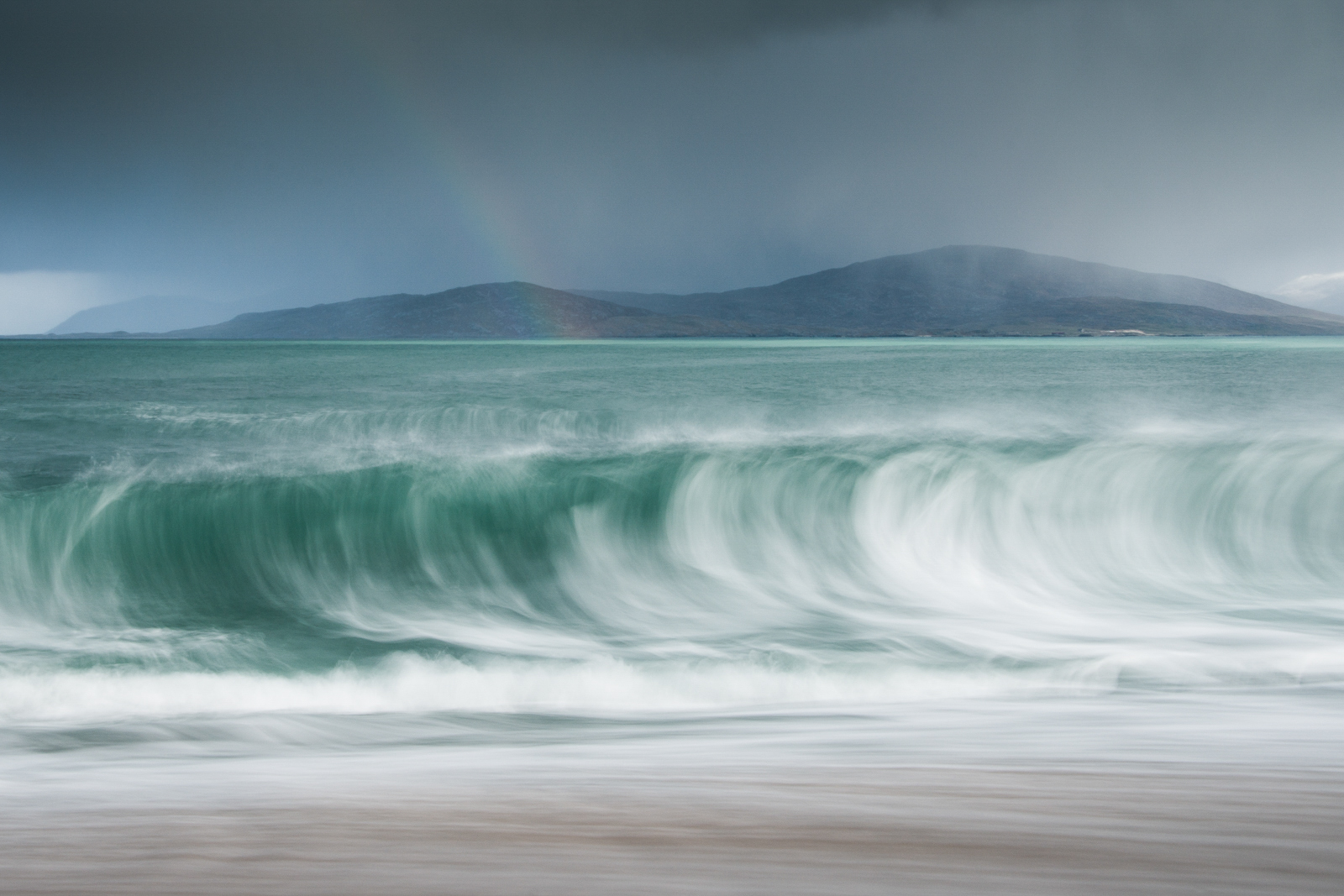
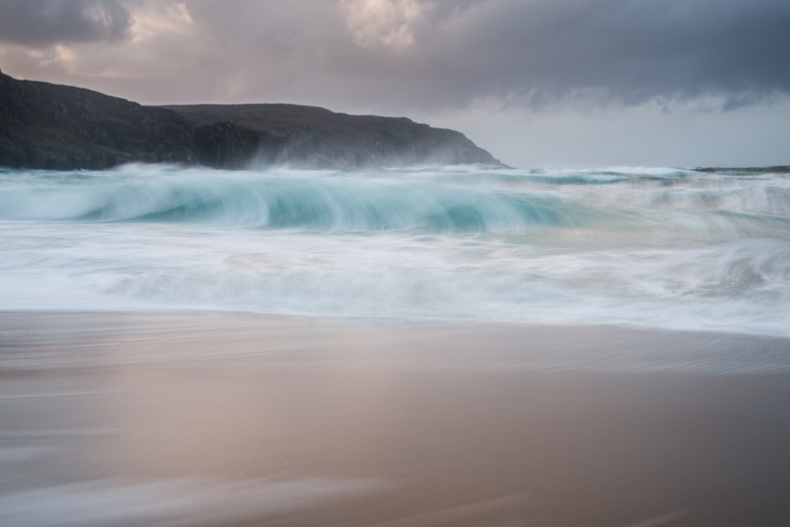
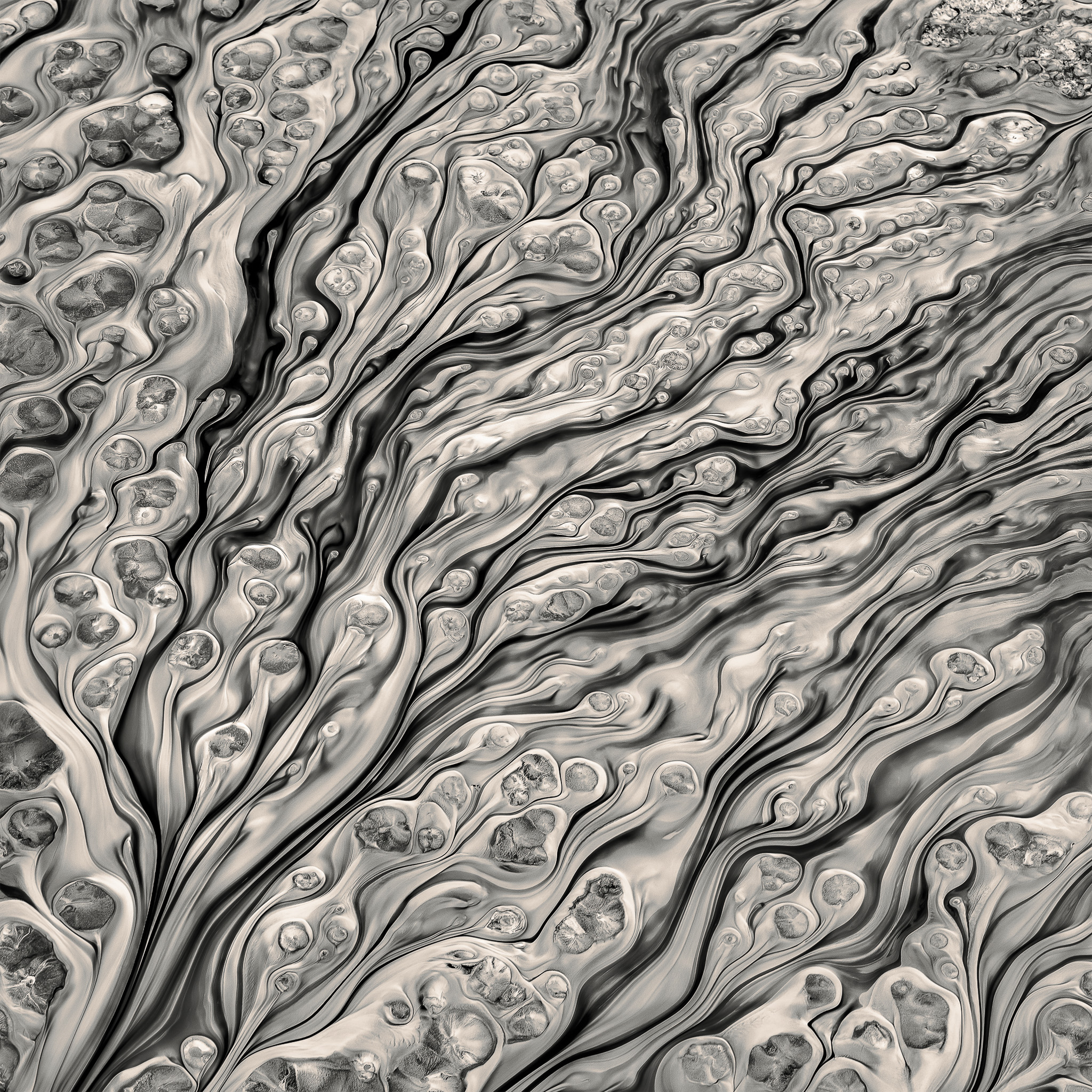
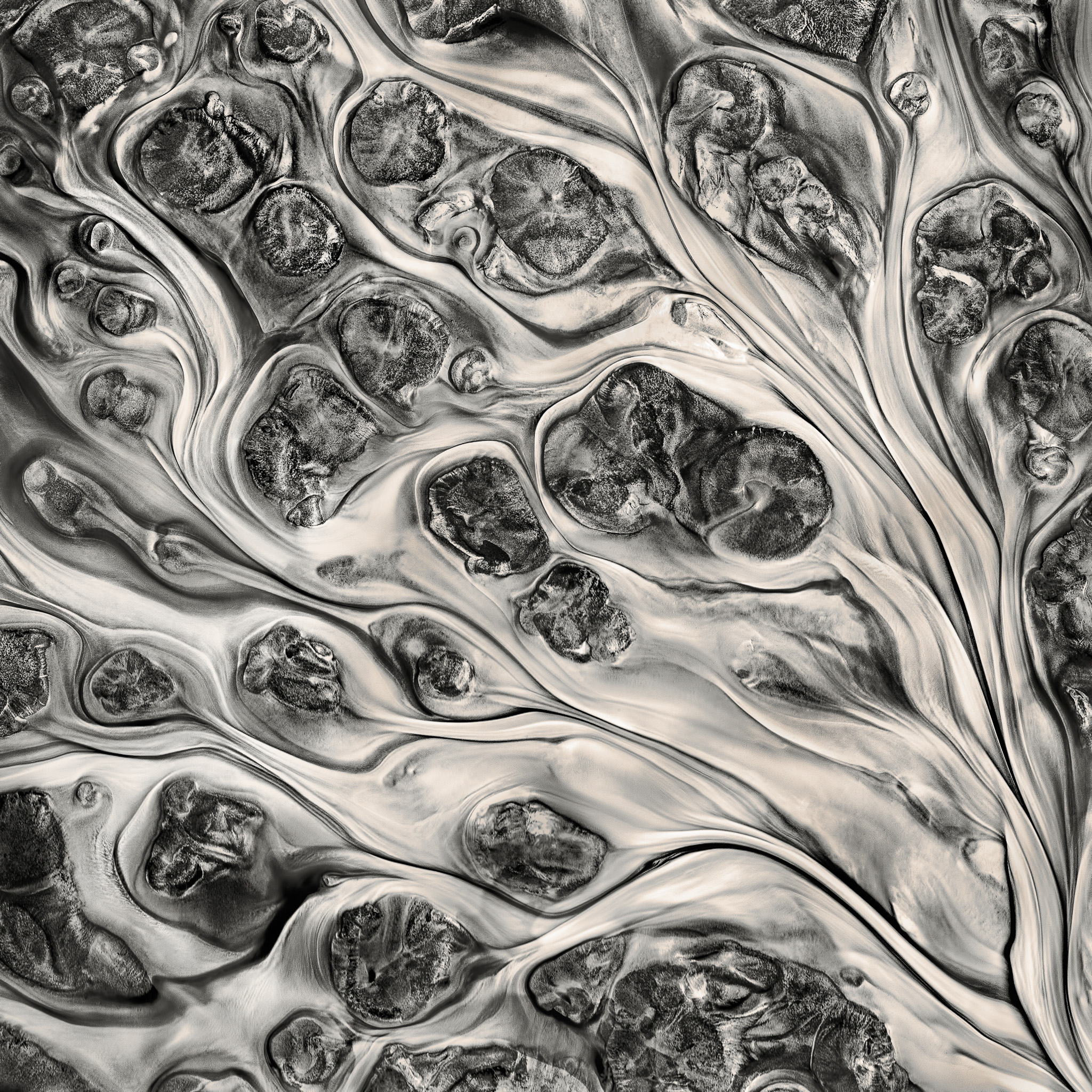
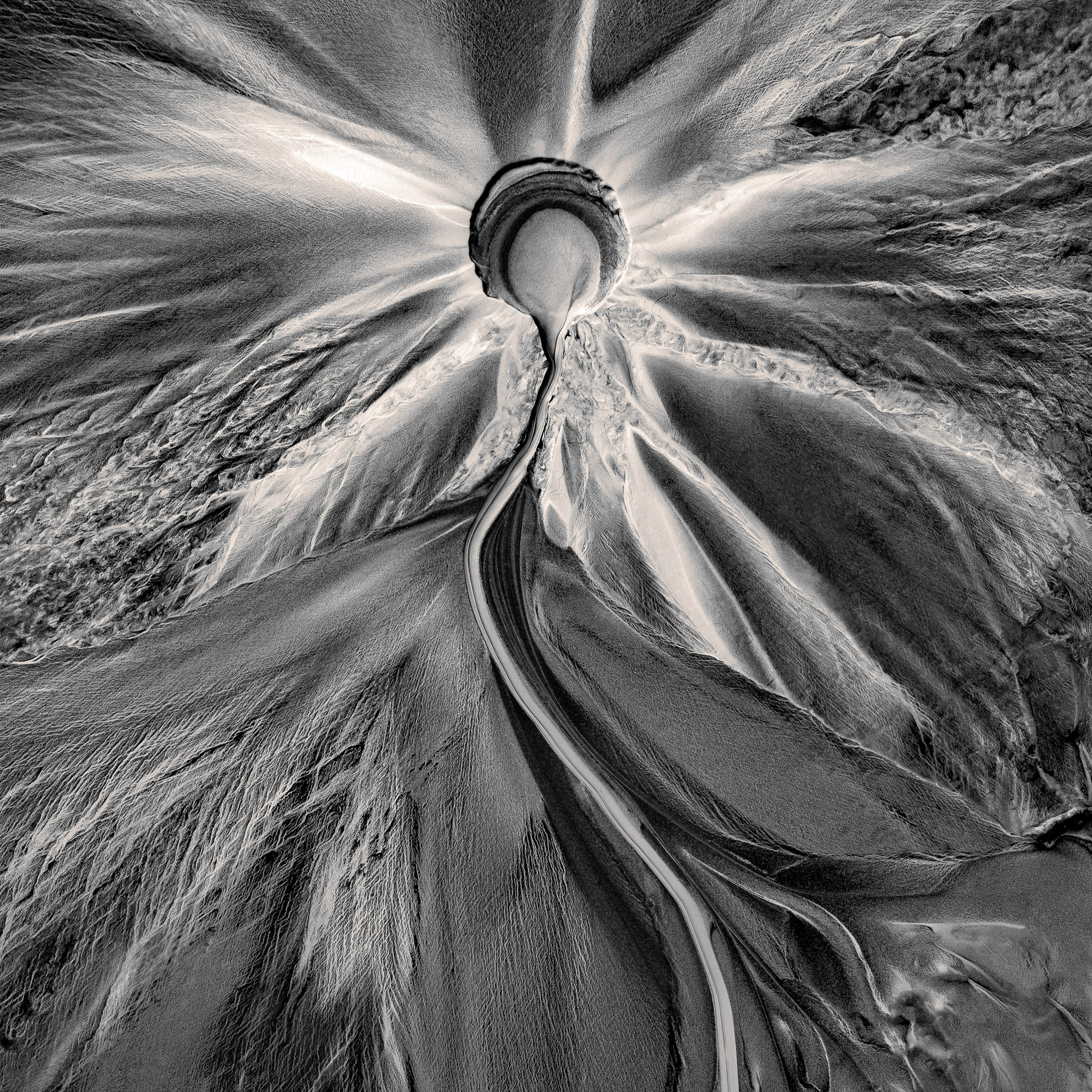
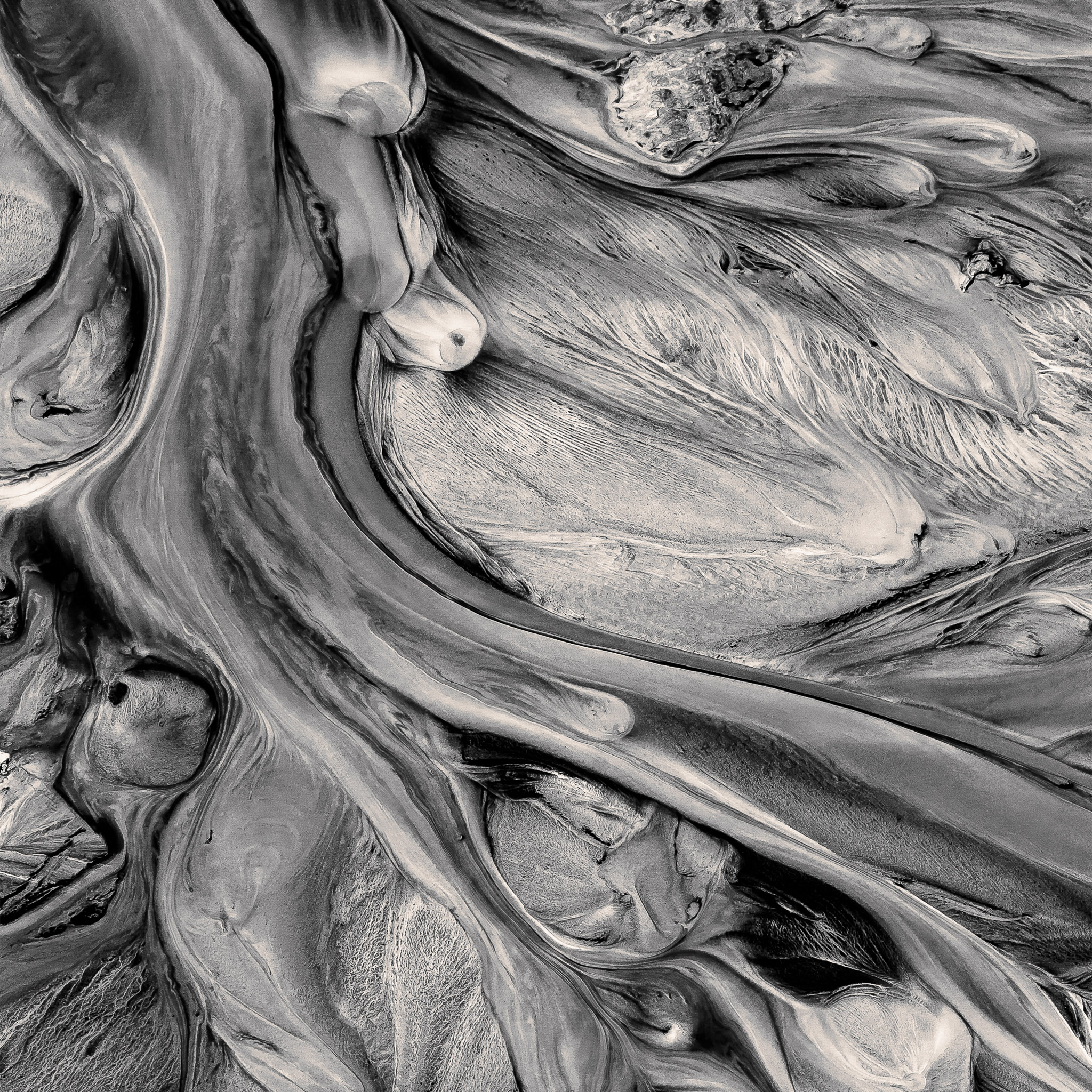
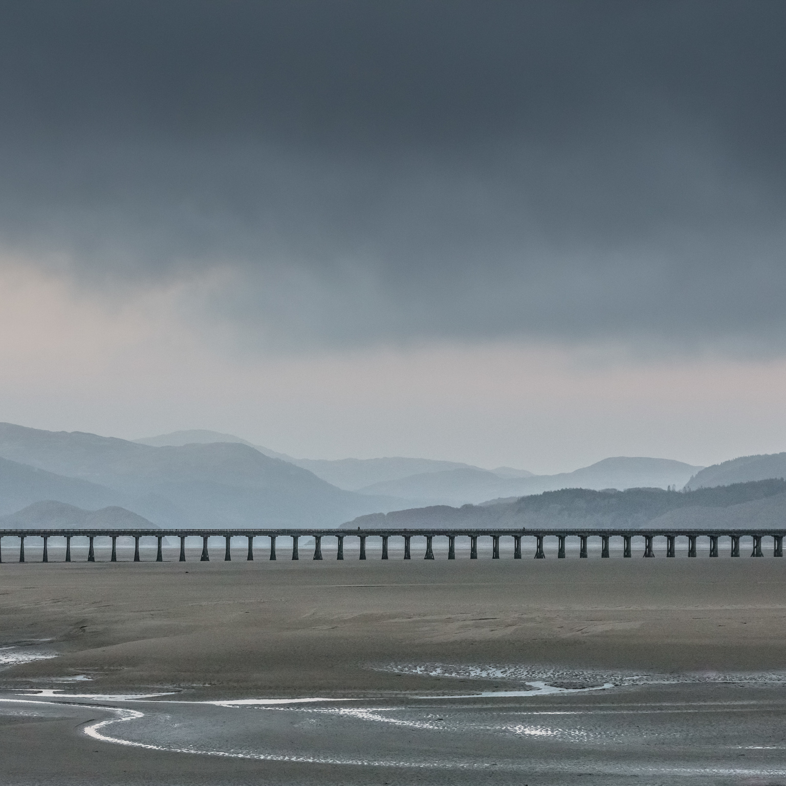
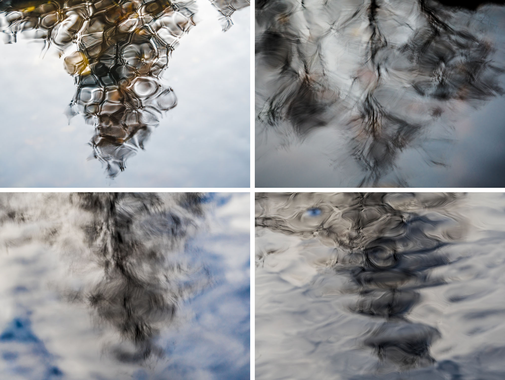
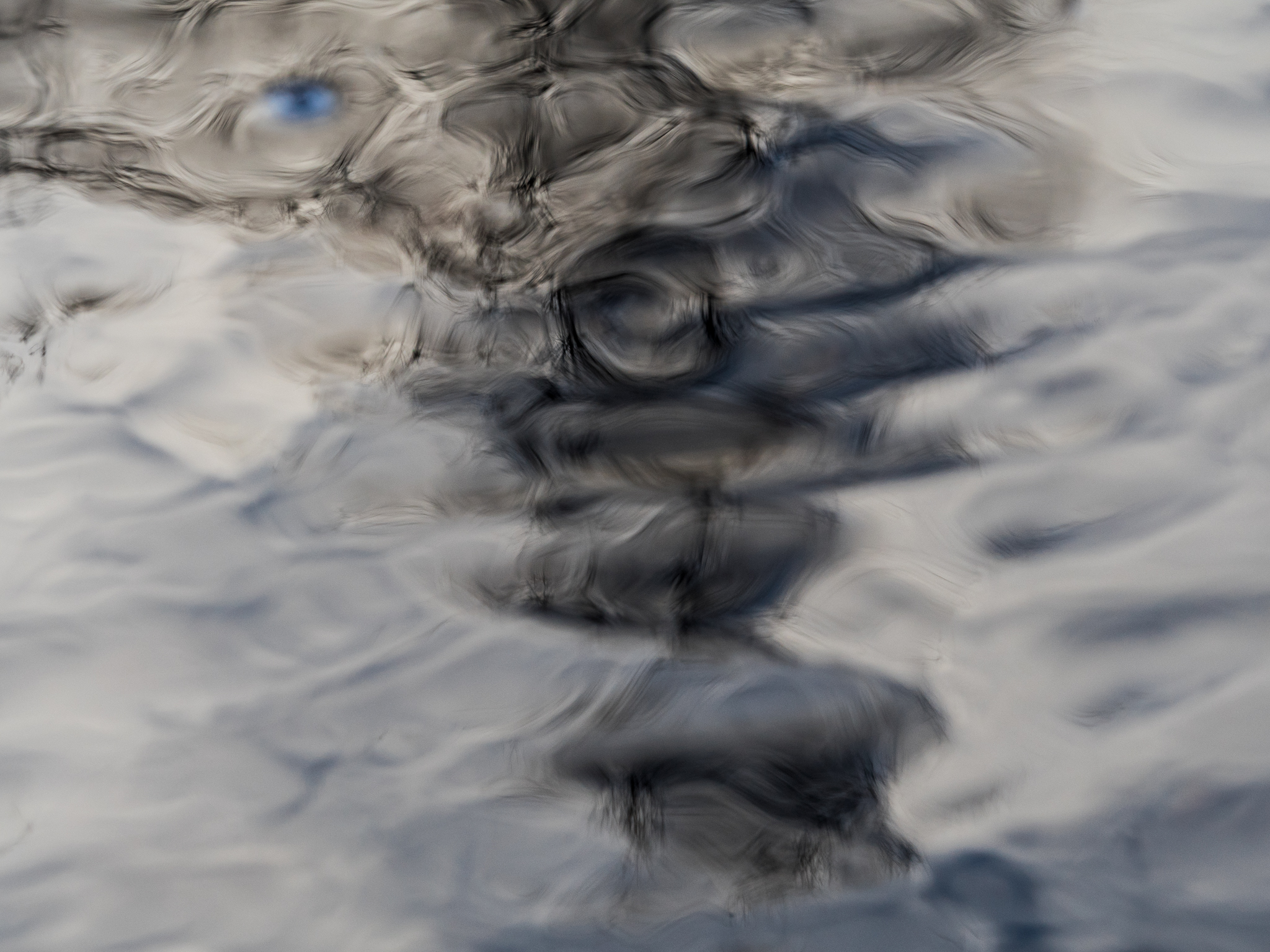
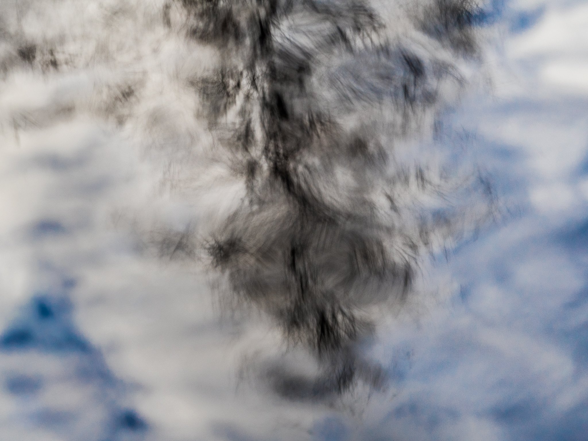
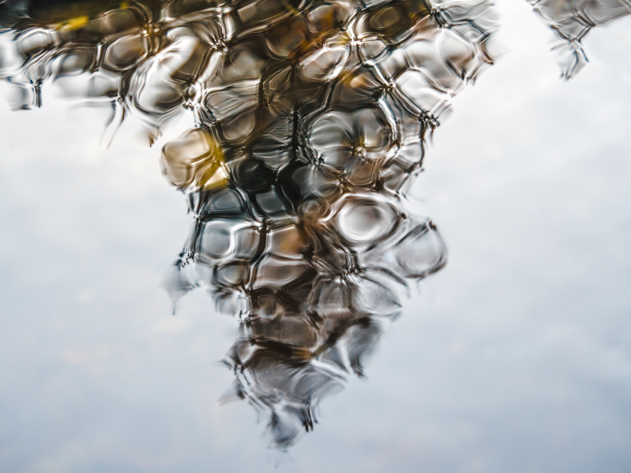
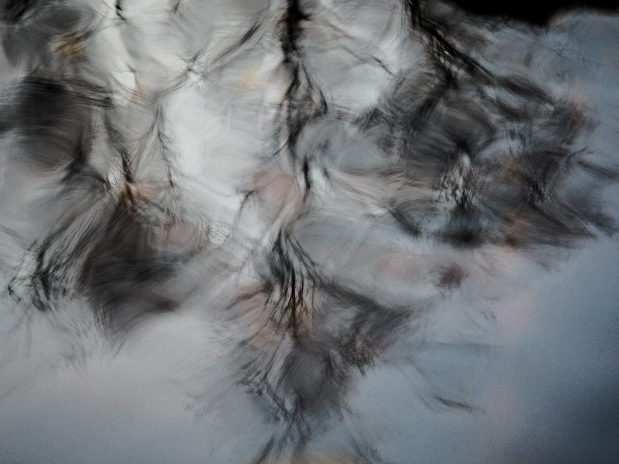
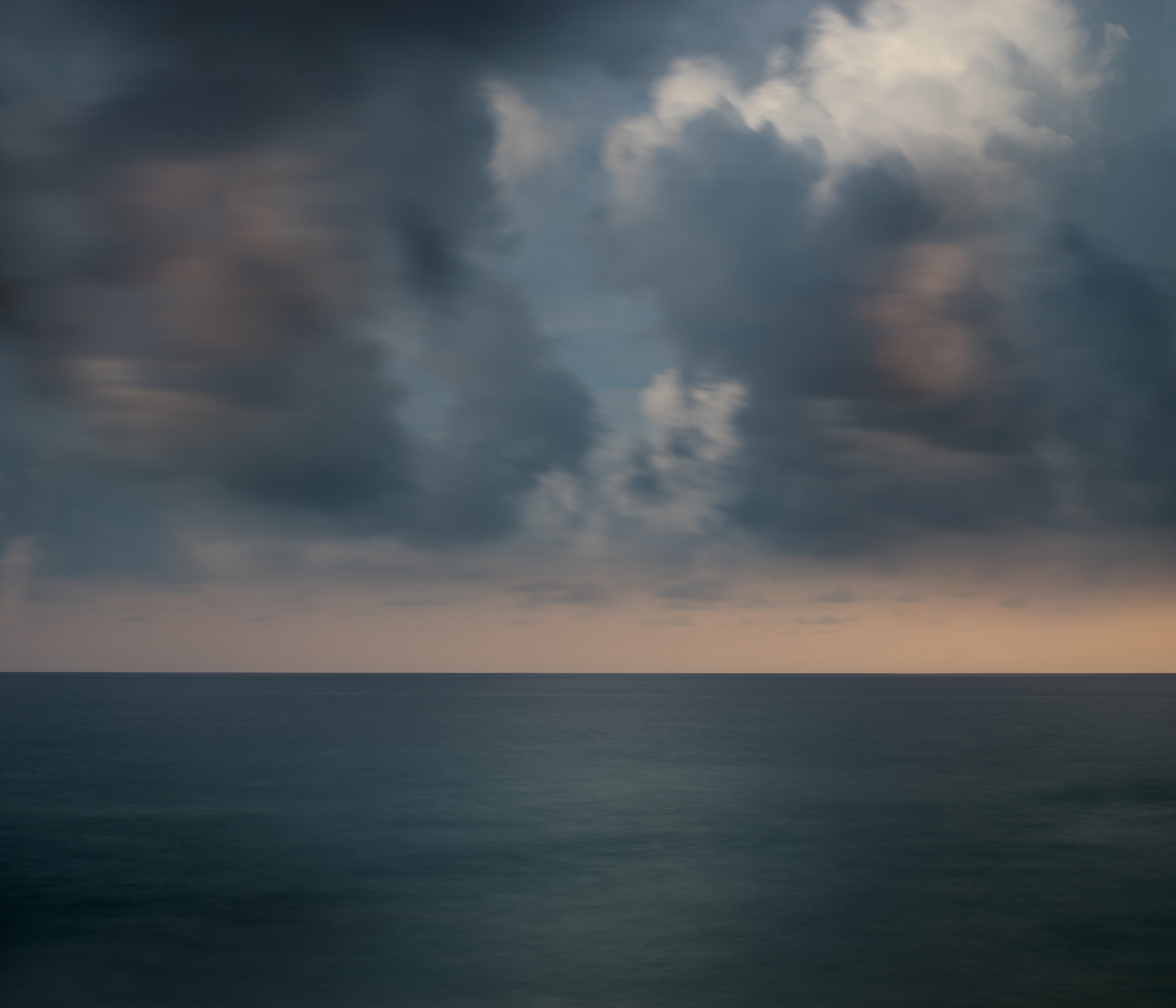
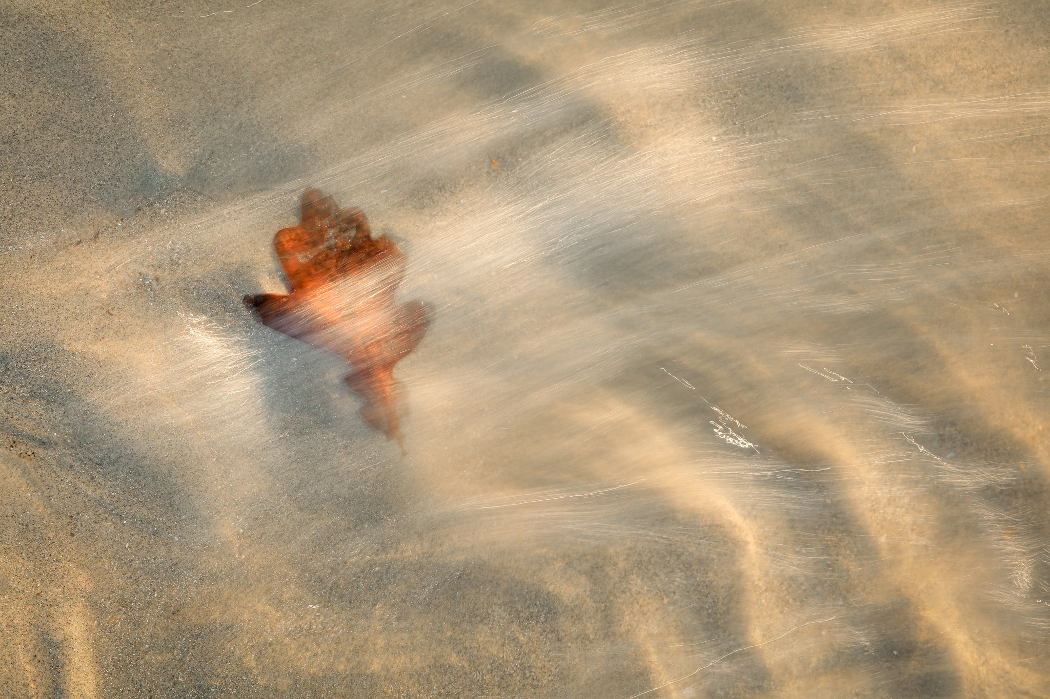
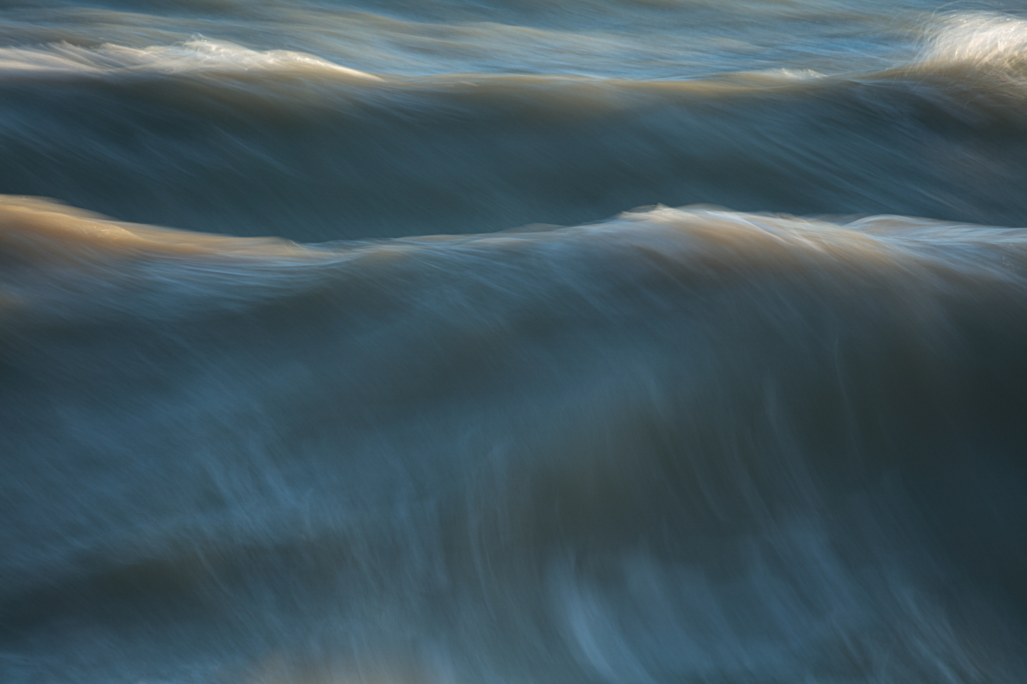
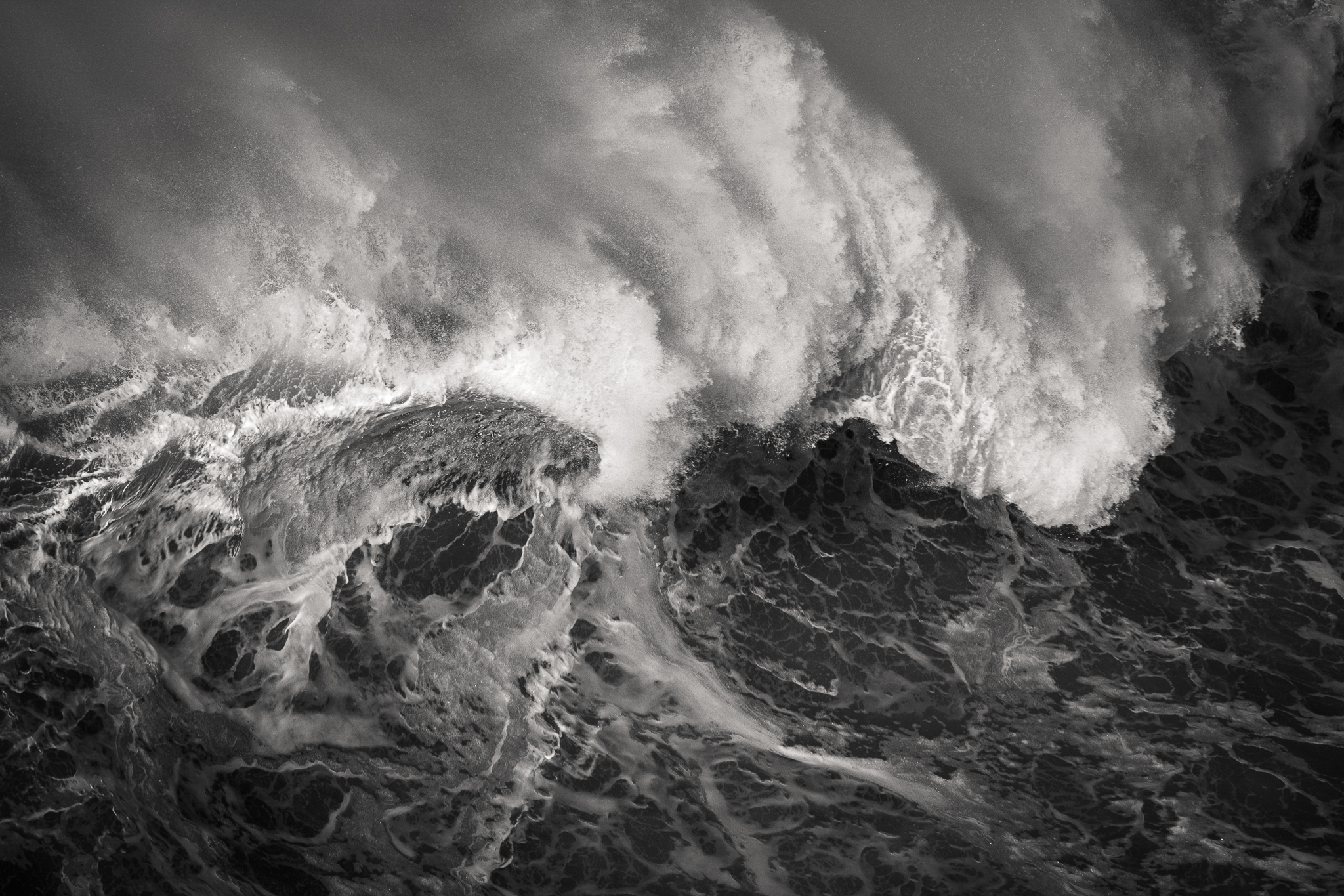
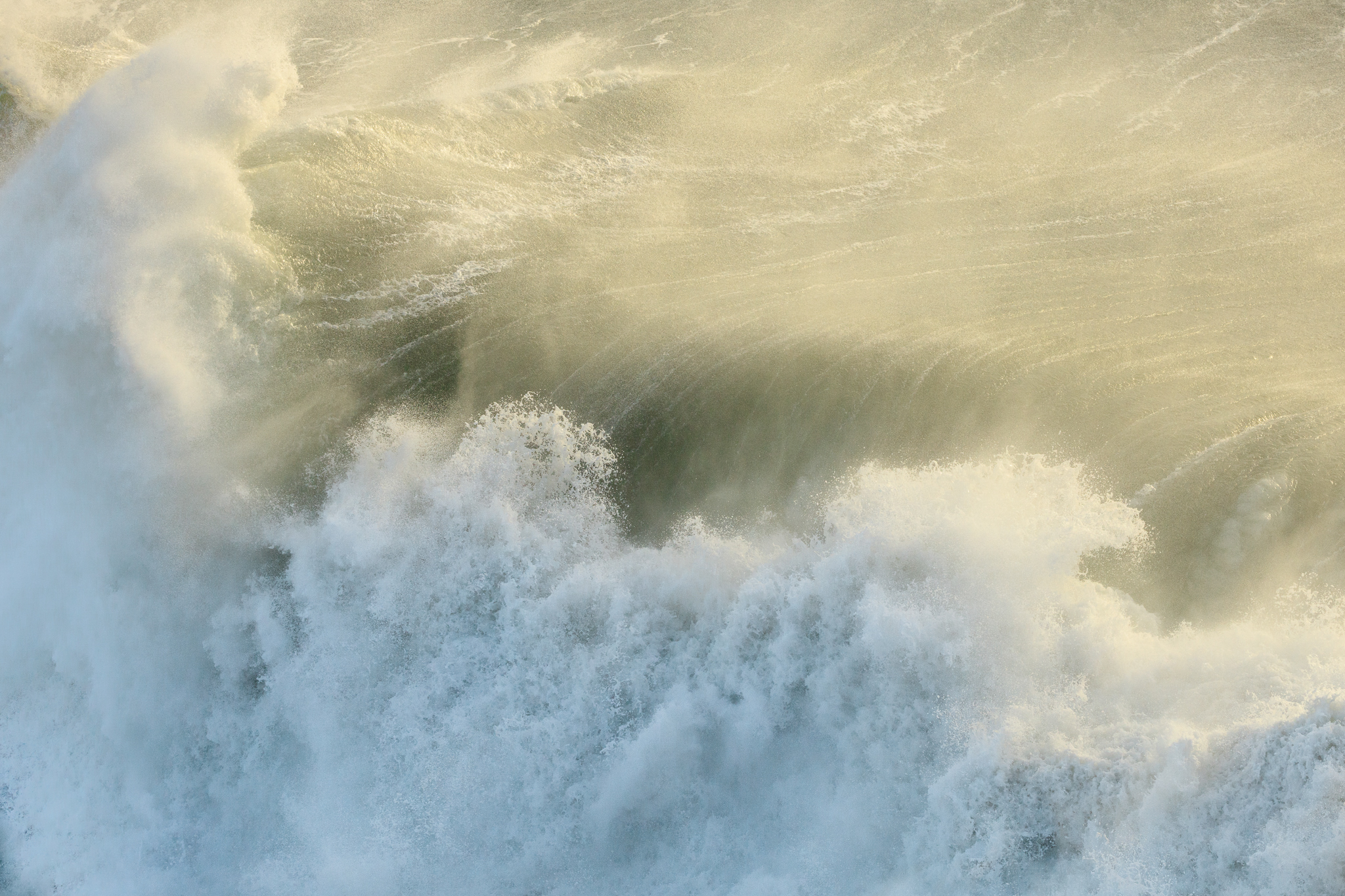
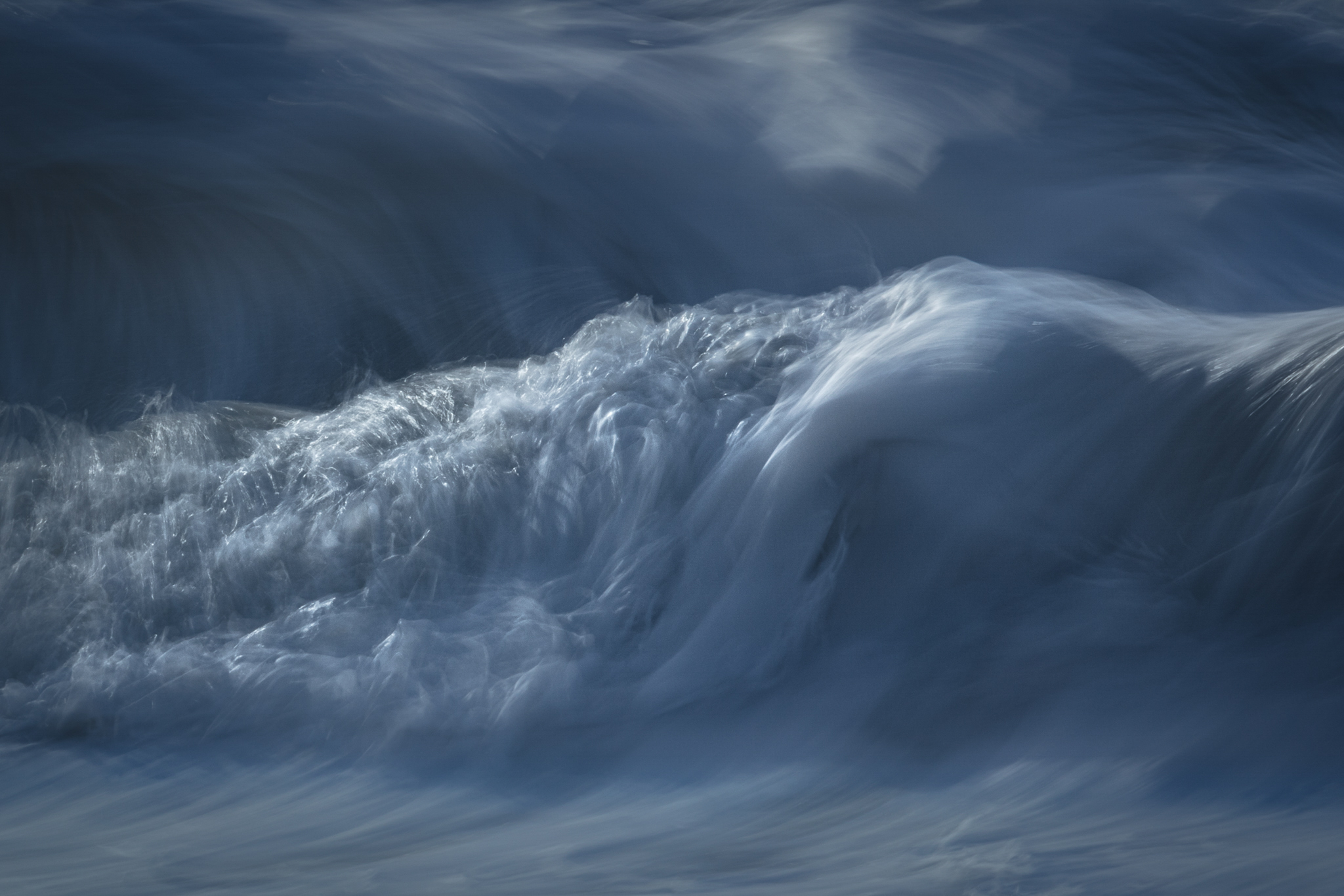
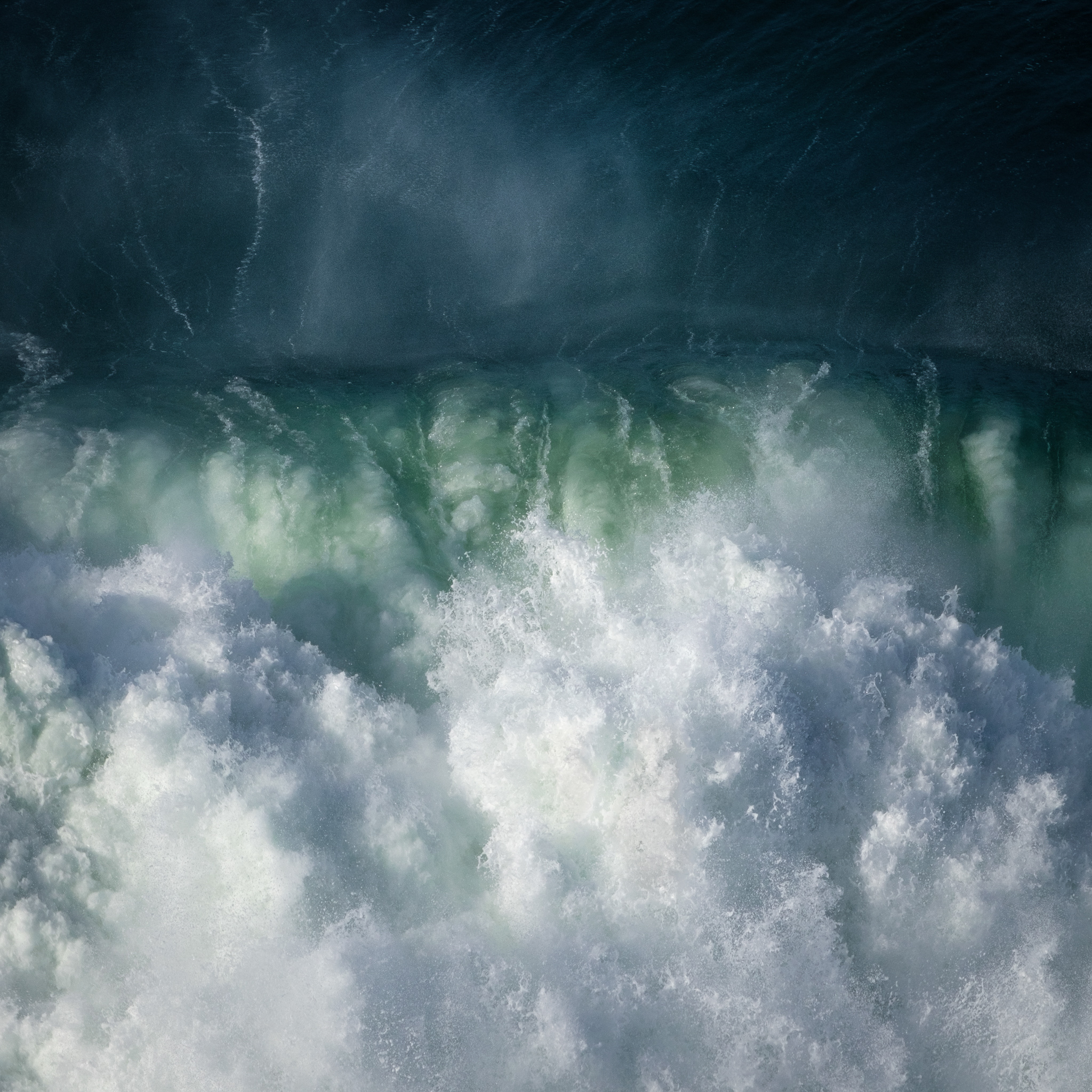
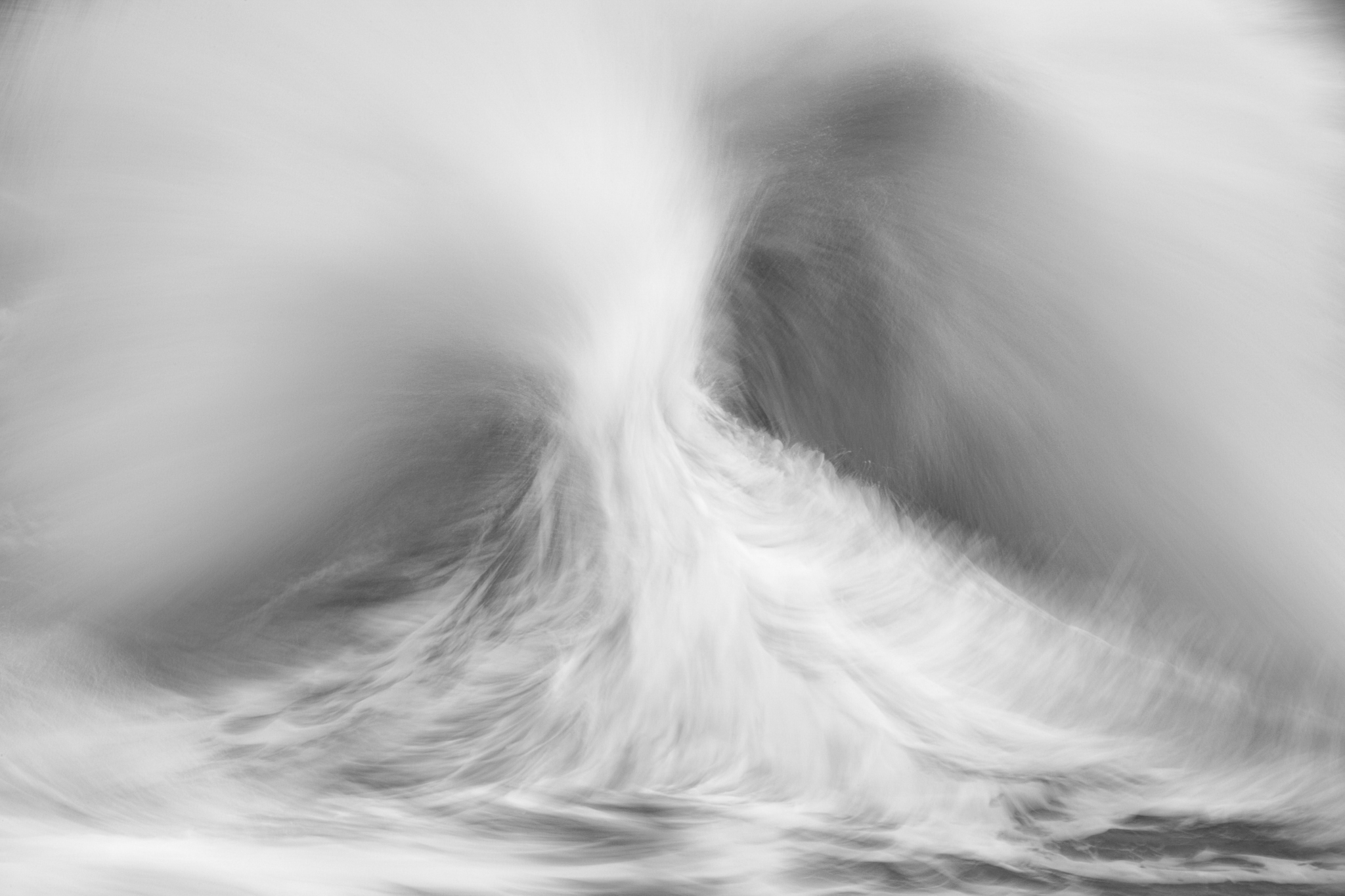
The camera movement mimics that of a moving subject to keep the subject sharp and the background blurred.
I come from a photography background and I believe this type of photography brings out the expressionist painter in all of us.
I used a Canon 7D Mark2 for this image and as long as I captured this image at a very slow shutter speed in 1/6 seconds. It all depends on How you prepare the composition of the images and framing the shot you are after.
I have had great results using lenses from 16mm.
The important thing is you need to focus on getting the shutter speed that you are after. I always shoot in the manual exposure mode as this gives me complete control over my camera.
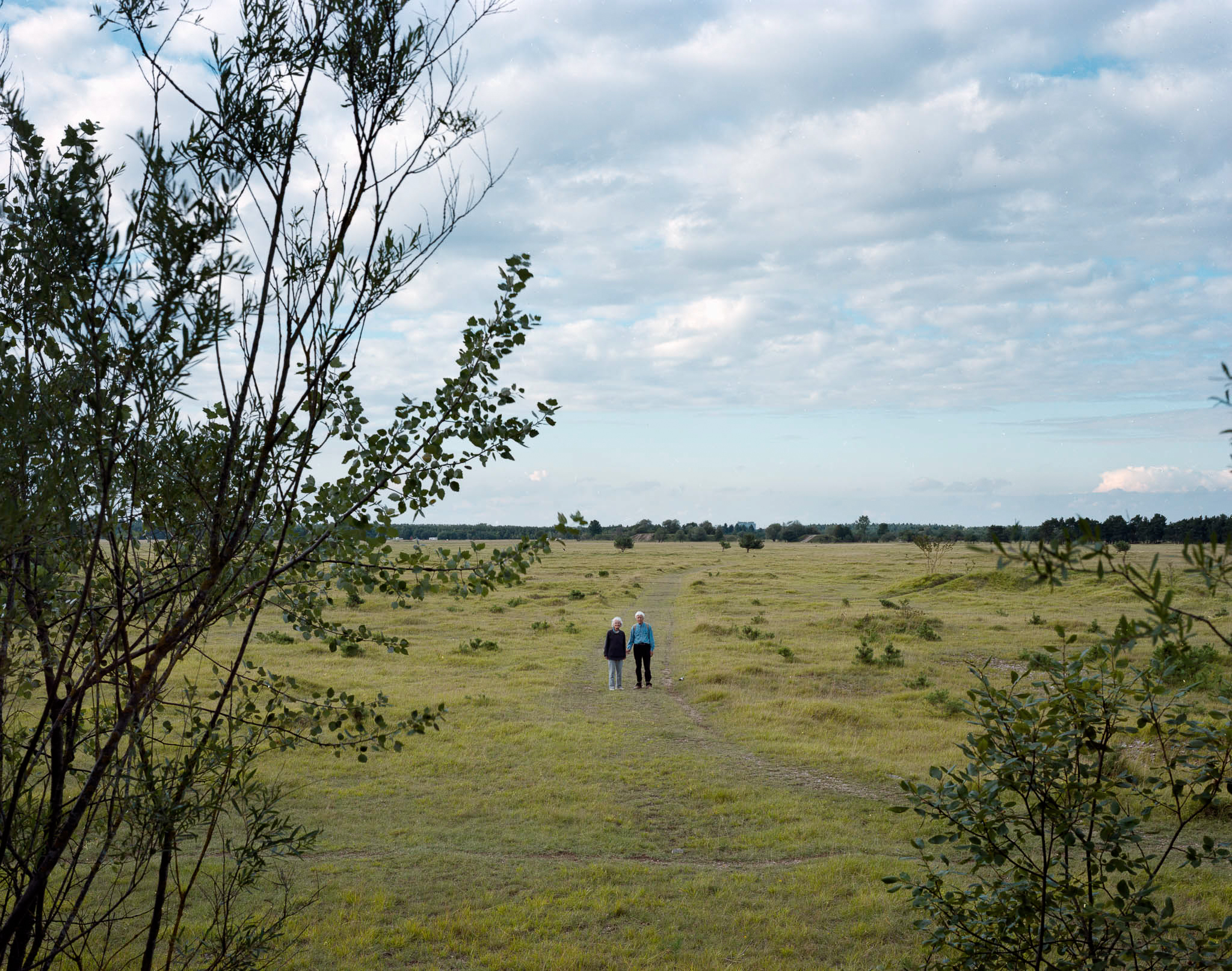
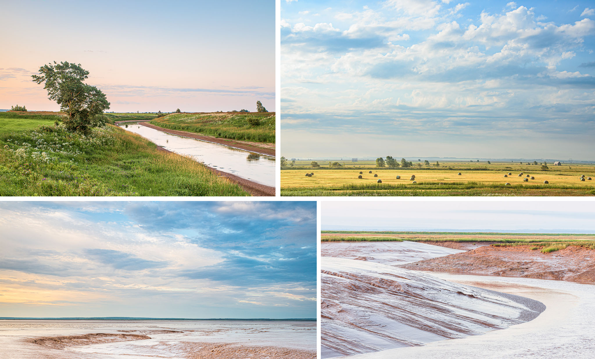
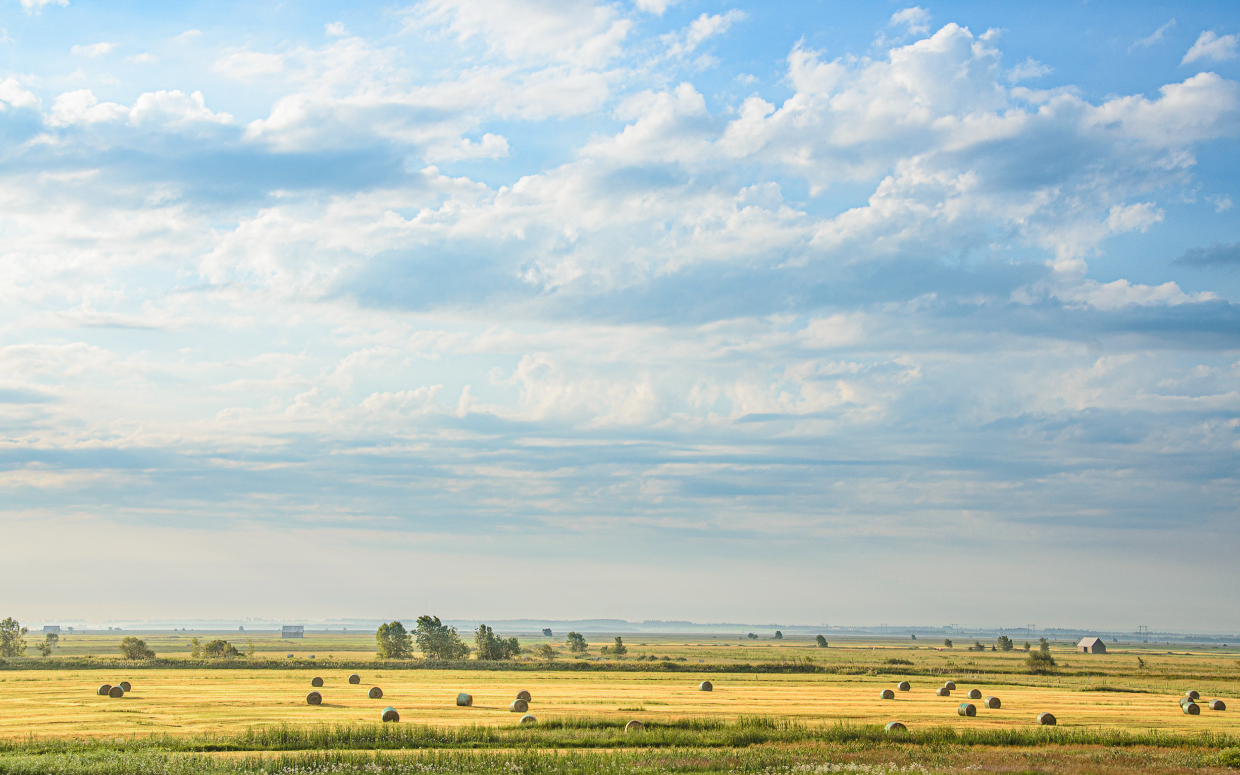
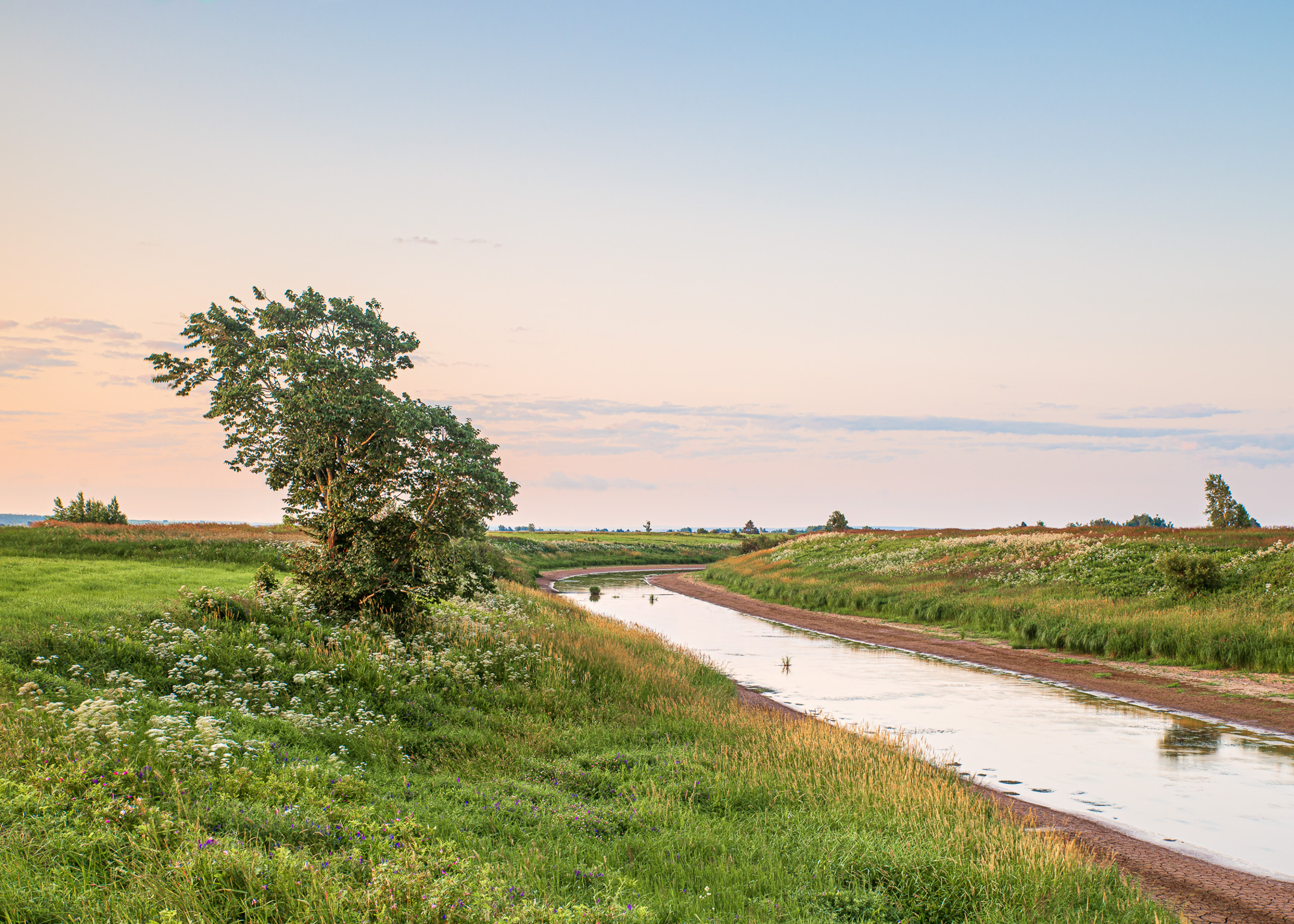
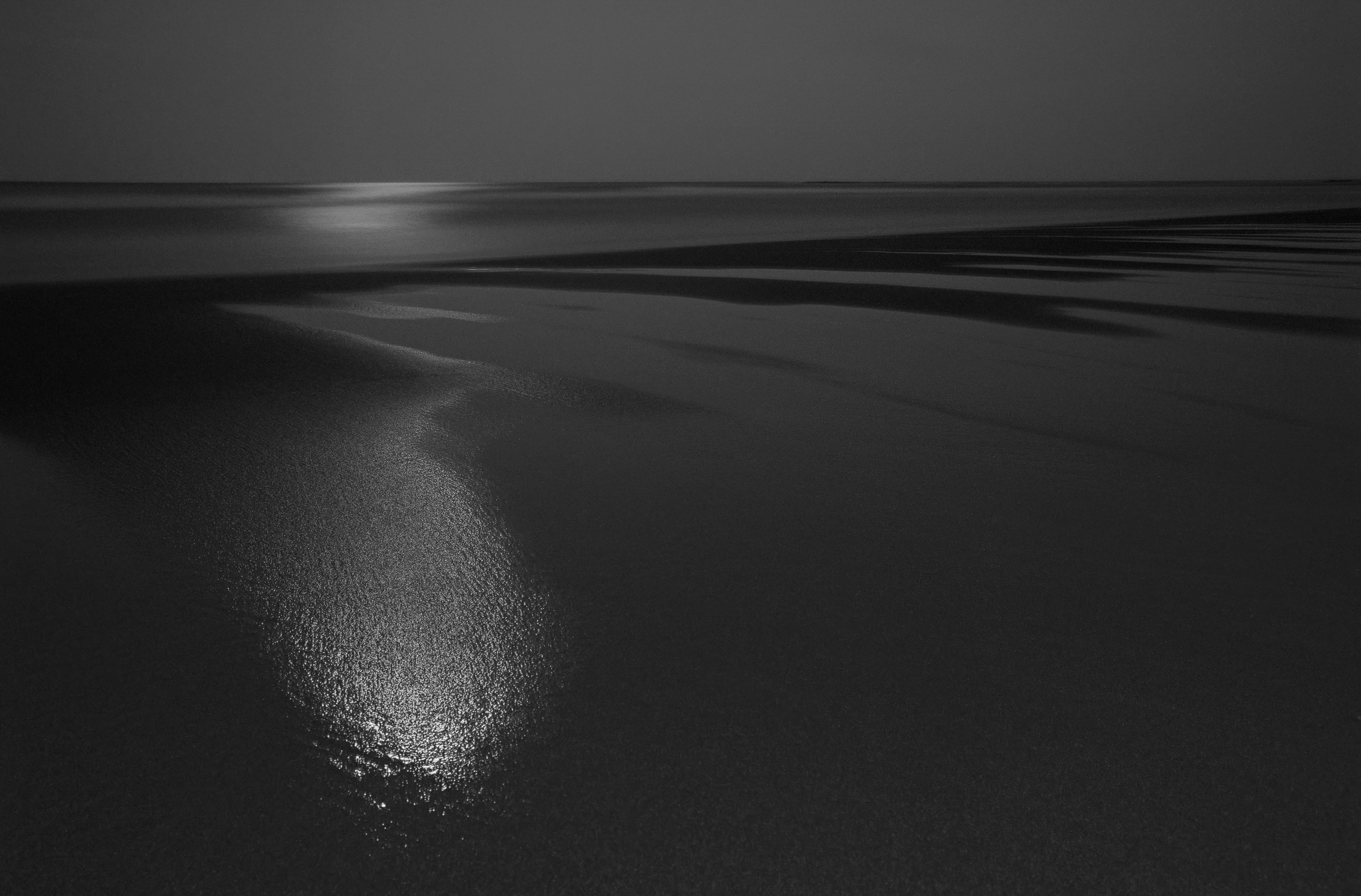
Since my return to the north of the Netherlands, I have started to wonder what home actually means to me and how that manifests itself in my photography. I found myself starting to see "home" in a different context. The abundance of water and the open and wide character of Friesland make it a place for me, a landscape in which I feel at home. At the same time, I also see 'home' in the sense of being at home with myself. When I am home with myself I live more in harmony with my environment.
In a broader context, I believe that when we are more at home with ourselves, there will be less fear and aggression in the world, and the world can live more in harmony. We currently live in hectic, troubled and uncertain times. It is precisely this time that is the source of inspiration for me to depict the theme 'home' as a counterpart to these troubled and uncertain times.
'Home' evokes all kinds of images and words in me: emotion, awakening, intuition, dreams, intimacy, life, your own voice. I take those words with me when I go out with my camera, because when I connect with the words and emotions that evoke "home", the images follow automatically. Soon I saw landscapes of the soul appear in my first images.
And with those images, I then 'paint' a landscape of the soul and I give it the colours that in my experience belong to that specific image, colours in which I feel at home.
Coming home to myself, in the landscape of my soul. That is not easy and remains a constant challenge to look for it and to step out of there into the world.
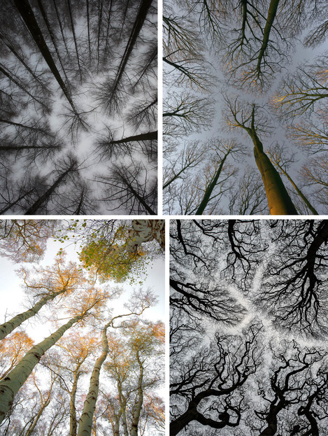
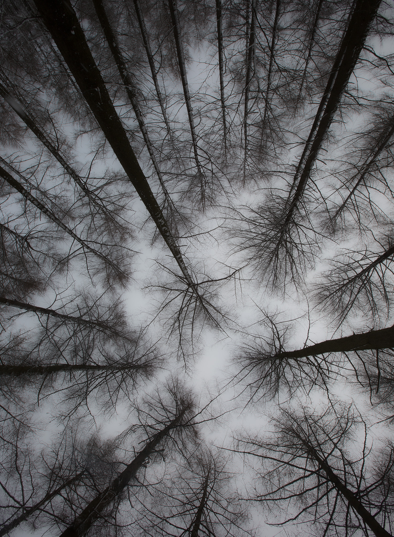
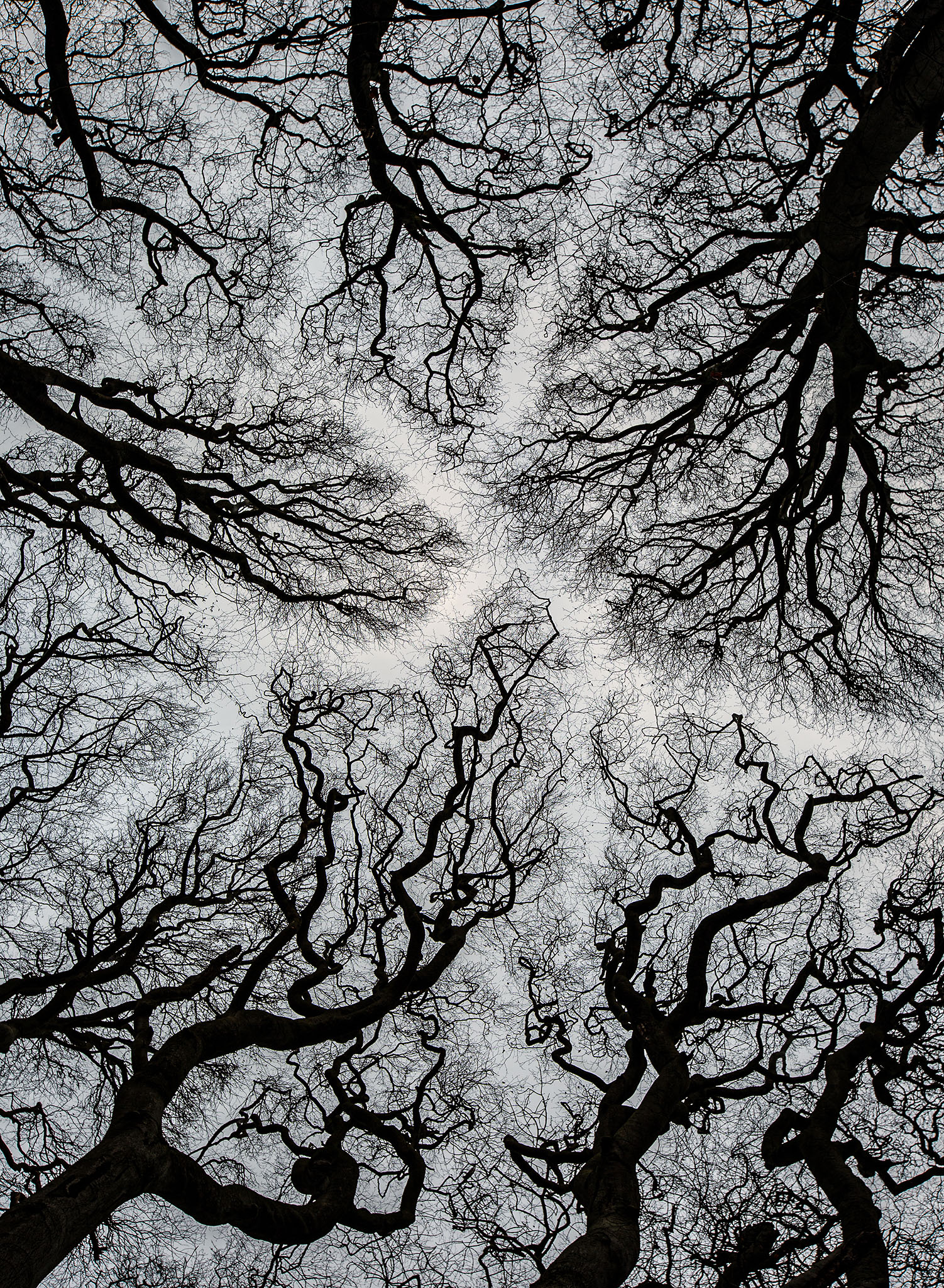
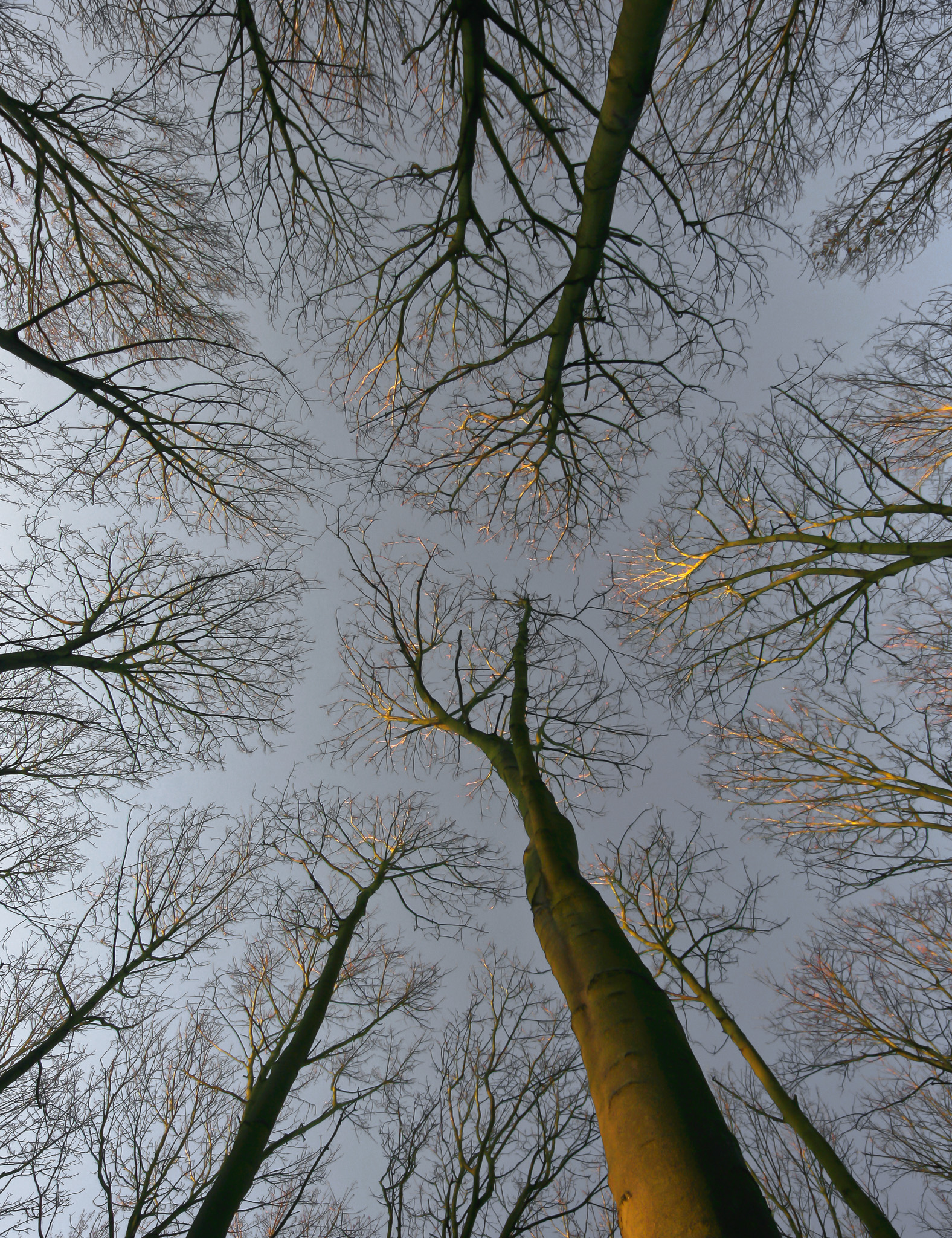
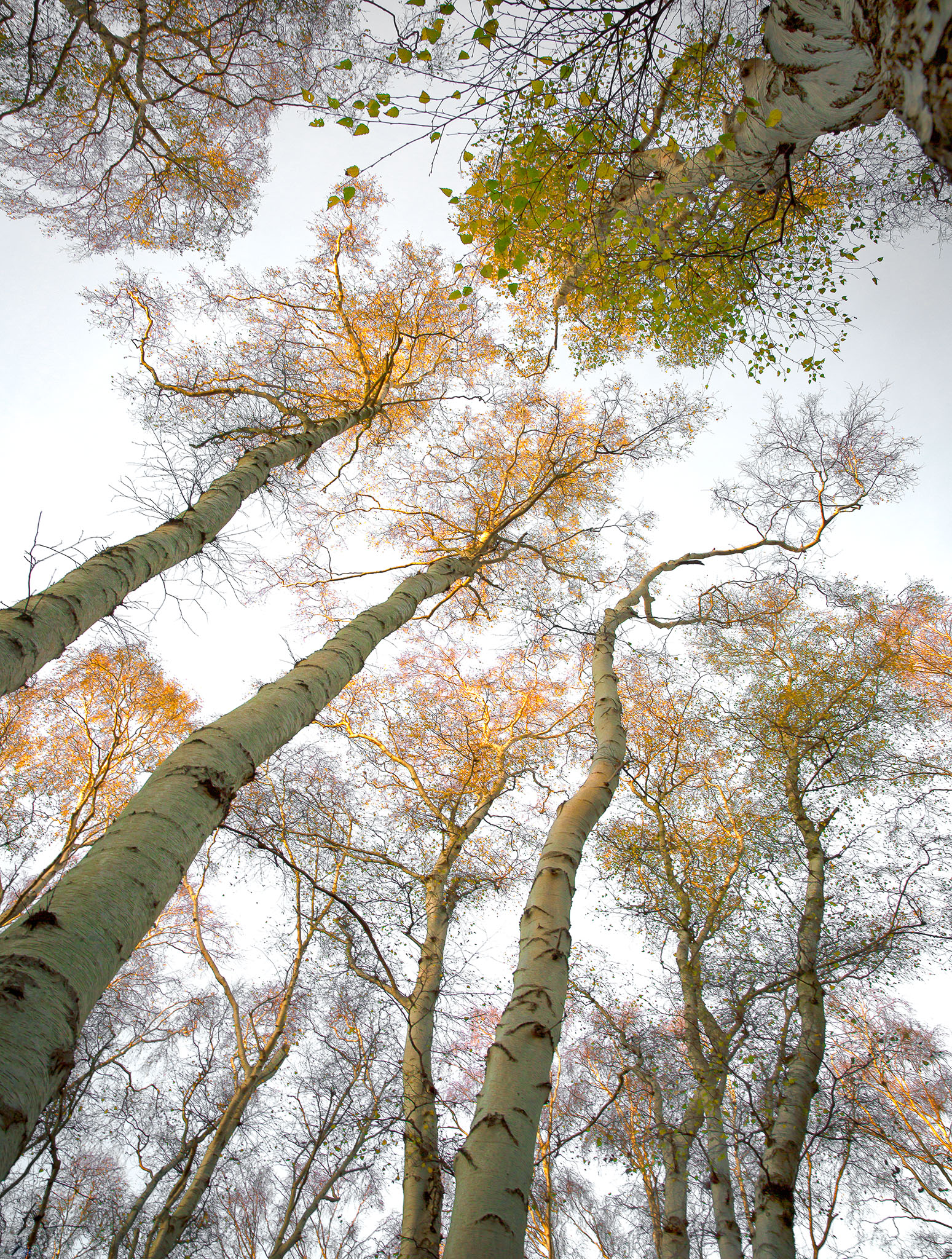
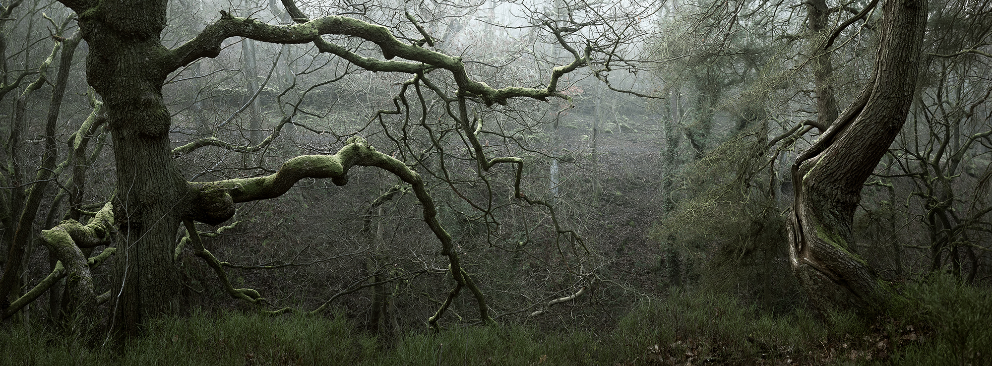
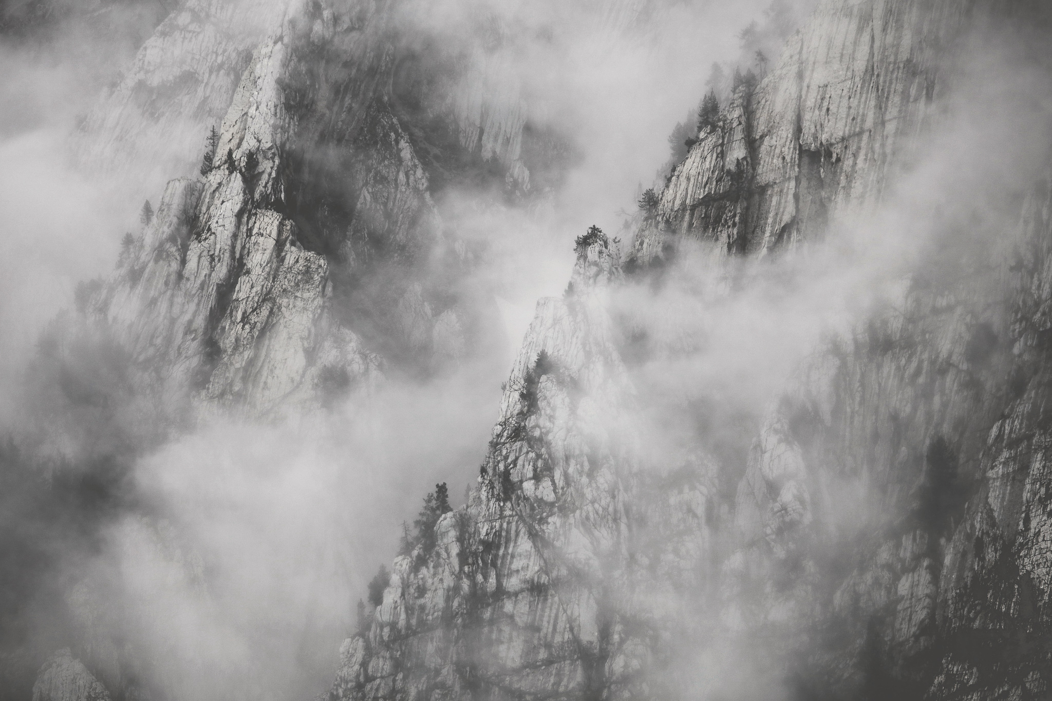
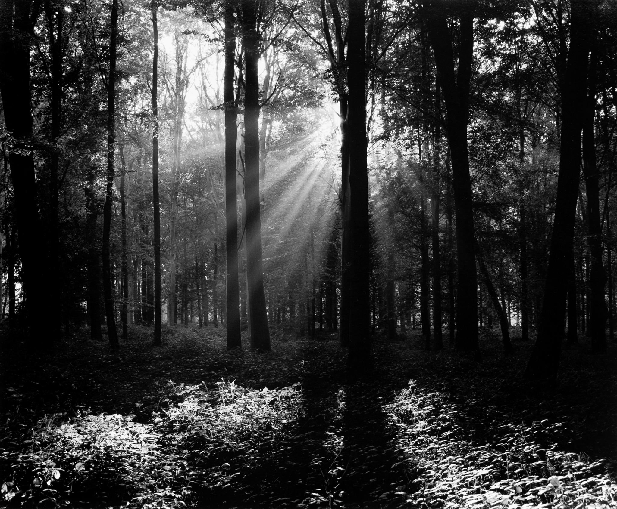
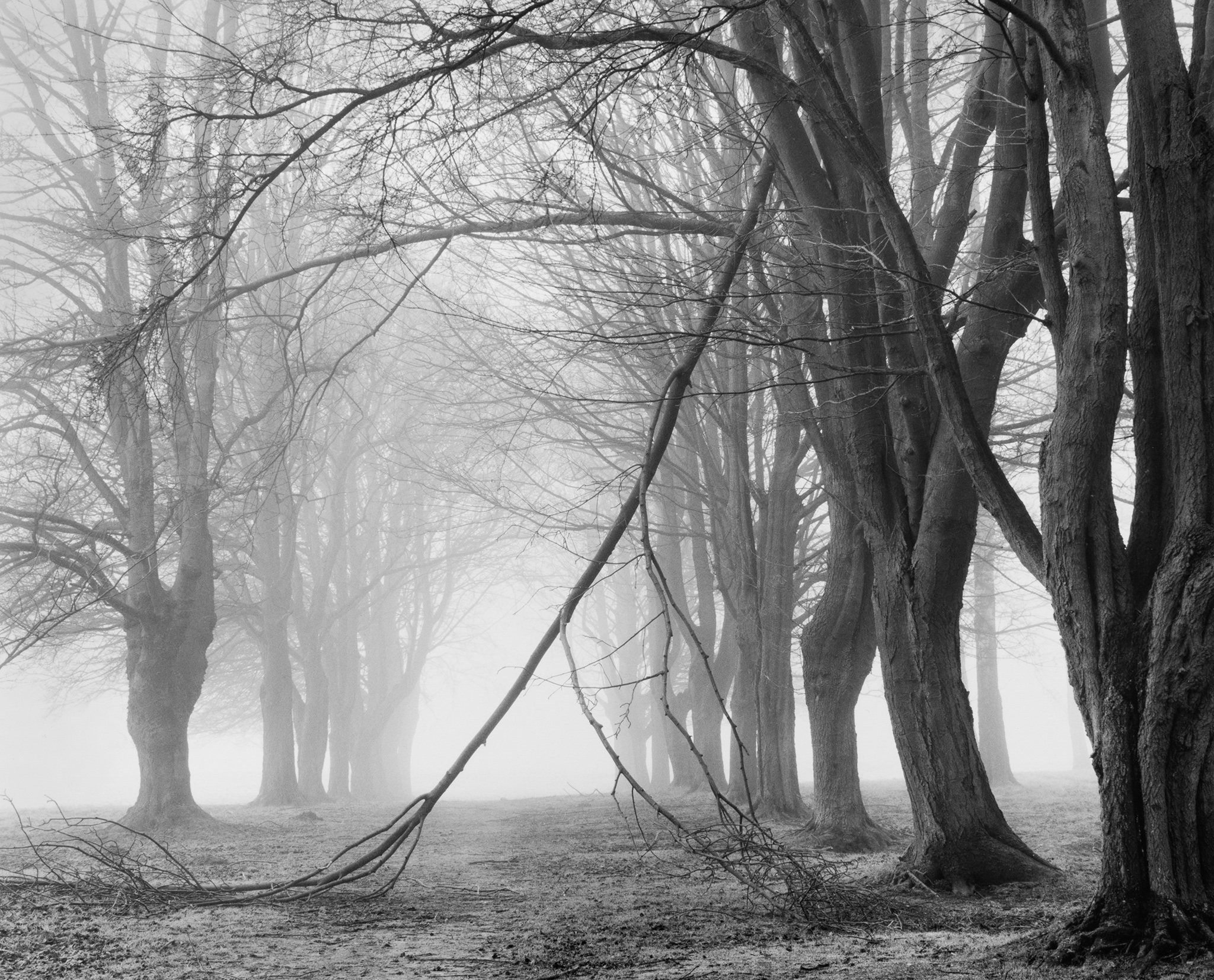
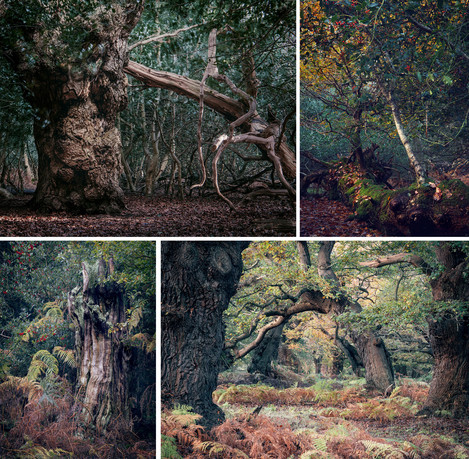
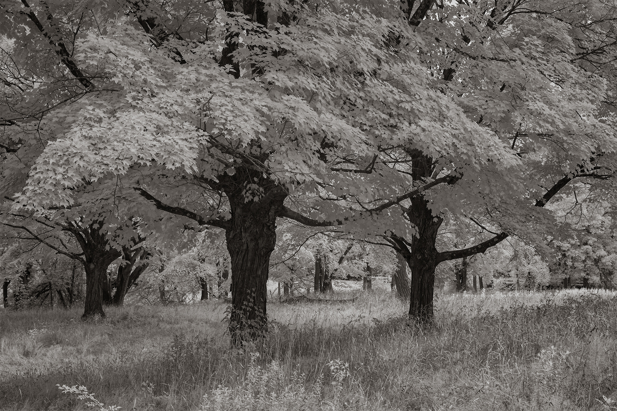
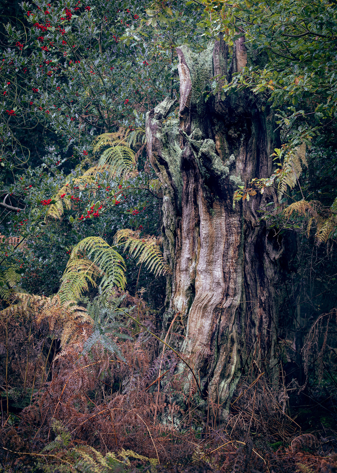
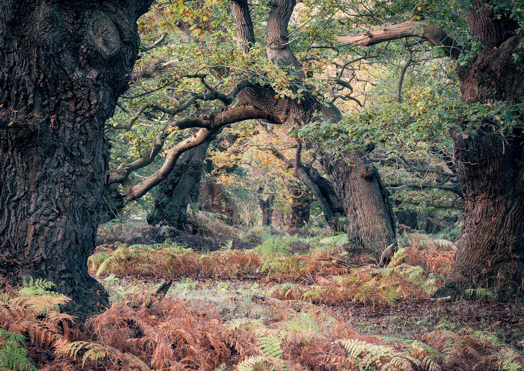
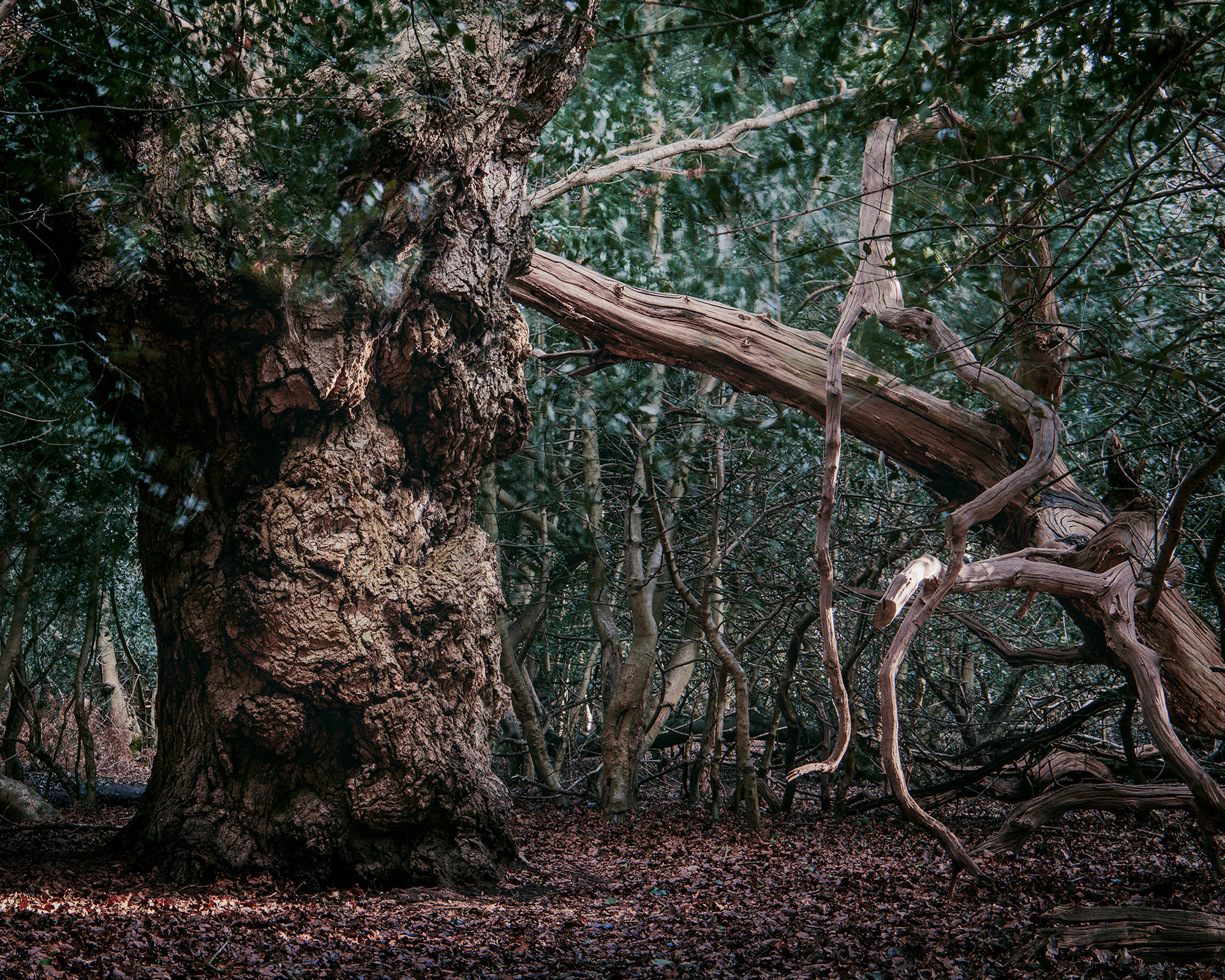
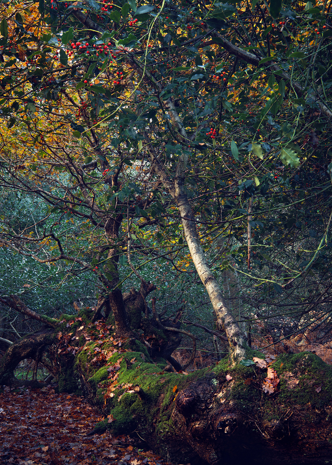
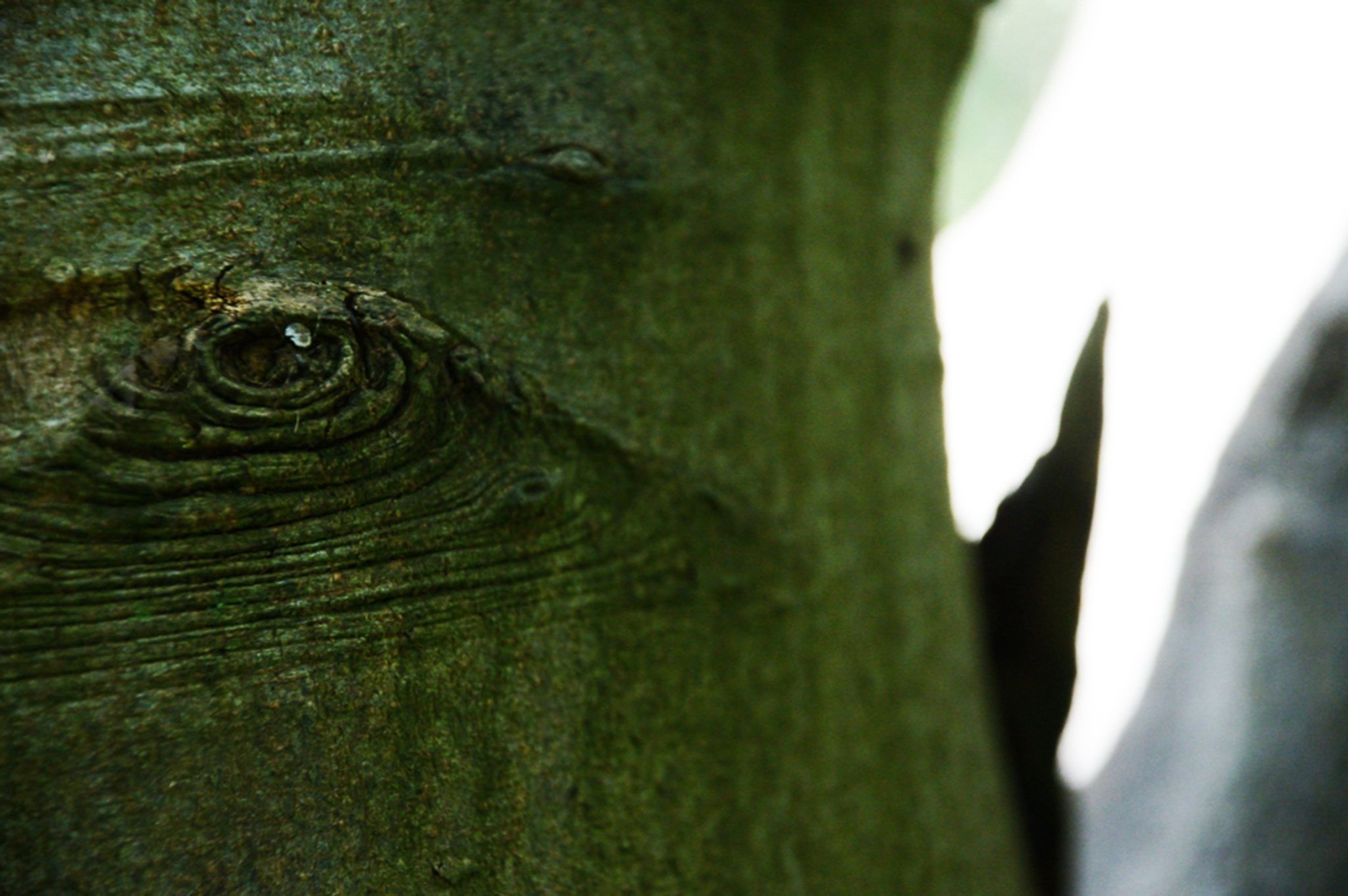
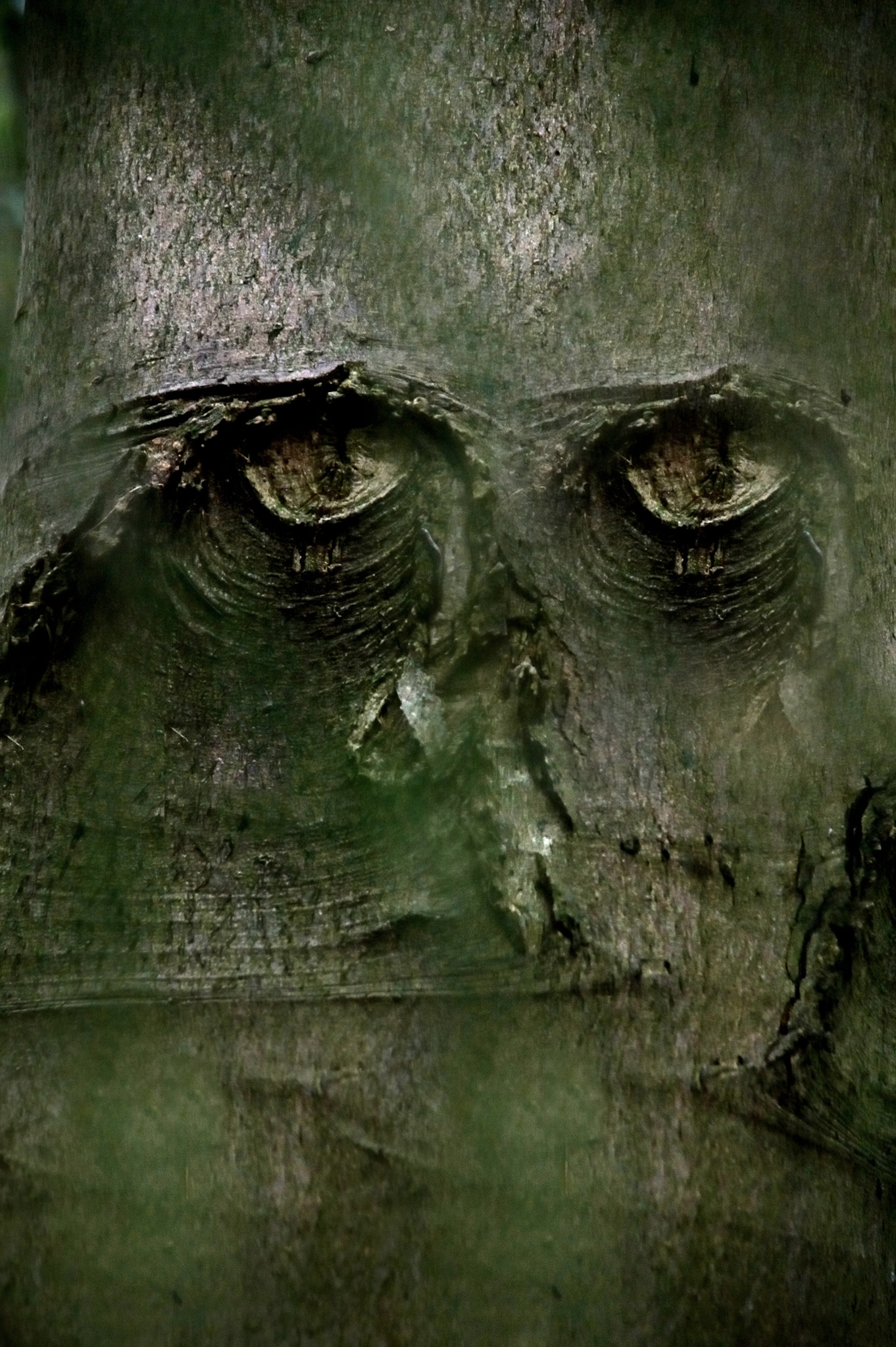
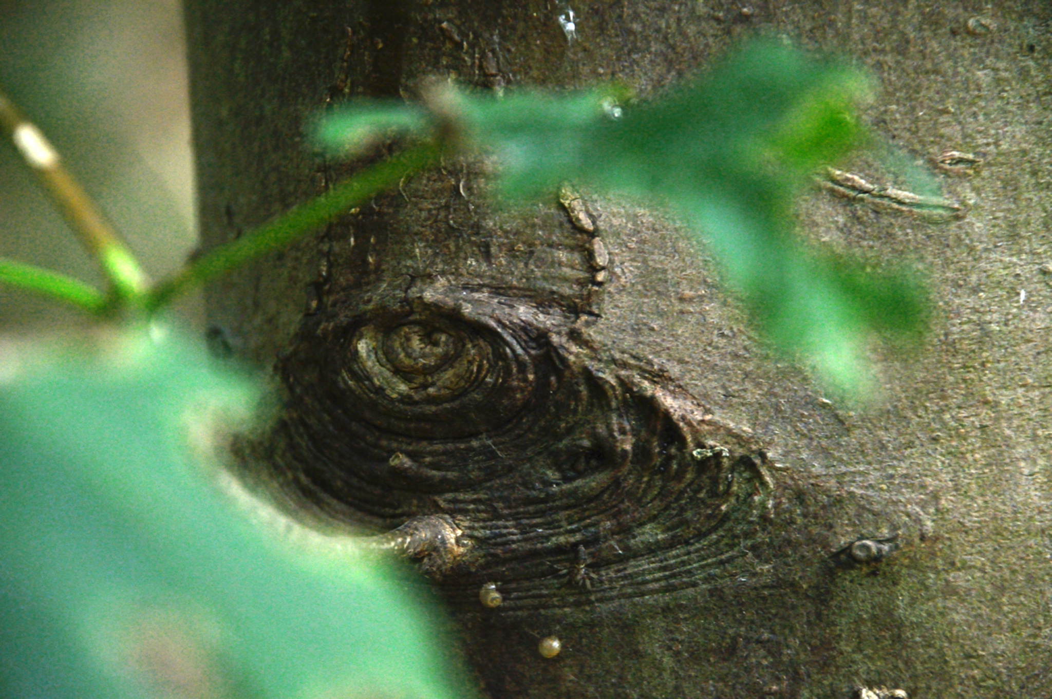
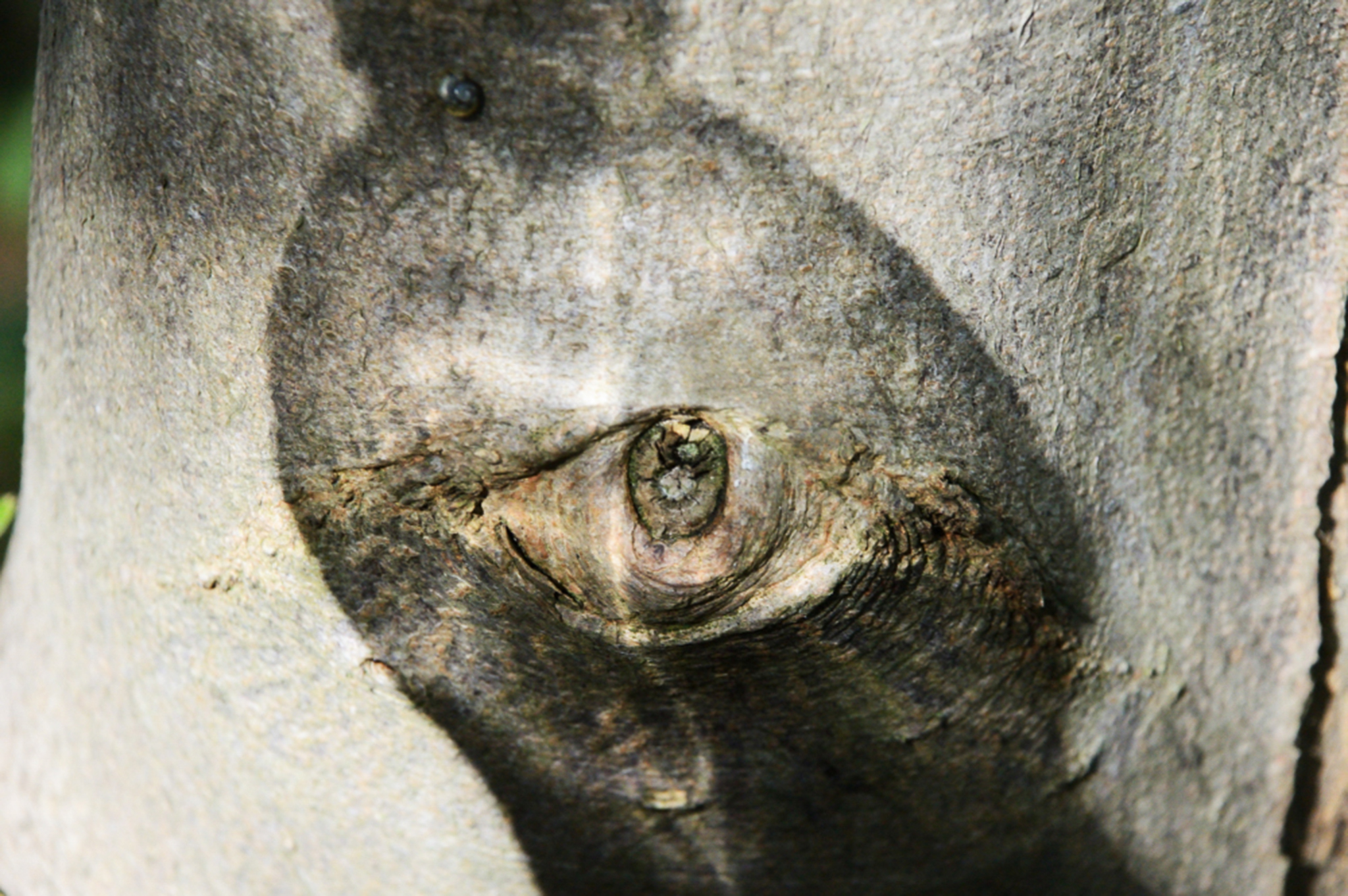
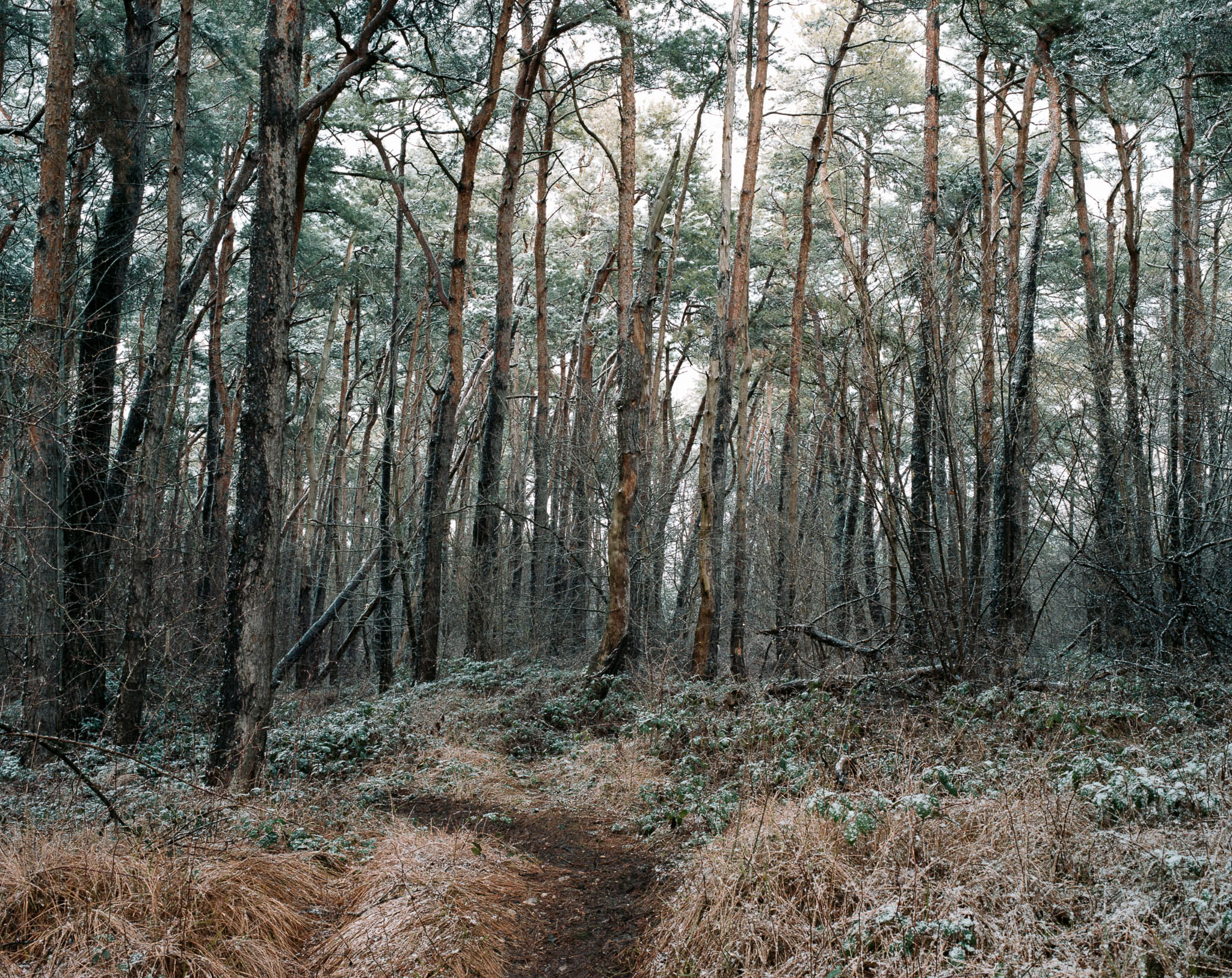
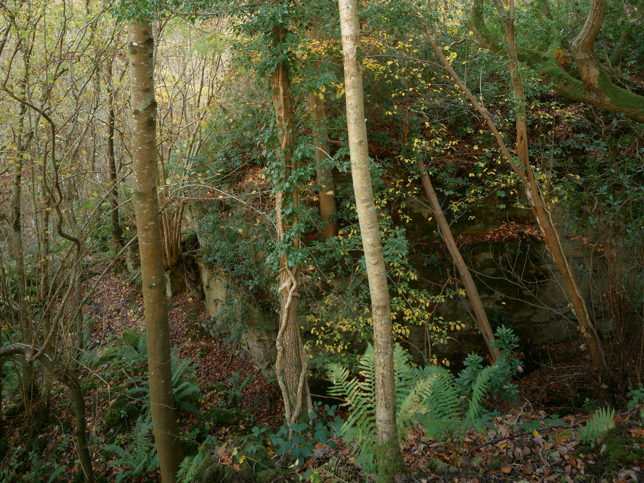
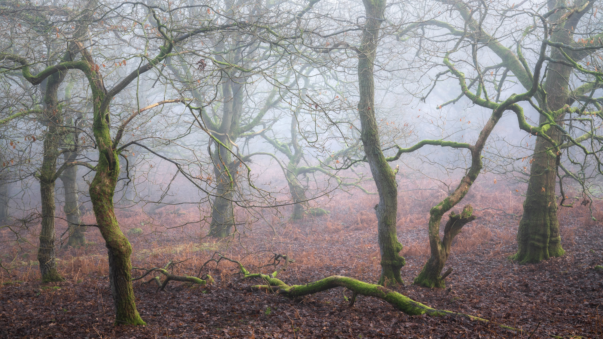
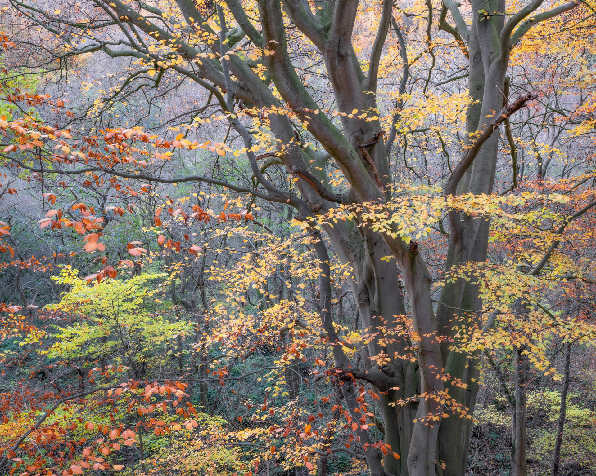
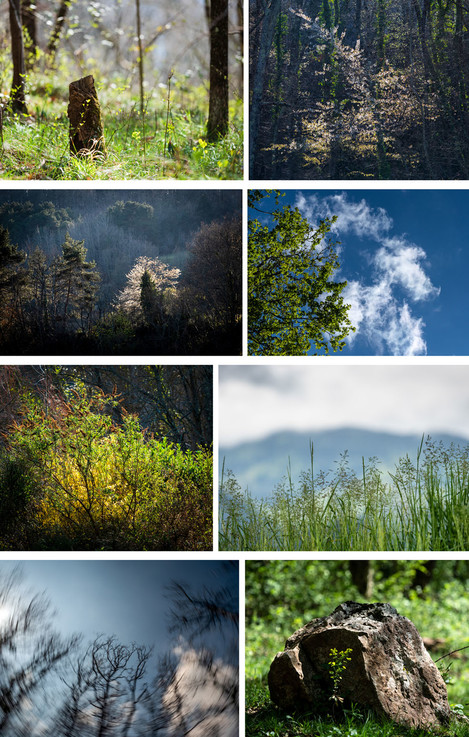
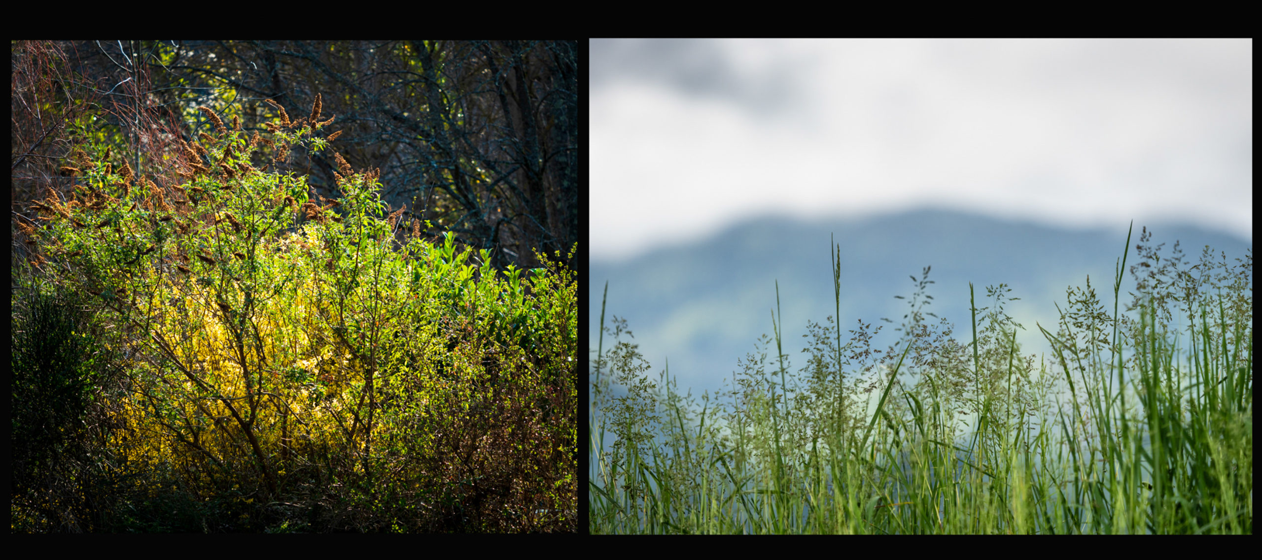
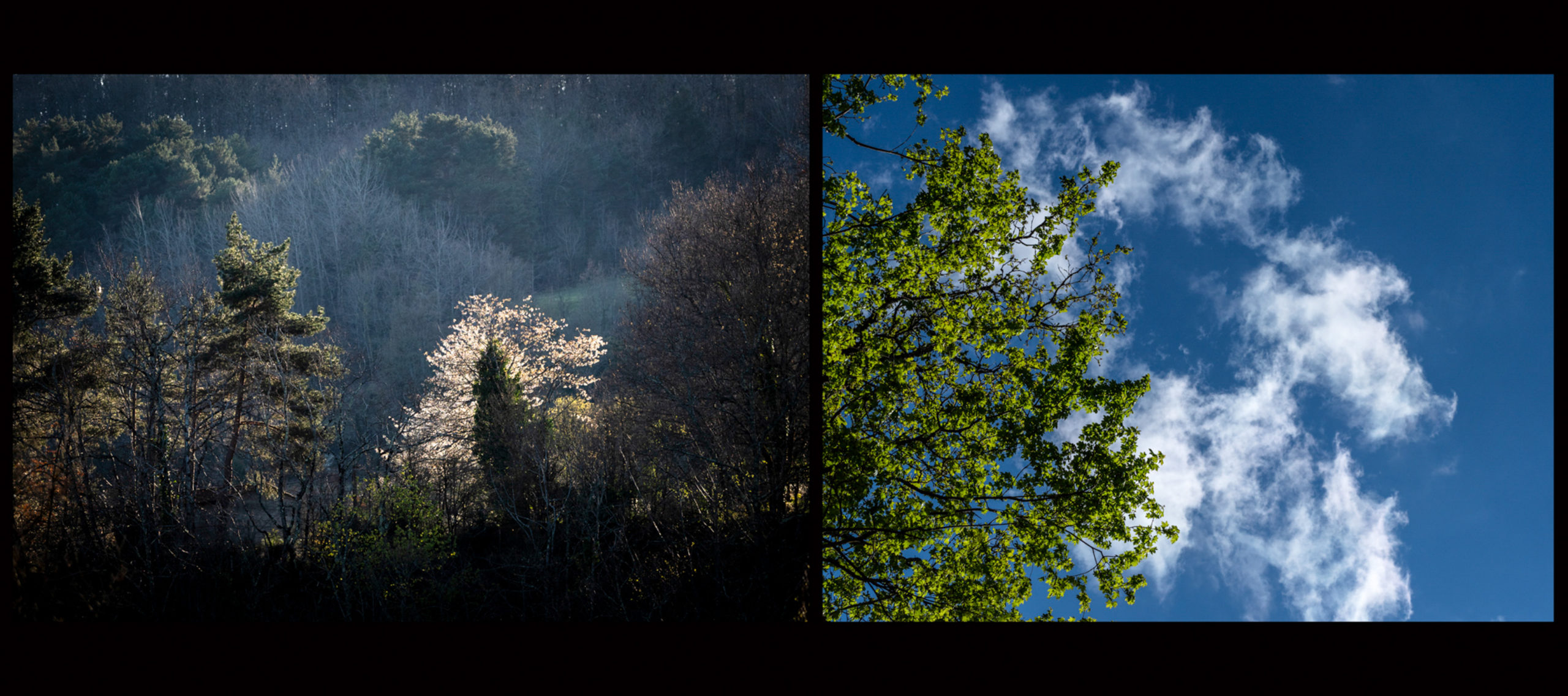
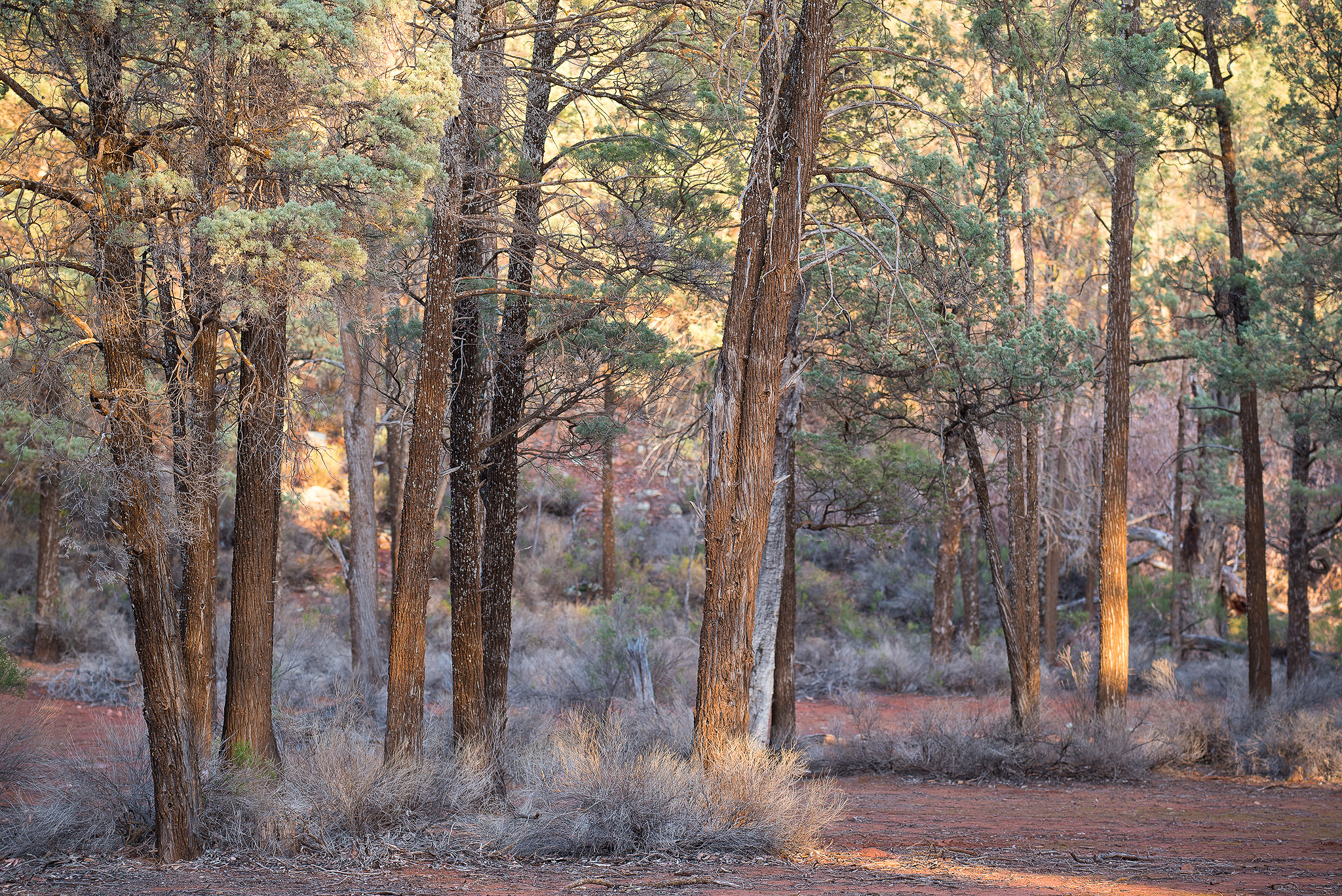
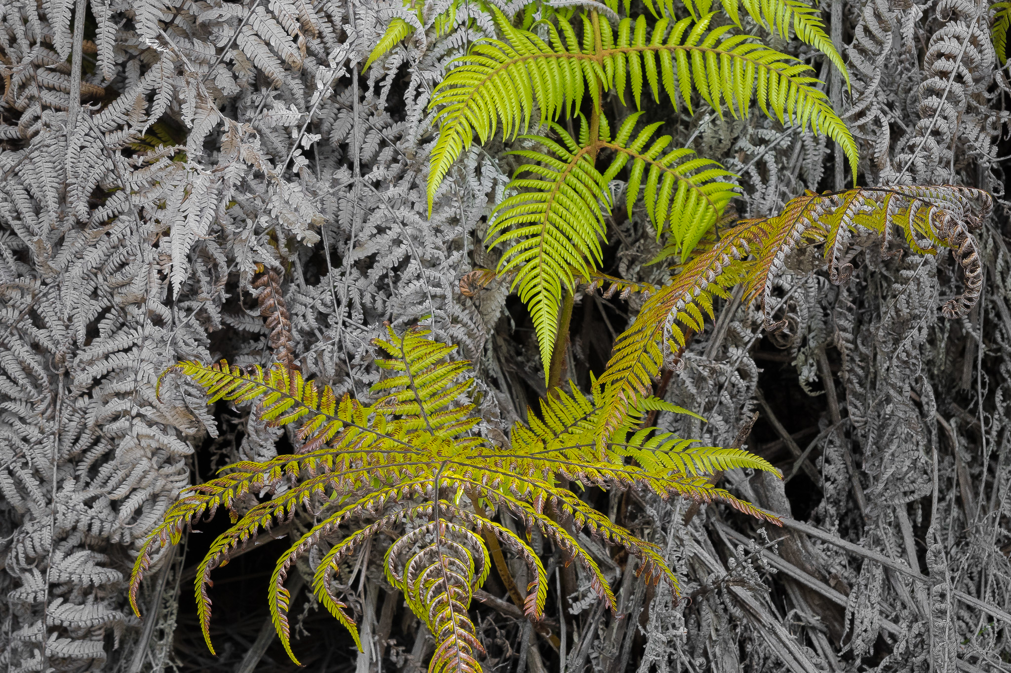
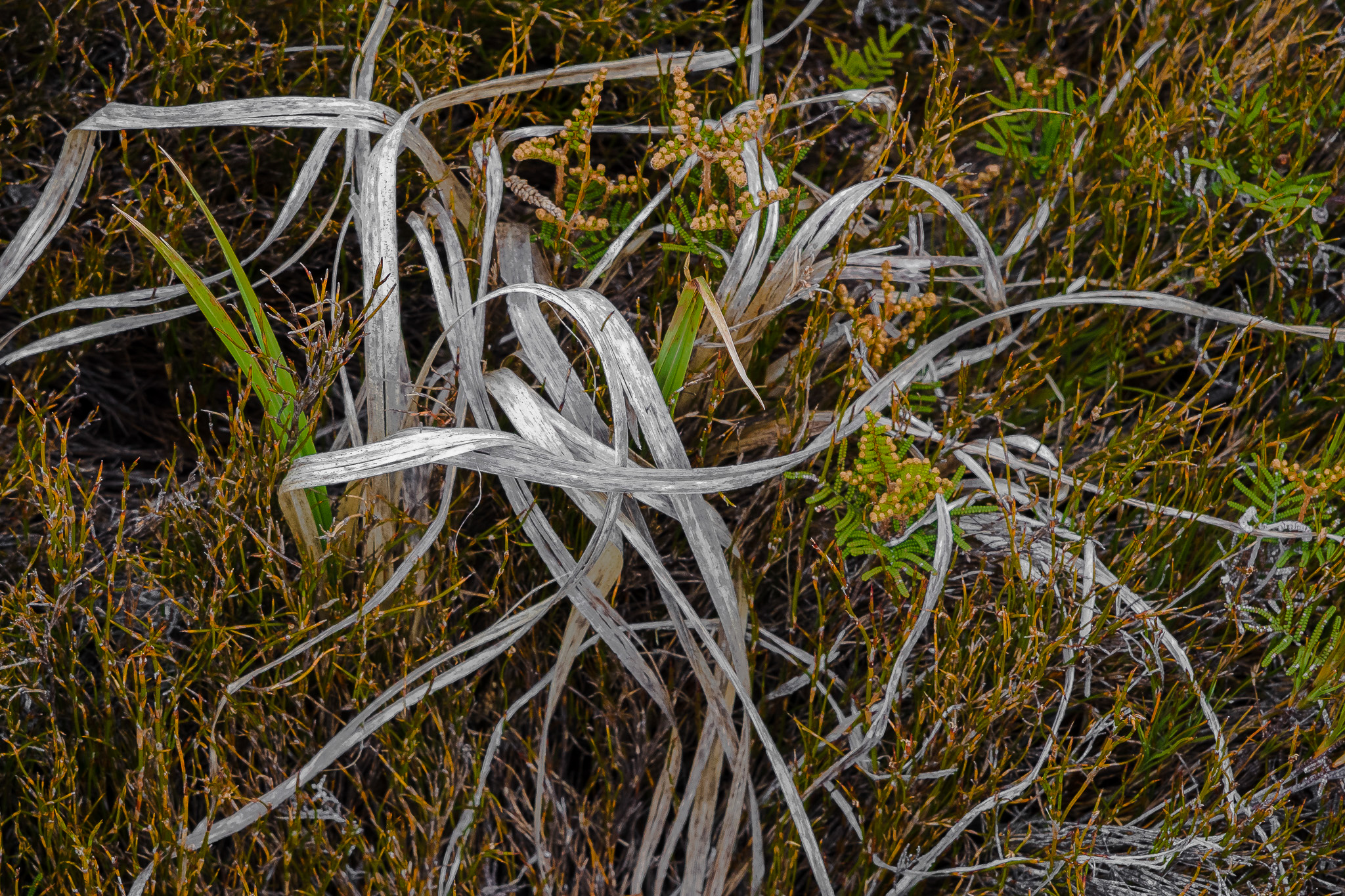
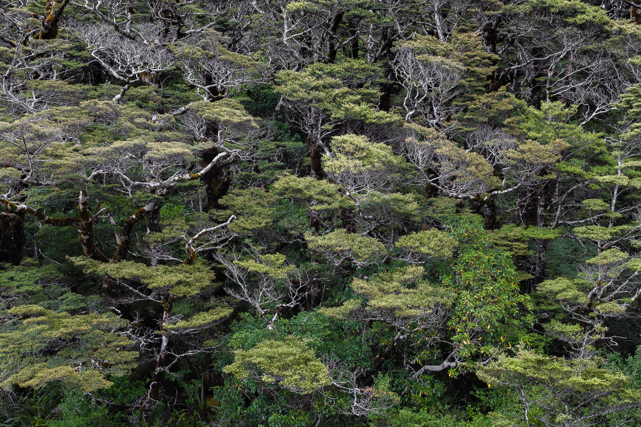
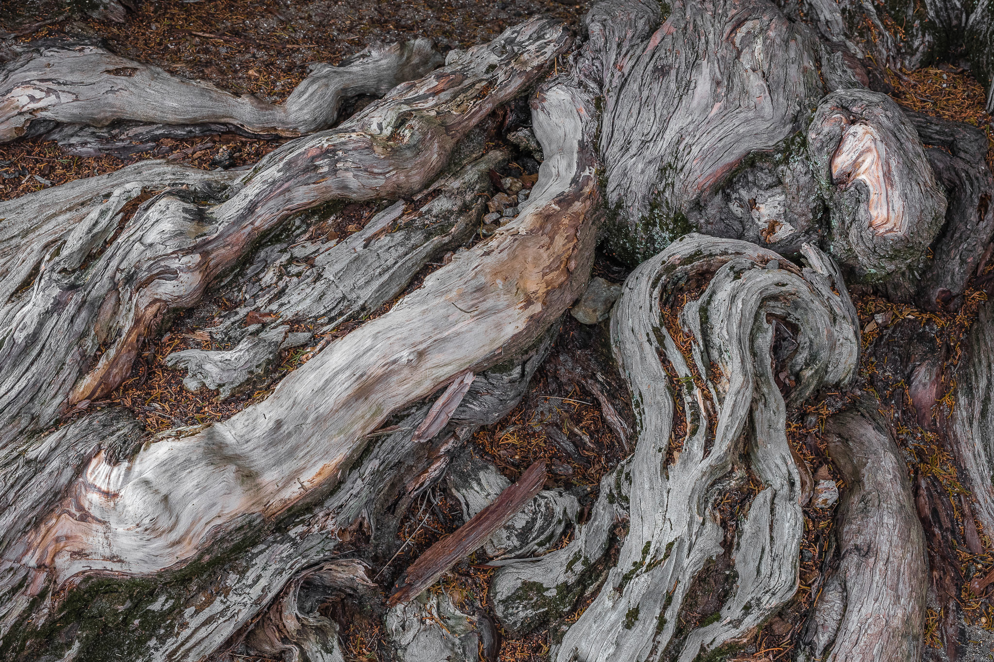
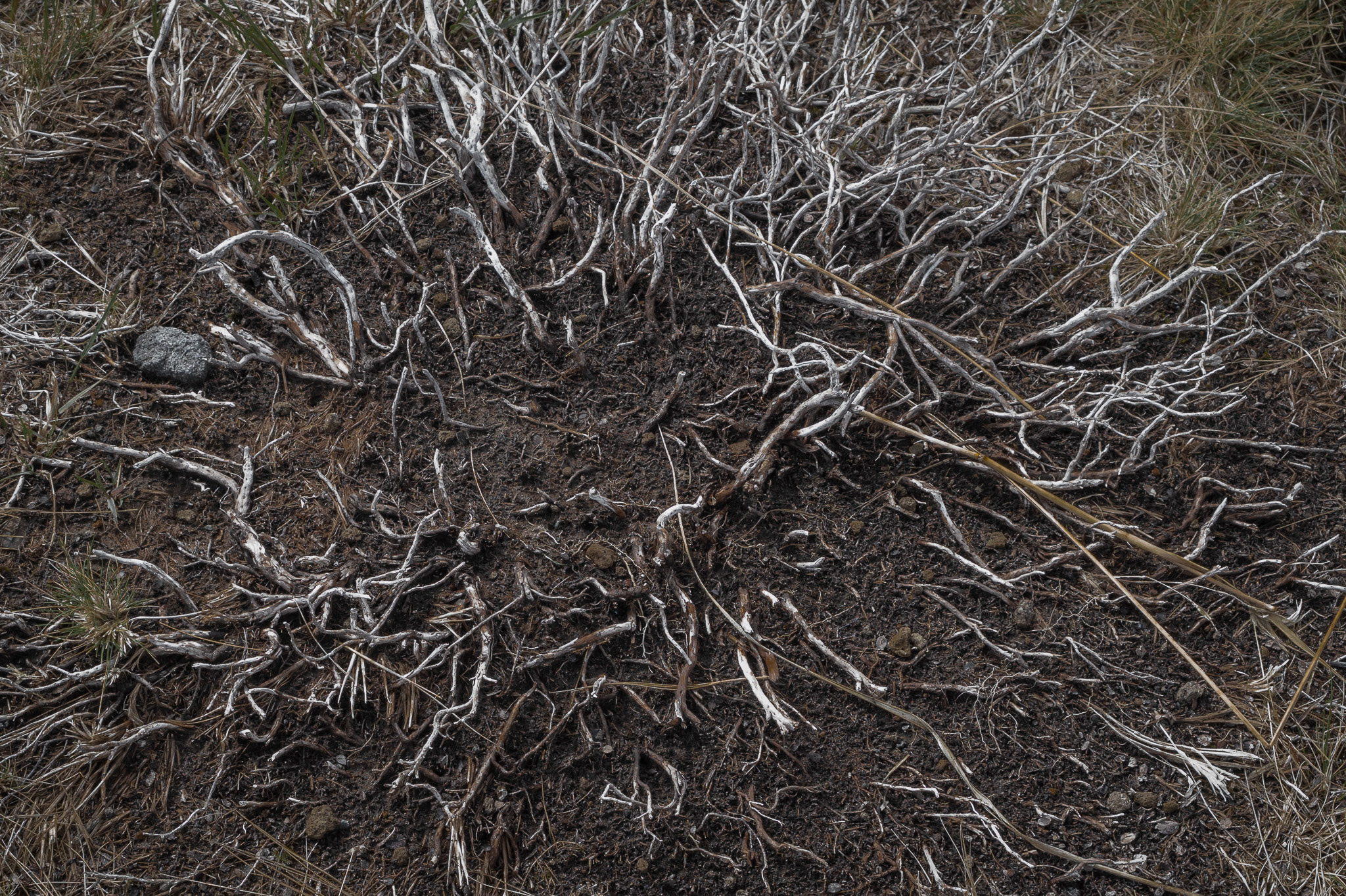
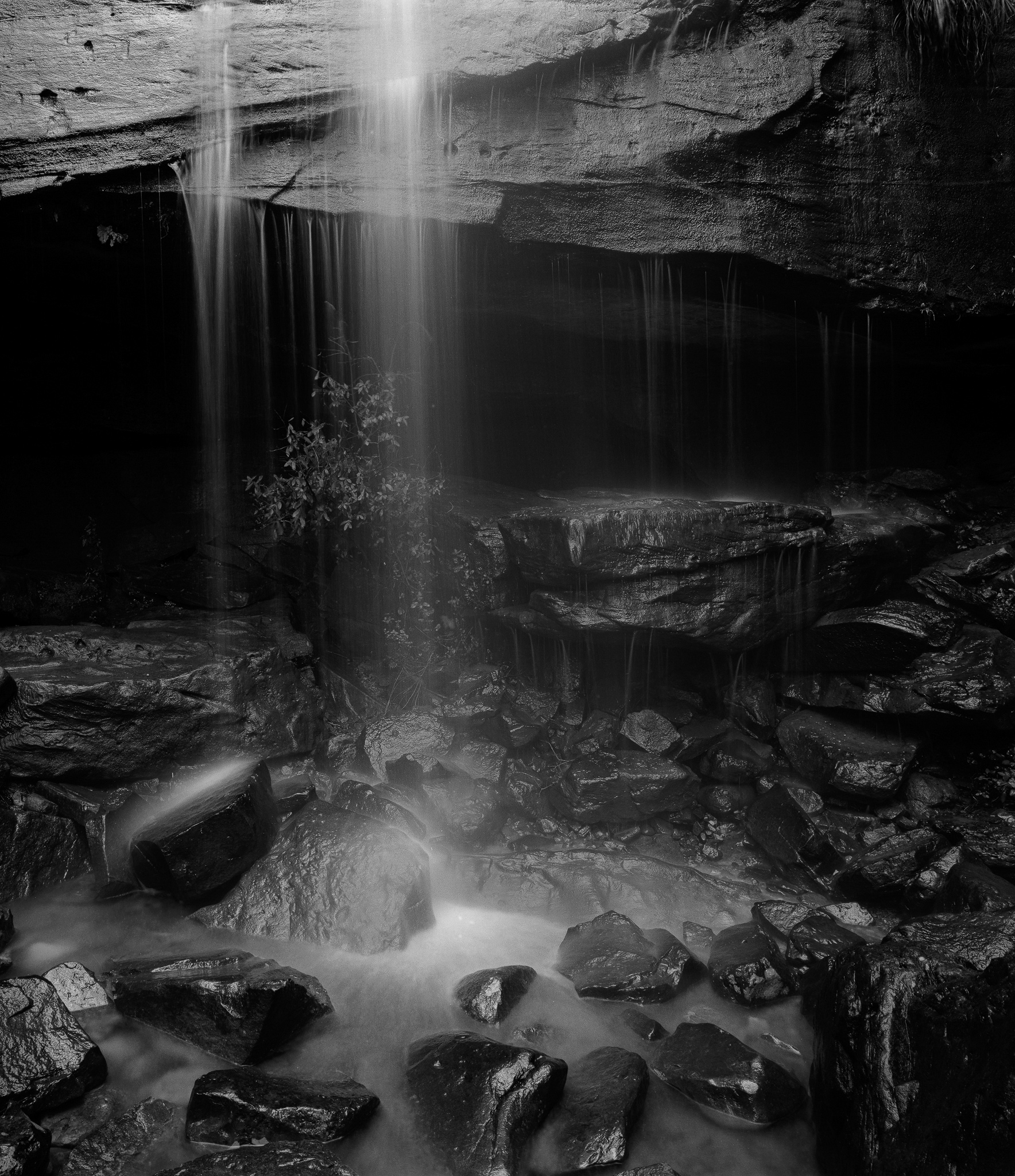
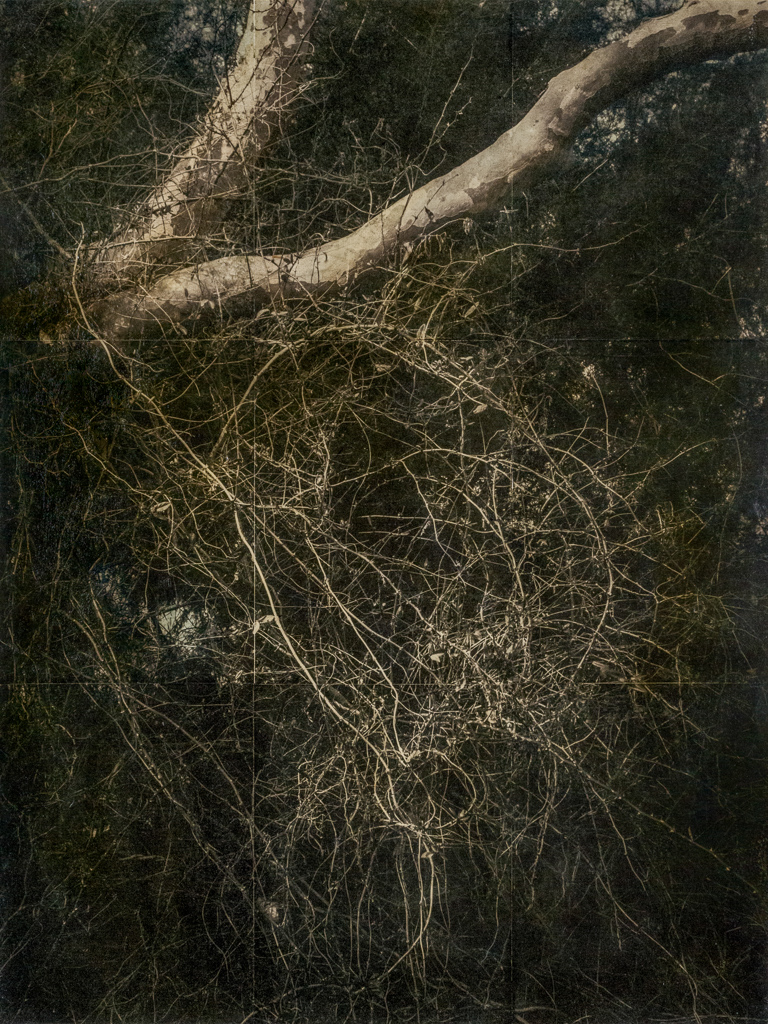
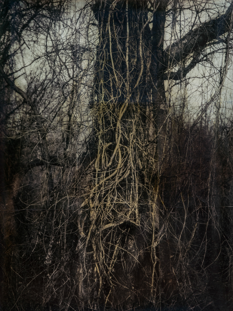
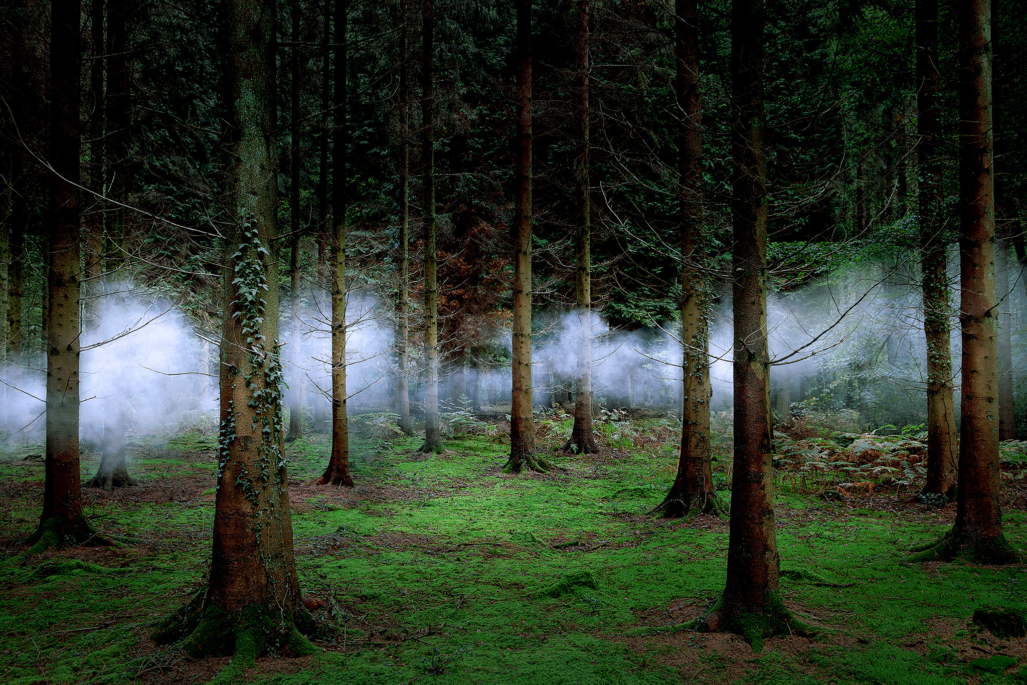
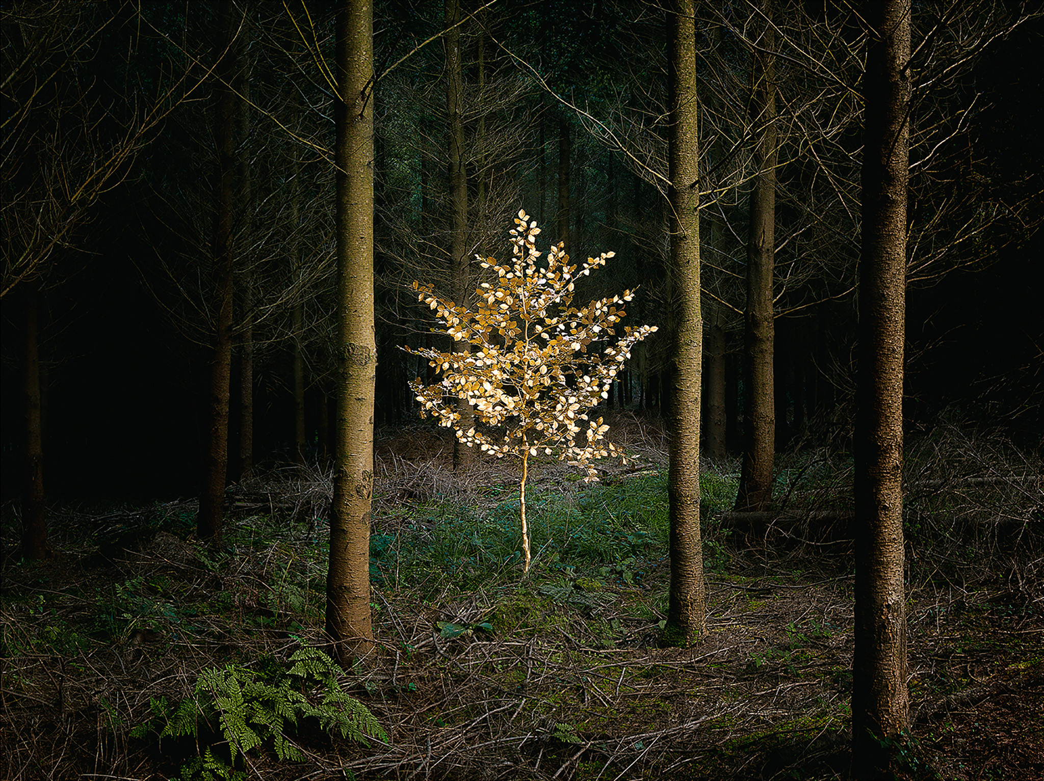
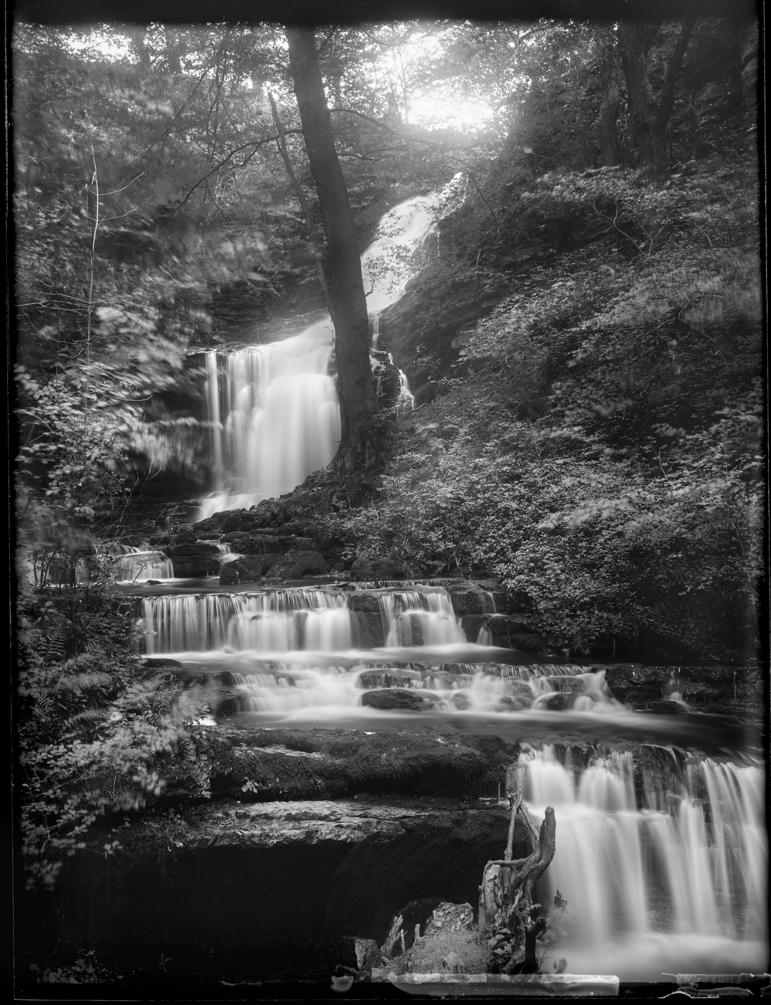
These images are all drawn from within 20 minutes of my home. I am slightly amazed by the number of people who walk through woodland looking around, ahead or downwards (presumably to avoid cracking their heads or falling over) and yet so rarely upwards into the glorious canopies.
I have always found them magical, and even in relatively mundane photographic conditions can yield such beauty and mystery. Consequently, I spend a great deal of my time lying on my back gazing up at and photographing the wonders above. Aside from having a soggy back much of the time, I also number many of the images generated, often handheld, as amongst my personal favourites.
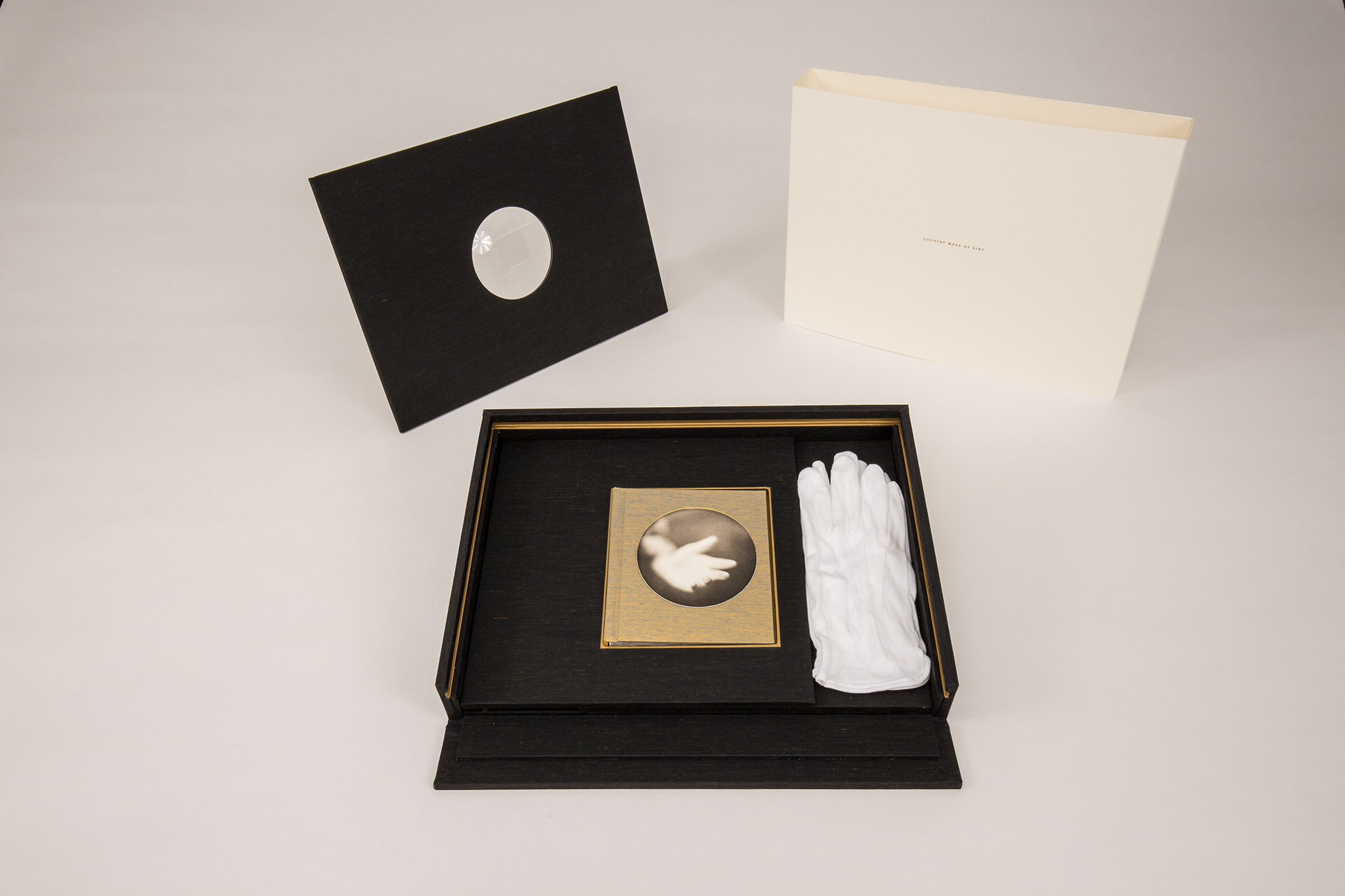
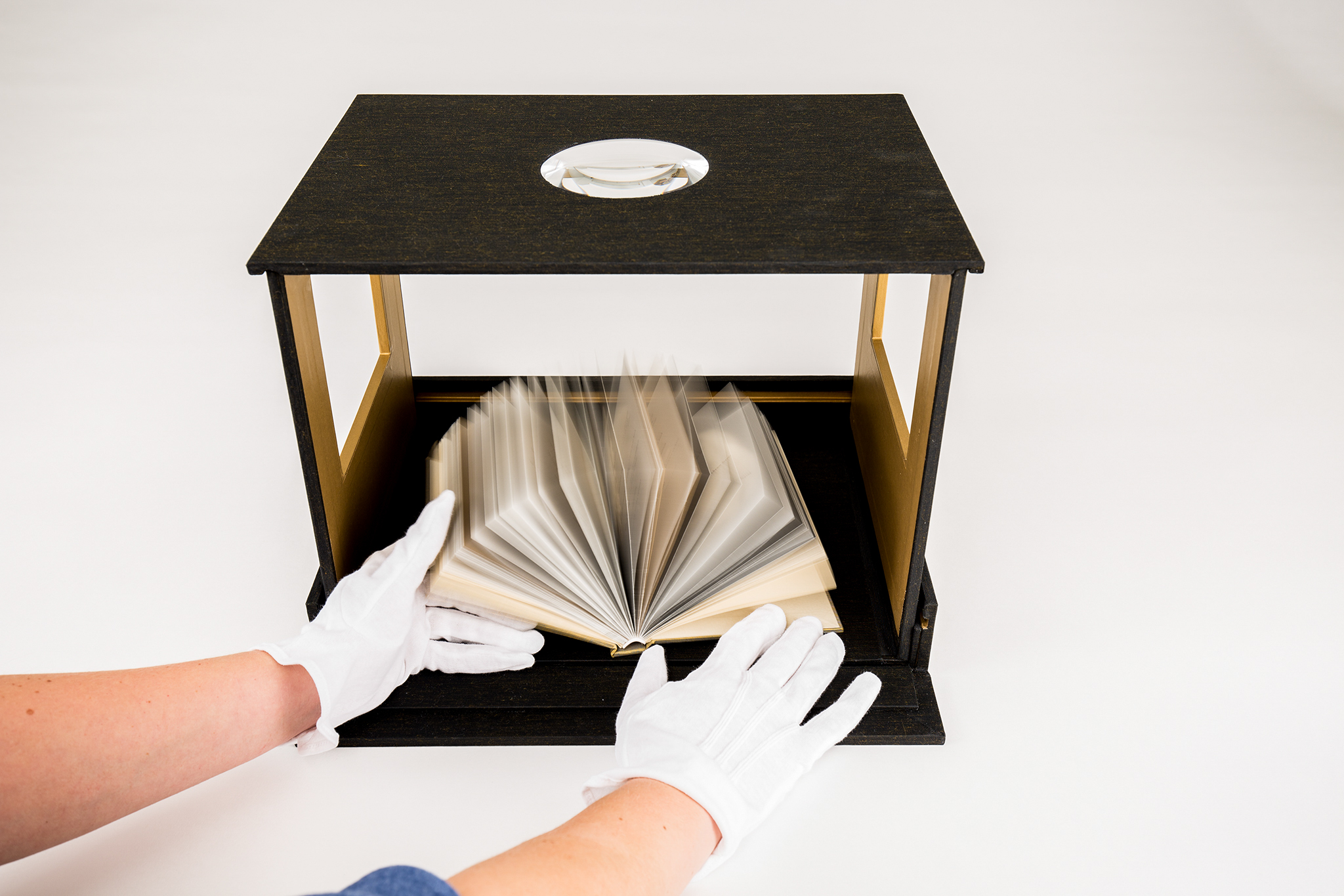
TP: We have been trying to get together for some time and after a few things getting in the way, we are now, finally, going to have our chat about your lovely handmade books. Hello and welcome Judy!
JS: Hello Tim and thank you.
TP: I have in front of me a range of 5 of your handmade books and I wanted to chat with you about how you got into making books. Also, the techniques involved and what has inspired you for the content of these books.
Firstly, over what time period were these books produced?
JS: These books have all been produced post “lockdown”. It was something I got inspired to do during lockdown. So they have all been produced since June I believe.
TP: Oh wow, so quite a short period of time. Have you been a landscape photographer for long?
JS: No, I took up landscape photography in 2013 after I had been retired from work for a few years. Though two or three different things came together at the same time to make it happen. Firstly I had been taking a lot of photographs of horses and happened to see an advert in our local post office advertising evening classes in A level photography. I thought it would be a fun thing to do, and it was. At the same time, we were building a house in northwest Scotland, which happened to be next door to Adrian Hollister’s Perfume and Open Studio where he was running a series of workshops. Adrian and I became friends and he gave me a huge amount of help to get started. We did a workshop with Adrian, Eddy Ephraums, Joe Cornish and Paul Sanders. That was life changing for me, that is what kickstarted me into landscape photography.
TP: Quite a useful start there! Also, the beautiful highland landscape to work with as well.
JS: Definitely a good starting point. At home, I live in the new forest so that is not too shabby. However, I find the new forest quite hard to photograph in. Very little of what I have done is down here. Which is something I plan to change, however, I have not done, yet.
TP: So in terms of bookmaking, I know that Mr Hollister has run a few workshops where handmade books have been involved. Have you been on any of those?
JS: I have done one a couple of weeks ago. However, I have not done any before then. I did get involved with Eddy making a book, a very different sort of book. I got very intrigued in the bookmaking process at that time and I planned to, but never got round to doing it. Come lockdown, I saw that Alex Hare and Lizzy Shepherd were running some online bookmaking workshops. At the same time, I had started to try and make the first of the books that you have in front of you. So, I signed up for that which was really helpful and got me going. From there I bought all the kit required and put it into practice.
Come lockdown, I saw that Alex Hare and Lizzy Shepherd were running some online bookmaking workshops. At the same time, I had started to try and make the first of the books that you have in front of you.
TP: Tell me which book was your first book out of the five I have. Also, tell me what intrigued you about the bookmaking process and what you learnt on the course?
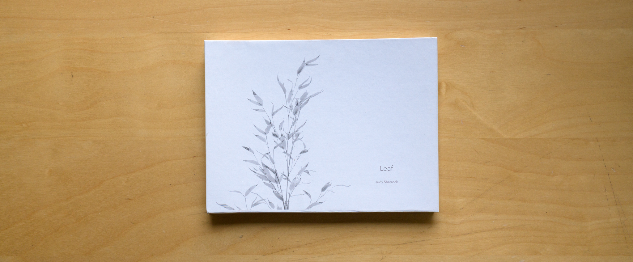
JS My first one is called “Leaf”. What intrigued me about the process, was the idea of putting images together. Someone on the first course I took said, “One image on its own no longer satisfies”. It’s a new dimension of putting them all together. What I learnt with Alex and Lizzy was the techniques of making “Hard” covers for books. Then the different ways and styles of putting them together; in my time with Eddy I had never put hardcovers on them before.
TP: This is one thing I found quite intriguing and visually compelling about the books is the beautifully wrapped images and the hardcovers. Let’s talk about your first book, “Leaf”. Tell me about the photographs within and then the technique you used to make the book.
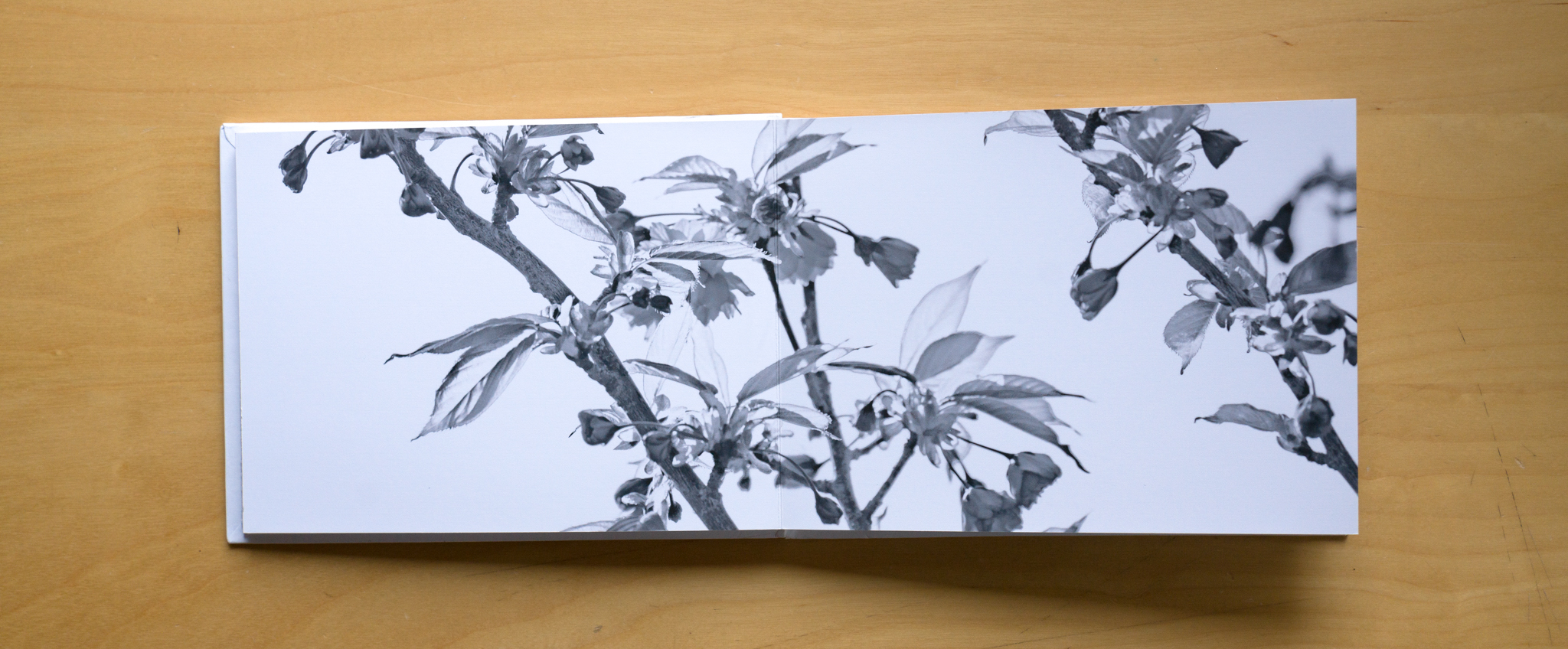
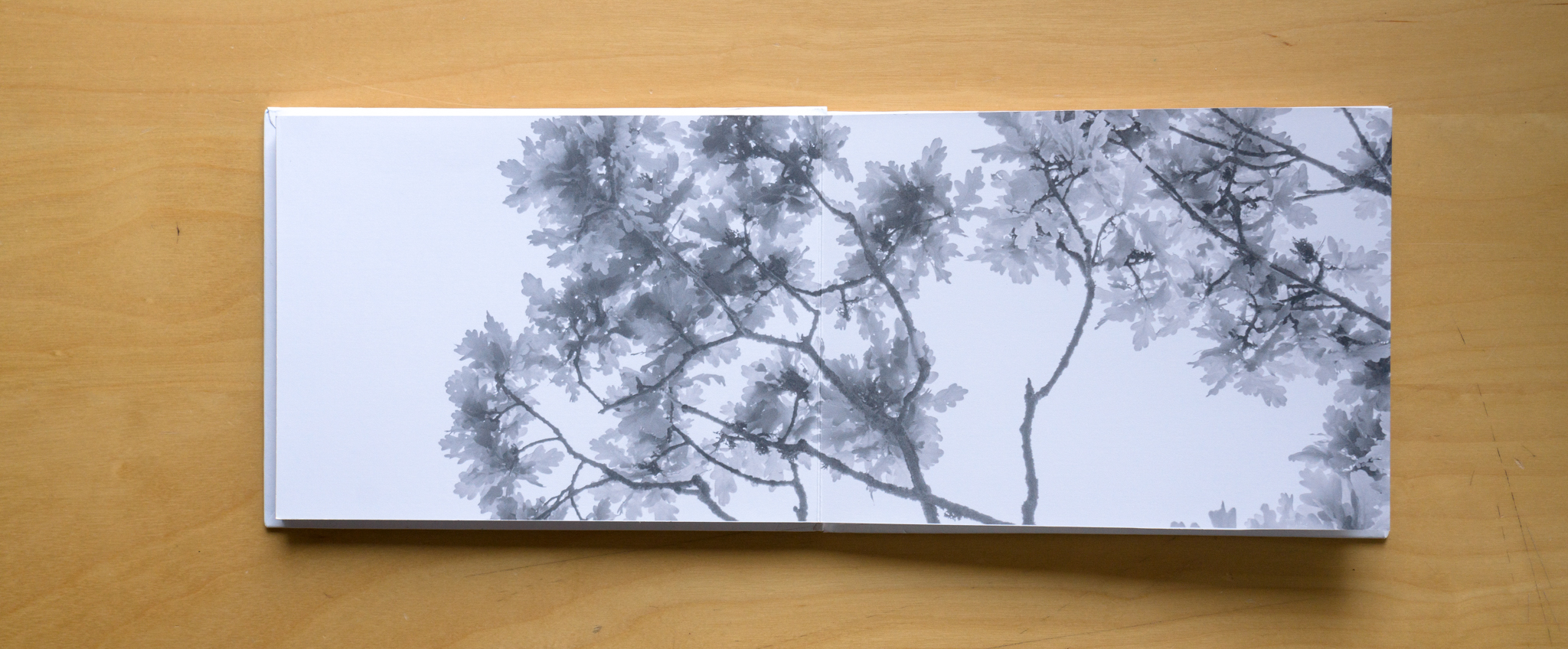
JS: This was very much a lockdown book. We had all been plunged into this lockdown and everyone reacted to it in different ways. I didn’t really feel like doing any photography - however, one day I had to get my camera out and just get on with it. I am very lucky that I live in a place with some nice land and a lovely garden. I took a few images and then went to play with some of them. It was in summer, so it was hot with blue skies. I thought that high key images might be fun. I did one image that I really liked and a few others. I went away and thought maybe it was something I could turn into a book. I created this high-key image of cherry blossom, so went round the garden and took images of different trees in the garden. Then I produced the book from that. So this book is composed just of different trees in my garden.
TP: Since you started with a “double page spread”. It is effectively a 3:1, or a 6:17 aspect ratio, did you have the idea of the book and took the photographs to match or did it happen the other way around?
JS: No, it happened the other way around. I had seen a book of Lizzy Shephard’s that she had done with Tulips, which had no frames to them and it ran to the edges of the book. I really liked that idea and I thought it worked quite well with these images. I like the idea of the “slices of the trees”, the fact you can recognise each type of tree from a fairly small section of it.
Anyone can do it. Once you understand how the process works and the techniques involved, it is down to how you want to construct it. My first attempt at constructing “Leaf” I did before the workshop with Alex and Lizzy. With guidance from them, I refined the techniques.
TP: Down to the bookmaking itself, what is involved in producing these? Is it quite involved or is it something that anyone could do?
JS: Anyone can do it. Once you understand how the process works and the techniques involved, it is down to how you want to construct it. My first attempt at constructing “Leaf” I did before the workshop with Alex and Lizzy. With guidance from them, I refined the techniques. Better paper, constructing the hardcover, sizing and framing. Then you work out how you stick all the pages together and the different types of book you can make.
I like the idea of using an image on the cover as it pulls you into the book. You can buy some beautiful papers to cover the card with if you like, however, I like the cover to become part of the book as well as the pages within the book itself.
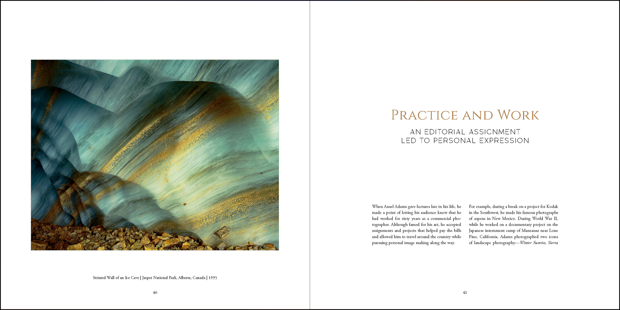
TP: With the sequencing, what was the thought behind the order of the pages and the prints within?
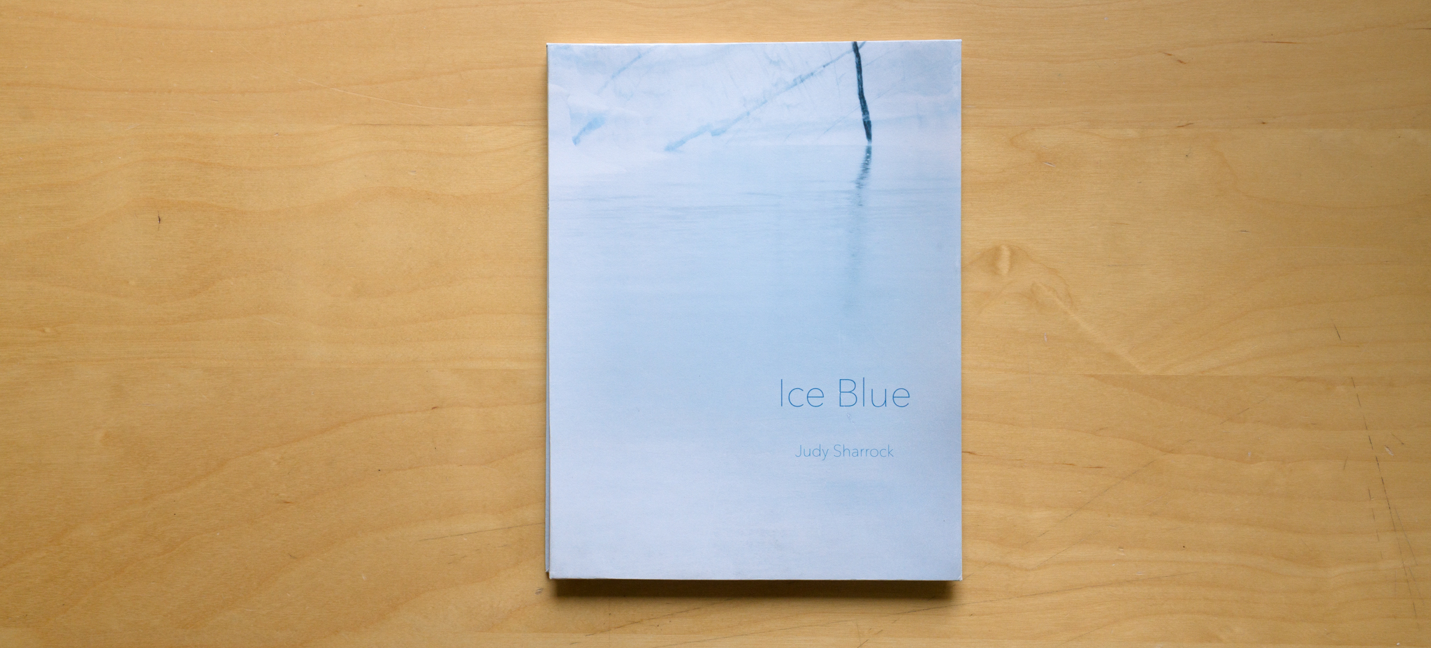
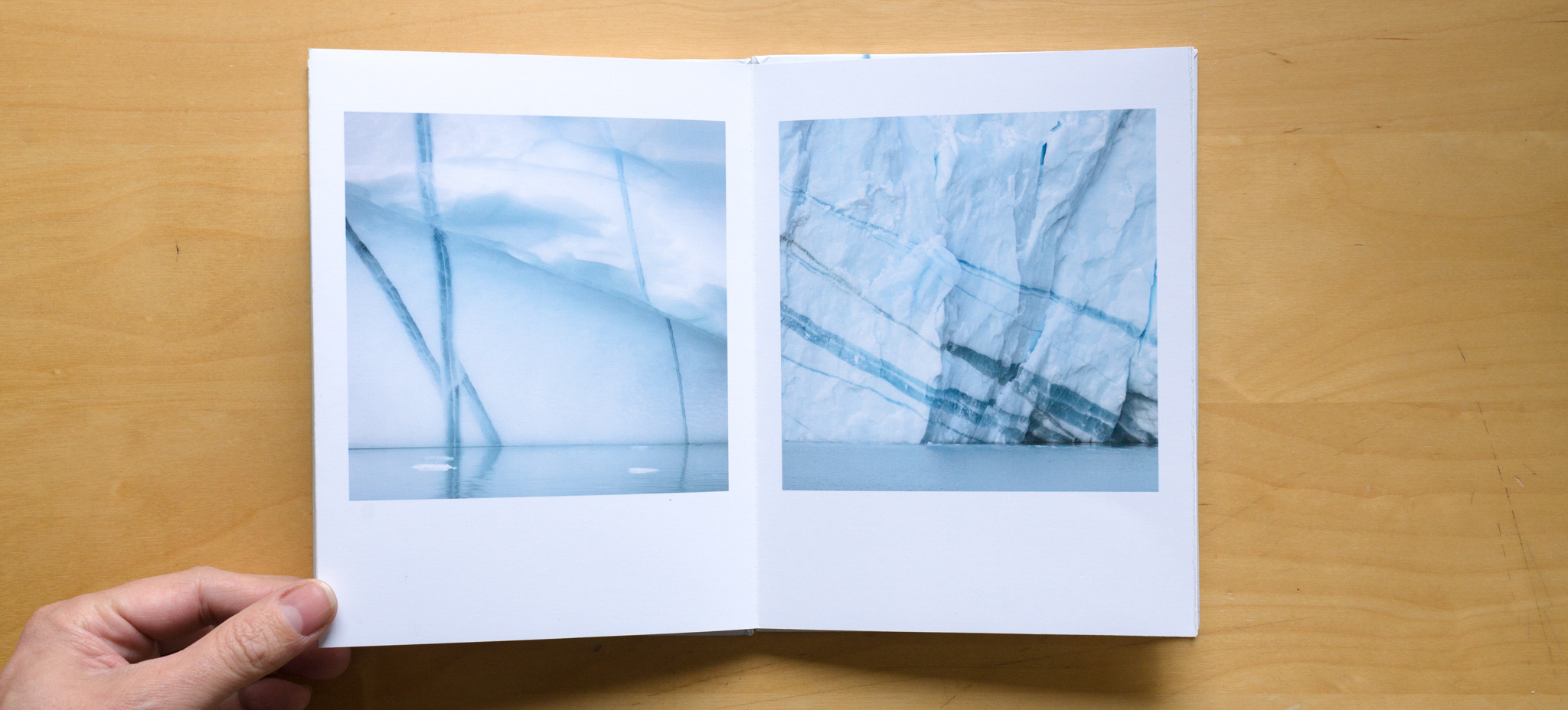
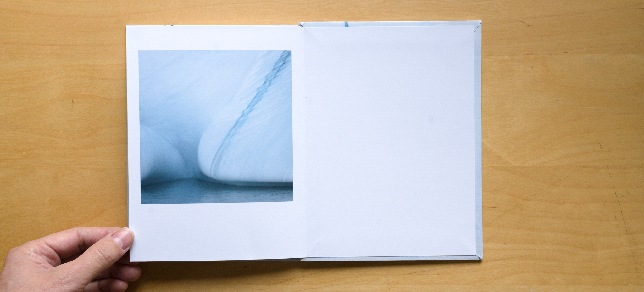
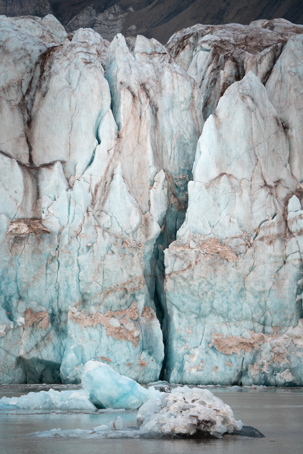
JS: There is probably less thought behind this one, however, there is much more thought behind the other such as “Ice Blue”. The sequencing in this book to me is what makes it. There was a lot of cropping involved to make this one work. They were not all just as they were. It is the sequencing and the way the images flow from one to another works for me. How the lines all carry on throughout the book.
TP: This (Ice Blue) is very much about line and form. These striking clear sections through icebergs carrying on from page to page. I am intrigued about this book, most people who think about books of any sort think “how am I going to get so many pictures together to fill a whole book” and yet this is almost a mini portfolio of 5 or 6 images brought together. Most people would have enough of these sort of images in their collection already to try this with.
JS: This is a perfect lockdown project. You can go back through all your images and find sets like this that lend them to bookmaking. As you say it doesn’t have to be a massive book. Somebody referred to little books like this as a “mini and individual works of art” rather than books. They are a different way of displaying your images. This book, “Ice Blue” is a concertina style book. You can pull it out and put it on a table and it is a very nice way of displaying them
TP: They are individual artefacts. They are not mass produced, they are handcrafted and brought together. It would be difficult to mass produce them. I know people who have done a series of them, a series of 4 or 5 rather than a series of 1000s.
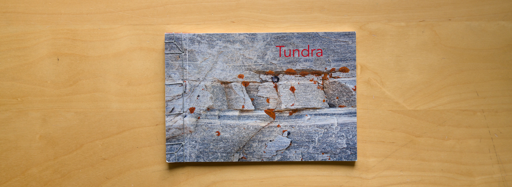
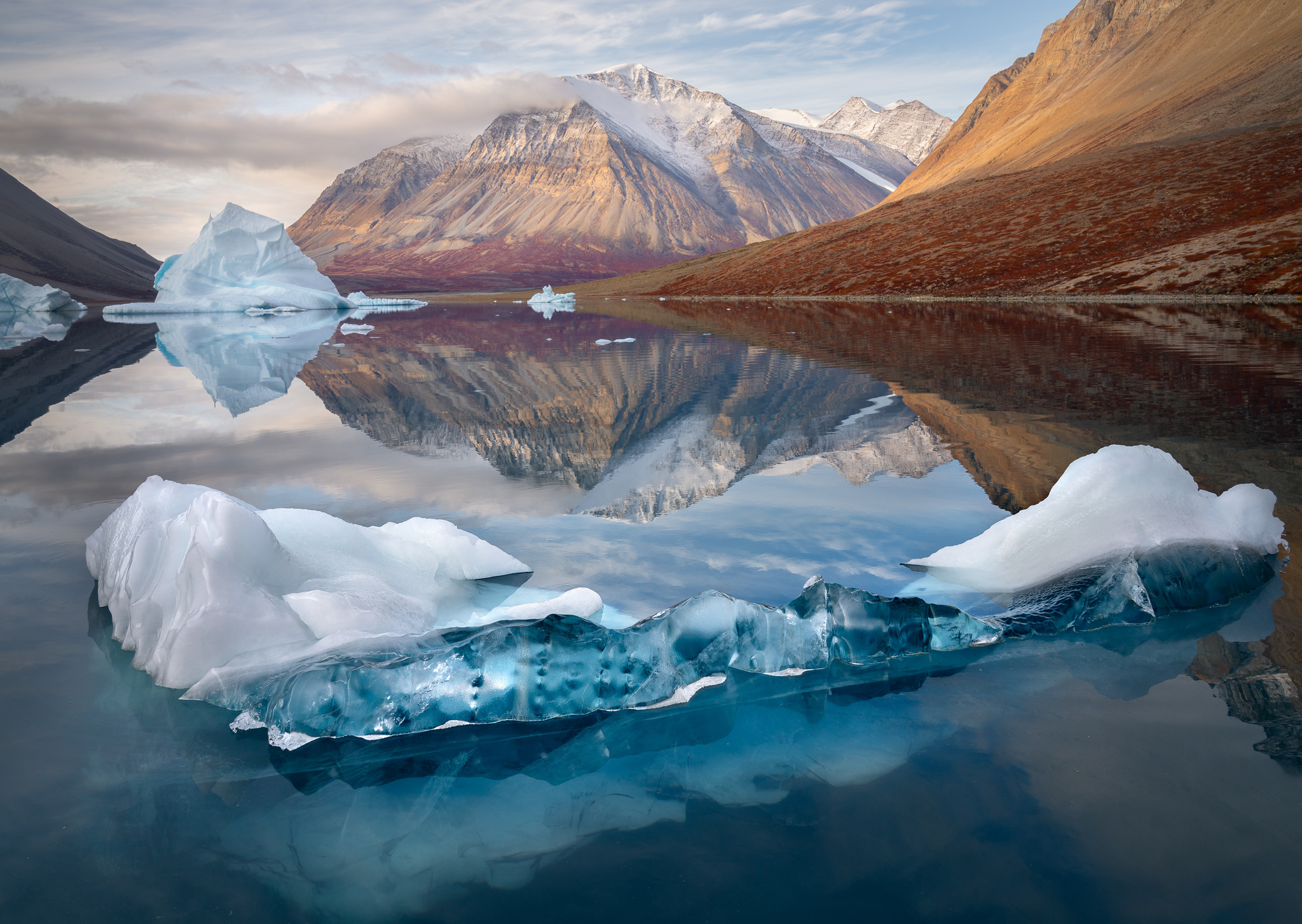
Let’s look at another book. I loved some of the images in the Tundra book. It is a different way of producing them. This one is stitched, so tell us how the book is made.
JS: This is called JSB – Japanese Stab Binding. In essence, when you size up each page you could just print them out of lightroom. You could create a blank book this way and then stick them in the book rather than constructing the book by printing all the pages and then binding them together. There are many things you can do using this technique. So in creating this book you have to make sure that all your sizing works. You have to make sure that you have the strip down the edge where you will bind the book. You have to crease it as well to make sure that the pages turn. The actual sewing is very simple and straight forward once you know how to do it. This makes a book that most people are familiar with. It has pages you can turn where other styles don’t. I experimented with the cover with this one. It is two types of paper stuck together but not convinced that this style works for me, but I was willing to give it a try.
This is called JSB – Japanese Stab Binding. In essence, when you size up each page you could just print them out of lightroom. You could create a blank book this way and then stick them in the book rather than constructing the book by printing all the pages and then binding them together.
TP: Please tell me more about the project surrounding the images in this book. There are some beautiful images in here.
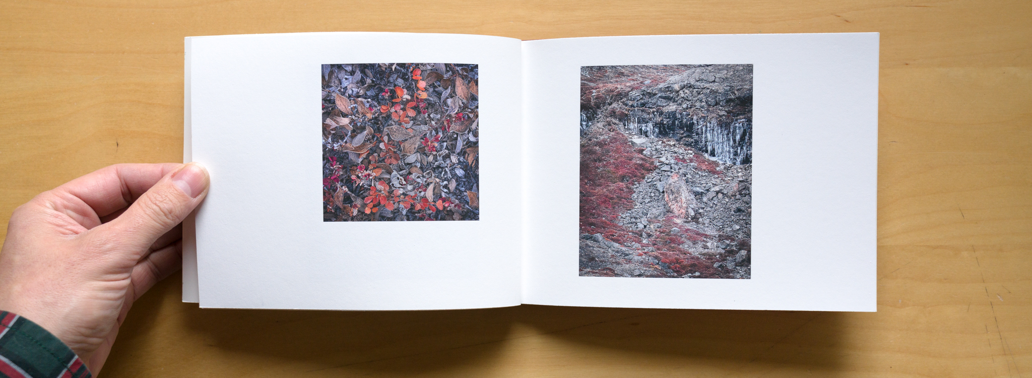
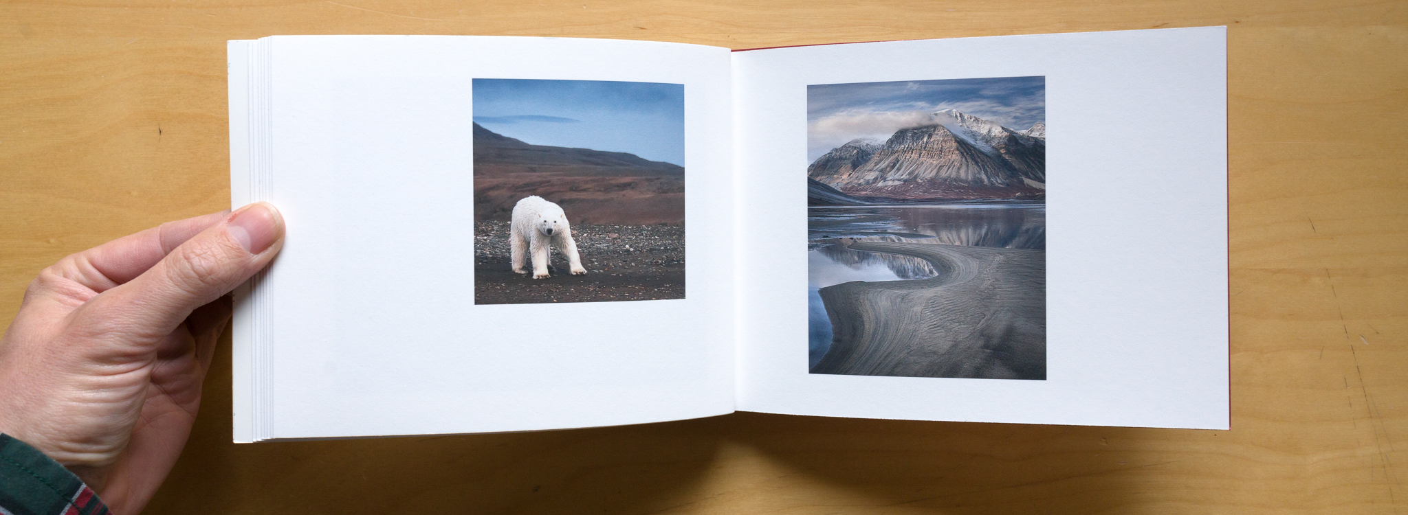
JS: I was very lucky last year to go on a trip to East Greenland organised by Anthony Spencer and Joe Cornish. They took 12 of us on a small ice breaker up to the northeast area of Greenland. This is a very unvisited part of the world. All the ships follow designated shipping routes and the ships crew showed us that we were going back to the old days away from these routes. It was a proper adventure as well, as the crew of the ship had not been to these places before as it is only ice free for a few weeks of the year. We were very lucky to have amazing weather in September that year. At that time, it can be wiped out by the snow and ice. What fascinated me the most, we were there in autumn and you could see this in the ground. The colours were absolutely amazing, in a totally different way compared to back here, I thought it would be a fun way to show Greenland not in the ice and snow. Show off some amazing colours.
TP: We would like to feature some of these images in the article as I think they are very strong images. Was it easy to pick out the images to use for this book from the photographs from this trip?
JS: It was easier than it might have been for other things. It was fun, you could put images in that had polar bears in them! However, the book was about the Tundra. It is about what Greenland looks like in autumn, not only about the astonishing big landscapes, also what is going on at your feet as well. The other folks joked that I spent more of my time with my camera facing the ground than the landscape.
TP: Although I can imagine the most interesting part is what is going on at ground level.
JS: The Tundra is like mini forests that are only a couple of inches high and they grow very little. They are tiny, but the colours and the intricacy of them were amazing.
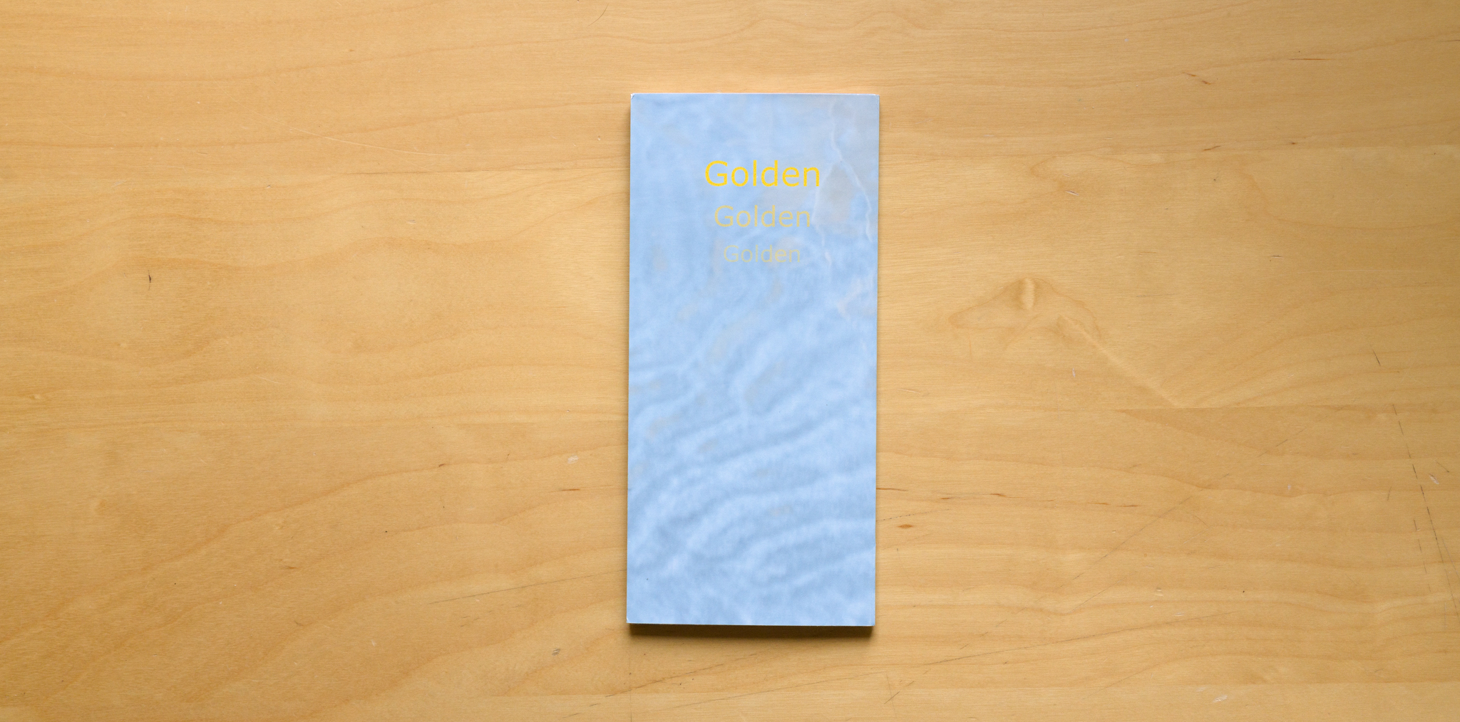
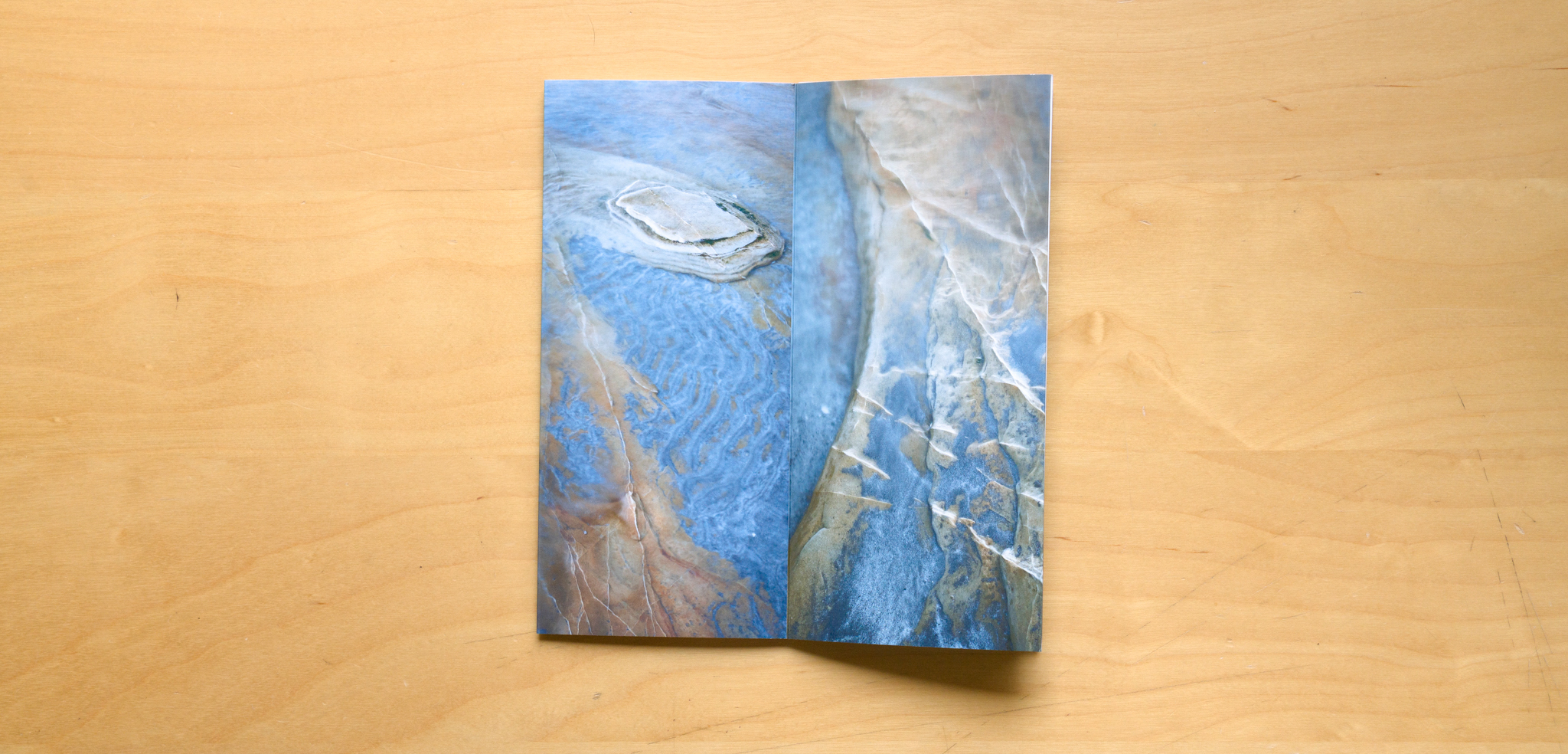
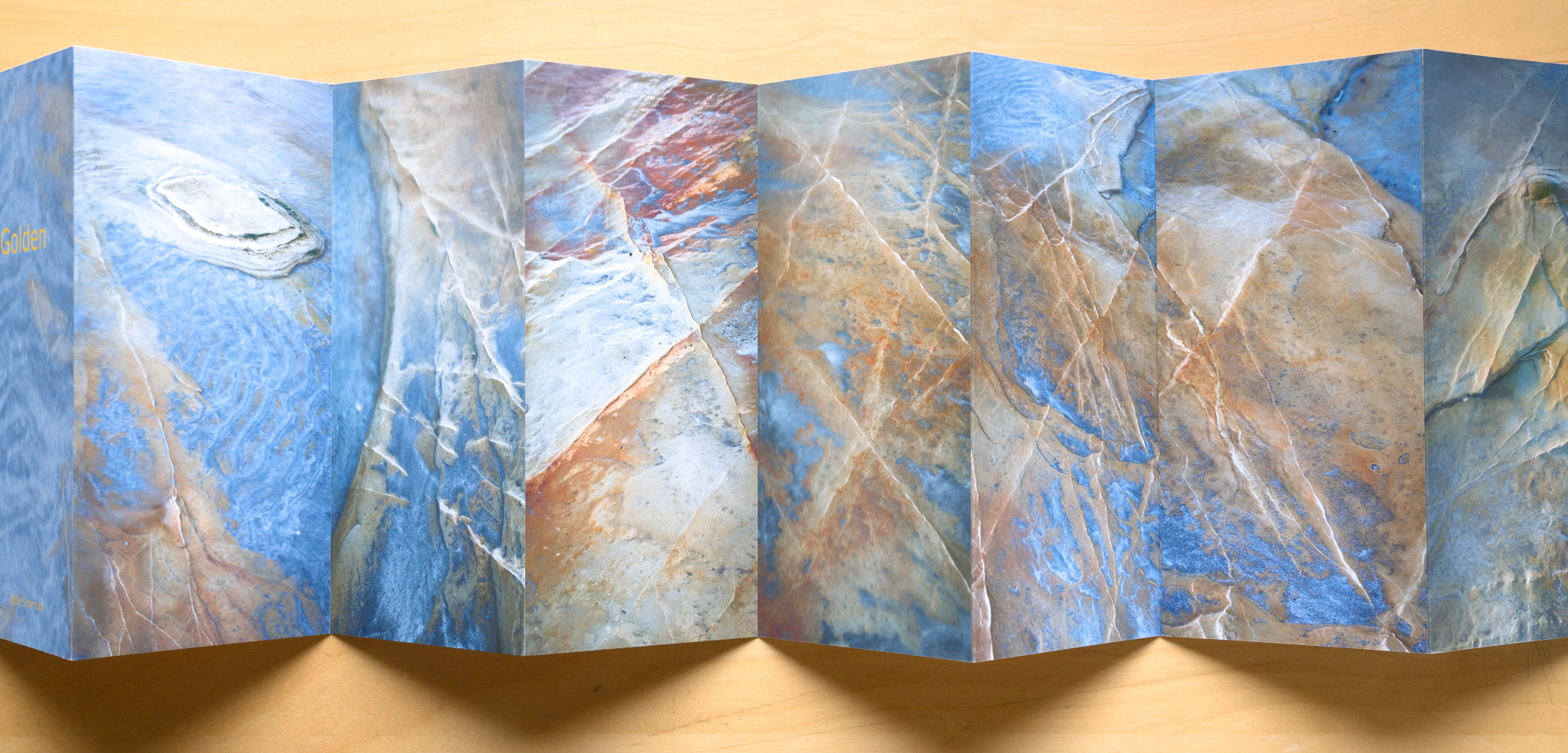
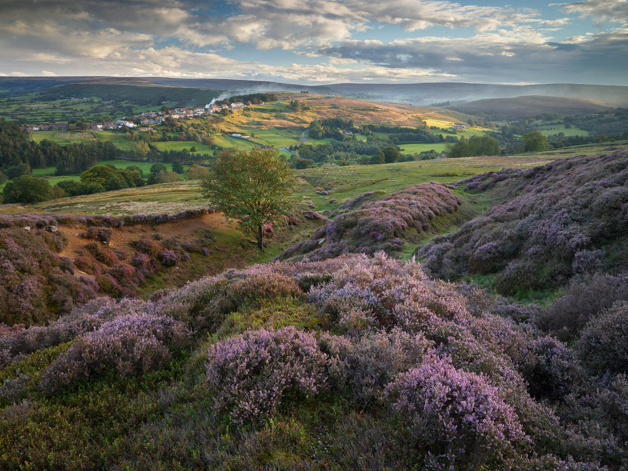
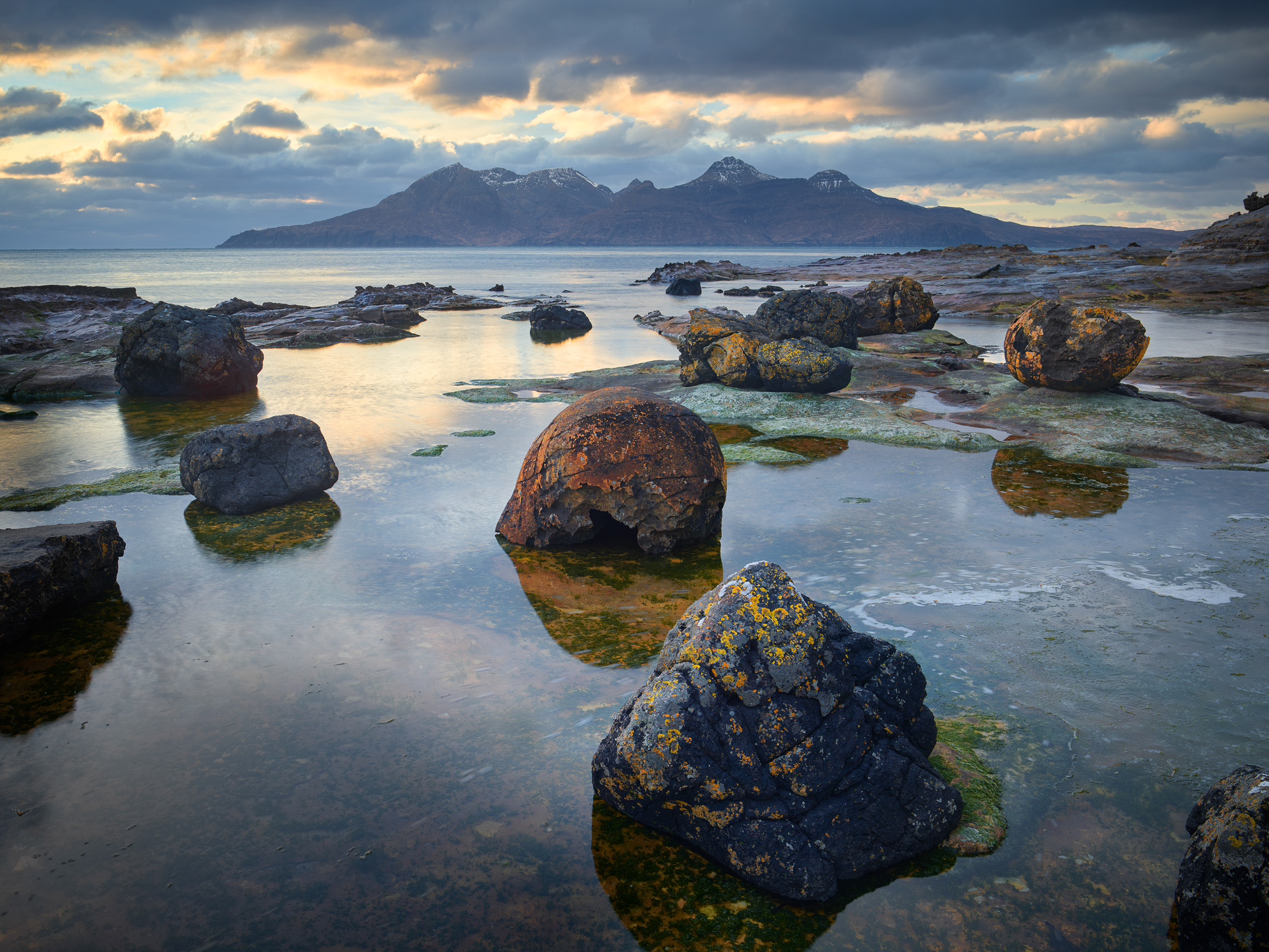
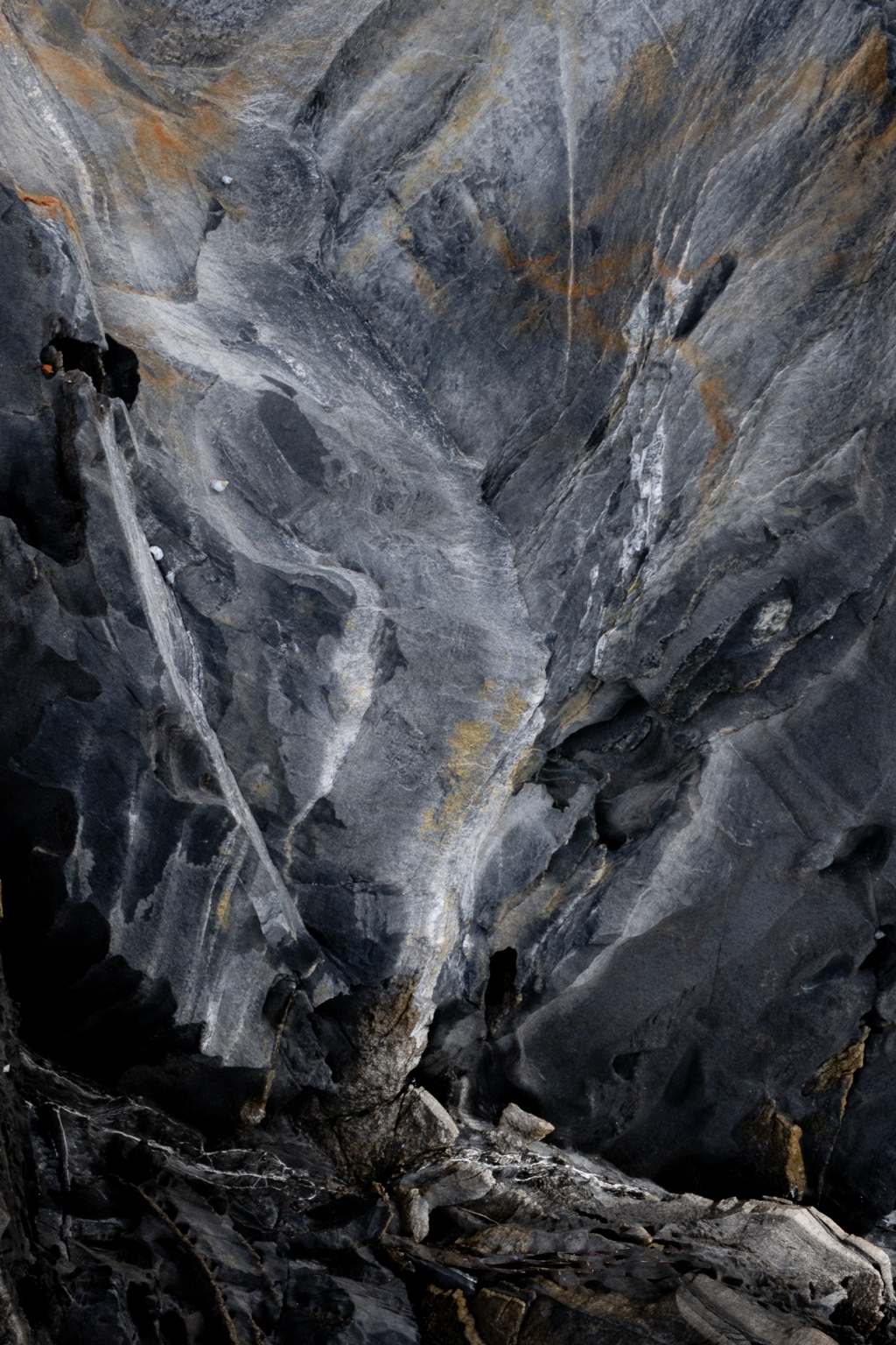
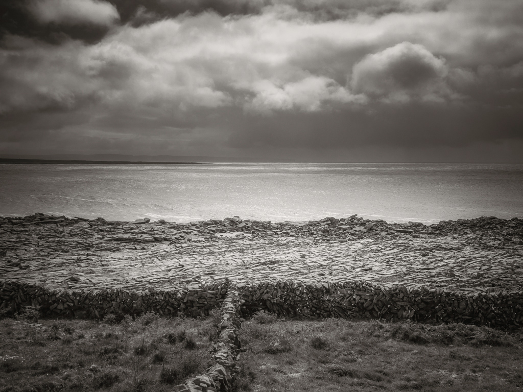
TP: This is another one of your books that I found interesting, it is very tall and thin. It is a book in a sleeve, it looks like it is from the west coast of Scotland with amazing geology, Eigg or Arran. Lots of folded iron rich ridges and cool blue sands. Whereabouts is the project from and can you describe to me what was involved in making this book?
JS: It was taken on the Isle of Eigg. I made this book on a recent workshop with Eddy and Adrian up at the perfume studio. I like the idea that the images are very similar, and you can put them together with no borders, so they all run into each other. At times it can be difficult to tell if it is one big image or several smaller ones.
TP: I like this one as it is another concertina book so you can hold it out almost into a long strip and it creates a textural, rhythmic image.
JS: It is a good example of what fun you can have with bookmaking. You can almost make it up as you go along. It doesn’t have to conform to a “Standard book”, the sky is the limit in respect to what you can make out of a book.
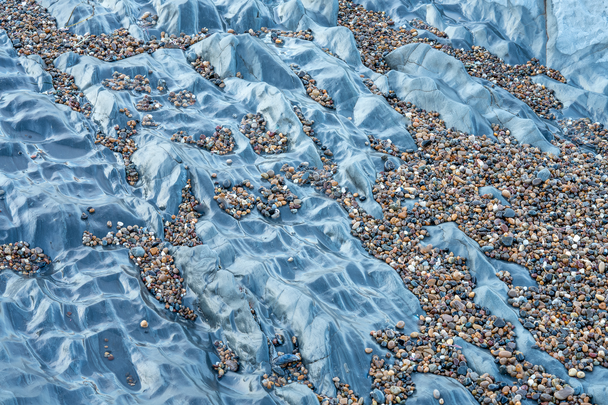
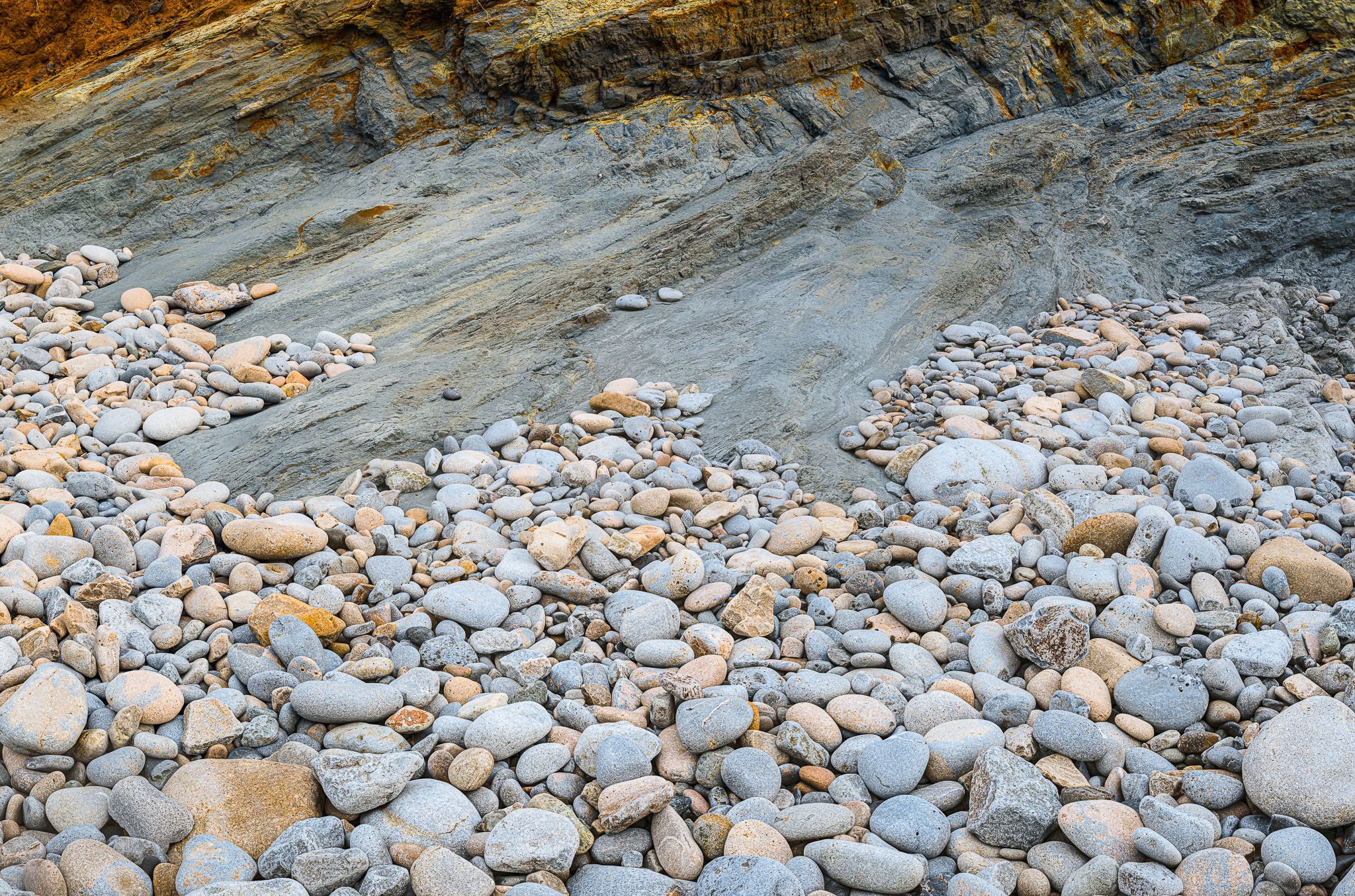
The piece of rock that they are portraying is only 4 or 5 m2 and the tide was coming over it, washing sand on and off them creating different images in the same piece of rock.
TP: The fascinating thing about this, is being able to make crops or aspect ratios that you would rarely use or see in a portfolio.
JS: The piece of rock that they are portraying is only 4 or 5 m2 and the tide was coming over it, washing sand on and off them creating different images in the same piece of rock.
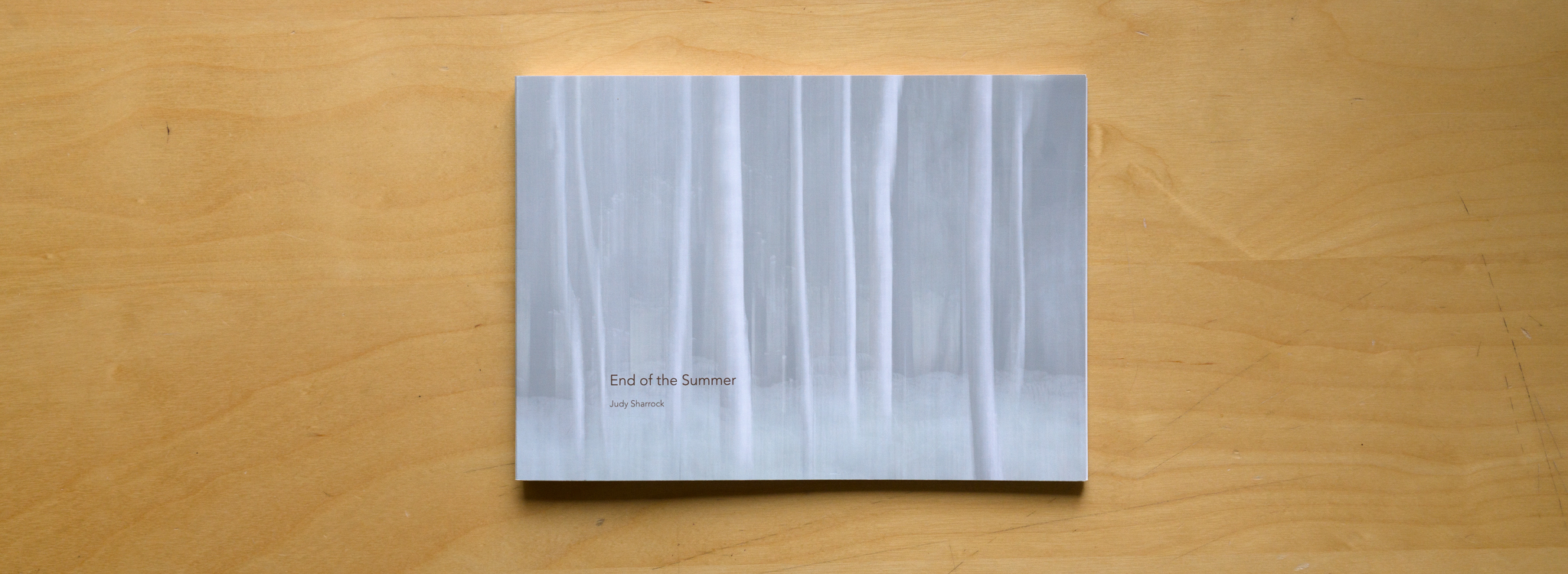
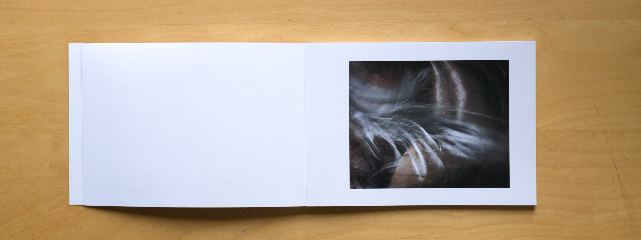
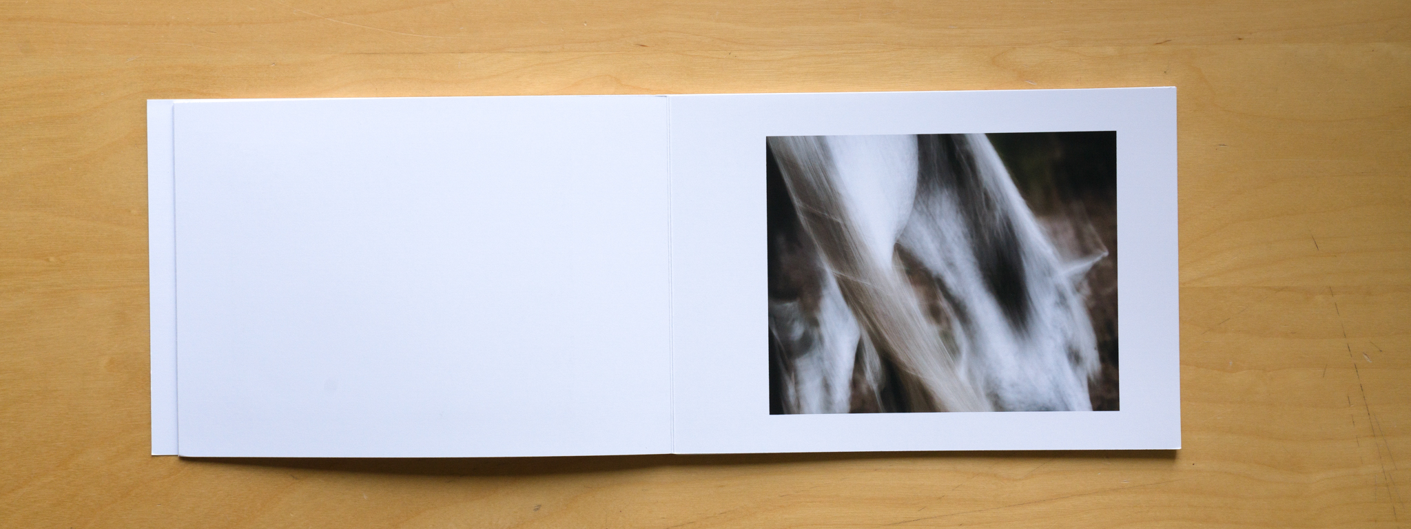
TP: Now we will look at an aptly named book called “End of the Summer”. This is a simpler book without the hardback covers. Please tell me about the book.
JS: This is another one that I did at the workshop, it is called a “Layout book”. It’s a type of concertina book. However the pages are stuck together differently so you can open each page out flat, Eddy used the same technique to make Paul Sanders’ book Solace. It’s a nice structure for a more traditional book, very simply made.
TP: I like this technique and the concertina technique as you can open the book fully at an image and see it in its entirety without bending the book. With the JSB you have to almost bend the images to open the book up. Tell me more about the book and project, End of summer.
JS: This was shot in the new forest, I shot it all in one afternoon. I have a love hate relationship with ICM. I did some, one summer’s afternoon, again a hot summer’s day. I have been interested in horses, one of my passions. So I went to see what the ponies were up to, it just came from an afternoon out seeing them and being in the forest. The feel of it for me, captures how it felt that afternoon. Very hot, tired and dusty, very simple.
I went to see what the ponies were up to, it just came from an afternoon out seeing them and being in the forest. The feel of it for me, captures how it felt that afternoon. Very hot, tired and dusty, very simple.
TP: I went on a workshop with Lizzy Shepherd, but it was a John Blakemore bookmaking workshop a while back. At the time I didn’t have any images that I thought would work together in a book. So I went out and took pictures in an afternoon and it was brilliant, maybe none of them would work on their own, however in a book together they did. The ability to use editing and context in a project to make something coherent is a different way of looking at photography rather than the individual picture.
JS: Definitely totally agree. I have it in the back of my mind now when I go out. I will occasionally look at a picture and think, will this make a sequence, its like having a totally new dimension to photography. Thinking, “can these pictures go together or not?”
TP: Has bookmaking made you think differently about your photography outside?
JS: I think it makes me look at things differently when I start processing them. I might see something that had potential, then go and take more images of it. I am currently working on a book on Lilys. I took maybe more images of that pond as I did think that there could be a book there. It probably translates to more images rather than different images.
TP: Thank you. We will look forward to seeing the Lily book in due course I’m sure.
Photography’s potential as a great image-maker and communicator is really no different from the same potential in the best poetry where familiar, everyday words, placed within a special context, can soar above the intellect and touch subtle reality in a unique way. ~ Paul Caponigro
It’s interesting how often artists, including photographers, refer to poetry when describing their work and philosophy. The correlation is easy to understand when considering that the word “poetry” derives from a Greek word meaning to create or to bring something into being. This definition is close to that of the word “art,” derived from a Latin word referring also to items brought into being by human skill.
The distinction between prose and poetry in writing is analogous to the distinction between representation and artistic expression in photography.
The distinction between prose and poetry in writing is analogous to the distinction between representation and artistic expression in photography. In both cases, the difference comes down to how one expresses meaning: literally or metaphorically, objectively or subjectively, decisively or ambiguously, descriptively or implicitly.
One glaring difference between writing and photography, however, is this: in writing, neither poets nor journalists try to assert their own style as the only valid form of writing or to demonise others. In photography, expressing meaning poetically, departing from objective representation when it serves no useful purpose or even distracts, is still often met with ire. In writing, no journalist is concerned that the existence of poetry may diminish the importance or credulity of reportage, and no poet worries about readers feeling deceived if they realise that poetic verses are often not meant as statements of fact. In this sense, the analogy also makes it plain how far photography still has to go as an art form, if only just to catch up to where other media already are.
Pondering the challenge facing photographers aspiring to creative expression, W. Eugene Smith wrote, “I am constantly torn between the attitude of the conscientious journalist who is a recorder and interpreter of the facts and of the creative artist who often is necessarily at poetic odds with the literal facts.”
Despite such historical figures acknowledging the artistic potential of photography, many photographers today still wish to clip photography’s expressive wings: to renounce its ability to serve as a medium for visual poetry, distinct from but equal in importance to its ability to serve as a medium for factual representation.
I find it unfortunate that any photographer would feel torn between these two intents as both are squarely within the capacities of photography and only in contention because of misinformed assumptions about non-existent limitations inherent in the medium. There is no practical reason—not even in terms of photographic purity, however one chooses to define it—why photographs can’t serve both purposes without diminishing either.
Among other photographers who pondered photography as it relates to poetry, Minor White (who was a poet as well as a photographer) wrote: “My pity for the pure photographer / My pity for the pure poet / Is tempered by the responsibility / I have to three media / Whereas they to only one.” Ernst Haas, former president of Magnum Photos, wrote, “we are on the way to speaking our very own language. With it we will have to create our own literature. You will have to decide for yourself what kind of works you want to create. Reports of facts, essays, poems—do you want to speak or to sing?”. Henri Cartier-Bresson wrote, “I’m not responsible for my photographs. Photography is not documentary, but intuition, a poetic experience.”
Despite such historical figures acknowledging the artistic potential of photography, many photographers today still wish to clip photography’s expressive wings: to renounce its ability to serve as a medium for visual poetry, distinct from but equal in importance to its ability to serve as a medium for factual representation. This is not to say that a photograph can’t be both factually representational and poetic in meaning, only that there is no tenable argument why the former should be a requirement for the latter.
Perhaps a stronger argument in favour of acceptance of photography as a means for (metaphorical, non-representational) creative expression is that, regardless of opinion, poetic photographs—many decidedly not representational—already make a great proportion of photographs one is likely to see in public media. This accords with the general trend in art—away from literal representation and toward greater abstraction, subjectivity, symbolism, and ambiguity.
Much of today’s art, loosely referred to as “post-modern,” is no longer about any adherence to recognisable styles or purity of process, and more about the expression of ideas, by whatever means the artist sees fit.
In considering artistic movements of the past, it takes little knowledge of art history to distinguish based on appearance alone between a realistic painting and an impressionistic one. But art has long moved past impressionism, too. Much of today’s art, loosely referred to as “post-modern,” is no longer about any adherence to recognisable styles or purity of process, and more about the expression of ideas, by whatever means the artist sees fit. It’s inevitable that photography practised as art will follow the same trajectory. (If anything, it’s about time photography stopped playing catch-up with other arts.) Those who tried to derail such progression in other media have often found themselves on what we now consider “the wrong side of history.”
On a recent On Landscape podcast discussing truth to nature David Ward commented, “nobody gives any objection at all to the fact that paintings aren’t real.” This may seem obvious to us today, but it was not always the case. Until the late 19th century, fidelity to nature was considered in many venues (notably in France, which was the hub of western art at the time) as the highest aspiration for art. Works that departed from realistic appearances, such as those by the early impressionists, were shunned, sometimes even ridiculed, and excluded from the most prestigious exhibitions, such as the Paris Salon.
The invention of photography, portending a future in which the photographic medium could surpass painting in its ability to portray natural, realistic appearances, was seen by some critics as potentially ruinous to art. Charles Baudelaire, a distinguished poet and art critic, wrote a scathing rebuke of photography in an essay about the Paris Salon of 1859—just three decades after the invention of photography. In his critique, Baudelaire wrote this:
The invention of photography, portending a future in which the photographic medium could surpass painting in its ability to portray natural, realistic appearances, was seen by some critics as potentially ruinous to art.
“In matters of painting and sculpture, the present-day Credo of the sophisticated, above all in France (and I do not think that anyone at all would dare to state the contrary), is this: ‘I believe in Nature, and I believe only in Nature (there are good reasons for that). I believe that Art is, and cannot be other than, the exact reproduction of Nature […] Thus an industry that could give us a result identical to Nature would be the absolute of Art.’ A revengeful God has given ear to the prayers of this multitude. Daguerre was his Messiah. And now the faithful says to himself: ‘Since photography gives us every guarantee of exactitude that we could desire (they really believe that, the mad fools!), then photography and Art are the same thing’ […] this industry [photography], by invading the territories of art, has become art’s most mortal enemy.”
The infamous satirical critic Louis Leroy, upon seeing Claude Monet’s painting, “Impression, soleil levant” (Impression, Sunrise), commented, “I was just telling myself that, since I was impressed, there had to be some impression in it ... and what freedom, what ease of workmanship! Wallpaper in its embryonic state is more finished than that seascape.” Prompted by this critique, the early impressionists adopted the term “impressionism” for their movement, rendering Leroy a historic laughingstock. France’s Académie des Beaux-Arts attempted to squelch impressionism by excluding impressionist work from its Salon. In response, the early impressionists started a salon of their own, and prompted a revolution in the arts. As painter Robert Henri put it, “History proves that juries in art have been generally wrong.”
I mention the impressionists not only as an example of art evolving by revolutionary leaps (rather than gradual transitions)—toward subjective expression and away from objective realism. Impressionism holds another important (if not as widely acknowledged) lesson that is eminently relevant to photographers who care about fidelity to real experiences (which, in the case of poetic expression, does not necessarily imply fidelity to real appearances).
Of those concerned with truthfulness in photography, I ask this: if you inspire in your viewers an experience you did not actually have, is the fact that your images are not “manipulated” sufficient to make them “true”? Conversely, is a photograph that is “manipulated” as to expresses true qualities of experience any less “truthful” just because it is at “poetic odds” with objective representation?
The lesson is this: impressionism has lost its connection with real experience (read: subjective impressions) and came to be regarded primarily as an aesthetic style. This trend also is evident in photography, where many are content copying the styles (if not the exact compositions) of others, giving no mind to the fact that what such photographs express often is incongruous with their own real experience.
Monet famously credited the success of his works to the emotions he felt when working while out in nature, rather than to his distinctive style. Many other impressionists, despite lumping their work into the same category as Monet’s, produced works of similar effect but without the experience of working in, and from, nature. As Monet himself put it, “My only merit lies in having painted directly in front of nature, seeking to render my impressions of the most fleeting effects, and I still very much regret having caused the naming of a group whose majority had nothing impressionist about it.” This should serve as a warning to those interested in poetic expression in photography. Stylistic departures from realistic appearances are not enough (indeed, it’s not even required) for an image to be poetic, but fidelity to true experience is required if one aspires to live a poetic life.
Of those concerned with truthfulness in photography, I ask this: if you inspire in your viewers an experience you did not actually have, is the fact that your images are not “manipulated” sufficient to make them “true”? Conversely, is a photograph that is “manipulated” as to expresses true qualities of experience any less “truthful” just because it is at “poetic odds” with objective representation?
I first became aware of Hokkaido when I saw an article by Paul Gallagher saying how much he had enjoyed his visit and how different the landscape was to what he was used to. I loved the simplicity of the images in the article, so when some months later I saw that he was arranging a workshop in Hokkaido I jumped at the chance to visit.
I do very little planning for a trip like this beyond arranging flights, clothing etc, partly because with a workshop I expect to be taken to interesting places, but equally because I like to arrive at a location with an open mind and react to the landscape in my own way. If I were to study photographs by other people, I might go with preconceived ideas of what to expect and I don’t like that, I want to make my own images in my own way. If I miss classic views (which I often do) that is fine as I will have found my own interpretation of the place which will mean much more to me.
The workshop
The workshop was in early February 2019 and I decided to add on a few days in Tokyo first, partly to recover from any jetlag but also to explore a city and country I had not previously visited. This was a good decision and I enjoyed the days wandering around various areas of the city and the bustle of this great city proved to be a huge contrast to the silence of Hokkaido.
Hokkaido is the most Northern island of Japan and is full of flowers in summer and a popular place for Japanese tourists, but in February it is in the grip of winter and usually with deep snow.
The flight from Tokyo to Asahikawa airport in Hokkaido took about 95 minutes and there were warnings that we might not be able to land there due to heavy snow. We landed OK and I was delighted to see lots of snow, quite a change from mild Tokyo. At lunchtime next day I met the rest of the small group plus our guides Paul Gallagher and Michael Pilkington and our local guide Tsuyoshi Kato.
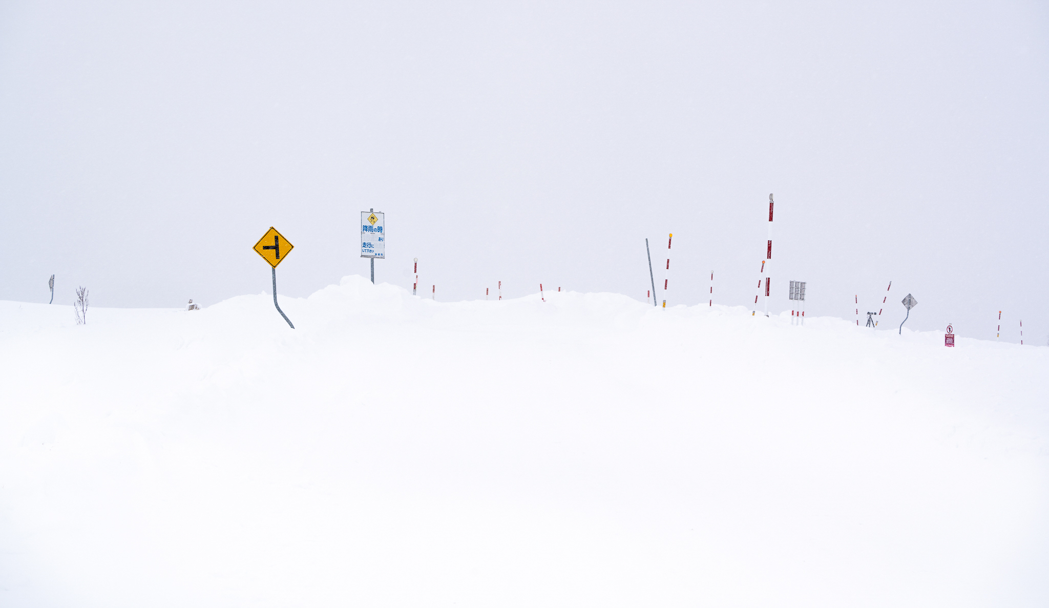
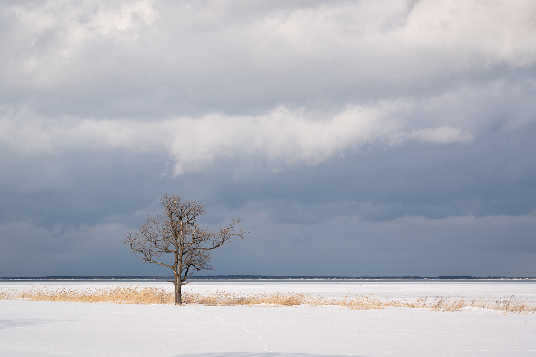
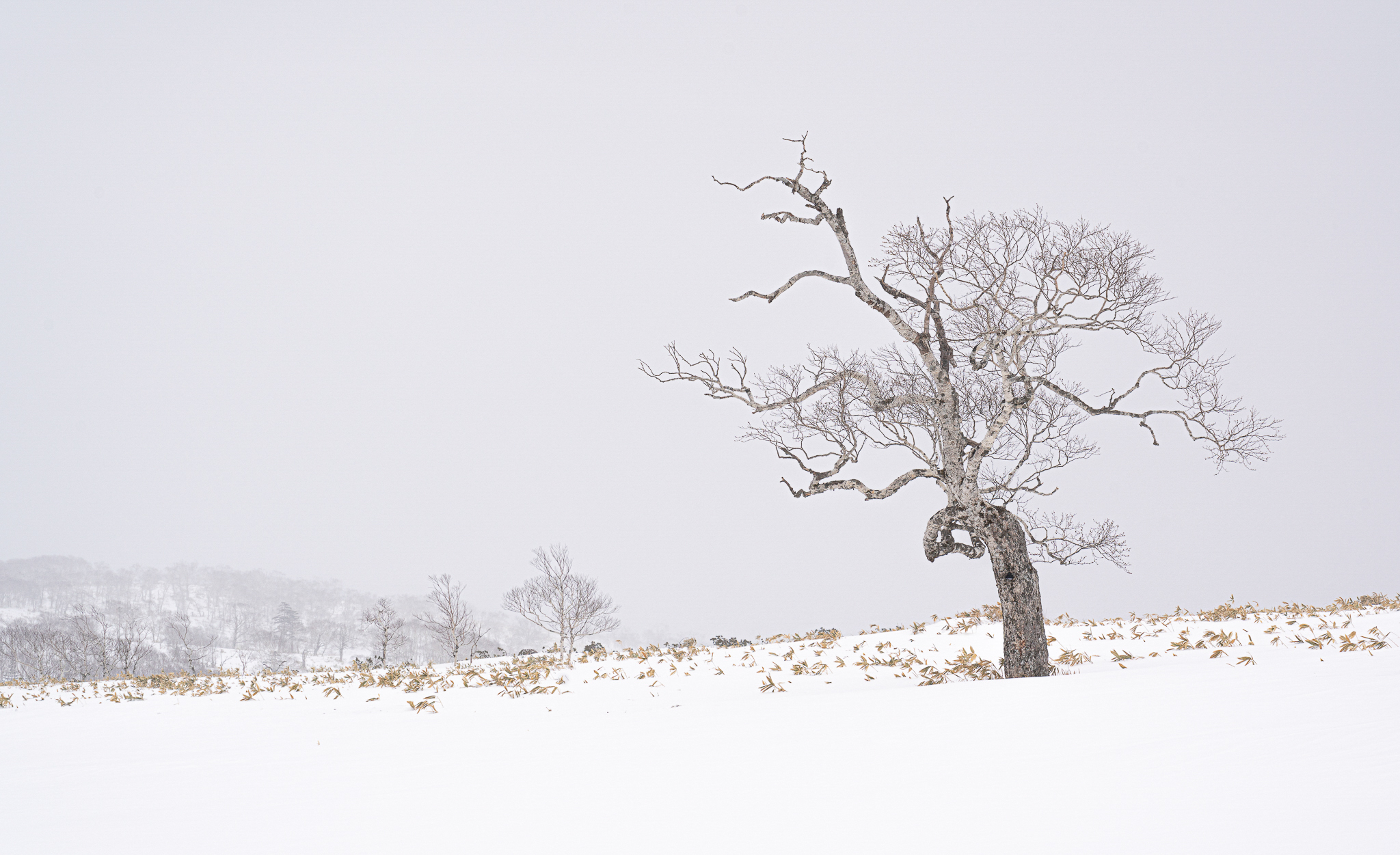
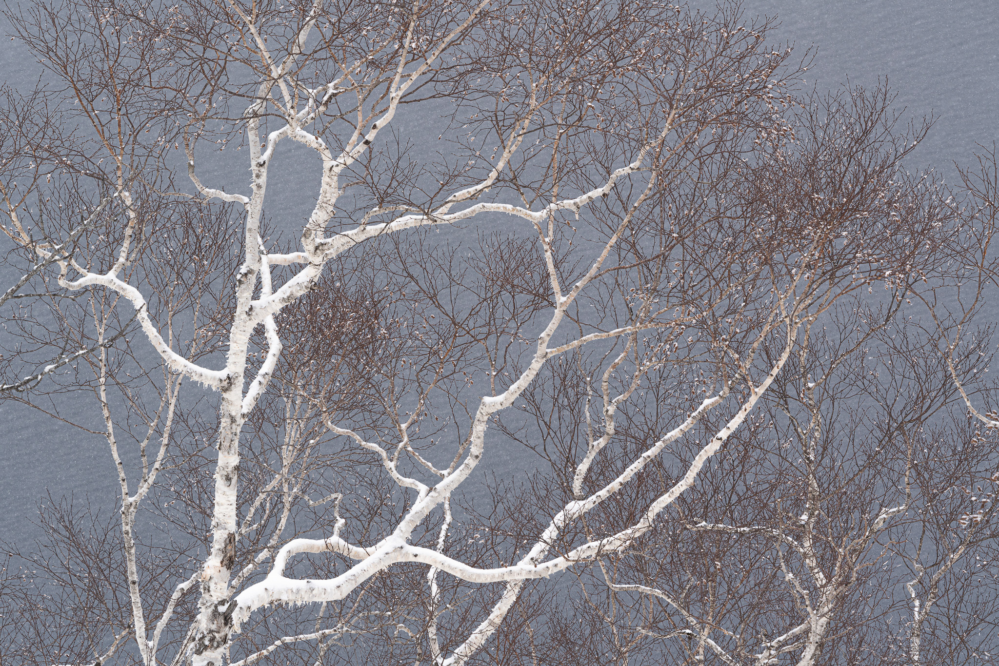
We started our trip in the Biei area and we stopped at the Seven Star Tree. This lone Oak tree became an overnight sensation for its use on a package of Seven Star cigarettes in 1976 and I was very surprised to find several coaches of Japanese tourists there. Fortunately, they alighted from the coaches, took selfies with the tree and left again soon afterwards. I hadn’t expected to see lots of other people on this trip and fortunately, this was a rare exception.
This stop gave me a taste of the weather to come, overcast with regular snowstorms. I loved the snow as it gave a great texture to the trees and landscape, although it made photography difficult when it was blowing straight into the lens.
Having photographed the Oak tree and the adjacent line of trees, I looked around to find something which interested me more and I discovered lots of snow poles and signs in the deep snow which I really enjoyed exploring. Look closely and you will see a lone tripod and camera, but no sign of a photographer! I didn’t spot that until I got home.
This lone Oak tree became an overnight sensation for its use on a package of Seven Star cigarettes in 1976 and I was very surprised to find several coaches of Japanese tourists there.
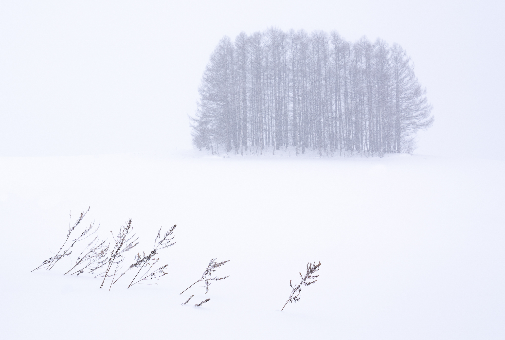
Trees were undoubtedly the principal subject of the trip; they were everywhere and the deep snow gave them a simplicity which rendered them very beautiful and special. Although I enjoyed the shots I took of the tree copse, I felt that the foreground grasses added a lot to the composition. The almost horizontal snow in this photograph added to the separation between the foreground and trees.
We stopped at a frozen lake where I was particularly attracted to the view across the lake to trees covered in frost and snow. A long lens made some very abstract images. I particularly liked this elegant tree with the white background and the snow on the branches adding to the image.
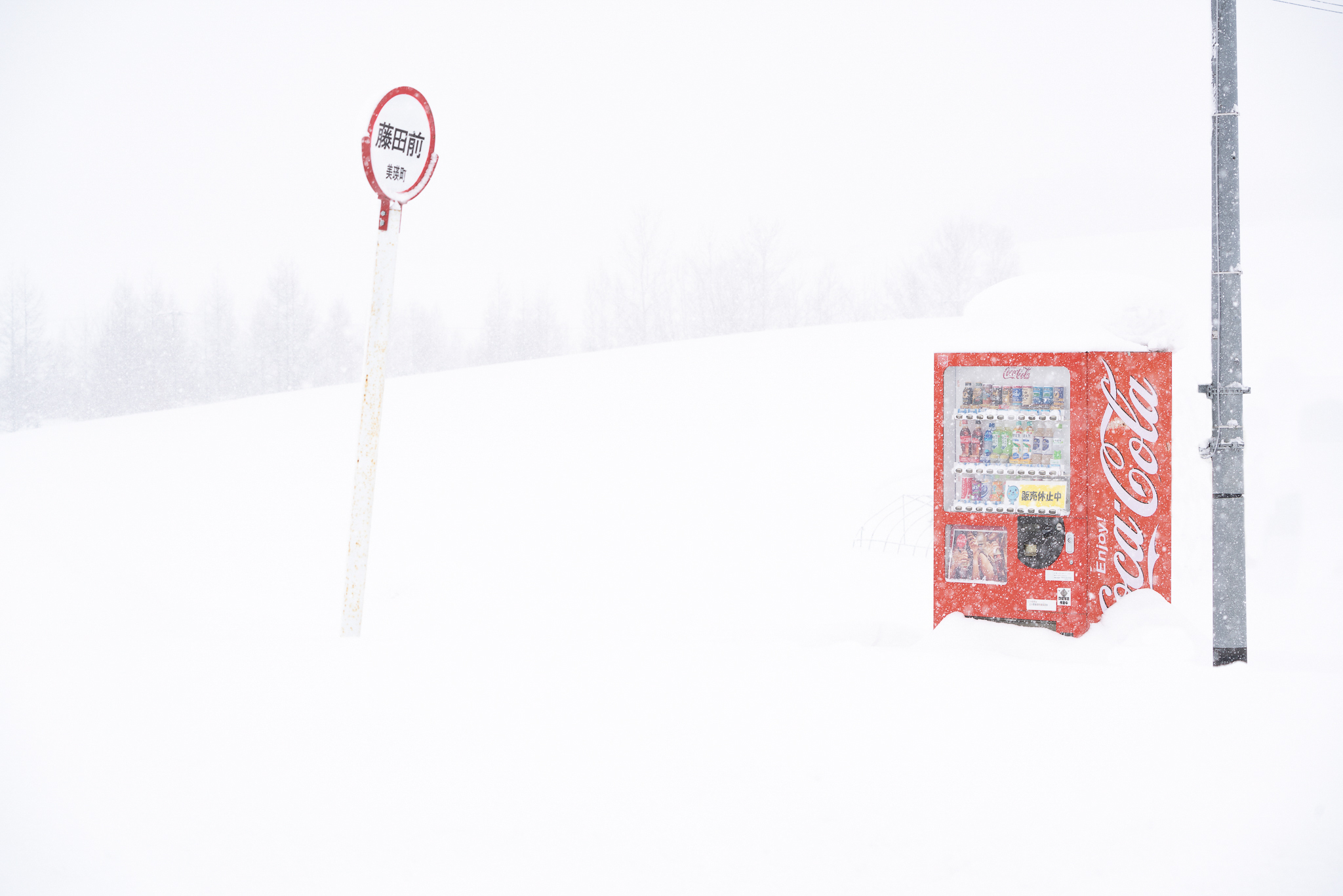
On several occasions, we saw Coca-Cola dispensers, deep in the snow. They seemed to be full of cans which was surprising as I would have thought that the cans would all be frozen. The juxtaposition of the dispenser and the sign made the image work.
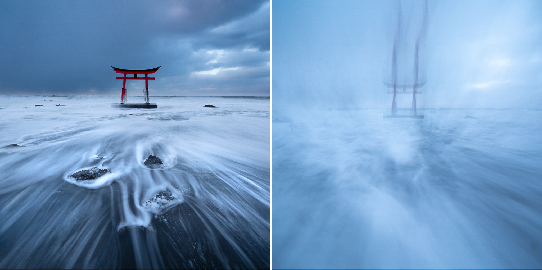
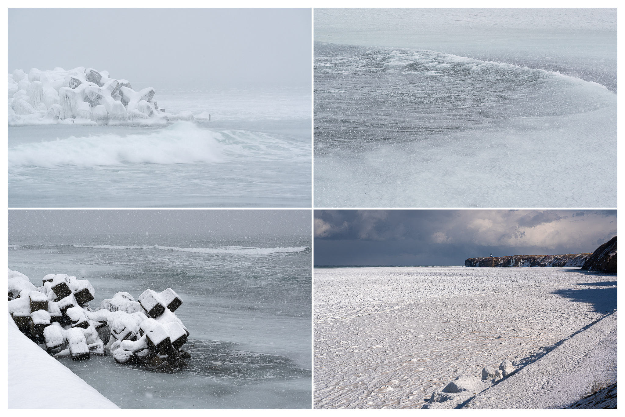
We travelled to the North West coast and as the sun was going down, we photographed a Torii Gate in the sea near our hotel. The snow was deep by the shore and there was not much room at the water’s edge.
The first photograph was taken just before the big wave and the other exposed as the camera sank in the water A ‘UCM’ - unintentional camera movement.
Everyone else had their tripods up at full height, but I wanted something different so I squatted down for a low-level view with my 12mm lens and just above the sea. I got some nice shots as each wave went out. But then a big wave came in and I tried to move back a bit, then realised that the wave had undermined my front tripod leg. I made a grab for the tripod and then the camera and tripod were in the water, me too. No worry for me as the water was very shallow, but of course the camera didn’t like it and was dead the next day. The lens had salt inside, but continued to work until I got home. One of my friends had offered me his Sony A7r3 to take as a spare and naturally his camera was the one which went in the water. Oops! Luckily, we are still friends!
The first photograph was taken just before the big wave and the other exposed as the camera sank in the water A ‘UCM’ - unintentional camera movement.
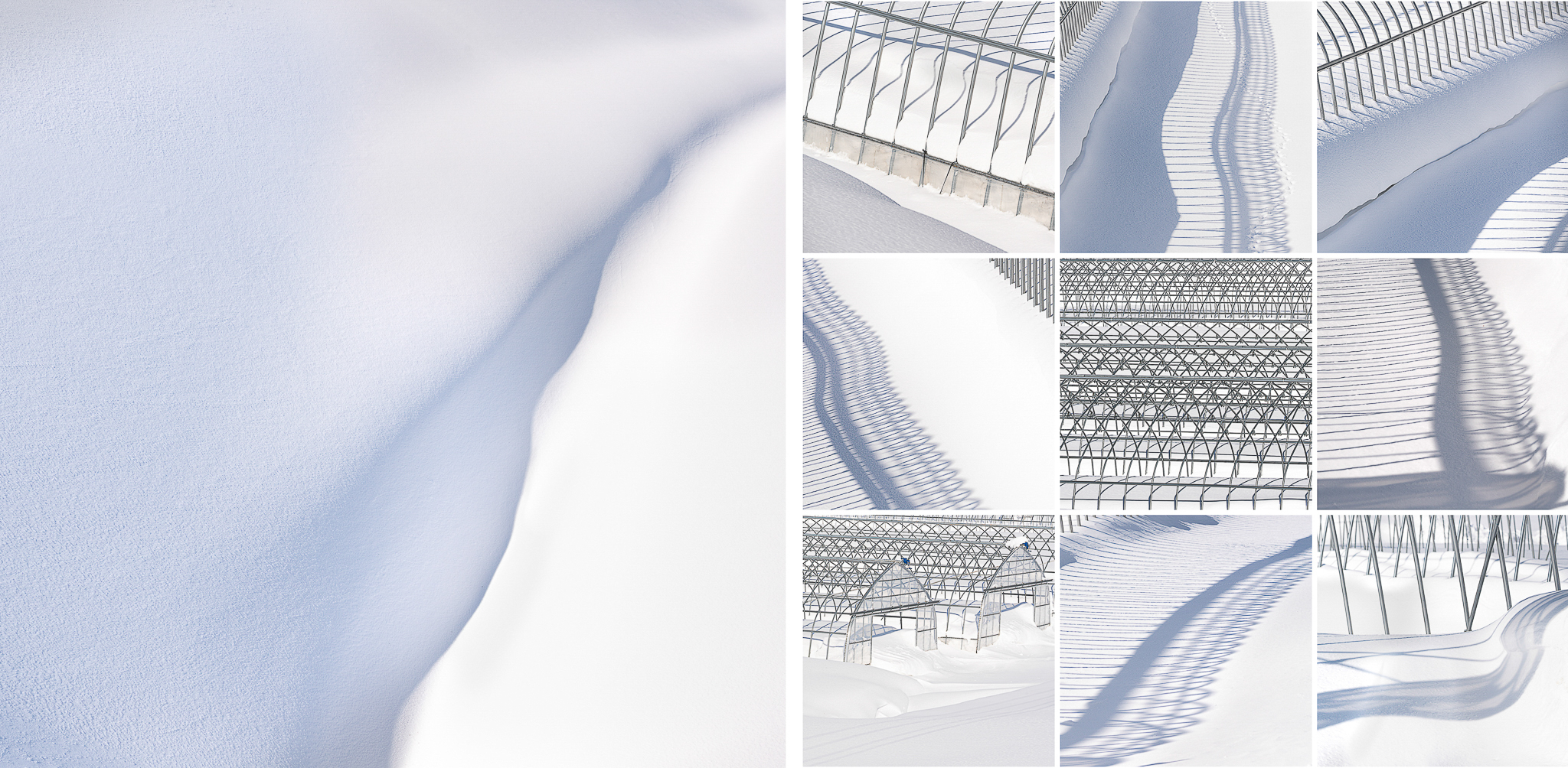
We travelled to the North East coast, stopping a few times, including some greenhouses with just the structures visible. These were great for picking out patterns and details. We had very little sunshine during the trip, which suited me very well as I like overcast conditions, but here the sun did come out which was fortuitous as the shadows enhanced the patterns.
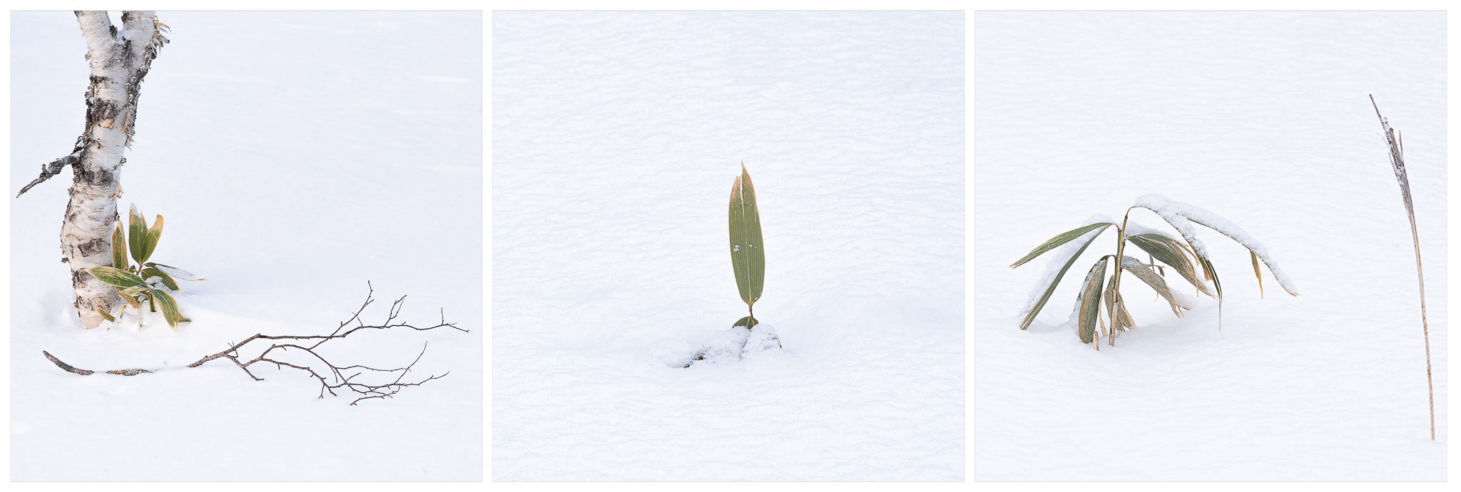
The snow was immaculate most of the time and I enjoyed making very simple compositions with shadows.
Details of simple plants in the snow kept me occupied in many places, looking for compositions which pleased me.
A 400mm lens was used for these details, I use Sony cameras and took two A7r3 bodies, a 12-24mm, 24-105mm and 100-400mm, all Sony lenses. Lightroom shows that the 100-400mm was my most used lens (56%) followed by the 24-105mm. I also used a Gitzo tripod with a geared head for all the images.
This stop by one of the many frozen lakes was memorable for the rich colours of the grasses which contrasted well with the colours in the sky. The snow was very deep here and I remember struggling across this field in snow which was waist high in order to make the most of the grasses. The trip was very tiring as everything was hard work, from getting dressed in all the layers in the morning to being outside in the cold. Fortunately, we were not out for long periods of time and could relax when back in the minibus.
This stop by one of the many frozen lakes was memorable for the rich colours of the grasses which contrasted well with the colours in the sky. The snow was very deep here and I remember struggling across this field in snow which was waist high in order to make the most of the grasses.
Photographing on the East coast of Hokkaido we encountered wet snow for the first and only time on the trip. The temperature had obviously risen above freezing and the snow was more like we normally get in the UK and we had to protect our cameras to keep them from getting very wet. The rest of the time we could just brush off the snow with no problem.
In the photograph bottom right, the sea was freezing and had created a slowly moving slush. This was a bitterly cold morning as the wind was very strong and the wind-chill factor made it feel much colder.
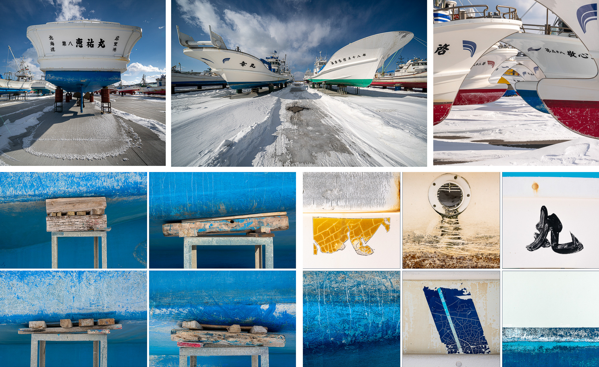
As the sea freezes over the fishing boats in this area are raised out of the water onto land for the winter providing a good subject both for a wide-angle lens and also for close up details.
I was fascinated by the wooden blocks which supported the boats, I am sure that they were very secure, but I felt that one push would collapse the whole line of them. I was very careful!
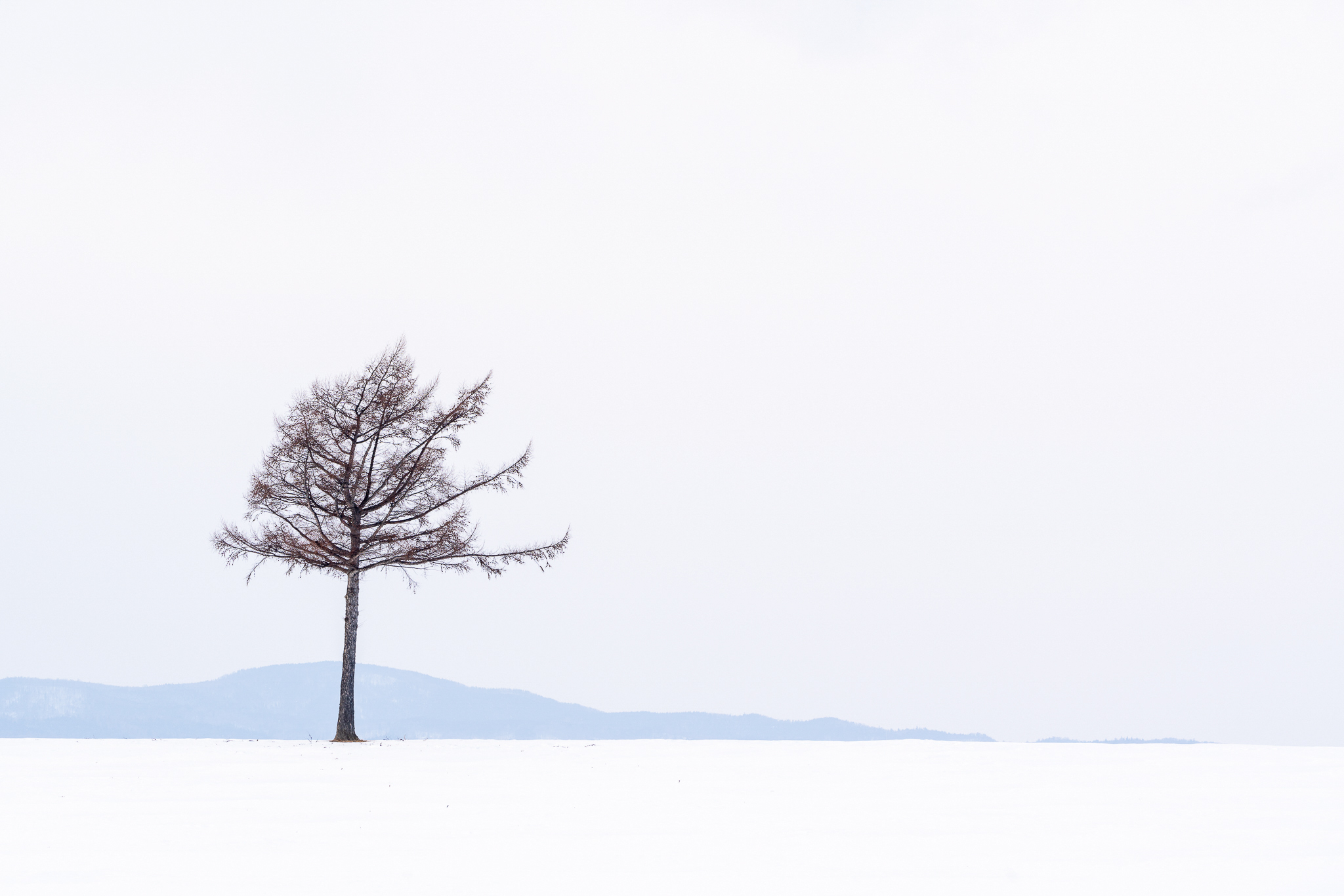
Returning to trees again the distant hills provided the perfect background for this elegant tree. For me, this image encapsulates the feelings I had for Hokkaido, clean lines, elegant trees and simplicity.
Returning to trees again the distant hills provided the perfect background for this elegant tree. For me, this image encapsulates the feelings I had for Hokkaido, clean lines, elegant trees and simplicity. There were many trees here and many opportunities for different compositions with two, three or more trees in the foreground and that delicate blue line of the hills in the background.
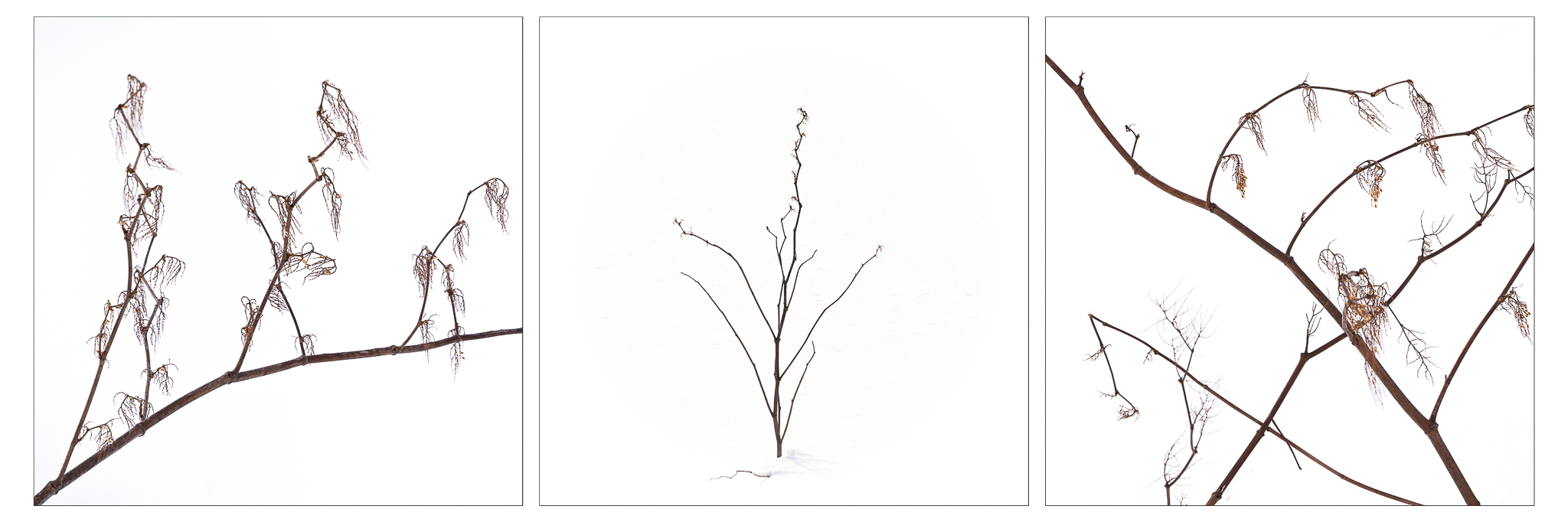
One of my very favourite locations was a hillside with lots of interesting trees; this was a delight. We had many short snowstorms which kept everything fresh and we spent several hours here exploring different compositions of trees, snow and the bamboo which grew close to the ground.
I found the bamboo leaves peeking through the snow quite irresistible. A long lens is a real help here to avoid walking through the snow too much. When the snow covers everything, it is hard to tell where you are walking and most of Hokkaido is private farmland so we were careful not to trespass, well not too much anyway.
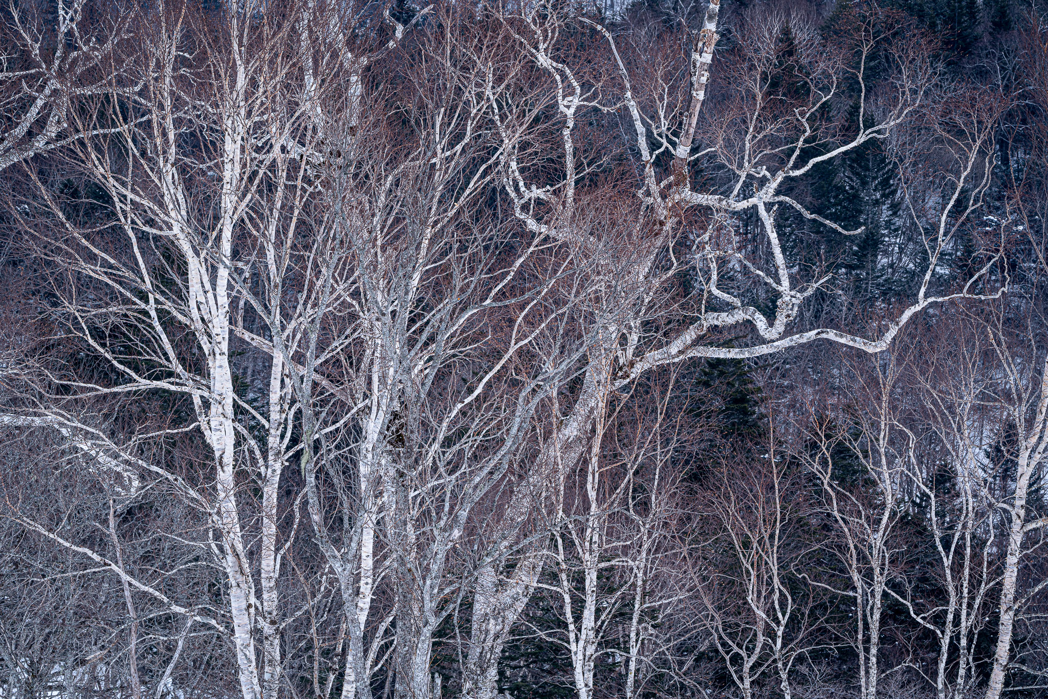
These lovely trees were in the shade of a hillside and they looked almost like negatives against the dark background and I loved the colours in this image. Most of the photographs I created in Hokkaido were very simple designs and this is one of the few more complex compositions.
These lovely trees were in the shade of a hillside and they looked almost like negatives against the dark background and I loved the colours in this image. Most of the photographs I created in Hokkaido were very simple designs and this is one of the few more complex compositions.
I am very much a colour photographer and rarely create black and white images and throughout my trip to Hokkaido I appreciated the limited colour palette in the landscape.
We visited several frozen lakes where I loved the rich colours of the leaves and grasses which contrasted beautifully with the frozen white background of the lake. There were many subjects to photograph here; the patterns in the lake were lovely as were the distant hills which quite often looked like pencil drawings.
We spent an early morning here to try and capture the sun and mist rising across the lake, but had only cloud, which suited me as I usually prefer the subtle colours of dull weather to a spectacular sunrise.
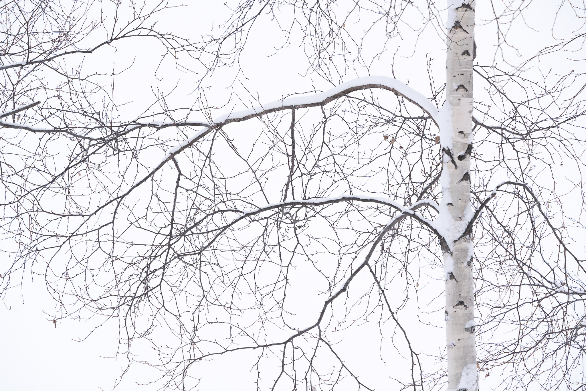
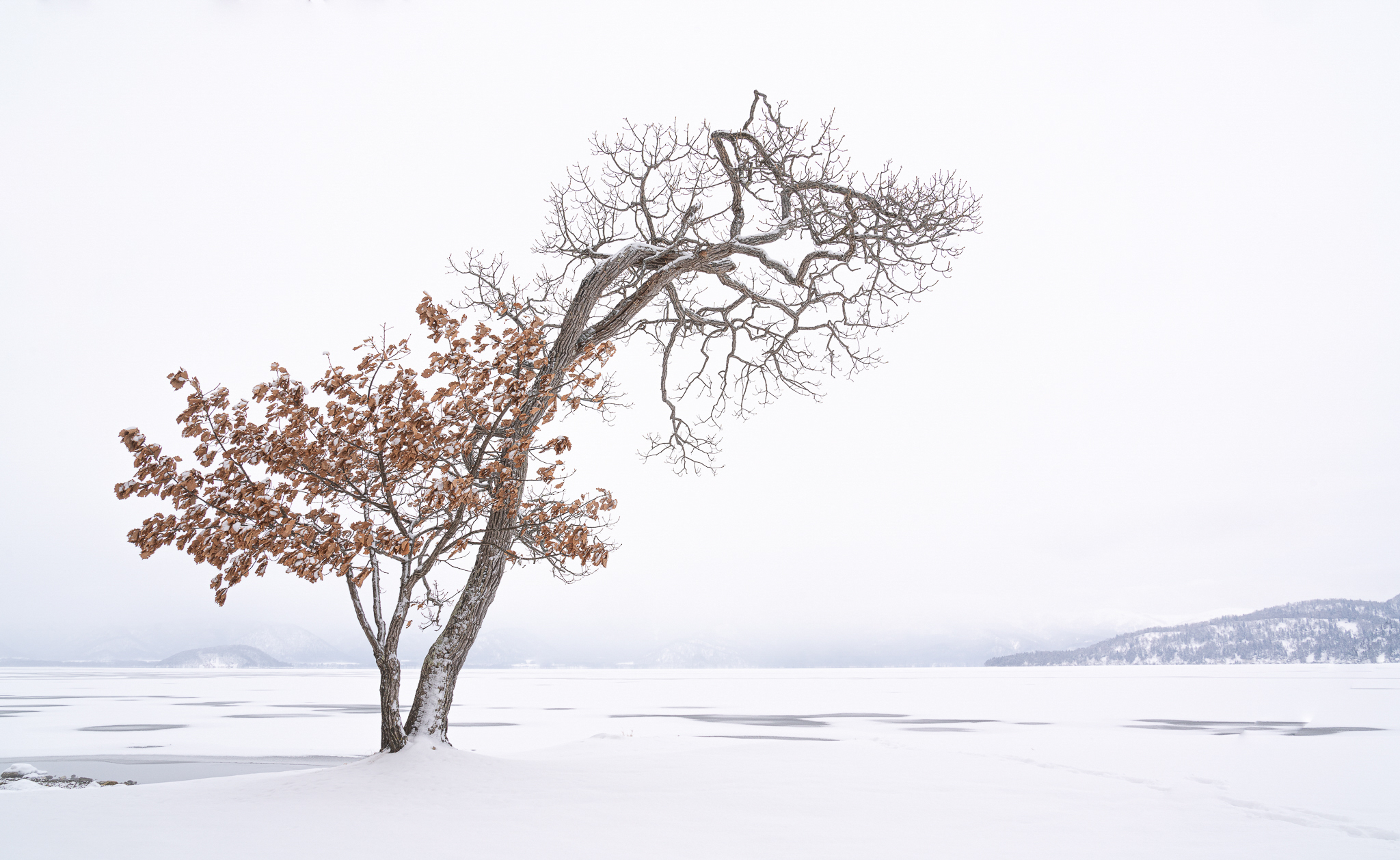
Looking over another frozen lake the white trunk and branches of these Birch trees were beautiful and quite startling against the darker background. It was snowing when I took this photograph and this added a white layer on the branches and a subtle texture to the background.
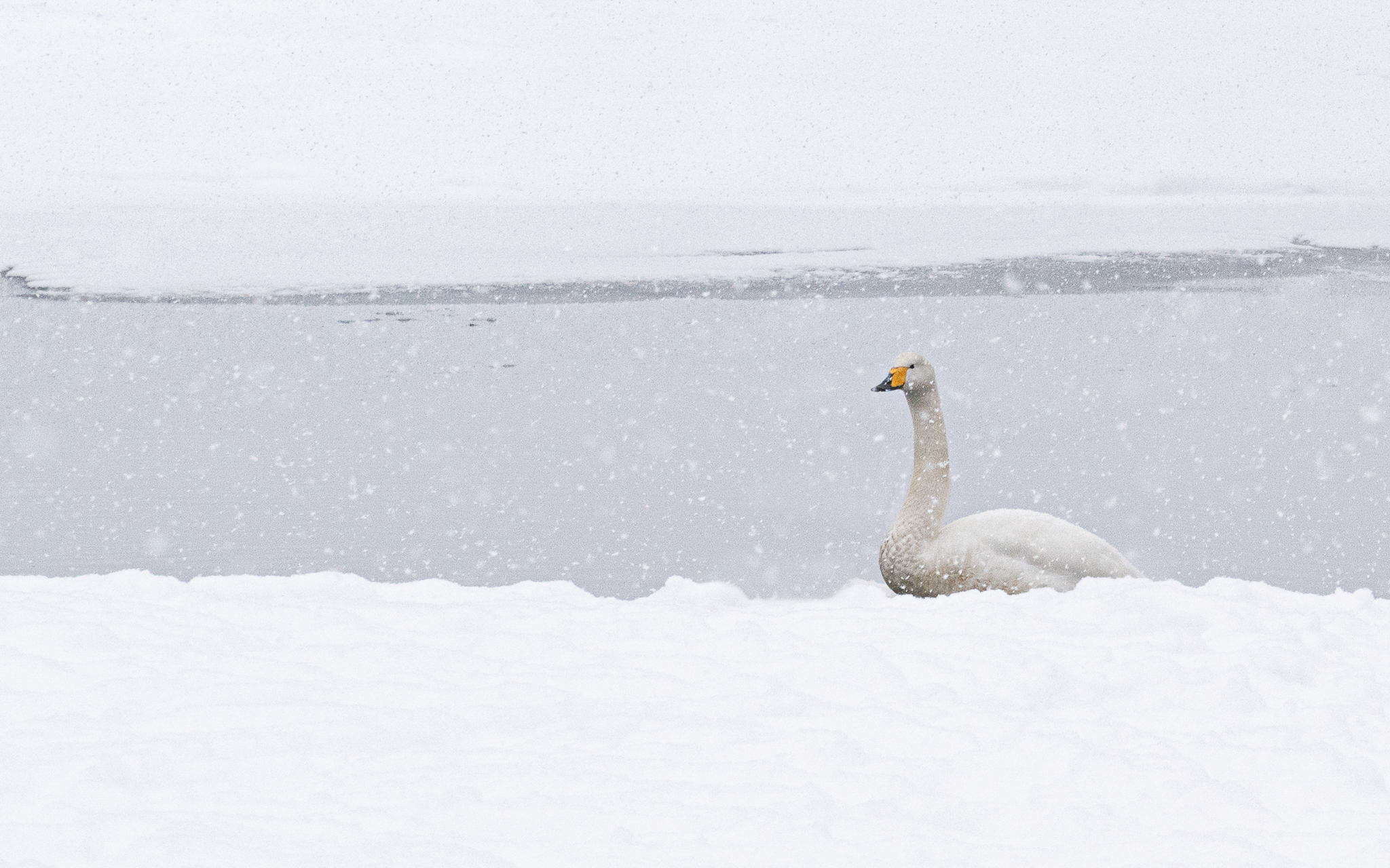
There are many Whooper swans that live on this lake throughout the winter and they return to Siberia in Spring to breed. I am not a wildlife photographer, but I took a few shots here and enjoyed the empty lake and the birds in the snow.
Later we also visited the famous Hokkaido Cranes, but I was put off by the large crowd of Japanese photographers who were pushing to get shots of the birds; not my sort of photography.
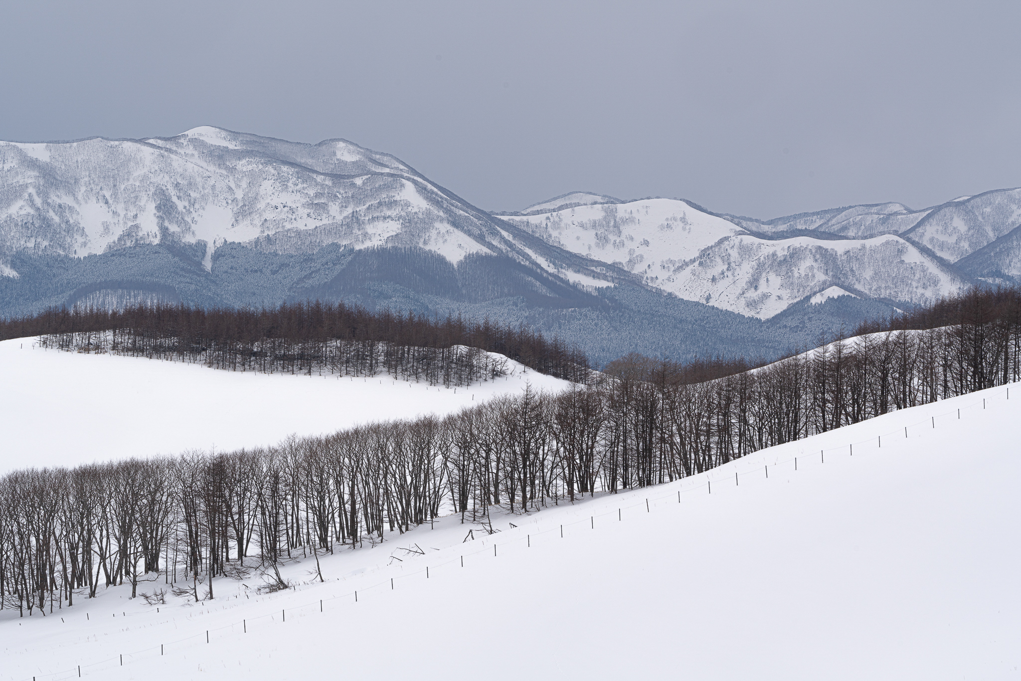
This is a typical view of Hokkaido, fences and lines of trees which make such great compositions. The beautiful blue hills in the background partially covered with trees together with a plain sky and areas of white snow complete the scene.
My abiding impression of Hokkaido was of simplicity and beauty of line and form, which of course are important elements of Japanese art and this picture perhaps illustrates this very well; nothing special, just farmland with fences and a tree. There is no need for a spectacular view, no need for special lighting, I am happy to create photographs from very simple elements.
This was a memorable trip and I am delighted with the photographs I was able to make there.
You can view more photographs from Hokkaido on my website; there is also an audio-visual sequence from Hokkaido.
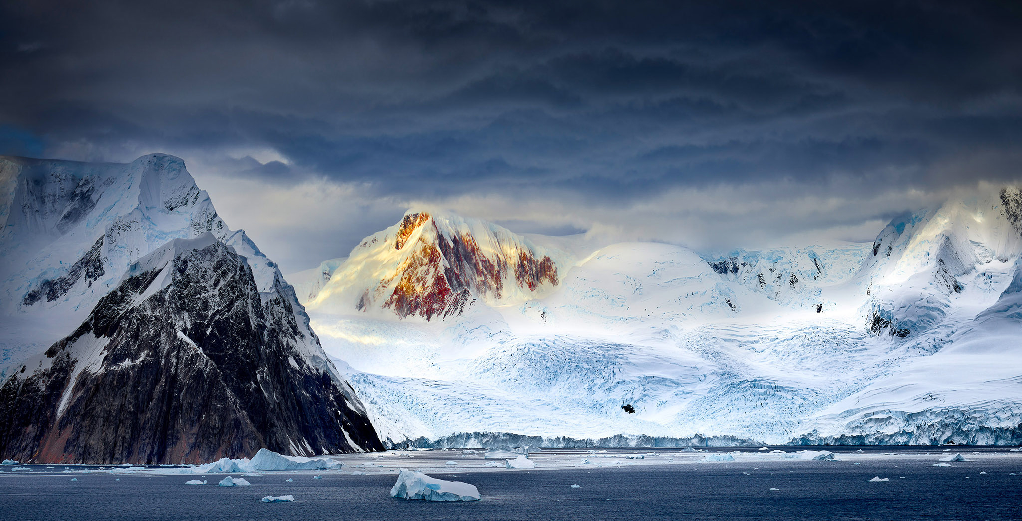
Sometimes it’s good to swap sides of the desk and for this issue, we are interviewing Peter Eastway, who among many other things is Editor and Publisher of Better Photography Magazine. When I got in touch with Peter he initially wondered if it was payback for sending Tim some work, but I had quite coincidentally been enjoying Peter’s images. Of the many on his website, we’ve largely narrowed our image selection down to the Polar Regions, a particular passion of Peter’s, and of course his homeland, Australia. While the diversity of locations he has visited might prompt you to think that travel is the key to a successful image you’ll find out that, for Peter, image capture is only the beginning of the story and his ethos can be applied wherever you chose to photograph.
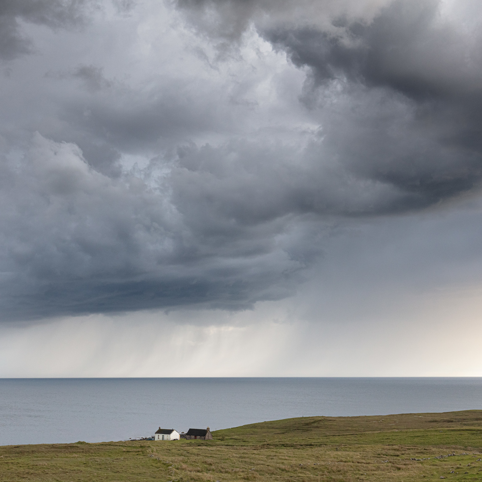
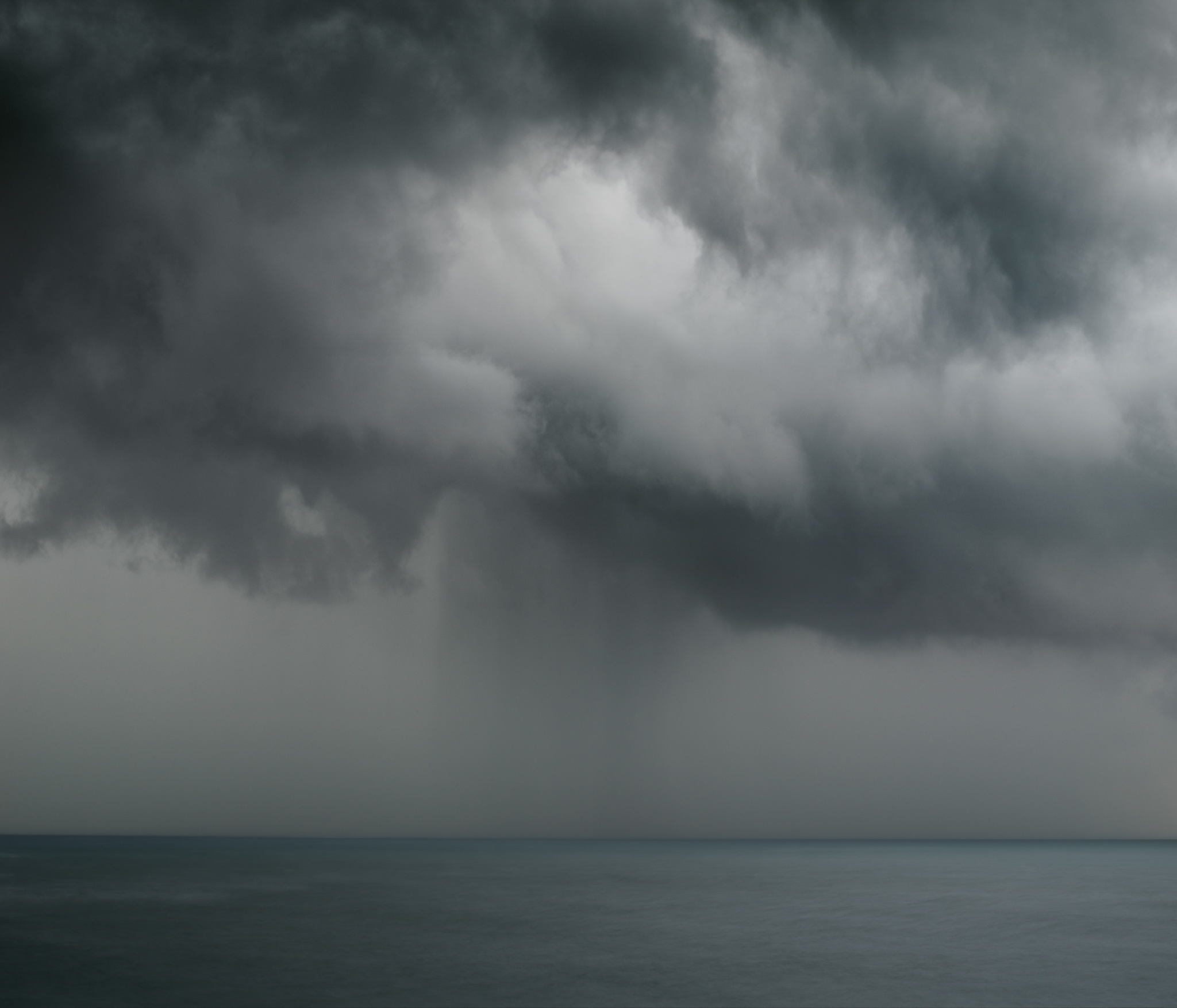
Thunderstorm opposite Neko Harbour, Antarctica
Would you like to start by telling readers a little about yourself – where you grew up, your education and early interests, and what that led you to do?
I’m told I was conceived in England and born in Melbourne, but I’ve lived all my knowing life in Sydney, Australia. Most of the time I’ve worked as a professional photographer, including editing and publishing photography magazines, plus a number of other business interests.
When did you first pick up a camera? What prompted this and what kind of images did you want to make?
In school, my first camera was a Ricoh compact in a circular water housing. As a keen surfer, I wanted to photograph my friends from the water. I was infatuated with surfing and couldn’t really understand why people would want to take photos of anything other than surfing! Later in life, I changed this view.
Who (photographers, artists or individuals) or what has most inspired you, or driven you forward in your own development as a photographer?
As a photo magazine editor for over 40 years, it’s hard to pinpoint one or two photographers who have inspired me because there are so many. What’s the difference between plagiarism and inspiration? Plagiarists copy one photographer, but when you’re inspired, you’re copying the work of thousands. Editing a photography magazine has given me an appreciation of every genre of photography (except maybe passport portraits) and I have met and interviewed many of my heroes as well.
However, since we have a polar bent to this article,
Plagiarists copy one photographer, but when you’re inspired, you’re copying the work of thousands. Editing a photography magazine has given me an appreciation of every genre of photography (except maybe passport portraits) and I have met and interviewed many of my heroes as well.
I’ll suggest Australian photographer Frank Hurley who travelled with Shackleton to Antarctica in the early 1900s, photographing and filming an epic journey across the Weddell Sea and up to Elephant Island. Hurley was a showman, which I think is still necessary if you’re going to be a successful professional photographer. Hurley would return from his trips with a slide show and give presentations in town halls around Australia, enthralling his audiences. Today most of us do something similar on Instagram, but what I love about Hurley is the way he would interpret his photos, pushing the technology available to him as far as possible. Although working over 100 years ago with plate glass negatives, he would drop in skies and ‘adjust’ the reality of the image in the darkroom to better tell his story. What he did would not be allowed by documentary or nature photographers today, yet back then, no one really knew what happened inside the darkroom – although he certainly had his critics.
After featuring two articles on tripods recently, a review of travel tripods and a short overview of tripod spikes, I thought a general chat with Joe and David about their own experiences with tripods would make interesting listening. We cover a reasonable amount of ground and, once again, we hope you enjoying listening to them as much as we do recording them.
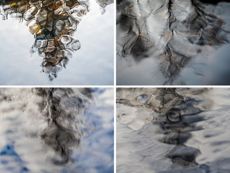
For the seventh iteration of this column, I decided to focus on the artwork of a photographer that recently popped onto my radar as a guest suggestion for my podcast. While Marco and I had already had many interactions on Instagram, I had foolishly not taken the time to look at his body of wonderful artwork. Upon deeper examination, I came to fully appreciate what Marco was trying to communicate through his landscape photography – the idea that if we take the time to slow down in nature and appreciate the small details right under our noses that we can more fully appreciate a place and find a deep connection to it. This connection then facilitates wonder, curiosity, and can instil peace within us to help us recharge our batteries.
Upon deeper examination, I came to fully appreciate what Marco was trying to communicate through his landscape photography – the idea that if we take the time to slow down in nature and appreciate the small details right under our noses that we can more fully appreciate a place and find a deep connection to it.
For some photographers, discovering these powerful moments in nature comes quite naturally and immediately. For others, including myself, it can take many years and involves countless experiences of feeling let down by preconceived expectations of what the final photographs from a trip should look like. What I admire about Marco’s work is that it is a fresh reminder that expectations can pigeon-hole us as artists to only look for what we had pre-envisioned, whereas an approach like Marco’s can lead to discovering a whole new world of photography that can enrich us and occupy us for a lifetime. Additionally, this approach to landscape photography yields more unique imagery that has the potential to give way to more meaningful and personally expressive artwork.
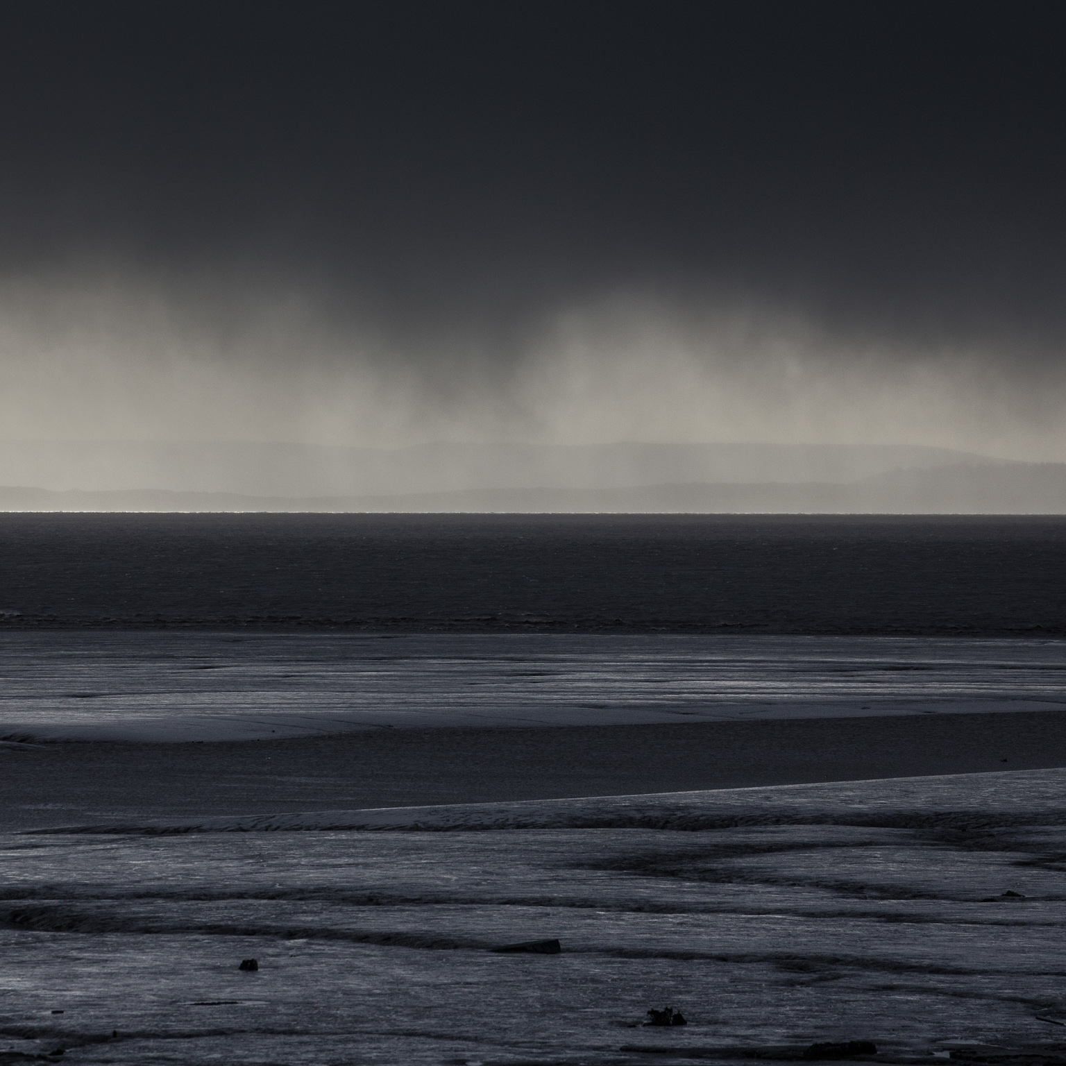
Normally the early autumn months would find me in France where we’ve long had a little house. It’s been a unique chance to lead a separate life, absorb a different lifestyle and photograph a different landscape. However, in view of the current uncertainties of life, we decided not to go this year. This offered the chance to realise a long-held ambition to visit some of the Western Isles of Scotland.
So, September 2020 found my non-photographer wife and I heading north on our two-day trek from our home in Wiltshire for a 16-day trip through the Hebrides. After an overnight stop in Dumfries our journey took us to Skye, then on to North Uist and Harris before returning to Skye.
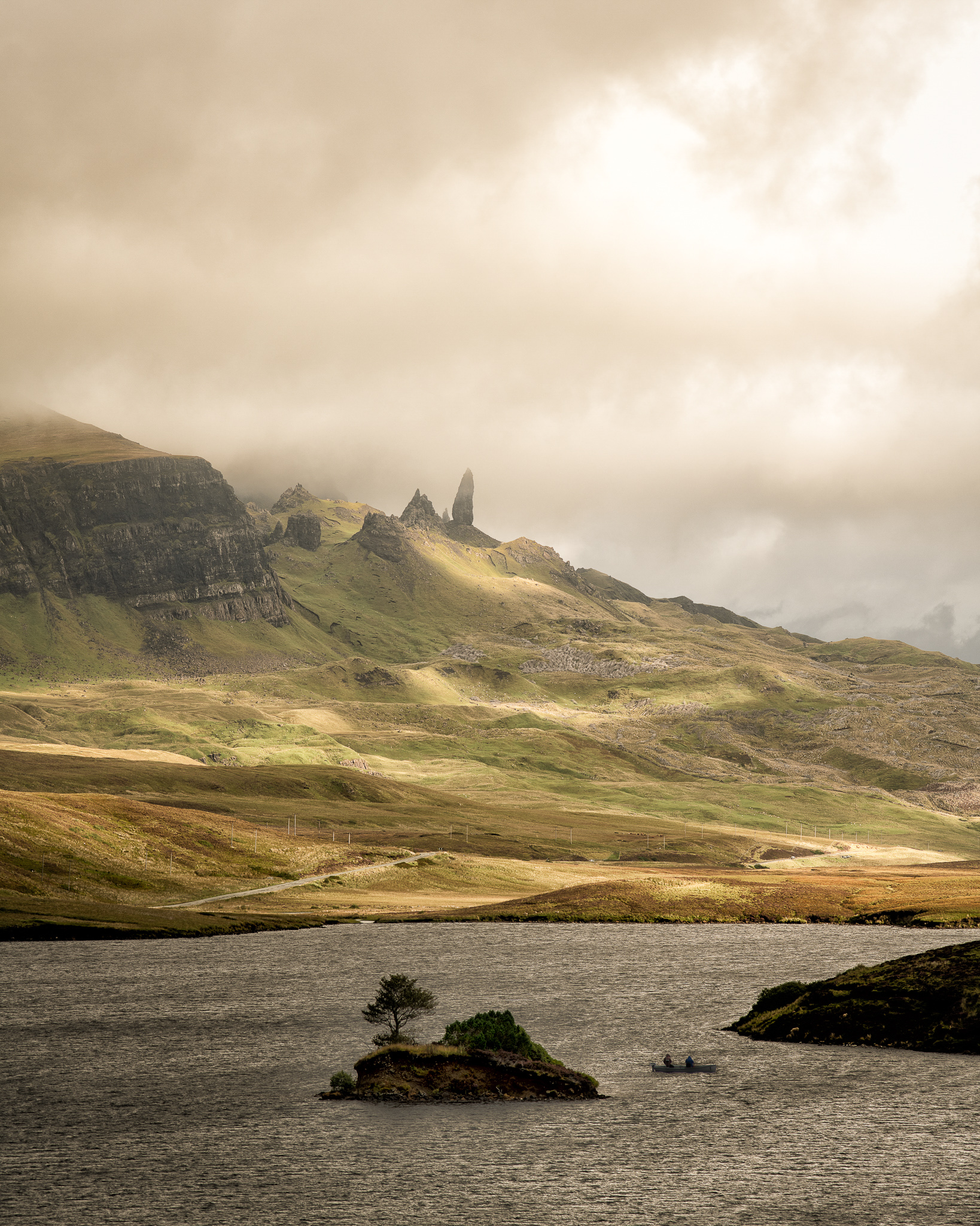
I’ve wanted to visit Skye for around 35 years having visited Mull in my 20s. I had a bucket list of places I wanted to see and photograph on Skye, but having seen the queues at the Fairy Pools, The Old Man of Storr, and Quiraing my initial reaction was one of dejection and a feeling I had left it too long. But I had no right to feel like that. The people I saw were simply doing what I was doing. Who am I to expect to have these places to myself? After having a good word with myself I studied my maps more carefully and realised there was an endless list of quieter places to visit where we did indeed find solitude and calm. It was simply a question of making a little effort.
During our first foray on Skye, the weather was simply atrocious. Had I been alone I would have toughed it out and taken to the hills, waiting for those elusive breaks in the sky that would reveal mountain tops and hidden valleys illuminated by shafts of sunlight. But I had to consider the wishes of someone else and grab opportunities where I could. It certainly focused my mind as a photographer and made me work with what I had.
Old Man of Storr – Skye The classic view of the rock from Loch Fada. With my ever-patient wife handing up pieces of kit as I positioned my tripod, we had to wait a while to get the right patches of sunlight. We were right next to the A855 and as I stood trying to capture the right moment, I became aware that a number of cars had pulled up (one blocking the road) and that there was a little huddle of photographers behind me trying to see the back of my camera. The guys in the little boat fishing on the loch were an added bonus! Nikon D850, 80-200mm lens.
From Skye, we took the ferry to Lochmaddy on North Uist. This wonderful island proved to be exactly what I’d hoped Skye would be. It is remote and some would say bleak.
Sound of Raasay - Skye We were driving up the A855 having passed the car park for the Old Man of Storr, which was jammed to overflowing both with cars and rain! My wife was driving and suddenly screeched to a halt, shouting – “look at that”! This is the image she saw. Nikon D850, 80-200mm lens.
From Skye, we took the ferry to Lochmaddy on North Uist. This wonderful island proved to be exactly what I’d hoped Skye would be. It is remote and some would say bleak. There are few places to stay and even fewer things to do. Unless of course, you love the landscape. If that it is all you need then you could spend a lifetime there. North Uist is an other-worldly place. One of the mountains and countless lochs, the few roads weave in and out of this watery world on their way to stunning beaches and mountains the shape of small volcanoes.
Lochmaddy Harbour – North Uist Lochmaddy is the main “town” on North Uist, where you will find the ferry terminal, a clutch of hotels and B&Bs, a shop/petrol station, a bank…. and an arts’ centre! The old harbour had a sad, neglected feel about it on a day like this. Fuji X-Pro2, 23mm lens.
North Lee and South Lee Mountains – North Uist The mountains of North Lee and South Lee dominate the landscape in this watery world. Nikon D850, 50mm lens.
North Uist is connected to the islands of Benbecula to the south and South Uist to the south of that by causeways. The archipelago is completed by Berneray to the north. Each island has its own unique character despite the relatively short distance between them. Benbecula is flat with few hills and seems more water than land. South Uist is more mountainous and has the largest population.
North Uist is connected to the islands of Benbecula to the south and South Uist to the south of that by causeways. The archipelago is completed by Berneray to the north.
Howmore Chapels – South Uist We had but one day travelling through South Uist. A day of relentless rain. The perfect day for gritty black and white images. Chapels have occupied this site since AD 300. Fuji X-Pro2, 23mm lens.
Meanwhile back on wonderful North Uist, this is the perfect blend of the two and is sparsely populated, each house a lonely outpost against the elements. The mile upon mile of machair dunes provide a unique backdrop to the spectacular beaches of the west coast.
Tràigh Iar – North Uist
Known by some as the Thai beach. Photographs of this beach were allegedly used by the Thai Tourist Board to advertise holidays in Thailand, although I found no Thai weather during my stay. Nikon D850, 16-35mm lens.
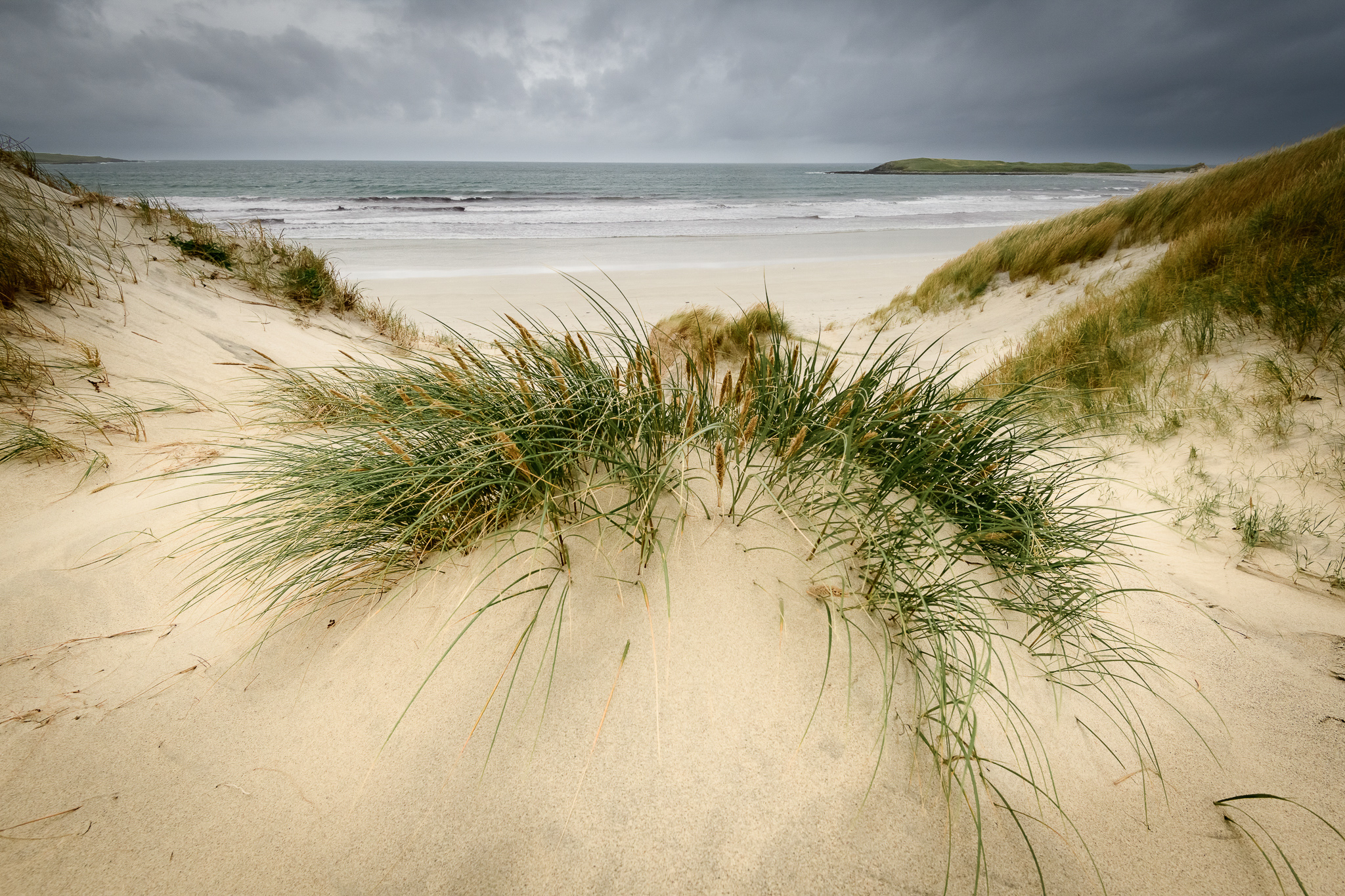
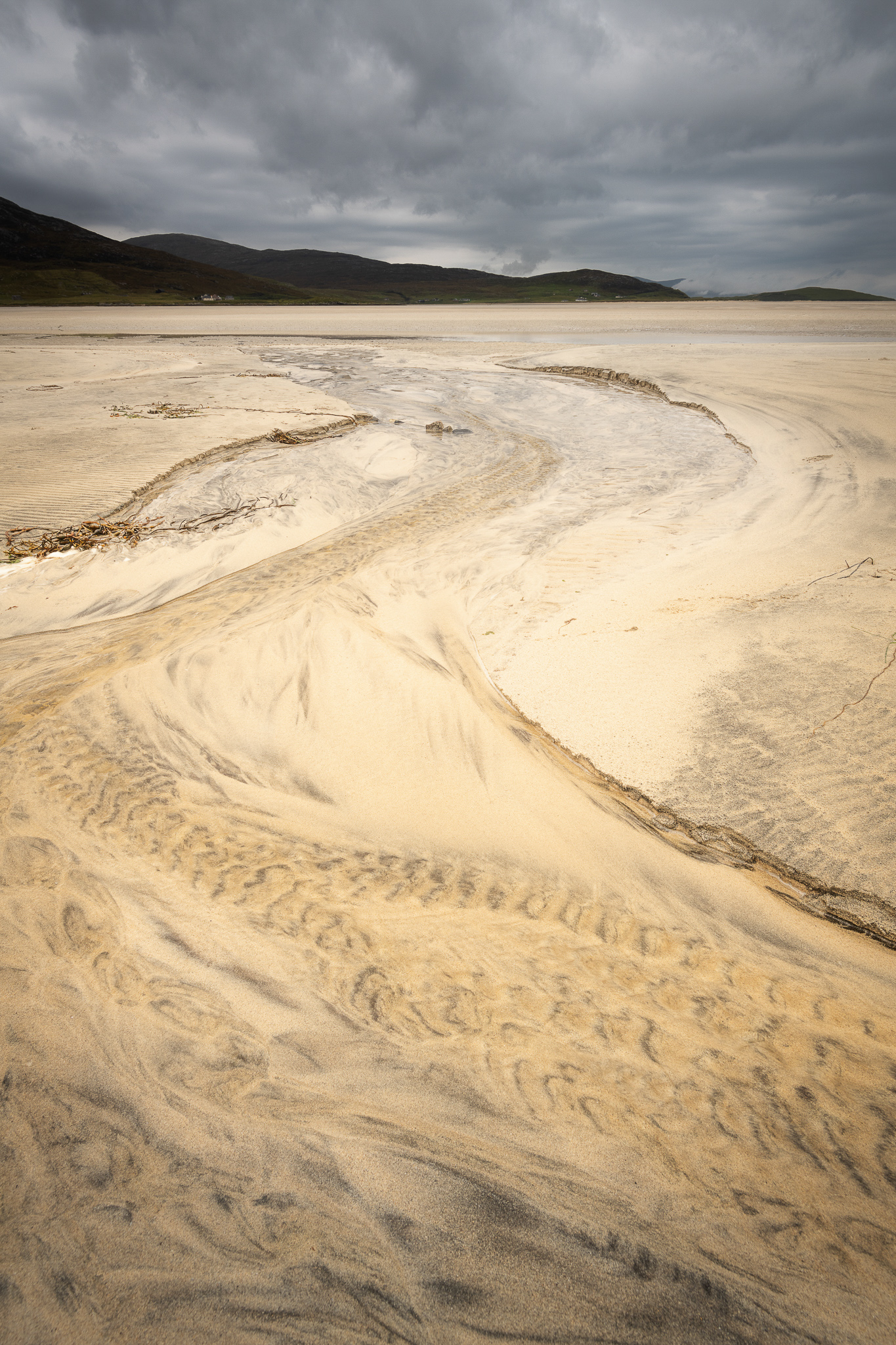
After a few days exploring the Uists and Benbecula, we caught the ferry to Harris for a five day stay in Tarbert. An opportunity to also visit Lewis, the largest of the Outer Hebrides islands. I’d long had this picture in my mind of Harris as a remote and wild place, ringed with some of the most fabulous beaches in the world. Whilst that is true, it was still a lot busier with other tourists than I’d imagined.
Luskentyre has become something of an iconic location for photographers. Without doubt, the seemingly endless white sands are simply stunning. But, on the day we chose to visit, the weather had improved slightly and the single-track road to the little village at the headland was busy with motor homes and cars, so we were forced to abandon and try elsewhere. But not before capturing one image.
Seilebost from Luskentyre – Harris Caption - The endlessly changing shapes in the sand made up for the fact the tide was a long way out. Nikon D850, 16-35mm lens.
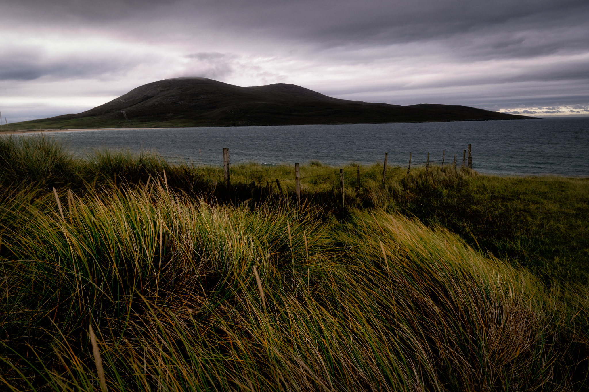
Heading further south we stopped to investigate Scarista but decided to park by the golf course at Sgeir Liath for a more distant view. I watched for a while as a golden eagle circled above Sgarasta Mhόr then headed across the fairway to the beach. A photographer was on the beach photographing a girl throwing poses. Too many footprints. So, I doubled back to the sanctity of the machair where I found a far more pleasing perspective.
Ceapabhal from Sgeir Liath, Scarista– Harris Caption - What little light there was this late afternoon caught the grasses of the machair with Ceapabhal brooding in the shadows across the water. Nikon D850, 16-35mm lens.
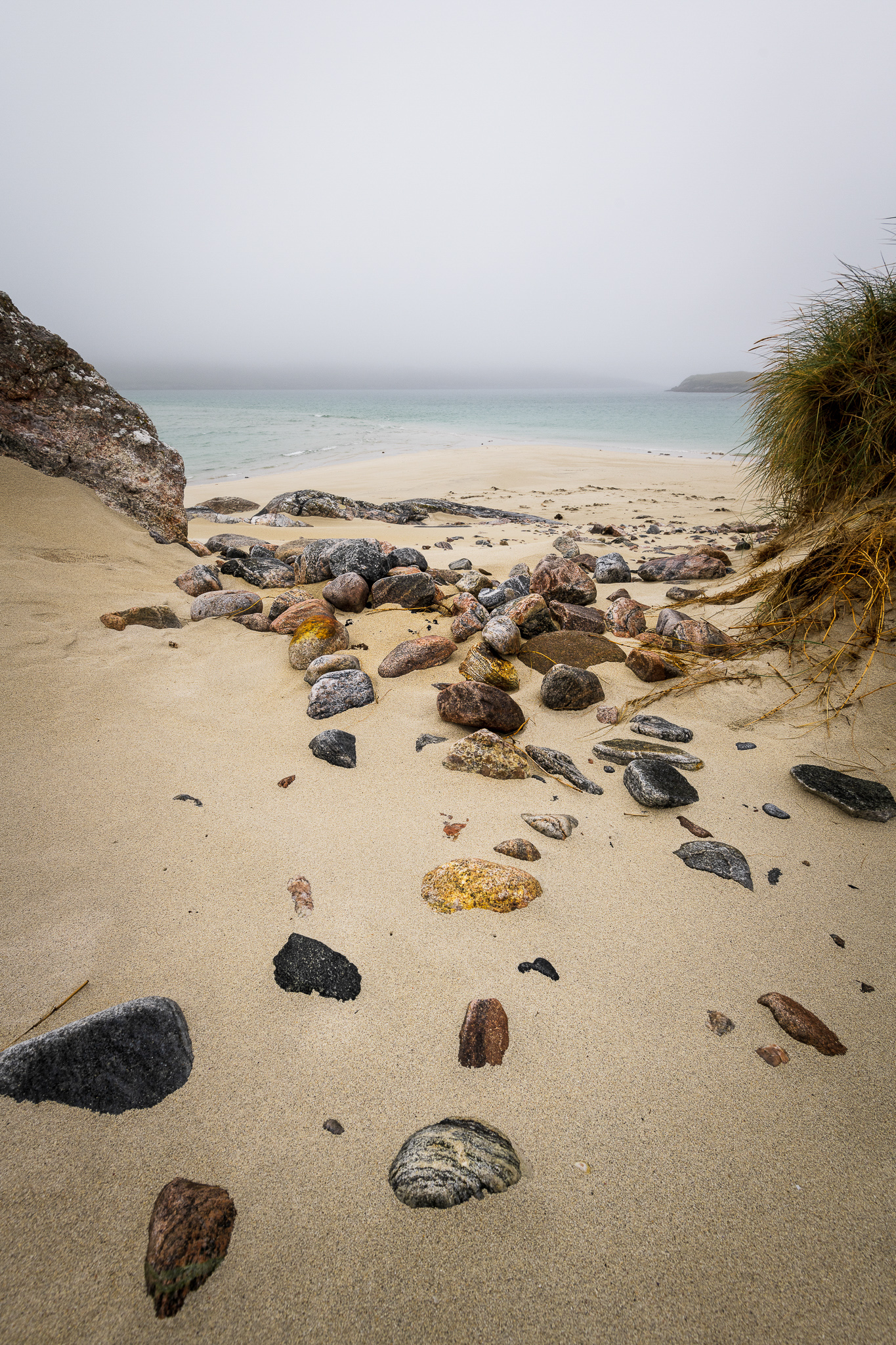
Without doubt, the most spectacular location I found on Harris was a beach about which someone had sworn me to secrecy. An hour’s scramble along an at times ill-defined path across the face of a mountain that dropped steeply to the sea; it’s not for the faint-hearted. But was it worth it! The beach was simply breath-taking. And since my wife doesn’t do heights, I was alone. A place I will never forget and whose location I will never reveal.
Without doubt, the most spectacular location I found on Harris was a beach about which someone had sworn me to secrecy. An hour’s scramble along an at times ill-defined path across the face of a mountain that dropped steeply to the sea.
Our visit to Harris and a day spent driving through Lewis to Callanish, were far too brief. We only saw Lewis on a Sunday in torrential rain. We never even scratched the surface. I will return.
Finally, we returned to Skye for a couple of days before heading south again, staying in a bed and breakfast in a stunning location on the single-track road between Broadford and Elgol. On our last day in the Hebrides before heading south we walked across the hills to the abandoned village of Boreraig, its inhabitants the victims of the clearances in the 19th century. Its lonely location overlooking Loch Eishort seemed idyllic but life there for the crofters would have been harsh. This was our one rain free, warm and pleasant day so on the return journey, the peaks of the Blà Bheinn ridge just a few miles from our bed and breakfast were finally revealed.
A View of Blà Bheinn – Skye
This view of Blà Bheinn was taken from below the track bed of what was once the Marble Line, a railway taking marble to the harbour at Broadford. Nikon D850, 80-200mm lens.
This brief excursion to the Hebrides simply whetted my appetite. I have unfinished business there and will return, perhaps when it’s a little quieter and when it’s not quite as wet!
When asked to write for On Landscapes’ end frame feature, I jumped at the chance, a fantastic opportunity to share and talk about a favourite image and photographer of mine! Then the reality of the challenge set in, actually narrowing down the choice to one image, hugely difficult.
As I have explored photographers’ work over the years, obvious choices stood out.
Joe Cornish's images have always inspired me. My bookshelf is littered with his amazing work, along with Bruce Percy, David Ward, and Hans Strand.
More recently Neil Burnell and Dylan Nardini have been regular views in my browser. Both of these photographers have a real fresh and original take on photography with images taken in dramatic light, in unique and creative ways.
Viewing and becoming absorbed in other photographers’ work has definitely helped me improve my creative journey. I feel it’s a must to learn and be inspired. Watching others follow their path has eventually led to me finding my own.
In the process of thinking about the article it reminded me of the earlier days of taking landscape pictures.
Back then, the online gallery Flickr was a popular resource. There was a group of photographers that all ventured out into the Peak District who used this platform and it became quite a community sharing and commenting across each other’s pictures.
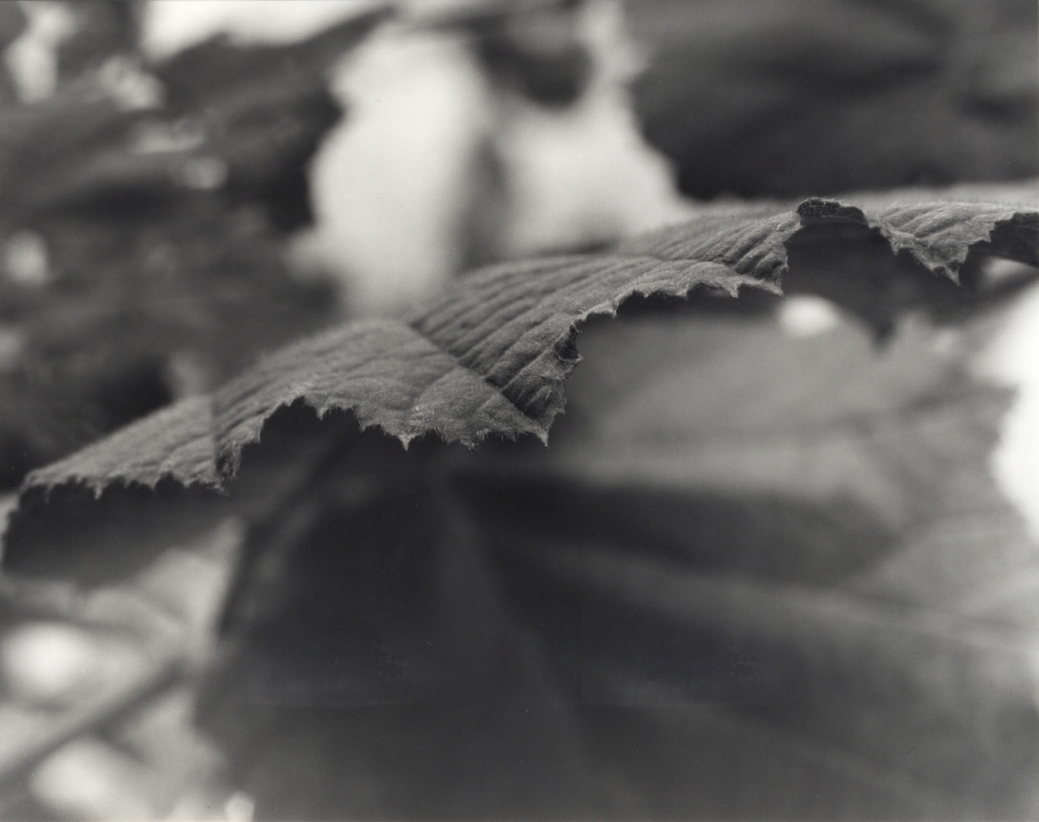
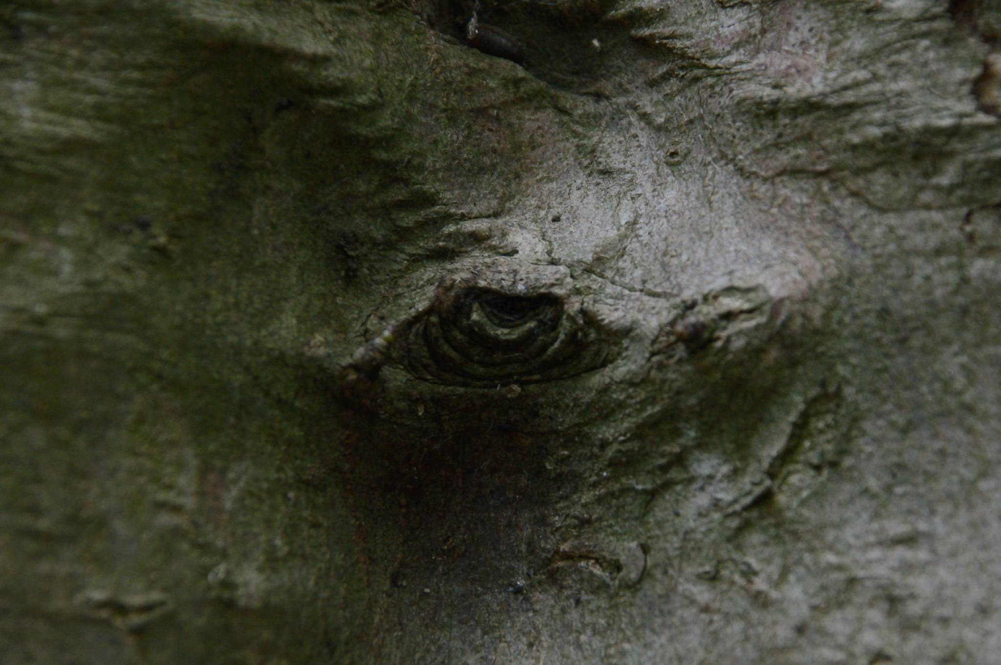
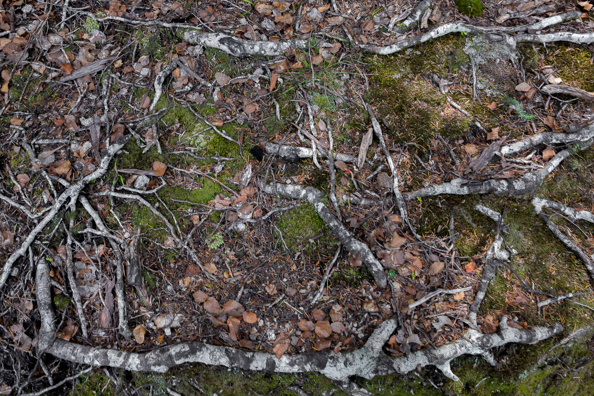
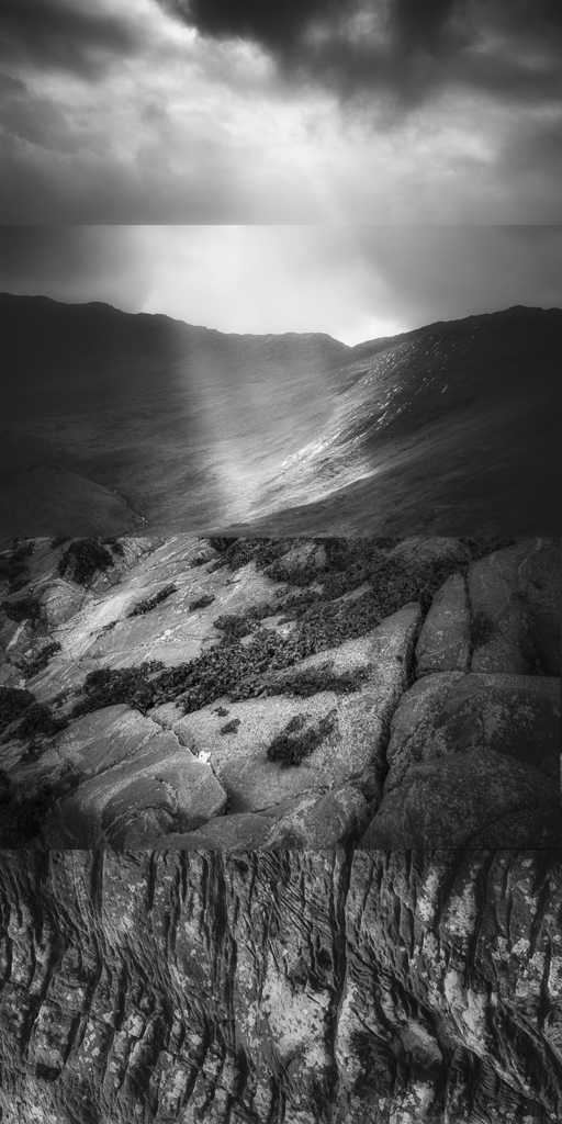
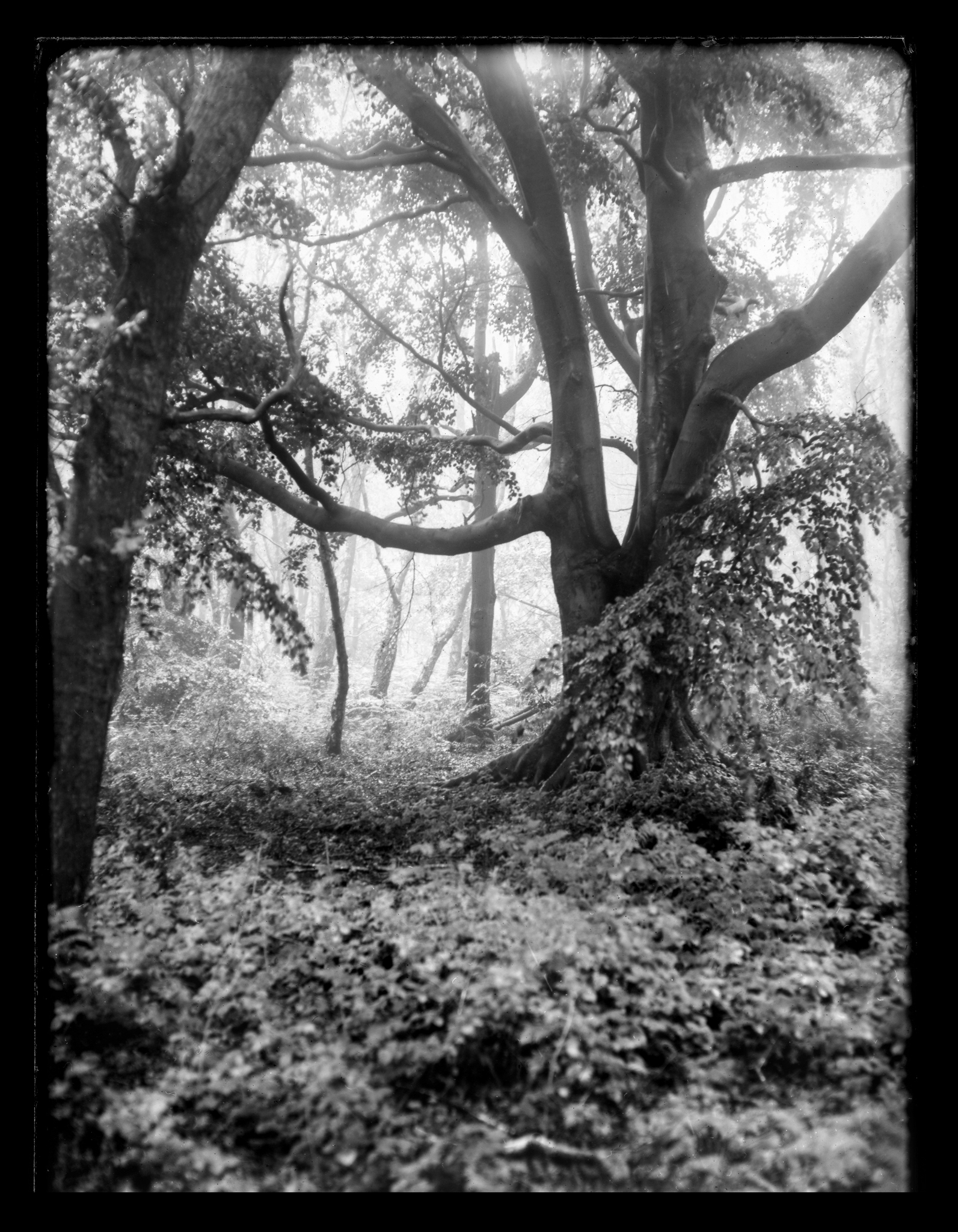
One of these photographers is called Jeremy Barrett. I had admired his work for a while, his pictures often muted in colour and packed full of brooding moodiness. His woodland images always stood out, organising the chaos into constructive and beautiful ways, capturing fantastic scenes in stunning light.
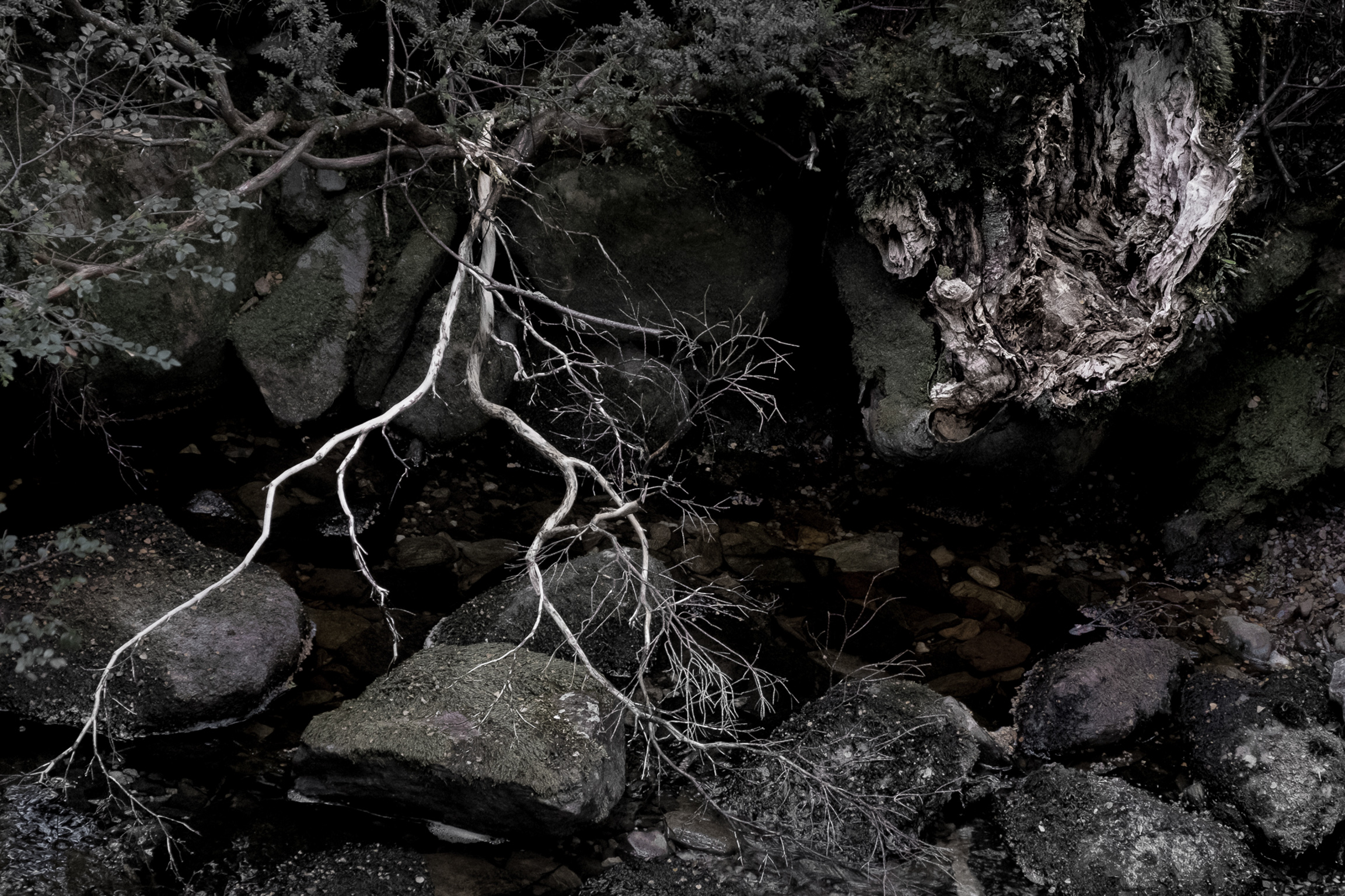
The image of Jeremy's I've chosen is from a popular spot for walkers and photographers alike. An ancient woodland, full of history. Trees that have stood probably for hundreds of years, intertwined, creating relationships of shapes, patterns and textures.
It's an amazing location but is notoriously difficult to produce balanced and coherent pictures.
Jeremy cleverly captures photographs of this area using a wide field of view whilst maintaining a compressed depth of field. This gives a wonderful perspective to the pictures. You are pulled into the image, giving your eye a magical journey through the photograph
Jeremy cleverly captures photographs of this area using a wide field of view whilst maintaining a compressed depth of field. This gives a wonderful perspective to the pictures. You are pulled into the image, giving your eye a magical journey through the photograph.
This image called "Dance off" is a great example. It is a photograph that immediately caught my eye. The composition is very dynamic; the wonderful branches on the left lead the eye to the centre of the image, along to the twisted bark of the opposing tree, tying both sides of the view together perfectly. Using the bank of the ravine beyond offers more textures to view and explore. The more you look the more the image reveals itself. You begin to see the mossy boulders and the old stonewall, the history of the place, it is a picture you really want to take time to view.
I admire the way Jeremy uses the contrast and luminosity, such an important element, often overlooked. The picture packs a punch of deep blacks, but still retains subtle tones through the grasses and leaves, it gives the image a real depth from front to back. The toning and subtle hues are very familiar to Jeremy's work and sit perfectly with this photograph giving it a wonderful mood and atmosphere.
Finally, the use of panoramic crop on this picture makes you feel as if you were stood in that exact spot, sharing the view; you can almost hear the woodland sounds and smell the crisp air. It surely is the next best thing to actually being there, and for me that's a sign of a great picture.
Have you ever tried looking for a weather forecast until you found the one you liked the look of and decided to believe in that? If so, you are not alone; I would definitely plead guilty. ’Forecast surfing’ may not be restricted to landscape photographers, but I guess we are more prone to it than most. Especially in the winter, when conditions are at their most critical, I often check the predictions three times a day on the internet, even listening when the (hopelessly vague) radio forecast is on.
But is it useful to indulge in this obsession? No doubt there is some justification for saying that looking out of the window is a more reliable guide to the forecast than those supplied by the experts with their billion-dollar computing infrastructure.
My son Sam, an atmospheric and oceanic earth scientist, tells me that in scientific modelling, all models are (more or less) inaccurate…but that some models are useful.
My son Sam, an atmospheric and oceanic earth scientist, tells me that in scientific modelling, all models are (more or less) inaccurate…but that some models are useful
This quite nicely sums up weather forecasting. And occasionally the forecast can appear to be, more or less, spot on. Now all of us know that the weather system itself is chaotic, so inevitably forecasting is a form of educated guesswork.
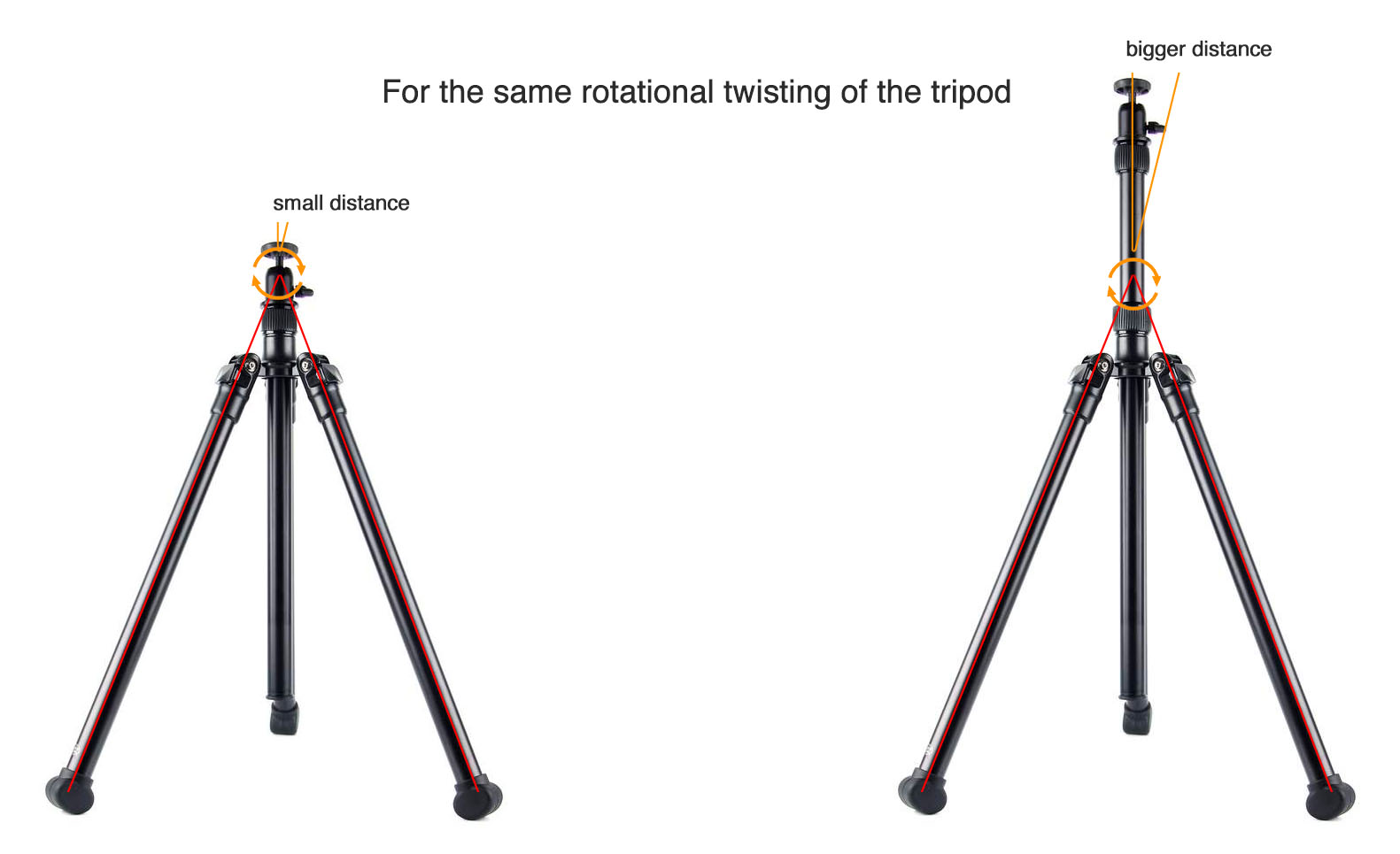
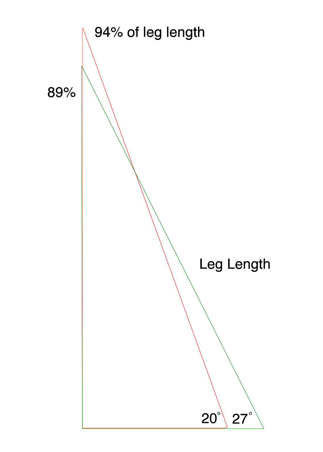
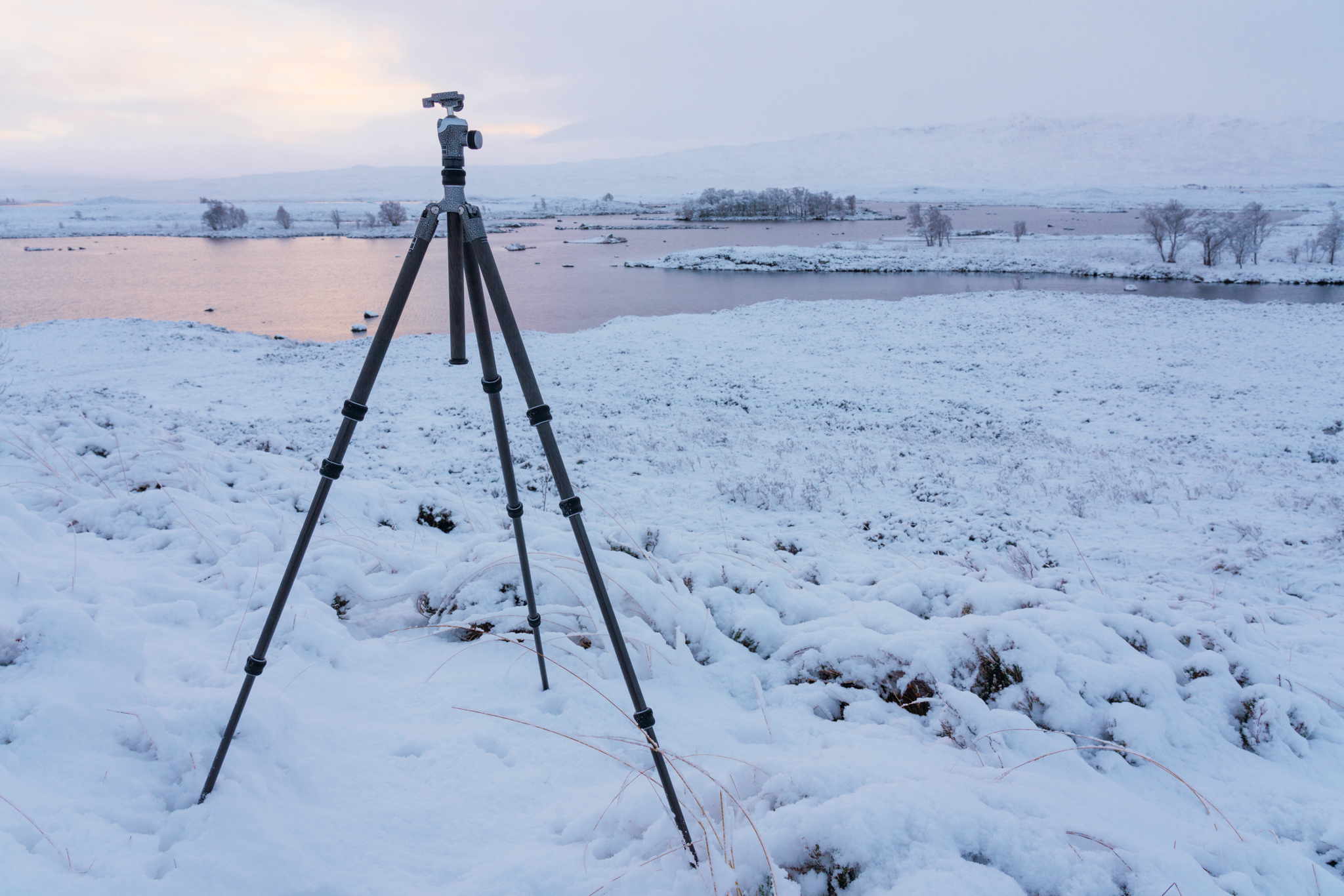
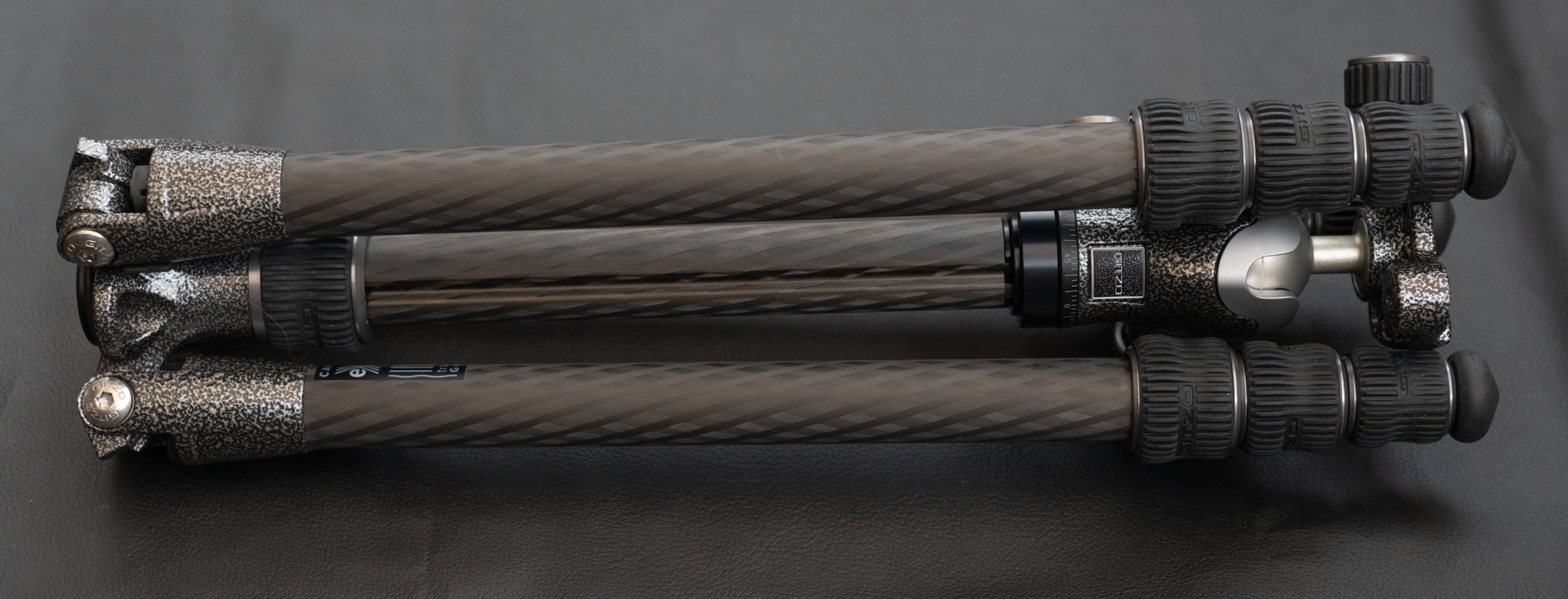
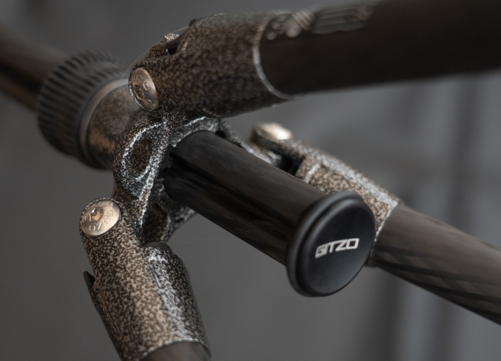
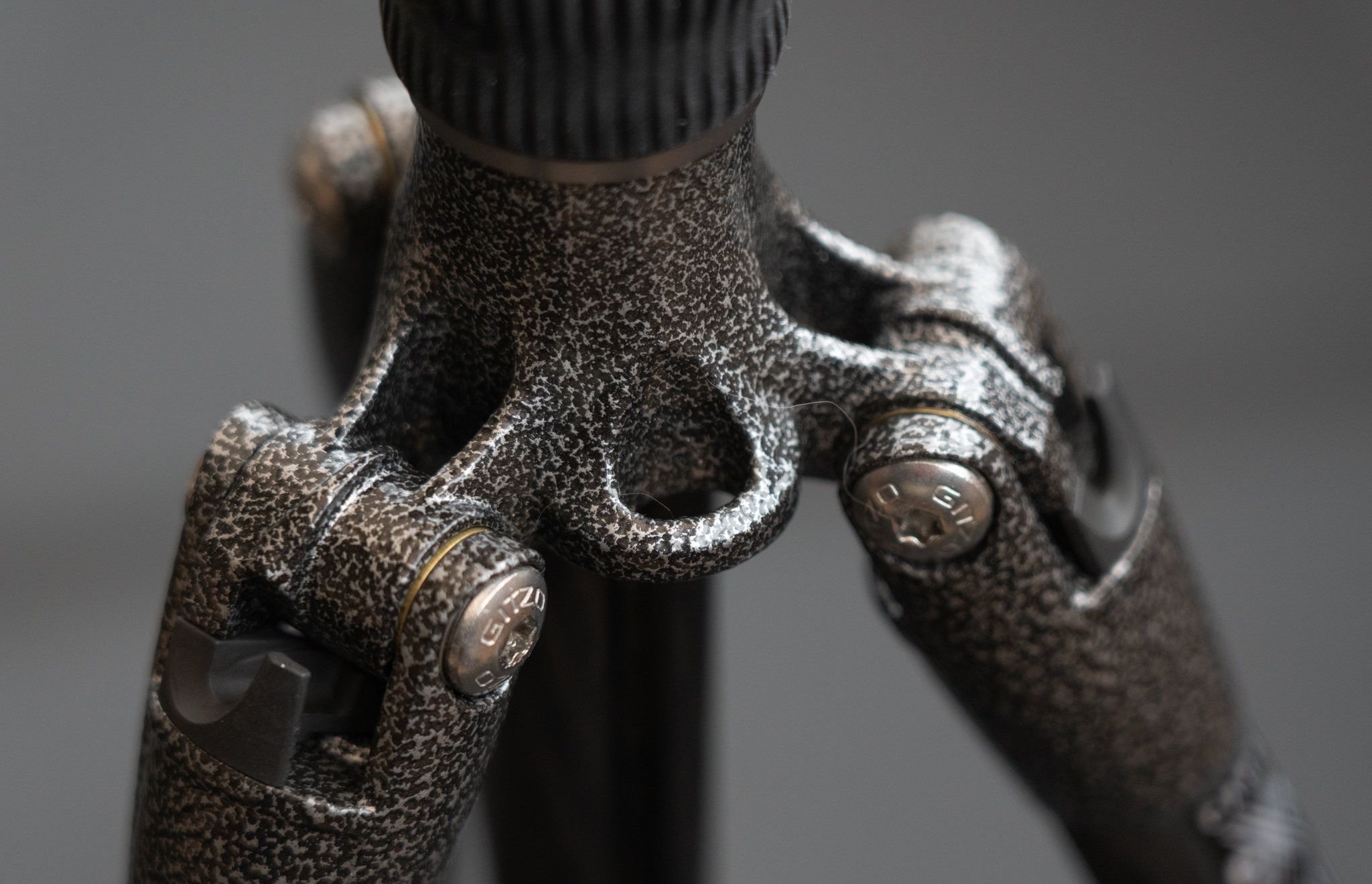
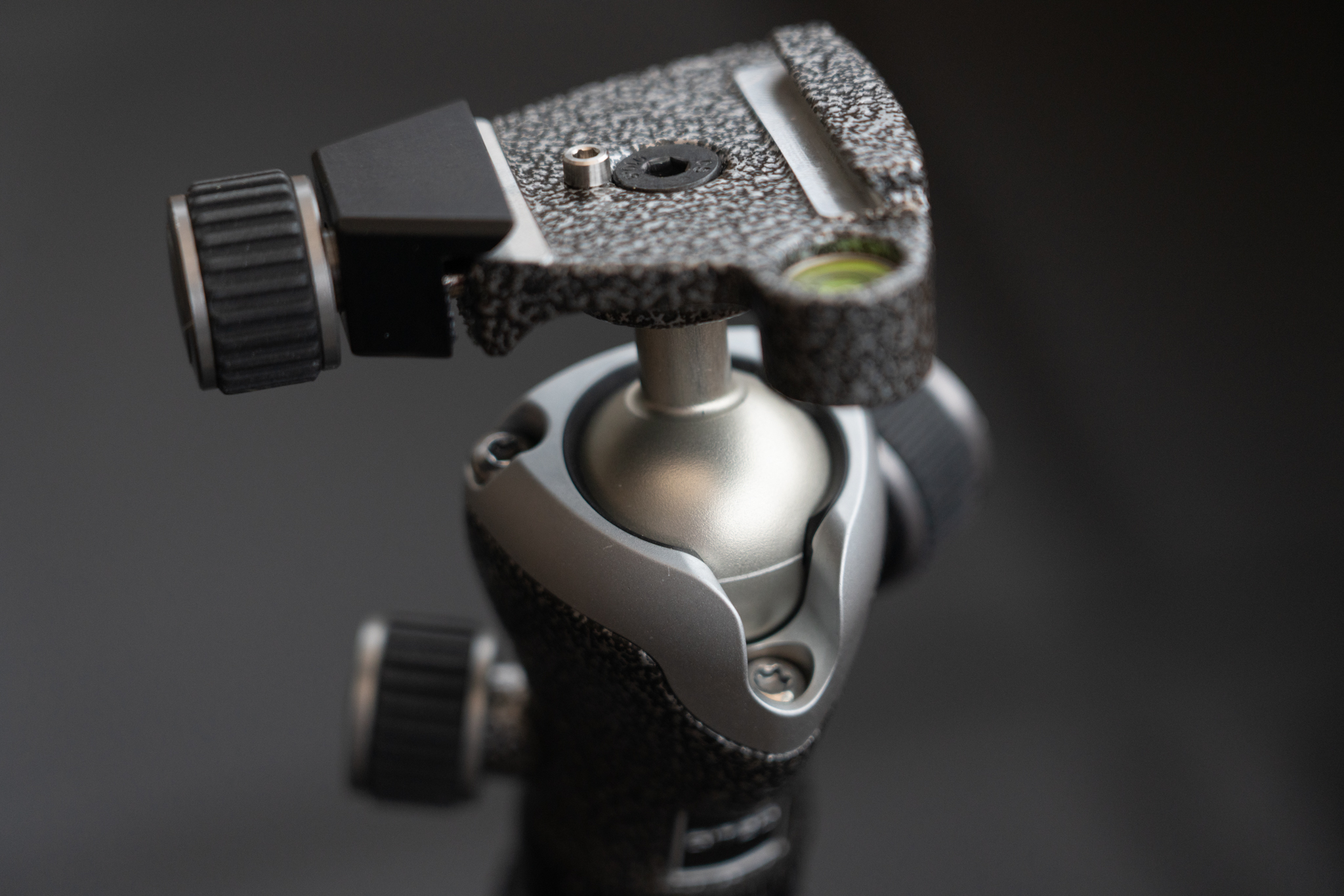
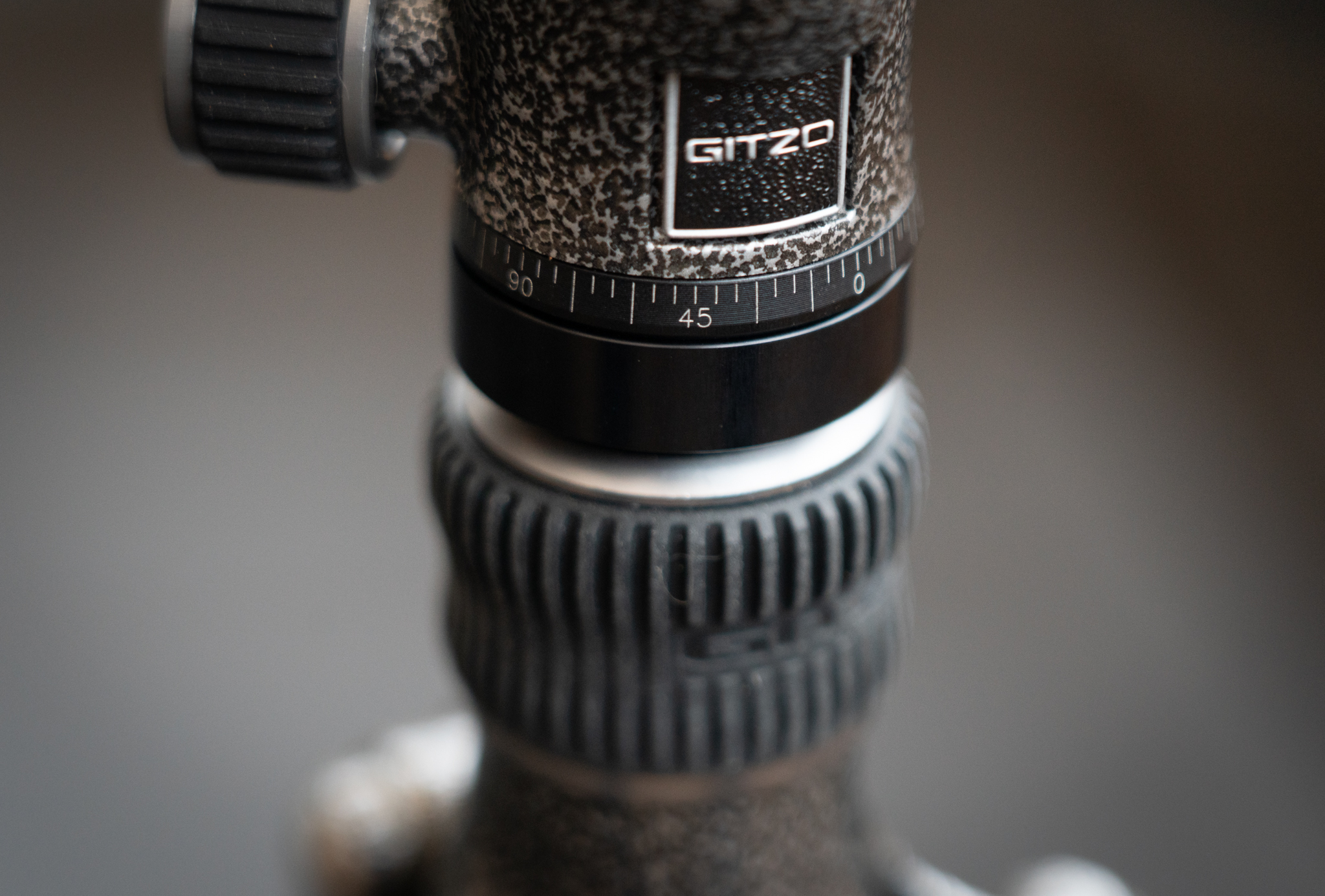
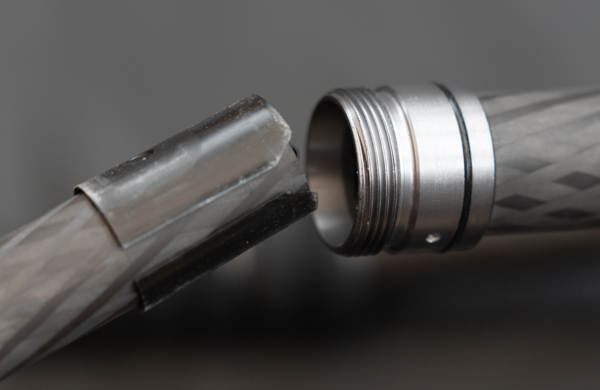
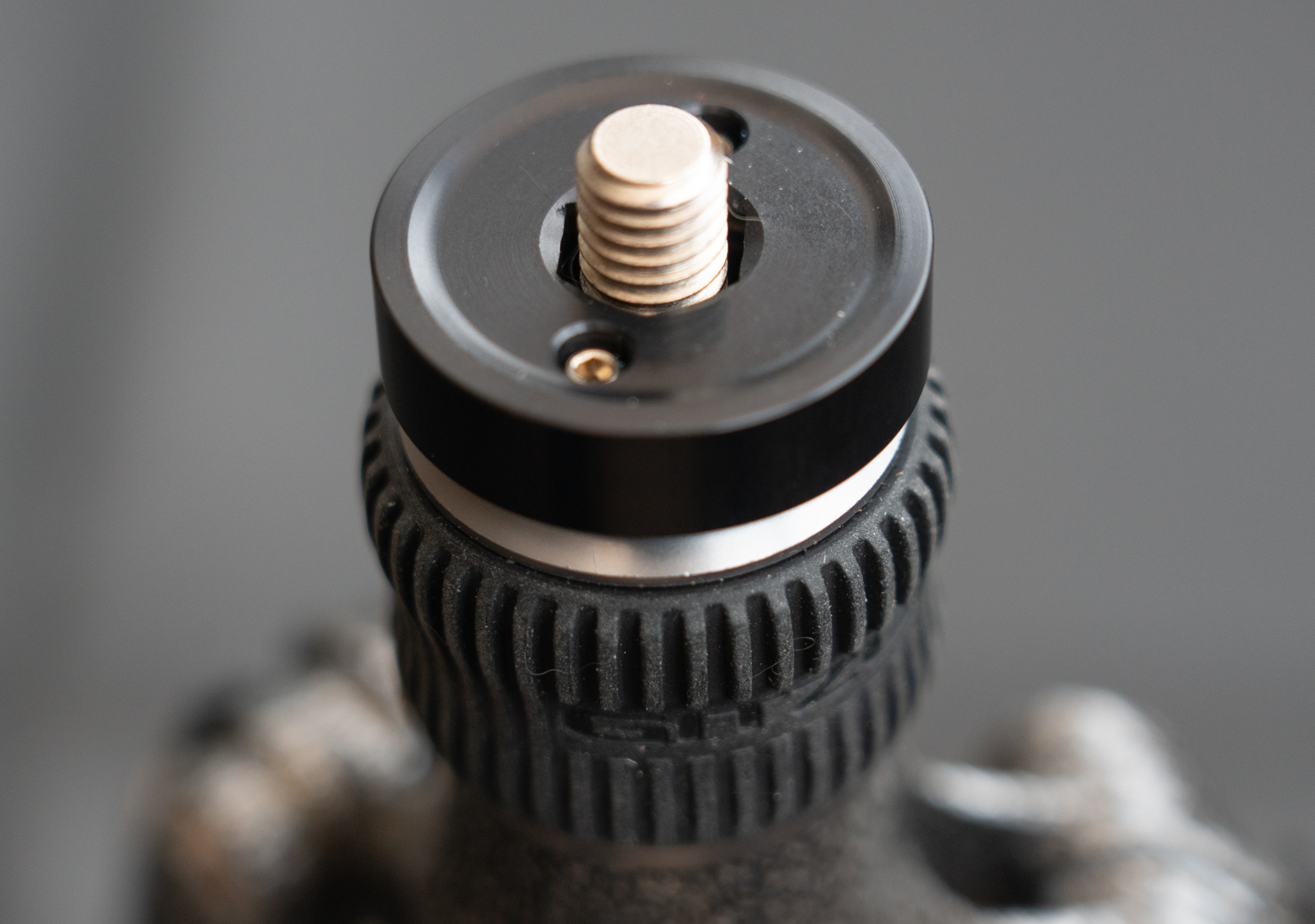
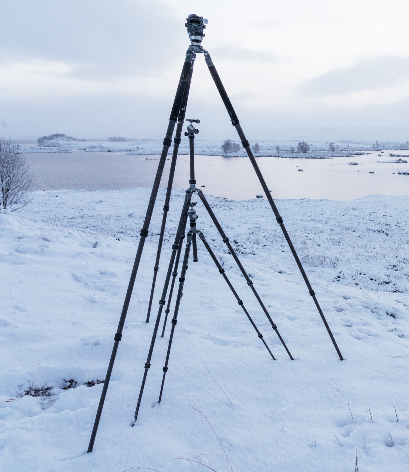
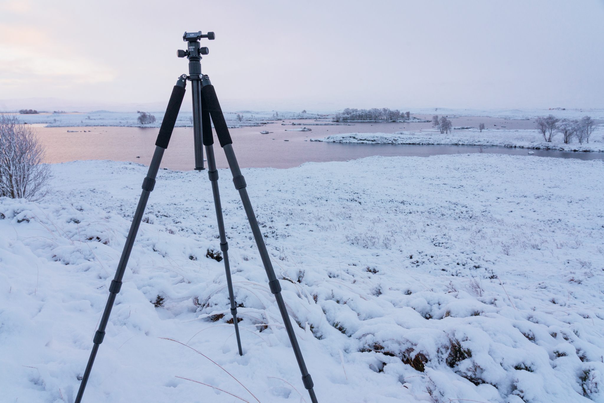
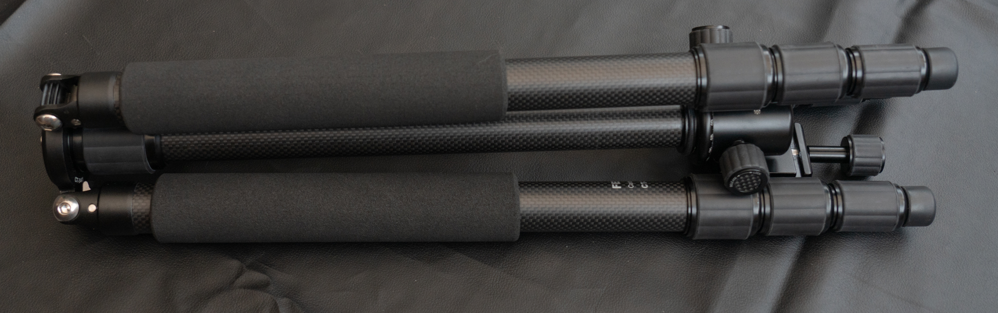
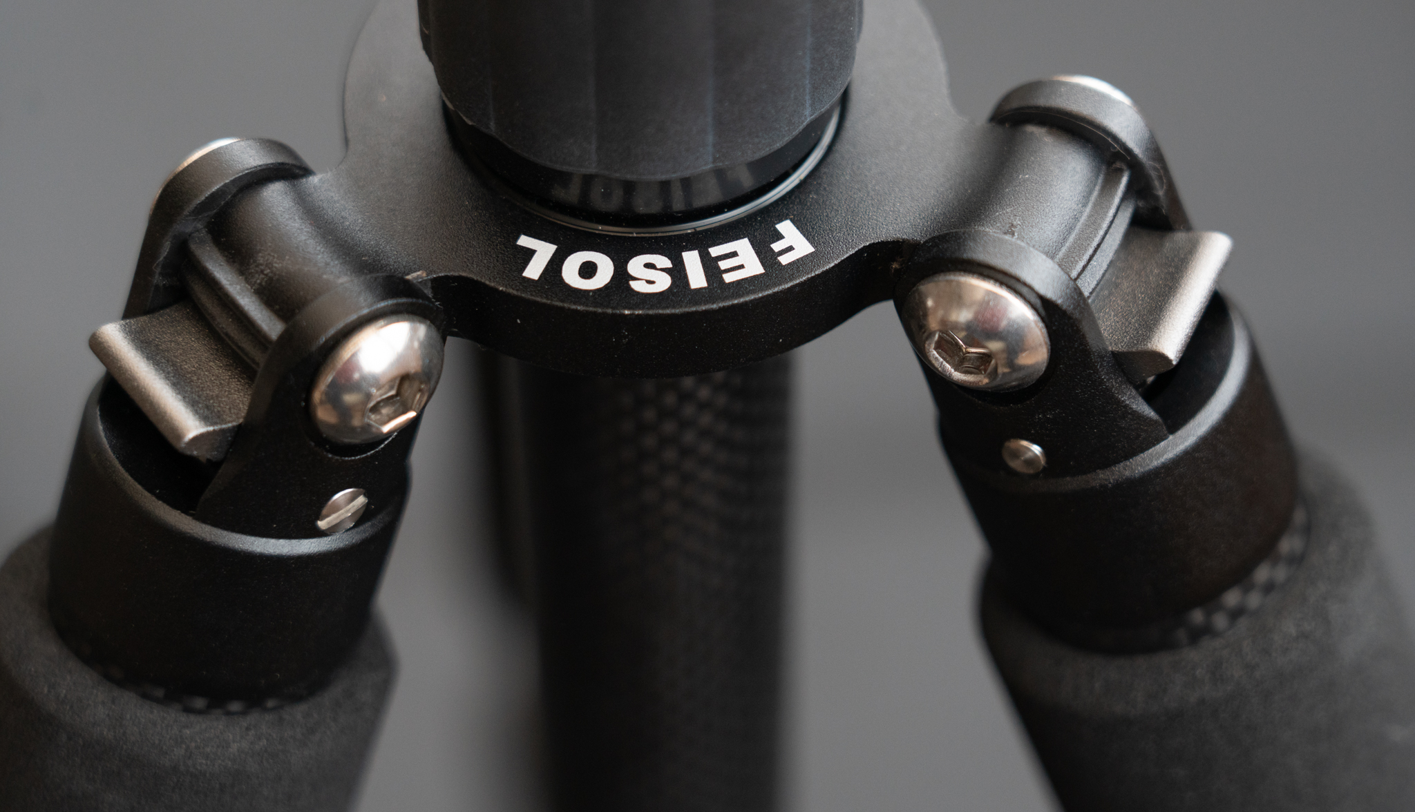
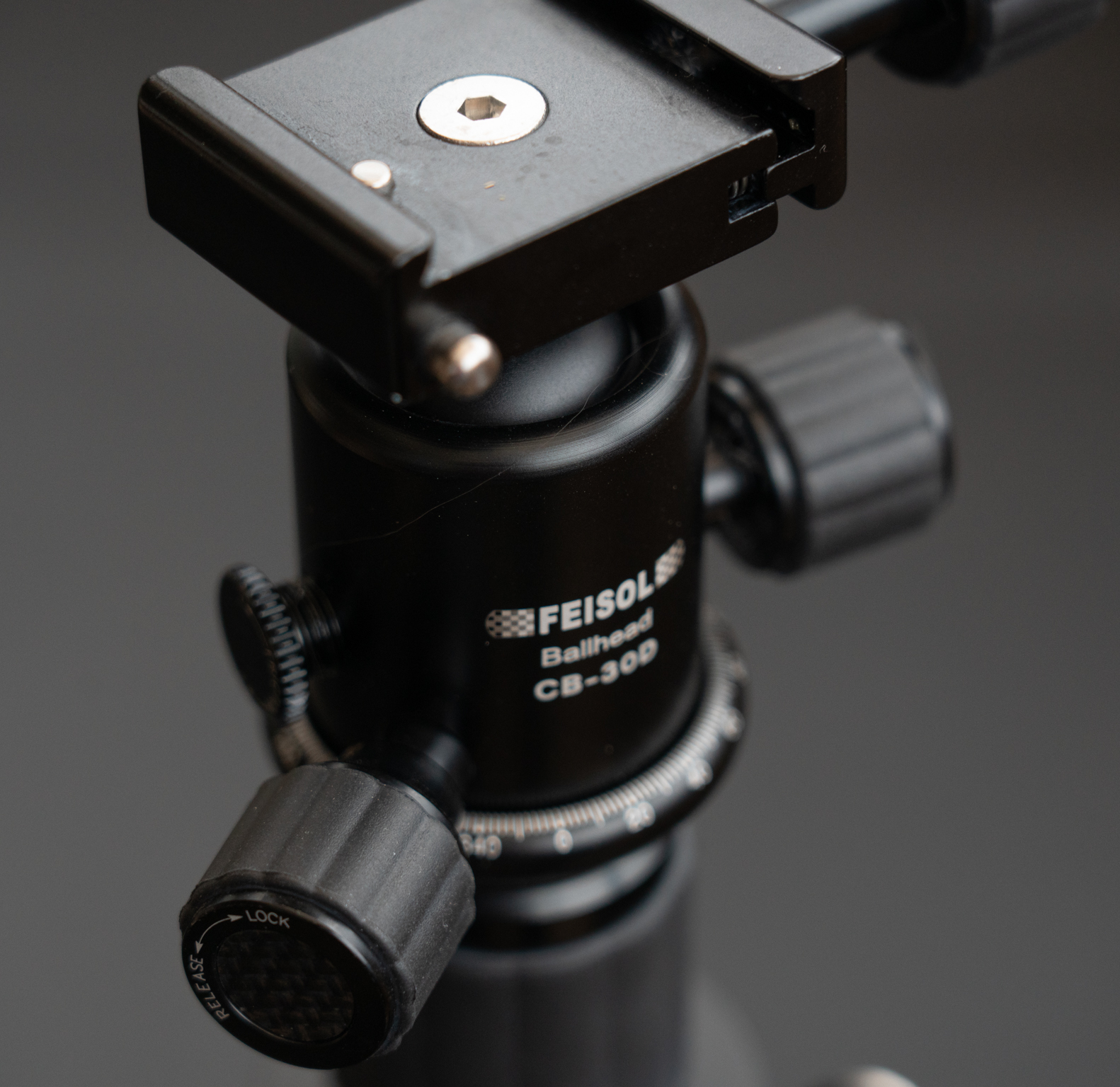
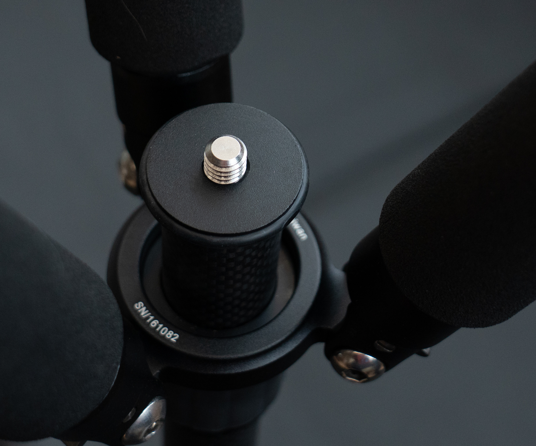
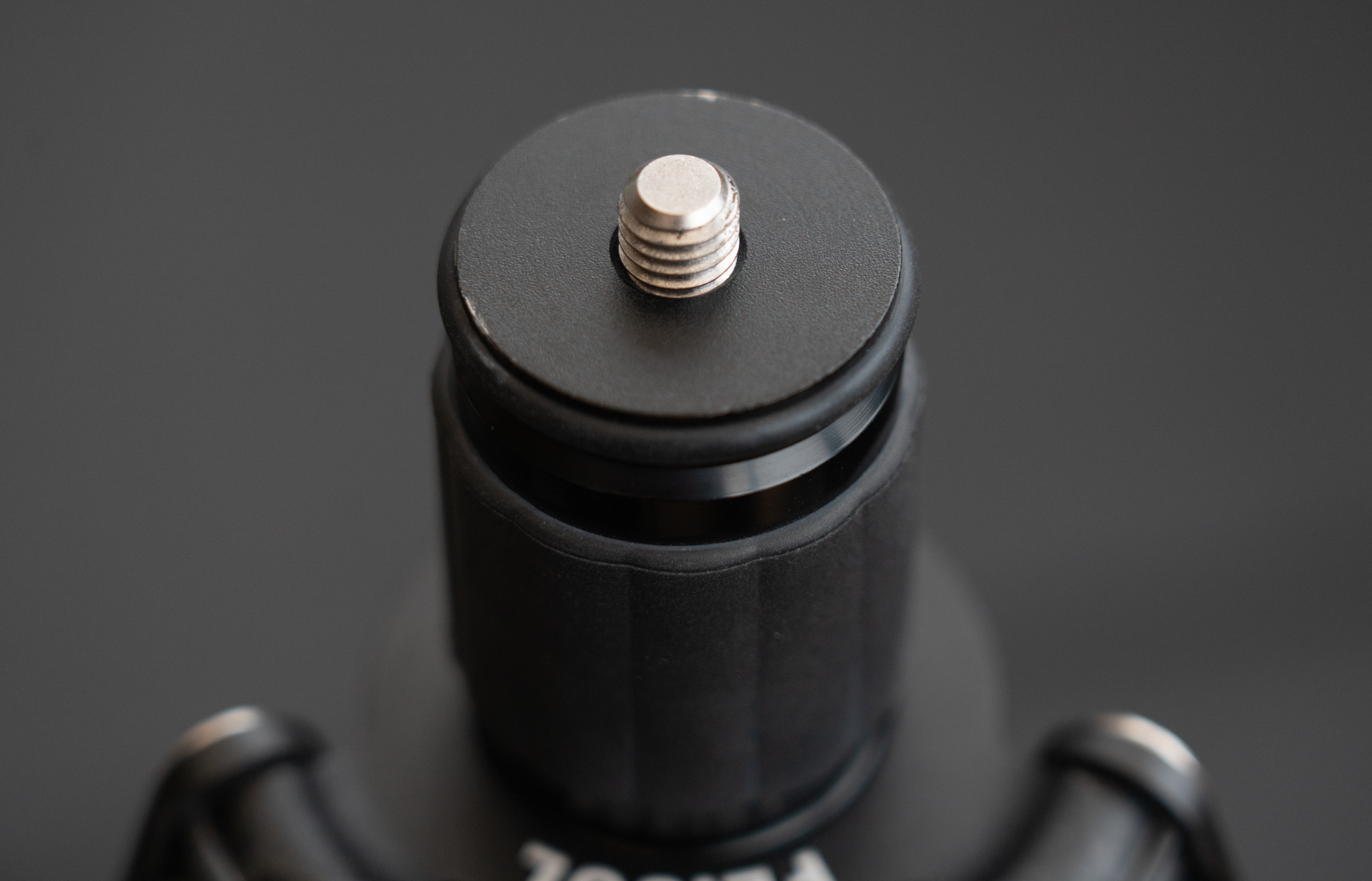
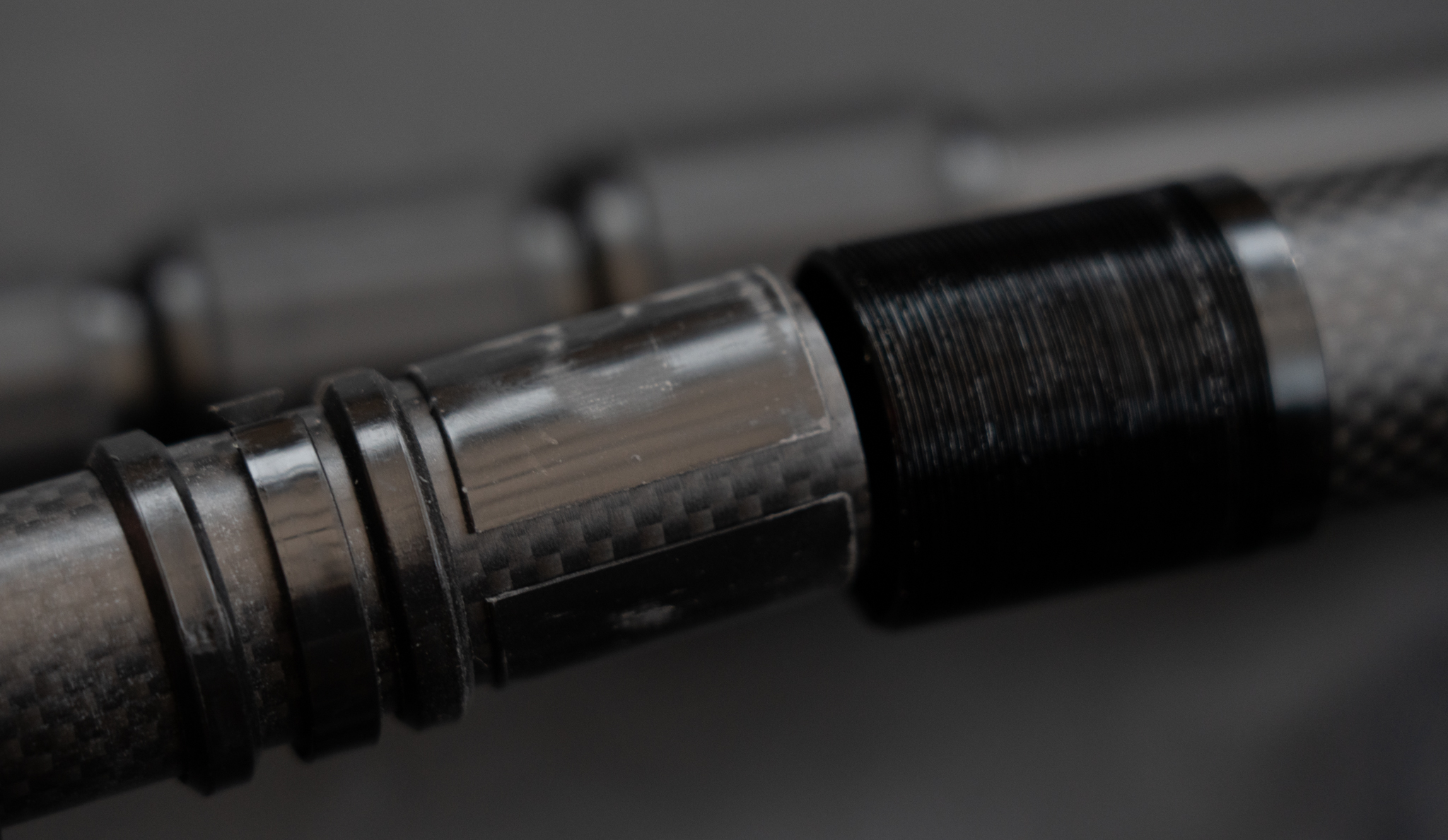
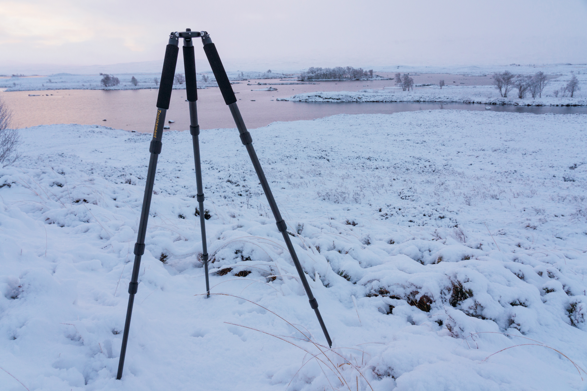
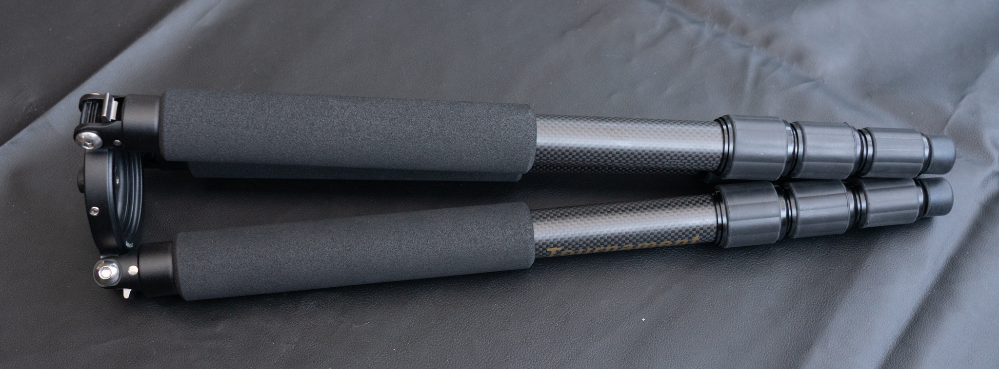
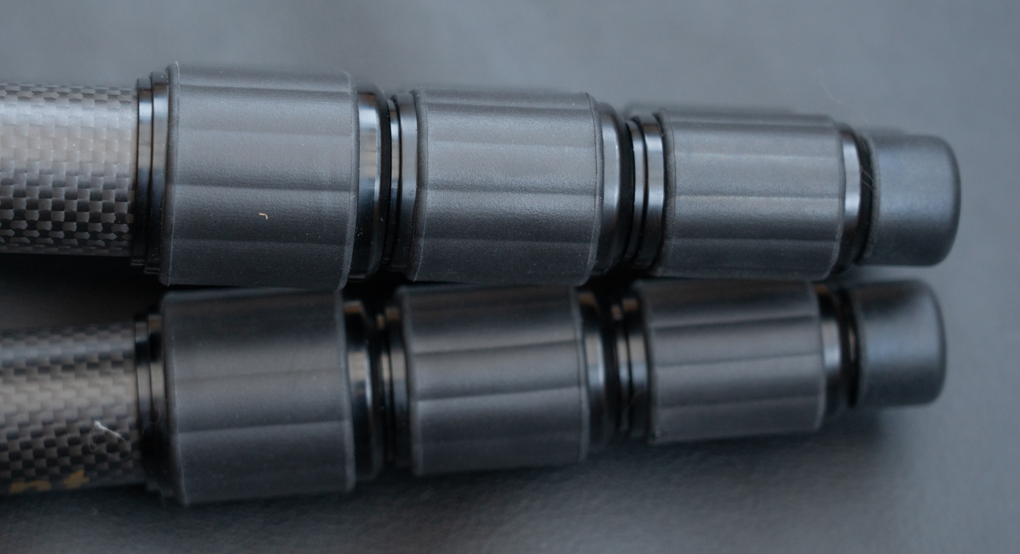
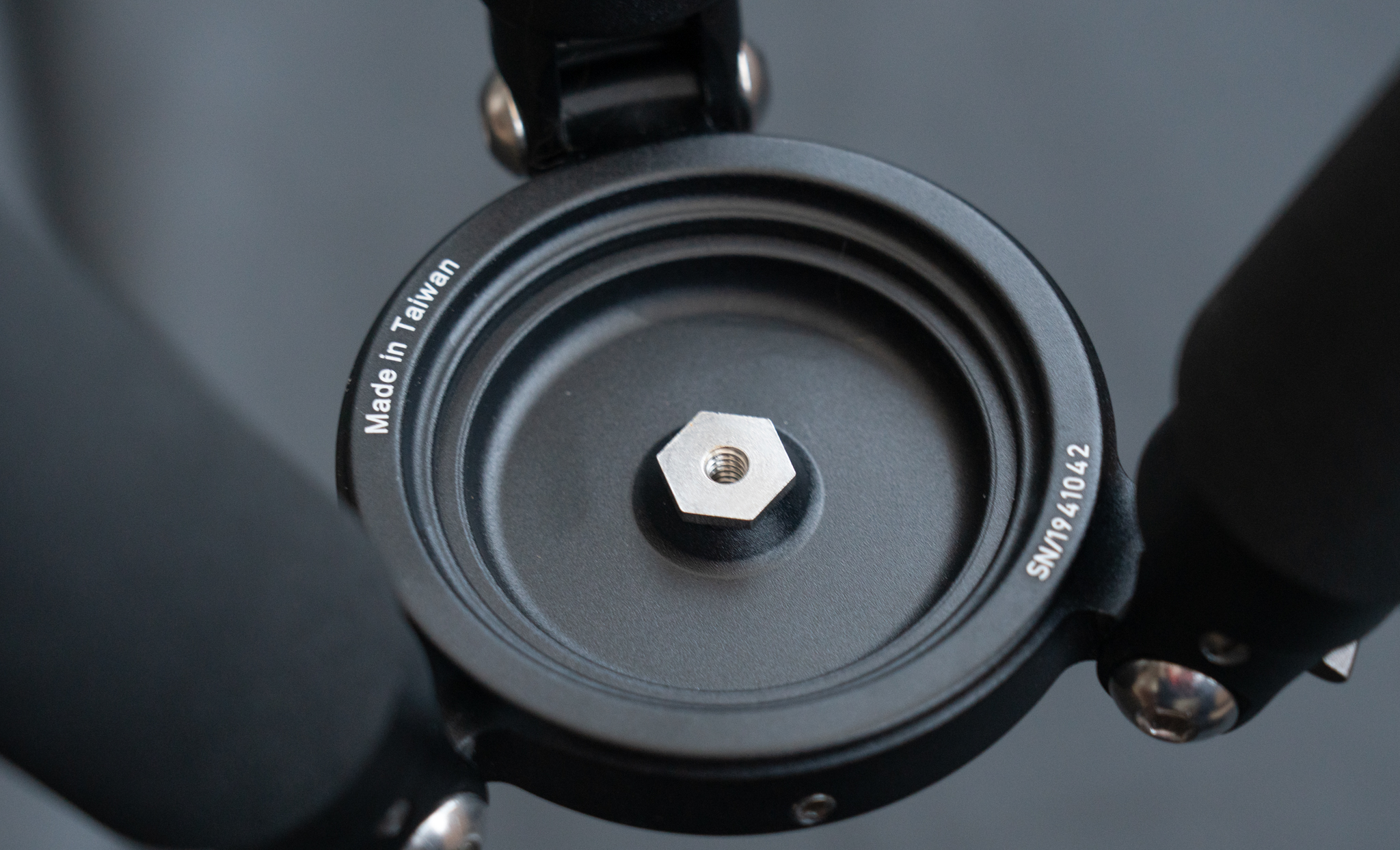
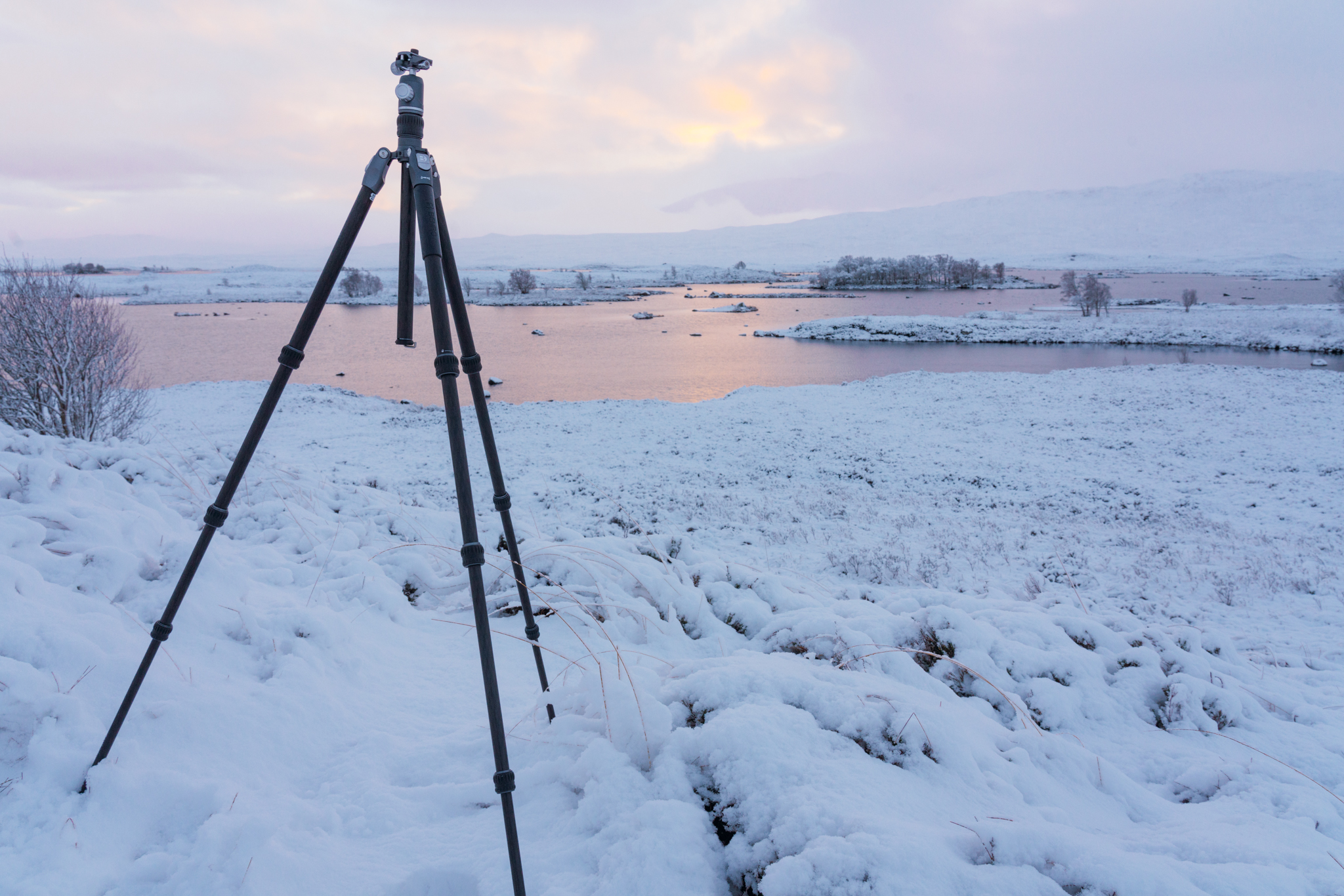
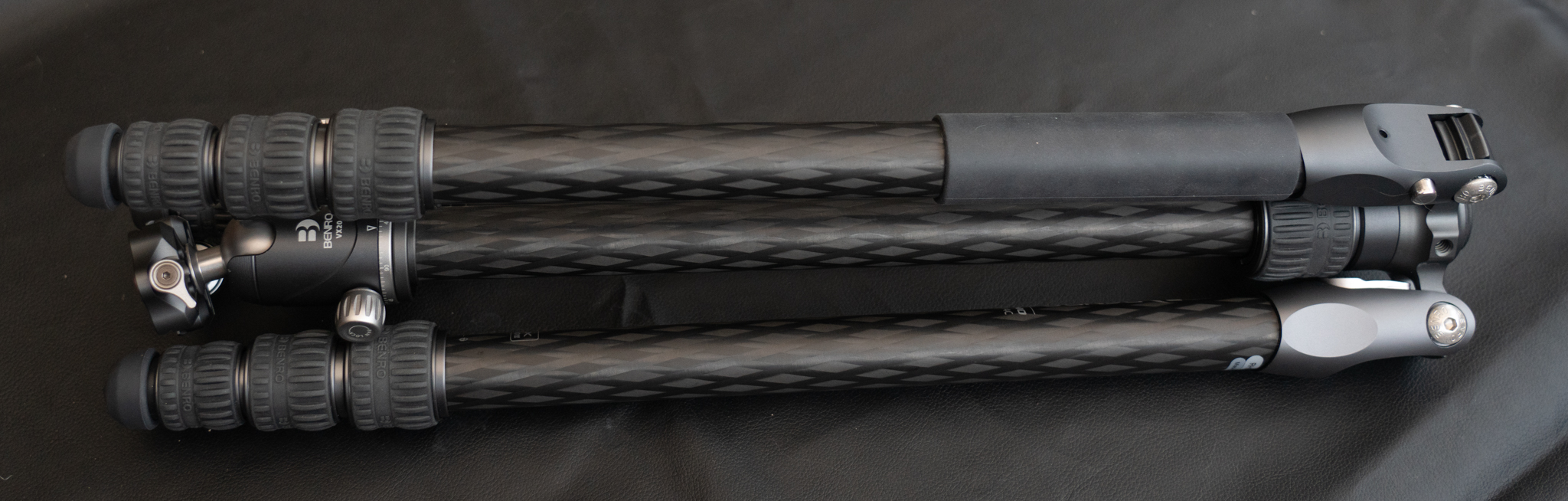
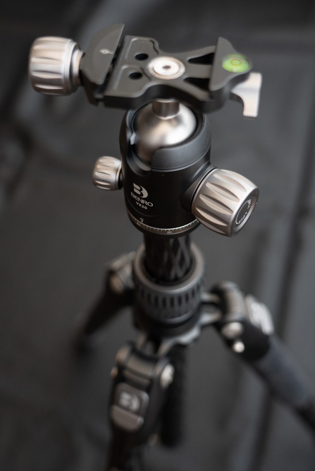
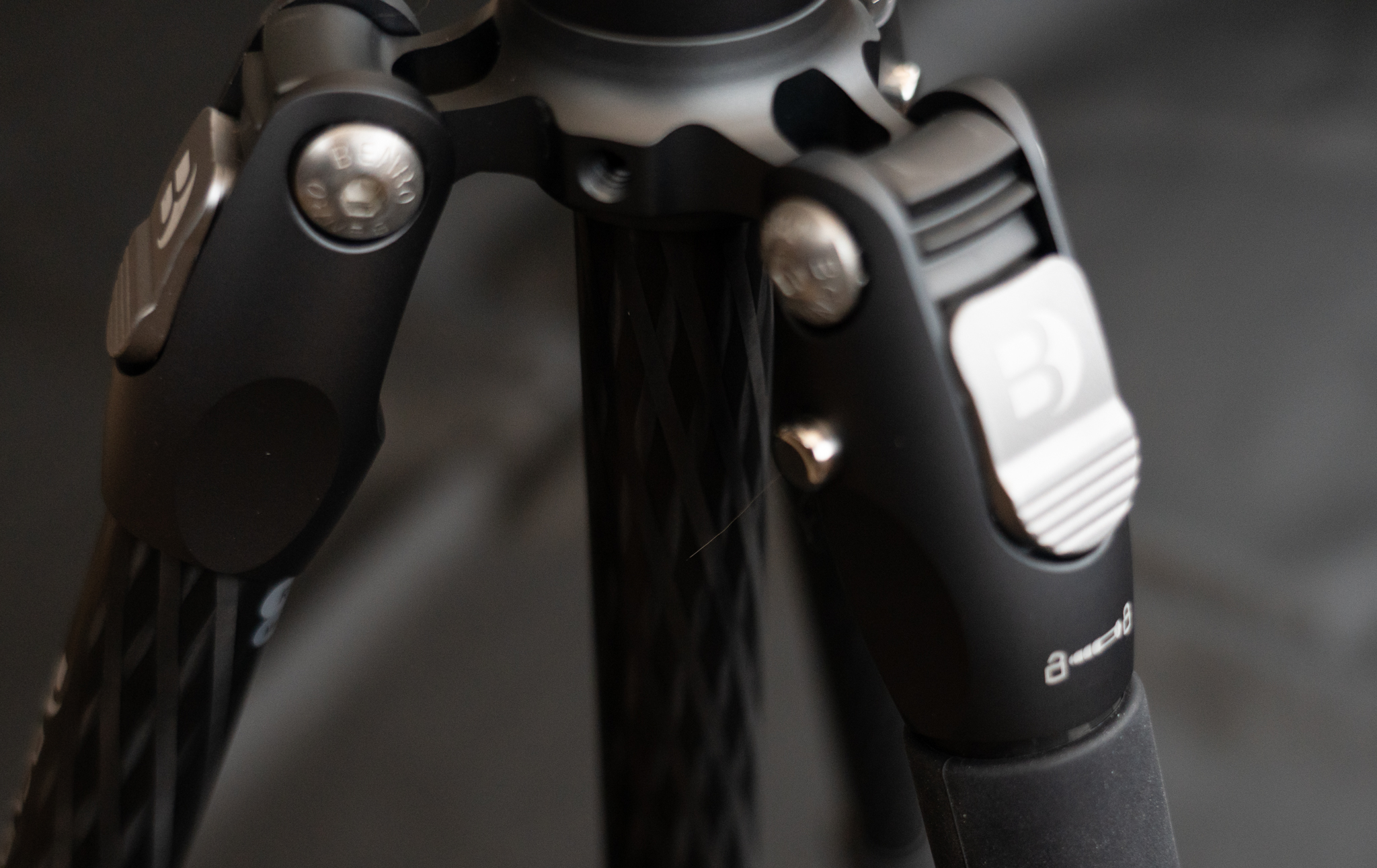
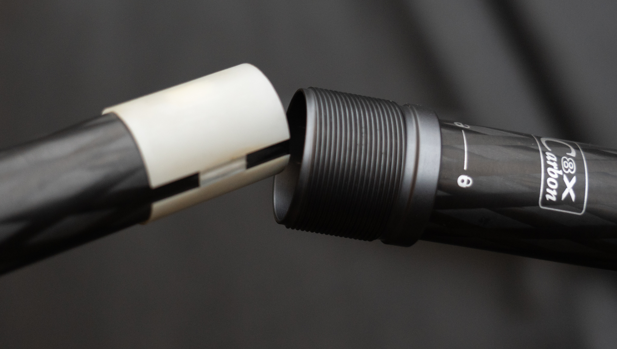
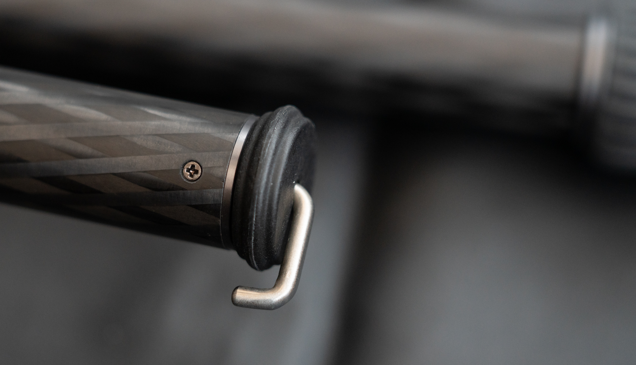
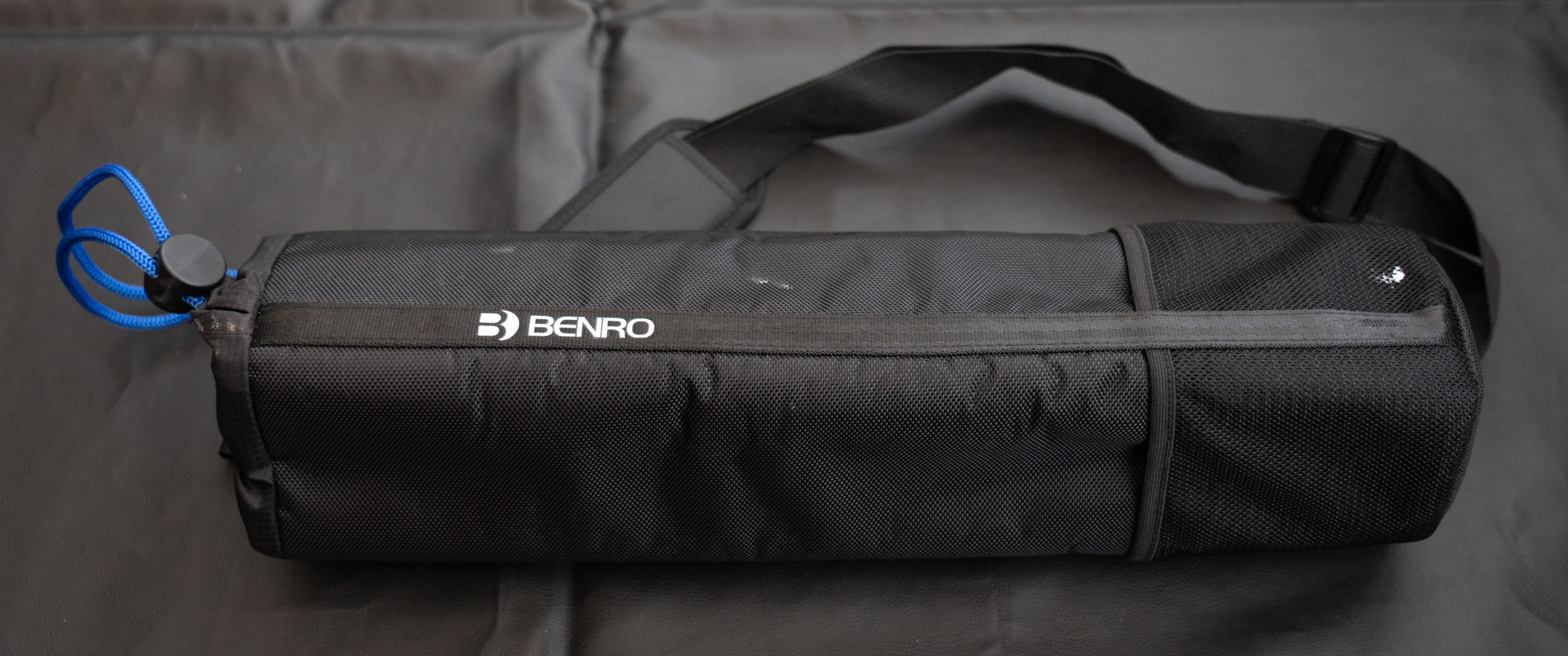
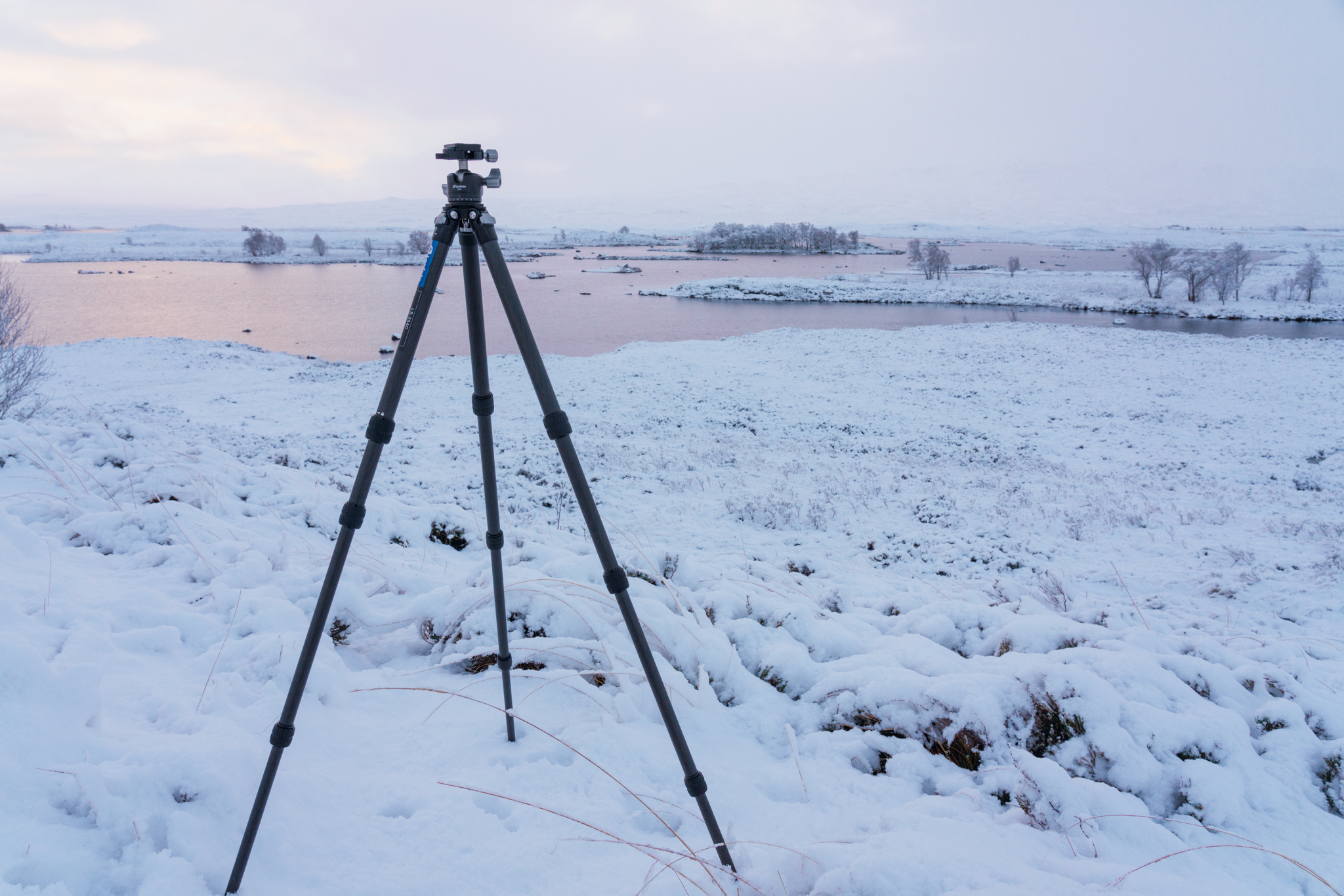
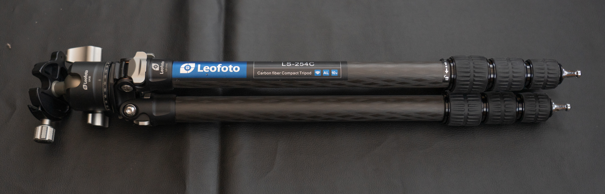
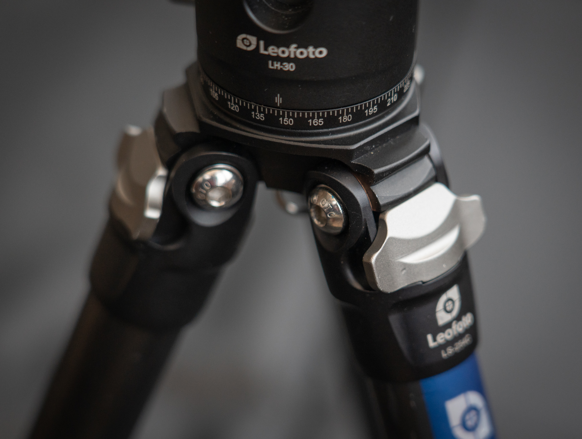
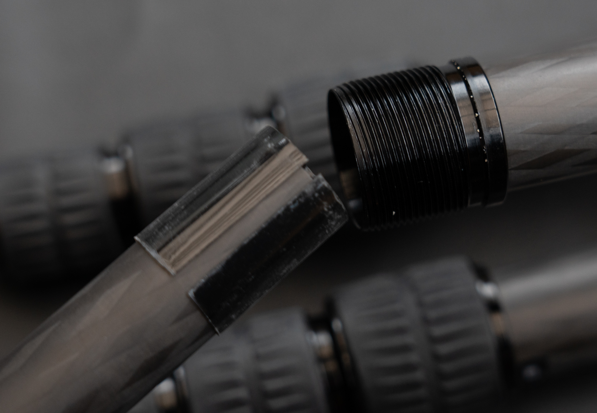
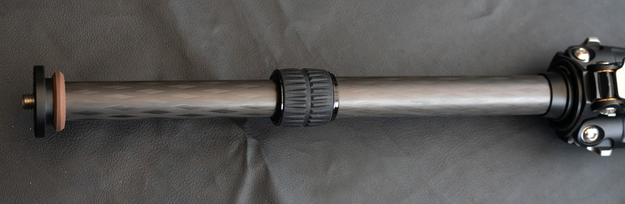
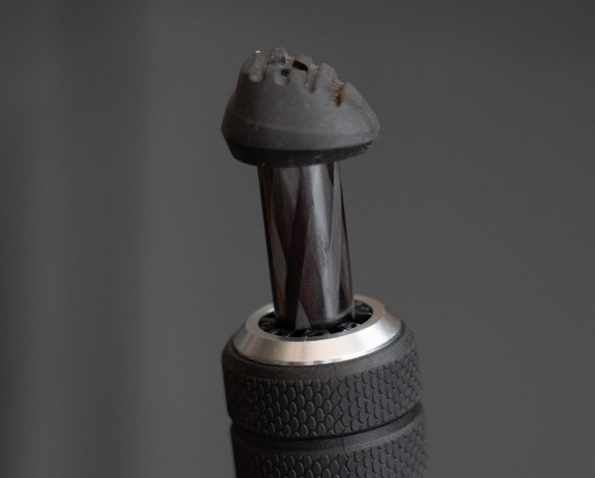
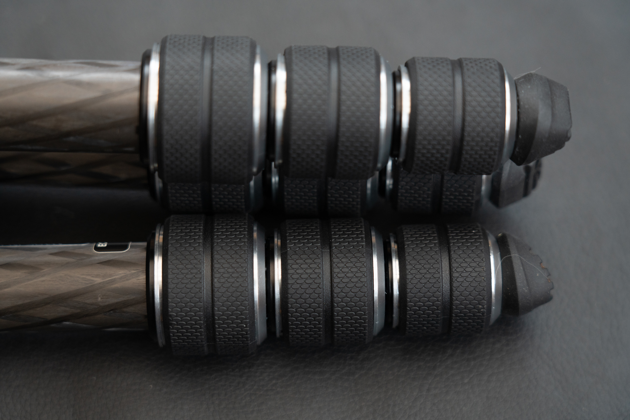
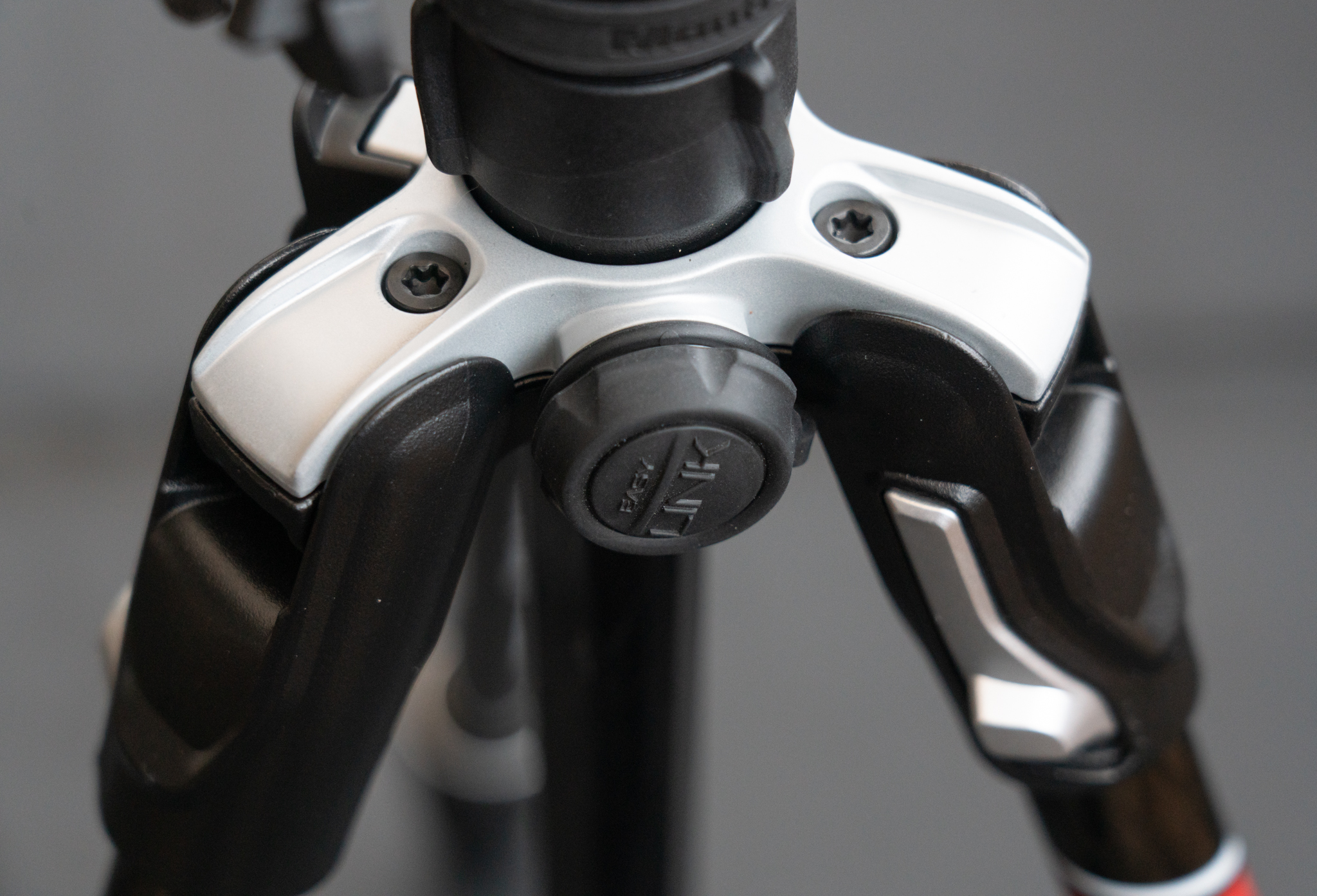
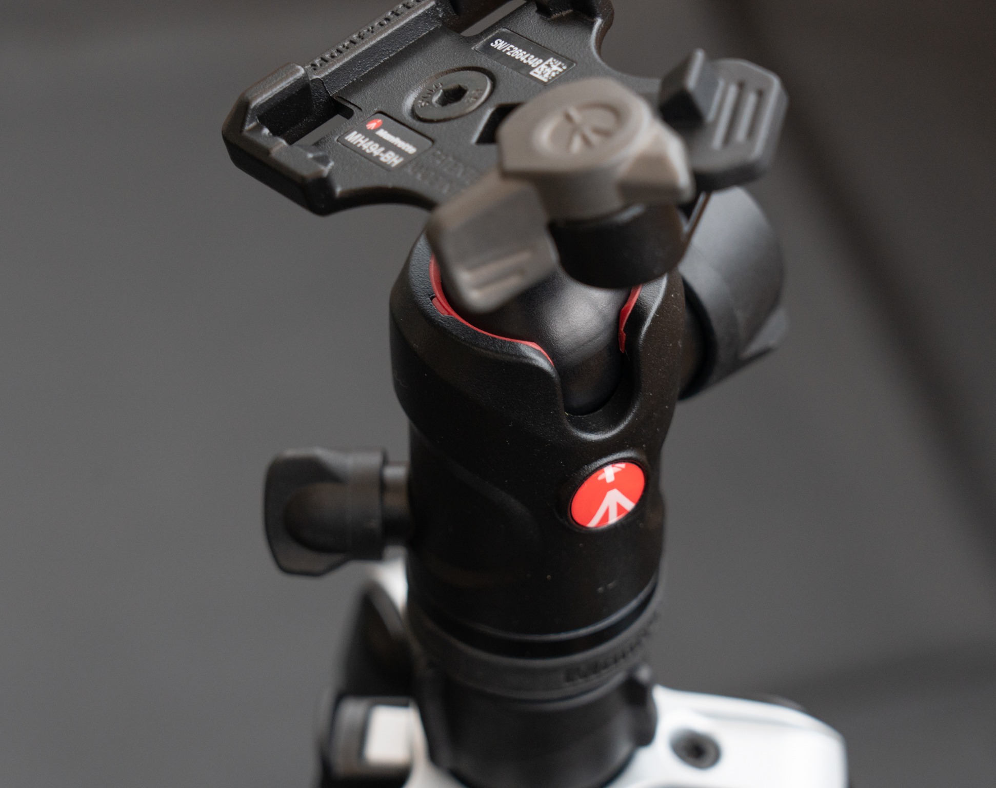
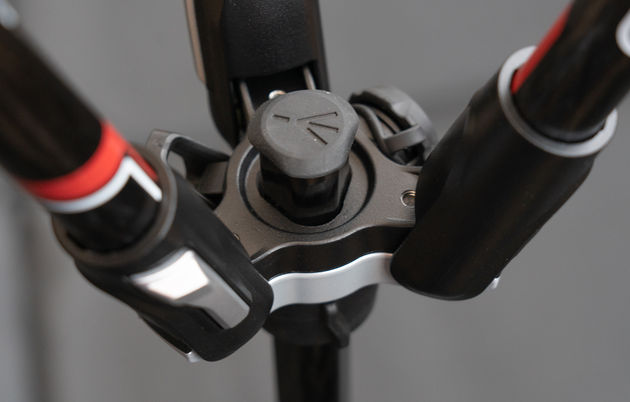
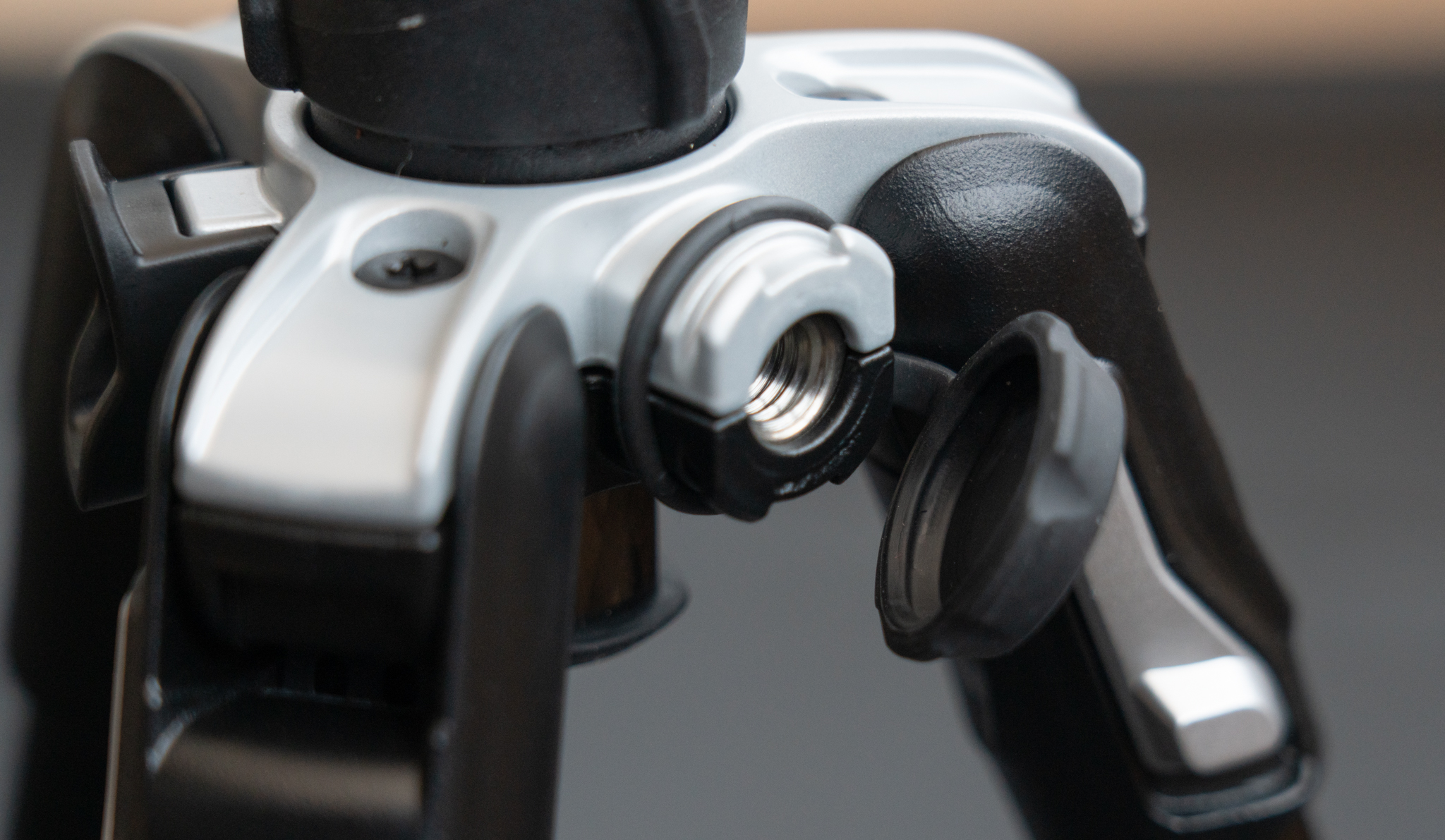
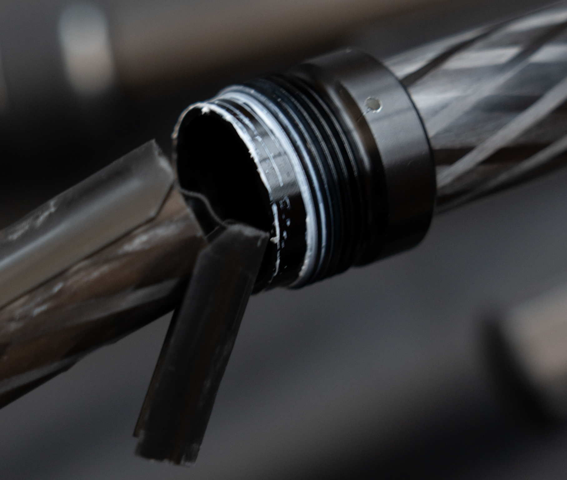
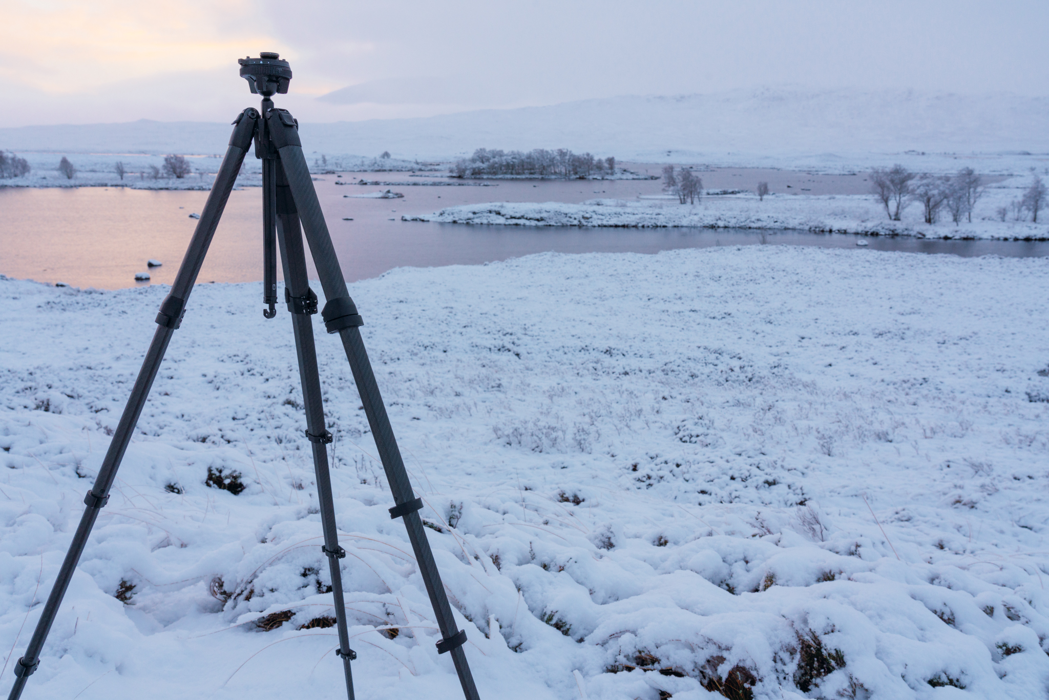
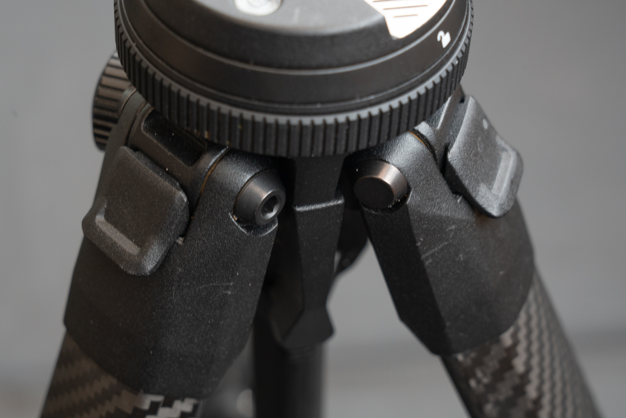
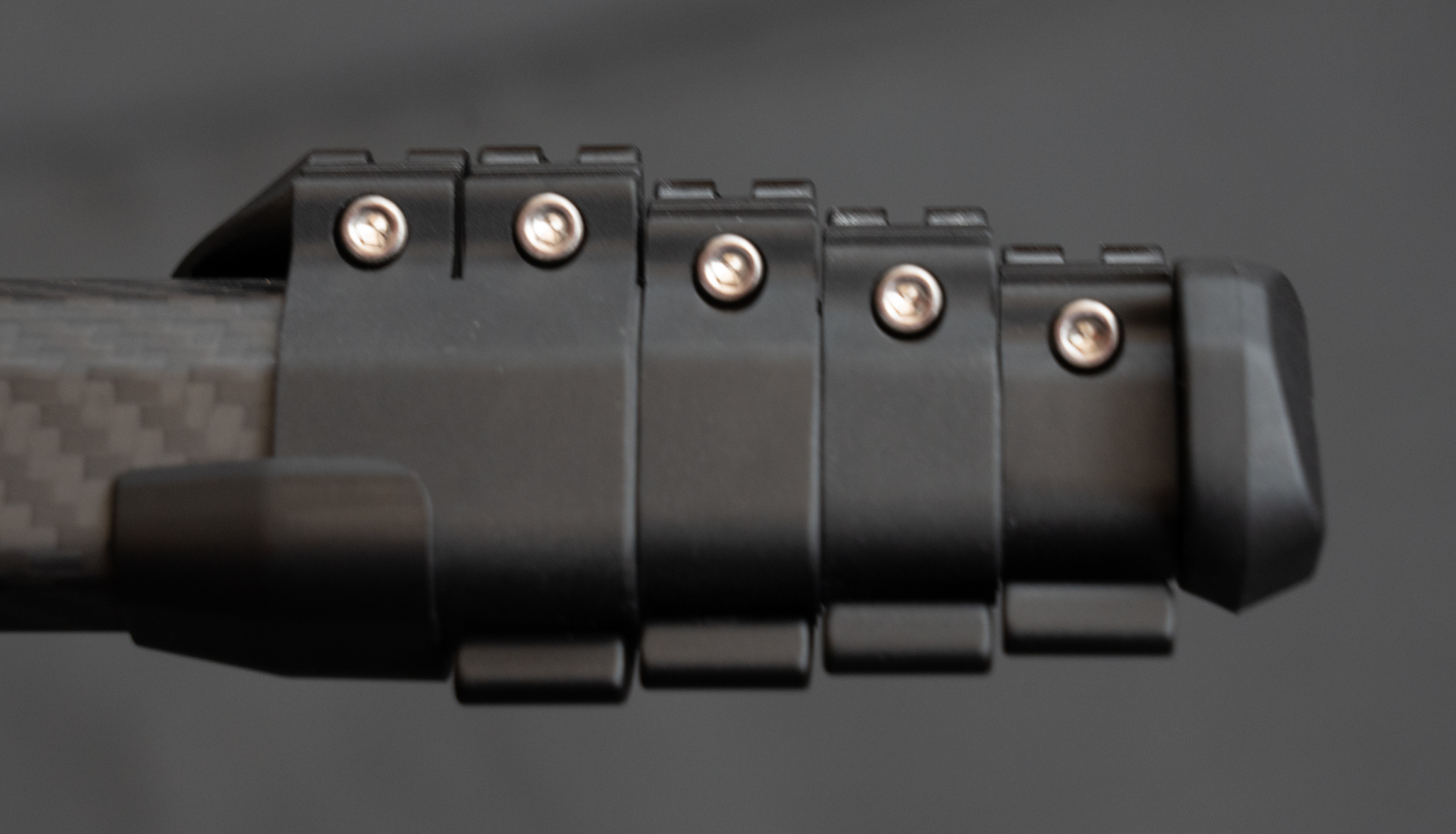
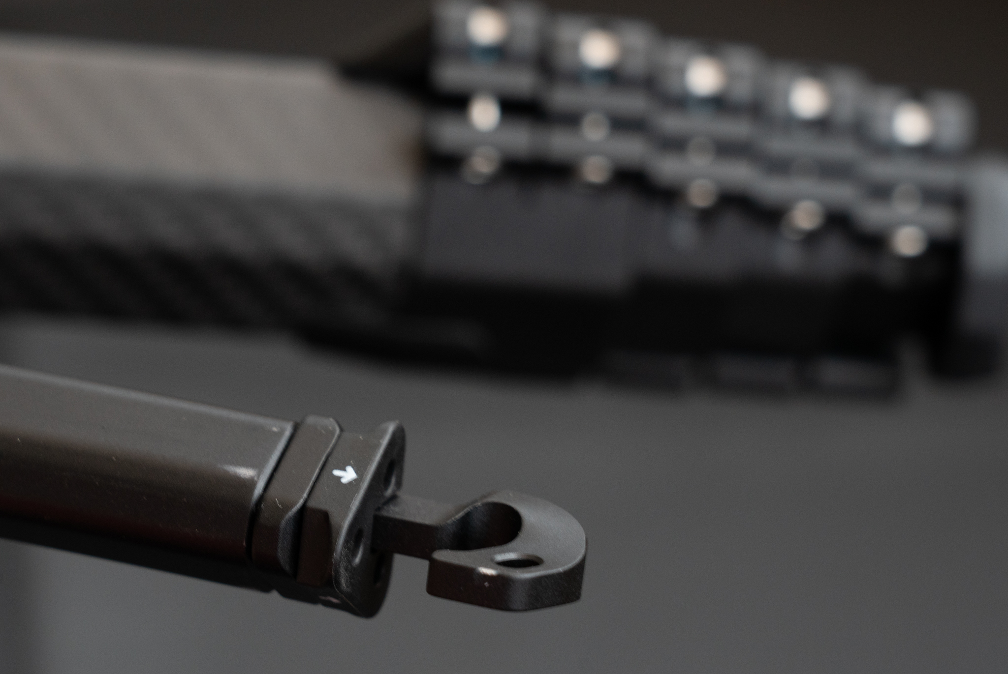
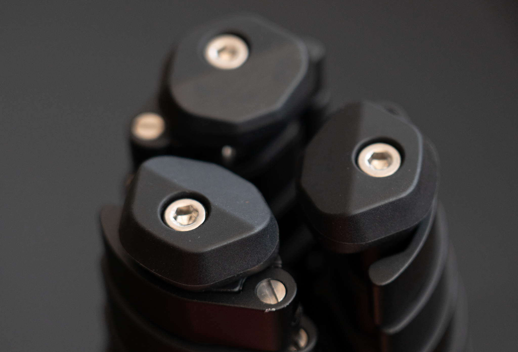
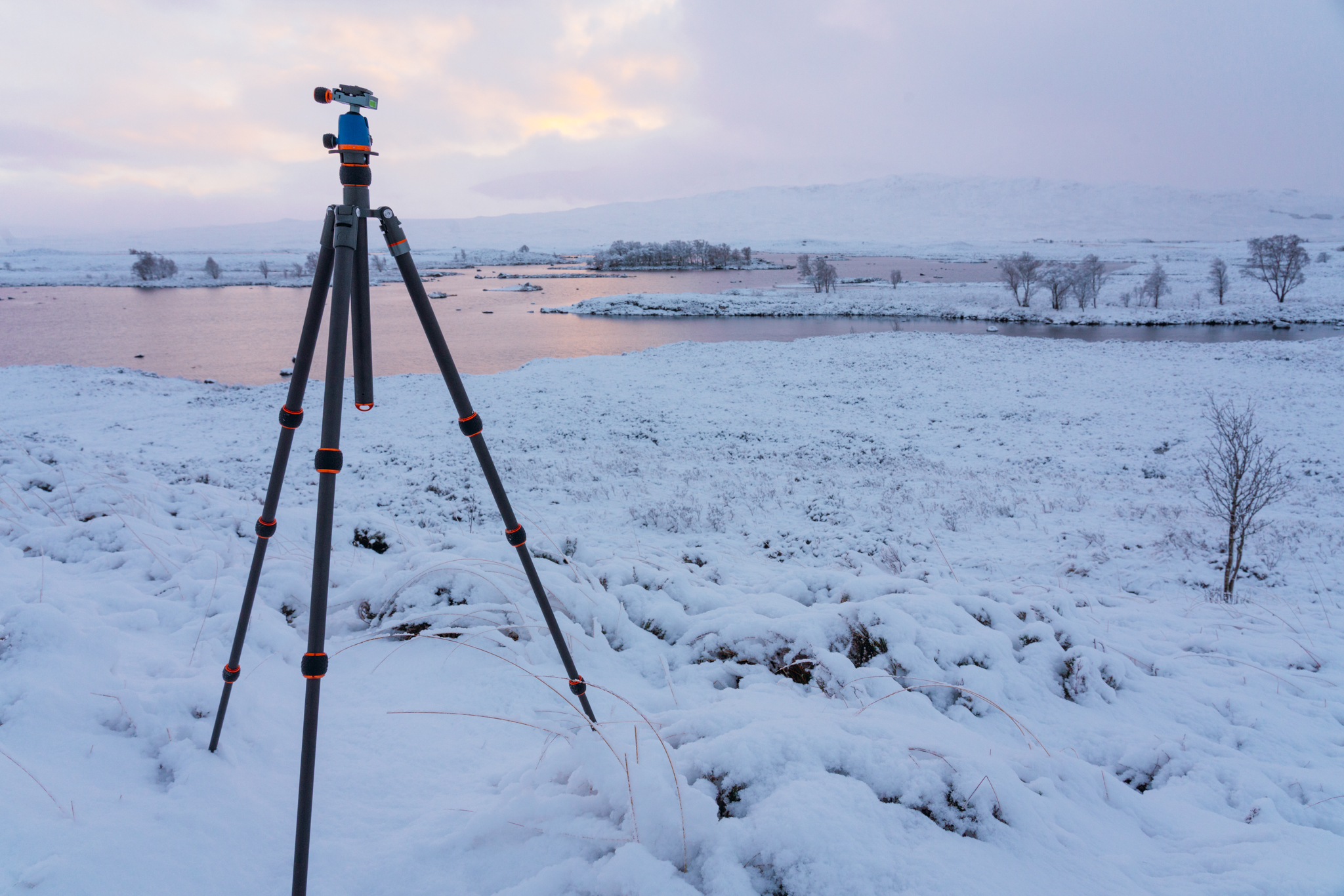
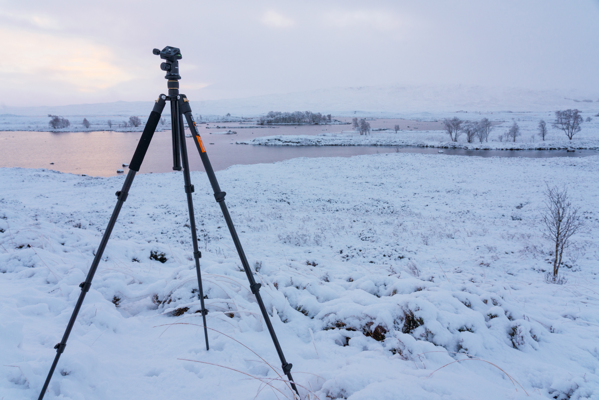
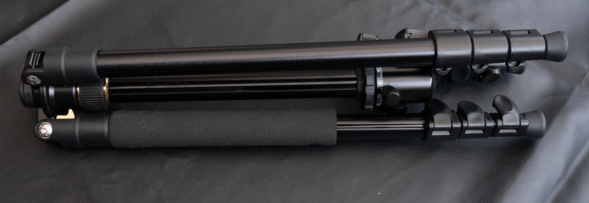
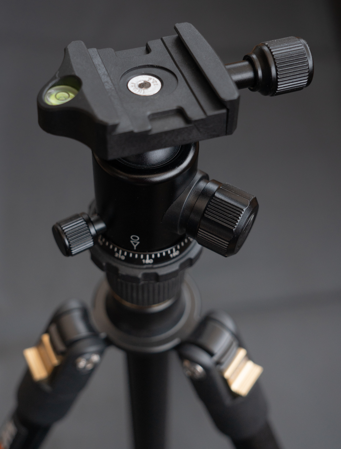
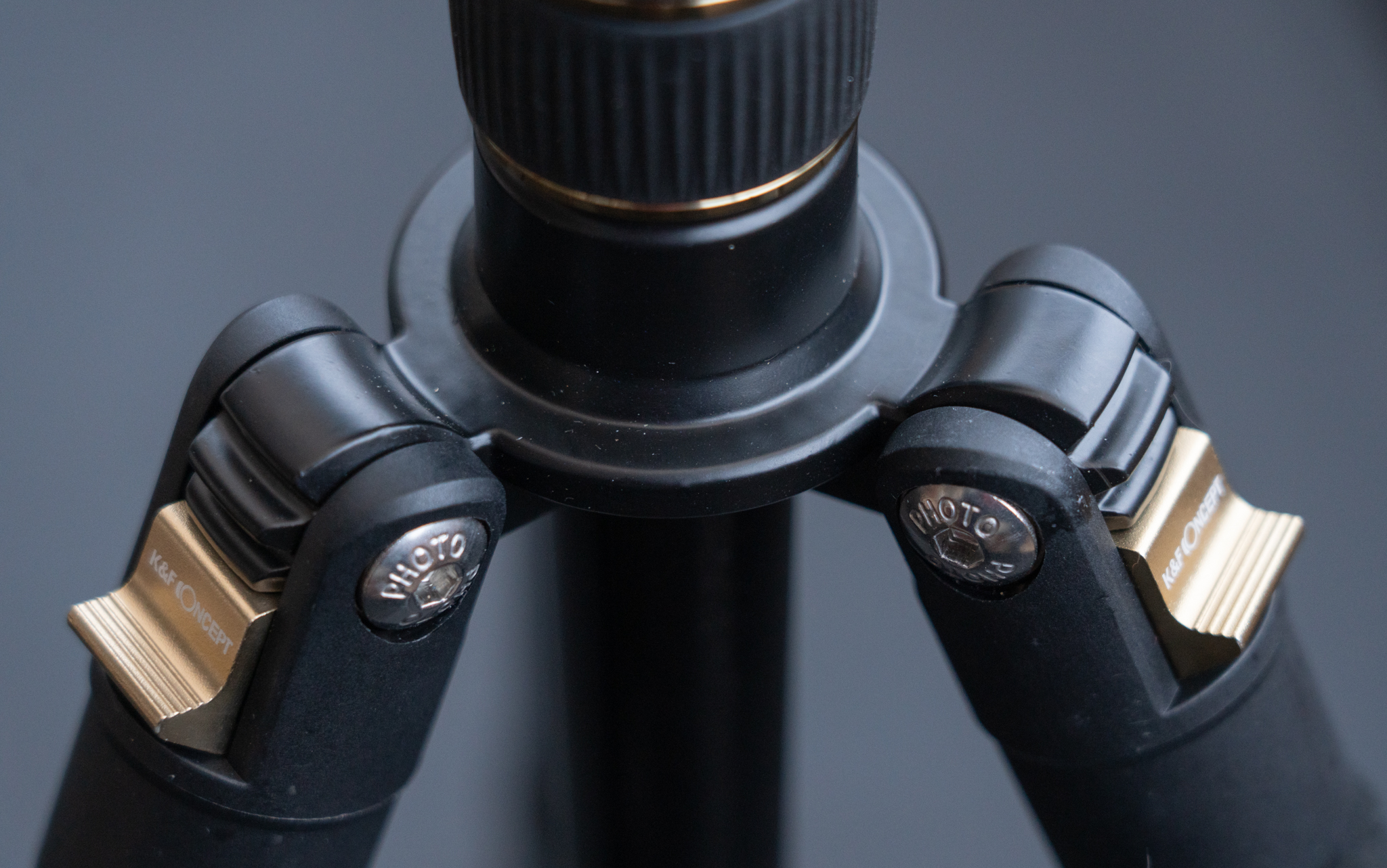
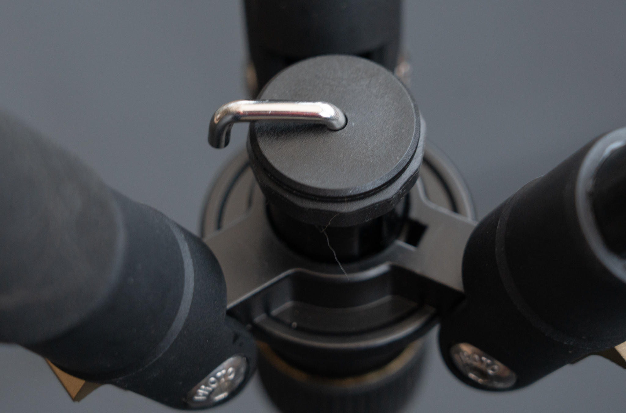
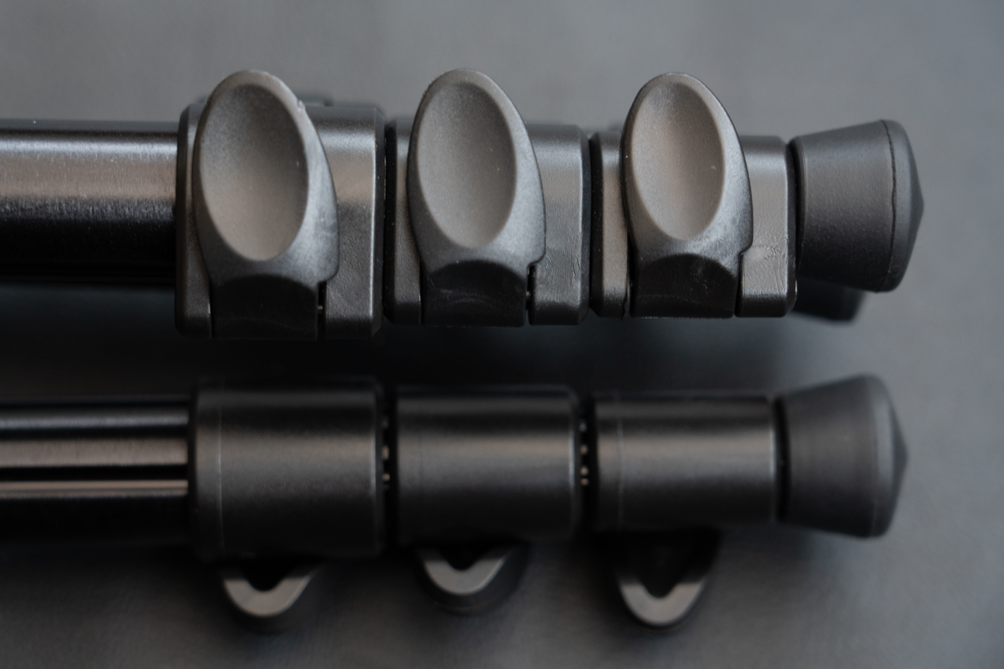
During the testing and research for the recent tripods review article, the subject of tripod spikes came up a few times. I’ve taken it for granted for quite some time that spikes are essential tripod accessories but it seems there are quite a few people who don’t use them or, if they do, are happy to use the small spike tips that often come with professional tripods. Hence I thought it would be good to do a little research on the topic.
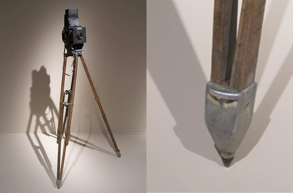
Paul Strand's Camera and Tripod at the V&A
What are tripod spikes supposed to do?
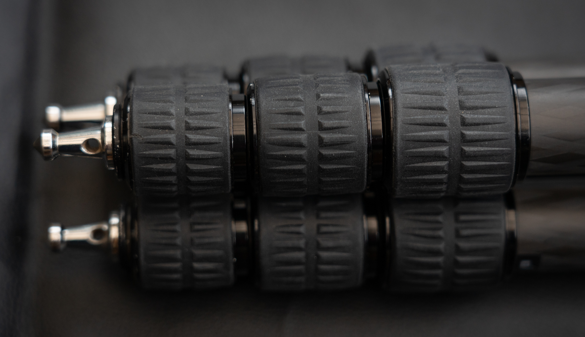
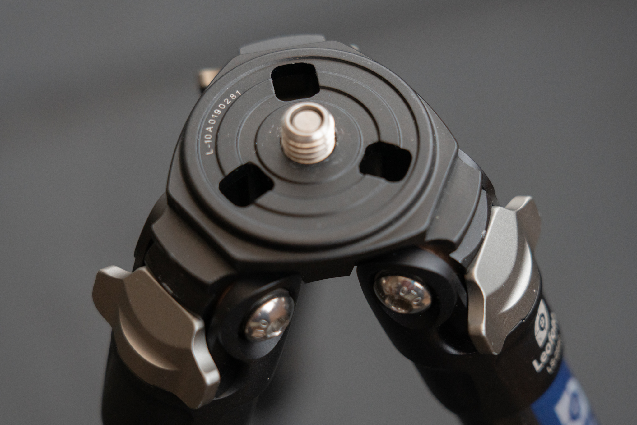
In order for a tripod to hold a camera steady, it’s important that the ground it’s standing on doesn’t move. This can be taken for granted if the ground is solid rock but unlike urban photography where tarmac and concrete can be relied on pretty much everywhere, our natural landscape has all types of ground cover, from grass to peat, bog and heather, sand, leaf litter etc. If your tripod is resting on these types of ground cover and only has rounded, hard rubber feet then there are a few possibilities for camera movement. Here are a few examples of situations that may cause issues.
Slow Sinking
You know the feeling when you’re standing on what you thought was solid ground but slowly the mud or sand and water is rising up the sides of your shoes. Well your tripod only has to let you camera sink by a fraction of a millimeter and your photograph may end up blurred. You’re unlikely to sink more than a couple of inches as in most cases the lower layers beneath the ground are more compacted. This can be even more of a factor during long exposures.
Slipping
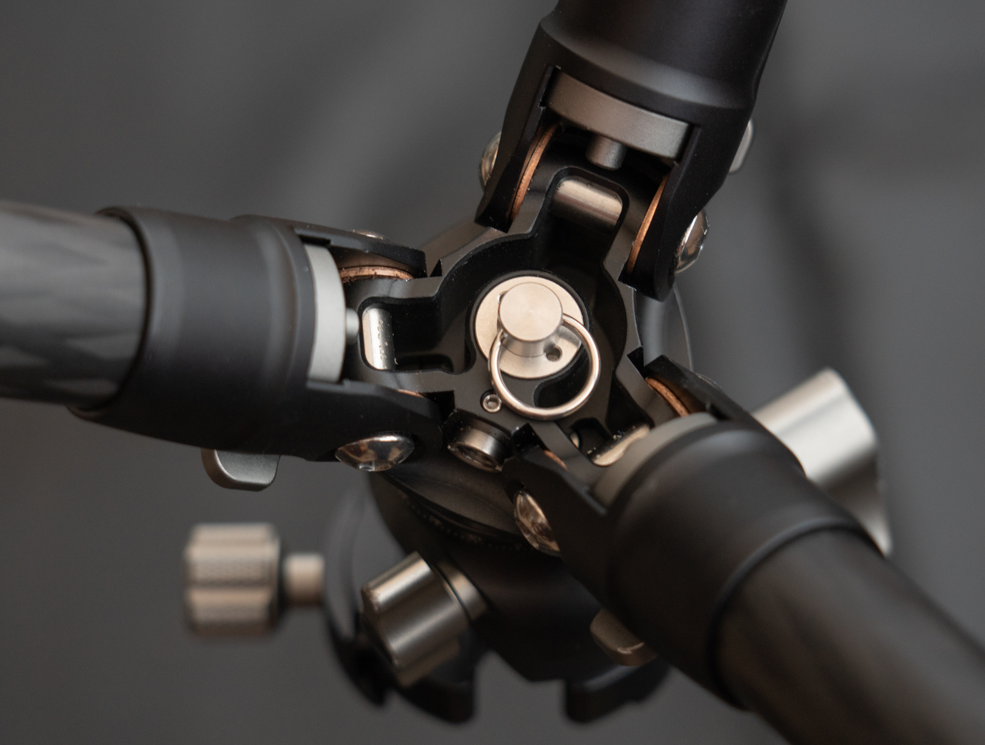
A few slippery leaves and your tripod foot can slip outward slowly. This can be mitigated with extra stiff legs and spider (the bit that connects your legs to your tripod head) and could be worse if you’re working between leg angle stops. Some tripods can be tightened so the leg angle movement is very stiff which can help.
Floating Mats of Hell
If you’ve stood on floating bog mats in Scotland (or elsewhere), you’ll recognise this one! Imagine setting up your tripod and camera on a mattress. If you’re also standing on that mattress next to the tripod, your movement will get transferred to the tripod. Instead of a mattress, think of a surface of peat/loam soil floating above a boggy quagmire and the same effect will happen, even if it is not quite as pronounced. This is a good reason not to move around near your tripod while taking photographs, especially long exposures.
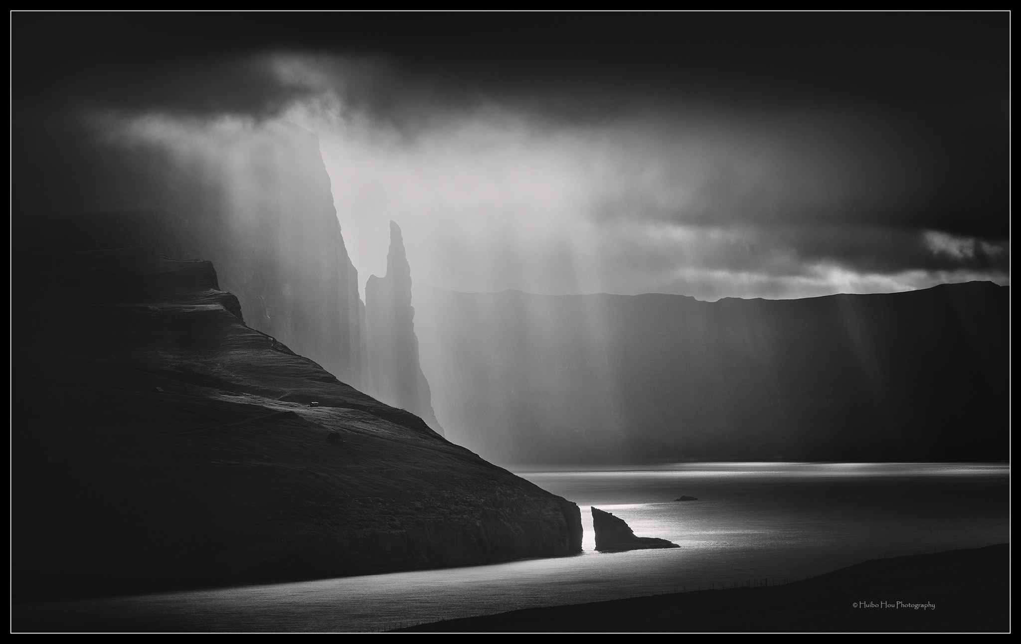
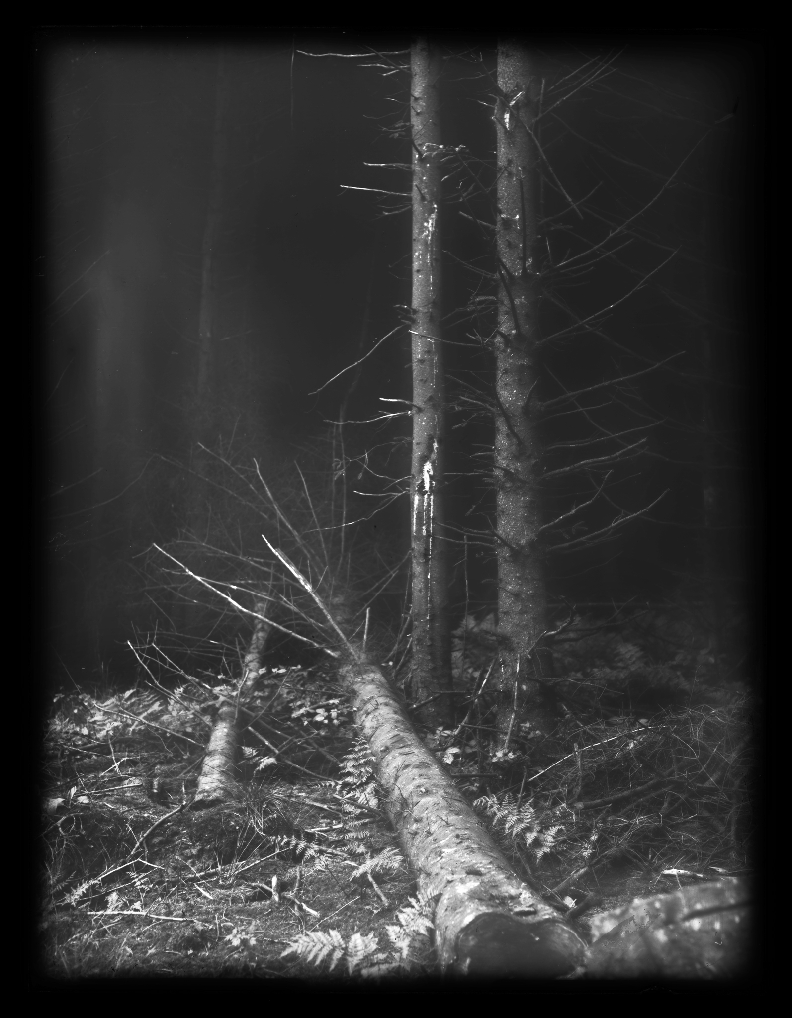
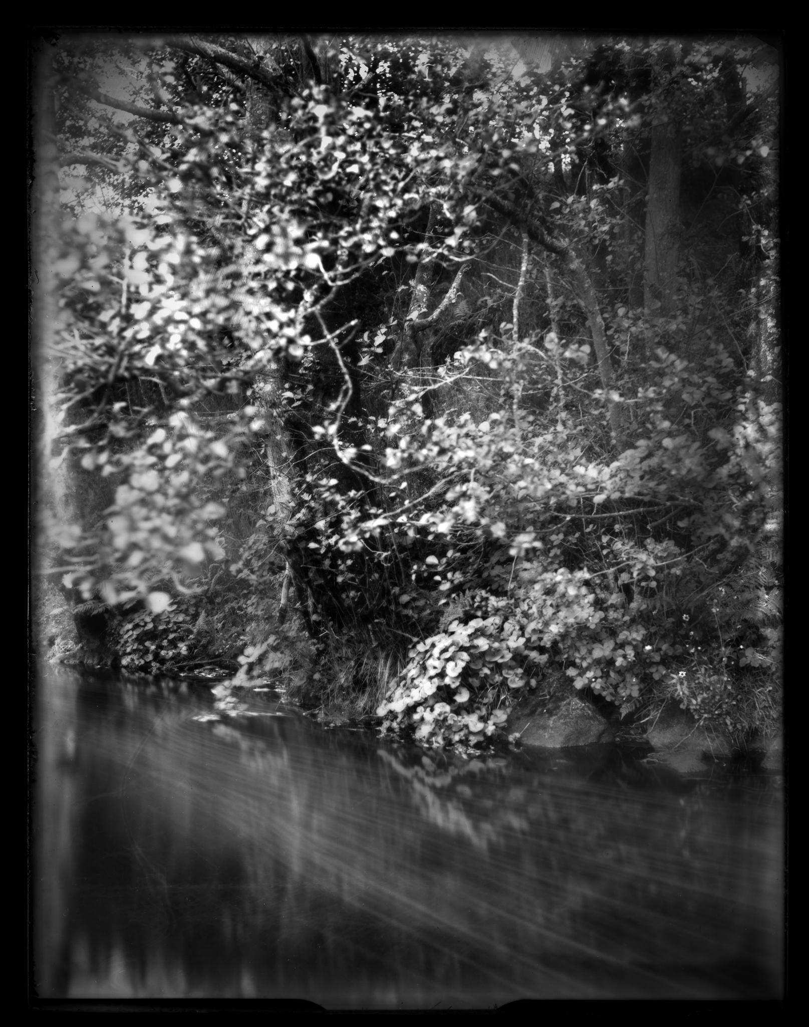
In my last article (Huibo Hou & how a Witch’s Finger becomes Fine Art, On Landscape 216) we looked at how a hugely contrasty, chiaroscuro, emotionally drenched landscape image from the Faroe Isles exemplified the awesome Burkian sense of the Sublime. A fantastical, grab you by the eyeballs and squeeze image, that just exuded black & white drama. So, as a complete contrast, I thought it would be interesting to look at something from the other end of the spectrum – the equally beautiful, but quiet, meditative and minimalistic images by Anthony Lamb of the trees in the Dubai desert, from his Desert Portraits series.
There is a stillness to these images which is quite bewitching. A feeling of tranquillity and harmony, of peacefulness and austere simplicity. The lighting is very delicate and evanescent - there is a sort of fragility to the mood of the images. I must admit, this is not how I envisage the desert, and here is perhaps the first key to understanding the beauty of these pictures: They represent a very personal and unique interpretation of how the desert can look. Anthony describes his minimalist style in this portfolio as “pastel expressionism – the opportunity of escape into solitude”.
It’s fascinating to think for a moment about exactly how and why these images create this mood. I suggest there are four key elements to a minimalist image: simplicity, colour, strong composition and the powerful use of negative space. The first – simplicity – is perhaps the most obvious. We all know that for a minimalist image the author has to decide on the subject and strip away all non-essentials to that point beyond which it would start to lose impact. Here, Anthony is asking the viewer to look at the tree in Sandblasted and the tiny distant bush/tree in Captivation, underscored by two tiny patches of different coloured sand. All other potential focal points have been stripped away, there is nothing to tug the eye, and the other elements within the image play a secondary supporting role to those subjects.
Alexandre describes his photographic beginnings as coming from within as much as without, a means of expression which complements his passion for music and shares its improvisation.
Six years after beginning photo workshops on a dreamlike and evocative vision of nature in the French Alps in 2008, his work expanded worldwide to include Patagonia, Iceland and the Italian Dolomites, as well as conferences and exhibitions. Landmarks along the way have included the 2012 movie “The Quest for Inspiration” by Mathieu Le Lay & Alexandre Deschaumes and his 2016 self-published book “Voyage Éthéré”. Over the last year, Alexandre has been developing new website collections and we’ve been fortunate to have a preview of these at the time of our interview.
Would you like to start by telling readers a little about yourself – where you grew up, your early interests and education, and what that led you to do?
Yes, I grew up in France close to the Swiss border: Lake Geneva, Annecy, Chamonix, Mont Blanc...
I never really managed to feel comfortable at school and I was always struggling to understand where my place was. Also, I wasn’t aware of the surrounding great landscape and mountains around me until my 20s. I spent lots of time in my inner worlds with books and computers, and I became a musician (guitar composition and improvisation, drums, atmospheres) around 1997.
When did you first become interested in photography and what kind of images did you want to make?
I started in the garden and forests around my home in the year 2002; I was fascinated by the autumn mists, with the sun piercing through the forest. I had no specific ambitions and projects except sharing this kind of romantic feeling in nature, looking for something emotional and atmospheric.
Due to my interest in the technicalities, I started to explore large format photography a few years ago. In contrast to my previous subjects, where I mainly photographed people I met while travelling or in my everyday surroundings, I was now more drawn to quiet scenes where I was particularly interested in nature and landscape.
Despite my technical advances, many of my photos were average at best, making me increasingly doubtful of successful progress. I asked myself the question of why and came to the following insight:
It was mainly due to the way I conducted my photographic excursions.
In the preparation phase at home, I planned motives in great detail with the aim of finding and photographing them outdoors.
For example, when the weather forecast announced strong winds and thunderstorms for the next few days, I prepared myself accordingly to capture dramatic weather situations with my camera, ignoring all other possible subjects I might encounter.
Or I had the idea of searching the forest for rotten wood on which new plants were already growing, then I went off to realise this idea and nothing else.
This worked fairly well from time to time, but in the long run, it did not satisfy me.
Looking back, it is clear to me today that I had voluntarily put-on blinkers by this meticulous preparation and preliminary fixing to certain motives!
This insight is supported by the fact that the majority of the better pictures were not the result of advance planning, but were more or less accidental or spontaneous.
For example, the section of the dirt road near the Kochhartgraben,
Whose prominent stone caught my eye in passing on the way to a conscientiously planned motive, and which I then photographed on the way back.
One of the similarities I see between these pictures and my earlier photos of people is that they were also taken not after anonymous preparation but after personal acquaintance, so that they are within the viewer's grasp, so to speak, and they can perhaps feel the spirit of the situation.
In concrete terms, for me this means giving my surroundings the unrestricted chance to be noticed by me with relaxed attention and, if appropriate, to be photographed or not.
The planning and preparation consist of dressing appropriately for the weather and getting the camera equipment ready for use, that's really all.
Of course, this change did not happen overnight. I went for walks and extended hikes, leaving my camera equipment at home from time to time, to unconstricted experience impressions without any filter and photographic considerations.
This approach has helped me to free myself from the limitations described above and to continue my photographic activity with renewed enthusiasm.
Thus, the respective momentary perception is in the foreground and my decision to photograph or not to photograph results from the concrete situation and not from a previously detailed planning.
This approach has helped me to free myself from the limitations described above and to continue my photographic activity with renewed enthusiasm.
It would be a great pleasure for me to have given the one or other reader an equally helpful push through this report.
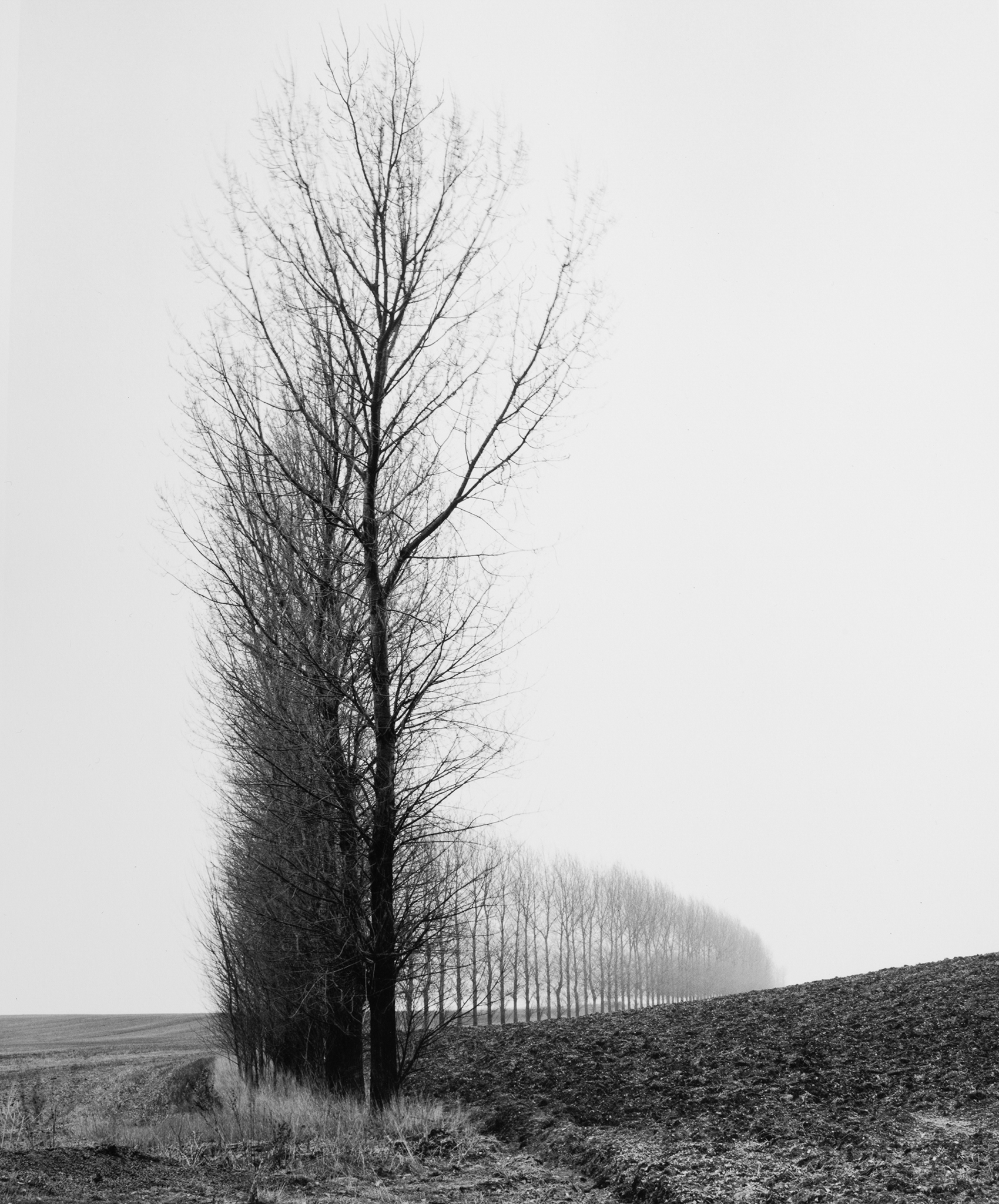
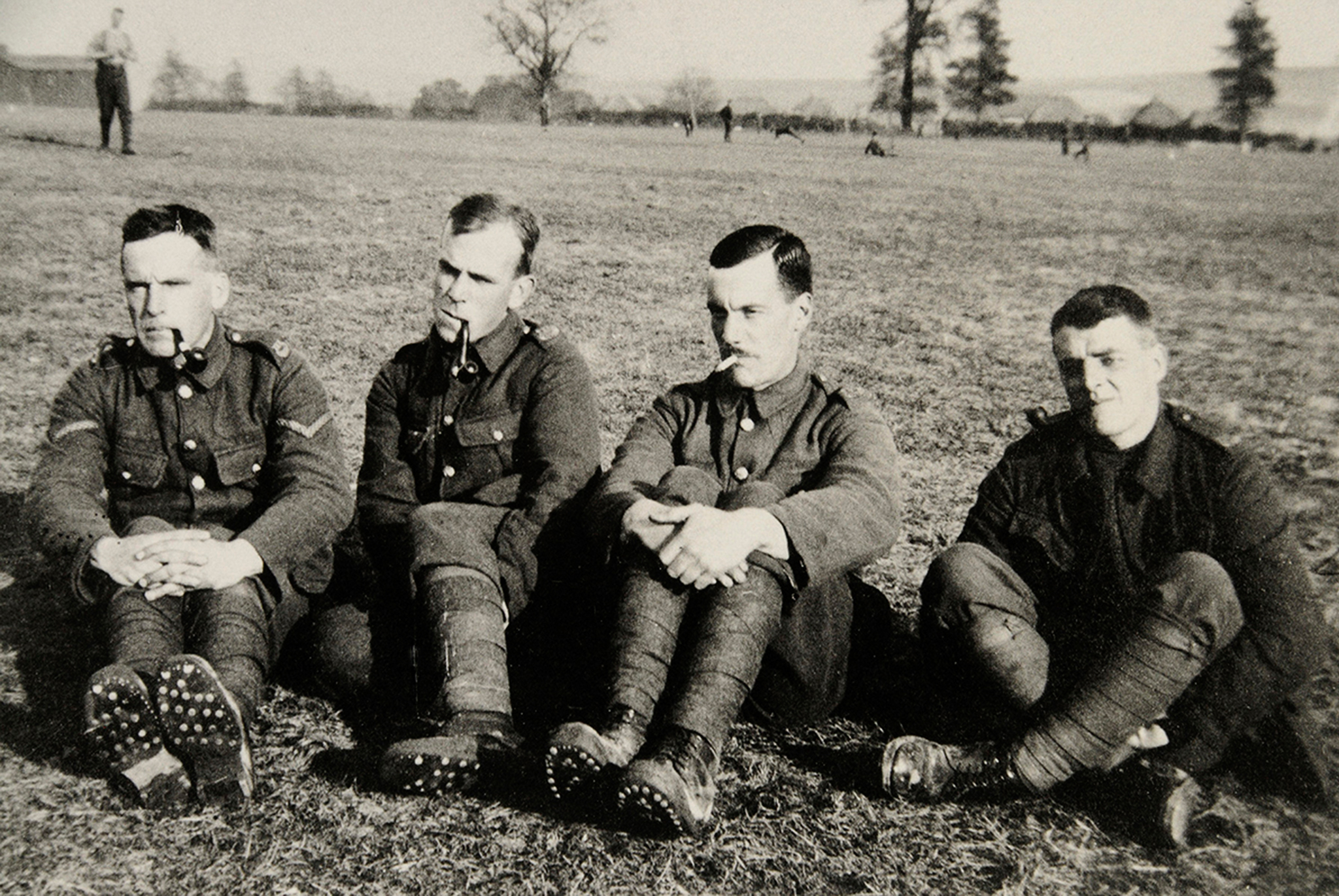
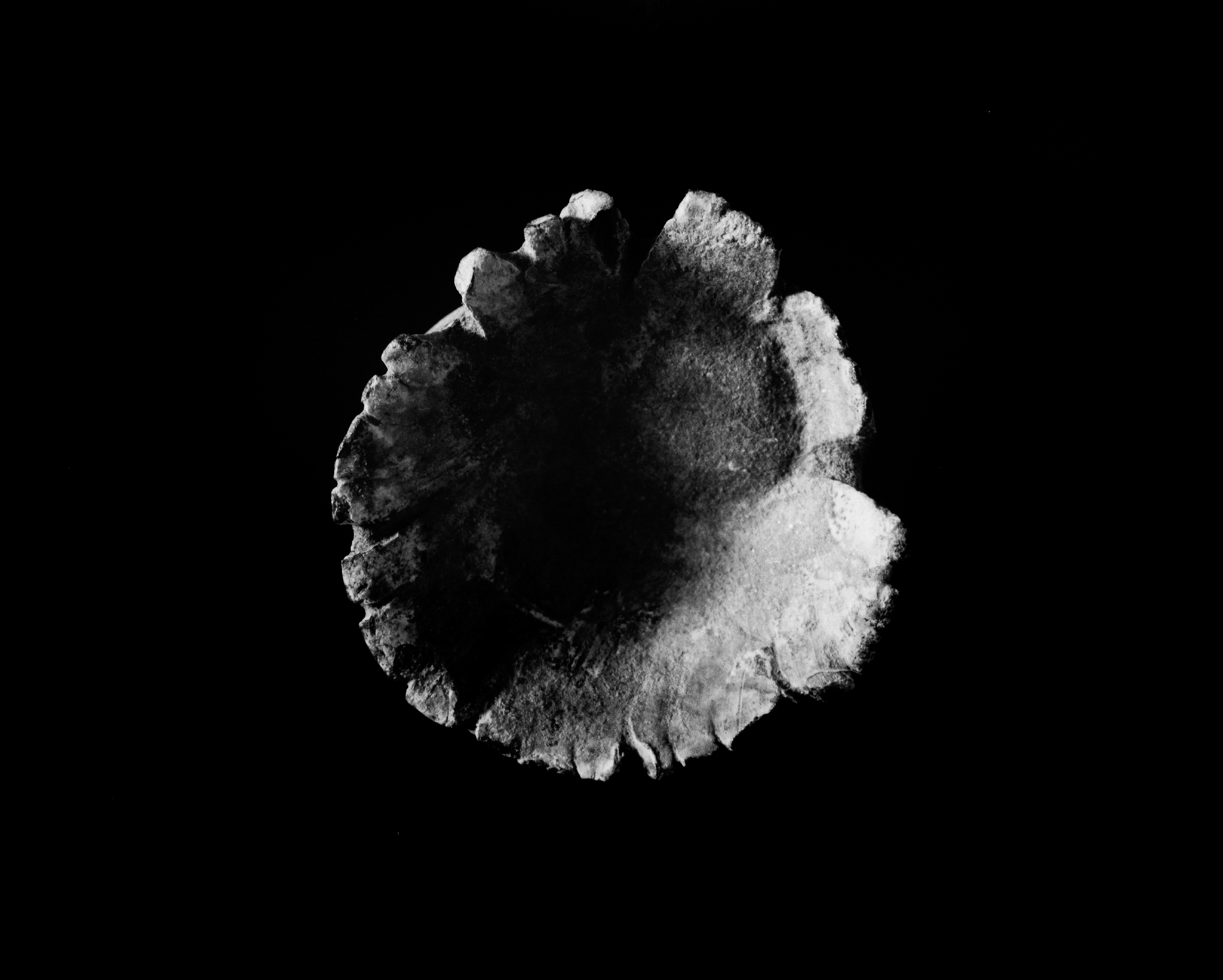
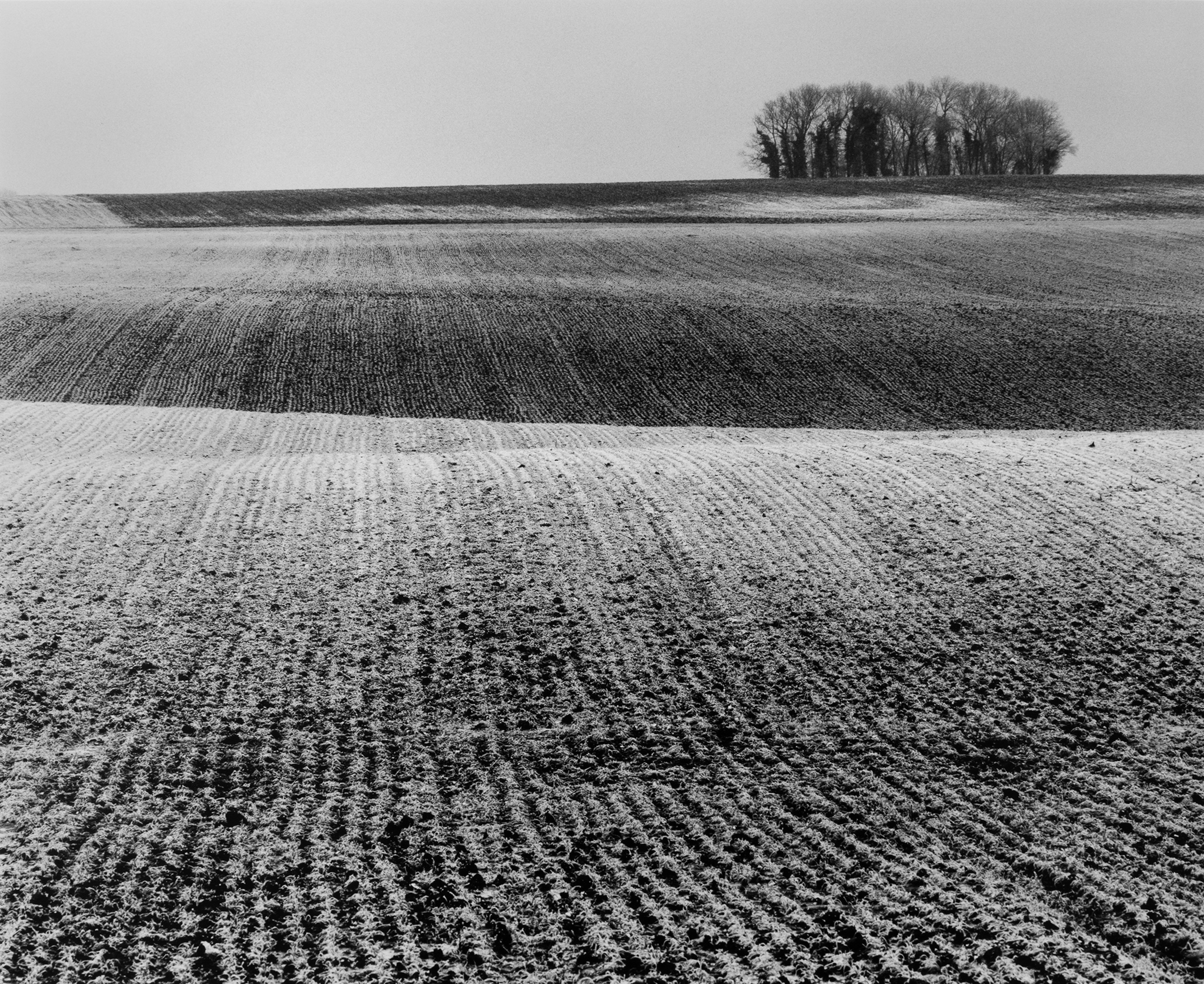
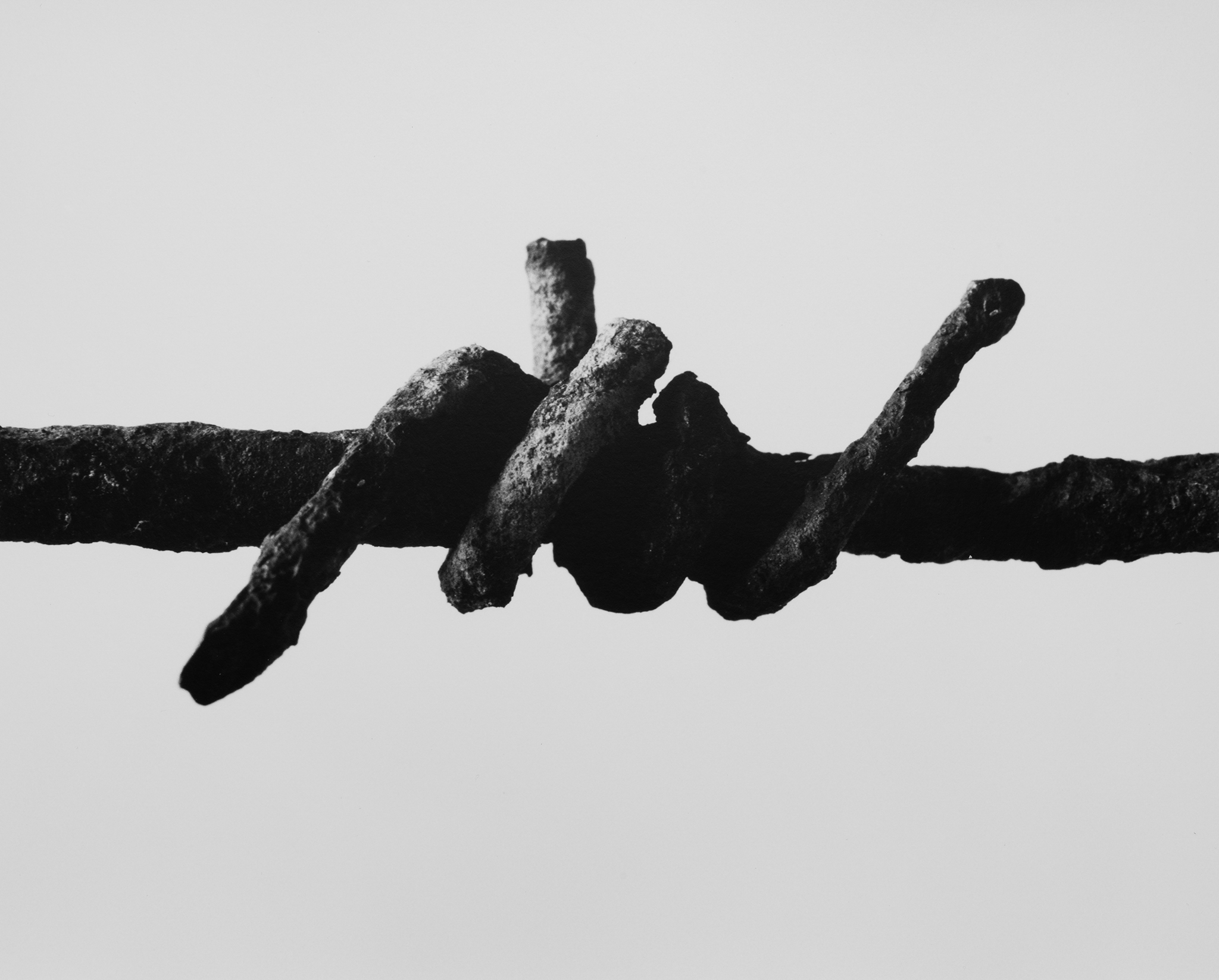
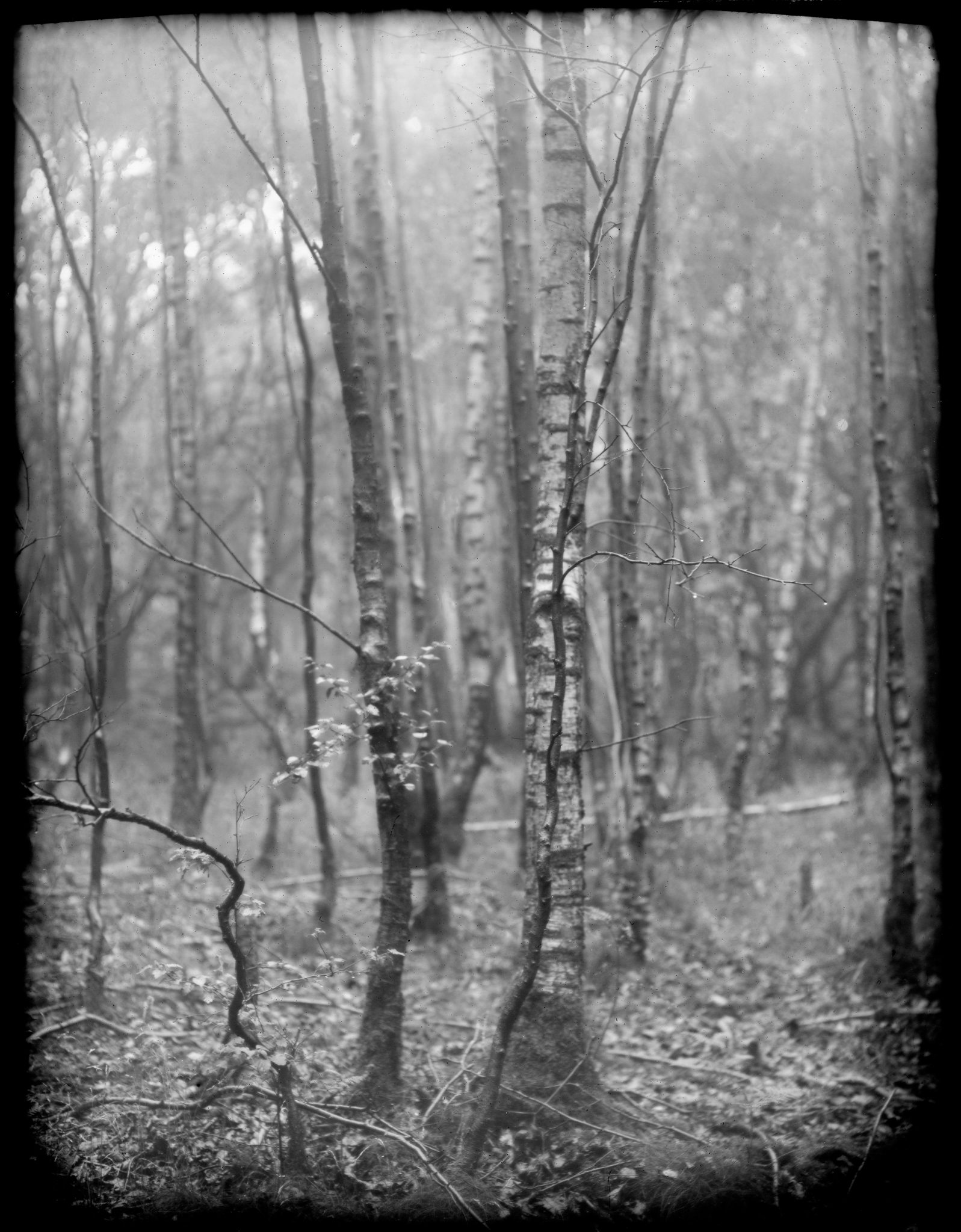
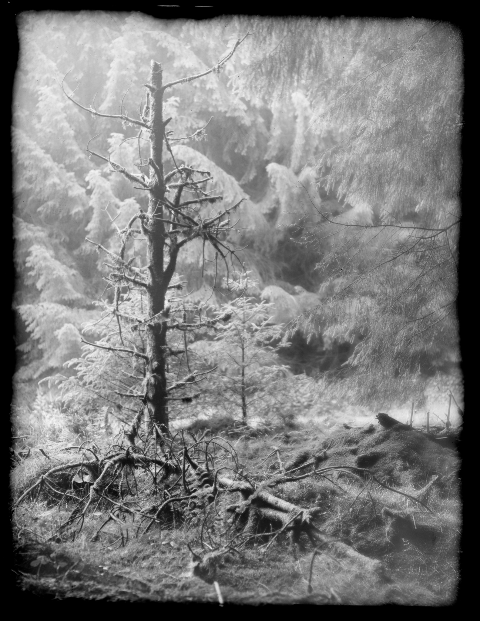
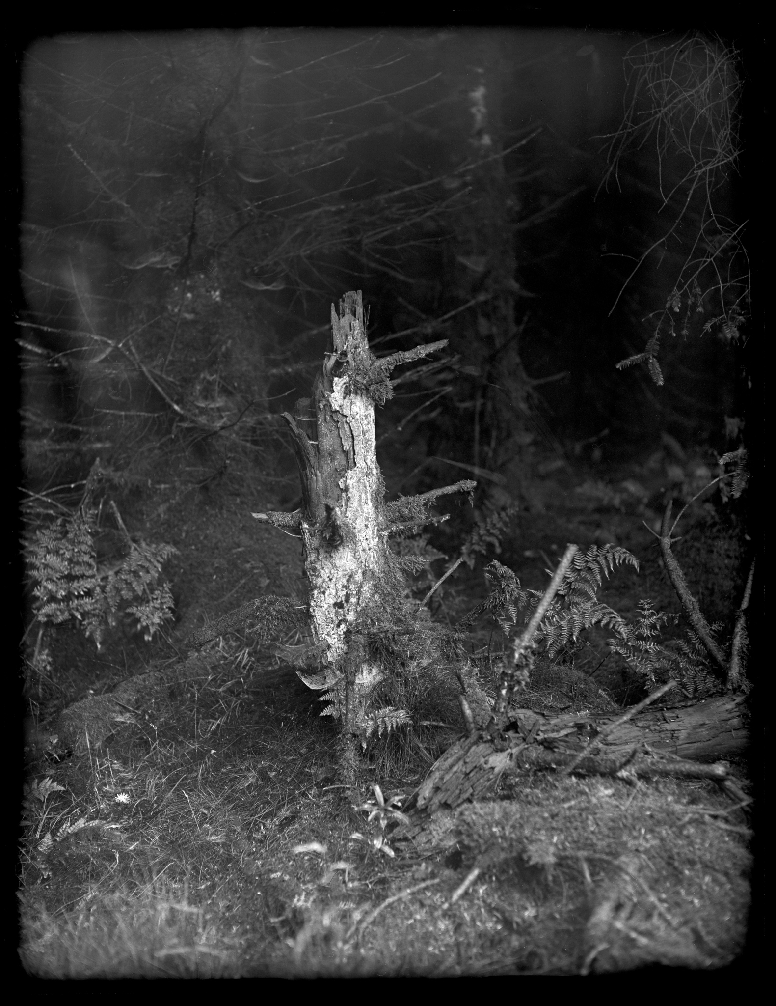
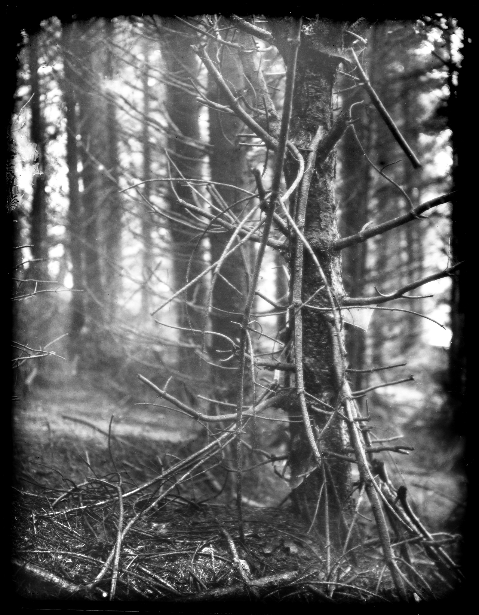
Last year, Peter Jones from the Photo Space got in touch and suggested we talked to Peter Cattrell about his photography project 'Echoes of the Great War'.
In April 2016, Peter's exhibition "Echos of the Great War " opened at Weston Park in Sheffield and marked 100 years since the Battle of the Somme. Peter’s Great Uncle William Wyatt Bagshawe fought and died in the Somme and through retracing the footsteps of his great uncle, he took black and white photographs of the land as it is now, suggesting the terrain of the frontline through details and abstractions.
Can you tell me a little about your background (e.g., education, childhood passions, early exposure to photography, vocation)?
I went to a private boys' school in Edinburgh and was hugely into sport. I was best at subjects like History, English, and Art. I did photography as a hobby at the school's camera club, and they had a darkroom attached to the chemistry department, so did my first processing of films and printing there. I would go to exhibitions in Edinburgh, and with the annual festival, there were always important shows of art and photography such as August Sander, Lewis Hine, Karl Blossfeldt, and Cartier Bresson. I remember seeing the Becher's show of photographs of colliery pit heads in Glasgow in about 1975 and thinking it such a strange idea for an exhibition, whereas now their influence and ideas on 'Typologies' are so well known. The Stills Gallery in Edinburgh was important to me and I saw many good shows there, from Tony Ray Jones, to Paul Strand's Hebridean photographs.
I then took a year out and got a job in the department of the National Museum of Scotland. I worked under a good studio photographer, learnt a great deal, used medium and large format cameras every day, and also did much printing and darkroom work. It was very precise and technically high-quality work. He encouraged me to apply to the London College of Printing and do a degree in Photography.
My mother had been to Edinburgh Art College and did still life and landscape painting. I grew up meeting many Scottish artists and was aware of the landscape tradition in Scottish art. My father was a scientist, taught at Edinburgh University and he was very interested in art and took it up in his retirement doing painting classes. A friend of his who was a medical photographer gave me a developing tank and I started processing films and then printing at home with a basic Paterson enlarger. He was supportive of my career although it seemed an unusual choice to him, but I'm pleased he saw some of my early exhibitions. My two sisters are both artists, Louise doing painting and Annie sculpture, who went through Art Colleges in Scotland and in London at the RCA, and they have influenced me in many positive ways.
When I left school, I didn't know what direction to take as a career and went to St Andrews University to study an Arts degree doing English, Modern History, and Art History. This was a pivotal year as I realised, I wanted to do something more practical and creative - much of the creativity there was in music and theatre. I used the darkrooms in the student union and was part of the photographic society. I then took a year out and got a job in the department of the National Museum of Scotland. I worked under a good studio photographer, learnt a great deal, used medium and large format cameras every day, and also did much printing and darkroom work. It was very precise and technically high-quality work. He encouraged me to apply to the London College of Printing and do a degree in Photography.
Tell me about the photographers or artists that inspire you most. What books stimulated your interest in photography and who drove you forward, directly or indirectly, as you developed?
In the early days, I liked Bill Brandt very much and wrote to him when I was a student at LCP. Sadly, he died soon after and I didn't meet him. The 'Shadow of Light' influenced me a lot due to the intensity of the printing and rich moody tonalities. I was given a book on Paul Strand's work which I liked and have been a lifelong fan of his. The TV series 'Exploring Photography' presented by Bryn Campbell was an important influence and introduced me to the work of Faye Godwin, John Blakemore and other well-known contemporaries. I liked Richard Avedon very much and saw a TV documentary on his portraits of his dying father which had a strong effect on me. In 1980 I went to Salford 80 which was a big Photo Festival and enjoyed seeing all the exhibitions. I saw the show 'Mirrors and Windows' of American Photography at the Edinburgh Festival in 1981 and wrote about this in my end of course thesis. The model of American photography being either a window on the world like Robert Frank or a mirror of the photographer's own self such as in Minor White's introspective work was I thought very useful. I remember seeing a big show of Richard Misrach's work at the Photographers' Gallery and being hugely impressed by his large colour prints of jungles at night with flash. I was taught at LCP by Jorge Lewinski who did workshops in portrait photography, and inspired by this I did a series of portraits of artists. As a student, I bought a copy of Robert Frank's Americans for £1 in a street market and this is a prized possession.
Some of the Scottish painters like Sir William Gillies and Joan Eardley are important to me, and the German artists Anselm Keifer and Joseph Beuys fascinate me. In the 1980's I started teaching on workshops at the Photographers' Place in Derbyshire and Paul Hill's ideas influenced me as he used to encourage students to work on areas of landscape that were important or significant to them, and not necessarily dramatic and scenic places. I also went on workshops such as Hamish Fulton, and Platinum Printing with Pradip Malde and Mike Ware. I taught a 'Zone System' workshop with Peter Goldfield many times there, and all of these connections have had a lasting significance. Michael Schmidt's 'Waffenrue' is a favourite book of photographs of Berlin before the wall came down. The Japanese photographer Fukase's book on Ravens is very powerful and a favourite.
In the 1980's I started teaching on workshops at the Photographers' Place in Derbyshire and Paul Hill's ideas influenced me as he used to encourage students to work on areas of landscape that were important or significant to them, and not necessarily dramatic and scenic places.
Tell me about why you love landscape photography? A little background on what your first artistic passions were.
I spent much time as a child in the country and used to go fishing with my father - I sometimes think that landscape photography is a bit like angling - you can spend a lot of time waiting for a bite and getting to know small stretches of river and coast. After my father died in 1991, I went to a river we had fished in Ayrshire and took some photographs of where he had caught a salmon when I was six years old. I used to watch my mother drawing and painting and she encouraged us to do the same. Living in Glasgow, and then Edinburgh, you were only a short journey to the country and we holidayed in the Scottish countryside, which was very formative. I did a lot of hillwalking and started taking a camera along. My portfolio to get into LCP had many landscape photographs in it and I went through a phase of pushing 400 ISO film to 1600ISO to get grain and mood. I did many portraits also when I started and my degree show had a portfolio of portraits, and abstract urban landscapes shot on 6x6cm. At LCP I was taught by many good visiting tutors such as Homer Sykes, Martin Parr, Brian Griffin, Paul Hill, and more. I did all kinds of projects from reportage, still life, fashion, portraits, and screen-printing. We had a brilliant technician Heino Johansson who ran the darkrooms.
I think landscape work is in your blood or DNA, and it became my main area of work from about 1984. I had a small show of my urban pictures at Lacock Abbey in 1983, then drove around the area and went back to do some more photography which started it off. Simply owning my first car in 1984 helped hugely as I had the freedom to go off and travel more easily and do creative work. I have been researching about the German concept of 'Heimat' or homeland which is nostalgic for rural life and sense of place, but which was distorted by the Nazis for their own extreme ideology. Many people in Europe have a fragmented sense of identity as they live in different locations, and you can trace your ancestry from different countries. Some of the choices of location that I have done have been to do with family history and personal connections.
In an interview with ffoton.wales it states “Highly regarded for his landscape photography made in Britain and Europe, Peter works primarily with film and fine printing techniques - and these skills as a master printer brought him to the attention of the renowned photographer Faye Godwin who worked with Peter to print her black and white landscapes of the British countryside.” Can you tell us about your background in film and printing and more about how you came to print Faye Godwin’s work?
In my second year at LCP, I was taught by Helen McQuillan who ran advanced fine printing workshops. She had worked with Faye Godwin and it was through Helen that I was introduced to Fay when I left college.
I printed for Fay from 1982 to 1990, did more when she showed at the Barbican in about 2002, her big retrospective, and was printing for her when she died. I have recently done some printing for her archive which is held at the British Library.
I was working for magazines doing portraits at the time and found it hard to juggle doing that and working with her - magazines wanted you to be available when it suited them, and it was before mobile phones - even answering machines were new! My degree show was large B/W archival prints of urban abstractions shot on 6x6 so I had done some fine printing at LCP. I had not planned to become a printer and I just fell into that role. Initially, I did proof prints for books and then moved quickly on to exhibition printing. She used a cold cathode head to a DeVere 504 enlarger and we mostly used Agfa Record Rapid graded chlorobromide paper. It was an interesting time as Fay kept doing new books, exhibitions and her career was building a momentum. Sometimes a famous writer would come to lunch, and she made me feel that there was a photographic community in Britain and London.
She became politically very active and was keen on environmental issues. I started doing rural landscape work as my main creative area, having previously done much urban imagery, and this aligned me more with what Fay was doing. Her retrospective 'Land’ at the Serpentine gallery and the book, in 1986 was a high point, brought her to a much wider audience, and was a big achievement. My generation worked with film because we had no choice, whereas now the emphasis is on digital, and maybe exploring film as a change, or to be alternative. I printed for Fay from 1982 to 1990, did more when she showed at the Barbican in about 2002, her big retrospective, and was printing for her when she died. I have recently done some printing for her archive which is held at the British Library. Occasionally I print for museums which is always interesting when they are old or unusual negatives, and one project I did was printing glass negatives at the IWM darkrooms of women in Scotland working in WW1 doing what had previously been men's jobs. It was Fay who got me involved with teaching as I assisted her on workshops, which led on to Central St Martins asking me in to teach.
Your work is held in numerous collections around the world, including the V&A, London; Bibliotheque Nationale, Paris; National Galleries of Scotland; Museum of Fine Arts, Houston; Goldman Sachs, London and National Trust for Scotland. Can you tell us how these collections have come about and how you worked with the various museums?
I had a show at the Edinburgh Festival in 1987 and the curator Sarah Stevenson bought a set of prints for the National Portrait Gallery in Edinburgh. She was starting to build a collection for the National Galleries of Scotland. Later they would buy other prints and I would also donate work to them. My Scottish roots are very important to me and it is where I have done much of my best work. In 1988 I showed my portfolio to Mark Haworth Booth at the V&A and he bought some prints for the collection. In 1989 I did a trip to the Photography Festival in Arles, showed my portfolio to many people including Jean Claude Lemangy, who gave me a show at the Bibliotheque Nationale in 1993 and bought a set of prints. It is very useful to have work in important collections as curators put on group exhibitions or publish books and include your work. How you publicise yourself in the art world of photography is an issue and people want to know if your work is held in important collections. Meeting curators and keeping them in touch with what you do is important. Going to Photography festivals, and showing your portfolio is something you have to do. I was commissioned by the Scottish National Trust through a design group in Glasgow, I also did a project for the Hunterian Art Gallery in Glasgow, and a favourite project was for the new Scottish Parliament in Holyrood photographing Scotland to make a set of prints for display and their collection. I like it when curators know my work and commission me to do a project, trusting me to do my own interpretation.
You’ve lectured since 1986 at Central St Martins, Camberwell and London College of Communication, has teaching influenced your style and approach to photography?
Teaching has given me less time to do my own work, and it does take up a lot of your energy. I like working with people, so teaching fulfils that side of me as landscape and darkroom work is more solitary. I think when you teach you have to really know your subject. Initially, I taught fine printing and then started teaching other areas such as the 'zone system', studio lighting, medium and large format, colour printing, architectural, portrait photography, and nowadays I have to teach digital and Photoshop. I was taught some critical theory at LCP, and am aware of the balance between teaching technique, and the ideas that underpin what you do in creative practice. There have been many students who have good ideas but need help putting them into practice by understanding technique. Some people have technical ability but their work lacks research and is weak. I think there have been times when too much theory has been taught at the detriment of technique at colleges. Teaching has kept me in touch with contemporary theory and ideas. I think understanding technique or the process of photography, needs to go hand in hand with concepts, theory and ideas and is as important.
When you talk to groups about your own creative work you clarify what you have done and also get feedback on your approach and ideas and placing these into a cultural context is essential in modern practice. At CSM I have worked with degree students who are majoring in painting, sculpture or film, and they approach using photography in a different way to perhaps a photography degree student at LCC. Many students do projects which are issue based or a piece of theory that a tutor has proposed, so you must be open to working with anyone on a variety of projects. I had to do a Post Grad course in reflective teaching for Higher Education which was very interesting as it put an emphasis on how students learn and turned on its head many of the preconceptions you might have about teaching or your own experience of being taught at university in past years. Meeting other tutors who are practising artists in other areas has inspired me. I currently teach a portfolio short course at CSM which covers a wide range of work and projects which I like, and portrait courses. In some ways, I think I keep my creative work separate from my teaching persona, but in some areas, they cross over very much.
In an interview with Museums Sheffield, you say “When I did my degree in Photography at London College of Printing the Falklands War happened, and we discussed that, including how different newspapers used photographs. As a child I remember seeing images of the Vietnam war regularly, and also the troubles in Northern Ireland were very prominent. As a tutor at St Martins, I watched the Gulf, and Afghan wars on TV “How do you think this influenced your focus on the project “Echoes of The Great War?”
Any cultural references influence your thinking and I was impressionable as a child when the Vietnam War images were on the TV news every day and in the newspapers. I remember reading Michael Herr's book 'Dispatches' while at St Andrews. The troubles in Northern Ireland were also in the news each week and felt very close to home. Coverage of war has changed so much. It is interesting to look at Goya's etchings of Disasters of War from the C18th, or Otto Dix's etchings of WW1. I have often visited the Imperial War Museum in London and looked at the painting collection, and have always liked Paul Nash's paintings of conflict, but other artists like Eric Ravilious appeal very much also, and Brandt did much work of bombed London in WW2, and Cecil Beaton did much imagery also.
Memorials are in every village, town and city in Britain so you are reminded of past events everywhere you go. My grandfathers were both in the Great War, one in the Navy in Orkney, and the other in France and Belgium working with artillery. I have several great uncles who fought also in different theatres in WW1 including Italy, and one in the naval Battle of Jutland.
My intention with the Great War project was to approach the specific story of my Great Uncle, rather than comment on war as a whole, and I think of it as a loss of a very talented generation on both sides.
My mother was in the WRNS in WW2, and my father was a research scientist based in Surrey, so I am the first generation not to have to engage in such a large conflict, although warfare in different forms has taken place throughout my life. As someone who has studied history and had to write essays about the European wars of different eras, it is a subject that I have an interest in, but particularly the Great War mainly because of my great uncle and his story. There is a collective memory across continents with a World War, as every family in Europe was affected, but individual stories and personal memory is what interests me most.
Roger Fenton's photographs of the Crimean War have always struck me due to the empty images of battlefields after the conflict has happened, and Timothy O'Sullivan's work on the American Civil War I have found haunting, as images of strewn bodies lying dead on the field after the battle is over. In Britain, there are traces of military history everywhere, not least the many concrete blocks and empty pillboxes that are still around the coast to prevent invasion, which I have photographed, and some which I played on as a child in East Lothian. I have a fascination with history and Britain is so rich as a subject for study, that can inform creative projects in any medium. As a student, I saw a big show of Don McCullin's work at the V&A and much of that show was striking reportage of conflict and suffering. A theory tutor at LCP brought all the different newspapers one day during the Falklands conflict in 1982 to show how one image of the exploding ship was presented in different papers, to discuss that the context in which an image is used influences its meaning. The live video images of missiles being directed on targets in recent wars in the Middle East is so different to how earlier wars were represented, and we are told of, or shown images of violence and its effects every week in news coverage such as terrorism. My intention with the Great War project was to approach the specific story of my Great Uncle, rather than comment on war as a whole, and I think of it as a loss of a very talented generation on both sides.
You say in an interview "The project Echoes of the Great War is in homage to my great uncle William Wyatt Bagshawe and his friends in the Sheffield Pals. I started by photographing the frontline of the Somme at Serre where they died. Uncle Willie’ was an artist who did mostly landscape subjects, and we have some of his work, including watercolours and etchings". Tell us a bit about the project 'Echoes of the Great War’. Where did it all start and more about your personal interest in this subject?
The research has played a big part in my enjoyment and fascination with the subject. My grandmother had kept an archive of family photographs and letters and she would show them to me as a child. When she died, I took over this archive, and have added to it. There were letters by Willie to his parents from boarding school at Framlingham College in Suffolk, back to Sheffield. He used to draw and doodle on these letters and envelopes which endeared me to him. He studied in Sheffield and then went to the Slade School in London, which became famous afterwards with people like Paul Nash and Stanley Spenser students there, and Henry Tonks teaching. Willie was part of the New English Art Group which was a breakaway group from the Royal Academy school and he did mostly landscape paintings and etchings, as well as funny sketches and cartoons. He will have done many cartoons of friends in army life which must exist somewhere.
My grandmother had several photographs of him with friends at training camps in England, and one in particular of him with three friends is very poignant, sitting on the grass smoking at Cannock Chase. All but one died on the first day of the Battle of the Somme, and those three are on the big arch at Thiepval as part of the 'Missing of the Somme': William Wyatt Bagshawe, Edward Stanley Curwen a classics master at Rotherham Grammar school, and the poet Alexander Robertson from Edinburgh who was a history lecturer at Sheffield University. The survivor 'Mr Bailey' went back to Sheffield University, and I think became a school teacher, and I will look at the census returns from 1921 next year to try and trace his family.
In 1989 I drove down to Arles in the south of France to visit the annual photography festival. After that, I did a three-week trip driving north and visiting places of interest to photograph the landscape. In the last few days, I visited Verdun where the French held back the German advance in WW1 defending a huge fortress which protected Paris. I took some photographs there of shell holes in the forest and was very moved by signs showing where a village had been. This was completely destroyed by shellfire and tape and name tags show where the Marie, the schoolhouse, and the bakery had been.
In the last few days, I visited Verdun where the French held back the German advance in WW1 defending a huge fortress which protected Paris. I took some photographs there of shell holes in the forest and was very moved by signs showing where a village had been. This was completely destroyed by shellfire and tape and name tags show where the Marie, the schoolhouse, and the bakery had been.
Next day I went to the Commonwealth War Graves Commission office in Arras to trace my great uncle. It was before records had been digitised so I had to wait 2 hours, but they were very helpful and showed me that his name was on the memorial at Thiepval for the 'Missing of the Somme'. I drove there next and photographed his name on the pillar, and then took some landscapes near Albert. Lastly, I drove to the Newfoundland Park which is a famous memorial to that regiment who were hammered on 1st July 1916 - the French Government gave the land to the Newfoundland people as a memorial and is kept as it was with trenches intact. That night I got the ferry back to England and did not realise how close I had been to where 'Uncle Willie' had died at Serre. In London, I did some research at the Imperial War Museum library on the Sheffield City Battalion and found him mentioned in a book by Sparling written in about 1929. I then read avidly about the Somme and found specific books on the Sheffield Pals, and one had a photograph of Willie in a tweed suit learning drill at Bramall Lane, Sheffield Utd's football ground.
How did the project evolve? Did you have to refine the vision of what you wanted to achieve when you progressed in researching the project?
Initially, I went to the 80th anniversary commemorations in July 1996 and took some photographs of the frontline where he died. I was there at dawn on the 1st July 1996 - 80 years to the minute and someone blew a whistle at 7.30 am when the main attack started. I spent several days there taking different images and doing some portraits of visitors and reenactors. I was hooked on the area and the feelings I had about the place were very strong. The frontline areas have a presence that is very special. They are now just farmland with a rotation of crops such as sugar beet, corn, and maize, and each time I visit the place looks different. There are several woods on the Somme which if you enter are very atmospheric, but also dangerous with unexploded ordnance - 'Passage Interdit'.
To start with I thought I would probably do one visit just to see the place, but on returning to London and processing the films it became clear that I was getting good images, and made me want to develop the project further. There were other connections to follow such as my father's uncle who had fought through the whole war and won a medal near Ypres; the war poets Sassoon and Owen intrigued me as they had met in South Edinburgh not far from where I had lived, and I had studied their writing. I have taken images of where Owen died, which is also near where Matisse grew up. Other areas of the Somme and Ypres front interested me and I included them in the project. The image of the four men sitting smoking has made me research about them and their backgrounds, as well as where the Sheffield Pals trained and the story of the battalion. I traced and met up with Alexander Robertson's relation in Scotland who talked of him as 'Uncle Alex'. I also discovered that I am related to Charles Hamilton Sorley, another well known poet who died at Loos in 1915, as a relation married his twin brother. He was an influential poet admired by Sassoon, Owen and Graves. I hope to do work at Loos in the future.
In 2019 I visited my old school in Edinburgh and researched in their archive as over 200 former pupils were killed in WW1. Many died at Gallipoli but some were at the Somme and are on the Thiepval memorial for the 'Missing'. I may do some work to include this connection into the project. Similarly, I became fascinated by Colonel McRae’s battalion from Edinburgh based on the Hearts football club and their supporters. I was involved in a charity auction to build a memorial cairn at Contalmaison, where the battalion reached their objectives on the 1st day of the battle. The potential to expand the project is obvious, especially when there is a personal interest, but it is a question of funding and time, as I have done the project self-funded.
Did you plan the images that you wanted to capture or were they more spontaneous when you visited specific locations?
The images were a spontaneous response to the locations, and the hardest part is reading up about each place, and knowing that you are actually at the correct place when you are there as it is all farmland now. Occasionally you come across the remains of concrete bunkers and if you go into the woods you can see the zig-zag of trenches. If you walk the fields you come across lead shrapnel balls that were fired by the British - lethal if the opposition soldiers were out in the open, but not if they were hidden in underground bunkers as at the Somme. For years I photographed at Serre and on the frontline, there were four copses named after Matthew, Mark, Luke and John. Matthew doesn't exist anymore, and the others are now one wood. I read that the Sheffield Pals came out of John Copse, and the Accrington Pals came out of Luke Copse, but recently I read that Willie's 'A' company also came out of Luke Copse. He had volunteered to be in the first wave at 7.20 am which was very brave as they had little chance of survival. His group lay down in front of the uncut German wire at 7.20 am and he was shot by a sniper. The main attack started at 7.30 am with the blowing of several large mines under the German front line. So many guidebooks have been written for people walking the frontlines, and there is much tourism with people visiting cemeteries, and coach tours with guides. I have met many people on their own pilgrimage to the sites and doing their own research.
The contemporary images you’ve taken of the location of battlefields which are of the tranquil countryside are a stark contrast to the horrors of the war. What narrative did you want to convey to the viewer when you were making the images?
In a way I wanted to show the ordinariness of the places, and how strange two huge armies could meet in these bits of farmland, and that they should have such huge significance. Some small villages in the Department de La Somme became such famous names in military history such as Serre, Beaumont Hamel, and Thiepval in the same way that people talk of Crecy and Agincourt.
In a way I wanted to show the ordinariness of the places, and how strange two huge armies could meet in these bits of farmland, and that they should have such huge significance.
The countryside of the Somme is very similar to parts of Britain and the soldiers could identify with this countryside as it was like home, whereas Gallipoli was quite different.
The way I have composed the photographs is often details, and abstractions of parts of the places and this is probably how the foot soldier saw the field ahead. I have not gone for grand views or sunsets with poppies. I have visited many cemeteries and often photographed them but have not included these images when I have exhibited the project.
The memorialisation of the war in stone and sculpture is a separate issue to me and I have read about this including Geoff Dyer's 'Missing of the Somme'. He also did a trip with John Berger which was a BBC radio programme where they discuss the places and the way the war is thought of and remembered. The whole concept of the 'Missing' is fascinating - how do you live with the knowledge that your son or relative is reported as missing, not killed or wounded, and has no known grave. Many waited in hope of news of someone reported 'Missing' only to get confirmation later that they were dead. Willie's mother put an ad in the Sheffield Telegraph asking if anyone knew of what had happened to Willie, and she had a reply in a letter describing his death by someone who was with him. Sadly, many like him lay there in no man's land for months and his body may have been hit by a shell, or deteriorated and unrecognisable, buried as a 'Soldier Known unto God', or 'A Soldier of the Great War'. I may have seen his grave but not known it was him.
I have been involved in the visitor centre at Thiepval and they have been trying to place faces to the names on the memorial to the missing. I sent in the images of Curwen, Robertson and Bagshawe and they used these in a lightbox collage of many faces as you enter the centre, and on a poster that you can buy. I did a talk at CSM on the project and one tutor was critical of the work saying why was there mostly trees and agriculture and not more evidence of the industrialisation of the war. If you go there, there are traces of shell holes and trenches but very little else. There are a very few concrete structures - the places are tranquil but I think I have tried to capture an edge in the imagery, and also the sense of mystery that I feel there. In a way the absence of traces is the point of the work, hence the title 'Echoes of the Great War', as the work is not a record of the battle, nor an architectural project on memorials and gravestones, but more that there is a regeneration of the places, and the overall terrain is much the same as it always was. To me the land itself is a memorial, as it is where the men fell, many of them particularly the 'Missing' are part of that soil. The architecture of remembrance of the cemeteries and memorials is important too but it is not what I have chosen to present. I collected some shrapnel fragments, bullets, wire, and other debris while walking the frontline, and then did extreme close ups of these pieces which I include in the exhibitions. I was struck by how small these pieces are but how lethal they were in the heat of battle.
“The colour prints taken at Redmires are of the area where the Sheffield Pals camped and trained, and are a new departure working digitally, but in the same contemplative way with a tripod and long exposures, pursuing the highest quality. The winter of 1914 at Redmires was bitterly cold with much snow, and the first casualty in the Pals was someone dying of pneumonia...” Tell us more about the images you took at Redmires Training Camp.
The Sheffield Pals were the 12th Battalion of the Yorks and Lancs Regiment. They recruited many men from the university students and were thought of as a rather middle-class battalion.
They were billeted above Sheffield in the hills near Redmires reservoir where they were trained in shooting and did many route marches to become fit for service, such as to Stanage Edge which I have photographed, and around Stanage Pole, there are carvings of names on rocks by the soldiers.
They were billeted above Sheffield in the hills near Redmires reservoir where they were trained in shooting and did many route marches to become fit for service, such as to Stanage Edge which I have photographed, and around Stanage Pole, there are carvings of names on rocks by the soldiers. I found one by a Sheffield Pal - 'Alflat' - and I know his grandson who I met at the Weston Park Museum in 2016. There is a forest at Redmires where you can see the concrete bases of huts which were there in 1914, but in WW2 this was a prison camp for German POW's. I have visited several times and photographed in different seasons, once in early 2015 in heavy snow as I wanted to be there at the same time that there had been bad weather in 1915. I like photographing in snow for the graphic qualities you get in black and white but took colour pictures on a digital camera as a change. I have used colour on the Somme to a certain extent but have not exhibited these. I see the series in black and white in my mind's eye, and I like the format of 6x7cm with mostly horizontal pictures. There is a gravity with working in black and white and I think this suits the project, and I am always drawn to the sense of abstraction that B/W has rather than colour.
There was trench digging at Redmires, and I have been to those sites with a historian. A good friend of mine in London has a brother who lives in the same house in Sheffield that my grandfather Benjamin and Willie grew up in on Fulwood Road. This is not far from the gallery and is in an attractive part of the city, a short drive from Redmires. I have stayed with them in the house that my family lived in before WW1 and they have been very supportive to me during this project, and I have photographed the house, although I have not exhibited these pictures. Just before WW1 they moved to Wolstenholme Road not far away, and Willie's older brother lived there until 1956, but this house is now flats. There is a novel 'Covenant of Death' by John Harris about the Sheffield Pals, which is based on interviews he did with survivors at the reunion dinners in the 1920s. He calls the camp 'Blackmires' in the novel and goes into details of the training and life there and follows the story of their journey through different training camps at Ripon, Cannock Chase, Salisbury Plain, then to defend the Suez Canal against the Turks, and finally across to France for the 'Big Push'. He described them as 'two years in the making and one day in the destroying'. A recent book 'The Meakin Diaries' of another Sheffield Pal describes how he was in a later wave at Serre, and ran past Uncle Willie lying dead there in the first wave, and jumped into a shell hole for cover, after which he crawled back to the British line under cover of darkness. The attack was a failure and didn't reach its objectives as the German trenches and wire had not been destroyed by the 5 days of shelling leading up to 1st July, and they came out of their deep shelters to set up machine guns at a terrible cost to these Pals battalions. The 'Somme' is often used as a metaphor for disaster and the loss of life in a short time - the first hour of the attack was dreadful, with wave after wave leaving the trenches and walking uphill into the machine gun fire, as the generals had expected there to be no opposition as the German front line had been shelled so much.
You had an exhibition in April 2016 to mark the 100 years since the Battle of the Somme at Weston Park, Sheffield. How did this come about? How did you go about planning the exhibition and alongside archival materials including artwork, letters and maps?
I first showed the project in 2000 in Dublin, and then Belfast in a group show 'For Evermore', then in Edinburgh at the National Portrait Gallery in 2005, followed by the Durham Light Infantry museum, and the IWM in London. I didn't show it for a while after that as I was doing other projects, but kept doing bits of work when I could, often on family holidays with children. The 100th anniversary inspired me to show the work again and I showed it in London in 2014 at the Robert Fleming Gallery, and in a group show at the National Portrait Gallery in Edinburgh in 2015. I contacted the Sheffield Museums as I had always wanted to show the project there. They were keen on the idea and put it on at the Weston Park Museum in 2016 to coincide with the 100th anniversary of the Battle of the Somme. I was so pleased to show there and they included many artefacts from private collections and their own archives to add to the exhibition. I had my file of letters, and vintage photographs, and Willie's paintings and drawings, and this was added to by the museum but also the University which is nearby. Outside the museum is the sculpture of a WW1 soldier and is the city's memorial to the Pals. I have also seen the chapel of remembrance in Sheffield Cathedral and Willie's name in the book there, as are his friends Robertson and Curwen and the other fallen.
Tell me what your favourite two or three photographs from the series are and a little bit about them (please include these images in the ones you send over)
The Maize Cutting at Serre 1997
This is taken looking uphill towards the German front line, and the farmers were cutting the maize crop that day and I liked the angle and line of the maize. It is metaphorical of the cutting down of the crop which is symbolic of the scything of the men as they walked uphill, heavily laden with backpacks and tools, into the machine gun fire at short range that could tear them apart.
Avenue of Trees at Newfoundland Park 2000
This is taken on a very cold misty day in January, after a storm so one of the branches had fallen down. The Park is often visited by coaches of people during the summer months and students show visitors around. The trenches have been preserved and the Germans held a strong base called 'Y Ravine' which was captured by a Scottish regiment later, so there is a huge memorial of a kilted Scots soldier.
Could you tell us a little about the cameras and lenses you typically take on a trip and how they affect your photography?
For this project I have taken mostly a Mamya RZ67 with a series of lenses: 50mm, 65mm, 90mm, 127mm and 250mm. You get fantastic quality from these prime lenses and the camera on a tripod, with 100 iso film. I have taken a digital camera and taken colour pictures as well - a Nikon D810 with different lenses.
What sort of work do you undertake on your images? Give me an idea of the processes involved.
With film I use the zone system carefully and process the films at home in my darkroom, using different dilutions of developer and times than the norm. I do contact sheets, and proof prints at about 10x8, then do exhibition prints on silver gelatin paper. The whole process is quite slow and takes time to digest which I like. I have shot several colour negative films which get processed in C41 in a lab and may be scanned or printed in a darkroom, or digital as Giclee prints. With digital, I shoot RAW and put them in Lightroom, but edit in Photoshop. I don't do much post processing apart from small changes to get the colour balance, or exposure correct. I print on archival paper and use archival inks.
The moment the opportunity arose where I was able to visit Yosemite, I grabbed it with both hands and seized the chance. There was something about the place that had enticed me for decades, namely the work of Ansel Adams that had me transfixed to his books in a college library at the age of sixteen whilst working as a photography student. Every photograph Adams made in this National Park seemed to ooze the true essence of what an American wilderness should look like. Vast areas of forest, towering spires of granite, huge waterfalls cascading thousands of feet over cliffs into the valley below, in which wildlife ran free and drank from the crystal clear waters of the rivers. This, of course, was the vision Adams intended in the first place to ensure that the landscape was protected for future generations of Americans.
The other consideration for visiting Yosemite was being aware that my mind was saturated with mental images that had accumulated over many years of seeing photographs of the area. Many of these, and the most revered ones, were photographs made by Adams himself, but also many of the contemporary photographers that have worked in Yosemite National Park. In short, the place had a lot to live up to.
I arrived in San Francisco and began the four-hour drive to the valley and the initial journey took me through some areas that I would describe as huge urban sprawls straddling the constantly throbbing interstate highway. After about three hours of peering toward the horizon and not really seeing any rising mountain ranges, you begin to feel like you are never going to arrive. Because Yosemite is in the High Sierra you are unaware that you’re gradually climbing and slowly you begin to leave the conurbations behind, and slowly the road steepens and the forests begin.
By chance, my first arrival into Yosemite Valley was via Highway 120 and Big Oak Flat Road. This route hugs the steep granite walls of the western end of the valley and on one particular turn a view opens up looking the entire length of the valley towards Half Dome.
I did what I suspect every photographer would do during my first days in the valley which was to be out and photographing as many iconic locations as I could
I pulled up in the busy layby and just stood there with all the photographs and images I had seen over the years fizzing in my mind in amazement at what was in front of me.
Those who follow me are aware of my love for trees; subjects that have now become the trademark of my photographs and that have made my photographic style quite identifiable, less impactful and less commercial, but more meditative and reflective, subjective representation and intimate of my reality. I pay a lot of attention in the choice of subjects, I look for lines and shapes, colour and shades, elements that must metaphorically represent my state of mind and that basically translate into an inner search.
What binds me to trees is the memory of some emotional states belonging to parts of my life and the forest symbolises something very deep, metaphysical, psychic.
In 2014 bored by years of spectacular landscape photography and that I no longer felt mine, I set out on a personal search, free from any stereotype that influenced my images. I spontaneously approached a more personal and descriptive photograph of my Self rather than the landscape. So, I started to frequent the Calabrian mountains, especially the plateau of the Sila National Park and with its huge pine and beech forests I created a symbiotic and interpersonal bond. Thus, it was that from the depths of the unconscious some memories emerged, as from the abyss, which gave life to my photographic identity.
In 2008 I faced a dark period in my life, depression, as underrated as it is widespread, a mood disorder that affects 15 out of 100 people. This is a society that I consider suffocating, bombarding with information and injustices, generating discomfort and further fuelling suffering. Obviously, medicine and psychology have made enormous progress and with will you can face any malaise.
This image on the cover of the book The Unpainted South caught my eye in a book shop in South Carolina in April 2019. The book is sub-titled Carolina’s Vanishing World. Selden B Hill took the photographs and the poetry was written by William P Baldwin.
In the cover image, the barn stands alone, propped up in the morning mist by the columns that support its eaves, somewhere in the plains of South Carolina with just a single tree for company. To me, the photo has the feeling not just of emptiness and loss but also one of the building looking back at the visitor as if to say, “I am still here, still proud and still defiant even though I no longer work.”
The image kept coming back to me as I sat at home in the leafy suburbs of south west London. Who had built the barn? How could something so engaging have been abandoned? Where had the owners gone? These are reactions that many photographers will recognise and empathise with about other places that we are drawn to. Leaf through the book and “The Barn” is just one of many abandoned, derelict buildings photographed by Hill.
South Carolina does not seem to be the main destination for photographers but there is much to see: the city of Charleston, faithfully restored to her former self after the devastation of Hurricane Hugo in 1989 sits in what is known at the Lowcountry - a large area of land rising no more than a few feet above sea level; forests of Southern live oak with their long flowing tendrils of Spanish moss on the banks of the marshlands of the May River and a few miles further inland; the Old Sheldon Church ruined first by the British and again in the Civil War; plantation houses - some gated and some open to visitors. Everywhere the land is flat with barely a mound, let alone a hill to break the skyline. What the Lowcountry lacks in rolling landscape and mountains it makes up in atmosphere and history – a history that struck me as more alive and present than it is in Britain.
I wanted to return and six months later, in October 2019 I flew to Charleston on my own. Most of the passengers on the flight seemed to be going to play golf at the many famous courses along the coast to the south of Charleston but I wanted to explore and discover, perhaps even to find Selden’s barn.
Welcome to our 4x4 feature which is a set of four mini landscape photography portfolios submitted from our subscribers. Each portfolios consisting of four images related in some way.
Submit Your 4x4 Portfolio
Interested in submitting your work? We're on the lookout for new portfolios for the next few issues, so please do get in touch!
The notion of time, stilled within a photograph has been the foundation of my work. Ever since discovering Hiroshi Sugimoto, I realised there is an ability of a photograph to contain far more than is apparent, even when there is a narrative attached to the image. Time compressed and then printed on paper or viewed on a screen is compelling and a fascination.
Inspired by Paul Hill and Martin Parr, worked for NGOs in West Africa, now resident and teaching in New Zealand. Tortured and inspired by light and what the camera saw.
The gradual lifting of lockdown and the turbulence of the current political climate has allowed and driven me to wander about the old fields and woodlands of my neighbouring town of Concord, Massachusetts to visit some old friends. While too young to have experienced historic events nearby first hand, their stately grace suggests deep knowledge of what went before. If only I was wise enough to understand what advice they could share about going forward...
I’m a reformed large format camera user. Walking softly and carrying a large tripod, I explore the woods and waters of my native New England and beyond to experience and share the amazement of their subtle beauty.
Some wild places have the power to captivate all who visit them, not because they have unrivalled views or superior scenery but because they instil in the visitor a sense of wonder and awe. Staverton Thicks in Suffolk is one such place.
It’s ancient woodland is a landscape of fairytale qualities where vast oaks stand side by side with some of the tallest holly trees in Britain. Reminiscent of childhood stories, the ‘Thicks’ is a chaotic tangle of twisted branches where light is sparse and evergreen curtains of holly hang in the air. Dead and decaying boughs and trunks litter the floor and even on the brightest of days the air is cool and the forest dark.
This small area of woodland is a place I love to visit especially in the autumn and is the subject of an ongoing photography project.
Like so many people on this planet, the Corona virus pandemic has affected me in several ways, not least financially. My workplace has been in short-time work mode for months and despite having more time on my hands, I found myself with less of a mind for photography.
During the lockdown in May I had to do a professional trip to Amsterdam and I took the chance to spend a few days at the North Sea. It was surprisingly and thankfully quite deserted.
The images show a memorial to the small seaside village Petten which had to be evacuated, moved and rebuild multiple times due to its vicinity to the sea and to war destruction. The memorial is a marker for its historical location.
I have always loved the graphical nature of groynes, therefore these strange forms attracted me immediately. I was also fascinated by the symbolical value of the poles. The idea that something remains to brave the tides and storms long after it vanished. Their indifference towards weather, breaking waves and the people who are walking, playing and partying in between.
To me it also seemed like a symbol of loss: people lost at sea, the loss of homes and the loss of lives - like ghosts standing guard between the tangible and the ephemeral world.
We spoke to you last in 2018 about your Scotch Mist project can you give us an overview of what projects you have been working on and how your photography journey has continued since then?
Over the past few of years, I have been working on various photography projects. I have also been exploring other avenues and trying new things other than photography. I started Outsider an ongoing land art project. For me personally, I have always seen photography as more of a ride than a journey, without departures or destinations, I believe the meat is in the transitions in between the two.
During Scotch Mist, I was shooting "Body of light". It's a conceptual series made from old vintage postcards I had collected from bric a brac from market stalls. The light effect I shot in camera using a simple pinhole and direct sunlight. I used the series for my installation for the museum. "Station to Station" was a brief fascination I had for steam locomotives which I coupled together with railways at wartime, an event set in the 1940s. A trip back in time.
I shot "Mare Nostrum" at random from my phone as I strolled along the beach. I wanted to fracture the seascapes and shot that again in camera (so to speak), I'm not a lover of the photoshop. I visit the sea as often as I can it's not far from where I live, it has always held an attraction for me, the fish and chips there are really good too.
"Crows"; I prefer to photograph animals than portraits or people. Having someone stand there looking into the camera has never really done it for me, personally I find animals way more interesting and challenging. You just never know what's around the corner, I like the unpredictability of it all. Crows came about after spotting two crows way up high grappling and fighting with each other as they fell from the sky. For me it was a rare and powerful image, I had never seen anything like it before. There's conflict everywhere, it just opened things up to explore the birds further. I became interested in their ariel skills and the juxtapositions.
"Outsider" is an ongoing Land art project, as I mentioned above. I had the idea for quite some time, it started in the autumn of 2017 when I got a phone call from the local museum asking if I would be interested in putting on a photography exhibition in their art gallery. I declined that offer, but said what I would be interested in is showing some work in the grounds, so I made an installation with the "Body of light" series. I used the opportunity as an experiment really so I kept it pretty basic for future outdoor photography projects to see how the weatherised prints would stand up over the winter months.
Tell us about your current project ‘Looker watchers of the forest’ - How did the project start? What were your thoughts when you were first developing the idea?
It started for a number of reasons; I have always had an interest for the natural world and wildlife, it has always played a part in my work over many years in both as a filmmaker and photographer; secondly, over the past four to five years I had clocked up a lot of mileage on various projects and needed a change, and try something different. I set myself the challenge of hunting down a project locally in the nearby forests. I find them atmospheric; they have an air of mystery about them. Rendlesham forest comes to mind where the famous UFO incident took place in 1980, creatures, myths and legends etc, I have always thought they are a fantastic place, a sanctuary to spend time in and get away from it all. I also felt one shouldn't need to travel thousands of miles to find beauty either.
As the months passed, I must have looked at thousands of trees. In the endeavour to find the ones that gave me a tug. I remember one day getting a strange look from the odd dog walker when she saw me just stood there in the middle of the forest in pouring rain staring at the trees; I was watching the rain run down the trunks, I wanted to see if I could fuse the rain together with the eyes.
How did the project evolve? Did it change over time as you took the photographs?
I have a free-spirited approach to all the still photography work. I would say it's more intuitive, a gut feeling more than anything else, I will start with very loose ideas, I don’t lock anything down which enables me to explore alternative ways to approach things and experiment with ideas. But at the same time trying not to overdo it. I like to keep things authentic but interesting at the same time, without sucking the blood out of it. With Looker, I wanted to work with nature and use the different seasons to see what may or may not reveal itself. I shot over a period of 10 months and just took whatever it threw at me. The projects evolve by just getting into it and putting the graft in like anything else, accepting things, rejecting things. It all takes time and effort. As the months passed, I must have looked at thousands of trees. In the endeavour to find the ones that gave me a tug. I remember one day getting a strange look from the odd dog walker when she saw me just stood there in the middle of the forest in pouring rain staring at the trees; I was watching the rain run down the trunks, I wanted to see if I could fuse the rain together with the eyes. Alas, I wasn't really happy with the effect so I only used the one. You win some you lose some. I try as much as I can to push things, but also trying to avoid the crash and burn scenario. I've had my fair share of those as one does. I listen to a lot of music, mainly rock, that can sometimes help for a bit of inspiration or ideas, I find it’s the oil that gets things turning again when I hit the buffers.
Joe Cornish in his recent article talks about the Metaphoric Landscape “that landscape can be said to have characteristics that are similar to something completely different. In most cases that ‘completely different’ will be the human condition.” Was this something that you had in mind when you worked on this project?
I never set out with any preconceived ideas about the human condition or metaphor. But yeah, when I first came a cross the eyes, I was struck straight away by the resemblance; I thought how ironic the trees are mirroring the very cause of the destruction problem, Humans. There were times at the start of the project where I would just wander off into the heart of the forest like a lost dog trying to snatch some inspiration from somewhere or spark the imagination up, then one day it was one of those rare occasions I find with still photography where I felt I was just gifted the pictures, where the pictures are not taken. But given. I was off and running again more by luck than judgement.
It wasn't only the human connection that attracted me, there were eyes that took on the form of animals like the elephant and the whale.
It wasn't only the human connection that attracted me, there were eyes that took on the form of animals like the elephant and the whale. We are doing a good job on wiping those out too. I found the main driver was in the otherworldly ethereal feel they had, some had a melancholic and sad feel. They all had their own unique and individual characteristics.
You say you’ve walked the forests in Yorkshire for over 40 years - what changes have you seen in that time?
The main changes from where I stand is in the weather; as we all know over the years our summers have got hotter and winters milder, for instance, I was hoping for a bit of snow in the forest when shooting Looker, to give the images a bit of weight. In previous years I noticed how the wind would whip up the snow onto the tree trunks, there wasn't any snow again this year. The autumns are longer which you could say is a plus for the visual side of things, there is more flooding here now and it doesn't help when developers build houses on flood plains. Frackers came and went which could have been pretty devastating on so many levels. I think the native American Indians from the past had the right idea with their philosophies and cultures regarding the respect they had for nature and the planet. It’s a crazy world. I'm not sure where it's all going to end up. But there is lots of great work going on in nature reserves and wetlands here and many other parts of the UK and worldwide I should imagine where the land is being well managed and cared for so that nature can thrive. I believe it's all about balance. So maybe the replanting of millions of trees would be a step in the right direction.
What is next for you? Where do you see your photography going in terms of subject and style? Did the process of putting this project together give you any other ideas to go forward with?
Like I mentioned earlier with Outsider I'm getting involved in all sought of art, not just photography and film; I have a curious mind and want to keep moving on and try new things, I prefer living and working in the real world not a digital or virtual one. That’s the whole reason for Outsider. At the moment there are various projects some current and some for the next year. l am looking at putting on a show for the Looker series in a forest, I'm looking at Sherwood at the moment. I want to hang the prints in the trees, I made the frames out of foraged materials from the forest and converted large tinder fungus I found into downlighters so the images can be lit up at night. I have recently been given permission to use some land next to a local nature reserve to display some artwork in which will include some photography installations, so I look forward to that. At the moment I am currently experimenting with Cut ups, (photomontage). The idea came to me during a spot of research when I stumbled across a guy called Tristan Tzara, he was one of the founders of the anti-establishment Dada movement. What did it for me was, at a surrealist convention, Tzara proposed to create a poem by pulling out words from a hat, a riot ensued and the theatre got smashed up and he got kicked out of the movement! I have always been drawn to these kinds of crazy people. People that experiment and try different things in music art anything really, I find it all just keeps things interesting and alive. Ongoing forwards, I think it's all down to the inner zones and impulse that drives the need to create, and just the freedom to explore ideas. I set my own boundaries. No one else’s. It's a need, I'm not quite sure where that need is going to go if I'm honest.
People who set aside a special time and place in their lives for creative thinking and work—for instance, waking up with the sunrise each morning to write in the quiet of the early hours or meditating before a painting session—also tend to score higher on measures of creative potential. In contrast, those who are more motivated to develop a final product … tend to score lower in creative potential and intrinsic motivation and higher in stress and extrinsic (reward-oriented) motivation. Those who derive enjoyment from the act of creating and feel in control of their creative process tend to show greater creativity than those who are focused exclusively on the outcome of their work. ~ Scott Barry Kaufman & Carolyn Gregoire. Wired to Create
Edward Weston wrote in his Daybooks, “If I have any ‘message’ worth giving to a beginner it is that there are no short cuts in photography.” In the literal sense, Weston was wrong. There are many shortcuts in photography—from the old Kodak slogan, “You Press the Button, We Do the Rest” (coined in 1888, when Weston was just two years old, and perhaps even more apt today in the age of smartphones and sky replacement algorithms), to the plethora of present-day computerised effects making it easy to produce striking photographs instantly with little effort. Photographic shortcuts were common in Weston’s day, too, which is why I believe what he meant in fact was not that shortcuts in photography don’t exist, but that many of them are ultimately not worth taking.
Earlier this year I came across Dara McGrath’s ‘Project Cleansweep’. My line into it was the euphemistically titled ‘Blue Lagoon’ at Harpur Hill, a few miles up the road from me towards Buxton, Derbyshire. It was once again drawing visitors, for the wrong reasons, and it irritated the heck out of me when I heard BBC Radio 4 refer to the site as ‘a beauty spot’. Nothing could be further from the truth, and in searching online for its pH (the chemical truth) to correct them I came across Dara’s project. Maintenance Unit 28 at Harpur Hill was the largest UK reception and storage depot for chemical weapons during WWII and later was used for the disposal of captured chemical weapons until its closure in 1960. The unwise, and those swayed by Instagram, have been known to attempt swimming in a flooded quarry contaminated and turned blue by caustic chemicals; periodically it is dyed black as an added deterrent.
Gruinard Island rang bells too, as I knew a little of its history from our time in Scotland. In 1942, the Ministry of Defence conducted a series of experiments which tested Anthrax bombs against livestock on the island. The weapons were so successful that the island was declared out of bounds for decades.
Dara’s documentary series ‘Project Cleansweep’ takes its name from a 2011 Ministry of Defence report on the risk of residual contamination at 14 UK sites used in the manufacture, storage and disposal of chemical and biological weapons. A newspaper article led Dara to carry out his own research, and look at over 60 sites around the UK which were used by the MoD for the testing of biological and chemical weapons throughout the 20th century. It’s a revealing insight into landscapes that we think we know, and some that we don’t.
Site-21, Nancekuke, Cornwall In the 1950s, Nancekuke was the UK’s main site for the production of nerve agents. When it closed, remnants of many of the contaminated buildings and equipment were dumped in old quarries and mine shafts on and around the site, where they remain to this day. Today the site is an active military radar station. Some years ago, the Nancekuke Remediation Project was undertaken to assess the site to determine what was buried there.
Would you like to start by telling readers a little about yourself – where you grew up, your early interests and education, and what that led you to do?
I was born in the mid-west of Ireland. Now I’m living in the south of the country in Cork City. Between then I lived in Berlin, Zurich, Vienna, Luxembourg and Dublin. After school, I trained as an aircraft mechanic and subsequently got a degree in aeronautical engineering.
When I was around 16, I picked up a second-hand copy of a catalogue called American Images: Photography 1945-1980 edited by Peter Turner for the Barbican Art Gallery. To me, at this time, it was a revelation.
At that time unemployment was still high in Ireland in the early 1990s, so there wasn’t much of a choice then for a career. At 23 years old I quit being a mechanic, having realised I didn’t want to do that and with a little bit of savings I put myself through a year-long photography course to prepare my portfolio which helped me get into a formal art college. Since then, I have not regretted the change.
Mallerstang is the valley of headwaters of the Cumbrian River Eden and has been the subject of a previous article for On Landscape discussing the Essence of Place1.
Looking South to the Nab from Little Fell
It is a place where I have been fortunate to take photographs for more than 20 years, using both film and digital2. During the spring 2020 lockdown, I had the opportunity to explore some of the more remote parts of the watershed of the Eden, on Mallerstang Edge to the East and Swarth Fell, Wild Board Fell and Little Fell to the West. It is not an area that is very popular with walkers, but during the lockdown, there was no-one to be seen and no aeroplane contrails in the sky.
Mallerstang is now part of an enlarged Yorkshire Dales National Park. Although, of course, it had never been part of Yorkshire. Until the boundary reorganisation of 1974 it was part of Westmorland and then, after that, part of Cumbria. So, there was some strong local protest when, at the new boundary of the National Park in Mallerstang on approaching the village of Nateby, in Cumbria, a sign was erected saying welcome to the Yorkshire Dales. This has now been changed to the Westmorland Dales (with Yorkshire Dales National Park in a much smaller font).
Just before the New Year, Joe David and I recorded a podcast on the concept of "Truth to Nature". It's an idea that has its seeds in the romantic era of landscape painting when John Ruskin, a massively influential art critic and artist of the time, encouraged painters to closely observe the landscape and in doing so capture the natural world as truthfully as possible. The idea then has its echoes in an essay "A Plea for Straight Photography" in Stieglitz's Camera Work magazine. Sadakichi Hartmann's essay was critical of pictorial photography’s attempt at emulating other artforms, most notably painting. In our current era where photo editing has become easier than ever, are we seeing a return of the clash of straight vs pictorial photography? Prepare yourself for another podcast where non of your questions are answered but we have fun attempting...
For the sixth iteration of this column, I decided to focus on the artwork of a photographer that most people (including me until quite recently) have never heard of before – Dale King. Dale King’s photography was recommended to me by On Landscape reader Laura Zirino (thanks Laura).
Upon visiting his Flickr page where he features his work, I was immediately struck by the way he photographs the area he lives near in North Carolina in such an intimate and connective fashion. Each of his images feels like they were made by the same photographer, which may sound silly; however, I find that consistency in a photographer’s work is actually quite rare these days. I was also very impressed with the way in which Dale photographs his home throughout every single season of the year, highlighting both subtle and extreme differences throughout each season. I believe that his approach to photographing close to home has some incredible advantages as well.
Have you ever noticed that when you look at the work of some photographers, you instantly know that they have a connection to a place as an artist? I cannot totally put my finger on how or why this happens to me when viewing some photographers’ work – either your images have this quality, or they do not.
Have you ever noticed that when you look at the work of some photographers, you instantly know that they have a connection to a place as an artist? I cannot totally put my finger on how or why this happens to me when viewing some photographers’ work – either your images have this quality, or they do not. In the case of Dale’s artwork, I instantly knew that he was passionate and deeply connected to the places he photographs. Perhaps it is the way in which he frames up smaller scenes to include just enough subject matter to tell a story about the landscape, or to showcase intricate details of leaves, plants, and other foliage. Either way, I found his work to tell the story of North Carolina succinctly and effectively through his lenses in a way that instantly evokes comfort, solitude, and a sense of belonging. Even in his winter photography (which I am famously avoidant of as someone who dislikes being cold a great deal), I feel like looking at his photographs invites me to stroll into those scenes and experience them in an oddly familiar and comfortable way.
The Fröttmaninger Heide (the heath of Fröttmaning) is a nature reserve located north of Munich’s suburbia, right next to the famous Allianz Arena. It’s one of the largest grass-heaths of Europe. The area has a long history with the oldest archaeological date traced back to 4000 b.c.; Bronze age tumuli and roman sacrificial sites are still visible in the landscape to this date. In the middle ages the landscape was intensively used and with that, the forest that existed there beforehand had to make way for a heath. Between the 18th and 19th century the area was reforested with pine trees. It was also at that time that mineral fertiliser was introduced and most of the vast heath landscapes around the Fröttmaninger Heide (around 15.000 hectares) were transformed to farmlands.
The Fröttmaninger Heide continued to exist as a royal game reserve and as a military training site for the Bavarian army. During World War 2 ammunition was produced on this site and military aircrafts were launched there. The area was hence heavily bombarded. After the war the Fröttmaninger Heide was used again as a training site for the American and German army until the late 80s. In 2016 the Fröttmaninger Heide became a natural reserve.
The area piqued my interest for the first time while I was sitting in the metro on my way to work for a local photographer. Looking out of a train’s window I noticed a relatively vast tundra like landscape. To me it was puzzling how such a “wild” landscape could exist that close to a major city.
Weeks before that moment I had finished a little body of work called “natura naturata”, where I took photographs of manmade landscapes, mainly the parks of Munich, in order to explore the relationship of the locals with their artificial environments. Now I wanted to photograph something more authentic (or so I thought).
On a sunny summer day in 2011, I decided to explore the Fröttmaninger Heide. With my trusted Pentax 67 in my hands, I shot my first rolls of film of this new series. Quite happy with the results I asked some peers what they thought about the pictures. What I got was pretty standard German feedback of which the most memorable passages were: “It looks a bit like Robert Adams… in bad light!”, “The colours are way too harsh” plus “you should get up earlier so you can catch the morning light”. The last bit of advice turned out to be quite valuable. For an entire year I tried to be there every two weeks in the morning to catch the first light of the day.
What makes the Fröttmaninger Heide so fascinating is that it is very diverse in plants and trees. Roughly, you can divide the area by 4 types of landscapes: pine woods, mixed oak forests, gravel and grass heaths.
It was a very immersive experience as each step on the terrain decides with what kind of pictures you will take home. Already the decision to enter the area involved a complex and intuitive decision-making process. The metro station is right in-between the alliance arena and the heath. Once you exit the station, probably a bit sleepy as it is still early in the morning you first have to go down a steep hill to enter the area.
What makes the Fröttmaninger Heide so fascinating is that it is very diverse in plants and trees. Roughly, you can divide the area by 4 types of landscapes: pine woods, mixed oak forests, gravel and grass heaths.
When I set out to take pictures there, I didn’t have a distinct plan or project in mind. My aim was quite simple; to show somehow the diversity and richness of this landscape and how everything changes throughout the seasons.
After having visited the area around 3 or 4 times, thus gaining a fairly well overview, I split the area mentally in parts that I had found particularly interesting. The following trips to the heath were aimed each time directly at one of these sites. Mostly I would enter a location as early as possible and take pictures there for about two hours until the sun was too high and the light too harsh. Rarely the first and the last picture of such a trip were made more than 300 metres apart from each other. As a consequence of that procedure, I could create with each trip a very homogenous series of pictures, most often consisting of 2 exposed rolls of film.
Thinking about it now, I have to admit that I have probably divided the landscape in parts that were quite similar to the design of the creators of this military training ground in order to provide the soldiers with very different fighting experiences.
One time you would see on my contact prints pictures that seemed as if they were taken in the depth of an ancient forest. Next time there were pictures exclusively of a far and flat heath. Then of bushes, of military training facilities and so on. To me, the Fröttmaninger Heide resembles a bit of The Zone from Tarkovsky’s film Stalker. Each step you make, each direction you take will change the entire experience. Add to this the dreamy mood that the morning light can put you in and you can feel how the landscape around you changes drastically with each hour that the sun rises. Though my motives were still, there was never really a lot of time to set up the camera. Most often I had my camera already planted on my shouldered tripod as I wanted to be as ready as possible. As you all know one has to be quite alert to take landscape photographs.
To me, the Fröttmaninger Heide resembles a bit of The Zone from Tarkovsky’s film Stalker. Each step you make, each direction you take will change the entire experience.
The reason for the immersive experience and the sensation of crossing different landscapes (even countries or continents) at one time is in fact quite simple. The 334 hectares small area boasts a large variety of different plants (around 352 different species), trees and a multitude of terrains. It also boasts a diversity of different military terrains (bunkers, defensive walls and so). All of this leads to a very intense and particular feel.
At one moment you feel as if you were just deep in nature only to step onto an old military smog grenade.
And this is what fascinates me. There is a constant dialogue between nature and humanity, a constant shift between two worlds that are separated yet together in an odd way. This landscape permanently asks the question what an authentic landscape is on a philosophical level. As one has this sensation of authenticity the facts quite simply counter this intuition as this landscape has been shaped quite intensively over the course of the past six thousand years and the process is still going on; the organizations that helped the area to become a natural preserve changed the surface of the area to what they think an untouched landscape should look like. And to such an extent that there are areas that I do not recognise anymore today.
There is a constant dialogue between nature and humanity, a constant shift between two worlds that are separated yet together in an odd way. This landscape permanently asks the question what an authentic landscape is on a philosophical level.
The series was never officially finished. It came quite naturally to an end when I moved to England to study landscape photography under the tutelage of Jem Southam.
Over the past years I have taken some new pictures there. But not only has the Heide changed. My style of photography has changed too over the past years. Perhaps I will have to start a new series at some point.
The series was exhibited 2017 at the EMOP as part of a group exhibition called “Longing for Landscape. Photography in the time of Anthropocene”. The show revolves around the idea, that for the first time in history the surface of the earth is shaped more through the deeds of mankind than through geological activities. In all of the presented landscapes one can sense human activity (gardening, tourism, fracking etc.). It is as if nature has ceased to exist for its own, rather it is used or exploited as man wills it. My series resonates with the general theme of the show because it shows the dilemma of a nature reserve that wants to protect the diversity and authenticity of a landscape though in fact this landscape that they deem worth protecting still resembles what the military landscape architects intended it to be.
The show was a great opportunity to show my work with my colleagues from Plymouth University alongside well known established international photographers.
Over the last few weeks, I’ve been testing out a range of travel tripods. As with most of the testing we’ve done, it all starts with a personal question and ends up with me getting carried away.
In this case, the personal ‘question’ came about because I wanted to go camping in the mountains and combine it with landscape photography. Typically the idea of lightweight camping is to get down to the minimum possible weight and still function safely and comfortably (ish). I’ve already made a bunch of these decisions for camping gear by looking at the many lightweight camping websites out there.
However, a major portion of the weight for a photographer going lightweight camping isn’t in the camping gear (generally) but instead it is the photography gear. The decisions on which system to use are often quite subjective ones as well - I can’t justify investing in an extra Micro Four Thirds system and I love the quality from my Sony A7R3 (or Chamonix 4x5 camera) and sticking with a single zoom lens works well for me. My gear questions arose because the only two tripods I own are a very heavyweight Gitzo 3541XLS with an Arca Cube and a levelling base and a very old Velbon Sherpa CF with an Acratech Ultimate ball head. The first is nearly 4kg in weight and the latter is still 1.6kg and a bit bulky (and old, and not compatible with spiked feet - more on spikes later).
So I started looking at travel tripods and wanted to know whether these very lightweight tripods are really worth the compromise and out of a small selection, which performs the best.
Criteria for Inclusion
First of all, I needed to work out my base criteria for inclusion in the test. Being as the Gitzo 1545t is pretty much the reference travel tripod for most people and it clocks in at a decent 1kg weight, substantially less than my current tripods, and is an almost comfortable 1.3m height, which is just tall enough for me to be able to use the viewfinder without bending over, I figured selecting tripods near this specification made sense.
The following tripods were the primary selection...
Gitzo 1545t
Manfrotto Befree Advanced Carbon
Three Legged Thing
Feisol CT-3441T
We also did a bunch of searching to try to find other tripods that might fit the bill. One tripod that was recommended by a few people was the Benro. Their marketing team recommend a new release, the Benro Rhino FRHN14CVX20. Another tripod manufacturer that was recommended was Leofoto, a brand I had not heard of before. They recommended the Leofoto LS-284C.
We asked for review loans for the Gitzo, Manfrotto and Feisol but as our deadline for starting testing approached we had not been able to source them (a block on marketing because of Covid or no response at all). So we ended up buying the Gitzo and Feisol. With typically annoying timing, we received a couple of phone calls on the day the two tripods arrived asking us if we’d still like to loan the Gitzo, Manfrotto and Feisol tripods. We decided it was worth asking for different versions of each to expand on our selections so we asked for a 0 series Gitzo and the Feisol without a centre column.
On top of these, K&F Concept somehow heard about our tests and sent us a sample of their tripod line. It wasn't carbon fibre but it matched the specifications so we included it as a sample of the base budget choice.
Finally, we really wanted to test the Really Right Stuff travel option and the Peak Design tripods but we received no response from either company. Fortunately, a good friend was willing to loan me his Peak Design tripod for these tests (Thank you David Knight. Sorry it took so long!). Nobody I knew had the RRS travel option so we’ll have to imagine that they were outside of our budget!
So the final list was
Gitzo 0545t
Gitzo 1545t
Leofoto LS-254C
Manfrotto Befree Advanced Carbon
Benro Rhino FRHN14C
Three Legged Thing Billy
Feisol CT-3441T
Feisol CT-3442T
K&F Concept TM2324
Peak Design
What Makes a Good Tripod
My first thoughts when I was looking at testing these tripods was to go into different aspects of leg stiffness, torsional rigidity etc i.e. completely geek out. Amazingly though, someone else has already gone the full geek and tested most of the tripods we’ve included. The Centre Column website has done an excellent job of looking at quite a few different aspects of tripod design and we’ll summarise a few of them as part of this test. Their main technical criteria was system stiffness and as much as this is one of the key features of a tripod, after all what use is a wobbly platform for your camera, I wondered if there wasn’t a stiffness point beyond which the system was “good enough” and when other aspects of the tripod became key differentiating factors.
So other than stiffness, what else can we assess? Let’s make a list.
Price
Weight
Stiffness (all parts)
Packability
Usability
Leg locking system
Leg sliding system
How easy the use and stow cycle is
Field Adjustment
Center column
Spikes/Feet
Ballhead mounting system
Ease of cleaning
Water tolerance (and salt water)
Stability, centre of mass, leg angle
Leg Joints
Spare part availability
Phew! That's quite the list! We can leave price and weight for the full summary so let’s start with stiffness.
Stiffness
The stiffness of the whole system - legs, leg joints, leg hinges, spider, ballhead mount - all adds up to create a tripod that doesn’t move when an external force is applied. It is totally true that any tripod can make sharp images if we have no external force (e.g. wind) or internal force if we have a big flappy mirror and shutter. It is also true that you cannot make sharp pictures if the forces applied to the system are too large, regardless of the tripod uses (an Icelandic storm perhaps). So what we’re after is a tripod that is just good enough for the majority of situations we might encounter. It’s all a trade-off with the variables being lightness, height and budget. Move one of these variables affects the other two.
Packability
This doesn’t just mean the collapsed length. It also includes the diameter of the collapsed system and whether it can attach to the side of a camera bag well. For instance, the Leofoto tripod has a very small ‘spider’ (the bit that connects the legs and that the head mounts on) and no centre column so the diameter of the collapsed system is very small whereas the Feisol 3442T has a giant spider to give better stability but because of this the system tapers and makes attaching to a camera bag harder.
Usability
There is no point having a supremely lightweight, stiff and cheap tripod if it’s an absolute pain to use. There’s nothing more frustrating than fighting with a tripod as the light disappears in front of you. Or adjusting a leg to recompose and then finding the whole system slipping as you look through the viewfinder. Finally, I have found that the process of stowing the tripod can sometimes be a pain i.e. having to raise the centre column, collapse the legs and then having to fiddle with the ballhead in order to get the legs to sit flat can be quite irritating. Obviously you can leave a tripod with this system uninverted whilst wandering around so it isn't a major issue.
Small things can make a big difference though and landscape photography at its best lets you enter a wonderful ‘flow state’ and anything that breaks that spell is a big negative in my opinion.
Leg Locking
The way that the legs lock on a tripod is critical. There are two physical systems, either flip locks or twist locks, and within the twist lock category, there are two variations - firstly a simple progressive tightening, wind it more and it gets tighter gradually, and secondly a ‘click’ stop where you reach a certain point and you get a final positive lock (the Gitzo is the reference here). There’s been a lot of discussion about which is better, levers or twist locks but the consensus seems to be that personal preference is the most important factor.
It seems that the differences between the Gitzo style twist lock and the normal ‘progressive’ style lock is also down to preference although I much prefer to have some physical feedback as to when the locks are tight enough. i.e. I think there are two advantages to the Gitzo style ‘positive lock’. The first is that you don’t need to turn it very far between locked and loose and secondly, the click does give you confidence that you’ve achieved full lock. Only the Leofoto has a similar positive lock like the Gitzo and the Leofoto has the smallest turn needed to go from fully locked to fully unlocked.
Leg Sliding System
Once you’ve got the legs unlocked, how easy is it to slide them in and out? In the best systems, the legs will be almost completely loose in a small turn (or flip) of the lock. In the worst system, the legs will be randomly stiff, even when fully unlocked. The Benro and Three legged thing tripod suffered from this random stiffness. On both tripods you had to turn the leg locks more on the sticky legs to get a smooth release.
Deploying and Stowing
If we look at the usability of deploying the tripod into a medium height stance and then closing and stowing the tripod onto your camera bag there are a few factors that can make a difference. The relatively new system of inverting the tripod legs around the centre column makes for a smaller package but it can be a pain to get the ballhead in the right position to close the legs up as tight as possible (the clamp and tension knobs can block the legs from closing completely). This also limits you to using slimline ballheads which have their own disadvantages.
Field Adjustment
Beyond setting up and stowing the tripod, the main usability issue can all be summarised by "field adjustment". How easy is it to make small to medium adjustments of tripod height and leg angle. Can you make the adjustments with gloves on? Can you be confident that a leg is locked with a quick twist? How easy is it to pull out the leg angle adjusters? Fortunately, all the tripods tested were usable with gloves on and the only real usability annoyances were having to turn the leg locks more on some tripods than others.
Whilst I'm talking about field adjustment, a colleague had a little rant at me about the lack of bubble levels on some tripods. For something hard to add after the fact, it would be great to see more tripods with bubbles built in.
Centre Column
The centre column is a necessary evil for travel tripods. In order to get the weight down, nearly every manufacturer opts to use a single centre column to increase height rather than adding length to every leg. Using the centre column degrades image quality more than having equivalent extra height bu extending the legs. This is because flex in the tripod tends to cause a rotating movement around the camera mount point. If the camera mount point is extended away from the vertex of the tripod though, this rotation is converted into lateral movement (see diagram below).
Centre Column Weight Hook
Most higher-end tripods include a hook on the centre column or base of the spider in order to weight down the tripod to stop it from tipping and also to increase its stiffness. The only tripods in our test to exclude this capability were the Manfrotto, which just had a rubber stopper pushed into the carbon fibre tube, and the Gitzo 0 series for which I could find no centre column hook.
Spikes/Feet
The use of longer spikes on tripods has gone from a rare option, only available on some of the larger and more expensive tripods, to being pretty much compulsory at all levels. There are few tripods that don’t have the option of changing the tripod feet in this test it was only the Manfrotto and K&F tripods.
Ballhead Mounting System
There’s not a great deal of importance in this but there are a few things that companies can get right or wrong. Most tripods in the test were adequate and only the Manfrotto and K&F didn't use a metal base.
Spider Size
The bit of metal that connects the legs to the ballhead is called the spider and there are a few different options for this. It can be large or small and there are advantages of both. A larger spider brings the apex point of the legs higher (see below) but it becomes a disadvantage in packing the tripod to a small volume. Likewise a small spider will allow packing down nicely but the apex of the legs will probably be below the camera. The two extremes here are the Feisol 3442L and Leofoto LS-284C as shown below.
Materials Used
The gold standard for the material a spider is made from is undoubtedly machined magnesium or even aluminium alloy. The old Gitzo tripod heads are cast and have had problems being brittle in some situations and with age. Some spiders have a plastic base that the ball head screws down onto which does affect stiffness in a very small way (imperceptible for hard plastics) but could be an advantage in that too much stiffness can cause vibration to persist and a plastic piece could help damp vibrations.
Ballhead Bolt attachment
Not much to cover here but it’s a real advantage if you can access the other side of the tripod spider to be able to unscrew a tripod head that has become stuck. I’ve had a few times when I’ve had to fight with tightening a panning base in order to put enough force through the tripod head to remove it. Obviously, with a centre column in place, this is more difficult. Perhaps tripod heads should come with a panning base locking screw to get around the issue.
Ease of Cleaning
We all know we should clean our tripods occasionally and we should definitely do so after exposure to salt water. Many people don’t like doing so because of the fear of being able to put everything back together again afterwards. The Gitzo tripods have to white plastic bushings that are notorious for flying off and a pain to try to align to get back on. They’ve since updated the bushings to help with this. We've had feedback from tripod returns that not dismantling your tripod after using in saltwater can leave areas of the carbon fibre tube in contact with concentrated salt water for a long time. Water will only evaporate normally when it is exposed to the open air. Trapped inside the legs of a tripod and it will stay damp for days if not longer. Constant exposure to this salt water can cause parts of the carbon fibre weave to expand and ruin a tripod. This is a feature of all carbon fibres, even ones supposedly design for salt water use. Hence, if a tripod can be dismantled and cleaned easily then it’s a definitely bonus.
Water Ingress/Rejection
We've mentioned the importance of cleaning your tripods when they’ve been near salt water and, if you're extra vigilant, cleaning the legs when they’ve been immersed in fine silt so prevent the leg locks from prematurely ageing. However, the tripod design can help reject water and particles. Gitzo even created a tripod specifically for salt water exposure which had stainless steel parts and extra seals in the leg sections. The crystals of salt that form when seawater evaporates can cause quite serious wear in the plastic components of the leg locking systems. The Gitzo tripods have introduced an 'O' ring into the leg locks which should help reduce ingress of water. Fully sealing the legs of a tripod, whilst sounding like a good idea, would create a piston effect and make it difficult to extend and collapse the legs.
Stability and Leg Angle
Tripod legs usually have two or three ‘stops’ that allow them to be fixed at set angles. These are adjusted by manipulating a tab at the top of each leg. The angles used for the two wider settings aren’t that important but the angle that makes the tripod as tall as it will go is a trade-off for manufacturers vs users. If the angle of the leg at maximum height is quite small, this will make the tripod taller but at the same time more liable to tip. A wider stance, created by making the angle bigger, makes the whole tripod more stable.
For instance, the Feisol has a leg angle of about 20 degrees which is perhaps a little too ‘tippy’, whereas RRS tripods use 27 degrees which isn’t a big difference but it does sacrifice height (a possible 4% reduction in peak height by using a sensible 27 degree angle instead of a ‘tippy’ 20 degree angle - or nearly 5cm on one of our travel tripods).
The difference isn’t huge, 21 vs 27 degrees, but it could make a 30-40% difference in stiffness. You can always just widen your tripod legs if it’s a worry or even file a bit off each leg stop for a more permanent solution. Something to be aware of though.
Only the Manfrotto, Leofoto and Feisol used angles around 21 degrees.
Leg Joints
The leg joints are a minor point. As long as they don’t flop around or get too ‘sticky’, they should be fine. The ability to adjust tension is important though as they can change in tension through wear or temperature etc. Most of the tripods allowed easy tensioning.
Spare Parts
It’s definitely better to pay more for a tripod and have access to reasonably priced spare parts than having to replace a whole tripod if you break or wear something out. I can still get spare parts for my Gitzo 3540XLS twelve years after I bought it. This is a good reason to get a reasonably new model as the spares will be available longer. We've asked for feedback from manufacturers for spare parts and will get back to you about this.
Individual Tripod Impressions
The following describes each tripod in the test with some of its advantages and disadvantages. You can view the measured data about each tripod by following this link to a Google spreadsheet. Feel free to make a copy or download it if you want to play with the sorting etc.
Gitzo Traveller 1545T
The Gitzo 1545T must be the standard to which other tripods are assessed. Since RRS have come to market, they may not be the best tripods anymore (but the RRS equivalent is well over twice the price!) but people know them well and know the quality you’ll get. And this quality shines when you’re handling the tripod. The locks are positive and smooth, legs travel freely, angle stops are nice to use, the finish is exemplary etc. etc. The only thing that really let it down as far as first impressions go is the crappy dust bag instead of a proper case.
The tripod folds down well although lining up the ball head protrusions properly to get a compact package is a bit of a pain, something you get used to probably.
The Gitzo leg locks are excellent and provide a short throw between fully locked and fully loose with a positive end stop. This means you rarely have to go back to a leg lock to open further or lock it down a bit more.
The centre column is implemented well, although it does lift the ball head up above the apex of the legs and hence transmits more movement to the camera.
It’s a bit disappointing that Gitzo chose to use a different thread for the feet on the smaller series tripods. These are a ¼”-20 instead of the normal ⅜” thread and so you need special spikes for them. The Three Legged Thing spikes fit nicely though.
The ballhead mounting plate is solid and although you can’t undo the head from underneath because it has a centre column, it does have a removable plate which may help give traction should a head get stuck.
The legs are easy to remove for cleaning and you can see the o-rings that Gitzo now include that will help prevent ingress of water. The old two part white bushings have gone and the new bushings are a single piece that is a lot easier to put back on reassembly. The leg hinges also appear easier to tighten than older Gitzo tripods (where the star allen key used to just strip as it cammed out too easily).
Gitzo Traveller 0545T
Not much to say about the 0545T as it really is just a baby version of the 1545T. The bottom leg section is quite tiny but is a thicker carbon fibre tube and hence is stronger. It should be noted just how small these tripods are compared with an extra tall tripod. Here's a comparison with my Gitzo 3540XLS and the two travel Gitzos.
Feisol 3441T
The Feisol tripods are a bit of an enigma, they’re not promoted well in the UK and I don’t think they have an agent at all now. They’re based in Germany and although I don’t know many people who use them, those that do are very pleased with them.
First impressions of the Feisol are generally a little disappointing. They’re lacking many of the fancy design features of the higher end tripods but you shouldn’t be deceived. When you start to use them you notice that attention has been paid to usability instead of fancy details. The legs lock smoothly, although not as positively as the Gitzo and the legs open and close with almost zero resistance. The spider is made of machined aluminium, as are the leg locks. The hinges are smooth but stiff and although the legs come with difficult to remove rubber ‘hats’, once pushed off (imagine popping a cork rather than twisting off) they have a decent threaded insert for spikes.
The centre column is as smooth in use as the legs are and at full reach, it’s the tallest tripod here and although it ends up the heaviest tripod in our tests, it’s only just heavier than the Benro. If you replace the centre column with a short column, you get Peak Design weight but it’s still at the heavy end. This weight is put to good use though as the tube dimensions of the legs and centre column are bigger than any other tripod listed.
Feisol 3442T
The 3442T is pretty much the same as the 3441T but with a bigger spider and no centre column. This enlarged spider does two important things. It not only adds significantly to the rigidity of the system but it also puts the place when the legs converge up toward where the camera is, which means if the tripod does twist, the movement of the camera is minimised.
Overall, both Feisols seem to be really basic but solid tripods.
Benro Rhino FRHN14C
Benro have been steadily releasing innovative products for the last few years. These have been a bit hit and miss, but fortunately for us, a lot more hit than miss. The Benro tripods have already created quite a few fans and the new Rhino range is, I’m sure, set to get some more. The Rhino represents the premium end of Benro’s tripods (a Tortoise range is set to come that skips the centre column - we’ve only just found out about these so more info later). As such they should be more of a match for the gold standard Gitzo’s.
First impressions are very good. The materials look high quality, almost to Gitzo standards, and the design is all clean lines if a little ‘flouncy’ (I prefer to have something a little more functional looking but that’s subjective). On using the tripod for the first few times I was disappointed in how much I had to open the twist locks in order to have the legs slide smoothly. Some of the legs were fine but a couple of them were ‘sticky’ and one was really bad. I found out that the plastic sleeve inside that leg had become folded and when I fixed it it was OK but still not smooth. In use, this improved but I still had to turn the twist lock more than I did on the Gitzo.
In use, if we ignore the slightly sticky legs, the tripod works very well. I like the use of a decent size hook at the bottom of the centre column but, from what I can see, the centre column can’t be removed and replaced with a short column.
Leofoto LS-254C
The Leofoto was a bit of a surprise. They’re not a manufacturer I had heard of before researching this test and so I didn’t know what to expect. What I actually got was a real treat though. At the price, I was thinking it would be a run of the mill Chinese white label but in actual fact, I received a really sturdy and well made compact tripod with a few innovative features.
Firstly, this thing is compact! The spider at the top is very small and yet still has enough space to mount a decent compact ballhead. Essentially the tripod legs run parallel to each other when closed. The big difference with this tripod to many of the others is that it doesn’t have an integrated centre column. Instead, it has an accessory column extension. This expanding column just screws into the main tripod instead of the tripod head and then you attach the tripod head on the top. Being as we only use the centre column occasionally, this appears to be a good compromise which allows the tripod to be more compact (and lighter in case you decide to leave the centre column at home). Not everyone will get on with this but I’m a fan!
The tripod appears to be very stiff and the legs have a very short and positive twist lock, the shortest in our test selection. Overall a very pleasant surprise with a clean and modern design. Leofoto may have a reputation as a rip off company (yes they have borrowed quite a lot from Gitzo, Arca Swiss and others) but they also add in some of their own innovations.
Manfrotto Befree Advanced Carbon
This particular Manfrotto is their choice for the advanced photographer and represents their top of the line travel tripod. Out of the box I have to admit to being a little underwhelmed. First impressions count and this tripod gave off plasticy vibes. In use, it was actually better than expected. The twist locks were OK but not great. The feet were just ribber inserts and so there would be no option for spikes or something more solid. The centre column was a bit sticky and took some undoing with, again, just a rubber plug in the end.
Overall, I was left feeling a little underwhelmed.
Peak Design Carbon Fibre Travel Tripod
When I heard that Peak Design, the company behind a few Kickstarter bags and camera straps, were making a tripod, I was initially sceptical; very sceptical. When they delivered, the product was so different from existing designs that I figured there must be a downside - innovation for innovation’s sake. However, when I received a package from my old school friend, I was quite surprised. Not only does it ooze quality, it actually felt like it might be a proper, functional tripod!
So, after taking it out a few times into the field my final assessment is that not only have Peak Design created something innovative but also that ticks most of the boxes for an excellent travel tripod.
So what are all of these innovations? Well, firstly the tripod legs aren’t cylindrical. They’re shaped more like a segment from an orange. This makes sense once you collapse the tripod legs as they make the most of the space available. The legs are in 5 sections and use lever locks (a little thought will explain why they don’t use twist locks). These locks are very secure and surprisingly usable, even with thick gloves on. The bottom legs section is very small and I was a little doubtful whether it would be stiff enough but it seems OK so far after a few days in the field.
Next, the tripod head is of the ‘inverted’ style where the ball is attached to a slim but stiff centre column and the head wraps around it. This allows the head to collapse down flush with the top of the legs.
The tripod head itself is part of the tripod and although is replaceable with a universal head adapter, you lose most of the advantages of the system so we were hoping it was good enough. Thankfully it is decent if not amazing. The clamp system wraps around the perimeter of the ‘base’ and works with Arca Swiss style plates (and the Peak Design plates obviously). The head lock control also works around the perimeter and locks the head adequately.
There are also a few hidden extras, such as the allen key device attached to one leg and the phone mount hidden inside the centre column.
All in all, a very competent tripod. If a little expensive.
Three Legged Thing
The brand that took the budget tripod industry by storm. Three Legged Thing are the brash and boistrous younger brother to the mature Gitzo’s and RRS’s of the world.
I hadn’t seen many of these tripods in the flesh but anecdotally I had more negative opinions than positive ones. “Make your own mind up”, I reminded myself. As it turns out, my photographer colleagues had it right in this case. The tripod looks snazzy enough in its metallic orange trim and subway graffiti logos but like the local lads with their ricer cars [https://www.quora.com/What-is-a-ricer-car], the performance doesn’t live up to the flashing undercarriage.
The locks aren’t that positive, the construction is pretty basic but sort of functional. Think Trabant not Tesla. That said - when the legs are locked down, the fact that the carbon fibre tubes it is made form are pretty burly means that it’s fairly stiff. It certainly seems stiffer than the Manfrotto but I hope to test this in a follow up to the article.
I remind myself that this is the budget brand and not to expect too much. But then I check and find out that the Benro is only £5 more expensive than the 3LT’s £210. If you want real budget you have to look at the …
K&F Concept TM2324
Proper budget! This isn’t carbon fibre. It has no bells and whistles apart from a bit of gold effect on the leg angle stops. We weren’t even going to include it in the test but the company got in touch with us and asked if they could send a tripod. I presumed it would be too heavy, or not tall enough or flimsy. In fact, it wasn’t the heaviest or the shortest and it certainly wasn’t the flimsiest. I reckon you could use this tripod quite happily in more benign conditions and as such sets a pretty good baseline for what a budget tripod should look like (£45 with the code KF10US). Not an embarrassing show at all!
Conclusions
Well, after testing these tripods over the last couple of months, what are my final opinions. Originally, I was thinking about making a lot of scientific tests of stiffness and torsion resistance and resonance and.. and.. and then I started using the tripods and realised that these aspects were mostly self-evident from the feel of the tripods and when they weren’t obvious, usability aspects played such a big role that for broadly similar stiffness, I’d choose a more usable tripod and one that matches my particular need over the one that was the stiffest.
Don't forget to check out the spreadsheet of specifications and measurements. We've created a shared Google Spreadsheet which you can access by clicking here
Gold Standard : Gitzo 1545T and 0545T
So, which of these tripods really stood out? Firstly I have to say that you can’t go wrong with a Gitzo. The relative price of Gitzo’s seems to have come down a bit recently and the price of mid range tripods has gone up, making the Gitzo choice less painful.
Compact: Peak Design Carbon Fibre Travel Tripod
Alongside the Gitzo, I was really impressed with the Peak Design Carbon Fibre Travel Tripod. It’s a hell of a lot stiffer than I expected and the only real downsides are a little bit of usability. The head is adequate and not being able to upgrade or choose a different head is annoying. However, as a true travel tripod (i.e. one to take on a proper holiday) it really does take some beating. It packs down beautifully and does everything you ask out of a tripod and is stiff enough to handle some inclement conditions.
Lightweight: Leofoto LS-254C
The tripod that really stood out to me, so much so that I bought one for myself, was the Leofoto LS-254C. I love the fact that it doesn’t have a centre column and yet has an accessory column if I really need the height. I really love the low weight and compact design that straps to the outside of a pack really well (and is small enough to go on the inside too!). Combined with a stiffness up there with the Gitzo and Peak design it’s a cracking option for a landscape photographer looking for the lightest reasonable solution.
Robust and Tall: Feisol 3441T and 3442T
The Feisol tripods ticked the stiffness boxes as well but are more suited to someone who needs a bit of extra reach as the centre column version, the 3441T, is the tallest in our test. Alternatively, the 3442T with its very large spider gives a reassuringly solid base, albeit with the downside of being quite bulky. If the packability isn’t an issue, then these are very functional solutions.
Budget All Rounder: Benro Rhino FRHN14C
The Benro was just not quite up there with these other options. It was neither the smallest, lightest, lowest volume but it was the cheapest that still gave a reassuringly solid feel and there is no doubt that as a package you get a lot of bang for your buck.
The Dissapointments
The two tripods that really disappointed me were the Manfrotto and the Three Legged Thing. The Manfrotto was a little surprising as coming from the same company as Gitzo you’d expect something capable but just with a budget feel. But I suppose they don’t want to cannibalise their Gitzo customers.
Proper Budget: K&F Concept TM2324
Finally, the K&F Concept was a real surprise. For what I thought was going to be a heavyweight pile of junk, it was actually a pretty decent first tripod for the real budget-minded (you can get this for a 10th of the price of the Gitzo and the Peak Design and, if you look hard, 20th the price of an RRS). They say with tripods, buy cheap, buy twice but in this case you really aren’t losing much by trying this out.
Coming Up
Thanks for bearing with me in what turned out to be a fairly epic look at the set of travel tripods we had for review. It should be no surprise that there isn't one 'winner' here, nearly all tripods trade off statistics against each other, height, weight, price, stiffness, etc. All the tripods tested will function adequately in the benign conditions that most photographers work in. However, if you're going to end up in Iceland battling a roaring storm wind, very few tripods will do the trick, the heavier the better though. I think most photographers have at least considered owning two or more tripods, a big heavy 'car' one and a lightweight 'I'm walking to Blea Tarn' one. I know I've ended up with three tripods* since this review and Charlotte might give me Paddington Bears if I consider another. (*Leofoto LS-254C for the small one, Gitzo 3541XLS for the large one and a Buddiesman for in between - more about that in a future issue)
I was going to end the article here but I couldn’t stop myself geeking out a little bit. I’m going to go and hide in the shed over Christmas and do a bit of MacGyver testing on the stiffness and wind resistance of these tripods. I don’t expect my conclusions to change too much but I’m going to have some fun with levers, cogs, beepy things and shiny lasers so who cares.
This End Frame features one photograph, from a 1996 book, Orbit, published by National Geographic and NASA. The majority of images within were shot from the Space Shuttle in the 1980s and ‘90s. There are some earlier ones from the Apollo programme as well. Most of the images are of the earth’s surface, with just a few concentrating on ionospheric meteorology, like auroras.
Seen from the perspective of space, the cartographic topography of earth is visually filtered by the weather, any pollution presence, and the prevailing lighting conditions in the atmosphere. Well-composed, these images can have all the colour and textural effervescence of abstract painting, while remaining grounded in the exquisite reality of what they are. This example showing Lake Baikal carries an additional jolt of significance when we read the accompanying caption that reminds us it contains one fifth of all the fresh water on our planet. But really, any number of the images within Orbit would justify inclusion here.
This one photograph is a reminder of the millions of scientific photographs which have not only informed and educated us, but also astounded us with their beauty. For ground-breaking science to continue to find funding, communications with those outside the science community are fundamental. Quite simply, the photographic output of NASA and related organisations do a lot of the heavy lifting in science outreach. And if these images were not beautiful, awesome or inspiring, would they work? At some deep level we recognise a beauty, power and wonder in these photographs that cannot be adequately described in words. This is where science depends on art.
I can remember lying in bed as a young child, waiting for sleep to come whilst the sun still shone strongly outside on a summer’s evening. As my parents pottered about in the garden, I watched elongated and blurry projections of them flowing across the white emulsion on my bedroom ceiling. A small gap between the curtains admitted a sliver of light, which fanned out and faded with distance. Near the origin the images were elongated but almost recognisable. As the distance increased so the focus decreased until both figure and light were lost. It never occurred to me then that what I was witnessing was an optical phenomenon that underpins photography. I wonder now, however, whether my lifelong fascination with projected images had its origin on those muggy evenings.
My formative years were dominated by two passions; science and art.
Neil Armstrong took his “one small step” when I was nine years old. I remember being woken by my parents in the early hours of the morning to watch the fuzzy monochrome images on TV. The first broadcast from another planet! It seemed very likely that the science fiction novels that I avidly consumed would soon become reality. (In my naivety I was completely unaware of the flip side of the Space Race; the Arms Race.) By the time I was sixteen, the first pocket calculators and then desktop computers ushered in the digital age. Before Three Mile Island and Chernobyl the future promised to be one of limitless ease, powered by nuclear forces. A new technology seemed to appear almost every day.
For my last two years at school, I was presented with a dilemma; I had to choose between art subjects and science subjects. No mixing would be allowed. Up until that point I had been a straight A’s student in both fields. This seemed an impossible choice. I didn’t want to give up either.
All children love drawing but many seem to lose interest by the time they are at secondary school. It has been suggested that the education system squashes their natural creativity, encouraging them to think in convergent ways. I was one of the lucky ones, perhaps, and never lost the joy of painting and drawing. Whilst always unhappy with my draughtsmanship, I took great pleasure from trying to transfer the pictures in my mind to paper. Hours were spent lost in the flow, engrossed in imagined worlds. Perhaps I was better than I thought as the school commissioned me to paint a mural – I say commissioned but of course I worked for the exposure dollars. My chosen subject was a life size painting of Neil Armstrong on the surface of the Moon, painted on the wall of the main corridor. Science and art together.
For my last two years at school, I was presented with a dilemma; I had to choose between art subjects and science subjects. No mixing would be allowed. Up until that point I had been a straight A’s student in both fields. This seemed an impossible choice. I didn’t want to give up either. It was quite forcefully impressed upon me by my teachers that art was not a serious subject, there were no prospects for a career in art, art was a hobby. After all, the education system is designed to prepare us for the world of work rather than make us better people. Art would have to become a spare time occupation. My future would be in a lab.
Sadly, my ambition to be a technocrat quickly turned to dust when I failed my maths exam. I lost my place at university and for a few months I lost my way. What to do now? Despite only having a passing interest in photography prior to my exam debacle I fairly quickly settled on it as my future career. Perhaps I was clutching at straws, but it seemed the perfect blend of art and science, a subject that would engage all my strengths.
At school, art and science were kept apart; literally kept apart in that sciences took place in “the laboratories”, a separate wing of the school. They were intellectually separated too. Science was serious, art frivolous. That separation continues in our wider society, with the two often seen as existing in opposition to each other. As a result, many people would draw a Venn diagram of them like this:
Art is characterised as concerned with the imagination, emotions and aesthetics. It is intent on making transformations of reality in order to provide new insights. There are no absolutes in art, only relative values. It is organic, disordered and slapdash. Art and artists revel in the unknown, the unknowable and fleeting, difficult to grasp, poetic connections. Above all art is subjective.
We return to the Lockdown Podcasts and in this instalment, Joe Cornish, David Ward and I discuss 'field practice'. By this I mean the way in which we go about finding images, what motivates us to go on a walk, what triggers our interest in a scene and how do we facilitate composing. It's fairly freeform, as usual, although I promise that none of us had been drinking (we're doing a New Year special for that one!) Without further ado...
For more than thirty years I have found inspiration in Paul Wakefield’s photography. Although our work has been published together in National Trust books, and we have met many times I remain in awe of Paul’s uniquely-seen images. Over the course of a long career, his style may have evolved somewhat, but even his earliest pictures still seem fresh and utterly authentic.
…and David and I have also written our own responses to the publication of his wonderful 2014 book, entitled (surprisingly unambiguously) The Landscape.
Paul has no need to seek out recognition or approval, for his success in the commercial world has fulfilled any such need long since. His personal work has genuinely been done for his own gratification and pleasure.
Paul has no need to seek out recognition or approval, for his success in the commercial world has fulfilled any such need long since. His personal work has genuinely been done for his own gratification and pleasure. And yet, intriguingly, he has as strong a sense of sharing his photography as any of us.
And yet, intriguingly, he has as strong a sense of sharing his photography as any of us. Indeed, one can almost say that the role played by the viewer is fundamental to him. He sees the back-turned figure in Caspar David Friedrich’s painting, Wanderer above a Sea of Fog, as a symbol of the viewer’s gaze.
If you were to take a guess at the topic of Colin Prior’s new book project you may be forgiven for thinking it would be documenting a part of the Alps, working on Scottish plateaus or perhaps portraying the sublimity of the Himalayas (actually, I think the Himalayas will be the next one). What you probably wouldn’t guess is that it’s a book on eggs.
Yes, you read that right, this review will be about a Colin Prior book on bird eggs of Scotland. And yet, as surprising as this sounds, it isn’t as random as it first appears. You see, Colin isn’t just passionate about the Scottish landscape, he’s also passionate about the wildlife that lives within it and it is this passion that sparked an idea. What makes the project particularly interesting, and relevant, for us is that for each of the exquisitely captured photographs of bird eggs, there is an associated landscape photograph that represents the habitat in which the egg would be found and has been paired to also give an aesthetic complement.
The result is a series of pairs of images that deliver much more than each would on their own. The book hits a very nice balance between just enough information in its preliminary essays to give scientific and environmental context but letting these pairs of photographs speak for themselves on their artistic merit. The patterns of camouflage on the eggs are constantly intriguing and the photographs of the landscape strike a good balance between representing location, portraying patterns and textures of the environment and bringing Colin’s sense of the aesthetic to each so that they may be enjoyed in isolation and in its pair, neither overwhelming the other.
On returning to this book repeatedly over the last weeks, I have been reminded that the sense of landscape photography producing individual ‘hero’ pictures is one that really only represents a single aspect of its utility. When used as part of a larger project, one that informs, intrigues and entertains the viewer at the same time, it brings a whole new perspective. This book is a great example of this and I would love to see more like it.
We got in touch with Colin to ask him a few questions about the project.
How did you come up with the idea for the project and what were your thoughts on how to present it?
The idea for Fragile began over twelve years ago and was a natural progression of my landscape work. I had spent the last 25 years shooting with the panoramic format and was ready to move on – I felt I had said what I wanted to say with that format and found that it had literally become a creative straitjacket. I wondered if there was a way in which I could fuse my passion for birds with that of the landscape without having to photograph birds themselves and was aware of the innate beauty of birds’ eggs. I was keen to create a body of work that was beyond views and was underpinned with an environmental message. Birds’ eggs offered something new and visually exciting which I felt people would be intrinsically drawn to and which would act as a metaphor to highlight the demise of wild bird populations throughout the UK.
How many of the images in the book were taken specifically for the project rather than accessing your extensive back catalogue?
there are not more than a couple of images used from my archive - they have all been photographed specifically for the book
I was under no illusion as to what it would take to photograph the eggs in the way I envisaged, and initially, I couldn’t see a way of achieving this as it would mean investing around 30K, into a studio stand, a stacking unit and a studio flash set up, which from a business perspective was untenable. However, I wasn’t deterred and for many years before I began photographing the eggs, I concentrated on searching out and photographing birds’ habitats and had generated a collection of these images long before I began the photography of the eggs at the Museums of Scotland.
Previously, when I was predominantly photographing from elevated mountain viewpoints, I had built up a list of undisturbed locations that I had either walked or driven through, en route and it had been my intention to return to these when the time was right – it was in these locations where most of the new images were created. Accordingly, there are not more than a couple of images used from my archive - they have all been photographed specifically for the book. With some locations, I needed to return at a different time of the year to achieve the colours I needed to match a specific egg – the dominant colour of the egg was ultimately my starting point and it wasn’t without challenges to create both a synergy between egg and habitat and diversity at the same time.
What makes eggs so visually fascinating is their shape, their colour and their patterns. In our early design concepts, my designer had chosen to present the eggs in a grey (80% white) box as she felt that the white page made the egg feel like a cut-out, which is not the case. I wasn’t convinced and wanted white space between the egg and the habitat, but it took me some time to realise why I didn’t like the grey box. One evening, I was looking at the PDF and became aware that, instead of my eye exploring the enigmatic shape of the egg, it was following the edges of the grey box, something, I concluded, that was not an attribute, so we lost the grey background and went with pure white.
I liaised with many experts in their fields, often via my contacts at the RSPB and NatureScot and with various stalkers and gillies that I have befriended over the years.
I know you’re very familiar with many of the birds included but did you have to do much extra research into habitat and behaviour in order to complete the project? Did this research change your mind about what images to include?
Research was crucial to the project – it was important that I was photographing habitats that were, in fact, areas where each specific bird bred and to this end I liaised with many experts in their fields, often via my contacts at the RSPB and NatureScot and with various stalkers and gillies that I have befriended over the years. Often their advice refocussed my efforts in a different area – I recall struggling with the greenshank’s habitat at Forsinard in the Flow Country – it’s a largely flat and featureless blanket bog and not easy to create a landscape image that has sufficient interest. Professor Des Thomson, who wrote the opening essay of the book, confirmed that greenshank nest in the Flowerdale Forest in the heart of Torridon which gave me a little bit more to work with. Another species, the nightjar, which nests in Scotland in tiny numbers is found only within a very specific range, so I had to concentrate my efforts in a geographically small area which proved to be very challenging – in the end, it was a change of approach that finally led to success.
The process of photographing the eggs is a strange mix of technical/scientific and aesthetic. What choices were involved in how to portray the eggs beyond mere technical accuracy of colour and focus?
Once the eggs were on the table, the stacking unit would be activated, and we would be shooting anything between 40-80 images depending on the egg size
Photographing the eggs was a fantastic experience and was all carried out, in situ, at the Museums of Scotland in Edinburgh. One of the most time-consuming activities was selecting the eggs to be photographed – there is such choice and with some of the smaller species, such as corn buntings there are typically 36 clutches, each containing 4-5 eggs, within each case – a total of 180 eggs. Corn bunting eggs are exquisite and trying to choose the best examples is frankly impossible – there are so many really beautiful eggs that, with this species in particular, I ended up photographing an entire clutch of 5 plus two others – a couple of hours for one species. With other species I was typically shooting 2 examples and with others, such as eagles and guillemots, as many as 10 eggs.
Once the eggs were on the table, the stacking unit would be activated, and we would be shooting anything between 40-80 images depending on the egg size. The lighting was crucial to the photography and I had already established how I would light the eggs before setting up in the museum. Images were collated and then stacked in Helicon Focus.
One of the biggest historic threats to wild birds was DDT and the book provides an excellent background on this. What do you see as the biggest current threat?
The story of eggs and the crucial role they played in establishing the devastating effects of DDT is well documented. Throughout my lifetime, I have witnessed, first hand, the demise of wild bird species, not only from my former family home where I was brought up, but from many other areas with which I am intimately familiar. The trends over the last 50 years are not encouraging with species such as lapwing, curlew and starling down by around 60% - many others show declines of anything between 20-40% and this is being driven largely by changes of land use and habitat loss. Large scale housing and retail developments can have catastrophic effects of local bird populations, particularly if the green belt has been encroached and increasingly, climate change is beginning to compound problems. It is difficult to see how this situation can improve and as more and more people are using the countryside recreationally, the ramifications for wildlife are not good. Long term, I see this loss of biodiversity accelerating as we continue to encroach and fragment the land areas on which wildlife depends. Despite this, Fragile grew from my sense of wonder of the natural world and it is my hope that you can share in that wonder too.
You can purchase signed copies of Colin Prior's "Fragile" at his website for £35. Click here to access the product page directly.
It’s easy to think that to be noticed these days, you have to be on social media, but for this issue, we’re happy to prove the exception. We have Guest Editor Joe Cornish to thank for pointing us in the direction of Russian photographer Oleg Ershov. If one or two of Oleg’s photos seem familiar, it may be that you saw them in our subscribers’ 4x4 feature in August. They certainly bear looking at again, as does Oleg’s wider portfolio, and he has provided us with a fascinating insight into his personal development as a photographer.
Would you like to start by telling readers a little about yourself - where you grew up, your education and early interests, and what that led you to do as a career?
I was born in the north of Russia, near the White Sea, in Arkhangelsk, and lived there for 17 years. I devoted all my free time to sports - playing football in the summer and ice hockey in the winter. Then I moved to Moscow to study computers at a technical university.
After graduation, I often changed my place of residence and type of activity. Then the era of capitalism began in the country, and it was necessary to deal with everything, not computers. But the engineering approach to problem-solving acquired during my studies and the mathematical skills I had helped me a lot.
Eventually, in the mid-1990s, I began working for a private company specializing in the import and distribution of food products. Over time, the company became quite large, and I continue to stay there even now.
For 15 years, I was the CEO and did a lot of work every day. And my main desire at that time was to have more vacation days for a photography hobby. Over time, this happened - I already perform more advisory and representative functions and have a lot of free time.
After graduation, I often changed my place of residence and type of activity. Then the era of capitalism began in the country, and it was necessary to deal with everything, not computers. But the engineering approach to problem-solving acquired during my studies and the mathematical skills I had helped me a lot.
What prompted you to buy your first DSLR in 2007 and what kind of images did you want to make at the time?
At first, I used compact cameras for travel photography. Then I became interested in landscapes and looked through the works of other authors on various photo sites. In 2007 I signed up for a two-week photo tour of the Southwestern USA, but did not succeed right away: the offer was oversubscribed several times. Usually, on the first day after the announcement, the number of applications exceeded the number of seats available, and the organizer chose the "right" participants.
Having agreed to write this ‘end-frame’ piece for On Landscape magazine I cast my mind back to my own, early inspirations into landscape photography and recalled admiring Joe Cornish’s images in a variety of National Trust publications from the 1980s if my memory serves me correctly.
I also remember reading his book about Northumberland and a particular 3.30am start on Holy Island which fired my imagination as I wistfully dreamed of pottering around on the beach myself exploring for foreground interest and patiently waiting for the amazing light of sunrise.
Before retiring to my (second) breakfast at 6 that is...!
Later, by several years I imagine, I came across this image by Joe known as 'Gateway to the Moors II, North York Moors'. At once I could see that this is where I wanted to be with my own landscape photography in the years ahead.
But let’s face it - we are not looking at El Capitan here. This is just a simple, fairly unremarkable, but pleasing, English viewpoint.
However, the photograph that Joe managed to create with seemingly modest raw materials is at once immersive, attentively observed, carefully crafted and composed.
A few issues back, Joe Cornish, David Ward and I started a chat about the origins of landscape and composition in art. The goal was to provide a foundation for a series of articles on composition in landscape photography but, as seems usual when I start researching things, I got sucked down the Rabbit Hole and got stuck researching some of the origins of landscape painting. What I found was interesting enough (to me at least) that I thought it worth sharing on our way to the final goal of ‘landscape composition’.
In that first article, I shared some paintings that ranged from the origins of art, cave painting through the Roman period and ending with some ‘World Landscape’ paintings, including one from Albrecht Altdorfer. I want to backtrack to talk about the era that this painting came from as the era represents the origins of ‘independent landscape’, i.e. landscape painting as the subject of the work rather than the ‘by work’ or background.
The Annunciation - Leonardo Da Vinci (1472-1475)
It’s fair to say that the Rennaisance affected art across Europe but its persistence said as much about the environment and dominance of the church as it did about the artistic temperament of the day. The Catholic church, the remains of the Holy Roman Empire, held a strong hold over society and most art, specially commissioned art, was in service to this. The main art of the day was either direct representation of biblical stories or allegorical works about moral rectitude (witness Hieronymous Bosch’s truly disturbing “Garden of Earthly Delights”). If an artist were to include a landscape it would form the background of the work, simply there to provide a foundation. For instance, there is another version of the Mona Lisa, created at the same time but from a slightly different angle. This suggests that the background of both versions was probably a painted backdrop and quite possibly a purchased or commissioned studio accessory. Many artists farmed out their background work to apprentices or, in some cases, completely different artists.
In northern Europe, there began a cultural questioning of the religious status quo, with Luther and Calvin developing Humanist ideas that would play a part in the formation of the Protestant Church. In this environment, artists worked with a little more flexibility and allowed their passion for landscape to reveal itself in their work. This passion for landscape wasn’t necessarily a new thing, but it had been frowned upon as an indulgence, not serious enough to be the prime subject of a painting. Gerard David worked on the cusp of this new era and created fully formed landscapes in the background of his major paintings. In one he case managed to sneak them onto the backs of the wings of an altarpiece triptych.
Before it can ever be a repose for the senses, landscape is a work of the mind. Its scenery is built up as much from strata of memory as from layers of rock.
~ Simon Schama, Landscape and Memory.
Through the months of this year, I have written in On Landscape about some of the different fields of landscape photography. My final theme is the Landscape of Memory. The idea is in part inspired by Simon Schama’s 1995 book, Landscape and Memory. Although potentially controversial, I hope it might be the most interesting – and certainly most embracing – category of all.
Schama’s is the historian’s perspective. He illuminates how landscape – nature – remains a subject of veneration and spiritual renewal in almost all major cultures. This seems to contradict the appearance that, since the industrial revolution, human progress has treated nature merely as a material resource to exploit.
In the course of a life, memories are so numerous they fade, dissolve or change to re-form into narratives that suit our purpose. But, are photographs not in themselves distilled memories?
His book is a monumental work that requires days and days of devoted reading…I wish I could claim I had read it all! But the idea is a starting point for the memory of one individual, yours truly, as well as the cultural and collective memory that Schama invokes.
In the course of a life, memories are so numerous they fade, dissolve or change to re-form into narratives that suit our purpose. But, are photographs not in themselves distilled memories? This is highly debatable. Some might argue (Sally Mann for one) that they may even mask or dilute memory… or that they can change it.
My experience is that photographic endeavour deepens engagement and connection with a place and the moment, binding us more closely to it. Memory may then be stimulated, inferred and extrapolated from the image at a later date. But the actualité is probably less important than the imaginative reconstruction it provokes. The empirical truth can never really be retold; everything passes through the filter of memory, the lens of recollection.
I have made thousands of photographs and could tell hundreds of stories about them. Yet a few have ultimately crystallised into something significant…to me at any rate. Whether it is the lessons learned from the individual photograph, or over the period through which the example was made is not so important. Perhaps it is not even about the landscape in the photograph, but these stories are always about the inner landscape, the landscape of memory.
Shotover Valley
Aged 17 and prior to attending university, I spent 6 months in New Zealand, travelling, and working as a sheep shearer’s roustabout for 3 months.
My father loaned me his Kodak Instamatic for the journey; it was the first time I had ever used a camera. His main reaction to my photographs on returning home was shock at my wanton profligacy. I had shot eighty exposures during those six months. Four rolls of (20 exposure) film would ordinarily have lasted my Dad around eight years.
At such an impressionable age some memories remain, and New Zealand certainly left its mark on me. I travelled widely by car and on foot through the South Island with an old school friend, during and after the work experience. We saw fjords, mountains and glaciers on its west coast, and, in the North Island, thermal wonders and active volcanoes. In many ways this was the epic landscape, still wild in parts, that my youthful imagination would have conjured up as an original Eden. Thirty-five years before The Lord of the Rings film franchise first appeared, there was barely a tourist to be seen.
I returned to the UK in late June 1976, a year of drought. As the train rattled its way from Reading to Exeter through the Wessex countryside, fields and woods already yellowed from lack of rain, I was overcome with emotion. It might have been unusually dry… it was scenically not a patch on New Zealand’s alpine South Island. But it was England; it was home. It must have been the first realisation of my landscape identity.
My brother Nick now lives in Dunedin, and I have visited him a few times since that first journey. The picture here was made in April 2018. Memories of New Zealand are, mainly, happy ones.
But they are not as deep as those of home.
Granite Coast
In a moment of mad extravagance, my great-grandfather had splashed out on a holiday bolt-hole in Polzeath, North Cornwall, in 1933. The wildly overpriced, poorly-built house became much loved by his (large and expanding) family over many decades.
In a moment of mad extravagance, my great-grandfather had splashed out on a holiday bolt-hole in Polzeath, North Cornwall, in 1933. The wildly overpriced, poorly-built house became much loved by his (large and expanding) family over many decades.
Late summer holidays were almost always spent here, often with our cousins. Ten kids and four parents, two families chaotically playing and squabbling outside in the sun, or the waves, or hunting the rock pools at low tide. About as idyllic as could be imagined. Perhaps predictably, when the family eventually sold that house it disappeared, replaced by a shiny modernist villa.
As an art student with my first camera (an Eastern European 35mm film slr), Cornwall was the site of my first photographic ideas and experiments. I looked at familiar places with a new, compositionally-critical eye, found myself thinking – worrying – about light and shadow.
Cornwall remains a home from home for me. On returning I carry my many memories. Sharing a name with the county probably helps preserve that sense of belonging too. These monumental, defensive-looking granite ramparts are a mile or so walk south of Land’s End. Framed on all sides except the east by the sea, Cornwall can seem a land apart, and to epitomise what Simon Schama refers to as Britain’s ‘cliff-girt insularity’. But, for me, these mosses, lichens and spring wildflowers evoke a memory of sunlit, warm, life-affirming abundance.
Toledo
The Greek-born Spanish painter, Doménikos Theotokópoulos, was known as El Greco to the people of his adopted city. He made one of the first pure landscape paintings of the Renaissance; the legendary View of Toledo. This in itself was remarkable, but even more so was his treatment of it. Although based on recognisable topography, El Greco’s trademark brushstrokes made Toledo into a fantastical city, a spiritual domain, dramatised by astonishing effects of light.
Because View of Toledo is such a landmark painting, any art student with a lively interest in art history was/is familiar with it. As a young working photographer I travelled widely in Europe during the late ‘80s and early ‘90s; once I knew Toledo was on my subject list for a book on Castille and Léon, seeking out El Greco’s View of Toledo viewpoint became an obsession.
Whenever we attempt to revisit an older view, everything has inevitably changed. Was this the spot? A cafe owner nearby was keen to reassure me, indeed it was. Having found the place, I returned twice before the light co-operated. Not El Greco’s sky, for his was drawn largely from imagination; but at least one that could evoke depth.
By now the cafe may well have gone, perhaps replaced by a multi-million euro El Greco experience museum. I feel lucky to have found my own perspective on a view El Greco immortalised in the memory of generations of art lovers.
Derwent Water from Kings How
In our loft is a large, faded, painting I made as a 15-year-old, while on an Easter family holiday in the Lake District. It is a detail of a twisted, rough-textured, complex old tree. I cannot recall where the tree was, but I do remember we were based in Keswick.
The first book for which I was the commissioned photographer was about the Founders of the National Trust. Its cover picture was of Brandelhow, the National Trust’s first Lake District property, on Derwent Water.
The first book for which I was the commissioned photographer was about the Founders of the National Trust. Its cover picture was of Brandelhow, the National Trust’s first Lake District property, on Derwent Water. I have continued to return to the northern Lakes, building up my back-catalogue of photographs and memories. For all its popularity I have never tired of the unique synthesis of dramatic fells, sheltered valleys, rivers, lakes and woodlands.
I recall a picture book from my childhood. Straddling two pages, one illustration showed a small girl sitting up in bed, totally absorbed in a picture book of her own. From a patchwork fabric her quilt changed into a patchwork of fields, and the end of her bed was all distant hills and woods, a river system and lake. This was no great work of art, but I love that picture; it proves to me that a feeling for landscape is embedded (no pun intended) in childhood.
The view of Derwent Water from Kings How brings that picture to life in my memory.
Bealach Na Gaoithe
Rarely do I recognise the direct inspiration of another photographer, but inevitably there have been such influences. In my book First Light, there is a chapter entitled, ‘Friends and Heroes’, which highlights those to whom I owe a particular debt. Paul Wakefield is one of those. A hero then, I am happy to also count him a friend now. This composition is a homage to Paul’s dark-yet-sunlit, precisely-seen large format film image from Scotland: A Place of Visions. It remains the iconic original, imprinted in memory.
The great writer Jan Morris collaborated with Paul on this book and others about the British Isles. In the light of her recent passing, and the context of memory, it seems only right to remember and acknowledge her immense contribution to nature and travel writing here.
Scotland’s landscape has been the subject of millions of pages of inspired prose and poetry. As much as any nation can be, Scotland is more than territory. It is also an idea, a land of the imagination, a refuge for the soul. It is a paradox and a contradiction, for although the rain almost always seems to be falling somewhere, the colours are richer, the spaces more sharply defined, and the light more brilliant and elusive than anywhere else I know.
Castleton, Drifting Smoke
When out and about with my camera I hope to be completely receptive, to respond to what I see and put myself “at the mercy of inspiration” as the Zen mantra has it. But at the same time a working photographer has to consider practicalities. The north of England is the territory of a calendar that I co-publish each year with my gallery, so if the opportunity arises, I am happy to make images with that in mind.
In late summer heather blooms widely on the North York Moors, close to our home. Although really only at its best for a few short weeks, it forms a much-loved and defining signature of the landscape. Each August I seek an image that may prove useful for a future calendar. Over time these wanderings have coloured my memory, reflecting a cultural memory of the Moors, shared by many.
Eigg, Boulder Field
The first book of which I was the literary as well as photographic author was First Light, published in 2002. The cover photograph is from the coast at Elgol, Skye, and its composition pivots around a beautiful, apparently spherical boulder. That unfortunate rock has now developed a certain notoriety among photographers. I owe it my apologies.
After many years I returned to Eigg in February of 2018, driven in part by memory and a desire to make an image that remained unfulfilled. The combination of elements there is irresistible.
At the time it seemed an ideal cover image, combining interesting geology and cloud-wreathed distant mountains. It was shot only a year or two after I had started with a 5x4inch film technical camera, full-time. This picture was a confidence booster – technically and creatively it seemed I was finding my way.
My next book was Scotland’s Coast, published a couple of years later. The cover photograph was shot on Eigg; interesting geology and cloud-wreathed distant mountains again. But that - apparently self-referential picture - was much more challenging to shoot. In my mind it remained a work in progress.
After many years I returned to Eigg in February of 2018, driven in part by memory and a desire to make an image that remained unfulfilled. The combination of elements there is irresistible. The charismatic geology may seem immutable, but the scene changes minute by minute with the tidal ebb and flow, and Hebridean weather. The accompanying image is one composition that starts to get close, but my memory will continue to tempt me back.
Aspens, Independence Pass
In 2013, thanks to the promptings of Tony Spencer, I found myself in Colorado, co-leading a tour. Tony and I spent a few days before our group’s arrival location-hunting, based on his considerable research. In spite of epic Rocky Mountain perspectives, and the vivid colours of the Badlands we passed, the most memorable spot was a simple aspen grove beside the road below the Independence Pass.
I might have known the geographic location, but at that time I was lost in terms of creative approach. For the preceding five years I had been preoccupied with the new digital workflow, learning to stitch, improving my raw and Photoshop skills, printing my own work, and struggling with the camera. But I had stopped making pictures that I liked.
Independence Pass gave me a photograph I liked… well, loved. It might not have been a big deal; it wasn’t clever, or original. It just distilled some feeling I needed to rediscover. Nothing technical, or spectacular; just pure form and light.
Subsequently, we have always stopped at the same spot with our groups and spent a happy couple of hours beside the road, admiring and photographing these graceful trees. My gratitude and the memory of their ethereal beauty keeps me returning. The image here was made in 2019, reinterpreting the redemption of six years before.
Lost fjord, Greenland
Another Tony Spencer-inspired and organised tour took me to Greenland last year. This was to prove psychologically demanding and utterly exhilarating in equal measure. Every day was a new adventure. On a small (12 passengers) ship we sailed from Svalbard across the Fram Strait, over two days in a storm, to East Greenland. From here we cruised through fjords for almost two weeks, before finally sailing across the Denmark Strait to Akureyri, in northern Iceland.
Deeply sheltered in one of the world’s biggest fjord systems, this day brought light winds and a gently changing sky. The multitude of icebergs grounded in the shallows had to be seen to be believed.
Deeply sheltered in one of the world’s biggest fjord systems, this day brought light winds and a gently changing sky. The multitude of icebergs grounded in the shallows had to be seen to be believed. Hand-holding the camera in an inflatable boat is usually incredibly challenging, but these conditions made it possible.
Such exceptional memories, shared with a wonderful and convivial group. But the other side to this story is the stark reality of climate change in which fossil fuel-hungry technologies like air and ship travel are implicated. It forces us to question our right to undertake such journeys. Unless carbon emissions reach ‘Net-Zero’ sooner rather than later, coastal environments globally will be subject to an irreversible cycle of flooding and severe erosion.
Eventually, under the onslaught of rising temperatures and sea levels, Greenland’s ice shelves will break up, and her glaciers will no longer reach the sea. And then northern hemisphere icebergs will themselves become mere shadows of memory.
I believe human beings need beauty, and that nature is our source. The ice-filled fjords of Greenland are an inspiration to me, and for now at least I hope I can do more good than harm by making photographs of these fabulous, transient landscapes. To galvanise action, political and personal change, we also need to know – and see – what we may lose.
Abandoned Quarry
My landscape memories of this year have been overwhelmingly connected to a book I’ve been working on about the landscape designer, Humphry Repton. Throughout the summer and autumn and up to the beginning of the November lockdown, in the field and on the essential editing and post-production, it has been this year’s one and only big project.
Working on privately-owned estates I was always socially distanced, staying safe, and doing my job. Every location had extensive woodland providing solitude and the sort of visual challenges I love, including complex visual problem-solving. I have never been more grateful for the opportunity to pursue my chosen profession.
Additionally, this process has strengthened my sense of the vital importance of texture and colour relationships in conveying emotional warmth. The many hours of field work and editing have given me plenty of opportunity to work on that. Finishing in autumn, with its dominant earth tones and colours, was a perfect way to end the process.
This corner of an abandoned quarry, a source of building stone, is now a regenerating woodland. The geological memory that led to its exploitation is mostly concealed, and the workings are barely visible. Nature has reclaimed the present. When sometimes I feel all hope is gone, I try to remember this resilience.
In the end, Landscape of Memory might be called landscape of history; or imagination; or even shadows. In the photographer’s actual experience surrounded by the light, colour, texture and space of reality, there is simply the moment; a living space/time continuum. But there is also the inner landscape, vividly coloured by the landscape of memory. Where the outer world collides, or aligns, with the inner world of the artist, a landscape photograph is born.
Life stands before me like an eternal spring with new and brilliant clothes.
~ Mathematician and Physicist Carl Friedrich Gauss
It was 2am in the morning. A few days earlier I had downloaded the last thirty issues of On Landscape. And now I was scrolling through them page by page. Separating the images into two categories depending on how much time I spent looking at them. This two-category sorting technique worked brilliantly on my own images. But I wanted to test it out to see if it would also work on images not mine.
In the first “not my style” category were images whose viewing times lasted less than a second or so. In the second “keeper” category were images I viewed much longer. Often going back to view them several times more before moving on to the next issue. Many of these keepers were as fresh on the fifth or tenth view as the original view. Prompting me to dig deeper and find out why these keepers stay so well preserved across so many viewings. Hoping in the process to discover some of the secrets to making meaningful images.
At the beginning, I had no clear idea of what factors were dominant contributors. Potential candidates included camera and lens configurations. Distance from home. Skill in navigating a tangled reductionist-centric maze of compositional rules. Industrial-strength post-processing machismo. And creativity-inspired uniqueness and novelty? But this exponentially expanding list soon became too impractical.
the second “keeper” category were images I viewed much longer. Often going back to view them several times more before moving on to the next issue. Many of these keepers were as fresh on the fifth or tenth view as the original view. Prompting me to dig deeper and find out why these keepers stay so well preserved across so many viewings.
So, I started to work backwards. Studying batches of existing keeper images using a “forest in the trees” mindset. I found many keeper traits anchored in my own eccentricities. Something I had already anticipated. I also encountered a few pet peeve gatekeepers that eliminated potential images. Which was a bit of an awkward surprise. Many traits became obvious only after their discovery. Hindsight working its revealing magic.
And on that introductory note, here are four of my most important keeper image traits: colour; curiosity; details; and title.
Colour
I can still remember in vivid detail, peeling my first colour print off a newly bought Kodak Rapid Colour Processor Model 11. It was around 1972, give or take a year or two. I had strapped it to two wooden slats straddled across the bathtub. The memory of that pivotal moment is the source for the quote at the beginning of this article.
With each additional colour print, I became more convinced that colour is where I want to be. Where I am supposed to be. Where I need to be for the rest of my life. A decision I have never once regretted making.
One of my favourite colour images is "Horizontal Meets Vertical". In this image, the bright surf acts like a highway dividing line. Ensuring two incompatible ecosystems get equal, collision-free billing. On the left, the refreshing cool blues of the ocean. On the right, the warm sun-loving oranges and yellows inhabiting the near-vertical cliffs. A natural for the expressive power inherent in complementary colours.
The "Almost Dinner Time" image is another example where colour plays an essential role. Here we have a late afternoon sun streaming through leafless oak trees still hesitating to enter spring. Paired with green grasses that got a head start at the beginning of the winter rains. A harmonious collaboration only visible when viewed through analogous RGB colour wheel hues.
Horizontal Meets Vertical Big Sur, California
Almost Dinner Time Mount Diablo State Park, California
Curiosity
Many keeper images contain a concoction of intriguing elements worthy of further inspection. Often bordering on the chaotic. Which is the preferred way the natural world presents itself to us anyway. Always a bit rumpled and dishevelled. Like the random musings, our minds like to engage in when we are in a happy and contented state of being.
Many keeper images contain a concoction of intriguing elements worthy of further inspection. Often bordering on the chaotic. Which is the preferred way the natural world presents itself to us anyway. Always a bit rumpled and dishevelled.
These elements have the capacity to expose my innate curiosity. Not the “pixel-peeping” kind only capable of focusing on the craft of photography. But the kind that consistently spawns why, how, where, and what questions. All worth scooping up with the click of a camera shutter.
One of my favourites is the "Forest Oasis" image. A prime example of the complex patterns that permeates much of nature. It did not take long after I arrived at this location, for the questions to start flowing. Do the self-similar rivulets forming the waterfalls have a well-defined fractal dimension? What kind of geology allows water to seep out across the entire cliff side? How many different plant species live between the rivulets? Questions that elevate my awareness of nature’s tenacious interconnectedness. Making me feel more alive. And in the process enhancing my viewing experience far beyond superficial eye candy.
Once, when viewing the image "Nomadic Pebbles", the following questions arose. Were these pebbles destined to become sand? If so, how much longer would it take? Ten thousand years? More than a million years? During a later viewing, a second set of questions stepped forward. How did these pebbles end up at this location? If not the blue bedrock, then from where? How long ago? Is this their final destination or a temporary stop along the way?
Both images prompted internet searches that spawned more curiosity than answers. A sure-fire guarantee that extra viewings will never decrease the image's net worth. Continuing instead to enrich and deepen my appreciation of nature's inner workings.
Forest Oasis McArthur-Burney Falls State Park, California
Nomadic Pebbles Bean Hollow State Beach, California
Details
I often encounter what I call fireworks images. Images streamlined for a rushed sugar-high fast-food kind of visual experience. Overloading all my senses the instant they appear on my computer screen. Only to reverse direction and immediately rush back into a forgotten oblivion.
But I also encounter keeper images resisting these instant gratification spikes. Urging me to slow down. On many of these occasions, I often take time out to brew a fresh cup of coffee. Augment it with a generous slab of fresh-out-of-the-oven pumpkin or banana nut bread. Before settling down to uncover additional interpretations and insights overlooked during previous viewings.
“Slow photography” should not be confined to the image capture end of the pipeline. But also encompass the visual interactions with the polished image at the other end. Easy to do if the image contains enough engaging details to make it impractical to digest in one viewing.
The image "Next Generation" is a perfect example. One could crop the left and right sides of the image to the point where only a thin sliver of the centre remained. Squeezing out everything except the twins taking centre stage in the image. But in the process, one can lose the structural details that bestow it with a sense of place. Details such as dappled sunlight strolling through the partially shaded forest. Wrinkled tree trunks sporting ages capable of outlasting many generations. A verdant meadow brimming with macro opportunities. Ambitious mountain tops sporting spectacular bird-eye views. And a bluer than blue sky primed and waiting for an unobstructed milky way to circle above the horizon.
The subject of the "Ambition" image has a long history. Before I settled on applied mathematics, I also considered a career in geology. And while it never happened, geology is still a latent force in many of my intimate landscape images. In this image, I was captivated by the diversity of stones inching up steeply inclined layers. Stones sporting brown and blue hues. Rough and smooth surfaces. Round and flat shapes. Some even pocketed with mysterious holes. A pleasing chaos of engaging patterns and textures begging for closer inspection.
I often encounter what I call fireworks images. Images streamlined for a rushed sugar-high fast-food kind of visual experience. Overloading all my senses the instant they appear on my computer screen.
Next Generation Trout Meadow, South Lake Tahoe, California
Ambition Pescadero State Beach, California
A Title
I prefer to launch an image into the public world armed with a title. A small token of appreciation designed to give it a head start as it embarks on a life of its own. When selecting titles, I lean towards expressions reflecting memorable facets of my life. Finding the right title always culminates in an exhilarating feeling of completion. A guaranteed ‘This is as good as it gets - it does not get better than this!’ moment every time.
The image "Curiosity" had another contender. "I Dare You to Get Closer". Both capable of influencing the mindset of the viewer when they first enter the image. Both had equal quantities of pluses and minuses. Requiring the flip of a coin to finalise the decision. Both titles gave me the freedom to strengthen the visual weight of the lichens. Increasing their area to better balance it with the much brighter waterfall.
The title "Thrashing About" has an interesting etymology. It was how one of my mathematics professors characterised students during final examinations. During my life, I found many other applications for these versatile words. Including the title to this image and the revision process used to clean up this article.
Curiosity Latourell Falls, Columbia River Gorge, Oregon
Thrashing About Point Lobos State Natural Reserve, California
Summary
There you have it. Four personal traits which consistently find themselves embedded in my keeper images. I’m confident the future still holds more traits worthy of discovery. But for now, they are more than adequate to help evolve my photography in the right direction.
Acknowledgements
The idea for this article sprouted from Allister Benn’s YouTube video, “Landscape Photography | Composition | Why, NOT HOW...” It's well worth watching.
Colour management as we know it in digital photography is often more about strange terminology than anything else, presenting itself in the form of profiles, gamut’s and unusual numbers. But colour management goes deeper than that, it centres around human vision which is a fundamental part of the visual arts, including photography. So I believe a deeper understanding of human vision, and the way it interacts with colour management can help us unlock the potential in our images, as we edit, view and print.
A fundamental principle of vision is seen in the interaction of colour. Leonardo Da Vinci wrote of these effects in his notebooks 500 years ago, and his observations are just as relevant today. “Of several colours, all equally white, that will look whitest which is against the darkest background. And black will look intensest against the whitest background. And red will look most vivid against the yellowest background, and the same is the case with all colours when surrounded by their strongest contrasts.” In essence, Leonardo noted that the colour perceived is determined by its surround.
“that will look whitest which is against the darkest background”
“And red will look most vivid against the yellowest background” You be the judge, the point here is the effect of different coloured backgrounds on an adjacent colour.
While these examples may seem like a pre-school lesson, I believe they provide an important insight.
While these examples may seem like a pre-school lesson, I believe they provide an important insight. We spend most of our lives observing colour without much conscious thought, yet we find ourselves using these largely unnoticed visual effects artistically and technically in our image making.
We spend most of our lives observing colour without much conscious thought, yet we find ourselves using these largely unnoticed visual effects artistically and technically in our image making.
The effect of a deep black can be counter intuitive. To brighten an image, it would seem more logical to increase the exposure than to lower the blacks, but a deeper black can be exactly what’s needed. In the same way, coated photographic papers with deep blacks, such as satin or baryta papers, appear to have more punch than rag or matte papers, even though the paper itself is just as bright, the blacks do the heavy lifting.
In colour science, a related effect was studied by Bartleson and Breneman. Just as contrast can be increased by using deep blacks within an image, they observed that contrast appears to reduce if the surround is dark, and increase if the surround is light, as shown here with Ansel Adam’s ‘Moonrise, Hernandez, New Mexico'. I came across this example during a discussion with Mark Fairchild, a Professor of Colour Science at the Rochester Institute of Technology. Mark had attended an exhibition which displayed Moonrise, Hernandez, New Mexico as the centrepiece of the show. Unfortunately, it was presented in a way that Adams would not have intended, against a dark background and directly illuminated. The effect created luminous whites, but the all-important black values appeared dark grey and effectively destroyed the centrepiece of the show. In his book The Print, Adams states his preference for a middle grey background. Today, official use of his images is generally not permitted on a dark background.
You could say that including Simon Baxter as a featured photographer is thanks for saving me from a long stay in London when the Beast from the East shut down all travel north of Yorkshire. But then again, he seemed happy with the cup of coffee and a bit of cake, so perhaps it's more likely because his photography has a consistent and creative vision of the world which he explores and shares so well through his YouTube videos (we've talked to him before about his video work here). Fortunately, Simon was happy to spend some time answering our questions and sharing some of his favourite images with us. We hope you enjoy his work and if you do, we can highly recommend exploring some of his videos on his YouTube channel. (Oh, and keep him in mind if you ever need a lift 'up North!')
Can you tell me a little about your education, childhood passions, early exposure to photography etc?
My earliest memory of photography is buying a compact film camera from Argos while on holiday in Cornwall. I must have been younger than 10 at the time. I progressed to a Pentax 35mm fully manual film camera and I recall watching a photography series on TV by Chris Packham. I started out by photographing things in the garden, household objects and then rallycross racing at the Croft race circuit near Darlington. Another hobby when I was young and into my twenties was freshwater angling. We enjoyed fishing at secluded lakes and quiet rivers where I would photograph the mist rising from the still water at dawn or the colourful sky and reflections from the setting sun. My interest in photography and being creative has always been present and my approach to it shares many parallels with my passion for angling and mountain biking.
Mountain biking dominated my spare time while studying for my degrees in Business and then a Masters in IT. It’s a hobby that I, unfortunately, had to give up due to a back injury but it’s an event that slowly led me back to photography, finding solace in nature, and developing a deeper connection with the landscape.
I think pride is something that has slowly developed as a result of an effort to seek a form of photography that offered solitude and therapy for both physical rehabilitation and to control my negative thought processes. In that process, I not only found my voice in photography but discovered a whole new world within my local countryside.
What are you most proud of in your photography?
I think pride is something that has slowly developed as a result of an effort to seek a form of photography that offered solitude and therapy for both physical rehabilitation and to control my negative thought processes. In that process, I not only found my voice in photography but discovered a whole new world within my local countryside. I spent a long time searching for quiet and rarely trodden woodlands where I could feel the peace and enjoy the sense of child-like adventure. Pride was the last thing on my mind, but looking back, I feel a sense of pride in having turned my life around through photography. I am equally proud and thankful to have been able to do so by creating images of the woodlands I’ve discovered and have grown to love.
In prehistory – you know, 20 years ago before a gazillion images were uploaded on to the Net each day – photographers found out about new locations by hearsay, reading about them or (on very rare occasions) seeing an image in a book. In those days we usually had little idea of what we would find before we arrived. At the time it seemed frustrating but in retrospect being free of the burden of expectation actually looks like a wonderful blessing. On the few occasions where I have set out to photograph a famous spot, I have almost always been disappointed with the results. In fact the image that I am perhaps best known for was one that I stumbled upon following a series of unfortunate events.
Starting in the 1980’s and on into the 1990’s, the American photographer Michael Fatali made a number of 10x8 images in a place called Coyote Buttes, in the Paria Vermilion Cliffs Wilderness, Arizona. He gave each photo a poetic title, such as Tales of Time, Vertigo or The Wave. He was careful not to say where each photograph had been made. Fatali was not the first to photograph there and others – notably Jack Dykinga – have made equally stunning images. I don’t know if Fatali coined the name The Wave but it has become a landscape icon in the internet era. It has even achieved the ultimate accolade of becoming desktop wallpaper for Microsoft Windows™ computers. (yeah, right…)
Starting in the 1980’s and on into the 1990’s, the American photographer Michael Fatali made a number of 10x8 images in a place called Coyote Buttes, in the Paria Vermilion Cliffs Wilderness, Arizona. He gave each photo a poetic title, such as Tales of Time, Vertigo or The Wave. He was careful not to say where each photograph had been made.
In an era where everyone incontinently shares the GPS location of their photos Fatali’s reluctance to say where he made these images seems almost inconceivable. Of course, the interest of every keen photographer who knew of Fatali’s work was piqued. In the mid-nineties, Joe Cornish was travelling through the desert southwest of the USA and met a woman who reluctantly told him where these images were made. Not long afterwards, Joe enlisted me and fellow photographers, Phil Malpas and Clive Minnitt, to accompany him on a pilgrimage.
Nowadays, this region is rightly considered one of the desert southwest’s most amazing locations for landscape photography. Ancient sand dunes, subsumed within the Earth’s crust, have been fossilised by millions of tons of pressure over millions of years. Millions more years of uplift and subsequent erosion by wind (and a little rain) have stripped away the overburden to reveal beautiful swirls of pink, yellow and cream Navajo sandstone. What’s not to like? Well, access isn’t straightforward.
First of all, visiting Coyote Buttes is dependent on acquiring a permit. The Paria Vermilion Cliffs Wilderness is split into a number of permit areas. Coyote Buttes is itself split into north and south. Only twenty are issued for each area per day. In those days, ten were issued for the next day from the Bureau of Land Management (BLM) Ranger Station nearby. The other half were available over the Internet a year in advance. Whilst researching how to get permits, Phil found out that they normally went within a few minutes of being released so he sat with finger poised over his mouse to claim four permits for Coyote Buttes North (CBN) for three consecutive days. I doubt that would be possible today as the popularity of the area has increased enormously since 2009 (the year when Microsoft used it on millions of machines for Windows 7). In 2018 there were 168,317 applicants for permits, with only 7,300 people allowed access per annum. That’s a 4.3% success rate. The pressure for permits was nowhere near so high in 2001 but we still needed Phil’s diligence. Thank you, Phil!
In this article, Peter tries to understand what it is we are trying to communicate in our photographs.
My Problem
Let me start with an anecdote. I was visiting a local art and craft fair a few years back, held in a nearby village hall. The exhibits on show were mainly paintings by local artists, but there was a small photography display that caught my eye. The images were excellent, I really liked them. There was a set of three in the style of a high key snow scene with a few trees and a fence. From this simple description, you will be able to imagine what they were like. There was a young man hovering nearby who was clearly the photographer, and we started chatting. He told me where the photographs were taken, the efforts he made to get the right composition, how difficult it was to get the correct exposure, and how he considered his photography as art. He just happened to mention that one of the images was accepted into the Landscape Photographer of the Year, and I was duly impressed. But then just as the conversation was coming to a natural end, he added that what he tries to do with his photographs is express his feelings. At this point the conversation stalled. I asked him to explain, but he struggled to find anything more to say. I’m assuming he was serious when he said he used photography to express his feelings, but he just had no more words to flesh out what he meant.
Generations: This is about ageing and is both sad and hopeful at the same time.
I’ve always remembered this conversation and it keeps coming back to me as I read an increasing number of articles or listen to talks, which also say the communication of feelings and emotions is the primary purpose of photography. It’s not always ‘feelings and emotions’; other words or expressions are used, for example, the photographer should convey a message, or provide a personal view, an interpretation of the scene. He or she should add something from within, should ask questions of the subject, and find answers. However expressed, the point being made is the same, the artistic photograph should have that something extra.
There must be something in these sentiments for them to be expressed so strongly, and so frequently. Such views appear in magazines, in talks and frequently in On Landscape articles from regular and occasional contributors. Unlike my conversation at the art fair, the authors of such articles do support their case with much richer arguments to provide extra detail. The authors are very articulate and inspiring, and their photographs are great. But often (nearly always) I find the ideas are hard to pin down in any practical way. None of the articles ever say ‘in this photograph I’m trying to …… ‘. So, we’re left guessing as to what the photographer’s intent actually was. Am I the only one to feel this way? Based on the photographers in my circle, I’m not alone.
So, what is this missing ingredient, this something extra? What does it look like? Can it be opened up and made more accessible? Is this even a sensible question to ask?
Under the pier: I was attracted initially by the light and the colours, but quickly realised this was also about pollution.
The extra ingredient
I’ve thought about this a lot and asked myself how this relates to the way I take photographs. Do I try to express feelings and emotions when I take a shot? The answer is sometimes yes, but often no. When I’m aware that I have something to express, I wouldn’t necessarily talk in terms of ‘feelings and emotions’, but there would be something about the scene I wanted to capture. For me, there are other drivers at play. The photographs I’ve used to illustrate this article have captions which describe what was in my mind when I took the shot.
Do I try to express feelings and emotions when I take a shot? The answer is sometimes yes, but often no. When I’m aware that I have something to express, I wouldn’t necessarily talk in terms of ‘feelings and emotions’, but there would be something about the scene I wanted to capture.
I found a few interesting quotations around this subject. The first goes way back to our favourite landscape photographer, Ansel Adams.
“A great photograph is full expression of what one feels about what is being photographed in the deepest sense and is thereby a true expression of what one feels about life in its entirety.” Clearly, Ansel was very much into expressing feelings.
More recently, Gerry Badger (2010, p166) argues that:
"The real trick - and here photography becomes immensely difficult and complex - is deciding what to photograph. And that, in essence, is a two-level process. The first is deciding on the raw material - trees, nudes, war, raindrops etc – which represents a photographer finding his or her subject matter. It's an important step, but not yet ‘job done’. The second, and much more difficult step, is to say something – something unobvious and personal - about the raw material. The two are very different entities, and a photographer's subject may bear only the most oblique reference to his or her subject matter."
Here Badger isn’t asking for ‘feelings and emotions’ but is asking for some added value from the photographer, something over and above the material reality of the scene itself. Badger, having made this important distinction between stages one and two, goes on to make the damning comment that most photographers “never progress beyond stage one, except in the most trite and obvious ways.” If this is so, maybe photographers grow into expressing feelings and emotions, having mastered the technicalities of photography and sound composition. It’s a higher level of skill that not all will aspire to, achieve, or appreciate.
Pier and boat: This is entirely about producing an attractive image.
Cold and alone: My initial intent was to produce an attractive image of the hut and the aurora, but in post processing I realised the single line of footsteps in the snow and the stars in the sky created story of being cold and alone.
In another quote, Bright (2004, p8) says that what really counts when assessing whether a photograph might be considered as art is that “the work communicates intelligent ideas that are worthy of attention, appreciation and investigation”. This sounds weighty, and puts a bit more flesh on what might be “feelings and emotions”. Cotton (2004) approaches photographic art in a similar way. Her book explores the motivations and working practices of the photographic artists but from the beginning places most importance on the ideas that the photographer is wishes to communicate. This is seeking clarity on the photographer’s intent. I find the word ‘intent’ a more accessible and meaningful term. What is it the photographer is trying to do? For both Bright and Cotton, the ‘idea’ that underpins the work is the distinguishing aspect that qualifies the work as capable of being considered as art. Maybe were getting closer.
I know I get as much enjoyment from the process of photography, the friendship groups, the outings, the continuous learning, as I do from producing the photograph itself.
Where do motivations come from?
I think we need to take a step back and explore the motivations of the enthusiast photographer. Some might be motivated by the need to express their feelings and emotions, but for most I’d argue the motivations are more varied and complex and driven by multiple factors. I know I get as much enjoyment from the process of photography, the friendship groups, the outings, the continuous learning, as I do from producing the photograph itself.
We’re all influenced by everything around us. The images we see, the people we know, the networks we are part of. All shape our way of seeing. These are external drivers that become internalised. This being so, is there scope to be totally original? It is certainly very difficult. Must the underlying idea address the big issues in life, like Salgado or Burtynsky, or the many bits of minutia that captures our eye. I suspect the latter for most of us.
I also wonder if it is it possible for every image to have something new to say? How many new messages are there to be shared? Certainly less than the number of photographs that are produced. What happens when a photographer has a recognisable style, for example, the high contrast architectural image, or the ICM or multiple exposure, or long exposures seascapes, or any one of many more. Can each of these images produced to the same style each have something new to say, or is a point reached where the images become repetitive, technical exercises and the production of a beautiful image becomes the main motivation? And what happens when these styles are copied by others, which happens all the time, even to the point where workshops are held to teach the technique. This surely makes it a technical exercise rather than the communication of something deep and meaningful.
Survival: I saw this tree and the single root stretching out to the shore and immediately thought the tree was hanging on for survival.
This presents a number of challenges for the enthusiasts wanting their work to be considered as art. Evidently, it requires the enthusiast to be thinking in terms of communicating ideas as a core part of their purpose, but I’m not sure that communicating an idea is typically ingrained in the working practices of most enthusiasts. At least not explicitly. So much militates against this - the places where enthusiasts show their work, the competitions, salons, the judging and selection processes, and the focus on the single ‘impactful’ image, do not encourage the presentation of work designed to communicate core ideas. The notable exception to this is the RPS distinctions which require a Statement of Intent to support the work.
However, what does work in the enthusiast’s favour is the pictorial culture that prevails. Robert Adams, in an interview (Di Grappa, 1980, p12) puts great importance on this aspect of an image “… my feeling is that composition is the main tool we have and that a photographer has to use it. Composition is what concentrates the viewer’s attention. A bad picture doesn’t make evil seem any more evil – it just loses your audience.” In his own writings he (Adams, 1981, p27) talks eloquently about the need for beauty in photography, but makes the point that for a picture to be beautiful, “it must in some significant respect be unlike what precedes it”. Adams is arguing for sound composition as an essential starting point, the quality that enthusiast photographers have demonstrated, but in asking for the something different is also calling, like Bright and Cotton, for an underlying core idea to be present.
These arguments about the images having that something extra are expressed from the point of view of the photographer. But it is relevant to ask what the viewer gets from the image and whether the viewer sees the message that the photographer seeks to convey.
Kings Cross station: This is a multiple exposure and part of a panel of images telling the story of visitors to London rushing around all the attractions.
What about the viewer
These arguments about the images having that something extra are expressed from the point of view of the photographer. But it is relevant to ask what the viewer gets from the image and whether the viewer sees the message that the photographer seeks to convey. This again is difficult. Much has been written about the visual image being a language, and how this language is based in our culture. Semiotics, the study of signs and symbols, provides a theory for how this works (a subject worthy of study, and of a separate article). But the visual language is far more imprecise than the written word, so the viewer has a tougher job extracting meaning, and there is every likelihood that that meaning will not coincide with that intended by the photographer. This is more so for landscape images, where the ‘signs and symbols’ are far more generic than in other genres such as say portraiture, sport, wildlife. Is this why so many landscape photographs rely on beauty rather than message for their attraction?
However, the viewer can be given a helping hand to understand the photograph by the provision of a meaningful title. A factual title suggests the image is more of a record of the scene. A more abstract title can point to the real message behind the image.
Stairs: This is a design shot intended solely to produce a beautiful image.
So where does this leave us?
The purpose of this article has been to dig a little deeper into what that something extra is that makes a photograph. I am not questioning that this something extra exists, it clearly does, but I am asking to find a way to understand what it is in a more practical way. I don’t know that I have been successful. I seem to have asked more questions rather than provided answers.
Which brings me to my request. It would be really instructive if the authors of articles in On Landscape and elsewhere gave some insight into the ideas they were trying to express in the photographs illustrating their articles. I have tried to do this with the captions attached to my photographs in this article. But authors never usually do this. There is one exception - Raphael Rojas. Raphael has not only written several articles along these lines but has also written an eBook called ‘The Photographic Message’ which includes a second half where he presents 50 images along with the motivations behind each image. Thank you, Raphael.
If readers are prompted to comment on this article can I invite them also to attach an image plus a few words on their motivations for taking the photograph. Was it beauty or message or both? That way we might get some practical insight into what it is that photographers are trying to achieve.
Tranquillity. The intention was to produce an attractive image capturing the tranquillity of the lake.
References
Adams, R (1981), Beauty in Photography, Essays on defence of traditional values, Aperture
Badger, G (2010) The Pleasures of Good Photographs, Aperture
Bright, D (2011) Art Photography Now, Thames and Hudson
Cotton, C, (2004), The Photograph as Contemporary Art, Thames and Hudson
Di Grappa, Carol (Ed), (1980) Landscape: Theory, Interview with Robert Adam, Lustram Press
Generations: This is about ageing and is both sad and hopeful at the same time.
Under the pier: I was attracted initially by the light and the colours, but quickly realised this was also about pollution.
Pier and boat: This is entirely about producing an attractive image.
Cold and alone: My initial intent was to produce an attractive image of the hut and the aurora, but in post processing I realised the single line of footsteps in the snow and the stars in the sky created story of being cold and alone.
Survival: I saw this tree and the single root stretching out to the shore and immediately thought the tree was hanging on for survival.
Kings Cross station: This is a multiple exposure and part of a panel of images telling the story of visitors to London rushing around all the attractions.
Stairs: This is a design shot intended solely to produce a beautiful image.
Tranquillity. The intention was to produce an attractive image capturing the tranquillity of the lake.
Clevedon Pier. The intention was to produce an attractive image using long exposure
Just over ten years ago whilst sitting around the dinner table on holiday in Northumberland, I announced to my in-laws that I was going to give up my job and start a photography magazine. This came as a bit of a shock to them but also to my wife as I’d forgotten (ahem) to tell her as well! Fortunately, there weren’t any major repercussions (well - in hindsight anyway) and over the next few months Joe Cornish and I chatted about content, design etc and On Landscape was born. Actually, it wasn’t On Landscape at the time, we called it Great British Landscapes but quickly realised that it had an audience beyond Britain. Even from the first few months we had people from as far away as Australia, Brazil and Canada subscribing and now we’re about 50% from Britain and 50% from the rest of the world. From the start, we had an inkling that it should be successful but we didn't think we'd have the level of support we now have.
In celebration of our ten years of publishing our magazine, we thought we'd pick some of our favourite content for you to look back on, particularly if you weren't a subscriber from early days. But, to be honest, I enjoyed going through the older content and rereading some of our articles because, even if the content hasn't changed, I certainly have and am getting different things from them when rereading.
In the beginning
From the start, the first few issues were a bit of a mix of video interviews, reviews and editorial but there was still some great content. In the first couple of months, we had a series on Aspect Ratios from Joe Cornish and one of our most popular articles called “Shooting into the Sun” (a result of search engine optimisation, rather than my writing I imagine).
There were also some really informative and inspiring videos from Joe Cornish about some of his old & new images and also about post-processing. We're currently transferring these to YouTube so apologies if you can't access them all at the moment. Here's a sample of the "Hindsight" series you can view now though.
We also wanted to inspire people with information about some of the pioneers in landscape photography, for instance in an early issue me and Joe looked at the work of Galen Rowell and also reviewed a couple of his books.
We've run a few Master Photogarphers since then, one of my favourites was Josef Sudek who should be more well known to our landscape photographer community.
Some topics keep recurring throughout the history of On Landscape and early on we had a couple of reactions to social media's propagation of the 'Wow!' image. Julian Barkway and Dav Thomas took complementary positions (partly for the sake of argument I imagine!)
From the start, we wanted to make sure we represented more than just the wow and one of the more inspiring articles from a photographer pushing the boundaries was an interview with Michael Jackson on his Poppitt Sands work - Thanks Rob Hudson!
We were often told that one of the best ways to get lots of page views was to include equipment reviews. So we made a bit effort to ensure we were predominantly equipment review free and concentrated instead on the art and science of photography. However, occasionally we did think that some review content was useful but only when there wasn't much coverage elsewhere on the internet. For instance, some of our first reviews including a survey of colour film, which we spread over three different articles. This was a massive undertaking and I hope some people found it useful. Sadly it's also an indication of how film has changed in this short period with only half of he films still in production (3 of the slide films and 3 of the colour negatives films, Velvia 50 and 100 plus Kodak E100G and then Kodak Portra 160 & 400 and Ektar).
The other testing we did was in response to a 'test' on the old Luminous Landscape website. It compared the Phase One IQ180 with 8x10 film, saying the reign of 8x10 was over. Well, we couldn't let that lie and so we applied ourselves to a 'proper' test with the conclusion "oh no it isn't!". The article was just simply a resolution test though, it also looked at differences between resolution and sharpness and did print comparisons (quite revealing) and it prompted Dav Thomas' "Why Size Doesn't Matter" article. We promised not to repeat this for a long time and we mostly stuck to this. However, when the IQ150 came out (150 MAGA Pixies!) we had to give it another go and had to conclude that it's finally pretty close (although the edge still goes to a well-taken 8x10!)
Coming from a scientific background (many years of pointless engineering research toward a PhD) I was very interested in some of the more 'esoteric' (read boring and pointless) studies of aspects of photography. I was particularly interested in how colour is perceived and recorded and a couple of early articles looked at some of the inconsistencies both our vision and our cameras. One of the more interesting aspects (to me) was the differences in how we remember colour. So much so I realised I've actually written two articles with the same title over the last ten years! They cover different ground though so I hope they're interesting enough to at least a few other people.
I've also been interest in the subjects that we photograph and have investigated the science behind autumn and some interesting facts about some of our favourite trees.
And a final pick from me - I loved playing with pinholes and writing this article about how they work was such a good excuse to combine my love of science and photography.
Being a good photographer, having interesting thoughts about photography and having the skills and inclination to write them down in a way that informs and entertains is a rare combination. Fortunately, there are a few photographers out there who can do a great job of all three. My personal favourite writer and someone we're lucky to have produced quite a few articles for us in the past ten years, is David Ward and we would be remiss if we didn't include a couple of my favourite articles from him.
(Un?)Fortunately, there is only one David Ward but on the other side of the Atlantic, there is another excellent photographer who has written many articles for us, covering issues from psychology to history, geography to neuroaesthetics. Guy Tal consistently explores some of the fundamentals behind what we do as photographers and to read many of his articles is to explore our own psyche and perhaps help us realise what it means to live the creative life.
As well as Guy and David, there are a load of people who write less often but have still provided lots of excellent articles for On Landscape such as Richard Childs, Alister Benn, Raphael Rojas, Colin Bell, Andrew Nadolski, Thomas Peck, David Tolcher, Doug Chinnery, Graham Cook, Harvey Lloyd-Thomas, Dav Thomas, Keith Beven, Lizzie Shepherd, Mark Littlejohn, Matt Lethbridge, Paul Gallagher, Paul Moon, Colleen Miniuk, Ted Leeming & Morag Peterson and Theo Bosboom. We're lucky to have such a good pool of writers to draw from.
One of my favourite interview over the past ten years was with Thomas Joshua Cooper. A proper misfit rebel screaming at the world through his camera. If you ever get the chance to meet him, say hello, buy him a bottle of red wine and look forward to a few hours of free form entertainment.
Our favourite regular columns are always worth looking back on. Here's a couple of our favourites from 4x4's (from an International Landscape Photographer of the Year!), Endframes and Featured Photographers
One of the saddest events of the year was to witness one of our contributors and friends pass away during a Zoom interview. Richard White was a truly passionate photographer and a friend to the magazine. In his memory here is his first interview for us and his last.
I hope you'll excuse me indulging myself in a wade through our back issues. It's been great to spend a little time reviewing some of our old content and it's inspired me to find more for the next ten year anniversary. What the world will look like by then is anybody's guess but I wish you all the best in recording it!
When Charlotte asked me to write this article my first thought was had she approached the right person? After all, I am no student of photography and these days rarely shoot natural world landscapes. But reading the brief again and seeing urban images were in scope, doubts were banished.
Photography is not just my passion, it's a way of life. When I jumped off the corporate ladder, I committed to achieving success in the world of photography too. In the early days of learning my craft (do we ever stop?) landscape tours and workshops was the order of the day. I enjoyed the subjects enormously but a few years later my head was turned by two themes: the American Road and Olympic London. They took me in a new direction from which I have seldom looked back. Today I describe myself as an urban / cityscape photographer who makes big prints of London and other world cities for UK and international clients.
We all see hundreds of images every day and most aren’t even worth a second glance. Favourite images don’t easily spring to mind so how would I go about choosing one? My approach would be to firstly identify a photographer who inspires and influences me then delve into their work. In the photographic world, inspirers make me think, and influencers make me do something different. I considered a handful of photographers mainly comprising masters I have had the pleasure of learning from. Nine such photographers fall into a few groups.
Great UK Landscape Photographers: The work of Charlie Waite and David Ward immediately came to mind. Both of these esteemed photographers and their work were important to me in my early days. Had I written this article a decade ago I would probably have referenced one of their images. I discovered the work of Joe Cornish and Tony Spencer much later but also including them in this category is essential. I decided not to select an image from any of these four gentlemen as our contact is less frequent these days and therefore their influence is less than it was.
Visual storytellers: I admire the work of Gregory Crewdston and Julia Fullerton – Batten. Both create amazing portraits, often in landscape settings but their work is outside the scope of this article as it is people led.
Architectural and urban photographers: Julia Anna Gosporodou creates quite brilliant photographic artwork featuring the world’s architecture and urban landscapes. Luca Campigotto makes spectacular images of New York, Shanghai, other world cities and more. Both photographers create wonderful images in styles that influence me today and several could have been chosen here.
But instead, I want to draw your attention to the work of my good friend and sometimes mentor Roger Arnall. Roger is an Australian photographer who will be known personally to many readers. We first crossed paths on a 'light and land' tour twelve years ago, and have travelled together many times since. I have selected his work because more than any other photographer he has the most direct bearing on my image making today. The acid test being the invaluable advice and guidance he gave me during a tricky multi city commission last year.
Welcome to our 4x4 feature which is a set of four mini landscape photography portfolios submitted from our subscribers. Each portfolios consisting of four images related in some way.
Submit Your 4x4 Portfolio
Interested in submitting your work? We're on the lookout for new portfolios for the next few issues, so please do get in touch!
Straddling the Canadian provinces of New Brunswick and Nova Scotia, the Chignecto Isthmus lies at the head of the Bay of Fundy. Much of its southern area is marshland, among which are the Tantramar Marshes. These tidal salt marshes have been dyked since the 17th century and are mainly used to grow hay and as cattle pasture, though recent efforts have reclaimed portions for wildlife, including numerous migratory bird species. As many as 400 hay barns once formed a distinctive feature of the landscape, but most have fallen to age and winter storms.
The Marshes are drained by several streams among which is the tidal Tantramar River. Its waters are reddish-brown with alluvial mud as it meanders towards the Cumberland Basin. The Basin’s wide mud-flats are inundated and exposed twice a day by the Fundy’s famously high tides.
In these summer photos, I’ve tried to project the expansive sky and bright colours of the Tantramar landscape; on a grey winter’s day the Marshes can look a good deal bleaker!
Nature has the last call when the beauty of a landscape unravels. A photographer can thus only develop pure patience after understanding this fact. The outdoors have been calling my soul since I can recall. And in view of these odd Corona days, I came to realise how gifted I was. Taking travelling for granted is rather easy in Europe. However, and thanks to quarantine, I was forced to see my local area with different eyes. This brief body of work expresses my introspection into my close surroundings.
Landscape photography has always been about getting as far as I can from home and scouting for the perfect view. Landscapes exceed the decisive moment, and are the result of a close and pristine relationship with nature. Nonetheless, it is remarkably hard and challenging to shoot the local habitat. This is because the deep connection with our ordinary surroundings bias our gaze so deeply that it becomes nearly impossible to find anything of interest around us. After noticing this, I was reassured that travelling and photography are a match made in heaven. This is because it is a hack – any foreign place or culture provides the opportunity of being easily surprised.
A wise friend once told me that everything had already been photographed. Therefore, I should stop worrying. “Try shooting everything that has already been captured in your own way, and you’ll find that everything is new for your camera and your eyes” he said. To reinterpret the world was his command, and so I followed his advice. Nature was generous to me, and I’m sure that these ordinary places had never been photographed in such a way. The colour palette vibrantly gets along with itself, everything in this venue screams for serenity and compositional balance – a rural East German countryside shaped by light of the magic hour.
I used a telephoto lens with these landscape images on principle. And this is often a preferred decision in contrast to wide angle options. Here, the four photos share something with each other. They all provide instant access, and human presence gets lost in the field. There are no distracting natural elements in the foreground. There is just less emphasis on interrupting features, making the complete image the main subject of the storytelling act. The landscape evolves and is free from obstacles. It flows in front of the viewer. It is an open invitation what the condensed visual impact has to offer. And this is my tribute to the Utopian human life we all shall pursue.
Life is a collection of moments. And a photographer is the agent who has the power to capture these situations. The mechanism and indeed art of photography aims to interrupt the constant progress of change that is life in order to create long-lasting memories. It always involves subjective judgement about the situation at hand. I am simply an ordinary photographer who is in love with natural light.
This is a selection of pictures from those I made during the eight weeks of officially imposed lockdown in the Spring of 2020 as the French nation responded to the threat of Covid-19. All the pictures were taken within 1 kilometre of home - the maximum distance allowed for casual exercise. I arranged them as pairs of images, to give an impression of the shifting and contrasting emotions generated by the experience of confinement. After the end of lockdown I was able to show the full set of eighteen pictures at a private exhibition locally. You can still see them on my website - www.bluehorizons.eu.
My home is in southern France, between the mountains and the sea. I like the wonderful light here, and gathering and sharing impressions of the hills and coastline, the changing seasons, and traditions and events in this region.
I find images that are ambiguous, enigmatic and with a surprise element particularly interesting. My selection approach is simply that they 'catch my eye' and of course the overwhelming majority simply do not work as expected when reviewed later on screen.
These images are a few that have stood the test of time. The locations are Rocky Cape National Park & Cradle Mountain -Tasmania plus Waipu Cove - New Zealand
I was introduced to photography at the School of Architecture in Auckland in the early 70s, then dropped out as one did in those days while my interest in photography continued almost uninterrupted to today, including darkrooms in bathrooms, kitchens, garages etc over many years. I have not missed darkroom work and I have no regrets about switching to digital.
Inspiration- Edward Weston stands out, Paul Caponigro, Ansel Adams and many others.
Published - Australian Photography many years ago and more recently a portfolio in Culture Magazine in Hong Kong.
This question of realism, let it then be clearly understood, regards not in the least degree the fundamental truth, but only the technical method, of a work of art. Be as ideal or as abstract as you please, you will be none the less veracious. ~ Robert Louis Stevenson
Two experiences come to my mind when I think about abstract art. The first occurred nearly two decades ago at the Museum of Modern Art in San Francisco. I was there to see an exhibit celebrating what would have been Ansel Adams’s 100th birthday. After getting my fill of photography, while wandering around the museum, I heard muffled giggling from one of the other exhibit halls. A young couple was standing in front of what seemed to be a large purple rectangle hanging on the wall, pointing and snickering. I waited for them to leave and went to take a closer look. I wondered if I had missed something; but no, that’s all it was: a large purple rectangle hanging on a white wall. My next thought was: “This is why so many people think modern art is absurd,” but I soon realised that several seconds had passed and I was still standing there, transfixed, staring at the thing. Its colour mesmerised me: a shade of deep, warm violet I have never seen before and can’t describe. It seemed to penetrate my mind and dominate my attention despite offering no details, or anything else I could associate any coherent meaning with. Something about it was jarring to me and I couldn’t look away. I could feel it in my gut, and I enjoyed it. Hours later, I still thought about it and something in me wanted to go back, just to stand there and stare at it again.
The second experience happened when I was a university student. On my way to meet a friend at the art school, I noticed a poster of stacked white and coloured rectangles hanging in one of the halls. When my friend arrived, I pointed to the poster and made a cynical remark. “It’s a tree,” my friend told me, and at first I thought he was joking. He pointed to another poster—a beautiful painting of a red tree against a blue backdrop hanging further down the hall—and told me it was painted by the same artist: Dutch painter Piet Mondrian.
..our visual system evolved to recognise what we are looking at, decide how to feel about it (or associate some meaning with it), and what to do about it
“Why would someone who could paint like that end up drawing stacked rectangles?” I asked my friend, who tried to explain, but admittedly I didn’t fully appreciate his answer and wrote it off as pretentious artspeak. The true answer and its profound implications in fact didn’t occur to me until years later when I recalled this exchange with a tinge of embarrassment.
Here at On Landscape we're always keeping an eye out for interesting, personal projects, particularly ones that work outside of the usual photogenic subjects. When Andy Holliman got in touch to tell us about his small pond on Blackheath it most definitely perked our interest. We asked if Andy would let us ask him a few general questions and some specific ones about his book, Luminis, and 'the pond'. Thanks to Andy for showing us some of his great work and answering our questions.
Can you tell me a little about your education, childhood passions, early exposure to photography and how your passion for landscape developed over time?
I had a very normal suburban childhood in South London. I went to University in Bristol and stayed there for a few years until work brought me back to London. Like a lot of people, I don’t think I realised the childhood events that would shape me when they were happening but we usually had a summer holiday in Devon or Cornwall; in pre-motorway days this was a seemingly interminable journey – particular with three of us in the back seat. The North Cornish coast is still one of my favourite places in the world, somewhere I’ll always want to return to. My Dad had an Agifold 6x6 camera, he took a lot of slides with it - remarkably he got the exposures spot on most of the time without any metering, Saturday night slide shows were always a bit of a family treat. I had an old plastic Kodak brownie when I was about 5 that produced tiny black and white prints, unfortunately, I don’t have any of them anymore – I’m sure they were all masterpieces! That was replaced with an Instamatic and from then on it was always slide film for me until digital took over.
What are the most memorable moments in your photography or what events changed your approach to photography?
I did a paper round to save up for an OM-1, a camera I still use. Using that was the first time I felt the buzz of seeing an image and thinking that’s not bad! I think that thrill is one of the things that still motivates me today; with digital it’s a more immediate experience but no less exciting for that.
We’ve tried to get out for a walk most days and although I’m based in urban South London there is quite a lot to photograph in the area; Greenwich Park isn’t far away, Brookmill Park is minutes away and Deptford Creek flows past the flat so there’s plenty to see.
I’ve been lucky enough to see quite a lot of the world, but I’m always drawn back to the polar regions. I once flew back from Vancouver over the arctic, the ice was covered in vivid blue pools and seemed an endless wilderness of ice and snow. That led to a trip to Greenland to see it close up and that was it – hooked! The combination of incredible wildlife and beautiful, harsh, rugged landscapes draw me back every time.
How has lockdown been for you and photography?
We’ve tried to get out for a walk most days and although I’m based in urban South London there is quite a lot to photograph in the area; Greenwich Park isn’t far away, Brookmill Park is minutes away and Deptford Creek flows past the flat so there’s plenty to see. The change in the pace of life has made me more attuned to what’s happening around me, it’s been particularly enjoyable to see the daily changes in the plants and wildlife even in such a suburban setting. There are a surprising variety of birds on the creek, herons and egrets are regular visitors and very occasionally even a kingfisher. My macro lens has had a very busy few months, I’ve taken far more images with it this year than all the time I’ve owned put together, discovering auto focus-stacking on my camera was a great discovery. Lilies are my current favourite subject, the curves and shapes are so delicate and so beautiful, each flower seems slightly different. I’ve been working on a series of long exposure images of the shadows and patterns on the surface of the creek and a film-based project on a local street that still has some aspects of old Deptford about it. I also did a series of images of the same leaf photographed in different ways and posted an image on Facebook every day for 100 days; it sounds trivial, but it was an interesting challenge to keep coming up with new ideas.
Whilst lockdown has been a very creative period for me, I should say that I know I’ve been lucky that we’ve both remained healthy so far, but I appreciate this isn’t the case for everyone.
The island of Eigg is the second largest and most populous of the Small Isles located off the west coast of Scotland south of Skye. From the mainland and arriving by sea Eigg is impossible to mistake with its towering rock prow of volcanic origin: An Sgurr. It is somewhere I have been visiting for the last 15 years and over that time, even though most of my annual visits have only been day trips by boat when staying on Knoydart, I have gradually come to have explored much of the island. With the landscape offering a host of photographic opportunities, both geological and of human occupation since the stone age, culminating with the community buyout of the island in recent times.
Galmisdale
Visitors will usually arrive on either the CalMac ferry Lochnevis from Mallaig or the Sheerwater from Arisaig at either the pier or slipway at Galmisdale. Here can be found the island's social hub: The Pier Centre (An Laimhrig) with shop and cafe (and where postcard maps for way-marked trails can be purchased from the craft shop). Galmisdale to the southeast is one of two main centres of population on the island, the other being Cleadale to the northwest, with the road between crossing the notch in the island's profile which may give Eigg its name. A taxi or minibus can be arranged for the journey across the island (bikes can also be hired), but if time and weather permit the hour or so walk is recommended. If walking the detour from the road at the solar farm via the forestry path is recommended. However, forgoing the shortcut across the island I'm going to present a tour roughly circumnavigating the island in a clockwise direction.
I've followed Eliot's work since Steve Coleman interviewed him back in 2015. Eliot's work has been prolific since then, working on different collaborations and projects, whilst exploring different mediums for expressing his work; from handmade books, printed books, and his most challenging project "Country Made of Dirt". His passion for analogue photography is impressive and he has recently set up The Film Photo Award which is to highlight the dedication to the film photographers pushing the medium forward in the 21st century.
Steve Coleman interviewed you back in 2015 and it looks like you've had a prolific creative period since then. What has inspired this? Are you always so productive or has this been an exceptional time for you?
I'm plagued with the gene that makes me constantly try to squeeze 30-minute tasks into 10-minute slots. I suppose we all have that to a certain extent today. I'm not sure if this is an exceptional time for me, but I try to remain productive every day.
Country Made of Dirt
Country Made of Dirt
Tell us about the project Country Made of Dirt. How did it come about, how did it evolve, and how did you go about collaborating with Arielle Greenberg? The final construction is an artefact in its own right - is the method of viewing part of the intended experience from the start?
Country Made of Dirt is certainly my most challenging book construction to date, which is curious because it was born from pure play. I taped a new Carl Zeiss digital lens to my 4x5 to see what would happen. I was mesmerised by the result, especially as it lay upon the ground glass. An attempt at recreating that viewing experience is what ultimately led to the Country Made of Dirt book project.
With this combination of camera and lens, the front and rear standards of the view camera had to remain completely smashed together, so there were no movements available, not even focus. To focus, I had to ask my subject to physically move forward and back to fall into the extremely thin slice of sharp focus the lens was providing. Because the Carl Zeiss digital lens does not have a shutter, and I was using it with the aperture wide open, I made these pictures at dusk, after the sun had dropped below the trees, which would allow me to extend the exposure time to something I could physically control by covering and uncovering the lens by hand.
After a mild obsession with making these images, I decided to print them in platinum and palladium. I printed them over the course of a year, enough of each image to make twenty books.
Country Made of Dirt is certainly my most challenging book construction to date, which is curious because it was born from pure play. I taped a new Carl Zeiss digital lens to my 4x5 to see what would happen. I was mesmerised by the result, especially as it lay upon the ground glass.
Then I began designing the binding of the handmade books to include sheets of letterpress printed poetry on vellum to overlay the platinum/palladium prints. And simultaneously, I designed a custom box with a four-inch convex lens embedded in the lid that transforms into a viewing stand from which to experience the book. The lens magnifies and distorts the images and text as one moves the book. It is the closest I came to replicating the experience of seeing the images projected on the ground glass.
Photographs and video of the book and box can be seen on my website: eliotdudik.com
The book 'Nothing that Falls Away' was a collaboration between you and Meg Griffiths about Highway 50, “The Loneliest Road in America”. How do you find the process of collaboration from a creative viewpoint and how did you go about developing your ideas both visually and conceptually?
This is one of several collaborative projects I've worked on recently, as collaboration has been playing an increasingly important role in my practice over the past five years or so. In collaboration, the process of overturning new rocks and discovering the unexpected seems to happen faster and in even more surprising ways because two or more minds are coming together and not only sharing those experiences but also interweaving past experiences in surprising ways. It goes beyond the collaboration itself; I've felt bits of collaborative practice filter into my solo projects too, shifting the way I work and think, and I find that very exciting.
Between books and exhibitions, what do you think is the most important for your work and why?
I engage with both mediums, although I have been focusing a lot of time lately on book projects as much of my work is made with the structure and sequence of a book in mind from the start. I do like the idea of permanence in a book that once it is out in the world it doesn't disappear. It can be revisited; the viewing experience can change over time; new understandings can emerge with prolonged engagement. I'm an obsessed book and print collector too, so I enjoy adding to the conversation and inventory with which I surround I'm not sure one is more important than the other. They both have their place and purpose.
Paradise Road, Baytown, Texas
The project “And light followed the flight of sound” was focused on one day rather than other projects where you've worked over a period of time. How did you find this different approach?
And light followed the flight of sound is the latest collaborative project I've done with artist Jared Ragland as part of our One Day Projects. He and I began these projects as an experiment and exercise, not unlike an athlete trains for an upcoming season. We wanted each project we did to be different from the last, but each revolves around the idea of a single day in some way or another. Both Jared and I typically work on long-term project spanning many years, so this collaboration was intended to get us both thinking differently from the very basic structure of the project – what can we do with or about a single day?
And light followed the flight of sound is the latest collaborative project I've done with artist Jared Ragland as part of our One Day Projects. He and I began these projects as an experiment and exercise, not unlike an athlete trains for an upcoming season. We wanted each project we did to be different from the last, but each revolves around the idea of a single day in some way or another.
The first two books we created focused on the photographs Jared and I made in a single day, and then came back to make-shift studios we had set up, either in New Orleans or Richmond, Virginia, and edit, sequence, design, print, and bind an edition of books. This latest project was different in that we collaborated with a little over 50 artists from across the United States, all of whom submitted some photographs they made on the day of the total solar eclipse that cut across the entire country on August 21, 2017. While our country was (and still is) extremely polarised politically and culturally, on this one day it is estimated that about 90% of the country came together and stared in wonder at the same sky. Jared and I spent the next 18 months editing, designing, and hand making 150 copies of a 30-foot-long accordion book and tipped in zine to complete this project.
This project was planned over a period of time as opposed to 'Nothing That Falls Away’ which was more spontaneous. Which process did you enjoy and why?
I see One Day Projects in general, and our latest book, And light followed the flight of sound as spontaneous projects as well. The spark of the idea comes quickly and intuitively, and slowly the specifics and materialisation arise through consideration and deliberate choices. Nothing That Falls Away happened this way too, so I'd say they were more similar in how they came to be, than different.
Paradise Road, Eagle Creek, Oregon
The website for the project says "The book’s title references E. M. Forster’s 1909 dystopian novella, The Machine Stops, in which the human species has become completely reliant upon technology to provide sustenance, deliver information, and mediate relationships." How did you go about translating or interpreting a work of art in one medium (novel) into photography?
Similar to our previous books, Bras Coupé and Or Give Me Death, we used references from history, literature, and folklore as points of inspiration from which to begin, or end, our work. Prior to making the photographs for these books, or designing the books, we would read these passages, discuss them, pick them apart, and try to absorb them into our psyche. In so doing, as we go out into the swamps of New Orleans, for instance, the words and images are filtering through our consciousness and sub-consciousness while we work and influencing what we see and choose to photograph whether we realise it or not.
On this project, you edited, designed and produced the project in collaboration with Jared Ragland. How did you find the process of editing and producing? How did you go about conveying your visual idea for the book?
And light followed the flight of sound proved to be the most difficult project Jared or I had ever attempted to edit, sequence, and design because the work was so varied. We collected about 500 photographs from a little over 50 artists. All photographs were made on the day of the solar eclipse, but they were all very different. Some were of the eclipse, many not at all, some were a digital, film, Polaroid, historic process, colour, black & white, etc. Editing to a cohesive set that made sense together and said something larger about our collective experience was very difficult and it took Jared and I many months to complete. We workshopped the editing process with students at several universities that was as helpful to us as it was to them, I'm sure. Ultimately, Jared and I are quite pleased with the result.
One of my favourite and, in my mind, the most important parts of my practice is engaging with the materials in an intimate and hands-on way. Whether it is the film I'm shooting, printing in the darkroom, bookbinding, frame making, etc., I enjoy engaging materialistically in every stage.
The book became a 30-foot-long accordion where the images are designed across the page in a sort of salon style. Some images even cross the folds of the accordion so you have to sometimes open 3 or 4 spreads at a time to see everything, and we enjoyed the way that opening up and closing down changed the relationships of the images. The handmade cloth covers have a gold circle stamped into them, and we made a clear sleeve for each book to slip into. The sleeve has a black circle stamped on it, and as the book is slid into the sleeve an eclipse is created between sleeve and book. That is my favourite part.
What made you decide on the handmade book as the final piece for the project rather than other formats?
This was partly out of necessity ($), partly out of a desire to be in control, and partly because we wanted to. This book is actually a sort of hybrid. We had the pages commercially printed. We managed to secure a small grant from the university I teach at, William & Mary, and that was enough money to cover the commercial printing of the book. But to bind it, have hardcovers made, tuck a zine into a pocket, create the interactive sleeve, this would have cost a lot more money to commercially produce entirely. So, we commercially printed the pages, and then painstakingly sat in an un-air-conditioned art studio in Birmingham, Alabama for weeks and glued individual pages together into 150 copies of 30 foot accordions.
One of my favourite and, in my mind, the most important parts of my practice is engaging with the materials in an intimate and hands-on way. Whether it is the film I'm shooting, printing in the darkroom, bookbinding, frame making, etc., I enjoy engaging materialistically in every stage. It just doesn't excite me to send off a project of any sort, whether a book or photograph and have someone else produce it and send the result back to me in a box. There isn't any reason for Jared and I to do these projects if they aren't exciting us, and for me, I want to physically make the books, that's how I get excited.
Paradise Road, Edgemont, South Dakota
The project 'Paradise Road' you started in 2013 and was focused around 'While mapping, travelling, and photographing Paradise Roads located across the United States, my aim is to build a typology of place that visually articulates how Americans’ sense of identity and inherent optimism can manifest in the landscape and to produce a metaphorical survey of American happiness, security, sanctuary, longing, and unfortunately, defeat in this particular changing and imbalanced time.' Is this a project that you have on the back burner and dip into and do you plan specific time periods to work on this project?
It's not so much that it's on the back burner as it is and I'm working on several things simultaneously. I still have many 8x10 negatives that I've made for this series that I haven't had a chance to get on my drum scanner yet. I tend to visit new or revisit previous roads while I'm travelling for other purposes as well. Lately, I've become deeply fixated on the state of Maine, and I've been obsessively working on an expanding project based there. I've found myself working there every summer and winter for the past 5 years, which has curtailed the time I have to work on other projects outside of my teaching. But I am still working on Paradise Road, our National Public Radio (NPR) Picture Show just featured the series a couple of months ago, and there are some new images included there.
You've run workshops on handmade books - what's the appeal of handmade books for you?
I think I've covered this above. But to continue, I've always seen the book as the ultimate, final realisation of an idea. However, getting published is full of challenges and limitations, which is what brought me to study bookbinding to begin with. It brought a lot of things together for me: control over the process, material, design, and quality, engaging with the materials in meaningful ways, and fully committing the finalising process of bookmaking. It is very freeing to take on book production on your own, building the confidence to layout your own edit, sequence, and design, and bring your work up to that threshold without having to rely on anyone else.
I've always seen the book as the ultimate, final realisation of an idea. However, getting published is full of challenges and limitations, which is what brought me to study bookbinding to begin with. It brought a lot of things together for me: control over the process, material, design, and quality, engaging with the materials in meaningful ways, and fully committing the finalising process of bookmaking.
Do you think that a desire to hand create real world artefacts is driving people back to old processes of capture and printing and also the handmade ethic?
Absolutely. At least for me it is.
Paradise Road, Hermosa, South Dakota
Paradise Road, Lopez Island, Washington
Sequencing is obviously important - how do you manage the flow of the images and visual narrative when you're working on a book. Can you recommend anything you have learned that would help our readers?
I try to start with everything, all possibilities, and slowly narrow the edit down, usually in a give-and-take scenario. Each book sequence evolves differently, but generally, I'll try to start with a beginning and/or end – how do I want the book to start or how do I want it to end? That usually gives me some parameters from which to work – all I have to figure out from there is how do I get from one place to the other. Then I'll try to put together little 2, 3, or 4 picture sequences that I feel have some rhythm to them and address some of the ideas I want to explore in the book. And ultimately, I try to connect those moments and ideas between the beginning, middle, and end.
Does this process differ if it is a handmade book compared to a commercially printed book?
I don't think it does. Although if you're talking about a traditional published, commercially printed book, the publisher is probably going to want to have a say in your sequence and design. That collaboration can be massively helpful, or it could be a nightmare.
Over the various projects you've done in the past few years are there any images that stand out for you for any reason?
There are a number of moments in my new work from Maine that have been new experiences for me, but I haven't yet published any of that work. Soon! From my most recent trip for Paradise Road in 2018 that took me 17,000 miles around the United States, there are several new pictures that I think bring this project to a new level. In general, the pictures from this trip were better than what I had made previously because I forced myself on this trip to be less concerned with efficiency and trying to cover as much ground as possible in as short a time as possible, and instead spend as much time on the Paradise Road as necessary to get to the heart of it. And I did not leave until I felt I had, which wasn't always the case in the past. I often landed on a Paradise Road somewhere, decided too early that there just wasn't anything there, made a picture anyway, and moved on. In 2018, I didn't do that, and the roads that I thought were not fruitful when I arrived, turned out to be some of the most powerful experiences and photographs made on the entire trip.
Paradise Road, Baytown, Texas, Paradise Road, Hermosa, South Dakota, Paradise Road, San Diego, California, and Paradise Road, Lopez Island, Washington are good examples of this. I was lucky to have met these folks, and it was only possible because I forced myself to stay longer, look closer, and dig deeper than what my initial perception of the road was revealing to me.
. Paradise Road, San Diego, California
You have worked on solo and collaborative photographic projects; do you have a preferred approach or do these different styles suit different needs?
I appreciate both approaches. Neither would be what they are without the other.
How do you structure your time? You obvious have creative periods, run workshops alongside your role as Visiting Assistant Professor/Lecturer in Photography: College of William & Mary, Williamsburg, Virginia. Do you work in bursts or have you developed a consistent work ethic?
I'm pretty much always working. I usually have a list of things that absolutely have to be done that day or that week, and I try to focus on those. There is usually so much to be done in a given day or week, that I rarely get a chance to work on anything that isn't due immediately. Someday I will figure out how to change this. It probably has something to do with doing less.
I use view cameras almost exclusively. I usually have a 6x7 medium format camera with me for less specific things, but my work is usually exposed on large sheets of film. Depending on the project, I work with 4x5 and 8x10 mostly.
Could you tell us a little about the cameras, film and lenses you have used on these projects? Could you tell us a little about the cameras and lenses you typically take on a trip and how their choice affects your photography?
I use view cameras almost exclusively. I usually have a 6x7 medium format camera with me for less specific things, but my work is usually exposed on large sheets of film. Depending on the project, I work with 4x5 and 8x10 mostly. Broken Land was 8x20. Paradise Road is all 8x10. Still Lives is 4x5. The work I'm doing in Maine right now is a mixture of 4x5 and 8x10. I also just picked up an 11x14 camera that I've been using to experiment with paper negatives. All of my colour film projects use Kodak Portra. I carry a variety of lenses with me for 4x5 and 8x10, usually wide, normal, and long, with some variations in between. I'm not sure it's terribly important to get into specifics on that, I don't really pay a lot of attention to these sorts of things. I tend to get attached to one lens for the 4x5 and one for the 8x10 that I use most of the time, and the others are just there for specific occasions. I enjoy experimenting with combinations of lenses, film formats, and cameras that are not intended to work with one another.
You are the founder of the Film Photo Award, tell us where the idea came from and what you wanted to achieve with this award.
The Film Photo Award is intended to get a large pile of Kodak Professional film into the hands of deserving film photographers who show a dedication to pushing the medium forward in the 21st century. I worked on this project for a number of years with Kodak Alaris before we finally got it off the ground in the spring of 2019. Unfortunately, the Covid-19 pandemic has put a damper on the award programme in 2020, but we have helped produce a number of outstanding projects thus far with the film we have managed to award. Check out some of the Film Photo Award recipients here: https://www.filmphotoaward.com/alumni
Paradise Road, San Simon, Arizona
Where do you see analogue photography going? Are you seeing more students using film or alternative printing techniques and why do you think this is?
Fortunately, I don't see analogue photography going anywhere any time soon. My students are floored by it. Most of them have never even seen a roll of 35mm film upon entering my classroom. My Introduction to Photography course is completely large format based, which allows them to engage with the practice of seeing, thinking, and composing in hyper deliberate ways. They are forced to make a long series of decisions throughout the process of shooting, developing, and printing, each of which leads them ultimately to an image they had an intimate role in creating. I think they are attracted to that engagement and relationship, the same as I am. When my students ultimately get to my upper level Photography Portfolio courses, where they can choose the medium, materials, tools, processes, etc that make the best sense for the work they want to create, the vast majority of them end up back in the darkroom. I'm teaching a lot of historic processes right now, using the sun, and teaching outside, because of the pandemic. The students love it. None of them would give up their screens, of course, but to have the opportunity to step away from them for a minute and make something with their hands and watch it come to life under the actions of the sun; they're quite thirsty for it.
You studied photography at Savannah College of Art and Design, Savannah, Georgia. How did this experience shape your photography?
I can't explain how powerful this experience was for me. Before entering into something like this, there is no way to fully understand how the experience is going to change you as a human being, and in my case, as an artist. But I know who I was going in and who I was coming out, and those two people are very different from one another. I have the photography faculty there to thank for that, 100%. One of the things I found truly helpful at SCAD was that there were a ton of photography specific faculty. I think there were about 20 photo faculty. This allowed me to get varied feedback from a lot of different types of people and also to gravitate toward certain faculty for certain purposes. I would intentionally take my work to faculty who I thought would hate it and tear it apart. I would also have many options for going to the right person for advice on printing techniques, historic process, view camera techniques, marketing questions, etc. Many colleges and universities have somewhere between 1 and maybe 3 photo faculty, so having this variety at SCAD was super helpful. A number of the faculty I worked closest with remain dear friends of mine today. They also have incredible facilities.
Your work explores the connection between culture, memory, history, and place. Has this always been this way or was this something that has developed over time?
I think it has always been there, but it has been nourished and expanded in various ways. Some play a larger role in some projects more than others. I tend to gravitate toward the landscape. Most of my projects begin as landscape projects and either remain that way or sometimes expand into more. I studied Anthropology and Art History as an undergrad, intentionally to influence my understanding of the world and my photography. I continue to study every day, so my relationship with these things and their influence on my work is certainly evolving.
Paradise Road, Tracy, California
Do you develop and scan the film yourself? Do you enjoy this part of the process?
I usually send my colour film off for processing to Griffin Editions in New York City, but I've always scanned my own work. Of course, I develop my own black & white film and make my own silver prints. I do enjoy this part of the process as much as any other. It's getting a little overwhelming these days with so many things happening at the same time, and I've considered bringing in some help, but I have a hard time imagining someone else doing part of the work that I feel is so integral to process, and ultimately the understanding of the work. I'm not sure, we'll see. It would probably be healthier for me to try and let go a little...
Tell me about the photographers or artists that inspire you most. What books stimulated your interest in photography and who drove you forward, directly or indirectly, as you developed?
Goodness, as I said above, I'm an obsessed book and print collector. Certainly, each one of these 100s of volumes and countless others I don't own have influenced me over the years. I can say that Joel Sternfeld was one of my biggest early influences, first with American Prospects, then Walking the Highline, and then Oxbow Archive. These books just knocked me flat. They had a massive impact on the way I thought about a photographic project and they are what first got me hooked on holding a photography book in my lap. I began collecting with these books, and it has become a huge problem since then.
Another problem I have is that I'm interested in an enormous array of photography types. I don't just collect books by photographers who make work similar to me. I'm looking at all kinds of things that are far from what I do, and in many ways, I often appreciate that work more. Some photographers I can't get enough of lately are Thomas Locke Hobbs, Jordanna Kalman, Barbara Bosworth, Raymond Meeks, Justine Kurland, Deanna Lawson, Sam Contis... this just goes on and on. Chris Killip passed away the other day, and I've been revisiting a bunch of his work. What a massive loss. He was so damn good, and just a massive influence on photography over the past 50 years.
What is next for you? Where do you see your photography going in terms of subject and style?
I wish I knew the answer to that. I'm still really focused on the work I'm doing in Maine and I hope to start releasing some of that soon. I've just begun a new chapter on that work, which has probably another couple of years of work in it. In the meantime, I hope to find some time to get into my book studio as much as possible and see what I can come up with. I haven't made a book since 2018, and I'm itching to get in there.
Returning once again into my local forest has provided new inspiration. I had been preoccupied with cut down trees back in 2016 but aesthetically the range of images seemed finite at that time. However, the mandatary ‘lockdown’ of March/April 2020 enabled me to look again very much closer to home but this time venturing in a different geographical direction, one that followed sandy narrow trails, quite at odds with the rocky greater forest around them. These paths are referred to by locals as the old river, a gathering basin from the shallow slopes either side.
The slightness of a northwards river track, perhaps no more than a metre wide at its core, is a useful source of fire materials for the local villagers. Felled and left to dry for months and years, branches and trees render a two-tone colour palette for a photographer’s eye. The trees species here at variance to the forest just a few metres beyond it. My attraction was drawn to recently cut material which still held some colour.
Shapes and form as always become paramount and photographing in overcast conditions is a necessity to reduce overall contrast. These river paths extending from the village and within the greater forest of 125sq kilometres offer a unique exchange between flora and man’s intervention.
Projects are good, it’s finding a new friend
A relationship which can be great at the start with perhaps a difficult middle period and then a common understanding of limitations and finally acceptance. We often have high hopes for new work at the beginning so what seems initially interesting then becomes less so once we gain some objectivity through time.
Learn to embrace the more mundane and ordinary at first glance. It can sometimes take quite an effort to overcome your instincts but the advantage is you can make it yours.
Returning to a location many times in a short time takes a particular resilience so spacing out visits may be beneficial. Our projects are part of who we are so I always allow time to look back on them with affection. Take time to reflect on your previous work, enjoy looking at the images and learn from them.
I have been a photographer for over 28 years, more than half my life, and during that time, I have made thousands of images and undoubtedly viewed hundreds of thousands more. We are all exposed to a massive amount of photography, growing at an exponential rate, but how many of these images ever really stick with us? How many have the profound effect that the artist probably hoped for? How many times have you viewed an image that changed your life?
Granted many of us can point to images or photographers that inspired us at the beginning, picking up an Ansel Adams book or seeing a spread about a photographer in a magazine. I began my photographic journey in a very different space, well before the dawn of the internet and living in a rural town where the library didn't have a single book on photography. I began making landscape images without anything to reference them to. It was at least a year into it before I was gifted an Ansel Adams book that filled me with awe and wonder but also slightly depressed me as I reckoned, I would never be this good... I was right!
If you ever think “what would Ansel Adam’s work be like if he’d taken up colour photography instead of black and white?” then the answer is, depressingly, pretty bad as his short trial of early colour film goes to show. We shouldn't be critical of Ansel for this, the materials weren't great and as he said quite elegantly, "I can get a far greater sense of ‘colour' through a well-planned and executed black-and-white image than I have ever achieved with colour photography". However, if he’d used colour film from a young age and developed his craft I don’t think he would have been too far from what we see from William Neill.
There are more parallels with Ansel's work, in my opinion. William worked for the Ansel Adams Gallery in Yosemite and as much as he worked in a different medium, the location and associations definitely rubbed off on him. In general, William’s work may be more intimate than most of Ansel’s more famous compositions but he still produces wonderful classic landscapes when the subject presents itself.
Finally, just like Ansel, William is an excellent communicator and it’s the balance of his landscape photography skills and his ability to articulate his working and artistic practices so well that makes this book so special.
Influenced by his father’s career as a writer, William put pen to paper early on in his career (when it really was pen and paper!) and he contributed his first articles to Outdoor Photographer magazine in 1986. His wonderfully named “On Landscape” column has now run for over three decades (hopefully William will believe us when we say we pinched the name from Sontag, not him!). This book, “Light on the Landscape” is a compilation and reworking of some of the best of these essays and alongside them, we are treated to a great range of work from his more famous images to some lesser-known but equally wonderful works.
The articles don’t really try to be a concise instruction manual on the photography or a philosophical treaty on the art of landscape but along the way, they cover a great deal of ground. From Lightroom and focus stacking to how to engage emotionally with nature, from conservation to intentional camera movement, from dealing with different conditions in the field to the challenges of making photographs on family holidays.
This isn’t a book to be read in one sitting (although I nearly did!) but it will be better appreciated as a resource to dip into occasionally and pick out a couple of random essays to ponder at leisure.
I was trying to think of what the book reminded me of and I think it fits on my bookshelf alongside the work of Galen Rowell, Joe Cornish, Guy Tal, John Sexton and obviously Ansel Adams as an example of a great balance of the informative and the inspirational.
Beyond Words have both the softcover and signed hardcover copies of the book available and I highly recommend getting a copy before they sell out. A great addition to any landscape photographers bookshelf.
There's a world of difference between going out and photographing what you love and being commissioned to photograph a location for a job. You might be lucky and the commission is to photograph an area you know well and have lots of insider knowledge about best times and weather conditions and the client has lots of time for you to choose the best day to visit. In reality, you'll be lucky if you have more than a few hours to capture a location and you'll have to live with access during 'poor' light (never mind being asked to work during the summer! Bleurgh!). In this screencast, I talked to Joe about his work on a project photographing various gardens designed by Sir Humphry Repton, a successor to the legendary Capability Brown.
Back in May, during the first lockdown in the UK, Manuel Chicchetti contacted us about a book that he had just finishing called 'Monocrome | Walking through the Ampezzo Dolomites'. Browsing through the images really made me want to get out in the mountains around our home but that was met with the frustration that I couldn't as were we confined to our immediate area, with advice from the Mountain Rescue of not venturing up the mountains. The big vistas and views you get in the Dolomites are like no other and kept me inspired, so I started an email conversation with Manuel and enjoyed hearing about his project and his passion for the mountains.
What sparked your passion for photography?
It all arose from the education that my family chose for me; since before I was a schoolboy, they took me to museums, to art galleries and to visit the most iconic cities both in Italy and abroad. As I grew up, it felt natural for me to enter first the world of painting, and then later the world of photography.
Why did you choose landscape photography as opposed to other genres?
After working for twenty years according to the rhythms of a large metropolis – obviously a very stimulating environment, but also a frenetic one – I felt a need to slow down, to decompress. And therefore, to train my lens on something else; something that would accompany me on a slower journey, and landscapes are the most apt subject for that. I went back to looking at nature and at the environment. The choice is not exclusive, but today landscape photography occupies a very high place in my work.
Baste Lake and Monte Pelmo (p.145)
Line of larch trees in the fog (p.118)
Tell me about the photographers or artists that inspire you most. What books stimulated your interest in photography and who drove you forward, directly or indirectly, as you developed?
One of Ansel Adams’ famous quotes reads: “You don't make a photograph just with a camera. You bring to the act of photography all the pictures you have seen, the books you have read, the music you have heard, the people you have loved.” I believe that the great American photographer was absolutely right. I have studied a lot, attending exhibitions, buying books, reading and keeping publications: from August Sander, Tina Modotti, Robert Adams, Don Mc Cullin, Josef Kudelca, Richard Avedon, Robert Doisneau, Henri Cartier-Bresson to Luigi Ghirri, but these are just a few of them. I could list dozens, and they are all, in my opinion, among the greats. But it’s not just photography; film was key for me, from John Ford to Fellini to Luchino Visconti, as was theatre, which was the first area in which I gained regular employment as a photographer.
In 1999 the composer Filippo Del Corno asked you to realise the scenography and to be the director of the piece “On the high wire” by Philip Petit, with Marco Baliani and Michele Abbondanza, inside the renowned festival Cantiere Internazionale d’Arte in Montepulciano (SI) – Italy. How did you find that experience and about organising the project?
I have always thought that working with others has as its first consequence an increase in my knowledge and my sensitivity. Therefore, I have always loved and sought the mixing of different art forms. I felt lucky to have been chosen for this project; I would have to reckon with some of the masters, and I wasn’t even thirty years old, I wasn’t much more than a beginner. In the complexity of an event which included a great actor, a formidable dancer, a refined composer, a symphonic orchestra and a scenography made out of images projected onto multiple screens we managed to create a magical alchemy. Three things were key: great serenity, being able to listen to others and the freedom which derived from the first two.
Frozen trees (p.161)
You have a strong background in music, do you think there is a link between the visual medium of photography and the medium of music?
A young photographer just over twenty years old has to find areas to work in, and mine was music, to begin with. Images have always gone together with other art forms, and music is certainly no exception. You only have to think of the spine of many editions of the Divine Comedy, which depict the crooked nose of the greatest poet, Dante. Images have always been part of operas; you only have to think of the set designs. It is and always will be an inseparable union. Photography, which is just over 150 years old, has been and always will be an integral part of the musical medium together with videos.
A young photographer just over twenty years old has to find areas to work in, and mine was music, to begin with. Images have always gone together with other art forms, and music is certainly no exception.
The nice thing about photography, though, is that you disentangle it from music and you observe it for what it is, it can live on its own, whereas this doesn’t always happen with videos.
You say in the book 'My story among these mountains starts early, I was just 3 months old, I moved my first steps right on these paths. I spent my life on these paths for nearly half a century, but I am, and always will be a foreigner, a “foresto” as they luckily call whoever is not from these places, whoever is not from Ampezzo" Have you always had a connection to these mountains? Do you think you saw the area differently as an ‘outsider’?
I am sure that the mountains of Ampezzo were the first place that I visited in my life, and for me, they represented a place of reunion for my family, who were divided between Milan and Bologna. I have always spent long periods in these mountains, weaving relationships with their inhabitants and oftentimes growing with them, but my formation remains urban. The only peaks I would see for the rest of the year were skyscrapers and the roofs of high-rise buildings. I never got used to the mountains to the point where I wouldn’t be surprised when I opened a window in the morning and saw forests of fir or larch trees and the Tofane or the Cristallo. Yes, I think that the term “foresto” is a correct way of describing me, but I don’t think that’s a bad thing; being surprised is a fantastic feeling.
Tell us a bit about the project 'Ampezzo Dolomites’. Where did the idea for the project start?
It seems incredible, but I had never photographed them. Yes, a few shots over the years, but these were largely of moments with family or friends. The theme was neither nature nor the Dolomites. One summer I considered paying back what these places had gifted me over so many years, and I thought about how to do that. It all started from the first frame that I would shoot the following year. That photo matured within me for twelve months. The rest came by itself over four years of work, with no rush.
Limedes Lake(p.165)
How did the project evolve? Did you have to refine the vision of what you wanted to achieve?
I was clear on what story I wanted to tell and I was clear on how I should do it. I worked with “tilt&shift” architectural lenses; for me, these were no longer mountains, but sculptures, or stone architectural structures, or Renaissance paintings. I went back to everything I learned in my formation, especially as a boy, and I started shooting. All the seasons and all the natural elements would have to be present.
Was the choice of black and white photography a way of linking the project with the past?
No, I have always loved black and white photography, it was at the core of my formation. Many of the photographers I mentioned did not shoot in colour, whether because of age or because of choice. I chose to work by subtraction, eliminating colour, and I focused mainly on shapes.
Helping my work along, especially in this case, is nature; in the mountains the clouds change the lighting within a few minutes, altering the scenery at a rate that keeps you alert at all times.
Denis Curti writes in the book "There are three distinctive elements in the photographic project of Manuel Cicchetti: the strong feeling of belonging to a place, the unconditional love for nature and the need to translate his visions and feelings into clear images, full of harmonious development that can give back to the vision and contemplation a true meaning." How do you think you capture these emotions in your images? Is it something that you consciously think about or is it intuitive in your workflow?
At the basis of every shot, unless montaged like you can do in a studio, whether you are shooting a portrait, a building or a landscape, is a reading. For me it is essential to read the shapes that light draws on objects. The majority of the time the photograph is born before you pick up your camera. I think it’s my tendency towards observation that guides me, and that is born out of my curiosity.
Helping my work along, especially in this case, is nature; in the mountains the clouds change the lighting within a few minutes, altering the scenery at a rate that keeps you alert at all times.
How did you go about researching and deciding which mountains and landscapes to include in the book?
A deep knowledge of the land forms the basis of this work. The Ampezzo Dolomites are a very small territory of 370 km2, 24 times smaller than Yellowstone (8.913 km2).
What’s surprising is the concentration of extraordinary mountains, rock complexes, lakes and stretches of water, and forests that are enclosed within this one corner of Italy.
Tell us about how you planned the project, how long it took, how did you decide in which sequence you chose to visit the locations.
My planning process followed a study of the Ampezzo Dolomites National Park and of the seasons. I was in no rush; four years went by since the first shot. In the meantime, I finalised how to bring the project to fruition, I found a publisher, I built a very close team with a photo editor, a printer and a graphic designer, and I formed partnerships with local councils and organisations. Indeed, this book was followed by exhibitions in Milan, Cortina d’Ampezzo, Belluno, Turin, and – upcoming – Venice and Rome.
After I finished shooting, I chose to leave it up to the photo editor to build the sequencing of the book, and I think I made the right choice; I would have been too attached to the individual images to feel free to choose between them.
Were there any of the mountains that you found particularly challenging to photograph or were in interesting locations?
From a photography point of view there are, as always happens, people or places with whom you vibe more, and where everything comes more easily. I often went back to the same places again and again within a few days or months to shoot again in a different light, not because I wasn’t happy with the previous shot but to satisfy my curiosity.
Tell me what your favourite two or three photographs from the book are and a little bit about them (please include these images in the ones you send over)
Tricky question… I’m joking, but I don’t just have three!
Col del Bos (p 34)
Winter light on the Rio Fanes ( p.39 )
Canyon over the river Boite (p.75)
Old pine and Tofana di Rozes (p.101)
Could you tell us a little about the cameras and lenses you typically take on a trip and how their choice affects your photography?
I work with both analogue and digital photography. For what concerns analogue photography I use:
Large Format Camera
Linhof Technikardan and Master Technika both 4x5
With Schneider and Rodenstock optics
Medium Format
Hasselblad 500 CM
With 40, 50, 80 and 150 Carl Zeiss-Hasselblad optics
For digital medium format
Fuji GFX 50 MP
FUJINON GF63mmF2.8
FUJINON GF120mm
As for DSLR
I shoot with a Nikon D5
AF-S NIKKOR 14-24mm f/2.8G ED
AF-S NIKKOR 24mm f/1.8G ED
AF-S NIKKOR 28mm f/1.8G
AF-S NIKKOR 50 mm f/1.8
AF-S NIKKOR 70-200mm f/2.8G ED VR II
PC-E NIKKOR 24mm f/3.5D ED
PC-E NIKKOR 45mm f/2.8 ED
PC-E Micro NIKKOR 85mm f/2.8D
What sort of post processing do you undertake on your pictures? Give me an idea of your workflow...
When working with digital photography the process involves two pieces of software, which I use depending on which camera I chose for the shot. They are Lightroom and CaptureOne. Then if the images are going to be printed a print file is prepared, having chosen Fine Art paper. I usually use Canson® Infinity Baryta Prestige 340g/m² for B&W prints such as those in the book.
For analogue photography I use Kodak or Ilford for the shot, depending on what I want to achieve. Then comes the development phase. But here the question becomes empirical as well as technical…
800 sheep at Passo Giau, transhumance (p.105)
Light and shadow on the Croda Rossa (p.117)
Did you start with the intention of making a book or did that idea follow later?
I knew from the first day that a book would be born out of this.
How did you manage the flow of the book with the images and the narrative?
I chose to work with a very good photo editor: Jacopo Anti.
Did you manage the project yourself or did you work with an editor?
In agreement with TCI Touring Club Italiano, who published the book, I chose to work with a photo editor, whom I picked because I feel that he is close to my own aesthetic.
How did you decide on the format of the book e.g. size and paper, print type?
I chose to work with a graphic designer and a printer. The graphic designer is Massimo Fiameni, who helped me choose the format and the paper. Then I worked with Mario Govino, the printer, who created the prints for the exhibitions, and with whom I adjusted the photographs for use in the offset printing of the book.
What is next for you? Where do you see your photography going in terms of subject and style?
In September, after the end of the Covid pandemic, which slowed down the publication, my second book will be released, which is centred upon VAIA, the cyclone which destroyed 14 million trees in Italy. It is a book born out of an exhibition organised for Belluno Council and for the Festival Oltre le Vette (Beyond the Peaks Festival) in October 2019. This project combines my pictures with short stories written by journalist and writer Angelo Miotto, and it will be translated into both English and Spanish.
Meanwhile, I am working on my third book, in which I change subjects, telling the story of all that man has built in order to sustain globalisation.
You can buy Manuel's book 'Monocrome | Walking through the Ampezzo Dolomites' from Amazon Italy or from LensCulture.
Mondeval and Monte Pelmo (p.93)
Mondeval and Monte Pelmo (p.93)
Storm on Antelao ( p.150 )
Trees in the thaw (p.103)
Windy day and backlight on Averau and Croda Negra (p.83)
Instagram’s thrown up a treat this time, in the form of Jan Gray. It can be hard to fully judge someone’s photography on the platform (others may disagree) and at the time I contacted Jan in August there was no link to a website. Serendipity obviously played a part, as my email found her putting the finishing touches to one, and I had the pleasure of selecting images from it before it went live. I’ve loved putting this together - Jan’s humour permeates her answers. Although you can guess at some of her formative photographic influences, there are many other sources of inspiration and Jan has clearly reached the point of knowing, and going, her own way. Even if you think swooshing a camera around isn’t your thing, I’d encourage you to read on; we are all so much more than just the sum of our pixels.
Would you like to start by telling readers a little about yourself - where you grew up, your education and early interests, and what that led you to do?
Right, well, first of all thanks so much for asking me to do this, Michela. I was amazed when I received your invite and it arrived at a time when I finally feel ready to unleash a website, so great timing.
Anyway, my wonderful childhood was spent in North West England - mainly in 70s flares, very long hair and with a well dodgy fringe - about a mile outside the rather gorgeous walled City of Chester. My home was a terraced house in a working class row of three streets that housed lots of kids so we all played and schooled together. My mum worked at the local Playgroup and my Dad was a Milkman. I was good at school, had lots of small rodent pets, resisted eating meat as often as possible and became transfixed by David Bowie. The only photography in my life came in the form of holiday snaps on Agfa or Kodak film and those heinous school shots that make you want to die.
Art, on the other hand, was a different matter. I was never without a sketchbook or a ‘life of an artist’ book from WH Smiths
Art, on the other hand, was a different matter. I was never without a sketchbook or a ‘life of an artist’ book from WH Smiths and I dreamed, in an almost tragically spiritual manner, of becoming the muse of a Lucian Freud or of meeting a like-minded group of painters and going to live in a commune where we would paint, grow vegetables and smoke pot.
Mercifully, I stayed at school instead and became a teenager (and importantly, a lifelong vegetarian). As much as art shaped my thinking, so did political ideology. My Dad was very left wing, a Labour man and Bennite, and I followed his thinking. I joined the Labour Party Young Socialists at 14 and became a very active member. The time was perfect for someone like me: Thatcher’s Britain, CND, The Miners’ Strike, The Troubles, Clause 28, Militant, Apartheid…I was angry, furious actually, but so so happy. Even today, I am never more ragingly delighted than when I am ideologically fuming about something.
My angsty life was also always filled with music as a backdrop: Bowie, Nick Cave, Iggy, Velvet Underground, Bunnymen, Talking Heads, Billy Bragg, John Peel’s seminal radio show in bed under the covers, that sort of necessary thing. And reading, anything and everything: Orwell, Marx, Vasari, Bronte, Tressell…
For the fifth iteration of this column, I decided to focus on the artwork of a photographer who has accomplished a great deal in a short amount of time. His passion and commitment to the natural world consistently inspires me to be a better person, a better photographer, and to try to focus more of my own work on actions and words that inspire others to protect the places we love to photograph. Eric Bennett is a 30-year-old landscape photographer living in the Salt Lake City area who has a deep passion for wild places.
I was first introduced to Eric’s incredible photography when he joined me to discuss his artwork on my podcast in January 2018. Eric and I had a wonderful conversation about his journey into the craft of landscape photography where I learned about his upbringing in a family of performing artists, which heavily informed his pursuit of the creative arts at a young age. I first met Eric in person last fall when he joined my friends and I for a few days of photographing fall colours near where I live in Southwest Colorado. The more I have gotten to know Eric and his photography over the years, the more I am impressed with not only the quality of his work but also the deeper emotional commitment and connection Eric has with the wilderness through his photographic artwork. Truly, it has become quite apparent to me that Eric’s goal with his photography is purely selfless – he wishes to inspire the world to take better care of wild places and hopes to do that by showcasing these places in a way that only he and a small handful of photographers are able to do.
"Quiet", Margaret Soraya’s solo exhibition opens at the Taunus Gallery in Frankfurt on Saturday 31st Oct and runs through until January 2021.
Margaret Soraya is a Scottish landscape photographer, who has been visiting the Hebrides for over ten years in search of solitude, a positive state of aloneness that allows her the creative space to capture the untouched beauty of the islands’ rugged coastline and endless beaches. Margaret's artistic interpretation of stormy seas reminds us that strength may be found in quietness and solitude, allowing creativity to flourish.
Solitude is a positive state which can stimulate self-awareness and creativity. We all need periods of solitude to restore body and mind.
Margaret uses minimalist compositions with a very limited colour palette and tone, only allowing the Hebrides’ distinctive turquoise sea to stand out. A gentle mood and feeling of peacefulness is conveyed by the use of soft, overcast lighting complemented by a softness to the impressionist waves and swash on the beaches created by the use of long exposures.
As a child, my earliest and most significant and happiest memories belong to days spent by the sea. The sound of waves crashing, the smell of sea air, feel of sand bring with them associations of contentment and an affinity with water. This has become the driving force behind much of my landscape photography
~ Margaret Soraya
Opening
Taunus Foto Galerie will be open for all on Saturday 31 Oct and Sunday 1 Nov to show guests around Margaret’s work, along with a glass of sparkling wine. The Covid pandemic means that we cannot hold a normal exhibition opening, but we will show a welcome video from Margaret, as she cannot be here in person. Please see www.taunusfotogalerie.com/en/gallery
His description of the photographer as an artist is alone sufficient to relish this interview with Hal Gage. His creative journey spanning 4 decades, exploring not just the technical elements of the medium but the emotive, results in images of personality, strength and depth that become ever more powerful and relevant when considered as bodies of work. But for me, with project timeframes ranging from 5 to 20 years, it is the focus towards subjects of personal artistic relevance that resonates most strongly (that and rating “This is Spinal Tap” and “Blade Runner” as favourite movies obviously!).
I strongly advise you take a cup of tea or glass of wine, relax with an adequate amount of time, then contemplate for yourself - as Hal suggests - the beauty and the messaging contained within both his words and this beautiful body of work.
Firstly, perhaps you could tell us a little bit about yourself and your photographic practice.
As a child, I was always fascinated with drawing. In high school, my interests turned to music. While working in cover bands as a drummer and lead guitarist, I began composing and recording my own music, all the while continuing making visual art. At university, my painting mentor turned me on to photography (not sure if that was a commentary on my painting skills!). After I bought my first camera, I never looked back. Forty years later, I am still making photographs.
I work in thematic bodies of work that take between 5 and 20 years to complete. Novelty is not my friend. I need to get to know a subject over a long period of time, to listen and hear what it has to tell me. I found my voice kind of late in my career. I started out in the mid-70s following the luminaries of the time like Ansel Adams and Edward Weston. I got sidetracked with the technical aspect of photography (developers, sensitometry, optics… you name it, I studied it) before I allowed the intuitive side, I had cultivated in my painting days, to emerge. I think I ultimately benefited from that “techie” period in my life, but because of it, I didn’t really find my voice as an artist until the late 80s.
After a long career working in the “wet” darkroom, I made the switch to digital in 2008. I mention that only to say that I have a long history with the traditional aesthetic of photography. Nothing really changed in the transition, except I just became that much more productive. Because of my background in graphic design and desktop publishing, I was an early adopter of digital printmaking. In the late 80s and early 90s, I worked with laser printers, imagesetters, dye-sublimation printers, digital negatives for the darkroom, and Iris prints to produce my artwork. Once cameras could produce high enough resolution to rival or equal film, the switch was a natural move.
How did you become interested in the Ice series and glaciers in particular? What were your motivations and how did you deliver the project?
In Alaska, winter is a ubiquitous part of life. After decades of trying to ignore it, I decided to embrace it. Back in the darkroom era, I focused on ice as a subject for its unique beauty and for its symbolism for our changing environment. The series developed organically and branched out to several sub-series. Ice is primarily a winter subject, so I started visiting glaciers in the late 1990s. There I found a subject worthy of study and available year-round.
How did that bring you to photograph glacial silt?
After completing the Ice Series, which premiered at Alaska’s largest museum in Anchorage, and travelled around the state and on to the continental US, I continued to work on familiar subjects. After years of looking at the glacier's soaring seracs, wind and water carved caves, and shapes or patterns in the ice, I started looking down at my feet. There I found a microcosm of the ecosystem of our environment. Water goes through its cycles, and ice and water move boulders and fertile soils, transporting them down the deltas. Erosion reshapes the landscape and makes and remakes the world around us.
The shapes and patterns in the images from the Glacial Silt Series seem an obvious subject for photography. However, these patterns exist and are often hidden in a subtle and narrow range of tonality. It takes considerable time to “see” the shapes and patterns in the slow flowing glacial silt. With the use of daft image processing, the patterns emerged. Their beauty belays the circumstances that have created them. As the average Earth temperature continues to raise (doubly so in the Arctic and sub Arctic), glaciers melt and recede leaving behind a moraine of rocks and soils scoured from the mountain tops and valleys. The melting waters from the glacier slowly carry the finely pulverised rock (glacial flour) in minutely shallow rivulets. The Glacial flour, mud, and tiny pebbles accumulate into strange and unexpected patterns. Although barely visible to the naked eye, the subtle patterns of grey on grey can be drawn out of the digital file through a careful use of software processing to make the final image.
What have you learned from the experience?
Each series I create has its own learning curve. Working slowly and being mindful to listen to what the subject has to tell me, brings me closer to nature and the spirit within. Couple that with advances in image-making technology, and I gain a wealth of knowledge and skills. It’s hard gauging what I learned from this project since it transpired (like so many of my projects) over 20 years.
Each series I create has its own learning curve. Working slowly and being mindful to listen to what the subject has to tell me, brings me closer to nature and the spirit within.
Not only is there a vast difference in me today as a photographic artist compared to the person I was in 2000 but, cameras, photographic techniques and computer software have all evolved tremendously. Revealing these silt patterns could not have been done 20 years ago, at least to the degree that I can now. Knowing current capabilities and how to use them allowed me to see in the moment what was possible, visually, in the final print.
When I started out working with ice, I knew little of climate change. But, a few years into it there was a lot of speculation on the subject. I can still remember bantering back and forth with a science journalist (who ended up writing a piece for my exhibition, Ice: a personal meditation, on the physics of ice) about whether climate change was a fact or still just a theory. He was a bit of a sceptic, and I was convinced. That has been a big part of my motivation in working with ice. I feel that ice is the perfect symbol for all of human-caused environmental degradation.
What measures can we all take to be proactive in the discussion?
Photography (like any art mediums) can be something that we hide behind while looking at the world around us. Although photography–almost by definition–is an experiential pursuit, as photographers we often allow the camera to stand between us and the subject as passive viewers of the world. Once made, the image can become a flash point of conversations. I don’t think it’s up to the artist to create or drive the conversation, but it is incumbent on us to look, observe, and see the world in a new and unique way.
Which photographers inspire you and why?
As a young artist, I was first inspired by the surrealists and the impressionists. Max Ernst and Paul Klee were my art heroes. Ernst’s mastery of the grotesque, detail and organic shapes and patterns were an inspiration to me as a painter. Klee’s sense of arrangement and his part in the Bauhaus movement challenged me to concentrate on arrangement in a 2D space. This was all long before I threw myself into the study of photography.
It seems that every day I come across a new photographer who captures my attention. The Internet has made so many voices heard and allowed me to see so much work, this truly is a new golden age for photography. In my mind, the key is to be someone who is adding to the conversation of art, not just repeating what has already been said.
My first photographic inspiration was Edward Weston. That may seem a cliché today, but Weston was a revelation both in his images and in his writings. He truly gave me the “flame of recognition” that photography was about far more than the subject pictured. Calling on my 2D design schooling, I could see a photograph as a 2-dimensional space with a relationship of tones that (like Kandinsky’s “visual music”) could evoke an emotion. Ansel Adams came along soon after and showed me a pragmatic approach to mastering what is a very technical medium. Work of those two and others like Fay Godwin, Bill Brandt, Jay Dusard, and Michael Kenna helped to shape my subject choice and printing style.
Fast forward 40 years: today I find inspiration in many of my contemporaries. My interests in photography range widely. Landscape artists like Robert Adams, Camille Seamen and Mitch Dobrowner are essential parts of the conversation of art. Closer to home, artists like Charles Mason, Dennis Witmer, and the late Barry McWayne continue to inspire me. Street and social commentary photographers like Garry Winogrand, Simon Norfolk, and Martin Parr are all artists I hold in highest esteem. There are many many others. It seems that every day I come across a new photographer who captures my attention. The Internet has made so many voices heard and allowed me to see so much work, this truly is a new golden age for photography. In my mind, the key is to be someone who is adding to the conversation of art, not just repeating what has already been said. A good grasp of art history helps (not just photography, but all mediums). That is what “finding your voice” means to me.
All your work has an environmental or social impact aspect to it. How did you plan the images that you wanted to capture - both in terms of locations and messages that you wanted the stories to tell?
While that may be true, thoughts of environmental and social issues come long after I make the images. I guess I’m old-school. Aesthetics are my first and only thought when out in the field. I suppose there is a subconscious motivation going on in the back of my mind. I am very concerned about the current state of the world. Since I am out in the environment when making art, climate change, pollution, and man’s impact on the land have a great influence on me and my subject of choice (nature). When I make photographs, I look for things that interest me. Nature is beautiful and being in it rejuvenates my spirit, but that’s not always enough to bring me to the epiphany of making art. I look for something new and different in my environment, and that usually is the metaphoric footprint of humans. It’s usually after making photographs for a while, that I start to see a pattern in my catalogue of images and a theme emerges. Maybe it was always there to begin with, but wasn’t a forethought in my mind. Once a theme emerges, I start fleshing out the concept into what, I hope, becomes a cohesive body of work. That requires me to revisit locations over and over again. It’s rare for me to create a body of work from just a few passes at a location and/or subject.
When I teach, I tell my students, when you find a subject that grabs your attention, photograph it from every angle, in every way possible, before moving on. You’ll never be there again, at that place, at that time, take advantage of it. That’s my philosophy: photograph your subject to within an inch of its life! And then come back repeatedly until you feel the subject has nothing more to say to you. It’s that commitment, that thoroughness, that helps make strong bodies of work. When it comes down to it, it’s never really my story. I am there to relay a story that has been told to me while living with my subject.
I think to a certain extent that is true. Anyone who works in nature, basking in the sheer joy it has to offer, becomes an advocate for its protection. I can't hope to say more than Joe Cornish. He is well versed and eloquent on the topic.
Being an artist has meant not steering my creativity to push an agenda. I think Ansel Adams had his internal turmoil about keeping his motives pure: even after becoming a de facto spokesman for the Sierra Club where he lobbied Congress on environmental matters. In the end, I feel he stayed true to his aesthetics and made work because it was meaningful to him without thought to what anyone else wanted or needed from him. I often photograph things that are not necessarily considered “beautiful” in the conventional sense.
I think Ansel Adams had his internal turmoil about keeping his motives pure: even after becoming a de facto spokesman for the Sierra Club where he lobbied Congress on environmental matters. In the end, I feel he stayed true to his aesthetics and made work because it was meaningful to him without thought to what anyone else wanted or needed from him.
I photograph them because they excite my imagination, appeal to my aesthetic disposition, and fit into my journey as an artist. I feel that is my “job.” I personally feel compelled to write to my Congressman from time to time and donate money (and artwork) to worthy causes that mesh with my views—that is my engagement with the body politic. We should all do it. But, as far as my artwork goes, I make images that appeal to my personal aesthetic first and later offer my perspectives on social issues through the presentation of my work in exhibition. I make my opinions and motivations (beyond the making of the work) known in statements and articles. That is the horse to my artistic cart. My aesthetic duty is to make art that adds to the conversation we call art history and not simply repeat what already has been said. I think most artists do that. Adding a political point of view on top of the work after the fact, has a long and storied history, and as political beings it is our responsibility to help save what we most love, however we can.
Living in the far north, I am privy to much of the impacts of global climate change. The summers are hotter, winters milder but more erratic. Wildfires burn huge swathes of the tundra, sending all that carbon back into the atmosphere. The melting of the permafrost creates slumps and wetlands that exposes once-frozen middens which encapsulates more than twice the amount of carbon already in circulation in our atmosphere. I try to live a low impact, small carbon footprint, but I admit that it’s a fraction of what is needed. I rely on science to help make good decisions and understand what to lobby for locally and protest for nationally. Any more than that, I fear I am more a part of the problem than the solution. Still, I don’t lose heart. I continue to look around me and document what I see. If my images please people, that's nice. If people are moved to action in the cause of the environment, even better. But ultimately, making art is a selfish endeavour. Its impact, purpose, and ultimate value is left to the ages…. Let’s just hope there are ages to come!
Could you tell us a little about the cameras and lenses you typically take on a trip and how their choice affects your photography?
Since I was a young photographer, I have made sure that my “kit bag” always had the equipment needed to photograph the kind of subjects of interest to me. I always have a wide angle, telephoto and close-up lens. Every camera system I have owned has met that criteria. I tend to like 24mm (full frame format) wide angles. For the last 20-30 years I have used a 24~70, and chose a fast one if I could. I currently use a Canon 24~70 2.8 L, 100~400 4.5, and a 100mm 2.8 macro on a 1Ds mkIII. All that fits into a Think Tank Accelerate camera backpack. That camera has served me well for the last 12 years. It’s getting long-in-the-tooth and it’s time for an upgrade. Recently I have been trying out a Sony A series camera. I’m not super happy with the way it handles, but you can’t complain about the output nor the quality of the lenses. I am also considering the new mirrorless Canon R series of cameras (like the R5). I am not a video person, so my interests are in the still capabilities of a camera.
Surprisingly, when I travel out of state or overseas (all travel is by jet out of Alaska), I only bring a Sony RX100 with me. I admit it is tricked out with all the accessories: clip-on conversion lenses for telephoto, diopters for close-up, polarising and neutral density filters, remote release, etc., all that and my regular full-size tripod. It’s still just a pocket camera, but I am amazed at the quality of its files. It accounts for almost all of my portfolio work when I travel out of state. At exhibition-size prints (usually around 25cm Sq.) I wouldn’t know the difference if I hadn’t made them. Although pushing it a bit, they hold up well when making large-metre-size prints, too.
The old platitude: there is no photograph that can’t be made better by getting closer, often has some merit. But filling the frame with just one subject can lead to a one note melody. I like to tell my students that a photograph is like a play: there is a lead actor, and there are supporting actors, find your lead and position the others accordingly
My work seems to be made most often with a 24mm focal length lens. I like to get up close and see far away at the same time. The trick with a 2 dimensional medium like photography is to give the feel of depth. Using this technique, I get the feeling of depth by exaggerating near to far relationships. It helps to concentrate a viewer’s attention on a subject, but give the image context by showing the environment.
That said, I often like to explore with a medium to telephoto lens that tends to flatten out space. I play with the frame as a 2D design problem to solve. How shapes overlap, or not; how lines weave and draw one’s eye; how colours and tones relate to one another and the emotions they evoke when placed near or far apart.
The old platitude: there is no photograph that can’t be made better by getting closer, often has some merit. But filling the frame with just one subject can lead to a one note melody. I like to tell my students that a photograph is like a play: there is a lead actor, and there are supporting actors, find your lead and position the others accordingly. A single monologue can be compelling, but multiple voices create more interactions and a richer experience. To keep things intelligible though, there needs to be a focus point that everything revolves around.
I embraced the square format when I started using a Hasselblad in the 80s. I feel it is the most interesting format: it is very formal in presentation, it concentrates the viewer’s attention, it’s more interesting to compose in and deal with 2D design issues, and wide-angle pictures are both wide angled vertically and horizontally (bonus!).
My technique with a digital camera is to make two images for each subject: one slightly above and one slightly below the centre of the composition. I later combine the two images in software to get a square format. I do this for two reasons: 1) to increase the resolution of the file, 2) because I’m a square guy and cropping a rectangle goes against my aesthetic disposition (I’m also exceedingly parsimonious. I hate wasting expensive pixels!).
What is your favourite location?
I photograph everywhere I go. Although novelty plays little in my art, I still love to travel and see new places and be inspired by new lands and cultures. Since I don’t travel all the time (or even most of the time), I enjoy working and exploring in deeper nuance the landscapes of Alaska that I have already been to many times before. Once I find something that interests me, I photograph the bejeezus out of it. I come back over and over again looking for a deeper understanding of that place—to find its voice. Even after “finishing” a series, I continue to haunt those locations for years after.
Living in Anchorage must give you access to some pretty fresh seafood?
I visited and photographed in the Monterey, California area for many years. Friends took me to The Fish House one night and I sampled Cioppino for the first time. It's a seafood stew in a spicy tomato base broth, and it is to die for. Being from Alaska where seafood is king, I try and make a big pot of it once or twice a year.
You also studied broadcasting in college. Do you have any favourite films and do you still have a link with the moving image?
I’m a sci-fi nut. Blade Runner has to rate right up there. A lesser known film, Brain Storm, is still one of my favourites. Although I love all cinema, I enjoy the stimulation that it brings to my imagination. Comedy films with social satire run a close second. Dr. Strangelove and This is Spinal Tap are classics.
I have always thought cinematically and intuitively understood the language of film-making, I still watch movies with the eye of a cinematographer and director, but I never embraced the collaborative part of movie making. Still photography has always appealed to my personal aesthetic.
Is it a style of photography that you look down on? It is associated with a particular period, but we are still influenced by it. I would suggest that your photography follows some of the same principles if you break it down thoughtfully. What do you think of when the style of photography known as Pictorialism is mentioned? It is associated with what the f/64 group referred to as ‘the fuzzy wuzzies’, photography that employed the use of soft-focus optics and diffusion to impart an artistic look. The term is a derogatory one and refers to the tendency of many photographers of the time to create unsharp images in the mistaken belief that it by itself imparted artistic value.
The original intentions of pictorial photographers were to imitate the established arts of etching, charcoal drawing etc. This way, they assumed, photography would be accepted as a legitimate art. Much of the work from that period is still good enough to elicit gasps of awe from the viewer, even though cameras were crude and printing was laborious. Technologically we are capable of a much higher quality these days, but here is the interesting thing: Why is it that with the ease of use and the staggering quality of modern digital cameras, there are not millions of brilliant photographers?
When asked to write for the End Frame section of On Landscape, one artist that sprung to mind among many of my favourites was Paul Kenny and especially the image ‘Iona Sun’.
Born and educated in Salford, in the Northwest of England, Paul completed his Fine Art Degree at Newcastle upon Tyne in 1975. His own words probably describe best what he does
Quintin Lake has featured in a couple of articles about his adventures in "From Greenland to the Sahara" and a walking project on the Thames Waters in previous On Landscape issues and at the time he replied to a comment from one of our subscribers saying "it's actually reminded me how much I want to continue the journey". At the time, I'm not sure he thought 'continuing the journey' meant walking around the whole of the coastline of Britain though! We nearly caught up with Quintin as he passed by us on the way to Ardnamurchan but ultimately it's taken until now, just after the journey finished, for us to finally chat. We talked online about a selection of his images and how he ended up on this gigantic journey.
Barmouth Bridge at dusk, Mawddach Estuary, Gwynedd.
Chalk cliffs of the Seven Sisters, Sussex.
Dawn at Bamburgh Castle, Northumberland
The Isles of Great Cumbrae, Bute and Arran from near Largs, Ayrshire, Scotland.
Gourock Outdoor Pool, Inverclyde, Scotland.
Pilgrim’s path to Holy Island under a full moon, Northumberland
Loch Hourn from Knoydart, March 2019
White horizon, Irish Sea, Dumfries and Galloway, Scotland.
Sunset over the Humber, Yorkshire
Dylan Thomas Boathouse, where the poet lived with his family between 1949 and 1953, Laugharne, Dyfed.
The Wash from Snettisham Beach, Norfolk
Ynys Lochtyn from the coast path, Ceredigion.
Storm off Stoer head, Scotland
Hailbow over Knoydart, Scotland
Heavy Sky over Cardiff Flats, Gwent.
Digging for bait, Gann Beach, Pembrokeshire.
Stout Bay I, Glamorgan.
Cromarty, Scotland
Banded clouds, glimpse of Wales from Somerset.
Drinks on the shore, Ferring, Sussex
If you enjoyed watching this video, we've picked some extra photos from his Perimeter library below.
Extra Images
Severn Bridge shadow, Avon.
M5 Exe Viaduct III, Devon.
Stevenson fish packing plant I, Newlyn Harbour, Cornwall.
Anthorn Radio Station II, Cumbria.
Seascape in gale, Trwyn y Bwa, Pembrokeshire.
Salmon Nets II, Sandyhills Bay, Dumfries and Galloway, Scotland.
Silken Sea III, Portling Bay, Dumfries and Galloway, Scotland.
Robin Rigg Wind Farm and the Cumbrian fells from Balcary Point, Dumfries and Galloway, Scotland.
Clachan Bridge I, which links the mainland to the island of Seil and is also known as the Bridge over the Atlantic, Argyll, Scotland.
Fishing huts II, Arcasaid Bheag, Ardnamurchan, Highland, Scotland.
Welcome to our 4x4 feature which is a set of four mini landscape photography portfolios submitted from our subscribers. Each portfolios consisting of four images related in some way.
Submit Your 4x4 Portfolio
Interested in submitting your work? We're on the lookout for new portfolios for the next few issues, so please do get in touch!
“This is a man-made facility designed to help control flooding during…”
Within walking distance of my home are two “Stormwater Facilities.” They are landscaped depressions with a pond. Each is surrounded by a green space, which in turn is surrounded by suburban houses, schools and playing fields. Waterfowl and other birds visit and nest once the ice melts in spring.
This year, housebound due to the Coronavirus, I had limited reasons to leave the house. Walking the dog was an approved activity. Once the snow melted, I would slip a small camera into my pocket and visit the ponds on my daily dog walks.
My project was to capture images that gave a feeling of being outside of the city. To this end I wanted images without houses, other man-made structures or their reflections. This meant I could rarely include the sky in an image and had to exclude other compositions due to reflections of among other things, power lines. Though the ponds and their surroundings could not be described as spectacular, I had a chance, if not a bit hurriedly due to the dog, to experiment with different camera and post processing techniques.
Firstly, this portfolio depicts my love of Australian trees in the desert. I love their shapes and forms and the way in which they interact with the landscape. I love their bark, which comes in such a varied range of colours and textures. Foliage too, in its various forms of life and decay, can provide much visual interest.
I’m also interested in the cyclical nature of life and death. Some trees die, and other trees take their place. Some others senesce or go dormant until the next rains arrive. I am endlessly fascinated by their ability to survive prolonged dry periods – and these are the stories I am inspired by. To some extent, the themes of life, death and the struggle for survival are metaphors from my own life.
My images were taken in the Flinders Ranges, South Australia – an area which has been in a severe drought for the past three years. The Flinders Ranges is a semi-arid desert, but rainfall has been very much below average during this time. Even though the plants (and many of the animals) are adapted to the desert climate, many are nonetheless showing signs of severe stress. It is one of my favourite locations, and I regularly visit with the same sense of excitement I had on my first visit. But with so much investment in the story of the landscape, it has been sad to see many plants and animals meet their end recently.
To some, the Flinders Ranges landscape is bleak, barren, and uninviting. But I see the infinite beauty of the natural world. There is beauty in death and there is beauty in the struggle for life. There is much to see for the photographer who is willing to see it.
After having spent 2 days practising landscape photography in Dhanaulti I was lucky enough to witness some amazing scenes.
The weather in Dhanaulti can be unpredictable, but this results in it always being interesting. We could see an enormous amount of rainbows and rain being whipped up into beautiful clouds in the distance. This was quite unusual because Dhanaulti is a very cold place, but it hadn’t rained for 6 weeks. As I tried to select a composition, I found I was distracted by a large hill that was always in my shot.
It was a challenge to try and portray their greatness in a photograph and get the viewer to feel what I was feeling attempted a pano to capture the entire sky. I used a high ISO to achieve a fast shutter speed due to the high winds. The image came out ok, but there is too much going on so I needed to simplify things and break the image down.
I made one more exposure, which was a shot of the entire mountain from a much wider angle. I am still unsure how I feel about this image.
The weather was nice and pleasant when I captured this photo. But the reality of the situation was quite the opposite – it was extremely cold and windy.
Some of the best landscape photographs are taken in very challenging weather – during a storm, after a heavy snowfall, early in the morning at below freezing temperatures, etc
Landscape 2 and 3 I took from Dhanaulti, Uttrakhand, India.
Landscape 1 and 4 I took from Nainital, Uttrakhand, India.
After a decade of self-study in photography, I went back to school and got an MFA. Subsequent to that I struggled to make a living with photography, and then with some major changes in my circumstances, my creative inspiration shifted to writing. So much of sustaining an art practice is about finding inspiration in your own experience. Fortunately, after a period of time, I happened upon John Daido Loori’s The Zen of Creativity1 and got a new perspective on creativity and paying attention.
Upon graduation from college in 2007 my son moved to Beijing and has lived in East Asia ever since. Because of his move to China, my wife and I went to see him in 2008. Certainly, I had to take a camera but I was unprepared for what I experienced, not only the excitement of photographing in a new place but finding a different cultural ethos about nature that resonated strongly with me. My previous reading certainly had informed me about this and I had seen evidence of it in Chinese and Japanese art. However, this was not an afternoon trip to a museum, it was an extended visit with people and places far away. Time after time in different public locations I noticed what seemed to be a reverence for the natural world as a kind of family ancestry. When I visited the scholar gardens of Suzhou, I felt completely at home on the other side of the globe.
Returning home my motivation to use a camera again was considerable. I also experienced a renewed interest in learning more about the themes of art and nature in Chinese culture, especially as it related to Zen. A subsequent book by Loori, Hearing With The Eye2, soon came to my attention as his photographs of Point Lobos accompany an extensive discussion of a famous Chan (Chinese precursor of Zen) teacher’s thinking about perception and how the insentient natural world can speak to us directly.
In Zen, this experience is often referred to as intimate knowledge, sensory experience that has an immediacy and an ineffable quality that is not reducible to words. Loori suggests this is made possible through a kind of resonance or accord with what is being perceived – a dynamic interaction..
The book title refers to the cultivation of a whole-body experience of what is before you. This is similar to what is called mindfulness, about having an open or empty mind as opposed to a mind full of silent chatter. One consequence of this awareness is that it allows multiple sensory sources to play an active and collaborative role with each other, informing our experience. Through this interplay, the separateness of what is perceived can dissipate and enable a more direct awareness, or perhaps even some sort of communion. In Zen, this experience is often referred to as intimate knowledge, sensory experience that has an immediacy and an ineffable quality that is not reducible to words. Loori suggests this is made possible through a kind of resonance or accord with what is being perceived – a dynamic interaction.
In his Zen and Photography3 post from last June, Guy Tal mentions the concept of flow, which psychologists have coined to describe a non-distracted open-mindedness. Guy suggests that both mindfulness and the similar flow experience are implicated in creative activity. Many artists have described this phenomenon, as in Paul Cezanne’s statement “The mountain thinks itself in me”. In Cezanne’s poetic framing there is a porous boundary between painter and subject matter - the breakdown of a conventional distinction between two otherwise separate entities and a sense of mutual intertwining – a phenomenon that is neither one thing nor two things but an ongoing process. The nature of creativity is that the result is not pre-determined.
In the case of photographing nature much of the creativity is in framing the exposure with distance, perspective and light but there is also the issue of how to make contact with the subject, as one would in portrait photography. How do we pay attention so that we hear with our eyes? There are always visual elements in the exposure rectangle but how can our contact help us arrange them? The subject is not a person with a voice and yet it can cause us to stop and wonder and can take our breath away in its appearance. When that happens, we seem to forget what separates us from this other manner of life and being. American Transcendentalist Henry Thoreau alluded to this when he wrote in his Walden dairy about the “living poetry of the earth”. It is noteworthy that Thoreau mentions poetry as this is a particular kind of speech, as contrasted with prose. Poetry is more associated with affect and musical qualities than the usual discursive qualities of prose. And so, to experience a rock or a tree as more than an object with a name we must focus on its sensory qualities and its sheer facticity, its inescapable materiality.
We see this generous sense of our relationship to nature in many indigenous cultures, exemplified by Oglala Sioux elder Black Elk’s remark: “… I was seeing in a sacred manner the shapes of all things in the spirit, and the shape of all things as they must live together like one being.” Mind and nature are words that conventionally refer to divergent concepts in western thought but can point to a fundamental unity in which many indigenous cultures have placed great value. These cultures have the advantage of being spared the divisive dualisms that are so central to modern complex societies.
It is this kind of open inclusive awareness that allows the insentient natural world to speak to us, to animate us and give us great peace as we recognise not only something beautiful but, something we are part of, another kind of being/existence that we have evolved from and that has sustained us, despite our misguided violations of its integrity.
It is this kind of open inclusive awareness that allows the insentient natural world to speak to us, to animate us and give us great peace as we recognise not only something beautiful but, something we are part of, another kind of being/existence that we have evolved from and that has sustained us, despite our misguided violations of its integrity. To hear this poetry is an experience of immediacy where there is no sharp distinction between subject and object, not unlike what is suggested by flow but here the emphasis is on the relationship between perceiver and perceived. This immediacy is about being in relation to some other in a more encompassing way than the conventional scanning and recognising of discrete entities.
Since I reclaimed my photography many years ago, I have found the natural landscape to be a perennial attraction. This emphasis is inspired in part by Zen but also by other experiences, including a childhood growing up in the rural south and feeling at home in the woods. In any case, the more-than-human world is where I feel most at home in the present when I have a camera in hand. It is an environment where I can easily lose myself in wonder.
These photographs were made on a recent trip to see my far away son, though this time we met him in New Zealand. I had heard much about the diverse natural features and relative geographic isolation of this two-island nation and was excited about the photographic possibilities. This work was an opportunity to investigate my experience of discovery in a new environment. As is often the case, I was drawn to rocks and plants and trees in whose presence I am consistently inspired by amazement at their emphatically different way of being and appearing. I made these photographs during walks on both the north and south islands of New Zealand, mostly in national or municipal parks. My pictures tend to be close views because I am drawn to concrete particulars and I try to move at a pace where I don’t fail to notice what might call out to me. Texture is one way to denote a persistent element in my pictures because it can be a medium of encounter with the intimate physicality of things large and small. As Frederick Sommer once remarked: “In total acceptance, almost everything becomes a revelation”. I try to be open to the element of surprise and to fill the frame with as much as possible of what I find surprising.
I have come to think of my photographic approach as that of losing myself to the experience of seeing, where seeing includes other senses, as well as that of the eyes. Though decisions have to be made in exposure and processing I try to draw on existing skills and intuition so that I can remain in the background as much as possible by letting go of the presumed sharp separation between me and what is other. In the processing phase there is often more time to explore finding accord with the resulting exposure and what I can recall about the camera experience. If I am successful the subject matter expresses its immediacy through my awareness of the details– whether they be serendipities of colour, value, shape, texture, or configuration. If this occurs there may be an evocation of the thisness of things that were before my camera and perhaps a sense of the wholeness that can accompany it, at least for me.
Photography, if practiced with high seriousness, is a contest between a photographer and the presumptions of approximate and habitual seeing. ~ John Szarkowski
In his seminal work, The World as Will and Representation, philosopher Arthur Schopenhauer proposed this thought experiment: “Let us transport ourselves to a very lonely region of boundless horizons, under a perfectly cloudless sky, trees and plants in the perfectly motionless air, no animals, no human beings, no moving masses of water, the profoundest silence. Such surroundings are as it were a summons to seriousness, to contemplation, with complete emancipation from all willing and its cravings.” Being in such a setting, Schopenhauer proposes, has the power to liberate the mind from its default mode of constant striving, and to reach a state of pure contemplation. “Whoever is incapable of this [state of seriousness and pure contemplation without striving],” Schopenhauer wrote, “is abandoned with shameful ignominy to the emptiness of unoccupied will, to the torture and misery of boredom.
Although we may differ in our preference of where and how we feel most at ease and most motivated to photograph, we all have the choice to consider such situations as “summons to seriousness.
Although we may differ in our preference of where and how we feel most at ease and most motivated to photograph, we all have the choice to consider such situations as “summons to seriousness.” Seriousness manifests both in how we pursue our own work and consider the works of others, the importance we give art in the greater scheme of our lives, and the sincerity and courage with which we experience and express our thoughts, views, and feelings. It is likely that most, perhaps all, of those we consider as “the greats” have taken their work as more than just a casual pastime—as something to invest serious thought and effort in. I propose that it is this serious attitude, and not any circumstance or virtuosity of skill, that is the seed of greatness: what Paul Strand described as, “the sharpest kind of self-criticism, courage, and hard work.”
For over 30 years - I have been making photographs outside. My aim is to provide an antidote to the world we now inhabit, a world of excess, over-branding and mass production. My intention is to offer the viewer a point in time to reflect and be drawn into a world of quietude, contemplation and tranquility. To engage the viewer with the experience of being immersed in the landscape and the spirituality of nature.
Earth, Water, Air... are the recurring elements that I work with. It is my relationship with and my interpretation of these elements that forms the basis of my photographs, in whatever form they take, once I am absorbed in the landscape. However, it is the composition and the combination of light, tone and movement and the passage of time used through extended exposures that creates the atmosphere.
The location itself, is totally secondary to the feeling. The feeling is everything.
Title : Natural Mystic Study #1 Date : 20.09.2018 Location : The Long Strand, West Cork, Ireland Medium : Archival Pigment Print on Hahnemühle Photo Rag Pearl 320gsm Edition : In a Limited Edition of 3 with 1 x Artist’s proof
My photographs are emotional experiences involving
a lot of travelling, walking, sitting, waiting, thinking,
re-thinking and finally creating.
It’s the entire process that fascinates and motivates me.
~ David Magee, October 2020
About the works
These images form part of an ongoing study of the Atlantic coast of Ireland. This exhibition presents seven photographs.
ATLANTIC - The second largest of the world's oceans, spanning an area of 106,460,000 square kilometres. It separates the "Old World" from the "New World" and covers approximately 20% of the Earth's surface.
At the dawning of a new decade, in an unprecedented world, we bear a collective responsibility to repair the earth and initiate change. We are fighting against time. We live in an era where we have lost control. Where nature is constantly staving off the consequences of humanity’s wanton destruction.
These images aim to engage the viewer with the experience of being immersed in the elements and the spirituality of nature, as well as touching on themes of transcendence and self. They portray the fragility and preciousness of nature on the one hand and exemplify the enduring power and resolve of nature - on the other.
These photographs were created on - The West Coast of Ireland, that has recently become known as “The Wild Atlantic Way” - the longest defined coastal touring route in the world.
It is my home and the source of both my subject matter and the inspiration for my work.
Title : Salt Study #1 Date : 21.12.2016 Location : Cois Farraige, West Cork, Ireland Medium : Archival Pigment Print on Hahnemühle Photo Rag Pearl 320gsm Edition : In a Limited Edition of 3 with 1 x Artist’s proof
Title : Exhydria Date : 03.12.2018 Location : Dunworley, West Cork, Ireland Medium : Archival Pigment Print on Hahnemühle Photo Rag Pearl 320gsm Edition : In a Limited Edition of 3 with 1 x Artist’s proof
My work outside, is based upon an intimate relationship with nature. It’s not about documenting a specific time or place - its about harnessing the feeling. I want to create a picture that resonates with the viewer on a deep emotional level.
I want them to feel touched and affected, to get something from it, to remember it…
~ David Magee, October 2020
Exhibition Details
The exhibition is part of the Start Art Fair at Saatchi Gallery,
Address:
Saatchi Gallery,
Duke Of York's HQ,
King's Road,
London,
SW3 4RY
Dates of Exhibition: 21-25 October 2020
Title : The Pebble Date : 16.08.2018 Location : South Ring, West Cork, Ireland Medium : Archival Pigment Print on Hahnemühle Photo Rag Pearl 320gsm Edition : In a Limited Edition of 3 with 1 x Artist’s proof
Title : Kind of Blue Date : 31.08.2018 Location : Inchydoney Island, West Cork, Ireland Medium : Archival Pigment Print on Hahnemühle Photo Rag Pearl 320gsm Edition : In a Limited Edition of 3 with 1 x Artist’s proof
Title : Stratum Date : 8.09.2018 Location : Mizen Head, West Cork, Ireland Medium : Archival Pigment Print on Hahnemühle Photo Rag Pearl 320gsm Edition : In a Limited Edition of 3 with 1 x Artist’s proof
Title : Salmo Salar Date : 01.12.2018 Location : Dunworley, West Cork, Ireland Medium : Archival Pigment Print on Hahnemühle Photo Rag Pearl 320gsm Edition : In a Limited Edition of 3 with 1 x Artist’s proof
Stuart got in touch with On Landscape about a pdf of images that he had put together titled ‘The Place That We Call Home’. At the time we didn’t know much about him - there are few words on his website - but his photographs offer a tantalising glimpse of parts of the world that few of us know and even fewer will get to see. It’s a fascinating read; we think in our relative comfort with the world at our e-fingertips that we can find out all that we need, but the following offers an insight into personal experiences beyond our imagination, our own smallness, and the disproportionate influence that we exert.
Would you like to start by telling readers a little about yourself – where you grew up, your education and early interests, and what that led you to do as a career?
With the exception of my tertiary education, I have spent my life in Africa, having grown up in Kenya. I grew up under big skies and the equatorial sun, with great lungfuls of fresh air and scabs on my knees, surrounded by ant-covered Acacia drepanolobium and the powdery yellow bark of Acacia xanthophloea trees, and getting immovably stuck in black-cotton mud late at night and having to walk back home for miles under a blanket of the darkest clouds and feeling, with each step, gooey mud being squeezed between my toes. Being on safari - in the true sense of the word and in which the journey was the destination - in great wildernesses with an assemblage of extended families, strangers and other eccentric characters was a central part of growing up. (And safari in this context and in KiSwahili means ‘journey’ - and has nothing to do with going on a “game drive” or “wildlife viewing perambulation” in an African protected area, or the web browser associated with Mac computers that have become synonymous with the common, modern use of the word.) Psychologists might say that I have an issue with identity and, true, I have long lost my sense of belonging - including to any nation state (which are, after all, only figments of our imaginations). Consequently, I probably exhibit an eclectic melting pot of cultural traits and characteristics. Along the way, I did receive an education and at some point, I embarked on a career of medicine - but the lure of the wild places of the world, and distress and discomfort at what humanity is doing to those places got the better of me and I ended up with a PhD in Conservation Ecology (on Grevy’s zebras, more of which a little later) and the rest, as they apparently say, is history.
Psychologists might say that I have an issue with identity and, true, I have long lost my sense of belonging - including to any nation state (which are, after all, only figments of our imaginations). Consequently, I probably exhibit an eclectic melting pot of cultural traits and characteristics.
Where are you currently resident, and what (non-photographic) projects are you involved in?
I am currently homeless but in the process of shifting jobs, taking me from working with an organisation in Malawi that is striving to slow as much as possible - if not stop - the illegal trade in wildlife products (mostly ivory from elephants, horns from rhinos, teeth from hippos and pangolins that are traded in many forms from live animals to the scales that are removed from animals that are dropped live into boiling water) to working with another organisation in the heart of the forests of the Democratic Republic of the Congo.
Lockdown has been pretty tough for many of us. But one of the silver linings for me has been the ability to present to many more camera clubs via social media than would normally have been usual. And it was during one of my recent Zoom presentations (on The Sublime In Landscape Photography) that one of the viewers asked me a question that really stopped me in my tracks. I had been talking about ‘fine art black and white photos’, and the club member asked me exactly what I meant, how did I define ‘fine art’, and why was the link made so often between fine art and black & white?
To be honest, I think I gave a rather waffly and unconvincing answer. The moment passed and the presentation went on. Truth be told, I wasn’t happy with myself, and the question has stayed with me ever since like a tiny itch in the back of my mind. The problem is I trust my vision and my intuition – I think I’m pretty good at recognising an image which I can categorise as ‘fine art’. But to be able to describe why it’s fine art…? That’s much harder. So, I took the viewer’s question, and my little itch, and looked for an image that would allow me to say not only “That’s fine art”, but also to rationalise why I should describe it so. And then I came across this wonderful image by Huibo Hou and my thoughts started to fall into place.
Huibo’s image of the Witch’s Finger (Trølkonufingur) in the Faroe Islands is a great example of emotive feeling exploding out of an image. To say it’s got drama is to do it a disservice. The view here is epic, monumental, awesome in the Burkian sense of the sublime.
I should start by appending the words "to me" to the title of this article. Photography matters to lots of us, as minimum to every reader of this publication but I want to spend a little time talking about how I know how important my photography has been, is, and will continue to be to me. Without it am honestly not sure where I would be now.
I don't trace my photographic heritage to a box brownie that I played with when I was 8. I started much later than that. My parents were very enthusiastic amateur photographers, my father worked exclusively in monochrome and would spend most Sunday mornings at Speakers Corner enjoying all the characters on offer at that time. My mother enjoyed all styles of photography, always working in bright colours on the basis of an implicit 'no compete' clause. They tried their damnedest to get either my sister or I to show some (any!) enthusiasm for taking a photograph but we managed to resist for many, many years. My sister still to this day.
When digital cameras were starting to become affordable, around 15 years ago now,
I don't trace my photographic heritage to a box brownie that I played with when I was 8. I started much later than that.
I had a significant birthday so my parents made a last-ditch attempt at trying to get one of us at least to show some interest. I was lucky enough to be the proud recipient of a Nikon D50 with its kit lens. I thought… ok, why not, let’s give this a go!
After a couple of months of trying to work out what on earth I was doing something started to click (literally!) and I began to think that there might be something to this whole photography lark. I continued to play, to try out different settings and scenes to see what worked and (shock horror!) to read the dreaded manual which was admittedly much thinner in those days.
A year or two later I could feel the bug starting to bite quite seriously and I realised that if I was going to make any progress in terms of my own learning and ability to take a half-decent image I needed to start looking for some outside influences that I could use to develop my still very limited skills and hopefully establish some direction.
I joined a local Camera Club and started to get involved in that scene. At the time this was a good decision, it allowed me to learn from those around me, talk to people about photography stuff and, most importantly at the time, to gain some sort of feedback as to where I was in my photographic journey. I also joined an organisation called United Photographic Postfolios (UPP). UPP is a series of Postal or Digital Circles, each with different themes. I was lucky enough to join a print circle which focused on producing small mounted prints; the prints could be no bigger than 12 square inches (any aspect ratio) in mounts measuring 7x5 inches. To this day I still think there is something quite beautiful about very small prints regardless of their subject.
The years rolled by and I continued to develop my style. Landscape was my primary focus with a developing interest in abstracting that landscape in as many ways as I could as my skills developed. This was very much my happy space and somewhere I retreated into when I was left to my own devices.
My home life was changing over that period too. My career which centred around financial software within a highly regulated industry was getting busier and busier but my home life was crumbling at the same time. A marriage which was falling apart coupled with supporting close family through some incredibly challenging illnesses meant that stress levels were sky high most of the time and in every direction. Photography was a refuge for me during these years and I immersed myself in the various challenges presented by the RPS and FIAP. This gave me a much-needed focus while I tried to keep every else together.
As with all things of this nature, time rolls on and some things resolve themselves and some break. My marriage fell apart and I returned to being a single woman the same week that I achieved my Fellowship from the RPS. The family illnesses continue but in a steady and much more manageable state than before.
The years rolled by and I continued to develop my style. Landscape was my primary focus with a developing interest in abstracting that landscape in as many ways as I could as my skills developed.
Work however continued to ramp up and I allowed it to gradually take whatever of me there was left to take. I also needed to recover financially from my divorce so it ticked a few boxes at the time too. In an effort to keep the photography going and with the need to find new challenges and goals I decided that wildlife photography was going to be the next big thing for me. I bought a big lens and started to go out 'shooting' wildlife, highly unsuccessfully I might add. I continued to push this new obsession until I found myself one day on a beach in South Georgia surrounded by penguins in freezing, driving rain with the very real risk that the turn the weather had taken made the necessary zodiac trip back to ship extremely dangerous. I very quietly just sobbed. That was the moment I decided I was done with photography. When I arrived back home the big wildlife lens was sold and the rest of my photographic equipment went into the loft still dirty and still in its camera bag. It stayed there for 4 years while work took over my life.
In the summer of 2018, I was as close to career burnout as it was possible to get without actually tipping over the edge. I was however self-aware enough to know that I couldn’t carry on and needed something to start to provide a counterbalance. I very clearly remember being at a music event in the July of that year. I was walking across a field with a friend checking my emails (my default mode while not actually working) and seeing a newsletter from a mailing list which had as its header an image by Valda Bailey. I stopped in my tracks. I had never seen an image like it! The fact that this sort of work could be produced using a camera as it's starting point was something I just couldn’t take in at the time, it was a complete revelation to me. That moment in time I can still visualise, I can see exactly where I was standing in that field, remember what my friend was saying and how far I was through the cup of tea that I held in my other hand, that tiny little trigger was the start of my very embryonic (second) photographic journey.
When I got home, I dug out my camera bag, which due to my not having cleaned anything I needed to cut open with strong scissors, and started to assess the situation. I very quickly established that my camera was too old to do any of the fancy stuff that I now needed it to do if I was to attempt any of the artistic photography that I now wanted to try (mainly multiple exposures). I also had heavy lenses which were great for landscapes and pin sharp when I needed them to be but I couldn’t face carrying all this kit again so I decided to trade absolutely everything in for one new camera body and one zoom lens (28-300). I remember lugging everything up to a camera shop in London for the trade-in on one of the hottest days of that summer, not one of my best decisions! I took my new camera and lens home and put them, still in their boxes back in the loft. I still hadn't resolved the issue of time.
I was lucky enough to grab a cancellation space onto a 5-day photographic workshop in February 2019 to Morocco with Valda Bailey and Doug Chinnery. This would be the first holiday I had taken from my work in more years than I care to admit and I still had no idea whether I wanted to take a photograph. I did know that I needed something to start to provide some sort of balance in my life otherwise I am not sure where I would've ended up. Whether that something was photography though, well I didn't have a backup plan so I was a bit stuffed.
By the end of the 5 days I was excited about photography again, hurrah!! I knew that taking photographs was going to be my route to introducing some sort of balance into my life. Given that I didn't have a Plan B this was a bit of a relief.
I took my new toys out of their boxes a few days before the trip and started to familiarise myself with them, then we were off! It was a real struggle being away from work, it was probably killing me slowly but it was also a powerful drug which would prove difficult to wean myself away from. I realised very quickly how much I had forgotten about the craft of taking a photograph before even thinking about trying to learn anything new so I needed to hit the ground running if I was going to make any use of the tuition on the trip. By the end of the 5 days I was excited about photography again, hurrah!! I knew that taking photographs was going to be my route to introducing some sort of balance into my life. Given that I didn't have a Plan B this was a bit of a relief.
As 2019 progressed I concentrated on carving out small periods of time to get my camera out. I also started to see a life-coach who was incredibly good at helping me to work out strategies to put work pressures into perspective. She helped me make time for me and to recognise and stop the feelings of guilt I had when I did put photography ahead of my work. I gradually started to learn my way around a camera again and to take/make some images that gave me some satisfaction. This was the catalyst I needed to start to redress the work-life balance and I switched to part-time work at the start of 2020. It quickly became clear that part-time wasn't going to work at all for anyone involved, I just didn’t have that sort of job, so I decided to stop completely at the end of February, I couldn’t go back to how things used to be. Given how much the world has changed since then I probably would've lost my job anyway so I am pleased that it was my decision and on my terms.
I am not sure what the future holds for me both in terms of whether I will work again or where my photography will take me but I know that my work/life balance was probably going to finish me off if I didn't do something about it. Getting back into photography again has been that catalyst for change that I so badly needed. Seeing that image from Valda was enough to start a process which I think probably saved me from goodness only knows what. I certainly know that I am happier now than I've been for a long time. As they say, it's been a journey!
I have come to believe that there are two broad tribes of landscape photographers. Those who (whether consciously or not) view the landscape as a resource that may be consumed or even exploited in order to generate money and perhaps a measure of fame or notoriety.
The other tribe are those who exhibit an immense reverence for the landscape and develop a much deeper, personal relationship. They may generate some wealth but this is essentially a bonus rather than the core.
Broad brushstrokes of course but when you see a photographer break off a branch to improve a composition, you know in which tribe they fit.
William Neill grew up in the San Francisco area and visited the National Parks as a child. By adulthood, he was already familiar with Yellowstone, Grand Tetons, Sequoia and Yosemite. He moved to Yosemite in 1977 and never left. A few years after arriving he was hired to be the photographer in residence at the Ansel Adams gallery. He is wrapped entirely within the legacy of Adams. His tribe, I would suggest, is the latter.
He says of himself that he is a photographer who is,“concerned with conveying the deep, spiritual beauty he sees and feels in Nature.”
Perhaps the main point of this article is to assert that the landscape is capable of metaphor; that landscape can be said to have characteristics that are similar to something completely different. In most cases that ‘completely different’ will be the human condition.
It is difficult, living in sceptical and cynical times, to make this assertion. After all, is not the landscape in a photograph simply the sum of what it represents? Is not the idea that it can stand for something else mere intellectual posturing, or, pretentious nonsense?
If you take that view then probably no amount of argument could persuade you otherwise. Yet the art world generally depends on metaphor, for so much of its power and meaning. It is easy enough to see how music works as an abstraction of the human condition, even if we only vaguely understand how it does this. Perhaps the fact that it is hard to understand all the rich references and connections of music is what makes it so effective, and affecting. Dance, the art of the human body, uses metaphor in a more direct way.
Perhaps the main point of this article is to assert that the landscape is capable of metaphor; that landscape can be said to have characteristics that are similar to something completely different. In most cases that ‘completely different’ will be the human condition.
Those arts that are more descriptive (painting and sculpture) use the idea of metaphor confidently. It is photography, that apparently faithful reproducer of the visual world, that is rarely associated with metaphor. Yet in ways that vary from subtle to overt, even a field as direct and apparently literal as landscape photography still provides a rich seam of metaphoric potential.
It’s fortunate for us that Janet Matthews was tasked to teach photography as part of her duties in art education. In the process of preparing the lessons, she fell in love with the medium. Unsurprisingly, it was the magic of traditional processes that prompted this, and while much of her current output is digital, you can see a legacy of the darkroom in it. She has moved from still life to explore man’s imprint on the landscape and to examine through its detail our own complexities of life and thought. New work interrogates the visual threads within a view and composites these into imaginary landscapes.
Would you like to start by telling readers a little about yourself – where you grew up, your education and early interests, and what that led you to do?
I grew up in suburban towns in Illinois, Michigan and Missouri in the U.S. My family moved to Maryland, near Washington DC, when I was a teenager, and I have lived here ever since.
Imagination and creative play with siblings and friends was an important part of my childhood. The making of things was often involved, and my mother, an avid crafter and DIYer, provided us with both inspiration and an abundance of craft materials to experiment with. I was particularly interested in learning to draw, and acquired many “How-To-Draw” books and drawing supplies as I grew up. I was also an insatiable reader. I have looked back to those times and explored ideas about memory, creativity and childhood in a few of my early series.
I attended the University of Maryland as a studio art major after graduating from high school. I dropped out freshman year but returned 10 years later to complete my B.A. degree, with a focus on painting and drawing.
How did photography come (back) into your life? What transformation did it effect?
After leaving the structured environment of the university program, I found it difficult to work as an artist independently, particularly in light of family responsibilities. My priorities had changed, and I found myself becoming active as a classroom volunteer at my children’s schools as well as developing an interest in education. When my younger son started first grade, I began to think about combining my interests by becoming an art teacher. I soon returned to the University of Maryland and entered an Art Education program.
After leaving the structured environment of the university program, I found it difficult to work as an artist independently, particularly in light of family responsibilities. My priorities had changed, and I found myself becoming active as a classroom volunteer at my children’s schools as well as developing an interest in education
After earning a degree in Art Education, I was hired to teach at a high school and was assigned a course load that included Photo 1. Although I had taken a few photography classes in college and had very basic darkroom experience, I realised I would need to refresh and extend my skills. I began attending continuing education courses at the Maryland Institute College of Art. That first semester as a teacher, I felt as if I was keeping only a step or two ahead of my students. We started with photograms, then progressed to making and using pinhole cameras and included a lot of photo history along the way. I began to appreciate photography as an image-making process. Later in the semester, we worked with Liquid Light, a hand-applied silver gelatin emulsion. This was an “aha!” moment for me: I found a connection to my own artwork. I began working with Liquid Light and mixed media. Once I became aware of other hand-coated historic photography processes, I started taking workshops to learn more and began developing projects that used these processes. As I continued to learn more about the history and processes of photography, as well as becoming familiar with work by contemporary photographers, I became more motivated and focused on making my own work.
Who (photographers, artists or individuals) or what has most inspired you, or driven you forward in your own development as both an artist and a photographer?
Years ago my mother subscribed to a series of art appreciation books from the Metropolitan Museum. Each month a new book would arrive featuring colour plates of artworks that demonstrated a specific theme: composition, technique, historical styles and so on. I was fascinated by these books. To this day, I still love looking at and am inspired by art and photography by many different artists. That being said, there are a few photographers in particular, whose work I find particularly inspiring. Sally Mann (Read Joe Cornish's book review Hold Still)is fearless in her pursuit and use of concepts and processes and creates exceptionally beautiful images. Robert and Shana ParkeHarrison have created powerful images that incorporate mixed media and performance. Mike and Doug Starn have created conceptual artwork that uses photography in a raw and sculptural way. These photographers have inspired me in the way that they have pushed the boundaries of photography into new areas.
The alternative process photography community has also helped my artistic development. The photographers are supportive of one another and generous in sharing techniques and advice.
The alternative process photography community has also helped my artistic development. The photographers are supportive of one another and generous in sharing techniques and advice.
Your recent series focuses more on the landscape. I know that a health scares accelerated the shift in subject matter, but did anything prompt the change in the first place?
In the past, I had made attempts at working with the landscape, but I didn’t feel a real connection to the subject, which was reflected in my images. I just felt more comfortable working in a studio (which was a table in the dining room for many years) where I had more control over my subject and environment. Later, I came upon the work of Julian Calverley on Instagram, a project that he called iPhone Only. He was posting lovely, dramatic landscape images that he made with his iPhone while on commercial assignments. I enjoy playing with photo apps so I decided to try to imitate the style of his images as an exercise. I started feeling more comfortable and continued shooting outdoor scenes.
The photographers who were going to be sharing the house were all landscape photographers and I thought this would be an opportunity to take myself outside of my comfort zone and learn from them. It was a great learning experience that helped me begin to recognise aspects of the landscape that interested me.
In 2015, a photographer friend and I started planning a month-long trip to Ireland. We wanted to rent a house and invited a few other photographer friends along. I wanted to have some project ideas to work on during this visit. I had been to Ireland previously and knew that the landscape was pretty spectacular and different from the landscape I’m used to seeing at home. The photographers who were going to be sharing the house were all landscape photographers and I thought this would be an opportunity to take myself outside of my comfort zone and learn from them. It was a great learning experience that helped me begin to recognise aspects of the landscape that interested me.
I had been working on a studio-based project prior to the trip, and when I returned home, I resumed working on it and set landscape aside. I exhibited this project early in 2017, but before the opening of the show, I had a heart attack. It was this experience that sent me back to landscape.
What is it about the landscape that now draws you to it?
I started visiting woodlands with my camera at a time when I needed a place to reflect on life. This was at the time when the leaves had already fallen, making visible the underlying structures created by the branches and vines. There seemed to be a sense of controlled chaos in nature that I found very appealing. I was much more observant than I had been in the past. I enjoyed finding interesting forms, which suggested sanctuaries and portals. The anthropomorphic qualities of the trees were on display. The space felt welcoming and intimate and contemplative. I realised that I could go beyond simply representing nature/landscape if I left myself open to it. It was another one of those “aha!” moments.
Where do you most enjoy exploring? You’re clearly drawn to Ireland but presumably, you have developed a connection with places closer to home too?
The Tangled series was photographed at some local wooded parks and wetlands that I have visited and revisited a number of times. There are a variety of natural areas in Maryland, including shorelines, wetlands and forests, which are within an hour or two of home that I am looking forward to exploring in the autumn when the weather is cooler.
There are a variety of natural areas in Maryland, including shorelines, wetlands and forests, which are within an hour or two of home that I am looking forward to exploring in the autumn when the weather is cooler.
While the camera is only a tool, which ones are you currently enjoying playing with? How much of your workflow is digital, and how much analogue?
I mainly use a DSLR (Nikon D610) to make photographs. The cameras that I enjoy playing with are my iPhone and several plastic Holga cameras that I often take with me, plus a couple of cameras in the Lomo/toy camera category. I like to use my iPhone for documenting and for sketching or trying out visual ideas. The Holga is a pretty low-tech film camera. The plastic lens is prone to distortion and vignetting, while there are virtually no controls for exposure or focus. Because there is less control over the outcome, the Holga frees me to photograph in a less analytical, more intuitive manner. And I won’t be able to see what I’ve got until the film is processed. It’s a great tool for loosening up as well as learning how to see.
For my past several projects I have worked with digital processes from start to finish. However, there are a couple of analogue printing processes that I am interested in eventually using if I have an appropriate project for them. In terms of workflow, I currently use a digital camera for image capture, Adobe Lightroom and Photoshop for post-processing, and an Epson pigment printer for making prints. However, I sometimes use film (as with a Holga or toy camera), which I scan and then process and print digitally. If I am planning to use an analogue process to make the print, I will use the digitally processed image to print a digital negative on transparency film to use for contact printing.
Would you like to choose 2-3 favourite photographs from your own portfolio and tell us a little about why they are special to you?
It is difficult to choose favourite single images from past work because I usually consider my newest images to be my favourites. Instead, I have chosen some images that represent ways in which new ideas have presented themselves to me.
Caught in the Middle from the Small Anxieties series
This series is the first (and thus far, only) body of work that I produced in colour. I initially processed these as monochrome images until I realised that colour was an integral part of this work. Small Anxieties was a further development of a previous series, Vignettes, which addressed similar themes of children’s play. Vignettes, however, was printed in monochrome which suited that work better.
Contemplation 1 from the Tangled series
I shot hundreds of images while working on Tangled. I was interested in continuing to engage with some images that had not made the final cut so I experimented with possibilities. This is one from a group of diptychs that I created using cropped portions from the original photos. These diptychs suggested some new ideas regarding part vs. whole that I have explored in some newer work.
Can you give readers an insight into the processes that you’ve used to process and print the images that they see here?
I generally work in monochrome as I see the image in terms of forms and tonalities, lights and darks. I feel that I make stronger images when not distracted by colour. I occasionally add subtle colour to a monochrome image with hand colouring if I feel that it adds to the image. My Small Anxieties project is the one exception to my monochrome approach.
All of the work shown here was captured using a DSLR and post-processed using Adobe Lightroom and Photoshop. My approach to post-processing involves primarily image cleanup and contrast adjustment. I usually start in Lightroom where I remove sensor dust spots, reduce noise when necessary, and adjust clipping points. I follow that with some global contrast adjustments making sure that I leave enough flexibility to fine tune in Photoshop. When I move the image to Photoshop, I convert the image to black and white and then adjust local contrast using Curves Adjustment Layers with masks. I sometimes soften the image a bit using the Nik Color Efex plugin. Finally, I make the print using an Epson pigment inkjet printer. I usually print on Canson Rives BFK or Edition Etching, both of which have a relatively soft surface.
Small Anxieties: I composited my image of the sky into the background and did not include a black and white conversion.
Tangled: The Tangled series is based on the process of healing. The images were assembled from multiple pieces into a coherent whole to suggest that process. I began to experiment with printing on several Japanese papers. This project was printed on lightweight, unbleached (yellowish tonality) kozo paper as monochrome images. The images were printed in nine separate pieces (or two pieces for the diptychs) that were reassembled and adhered to a sheet of 22x30” Rives BFK paper. I used thinned acrylic paint to add subtle colour to the images and finished with a polymer varnish topcoat. The diptych images did not receive the addition of colour.
Recent Work - Constructed Landscapes: This series is currently in progress. The name Constructed Landscapes serves as a placeholder until I decide on the final title. This work began as a continuation of the diptychs done in Tangled, but using my existing Ireland landscape images.
Having knowledge of working with various art media opens up many possibilities for approaching the printing of my work, and to add another layer of meaning to the image.
Much of the work was made during the continuing Covid-19 quarantine. As the work progressed I expanded the number of pieces that comprised each image from 2 to 4 – 5 and adjusted the aspect ratio to accommodate. I enjoyed seeing a visually cohesive landscape emerge from the disparate collection of imagery. I used Photoshop to digitally composite these images. I printed them on coated Japanese unryu paper that is distributed by Moab. The delicate nature of the paper with its visible fibres added an interesting topographic quality to the prints.
What have you been able to bring to making and printing images from your background in drawing and painting?
Having knowledge of working with various art media opens up many possibilities for approaching the printing of my work, and to add another layer of meaning to the image. Process has always been an important part of my image making practice. By that I mean that my creative process involves a certain amount of dialogue with the image as it is coming into being. The act of post processing digitally involves a sort of back and forth that feels very much like drawing to me. I don’t consider myself a pre-visualiser. I think of the image capture as only the beginning of the making of the image, similar to making the first mark on a blank sheet of paper or canvas. I also like the tangible quality of a handmade print, its presence as an object. It involves leaving a trace of the hand of the artist in the artwork. This is the reason I often include a hands-on component to the making of print.
Do you have any particular projects or ambitions for the future or themes that you would like to explore further? I noticed that you did a papermaking course in May.
The Constructed Landscape project has opened up a lot of ideas to continue to pursue: part vs. whole, Gestalt concepts, historic Chinese landscape painting and scrolls, and raising the question ‘what is landscape?’
The Constructed Landscape project has opened up a lot of ideas to continue to pursue: part vs. whole, Gestalt concepts, historic Chinese landscape painting and scrolls, and raising the question ‘what is landscape?’ I had also experimented with printing these on Japanese hosho paper which comes in pads sold for Sumi-e painting. The prints had an interesting soft quality. As I was already considering the idea of a new landscape emerging from the pieces of various landscape pictures, I thought that having the landscape emerge from the paper itself would be interesting.
I consulted with an artist who makes paper as to whether the paper-making process could support this idea. She offered some advice and invited me to participate in an upcoming online paper-making workshop. I learned some basics about materials and techniques. I plan to continue experimenting with papermaking methods.
If you had to take a break from all things photographic for a week, what would you end up doing? What other hobbies or interests do you have?
I have always had craft projects going on in the background. I’ve gone through many periods of high interest in one type of craft or another: a needlework phase, basket-making phase, beading phase, and so on. Recently I have revived an interest in making dollhouse miniatures. I had started working on a dollhouse in the 1990s, but never brought it to completion. It had been sitting in the basement collecting dust until I retrieved it last winter and began to work on it again.
I am also very interested in making books by hand. Although I sometimes use my photography as content, I am primarily interested in the book as an object. I’m somewhat of a novice in terms of skills, but I enjoy learning how to make the various book structures.
And finally, is there someone whose photography you enjoy – perhaps someone that we may not have come across - and whose work you think we should feature in a future issue? They can be amateur or professional.
I have recently come across two photographers online, who create wonderful images. Saskia Boelsums is a Dutch photographer who creates very painterly landscape images that reference 17th century Dutch landscape painting. Her work has a beautiful sense of light. Nobuyuki Kobayashi is a Japanese photographer who does sensitive, large format landscapes that he prints with platinum/palladium.
Thank you, Janet, for a fascinating insight. We’re very much looking forward to seeing how your ideas develop.
You can see more of Janet’s images on her website and you’ll also find her on Instagram.
I recently chatted with Niall Benvie just as he was finishing an e-book documenting his journey through photography through anecdotes, thoughts and photographs. I asked if it would be possible to ask him a few questions about the project and his experience as a committed environmental photographer and writer. A big thanks for the opportunity and I hope his lucky streak continues!
Thanks for letting us take a look at your Retrospective book Niall. You mention in your introduction that success isn’t guaranteed and you ascribe your continuance in your career to an ongoing lucky streak. Do you think you make your own luck or is there an element of it that is outside your control and if the cards had landed differently you might not be looking back on 30 years?
Luck. We’ve probably both come across lazy photographers who have prospered and hardworking ones who haven’t. I imagine there are a whole number of factors that lead to this - personality; the complexity of the work; birthplace etc. etc. In my case, good things have happened just at the right time often enough to make me think I’ve been lucky. And the older I get, the more I understand how little control I have.
Style informs how you approach different subjects - whether your intention is to tell a story or simply to make an expressive image - and changes in appearance accordingly. It’s the body on which different coats - techniques and looks - are worn depending on the subject matter and intention of the photographer.
You mention that many photographers get hung up on style and you personally have made some quite dramatic stylistic course changes and not suffered too much from it. Could you expand a little on what you think “style” really is?
Style is something endemic rather than acquired or cultivated. It emerges once you’ve worked through all the external influences that inform your work as you’re making your way. Style informs how you approach different subjects - whether your intention is to tell a story or simply to make an expressive image - and changes in appearance accordingly. It’s the body on which different coats - techniques and looks - are worn depending on the subject matter and intention of the photographer, but the coats themselves are not the style. Put more simply, style is your subject framed by your world view. It’s as simple as that; -)
You’ve long had a connection with the written word to go with your images. Do you think that has helped you develop your own personal approach to photography?
I sometimes use words as part of an image because I can’t trust the viewer to “get” the message of the picture without them. It’s not that I’m necessarily a bad photographer, just that most people don’t receive a visual education to allow them even to entertain the possibility that the picture might be about something rather than simply of something. People, generally, don’t read pictures: they look at the surface appearance of them. I’m not interested in mincing around hoping that a sensitive viewer will see what I’m trying to say in a photograph. It’s much better if I simply make some words part of the image to clarify what it’s all about.
International League of Conservation Photographers: I was invited by Cristina Mittermeier, who founded the not-for-profit, to speak at the inaugural conference in Anchorage in 2005 and became a founding fellow. The organisation was conceived as a way to help scientists and conservationists access top quality communications materials and partner with professionals who could help get their stories out to a wider audience. Successful campaigning photography (e.g., by Subhankar Banerjee, Middleton and Liittschwager and Ketchum) in the US gave us some hope. In reality, buy-in by our natural partners in Europe was negligible and I resigned my Fellowship as the organisation’s focus shifted.
Wild Wonders of Europe: Staffan Widstrand and I sailed down the Kennai Fjord on the last day of that conference and shared ideas we’d had independently about a big project on European wildlife. Once home, we recruited others to the team including Rosamund Kidman Cox (formerly BBC Wildlife); Florian Moellers (GDT) and Pete Cairns and got the ball rolling. The objective: to show 740 million Europeans the natural crown jewels of their continent through the work of dozens of the best nature photographers working in Europe. With a budget of around €1m, early efforts focused on fundraising led by Staffan. Things were going well until the financial crash hit. It soon became apparent that many partners wouldn’t commit until after work was produced. So, the photographers went out, did the work and, incredibly, were paid. I could manage to work only so long without a management wage so left the very capable team to it. Incredibly and, it has to be said, largely due to the force of Staffan’s personality, the project came to fruition, with a large touring outdoor exhibition that appeared in several capital cities in Europe and Russia seen by millions and several books.
The book makes sobering reading post-financial crash. However, your work ethic and pragmatic approach seems to have made a success of things. Do you see much hope in general for those who dream of being a professional nature photographer?
I wonder if things had been easier if I would have worked so hard. By nature, I’m an “escalator runner” rather than “rider” (tell me the clocks are going back and I’ll get up an hour earlier than usual so I can have a two-hour advantage...) but after years of doing this, it wears a bit thin. I still do this though because I have ideas I am desperate to execute and expect to have other new ones in future too.
It’s very easy to become a professional nature photographer; the real challenge is to remain one year after year. You need to figure out if what you’re willing to sacrifice at 22 is the same as you’re willing to sacrifice at 40. Or 60. The shine of any profession in which sacrifice is an integral part wears off pretty quickly for most people. You really, really need to make stuff and to have a connection into the ether where ideas come from. I see depressingly few young photographers with that, perhaps because fewer and fewer young people have a meaningful, unmediated experience of the natural world. Please, prove me wrong!
Living up in Glencoe next to a sea loch, you can't help but tune into the tides and the power the moon has over the ocean. As a wild swimmer, I've experienced quite a few different aspects of the sea down the west coast of Scotland and you can't help but be in awe of the energy and beauty of the sea and waves. So when Rachael sent me an email about her forthcoming book I was excited to see what was inside. The images capture the sublime beauty of the sea, which transports me back to various beaches, feeling the gentle surge of the water between my toes as I stand on the edge of the water (not that I'd go swimming if I saw some of these waves offshore!).
We interviewed you back in 2017 as our featured photographer can you give us an overview of what projects you have been working on and how your photographic journey has continued since then?
Things have been a bit mad since then! I mentioned in that interview that I hoped to make a book of my Sirens portfolio and also exhibit it. Sirens was published by Triplekite in early 2018 and I have, since then, exhibited the collection a number of times. The series has won some nice awards and been published all over the world. It’s been a lot of fun, if rather overwhelming at times. I am now represented by some good galleries both here and in the USA and fine art print sales are my main business but it doesn’t matter how many prints I sell, it’s still the best rush every time someone parts with their hard-earned cash to buy one of my photos.
Sirens continues to grow and I’m happy to be able to include several of the newer ones in Tides and Tempests, but I have also moved on. Some of my more recent work is becoming slightly more abstract. The photos aren’t truly abstracts as you can still tell the subject is the ocean but I am enjoying exploring the textures within waves, and on the surface of the sea, and seem to be using ever longer focal lengths to achieve this. I’m also interested in the little details one can find at the tideline. I’ve been slowly accumulating photographs of these for the last 6 years and I’m pleased to be able to include some of them in the new book too.
When you make a business of photography or any artistic endeavour, it’s tempting to put the commercial potential of your work ahead of your own artistic satisfaction. Pushing slightly against that trend, I am enjoying making time for more experimental work, innovating without regard for the reception the new work might receive. For example, I have absolutely no profile in the video industry but am working on some projects that combine video, stills and moving stills. I may never publish the result – it’s just for my own pleasure. I suppose the other big change is that I am no longer motivated by competitions. There are so many of them out there now that it’s all a bit overwhelming. The publicity they can generate is sometimes useful and I won’t say I will never enter another competition but, on the whole, my interests lie elsewhere now
When you make a business of photography or any artistic endeavour, it’s tempting to put the commercial potential of your work ahead of your own artistic satisfaction. Pushing slightly against that trend, I am enjoying making time for more experimental work, innovating without regard for the reception the new work might receive.
Autumn Tide
Painted Water III
Has anyone or anything helped you in realising your photographic ambitions over the past few years?
I mentioned Jonathan Chritchley in my earlier interview. I have continued to enjoy Jonathan’s support and I now lead residential workshops for his business, Ocean Capture. The late and very much missed Steve Watkins of Outdoor Photography Magazine also continued to be supportive and encouraging. I’d also like to mention Finn Hopson who took a risk in giving Sirens its first solo show in his gallery in Brighton and ‘Wired’ magazine for featuring my work, after which everything got so exciting. Finally, not a person but a thing, lots of hard work lies behind everything. It’s not glamorous or interesting to read about, but it’s true.
Tell us about your new book 'Tides and Tempests', how did it start? Was it always intended to be realised as a book?
I first came up with the name in 2016 and I have used it extensively since then, for talks, as my social media hashtag, the name of one of my workshops and my solo show in Massachusetts last year. So, it seemed an obvious choice for the book. The idea of doing another book had been in the back of my mind for a while. Although most people know me for Sirens, that is by no means the sum of my work so I wanted to create a book that would show a wider sample of what I do but without being simply a catalogue of my portfolio. Nonetheless, I don’t think Tides and Tempests would be happening this year if it weren’t for lockdown and a broken shoulder, both of which kept me at home and gave me time to concentrate on the book.
Convergence
How did the project evolve? Did you have to refine the vision of what you wanted to achieve over time?
When I originally put the book idea together, I divided it into two separate sections, one for Tides and one for Tempests, but over time I came to feel that the work should be more intermingled.
When I originally put the book idea together, I divided it into two separate sections, one for Tides and one for Tempests, but over time I came to feel that the work should be more intermingled.
This has allowed us to match pictures based on their tones and colours rather than subject, which has led to some intriguing pairings that I find more satisfying. I have also written some mini-essays for the book. I wasn’t sure initially about this as I quite like the idea of pictures needing no words but I enjoyed the short essays in Alex Nail’s book, ‘Northwest’ so much that I changed my mind!
Tell us more about how you managed the time on the project? What took the longest? What challenges were there?
The biggest challenge, not surprisingly, was choosing which images to include. I take a lot of photos and I also have a bad habit of liking my most recent photos best. A good sequence in a book requires the killing of a few ‘darlings’ and that’s not an easy thing to do when you’re the artist as you can’t always see objectively. Fortunately, it’s a team effort with Greg from Kozu Books, which really helps.
Hans Strand wrote the foreword for the book - Why did you choose him and how did you work together on the narrative?
I asked Hans because I have long admired his work and I am also looking forward to meeting him next year when we will be co-leading a workshop in Iceland, along with Jonathan, Ragnar Axelsson and Sandra Bartocha. I think Hans’s work shows that he has a genuine and passionate appreciation for the natural world as well as a very artistic eye. Basically, he had carte blanche to write whatever he wanted!
Lemon and Lime
Luna
How did you work out the sequencing of the book?
I sent Greg about 350 potential images and an indication of my favourites, plus a draft pdf which was really more of a concept than a finished sequence. Greg then produced a first draft sequence and I amended it. I find it easier to work with physical objects so I printed out at A5 size every potential picture and laid them out on the ground in my studio. You should have seen the mess! (Actually, it’s probably best that you didn’t.)
Hans says in the foreword "The subject itself has a wide span of expressions. Sometimes the sea expresses itself as a powerful storm wave and at others as a quiet and thin surface on a sandy beach." I'm a wild water swimmer and I love swimming in the wild seas, it's so exhilarating and you feel so alive. Equally, I love the serenity of a calm still day. What's your favourite expression of the sea and why?
I like every expression of the ocean and it is the ocean’s changeability that makes it so beguiling for me. Yes, I am thrilled by storms, but I also enjoy paddling in a glassy sea.
This made me smile wryly as I am a terrible swimmer. Efforts to teach me in swimming pools failed dismally. In the end, I taught myself to swim by bodysurfing on waves off Bognor Beach when I was about 11. I can remember some long summers in my teens when I swam almost every day off the beach at the end of our lane. Of course, we didn’t call it wild swimming then – it was just swimming in the sea and everyone did it. I had, and still have, zero technique, but I loved it. I like every expression of the ocean and it is the ocean’s changeability that makes it so beguiling for me. Yes, I am thrilled by storms, but I also enjoy paddling in a glassy sea.
Hans writes "There can be little doubt, on perusing this book, that Rachael is particularly inspired by waves." There are many aspects of the sea - the effect of the weather on the water, the patterns in the sand on the shore, the rock faces and the erosion of the tide, where did this inspiration originate and how does it continue?
I suppose it has to originate in my childhood, first spent at sea on Dad’s yacht and then later, when Dad gave up long distance sailing, spent on the beach at home. I grew up less than 100 metres from the shore and it was easy for me to pop down to the beach and dig sandcastles or investigate rock pools when I got home from school. I remember Mum and Dad sometimes took me and my brother to the promenade to watch storms throwing shingle across the road and, on rough nights, I could hear the sea from my bedroom. I still love to fall asleep to the sound of waves. There’s a rhythm to waves – it’s calming, even on stormy days. I suppose waves particularly appeal to me because of their energy. I am fuelled by that energy – it seems to transfer itself to me when I am out in it. That’s rather fanciful, perhaps, but that’s how I feel.
Rock
You say in the introduction 'The rhythm of the tides, tethered to the waxing and waning of the moon, shapes our very sense of time.' Do you find yourself more connected to the rhythm of the tides and pull of the moon? Do you plan your photography trips around the tides and the waxing and waning of the moon? Or is it more random than that? Are there favourite conditions?
You do, absolutely, have to be tide-aware to be a coastal photographer. It’s obviously partly a question of safety – you only have to watch the water rushing in at Camber Sands on a spring tide to realise how very dangerous it can be not to understand the tide. It’s also about getting the photo – some things can only be photographed at certain points in the tide and you need to understand not only how tide tables work but also the impact of spring and neep tides, wind direction and speed. If pushed to choose, I prefer a spring tide, because everything changes so fast.
"Understanding the tides and how they interact with a location is a logistical and safety necessity." Do you keep a log of how the tides behave at different locations in different seasons and times of the moon cycle? Do you plan trips for specific locations at specific times to capture specific wave patterns?
I use an App called Nautide and I mostly keep the local knowledge in my head. When I go somewhere new, I sometimes keep a notebook with me and jot down observations about the tides and their impact on the landscape. If I have a day set aside for photography, I will choose where to go based on the tides that day. Tides have an impact on my workshop planning too. Some of my workshops require a big spring tide and some of them are better when there’s relatively little difference between high and low tide. I need to get the group to a location at the best moment for the tide as it relates to that specific place. It’s not always easy!
Some of my workshops require a big spring tide and some of them are better when there’s relatively little difference between high and low tide. I need to get the group to a location at the best moment for the tide as it relates to that specific place. It’s not always easy!
Ruffles
'Rather than mindful photography, I’ll call it slow photography. Very few of the photographs in this book were taken on my first visit to a place.' How do you go about scouting out a location and getting a sense of place?
Most of my photographs were made on the UK’s south coast because that’s where I grew up and it remains the closest coast to where I live, but I do visit new places too. For example, although I have been to Oregon several times, there was obviously a first time. I can’t recall what prompted me to choose Oregon but, once I was booked to go, I googled the places I planned to visit to see what other people had photographed there. My aim was not to try to copy those photos but rather to try to do something different. This is fairly typical for me. I also really like maps and will pore over them looking for interesting features at the coast. Once in Oregon, I spent more time exploring than I did making photos, taking in the atmosphere of the place, getting to know it. I enjoy hiking so a lot of the time I will just go for long walks without the camera. I have to enjoy a place first – the photographs come later.
"My relationship with the sea is complicated. I am a poor swimmer and a poorly sailor. I’m definitely happier and safer viewing the ocean from the shore (or a helicopter), but my encounters with the sea number among the most memorable and formative moments of my life." Tell us about some of the more memorable moments you've had. Also, do you think your lack of capability in the sea gives you a more significant sense of awe and fear, i.e. the classic sublime, than those who spend time in the water?
I mention one of those moments in the book but there are plenty of others. Growing up in a yachting family, there were some super days spent playing with other ‘boat-brats’ in various continental marinas. We’d all be in our separate dinghies, ‘playing pirates’ and so forth. The language barrier didn’t seem to be a problem - kids are like that. I also have a strong memory of being at sea during a squall. We were all in our oilskins in the cockpit and just getting drenched by wave after wave yet Dad seemed in control and I remember me, my mum and my brother laughing and whooping like mad things – it was so exhilarating. I also remember being in Beaucette Marina in Guernsey and Dad needed something fixing at the top of the mast. Because I was light, he sent me up in the bosun’s chair. I was 10 or 11, I think, and quite the little feminist so, although I was completely terrified, I was also determined not to show it. I don’t think I stopped shaking through the whole experience, except for a moment, when I was at the top, that I remember very well. It felt still and peaceful up there. I looked out, so far above everyone and everything, and was utterly entranced by the change of perspective. It was very much a case of awe and fear combined. Since then, I have studied the sublime at university. It immediately connected with my experience of maritime life and, without doubt, influences my photography today.
Did you plan the images that you wanted to capture - both in terms of locations and messages that you wanted the stories to tell?
I am a planner but I also think you have to be open to the unexpected. Perhaps, a healthy balance of the two is ideal. Although I often have an idea in mind when I make photos, I have usually come up with that idea in the first place while making other photos. One thing’s for certain, the sea will surprise you and frustrate your best-laid plans. But it usually offers up something else instead. I don’t seek to impose myself on the places I photograph so, ultimately, what I’m offered is what I capture and I prefer to approach my subjects with an open mind. I don’t like to work against the grain of what I’m offered - if the atmosphere is turbulent, I’ll make a turbulent photo and, if it’s calm, my photo will reflect that - but how I respond to a place or a moment will not be the same as how someone else responds. Without distorting reality, I hope to offer work that stimulates the imagination.
There are lots of ways to create kindly vacancies. It can simply be a matter of allowing areas of emptiness within the frame or deliberately leaving out something, for example, anything that might give a sense of scale.
You talk about Ruskin’s concept of "Kindly Vacancies”, the idea that the image should leave space for the viewer to fill. How do you explore these vacancies in your own work?
There are lots of ways to create kindly vacancies. It can simply be a matter of allowing areas of emptiness within the frame or deliberately leaving out something, for example, anything that might give a sense of scale. Sometimes, the weather provides kindly vacancies – in my photograph Clearing Fog, mist obscures the base of the lighthouse, adding a sense of mystery. Kindly vacancies may be conceptual too and this is the case with a lot of abstract art. With abstract textures, whether sand or rust or sea walls, I like to make sure there is no perspective, working with the camera completely parallel to the surface. This conceptual vacancy allows the viewer to start to imagine all sorts of possibilities.
"I am not a documentary photographer. I can’t help being compelled by the natural beauty and power of the coast and we have to be true to what inspires us. [...] Of course, the environmental crisis fills me with despair. I do what I can behind the scenes. " Have you seen changes in the coastline over the years and do you think we can make a positive impact personally?
This is so hard. I usually try to see the positive in most situations but I must admit that the climate crisis is challenging my natural optimism. But what’s the alternative? Give up? Based here, in this mild climate, we aren’t yet confronted by the effects of climate change as urgently as people who live in some other parts of the world so my first-hand experience is mostly limited to observing the increase in plastic debris along our coastlines. I do what I can there. Through my workshops business, I support the work of a charity, Big Blue Ocean Cleanup, by donating £5 for every coastal workshop booking as well as lump sums for specific projects and I also donate to a number of other conservation charities. I had hoped to organise a beach clean-up this Autumn but the coronavirus put paid to that. However, if each of us were to take some litter with us every time we finish at a location, whether at the coast or inland, that would help. There are a lot of us photographers out there! Wouldn’t it be good to feel we were making a difference?
Tell me what your favourite two photographs from the book are and a little bit about them.
I can’t choose favourites, sorry. So, just a random pair
Clearing Fog
Clearing Fog
Fog is quite common at Beachy Head in East Sussex but this is the only time I have been able to photograph it with the top of the lighthouse peeping out. I grabbed about 6 exposures and this one was the ‘keeper’ because of the small flock of gulls. I called the photo ‘Clearing Fog’ but that’s taking a little poetic licence as, in fact, the fog rolled in and completely obscured not only the lighthouse but everything else for the rest of the day! I see faces in things quite a lot and to me, the lighthouse is looking surprised as the birds fly past its ‘nose’.
Etain
Etain is my newest ‘Siren’. In the years since Sirens was created, Newhaven has become a popular beach for people hoping to photograph their own wave-monsters and I like going there less now as it feels rather crowded. However, on this morning, I had the beach to myself, probably because I got there very early and the forecast wasn’t especially exciting. The lovely apricot sunrise allowed me to capture a rather different Siren. I named her after the Celtic goddess of love, transformation and rebirth. I was saving her for a special exhibition that would have raised money for charities working against climate change but it had to be cancelled because of COVID-19 so I published her during lockdown instead. Etain is associated with healing so she seemed the perfect goddess for these times.
Did you manage the project and design yourself or did you work with an editor?
Greg Stewart of Kozu Books worked on the design and editing with me. It’s a team effort.
How did you decide on the format of the book e.g. size and paper, print type?
With size, there are cost constraints based on how many pages can be printed on a single sheet and we went with the biggest size that met Kozu Books’ requirements. I chose the best quality paper they offered and, after some thought, I decided I wanted a picture on the cover rather than Kozu Books’ usual plain cloth cover. When you work with a publisher rather than self-publishing, compromises are required but, on the other hand, you get to work in a team and I think sometimes you can be too close to your own work to make the best decisions if you don’t have someone else involved.
There’s no connection between the two projects really. I chose Kozu Books this time because I also buy a lot of photobooks and have really liked some of their recent publications, not least Adam Gibbs’s ‘Quiet Light’. I was impressed when I ordered a ‘second’ (because I was too slow off the mark to get anything else) of that book. The book arrived and I had to try quite hard to find the small defect that made Greg sell it as a ‘second’. That showed me that he has integrity, a commitment to quality and an eye for detail.
Twist
We interviewed Greg Stewart at Kozu Books back in Oct 19 to learn more about the insights into the production of photo books and he says 'The specification of each book is dependent on the potential audience of each individual photographer and their specific series/project. ' How did you work with Greg to agree the format, layout and design of the book and did you take into account the potential audience?
We did discuss the audience, not least to determine the size of the print run, which is also influenced by my need to have enough copies to supply to the galleries that represent me. I was terrified when Triplekite decided to print 1000 Sirens – I was convinced they’d never sell. They did, so I am trying to be a bit braver this time (I’m still scared though)! We also considered my audience when choosing the different special and collector’s options. As I am represented by galleries and a lot of my photos are mid-way through their editions, it was quite complicated to choose which prints, and how many, to make available for these offers. We got there in the end and I’m glad to say those special and collector’s editions are proving popular. They offer people a way to own a print at a more affordable price without impinging on the prints being sold by the galleries.
Thanks for your time Rachael, and hope the new book is as an equal success as your previous one.
Litho Printed in Bath, UK
Casebound
Thread Sewn
300mm x 240mm Landscape
Printed Cover with Foiling to Front Cover, Back Cover and Spine
Text: 160pp Heaven 42 Fine Matt Coated
End Papers: Colorplan
Images: 120+
Foreword by Hans Strand
A new solo exhibition of forest landscape photography by Dorset-based artist Ellie Davies opens at 10 Gresham Street in London until the end of January 2021.
The exhibition is a collaboration between Vanessa Brady at VJB Arts and Crane Kalman Brighton Gallery who represent Davies’ work in the UK.
Davies works with a Pentax 645Z camera and lenses using predominantly natural light. She prefers to shoot in overcast weather and has recently begun to handhold her camera, preferring a light kit in order to walk the woods more freely.
Ellie has been working in UK forests for the past ten years, making work which explores the complex interrelationship between the landscape and the individual.
Between the Trees 1, 2014
"Our understanding of landscape can be seen as a construction in which layers of meaning that reflect our own cultural preoccupations and anxieties obscure the reality of the land, veiling it, and transforming the natural world into an idealisation.
UK forests have been shaped by human processes over thousands of years and include ancient woodlands, timber forestry, wildlife reserves and protected Areas of Outstanding Natural Beauty. As such, the forest represents the confluence of nature and culture, of natural landscape and human activity. Forests are potent symbols in folklore, fairy-tale and myth, places of enchantment and magic as well as of danger and mystery. In recent history, they have come to be associated with psychological states relating to the unconscious.
Against this cultural backdrop, my work explores the fabricated nature of landscape by making a variety of temporary and non-invasive interventions in the forest, which place the viewer in the gap between reality and fantasy. Creating this space encourages the viewer to re-evaluate the way in which their relationship with the landscape is formed, and the extent to which it is a product of cultural heritage or personal experience.
Stars 9, 2016
Fires 9, 2018
Throughout my practice small acts of engagement respond to the landscape using a variety of strategies, such as making and building using found materials, creating pools of light on the forest floor, using craft materials such as paint and wool, introducing starscapes taken by the Hubble Telescope or glittering light from the surface of the sea.
The final images are the culmination of these interventions. The forest becomes a studio, forming a backdrop to contextualise the work, so that each piece draws on its location; a golden tree introduced into a thicket shimmers in the darkness, painted paths snake through the undergrowth, and strands of wool are woven between trees mirroring colours and formal elements within the space.
These altered landscapes operate on a number of levels. They are a reflection of my personal relationship with the forest, a meditation on universal themes relating to the psyche and they explore the concept of landscape as a social and cultural construct."
10 Gresham Street, a dazzling Norman Foster designed building in the heart of the City of London, provides an interesting contrast to Davies’ forest images which date from 2010 through to 2020.
Morag Paterson put me in touch with Gina after she came across her work on Instagram. Following on from an article from Joe Cornish back in March 2019 "A question of responsibility - Does being an outdoor photographer inevitably lead to environmentalism?, we have published a series of articles based around this topic and call out from Joe "If any of this resonates for you, if you want to share your ideas or suggestions, or feel you could write or contribute a piece on what we as a community can do collectively to help the causes of landscape, ecosystems and the wild world then please do contact Tim".
Gina's work on 'The Hydrocarbon Forest' project in collaboration with Geof Rayner, resonated with this topic. We got in touch to find out more about this project, the background and impact. Photographs: Gina Glover and text: Dr Geof Rayner
Forests are the ‘lungs’ of our land, purifying the air and giving fresh strength to our people.
~ Pres. Franklin D. Roosevelt, Statement on receipt of the award of the Schlich Forestry Medal, 9 January 1935.1
What we think about forests informs how we see them. The roots of our perception are lodged in culture and laid down in our upbringing. As we develop as adults, our knowledge can be enhanced by practical, scientific, philosophical, even poetic understandings of forest ecology. Added to this, and perhaps best of all, we can experience the forest by the simple and immersive pleasure of merely walking through them. This project investigates the forest, to be more precise, one specific forest, this forming part of an on-going photographic project on energy and the energy transition. In beginning with the above quotation from US President Franklin Roosevelt, we come to see how this positive promise of the forest – acting as the ‘lungs’ of the land - was almost entirely frustrated, even reversed.
Any of us – perhaps all of us – can instantly recall stories and songs of big and bad wolves and woodland picnics involving teddy bears (the ‘teddy’ being derived from bear hunter Theodore (Ted) Theodore Roosevelt, a US president and creator of the first US national parks.) The darker toned forest stories usually have European origins. Grimm’s classic Hansel and Gretel tells of two hungry, abandoned children lost in an entangled forest. Entering a clearing they encounter a sweet – indeed edible - forest cottage. It is not what it seems and they quickly come to realise that it is a honey trap set by a murderous witch.
Most of us at some time fall into something of a photographic rut. In my case this has happened several times, usually resulting in deep thought and a change of direction. Each time this has happened to me I have, through trial and error, come out on the other side perhaps a better but more significantly a happier photographer. The first time this happened, I tried some film instead of digital and this eventually led to me adopting film for all my photography and the selling off of all my digital cameras. The second time led to shooting Large Format, the third to shooting vintage cameras and predominantly black and white film; home processed, of course.
It was along this vein that things were ticking along steadily until the beginning of this year. I couldn't shake off the feeling there was still something missing from the pictures I made. I could not put my finger on it but I was still quietly dissatisfied and growing more so by the month.
Whilst browsing the internet looking for inspiration, I came across some very interesting looking landscapes that seemed to have a vintage "look" to them, even though they were contemporary. On further research, I found that these were made using "J Lane Dry Plates". Now I am familiar with wet plate collodion landscapes by photographers such as Berut Peterlin but had never heard of the dry variety.
Whilst browsing the internet looking for inspiration, I came across some very interesting looking landscapes that seemed to have a vintage "look" to them, even though they were contemporary. On further research, I found that these were made using "J Lane Dry Plates".
The more I looked into dry plate, the more appealing it became. Load under safelight, no need for complete darkness; lasts like commercial film so you can leave them for weeks in the darkslides before use; develop by inspection under safelight... what's not to like?
The more I looked into dry plate, the more appealing it became. Load under safelight, no need for complete darkness; lasts like commercial film so you can leave them for weeks in the darkslides before use; develop by inspection under safelight... what's not to like?
So, I decided to take the plunge and start with some of the cheaper sized quarter plates, "speed plates" no less (asa25), ideal to use in my Houghton-Butcher Klimax. The only place in the UK to stock J Lane Dry Plates that I'm aware of is Analogue Wonderland, so my order was duly placed.
On arrival, these were loaded into the darkslides with eager anticipation. This process is very much simplified by the fact that you can do this in the darkroom under safelight but the plates are also notched just like film if you have to do this in a changing bag or the like. So, darkslides loaded, off I trotted to my nearest local woodland. I wish I could regale you with stories of steep learning curves, multiple issues, seemingly insurmountable hurdles to leap but this is simply not the case. I used incident metering at asa 25 as instructed, added an extra stop for luck (good job I did) and shot several plates.
Back at home, these were tray developed as instructed on the back of the box with Kodak HC-110, dilution "B" for around the recommended time, or until I could see shadow detail appearing. Wash and fix just like film. These were then left on a drying rack for several hours. To say I was pleased with the results is an understatement, they have a look that I have been seeking for a very long time and I love the tactile nature of handling the glass. There is that certain serendipity when shooting, mainly due to the hand made emulsion coating, which I really like. None of the plates came out as I expected and the end results were so much better than I anticipated.
I have since shot 30 of the "Speed Plates" and several of the normal asa2 plates. My results have shown me that they do like a lot of light, especially the "normal" asa2 plates. These are only receptive to UV and blue light, so you have to take into account the time of day and season to really get the most from them. Jason Lane's website Pictoriographica has a handy downloadable chart to assist in calculating the correct asa. The standard plates will also react differently to your normal black and white film, skies will predominantly be devoid of detail such as clouds, foliage tends to be quite dark. This is due to the emulsion formula being pretty close to the original 1880's one. The Speed Plates seem to be somewhat more forgiving and are Orthochromatic, I just usually add an extra stop or so.
This is a new direction and I have to say I'm delighted with the results. The slight variations in the emulsion coating (these are all hand coated) and occasional blemish all add to the pictures in my opinion.
So, in conclusion, have I pulled myself back out of the rut? Definitely. This is a new direction and I have to say I'm delighted with the results. The slight variations in the emulsion coating (these are all hand coated) and occasional blemish all add to the pictures in my opinion. I seem to average 7 good plates from 10, which due to the price, is a very good thing. That brings me nicely along to the cost. These are not cheap, but when you consider that they are individually hand cleaned and coated in the US, before being packaged and shipped, I think that the price is very reasonable indeed, about on par with colour slide film in large format sizes.
If you fancy trying something completely different, perhaps these may be worth a try. Going back in time really has helped me to visually move forward. There is plenty of technical data and experiences on Jason's website if you would like a more technical review.
So, What next for me? Well, I have just ordered several boxes in half-plate for use in my Sanderson Regular for use with some very old brass lenses...........