A Review from an Exhibitor & two Visitors
Light and Land put on a week long exhibition last year at the Mall Galleries called "The Year of the Print" (read review of 2014 exhibition). The exhibition ran again in August 2015 and Nigel Morton, one of our contributors exhibited some work. We also had a couple of reviews submitted from Steve Gray and an anonymous reader.
Here's an overview video produced by Light and Land that gives an overview of the exhibition.
[vimeo https://vimeo.com/139464036 w=456]
Nigel Morton - Exhibitor
In March last year I visited the Year in Print exhibition organised by Light and Land at The Mall Galleries in London. The exhibition had some wonderful work on display from both Light and Land workshop participants and tour leaders. I was quite envious of not just the images but also how well presented the event was and the publicity it attracted. I remember thinking at the time that if they ever ran something like this again, I would be first in line to sign up. Happily at the tail end of last year it was announced that a similar exhibition would run at the same venue for ten days in the summer. After registering my interest I received an email explaining the costing and a preliminary floor plan, which was pretty much identical to the first event.
There were three pricing options between four and five hundred pounds. The difference reflected position and size of allocated space. I went for the middle ground of £450.00 and chose my position based on my viewing experience the previous year. When entering the venue, one can turn right and into the small East Gallery or left into the larger West Gallery. Being the more open and spacious of the two, people seemed to gravitate to the left and down a small set of steps to the West. Pictures were hung around all four walls with an additional central set of hardboard partitions making four alcoves. The first of which was almost directly in front of where you enter the room. It seemed like a good option to display here as visitors would see the images early in their visit and hopefully spend a little more time before moving on.
After making payment back in December I had plenty of time to organise which images I would display and how to best use the space. I decided to show a selection of work all made within the last year at various UK locations. I mocked up the space to scale using Photoshop so I could play around with potential layouts. This also allowed me to review how the images sat with each other. After a mulling things over for a few days I decided upon six pictures all to be displayed in portrait orientation. I printed out the final layout and thought I better live with it for a bit, just in case. I could have made the prints straight away, but I'm really glad I held back. Over the next three of four weeks I felt as if something didn't click with the selection. It was too eclectic.
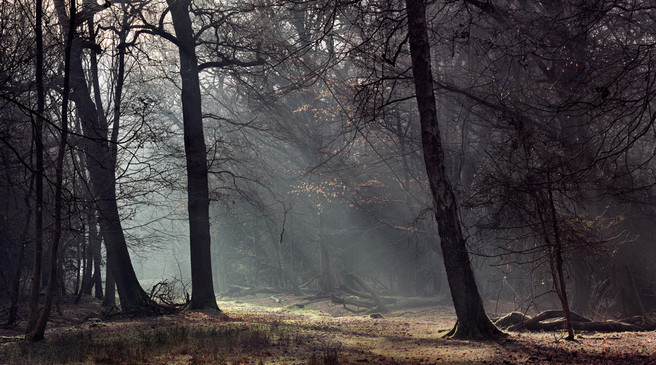
I knew I had to rethink my image options. In the end I chose four images from my Epping Forest project. Three of them were made very recently and the fourth was a three-year-old picture that I'm still very fond of. Light and Land sent out a very comprehensive PDF information pack, detailing set up/break down times, directions and local road closures. Also included was printing information where the suggestion was made to go through Fotospeed. They would print, frame and deliver the prints, meaning you could turn up and just hang your images. I almost went down this route, but I'm still very fond of Hahnemühle 308gsm photo rag paper and the printing quality offered by The Print Space in East London. I'm also lucky enough to have a very good framer across the road from where I live. It may have cost me slightly more to have it done this way, but being able to quality control each step was very important to me. The frame selection on offer from Fotospeed was also limited so I selected some very nice walnut stained wooden frames in store at my framer.


