Derrick Golland chooses one of his favourite images

Derrick Golland
With work out of the way I finally had the opportunity to return to my lifetime interest of photography, or rather the photography that enthused me not that which was needed in my role in education. Perhaps it was because I was trained on a Gandolfi or spent many years in pre-DSLR days owning a Bronica that I tend to be drawn towards a square format when making an image.
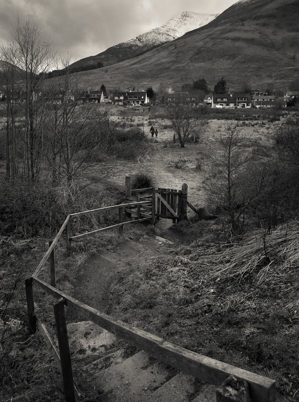
You could be forgiven for thinking this is a set-up! In fact, it is quite the opposite. Tim Parkin rarely makes an image in black and white and does not normally include people. His photograph ‘School's Out’ is, therefore, a break in his usual style as part of his Lochaber 365 sequence (which has been on pause since April, back soon - Ed). So intrigued by this I kept returning to the image and, in the end, contacted him with the request that I might write this up as an ‘End-frame’ contribution.
‘Schools Out’ deserves examination in detail. There is much more to it than its being a straight record shot. Yes, it has a good sense of composition. The footpath is a natural leading line drawing the eye to the mother and child on their way home from school; small figures that might otherwise be overlooked, and ensuring that they become central to our thinking. The handrail on the steps occupies much of the lower half of the image. It would have been only too easy to omit this - a man-made object that spoils the view! Instead, it is used as a device that pulls us into the whole image and links the viewer with the scene.
The lower part of the image comprises a number of key components. The steps roughly cut into the hillside, where once there was probably only a slope, draw us down into the central area. Although they dominate the foreground they add strength to the middle and distance. To the right are the stems of last year’s bracken fronds sweeping downwards to counter the curve of the rail. The curves are in sharp contrast to the upright stems of the self-sown trees. Those on the left conveniently obscuring a bright sky that would have otherwise formed a natural distraction. In many respects, the vegetation is a contrast between the old and the new and yet they all remain stilled by the cold of winter.
Most landscape photographers spend their life trying to keep the built environment out of their images. On this occasion, Tim has included it to make a clear statement. Yes, it is the destination for the walkers, but on the other hand, it acts as a symbol. How small the homes look set against the dark, somewhat brooding, the barren slope of Beinn Bhan. How small man’s efforts seem against the snow-capped peak of Sgorr Bhan. How heavy the grey clouds seem as they, too, hang over the village.
Like so many elements of this image even here there is a paradox. It seems that the mountain furthest away is the one that sets the scale and because of the light on the snow our attention is drawn towards it. The almost central position of the peak has been carefully placed above the line of the path. We are being invited to walk, from the wasteland, through scrubland, on to urban land, only to continue to a barren land and, ultimately, a shining destination. Perhaps the whole image is an allegory. Above all, it is a landscape photographer's essay on nature’s dominance over humans.


