How reliable is the Rule of Thirds?

Tim Parkin
Amateur Photographer who plays with big cameras and film when in between digital photographs.
Rule of thirds, rule of thirds - it’s all we hear from photography magazines, camera clubs and composition guides. According to these sources, the rule of thirds is the prime rule in photography and you should break it at your peril. In this article I aim to rip up this part of the rule book and show it for the misdirected rubbish it really is (it’s acronym is ROT, in case you need reminding).
First of all let’s start with the origins of this rule. According to our research, the first mention of the rule of thirds is in a book “Chromatics” by George Field where Sir Joshua Reynolds and Sir John Thomas Smith (1797) are referenced as follows:
“Sir Joshua has given it as a rule that the of warm to cold colour in a picture be as two to one although he has frequently therefrom and Smith in his Remarks Rural Scenery would extend a like rule to all proportions of painting begging for it the term the rule of thirds according to which a landscape having one third of land should have two of water and these together forming about third of the picture the remaining two thirds be for air and sky and he applies the same rule the crossing and breaking of lines and objects &c”
So it seems that this rule of ratios is intended at first to be applied to colour ratios but then became extended to all ratios within a picture. Even then, this author immediately follows with “the proportions in both cases are to be governed by the predominance of light or shade, and the required effect of a picture,”. So even this early in the game, the rule is being knocked. He goes on to say.
“This rule, however, does not supply a general law, but universalises a particular, the invariable observance of which would produce a uniform and monotonous practice. But, however occasionally useful, it is neither accurate nor universal, the true mean of nature requiring compensation, which, in the case of warmth and coolness, is in about equal proportions, while, in regard to advancing and retiring colours, the true balance of effect is, approximately, three of the latter to one of the former; nevertheless, the proportions in both cases are to be governed by the predominance of light or shade, and the required effect of a picture, in which, and other species of antagonism, the scale of equivalents affords a guide.”
It is thought that the rule of thirds is originally related to the golden section - where the golden section appears from the golden ratio of approx 1.6:1 - hence the rule of ‘golden ratios’ moves those ‘key third points’ further into the corners. These golden sections supposedly originated in antiquity and were the basis of much historic art and architecture. But many experts say that these ratios can’t be found in the pyramids or the Greek parthenon and other buildings. The obsession with these ratios only really reappeared during the time of da Vinci and this was from Vitruvius’ treatise on proportions (although it is widely thought that even Leonardo didn't really use the golden section). [see wikipedia golden section page for more]
So, if there is very little behind the ‘rule of thirds’, why do people hold on to it so strongly as a compositional crutch. After going through hundreds of different pictures, the amount that conform to the rule of thirds is minimal.
I’ve seen critics call objects that are close at the edge of the picture as ‘nearly a third’ and also, anything slightly away from the exact centre as ‘almost a third’. Hence the only things that don’t really fit the thirds rule are objects almost against the edge of the picture, objects in a corner or objects/lines smack bang in the centre. So by applying the ‘rule of thirds’, we’re saying “Don’t put things at the very edges of the frame or slap bang in the centre”.
Another contradictory thing about the rule of thirds is that I’ve yet to see a picture that uses all four of those ‘third’ hot spots. Why not? Surely if it conformed to every third it would be so much better!? In reality it would look very odd, with weird symmetries disturbing the eye.
It is probably true that the ‘first guess’ placement of an off centre object with no other context will probably be around a third point (but within quite a large tolerance). However, if we can use a musical analogy (and it’s probably one of the most productive genre to access analogies from) a ‘third’ placement is like a major chord in music and just as a song full of major chords will sound dull very quickly, a picture with just thirds will do the same. I tend to place horizons quite close to the edges of the frame - a rule of fifths would work very well.
Just as a side test, I went through twenty of Joe Cornish’s pictures and logged some ‘focal points’ and horizons. The vast majority of the horizons were on a 25% line, although a significant minority were at 20% and 50%. As for objects, the spread was all over the shop but nothing got closer to the edge than 20% of the frame width to the edge.
So what can you take out of this article? Well for one, composition is more than just aligning a few objects with a simple grid (but I guess most of you knew this before you read the article). What composition is about is flow and balance and I’ll use the end of this article to announce a new series starting in February which looks into composition. We’ll study to approach the task of composition from working in the field to honing a composition with your camera on a tripod and predicting/waiting for complementary light.
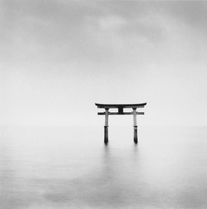
The pictures in this post are from some photographers that are well known for their compositional skill. I looked though many of their best photographs and it was consistently difficult to find pictures where key elements, such as horizons or focal points, sat on the 'third' lines.
Read Joe Cornish's article: Compositional Controversies - Rule of Thirds; Golden principle, useful guide of strait jacket?


