Final instalment of Tim's journey to his first exhibition

Tim Parkin
Amateur Photographer who plays with big cameras and film when in between digital photographs.
This is the third and final instalment of my “journey into world of exhibitions” article. If you’d like to catch up with the previous two articles you can find at the following links -
Part One:- https://www.onlandscape.co.uk/2014/02/exhibition-planning/
Part Two:- https://www.onlandscape.co.uk/2014/02/exhibition-planning-part-2/
We left you in part two having just hung the exhibition and finished arranging the card spinners and sample of a framed print etc. At this point in time the only thing left was to wait for 24 hours until the preview evening. I hadn’t invited many people* but a few friends live nearby and so I arrived at the exhibition early to make a few final tweaks and waited for the surge of attendees. We forgot the crash barriers at the entrance but fortunately not too many people turned up.
The disadvantage of not having many people was that I didn’t sell out all of my print editions** on the first night - the major advantage was that the free wine didn’t have to stretch as far :-)
As it was I had a couple of friends from the Lakes (thanks to David & Angie), colleague David Ward popped over from his nearby residence, Paul Moon and his wife arrived and Dav Thomas came over from the Peak District.
My role was to talk over the prints with the occasional visitors and let them know a little about my background and the reasons behind the type of photography I was doing. A lot of people were very interested in where the images were taken and it started off with quite a few conversations about their own personal experiences in the areas in question.
It was very interesting observing people’s behaviour around the prints - the photographers spent quite a while moving backwards and forward, engaging with the images on a global and local level - looking at fine details and absorbing overall composition - whereas the general public would nearly always place themselves at a distance away to absorb the whole picture at once and only really observed more closely when the picture wasn’t immediately clear.
Promoting Your Exhibition
There is little point in putting together an exhibition if you don’t do some promotional activities to get people to visit. In my case, the museum has just had a new director and they have been great at getting press opportunities but we also decided to appoint a PR person to help stretch the effect a bit further. They managed to get a couple of interviews with local newspapers but missed out on some obvious opportunities - I think the major thing a PR person can bring to a job (apart from offloading some tasks) is having the appropriate contacts in the press to get interviews/news but also to plan a campaign that keeps a level of public attention. But to get the most value for money out of PR you need to work with your representative so that they do the things that you can’t do at all and allow you to help with the general work.
Making the Most of Your PR Opportunities
The thing to keep in mind with journalists is that they are naturally lazy and anything you can do to supply them ‘material’ will increase your chance of good coverage. The one thing most journalists will tell you is that the exhibition itself and your pictures aren’t enough for a good article and will only really get an event listing and perhaps a small news item. What journalists really want is the back story, the ‘human interest’. My own story about recovery from a back injury and the movement from digital to film was something they found quite intriguing but the more human interest you can supply (and the more ‘local’ it is if you’re dealing with the regional press) the better.
Lessons Learned
1. Print Brightness
One of the big mistakes I made was in the assessment of print brightness. I assessed the brightness of the prints I was making on a Just Normlicht daylight print proofing booth. This provided good quality daylight light and the prints looked very good. However, upon hanging the images on the wall I was surprised to find out that they looked quite dark. It took me about a day to figure out why. The first, and most obvious, reason is that the lights in the museum were not as bright as I had first realised. This meant that there was a general reduction in ambient light level but this shouldn’t have caused the dark effect I was seeing.
After a while, I realised that the prints looked absolutely fine when you walked up to them but when you looked at them from further away they looked too dark. Then it clicked - white walls! When I was looking from further away there was a lot of white surrounding the picture and my pupils were closing down causing the image to look darker. You can see the effect in Photoshop or Lightroom by viewing a photo that only fills the centre of the screen and then change the background colour from white to black. You’ll see that the picture looks brighter on a black background and darker on a white background.
The same problem was seen with the larger prints but in this case was my fault as I didn’t ask for some form of proof. The prints are not too dark but are darker than I expected and combined with the white walls they looks odd from a distance. However when you get closer to them they look pretty good - the ‘surround’ effect or in perceptual terms “Simultaneous Contrast” .
2. Gallery Lighting
As mentioned above, the lighting in the gallery wasn’t quite as good as I had expected. This was a case of not spending enough time looking and preparing. Given the time constraints perhaps it might not have been possible but if I had the opportunity again I would make a few test prints at various brightness levels and hang them at various positions around the gallery. If I had done this I would have noticed that some parts of the gallery were not really illuminated at all and perhaps would have printed images brighter for them. This presupposes that I had planned all of the prints and their respective positions in advance though.
It’s a tough trade off as prints that look too bright can definitely look a lot worse than prints that are too dark. If you can do so, make some test prints and check!
3. Plan A Post Preview Dinner Party!
I didn’t arrange anything for after the exhibition but my colleagues all agreed to go to the local village pub for a meal and a few drinks. I didn’t quite realise how stressful the whole exhibition planning and producing was and hence hadn’t quite realised how much I needed an evening of relaxation in good company. I’d recommend making this something a little more organised and try to make your preview night an enjoyable evening for yourself and not a stressful one.
Conclusions
Overall the experience of putting on an exhibition was one that I enjoyed on the whole. There were moments of sheer panic and desperation, some late nights and some missed work deadlines (sorry to my work colleagues!) but it worked and I think it has allowed me to take a look at my work properly for the first time and draw a line in the sand to say “This is where I am now” and ask myself if it’s where I want to be? I’m now working out what next - where will my journey take me.
I think this is possibly the most important aspect of exhibiting - the opportunity to look backwards as well as forward and to make space to move onward with your photography.
For me this means less of an emphasis on just taking pictures and more of an emphasis on the reasons surrounding picture taking; the connection between a series of images and the potential to convey a message or feeling. I don’t suppose this will change my photography in the short term but from little acorns…
* OK! I invited the whole of you lot but it was possibly a little short notice to get to the edge of the Yorkshire Moors at 4pm on a weekday - at least I hope that was the reason
** OK again! I don’t do print editions! It’s embarrassing to have a wall full of 1 of 1s!
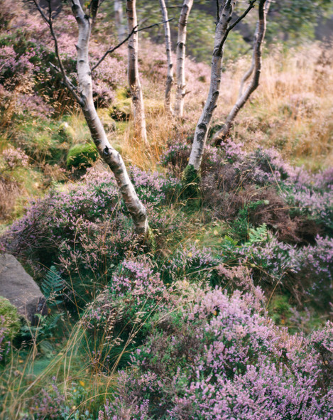
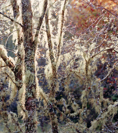
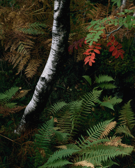
Here is a gallery of the images I used in the exhibition for those of you who couldn't get along in person.


