The Shape of Things To Come?
 What do Michael Kenna, Josef Hoflehner and Hengki Koentjoro have in common? I suspect many of you have guessed the answer already: they all work predominantly in black and white and use the square format.
Its popularity with arty landscapists means that I've come to think of the square format as the 'fine art photographer's format'. Perhaps this is because of the format's roots – before digital, you needed a 6x6cm medium format to work in the square format (print cropping aside). These cameras tended to be owned by keen amateur or professional photographers attracted by the high image quality and large print potential of the medium format negative.
How times have changed. Now, any photographer with a digital camera can crop an image to the square format in post-processing. Some cameras even let you use the square format when you're taking a photo (this tends to be cameras with electronic viewfinders or that can display crop marks on the camera's LCD screen in Live View mode). But just because you can doesn't necessarily mean that you should.
Or does it? I've found myself using the square format more and more over the last 12 months. It has been both fun and instructional to work in a different format other than the 3:2 aspect ratio I'm accustomed to seeing through my camera's viewfinder.
 One of the reasons that I like the square format is that the rule of thirds no longer applies. I'm not a big fan of the rule of thirds anyway; I firmly believe that balance, space, energy and flow are far more important elements of composition within the landscape.
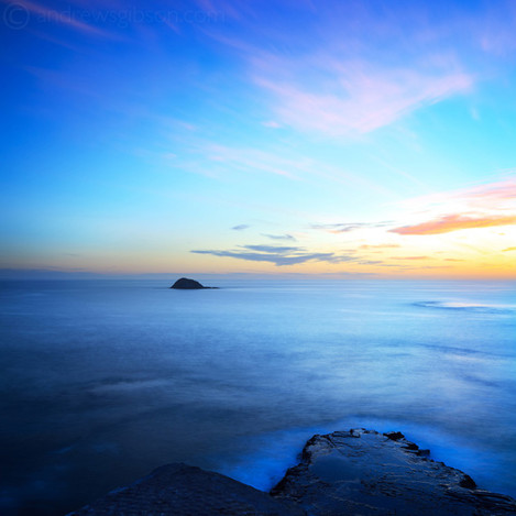
There seems to be a strange kind of freedom to composing within the square frame. You can place the subject in the centre, or near the edge of the frame, and it seems to work. The square format lends itself to strong, simple compositions. Shapes become emphasised, negative space more important. Perhaps that's why black and white images work so well – the square helps reduce a scene to shapes, forms, texture and lines; which also happen to be the building blocks of strong black and white images.
My first square images were crops of photos that I never originally intended to be square. It started when I was building a photo gallery for my website that used square thumbnails. I noticed that many of the images seemed to become stronger cropped to a square. But not only that, the dynamic of the image had changed. In a rectangular image, the viewer's eyes scan from side to side (if it's in the landscape orientation) or up and down (in the portrait orientation). But a square is different – all the sides have equal weighting and the eye tends to move around in a circle.
 Now, I find myself taking images that I intend to crop to a square in post-processing. I've started to 'see' in the square format, and recognise when a subject has the potential to work as a square. Working in the square has also improved my eye for composition within the 3:2 aspect ratio. It's made me more aware of the need to fill the frame with something that's interesting to look at and to avoid too much empty space at the far ends of the rectangle.
The graphic qualities of the square format means that it suits very simple or minimalistic compositions. Again, these are important elements of good black and white imagery. Converting to black and white is in itself a form of simplification as colour is discarded to reveal the underlying forms, shapes and textures.
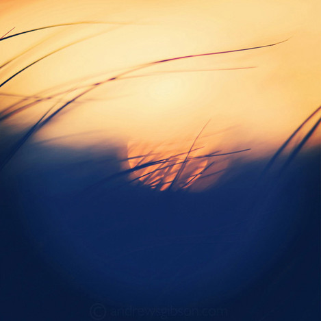
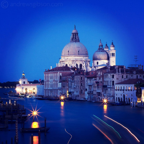
That's not to say that the square format doesn't work in colour. I've deliberately selected some colour images to illustrate this article to make that point. You should also take a look at the work of Jessica Hilltout. While only a small amount of her work could be described as landscape, she has a wonderful eye for colour and composition and utilises the square frame beautifully.
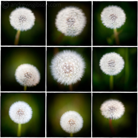 I've come across a few slightly 'oddball' uses of the square format. One is Instagram, an iPhone/iPad app which crops images to a square and applies 'creative filters' that imitate vintage film types. I enjoy uploading photos to my iPad, and playing with Instagram to see what happens. It's surprising how pleasing the preset effects can be.
Another is the use of toy cameras such as Holga. These are used to good effect by black and white photographers who use film and make their own prints. Flavia Schaller has some wonderful black and white images created with a Holga camera on her website. Lee Frost also has a beautiful series of photos taken with a Holga.
You can also create an enormous square image by taking two photos with a 35mm camera and blending them together afterwards. These are called 'vertoramas' (a search on Flickr will bring up many examples) and are another way of exploring the square format. They work best if you use a tilt-shift lens, although you can achieve the same effect with regular lenses as long as you are prepared for a little more work in post-processing.
There is something very appealing about looking at a framed square image. They also seem to work well when placed in sets of two or three to make a diptych or triptych. Perhaps these are other reasons that it appeals to fine art photographers; who are creating art that will one day be exhibited in a gallery or hung on someone's wall.
Andrew S Gibson is a freelance writer and photographer. His clients include EOS magazine, Craft & Vision, Peachpit and Focal Press. His eBook Square is available on his website.

