More on using masks in Photoshop

Tim Parkin
Amateur Photographer who plays with big cameras and film when in between digital photographs.
In a previous issue we introduced the idea of Photoshop masks - many of you will have already had some experience of masks but if not, recapping the previous article might not be a bad idea.
In that intrduction, we only really talked about masks in terms of a graduated filter effect; making changes to a large area of an image - in the sky or foreground for instance. Sometimes we want to make changes that target only the darkest areas of the image though, perhaps our shadows need to be warmed slightly or we need to remove a cast from our highlights. Luminosity masks allow us to make these changes. They also help us to mask hard contrast edges more accurately - we'll come back to that later though.
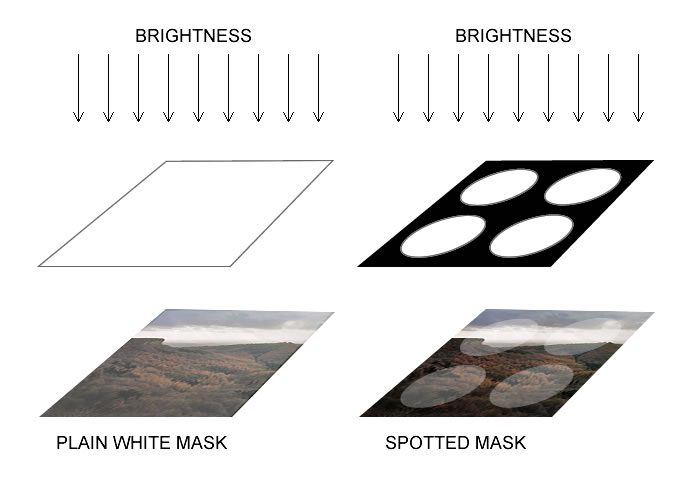
If you remember our introduction to masks, you will recollect that a mask is just a black and white layer where whites. The diagram below shows how the mask is just like a cardboard mask that is used in a real darkroom. 
The difference between a real cardboard mask and a photoshop mask is that the photoshop mask can have shaded areas that limit the amount of the effect rather than just switching it on and off. In this way the mask is like a sheet of black and white film that limits the light (or effect) being passed through. The following diagram shows the idea
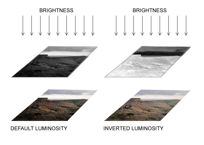
As you can see in the first picture, a default luminosity mask ends up applying the brightness (or whatever effect) to the bright areas and stops the effect for the dark areas. We can invert the mask to apply the brightness just to the darker areas. This just ends up reducing the contrast of the picture though, which is achievable without luminosity masks.
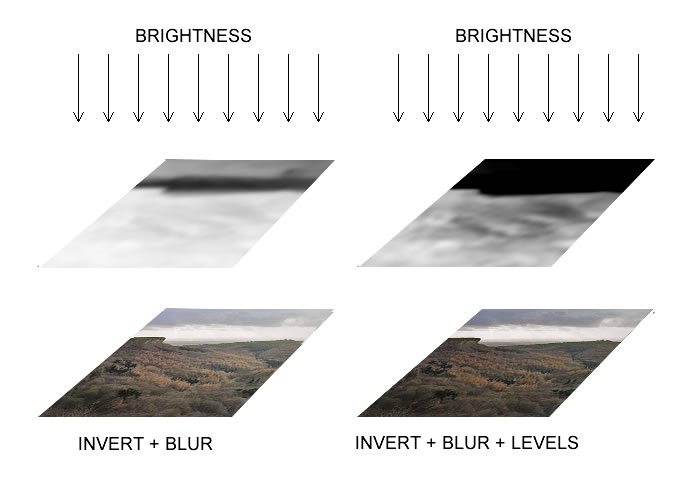
The real magic of these masks come when you realise you can edit the mask just as you can edit any other picture. This means you can blur them, darken them, lighten them, use levels to move much of the picture to black to limit the effect. Here is an example of blurring the mask.
We can see here that the blurred mask is now raising the brightness of the darker areas of the picture - however, it is also brightening the brighter parts of the picture too, reducing overall contrast. In the second example, we have used the levels tool to clip the blacks and to increase the contrast of the mask. This has now limited the brightness to just those dark areas of the image so it lifts the shadows in the same way that the shadow/highlight tool does.
The following video should give you more of an idea of how we are achieving this.


